Good Saturday morning, Uni Watchers. I hope that everyone had a pleasant week.
I’m pleased to once again return with Chris Diamond, who you may recall had been working with me on a project that has taken up several exploratory phases. To refresh your memory, I’m going to rehash the project so far.
When this began (Phase I), we wanted to see how every team who wears a dark colored alternate jersey would look if we paired them with same-color pants. There’s a lot more to it, of course, and if you missed it or forgot, that encompassed Phase I (Part I, Part II and Part III). For Phase II, we took it up a notch, creating mono-dark unis for teams who currently don’t wear any alternates, and tweaked some unis from Phase I to address some issues we had with those (Part I and Part II).
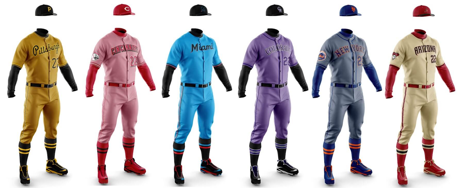
Phase III is a little different. For years now, almost every MLB team has a light gray road uni. It didn’t used to be that way. Back in the day, teams had a variety of colorful roadies — in both leagues. Powder blue abounded. Even the gray uniforms didn’t all seem to be the same light shade. So Phase III is a concept where we try to see how teams would look in “lighter dark” colors, based on each team’s primary color. So, if a team’s primary color is red, the road uniform might take on a reddish hue. Blue teams would have a bluish (but not powder) tone.
Now, there are some teams that have really good road uniforms right now, and should be kept as is. But we thought a few teams might really look sharp if we changed their current gray away unis to something else. I think some of what you’re about to see are really great concepts, while others — well, you’ll see.
Back at the end of August, we completed the first part of Phase III, which looked at the American League. We now conclude this project today with the National League. Please note there will be no concepts for the Cardinals and Padres, as both already have a non-gray road uniform (blue and tan, respectively).
Atlanta
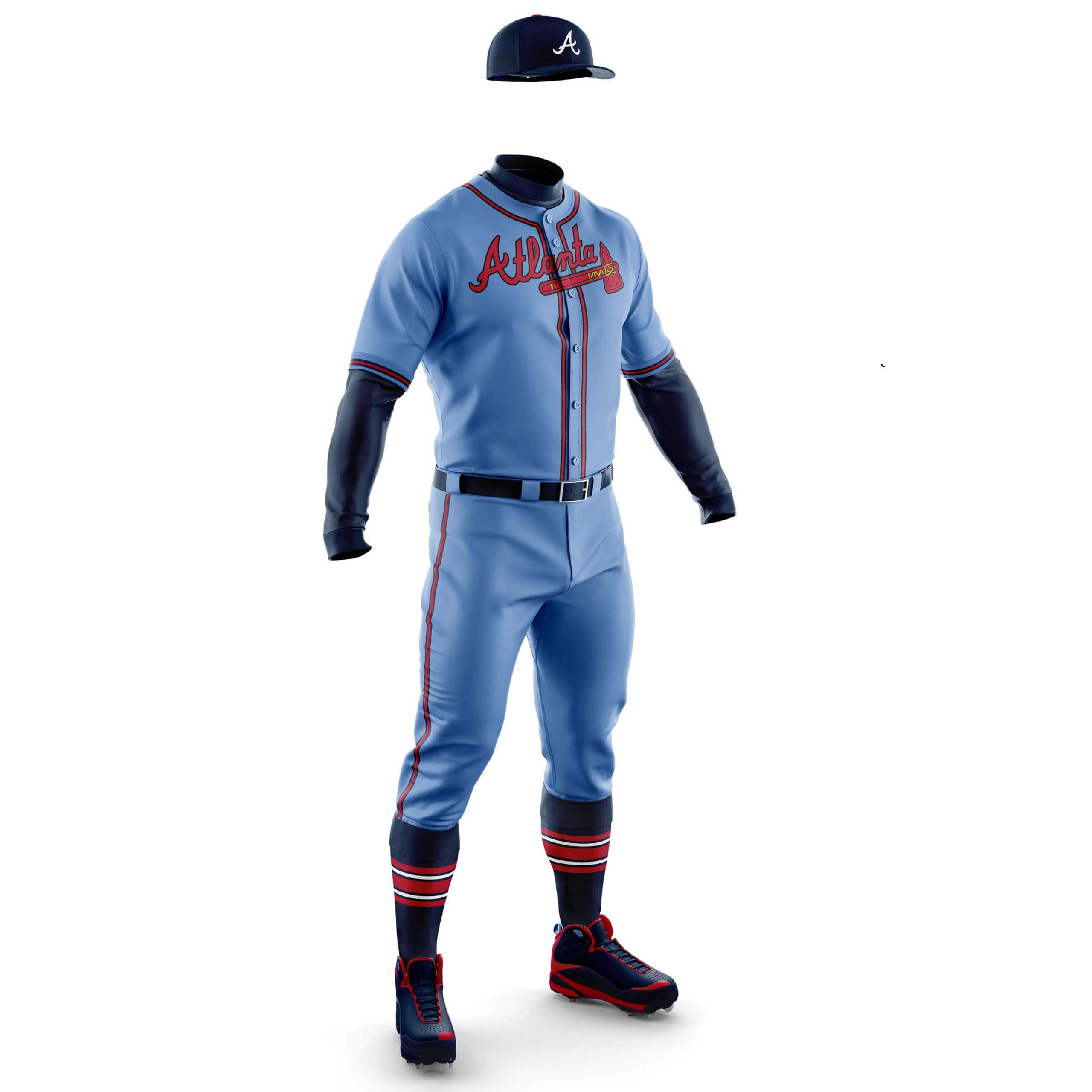
Chris Diamond: Powder blue almost always works with red and navy and that’s the case here. Here I’ve gone for a slightly cooler shade of blue than classic powder.
Phil Hecken: For those of a certain vintage, seeing Atlanta in powder blue isn’t out of the ordinary at all. Other than the imagery, I actually think Atlanta has a perfectly fine roadie now, but I like the full powder too!
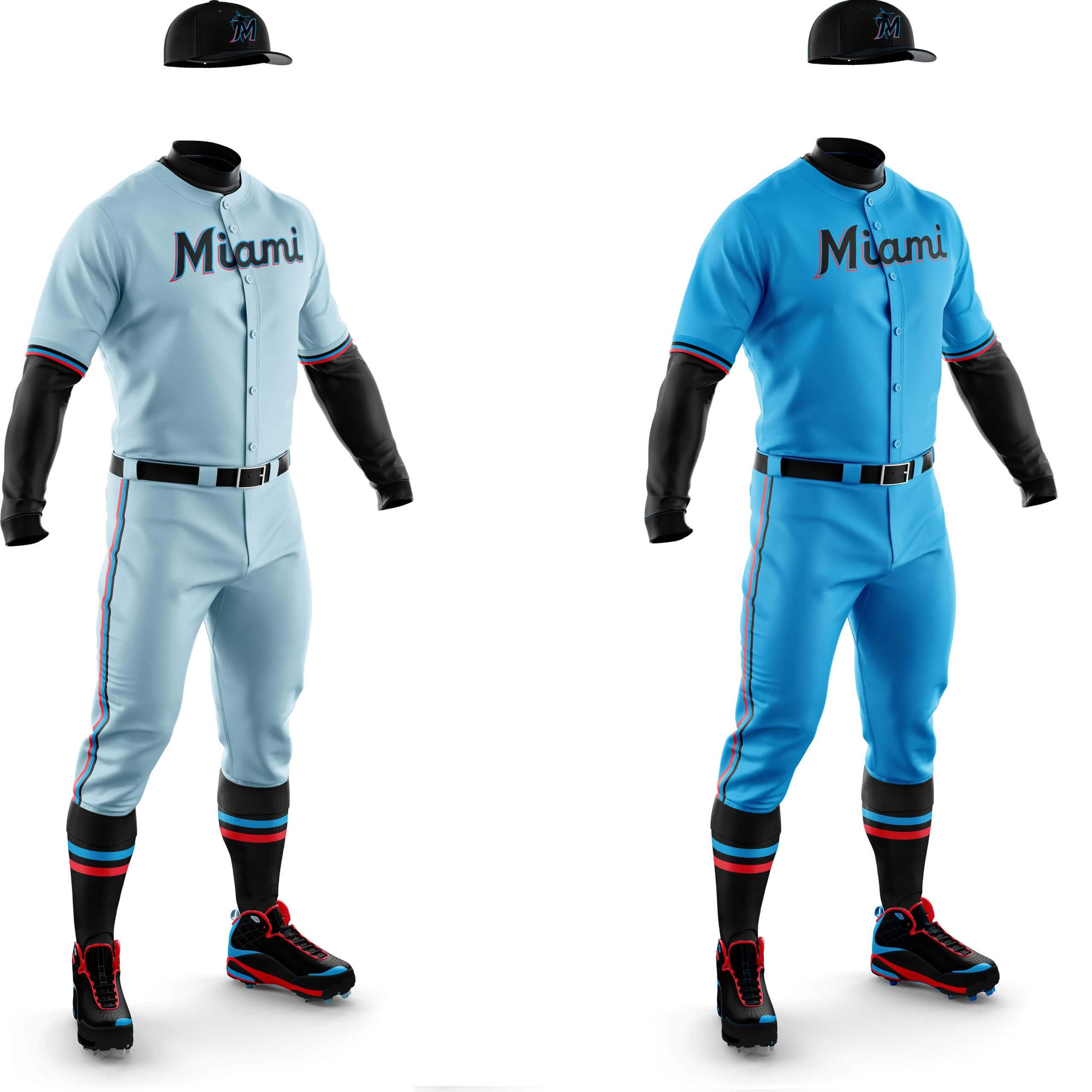
CD: I know the Miami Vice pastels thing has been done to death, but it needed to be tried! It feels a bit peely-wally to me though. The alternate is using Marlins blue as the base. I think it barely counts as a pastel, but I really like the look.
PH: I’ve been saying for years the Marlins need to ditch the black, and the deeper blue screams Miami! Two thumbs up from me here.
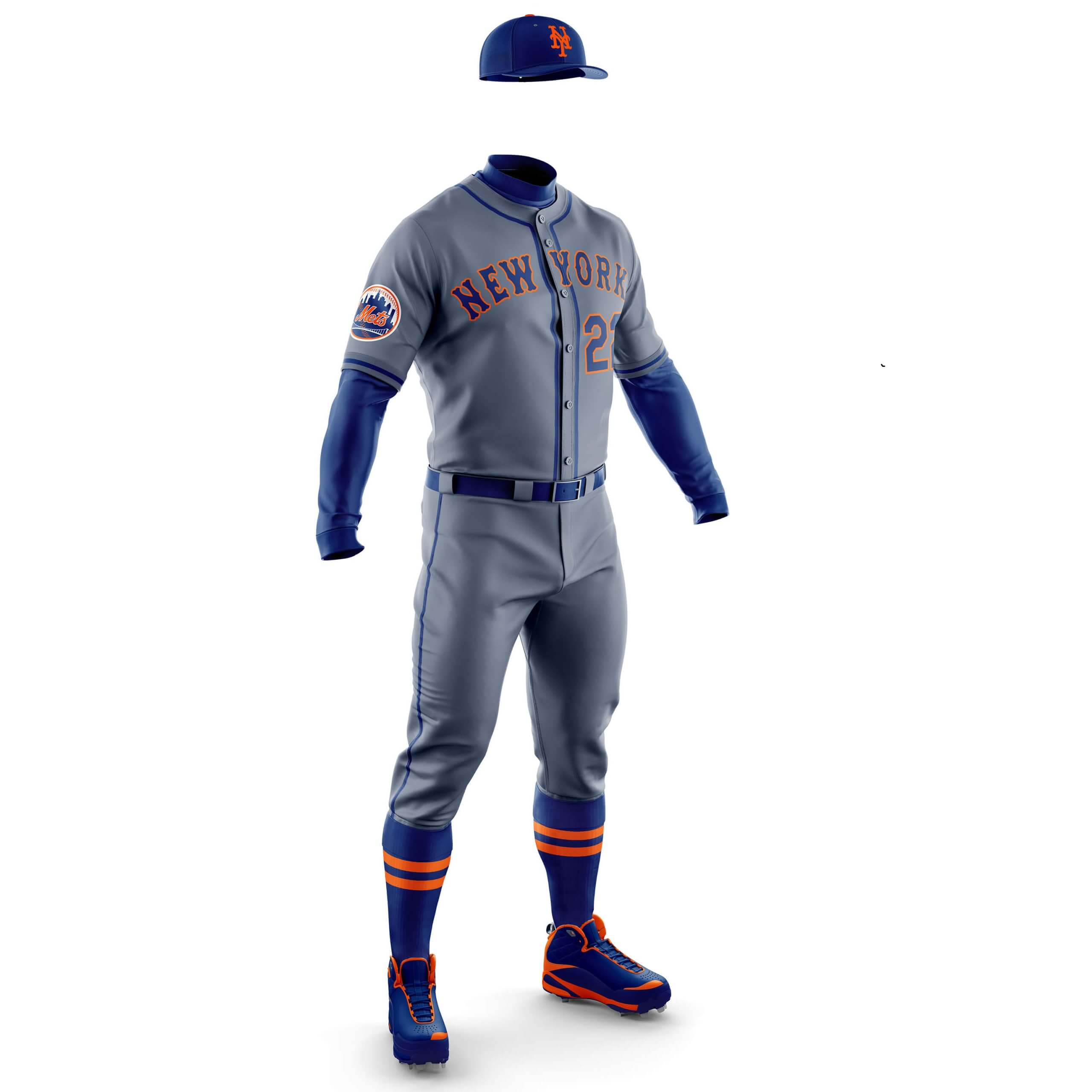
CD: I’ve gone for a darker steel grey for the Mets because it makes the orange outlined wordmark really pop. A thing of beauty.
PH: I’ve also said I’d love to see the Mets in a darker gray, even though I think they also have one of the best roadies in the bigs. This works!
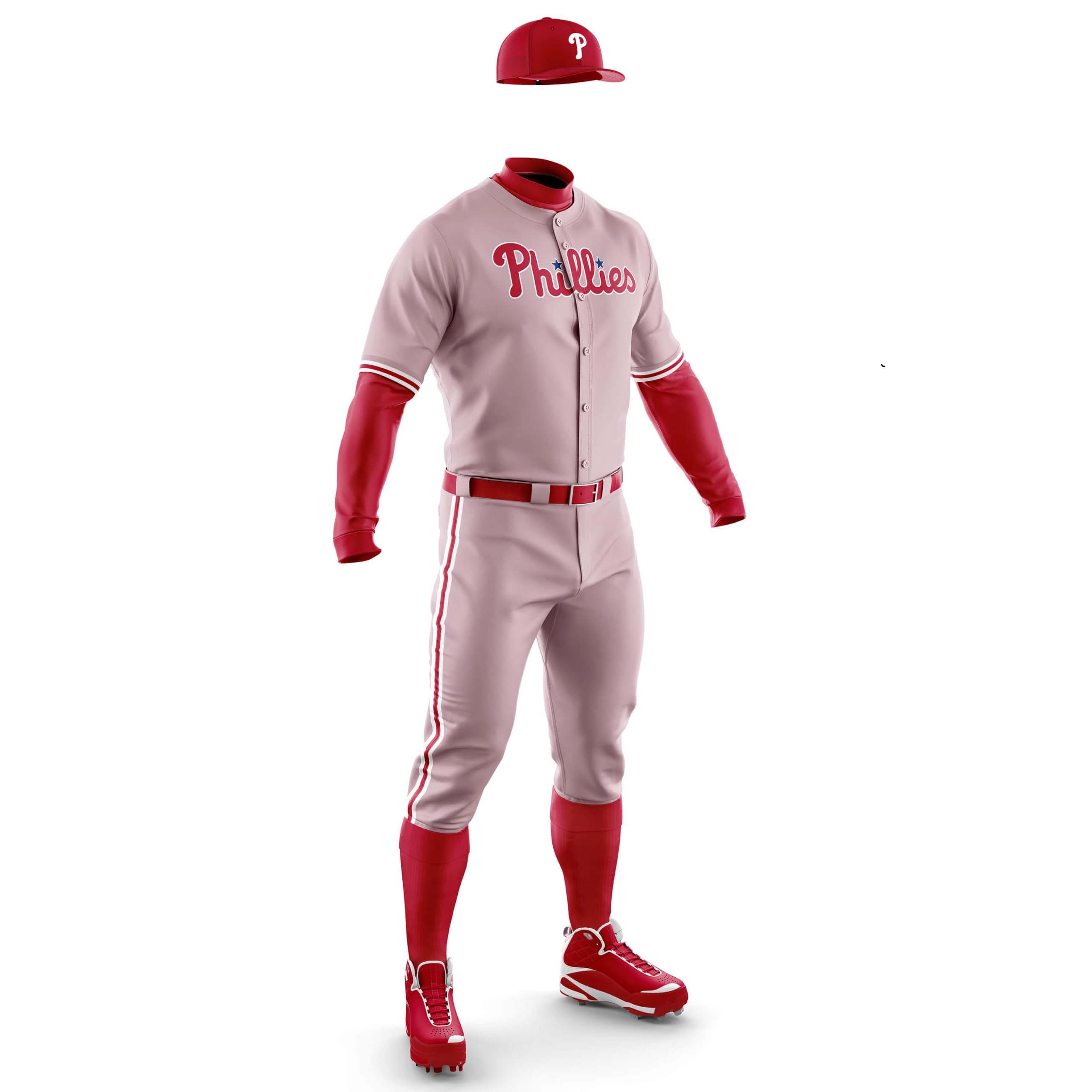
CD: Pink is always going to be tricky to pull off, but the limited Phillies colour palette means it works for me.
PH: I do think there is a National League club that can go with “powder red,” but the Phillies ain’t it.
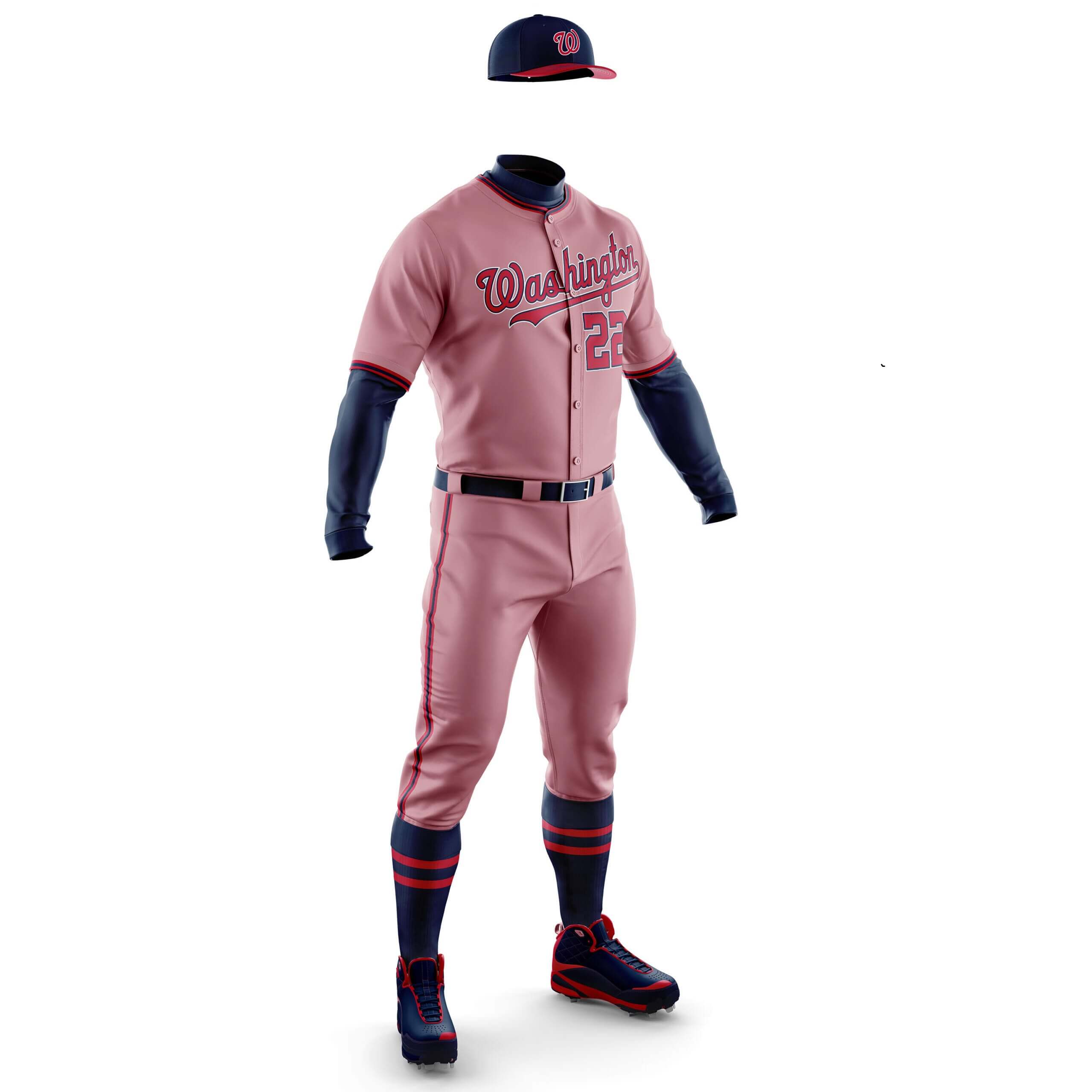
CD: Another pink team, but here the shade is from their City Connect unis. I’m not sure I like it as much as the Phillies but I think it works.
PH: See the Phillies above re: pastel red. However, I’d love for the Nats to use either the dark gray or cream found on the CC for a roadie.
Chicago Cubs
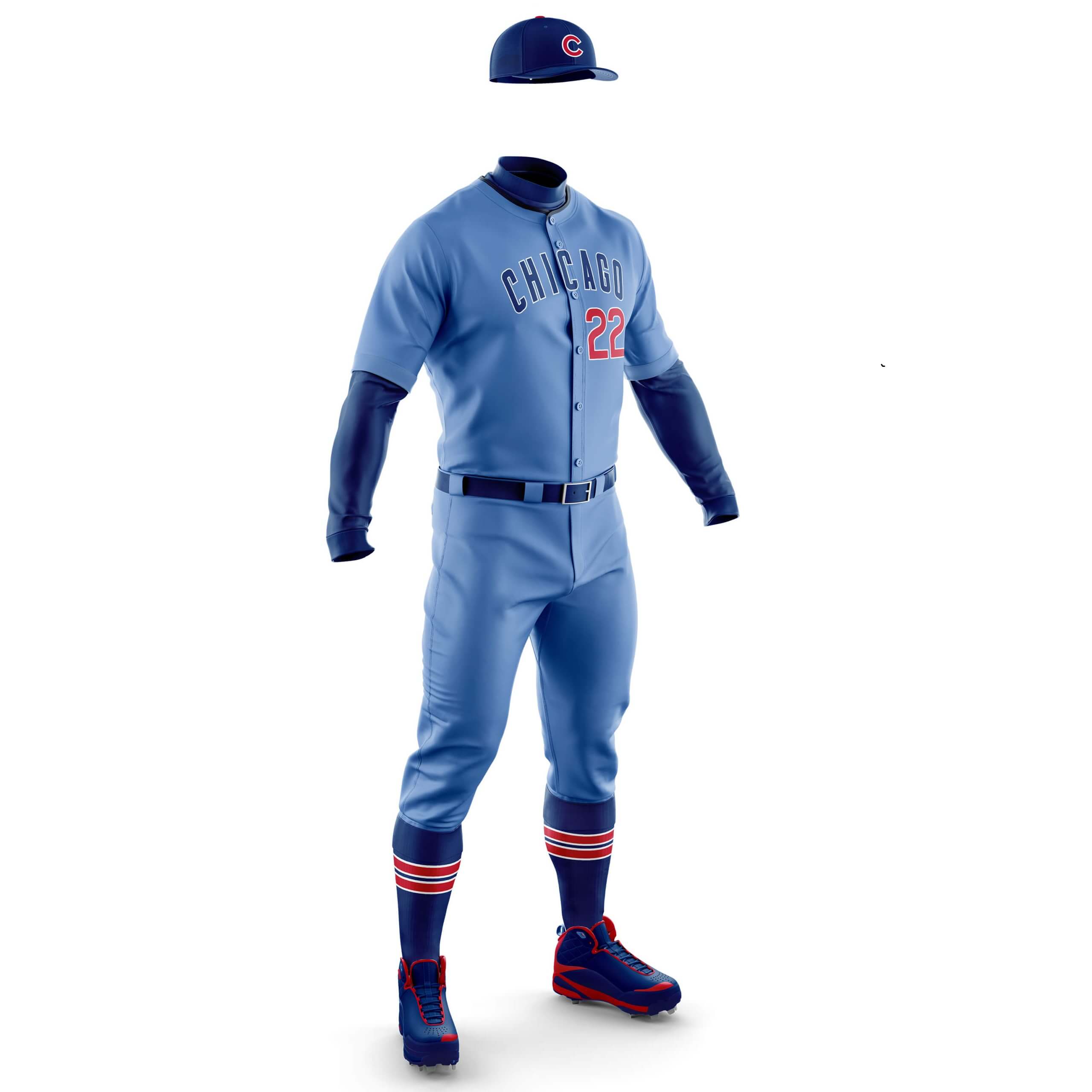
CD: The Cubbies road uni is about as simple as you can get, but I think it looks smarter in blue than the standard grey.
PH: The Cubs are another team for whom powder blue roadies have historical precedent. Hell, the Cubs invented powder blue as a road option in 1941! So this gets two thumbs up from me!
CD: I think without the black highlights this would look good, but with them it makes it look a bit too busy for me.
PH: Unlike the Phillies and Nats (and Angels), THIS is the team that needs to make “powder red” their road uni.
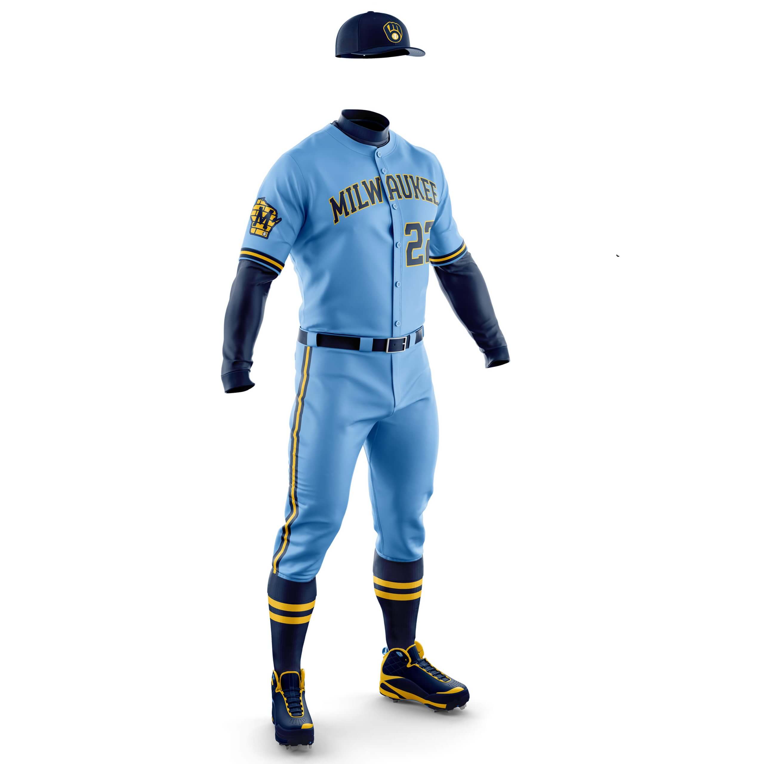
CD: This is simply a case of using the blue from their BrewCrew City Connects with the road uni and I think it’s a real doozy! It shows the colours for the City Connect are good and it’s the lame design that is the problem there.
PH: Like the Cubs, the Brewers have a history in powder blue, and some have argued that their script Milwaukee blues were some of the best ever. I was actually more partial to their previous set, which featured gold sanis. But there is no doubt the Crew look great in powder, especially with the great gold accents. Make this happen!
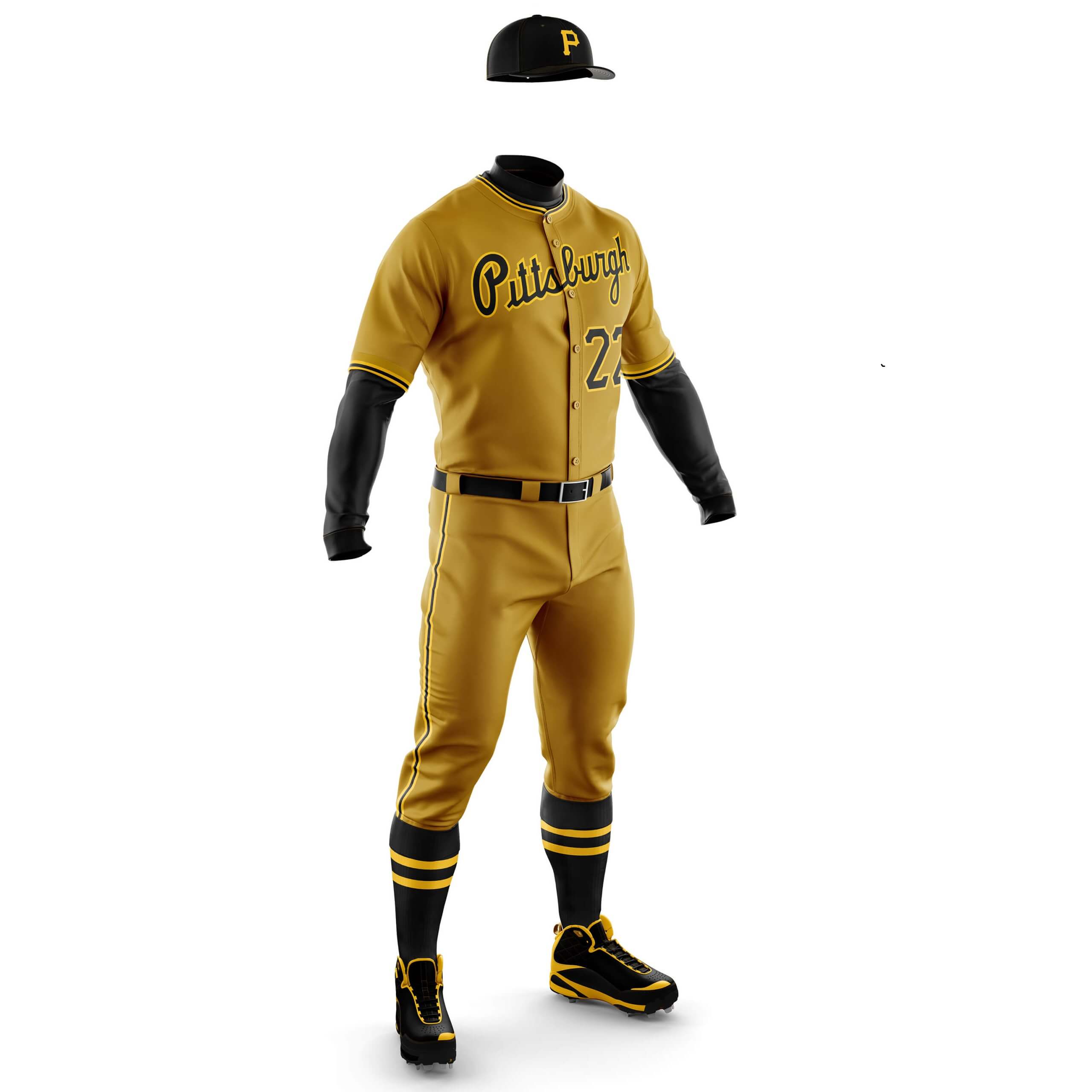
CD: Back in the mid-70s the Pirates used Old Gold (sometimes called mustard) instead of the athletic gold they do now. I’ve just used that shade as the uni colour and I really love it!
PH: I love the effort, but I think the Pirates should go with the athletic gold Chris did in an earlier concept. But this concept is growing on me.
Arizona DiamondBacks
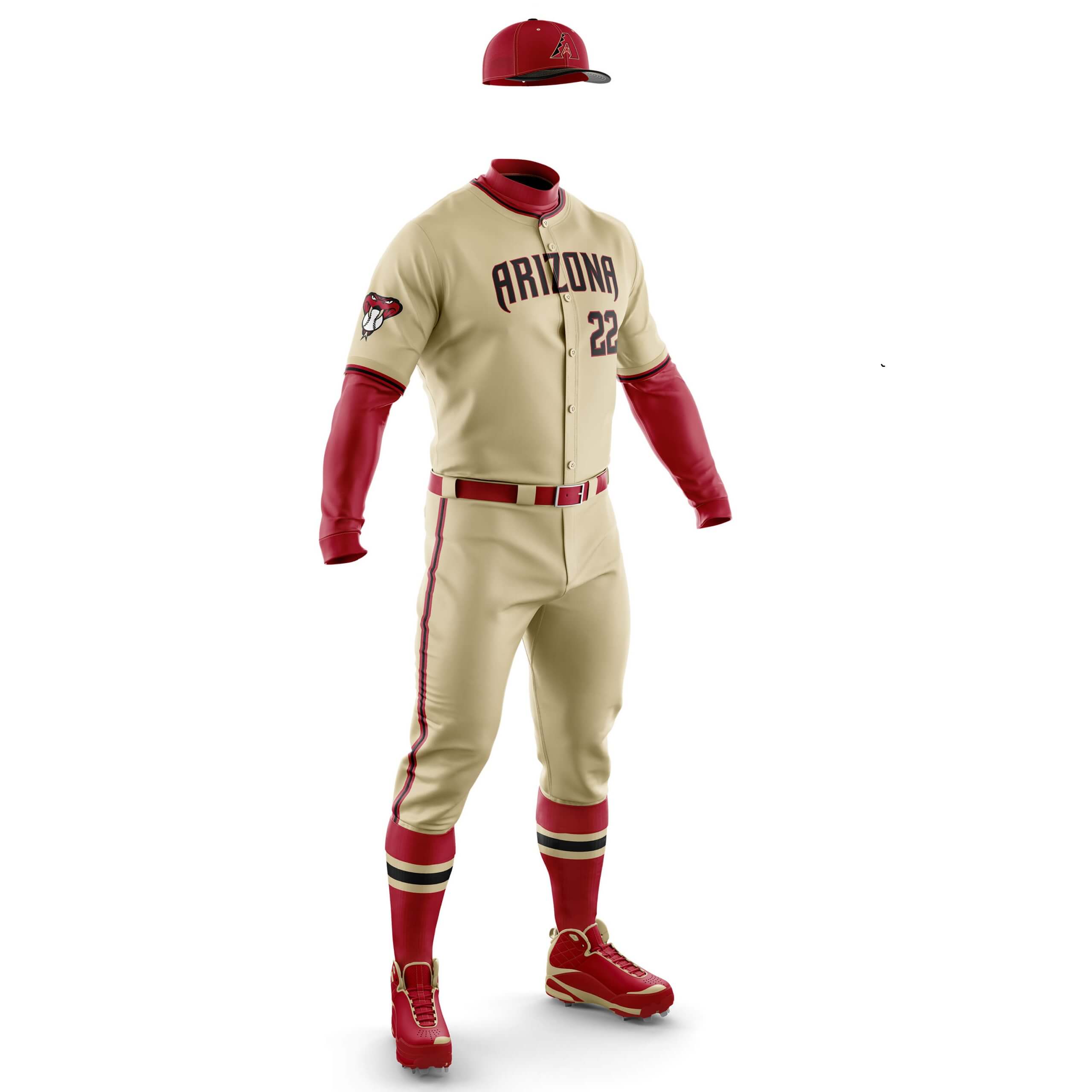
CD: The D-Backs already have a pastel uni in their Serpientes City Connect. I’ve just taken the desert sand shade and used it on the road. I think it looks really smart and shows how well those colours work together. I still have no idea why they added teal to this palette for the home unis as the only thing that goes with it is the sleeve ad!
PH: Ever since they ditched the white pants they originally wore with their CCs for full sand, I’ve wanted them to use this look for a road uni. Chris’ concept is fantastic and these would be fantastic away kits.
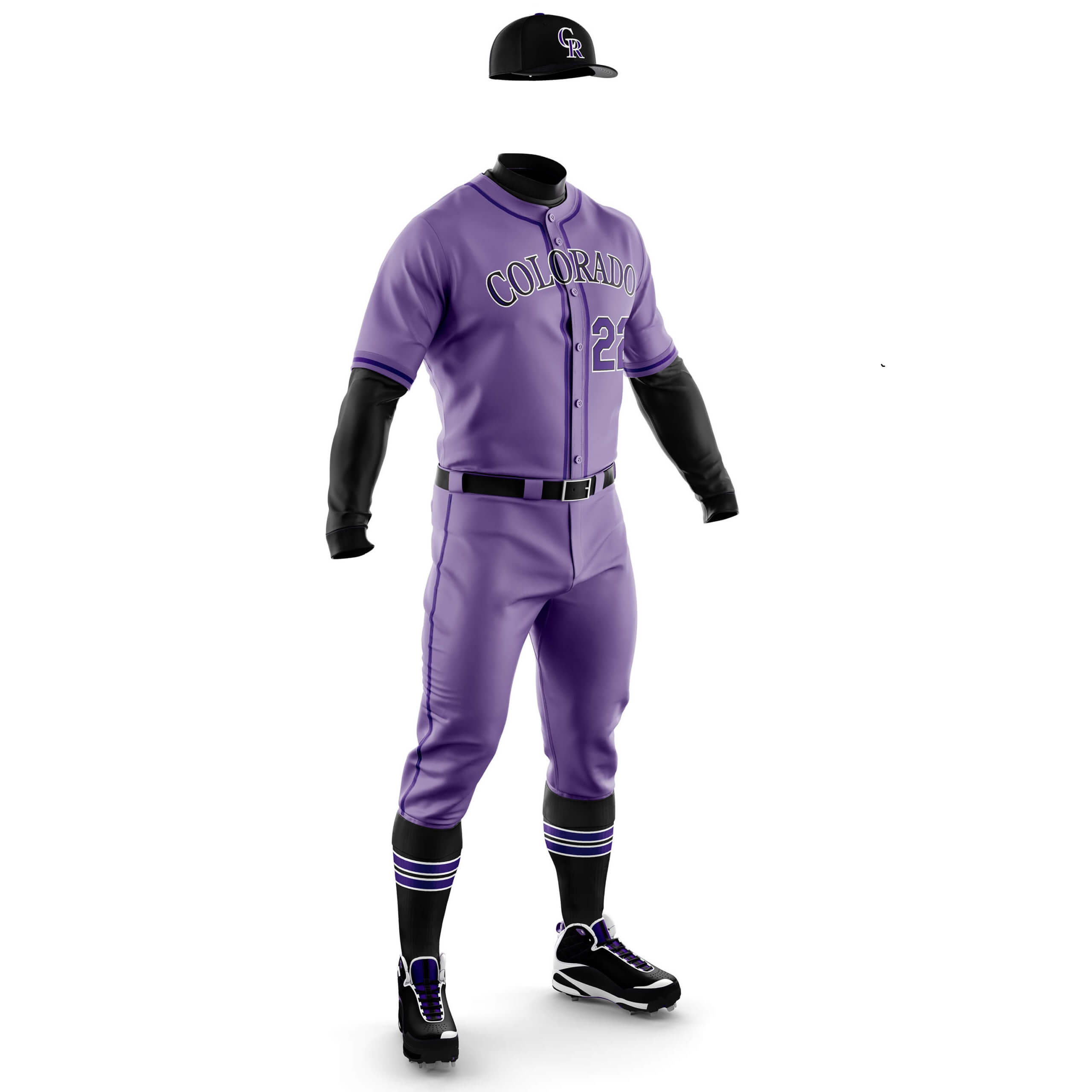
CD: I wanted to avoid a blueberry yoghurt vibe so chose a deeper shade of purple. I think it would look better with white spoon and pants trim but I wanted to stay true to using the standard road unis.
PH: THIS! I’ve been waiting months to see this concept and it’s as perfect as I had envisioned it. A certain uniform scribe may be revulsed by these, but I would kill to see these on the field.
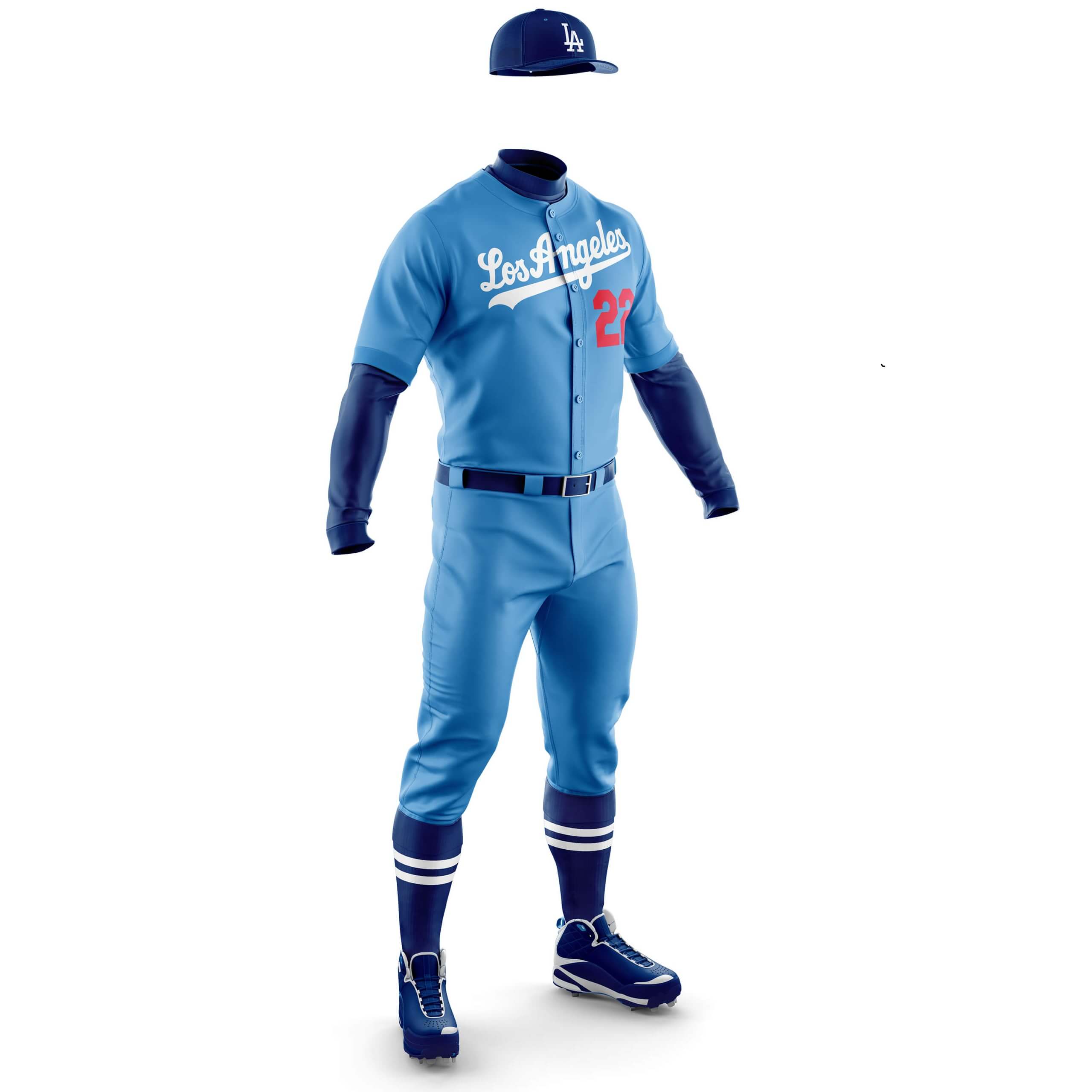
CD: Back in their Brooklyn Days the Dodgers had a powder blue set of this shade so I’ve just re-used it. Looks really smart and the red numbers pop nicely and stop it looking too much like the Royals.
PH: While there is historical precedent for light blue (the team even threw back to this look) in the Dodgers past, and I do really like Chris’ concept, I also think their current gray roadie is quite nice. So I’ll pass on this one.
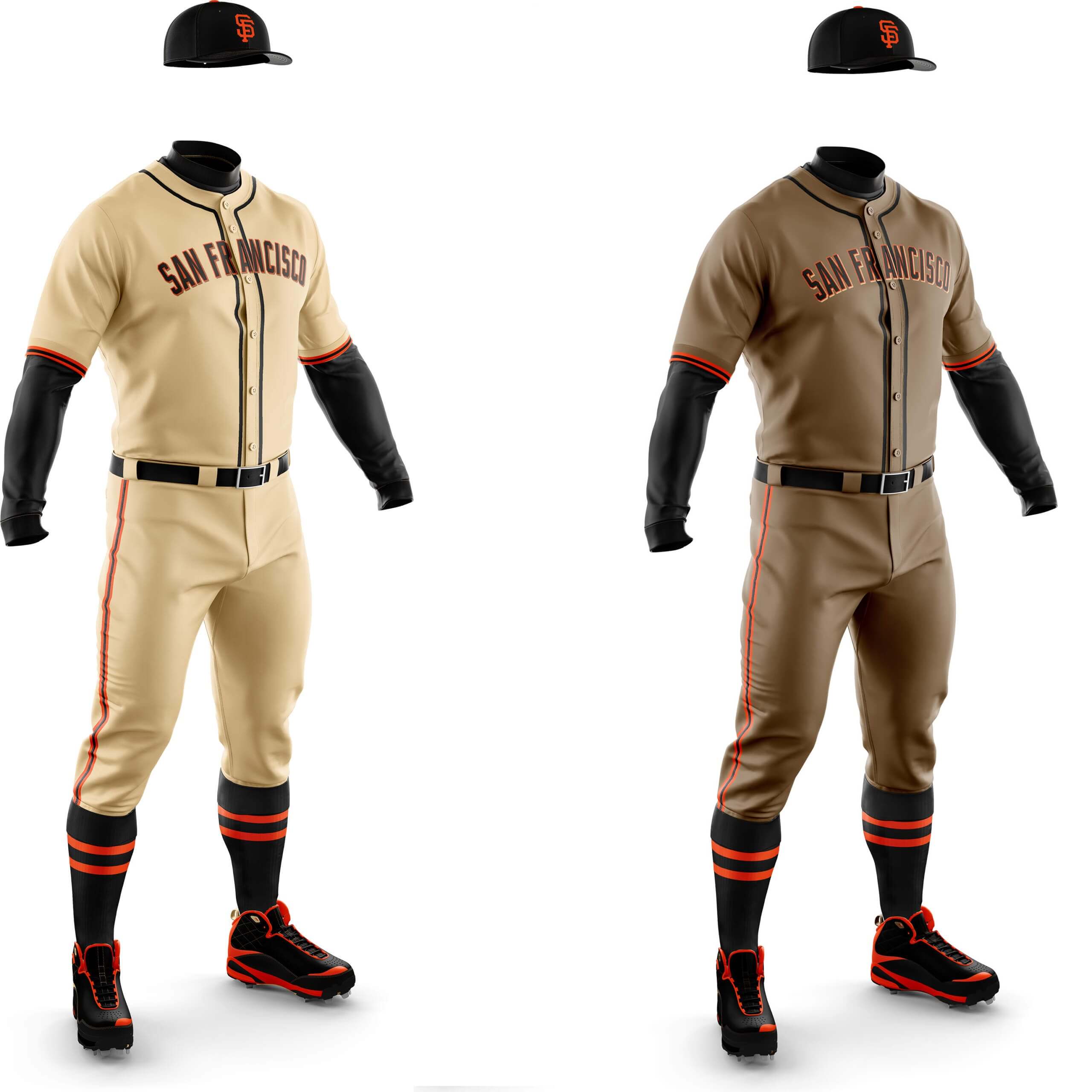
CD: The Giants introduced gold and beige highlighting in 2000 and I’ve tried both these shades for uni colours. I’m not sure I really like either, but I think the beige works better as a uni.
PH: The lighter one isn’t that dissimilar to their current home cream uniform, so I’m not really feeling this in a road version. The darker one, however, has possibilities. It’s not quite there, but it’s interesting.
What do you guys think? Please let us know in the comments below, and please give Chris a giant thanks and shout out for all his great work on this monochrome exploration project.


Man I wish the Nats would adopt exactly this here uniform, or something like it. It could even be a Cherry Blossom Season thing, like pink for games in April or before Memorial Day.
As for the Phillies, that’s pretty much what their home uniform looks like to me when seen from a distance.
Thanks Scott! I think the distance comment about the Phillies uni is why I feel it works as a whole design. And why I generally don’t like powder blue for red teams (heresy I know!)
Came here to say the same thing about both teams. Vote for pink Phillies and Nats over Reds (but I like the Reds in pink, too). Also, if any team should have multiple pastel roads, it should be the Marlins. Pink, azure, orange, teal
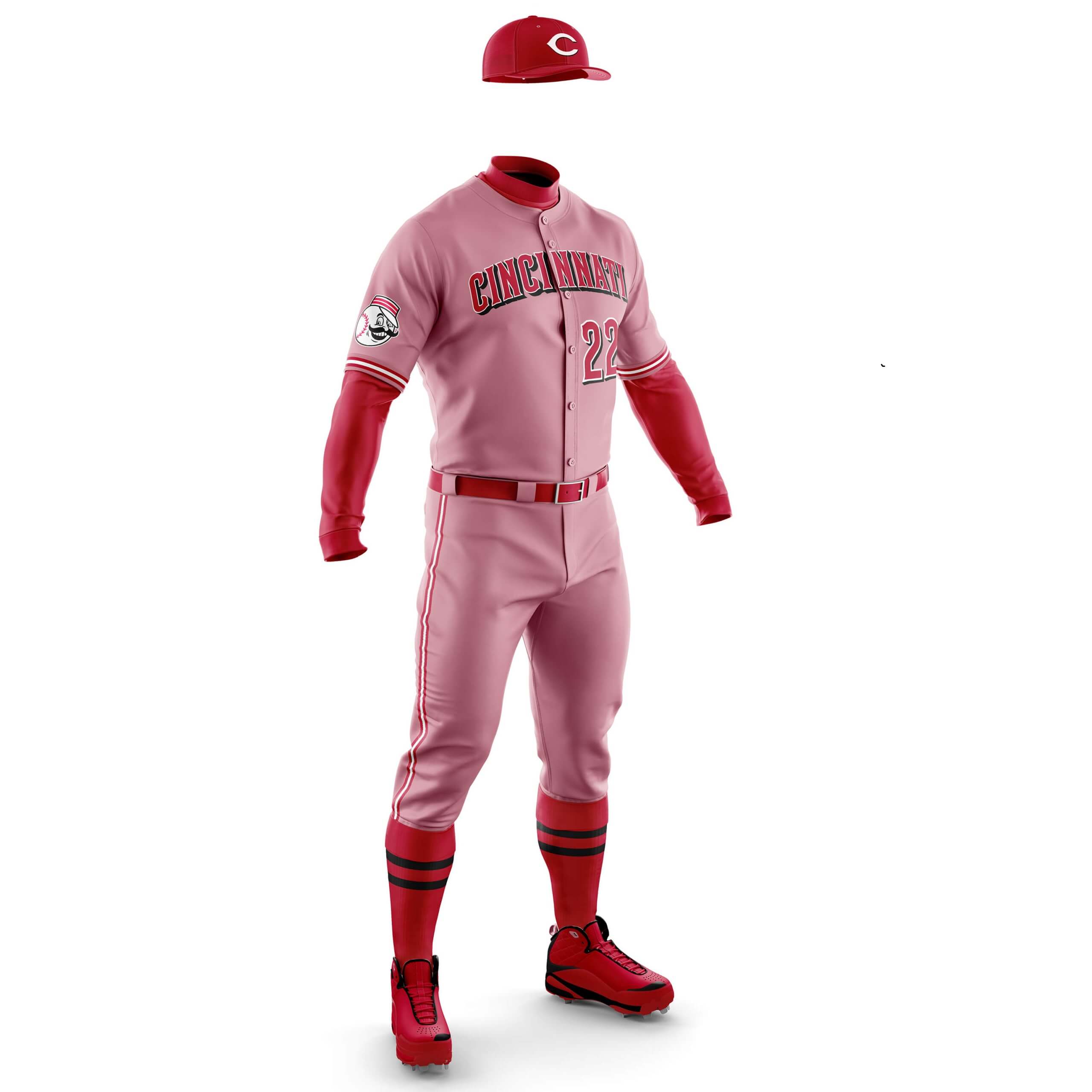
The Reds are just about the only team I think would look great in either mono-red or mono-black. A pastel would tend to dilute the impact of their signature, eponymous color in my eyes.
As for the Marlins, heck yeah. I’m OK with the team using black for the jersey script, if and only if the color appears nowhere else on the uniform. (OK, maybe a black squatchee would be OK.) Vibrant colors and pastels should define and dominate the Fish.
Reds should have red legs, not pink legs.
The Nats are the natural choice to wear powder red. Go big…go cherry blossom!
I love every one of those colored uniforms. As much as I want to see the Cubs go back to full dark blue as they did in the 1910s and 1880s, powder blue is fine too. Their powder blue with white pinstripes is famous, but I think they’d look good with dark blue pinstripes over powder blue also. Numbers on the backs could be single-layer blue.
Thanks Mark! Yes as I told Phil the pastel sets and particularly this one had the best looking unis of the whole project.
White, blue…as long as the powder Cubs have pinstripes, I’m totally on board.
It wasn’t clear if we are falling back on precedent or not, but the Phillies wore powder blues and blue is still part of their color scheme. This pastel red looks like someone accidentally threw some socks in with a white load.
The Giants in beige is interesting but one of their division rivals wears tan on the road.
Yes that’s right the Phillies have blue (and powder) in their current set which is why we went with pink here. The use of pink (for a whole uni) is so rare in sports that there is always a danger of it looking like a “red sock in the wash”!
“This pastel red looks like someone accidentally threw some socks in with a white load.”
This statement reminds me of this Classic commercial with a Philly notable:
link
Ha! I thought of this too!
Nice! He lived a few blocks away from me when he first joined the Flyers.
Great work on these concepts. I also love the Rockies uniform. It reminds me of blackberry yogurt which is more interesting than blueberry.
Haha! Thanks Mike :)
Not sure on this by any means, but is the GTGFTU November 5, 2006, Cleveland Browns & San Diego Chargers?
Cleveland Browns @ San Diego Chargers* I mean
A good guess…but that’s not it.
Hint: you have one of the teams correctly identified ; )
No pink. No lavender. No way. No how.
Fair enough. Care to elaborate on why not?
These new uniforms are disgusting. It pushes away their core fan base. When I go to games I want to see the traditional uniform, not some ugly design just for jersey sales. It always infuriated me when I went to Wrigley and Carlos Zambarano was pitching becuase they always wore the blue tops for his starts, so I missed out on the pinstripe jerseys.
Why are you setting up the argument as “traditional” vs. “ugly”? Why would a team’s “traditional” uniforms automatically be the best possible look? Any design can be improved or be supplemented by other good designs.
Oct 19 2009 Broncos at Chargers…looks like Raiders but it’s the ugly throwbacks Denver wore that season.
Yessiree, Jon!
I wasn’t sure that this one would throw sleuthers off.
Cleveland didn’t have brown pants ’til 2009(and let’s be honest-they should not have them at all, right?)…you can kinda see them peeking out bottom-left…but the Broncos sure did and sure looked great in ‘em(though they looked much better with the yellow jerseys).
Great guessing!
I knew it wasn’t Browns due to the location of the TV numbers. Then it wasn’t Raiders, it was Brown. The tell really was more of the Chargers, ReeBok era. and those Broncos uniforms stand alone that it was the only other brown I know in NFL in my uni watching time line.
“Ugly” throwbacks?
I’d MUCH rather see Denver in brown/white/brown than blue/white/white.
GTGFTU:
-Broncos @ Chargers
-Oct 19, 2009
-Broncos win 34-23
link
Beaten at the line by Jon Keefer-but also correct.
Rox should make this happen yesterday
Interesting concepts, Chris!
The Cubs and Brewers can surely get away with those blue beauties, and the D-Backs could also pull off the sandy look you gave them.
The darker Giants set gives me Padres vibes…and they ‘own’ the big-league brown look.
I know the umpires wear pink shirts in Cuban baseball. I’m uncertain players would want to wear pink or lavender uniforms in the USA where the colors are stigmatized as effeminate, for good or for bad. I’m gay, but honestly I’d prefer to wear primary red or purple, out of personal taste more than to make a point.
The goal of this project wasn’t to prove a point, as it were, just to see if there are any better (or at least acceptable/good different) alternatives to gray uniforms. I hesitate to call the colors “pink” or “lavender” — even if that’s how they appear — but (for lack of a better term) “powder red” or “powder purple” (or perhaps pastel red/purple). I get the stupid stigma (though I completely disagree with it) in this country. And while I personally refer to “yellow” in most cases (Steelers, Packers, Brewers etc.) as “gold” (athletic gold), I also understand the reason it wasn’t originally referred to as “yellow” was due to negative connotations (“yellow” as in “scared” in times of yore).
Yes, I admit I bobbled that one: I was thinking of a way to express the anticipated blowback over pink and lavender uniforms from American-born players. Remember what John Kruk said when he put on the khaki-colored San Diego jersey? “I hate these piss-colored uniforms.” Latin Americans and people from the Eastern Hemisphere have a bit more fashion sense; Inter Miami’s pink kits went over pretty well. Me? I love magenta, a more-saturated pink.
To my eye, when you pair the “powder red” with true red sleeves and stirrups it looks grey! Wonder if anyone else is having the same experience.
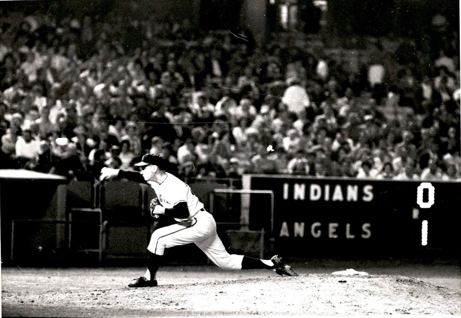
GTGFTS
17 July 1963
Los Angeles beats Cleveland 1-0 to sweep a doubleheader
Picture is Art Fowler pitching a scoreless ninth to earn his seventh save of the season.
This was EXTREMELY difficult, but all the clues are there with enough patience. Thankfully, baseball-reference is a real thing, so this is how I got there.
1) The scoreboard is from Chavez Ravine (nee Dodger Stadium). The Angels played there from 1962-65, so that narrows it down to 36 possible games between the Indians and Angels (teams played each other 18 times per season, so there are 9 CLE@LAA games in each season).
2) Since the inning is not visible (off the right side of the photo), each boxscore had to be checked for times when Cleveland was batting, losing by a score of exactly 1-0. This narrowed the pool of possible games to 8.
3) The Angels’ pitcher is wearing a two digit number that starts with a “2.” Incredibly, Art Fowler is the only Angel pitcher to pitch to Cleveland in Chavez Ravine with a 1-0 lead in history wearing a number in the 20’s (24 specifically).
QED
WOW!
Amazing research work, Marc!
Indeed. While ojai67 provides me with the date of the game, that’s all he does — so that was some fantastic detective work to come up with that!
I tend to dislike the “cream” uniforms, but I think more of a khaki or darker beige could look pretty good for a baseball uniform (as for SF here at the bottom).
I don’t always like the stripe on the pant leg in baseball. Sometimes it’s good, but often it looks over-designed.
13 teams is what I counted, so not all the NL teams. It would have been nice to see the Padres concept. Also, the Braves is the only one without a city+name. All of the others have a city and a name, That is a mis type there.
What happened to the St Louis Cardinals and the San Diego Padres?
Someone didn’t read the article thoroughly.
The designer does great work, but there is no such thing as powder red. It’s pink and its hideous. If I saw The Reds in that I would not be able to watch the game.