Good Saturday morning, Uni Watchers, and a Happy Armistice/Veterans Day to all. If you (or a member of your family) has served, thank you for all your hard work, dedication and service to our country. Please remember this holiday originally marked the armistice signed between the Allies of World War I and Germany at Compiègne, France, which took effect at eleven in the morning — the “eleventh hour of the eleventh day of the eleventh month” of 1918. The “War to end all wars” of course did not, but let us keep striving towards that goal.
Now then.
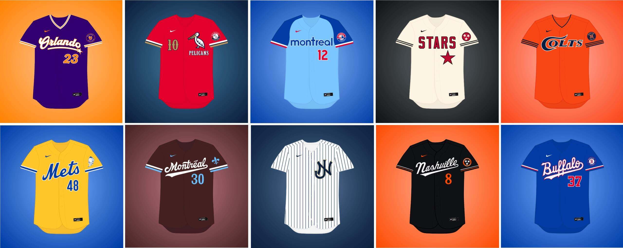
Today, I’m joined once again by Matthew Drake, who has embarked on a project he’s calling the “MLB Multiverse,” which is now entering its sixth part. If you missed any of the first five posts, you can click here for Volume I, click here for Volume II, click here for Volume III, click here for Volume IV, and click here for Volume V. As in previous posts, I’ve included Matthew’s introduction from his introductory post below, so you don’t have to click on Volumes I through V for an explainer. And as in previous volumes, for each “what if” I’ve included the new “home” jersey inline, with road and additional alternates in the gallery beneath. Enjoy!
You can follow Matthew @MJD7Design on the Twitter/X.
Here’s Matthew:
by Matthew Drake
I call this series “MLB Multiverse.” It’s essentially a collection of “what-ifs”: either relocations of MLB teams that very nearly happened, or what certain teams would possibly look like if they never relocated in the first place.
Obviously referential of Marvel’s recent cinematic dealings with the concept of the “multiverse,” another way of thinking about this is that these teams do in fact exist in an alternate universe, where their respective relocation deals followed through to completion.
The series was heavily inspired by user @SFGiants58’s legendary “MLB: The Defunct Saga” series on the sportslogos.net boards, as well as logo/uniform legend Todd Radom’s “Phantom Franchise” segment on Buster Olney’s podcast.
I created over 60 (!) different alternate-universe teams in this series, my biggest series ever by far. It was fun and exciting to try and flex my creative muscles a bit more beyond simply fixing up the 30 big league teams. I hope you enjoy seeing these designs as much as I enjoyed creating them!
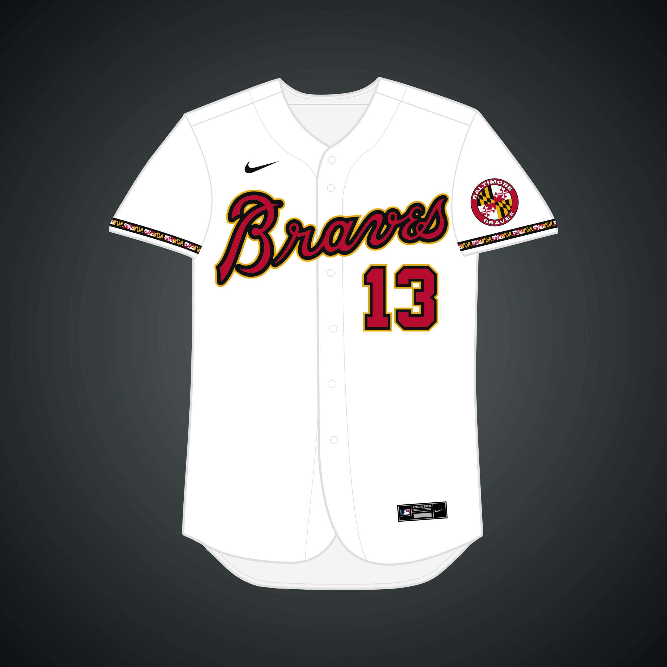
In 1949, Boston Braves owner Lou Perini made a failed bid to move his team to Baltimore before working out a deal with the City of Milwaukee. I wanted to incorporate the Maryland flag a bit more with this iteration.
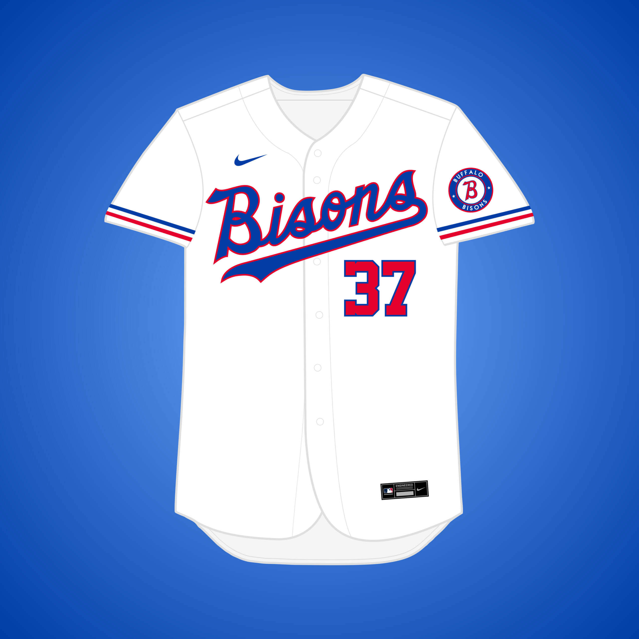
MLB told representatives in Buffalo that they would get the Senators franchise if their dome could be built, but it fell through & the team moved to Texas.
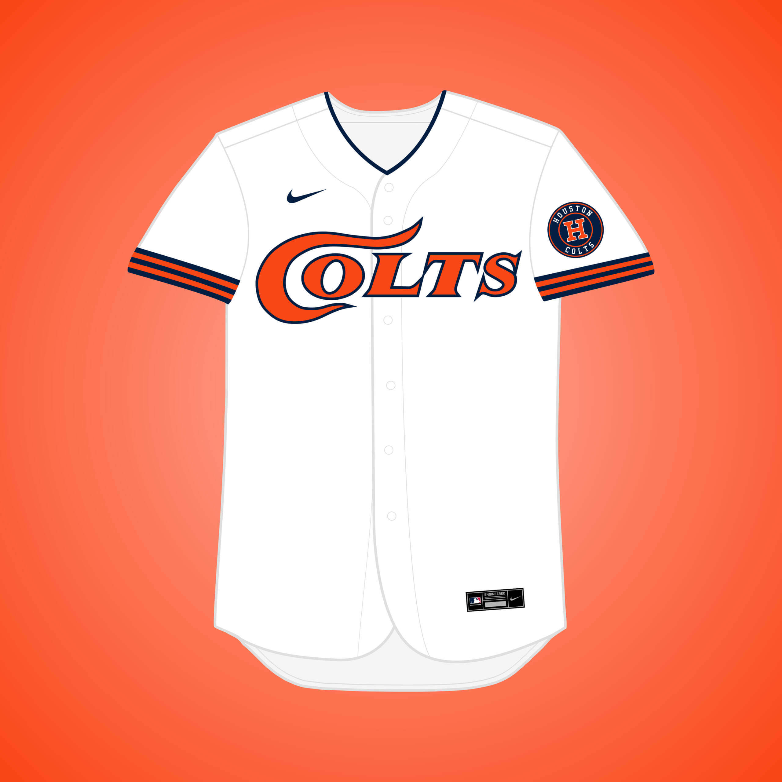
During the 1958 Winter Meetings, the executive secretary of the Houston Sports Association made a $5 million offer to purchase the team and move them to Houston. This was a good opportunity to go with the name “Colts.”
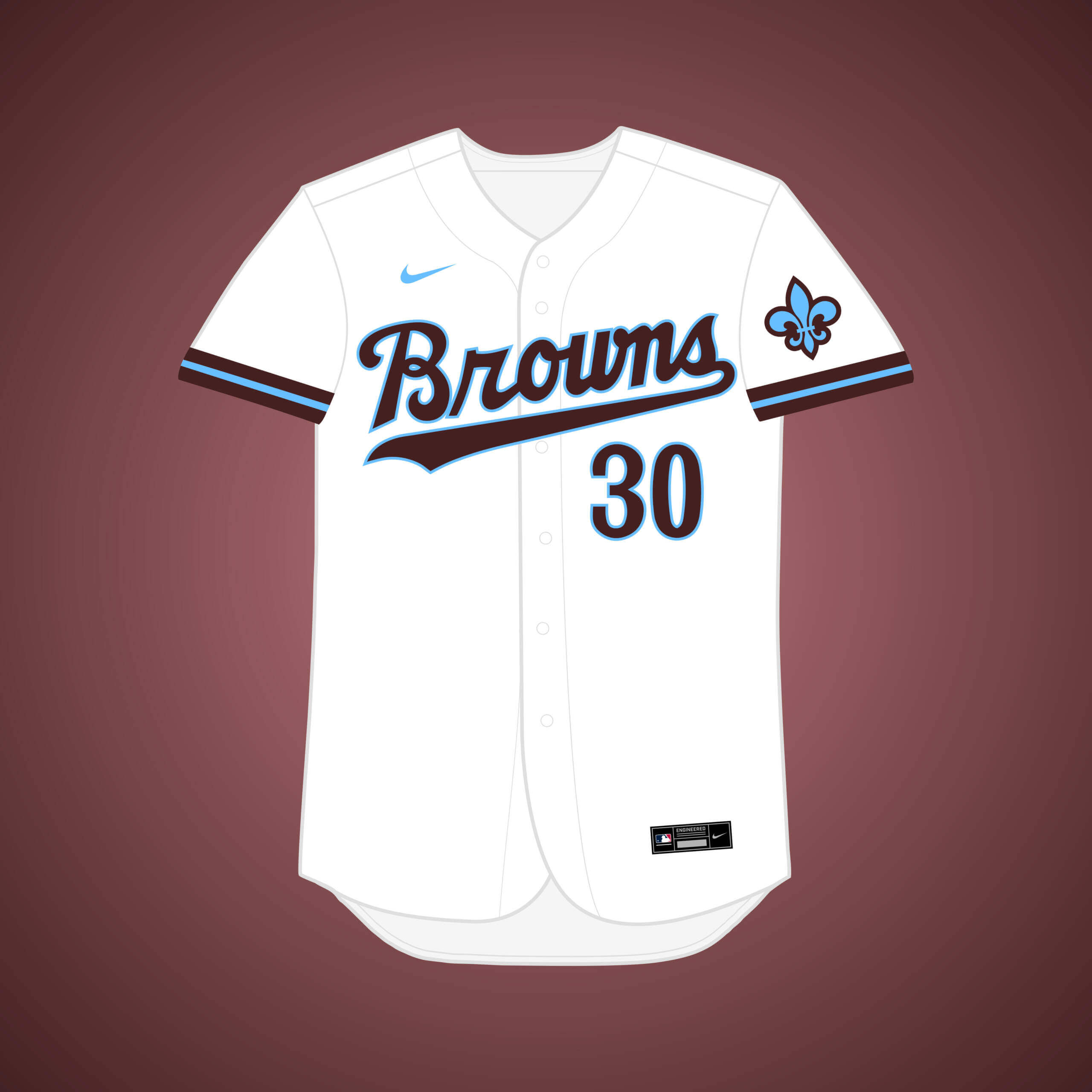
After Browns owner Philip Ball passed away in 1933, two Montreal business moguls expressed interest in buying and moving the team there. I paired brown with a color the Expos used tangentially on their uniforms in powder blue.
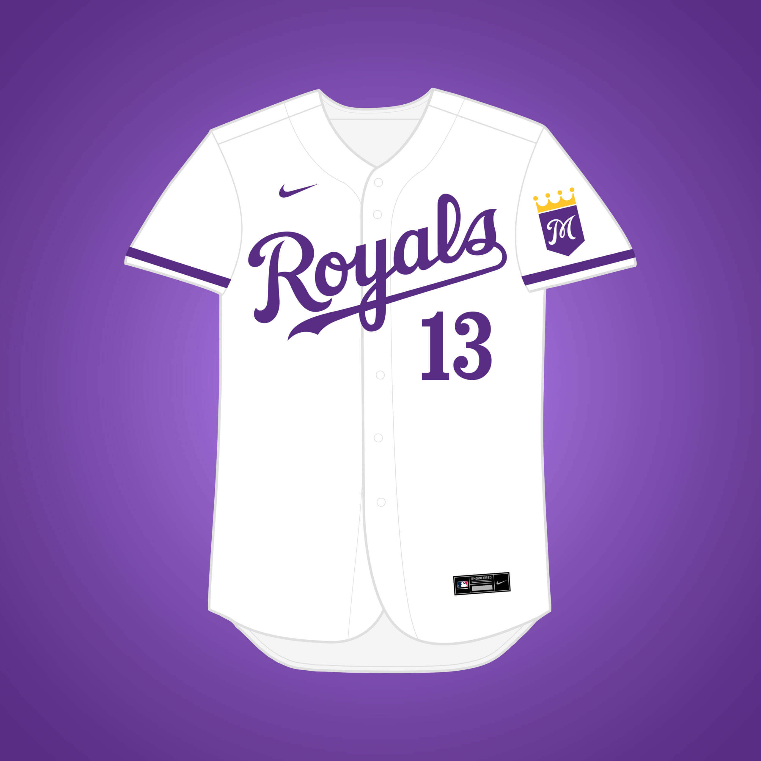
This is the same premise as my original Browns → Montreal design, but if they decided to beat Kansas City to the punch with “Royals.” I went with purple because of its association with the British crown.
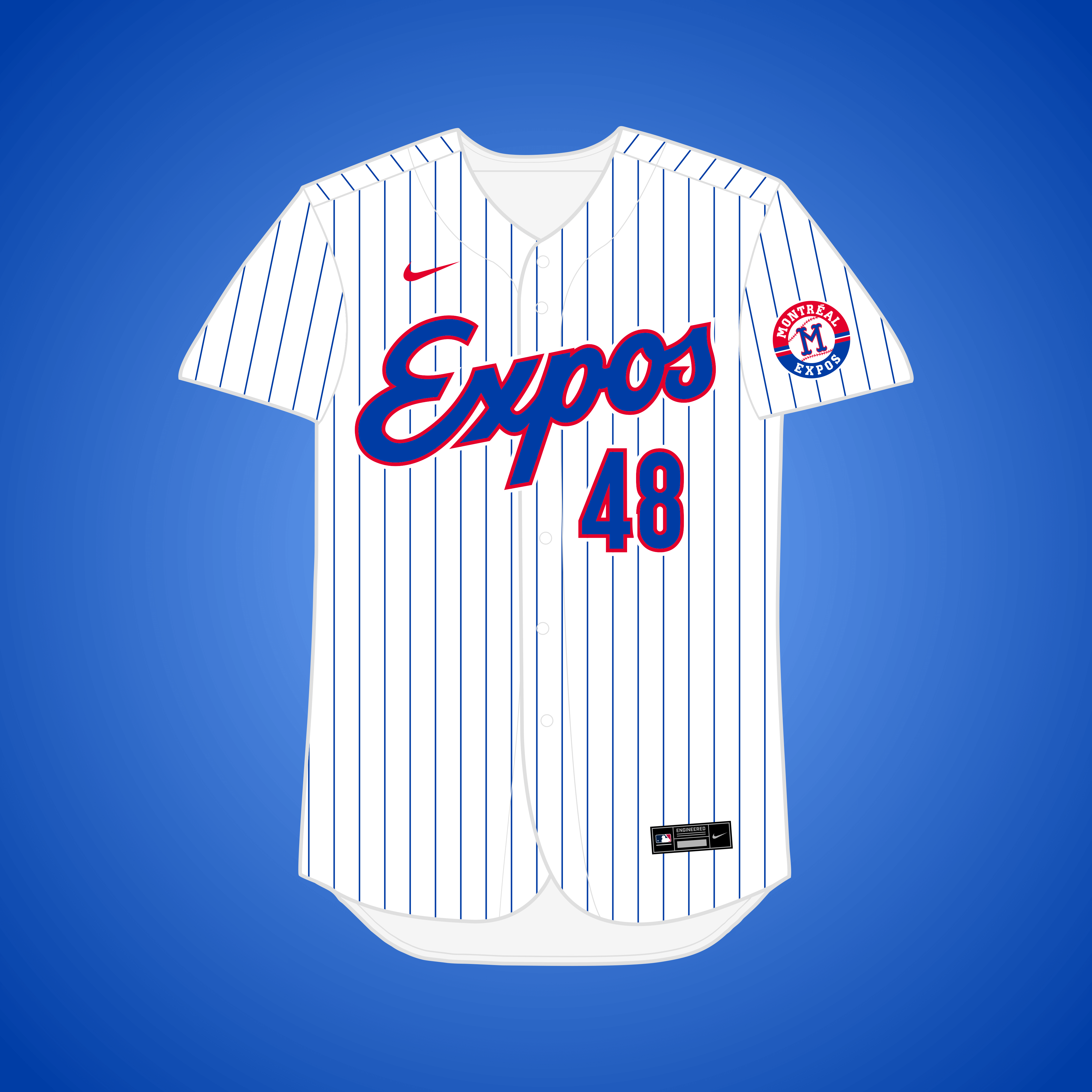
This one is a bit too conspiratorial for my tastes, but: In 2014, an article alleged that the Wilpons were conspiring to move the team to Montreal so they could use Citi Field’s land for mixed-use development.
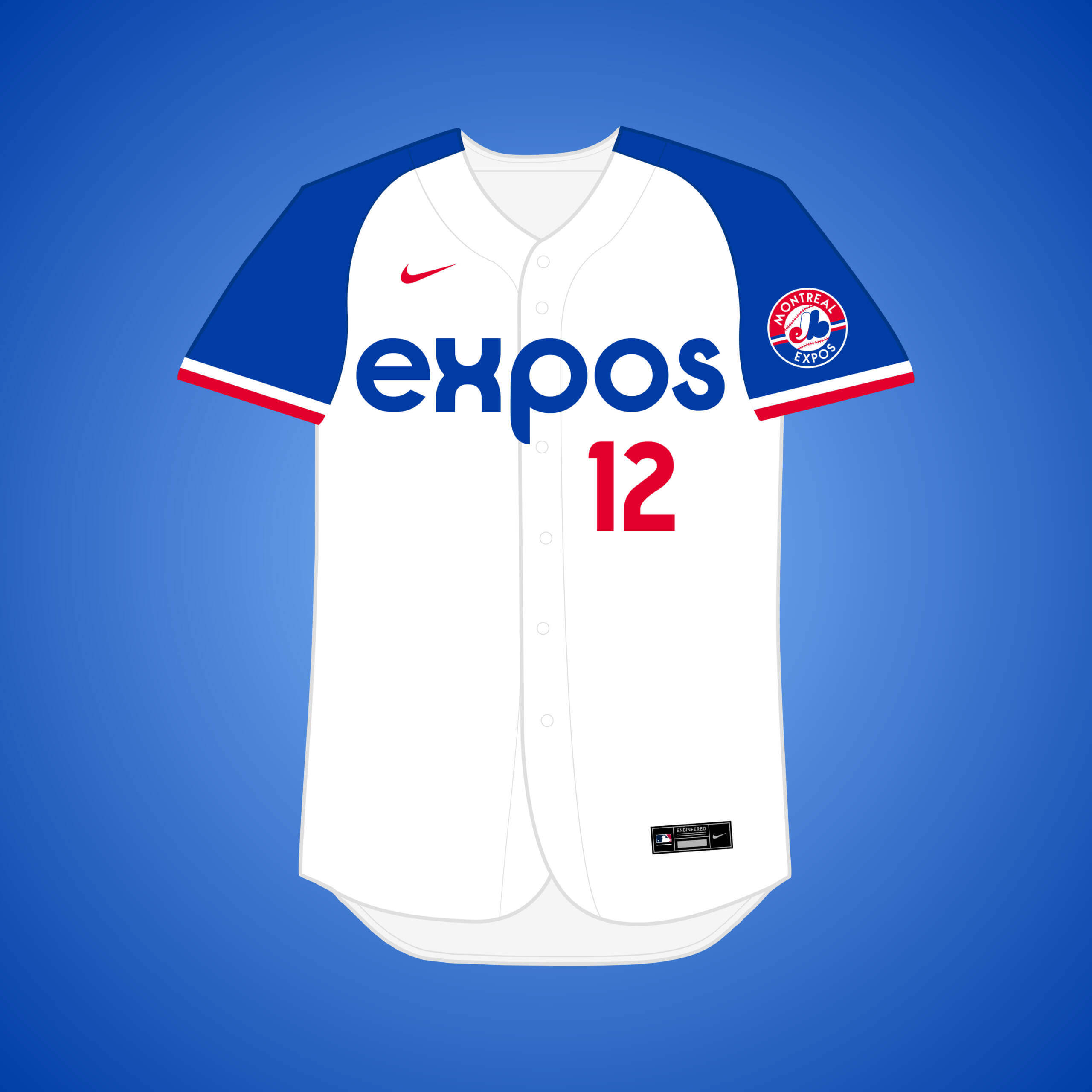
It was largely publicized that the Rays at least considered splitting home games between Montreal & Tampa. I combined the Rays’ fauxback aesthetic with the Expos brand.
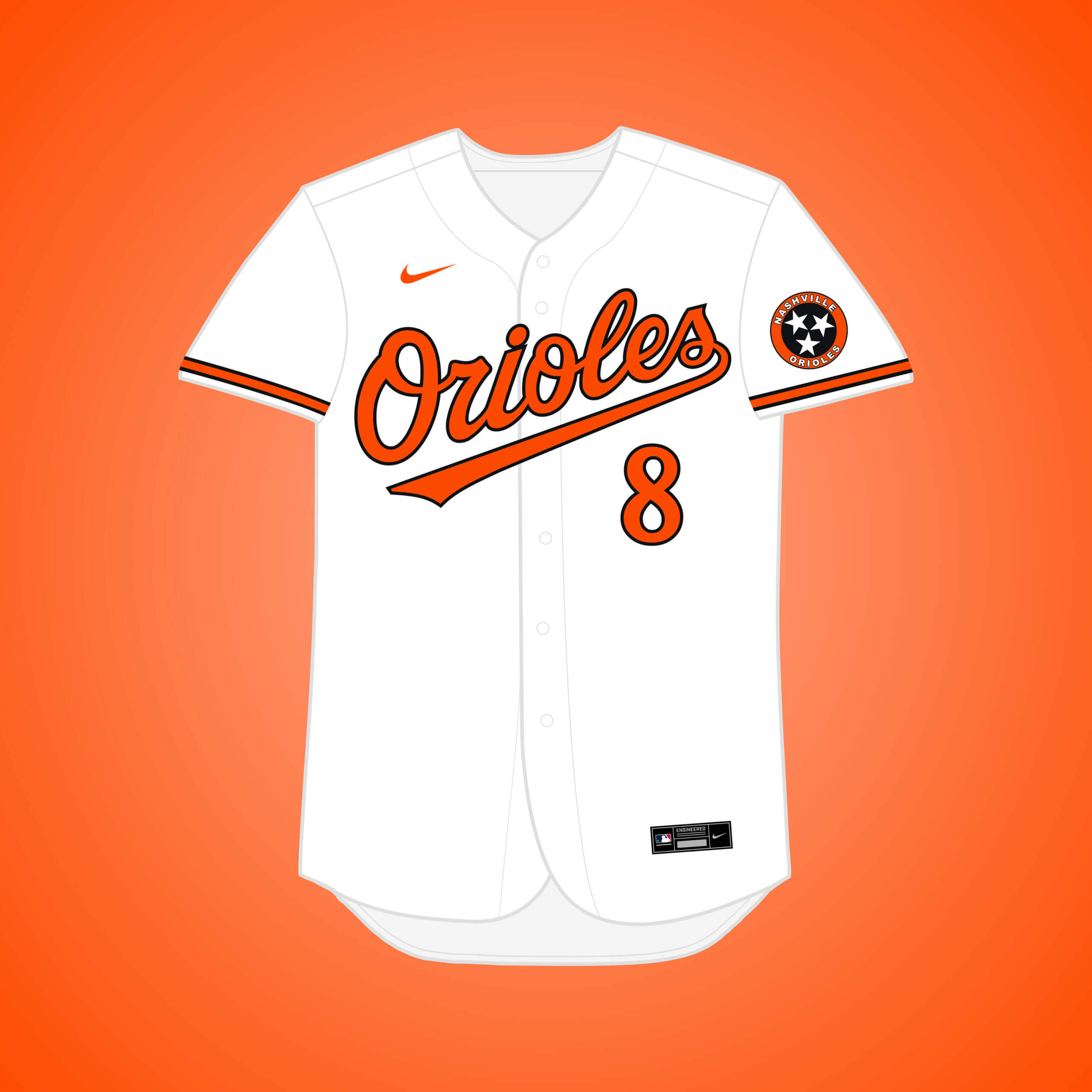
Louis Angelos, son of owner Peter Angelos, is reportedly suing his brother John (and his mother, Georgia), accusing him of wanting to move the team to Tennessee, where he has a home.
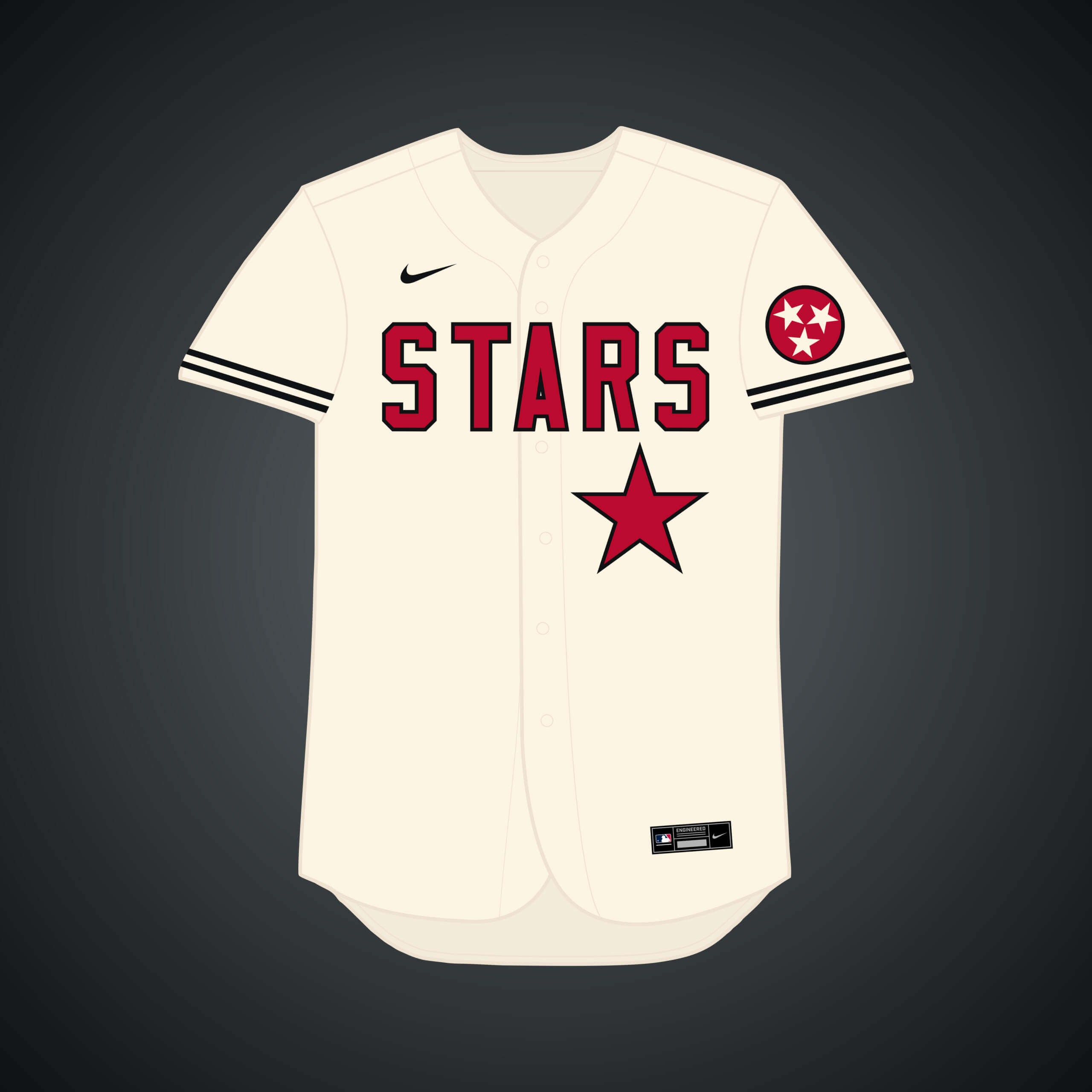
A Tampa City Council member said that Rays president Brian Auld told him that relocating to Nashville might be a possibility. It seems the team would be the “Stars,” which keeps 3 of the 4 letters of the old name.
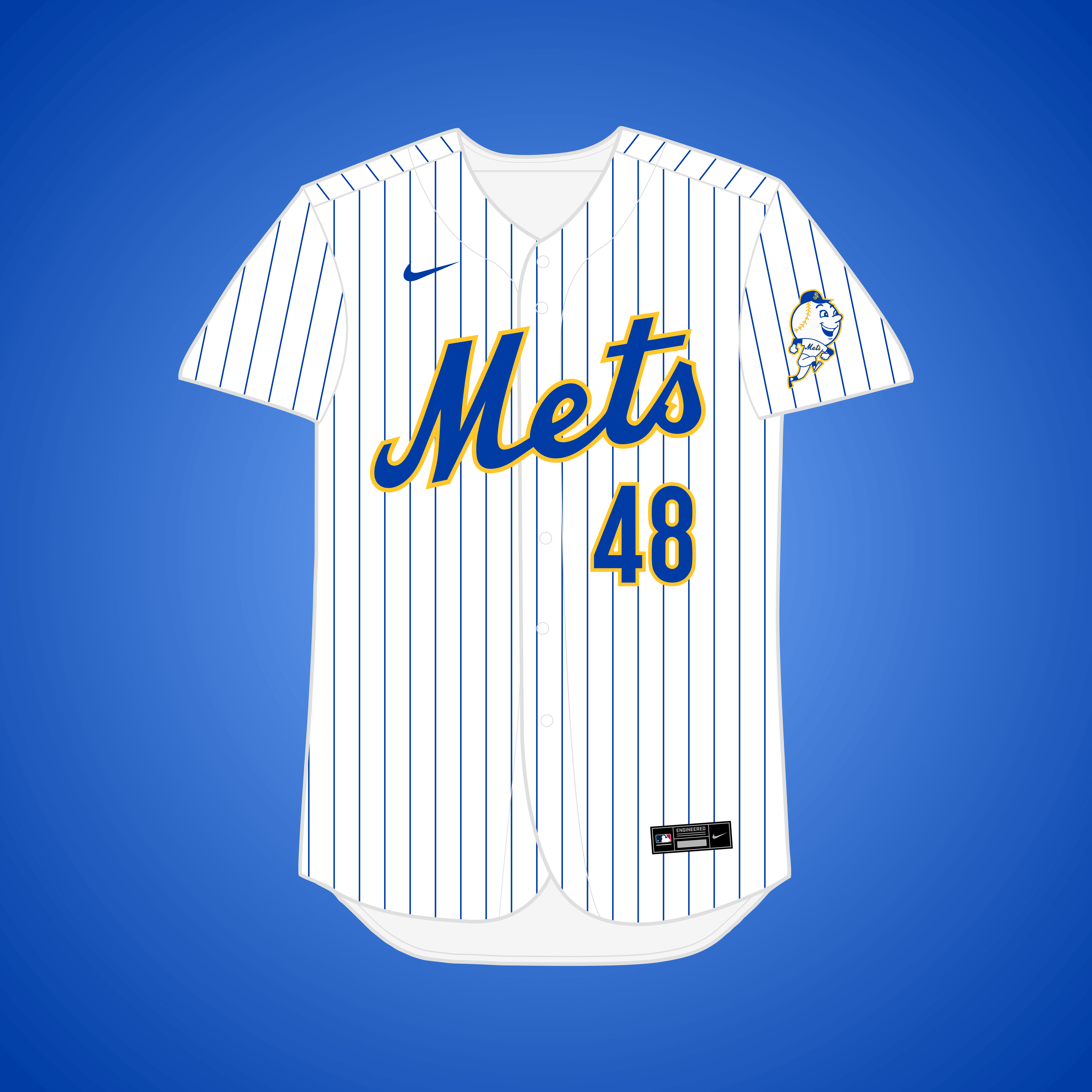
In 1971, with speculation that the Yankees might share Shea with the Mets, Mets chairman M. Donald Grant responded that he’d recommend moving the team to Jersey if this happened. Instead of NYC flag colors, I went with NJ flag colors.
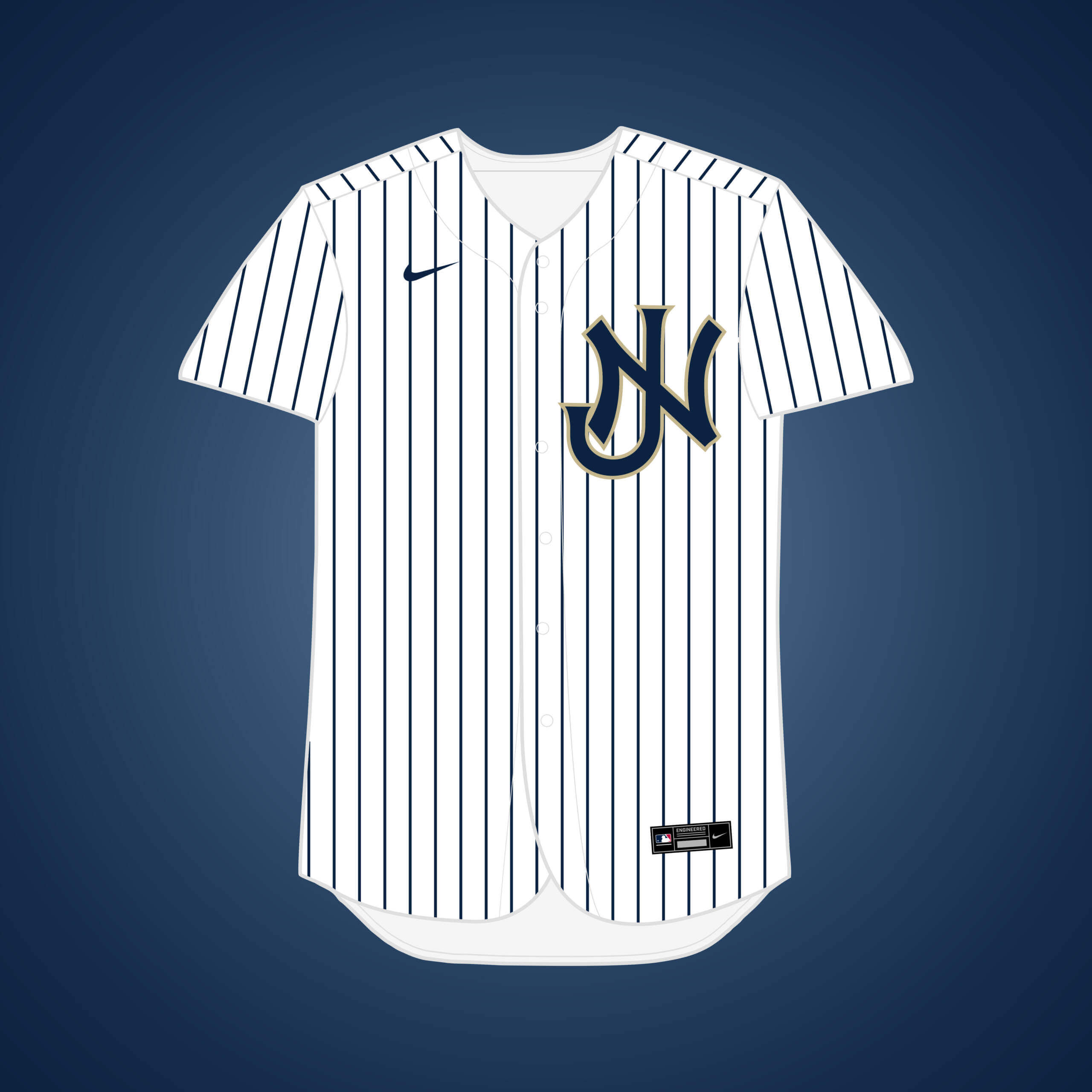
In 1987, Mr. Steinbrenner met with the New Jersey Sports and Exposition Authority to discuss moving the Yankees to a new complex in the Meadowlands.
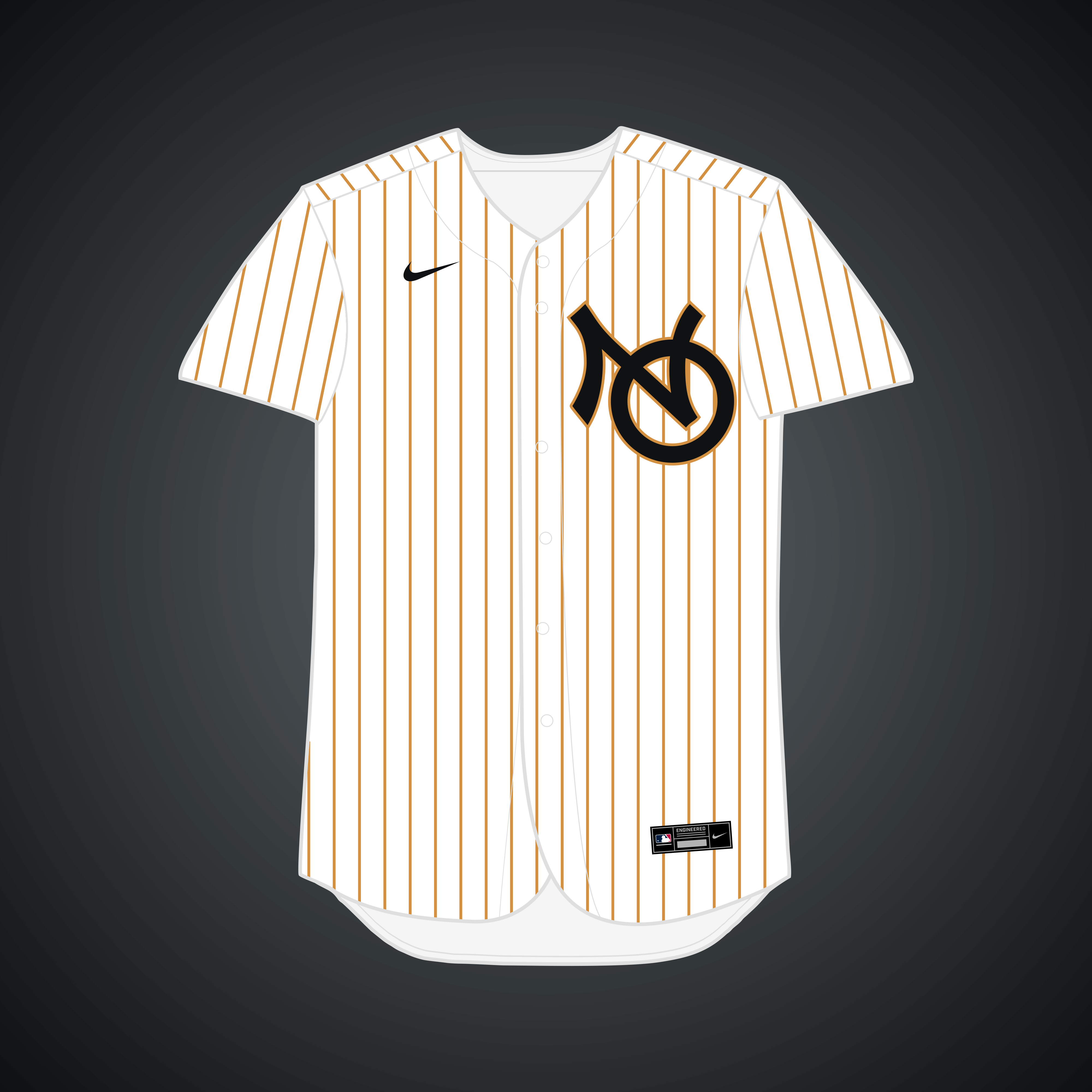
New Orleans pitched the Yanks to move south in the late 70’s, but negotiations broke down before they really began. I wasn’t forced to settle on a new name for the team, but I suppose “Cajuns” could work.
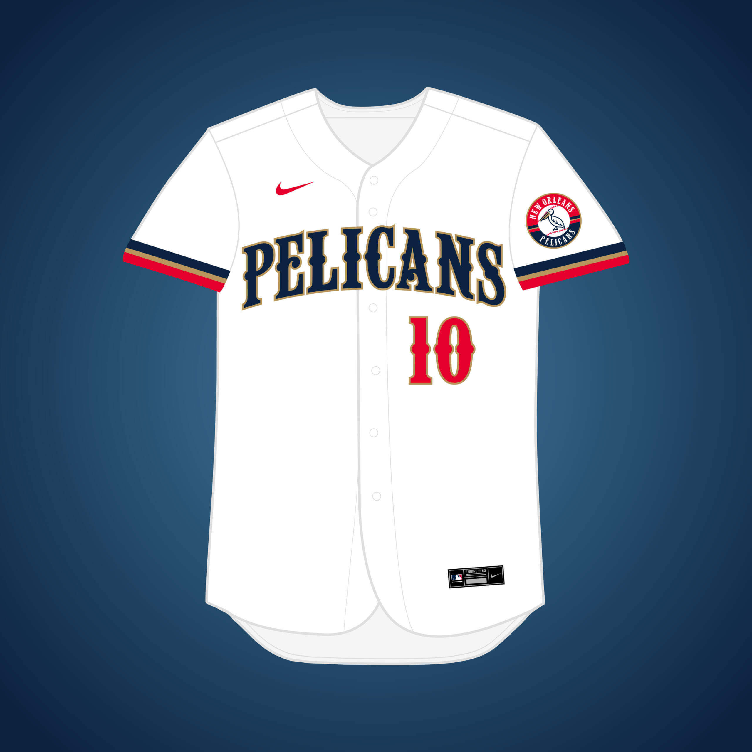
Along with Buffalo, New Orleans was prepared to swoop in if the Montreal deal fell through. I once again went with the name “Pelicans,” and used the New Orleans “Baby Cakes” font throughout the design.
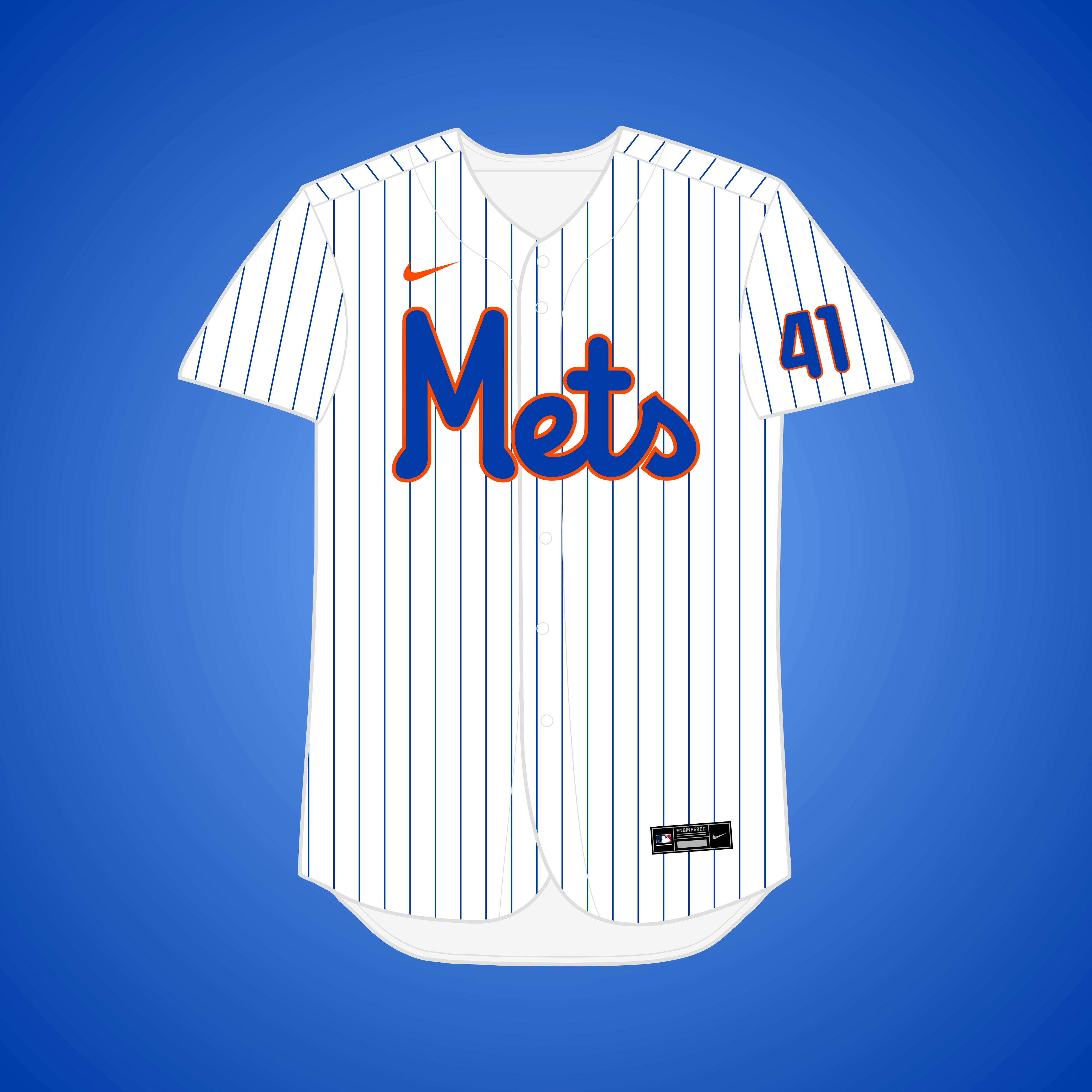
Along with the Pirates, William Shea tried to lure the Phillies to the Big Apple, to no avail. Obviously the name “Phillies” wouldn’t work in NY, so “Mets” works as a replacement that still ties back to the city.
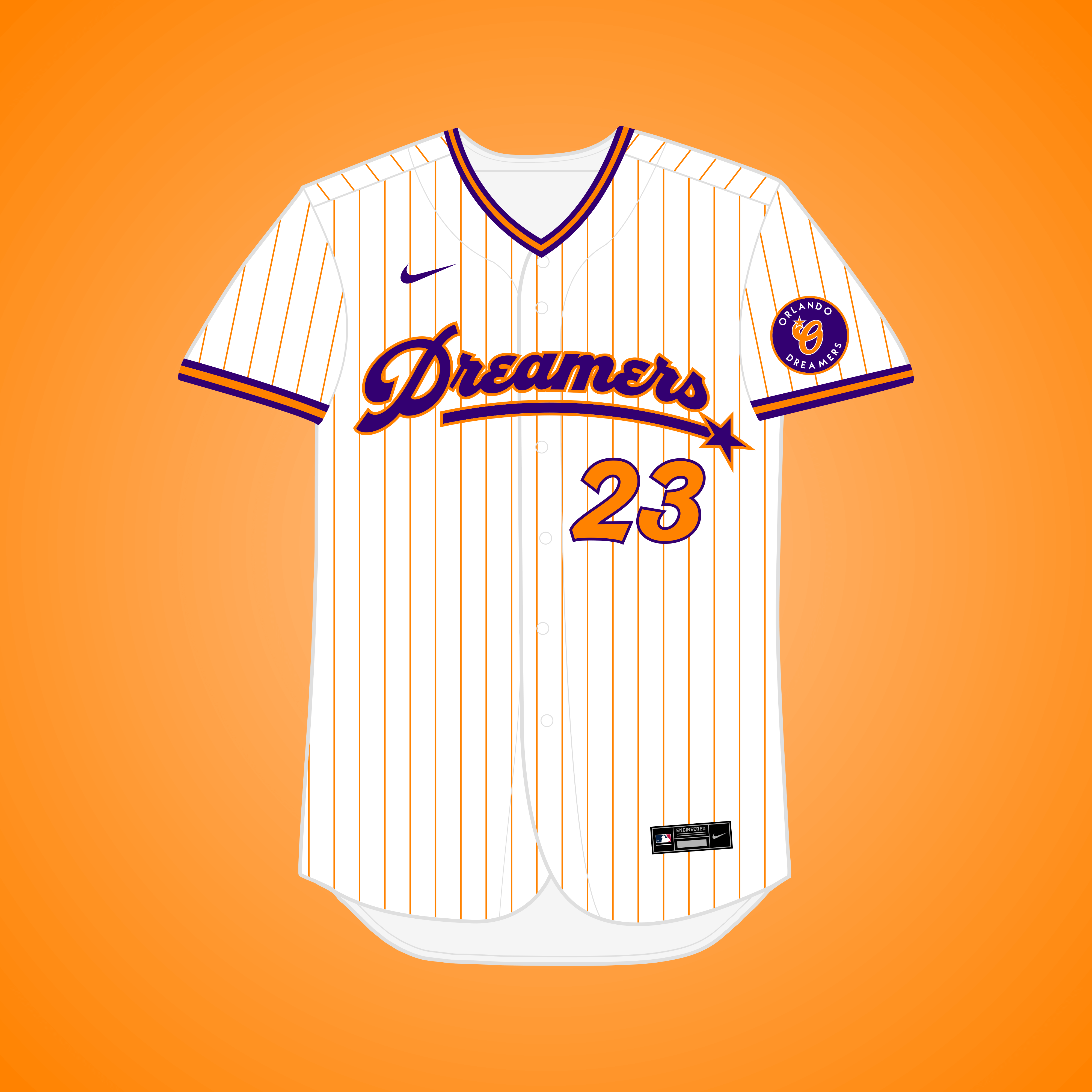
This is the same premise as my original Rays → Orlando design, but if they changed their name to the group campaigning to get a team there, the “Dreamers.” I based the color scheme off of the stadium renderings.
Readers? What say you?


The Angelos spawn settled their lawsuit and apparently Nashville is off the table. I don’t think the new lease is signed yet though, so there is a sliver for the Orioles to leave Baltimore still.
This thr first I heard of the Senators 2.0 moving to Buffalo as well.
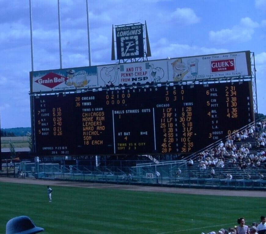
Definitely Metropolitan Stadium, Bloomington MN, Twins versus White Sox, early to mid 60’s. I thing it might be Jim Kaat pitching for the Twins.
Sep 1, 1963 at The Met. Sox beat Twins 8-3. Jim Kaat went 6 innings, but got a no decision.
The White Sox scored 1 in the 8th and 4 in the 9th off of Bill Dailey to win. 26,870 at the Met.
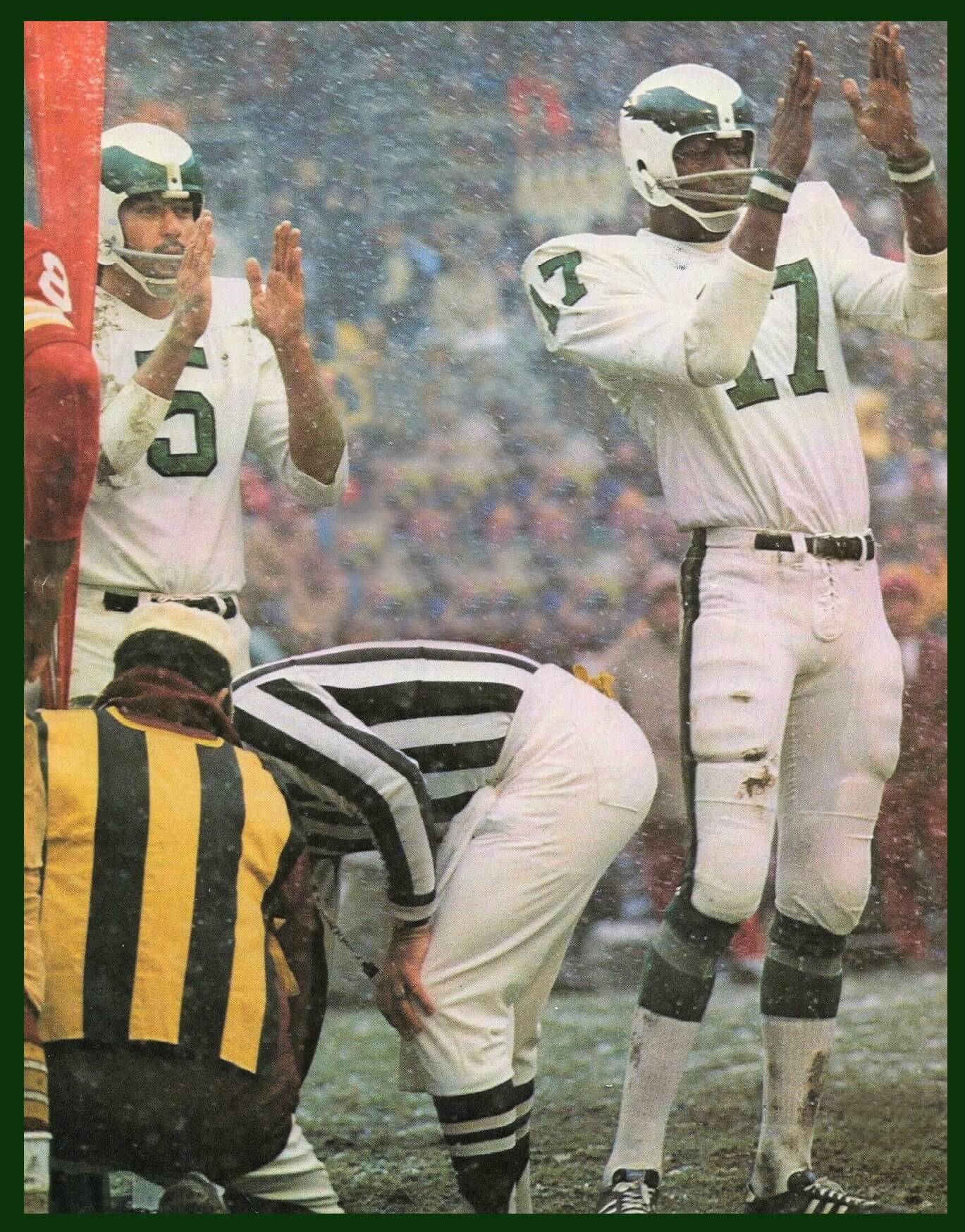
Wonder what would happen if it snowed on the day(s) when the Chicago Polar Bears decided to wear white… Now, how about a Panda Bears alternate?
I could go for the Bears in mono navy with the orange trimmed socks of the orange alternate.
What would happen is it would look terrible. As bad as Boise going mono blue on their turf.
And when it comes to football, the only thing more grinding to my ears than “clean” is when someone says “tuddy” instead of touchdown.
Disagree. This game was awesome.
link
GTGFTU
December 15, 1974
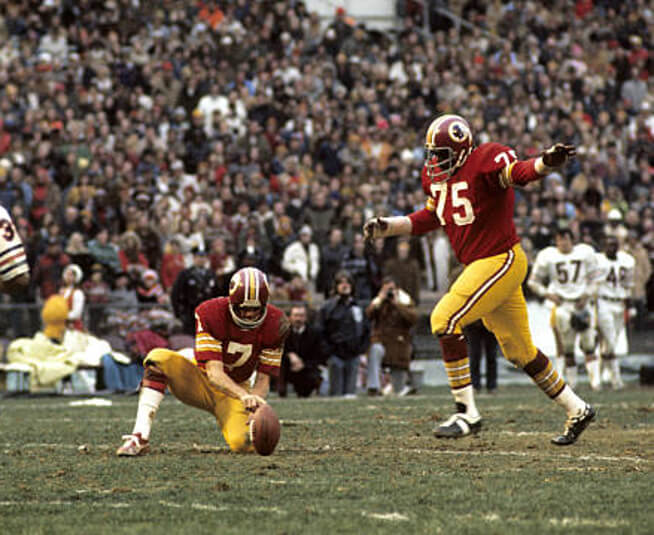
Deacon Jones (!) kicks an extra point…the 42nd and final point for Washington in a playoff shutout against Chicago.
I have a hunch Chris submitted this one *just* for you.
YVVM
LOL!
Why? Because it was an easy one?
; )
TBPH, The STL BuschStadium/Jim Bakken GWFG from GTGFTS a little while back was chosen specifically with JV in mind…this one was just a sight to behold IMHO (not Dare Ogunbowale clutch, but cool nonetheless).
Correct, Jimmer!
Jones in his uni-cameo with the ‘Skins in the final NFL game of his HoF career.
Theismann in a gray 2-bar? While not without precedent…it’s not his signature look.
It wasn’t a playoff game but it was my 16th birthday!
Thank you. I knew the ’74 Bears watched the playoffs on TV, but generally defer to the experts here.
Bears head coach Abe Gibron got fired shortly afterwards.
GTGFTU – Washington 42, Chicago 0 – December 15, 1974. Deacon Jones kicking a PAT.
Another down-to-the-wire guess…this has been happening frequently. Hmmm.
Also correct, Tom.
The GTGFTS is the Sunday September 1, 1963 game between the visiting Chicago White Sox and the home Minnesota Twins. Bob Allison of the Twins is at the plate in the bottom of the 5th (he will strikeout) and he is facing Eddie Fisher (the pitcher, not the serial marrying crooner). The White Sox (77 – 59) will defeat the Twins (75 – 60) by a score of 8 – 3 to increase their lead for 2nd place to 1.5 games. Unfortunately, the Sox are 12 games behind the league-leading NY Yankees.
Great work. This is a lot of fun. I like the Buffalo design (for obvious historical reasons).
“What if… the Orioles relocate to Nashville?”
That was almost a question of ‘when’, wasn’t it?
Speaking of Nashville, the TB-to-TN concept is a tad too Astro-esque, but the Stars name should be used sometime in the future…somewhere.
And if the Rays ever do move to Montreal and adopt that top (even if it kinda copies an Atlanta look?), forget everything I ever said about the Nationals ‘owning’ the Expos branding.
Nice work again, Matthew!
As usual, most of Matthew’s imagined unis are very nice.
Phillies moving to New York and becoming the Mets? Please say Mr. Matthew really didn’t ponder this and just had a bad dream. At least in his multiverse, there are no “partner patches” on the sleeves.
I forgot that Joe Theismann and Deacon Jones both played together in 1974. Joe played a good prank on me about twenty years ago in the Ft Lauderdale airport. I was waiting for my mother at the gate and Joe came through with his wife, we made eye contact and I said hi to him. He said it’s Jimmy Corcoran from the Pottstown Firebird movie, my favorite NFL Films movie. I couldn’t believe it, I said you liked the movie, Joe? he said I’m just joking, I didn’t see it, I met your mother on the plane, and she told me about it, and you look just like her, so I had some fun.
Love how a seemingly random pic leads into a Jimmy Corcoran story!
Also, thanks for coming up with GTGFTU…the anniversary of the 1st post was a few weeks back.
It’s not often Chris and I agree wholeheartedly on something. This is it.
Chris H, I also met Deacon Jones in Sept 1973 after he lost to Washington 38-0, I told him I saw him do a shaving cream commercial with Oscar Madison on the Odd Couple (one of my favorite TV shows as a kid) and he laughed.
Joe Theismann told me when he was about to open his restaurant, the backers said it’s between you and King Corcoran who we pick, I said you are kidding? They made the right choice, with my father’s name on there, it would have gone bankrupt right along with the WFL in 1975.
Well, that GTGFTU is from the game when Defensive Lineman Coy Bacon came in to kick. So it’s probably 78 or 79, but that’s before my time so I don’t remember exactly which one…
Or, I guess not. Obvs, my memory of old DC stories is not as strong as I thought…
As usual, Matthew Drake is perfect. I’ve long felt that brown and sky blue needed to be in the Big 4 and I love it’s appearance here.
Hell yes. Brown and blue needs to happen.
I really HATE the Bears orange helmet and jerseys I could definitely go for this all white. I will always say blue helmets first but as an alternate, the white would be my pick. Maybe put the bear head on the helmet instead of the C, I’m ok with that too, even tho I don’t like that logo.
Isn’t that Montreal Mets jersey what the Montreal Expos actually wore at the time?
Those aren’t really New Jersey flag colors. But I love royal blue and athletic gold.
I was going to say, NJ’s colors are blue and buff, not blue and yellow. They’re closer to the color on the Diamondbacks’ “Serpientes” uniforms.
As a longtime Jerseyan, one thing I learned from this is that no one should ever, ever use an interlocking “NJ” logo!
If the Yankees had moved to the South, they would HAVE to be the Carpetbaggers! Not that I think there was any chance that they’d leave the New York metro area.
Nike would def create those all White Bears Uniforms and call them Polar instead of Stormtrooper
I’m really digging that script New Jersey uniform. Total callback to the one-year-only Mets roadies from 1987, one of my fave unis of all time.
The story, written in 2013 when Deacon passed away, behind the picture from the Commie’s web page.
link
Good what if uniforms, I love that Montreal brown and blue one. As for the Bears in all white: no, please.