Tired of seeing annoying ads (like this one!) on Uni Watch? There’s a simple solution: Join Uni Watch Plus. You’ll get an ad-free site experience, plus exclusive access to our UW+ discussion forums, push notifications whenever a new blog post has been published, a special UW+ badge accompanying all your comments on the blog, and a 20% discount on our Teespring merchandise.
Good Saturday morning, Uni Watchers. I hope everyone has had a pleasant week.
Things are still very hectic with family matters, but that should start to ease up after Monday. Thanks for your understanding!
Now then.
Last Monday, you’ll recall I ran a fun “April Fool’s” article from Leo Strawn — a quiz actually — on Cricket kits in which all the answers were “England”. Along with that piece, Leo also sent me the piece you’re about to read below, in which he recalls the first baseball cap he ever owned, and how it led him down an historical rabbit hole. It’s a very cool piece and it delves into the similarities of the caps worn by Cleveland’s baseball team, and the Hiroshima Carp. Many folks know the Carp’s logo is a wishbone C which is very similar to the Cincinnati Reds, but back a half century ago, Cleveland also wore a cap featuring the wishbone C, and Leo’s going to get into that today. Enjoy!
Here’s Leo.
• • • • •
When Cleveland Brought Good Luck to Hiroshima, Japan by Leo Strawn, Jr.
I’m Leo…welcome to my world!
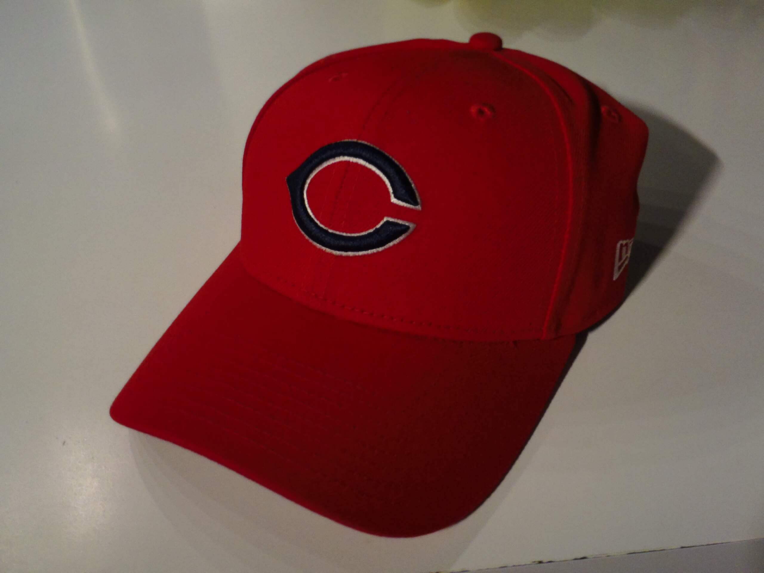
My grandpa was a Cleveland baseball fan and my dad was a Reds fan. The Big Red Machine era was just getting started when I was in grade school, but the first cap I ever got was from my grandpa, a 1965-69 (and, later, 1972) Tribe cap. The caps had a similar design to what has become the classic Cincinnati Reds look. (The Reds first wore a wishbone C on red caps for a single season in 1956 and brought that style back in 1967. When the Tribe started wearing these in 1965, the Reds were wearing white caps with red bills and pinstripes and a rounded C.)
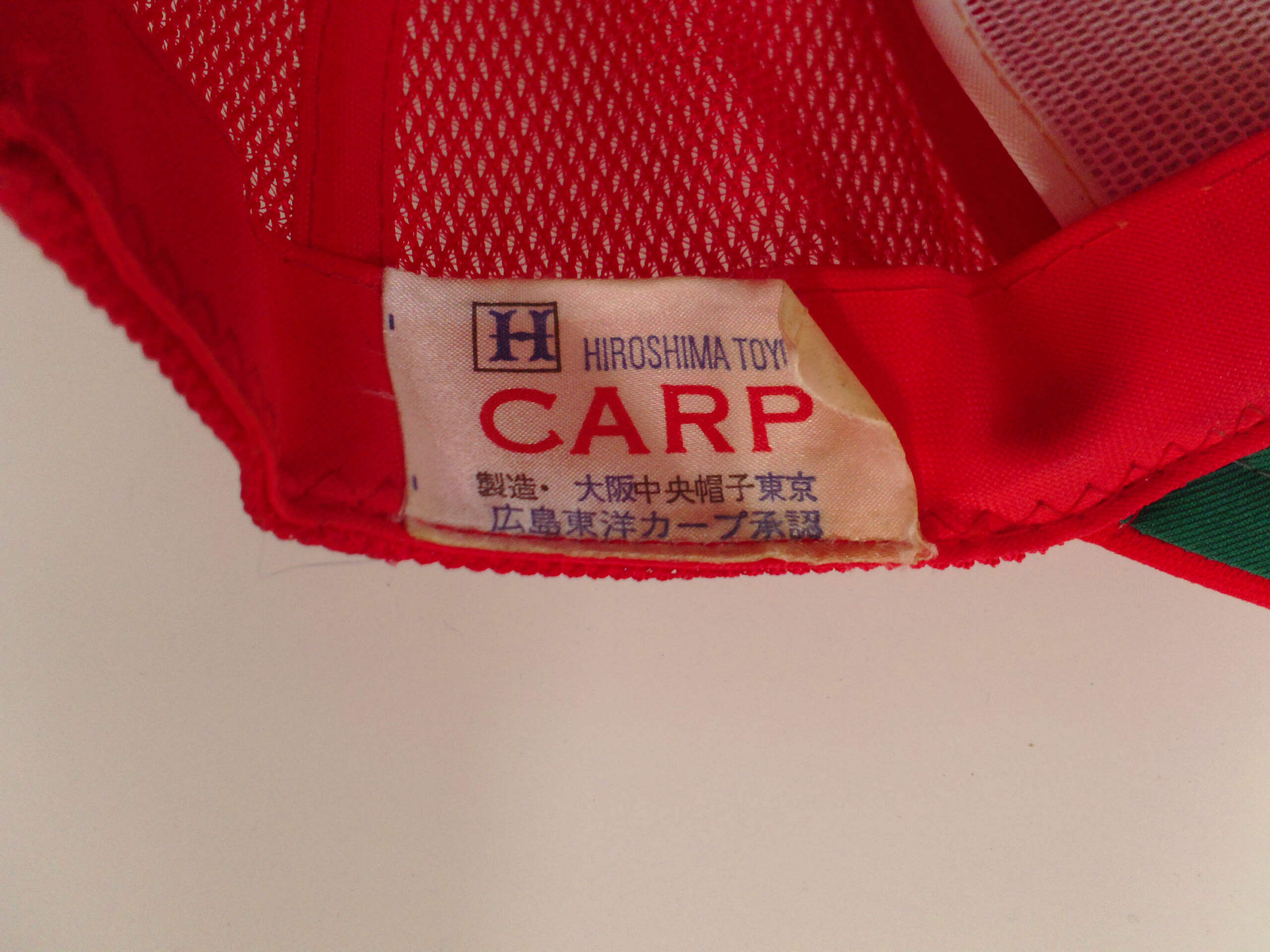
I tried for about the past 10 years to find one like that cap my grandpa bought for me to wear in my youth, but all the Cleveland caps in that style were fitted, with the big bowl front. I finally found a Hiroshima Toyo Carp one-size cap, but it has “CARP” stitched onto it. Aside from the “CARP” text stitched onto the cap and the color of the pill on top (Hiroshima’s was red, Cleveland’s was blue), this is identical to caps worn by Cleveland from 1965-69 and again in 1972.
FINALLY, last year, I found a Carp cap that perfectly replicates that Cleveland cap (aside from the pill color), that was adjustable in the back and without the big dome front!! It was worth ordering from Japan! (I think New Era is missing an opportunity to sell these here as Tribe caps since one size fits all caps in this style are impossible to find in the US.)
Not needing two, my wife tried to unload the first cap for me on eBay. I did some research for that listing and this is what I discovered about the history of the Hiroshima version of this cap:
Joe Lutz, who played a handful of games for the St. Louis Browns in 1951, was hired as a first base coach by Cleveland in 1971 and coached in Cleveland through 1973. For one season only, in 1972, Cleveland brought back the red cap with the blue wishbone C in a white outline that they had worn from 1965-69. So, Lutz would have worn that cap as a coach for that season. (Side note: 1972 was the first year Gaylord Perry pitched for the Tribe and was the first season he won the Cy Young Award. He also won the award six seasons later with the Padres, the first pitcher to win the Cy Young in both leagues.)
In 1974, Lutz left Cleveland and was hired by the Hiroshima Toyo Carp as a batting instructor. The very next season, 1975, he became the first foreigner hired to manage a Japanese professional baseball club. Joe wanted to change the team’s caps to red to “represent their fighting spirit”. No doubt, Lutz was partial to the Cleveland 1972 cap and that was the design Hiroshima began wearing in 1975. (In 1971 & 1973, Lutz’s other two seasons in Cleveland, the Tribe wore blue caps.)
Lutz quit after 15 games as manager of the Carp in 1975 due to a dispute over Japanese umpiring, feeling that the Carp were getting bad calls from the umps due to him being an American.
His replacement, Takeshi Koba, stayed on through the 1985 season, managing the Carp to their first Central League flag in that 1975 season, then leading Hiroshima to their next 3 CL flags and the club’s only 3 Japan Series championships in 1979, 1980 and 1984.
Sometime after Koba left the Carp, they abandoned these 1972 Cleveland caps. Hiroshima went to the 1986 Japan Series under manager Junro Anan, losing to the Seibu Lions. There are videos on YouTube of the Carp in 1986, but it’s difficult to tell if it’s the same cap or a red wishbone C with a white outline because of the video quality. It appears the 1972 Cleveland cap style was definitely worn by Hiroshima from 1975-85, possibly as late as 1989. (They had definitely moved onto Cincinnati Reds caps by 1990.)
Though Hiroshima has worn other baseball caps and uniforms inspired by the two Ohio MLB clubs throughout their history, the Carp have never won a Japan Series championship while wearing any cap design other than the cap reminiscent of the 1972 Cleveland ballclub, the one that Hiroshima began wearing at the behest of manager Joe Lutz in 1975.
You never know where a rabbit hole will lead or what will trigger the journey. This one all started with a gift from my grandpa in the 1960s. Hopefully, this cap will bring me good luck as it did for Gaylord Perry and the Hiroshima Toyo Carp! So far, so good…
• • • • •
Thanks Leo! Great stuff and a wonderful historical journey.
And Now a Few Words from Paul
Hello, weekend readers! In case you missed it, my Substack article this week is an interview with former Nike art director Tom Andrich, and it’s quite simply the best interview in Uni Watch’s 25-year history. Unfolding over the course of a whopping 8,000 words, it includes Andrich’s thoughts on working with NFL team owners, dealing with fan feedback, doing things “the Nike way,” balancing innovation vs. aesthetics, creating those alarm clock numbers for the Bucs, and a lot more. Packed with behind-the-scenes insider info and previously unpublished graphics, it’s essential reading.
But don’t take my word for it. Here are some of the comments that readers have posted in response to this piece:
“Paul, your time at Uni Watch is closing in spectacular style. You’re doing some of the best work I’ve read in my 20 years following Uni Watch right here at the end of an era.”
“Spectacular interview. Fascinating insight into how Nike works and great to have a human face to go with that.”
“25 years! And as soon as you are about to be done with it, you go and land an interview like this!!!?? This was definitely my favorite NFL piece you have ever managed to do! Thank you for this in depth look into the mind of a former Nike designer!”
“Great interview. Honestly have been hedging on the Substack for a long time and stuff like this makes it worth it.”
“That was great Paul!! So many insights and overall an honest and revealing conversation.”
“Wow, this was a fantastic interview. Really fascinating to see the insider approach, and also how much weight the league and teams really have on all of this, too.”
“This is amazing work, Paul, and explains so much about the state of things in professional (and college) sports.”
“Spectacular interview. Uni Watch is going out on the highest of high notes! You are doing some of the best work I’ve ever read. Well done, sir!”
“This is phenomenal.”
I could go on, but you get the idea. This is a special piece.
I hope you guys like this feature and will want to continue to submit your concepts and tweaks to me. If you do, Shoot me an E-mail (Phil (dot) Hecken (at) gmail (dot) com).
• • • • •
Today’s concepts come from Ed Westfall, Jr..
Hi Phil,
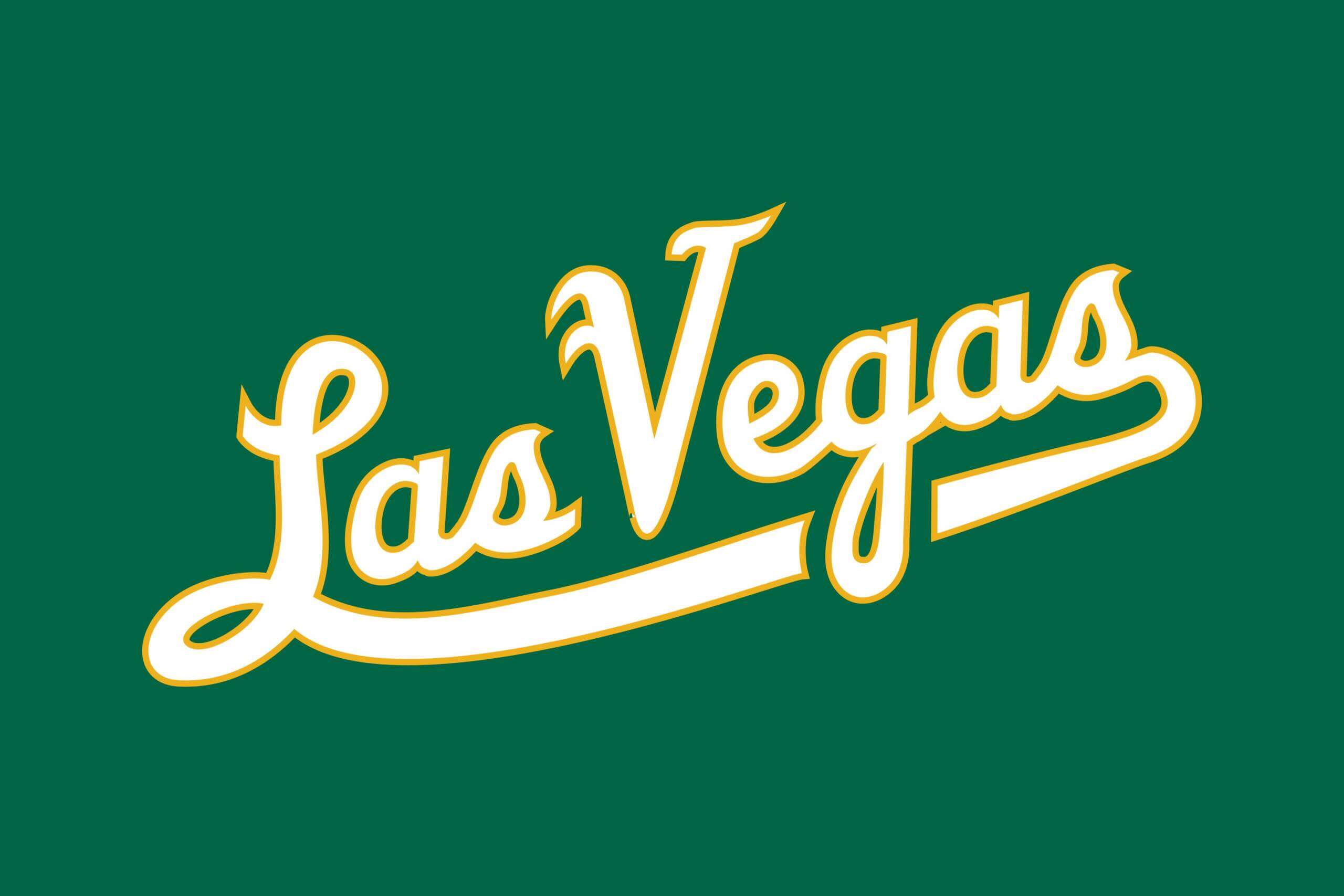
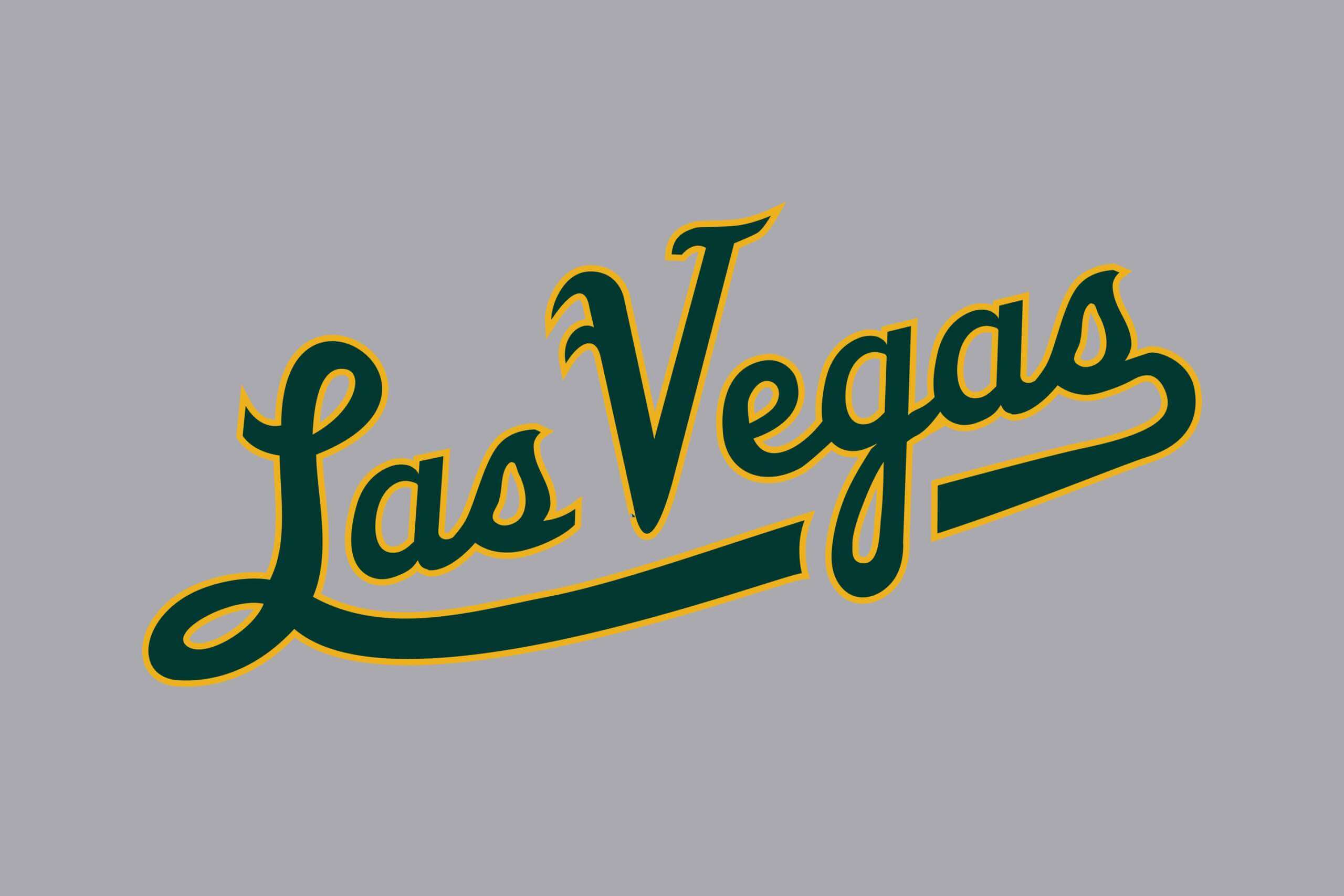
I don’t know if you guys still run uni-tweaks & concepts, but I just want to share with you my proposed design for a “Las Vegas” wordmark for the A’s
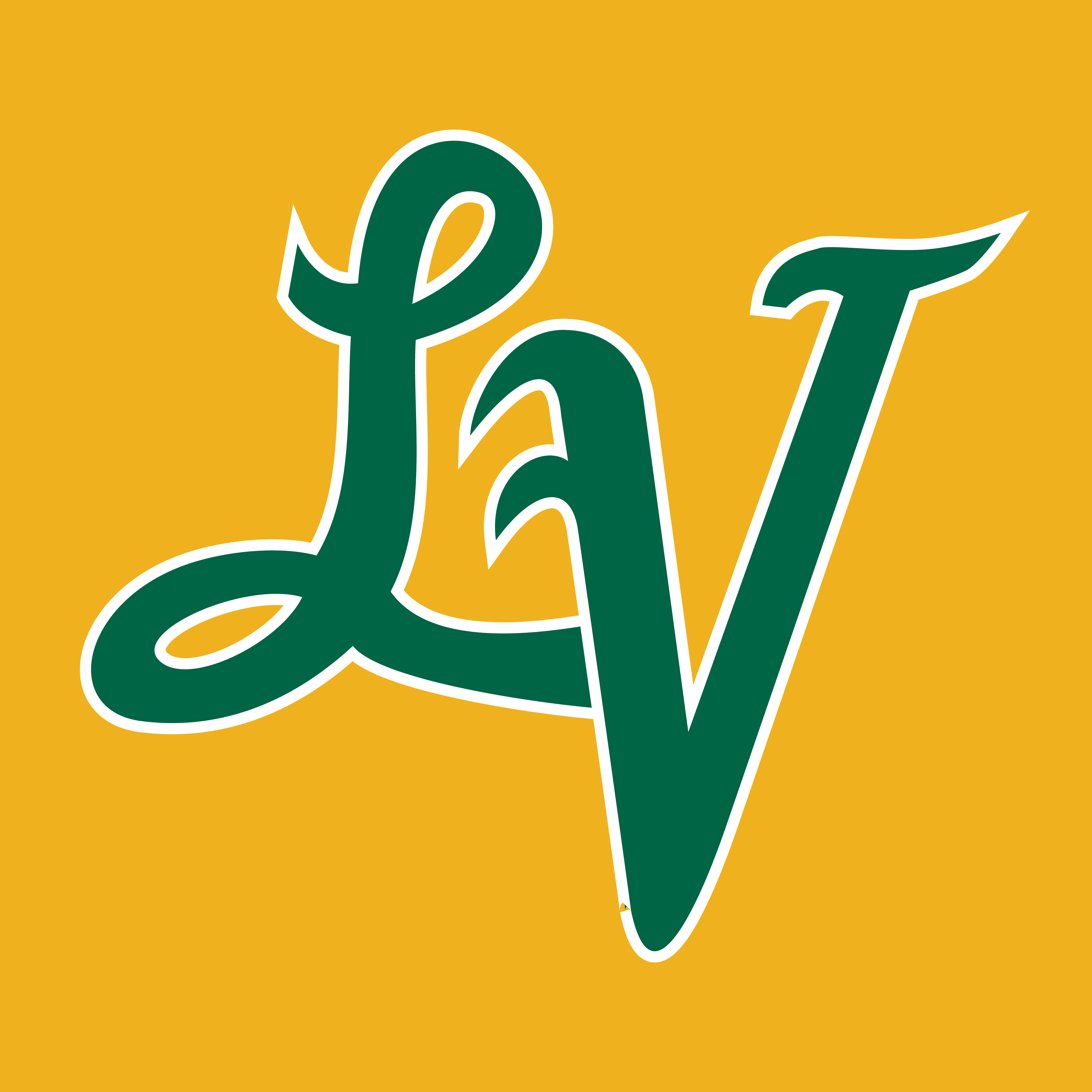
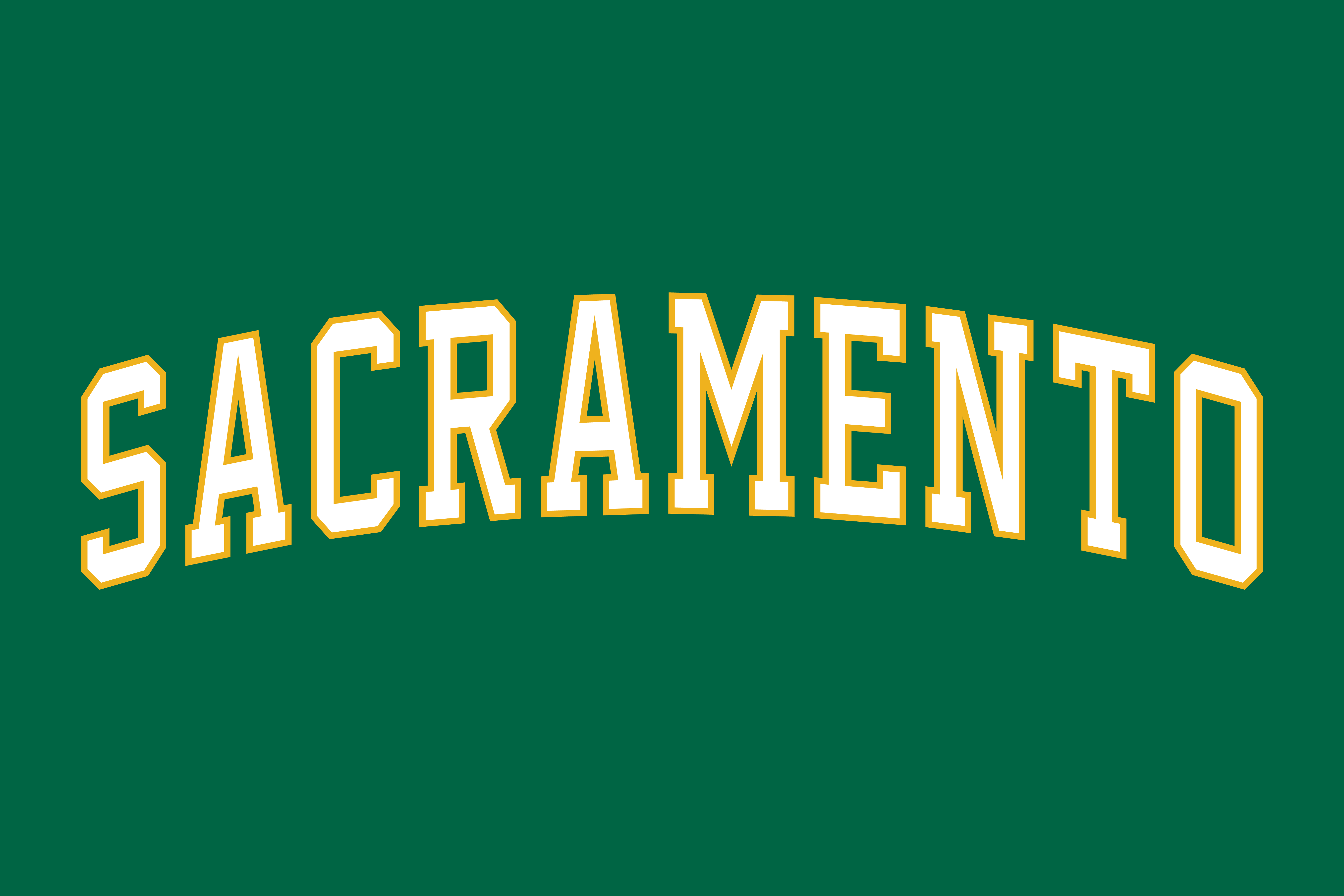
Also made an “LV” alternate cap insignia, and a “Sacramento” wordmark based on the 1980’s “OAKLAND” arched wordmark (that they will never use)…
Hope all is well… Thank you!
Ed Westfield Jr.
• • • • •
OK readers (and concepters). If you have some tweaks or concepts, shoot ’em my way with a brief description of your creation and I’ll run ’em here.
A Uniform Anomaly for the 1972 Buffalo Bills
I received a note earlier this week from pal/contributor/WFL expert Jimmy Corcoran, who found something interesting with the 1972 Buffalo Bills jerseys. I’ll let Jimmy explain…
__________
Hey Phil,
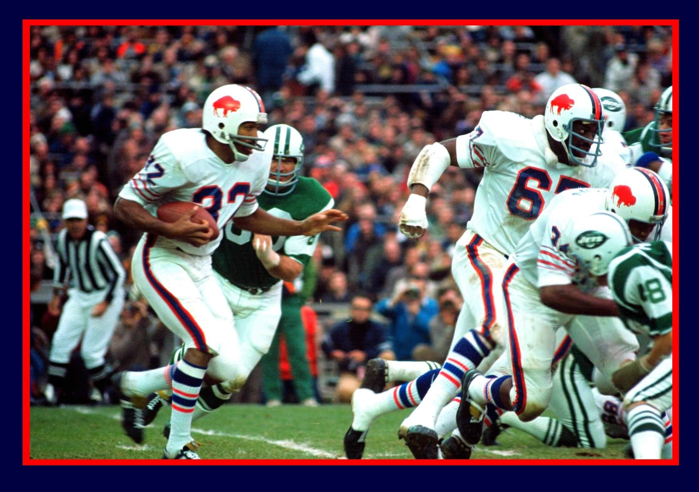
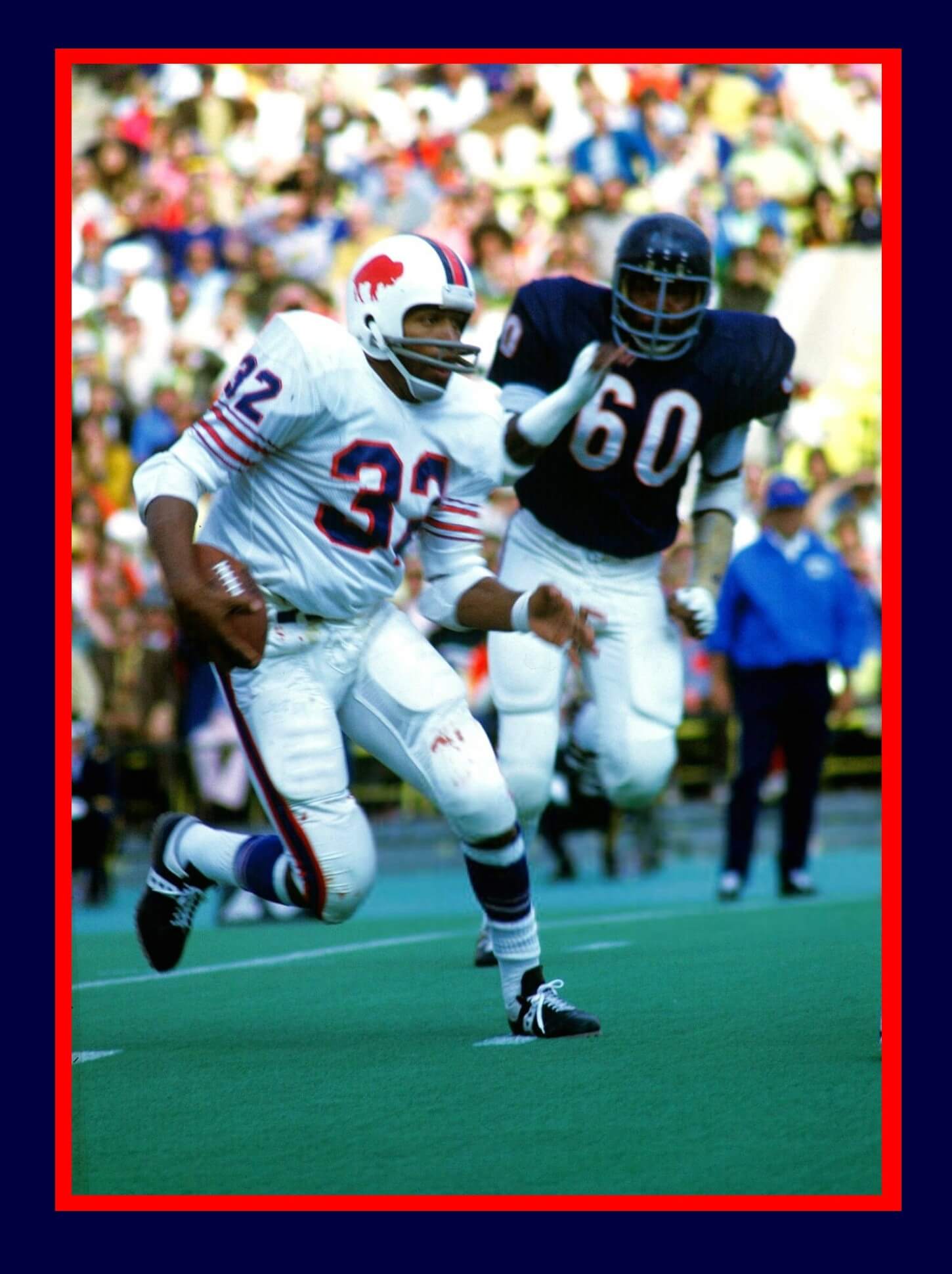
I came across this whole thing by chance, but after some research I was surprised by what I found concerning the Bills 1972 white jerseys. I was watching NFL Films from the ’70s on YouTube and when some games from the 1972 Bills came on, I noticed that some players were wearing 1973 white jerseys, with red stripes on the sleeves, which I thought were just a one-year style. I went to the Gridiron Uniform Database to check the white jerseys and as you can see, they have the Buffalo Bills wearing only blue stripes on their white jerseys for 1972.
But as you can see, they got it wrong. Here is a picture that was taken Nov. 12, 1972 against the Jets.
This couldn’t be the 1973 game when Jim Brown’s record was broken because the Bills wore blue pants in that game, and it was played in the snow. All of the Bills players in the photo have the red stripes on their jerseys like the 1973 jerseys.
Here is a picture from the 1972 preseason taken on Sept 3, 1972. This couldn’t be the 1973 preseason game against the Bears because the Bills wore blue in that game.
Again, GUD has the Bills wearing jerseys with blue stripes for that game, but the stripes were red again. I noticed that the Bills wore two sets of white jerseys in 1972: They wore the white mesh with the red stripes that were made by Champion, and in colder games, some wore the heavy durene jerseys that were made by Rawlings and had the blue sleeve stripes and different number fonts than the Champion jerseys. It took over fifty years but this red stripe stumper is solved.
Take care,
Jimmy Corcoran
Guess the Game from the Uniform
Based on the suggestion of long-time reader/contributor Jimmy Corcoran, we’ve introduced a new “game” on Uni Watch, which is similar to the popular “Guess the Game from the Scoreboard” (GTGFTS), only this one asked readers to identify the game based on the uniforms worn by teams.
Like GTGFTS, readers will be asked to guess the date, location and final score of the game from the clues provided in the photo. Sometimes the game should be somewhat easy to ascertain, while in other instances, it might be quite difficult. There will usually be a visual clue (something odd or unique to one or both of the uniforms) that will make a positive identification of one and only one game possible. Other times, there may be something significant about the game in question, like the last time a particular uniform was ever worn (one of Jimmy’s original suggestions). It’s up to YOU to figure out the game and date.
Today’s GTGFTU comes from Stetson Colon.
Good luck and please post your guess/answer in the comments below.
…that’s going to do it for today — big mega-plus-thanks to Leo Strawn for that great little yarn about the Carp/Cleveland connection!
As I mentioned in the open, things are still pretty hectic with family matters, so this is likely the only post (aside from the Ticker) today. If there is breaking news, I’ll do my best to report it in a timely fashion.
Everyone have an excellent Saturday, and I’ll catch you right back here tomorrow!
“some wore the heavy durene jerseys that were made by Rawlings and had the blue sleeve stripes and different number fonts than the Champion jerseys.”
So for these colder games did some of the Bills players wear this Champion jersey, and some wear the Rawlings jersey, with stripes and numbers not matching?
Until this post today I didn’t know that the Bills had a mismatch. But in that era it wasn’t unusual for players to wear different jersey styles in the same game, like the 1972 Dolphins where some players wore striped white jerseys and some wore stripeless jerseys (and the two types did have different numbers). Same with the Bears and Vikings. So it wouldn’t be a total surprise if that happened with the 1972 Bills as well, particularly if some players preferred the mesh jerseys over the heavier durene jerseys.
If you look at films of the 1972 Buffalo Bills on YouTube, they are kind of grainy, but you can see on Nov 19, 1972, QB Dennis Shaw is wearing the Champion jersey with the red stripes while most of the team is wearing the heavy jerseys with the blue stripes.
“I think New Era is missing an opportunity to sell these here…”
I have thought for years that New Era has missed the boat of not selling caps from the Central League and the Pacific League teams. But I could never get an answer to why they haven’t. Maybe Jeremy can shed some light. Especially now that the Yomiuri (Tokyo) Giants use New Era caps now. (An upgrade from the Under Armour ones, imho.) I get a lot of comments on my YGiants cap at the ballpark.
I am sure that there would be enough interest to sell them here after the success of Nomo, Matsui, Ichiro and others. Gotta throw in “Mr. Baseball” too. Yes, I know the Chunichi Dragons resembles the Dodgers bp caps, and the above mentioned Carp/Indians/Reds caps, but it’s not the same.
I have been fortunate enough to have had friends over the years that frequently traveled to Japan and would bring me back various teams caps. My first was a Hanshin Tigers cap during the Randy Bass.
Is your Hanshin Tigers cap the white pinstriped one? I remember having to settle for an adjustable-back Tigers cap when living in Tiger territory as an exchange student in 1998. Looked all over for a fitted one but they weren’t even being produced, it seemed.
I’m glad I got it because the next year manager Katsuya Nomura dropped the white hats; he preferred the black road cap for all games.
GTGFTU: Jets vs Bengals, November 21, 1993. Special “fauxback” to commemorate the 25th anniversary of the Jets’ Super Bowl III win.
As far as fauxs go, this one (an NFL 1st?) is not terrible despite the inaccuracies.
Why NYJ didn’t wait a few weeks to wear them vs the Colts was disappointing…a word that is used often when the talking about the Jets.
Agreed.
And agreed.
“NO CARP NO LIFE”
The Carp have the best rally cry of any team in the world! link
It would be difficult to wear the ’72 Indians cap and have anyone at all realize it’s not a Reds or a Bears cap.
The Bears’ version lacks the symmetry of the vast number of wishbone C’s out there (h/t UW reader Chris Bova): link
Paul’s piece on the history of that style of the C remains a favorite of mine: link
Da Bears’ wishbone C is rather unique (h/t UWer Chris Bova): link
…and really looks much much better rendered in plain white on their helmets (h/t UWer Jim Vilk).
Ah, the Cincinnati Indian Bears, one of the great defunct NHL teams!
For clarity, Cleveland has worn multiple hats with wishbone Cs. The 1948 World Series champion (and to date their last World Series win) featured a red wishbone c on a navy cap with red bill (nearly identical to the ‘39 Reds) which was initially worn in 1933. The ‘54 team that lost to Willie Mays and the NY Giants in the World Series wore an all navy cap with a wishbone C with Chief Wahoo inside it (my personal favorite cap in franchise history). The ‘59 team wore a good looking all dark navy cap with a red wishbone c with white trim.
I live in Ohio and if I wear one of the Wishbone C Cleveland caps paired with a Cleveland t, confused people will occasionally stop and ask why I’m wearing a Cleveland shirt with a Cincinnati hat.
I often wonder why Cleveland spent more than a few years of their existence looking enough like the Reds to cause that confusion. I know interleague play wasn’t a thing then, but I still didn’t get it.
Instead of Guardians (which is nice), I wish they would have changed their name to the Cleveland Blues. Then Ohio could have the Reds and Blues. Perfect.
I do like that Tribe/Carp cap though.
Seems like Ohio is becoming a lot more Red(s) than Blue(s).
I wish Ohio were Team Brewster.
When they were in the process of re-branding, I was hoping for Blues…or Spiders.
I was firmly in the “Municipals” camp.
The old school Indians uniforms were some of the best in baseball history. Especially those 1960s ones
the Indians script late 40’s-50’s were the best.
And the caveman script
Ed, I’m grateful you propose an A’s uniform with that beautiful vertically arched SACRAMENTO. I hope that’s the treatment LAS VEGAS receives when the move is complete.
Thanks, with all the changes they are going through, their classic look should stay the same.
The A’s got 99 problems, but a uniform ain’t one of them. A classic look.
That Las Vegas logo looks better than I thought.
But I have a feeling those dopes in ownership will throw away all the old look-and-feel entirely.
Probably, but I still went ahead and emailed these to John Fisher, Dave Kaval, and a few others in their front office marketing and creative departments. I know they’re having a busy week, but hopefully someone at least got to see it…
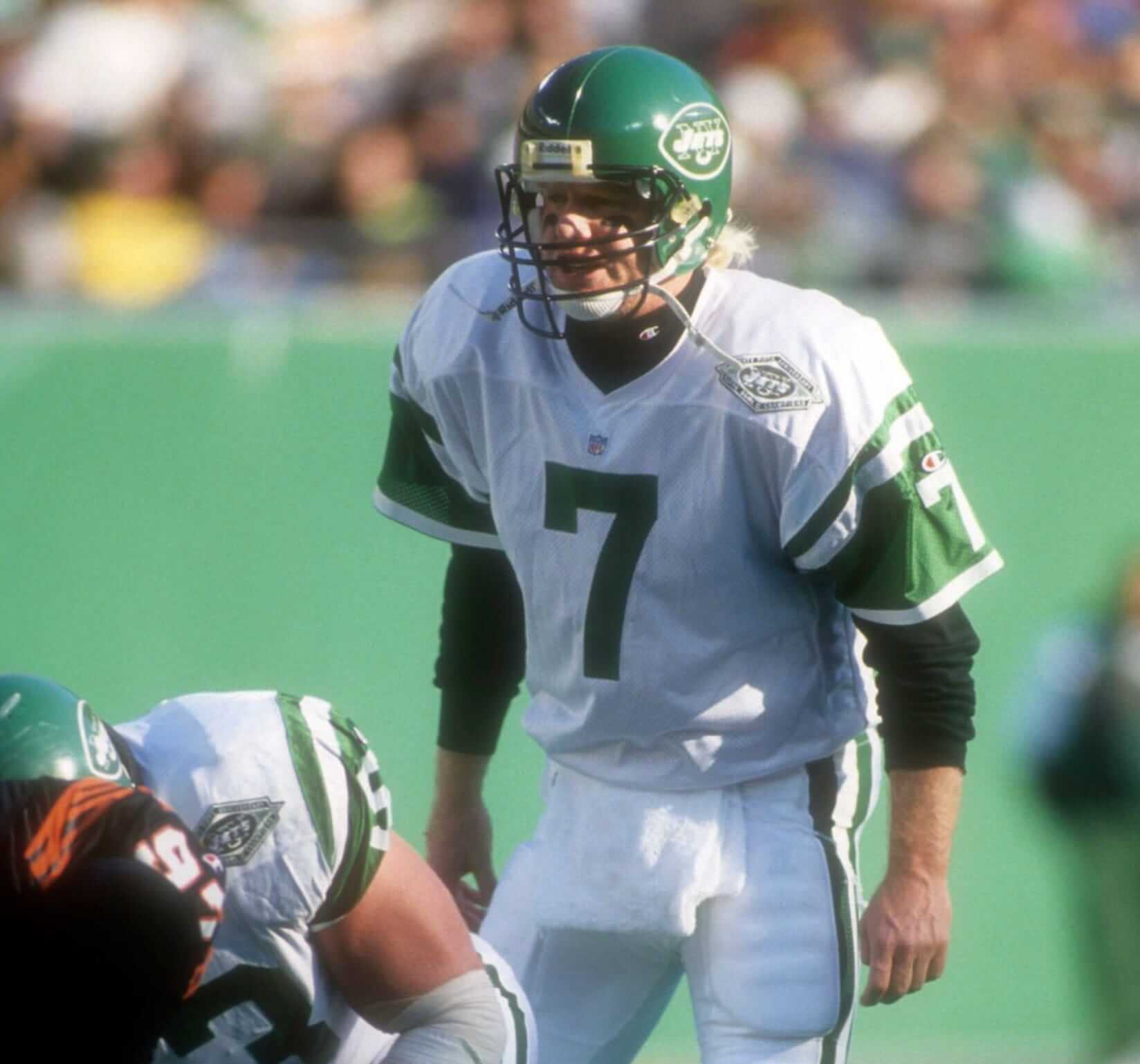
Boomer Esiason sporting a size 54 Champion jersey, you never see a QB wearing a jersey that baggy anymore.
You wouldn’t even see a size 54 player wearing a size 54 now…
In 1994 I was in Tysons Corner mall in VA, there was an exhibit there with high end sports memorabilia for an upcoming auction. One of the items was a framed Esiason Jets game worn jersey. The jersey was facing forward so you could see the tag, it was a size 54, it looked huge. He probably wore the biggest jersey on the Jets.
Great observation form Mr. Corcoran. Looks the Bills Champion and Rawlings jerseys overlapped, even though they didn’t match up!
The thing about the Bills jerseys from 64 to 72 (GUD has blue stripes on white jerseys) and 73/74 (red stripes on white jerseys according to GUD) is that on both versions the sleeve stripes had thin outlines in the opposite colors. link
GUD did a great job adding thin (½ point?) lines to all but the 73/74 blue jerseys, which I’m pretty sure also had thin red lines outlining the white ones. (Hard to figure out from this 73 highlight vid: link, but I think the red outlines were there.)
What drives me nuts is that the Bills have been wearing white “throwback” jerseys for 12 years that don’t come close to replicating the sleeve stripes from the era they’re supposed to recreate! link Strangely, from 2005 to 2010, the Bills created blue versions of the 64-74 jerseys and got the thin red outlines correct. But the white “fauxbacks,” with their “good enough” red and blue stripes, link were, to me, like fingernails on a blackboard every time the Bills dragged them out. Thankfully, they haven’t worn them since 21, but they’ll probably turn up again.
The old Carp logo with the actual Carp showing is a thing of beauty. I did not know about the Cleveland/Hiroshima connection with the C, very happy to know that now. Thanks, Leo! And since yesterday I am the proud owner of a vintage one size fits all Rakuten Eagles hat, but my favorite team in Japan (which I actually watched from their old Heiwa Dai stadium on two occassions) are the Hawks.


“some wore the heavy durene jerseys that were made by Rawlings and had the blue sleeve stripes and different number fonts than the Champion jerseys.”
So for these colder games did some of the Bills players wear this Champion jersey, and some wear the Rawlings jersey, with stripes and numbers not matching?
Until this post today I didn’t know that the Bills had a mismatch. But in that era it wasn’t unusual for players to wear different jersey styles in the same game, like the 1972 Dolphins where some players wore striped white jerseys and some wore stripeless jerseys (and the two types did have different numbers). Same with the Bears and Vikings. So it wouldn’t be a total surprise if that happened with the 1972 Bills as well, particularly if some players preferred the mesh jerseys over the heavier durene jerseys.
If you look at films of the 1972 Buffalo Bills on YouTube, they are kind of grainy, but you can see on Nov 19, 1972, QB Dennis Shaw is wearing the Champion jersey with the red stripes while most of the team is wearing the heavy jerseys with the blue stripes.
“I think New Era is missing an opportunity to sell these here…”
I have thought for years that New Era has missed the boat of not selling caps from the Central League and the Pacific League teams. But I could never get an answer to why they haven’t. Maybe Jeremy can shed some light. Especially now that the Yomiuri (Tokyo) Giants use New Era caps now. (An upgrade from the Under Armour ones, imho.) I get a lot of comments on my YGiants cap at the ballpark.
I am sure that there would be enough interest to sell them here after the success of Nomo, Matsui, Ichiro and others. Gotta throw in “Mr. Baseball” too. Yes, I know the Chunichi Dragons resembles the Dodgers bp caps, and the above mentioned Carp/Indians/Reds caps, but it’s not the same.
I have been fortunate enough to have had friends over the years that frequently traveled to Japan and would bring me back various teams caps. My first was a Hanshin Tigers cap during the Randy Bass.
Is your Hanshin Tigers cap the white pinstriped one? I remember having to settle for an adjustable-back Tigers cap when living in Tiger territory as an exchange student in 1998. Looked all over for a fitted one but they weren’t even being produced, it seemed.
I’m glad I got it because the next year manager Katsuya Nomura dropped the white hats; he preferred the black road cap for all games.
GTGFTU: Jets vs Bengals, November 21, 1993. Special “fauxback” to commemorate the 25th anniversary of the Jets’ Super Bowl III win.
As far as fauxs go, this one (an NFL 1st?) is not terrible despite the inaccuracies.
Why NYJ didn’t wait a few weeks to wear them vs the Colts was disappointing…a word that is used often when the talking about the Jets.
Agreed.
And agreed.
“NO CARP NO LIFE”
The Carp have the best rally cry of any team in the world! link
It would be difficult to wear the ’72 Indians cap and have anyone at all realize it’s not a Reds or a Bears cap.
The Bears’ version lacks the symmetry of the vast number of wishbone C’s out there (h/t UW reader Chris Bova):
link
Paul’s piece on the history of that style of the C remains a favorite of mine:
link
Da Bears’ wishbone C is rather unique (h/t UWer Chris Bova):
link
…and really looks much much better rendered in plain white on their helmets (h/t UWer Jim Vilk).
Ah, the Cincinnati Indian Bears, one of the great defunct NHL teams!
For clarity, Cleveland has worn multiple hats with wishbone Cs. The 1948 World Series champion (and to date their last World Series win) featured a red wishbone c on a navy cap with red bill (nearly identical to the ‘39 Reds) which was initially worn in 1933. The ‘54 team that lost to Willie Mays and the NY Giants in the World Series wore an all navy cap with a wishbone C with Chief Wahoo inside it (my personal favorite cap in franchise history). The ‘59 team wore a good looking all dark navy cap with a red wishbone c with white trim.
I live in Ohio and if I wear one of the Wishbone C Cleveland caps paired with a Cleveland t, confused people will occasionally stop and ask why I’m wearing a Cleveland shirt with a Cincinnati hat.
I often wonder why Cleveland spent more than a few years of their existence looking enough like the Reds to cause that confusion. I know interleague play wasn’t a thing then, but I still didn’t get it.
Instead of Guardians (which is nice), I wish they would have changed their name to the Cleveland Blues. Then Ohio could have the Reds and Blues. Perfect.
I do like that Tribe/Carp cap though.
Seems like Ohio is becoming a lot more Red(s) than Blue(s).
I wish Ohio were Team Brewster.
When they were in the process of re-branding, I was hoping for Blues…or Spiders.
I was firmly in the “Municipals” camp.
The old school Indians uniforms were some of the best in baseball history. Especially those 1960s ones
the Indians script late 40’s-50’s were the best.
And the caveman script
Ed, I’m grateful you propose an A’s uniform with that beautiful vertically arched SACRAMENTO. I hope that’s the treatment LAS VEGAS receives when the move is complete.
Thanks, with all the changes they are going through, their classic look should stay the same.
The A’s got 99 problems, but a uniform ain’t one of them. A classic look.
That Las Vegas logo looks better than I thought.
But I have a feeling those dopes in ownership will throw away all the old look-and-feel entirely.
Probably, but I still went ahead and emailed these to John Fisher, Dave Kaval, and a few others in their front office marketing and creative departments. I know they’re having a busy week, but hopefully someone at least got to see it…
Boomer Esiason sporting a size 54 Champion jersey, you never see a QB wearing a jersey that baggy anymore.
You wouldn’t even see a size 54 player wearing a size 54 now…
In 1994 I was in Tysons Corner mall in VA, there was an exhibit there with high end sports memorabilia for an upcoming auction. One of the items was a framed Esiason Jets game worn jersey. The jersey was facing forward so you could see the tag, it was a size 54, it looked huge. He probably wore the biggest jersey on the Jets.
Great observation form Mr. Corcoran. Looks the Bills Champion and Rawlings jerseys overlapped, even though they didn’t match up!
The thing about the Bills jerseys from 64 to 72 (GUD has blue stripes on white jerseys) and 73/74 (red stripes on white jerseys according to GUD) is that on both versions the sleeve stripes had thin outlines in the opposite colors. link
GUD did a great job adding thin (½ point?) lines to all but the 73/74 blue jerseys, which I’m pretty sure also had thin red lines outlining the white ones. (Hard to figure out from this 73 highlight vid: link, but I think the red outlines were there.)
What drives me nuts is that the Bills have been wearing white “throwback” jerseys for 12 years that don’t come close to replicating the sleeve stripes from the era they’re supposed to recreate! link Strangely, from 2005 to 2010, the Bills created blue versions of the 64-74 jerseys and got the thin red outlines correct. But the white “fauxbacks,” with their “good enough” red and blue stripes, link were, to me, like fingernails on a blackboard every time the Bills dragged them out. Thankfully, they haven’t worn them since 21, but they’ll probably turn up again.
The old Carp logo with the actual Carp showing is a thing of beauty. I did not know about the Cleveland/Hiroshima connection with the C, very happy to know that now. Thanks, Leo! And since yesterday I am the proud owner of a vintage one size fits all Rakuten Eagles hat, but my favorite team in Japan (which I actually watched from their old Heiwa Dai stadium on two occassions) are the Hawks.