
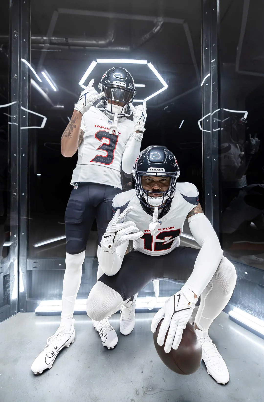
Good morning! Today will be another big day in the NFL uni-verse, as the Texans are scheduled to unveil their new uniform set. The unveiling event is scheduled to begin at 7:30pm tonight, although it’s not clear whether the uniforms will be revealed right at the outset or if there will be lengthy preliminaries. Either way, I’ll handle this the same way I handled the Lions unveiling last week: I’ll have a short post with basic info and photos shortly after the new designs go live tonight, and then I’ll have a fuller assessment tomorrow morning.
Update: I’m now hearing that the unveiling will actually be at 11am Eastern! If so, I’ll try to have a full assessment by noon-ish.
Just to refresh your memory, the team’s new white-over-navy combo leaked last month and then was confirmed by the team as legitimate (additional info here):
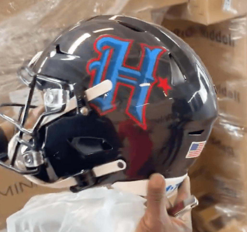
Then an alternate helmet leaked. It too has been confirmed by the team (additional info here):
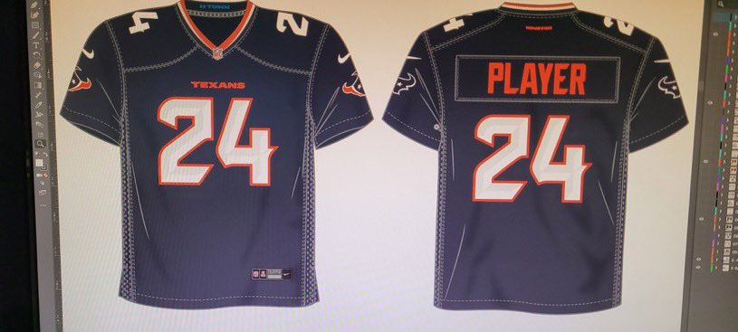
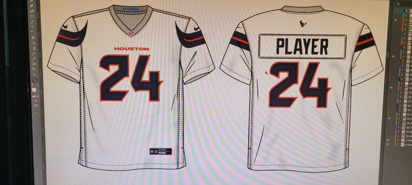
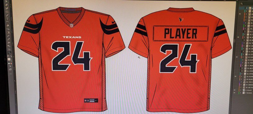
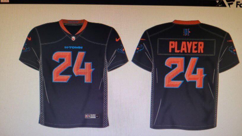
Then all four of the jerseys, including the one that the team had already confirmed, leaked (additional info now):
That first navy mock-up — the one with the white numbers — is apparently accurate, because yesterday a local Detroit TV news report showed this:

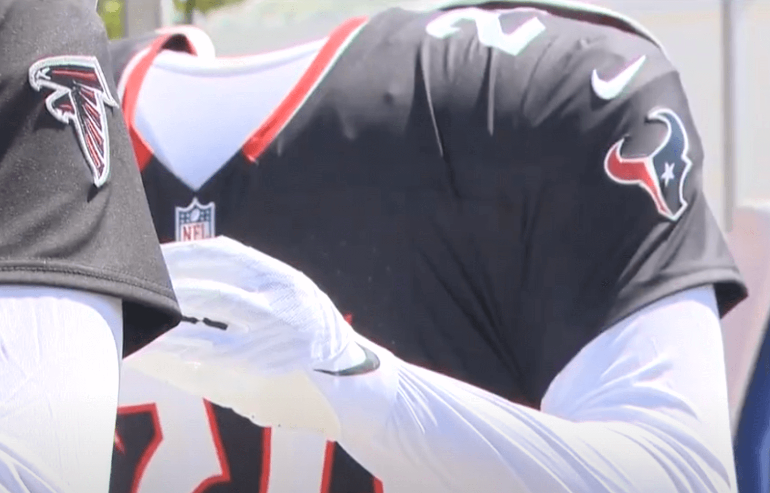
So that’s probably what we’re going to see unveiled tonight.
While we’re waiting, here’s a good rundown of the city of Houston’s relationship with Columbia blue, which extends way beyond the Oilers.
(My thanks to Trevor Williams for that last article link.)
What an idea for a membership card! And great execution Scott!
All that hype over H-Town blue and there’s no H-Town blue jersey ♂️ The Lions and Jets nailed their uniforms, Broncos and Texans failed!
The Texans took a modern classic and went Arena League. Funky, less legible numbers (when they had a good bespoke set that worked!). Bull horns. The overwrought H. “H-TOWN”. This is going to be a step back. Can’t we just fast forward to 2029 for their next unveiling?
I hope those phenomenal and well loved red helmets with matching red uniforms are the new primary over the blue.
The uniforms will be unveiled 10 am Central. 7:30 is just the party.
Nike project lead: “These old Texans uniforms aren’t boring enough. You know what to do!”
Somewhere…Bud Adams is grinning ear to ear.
“…here’s a good rundown of the city of Houston’s relationship with Columbia blue, which extends way beyond the Oilers.” – but no one ever referred to it as H-Town Blue until the 21st Century, and hardly anyone associated it with anything but the Oilers.
Hey, if the Texans’ new uniforms brings Adams even the smallest amount of joy as he’s burning in Hell for all eternity then who am I to tell him no? No skin of my bones if he’s still hung up on the city he tried and failed to hold hostage. The color’s been in Houston since the 1920s and is still on the Houston flag.
The color has been in Houston since the 1920s and is still on the Houston flag today, shows how little you actually know about H-Town.
It’s nice to see that Bud is just as hung up on the city he tried and failed to hold hostage all this time later and from beyond the grave.
Oh wow… Scott far surpassed my expectations on my Guy Lewis Towel card! Terrific work! Looking forward to seeing him (and Paul) in New Orleans in a month to thank him in person. Here’s a shot of Guy with his towel in case anyone is unfamiliar with it. The towel and a tray of water cups under his seat on the bench were SOP for Guy on game night. link
Did you notice in the picture from the Detroit news that Arizona’s red jersey is paired with white pants, presumably the white pants from their road uniform? Good gracious they need to start doing that instead of the blood clot look.
first thing i noticed ~ that’d be great
I just don’t understand some rebrands have multiple templates across their uniforms (Commanders and Cardinals for example). If there has to be one that’s different, it should be the alternate set(s). The home and away jerseys should be the exact same, just invert the colors! The blue and red ones should’ve had white horns to add better contrast and those “H-Town” ones shouldn’t even exist if that’s the final design to say the least. What a disappointment.
The home and away jerseys should be the exact same…
Why?
Giants don’t follow this rule. Neither do the Cowboys.
I think the uni-verse is big enough to handle both approaches.
I don’t think home/road should be *exactly* the same (although it’s 100% fine if they are), but to me at least, home and road sets should NOT be completely different looks; teams should be able to mix/match home/road elements and still have a cohesive-looking uniform. Arizona (and a few others) don’t really have that. Jerseys don’t have to “mirror” each other, but there should still be some cohesiveness between the two.
And IMO NO TEAM needs two different sets of the same color pants (like the Giants).
Just my $.02
I just prefer continuity personally for primary sets, it makes it easier to mix and match like you mentioned. It also gives the alternate set an opportunity to be very unique/different, which is what I always thought the point of an alternate uniform was to begin with. But yes, I do agree with you on the pants opinion! Completely unnecessary.
Mmmm. why strip down every detail in that new jersey? Because it costs less to produce and caters to the no frills practice gear aesthetic of modern players. I keep repeating myself but I cannot find another explanation for this overhyping of minimalism. And ofcourse there will be a BFBS uniform, the should call these Players Request edition.
Saw the launch details on the Texans website – I think they missed a golden opportunity to go all H-town blue with their color rush uni.
There are individual elements of the new set that I like:
-the red helmet with the horns is my favorite
-the addition of “H-Town Blue”
-The new H logo
But I struggle how how these elements were executed in the design
-using H-Town Blue as a trim color doesn’t seem to pop as much
-the H logo seems not to contrast enough with the blue helmet
-the two jerseys with the horns do not work for me
What I would like to have seen
-a white helmet with the H logo, H-Town blue jersey and white pants
-a sleeve design where the horn effect was totally encapsulated in the sleeve (a la Denver’s zigzag, which was totally encapsulated in the sleeve).
I like your thought on the sleeve design. The horn design now reminds me of the old Browns uniform with the stripes beyond the sleeves. I also agree the red helmet is pretty slick. That could have gone sideways or looked too Vikings-esque but they came up with a cool design there.
By starting with H-Town Blue as a trim element, does that allow the Texans to eventually release a H-Town Blue jersey without the Titans crying foul?
Had to gag when they said spikes on Old English letters were inspired by cattle horns.