
The Broncos unveiled their long-awaited new uniform set this morning, marking the team’s first design overhaul since their radical 1997 set. The new designs match up with the leaks from the past week or so, all of which turned out to be accurate.
Let’s take a closer look, one element at a time:
The New Primary Helmet

At first glance, it’s similar to the old helmet, but there are some differences. For starters, they’re going with a matte shell. Also, the nose bumper now has “5280,” as a nod to Denver’s mile-high elevation.
In addition, the old striping has been removed; in its place, as indicated by the recent helmet leak, is a truncated arrow comprised of of a bunch of triangles, signifying mountain peaks. But as we’ll see throughout these photos, this graphic isn’t really visible except from the back:

The New Orange Jersey

If you ignore all the silly color names and the cringe-inducing “storytelling,” it’s not bad. Obviously, the zigzag sleeve stripe is the weak link, but the rest is fine.
This jersey can be paired with white, orange, or navy pants:

The New White Jersey

Basically the same thing, but in white. Again, not terrible, although it would be stronger without the zigzag.
This jersey can be paired with orange pants (my favorite combo of the entire set), navy pants, or white pants:
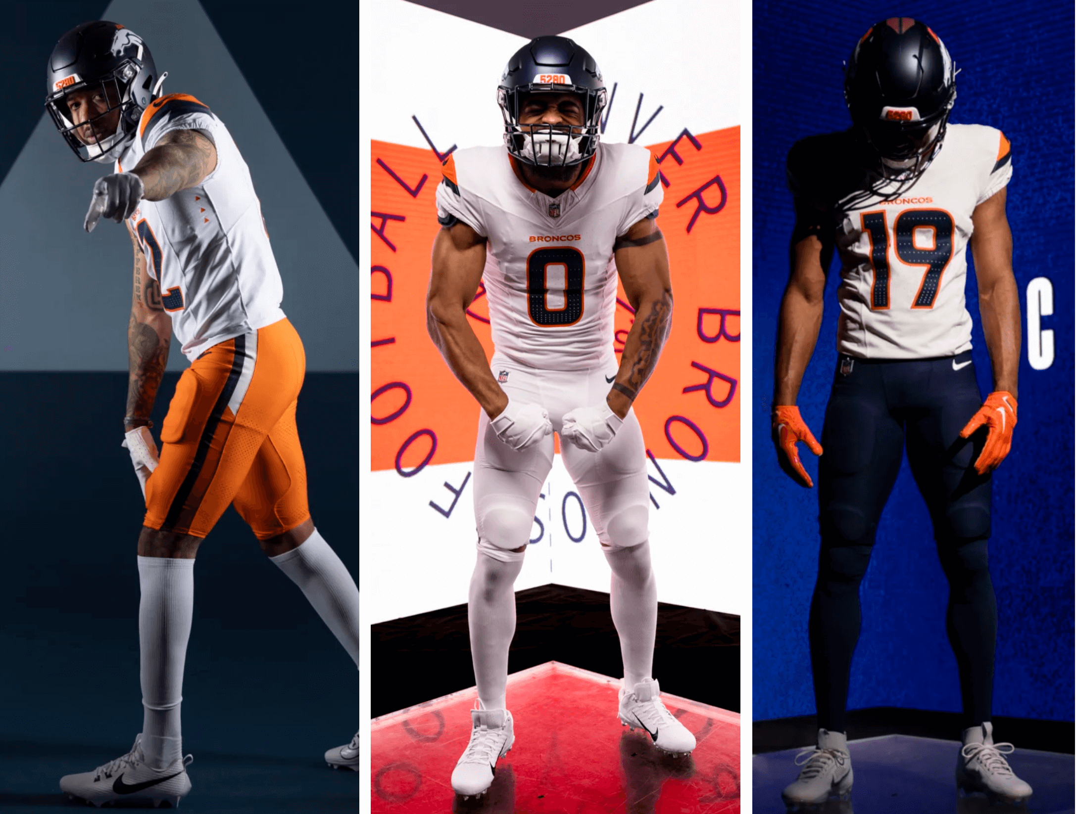
The New Navy Alternate Uniform

Woof! The white helmet really ruins this one — a bad fit that just doesn’t feel like the Broncos at all.
Here’s a closer look at the helmet, which has the same striping as the primary helmet:


The navy jersey can be worn with navy, white, or orange pants:

The New Pants
As you’ve probably noticed, the pants all have a new, modern stripe pattern. It’s apparently intended to mimic the sleeve zigzag, as you can see here:

Also, the pants all have a low-contrast “5280” graphic, which is stupid beyond words, but at least it’s apparently not visible except in super-close-up shots:


The 1977 Throwback

As had been expected, the new set includes, at long last, an “Orange Crush” throwback, which is a joy to behold. If the players actually wear those striped socks, I’ll weep with joy (but I’m not holding my breath).
Here’s a bunch of additional pics:


That noise you hear in the background is a few million people saying, “They should just go back to these full-time.” Yup.
———
Overall: All the triangles and “5280”s are tiresome, and the zigzag is silly, and the alternate uni is a bust. But the basic primary looks could’ve been a lot worse. Only a middling-to-lower NFL uni set (it would probably rank at about No. 22 out of 32, give or take), but still an upgrade over the outgoing set, and not the utter disaster I was fearing. Let’s think of it this way: John Lennon, when discussing Phil Spector’s mixes of the Let It Be album, once said, “When I heard it, I didn’t puke.” That’s pretty much how I feel here.
I’ll update this post with new/better photos as they become available.
Next up: the Texans, who’ll be unveiling their new set tomorrow.
I like these a lot more than I thought I would. I even like the white helmet on the alternates (probably because they remind me of my alma mater, UVa).
It’s ironic that they wouldn’t change the primary blue back to something like royal blue because it had a strong college football association (Boise State), only to wind up with a uni set that looks like something UVa would wear.
That said, big improvement. And I like the shoulder zigzag.
I love the new white helmet Don’t like Dark pants The broncos always wear white pants and I love that All white uniforms n the Navy tops with white pants only
UVA…or Illinois…or Syracuse. (Probably too extravagant for Syracuse, though.)
More like UTEP or UTSA
My first thought were UVA vibes (and I shuddered… GO HEELS lol). The Broncos and Nike really seem to be avoiding orange as their primary color. And I don’t get why. No team really uses it as their look – the Browns, Bengals and Bucs all use it to a degree but the Broncos were at one point the only team with orange jerseys. That was their thing.
This design is nice and all but too much navy and not enough “Broncos”.
The throwback set puts orange front and center. It brings back the “beloved” (their word) D/horse logo and sock stripes. If this is the stuff that the people love, why are you not bringing it back full time?
As a Hokie, I found these off-putting for the very same reason, but different viewpoints lead to different opinions.
They did all this market analysis. All these questionnaires with fans and season ticket holders and still got it wrong. How hard is it? So bland.
Living in Colorado, I was intrigued by the market analysis they did. The whole goal was to move the Broncos brand forward. The analysis mostly focused on younger (Gen Z/Gen Alpha) fans. The younger fans love the new design. The club gave us previous millenia fans the throwbacks. When you think about on scope of scrapping nostalgia for engaging a new young fan base, they did good. Next up, we need to watch how CU football rebrands. We will see the same approach.
I like the shoulders. It reads as a mountain with sky behind it. Why they didnt make the peak of the mountain white on all jerseys and swap blue and orange respectively and call it some day or night sky thing is beyond me.
The conspiracy theorist in me thinks it’s so that they could maximize the contrast of the part of the sleeve cap design that “holds” the swoosh
Not a conspiracy, new uniforms made by Nike have the swoosh as a feature in the design. So it makes sense.
He means he knows the swoosh will be there but nike wants it more prominently placed in white than on a darker color.
Disregard my previous comment. I forgot not all of the sleeve tops were white.
It’s fine, i guess. Taking the Orange Color Rush and starting with it and building from there on would have been a better option but here we are. The zigzags would be better with just two different sized stripes and the white helmet feels real dumb on the blue jersey, (should have just made all white an option if you want that). The throwback is fine, i prefer the modern colors even though i grew up with the baby blue.
Most excited about a blue/white/orange combo. Heck a blue/blue/orange would be fun
Grade is B- (not great, could be worse)
It’s definitely a HUGE upgrade from the atrocious ’97 set. I don’t mind the navy jersey, but I’m blown away by how bizarre the a helmet “stripe” (if you can even call it that) is. What is it with Sean Payton and his teams having horribly patterned helmets (he notoriously pushed for the fleur-de-lis patterned abomination on the Saints’ black helmet).
The zigzag is great, makes it seem more dynamic. Massive improvement over the bland, blank sleeves they had before.
The dot-dots on the helmet annoy me but everything else is respectable or hard to notice if it isn’t.
Whisper it, but the last few Nike redesigns haven’t been bad. Maybe not great, but not bad and that’s an improvement
I don’t hate these. I was prepared to flame these, but these are actually really nice. Now, are there unnecessary elements? Yes. Are there things I would change? Yes.
Does this make this a bad uniform overall? No. I like these. Throwbacks are amazing.
link
A little update on the orange uniforms: while it’s not a great photo, it appears that it can also be worn with blue pants. In other words, orange over blue is a possible combo.
Now added to the post.
I still maintain that the prior uni set was a modern classic. It was instantly recognizable as the Broncos and part of me wishes they made smaller changes (like getting rid of the side panels and making a pants stripe that can mix and match).
I actually kind of like these new unis! I wish that the white helmet could be paired with any jersey instead of just the blue, cuz that white helmet would look better both the white and the orange. Denver is actually one of the few teams that I think improves with a white hat (in some cases, clearly).
I agree the last set were a modern classic and had several elements that in time they will pull out of the moth balls again.
I agree. I liked the stripes from the last set, especially on the helmets. They worked well with the style of the horse logo. I would like to see this set with the royal blue instead of the navy blue.
Not good, but not nearly as bad as I thought it would be. The 5280 on the pants is whatever; it won’t be visible on TV.
The throwbacks are fire though.
These are extremely mediocre. I can’t explain it but something is just off. They should have just made variations of the color rush unis as the primary or gone full time with the throwback.
The white helmet is an abomination. A different color facemask would have helped.
Just make that 1977 Throwback the main set and make the others an NFL-style “Turn the Clock Ahead” one that you wear a few times and then forget.
I’m starting to think we’re living in a Turn Ahead The Clock present of uni design. I’m sure it has to do with innovation but …
And about the throwback…it could be lighting, but the “77” throwback looks like the 1982-1996 shade of orange to me.
A 1977 would throwback would be more the “blood orange” shade the broncos had back then.
link
The white helmets should be primary and they should have brought back lighter blue.
Putting the zigzag sleeve on uniforms for a team in the same division as the Chargers is just hilarious. What are we doing?
It’s too bad that in 5 years, they will likely just go back to the most recent designs (1997-2003), or the Orange Crush ones. Come on!!!
Orange Chargers was my exact thought. Terrible.
I mean it’s not bad (could have been way worse) but it just reminded me of the Atlanta Falcon unveiling their latest clown uniforms and showing up the retros that blew everything they had already unveiled out of the water.
Yeah, it’s a good point. They really should have waited with the throwbacks. The new set is maybe merely mediocre or below average, but put them on the same stage with those gorgeous throwbacks and they never had a chance. Is absolutely baffling that they have one of the true classic looks for an NFL uniform that could go toe to toe with the Bears or the Vikings or Browns or whomever, and they barely use it! At least they’ll wear it occasionally now.
Perhaps I’m the only one, but I like the zig-zag pattern on the sleeves. Looks like a mountain, but does so in a subtle, non-cheesy way.
My strongest complaint about the set is actually the socks; I really think uniform sets look better with contrasting socks, but in most of the pictures they’ve gone with white/white, orange/orange on the bottoms.
The socks are this entire set’s downfall. Terrible and boring.
The pants stripe mimicking the sleeve/shoulder stripe doesn’t work at all. On the sleeve, it’s a bit of a mountain — I get that. On the pants? Bleh. The 5280 on the pants is dumb but inconsequential. For an orange and blue team, this overall look is really DULL. Nothing pops (oh, the throwbacks do for sure) The navy is too dark and the orange too again, dull to actually contrast well with the navy. The best combo for me is navy/orange/white but I fear we will see all sorts of hideous combos that look like UVa or UTEP.
The white helmet is unnecessary but does work with the old Big D logo (as seen last season)
Is there a reason why they dropped the tv numbers here? There is plenty of room on the shoulders.
I can only speculate they got rid of that element to save money.
This set could have been a lot worse, but it is still pretty bad. The white helmet is brutal and I have no idea why it is even there. The little triangles are one of the dumbest features because you can barely see them, why include an element in the uniform that can only be seen in extreme close up angles of the game?
One can only hope they’ll pull a Jets, realize the throwback is the most popular set in their wardrobe, and in 5 years that will be the primary again.
I don’t like this annoying trend of teams getting rid of tv numbers, it seems more and more teams are doing this
I’m glad the 5280 on the pants is basically invisible. I was worried it would be similar to the Browns word mark on their old set, which was biggest sin of that design.
I wonder how long it will be before they make the throwback the primary. Next season?
Fine. Reminds me of the recently mothballed NYJ’s uniforms that had needless “modern” stripes. And why can’t Nike just design a simple helmet? Is there that big a market for recreation helmets? Like the Jets I look forward to the team realizing at long last that they should just return to to classic set.
As a Raider fan it continues to bring me joy that the Broncos are the worst dressed team in the division.
Amen to a simple helmet. Who thought it would be cool to use the striping to make the helmet look like a mullet?
Is it actually Nike that designs the helmets? His recent interview with the ex-Nike designer indicated they don’t.
Phil-
True, forgot about that. If it is the same designer(team) that has done this, the Seahawks, and Saints alternate then they should be reassigned. I actually liked the previous helmet stripe, and thought it would work well with whatever “triangle” theme the new design has going on.
So, do we think the rumored “new” accent color was scrapped late in the process, or was it a lie all along? Because it’s definitely not in the final cut here.
don’t love the textured numbers/helmet. would have curved zigzag (like horse mane curves on helmet) on the sleeve, rather than angled zigzag.
These are really good. The zig zag pattern on the sleeves is supposed to represent a snow capped mountain. The only changes I would make are changing up the helmet stripe, swapping the navy and white on the orange jersey and swapping the stripes on the white and navy pants. I disagree that the throwbacks should be primary though. I prefer when teams come up with creative designs for their unis. Overall a solid 9/10 from me
This was really just change for change sake and the result shows that. Just a collection of weak elements serving a story that should make everyone roll their eyes.
That said, they’re fine. I’ll be curious to see how they look out on the field and if it improves the aesthetic of what they were trying to do.
Is the heavy presence of the Ford Bronco (old and new) in the videos been a thing before? Is that new or was someone looking to get a free car out of the deal?
It was just a thing with the Lions new uniform unveiling! The Ford Bronco is supposed to be the inspiration for their new 90’s era-ish uniforms because the Bronco is back after production ended in the 90’s. Does the Ford family have part ownership of the Denver Broncos now as well? lol
I get it with Detroit. That has always been a thing. And I don’t hate the videos – very well done and fun the way it plays a part – past and present. I was just wondering if it had been there before and I never knew.
I mean, OJ Simpson just died, so the Ford Bronco is kind of a hot topic.
Ohmygosh, you are not right. You win!
The most frustrating part of this is that the 1970s throwback alternates look great. Same with their previous Color Rush set. Either of those would be the right answer. The main set they went with, it’s a very slight upgrade from the 1997-2023 set, but still not good.
The white helmet, in a vacuum, is fine. Paired with the navy jersey and navy pants, it looks TERRIBLE. Just like the Chargers white helmet when they wear mono-navy. Just ridiculous looking. They desperately need to keep the white pants for much needed contrast.
Otherwise, I agree with the breakdown you gave…a definite upgrade. I’d call it a D- to a C+…ish.
The Chargers want their zigzags back!
Other than that,, and the stupid helmet striping, these look much better as uniforms than the mock ups looked as drawings.
First, the good news. The 1977s are perfect. Every Broncos fan will be hoping they wear those for every single home game. Great execution of one of the classic uniforms in the NFL.
The rest is all bad news. Yes, the previous set was bad, but this isn’t a upgrade. The maelstrom of color combinations and especially the jagged stripes and half stripes on the pants really make this scream mid-major college football program. Is it Boise State? UTEP? Virgina? Auburn? Not sure, but several of the combos remind me of elements of those programs. Overall, seems like something Wal-Mart would have come up with; too busy, too choppy, and seems overdone and therefore cheap instead of classic. I think we’ll just call these the “Sam’s Club Specials.”
The other major problem is the storytelling. Not just that it’s totally overdone, that was to be expected from this vendor. But that it’s off: First of all people in Denver don’t go around describing themselves as from “5280 city.” The number just doesn’t have the kind of meaning that they ascribe to it. Now if they would have gone with “Mile Hi” instead of the elevation number that would have actually resonated, and because it’s the name of the Broncos original stadium it would have been particularly connected to the history of the team. The second is the heavy use of mountain and thin air themes which don’t match the team or the city. Denver is not in the mountains or particularly near the mountains. A mountain theme makes sense for the “Colorado” Rockies, not the “Denver” Broncos. Indeed, Broncos as a team name has always made sense because Denver is a cow town, Queen City of the Plains, not a mountain city at all. They should have leaned into that theme with horses, cows, something like that and it would have made sense. I guess maybe they did only in the sense that this design does has a certain whiff of the stockyards about it! Mountains is out of place and seems therefore highly inauthentic and overdone. Definitely seems like something come up with by people not from Denver and not connected to the city.
Well said. Very good points. I thought that about the mountains at first too – before I got distracted by the Ford Bronco.
I mean, “Denver is not in the mountains or particularly near the mountains” really depends on your definition of near, which clearly is subjective. Most people would say it is near, given that you know, you can see them and get to them in under an hour in the car.
Certainly, that’s true. To be sure, Denver is nearer to mountains than Omaha, but just as clearly Denver is also not in the mountains. In fact, people are often surprised to learn the Denver is one of the flattest major cities in America, not to mention one of the driest. It’s a flat, hot, dry, dusty city of the high plains. Indeed, Denver was founded where it is specifically to not be in the mountains. It was a dry and mild flat place good for railyards and warehouses to supply you before your journey into the mountains. Not much has changed in that regard, actually.
Culturally, it’s more like 50/50 high plains cow town and a northern Mexican Chicano city. So they could’ve learned into either of those themes and been far more on point than the made-up mountain theme.
Lastly, Denver less than an hour from the mountains??? No way, unless you have a supercar, are Lewis Hamilton, and it’s 3am on a Tuesday with perfect weather. I happen to live a little under an hour due west from Denver myself now, and I’m just barely into the foothills. The mountains are much further West. I have some coworkers who moved here to be “in the mountains” and were sorely disappointed to find that it’s generally a commitment of at least a half day’s journey from Denver to any of the mountain activities they had in mind. Recently many of them have moved “to the Mountains” meaning places generally at least 3 or 5 more hours of travel further west of me.
I’m not sure where you live in Denver, but I am in North East Denver (19 Miles) and it only takes me 20-30 minuets to get to the Mountains.
In regards to the Broncos new uniforms; I give them a -B. I am more fond of the orange and white jersey combos. I don not particularly care for the Blue Uni’s as they look more like a Bears Uniform. The throw back 77 Uni’s are fire and should be the primary uniform all the time.
For what it’s worth, a very small part of Denver actually is not only in the mountains but pretty high up in the mountains. Just below the summit of Mt. Blue Sky (formerly known as Mt. Evans) is a lake called Echo Lake. The lake and the land immediately around it are owned by the city of Denver.
It’s an absolutely beautiful area (my dad used to take me up there when we lived in Denver), and it is very much IN the mountains… and it’s technically part of Denver! So Denver actually has more of a mountain connection than even most locals probably are aware of.
I’m actually very pleased with these – both the Mile High Collection and the gorgeous throwback. As much as I love that throwback, I am glad it’s not the primary as I enjoy it more when teams keep the throwback an occasional something special rather that than the all-the-time – but I get that I’m unusual in that. As to the primaries, I love the ability to mix and match quite a bit and some of the elements that others have been critical of (the sleeve stripe, the helmet stripe, the tiny 5280 on the pant stripe) I quite like personally. I’m old enough to remember when the 1997 set came out and the uproar that happened then about the Broncos abandoning their past. It was hogwash then as all a team really needs to do is win and the set they are wearing will become beloved. The 1997 set will always remind me of Super Bowl XXXII and beating the Packers in a win that shocked the world and I’ll always love photos from that game as a cherished memory. Win and we’ll all love these too Broncos.
Is the legacy blue on the throwbacks not a royal blue? i’ve heard it called royal but i always felt like it was it’s own shade of blue not found on any other nfl uniforms. Is it just the way that it is paired with the orange that makes it look much different(the knicks blue doesn’t look like the broncos though). the blue helmet looks nothing like the giants, colts, bills or rams color of royal
That always bothered me too, and it is not the same color as what the Colts or Seahawks wore back in the day. Whatever that color is, it’s better than navy.
When Riddell first started molding helmets in colors back in the early 1970s this was how their “royal blue” came out. Since royal blue was an accent color for the Broncos they used shells in this shade when they made the switch from painted shells. I have always assumed that this is why the Giants, Rams and Chargers wound up using navy blue shells with royal blue jerseys chose the navy shells – it was a bit less jarring a mismatch than if they used those lighter blue shells.
thank you. that lays to rest a very confusing question i have always had.
This is an upgrade only because the 1997 set was SO DATED. And it’s a LOT better than I feared. Oh, and ORANGE PANTS — which should always and only be worn with the white tops — YES!
Of course the throwback is what they should make their permanent set.
Overall? I’m pretty much in agreement with Paul — it’s not that great, (I’d say 10th-12th worst as a set), but it’s so much better than it could have been.
For what it’s worth, the triangles and 5280s are tiresome when you are examining all 3 parts of the set…as a one off, during a game for instance, they are a nice touch.
This seems like it’s going to be another Jets ’19 thing where they realize (in 5 years) that these are not it and go back to the 77 throwbacks. Denver has looked horrendous for almost 30 years, so I’m not surprised by this. I do find it funny that their white + all navy look is basically the same as the Chargers. [See here](link) – Does markup work in these?!
Well, one thing is for certain.
Out of all the recent NFL uniform redesigns, this is one of them.
I won’t be TOO annoyed with watching the Broncos play now. The Zigzag is irritating, but I’ll get used to it. I NEVER liked or got used to their previous design.
Like many others, I feel like these aren’t as bad as I thought they’d be, but I think they’re kind of boring overall. All I can see in that sleeve zig-zag is a lightning bolt, especially in the head-on view. That then leads me to think of the Chargers… pretty ironic to go with a visual that could be interpreted as similar to a division rival.
So…those three “performance” vents on the sides of the chest portion of the jersey that also represent their 3 titles…
If the Broncos win a 4th title this upcoming season and want to add a 4th triangle, do they have to wait 5 years to do that?
Good thing we don’t have to worry about that… We might win 4 games.
Truly dull set. Uninteresting in every facet…
These are fine, expected much much worse. My issue with these and many other redesigns continues to be the non contrasting socks.
I think the standard home and away are ok, but I’m left a bit underwhelmed by the update. I like that they at least have some different options now. I think the pants would be better received if both stripes went all the way to the knee. I’m not a big fan of the midnight alternate, and I think it would’ve looked better had they tweaked the blue a little bit in the opposite direction. Same with the navy matte helmet. It seems incredibly dark, and the giant 5280 bumper looks like it came off the front of a steam locomotive in the rail yard.
I’m very thankful that they included the throwbacks. Those are beautiful.
People get paid big time to come up with this garbage. Compared to what the Jets and Lions did this is a joke. Be a nice college uniform is all.
I get the “zigzag” dislike, but to clarify it’s supposed to be a mountain peak based on the logo lining which I think their explanation is silly. At no point to I get a mountain peak from that. They should have just said it’s based on the jaw lining of the logo.
If you really think about it, the overall basic design almost looks like their mid-60s uniforms with the sleeves. I like the newer number font, kind of agree on the overuse of triangles.
I know everyone is crying for them to go back to the throwbacks, but this is the NFL and the NFL prints money. Part of that money printing process is jersey sales. There will be people who buy their favorite player in every style of jersey you put out. Why try to sell one or two jerseys when I can sell four. They will never go back to their throwbacks as a primary for that reason.
It doesn’t read “mountain” at all. It’s like the circus tent roof of Denver’s airport, which is supposed to read “mountain” but come across more like “run by clowns.” Same thing here. This reads poor art design.
Big improvement. It does seem like to please the average UW reader, traditional striping and block numbers (with TV numbers) is the way to do it. That’s not going to happen though with every team, so for me these are very good unis that hold up better than the previous set. I agree that the 5280 is tired (we get it, Denver is high), but at least it’s not too noticeable on the pants. Chargers do not own the zig zag, and it’s implemented differently enough here that it’s easy to distinguish unless you’re looking to complain.
The blue/white/orange is gonna look particularly awesome
“…the zigzag [is] easy to distinguish unless you’re looking to complain.”
The problem with the zigzag is not that we’ll suddenly confuse the Broncos for the Chargers on the field. It’s that the zigzag/bolt is synonymous with the Chargers. It’s silly to put essentially the same design element on a different team’s jersey (a team in the same division) and act like it’s original or interesting.
The Chargers don’t own the zigzag, but that’s like saying the Bengals don’t own the tiger striped helmet. If another team debuted a new helmet with similar stripes, we would all lambast it. It’s not about actual ownership, it’s about aesthetic identity. Chargers = Bolts. Broncos = Orange/blue. No need for silly zigzags.
Well, I don’t mind the matte helmets, and the strange…triangle pattern seems subtle enough to be mostly forgotten about (and hopefully dropped in a few years). Same goes for the elevation. Enough with this 5280 crap already, and the same goes for area codes. Describing a city/team with a three- or four-digit number code doesn’t enhance or honor its identity, character, or uniqueness; it takes those things away. “What team do you root for?” “I like the 303 5280’s, but they’re in a rebuild.” That’s dystopia to me.
The blue/white/blue looks a little too much like the Bears to me, although the strange trim helps with that somewhat. The mountain on the shoulder caps only really works on the blue version, and I think they should have had those be the same sleeves on all three jerseys. I wouldn’t see the other ones as mountains unless you told me ahead of time. I get that they needed an asymmetrical element on the mountain (to make it not just a triangle) but the zigzag is distracting.
The pant stripes are weird, but they could have been worse (at least there are pant stripes).
I’m not sure how I feel about the white helmet. It doesn’t look bad, but it also doesn’t look like a professional football helmet. I think it would look a lot better with a center stripe and the old D logo.
Blue/orange/orange is my least favorite of the set, especially with the matching socks. Blue/orange/blue might be the best of their new options, although it wasn’t modeled.
The throwback is nearly perfect, and blows everything else out of the water. Add a white version of that jersey and let the triangles and 5280s be a hazy memory.
So the Reddit guy who was interviewed was full of it. I’m glad he got this platform.
I was expecting much worse and am pleasantly suprised. Much more of an evolution from the previous uniforms than an overhaul.
I think the white helmet is kind of lame and unnecessary but rest of uniform is good.
Overall I think its an upgrade. The old set looked pretty tired at this point. I don’t understand why you wouldn’t create a blue or orange version of the logo to go on the white helmet. The most annoying parts of this uniform are nearly impossible to see on TV (triangles, the 5280 on the pants), it begs the question of what was the point in even doing it. Then again, I’d rather the worst details be easier to ignore.
Well, it’s an upgrade. That’s not saying much since Denver has had one of the worst uniform sets in the league for the past 27 years.
I still don’t understand why they’re using navy blue. We already have a navy and orange team. Orange is only used by a few teams, why not use royal blue and orange instead?
It was going to be hard for the Broncos to disappoint me as long as they scrapped the panels. That being said, I still do not and never will understand the fascination with putting text (5280, “CARDINALS”, “BROWNS”, etc…) inside of striping patterns.
Man, I really think the primary helmet is a miss. Maybe it’s the lighting, but the matte helmet just isn’t working for me. Feels kind of like they said “well, we’ve gotta stick with the navy blue helmets, but we’ve gotta change SOMETHING”…
It’s weird seeing these because after all of the rumors, I had fully prepared myself for white helmets, and just as I’d begun to embrace the idea they roll out these odd matte ones. Personally the matte fad feels NCAA, and it looks better on brighter colors.
That matte helmet will feel just as dated in 10 years as the old side panels did long after they premiered in ‘97.
The whole uniform isn’t offensive (I’m glad they were relatively restrained with the 5280 stuff) , but it’s still a slight downgrade in my opinion.
Meh.
Switch to 77 throwbacks full time or you just look like the Chicago Bears.
If it had a normal helmet stripe (or no stripe at all), it would be a whole lot better. But as is, it’s a modest upgrade at best.
I don’t hate it. It just feels bland. The shoulder zigzags aren’t that bad. I don’t get why the blue alternate jersey has to exist at all, other than just needing something to be a fourth jersey. I do like that the two orange jerseys are very distinct from each other. Some teams (Giants, Colts) make an alt that is very similar to their main, and I’ve never liked that.
To me, they look like something a child drew. They don’t look like a professional uniform. And nothing says “Broncos.” If anything, the dark ones look like a Chargers remade uniform.
“This jersey can be paired with orange pants (my favorite combo of the entire set) or white pants”
Doesn’t the picture show that it can be paired with navy pants as well?
Yes, thanks. Now updated.
I’m sick of Nike and the NFL trying to make football pants look like college basketball shorts with all the stupid side panel striping/ designs
These are worse than the graphics released earlier hinted. That orange combo may be the worst set in the NFL now that Detroit’s grays are gone. After a few uniforms leaning a bit more towards tradition or simply bland (Cards, Lions, Texans, Jets) , NIKE is back to seriously messing up teams’ looks ala Tennessee, Atlanta etc. I was never a fan of that leg swoosh stripe they gave to the NFL but whatever that is on this outfit is worse. They won’t look good on the field.
At first glance, I liked them. The more closely I looked, the less I liked. Looks very dated.
These are strong. The reactive, instantly negative nature of Twitter (unlike everyone here of course… haha) cracks me up because i expect this set will be well established and will grow well on people before the first season even finishes up.
Whatever happened to tv numbers ?would look better with them !
Exactly, it looks like some minor college football jersey without the TV numbers, I don’t know why teams are doing this.
Check this one out “Triangles: Dissipating triangle perforation in front and back numbers nods to thinning air at higher elevations” OMG i love it! Then again i am the biggest topographic map/mountaiscape nerd ever.
A marginal upgrade at best. Just about anything would have been an improvement on the 1997-2023 set which was outdated YEARS ago. At least the silly piping on the jersey and pants are gone, the new sleeve design with the mountains is definitely a winner. The white helmet is actually pretty slick and could work as the primary over the matte navy. But god damn those throwbacks are gorgeous! They absolutely nailed it and those should be the primary look. There’s something about teams simplifying things, but oversimplifying things is a trend as well.
It’s really nice to see the 1980s coming back because that was by far the best era with regards to NFL uniforms. Then the 1990s happened and we’re still trying to correct it.
Now we get the Houston Texans which judging by the leaks are going to be a substantial letdown.
Blue has more variations than any other color. The Broncos’ Blue is a dark blue without being navy. Remember navy blue is very neutral and practically black (think of the Yankees’ caps) I’m glad there’s more orange in the road uniforms than previous. The triangles on the helmets remind me of a Navajo blanket, the sort of Indian-inspired design I’ve been pushing for all along. Not thrilled with the font, but it was the most dated element of the previous jerseys, varsity block was a pipe dream on my part.
navy blue is very neutral and practically black
*midnight blue
Broncos fan here. The new white helmet is a miss. The horse head logo simply doesn’t stand out against it well enough. And white helmets just don’t look like the Broncos to me. I hope it gets shelved quickly.
The tiny triangles are gimmicky and don’t serve any useful design purpose other than to give the helmet the “Seahawks” treatment. The orange ones on the blue helmet get completely lost, and the blue ones on the white helmet make it look scuffed or smudged in the back.
I actually don’t mind the sleeve design. Some may call it a zigzag, but it looks to me like it’s supposed to replicate the shadows on the face of mountain peaks. For a team in a city where the elevation and proximity to the mountains is a key part of its identity, I think it’s an appropriate visual component. Could it have been rendered better? Perhaps. But I don’t mind the concept.
Of all the uniform combinations, I like the ’77 throwback the best (unsurprisingly), I wish they’d gone with the sock and pant striping the team wore for most of the ’80s and ’80s instead, though (link).
Overall, I’m basically in the same camp as Paul. It’s probably a slight upgrade over the set they’re leaving behind (depending on which combination they wear). But it probably could have been better. Long live the Orange Crush uniforms!
White helmet looks like WFWS to me
These are absolutely beautiful. Top 5 uniform in the league and all time classic.
I’m talking about the throwback.
The primaries are, like most have been saying here, mid-major directional school clown suits. Since they are ever so slightly better than the set they are replacing, I guess they go from D- to D? Still a bottom ten uni, and Denver remains the worst dressed team in the AFC West (except when they wear those beautiful throwbacks).
Ouch. Wow those are awful. Analyze the stripes and triangles and mountainpeak summit midnights all you want, but from ten feet away it looks like Middle Illinois Tech at Billings, if there was such a place.
This IS an utter disaster. At least they got the throwbacks right.
….And 50% of greater Broncos Country will continue to rock the royal blue/orange crush “D” design for another decade.
Looking forward to the 2029 redesign
Well, it’s an upgrade. Get rid of the Chargers lightning stripes, and the 420 Doritos crumbs, and it works. Also, Zach Wilson gets traded to Denver and could wear number 5, but you still need a brand-new jersey now. My head hurts.
I’d wear that. All of it.
ESPECIALLY THE BLUE/WHITE/ORANGE COMBO!
Yes, they’re trying to please everyone (except the BFBS crowd, surprisingly) and a lot of times you end up pleasing no one. I myself am very pleased. I could do without the white helmet but it’s not bad. I could do without some of the little details, but they’re not noticeable from a distance.
I like the sleeve caps, and most of the time they’re still instantly recognizable as the Broncos. Is it perfect? No. Neither is life. I’ll take it.
TV numbers would have been nice though.
You left out that the helmet logo is now 15% smaller than before, and I’m pretty sure I read on the Broncos’ website at 11:00 that all three jerseys can be matched with all three pants.
link
It’s an improvement, actually think the look works pretty well. The throwback is preferable but these are decent. I actually kinda like the zig zag striping.
Superfluous zigzag stripes in the same division with the team known for its zigzag stripes will not age well. Nike designs uniforms like Homer Simpson designs cars.
Ehhhhhhhhhhhhh… overall, it’s a step up. But that mono-orange, though… guh!
Sorry, but the entire set misses the mark by A LOT! Only the 1977 throwbacks are salvageable. Scrap the rest. Broncos still have the worst set in their division and it is t even close.
I was worried the increase to three helmet shells would result in a less professional, more collegiate vibe to NFL uniform sets. Between all the recent news of upcoming alternate helmets (Packers…what!!!), and this set right here, my fear seems to be coming true.
One thing I’ve liked about the NFL aesthetics is that they’ve done some work on QA to ensure viewers know what they’re looking at as soon as they turn on their TV (whereas NBA and NCAA take the opposite approach). Feels as though they’re willingly losing their grip, and that frustrates me.
I really enjoy these despite the criticism I’m seeing. I know the ‘97 Broncos design came first, but those will always remind me of the long time Madden create-a-team template more than anything.
I didn’t quite catch the explanation/storytelling for the helmet striping only going halfway, but one can only assume this is a tribute to Payton Manning’s forehead/hairline.
I’m getting some lame UTSA vibes here. Upgrade, but only because they’re replacing the worst.
“Introducing the XFL’ s newest team, the Denver Broncos.”
That’s the vibe the new uniforms give.
The stupid, stupid storytelling is just mind numbing. Here’s a description of the helmet stripe. When did every aspect of a uniform have to be part of a story rather than just be visually appealing?
link
“We put stripes on the sleeves using the teams primary and secondary colors because it looked great.” would go a long way for me.
Paul, here’s a guy who was part of the design process talking about all involved. Maybe a good candidate to interview.
link
The triangles allegedly represent the peaks of the Rockies, but they also make me think about the endless construction zones during the summer.
The new uniforms are an improvement but also a wasted opportunity.
As long as they don’t go mono-chromatic too much (outside of mono-white, which is fine), I think this set is ok. Not fantastic, but not horrible. Maybe slightly on the “pretty good” side.
I do wish the Broncos would use a lighter shade of blue, though. This navy color still screams “late 90’s when everything is dark and gritty” to me. They don’t even have to go as light as the legacy blue, just something that couldn’t be confused for black under the wrong lighting. Maybe a blue shade like the Colts or the Bills.
But I’m pretty sure after people see the throwbacks on the field, they are going to be clamoring for those to become the full-time uniforms. And I’d like that, although to make it a bit more modern, I’d make the colors a bit “richer” like what the Browns did with their shade of orange, or like what the Lions just did for their shade of blue.
I think this mock-up got it right. These would easily be some of the best uniforms in the NFL:
link
I think a bluer blue makes the orange look better, too. I’ve always felt that the Broncos outgoing blue was too dark.
I agree that seeing these throwbacks in action will bring out some clamoring for this as the full-time switch. All they really need is a white jersey for road games, and they’d instantly have one of the best sets in the league.
I’ve never been a fan of orange pants, and I think a blue option would look better to me, but I’d be fine with blue/orange/white and blue/white/white as the main (or only) options. Maybe throw in a dumb alternate for me to ignore twice per season.
Meh. At least they still look like the Broncos from a distance with blue lid, orange jersey and white pants. But at least they kept the logo!
That horse in the D is so bad and deserves to stay in whatever decade they dreamt it up in. Just happy they have it as a throwback only and not bought it back as full time logo.
With the zigzags (mountain peaks really) and being the Mile High City, shouldn’t they have introduced these unis on 4/20?
The white helmet on top of the all blue getup is atrocious. It looks photoshopped but someone forgot to click on fill for the helmet. I consider these an upgrade but only slightly. The silly side panels are gone and that’s a plus.
I did quick mock-ups where you pair blue socks with the white pants, orange socks with the navy pants, and blue socks with the orange pants, and the uniforms looks a hundred times better.
I don’t know why the NFL/players have decided to go all one color from neck to toes, but holy Christ does it looks like complete crap.
A little breaking up of that pattern with contrasting socks goes a LONG way towards making the uniforms better. Not great, but better
I usually like white helmets, but this looks terrible with the white horse head. Also, I don’t know why it’s so hard for teams to just admit that the throwbacks are better?
I HATE HATE HATE the helmet “striping” sticker. Looks like college merit decals that shrunk in the wash. White helmet is not a Broncos look either as far as I’m concerned. Not happy with these and the beautiful throwbacks provide an almost sarcastic contrast
To me it just looks like the Broncos version of the Chargers.
I saw those new Denver uniforms and I barfed, then my dog came over and ate my barf and then my dog barfed… That’s how barfing bad these uni’s are. Fortunately, then my dog and I saw the throwback and we felt slightly better…
No TV numbers. No fun.
At least they can wear blue pants with the white jerseys now LOL
Am I the ONLY one who actually prefers the previous (1997) set? At least that set was groundbreaking in its day. The new set feels like the designers tried to be innovative and missed the mark.
This is what happens when you care more about telling a story than designing a good uniform.
Exactly my thought.
The throwbacks are 100% perfect with those socks being the highlight. Most beautiful socks in the league.
These suck. Or maybe I’m just getting old.
After the Cardinals last year can we stop giving mediocre jerseys a pass because they are “Not as bad as they could be” or “Less bad than the previous”. That Division 3 number font is awful
I think someone said it best here last week…. “if you have to put your name on the jersey, you did a poor job of branding.”
There was a time when the Broncos owned a look. That being royal blue helmet and orange jerseys with white pants. You saw those colors, you knew who was playing. See modern day Packers, Raiders, Chargers, even the Saints & Browns. That’s why the Lions home blues look so good. They are “owning” (or at least trying to own) honolulu blue and silver without any gimmicks.
Anyway, instead of being classic Broncos, they are now the Bears or Auburn or UTSA or Boise St.
Jets and Lions – good. Broncos and looking like for the Texans – not so much.
This!
this is spot on. I don’t mind the updates from style perspective, but most of the dark blue helmet options give off a strong Bears vibe to me. I think retaining the previous logo is a bandaid for covering the lack of clear branding in these new sets.
Maybe at some point MLB and NFL will get the picture that Nike sux as a uniform designer and go somewhere else. Adidas? Macron? Umbro? Puma? Somebody PLEASE?
Why does everything have to be a god damn story? Just make a good looking uniform. It’s not that hard.
This is literal text about the helmet stripe, one of worst, if not the worst design element I’ve ever seen.
“You can start to see a bunch of those triangle clusters at the base of the helmet. They all form together into a giant arrow that stops at the crown of the head to really symbolize our continued climb. Continued summit.
It’s nauseating. Then you have the Broncos proudly displaying that there are at least 9 uniform combinations, which could turn in to upwards of 36 if they knew anything about contrasting socks.
link
One of the best things about the NFL is that outside of the whole “color rush” era, 99.9% of the time when you turn a game on, you know exactly who’s playing. This uniform set, plus the inclusion of a 3rd helmet might be the beginning of the downfall of NFL teams sticking to their true identities.
In not wanting to look like a college team… They end up looking like a college team. Congrats.
The image with all of the uniform combinations really illustrated how many of the combinations should never ever be seen again!
Reading the comments, the obvious conclusion is that most folks just can’t stand change. Based on yesterday’s introduction, it looks like they could mix and match 18 different new uniform combinations and one throwback. Hypothetically, the Broncos could wear a different uniform for every regular season game. I’m pretty sure that has never happened in the pros.
These duds don’t look too bad, and those that ca
I disagree. I think the majority were on board and READY for change but are sick of the garbage that Nike continually puts out there. I’ve seen no less than 5 different random social media accounts that have created a uniform set that look way better than what Nike actually did.
Any new uniform is going to include the following from Nike:
-Honor the past, while looking forward to the future
-Unnecessary hidden meaning design pieces
-At least one, if not two ore more unitard looks
-Complete absence of sock stripes and/or contrasting socks
-Lack of pants stripes or some kind of unique but doesn’t look good pants striping
-Oversized team/city chest wordmark
-Gimmicky saying inside the collar that no one will ever see
-Number fonts that include gradient/dots/triangles or something that makes it not just a number font
-The disappearance of TV numbers or shoulder numbers
-A helmet or facemask finish that takes away from the actual design (matte shells/chrome facemasks)
-One throwback that everyone agrees should be the primary uniform
The Jets and Lions delivered nearly perfect redesigns. I think we can all agree that both sets are better than the previous and are welcome changes. I’d change some things (adding 1960s Jets throwbacks and pants striping for the Lions) but I think both teams hit it out of the park. The Texans, based on leaks, look to have done a terrific job too. This Broncos set is just garbage.
It’s only 9 combos + the throwback. The White helmet can only be worn with the Blue top and vice versa.
There’s no reason they couldn’t break that rule and wear the white helmets or blue helmets with any jersey. Boom, 18 combos.
Better than expected but I am totally in line with Paul’s comments. The lack of TV numbers and lack of striped socks is another wasted opportunity, the white helmet is a waste of materials and the helmet striping is atrocious. The have all the ingredients to come up with a nice set. Again, it was expected and in reality it looks less gruesome and it truly is an improvement over the previous set (which I really disliked) but still: this is mediocre at best.
I think the U.S. Coast Guard could wear the orange ones when doing sea rescues. Holy smokes those are bright. Yikes.
The Jets and Lions had much better designs. Why can’t Denver use an orange helmet? And forget the matte look its already tired. The mono blue with white helmet looks like the Chargers especially with the peaks they look like bolts.