Tired of seeing annoying ads (like this one!) on Uni Watch? There’s a simple solution: Join Uni Watch Plus. You’ll get an ad-free site experience, plus exclusive access to our UW+ discussion forums, push notifications whenever a new blog post has been published, a special UW+ badge accompanying all your comments on the blog, and a 20% discount on our Teespring merchandise.
Good Sunday morning, Uni Watchers. I hope everyone had a great Saturday.
I’m back once again with the prolific Chris Diamond, who has another “What if?” segment for our reading pleasure. You recall Chris recently produced three similar “What if?” pieces, wherein he explored giving the “Eagles treatment” to the NFL’s bird teams, with his next article giving the “Michigan Panthers treatment” to “cat-themed” team helmets, and finally the “Jacksonville Bulls treatment” to ‘hooved’ teams. Those formed Parts I, two II and III of a series Chris is calling “Iconic Uniforms Re-Imagined.”
In the latest version of his ongoing think pieces, today Chris sets his sights on a new look: taking the USFL’s Boston Breakers helmet treatment and uniform template and applying it to NFL teams whose helmet logos are ‘fluid.’ Chris not only gives the NFL helmets the “Boston Breakers treatment,” he has also tweaked the uniforms of his chosen squads using the Breakers uni template.
Here’s Chris. Enjoy (click on all images to enlarge)!
• • • • •
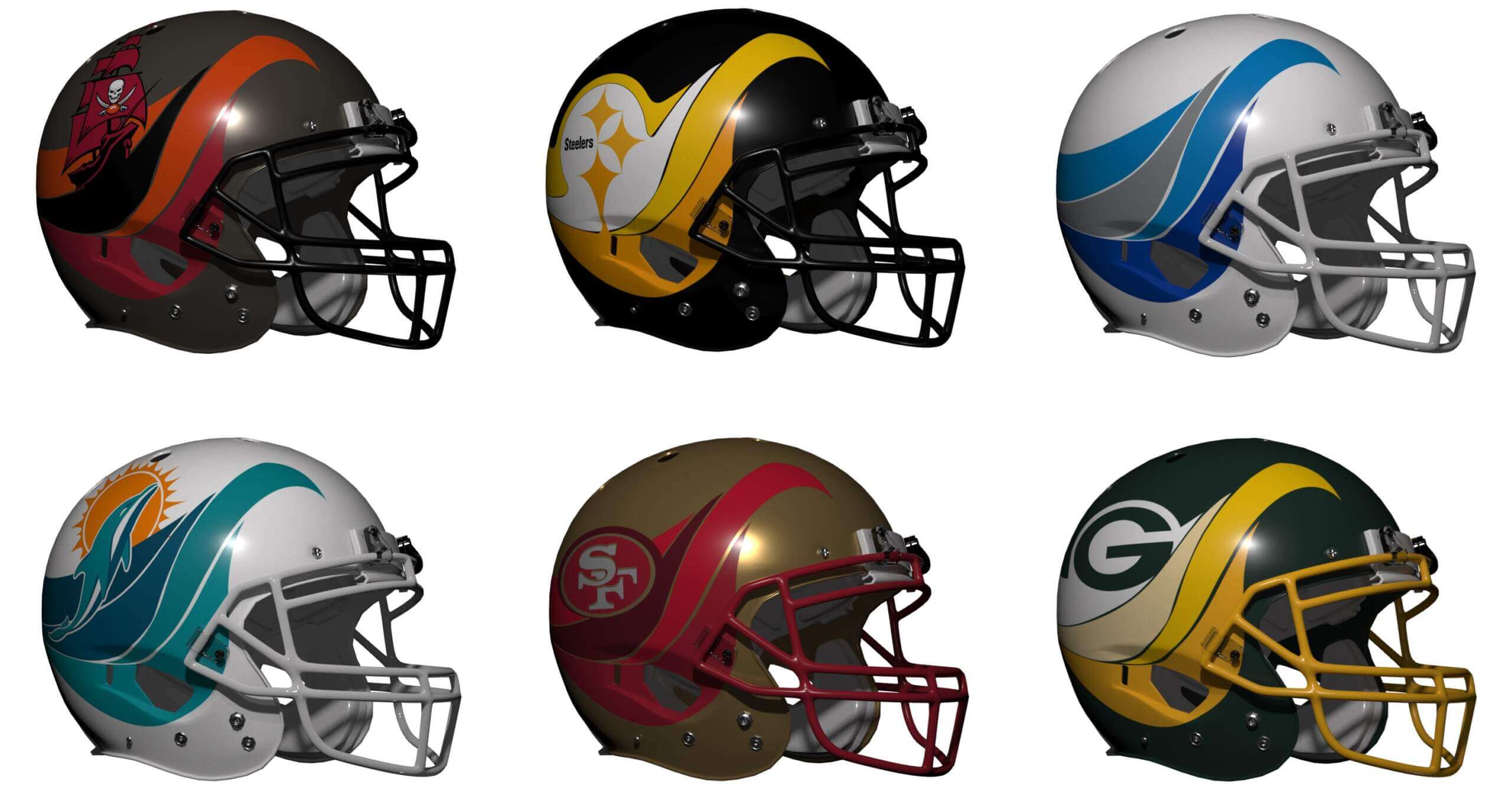
Iconic Uniforms Re-Imagined Part IV: What if All ‘Fluid’ Based Teams Were Like the Boston Breakers? by Chris Diamond
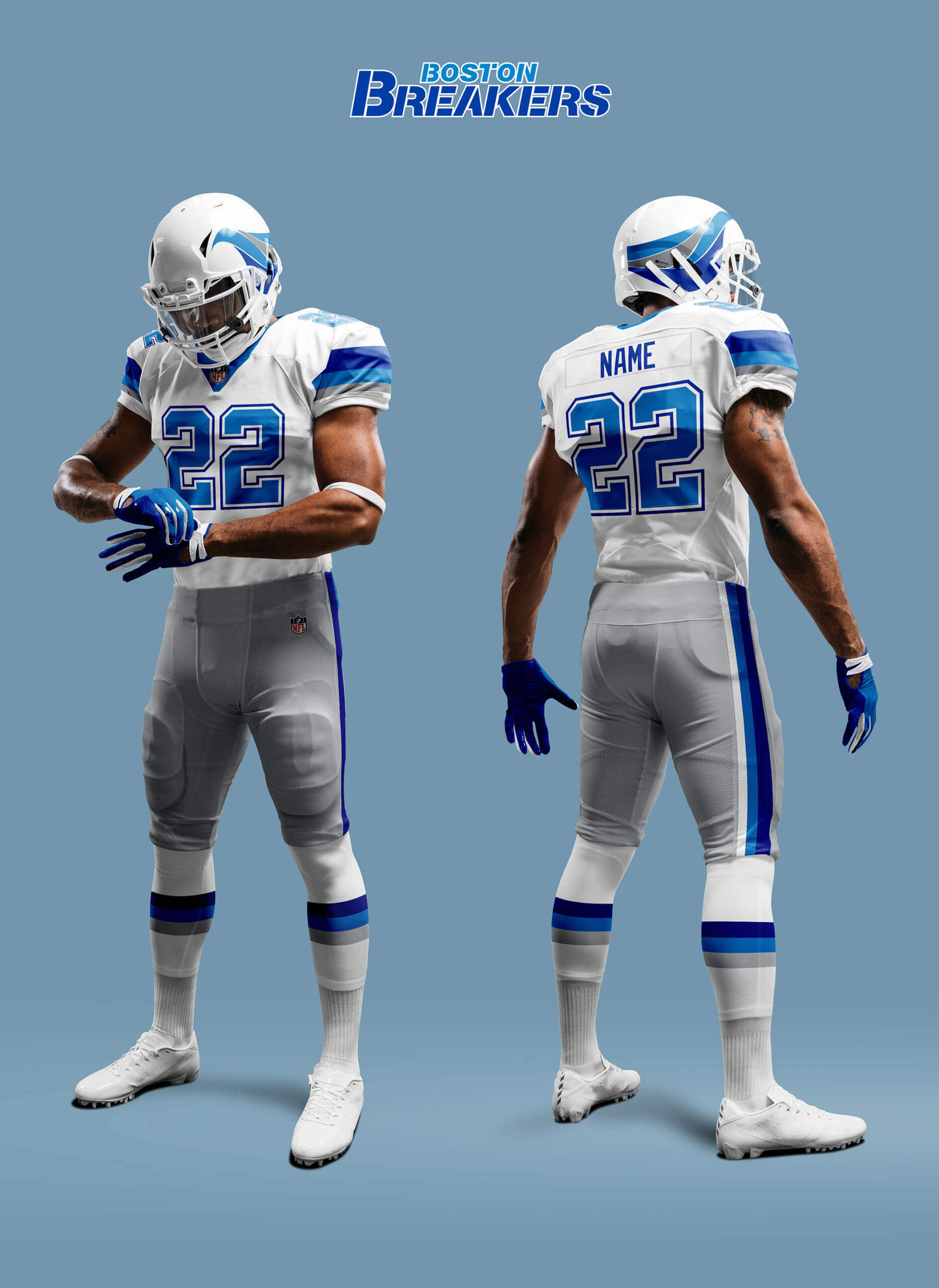
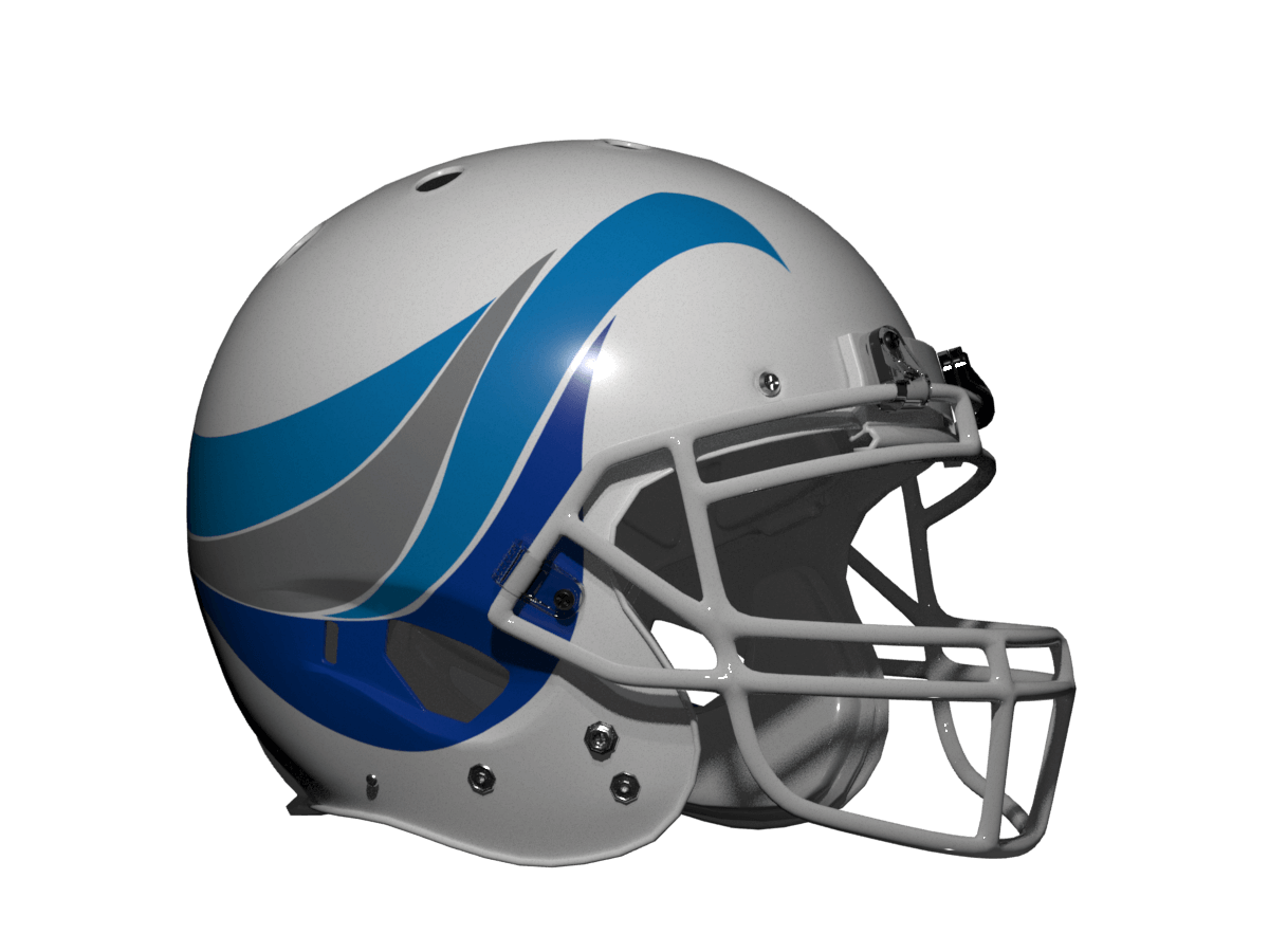
The first three parts of this series looked at NFL ‘Bird’ Teams if they emulated the Eagles, ‘Cat’ Teams if they emulated the USFL Michigan Panthers and ‘Hoof’ teams if they emulated the USFL Jacksonville Bulls. We’ve made our way through all the NFL animal teams now so I’m starting to go slightly left field for my inspiration. This time I’ve chosen another USFL team the Boston Breakers of 1983. The same uniform was worn by the team in New Orleans and Portland, but I always think of them as Boston and have a t-shirt I made (à-la-Vilk) to prove it! Their wave pattern helmet was unique at the time and the rest of the uniform was carefully styled to go with it…apart from the socks which for some reason look like they got the lot from the local Sporting Good Emporium!
Now the NFL has no wave-based teams specifically, so I’ve taken the design to represent any ‘fluid’ based team and gone from there. I’ve also allowed some leeway to allow incorporation of existing team logo elements into the helmet design rather than just change the colours, otherwise they just looked too different. So sounds a bit odd? Well it is, but stick with me and see what you think!
__________
Boston Breakers
The original and my favourite USFL uniform of all-time the Breakers unis were so good that even the USFL2 homage to them was the best uniform in that league. Of the home and away uniforms, the latter is the best (and the one I think they wore the most) so it’s the one I’ve shown here. As mentioned above I have taken a historical liberty and changed the socks because I feel the originals don’t go with the rest of the uni.
__________
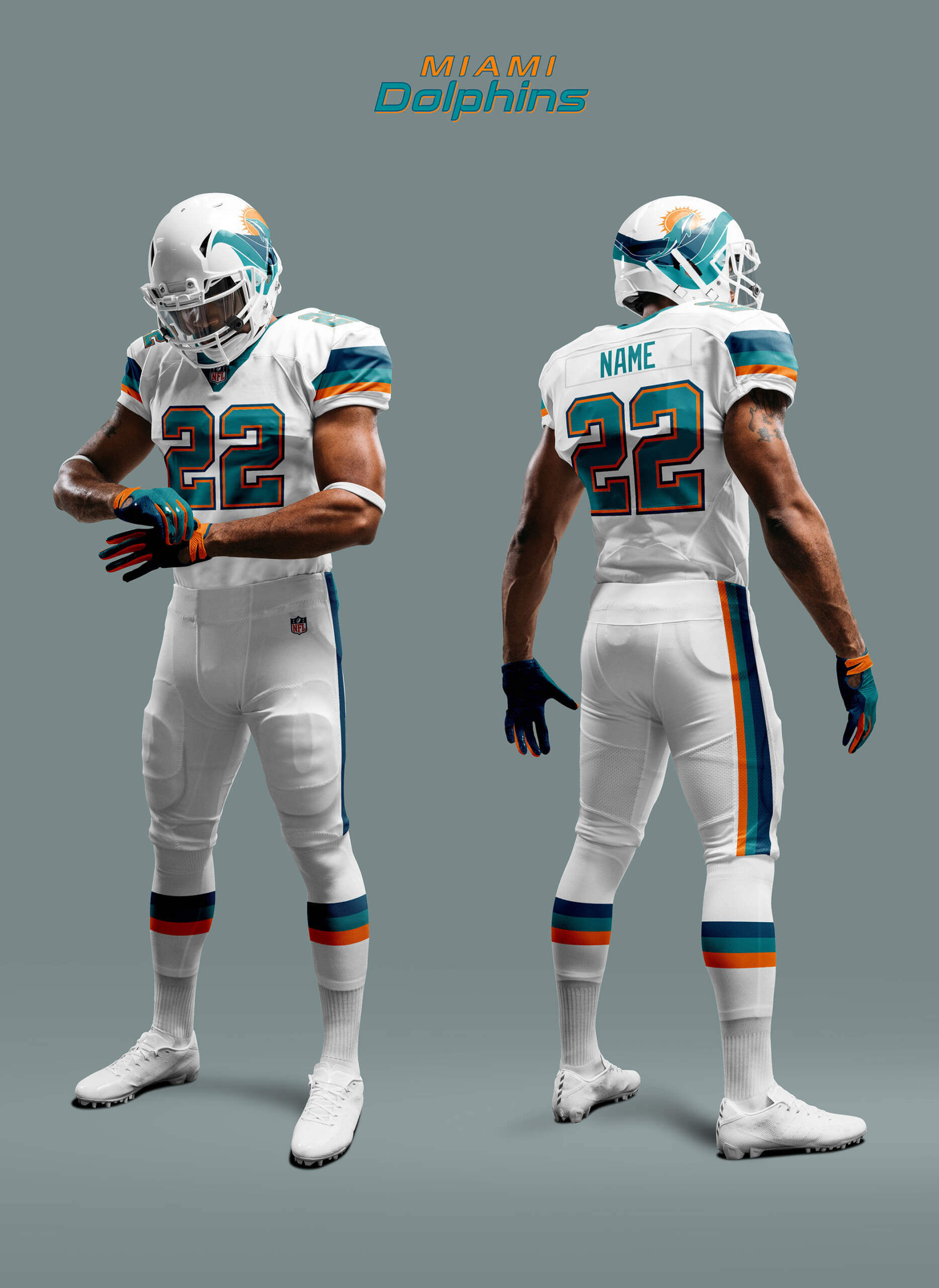
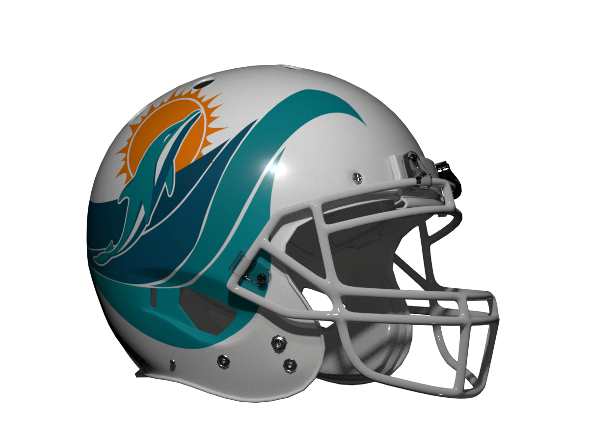
Miami Dolphins
The Dolphin is aquatic so here we can just stick with the sea as the interpretation. I’ve split the Dolphins logo and incorporated both parts into the wave pattern. Colour wise the Dolphins need another colour to fit the template so I’ve used their marine blue as the third colour. I think the template looks just as fabulous in Dolphins colours and I feel it works really well.
__________
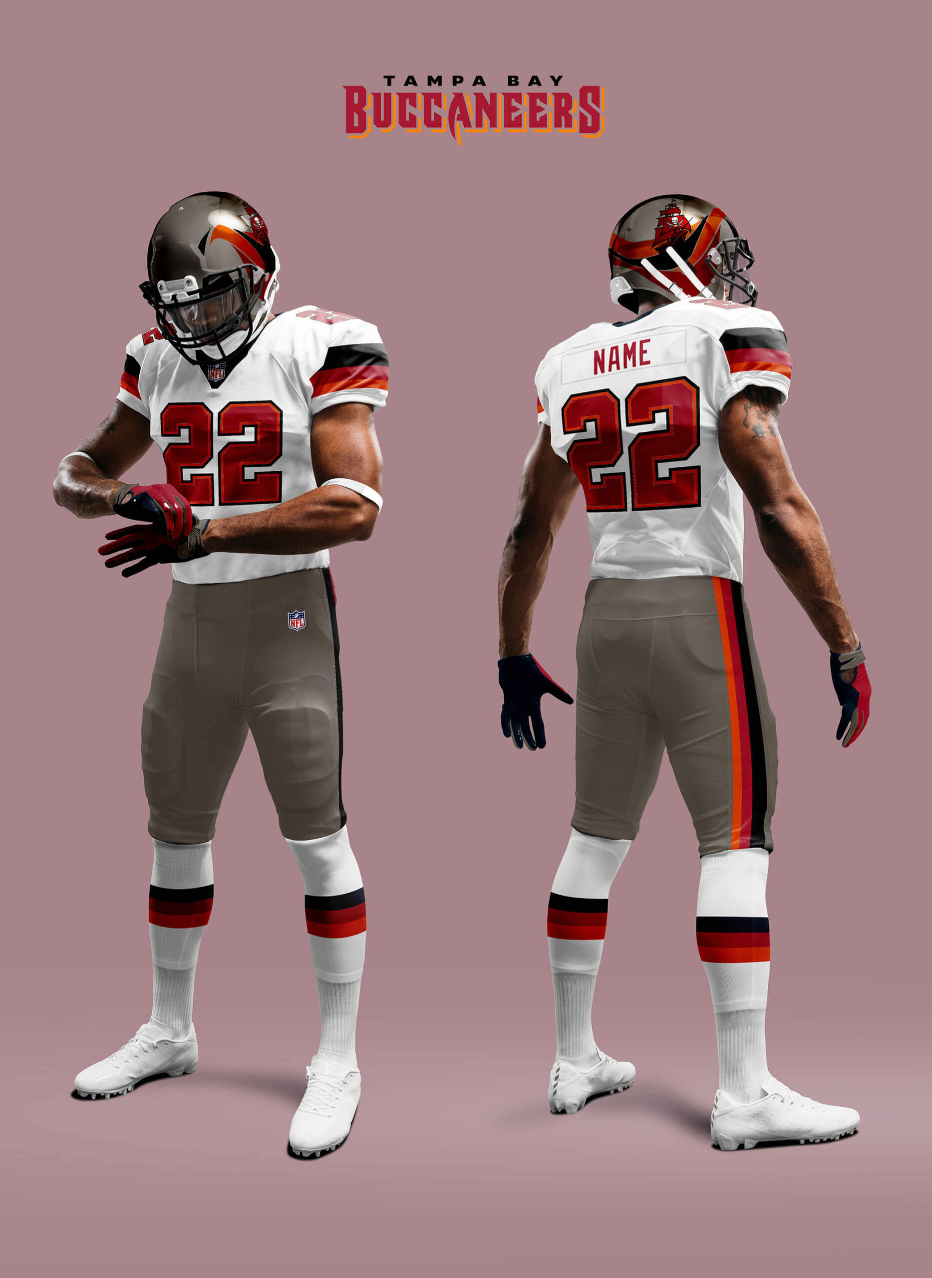
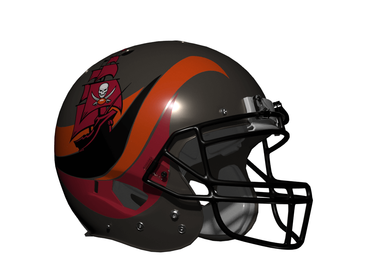
Tampa Bay Buccaneers
The Bucs are sea-born too with a ship alt logo so we’re good again here from that standpoint. But the team colours are definitely non-aquatic so you’ll need to imagine the wave is some kind of late-night sunset ocean view… or perhaps a rum-soaked vision, or perhaps both! Like the Breakers the white jersey works best for the Bucs although there are slight German flag vibes about the stripes! But I’m really pleased how the helmet design came out.
__________
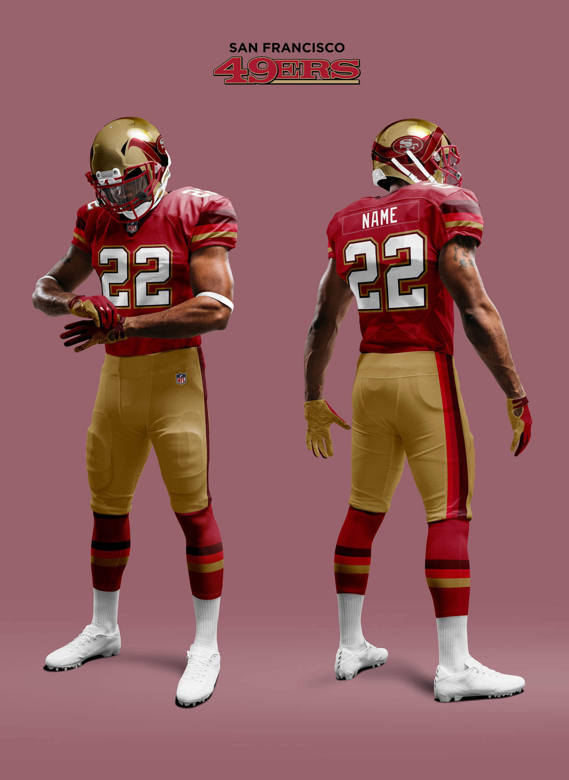
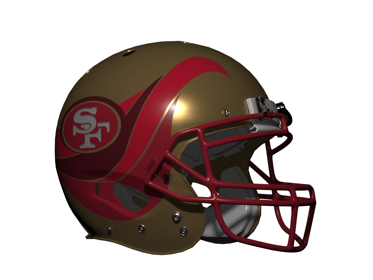
San Francisco 49ers
The 49ers are named after the California Gold Rush where panning for gold was the main way of acquiring it. Some see the Niners oval logo as a prospector gold pan tilted over so that’s the idea I’ve gone with here. The wave represents a river where the panning has stirred the silt up to turn it shades of red. The other thing I’ve done is remove black as a colour and replaced it with a dark red. Black is only a current team colour because of the logo edge, but it shouldn’t be used in the rest of the uni any more than black should be for KC. I’ve also tweaked the logo to make it more pan-like. It won’t please 49er uniform purists, but I like how this came out.
__________
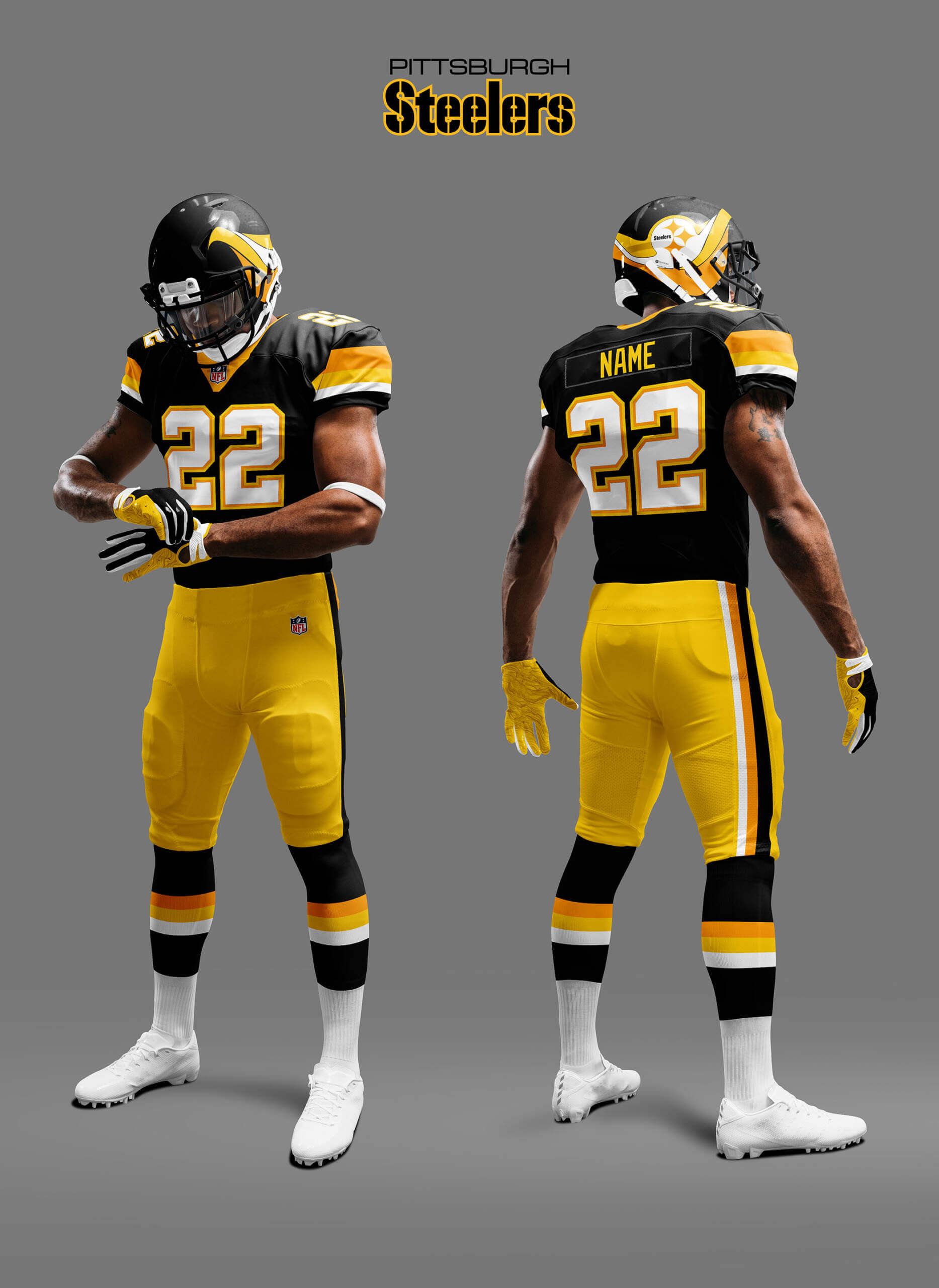
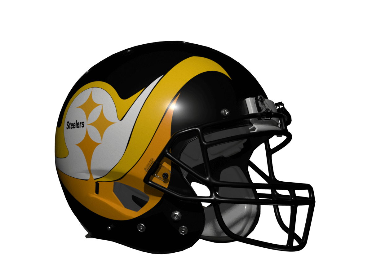
Pittsburgh Steelers
We’ve now run out of water related teams so I need to extend the metaphor a bit. The Steelers colours of Black and Gold always evoke the image of molten steel in a dark foundry so here the wave is meant to represent that with the Steeler logo just in black and gold with the bottom cycloid melting slightly to indicate the heat. Colourwise I’ve just used the different shades of gold the team has had throughout their history. I’m a Steelers fan and I love their current uni design, and although this is very different it still gives me a Steelers vibe.
__________
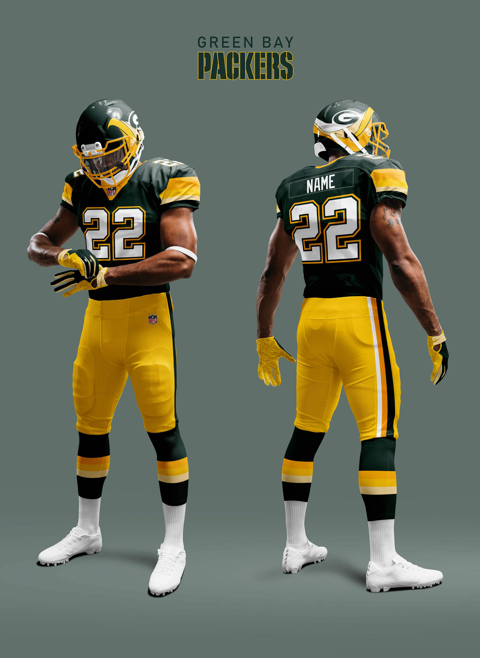
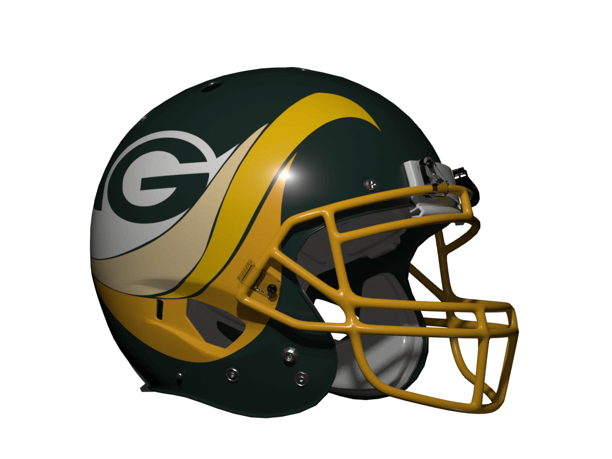
Green Bay Packers
I’ve left the Pack for last because their concept is the most left field. Everyone knows Packer fans are known as Cheeseheads and of course yellow/gold is one of the Packers’ team colours. So for the Packers I’ve made the wave a swirl of melting cheese in a fondue! The G logo becomes a negative space hole in the cheese (apologies for this sounding like one of those Nike marketing stories but at least in this case I started from a concept first rather than retrofitting it). The one consequence of this is I needed to make the helmet green to get some contrast. It’s definitely a stretch, but if the Packers ever want to go ‘All-in’ on the cheese thing I think it looks good :).
• • • • •
Thanks, Chris! Yet another very fun “What if?” segment, and this one definitely has some out-of-the-box-thinking regarding the helmet designs. I was also a big fan of the original USFL Breakers uniforms, though not as much their USFL 2.0 versions (and particularly their 2.0 helmet design). Glad you chose the proper USFL version as the basis for this segment!
Readers? What say you?
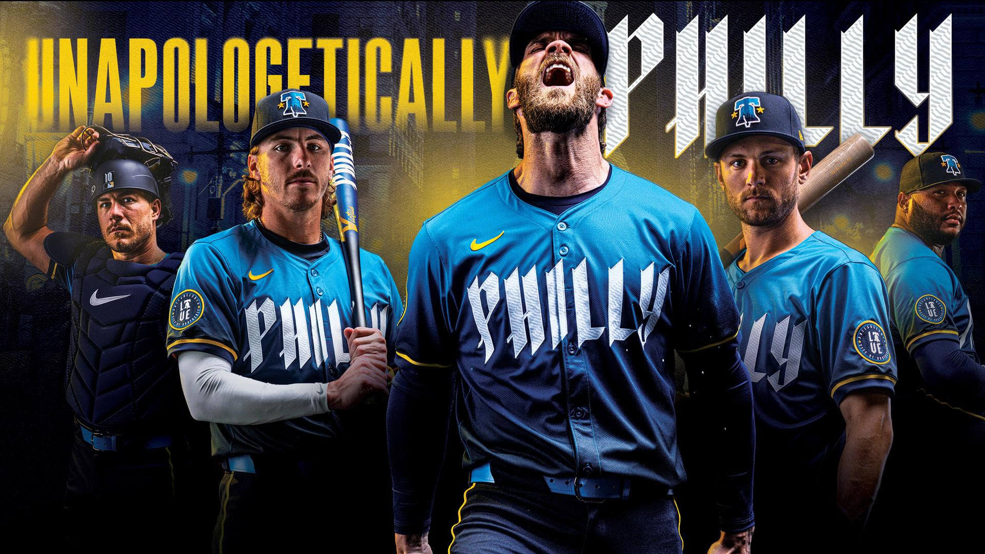
Unapologetically Philly -- How the Phillies Dealt with the Jersey Leak
Three separate readers forwarded to me an e-mail they receive, “Phillies Beat,” by Todd Zolecki (I get similar e-mails from Mets beat writer Anthony DiComo), and the subject of Zolecki’s recent missive was the Phillies new CCs, and the e-mail was titled “How Phils prepped for City Connect unis.” But it went deeper than that, and it’s worth sharing. Enjoy!
• • • • •
How Phils prepped for City Connect unis by Todd Zolecki
For months, Zack Wheeler and his Phillies teammates tried to learn the colors of their City Connect uniforms. They wanted the scoop, not only because they were curious about the look, but because they wanted to order spikes, shoes and accessories for the season.
Very few people had seen the jersey or cap in the weeks before Spring Training. Some had seen mockups, five-second looks from somebody’s phone. But nobody was allowed to say anything. Nobody was supposed to confirm the colors. (They are midnight navy and Neptune blue, by the way.) Nike and the Phillies wanted to keep everything a secret until Friday morning’s unveiling at Citizens Bank Park.
Despite everybody’s best efforts, the jersey leaked anyway in late January.
A jersey with Wheeler’s name and number on the back appeared on eBay. This jersey was completely different than anything anybody had ever seen. It had “PHILLY” on the front in white letters. It was dark and light blue with yellow letters and numbers on the back.
It didn’t take long for Phillies fans and uniform junkies to speculate that this was the Phillies’ City Connect jersey. They were correct, although the club never commented on it.
Bryson Stott texted Wheeler that morning to tell him the news.
“Good job,” Stott said. “Way to post it on eBay. You could have posted it on Facebook and nobody would have seen it.”
How did it happen?
It is a tale that started at sea.
Container ships from around the world arrive every day up and down the East Coast, including PortMiami. Once the ships dock, the shipping containers are placed on land. Later, the goods inside those containers are removed.
Sometimes, somebody opens a box inside one of the containers and grabs a bottle of cologne, a watch, a sweater.
Sometimes they snag a jersey.
They only take one, because almost nobody will notice or care if one bottle of cologne, one watch, one sweater, one jersey, etc., goes missing.
The Phillies heard that somebody at PortMiami had grabbed a Phillies City Connect jersey from a box, not knowing the significance of it. The person took the item home, plopped it on their kitchen counter, snapped a photo and posted it on eBay.
If this person had opened a different box and grabbed a Wheeler powder-blue jersey instead, nobody would have been the wiser.
But everybody noticed, including the authorities, presumably.
Whoops.
But at least it gave Wheeler and his teammates more time to order their gear for the first City Connect game on Friday.
“It’s good we saw it,” Wheeler said. “It gave us a head start.”
• • • • •
And that’s how the Phillies City Connect leak came to be…with the (random?) theft of a jersey by a thief who probably had no inclination of its significance.
Fascinating! (Thanks to all who shared!!!!)
And Now a Few Words from Paul
Hello, weekend readers! In case you missed it, my Substack article this week is an interview with former Nike art director Tom Andrich, and it’s quite simply the best interview in Uni Watch’s 25-year history. Unfolding over the course of a whopping 8,000 words, it includes Andrich’s thoughts on working with NFL team owners, dealing with fan feedback, doing things “the Nike way,” balancing innovation vs. aesthetics, creating those alarm clock numbers for the Bucs, and a lot more. Packed with behind-the-scenes insider info and previously unpublished graphics, it’s essential reading.
But don’t take my word for it. Here are some of the comments that readers have posted in response to this piece:
“Paul, your time at Uni Watch is closing in spectacular style. You’re doing some of the best work I’ve read in my 20 years following Uni Watch right here at the end of an era.”
“Spectacular interview. Fascinating insight into how Nike works and great to have a human face to go with that.”
“25 years! And as soon as you are about to be done with it, you go and land an interview like this!!!?? This was definitely my favorite NFL piece you have ever managed to do! Thank you for this in depth look into the mind of a former Nike designer!”
“Great interview. Honestly have been hedging on the Substack for a long time and stuff like this makes it worth it.”
“That was great Paul!! So many insights and overall an honest and revealing conversation.”
“Wow, this was a fantastic interview. Really fascinating to see the insider approach, and also how much weight the league and teams really have on all of this, too.”
“This is amazing work, Paul, and explains so much about the state of things in professional (and college) sports.”
“Spectacular interview. Uni Watch is going out on the highest of high notes! You are doing some of the best work I’ve ever read. Well done, sir!”
“This is phenomenal.”
I could go on, but you get the idea. This is a special piece.
Based on the suggestion of long-time reader/contributor Jimmy Corcoran, we’ve introduced a new “game” on Uni Watch, which is similar to the popular “Guess the Game from the Scoreboard” (GTGFTS), only this one asked readers to identify the game based on the uniforms worn by teams.
Like GTGFTS, readers will be asked to guess the date, location and final score of the game from the clues provided in the photo. Sometimes the game should be somewhat easy to ascertain, while in other instances, it might be quite difficult. There will usually be a visual clue (something odd or unique to one or both of the uniforms) that will make a positive identification of one and only one game possible. Other times, there may be something significant about the game in question, like the last time a particular uniform was ever worn (one of Jimmy’s original suggestions). It’s up to YOU to figure out the game and date.
Today’s GTGFTU comes from Jimmy Corcoran himself!
Good luck and please post your guess/answer in the comments below.
Uni Tweet of the Day
This is some Uni Watch level of attention to the smallest details!
In the last year of the AFL (1969), the @Broncos made one more uniform change, albeit a more subtle change than the previous ones. They moved to vinyl heat pressed numbers with a heavy rubber consistency. The previous numbers were sewn on tackle twill. They also increased the… pic.twitter.com/z6l2VMnAts
— DenverBroncos QBClub (@BroncosQBClub) April 6, 2024
And finally...
…that’s a wrap for today. Big thanks, as always, to Chris Diamond for this very fun and interesting series!
Everyone have a great week — and if you’re in or near the path of totality, enjoy tomorrow’s eclipse! I’m in about the “90%” range, so not a total eclipse for me, but still should be pretty cool if the weather cooperates. I even spent $2.50 at 7-11 for a pair of cardboard eclipse viewing glasses. Definitely don’t wanna end up like this guy.
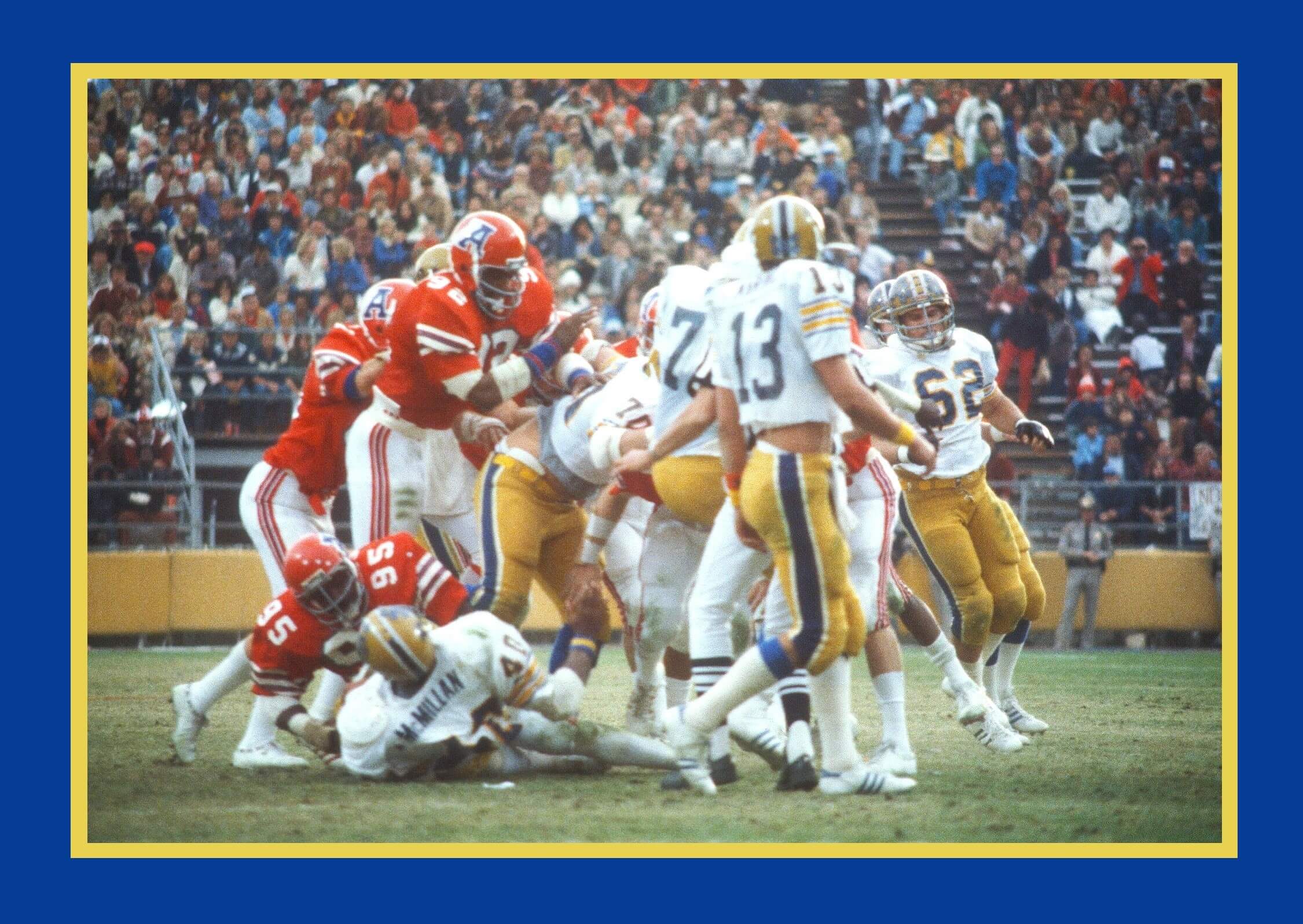
GTGFTU
Dan Marino’s first bowl game, the 1979 Fiesta Bowl. Pitt vs Arizona.
Both teams never looked better.
Akron would go on to emulate that motion A logo, adding some streaks to it.
I agree Jimmer! both teams looked great, but this was the last game for Arizona in these uniforms. The next season they went with what were basically practice jerseys and changed the A on the helmet. These jerseys would not be seen again until 1984, when the girls wore them in the spring fling skit in the movie Revenge of the Nerds, filmed on Arizona’s campus.
When I first saw this on my teesy-weeny cell phone screen (and knowing you made the submission) I thought it might have been the 10/30/74 (a Wednesday!) Bell/Fire game at JFK…and was sure there was going to be a King story to follow.
Who can forget when the Fire came to JFK! They Bell beat the Fire but the Fire beat the crap out of the King. To make matters worse, while soaking in the tub in the hotel room, my mother told him to get a bigger jersey, that he looked fat in his uniform. He smashed all the mirrors with a hair dryer over that comment. The King never took negative comments about his weight very well.
He didn’t like being thought of as King Sized?
No, he had a bad complex about his height and weight, Ron Waller would always tell him he was too fat for a QB. My father had a diet very similar to Elvis, ice cream, cake, soda, yoohoo, he truly was the carb King. Then when you tell him he has to lose weight, it puts him in a bad mood for two days. He was 6’0 tall but always looked a lot shorter because he was overweight his whole career.
Very interesting looks today with the Breakers treatment.
That Dolphins one is a real improvement over their current helmet! I still prefer the original logo with the helmeted dolphin, but this would be my second choice. Very nice.
Thanks Jimmer! I know you’re a big fan of the USFL so I hoped you would appreciate some of these :)
Fun! Always loved those Boston Breakers helmets
Thanks Kevin!
Todd ZOLECKI, not Zelecki or Zalecki.
Ugh. Fixed.
Given the post about the Angels player, you could have used the Browns as another fluid based team.
Bathroom humor could have won the day!
Just….. no! The Browns are in the final part coming up with *another* theme..
Love the theme of the concept package. It 1000% works for the Dolphins but the others are intriguing, even if they challenge 3 of the NFL’s most “untouchable” looks (49ers, Packers, Steelers).
Thanks MJ! I’ve already said as a Steeler fan I like their treatment, but, it would be interesting to hear what other fans of those teams think.
Upon my third viewing, I just realized the logo is on the right side only, as always.
Did you consider having the wave of molten steel cresting only on the right side as well?
No, I decided the wave *had* to go around the helmet. The Steelers’ logo being right-side only is what is key.
This installment of Chris’ “What If” series is one I’ve been waiting for – and oh boy was it worth the wait! Great work again!
The Breakers chassis translates really well on these teams (I’d say it’d work well for all NFLers-YMMV on that), even on the classics sets that should never be tampered with further (GB, PGH, or it it PIT?, SF). My only gripe is the incorporation of the logos on the helmets – keep the wave pattern in team colors, and if the logos are a must-have feature, slap ‘em on the sleeves…or the hips?
Thanks Chris, I thought you would like this one :) Yes, it was a tricky call about using the team logos on the helmets. What you suggested about just using them on the sleeves, or front if you wanted to keep the template as “pure” as possible, was my second option. I didn’t want to *just* add the logo so I experimented a bit to see if I could come up with ways to transform them that made sense in terms of what the fluid was. Because I managed to come up with concepts I liked I decided to go that way in the end.
Since the Dolphins aren’t going to use their gorgeous throwbacks as their regular unis, Mr. Diamond’s Breakers treatment on the Dolphins would be a terrific substitution as it is 1000% better than what they’re currently wearing.
Thanks Paul! I am one of the few people who actually likes the Dolphins current unis, but I do prefer this design :)
You’re not alone Chris. I too prefer the latest iteration of the Dolphins unis. Smooth and sleek, not clunky like the old ones.
I had never heard of the SF oval logo being compared to a gold pan but I guess that’s a thing. I learned something new today! Also, the Seahawks helmet could have been maybe kinda shoehorned into this exercise since they have a wraparound logo.
Agree about the modernized Miami look!
What If segment was great as always. Was just showing my son the Breakers uniforms Thursday night while watching UFL. I remember being young enough when the USFL began that I was excited to finally have a pro team in my state (Arizona Wranglers) but I couldn’t understand yet why they didnt play the Cowboys, Packers, Browns etc.
That was technically my first pro football game I got to go to. Arizona Wranglers vs Chicago Blitz in 1983.
I was a little surprised the Raiders didn’t make an appearance!
Thanks Jason! Interesting to hear from someone who saw the original USFL live. I remember seeing Doug Flutie in a NJ Generals uni on the cover of a magazine in the UK in 1985 as a child and immediately thinking “Whoa, what team is that?!” At the time TV coverage over here was NFL only and I had no idea that the USFL even existed up to that point!
You didn’t see the Stars and Bandits at Wembley in 1984…one week after the Stars won the championship?
It’s not too late to enjoy it now! link
I lived in very rural Dorset at the time and things like that passed us by!
I don’t normally comment on any concepts (at least not in the main article), but I’m going to make one exception here.
I absolutely LOVE LOVE LOVE the Dolphins helmet treatment and would support its immediate use (at least until the team comes to its senses and makes the throwbacks the permanent home/road).
It’s also the only one of Chris’ concepts to use a gray mask, which makes it even more awesome.
Wow, thanks Phil! I think that is the one that came out best and where the existing logo fits straight in with the wave perfectly.
Love the Dolphins, and like the Bucs, even though I’d have rather seen it with the Creamsicle. However, the last 3 make no sense, those I give you credit for the creativity of trying the fit them into this theme.
Thanks RICK! Yes the two Florida teams go best with the wave logo but I like I said this one is a bit left field for the rest! I think the scheme would also look good in creamsicle for the Bucs, but the ship logo is not from that era so it didn’t feel right.
Echoing here how good the Fish and Bucs look. Although it doesn’t follow the template, I’d make the three stripes white on the Niners uniform (with some daylight between stripes of course). But that is the purist coming out in me.
Really fun concept. I like that it’s out there in left field.
Thanks, Matt! Yes, the Niners three stripes has become one of those things that defines them. So much so that they restored them to uniform a few years ago after the bottom one sort of dropped off the end of the sleeve!
I always thought the Raiders were swashbuckling pirates of the… well, the desert, now.
I was thinking the same thing!
Chris, can you do a Raiders version for us?
Did you consider it and then pass up?
Please reply. :-)
For the Packers, you could also make the argument that there is “fluid” in Green Bay. So, two ways to explain how they fit into this group?
That’s true Dave! And if I’d just been using the template without trying to come up with metaphors for the wave pattern that match team identity and colours then it would have done. In fact that would have made my job a lot easier!
Of all Chris’ “One Size Fits All” projects, this one is soup-to-nuts the strongest. The Dolphins would be proud to wear those uniforms; they totally work! Even the teams with sacrosanct images (SF, GB, PGH) are strong, vibrant and use color well. It makes me wish there were new teams to wear them!
Thanks walter! It’s definitely a good day in design-land when something pleases you entirely :) I think it also shows how amazing the original uniform design is that it can be applied to multiple teams without seeming boring or repetitive. It would be amazing to discover who designed it and whether they designed any other unis. Unlike the World League I don’t think there was an over-arcing design strategy for the USFL. According to this link it was designed by Sand-Knit but that’s as far as it goes.
Like everyone else, I agree with the Dolphins helmet and uniforms. Great concept Chris D, they could wear those on the field this upcoming season and would look amazing. When the stripes are done properly, white socks look great with white pants.
Love your “what ifs” and your creativity, Chris. Keep them coming!
Both Miami and the Bucs should seriously think about adopting these helmets.
Love this set! Have to say, my favourite is Tampa as their first logo was awful (sorry everyone) and the current one is too generic. This capturing the pirate ship coming over the wave is brilliant. (but in creamsicle colours??)
I like using this idea on my team – the 49ers, but they have had red lids in the past, so I was expecting a red lid with a wave of liquid gold (maybe different shades of gold) and no logo, with that dropping to sleeve? Not primary status, but this would make a much better alt than the boring fauxbacks or that awful black third they had.
Really enjoying this whole series!
Motion to have a “What if all NFL, UFL, Arena, and Division 1-A College teams were like Penn State?” article.
Well there is something like that in the works John :)


GTGFTU
Dan Marino’s first bowl game, the 1979 Fiesta Bowl. Pitt vs Arizona.
Both teams never looked better.
Akron would go on to emulate that motion A logo, adding some streaks to it.
I agree Jimmer! both teams looked great, but this was the last game for Arizona in these uniforms. The next season they went with what were basically practice jerseys and changed the A on the helmet. These jerseys would not be seen again until 1984, when the girls wore them in the spring fling skit in the movie Revenge of the Nerds, filmed on Arizona’s campus.
When I first saw this on my teesy-weeny cell phone screen (and knowing you made the submission) I thought it might have been the 10/30/74 (a Wednesday!) Bell/Fire game at JFK…and was sure there was going to be a King story to follow.
Who can forget when the Fire came to JFK! They Bell beat the Fire but the Fire beat the crap out of the King. To make matters worse, while soaking in the tub in the hotel room, my mother told him to get a bigger jersey, that he looked fat in his uniform. He smashed all the mirrors with a hair dryer over that comment. The King never took negative comments about his weight very well.
He didn’t like being thought of as King Sized?
No, he had a bad complex about his height and weight, Ron Waller would always tell him he was too fat for a QB. My father had a diet very similar to Elvis, ice cream, cake, soda, yoohoo, he truly was the carb King. Then when you tell him he has to lose weight, it puts him in a bad mood for two days. He was 6’0 tall but always looked a lot shorter because he was overweight his whole career.
Very interesting looks today with the Breakers treatment.
That Dolphins one is a real improvement over their current helmet! I still prefer the original logo with the helmeted dolphin, but this would be my second choice. Very nice.
Thanks Jimmer! I know you’re a big fan of the USFL so I hoped you would appreciate some of these :)
Fun! Always loved those Boston Breakers helmets
Thanks Kevin!
Todd ZOLECKI, not Zelecki or Zalecki.
Ugh. Fixed.
Given the post about the Angels player, you could have used the Browns as another fluid based team.
Bathroom humor could have won the day!
Just….. no! The Browns are in the final part coming up with *another* theme..
Love the theme of the concept package. It 1000% works for the Dolphins but the others are intriguing, even if they challenge 3 of the NFL’s most “untouchable” looks (49ers, Packers, Steelers).
Thanks MJ! I’ve already said as a Steeler fan I like their treatment, but, it would be interesting to hear what other fans of those teams think.
Upon my third viewing, I just realized the logo is on the right side only, as always.
Did you consider having the wave of molten steel cresting only on the right side as well?
No, I decided the wave *had* to go around the helmet. The Steelers’ logo being right-side only is what is key.
This installment of Chris’ “What If” series is one I’ve been waiting for – and oh boy was it worth the wait! Great work again!
The Breakers chassis translates really well on these teams (I’d say it’d work well for all NFLers-YMMV on that), even on the classics sets that should never be tampered with further (GB, PGH, or it it PIT?, SF). My only gripe is the incorporation of the logos on the helmets – keep the wave pattern in team colors, and if the logos are a must-have feature, slap ‘em on the sleeves…or the hips?
Thanks Chris, I thought you would like this one :) Yes, it was a tricky call about using the team logos on the helmets. What you suggested about just using them on the sleeves, or front if you wanted to keep the template as “pure” as possible, was my second option. I didn’t want to *just* add the logo so I experimented a bit to see if I could come up with ways to transform them that made sense in terms of what the fluid was. Because I managed to come up with concepts I liked I decided to go that way in the end.
Since the Dolphins aren’t going to use their gorgeous throwbacks as their regular unis, Mr. Diamond’s Breakers treatment on the Dolphins would be a terrific substitution as it is 1000% better than what they’re currently wearing.
Thanks Paul! I am one of the few people who actually likes the Dolphins current unis, but I do prefer this design :)
You’re not alone Chris. I too prefer the latest iteration of the Dolphins unis. Smooth and sleek, not clunky like the old ones.
I had never heard of the SF oval logo being compared to a gold pan but I guess that’s a thing. I learned something new today! Also, the Seahawks helmet could have been maybe kinda shoehorned into this exercise since they have a wraparound logo.
Agree about the modernized Miami look!
What If segment was great as always. Was just showing my son the Breakers uniforms Thursday night while watching UFL. I remember being young enough when the USFL began that I was excited to finally have a pro team in my state (Arizona Wranglers) but I couldn’t understand yet why they didnt play the Cowboys, Packers, Browns etc.
That was technically my first pro football game I got to go to. Arizona Wranglers vs Chicago Blitz in 1983.
I was a little surprised the Raiders didn’t make an appearance!
Thanks Jason! Interesting to hear from someone who saw the original USFL live. I remember seeing Doug Flutie in a NJ Generals uni on the cover of a magazine in the UK in 1985 as a child and immediately thinking “Whoa, what team is that?!” At the time TV coverage over here was NFL only and I had no idea that the USFL even existed up to that point!
You didn’t see the Stars and Bandits at Wembley in 1984…one week after the Stars won the championship?
It’s not too late to enjoy it now!
link
I lived in very rural Dorset at the time and things like that passed us by!
I don’t normally comment on any concepts (at least not in the main article), but I’m going to make one exception here.
I absolutely LOVE LOVE LOVE the Dolphins helmet treatment and would support its immediate use (at least until the team comes to its senses and makes the throwbacks the permanent home/road).
It is absolutely perfect.
link
It’s also the only one of Chris’ concepts to use a gray mask, which makes it even more awesome.
Wow, thanks Phil! I think that is the one that came out best and where the existing logo fits straight in with the wave perfectly.
Love the Dolphins, and like the Bucs, even though I’d have rather seen it with the Creamsicle. However, the last 3 make no sense, those I give you credit for the creativity of trying the fit them into this theme.
Thanks RICK! Yes the two Florida teams go best with the wave logo but I like I said this one is a bit left field for the rest! I think the scheme would also look good in creamsicle for the Bucs, but the ship logo is not from that era so it didn’t feel right.
Echoing here how good the Fish and Bucs look. Although it doesn’t follow the template, I’d make the three stripes white on the Niners uniform (with some daylight between stripes of course). But that is the purist coming out in me.
Really fun concept. I like that it’s out there in left field.
Thanks, Matt! Yes, the Niners three stripes has become one of those things that defines them. So much so that they restored them to uniform a few years ago after the bottom one sort of dropped off the end of the sleeve!
I always thought the Raiders were swashbuckling pirates of the… well, the desert, now.
I was thinking the same thing!
Chris, can you do a Raiders version for us?
Did you consider it and then pass up?
Please reply. :-)
For the Packers, you could also make the argument that there is “fluid” in Green Bay. So, two ways to explain how they fit into this group?
That’s true Dave! And if I’d just been using the template without trying to come up with metaphors for the wave pattern that match team identity and colours then it would have done. In fact that would have made my job a lot easier!
Of all Chris’ “One Size Fits All” projects, this one is soup-to-nuts the strongest. The Dolphins would be proud to wear those uniforms; they totally work! Even the teams with sacrosanct images (SF, GB, PGH) are strong, vibrant and use color well. It makes me wish there were new teams to wear them!
Thanks walter! It’s definitely a good day in design-land when something pleases you entirely :) I think it also shows how amazing the original uniform design is that it can be applied to multiple teams without seeming boring or repetitive. It would be amazing to discover who designed it and whether they designed any other unis. Unlike the World League I don’t think there was an over-arcing design strategy for the USFL. According to this link it was designed by Sand-Knit but that’s as far as it goes.
Like everyone else, I agree with the Dolphins helmet and uniforms. Great concept Chris D, they could wear those on the field this upcoming season and would look amazing. When the stripes are done properly, white socks look great with white pants.
Love your “what ifs” and your creativity, Chris. Keep them coming!
Both Miami and the Bucs should seriously think about adopting these helmets.
Love this set! Have to say, my favourite is Tampa as their first logo was awful (sorry everyone) and the current one is too generic. This capturing the pirate ship coming over the wave is brilliant. (but in creamsicle colours??)
I like using this idea on my team – the 49ers, but they have had red lids in the past, so I was expecting a red lid with a wave of liquid gold (maybe different shades of gold) and no logo, with that dropping to sleeve? Not primary status, but this would make a much better alt than the boring fauxbacks or that awful black third they had.
Really enjoying this whole series!
Motion to have a “What if all NFL, UFL, Arena, and Division 1-A College teams were like Penn State?” article.
Well there is something like that in the works John :)