Welcome back to the “2+3+2 (+2)” project. Today is the final entry.
Click to see: AFC East
Today we’ll tackle the NFC West.
If you want to see the genesis of how this project came about, please refer to the AFC East post.
To sum up, the project parameters are the following:
• All teams will have 2 helmets, 3 jerseys, 2 pants and 3 socks
• All uniform elements will be “interchangeable” (any combinations can be worn)
• Some teams will be given two options: current uniform and throwback (or fauxback/alternate)
• Opposing teams will wear different color elements (helmet/jersey/pant/socks)
• Home team will select its color combo, and away team will then select its combos. No elements can match opposing team
• To the extent possible, uniforms will be based on a team’s current available options. Where no such options exist, they will be created such that every team has 2/3/2/3 options.
• Where present home and road (and/or alternate) uniform template designs differ, they will be “streamlined” to have one single format/style in the 2/3/2/3 parameters
• Color vs. color will be permitted. The only exception is only one team can wear its “dark” jersey (the opponent can pair their color “medium” jersey vs. opponent’s “dark” jersey)
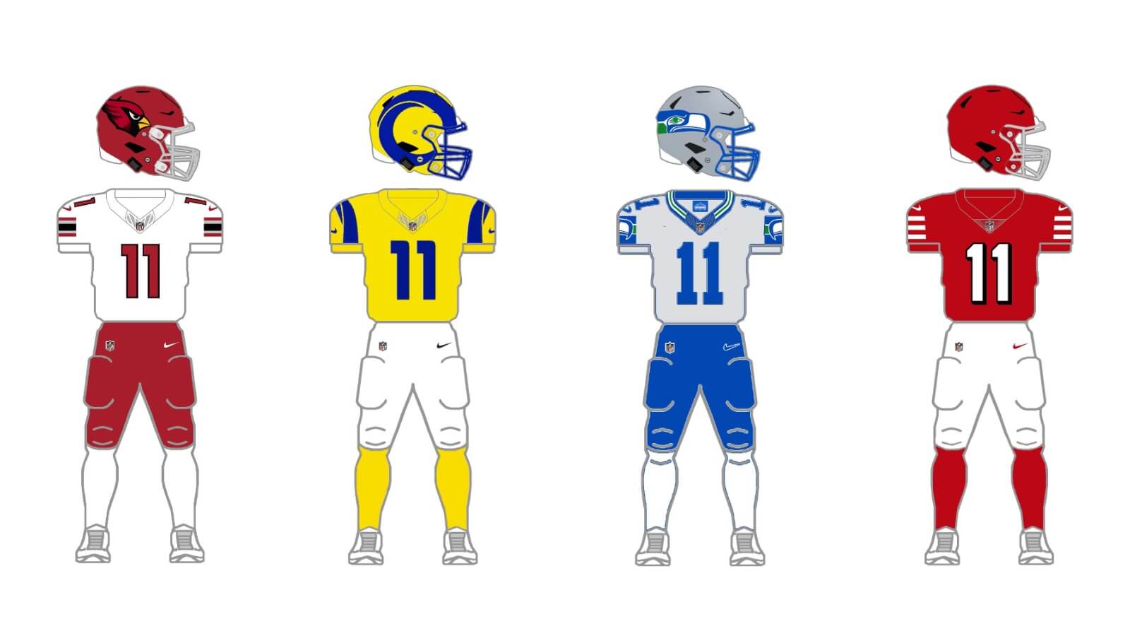
NFC West
ARIZONA CARDINALS
The Cardinals (finally) got new uniforms this year, and most of us agree, they’re pretty terrible. So far, the team hasn’t worn anything but mono (be it bloodclot, all-white, or mono-black). Most of us also agree, their all-white set has potential (and the all-black has gotta go). Obviously, it’s way too early to start thinking about throwbacks, but I’m gonna go there anyway. Although the team, with the new set, have all the options they need to go 2/3/2/3, the black elements — other than striping — will be jettisoned. The team also introduced a new color — silver/gray — so we’ll use that instead of black.
Current uniform
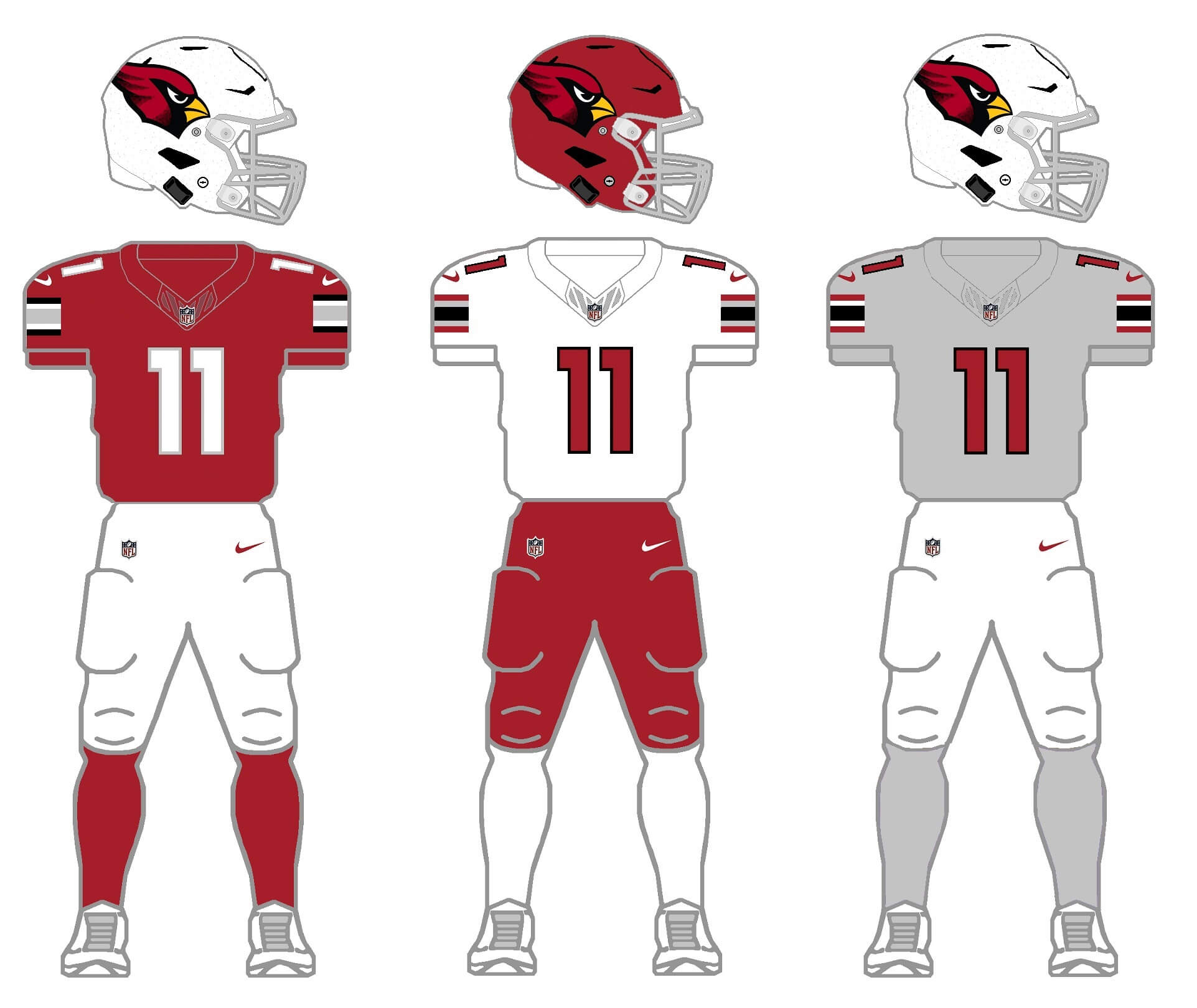
There are many problems with the new set, but the most egregious is the team’s insistence on going mono. They’ll still have that option, but the team looks much better when jerseys and pants don’t match. The first change I made was to remove the ginormous “ARIZONA” wordmark on the red jersey. The striping pattern found on the white (and black) jersey and pants are actually pretty nice, so we’ll use that across the board. The team has had a white helmet since the late 1950s, but when they played in Chicago, the team did use a red shell, so I’ve added that to the mix here. And for the third jersey/socks color, I’ve used the new silver/gray. It’s amazing how much better (and with just a few tweaks) this new uniform looks with proper striping and a mix/match of colors.
Throwback uniform
As noted above, the Cardinals probably don’t need a throwback uniform, but I created one based on their final years in St. Looey.
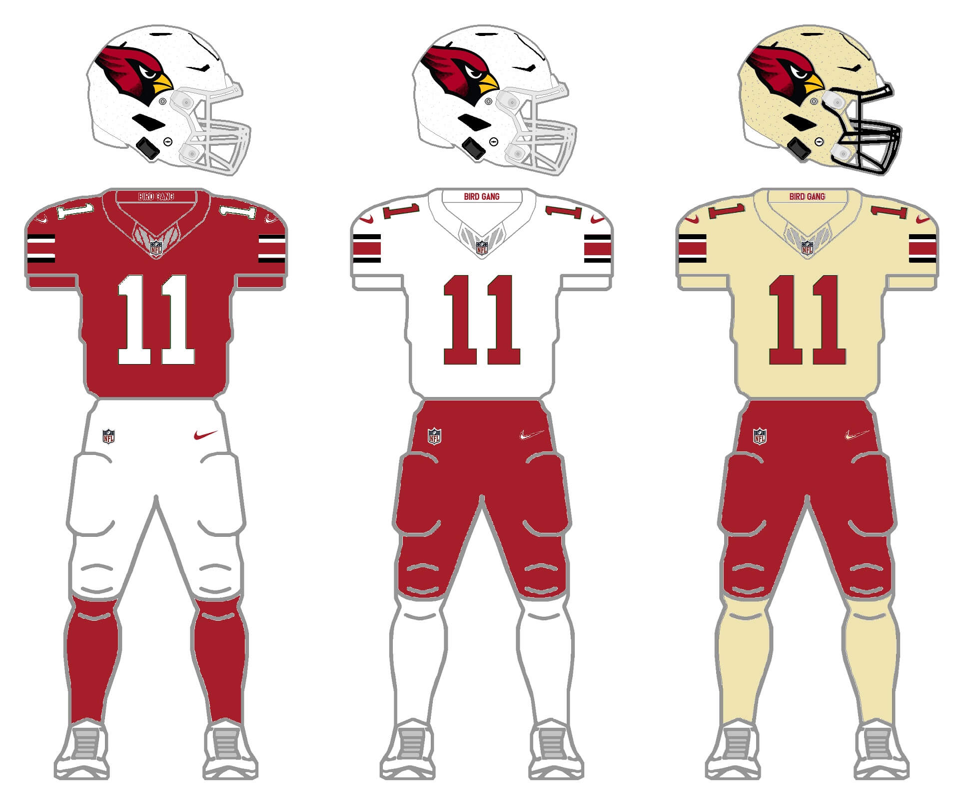
These aren’t all that different from the tweaks I gave to the current set, but the standard block numbers and removal of the silver (which was not present) are the biggest changes … except for the third color. I didn’t want to use black, so instead I created a helmet, jersey and socks in a pleasing “desert” sand color, which I actually think works quite well. I’d never want to actually see them in this (the Cards are red and white!), but in order to fit the 2/3/2/3 format, I went with it.
SAN FRANCISCO 49ERS
The Niners have both a classic current uniform and a fauxback (in both red and white versions) so we’ll give them two sets here.
Current uniform
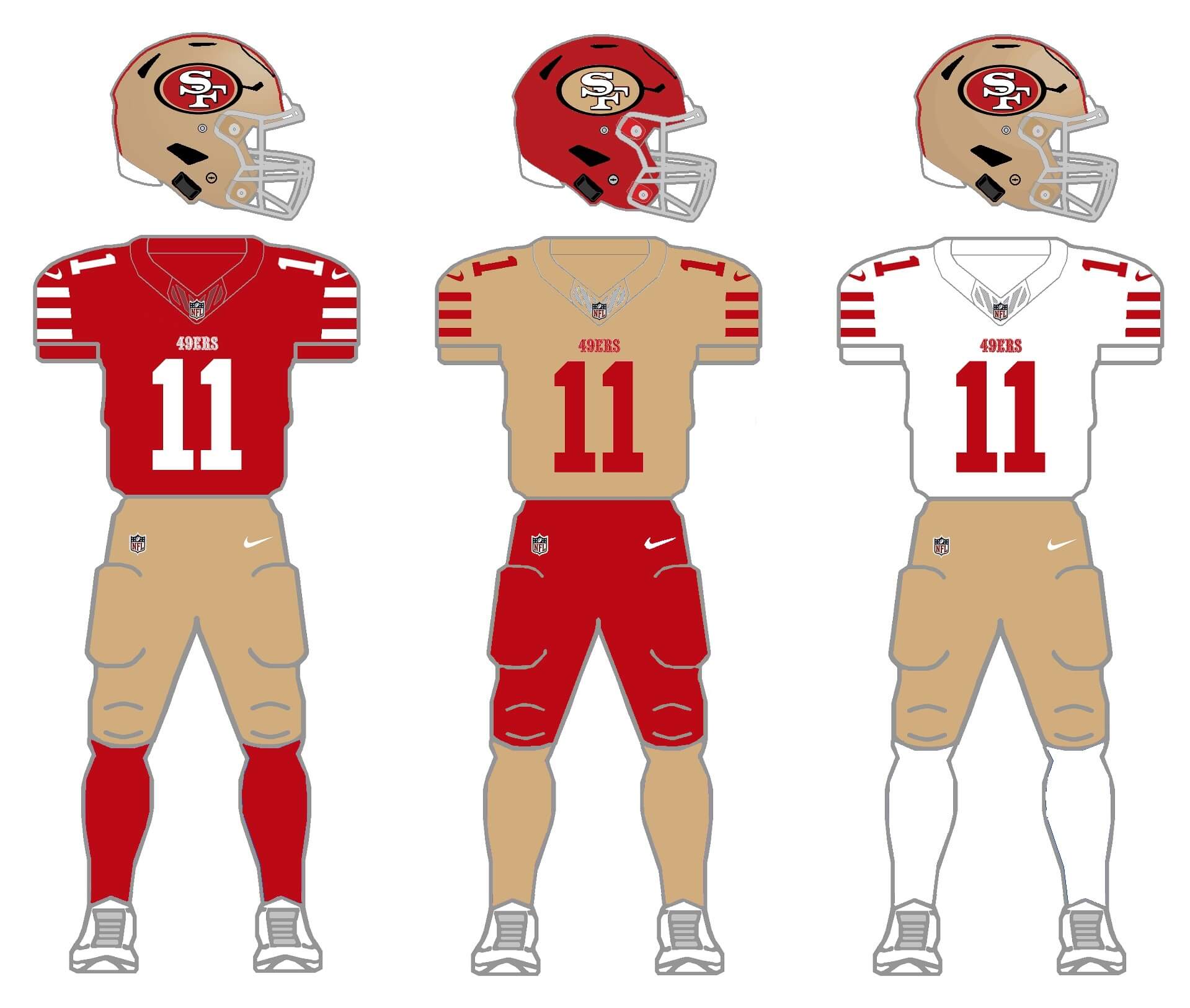
The team prominently feature a gold helmet and pants, but not a jersey or socks, so for this exercise, I gave them one of each. And the 49ers are another team who have worn a red helmet in the past, so I basically created an inverse of their current gold lid. I’m not sure I’m in love with the “opposite” effect of red/gold/red, but for the 2/3/2/3, it’s an option.
Throw/fauxback uniform
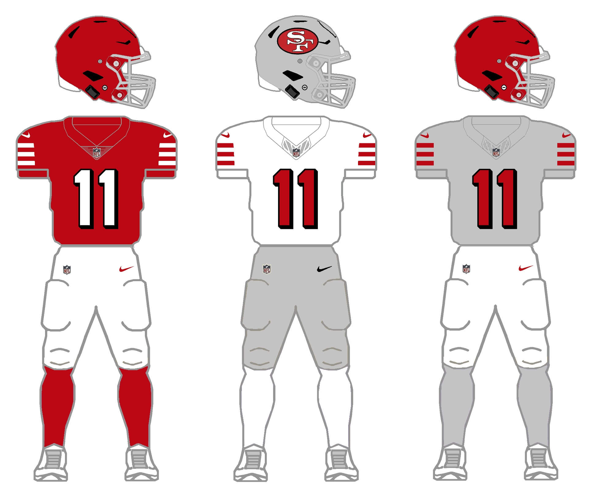
Aside from primarily wearing gold (the team is named for the 1849 Gold Rush), there were several years when the team wore silver elements, including a silver helmet. Their current throwback is actually a fauxback (created in 1994) which itself attempted to replicate the 1955 season. In order to make it more accurate, I created a blank red shell which is period-correct. For a third color, I decided to go with the silver that was worn in the early 1960s, and created a silver shell with the team’s original logo — the first time a logo ever appeared on a 49ers helmet. The design (set in 1963) was different from the 1955 — so that part would be a fauxback — but allows the team to show off multiple eras on uniforms with one set. The silver/gray jersey and socks are created to fulfill the 2/3/2/3 project parameters (although I wouldn’t want to see either on the field).
LOS ANGELES RAMS
The Rams got new, modern uniforms in 2020, featuring a lot of superfluous bells and whistles (gradient numbers, the “Hello, My Name Is” patch). That first year, the team promised a new uniform set for 2021 and 2022. While they did add a white jersey for 2021, there was no new offering (rumored to be a yellow jersey and white pants) in 2022 or 2023.
Current uniform
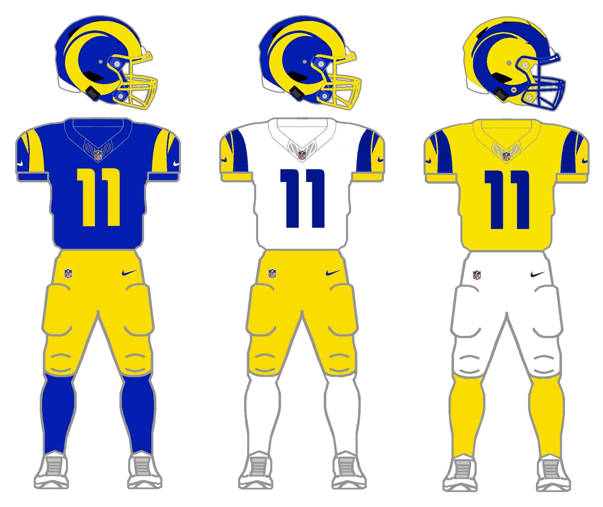
I cleaned up the extra doo-dads (numbers now solid color, no “nametag”) for their current set, and created the yellow jersey/white pants that were rumored for 2022. For the blue helmet with yellow horns, I changed the mask from royal blue to yellow. But the team still lacks a second shell, so I created an inverse helmet which is a yellow shell with blue horns, and added back the blue mask on the new shell. Pants are yellow and white (eliminating the blue they currently have) and both white and yellow socks are now an option. This streamlines the uniform across the various color choices, and IMO doesn’t look that bad once the extras are removed.
Throwback uniform
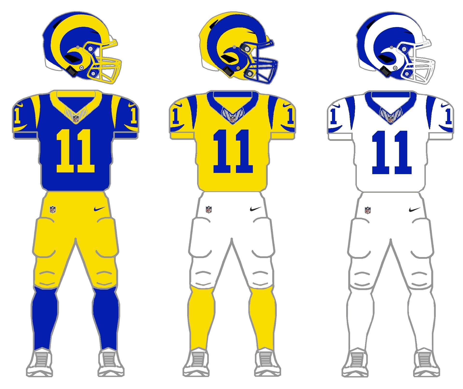
Similar thinking goes into the throwback — do you remember when the Rams played the Patriots in the 2019 Super Bowl? The team’s uniforms were so bad that season, they received special dispensation to wear their “throwback” for the Supe. While some like the style of the newer, modern uniforms, there is still great affection for the throwback. So I basically recreated that 2019 Super Bowl uniform, fixing the navy blue shell to match the royal blue for the home. For a “medium” I again went with a gold jersey. Pants in this set will be gold and white, and an “inverse” helmet was added. As most of you know, from 1964-1972, the Rams ditched the gold from their uniforms, and went with only white and blue. By changing the gold horns from the blue helmet to white, I am able to create a second throwback with this set. And lest you think the gold jersey/white pants isn’t itself a throwback, the Rams wore that combination from 1951-1957. That’s a look they threw back to in 1994. So, with this, you get three throw/fauxbacks in one! So, yeah.
SEATTLE SEAHAWKS
Like several other teams, the Seahawks introduced new throwbacks (which almost everyone thinks should be permanent) this season, while still wearing their modern uniform introduced by Nike in 2012. This uniform has actually grown on me over the years, and about the only combination that I don’t like is when the team goes mono-blue. With the throwback, the team introduced a new silver helmet, and they had until recently four jerseys: blue, gray, white and “Action” green. I’ll need to change the silver to gray for the second helmet, and eliminate one jersey (which will be the white one) for the current set.
Current uniform
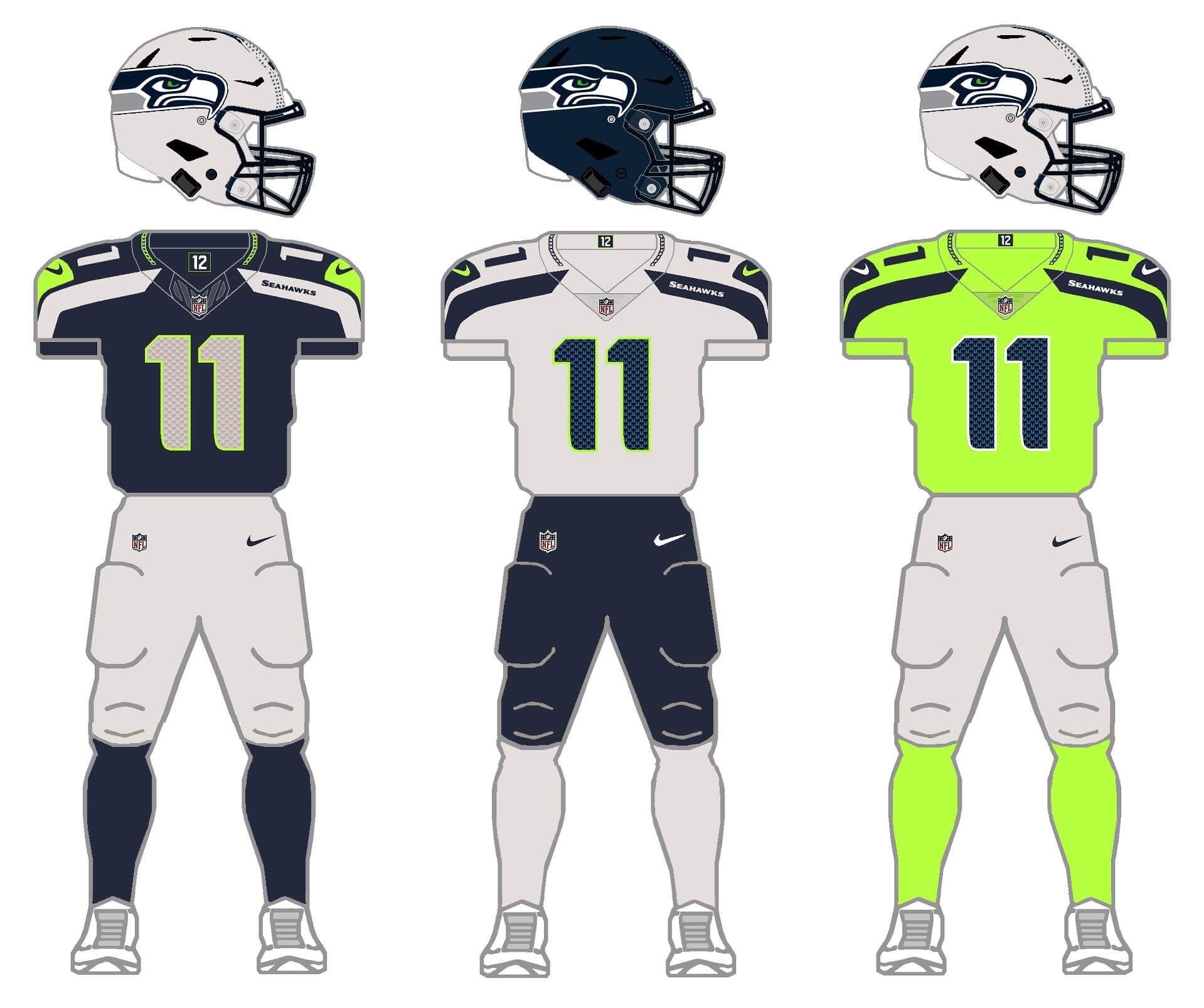
The new gray helmet I think actually works very well with this set (even if the neon green seems an outlier, color-wise), and the team will have blue and gray pants options. I thought about eliminating the green jersey, but that would leave the team with white and gray — which are very similar, so I kept the neon option. I’d hope they’d keep the neon jersey and socks to an absolute minimum, as I think the blue and gray work well.
Throwback uniform
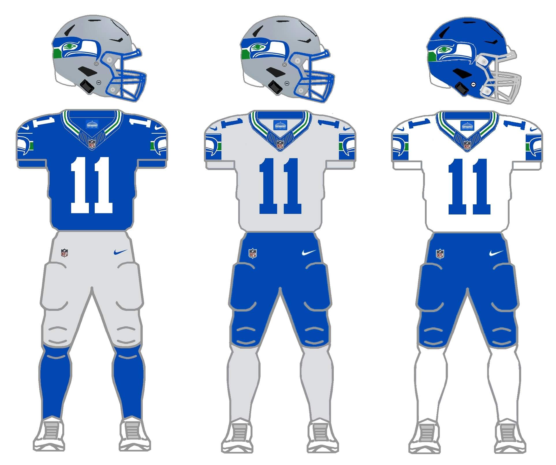
Like so many who’ve said, “the throwbacks should be their full time uni!” I went ahead and created a full set, per the 2/3/2/3 protocol. They currently have a silver/gray helmet, so I created a new royal blue helmet, as well as a silver/gray jersey and socks, to complete the set. The team did not have a second set of pants when they wore this uni, so I gave them a set of royal blue. I think I actually like the new silver/gray jersey a bit better than the white, as it picks up the color of the helmet. I’m not sure I’d want to see them go with the royal helmet, but it was needed to fill out the 2/3/2/3 parameters.
Thanks for indulging me for this entire project, and I hope you at least enjoy the concept of 2/3/2/3. Please leave any comments/suggestions/critiques in the comments below!
Nice work again, sir.
Each of these teams looks more or less as they should. A lot of wrongs righted here.
Only thing I think is missing is a green jersey in the Seahawks throwbacks. Not “action” neon but the green from the original color scheme.
Thanks MJ. I actually played with a green jersey (orig color scheme) and it was quite similar to the royal — and I felt (for the project) it needed a “medium” color (rather than two “dark”), which I why I went with the silver/gray. But good call as an second alternate.
Can the Cardinals do anything right? Geez Louise. A few minor tweaks and you’ve made them look like an actual legacy NFL franchise.
I really like seeing the Niners with silver.
I didn’t realize I could like the Seahawks modern uniforms at all. New helmet really gives this set life. And I agree the grey replacement for the white jersey makes everything stand out more.
This is no criticism to this project; but what has happened to striped socks in the NFL? Since most the league has done away with them even the best squads look a bit more drab than they used to. I’m thinking Green Bay, Dallas, San Fran. Off the top of my head I can only really account for the Bears that have continued on with the stripes and they look great.
It’s always the throwbacks that seem to showcase the reemergence of sock stripes. I truly believe that’s an unconscious part of the appeal to the larger community. Of course the original uniforms were often superior but the added pep from the hosiery brought it all home.
Thanks for these gems. I really enjoyed them.
Thanks Jason!
With regard to sock stripes — early on in this project I decided to eliminate all striped socks and low whites, in order to make the 2/3/2/3 *requirements* as uniform as possible, but there are still a few teams, like the Bears and KC and the Browns who still do wear them, although with all the *styling* going on, it’s almost more of a shit show than solid plain socks would be. At least a few teams *try* to make striped socks work when the teams are in throwbacks.
I’ve given up screaming at the clouds with respect to lower leg stylings; simplifying things to give all teams solid socks seemed like the best way to go.
Hey Phil, the season that the Rams went to the Super Bowl a few years ago they had actually designated their throwback uni as their primary home uni at the start of the season, so no special permission was required to wear it in the Super Bowl.
Ah yes — I was slightly misremembering. The team did in fact designate that as their official home uniform that season. However, it was for the season that the team got special permission to wear the throwbacks (link).
According to that article, “The NFL has now softened its rules to give the team the ability to embrace the yellow-and-blue uniform previously worn in L.A., through the team’s victory in Super Bowl XXIV while operating out of St. Louis.”
Prior to that special dispensation, teams had been limited to wearing throwbacks only twice a season. The NFL gave the team permission to wear them five times that season (as they too recognized the Rams regular home uni (link) was terrible.
The rule changes enacted in 2018 (link), and which are still in effect today, permitted teams to wear alts/throwbacks up to three times a season, but the Rams were permitted even greater lattitude by the NFL (specific to them).
Phil, this was awesome project. I went and looked back at all the others. I went back to look at the Vikings (my favorite team), and i loved what you did with there current set, but i feel the throwbacks for could use a little bit of tweaks, i think the purple collars for the white and gold are too much. I think if those were the same color as the base, those two jerseys would look even better. I was always one who said “The Vikings never should’ve changed the horn on the helmet.” I was going to say for the gold throwback helmet you should’ve put the old horn on it, but now with all these newer helmet shells i hate the old horn now so maybe leaving the newer horn on it works better. Just my 2 cents sir. Still great project all around.
Thanks Steve!
Thanks, Phil! I have to say that I absolutely love the 2/3/2/3 project as well as the MLB Multiverse and the What If? In fact, I’m a big fan of all of the uni concepts and tweaks that run on the weekend. It is a great consistent theme and I really enjoy seeing other UniWatchers’ ideas and work.
Thanks Nathan!
Nice job. Yea please for the Cardinals. However I’m not a fan of them adding silver/gray. They missed an opportunity when they updated their uniforms and didn’t incorporate yellow into the color pallete instead of silver. The color is already part of the bird logo. Even a yellow helmet and pants would have been a good alternative.
I definitely thought about doing the cardinals in gold (athletic gold), and I’m pretty sure an early version of the throwback unii included one (obviously I opted for the “desert sand”); I think I went with that because I had created a number of third jerseys in athletic gold (KC, Packers, Steelers, etc.) so I scrapped it in favor of the sand.
I believe before the new uniforms were introduced that there was speculation that yellow was going to be part of the new uniforms.
This was a great project, one I like to think I might have indulged in had I the time.
Thanks Walter, and I look forward to your next great project.
The white Seahawk uniform with the blue pants even catches your eye if you are just scrolling down the page, you have to stop and give it a longer look. The blue helmet looks great with it, what are you waiting for Seahawks, you have an alternate uniform right here.
Desert sand for the Cardinals works for me. I would like to see that!
I like the Seahawks action green, but only with the blue helmet. LOVE your throwback options for them.
And thanks for making the facemask white on that blue & white Rams throwback.
A lot of hits, and very very few misses in this entire project, Mr. Hecken. Take a bow.
Gray for the Arizona Cardinals needs to be used for. I think there is an opportunity for them to have a secondary logo based on the Desert Cardinal – link – to use on the White Helmet if they had a gray-based uniform.
Great opportunity for them to create a new improved brand.
More terrific concepts for another difficult division!
AZ: I often profess my approval for the current away look, but the rest of their sets are junk. I like the tweaks, but again silver jersey are tough to make look good. If the Cards ‘need’ a throwback option, I’d love it them to look like this (sand is the new tan):
link
SF: Maybe a white helmet rather than red would really be something.And while I long for a 1957 white throwback (gold/red/gold sleeve stripes), the plain red lid fits the bill.
LAR: The blue/white faux is absolutely terrific, and I’m sooo glad the blue pants are gone! The additional yellow helmet elements on the currents are a touch too much.
SEA: I’m going to assume you added some neon to the doo-dads on the wolf pants…if so, these are all gray-OK! The throwbacks are an easy sell, but give the ‘Hawks white pants if they ‘have’ to have a 2nd pair.
Thanks
CheisChris!Until Nike can make decent silver…hell, even a decent gray, none of these concepts will probably look as good as they could. Appreciate the critiques/comments. I think if the Cards just make the little tweaks (current/modern set), and use just the white helmet, and the red and white jersey and pants (so long as they don’t go mono), that’s more than plenty. I *tried* throughout this series to give teams one dark and one light/white helmet (tried: I know there are a few where that’s not the case), so I tried to avoid a white and silver or white and gold option (as was the case with the niners). LAR I gave too many options (with a helmet that’s basically two color anyway, they don’t need an “inverse”), but I’d love to see blue/yellow/white for jersey options, and yellow/white for pants. Ditch the royal pants completely. Re: hawks — white might be better than royal for the pants, for sure.
Of all the silver/gray thirds in this division (and the whole series), I like it on the Cardinals the best.