Phil here, pinch-hitting for Paul as he returns from the Eastern Shore.
The PWHL — Professional Women’s Hockey League — which will begin play this season with six franchises, has introduced the home and away sweaters for each of the member teams. The inaugural season will have 24 regular season games.
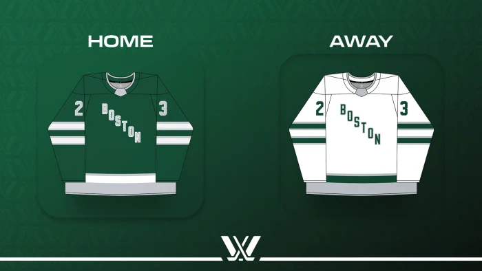
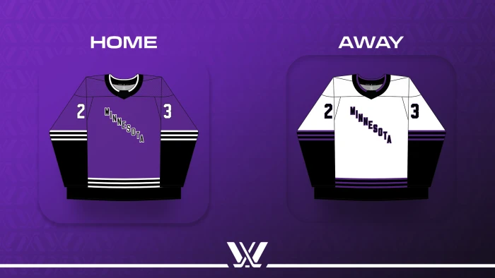
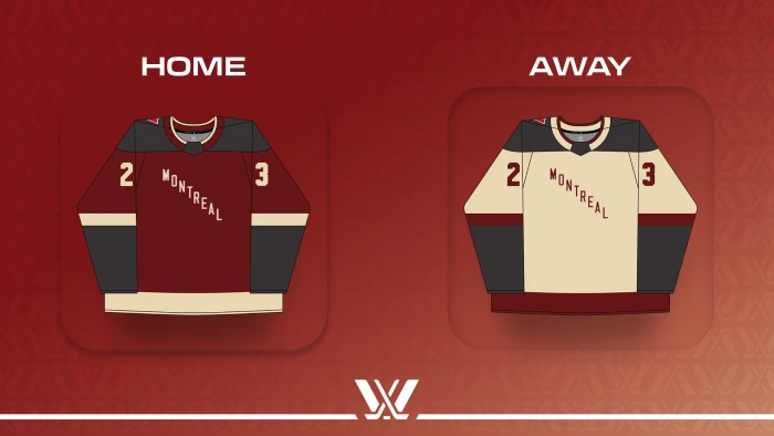
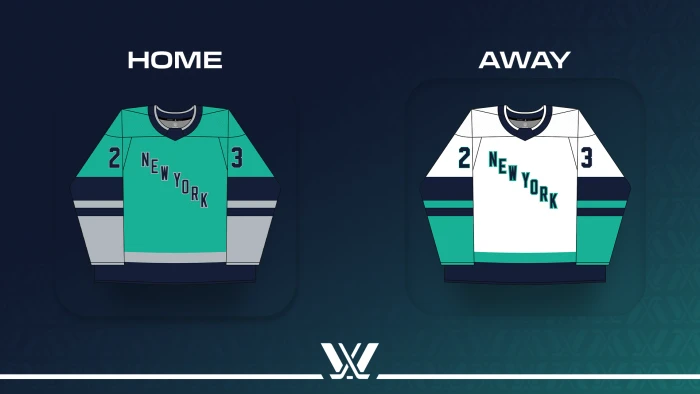
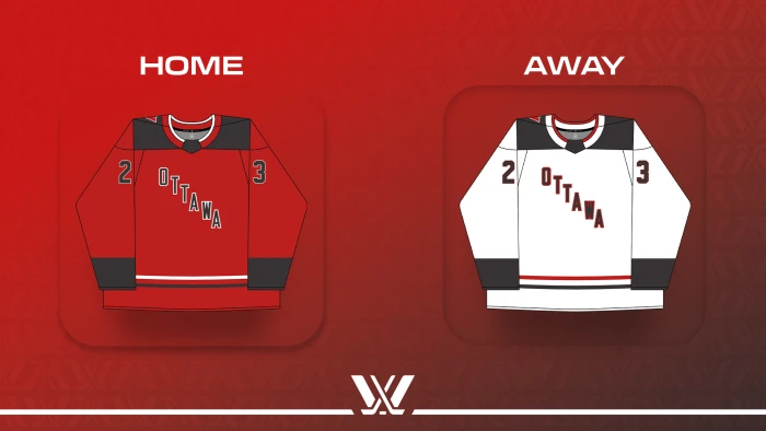
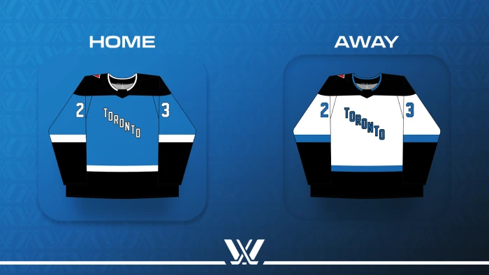
According to the PWHL, “teams will honor the league’s foundation with exclusive jersey designs for the inaugural season that distinctly feature the original six markets. Boston, Minnesota, Montreal, New York, Ottawa, and Toronto will identify PWHL teams on the ice with prominent diagonal inscriptions on sweater fronts when the puck drops in January.”
All six teams will have two sets of jerseys — a dark and a light, and all jerseys have the city name diagonally across the chest, and follow the same template.
Here’s a look at the Inaugural Season sweaters:
Also included with the unveiling was a Twitter/X hype video, which actually shows the full uniform — it appears all teams will be wearing black breezers and socks that will match the primary color of the jersey.
Silky mitts and now 🔥 fits.
Introducing the jersey designs for our inaugural season.
📰 https://t.co/nP46519YTx pic.twitter.com/giaSp0fGyQ— PWHL (@thepwhlofficial) November 14, 2023
The 2024 season is scheduled to begin in January and run through late May or early June, with a break for the Women’s World Championship.
[UPDATE: According to The Athletic, a league source says the jerseys are temporary for Year 1, while logos and team names are finalized.]
The players deserve better than that bland garbage put forth. Yikes.
I couldn’t agree more. I understand the budgetary restrictions, but that doesn’t mean you must also have design restrictions. The same descending block lettering for each is just depressing.
This is one area where “sponsorship” could kick in a few bucks, especially since their ad is going to be on all of the sweaters.
Agreed 100%.
Reminds me of the United Football League, whose first season featured four teams all with the exact same (awful) templated unis.
link
The ladies in the league deserve better, but hopefully it will survive and next season will add more teams and better uniforms.
To me, survival is not a question for pro women’s leagues anymore, especially since this one has rich and ambitious owners. It’s not as if the PHF folded; this is the result of it being bought out.
The PWHL might not add more teams immediately, but with any luck we’ll be back here in a year with proper uniforms.
Reminds me of the first year of the National Basketball Development League. Remember “The North Charleston Lowgators?”
“teams will honor the league’s foundation with exclusive jersey designs for the inaugural season”
Another way of saying we don’t have team names and logos yet before we start playing.
Yeah, I think this means the season is going to start without team names. I don’t know what I expected for the uniforms, but without logos or names this is probably as good as it gets.
Totally boring design. Let’s hope it gets better. Also, I had a major eyeroll when I saw Montreal’s (and Ottawa’s) team colors. “Storm” and “sand”? Am I missing something or is that just dark grey and tan?
Haha I said the same thing to myself. I went “Wait, I’ve been on pink sand beaches, black sand beaches, brown sand beaches, white sand beaches, etc…” Sand isn’t a color.
Montreal is, of course, quite famous for its sand.
These are awful. Beyond lazy.
Are they trying use the same colors as the Liberty, the WNBA team, for the New York team? Trying to unofficially create a NY woman’s sports brand?
I’d add that those are also the colors of NWSL champions Gotham FC, so it would certainly seem to be the case. I for one think that’s a good move.
UPDATE: I noted this in the article above, but the jerseys are temporary for Year 1, while logos and team names are finalized.
So we can expect a lot more effort when/if the league begins play in season two.
link
One can only hope that this is a mockup and the real lettering will be bigger and bolder. Look no further than the iconic NY Rangers jerseys to see it doesn’t require much extra effort to bolden, italicize and drop shadow the letters to create an exciting and classic effect. So far and yet so close if all the teams absolutely have to have the same template.
No team names, just the city?
For now, yes. The teams (cities) and unis are pretty much just placeholders for now. The six clubs are expected to introduce logos and nicknames down the road.
No orange or yellow in any of these mockups? Sad..Subtraction by adding could help.
No nicknames? C’mon. Is that code for “We’re going to overthink this and get too clever here?”
Yeah, I can see them breaking out a bunch of singular names too, like “Fire” “Reign” or “Liberty” … The PHL (the league which preceded this) had some really excellent unis and names. (link)
We can only hope the PWHL will build upon their initial offerings to have the world class nicknames and uniforms the players and fans deserve.
The league this is replacing put these to shame. My goodness, put any effort into this. And so many teams are even recycling color schemes from other local teams. I guess that’s fine, but somewhat uninspired. I appreciate towns like Pittsburgh that make that part of their identity, but Boston doesn’t do that, and New York doesn’t do that, I don’t know about Ottawa.
Anyway, calling these “(fire) fits” ok social media is sad and delusional.
Toronto looks like something that the Lightning would wear.
I actually like the colors, the lettering is very amateur however.
And the shot of Minnesota on the PWSL X link in nice, I see some of my favorite places to bike.
Couldn’t be more generic if they tried; really phoning it in. Low level beer leagues teams just tossed together have much more interesting looking stuff.
Not a serious effort at all, I know this is a placeholder but still: if this is the way you want to generate excitement for a new league and team identities forget it. Only family members of the players and staff will care or take notice. These athletes deserve a better start.
So generic, and yet so bizarre…how strange.
Looking at some of the names that apparently were leaked in October (“Ottawa Alarm,” “Boston Wicked”), maybe this is for the best.
That tiny lettering is so sad, though.
The lettering looks better on the real jerseys than on the drawings. Still, something that could have been fixed.
All of this has come together rather quickly. I guess it just takes longer to decide on branding than we might think. I’m not sure why it takes so long, but it does.
Just look at how long it took the WFT to come up with “Commanders.” And despite all of that time and, I assume, effort, nobody is happy with it.
if youre trying to save on funds, why not hold off on two jerseys? Just give each team one and make sure the 6 colors are different enough to contrast each other
As mentioned above, the list of names that were leaked (they filed for a copyright, as I recall) were nearly universally panned. So maybe they decided to go back to the drawing board with those and that’s why we’re getting these generic looks.
Also, once the league is a real thing and fans are in the buildings, they could get fans to vote on ideas.
The colors are good, at least.
The decision to flush all the PHF names doesn’t make sense. That feels political rather than rational business. Political in the sense that a lot of people involved in this didn’t like the PHF and its owners and now apparently want to erase it from history. If that’s the case, that’s just petty and not good business.
It’s also perhaps political in that there are reports that the new owners thought “Pride” was “too controversial.” That isn’t getting off on the right foot. The owners are going to find that the LGBTQ+ community is not one they want to alienate if they’re going to build a fanbase or have a good relationship with the players.