
[Editor’s Note: Today we have a very special post from our own Jamie Rathjen, who’ll be bringing you the rundown of the first half of the kits for this year’s Women’s World Cup. He’ll be back tomorrow with Part II. Enjoy! — PH]
The 2023 Women’s World Cup starts next Thursday in Australia and New Zealand. It’s the first WWC to have 32 teams, up from 24. The matches in the group stage are split between the countries, with New Zealand getting the “odd” groups of A, C, E, and G, and Australia getting the “even” groups of B, D, F, and H.
To me, a lot of the kits for this tournament seem to be doing the bare minimum, much like the relationship many national federations around the world have with their women’s teams. You probably remember the US’s equal pay fight, but there’s also other conflicts that have a common theme. To name a few, there’s Canada’s own pay dispute, England’s players arguing with the Football Association over bonuses, Jamaica’s players starting a GoFundMe for travel expenses, and a public spat between Nigeria’s American coach Randy Waldrum and his employer with his team threatening to boycott their first game over their pay. That’s not to say there aren’t standout designs, though, particularly from Adidas.
FIFA won’t allow participants to wear any sort of Pride captain’s armbands, even though some do so regularly by now, because its tournament rules require its own armbands to be used. Instead, one of the eight approved armbands is vaguely Pride-themed as it shows a rainbow heart, not colored in a way that would remind you of a Pride flag, and says “Unite for Inclusion.” Other designs highlight Indigenous peoples, gender equality, violence against women, hunger, education, and peace.
Additionally, FIFA did allow the Aboriginal and Torres Strait Islander flags to fly at Australian venues and the Māori flag to fly at New Zealand venues along with each national flag.
So, let’s start going over the designs for the first four groups.
Group A
New Zealand

New Zealand’s colors are black and white, like in other sports, and their nickname is the Football Ferns. That combines into a black first shirt with a nice fern pattern that extends down to the shorts. The white second shirt has blue accents, which seems like an odd choice to me but I think work well enough.
Norway

Norway has basic red and white shirts. The white shirt, in particular, is a Nike template that we’ll be seeing a few more times because most of the Nike-outfitted teams share it for one of their designs.
Philippines

This appears to me to be the Philippines’ first appearance at any FIFA tournament. They are one of a few teams that have three shirts, first primarily blue, second primarily white, and third red with yellow pinstripes. Between them, the three shirts manage to incorporate all the colors of the national flag.
Switzerland

Switzerland have only received one new shirt for this tournament, which is red with white pinstripes. The white shirt is held over from the men’s World Cup last year.
Group B
Australia

The other cohosts’ gold first shirt has a swirling pattern on it and is paired with a turquoise second shirt. It feels like the first shirt’s pattern is there because something has to be. It’s not that great that both shirts are light-colored; something darker would have been a better choice than turquoise.
Canada

Canada showed up at last year’s men’s World Cup without any new kits, which won’t be repeated this time. The red first shirt is another Canadian national team design that has black creeping into it and also comes with black shorts. The team isn’t outright wearing black yet like the men’s team does, though. The second shirt is white and red in the common Nike template.
Republic of Ireland

Ireland is now outfitted by Castore, who are still relatively new to team sports having started in tennis. The company’s first Irish efforts are green with orange and white pinstripes and white with pinstripe-width green hoops.
Nigeria

Nigeria’s first shirt is lighter than previous efforts. The second shirt’s pattern again extends to the shorts and also comes with red socks, which I think work better than black ones would here.
Group C
Costa Rica

Unlike two of their groupmates, Costa Rica got basic Adidas offerings. It’s red and then white with black pinstripes. White shirts with black accents occur often enough that I usually feel like they’re a reference to the black and white stripes that appeared at the 1990 men’s World Cup.
Japan

Japan’s usual blue is held over from last year and paired with the first of Adidas’s nature-based standouts, a pink and purple number. It’s apparently meant to call back to Mount Fuji sunsets, although others have made connections to cherry blossoms.
Spain

Spain’s red contrasts with its light blue, almost grey, second shirt with a pattern of coral on it. That’s not a very Spain-specific design to me — it’s home to coral reefs, like the hosts, but really what about Spain makes an average person think sea life? — although I think it works well.
Zambia

Zambia has three shirts in gold (or orange?), green, and white, largely variations of the same pattern. The green design has some nice touches in that it includes stripes in the flag’s colors down the sides and on the socks.
Group D
China

China is one association I feel can always do more with their designs — their crest has a dragon in it! — but somehow it never turns out that way. They consistently end up with solid-color shirts in red and something else, which is yellow in this case.
Denmark

Denmark have red and white versions of the same design. It’s based on pop art and not a callback to anything older, which makes me think it’s again just there to have something there.
England

England’s men’s second shirts have increasingly been blue instead of the usual red over the past 10 years or so, but the women’s team had never worn blue until now. It’s a lighter effort than the other blue shirts and is specific to the Lionesses. The first kit is as traditional as it can get when a Nike template is involved.
Haiti

Haiti have three shirts of blue, white, and red in the same pattern. It’s not a bad effort from the Colombian company Saeta, which doesn’t outfit any other national associations.
Come back tomorrow for the second part!

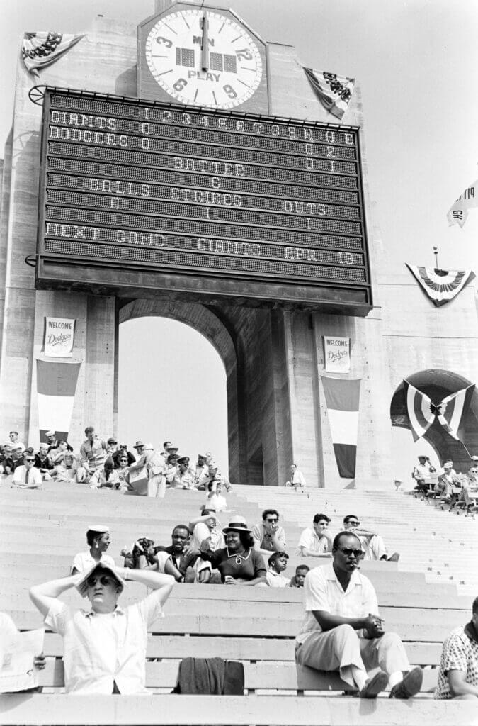

GTGFTS: April 18, 1958, LAD 6, SFG 5. Dodgers first game in LA.
That LA Coliseum baseball configuration was not exactly a sight to behold…but that scoreboard sure was!
A beautiful photo – Thanks for sharing!
Agreed, Paul had a great story a while back about how it was put together and how it was operated. That thing was a beast.
Some questions since that scoreboard was before my time:
1. There’s no customary “10” after the 9 in the event of extra innings. If it went to the 10th, did they erase innings 1-9 and start over?
2. For football, what was official time; the analog hands on the dial or the digits in the middle?
I enjoy these soccer kit rundowns. Thanks, Jamie. I’m not a fan of patterned shirts, like those worn by Spain and Denmark (white). I like more the subtle ones as worn by Haiti (whose shirts are really nice). If I was to pick a favorite it would be Ireland’s white shirt. Least favorite…Japan, by a mile.
And overall these rundowns remind me of how much better soccer kits look without the ads splashed across the front.
“…I like more…” Please don’t tell my former teachers I typed that.
Thanks!
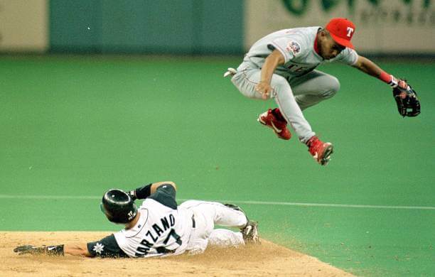
GTGFTS: 7/12/1997 Texas 9 at Seattle 2 – Kingdome.
That’s correct, Morris!
RIP Johnny Marz
The guess the game by the uniform is July 12, 1997. It was the only game John Marzano played against the Rangers in 1997. The patch commentating the 50th Anniversary of Jackie Robinson’s reintegration of the Major Leagues was the telling element.
Nice researching, Chris!
I’ll add that this was Philly native John Marzano’s only game played against his former team in the (I Miss The) Kingdome; he appeared just twice for the red Rangers in ’95, never once did he wear their road grays. I still always think of him as a Red Sock.
Oh my goodness I *adore* Japan’s set!
Also, it’s been practice in recent World Cups to mandate 100% clash – shirts, shorts and socks must conflict. So I wouldn’t be surprised to see, say, Nigeria, not wear their red socks.
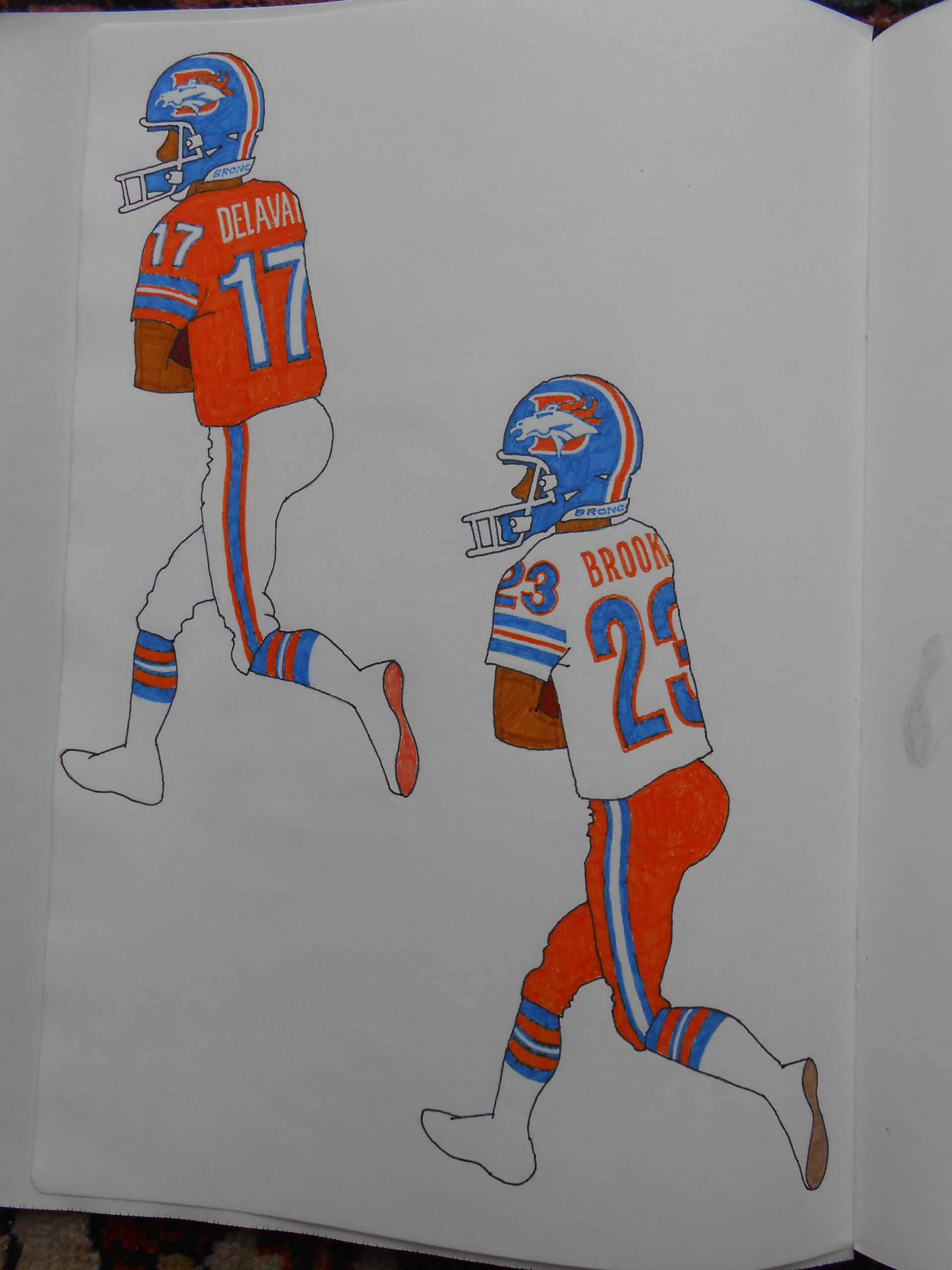
Really like your take on the Broncos, Walter…I’ve never been a fan of their orange pants though.
Speaking of the orange, yours seems brighter (though not at all highlighter!) than what they’ve used during the OC era.
Good work!
I may be a good artist but I’m a terrible photographer; the pictures are overexposed. The Orange Crush jerseys were terra cotta, nearly red. But without the orange britches, the road uniforms are too blue, looking more like a Giants’ treatment. I tried orange numbers with blue outlines but assume they’d be too hard to read.
NZ soccer seems to be taking a page from their cricket teams, who have occasionally incorporated a new color that no one else “owns” yet to brighten up the black and white.
One of my favorite kits ever is, in fact, their teal look (link) which this change kit seems to call back to. When they went back to it a couple years ago, it sold out of their online store within 2 days — at least in any size that would fit me — and became a “white whale” jersey for me for a while.
They also famously experimented with beige during the 1980’s, leading to a particular supporters group christening themselves “The Beige Brigade” (link) and showing up to most national team matches in their self-made beige throwback kits!
Whoa, Canada. Had enough of the black trim. Would prefer them to wear the set with the white jerseys and red shorts more.
I do applaud them staying with the classic Team Canada soccer logo. It has endured for many years and glad they have not decided to change it.
UTotD:
Im all for the inverse helmet approach…even if tigers don’t have orange stripes ; )
Nigeria Super Eagles always have brilliant in your face loud uniforms. This effort is no exception. I like it a lot.