
[Editor’s note: Our own Jamie Rathjen returns today with Part II of his preview of the 2023 Women’s World Cup kits. If you missed yesterday’s Part I, click here. Enjoy! — PH]
We’re back today with the second half of the Women’s World Cup preview, looking at the last four groups. This half of the preview includes a number of the Adidas-outfitted teams who received what I called “standout designs” in the first part and its short introduction. Of course, the US is also in this half, as are several other powers of the women’s game.
Group E
Netherlands

The first shirt is plain orange, although black accents have featured with the orange for a while now. The second shirt frequently uses the colors of the flag, and this time it’s dark blue with the crest in the flag’s colors.
Portugal

Again, the second shirt is more interesting than the first here. The first shirt is Portugal’s usual red while the white second shirt looks like it has red and mint-colored confetti stuck to it combined with the common Nike template.
United States

The US completes the trio of three of Nike’s more interesting efforts residing in one group. I am a fan of the first shirt’s pattern of dots. The blue second shirt uses that standard Nike template but has grown on me a little bit since it was released, with both national teams wearing it so often.
Vietnam

Vietnam have pretty basic red followed by white with a barely-visible marble pattern and a polo collar, both of which are the same as what the men’s team wears. This will be the first appearance for Vietnam at a senior FIFA tournament, having only before participated in the men’s under-20 World Cup.
Group F
Brazil

Brazil’s yellow shirt is among the most untouchable designs in the entire sport. The blue second shirt is not so sancrosanct and has a nice pattern of leaves on the sleeves this time.
France

For a while, France’s shirts under Nike were navy blue, but they’ve gone back to something closer to the traditional shade. It’s paired with a pretty nondescript white shirt, one of several at this tournament.
Jamaica

Jamaica was not one of the teams that got one of Adidas’s standout designs, which makes me wonder if Adidas has a “caste system” for soccer like the one Paul recently discovered for college football. Nevertheless, yellow with green stripes and brown aren’t bad efforts.
Panama

Panama are outfitted by Reebok, which pretty much disappeared from the uniform world while it was owned by Adidas (except for the NHL) but seems to be coming back. Again, it’s very basic red and white versions of the same design with blue accents.
Group G
Argentina

Argentina’s first shirt is another one that’s not ever going to change substantially and in fact hasn’t changed since last year’s. The second shirt is another of Adidas’s nature-based shirts that may be based on a valley or other landscape, but the result basically looks like broad brushstrokes, which is fine with me.
Italy

It’s strange not to see Italy with Puma, with whom they just ended a 20-year partnership to go to Adidas. But the upshot of that is Adidas’s first effort for them is a marble-patterned white shirt (more visible than Vietnam’s) to go with their normal blue.
South Africa

South Africa’s shirts were fan-designed and chosen by a public vote. If the third shirt looks really ’90s — and it seems to be the most popular of the three — it is, because it’s based on the shirt the men’s team wore when winning the 1996 Africa Cup of Nations.
Sweden

Sweden’s yellow is held over from last year. Adidas’s new design for them is supposed to be based on icy water. It ends up being blue, which is a common second-choice color for Sweden anyway.
Group H
Colombia

Colombia’s second shirt is one of my favorites from Adidas and is supposed to be based on the Caño Cristales, a river whose bed spends several months each year turning different colors. It’s paired with the usual yellow.
Germany

Germany got the last of Adidas’s nature-based designs (honorable mention to Belgium and Scotland, who were also part of the big Adidas WWC release earlier this year but didn’t qualify), which is generically based on forests. The design is one of the two along with Sweden’s that fits best with the recipient’s identity. Green is a traditional German second-choice color and when they wear it, it’s one of my favorite looks in the whole sport. The first shirt has a little more black than usual with the wide stripe down the front and is the design that the men’s team wears, but with the correct number of World Cup stars (two instead of four).
Korea Republic (South Korea)

South Korea’s red/red/pink first kit is leaning heavily on the pink, which I’m not a big fan of. The use of pink in women’s sports often feels gratuitous to me and doesn’t work well here, compared to a team like Japan who have managed to pull off pink accents for a while now. The second kit looks to be white with black shorts, which is a more usual accent color, but again comes with large red and blue side panels. It’s cramming in some extra colors where they’re not necessarily needed.
Morocco

Morocco have only started wearing the red design pictured above in their three warm-up games in the last two weeks, which is the same design as the men’s team. They last wore white in a game in February (pictured above). At the tournament, I can imagine that a white shirt like the one that the men’s team wears might appear.


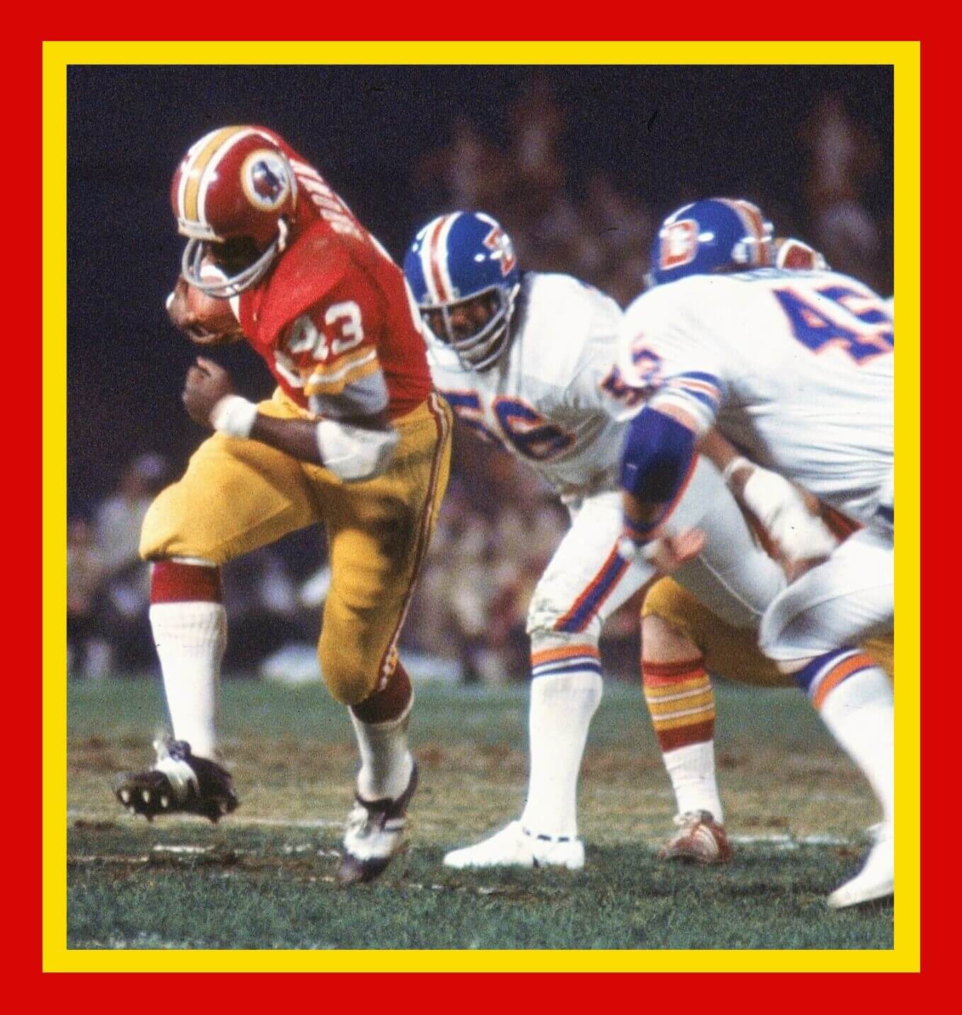
GTGFTU: 09/30/1974 Broncos 3 at Redskins 30; RFK Stadium.
I know ChrisH disagrees, but the Broncos deserved to lose by wearing white road pants. Orange, orange, orange!
Only time I’ve ever liked Denver wearing white over white was when they had the orange helmets.
Denver may have worn white pants in that game to avoid looking too simliar to Washington’s gold bottoms. my guess anyway.
No, in 1974 they didn’t have orange pants. Unfortunately. The last game at Tiger Stadium (Denver/Detroit, Thanksgiving) would have looked great if they did.
This is so very true : )
Even to this day I consider Denver to look their best in white-over-white…and while I prefer white pants generally (especially for away games) even this would have been better than any orange option:
link
It was easy, Denver is wearing a one year only style of sock, worn only during the 1974 season
Fun fact :
Denver has never defeated Washington when going white/white:
link
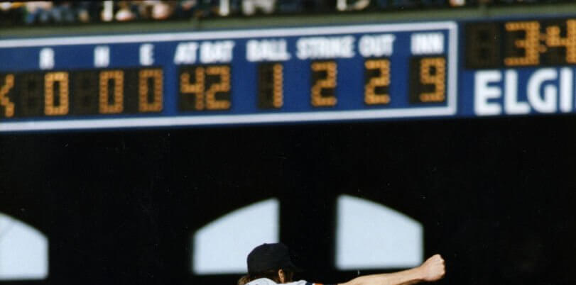
The GTGFTS is the April 7, 1984 no-hitter thrown by Jack Morris of the visiting Detroit Tigers versus the home Chicago White Sox. The photo is Morris releasing the last pitch of the game to strike out Ron Kittle (#42) of the White Sox to win the game 4 – 0. This is the earliest no-hitter by a Tiger pitcher.
You’ve got it, Mike!
Actually, Morris is celebrating his strikeout of Kittle to seal the deal; I trimmed the photo down quite a bit to put more focus on the scoreboard…and this was the last no-no thrown at original Commiskey Park.
Six years later, on July 1, 1990 (the 80th and final Anniversary of Comiskey Park’s opening), Andy Hawkins of the Yankees no-hit the White Sox for 8 innings but lost, 4-0. Because the Sox didn’t come to bat in the 9th, Hawkins was not credited with a no-hitter, even though Chicago got no hits in the entire game.
I think that should be “is not currently credited with a no-hitter.” The rule that said a pitcher/team has to pitch nine innings to be credited with a no-hitter didn’t go into effect until the 1991 season, so it would’ve been a no-hitter at the time.
Behind this game and an amazing 35 – 5 start to the season, the Detroit Tigers would go on to win the 1984 World Series.
The GTGFTU is the September 30, 1974 Monday Night Football game between the visiting Denver Broncos and the home Washington (as known then) Redskins. Pictured is Washington running back Larry Brown (#43) moving past Denver linebackers Ray May (#56) and Bill Laskey (#45). Washington won the game 30 – 3 with Brown rushing for 47 yards.
More blandness from Nike. Also dislike how they use a lighter shade of orange for the Netherlands, both in the mens World Cup and now for the womens World Cup.
So, we (the US) are wearing painters shirts? The white tops look like something you would wear while crafting, or repainting a kid’s bedroom. I’m not a fan of the splattered paint look. The blues are fine.
On the one hand, I agree that the paint splatter shirt is a hot mess. One the other hand, now that I’ve been seeing it in the wild on the backs of fans at my local soccer team’s games, it is by far my favorite home shirt a US team has worn recently. Still a C-minus at best, but Nike has mostly been dressing our men and women in F uniforms of late.
Agreed. But the paint splatter is far superior to the blue top with the collar horns.
link
I don’t know why Nike thinks this is a good look (for any sport, but especially soccer) but it’s not. Seriously, does anyone think this looks good? link
That’s a reason why it’s good that soccer teams change designs every year, because we will never have to speak about the collar horns again…
Changing designs every year or two…sure, okay.
I’m still bamboozled by the need to change the ball design every year, though. I know the rea$on why, and yet every other sport resists the temptation to change the basic look of its ball. Why is soccer so different?
Just caught up on both WWC recaps, great previews Jamie!
Jamaica has to suffer enough with a lack of support and funding and now they get stuck with a brown jersey? Terrible.
I’m not a fan of the random patterns showing up in these kits, they’re just not working for me. The paint splatter US kit looks odd, maybe not the worst kids and certainly better than a BFBS kit but I’m left uninspired.
Thanks!
Phil, I’d rather have the gray Lions unis than bring back that Matt Millen-era BFBS look.
That was the only time when I rooted against the Lions on Thanksgiving.
Right.
But you’re the only one who likes the monogray look.
With the blue helmets.
I tolerated it with the regular helmets.
I liked those Lions’ uniforms. I would have liked them even better if they were worn by the Carolina Panthers.
No he’s not. There are a lot of Lions fans who like the gray uniform. I don’t know where hating the grays comes from comes from. Everyone I talk to loves them. We all laugh at the narrative.
I’m disappointed that both of my teams (USA and Portugal) went the route they did with the alts. I don’t care for that splattered/confetti look. I really like Jamaica’s yellow shirt, and the two used by Sweden.
Thanks again for these Jamie. Looking forward to the tournament’s start.
Both of Italy’s kits are also worn by the Men’s team, not WWC-specific designs. Also if you are wondering about a caste system in soccer, the answer is yes, absolutely.
You’re right, they released Italy’s earlier than the others and then included them again in the WWC release. I was probably bound to overlook something like that.
I like my soccer shirts free of confetti, splatters, random graphic elements, gradients and everything modern soccer fans and designers seem to like. Most soccer shirts are gruesome and only work as a nod and a wink to complete tackiness. Yes , I am a snobby traditionalist when it comes to uniforms. The only exception in my book are teams from Africa, they can be as loud as they like as they always look good wearing gaudy outfits. And that is not meant in a demeaning or ironic manner. African sports is, more than anywhere else, celebration and they wear the uniforms to go with it.
Why is the Dutch player making a skating move?
After looking at all of them, my favorite by far is Japan’s blue.
great WWC preview! Also worth noting on the USWNT’s white jerseys that the swoosh and the 4 stars are in gold in honor of being the defending champs…much like France in the men’s tournament in 22.