Tired of seeing annoying ads (like this one!) on Uni Watch? There’s a simple solution: Join Uni Watch Plus. You’ll get an ad-free site experience, plus exclusive access to our UW+ discussion forums, push notifications whenever a new blog post has been published, a special UW+ badge accompanying all your comments on the blog, and a 20% discount on our Teespring merchandise.
[Deputy Editor’s note: Our own Jamie Rathjen has stepped up to review the 11 MLS jerseys unveiled yesterday afternoon and evening. MLS will release an additional seven jerseys today, and a final four on Saturday. Enjoy! — Phil]
MLS Jersey Week rolled on yesterday as 11 of its teams released new shirts. If you don’t know the rules, each team gets one new design each year, either primary/first or secondary/second, that lasts for two years, and releases are scheduled through Saturday. A lot of these designs are purposely city- or area-themed, as MLS said in its Jersey Week press release, and the remaining ones are marking anniversary or season milestones. I find all of the releases fairly decent but at the same time none really blow me away, which is a bit of a step back when Adidas has spent a few years creating awesomedesignselsewhere.
(Thanks to Phil for his assistance with gathering all the pictures for this story.)
__________
Austin FC (secondary)
This shirt is supposed to pay tribute to the Armadillo World Headquarters, a demolished music venue/beer garden that flourished in the ’70s. I’m not grasping what the connection is, besides the place’s address being on the back of the neck and some other small details. To the rest of us, it’s a serviceable enough white or cream design with green sleeves.
__________
Charlotte FC (primary)
This shirt was released earlier this week but missed Paul’s first post. With multiple shades of blue on the front supposed to represent the Carolinas’ elevation changes, the design can’t decide if it wants to be blue or white. It’s solid blue on the back and was shown with white shorts and socks, neither of which helps.
I’m convinced it’s going to cause an issue with color clashing at some point. If you’re Montréal, for example, what do you wear when going to Charlotte? To me neither blue nor white (see below) is quite the right answer.
__________
Chicago Fire (primary)
The Fire have completed a U-turn from their 2019 decision to make blue their primary color, instead of red, and introduce a new logo. The only element left from that period is a different crest, a third one revealed midseason in 2021. This is a pretty familiar red Fire design with a white chest stripe and a new addition of some sky blue accents borrowed from the city flag.
__________
FC Dallas (primary)
This shirt has a blue-red gradient on the front and is mostly red on the back, except for one sleeve in blue. Again, couldn’t they have just chosen one color? They’re instead a lot like the baseball Rangers, unable to decide if they’re a red or blue team. The shirt appears to come with blue shorts and socks so that in total there’s probably a little more blue than red.
There is also a Lamar Hunt memorial patch at the bottom — you probably know the name from the Kansas City NFL team. Hunt was also highly influential in MLS and American soccer in general (the US Open Cup is named after him) and briefly owned three MLS teams shortly before his death in 2006: FC Dallas and the then-Kansas City Wizards as well as the Columbus Crew.
__________
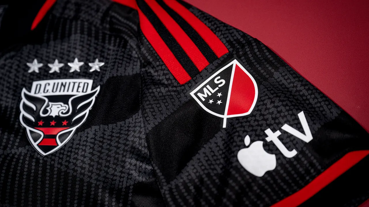
D.C. United (primary)
Now with a non-blockchain ad, DCU’s new black shirt includes the Frederick Douglass Memorial Bridge, near the team’s stadium, on the back of the neck. The wavy pattern on the front is also supposed to call back to the bridge, probably its shape, although I’m not buying that too much even having been on or near the bridge a bunch of times. I can say it seems this design has been well received, though, including the change in ad.
__________
Houston Dynamo (secondary)
Purple is a new color for the Dynamo, and with orange as the secondary color, it gives off real Clemson vibes for me. There isn’t much else going on with it besides some darker purple accents, but the entire design is supposed to reference the city’s hip-hop scene. If this is part of a mono-purple look, well, it gives Paul another very good reason to stay away from MLS besides Orlando’s first kit.
__________
CF Montréal (secondary)
The new design is a white shirt with a blue stripe under the crest, which is supposed to represent both Boulevard Saint-Laurent, a main street in the city, and the same-named river. There is a shoutout to the original “Impact” name on the back.
__________
New York City FC (secondary)
One of Adidas’s schticks this season is to make the stripes on the shoulders, and the corresponding accents, different colors on each side. They’ve done that here with what to me is obviously the blue and orange from New York City’s flag, alternating with each other all the way down to the socks. But the team complicates that a bit, saying it’s something like a neon sign for the “city that never sleeps.” Okay, then.
__________
Orlando City (secondary)
The white shirt is for Orlando’s 10th MLS season, and though they have a logo for that, it’s not on the shirt except for an X way at the bottom. Red is re-added as an accent color, which was worn by the first incarnation of Orlando City that played in the then-USL Pro from 2011 to 2014. The crest (also shown above) is very similar, but not the same, to the one that the first incarnation had. For a team that’s dealt exclusively in purple and white with gold accents since 2015, unlike the NWSL’s Pride, red is a welcome addition.
__________
Real Salt Lake (primary)
RSL tried combining red and blue stripes with a mountain pattern in a design that is a little busy and doesn’t really commit to either of its ingredients. They’re definitely two motifs that could have been done separately. The NWSL’s Utah Royals had the same mountain idea a few years ago and I think that one came out much better. Several Royals players also posed in this shirt, because the teams share ownership, but somehow I’m not sure the reverse will happen when it’s NWSL release season.
__________
Seattle Sounders (primary)
This is a 50th-anniversary shirt, counting all the various unrelated incarnations of the Sounders going back to the NASL. Its pattern of blue not-quite-pinstripes is based on the design worn by the NASL team in 1983 as well as the color scheme that team wore in earlier seasons, which was light blue with a darker green than now.
If you missed it over the past few months, the team also has a new crest.
__________
Toronto FC (secondary)
This white shirt was the first one this season to leak, appearing in stores last month. It’s pretty straightforward. It has a different “TFC” crest than the primary/first shirt, but any reports of a rebrand or something like that seem way overblown. The team describes this crest as an alternate logo, which is not unusual at all for a soccer team to wear on its second or third shirts.
All of the links aren’t working for me at the moment. Just FYI.
As for the Fire, is the Carvana ad not properly centered within the white stripe?
I know it’s not ideal, but if you want to view them before they’re fixed, right-click and select “Open link in new tab.”
I’m having a similar issue. Whenever I click on anything (I’m viewing on my phone) its bringing up a curser and allowing me to edit the text of the article. Some links are still working around this.
I’m getting that too. I’ve never seen it on a post here. Sorry about that.
Phil did something to fix it. Thanks, Phil.
Jamie, I always love your work and appreciate your depth of analysis and knowledge when it comes to soccer kits, and this piece is no exception.
With that being said, I’m a bit disappointed to see you referencing an old UW trope: “unable to decide if they’re a red or blue team”. They don’t have to be one or the other. Barcelona, Crystal Palace, Bologna, Genoa, and plenty of others are examples of red AND blue teams. And I know you don’t need me to reference the vast number of other clubs that are two-colour teams, even if you exclude white and black from the conversation.
Maybe I’m misinterpreting/overthinking it.
I’d say this is different from all of those, though, because FCD definitely used to be a red (and white) team and have been slowly walking that back for a while now. If they’d just worn red/blue hoops since since the beginning, then sure, to me it would be comparable to the Barcelonas of the world, but it’s not quite the same.
Neither the soccer team nor the baseball team in Dallas can figure our whether blue or red is their primary color.
Is the Guidehouse logo a little too far down or is that just the angle of the pic?
It does look weird, actually. If you go on DCU’s website there’s what looks like the exact same picture with the ad farther up where it “should” be, which is fascinating.
Seriously. This is the pic I think you are referencing: link
But on the merch store, it’s the “under the pec” position again. link
I am not troubled by the yin and yang relationship between blue and red: One doesn’t say, “The Los Angeles Lakers can’t decide if they are a gold team or a purple one.”
That’s the same five mountain peak of Utah’s new flag on RSL’s shirt. While similar to the Royals shirt, this one is definitely taking clear inspiration from the new flag.
I’ve been wishing that MLS would change kit providers for years (or do what nearly every other league in the world does and let individual teams pick their own providers). I have to say though, this latest batch of Adidas MLS tops have been most great, they really stepped their game up. At the same time, with many European clubs, Nike has gotten really weak. Big fan of Castore (at least from a design standpoint) and Hummel though, I’d love to see them take a shot at MLS. Hummel does have a decent presence in USL, and they all look good. But Adidas really has stepped it’s game up for MLS.
As long as Castore solves their material quality issues. Aston Villa is abandoning them next year after the soggy jersey debacle.
I have a Hummel jersey for FC Köln, 2022-23 third kit link. Best looking jersey I have!
A couple quick notes Montreal’s new shirt is a light blue and Orlando City’s is a light lavender.
Austin bills itself as the Live Music Capital of the World and Armadillo World Headquarters, along with the PBS show “Austin City Limits” helped get that started. NPR has a nice story about that: link
Listos!
Commemorating Liberty Lunch, which provided a venue for many touring and local bands after the Armadillo closed, would be a great next step for Austin FC.
My two favorites are definitely DCU and Orlando.
No Houston team has ever worn purple in any sport. At least above the high school level.
I love it as long as it’s not just PFPS.