
[Editor’s Note: Paul is on his annual August break from site (although he’s still writing his weekly Substack column). Deputy editor Phil Hecken is in charge from now through the end of the month.]
Good morning Uni Watchers! I hope everyone had a good weekend. In case you guys missed it, there was a late article on Friday, in which the Arizona State University Sun Devils unveiled a special jersey (and uniform) which appears to have glow-in-the-dark numbers. On Saturday, Jimmy Corcoran shared some awesome WFL sideline stories, and the Arizona Cardinals debuted their new mono-white uniforms. Finally, yesterday, Leo Strawn had his final August Sunday/Funday NCAA old-timey uni & helmet quiz (answers to that were posted yesterday afternoon). So it was a pretty eventful weekend if you hadn’t checked any of those out.
Today, our own Jamie Rathjen joins us to bring you a look at a soccer league across the pond that I don’t think has ever had its own article — the Scottish Premiership/Women’s Premier League — as most of the items we cover in this arena (or pitch) are relegated to Ticker mentions. But today, it takes center stage. Enjoy!
Here’s Jamie:
by Jamie Rathjen
The Scottish Premiership and Scottish Women’s Premier League 1 both started earlier this month. I’m combining them in this piece because both have 12 teams and their membership partially overlaps. I also wanted to cover other leagues than the ones for which Uni Watch normally does previews/reviews.
Of the 18 clubs here, six are in both leagues, and each league has six that are in that one but not the other. Which league each is in is marked after their name.
One change for both leagues is that they switched ball manufacturers to Puma from Mitre (ball designs pictured above). The Premiership has a new number/NOB font, while the SWPL has its own specific font for the first time — previously, many SWPL teams used the Premiership’s font.
Overall, I think Scotland is a very good-looking soccer country. There are a lot of great and at least relatively unique color schemes compared to the amount of blue and white or red and white clubs in England, for example. Instead there are colors you might not normally see such as maroon, amber, orange, and green. The first-choice shirts have also tended to be very traditional this year; there have been some instances in the past few years where somebody has tried a different color scheme, largely as a throwback to something older.
Additionally, there are far fewer third shirts here than those of you who follow other soccer leagues might be used to. While some might come later in the season, just as frequently a shirt from a previous season is pulled out for one more outing when needed.
Aberdeen (M, W)

The red first shirt has gold accents, both for the club’s 120th anniversary and because its colors were originally black and gold before abruptly changing (as quite a few clubs in the UK did before 1950 or so) in 1939. It is meant to have gold numbers, but right now only the men’s team gets those as league-specific number fonts tend to only come in a few basic colors. I’ve written about the northern lights-themed second shirt, which has been very popular, separately.
Celtic (M, W)

The green-hooped part of Glasgow’s first shirt this time is based on stained glass from the original entrance of Celtic Park. The second shirt is black and is supposed to have tartan patterns on the sleeves and collar. The third shirt is light green and allegedly has a sound wave pattern that looks more like a fingerprint to me.
I’m going to mark the second and third shirts down as uninspired, but on the other hand the stained-glass pattern is unusual enough that I’m not sure a large part of the fanbase likes it. The green and white hoops are normally a pretty untouchable design. The other shirts won’t even appear that much — as of this writing it looked like neither senior team had worn them yet.
Dundee (M)

Both of Dundee’s shirts this season also have tartan patterns, which I promise are not as common as you might think. They’re the standard first-choice dark blue paired with white/sky blue as second choice. I can’t say there’s a good reason for the gold accents unless they’re really excited about last season’s title in the men’s second tier.
Dundee United (W)

The orange first shirt is a fairly basic design from new outfitters Erreà. It’s supposed to have a marble pattern that is really not visible, especially since we’ve just finished the women’s World Cup where Italy and Vietnam demonstrated how to actually do that design. The second shirt is green with a white chevron, which was a design worn by one of United’s predecessors, Dundee Hibernian. It’s for the 100th anniversary of the club adopting its current name.
Glasgow City (W)

Going from one orange-and-black club to another, Glasgow City wear a slightly lighter shade of orange. Having been founded as a women’s-only club, they are one of two clubs in this piece that do not have both men’s and women’s teams (Dundee does not have a women’s team, which is a little odd in 2023). They’ve consistently dominated the Scottish women’s game for 20 years now, much like Celtic and Rangers do on the men’s side. Their second shirts tend to be teal- or mint-colored and this one fits that pattern.
Hamilton Academical (W)

Accies’ teams unusually have different manufacturers — the women’s team, who I’m focusing on because of their top-flight status, is outfitted by Adidas. Both teams wear the same design of red and white hoops, but the women’s shirt is solid red on the back. The second kit appears to be solid black and I thought might be training gear at first. When it first appeared in a league game Aug. 20, it had a mishmash of the SWPL’s new NOB font with the Premiership’s old number font. Pictures here.
Heart of Midlothian (M, W)

The first kit is the usual maroon/white/maroon for the men’s team, or mono-maroon for the women’s team. It has a pattern of bricks on the shoulders. That comes from the mosaic that the club’s crest is based on, located where the entrance of Edinburgh’s Old Tolbooth prison featured in the book The Heart of Midlothian stood.
The second shirt is pink, and it’s supposed to be a reference to the 1993-94 first shirt. I don’t see much resemblance and I wouldn’t think it’d solve any of their color clashes, but the women’s team has already worn it. The third shirt is for the club’s 150th anniversary. It’s been really well received and is based on the design of Hearts’ first-ever shirt from 1873.
Hibernian (M, W)

The green part of Edinburgh’s offerings are pretty basic this season. The usual green with white sleeves is followed by mono-purple with green accents that undoubtedly prevent Hibs from being Paul’s favorite club in this piece (sorry, Paul, although he’s probably not reading this) and then white with pinstripe-width hoops.
Kilmarnock (M)

The first shirt is blue and white stripes but is solid white on the back this time. The second shirt has been featured in the Ticker several times already because of the design’s basis in the DNA of penicillin, as its discoverer Sir Alexander Fleming was from and educated in the area. The third shirt is held over from last season and is dark blue with a multicolored pattern on it. Another feature is that each of the three shirts has a different collar style in what was described as an effort to please everybody. The goalie shirt pictured at far right is supposed to be inspired by local waterways.
Livingston (M)

Livingston have periodically switched between wearing yellow and black as first choice but have stayed with yellow for a second season in a row now. Both shirts have something to break up the solid colors: chevrons on the second shirt and that spiky pattern on the shoulder of the first shirt.
Montrose (W)

This is Montrose’s first-ever season in either Scottish top tier, the men’s team never coming closer than finishing third in the second tier in 1975-76. They tend to have a no-frills blue and white look but both of their shirts have tartan patterns on the shoulders this time. It’s lighter blue on the blue shirt and dark blue and red on the white shirt. Last weekend, Montrose wore a plain white shirt as part of a white/black/black combo.
Motherwell (M, W)

I think somebody at Motherwell Gets It ™, because they have produced at least one outstanding design for several years in a row now. This time it’s a very archetypal amber first shirt with one claret band around the chest. It’s paired with a claret second shirt with an amber sash based on a first-choice design from the ’70s.
This run of great designs has coincided with the ad on the second shirt being very small and below the crest. I’d think that’s because most of those designs have had something going on that a normally-sized and -placed ad would get in the way of. The club has also supported suicide prevention in the past few years by featuring Suicide Prevention North Lanarkshire’s logo somewhere on their kit, currently on the sleeve, among other uni-based initiatives such as last season’s third shirt.
Partick Thistle (W)

Thistle have worn pretty much every basic pattern in red and yellow that you might be able to think of, so I’m impressed that they came up with something completely new this season. It’s a pattern of red, yellow, and black stripes. The second shirt is pink and grey hoops, which is basically a new version of a design from the 2008-09 season. The white third shirt just debuted Aug. 20 and shows a map of the Maryhill area of Glasgow where Thistle are based, with their Firhill Stadium on the wearer’s upper left below the crest.
Thistle have also taken to releasing eye-catching goalie shirts in the past few years. This year they have one to go with each outfield kit, including a multicolored pink, purple, and orange design as first choice.
Rangers (M, W)

The blue/white/black first-choice combo for this part of Glasgow is again pretty untouchable, although the shirt has very subtle stripes on it. White with blue and red accents is a usual choice for a second shirt. Orange has increasingly been creeping into Rangers’ third and sometimes second shirts. That always comes off as odd to me because of its and Rangers’ association with Protestantism and the sectarianism that is part of the rivalry with the Irish Catholic-heritage Celtic — wouldn’t they want to stamp that out? This is a repeat of the first design that used orange, 1993-94’s second shirt.
Ross County (M)

The dark blue first shirt appears to be a mismash of modern and traditional design, with a white collar paired with whatever that is going down the sides of the front. If you’re looking at the red and white second shirt and wanting to joke that it looks like a bird dumped on it, I assure you somebody has already beaten you to that. I would say it’s by far the biggest dud of this entire piece. I also don’t think dark red would be a great alternative color to dark blue.
Both shirts have a very large version of the stag from the club’s crest awkwardly placed near the bottom of the back, as if they’re designed to be worn untucked.
Spartans (W)

Spartans, based in Edinburgh, have only worn one kit so far and it’s white/red/red. The design is actually a little different and more elaborate than the club’s men’s team. The second kit is usually blue and I would expect that to be the case again.
St. Johnstone (M)

St. Johnstone, from Perth, added white pinstripes to their blue first shirt (on the right) this time. The white second shirt has blue and yellow trim and reminds me of Livingston’s first shirt if I’m not looking at both at once. (I would say it’s unlikely that a matchup of those shirts will occur, though.) I’d like to credit the club for not attempting to come up with “inspiration” for the design and letting it be what it is: a really solid job from Macron, like a lot of their other work.
St. Mirren (M)

Unfortunately, I did this piece one year too late to be able to say that the club from Paisley was wearing paisley. Instead, the first shirt borrows the checkered pattern from the crest and contains a reference to the shirt worn from 1979-81: Macron logos go all the way down the sleeves instead of the Umbro logos on the original. The second shirt is solid black with pink accents and also uses the same checkered pattern.

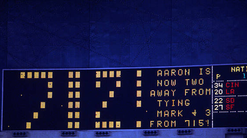

GTGFTS: 09/22/1973 Atlanta Braves (4) at Houston Astros (2); Houston Astrodome.
Good going, Morris!
Hank Aaron belted a 3-run shot at the ‘StroDome for HR #39 on the year and #712 all-time.
In other SB action, Pete Rose just missed hitting for the cycle (failed to triple) in the Reds 11-9 W over the Dodgers. Willie McCovey and Garry Maddox both homered to help Juan Marichal pick up his 11th W as the Giants beat the Padres 5-2 in a poorly-attended contest (Attendance ,3148) at Candlestick Park.
For UW GTGFTS reporting…this is ChrisH.
GTGFTS: 09/22/1973 – Atlanta Braves (4) at Houston Astros (2); Houston Astrodome.
“That always comes off as odd to me because of its and Rangers’ association with Protestantism and the sectarianism that is part of the rivalry with the Irish Catholic-heritage Celtic — wouldn’t they want to stamp that out?”
I assure you they do not want to.
Yeah, I thought that to myself after writing that, but decided not to sound cynical.
Yeah they talk a lot about how bad it is, and they do genuinely want to curb actual violence which is considerably less than it was in the 20th Century, but the reality is it fuels the rivalry. It’s actually started to get worse again I think since the 2014 referendum and then Brexit. You of course have Celtic supporters as pro-independence and pro-EU with Rangers being the Unionists and generally more against the EU.
As happy as I am to see women’s soccer uniforms get more attention, looking at the backs of those jerseys, with some kind of collar logo, then an advertiser, then the player’s name, *then* the number, and finally another advertiser… wooooow is that horrific. Hopefully someday they’ll make good money and not need to look like this.
I’m with you there. Doing these pieces every year lets me show how it’s slowly getting a little better, at least.
GTGFTU: 82nd Grey Cup – 11/27/1994 – BC Lions (26) vs Baltimore FC (Stallions) (23); BC Place Stadium
On spot Nat. Great game; the crowd exploded when Passaglia hit the field goal to keep the Grey Cup in Canada.
Interesting part of this uniform-wise. BC Lions were the “road” team for this Grey Cup in Vancouver. Wearing their white road jerseys in their home stadium.
It used to alternate back then between East Division and West Division for who would be the home team in the Grey Cup. It is different now. These days, if a West Division city is hosting the Grey Cup the West champion is the home team, and vice versa.
Morris got the game and date on the scoreboard game. I was there that night. link of the booklet the Astros were giving away to honor Hank’s HR chase. Each of his then 711 homers was listed and they left blank entries for you to fill in his next three.
Posted that wrong. It should say “Here is the cover of the booklet….”
That is a classy souvenir by the Astros. I hope you kept the book!
Yes I did! In fact the last entry on my memorabilia blog before I took my (now extended) break featured the booklet. You can see the rest of it at this link:
link
Bonus points for Bob – very cool, thanks for sharing that giveaway item too!
Football (soccer?) not my go-to sport really but this was a pretty cool article, well researched like Phil said… some favorites love the stained glass on Celtic team and bonus points for one of their ads being for their own Foundation, Aberdeen’s Northern Lights could be a Miami Vice, the 2nd Livingston shirt probably my favorite not classic but looks sharp (is that smoke in the photo BTW?) Honorable mention for Motherwell for the suicide prevention patch, and Partick Thistle has to be the coolest name for a city and the map shirt is cute/clever/hilarious… thanks Jamie, love the article and would love to see one on goalies unis and how/why they differ from regular team shirts, etc.
Thanks! Other people I’ve shown the Aberdeen shirt to have definitely made Miami Vice comparisons.
Yes, that is smoke in Livingston’s picture.
Love the SPFL! Very surprised/happy to see this feature today.
Thanks!
Nice write up on the Scottish leagues Jamie. overall a fairly solid league design wise. I don’t love the pale grey and pink from Park Thistle but their other two are fun.
Thanks!
Some interesting and good-looking kits in Scotland. Excellent rundown of the kits Jamie.
I have always been a fan of the Celtic, this year with the stained-glass detail it is even better. I also always like the vintage look of a sash. Motherwell done!
I clearly have a type in kits bc my favorite US jerseys have been the waldos & the anniversary set w/ the sash.
The Hearts 150th anniversary is very cool. Major bonus points for the long sleeves & no sponsor.
Lots of nice kits in this roundup; I don’t think it’s a direct inspiration, but the Partick Thistle womens’ side’s shirt reminds me of the classic Univ. de Guadalajara design from the Mexican League
link