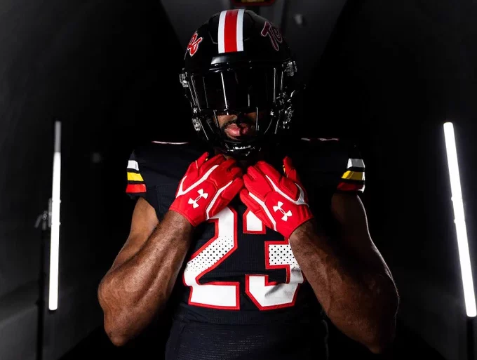
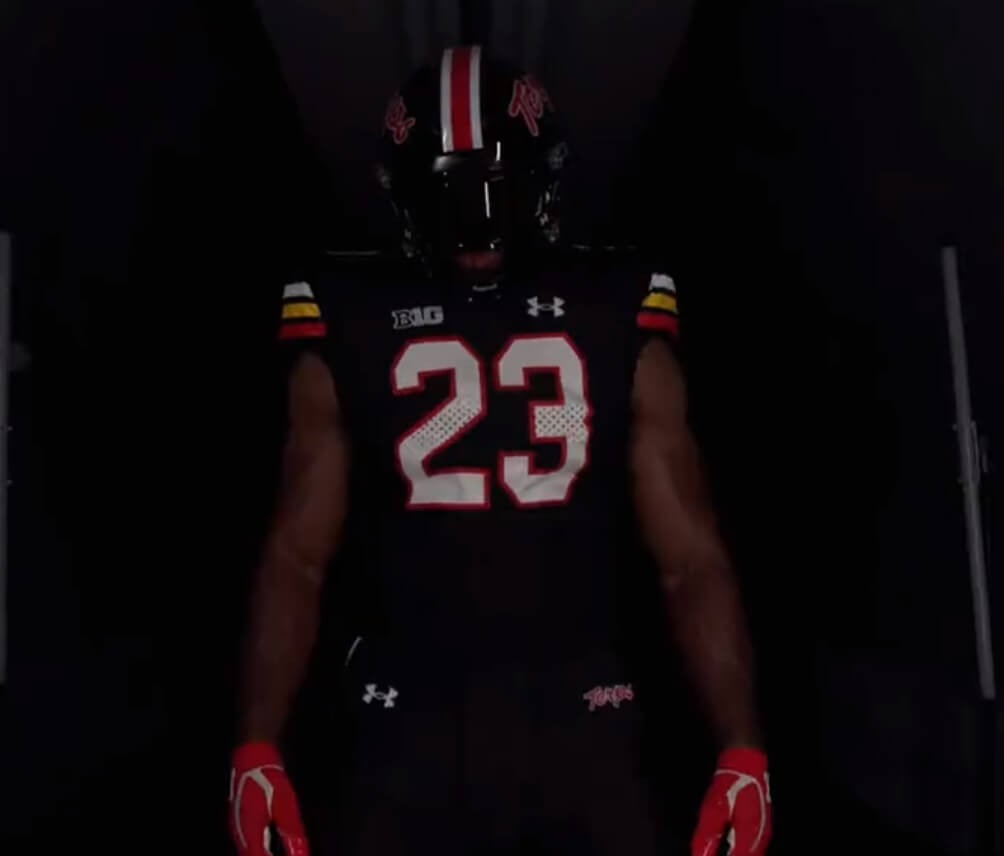
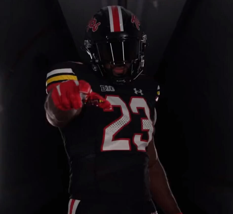
After unveiling a new black helmet yesterday, the University of Maryland today added a new all-black uniform, confirming my earlier suspicions. In addition, we got our first full looks at the new helmet, which we can now see has a white/red/white stripe down the center (which I had also noted would likely be the case in the earlier unveiling).
The new uniform follows earlier reporting that the Terps were returning to the “Terps Script” uniform they had worn from 2001-2010. The new black helmet and uniform are also in that throwback style.
Here’s the hype video the team posted earlier today:
⚫️ So Beautiful ⚫️#TBIA pic.twitter.com/o0v86VPWj2
— Maryland Football (@TerpsFootball) August 22, 2023
The new black helmet will be paired with the new black uniform.
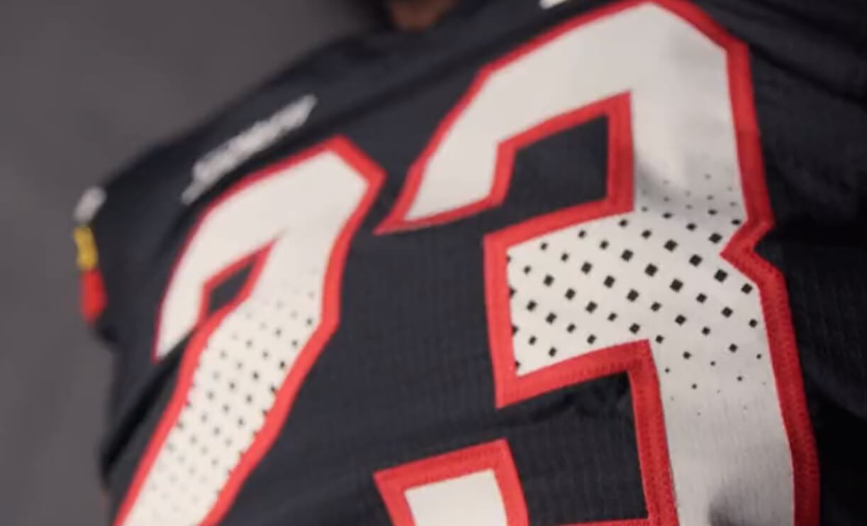
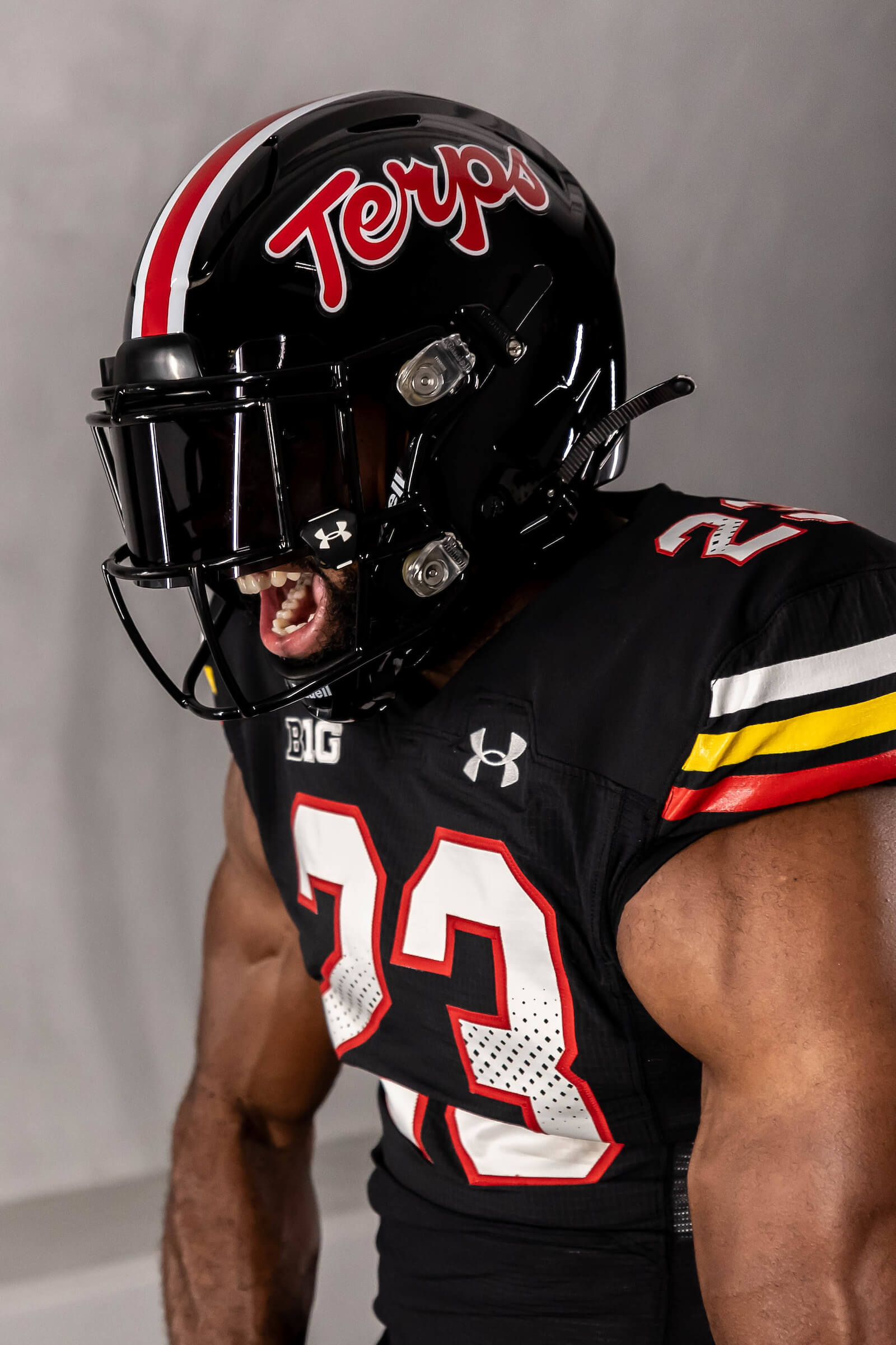
Like its red and white counterparts, the jersey features three stripes containing three of the school’s four official colors: red, gold, black and white. On the black jersey, the striping pattern is white/gold/red, separated by black stripes, on the sleeve caps.
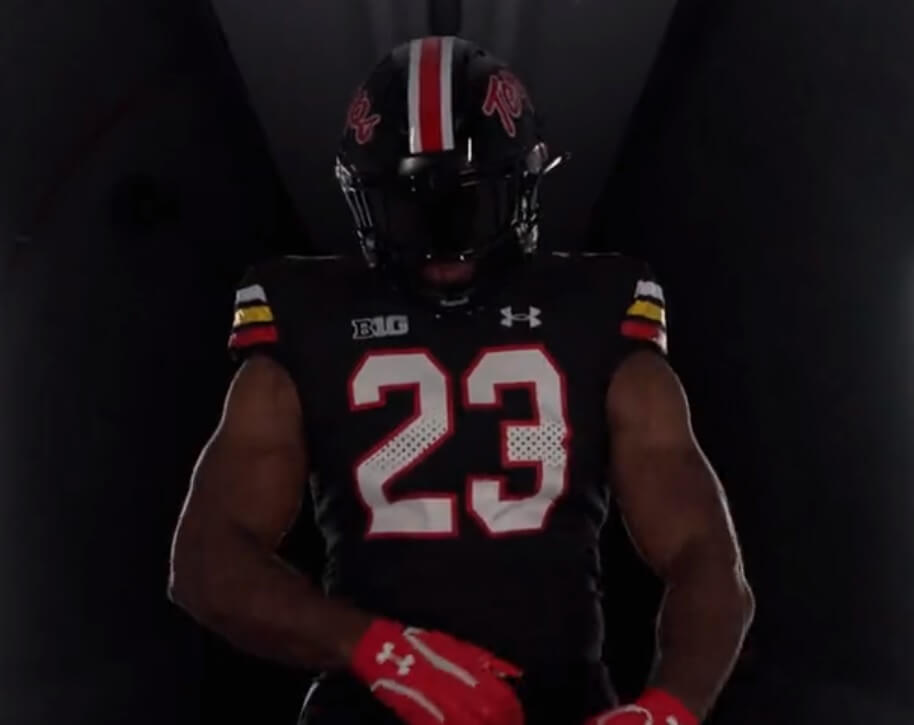
And like the white and red jerseys, the numbers on the new jersey feature a faux perforation pattern, mimicing the style of the old-school mesh jerseys worn in the past. Numbers on the black jersey are white, outlined in red.
Here’s a closer view.
Although we never got a really good look at the pants in the hype video, we do see there is a white/red/white stripe down the sides, the same stripe found on the helmet.
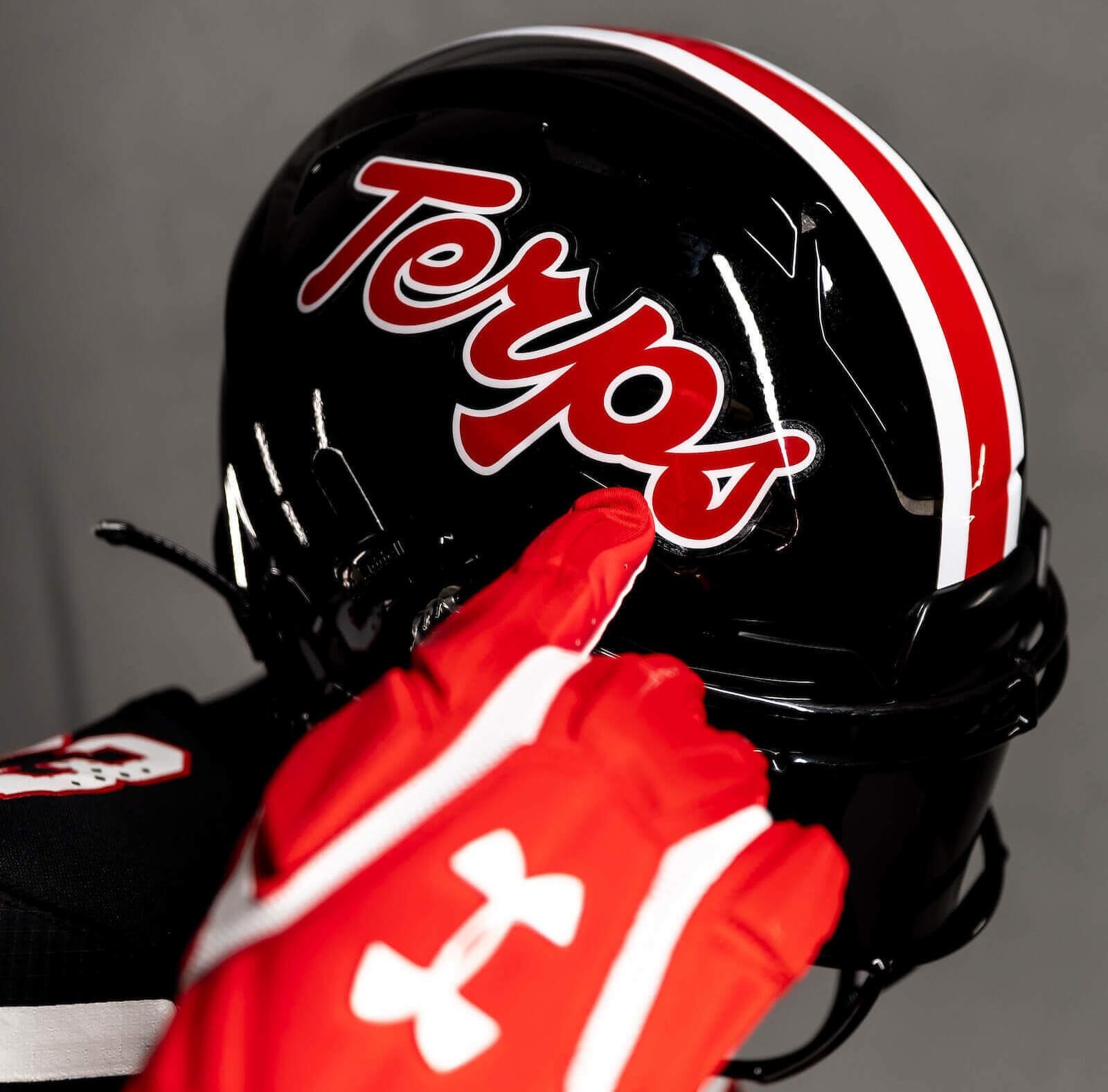
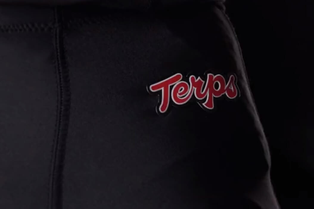
The pants will also have “Terps” in red script (the same as on the helmet) on the left front hip.
The Terps will debut this new uniform in a nationally televised game (FS1) in Week 3 (against Virginia, on a Friday evening at 7:00 pm ET).
Really wish the stripe pattern on the sleeves would match the helmet and pants or vice versa.
Agreed! The striping on the sleeves would have really set this off if it was duplicated with the helmet/pants.
I disagree. This is one of those things that has become accepted as conventional wisdom around here, but I personally think sleeve stripes are different than helmet stripes and should be treated accordingly. That’s probably because I’m an Ohio State alumnus who grew up with the gray-stripe jerseys, but think of like the Packers or the Steelers or the Cowboys. Their sleeve stripes are what make those jerseys great. They would look boring and even bad if they just recycled the helmet stripes on the jersey sleeve.
@Kevin, I get what you are saying and I agree with you almost entirely. However, each pro example you provide uses the same colors, creating a unified look through color if not pattern. The issue I have with Maryland (and I have had it throughout much of their uniform history) is that the yellow seems to be an awkward throw-away. It appears nowhere else on the uniform in any way except for that single stripe on the jersey. Perhaps that is a beloved tradition of the school of which I am not aware. Regardless, as a design, I find it bewildering.
Haha, yeah, Maryland isn’t a hill I’m willing to die on, but my larger point stands.
These are pretty sweet. Happy to see the Script Terp return to UMD after all the sturm and drang of “unified branding” under UA. Different sports at the same university do not need the same font and style, especially when you have this look in the back of the closet. GO TERPS!!
This looks like a football team again, rather than a clown outfit. Major upgrade.
I’m not usually a mono color uniform fan, but this looks very good. It works better in college with many players going bare legged, instead of the unitard look with matching socks with pants in the NFL. Hard to tell what this player is wearing on his legs in this dark video. And I’d like to see what this would look like if the helmet and pants also had yellow stripes to match the sleeves.
I’m with you… this is one of the best mono-black unis I’ve ever seen.
My only quibble is I wish the script was white with red trim. It’s not a deal breaker though.
Wow, the pants have stripes on them! I wish Arizona would do this with their blue pants, a much more finished look. The gold stripe on the jersey looks out of place, you don’t see it anywhere else on the uniform, but Maryland has been known to do this since the 1950’s.
I remember the 70s Terps had a white helmet with gold and black, and the jerseys were red with black.
I loved that.
My father’s Maryland helmet was white with gold and black stripes, the pants were white with the same stripes and the jersey was red with white UCLA stripes. It looked like parts of two different uniforms. Even Boomer Esiason wore the mismatched uniform his first two years at Maryland, though people call the red helmet with the white script the Esiason era, he only had it in 1982 and 83.
Wow! Another monochrome, all black, uniform.
Just what football needs.
No, they aren’t “sweet” or “fire”. They are boring and unimaginative.
Well, let’s just say this is addition by subraction…or rather substitution.
They previously had a mono-black uniform: link
I think *most* of us would agree this one is far superior to the “flag-based motif” that were the previous uniforms.
So, while it is “Another monochrome, all black, uniform” — it’s replacing a monochrome, all black, uniform.
Since black is officially one of UMd’s school colors, it’s not a BFBS uniform that is, somehow, still all the rage these days.
And it’s definitely one of the better ones out there.
What are your thoughts about a school adding black to their “official” colors? Has this ever been done, especially recently with all this fade of going with black alternate uniforms? I know at my school, USC, people would lose it if the football team added a black alternate, but they don’t seem to mind that every other sport has a black option.
The U of M has always had the four colors of the state flag — the white and red of the Crossland, and the black and gold of Lord Baltimore.
Obviously when a team adds black it is BFBS, which I don’t like. If their colors include black from the beginning (or shortly after founding) — like Vandy, Purdue, Maryland, etc., then I’m fine with a team wearing black.
In football, at least, I blame this all on Nikegon, which if they weren’t the *first* to adopt a BFBS uni, they were close (obviously teams in other sports did it before Oregon, but they kinda started it with football). To their credit (or detriment, depending on your POV), they have been and continue to be trendsetters for football teams — of course, having Phil Knight’s Nike billions behind them doesn’t hurt, and I’m sure the Nike team views successful uni ventures at Oregon to be a template for other schools/pro teams.
As to your specific question about other recent teams to go BFBS, there are a lot (not just college football).
And the reason is pretty simple: fans love black gear (caps, jerseys), so it’s almost an excuse to print money for them to add black when it had not previously been an official color.
Addition by subtraction, yes. Especially since it throws back to a kit uwers would have hated real time. I hated it, but not for mismatched sleeves. Rather then say what I would have changed with newer boomer, it’s a pretty solid looking mix and match in general, I’m optimistic.
Go Terps! Even though I loved the Maryland Pride uniforms from 2011 with all my heart.. I’m glad we’re (Maryland is) going back to the “Terps Script” uniforms and that we are also adding a black version of it. These are very cool uniforms and reminds me of the Ravens alts/the Falcons throwbacks. I’d love to see them wear the Black jerseys with red pants.. Also for any hypothetical yellow uniform to come in our future.. either the red or black pants would be a great combination.. rather than an all yellow look.
The only thing I would truly change after moving back to the “Terps Script” uniforms is that at least once a year the Terps wear the 2011 Maryland Pride uniform and helmet. When I first saw that pride jersey.. I can honestly say “I got it”
I will always want to be a uniform creator and admirer because of this website and all the truly great minds that have created my favorite uniforms through the years.
Thanks!
Yawn. Another BFBS uniform. Players, recruits, and jersey-buying fans must love them, because it seems that every school is going down this road.
Maryland wore a black link alternate jersey in the Neil O’donnel era too
The new uniforms are based on the 80s Bobby Ross era, not 2001 – 2010 Ralph Friedgen era. While Maryland did have the script “Terps” on the helmet from 2001-2010, the helmet was white and had a quasi-Northwestern style striping. The jerseys were also vastly different than the new ones.
Those helmets are almost exactly the same as Hart High School in Santa Clarita, CA which they have been wearing for years haha
I do not like all black uniforms from top to bottom but this somehow does not look halfbad. Because of the striping. That detail within the numbers is typically UA: clunky and boring design. But otherwise, not as bad as I thought it would be.