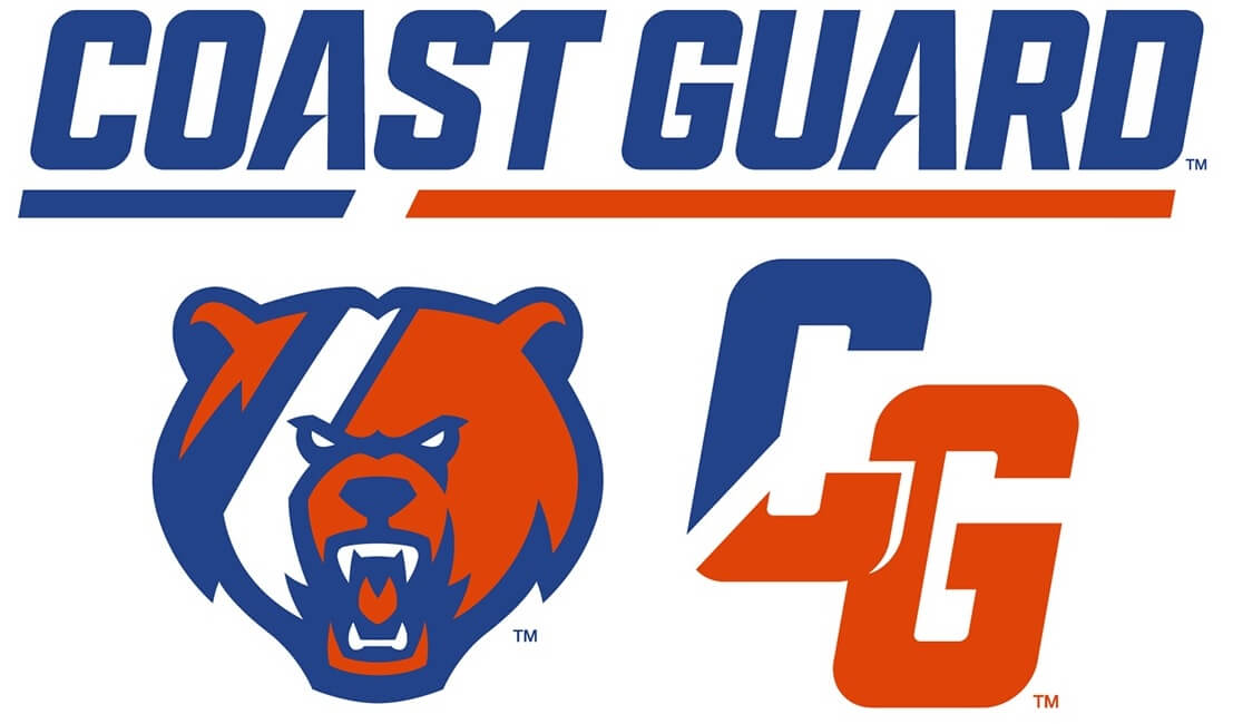
Yesterday, the U.S. Coast Guard Academy unveiled a new brand identity for all intercollegiate athletic programs. The rebrand was inspired by two core elements: the Coast Guard racing stripe and the athletics’ mascot, the bear.
The new branding will be worn across all sports.
Before we take a look at the new logos and wordmarks, here’s a hype video:
According to Dan Rose, USCGA Director of Athletics, “The goal of this project was to refresh our marks in a way that strengthens our alignment with the operational Coast Guard and pays homage to the rich traditions of our service.” The goal is to position the brand as “locally relevant, nationally prominent, and — above all — authentic to the Coast Guard ethos.”
The first goal of the rebrand was to incorporate the “racing stripe” which is featured on all Coast Guard ships, aircraft and other transport, into the uniforms, logos, wordmaks and athletics gear.
Accordingly…
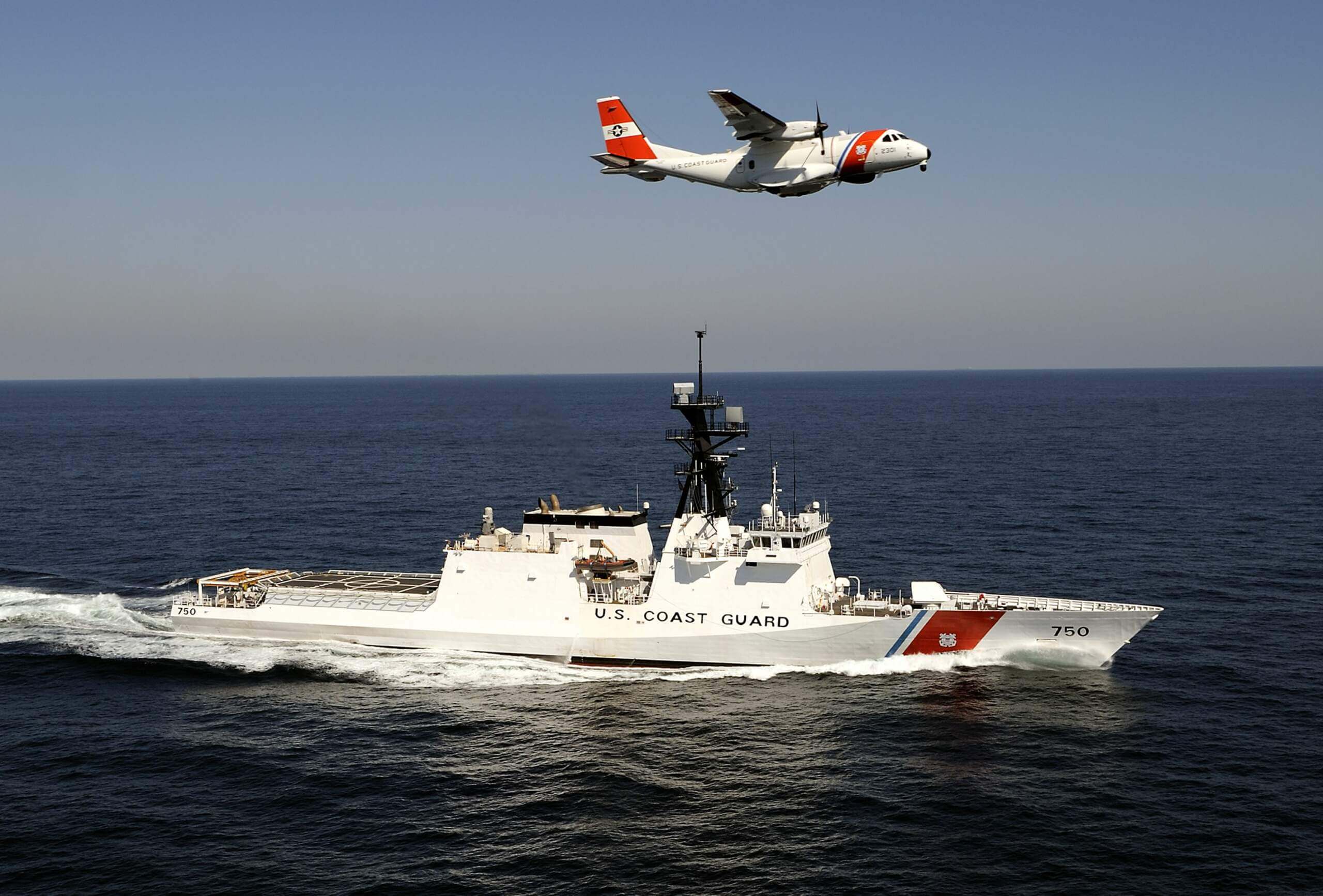
The racing stripe is the global identifier of the Coast Guard, connecting anyone associated with the branch. The iconic stripe is present on all Coast Guard assets ranging from patrol boats and cutters to helicopters and fixed-wing aircraft. This distinct feature is embedded within the core brand marks and uniform striping in order to build an immediate connection between the athletic department and the United States Coast Guard.
The second goal was to place emphasis on the bear — originally Objee the Bear, the Coast Guard mascot. The bear was introduced as the Academy’s mascot in 1926 — and you can read more about that here. The current bear is inspired by the Alaskan Kodiak Bear, a rare species native to Alaska’s Kodiak Island, “the ideal metaphor of the Coast Guard’s small yet mighty presence within the U.S. Military system.” It also pays tribute to the Revenue Cutter Bear, a ship which was commissioned in 1885 and served until 1944. According to the Coast Guard, “The bear is shown charging and strong, inspired by the Coast Guard spirit of facing all missions head-on.”
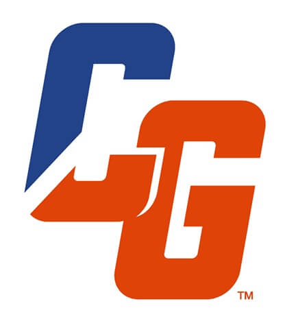
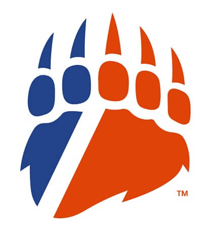
Here’s a look at the new logos and wordmarks:
Full Body Bear Mark

Wordmark
Bear Head Mark
Lettermark
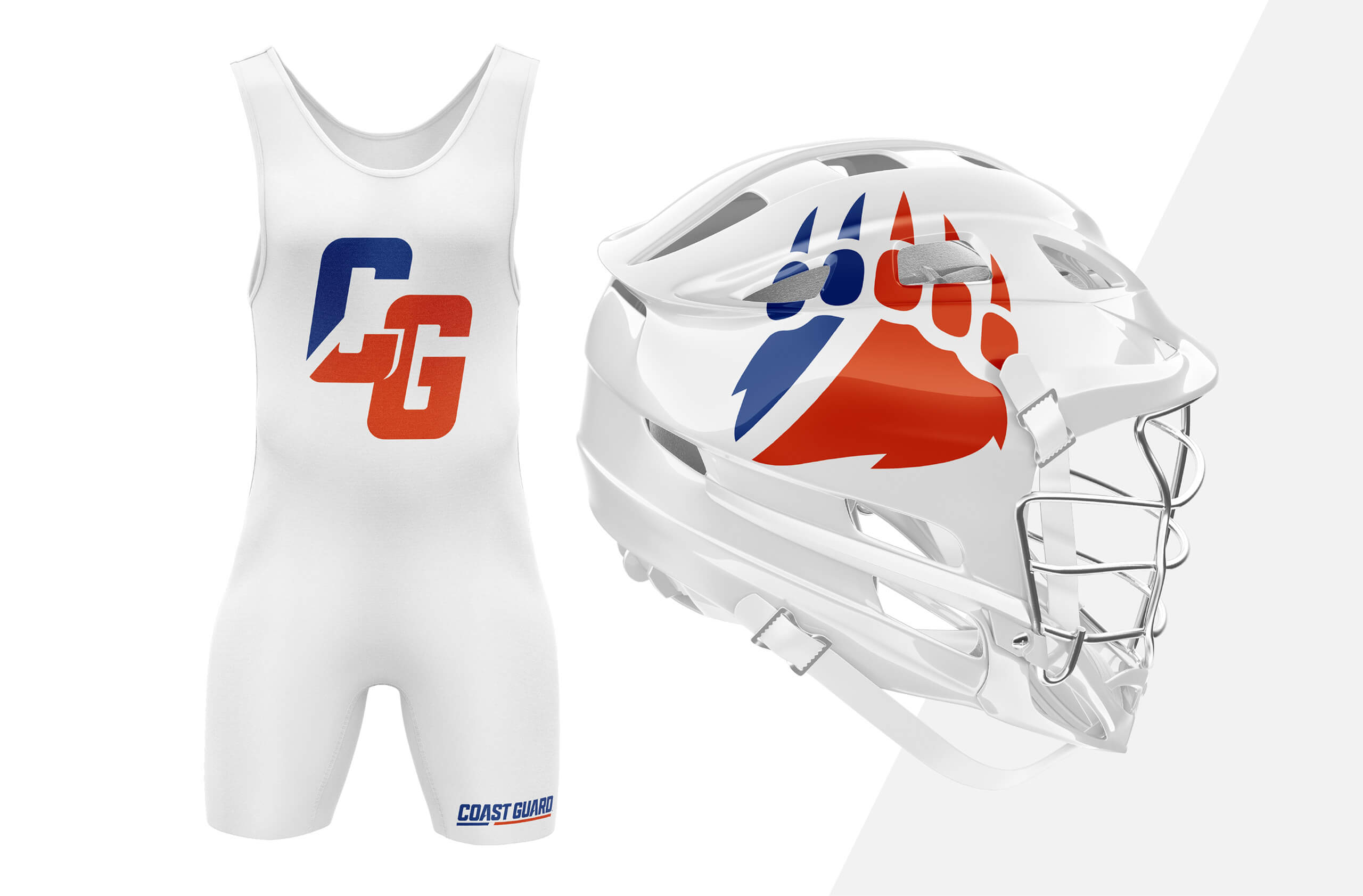
Paw Mark
The Coast Guard also introduced a new, custom font, “created for the exclusive use of Coast Guard Athletics to feel bold and streamlined, with curved motion lines in the ‘A’ reminiscent of ocean waves.”
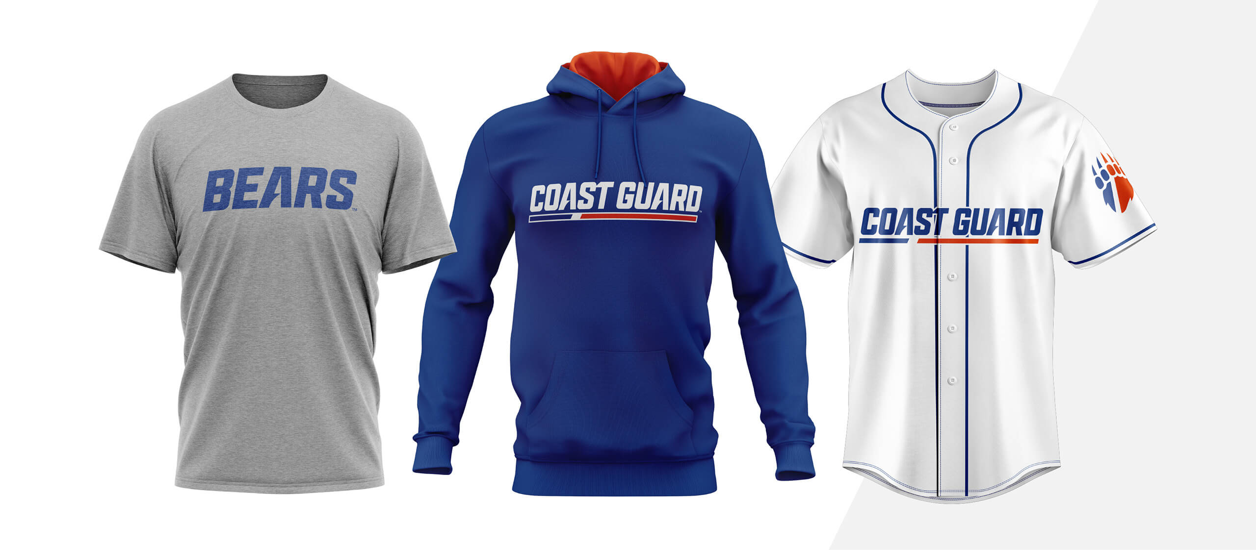
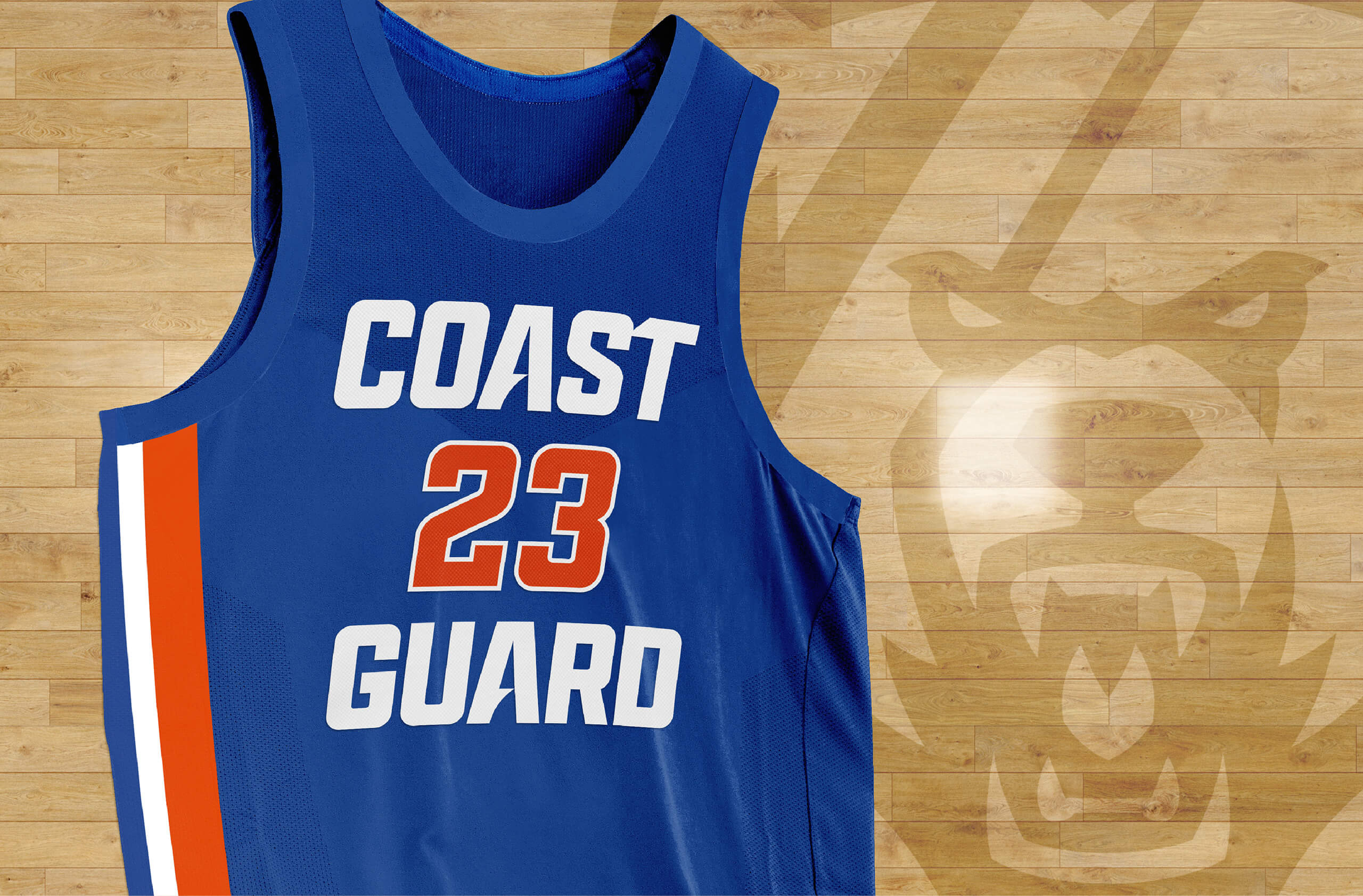
The entire rebranding will take place on all Coast Guard athletics uniforms and gear. Here are some looks at how the new branding will appear on athletic unis and other apparel.
The new branding has already been incorporated into the CG’s athletic website.
Major thanks go out to Bryan May for bringing this rebrand to my attention!
Not a bad look. But as a proud graduate of the USMMA I have to add: BEAT Coast Guard!
I’m confused by the orange. When looking up the Coast Guard colors on ships and aircraft, it says this…” COAST GUARD MARK
The Coast Guard mark is available for commercial use with a license agreement. The Coast Guard mark consists of the Coast Guard emblem and a tri-colored band of Coast Guard blue (PMS 307 C), then white, then Coast Guard red (PMS 179 C).
The wordmarks/logos do appear to have more of an orange hue than Coral Red (which is PMS 179C) link
Never knew their mascot was a bear. I assumed it would have been some sort of marine animal.
That makes sense to me, so I looked it up. They’re named after a ship:
The academy nickname is the Bears, after the USRC Bear, which made a dramatic rescue in Alaska in 1897, shortly after the opening of the academy.
Well the Navy is a goat.
That’s a good rebrand
Funny that the CG claims the custom-font A crossbar resembles a wave, when it also happens to resemble the shape of the bow of the USCGC Eagle, one of the most famous tall ships in the world today.
I like the ideas behind these new marks a lot, and a few of them work really well for me (I’m surprised by how much I like the paw mark). But the inconsistency in the angles of the white stripes from element to element to element and the inconsistency of the proportional width or volume of blue versus orange makes the whole package feel like a miss to me.
Oh, don’t be such a nitpicker.
Based on the logos the Coast Guard Academy had been using:
link
link
…I’d call the rebrand an upgrade.
The charging bear reminds me of Cal Berkeley, but the use of the stripe is very distinctive. A bit like David Bowie during Aladdin Sane. That monogram is really good, as is the paw. All in all a good rebrand.
The bear’s teeth look like the plastic vampire fangs you get during Halloween.
Really like that wordmark.
Skye Dillon does amazing work – not surprised at all that this rebrand looks so good.
Agreed. I’m surprised more schools and sports teams don’t take advantage of his services.
It’s about time the racing stripe was incorporated into CGA’s look! I will miss the old paw mark with its subtle and clean navy blue outline, but ecstatic that the old bear logo, which was essentially a minor league horrible version of the Carolina Panther logo in bear-form, is gone for good.
Does anyone else know of Raymond Loewy-design inspired uniforms?