By Phil Hecken, with Egon Schiele
Follow @PhilHecken
Hey everybody — it’s Phil, back with you guys in my regular Weekend slot, and it feels good. Hope everyone has been safe and healthy the past couple weeks. For the year from hell, summer seemed to speed right by, didn’t it? There’s A LOT to get to today, so I’ll keep it short and sweet.
As you’re all (hopefully) aware, COVID-19 has wrought havoc not just upon the world, and the United States in particular, but it’s also caused the sports world to re-examine how it would begin to return during the pandemic. All sporting events stopped for several months, and most of the leagues around the world have returned to play (or will be returning shortly), albeit with sometimes jumbled schedules and games held in “bubbles” and cardboard cutout fans. The Premier League was just one of many who had to scramble to piece together a season ending after a COVID-restart, and would normally have begun a new 2020-21 season in August. The resumption of the prior season happened after a three-month suspension, and didn’t conclude until July 26th (normally a season ends in May), which forced the 2020-21 season to be moved back as well. And today is the first day of that new season.
I confess that due to many things going on, I didn’t even realize the season was starting today until Wednesday of this week(!). My bad. And usually I have my “soccer guys” — Kyle Evans and CJ Fleck — bring you the PL P/review. But it didn’t quite work out. Fortunately, UW reader Egon Schiele offered to do this year’s preview for us, and he’s done a bang-up job! So, without further ado, it’s my pleasure to introduce Egon to you and please, enjoy the writeup!
2020/21 Premier League Kits
by Egon Schiele
The NFL isn’t the only football season starting this week. After only seven weeks away, the Premier League is back. Because European Football clubs change jersey designs every season, the yearly uni round ups are always a fun affair. I’ve been a uni nut since I was old enough to draw, so I’m pleased to be able to present this year’s slate of kits. Let’s begin, shall we?
Arsenal:
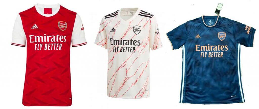
Even as a Chelsea fan, it’s easy to admit that Arsenal are one of the best dressed teams in the league. Their home red is iconic and always done with a sartorial flair. This year is no different. Red with white sleeves, this year’s version is sublimated with a quite handsome art deco pattern. Complete with white shorts and burgundy socks featuring their first logo make for a top notch home uniform.
The ostentatious away shirt is patterned to look like white marble and the all black crest just serves to make the Emirates ad to stick out even more than it already does. The third change is a harmless affair, with echoes of what Adidas has been doing for Real Madrid for years (and in the exact same template as this year’s Real Madrid third change), in navy blue and an orange so light it reads as pink. Paired with blue shorts and dark blue socks, it’s actually quite smart, and sure to turn some cash registers in North London.
Aston Villa:
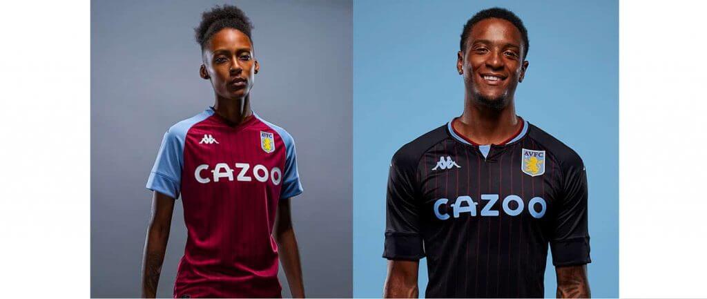
Aston Villa’s home jersey is classic, sporting the club’s ubiquitous claret and light blue raglan sleeves, complete with subtle maroon pinstripes. Here, maker Kappa has found a v-neck that works as opposed to the uncomfortable version Nike has been trodding out for several years now. Matched with white shorts and maybe the most beautiful socks in the beautiful game, the home kit does what it should: bring pride and confidence.
Unfortunately, the away kit gives us glaring BFBS that really clashes with the light blue and claret the club is best known. The design itself is fairly strong; at it’s best reminds me a bit of the ‘97 Chicago Bulls black with red pinstripe jersey.
Brighton & Hove Albion:
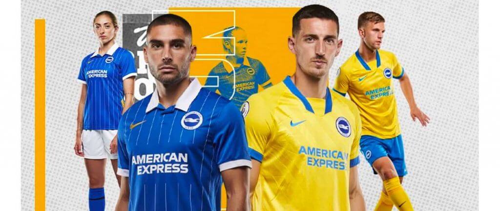
The new Brighton home kit is a stunner. A blue top with a smart white button collar and white hoops around the sleeves, Brighton moved away from their traditional stripes for thin white pinstripes with amazing results. Unfortunately, the pinstripes break for the sponsor logo, as well the bizarre look of stopping for name and number on the back, which is always quite visually arresting.
Their away uniform features the strangely ribbon like 90s collar which Nike used on several alternate kits last year (most notably on Chelsea’s and Athletico’s) in blue on top of a yellow shirt. Topped over blue shorts and yellow socks, the whole look is vaguely Chelsea-ish, but somehow feels like a statement piece that can provide identity for a proud club fighting for its place in England’s top flight.
Burnley:
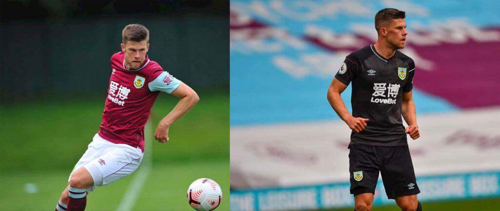
One wonders if Paul includes “claret” in his vendetta against the color purple. Burnley’s new kit certainly makes a strong case. The combination of half sleeves with the light blue circling on the collar speaks more to a design by committee than it does at attempting to make a shirt that looks good on the person wearing it. The “Love Bet” sponsor surely doesn’t help.
Chelsea:

The biggest complaint with this kit is that they look like pajamas and, once seen, cannot be unseen. The cobalt away kit particularly screams sleepwear with its dark navy trim and arbitrary dashed print.
But for Nike’s coup de grace is a red and blue striped third kit, ostensibly a Crystal Palace jersey. This would be akin to dressing the Red Sox in white and Yankee blue or the Celtics in purple and gold. In short, a travesty.
Crystal Palace:
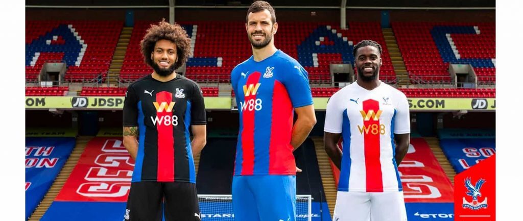
While the story of Crystal Palace Chairman Steve Parish reaching out to a local designer @palacekit over Instagram to use his uniform designs inspired from his children’s drawings is charming to say the least, the end result is a bit more complicated. The same design template is used across all three kits — a tall chevron flanked by two lines creating a kind of pyramid shape — is both unique, yet weirdly unfinished. The uniformity throughout the three designs is commendable, but perhaps there is something unsettling about the thwarted stripes on a Palace jersey that doesn’t quite make it a champion.
Everton:
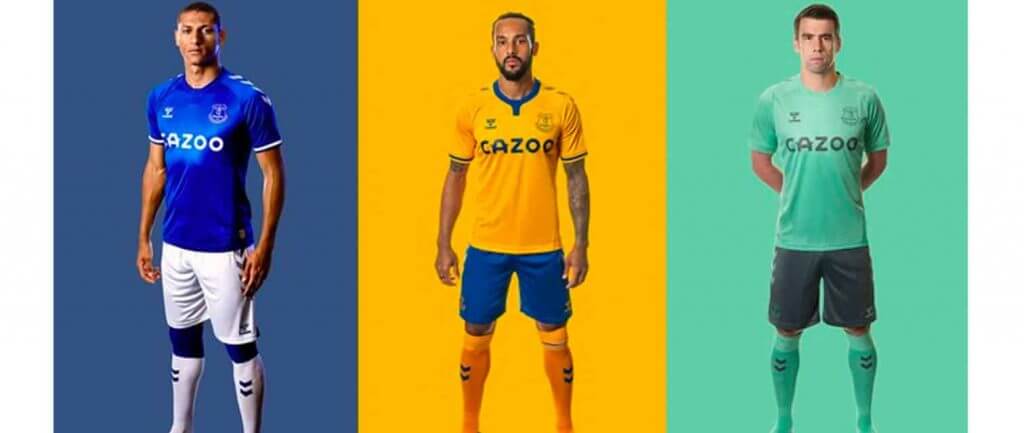
Another understated home shirt for Everton which somehow finds itself one step past subtle in the uncomfortable realm of needless accentuation. Apparently a soundbar of one of the club’s anthems, its stripes read only as ornament for the sake of ornament. The yellow away kit makes good on the concept, with the classic chevron shoulder panel and sleeve stripe well executed. The faux collar on all three designs looks best here, but shines throughout. The third, in seafoam with charcoal, is pleasing enough.
Fulham:
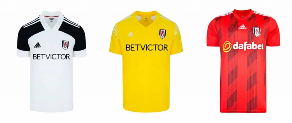
A boring kit for a boring team plus… mono-yellow?
Leeds United:
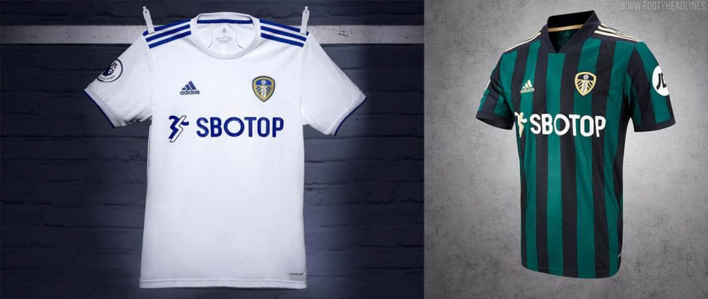
Leeds United is back in the Premier League and with their return a classic white home jersey ruined only by the obnoxious sponsor (SBOTOP? what even is that?). The away kit harkens back to the successful Leeds teams of the mid-nineties but without the collar and looks stunning. Great to see a legendary team with such a refined look.
Leicester City:
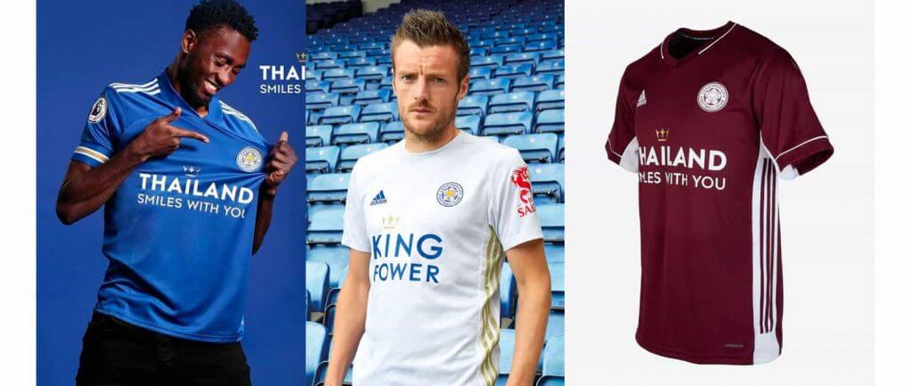
The new home kit for Leicester has a resale look about them. Something about the oddly thin gold stripe on the sleeves or the ever so slightly mismatched shades of blue between the body of the shirt and its sleeves screams secondhand bin. The away kit is subtle, almost unnoticeable. Matched with white shorts and socks, it’s a classic Leicester look accented by Adidas stripes on either side, gold on the left, blue on the right. The change kit is a bland affair in maroon, just a football uniform not trying to be anything but.
Liverpool:
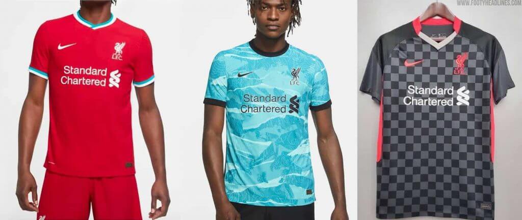
Liverpool the untouchables. Like the Yankees, constant, reassuring. Returning to teal accents this year, Nike has rightly removed the gold from the jerseys leaving the logo, shield, and ad all white. The away look follows the same template as the Chelsea jerseys, but to greater effect. ‘Hyper turquoise’ with a sublimated print inspired by the Shankly Gates — otherwise known as the famous “You’ll Never Walk Alone” gates — which look great despite the fact the print isn’t continued onto the shorts and socks which are for some reason a slightly different shade of turquoise. The third is a very unmemorable black checkered ensemble with red accents and black shorts which you might forget as soon as you finish this sentence.
Manchester City:
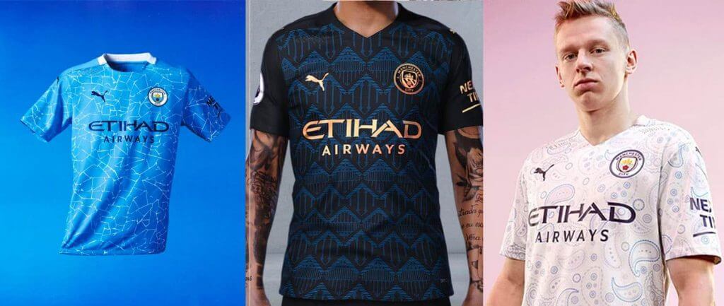
The mosaiced home jersey for Man City is fine. An interesting attempt at a novel design which works as much as it doesn’t. It has a white collar that only wraps around the back, but in this instance works, and their obligatory white shorts. If it ended here, I would be nonplused, but not dismayed. The away kit is black with a ‘dark denim’ sublimated pattern inspired by Manchester’s architecture that works adeptly in its identifiability. Crest, logo, and sponsor are all executed in copper. It really feels like this should work which is why it disappoints so thoroughly that it doesn’t.
City’s change is where things really go off the rails though. A pink and light blue paisley pattern adorns this beige jersey, and over the navy shorts I want to actually like the uniform but it’s all so darn… British. Ugh. We have yet to see this change on the field, but my instincts tell me it’s all going to be too much.
Manchester United:
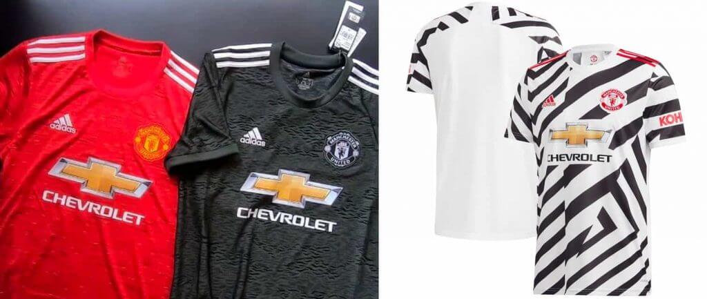
In all of sports there is no ad sponsor as hideous as Manchester United’s Chevrolet logo. It has this uncanny ability to take over no matter what design they bring out, and the way it actually matches the Red Devil’s red jerseys are slightly nauseating. This year, Man U has hatched black and gold stripes across the shirt — a kind of more refined version of what Chelsea had last year — over white shorts. Despite the sponsor, the kit works as a Manchester United kit is supposed to, and the away is black with a kind of Joy Division ‘Unknown Pleasures’ sublimated print. Which is all to say that it’s pretty cool. Their change is based upon dazzle camo, a fractured design used on battleships during WWII, with red detailing. Unfortunately, dazzle camo is predicated on its disjointedness and this shirt fails to accentuate that quality. A great idea underrealized, but better than most.
Newcastle:
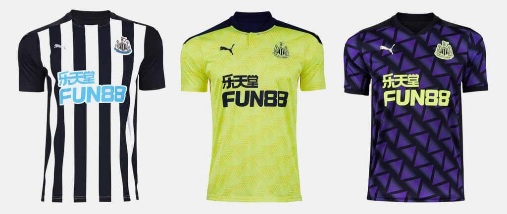
Not messing with a good thing, Newcastle’s home kit is in that traditional jailbird black and white stripes. Particularly compared to recent years, this home jersey is a complete success and should be welcomed warmly by fans. Keeping with tradition though, the away and change kits are horrible disasters. The navy capped shoulders and collar on the away kit is cool on its own, but paired with the most assaulting shade of lime green this writer has ever seen is enough for any sane person to carve out their eyeballs Oedipus style. The third is just a throwaway purple triangle design with neon green details over black shorts which says Newcastle just about as much as the Heiniken I’m drinking.
Sheffield United:
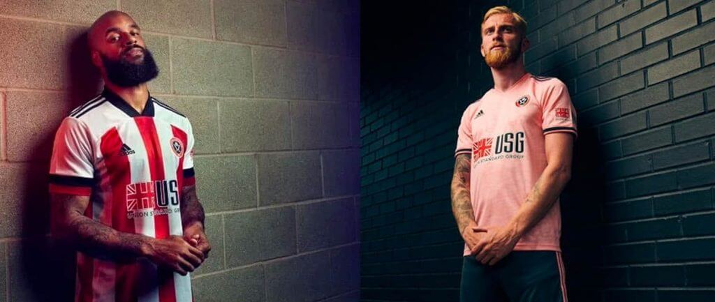
Darling upstarts Sheffield United return for their second consecutive Premier League season wearing their classic red and white stripes with black details. The way the black trims the top of the red hem really lets this shirt sing. Always good looking, Sheffield lets no one down. The away kit is pink featuring a slight jacquard print and gray trim over gray shorts that might be one of the better looks of any team this season. The mix of pink and gray really lets the red of their shield come through and, I suspect, look marvelous on the green of the pitch.
Southampton:
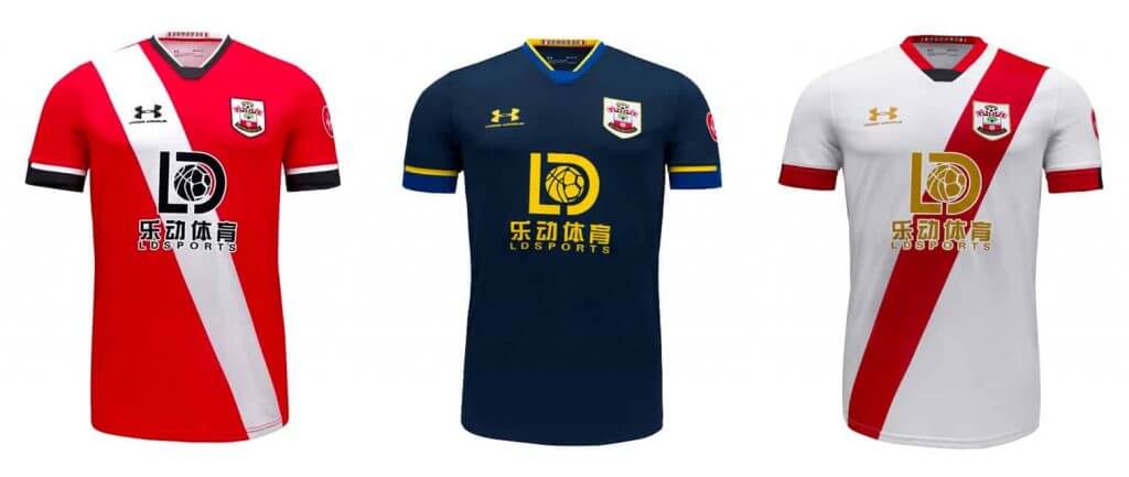
Poor Southampton. Always the bridesmaid, never the bride. This season The Saints have brought back the sash on their home and change jerseys, which might have looked great if not for the horrendous betting sponsor atop. Interestingly, the sash on the red home jersey and on the white change jersey travel in opposite directions. Of the two, the red sash on the change that crosses the team’s crest looks the best, but a fun play on design across the set. The away jersey is the odd one out, a matte navy with bright blue and yellow accents that works as much as you want it not to. While it doesn’t scream Southampton, it looks good; and heck, you never know how a sash might grow on you when seen in play.
Tottenham:
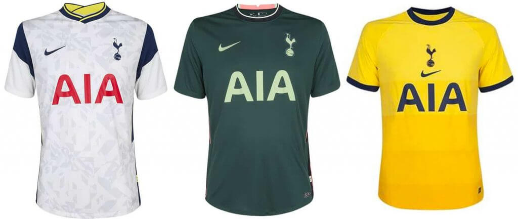
In my opinion, Tottenham have consistently some of the best jerseys year after year. While not their best showing this season, they still outclass most every other team in the league. The home kit is, of course, white with blue hoops around the shoulders and a surprising dash of yellow trim on the otherwise blue collar. Sublimated into the white is a needless geometric pattern. The away introduces an unexpected forest green with neon yellow graphics and ‘lava glow’ accents. It shouldn’t work, but – somehow – it does; even Harry Kane likes it. The change is the Premier League’s second all yellow kit, but styled more like Everton’s away than Fulham’s — which is to say attractively — but this one in a slight gradation before becoming gold. The centered crest is always a dubious move, but not enough to sink an attractive uniform.
West Brom:
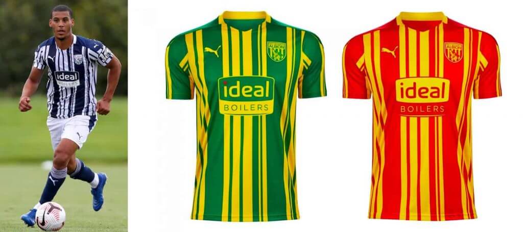
West Bromwich Albion celebrate their return to the Premier League with one of the most dashing uniforms they’ve ever worn. Their classic dark blue and white stripes are reimagined as a barcode, an all too prescient interpretation given the commodification of sports apparel, but one that feels more like a bespoke designer pattern than a chintzy gimmick or out of touch gesture. The reverse is true for their typical green and yellow, why are you pretending to be Norwich City, away strip. Admittedly, the more I look at it, the more I like it, but pales compared to their stunning home jersey. What’s undebatable is the same design in red and yellow is less bad than it is garish. Once again, the uniformity across the designs is admirable, but they please succeedingly less and less.
West Ham:
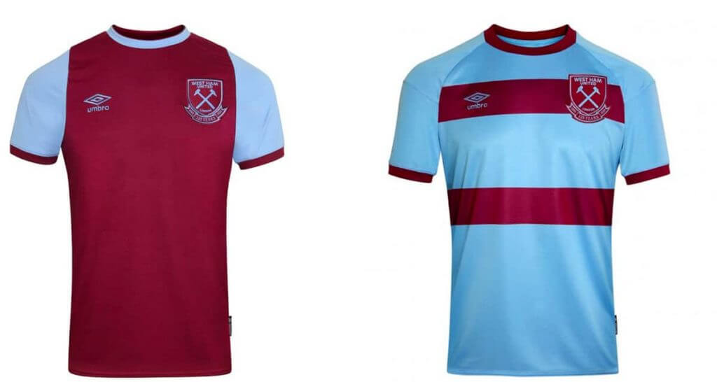
It’s no wonder teams choose to do some outlandish things on their alternate jerseys when you consider just how many Premier League squads brandish the claret and light blue. West Ham just does it best. This year, celebrating their 125th anniversary, The Hammers have a beautifully understated home kit featuring a claret shirt, blue sleeves, and a lovely blue ring for a collar. They feature a simplified crest with a ribbon underneath reading “1895 – 2020, 125 Years.” West Ham United earns extra points for continuing to play in a sponsorless jersey for their under 18s, eschewing their ‘betway’ gambling ad. The away reverses the palette, placing two claret bands across a light blue field with claret hems. Not as pretty as their home uniform, but still provides that nice gratification of a simple design done right. The third kit is merely monoblack, but minimized their crest further, accenting only the hammers and ‘125 Years’ in gold. It’s a nice touch for a classy look. Well done all around.
Wolves:
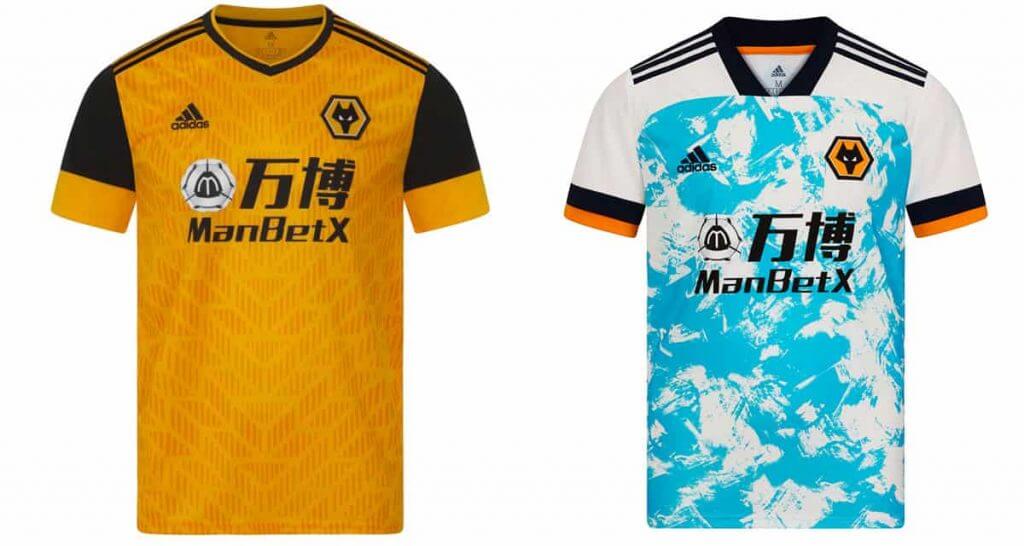
The Wolverhampton Wanderers always have some of the best looks and this year is no different. Their home amber jerseys don’t deviate too much from what has worked so well over the past few seasons. Black sleeves with amber cuffs separate them enough from other designs to be memorable and the tonal sublimated pattern doesn’t distract. The Wolves take a turn on their away strip, pairing a blue painted effect with their traditional amber and black that works surprisingly well. Disappointingly paired with white shorts, the look might be improved by amber or black shorts, but in either case should look refreshing worn on the pitch.
Wow. Thanks, Egon. Quite the writeup there! OK readers (soccer and non-soccer fans alike) — what do you think? Who have the best jerseys? Do you agree with Egon? Let’s hear your thoughts down in the comments below.
What They Should Have Worn…
You guys may recall that over the summer I twice featured the work of Logan Patterson (here and here), who came up with a genius concept of picking a College Game every week and then picking (at least in his view) a far superior uniform matchup. Sometimes he simply picks matchups using uniform elements from a team’s past, and other times he creates entirely new uniforms (if you click on either of the above links, you’ll see what I mean).
Working alongside Logan, we’re going to make this a weekly feature on Sundays (joining the returning Sunday Morning Uni Watch lineup, which returns tomorrow!) — he’ll take one game played on Saturday, and after reviewing the costumes, err, uniforms, the teams wore, and propose a new or “What They Should Have Worn” (WTSHW) matchup.
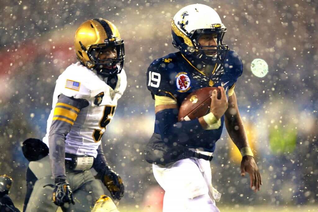
If you didn’t click either link above, you’ll see below what we can expect from Logan this season. Last year, he not only took the Oregon/Arizona and Temple/Tulane pairings I featured over the summer, he also did a WTSHW for Navy and Notre Dame (who at one time were mirror images of one another on the gridiron, with both teams in plain gold helmets and pants, with one team wearing a white jersey and the other a navy blue one — they’ve since become more distinct).
So I’ll turn it over to Logan now (again this one’s from last year), but he’ll be back tomorrow and every Sunday to bring us a new WTSHW.
What Should The Have Worn – Week 12
By Logan Patterson
Welcome back to WTSHW, a weekly recap of less-than-great uniform matchups we saw on the gridiron and my attempts to remedy them.
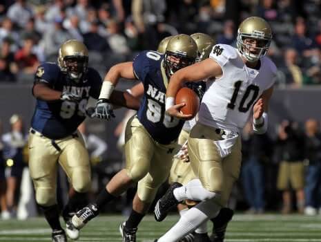
Navy at Notre Dame
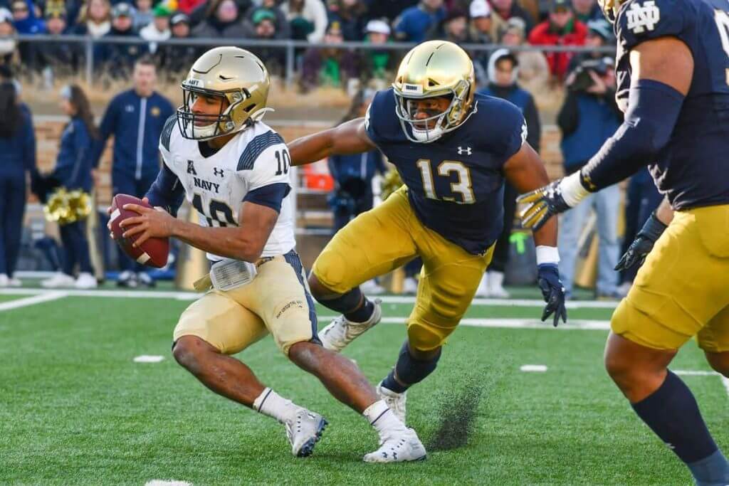
Notre Dame and Navy’s annual matchup has been a national staple since 1927. Historically it’s mostly been one-sided in the favor of the Irish, but has become pretty competitive over the last decade. On the uniform front it’s one of my least favorite games to watch, as year-in and year-out it pretty much looks like a scrimmage. It’s hard to enjoy a game where both teams have the same colors, wear the same pants and helmets, and lean heavily on classic looks.
The most simple option here is having Notre Dame bust out their green jerseys for the Navy game to get a bit of contrast going. Irish fans will love this, as they always win in green!
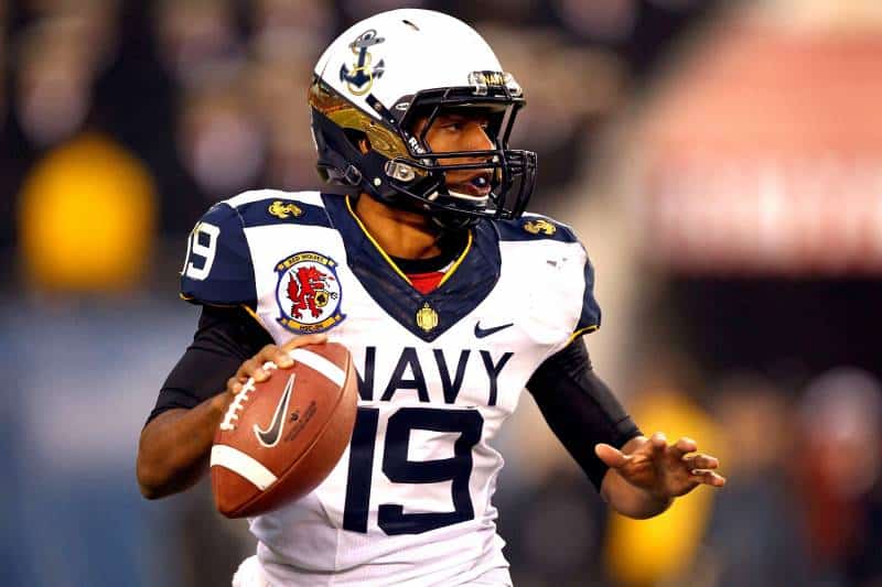
But the best way to tweak this one would have Navy take a trip a few years into the past and don the matching set they wore in 2012 and 2013 against Army – far and away the best the Midshipmen have looked in the modern era. This isn’t terribly realistic though, as Navy has since switched outfitters and is now dressed by Under Armor, but the look still holds up incredibly well.
Here’s What They Should Have Worn
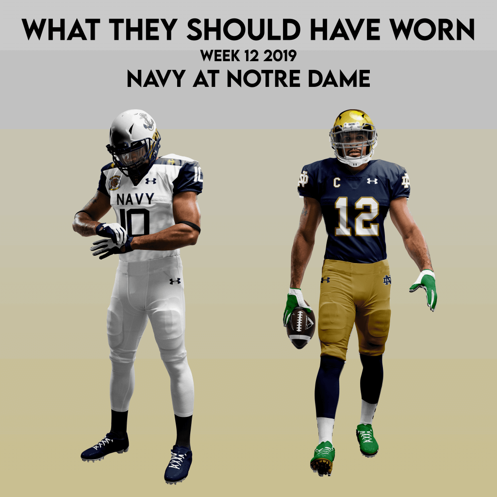
Notre Dame needs almost no changes to their set, but I did enjoy the green gloves and cleats they trotted out for their 2018 Cotton Bowl bout with Clemson. The all-white Navy look gives a plenty of clean contrast to their gold/blue/gold foes.
Thanks Logan! Looking forward to seeing which of today’s games you’ll WTSHW for us tomorrow!

Uni Concepts & Tweaks
Time for more Uni Tweaks from the UW readership.
I hope you guys like this feature and will want to continue to submit your concepts and tweaks to me. If you do, Shoot me an E-mail (Phil (dot) Hecken (at) gmail (dot) com).
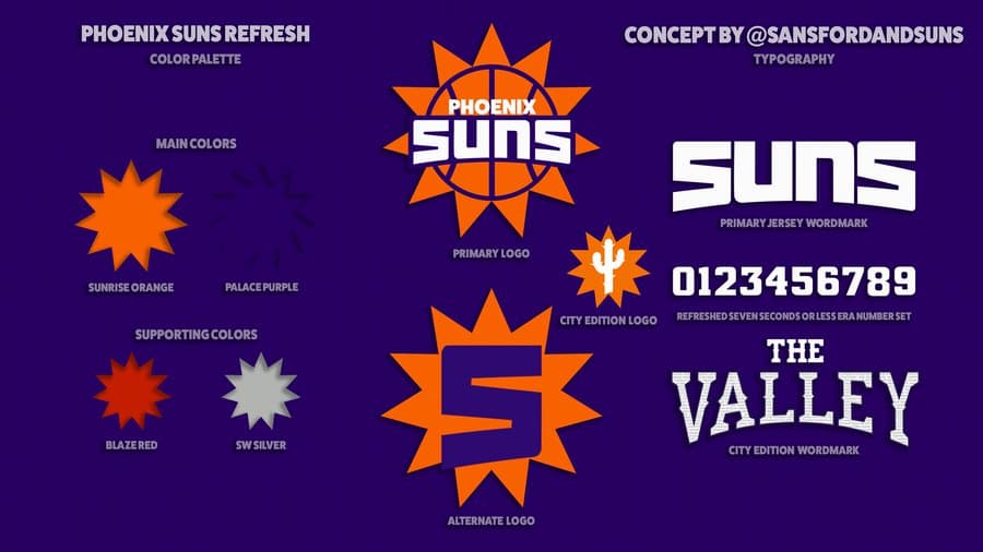
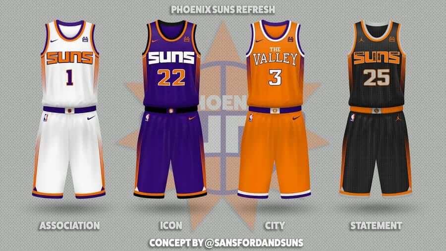
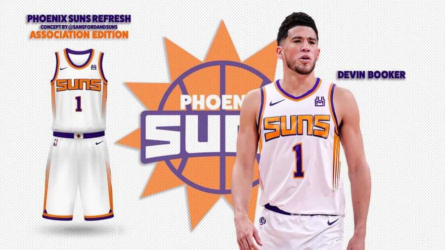
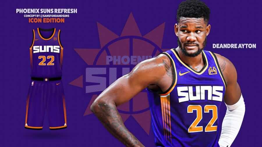
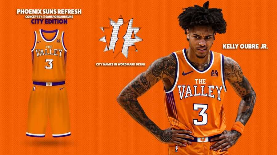
Today’s set of concepts come from Mike Joseph, with a bunch of Phoenix Suns redesigns (click on any image below to enlarge).
He writes,
Been working on this a long time and excited to finally reveal it to @Suns fans. A new identity, inspired by bits of the past but more than a refresh. Retro and modern at the same time, with familiar but fresh colors and styles. I hope you enjoy it as much as I do.
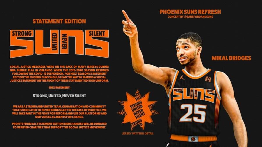
Thanks Mike!
OK readers (and concepters). If you have some tweaks or concepts, shoot ’em my way with a brief description of your creation and I’ll run ’em here.
The Wheaties Box that Should Have Been
Got a nice e-mail from our old Pal Gary Chanko the other day, and it’s pretty excellent (as you’re no doubt aware Gary created those great scoreboard posters among other projects).
Gary’s e-mail self-explanatory, so I’ll let him take it from here (please read through, as Gary might make more Wheaties Box graphics available to UW readers):
Hey Phil,
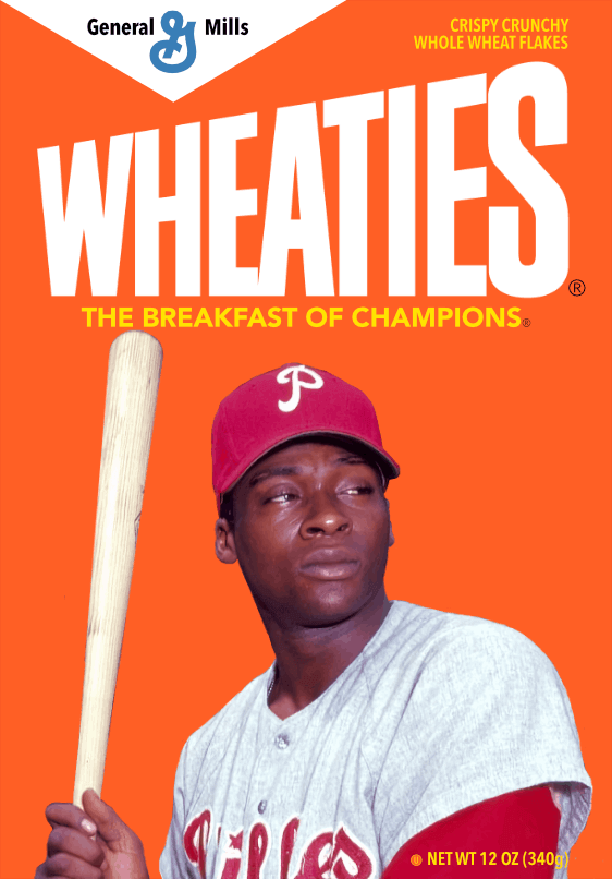
As you may know, the The Phillies retired Dick Allen’s number last weekend. This was a departure from Phillies normal practice of only retiring player numbers when they reach the Hall of Fame. But the owner made a welcome change to that policy. Hopefully the committee will do the right thing next year and finally elect Allen.
Always a Dick Allen fan since his rookie year (1964) with the Phillies. Also a casual collector of Wheaties boxes featuring baseball greats. Allen was never honored with a Wheaties box cover, so I decided to create one.
After the box cover illustration was finished, I continued on to create the entire box. The replica Wheaties box is about 5-1/2 inches tall. The graphic file is attached for those that want make their own copy.
If there’s enough reader interest, I’m open to creating replica boxes for other sports heroes that also should have been Wheaties box cover.
Gary
Thanks, Gary! Please let Gary know in the comments if you’re interested in Gary creating any additional “replica” Wheaties box(es). And yes, Richie Allen has still yet to get his due. Hopefully his HOF snub will be rectified.
Click to enlarge
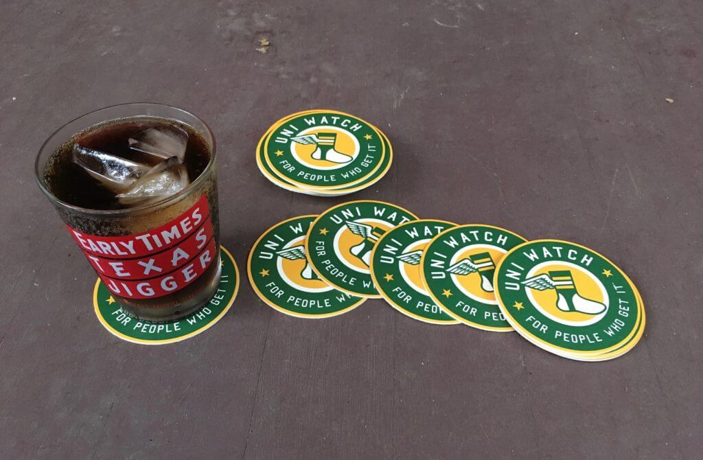
And now a few quick words from Paul: Hi! In case you missed it on Friday, I once again have a few sets of Uni Watch Coasters available. These won’t last long, so move fast if you want a set. Full details here.
Also, a few days we launched our new Uni Watch Color Remix T-shirts. Here are the first four designs:
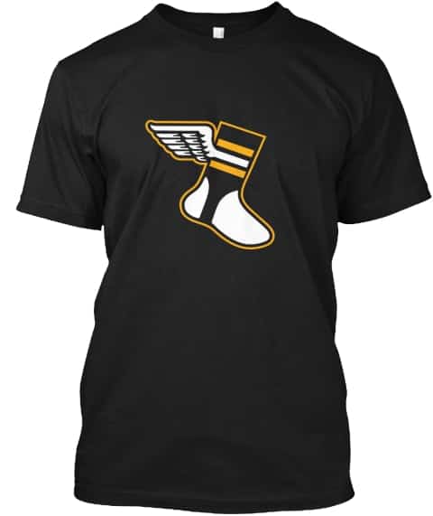
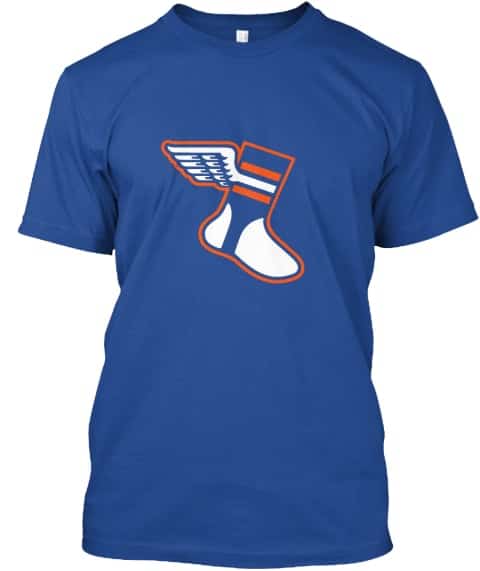
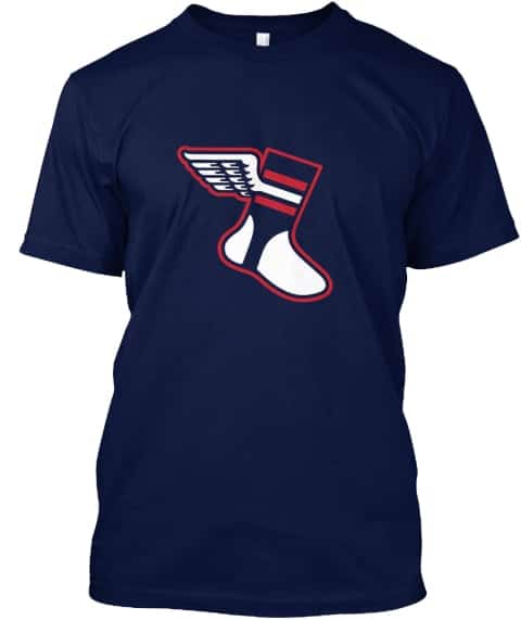
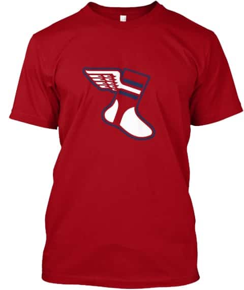
Not bad, right? Here’s where you can order the black/yellow, royal/orange, navy/red, and red/navy versions.
We’ll have matching caps next week, and more color combos each month. There’s some additional info here if you want to know more.
Okay — now back to Phil!

Guess The Game…
from the scoreboard
Today’s scoreboard comes from Mike Chamernik.
The premise of the game (GTGFTS) is simple: I’ll post a scoreboard and you guys simply identify the game depicted. In the past, I don’t know if I’ve ever completely stumped you (some are easier than others).
Here’s the Scoreboard. In the comments below, try to identify the game (date & location, as well as final score). If anything noteworthy occurred during the game, please add that in (and if you were AT the game, well bonus points for you!):
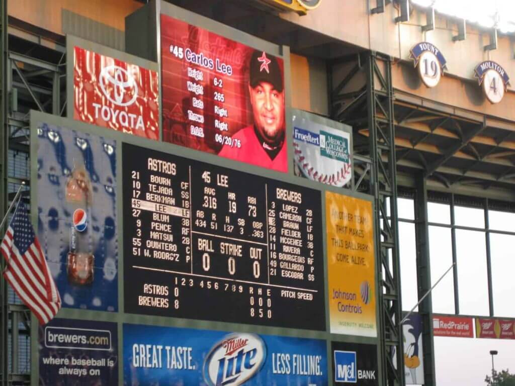
Please continue sending these in! You’re welcome to send me any scoreboard photos (with answers please), and I’ll keep running them.
The Ticker
By Anthony Emerson

Baseball News: The Mets and Yankees both wore caps honoring first responders last night, the nineteenth anniversary of the Sept. 11 terrorist attacks. The caps also had white Mets or Yankees cap logos on the side. The rest of the league’s memorial patches looked like this (from multiple readers). … Reds OF Nick Castellano was wearing a faux-button jersey last night (from Ron Lincoln). … The Cardinals have added a memorial patch for Lou Brock (from Erik Spoonmore). … The Beloit Snappers, Class-A affiliates of the Athletics, have unveiled the five finalists for their new name (from @BallparkHunter). … In last night’s game, the Cubs game on the Marquee Network had the Brewers logo missing the baseball (from J. Colbert).

NFL News: Washington is adding a “49” patch for Bobby Mitchell (from John Shandler). … Sinuhé Guevara found a set of 100 NFL stickers for sale on Mercado Libre. Included in the set are unused logos for the Jaguars and Bills, and one neither Sinuhé 0r I can place. … Ravens coach John Harbaugh was considering wearing a face shield instead of a mask on the sidelines, but after seeing it fog up on Chiefs coach Andy Reid during Thursday Night Football, he’s now decided against it (from Mike Chamernik). … Speaking of the Ravens, the team is honoring young superfan Mo Gaba by painting the “MO” in “BALTIMORE” gold in the endzones. Gaba died of cancer at 14 in July (from many readers). … The Browns will wear their new brown jerseys on Sunday (from @Sfallen20scott). … The Rams have released their jersey schedule (from Jakob Fox and @ezbutton11). … In a reply to that tweet, the Rams have also confirmed that yellow pants are in the works.
College/High School Football News: Ole Miss put a photo of pornstar Johnny Sins on their cups honoring frontline healthcare workers. The photo appears to be a screengrab from a film where Sins plays a doctor (from Ron Ruelle). … Georgia Tech has added “404” above the nameplate and a 3D “Atlanta” to the back bumper (from multiple readers). … Pitt will wear helmet decals reading “Until We Unite” and depicting multiracial raised fists (from @MikePanther247).

Hockey News: The “S” signage of Vancouver’s Sylvia Hotel looks very similar to the “S” logo for the Seattle Kraken (from Wade Heidt).
.
.

NBA News: The NBA has approved allowing “an additional sponsorship asset” on practice jerseys. Read: practice jersey ads. Gross (from multiple readers).
.

Soccer News: Liverpool has unveiled their new third shirt (thanks, Jamie). … Also from Jamie: Burnley has finally released their away strip, and considering it’s rather plain, I wonder what took them so long. … Romanian side FC Arges’ new kits will feature an image of the legendary Nicolae Dobrin on the sleeves (from Jeremy Brahm). … Bundesliga team Hertha Berlin have unveiled their new third kit (from Ed Żelaski). … The latest episode of The Ringer’s Stadio podcast discusses the decline of the two-year kit cycle, and how it might devalue clubs’ brands even if it increases merch sales (from Jacob Gibb).

Grab Bag: The Joe Biden campaign is selling bottles of hand sanitizer with Biden’s COVID plan on them (from John Cerone). … Here are the helmets being worn in Formula 1 this weekend (from Andrew Hoenig).
And finally… big thanks, again, to Egon (and also Mike, Gary and AE for the ticker!). Great stuff from everyone today!
I missed you guys! Good to be back on the weekends — especially now that it’s “fall” and both College Football (well, some conferences) and the NFL return. That means tomorrow one of our great features on UW, Sunday Morning Uni Watch will return. Not only that everyone’s back: Terry D, Memal, Rex, Dennis (who won’t have any PAC-12 to track this year, but he’ll be contributing in some other ways), Kyle and Ethan (who won’t have the B1G to track, and the SEC doesn’t start for a couple weeks). And Logan will be contributing his “WTSHW” (see above) for this season as well. So, even if we don’t have nearly as many college games this season, we’ll still have the best NCAA uni-coverage around every Sunday (and through whatever Bowls we end up having).
Hope everyone had a good couple weeks since my last article (Aug. 31). My final semester of grad school classes started this week, but, in another COVID-related rescheduling, all of them are online. Needless to say I’m disappointed, but I completely understand the decision in light of the pandemic. My school is going to attempt to have the undergraduates complete on-campus courses, and they’re under some pretty strict guidelines for doing so. I hope they can make it through the semester without any major incidents.
Unfortunately the fall (yes, I know it’s still technically summer, but I consider anything post-Labor Day to be “fall”) didn’t start so great for me as on Thursday, while driving out to the “summer” place (lol) on Sunrise Highway at 75 MPH I heard a HUGE bang — I thought I hit something, and immediately made my way to the shoulder. Pulled over and realized the car wasn’t going into any gears. I thought it was a transmission problem, got AAA on the horn who called me a wrecker. However, I wouldn’t be allowed to ride in the tow truck, because COVID. So, I had to call a cab to meet me at my car, with the tow truck, then follow the truck to the designated repair shop. After coordinating them to arrive at approximately the same time, the flatbed driver is like, “you can ride with me.” I’m like, “but COVID” and he (who was not wearing a mask at any time) says, “ah, that’s bullshit. It’ll all be over November 3rd.” I was kind of taken aback but said, well, I wish I’d have known this before I called the cab. His reply was “AAA’s gotta cover their ass. It’s fine.” Now that the cab was there, I tossed the guy a Hamilton and thanked him for the effort, but I was gonna ride in the tow truck cab.
Long story short, after 2 additional cab rides and a rental car for the evening, it turns out the drive shaft had broken and the shifter cable(?) had snapped, both of which needed to be ordered. Everything got all squared away, finally, yesterday late, so I spent the better part of 24 hours dealing with a broken down auto. Here’s what broke and had to be replaced (and it wasn’t cheap, either, dammit). But it’s all good other than the hassle and the cash. I’m fine and I’m not complaining. Just one of those sucky things that sometimes happen.
So — where’s the sunset? Well, I saw plenty (and took shots of many) over the past two weeks, but today while walking I was touched to see this. With everything going on (and me trying to avoid watching any news as my stress level has been thru the roof), I’d totally forgotten what day yesterday was. Here’s what I saw downtown last evening:

Yep, yesterday was the 19th anniversary of 9/11. As some of you may know, my cousin’s husband perished in the towers, and a number of people in my hometown (at the time) also died that day. For weeks I attended several memorials — memorials because it’s hard to have a funeral when you don’t have a body. 9/11 is still very vivid in my memory (as I’m sure it is in many of yours) and seeing the American flag vertically hanging between two ladders was a somber but appropriate way to remember those we lost 19 years ago yesterday. It was a good way to end a couple crappy days.
I’ll catch you guys tomorrow with the first edition of SMUW 2020! You won’t want to miss it!
Peace,
PH
Southampton kits are wrong. They got a new sponsor last minute
link
The Sylvia hotel logo thing is a perfect example of the increasingly ubiquitous trend of claiming that two logos that really aren’t all that similar are exactly alike. Each is a blackletter S, but there the similarity ends. In all of the details that define the form of the letter and the logo, the Kraken S and the Sylvia S contrast.
Exactly! And that’s a trend that I just find annoying.
Why are they sponsers and not advertisers?
re Arsenal — the white away kit has been referred to elsewhere as the “ax murderer” kit. Once you see it, you can’t unsee it.
re Chelsea — this may be the American sports fan in me coming out, but to me the most ridiculous thing about all three of these kits is the sponsor logo. Even though front shirt numbers are for the most part not a soccer thing, having something that *looks like* a front uniform number is distracting and stupid. I actually like the kits otherwise, but I will be buying nothing with the stupid 3 logo. #KTBFFH
Under the FA’s rules, Chelsea’s ad seems like it’s not allowed because an ad can’t just be a number for exactly that reason (that it could be too similar to players’ numbers). They’ve apparently decided that it can’t possibly be confused with a number…
Could be worse. At least one Arsenal pod said people were comparing them to feminine hygiene products.
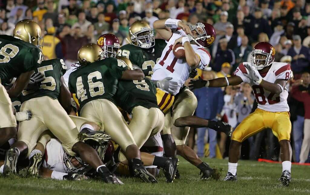
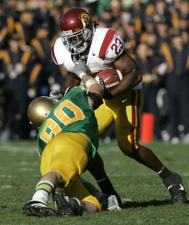
I’m not sure what notre dame’s record is wearing green at home, but the away game shown was a loss at Michigan.
Re: Guess the game – Looks like August 5, 2011.
Actually I lied. It was 8/14/2009. Final Score 11-2.
Agreed. The most significant things I can find about the game are that Mike Cameron struck out for the first and third outs of the first inning and that Sammy Gervacio made his MLB debut.
Some theories on why the Man U /Chevy kit is so reviled… Aesthetically, it’s one of the few logos on these kits that isn’t rendered in a single color, so it sticks out more. Plus, it’s a gradient illustration, calling more attention to itself. And it’s a bulky, dense shape. Added to that, this is a classic English team sponsored by a very American brand that has almost no presence in Europe, so it feels like cultural intrusion.
Just as an FYI Mr Allen hated being called Richie, he much preferred Dick.
And he should have been in the HOF well before Harold Baines.
“ The most simple option here is having Notre Dame bust out their green jerseys for the Navy game to get a bit of contrast going. Irish fans will love this, as they always win in green!”
Not true. There have been a number of articles written about the green being cursed for Notre Dame, and since after the Devine era, when basically they wore green as their main uniform, they have barely been over .500. Funny you show the loss to USC and the famous Bush Push.
I know nothing about soccer but a lot more teams should use claret and light blue. Also, I’m usually not a fan of sublimated jerseys but I think Manchester’s are pretty nice.
Great set of sponsors in the EPL. Used car dealerships, betting websites and a marginal US car.
I know there’s not a lot of college football this weekend but will there still be a 5&1? That was always one of my favorite features on college SMUW.
Also, I have good scoreboard photo to send if I can find it.
The *full* SMUW, including the 5 & 1, will run tomorrow. Obviously, with several of the conferences (B1G, PAC) not playing at all and the SEC still a couple weeks away, the tracking will only be for those teams playing. I am planning on adding a couple new features this year (WTSHW and some special posts by the SMUW crew). Memal will have less games from which to choose, but there will still be enough for a 5 & 1!
Love the Dick Allen Wheaties box, Mr. Chanko! Sorry about the car troubles, Phil. Having been on the receiving end of a couple of major repair bills, I know the uncertainty, followed by the dread, followed by the hammer falling. As far as Covid being over after 11/3, I wish.
“It’ll all be over November 3rd.”
Riiiiiiight… because this pandemic only exists within the U S and A.
The wrecker driver’s attitude is why we’re steal dealing with this and haven’t brought it under control.
Yup.
Also, their conspiracy theory will be cemented if there is a second term and it doesn’t go away…
umm “it’s all so darn.. British. Ugh”
w.t.f?
Really enjoyed the Phoenix Suns concept. The “The Valley” jersey looks kind of like a college or high school jersey, though, but a very excellent college or HS jersey.
Also, Paul, I think the universe if trying to send you a message and telling you that it is time to get a new car. A green one, this time!
If by Paul, you mean Phil, nah. The car is in relatively good shape for a 10+ year old vehicle with 100K miles. It’s just one of those freak things that happens.