[Editor’s Note: Paul is on his annual August break from site. Deputy editor Phil Hecken is in charge from now through the end of the month, although Paul may be popping up here occasionally.]
By Phil Hecken, with Logan Patterson
Follow @PhilHecken
Hey kids — little bit of bad news this morning, as I was expecting Paul’s Annual College Football Uni Preview to be running, but literally at the last minute, that got bumped (we expect it will run tomorrow, so be sure to check back then for that!). So, instead, I’m back again today with Logan Patterson, who has a nifty “What They Should Have Worn…” idea. If you missed the first edition, which ran a couple weeks ago, click here.
There’s a lot in today’s post, so let’s get right to Logan’s section.
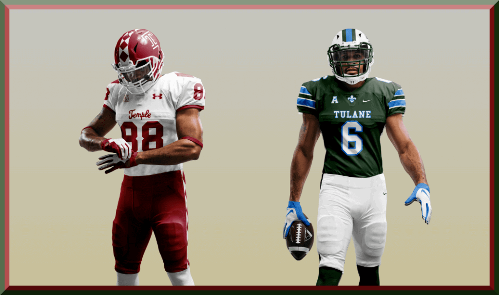
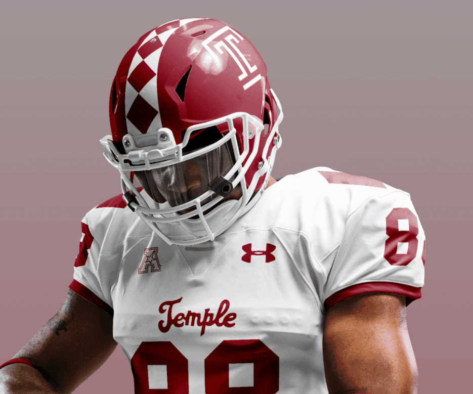
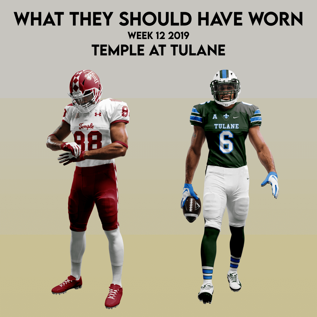
Temple at Tulane
By Logan Patterson
Temple made the trip to New Orleans in week 12 of 2019 outfitted in 1935 inspired throwbacks, a nod to their first matchup with Tulane in that year’s Sugar Bowl. It’s a solid look and I enjoy a good throwback. It’s hard to be too critical here, but I’ll take the opportunity to roll out a new look for the Owls. Over the years, Temple has incorporated unique diamond patterns into their uniforms, most memorably on their helmets stripes.
The university uses diamond imagery in all kinds of ways, from their uniforms to the campus currency, Diamond Dollars. It’s a nod to a lecture titled “Acres of Diamonds”, delivered by Temple founder Russell Conwell over 6,000 times about the value of education. Let’s roll with that look and ditch the generic looking chest/shoulder pattern.
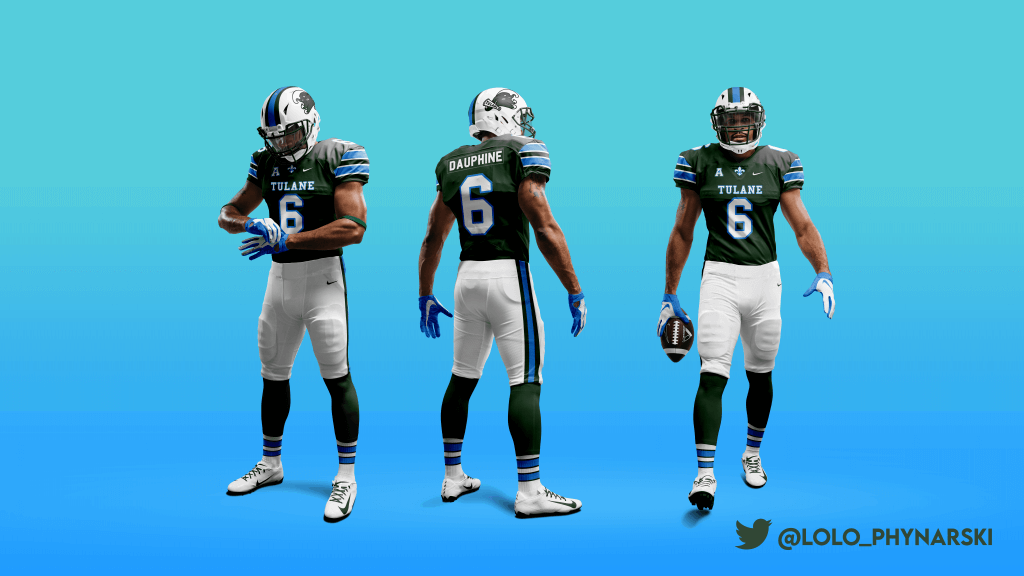
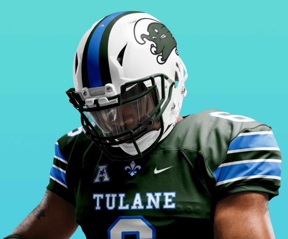
I would have liked to see Tulane in their green jerseys for the sake of contrast. The light blue look is great, but with the white lids and pants and their opponents in cherry/white/white, there wasn’t a lot of value on the field. While the Wave’s recent rebrand has been a home run, they haven’t really settled on a signature look — regularly mixing up stripe patterns, metallics and one-off helmets.
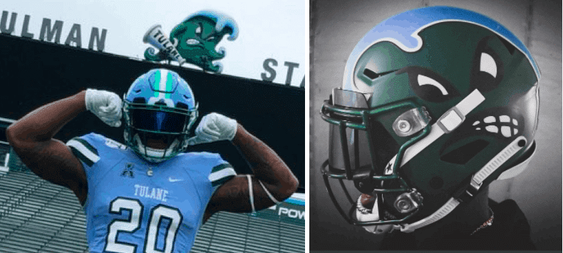
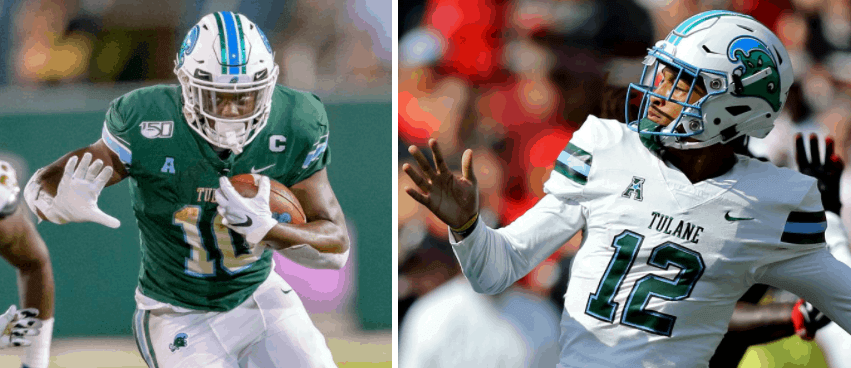
Tulane made “olive and blue” their official colors back in 1919, but their current shade of Tulane Green isn’t particularly… olive-y. I’ve remedied that, while making marrying some elements from their ‘90s and early 2000s looks.
Here’s
Thanks, Logan! Great stuff again.
Three’s A Charm
At the end of July, when I put out a call for reader submissions/suggestions for articles, I received the following piece from UW stalwart Wade Heidt — it’s probably lede material, but as I have already more than enough articles to finish up August (and likely September), I want to run this as a sub-lede. Wade sent it to me prior to the 2020 CFL Season being cancelled, which is unfortunate, but probably the safest course of action. Here’s a bit of what he said…
This email is in response to your request for submission of content in August. I have attached a small article. Not likely large enough to be a main article but might work well as secondary.
Of course, it is from me, so you know good chance it is about the CFL. I am missing seeing the league this year because of the pandemic. There is still hope for a short season starting in Sept in the bubble which is to be in Winnipeg. However, it is looking bleak that this will happen due to many complications and likely will be no 2020 season. This pandemic is also really hurting the league financially. Really worrisome as this football league is not rolling around in cash like the NFL does.
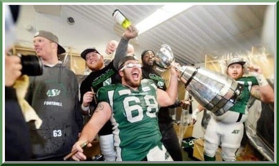
My article focuses on the 2013 Grey Cup Champion Saskatchewan Roughriders. They did something interesting to us uni watchers. They wore three separate helmet designs in their three playoff wins to the championship. Often teams would want to keep the same look for superstition. This is the opposite. Cannot think of another pro football team that has done this.
Obviously, at least in the NFL with its one shell rule, this hasn’t been possible (although they may change that rule in the future, at least to accommodate throwbacks); and I can’t think of any NFL team that’s worn two different shells since the 1969 Eagles as part of their regular helmet lineup (non-throwback variety). So this is actually pretty cool what the Riders did. I’ll leave the rest of the story up to him! Here’s Wade:
Three’s A Charm
By Wade Heidt
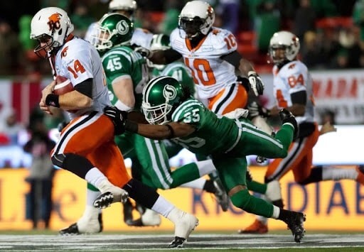
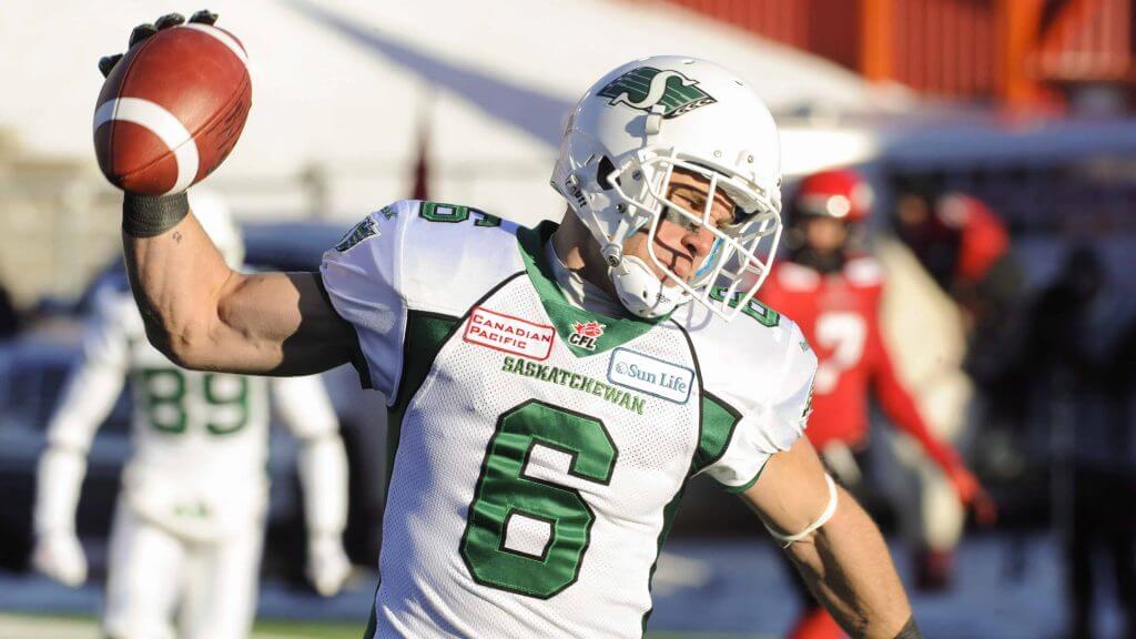
The 2013 edition of the Canadian Football League’s Saskatchewan Roughriders did some interesting from a uniform watcher’s perspective. Something I do not believe has been done by another pro football team (correct me if I am wrong). They wore 3 separate helmet designs during their playoff march to a championship in 2013.
West Semi-Final
The Roughriders finished in second place in the West Division. They hosted the BC Lions in the 2013 West Semi-Final. The Riders elected to wear alternate throwback-style uniforms for this game. They wore their classic helmet design featuring their vintage logo and white centre striping. This throwback uniform usually was worn as green jersey over white pants. The Riders decided on this day to wear green over green. They still had the green pants hanging around that were worn with their alternate 1970s throwback white jersey back in 2010.
West Final
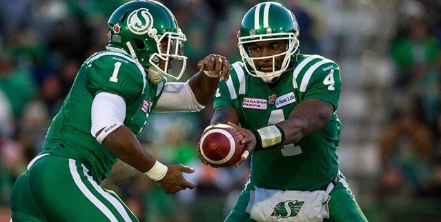
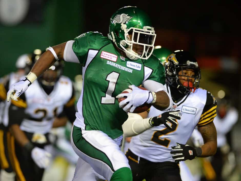
After the West Semi-Final win, it was time to visit the Calgary Stampeders. From 2012 to 2015, the Roughriders had a white helmet that was worn for almost all their road games. I was not a fan of the white road helmet but learned to deal with it during its time.
The Riders sported their usual road look featuring the white helmet on that frigid day in Calgary. Helmet design number two and playoff win number two! The Saskatchewan Roughriders crowned the West Champions and secured their spot in the Grey Cup game.
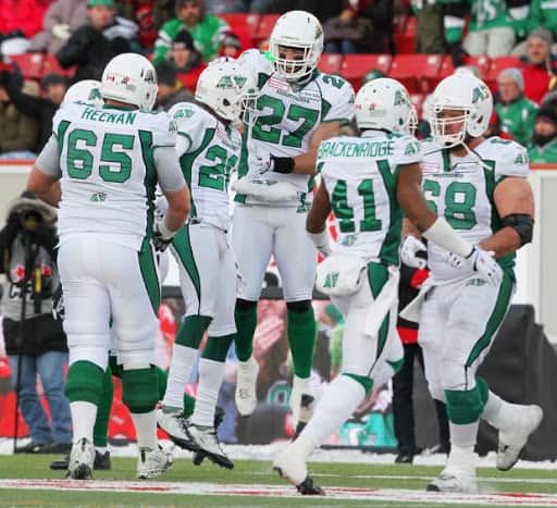
101st Grey Cup
The Roughriders were designated the home team for the Grey Cup as the game was being hosted by a West Division team. Grey Cup sites are awarded in advance and the 101st Grey Cup was being hosted in Regina. The Roughriders were fortunate to be in their home city and stadium for this game.
No alternate uniforms in the 101st Grey Cup. As the designated home team, the Roughriders were in their dark jerseys. They wore their usual home uniform featuring their home and primary helmet.
The third helmet design worn in three playoff games and their third win. Comfortably defeating the Hamilton Tiger-Cats and hoisting Grey Cup!
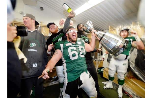
Thanks, Wade! Great story I’m sure not many of us were aware of (at least I wasn’t). Can anyone think of another (pro) season in any football league where a team wore different helmets for a playoff run?

Guess The Game…
from the scoreboard
Today’s scoreboard comes from Mike Chamernik.
The premise of the game (GTGFTS) is simple: I’ll post a scoreboard and you guys simply identify the game depicted. In the past, I don’t know if I’ve ever completely stumped you (some are easier than others).
Here’s the Scoreboard. In the comments below, try to identify the game (date & location, as well as final score). If anything noteworthy occurred during the game, please add that in (and if you were AT the game, well bonus points for you!):
Please continue sending these in! You’re welcome to send me any scoreboard photos (with answers please), and I’ll keep running them.
NHL’s Forgotten Teams…A Follow-up
Yesterday’s main article on NHL “Defunct” Teams prompted reader Christopher Noice to do a bit of a follow up:
Loved the photos of the NHL’s defunct teams.
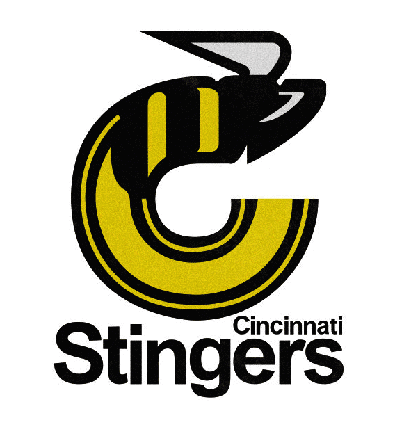
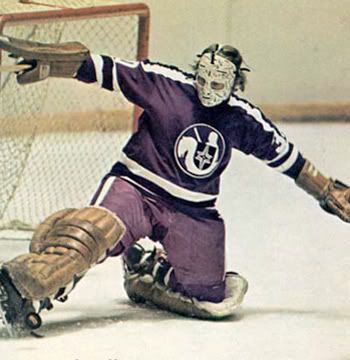
I always loved the Cincinnati Stingers’ logo and look. Sadly, like the ABA’s Kentucky Colonels and Spirits of St. Louis (and Flint Tropics), they were paid to go away when leagues merged, and never made the jump from the WHA to NHL ice.
Come to think of it, the other Ohio WHA team – the Cleveland Crusaders – had a pretty good look, too (note the hockey sticks and puck shield crest). They were nudged out of Cleveland when the California Golden Seals moved to town and (I think) became the Barons. Hey, not so fast – purple is the traditional color of royalty. Some teams HAVE to use it!
Christopher Noice
PS: On that Crusaders Shield ‘hockey sticks and puck’ logo, is that the only use of ‘reflection off the ice’ as a design element in the NHL?
Good stuff, Christopher. Thanks for sharing!
Too Good For The Ticker!
Short one here from Robert Brashear, but it’s just TGFTT!
If you’re a Steelers fan (or not), this is for you (click to enlarge):
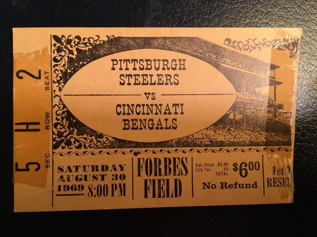
Going through boxes at my mom’s I found these…
51 years ago this month the Steelers returned to Forbes Field for one last game…against the AFL Bengals…
Classic ticket stub:
One year later was the first football game at 3 Rivers…
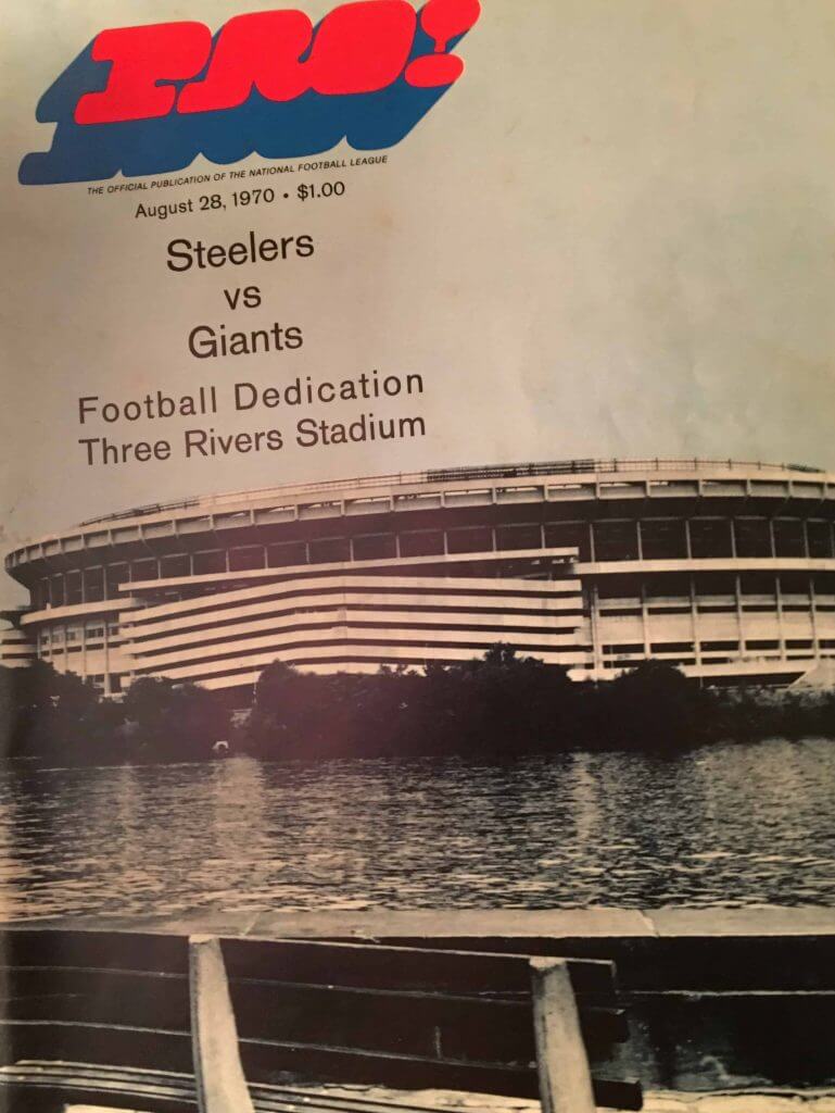
Inside the program was a logo not seen before or since…
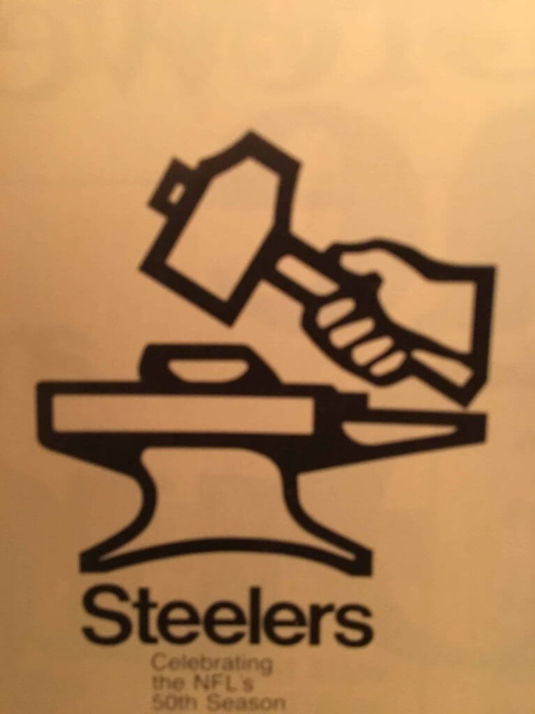
Great stuff! Thanks, Robert.
OK, now…on to the ticker.
The Ticker
By Lloyd Alaban

Baseball News: The Marlins/Mets game experienced a rain delay yesterday. During the delay, Mets 1B Pete Alonso decided to change shoes (from @1NepC). … Here’s a uni tracker for the Diamondbacks (from @DbacksUni). … And here’s A’s tracker and Dodgers tracker (from Jakob Fox). … The University of Florida is selling seats from McKethan Stadium to baseball season ticketholders as keepsakes now that the new stadium set to replace it is scheduled to open next season (from Kary Klismet).


Football News: Here are more looks at the Raiders’ inaugural season logo (from @TruColorNet). … Wabash College, a Division III school in Indiana, has released architectural renderings of what its stadium will look like after ongoing upgrades are completed (from Kary Klismet). … Baylor is continuing its tradition of giving single-digit numbers to the team’s “toughest” players, as voted by coaches and the players themselves. The team released the new numbers on Twitter (from Joshua D. Lassiter). … Andrew Cosentino is a not big fan of the Rams bone uniforms for some reason.
Basketball News: A massage gun pushed in part by late Lakers PG Kobe Bryant can be found at every bench in the NBA.
.

Soccer News: Vancouver Whitecaps F Tosaint Ricketts wore an armband to commemorate his friend and former FC Edmonton MF Chris Kooy, who recently died of stage four colon cancer (from Wade Heidt). … Southampton spontaneously ditched their shirt advertiser in favor of another one today, although both the old and new ones are betting companies (from our own Jamie Rathjen). … New home, away, and goalkeeper shirts for ŁKS Łódź (from Ed Zelaski). … Also from Ed: New home shirt for Venezia.

Grab Bag: NASCAR driver Ryan Blaney will drive a strawberry-banana-Body Armor-themed car this weekend at Daytona (from Jakob Fox). … Saint Peter’s University of New Jersey athletics has new logos. This Twitter thread includes lots of details and hype videos (from Kary Klismet). … New uniforms for the Girl Scouts (from multiple readers). … Here are the two design finalists for Mississippi’s new flag. … New 70th-anniversary logo for Whataburger (from John Cerone). … New logo for Rolls Royce (from our own Phil Hecken). … Army scientists have designed a new bite sleeve to train military working dogs. The real-feel bite sleeve gives a flesh-like sensation and can bleed to simulate actual biting. It improves and focuses the dog’s training (from Timmy Donahue).
And finally… thanks again to Logan, Wade and also to all of today’s contributors. I’m looking forward to the NCAAFB preview which should run tomorrow, so again, check back for that!
Here’s a recent sunset (sorry, wasn’t a very good one yesterday)…
Everyone have a good Wednesday — and to anyone in Laura’s path, please be safe!
Peace,
PH
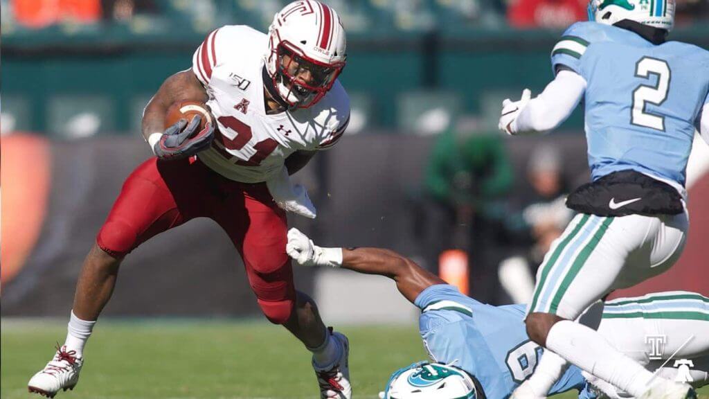
Temple did not play at Tulane in 2019. Tulane came to Philly, I was at the game. Temple did wear white at home, the throwback uniforms mentioned.
Thanks for catching that. I was looking through game photos from that week and jumped to the conclusion it was in New Orleans.
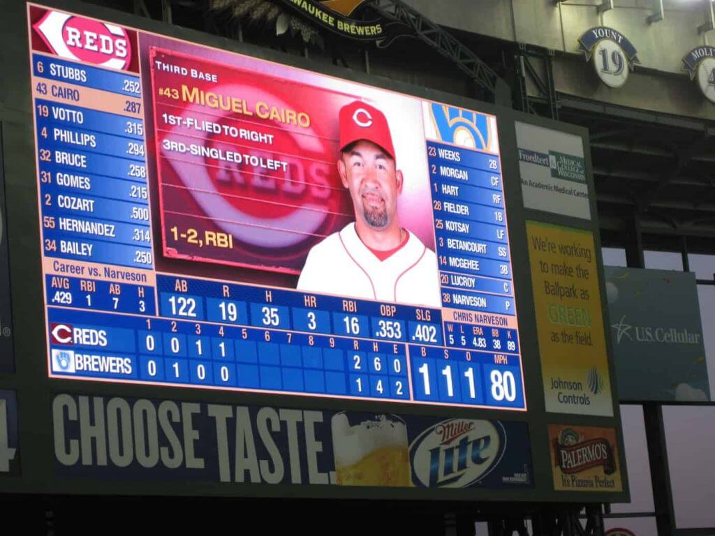
Scoreboard:
July 7 2011 – Cincinnati @ Milwaukee
Milwaukee wins 5-4
Milwaukee 5 – Cincinnati 4
Thursday, July 7, 2011
Start Time: 7:10 p.m. Local
Attendance: 34,102
Venue: Miller Park
Game Duration: 2:51
GTGFTS…
7/7/11 @ Miller Park
Brewers (47-42) 5, Reds (44-45) 4
WP: Narveson LP: Bailey S: Axford
Cairo wasn’t with the Reds in 2011, was he? I was stuck on 2010 for that reason alone.
Baseball Reference says he was a Red from 2010 through 2012.
I never understood why the Stingers logo didn’t have a STINGER??!!
And the White Sox don’t wear white socks! aAAAAARRRGGGGGHH!!!!!
The Stingers were not the only WHA team payed to go away. The Birmingham Bulls also were payed compensation for not being absorbed by the NHL.
Both teams were re-created in the Central Hockey League for the 1979-80 season, a significant step down, but they didn’t last long; the CHL Stingers folded during their first season, and the CHL Bulls folded during their second.
I think the Crusaders sweaters would have looked so much better with just the shield/crest on the front, not the crusader/horse/shield logo. Good look, just think it could have been even better.
And good catch on the Scoreboard answers by the others. I was stuck on 2010 since Cairo came to the Reds that year and usually only signed one-year contracts. I forgot Cincy gave him his first (and only?) 2-year contract in his career.
I swear the Rams new uniform looks more purple then blue.
Having been born in 1969, I unfortunately must report that the Steelers/Bengals game was 40-eleven years ago, not 41.
Having been born in 1966, I refer to my age at “late 40s…. very very late 40s.”
Is it just me or does Messier’s head look way too big on his body?
The Forbes Field game was 51 years ago, not 41, I was just barely 3 months old at the time. What a very cool find
Damn, you,re right…that should be fixed….
Sorry Robert — I should have caught that before going to post. Now fixed.
Where did the Steelers play their 1969 regular season games?
Pitt Stadium
I hope the Columbus Blue Jackets one day will feel compelled to wear Stingers’, Crusaders’, and Barons’ gear during the season b/c all of those teams look better than what the BJ’s wear on a daily basis.
And yes, I know the “Crusaders” nomenclature is on the outs nowadays because crusading is not a worthy pursuit of Christians. It’s still a cool-looking uniform.
i asked this late in yesterdays story in regards to the Whalers, opinions
“If the Whalers were still an active team, do you think they would have been forced to change their name being how negatively whaling is looked upon now. Do you think they would just drop the R and gone Whales?”
There was the “Connecticut Whale” in the AHL and currently in the NWHL, but that may be due to the fact that the Hurricanes own the Whalers name.
It looked like the Whalers took care of any cruelty concerns by dropping the “harpoon” motif and using insignias of living, smiling whales on their epaulets.
That is a pretty sweet Tulane uniform. Always loved the anthropomorphized green wave.
Seeing those LA Rams uni’s makes me sad. They went and ruined one of the nicest uniforms in NFL history.
To add to Wade’s Sask Roughriders post, the white helmet worn in the West Final, was also the first time (I believe) that they wore a white mask with the helmet. The white helmet previously had a green mask.
Anyway, always love the CFL bits. Thanks Wade and Phil!
It is true that the Riders were wearing a green mask with the white helmet earlier and for the most part of 2013. I do believe the switch to the white mask might have been late in the season a game or two before the West Final, but not 100% sure right now.
Of course, CFL is one shell rule now. What is interesting from a helmet perspective is arrangements made to not wear similar coloured helmets in games when many teams had road helmets for that short period.
For example, the BC Lions wore white helmets back then. When the Riders visited Vancouver during the white road helmet era, the Lions either wore their 3rd uniform featuring the dark grey helmet:
link
Or Riders wore their green helmet and the green pants seldom worn on the road during that time the road:
link
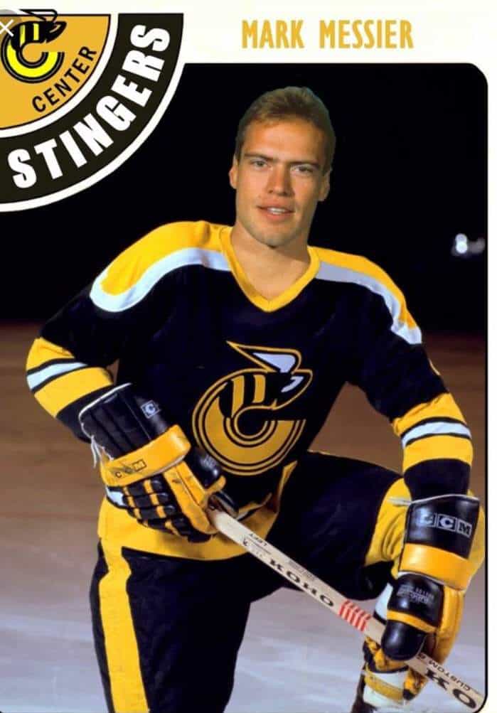
Well, that didn’t take me long to look up… the photo in that mockup of a Mark Messier Stingers card looked shopped, and right away on searching I found that Moose’s head was placed on the body of Dennis Sobchuk.
It immediately looked wrong to me just by the shoulder yoke, since that’s a 1975-76 jersey; the Stingers didn’t have the white trim going around the ends of the shoulders by the 1978-79 season.
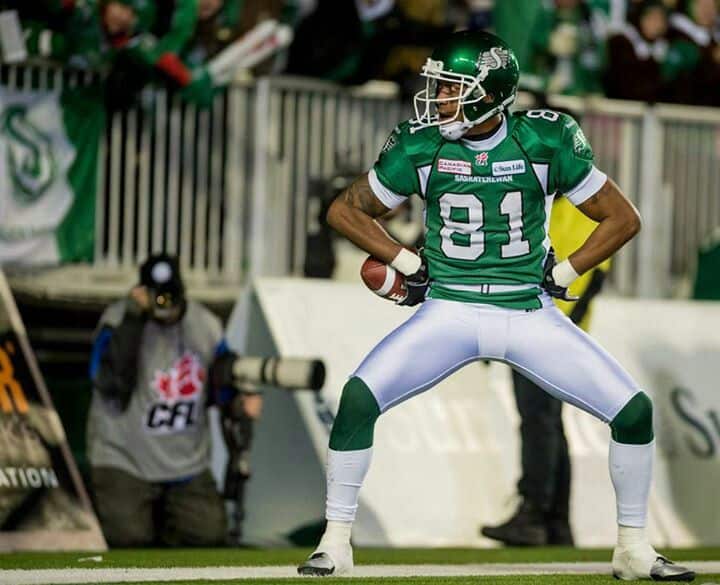
I am just glad to see my guy Geroy Simon and the Superman pose in the picture collection. It was his only season in Saskatchewan, but he went out with another Grey Cup!
Yeah man. As a Riders fan, Superman pose looked as sweet as it possibly could in that game. Grey Cup win at the old home stadium that is torn down now. We saw that pose so much when he was playing for the Lions. I liked it a lot better when he was wearing green compared to orange.
Another great, memorable Rider receiver TD celebration came from Don Narcisse. His signature moves at the 15 second and 30 second marks of this video:
link
What a beautiful sunset! I needed that today.
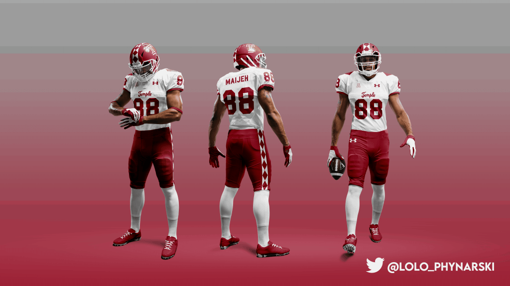
I think Logan did a fine job with those Temple uniforms especially the shoulder treatment), though the TEMPLE helmets of the Hardin/Arians/Golden era are more to my liking. Replace the Block T with that lid so you can remove the wordmark from the jersey, and resize the chest numbers…Perfection!
Thanks for the Riders piece, Wade! I was lucky enough to be at both the West Semifinal (to this day the coldest game I’ve been to) and Grey Cup 101. Until you pointed it out, I never noticed the Riders’ playoff uni choices in 2013. I’ve gotta say, seeing the Green & White win it all in person, at Old Mosaic Stadium was priceless!