A little over two months ago, I published the first in what I promised would be a running series of blog posts featuring Uni Watch readers sharing their stories of how they first got hooked on uniforms — in other words, how they first realized that they Get It™.
Things have been a bit hectic since then, so I apologize that it’s taken me this long to get around to the second installment, but I think you’ll agree that it’s worth the wait. Some really good stuff here! Enjoy.
Brandon Weir
On rainy days and evenings, my cousins and I used to take out blank sheets of paper and practice drawing (no tracing!) and coloring various professional sports team logos. It was fun to compare our drawings to our references. That’s when I started to home in on all of the little intricacies of each logo. If I missed something, I would go back and redraw until I got it right. I distinctly remember the Charlotte Hornets and New Jersey Devils were my favorites to draw and color.
———
Louis Griffel
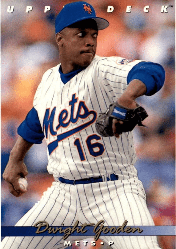
I’ve always loved baseball caps and uniforms since I was a kid in the 1970s, when I particularly loved the uniforms of the Padres, Expos, and Astros. To this day, the Padres’ various uniforms of the ’70s remain my favorites. As for getting the minutiae, the uniform that aggravates me to this day is the 1993/1994 Mets home jersey. I hated the tail on the script, but what really annoyed me was the awkward-looking “M” on that set. To this day, looking at any pictures from those seasons gives me an uncomfortable feeling. [I always hated that “M” as well. Reminded me of how your friend’s mom could never get the script quite right when making a homemade jersey for him. — PL]
———
Wade Heidt
Growing up in Regina, Saskatchewan, I went to my first Canadian Football League game in 1984 at the age of eight. I became a huge fan of the league, and the Saskatchewan Roughriders were (and still are) my team. The next season, the Roughriders underwent a uniform redesign for their 75th anniversary. I was dazzled by the new set. The new wraparound helmet logo done up in silver, the shiny new silver pants. This exciting process of giving us a new visual identity yet still having the look of the team I loved. I was hooked at that point.
———
Bob Fittipaldo
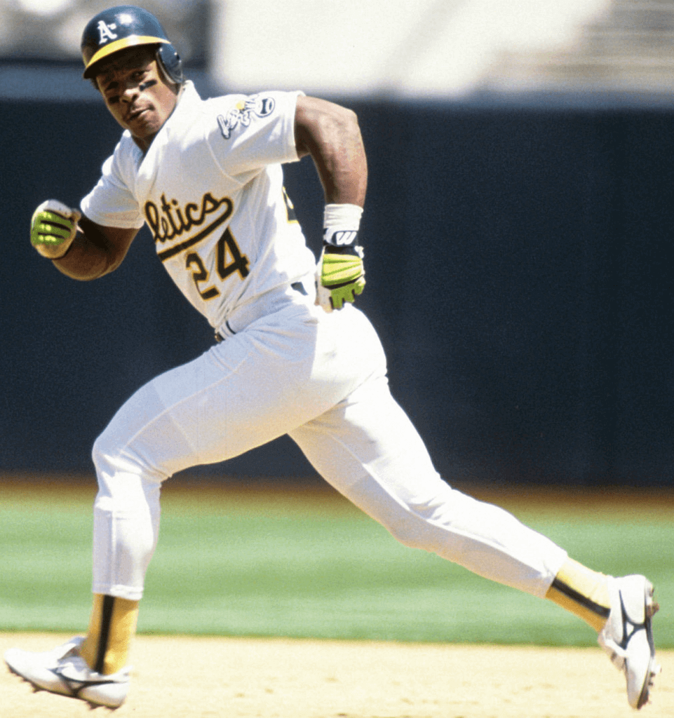
When I was a teenager growing up in Pittsburgh in the early ’80s, the Pirates had just started their downward spiral. So I adopted the Oakland A’s as my favorite team and Rickey Henderson as my favorite player. I remember waiting for the afternoon paper every day to check the box scores from the previous night because they were on the West Coast. Watching This Week in Baseball on Saturdays and seeing Rickey stealing bases in the green, gold, and white uniform was always something to look forward to. For Christmas in 1984, I asked for a No. 35 white A’s Henderson jersey. I was probably the only kid in Pittsburgh rocking A’s apparel. It was definitely then that I Got It™!
———
Benjamin Page
I made the basketball team in seventh grade. We were issued a white jersey, a blue jersey, blue shorts, and a white/blue shooting shirt. The blue shorts featured a wide white stripe down each leg. The blue jersey featured the same stripe. I remember strongly disliking that the stripe on the blue jersey did not match up perfectly with the shorts, making the white jersey more appealing to me. However, I did not like that the jersey and shorts were different colors because basketball jerseys and shorts should match.
———
Jimmy Lonetti
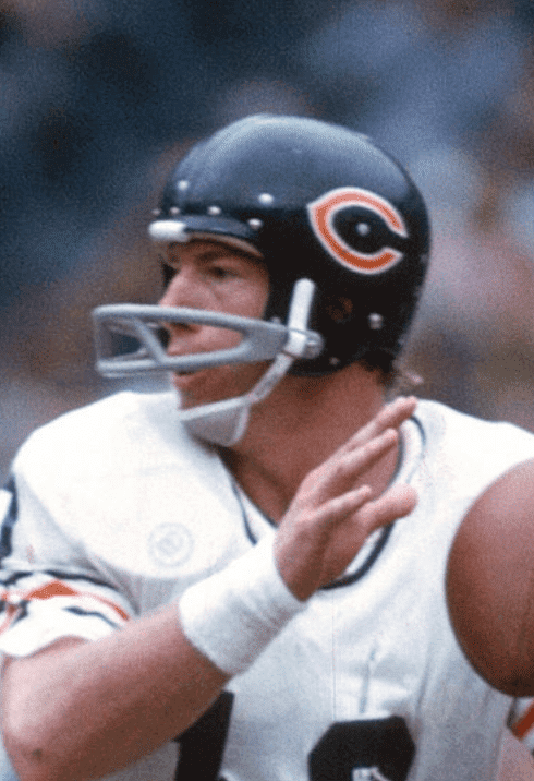
In the fall of 1973, I was in my elementary school’s library and was paging through the latest Sports Illustrated, which featured their NFL season preview. That included a small mention of a few teams’ uniform changes. The Bears were changing the wishbone C on their helmet from white to orange with a white outline; there was a graphic included. I remember thinking that it was an improvement. For some reason that has always stuck with me, even though I’m from Minnesota.
———
Bob Kelly
Sometime in the mid-’70s, I was around eight years old and began my lifelong fandom of sports (rooting mostly for the Yankees and the New York Rangers) and Star Trek. I have an older cousin who made his own Trek unis using a blue sweatshirt, some markers, and glitter. I sat wide-eyed and eager as we figured how to make one for me. I didn’t stop there — I proceeded to make my white T-shirt into a Yankees shirt. Using my a replica Yankees cap as visual reference, I drew the interlocking “NY.” Later, someone told me it was different from the “NY” on the jersey. Comparing the two different logos inspired a life and career of design and print production that I continue today.
———
Joe McGrath
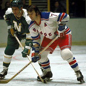
Nov. 22, 1970. Sunday afternoon. Seven years old. New York Rangers vs. Minnesota North Stars. Talk about a great-looking game! When the Rangers hit the ice at the Garden, I was mesmerized by how the uniforms looked in the bright lights. The vivid red and blue against the white, the awesome drop shadow lettering and numbers (of course back then I didn’t know it had a name). From then on I was hooked on hockey, the Rangers, and hockey jerseys.
———
Adam Cole
I grew up right outside Philly and am a diehard fan of our (mostly) well-dressed teams. A few years ago my parents sold the home I grew up in and I had to go clean out some of my things. I discovered that I saved a newspaper clipping from when the Eagles ditched the gorgeous Kelly greens for a new “blue-green” set. The article is dated Feb. 2, 1996 — I was 11.
———
Thomas Roddy
My formative uniform experience was the Patriots announcing their major uniform redesign and new logo in 1993. My family and I watched the unveiling on the evening news, and I remember my father was livid because the home uniform looked “too much like the Giants.” At the time I remember thinking the Giants had white numbers and there weren’t too many similarities because of the silver pants/helmets. I would start to agree with my father in 1994, when the Pats tweaked the uniforms to have white numbers with a red outline.
Additionally, the day after that 1993 unveiling would be my first real analysis of a logo/uniform. The next morning, The Worcester Telegram & Gazette ran a headline with no pictures from the unveiling, but an image of the Flying Elvis logo. But the logo they chose was the curved logo from atop the script logo, and they printed it without the accompanying wordmark. I remember thinking it was hideous and needed the wordmark to look complete. It was the beginning of a 22-year hatred of the wordmark logo, mostly because the second red “streak” is longer than the top red one or the bottom blue one, which is not the case on the helmet version of Flying Elvis. The amount of modification necessary to curve the left side of the logo around the “P” was just too much of a change of the original logo, and it was the first time I really noticed these types of design elements.
———
Dave James
The year was 1959. Back then, the NFL would play exhibition games in out-of-the-way places to gin up interest in the league. When the Eagles and the Packers came to Portland, Ore., late that summer, my brother and I talked our dad into getting us tickets.
For whatever reason, my 11-year-old mind was captivated by Philly’s helmets. So much so, that the following weekend I went to a local hobby shop and bought a small amount of Kelly green and silver paint. The football helmet I owned at the time happened to be red, but that didn’t get in the way. By that evening, I had me an Eagles helmet and that’s all that mattered. One of my great regrets is not hanging onto it as a tangible reminder of why I became an Eagles fan and remain so to this day, more than six decades later.
———
Edward McVey
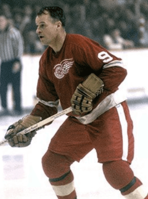
This memory is amazingly clear to me. Our family had just bought a color TV, so this would have been 1965, making me four years old. When my dad turned the set on, it was tuned to an NHL broadcast showing a Detroit Red Wings game. It was the first hockey game I had ever seen, and what really fascinated me was the Red Wings’ uniforms. Those red jerseys with the wheeled wings looked magnificent against the white of the ice.
That evening we went to an Italian restaurant that had red cloth napkins. While we were waiting for the meal to come, I quietly collected everyone’s napkins and draped them over myself to emulate the Red Wings’ look. Of course my parents had no idea what I was doing.
———
Peter Fidrych
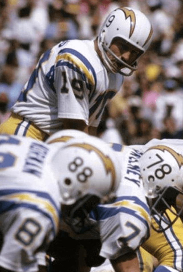
I am the youngest of three brothers. Growing up in the Washington DC area, it was assumed that you would be a fan of the local NFL team. I was taught their fight song, had pennants and posters in my room, and my closet was full of hand-me-down gear. In the fall of 1973, I was three years old, and loved watching football with my father and brothers. My oldest brother is a diehard ’Skins fan, and he always tried to get me to verbally commit my loyalty to the burgundy and gold. The middle brother was a Colts fan (the team was still in Baltimore) and tried his best to pull me to his side. I never wanted to pick between my brothers, but then, one Sunday, I saw it: a team with lightning bolts on their helmet. FREAKING LIGHTNING BOLTS!!! I remember pointing to the TV and saying, “Chargers!” — hell, even the name was cool! Both of my brothers were dumbfounded, but it stuck. I had found my team, and all was right with the world.
———
Larry Adams
I grew up in Seattle in the 1960s. I loved the SuperSonics’ uniforms with the script name on the chest, but what really did it for me were the horizontal stripes on the shorts.I had never seen that before. That, I believe, was the starting point for my obsession with uniforms.
In 1970 our family moved from Seattle to Walla Walla and began attending Whitman College basketball games. At some point that year it was announced that the Whitman men’s team would wear new uniforms in their next game. They had been held under wraps until then. I was so excited I could hardly contain myself. But before the start of the game, my foot slipped on one of the wooden bleacher seats and my cheek got cut up. My dad said, “Larry, we need to go to the doctor. You need stitches.” I responded, “But what about the uniforms?” He told me I might have to see the uniforms at the next home game.
I had six stitches sewn into my cheek and made it back for the second half of the game. Whitman was wearing horizontal stripes on their shorts, just like the Sonics. I was in heaven.
———
Caleb Bentz
It was 1991. Ten-year-old me realized that Michigan’s Fab Five was known more for how they wore their uniforms than for the substance they brought to the court. The actual jerseys were pretty blah, but the swagger and attitude with which they were worn made me take notice. Add the black shoes and socks, and the establishment’s general disdain for their look and young me could connect the dots. Maybe it was all the Hardy Boys books I was reading at the time.
———
David Baughman
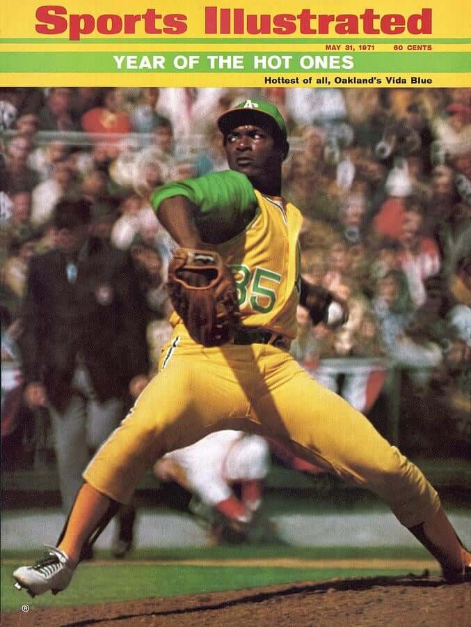
I was nine years old on 1971 and was still learning how to watch baseball. Since I lived in Connecticut, we were stuck with bad Yankees and Mets games on TV. My dad got me a subscription to Sports Illustrated that spring, and they had a cover story on Vida Blue with the high stirrups and I went nuts. I had my mother cut up my little league stirrups and add in fabric so I could have the high ones. To say the least, I was the envy of the team. My coach was not happy, but who cares. Sad that stirrups went away, but I’ll always have Vida. (Frank Robinson was pretty good, too!)
———
CJ Fleck
I was playing an iteration of the EA Sports FIFA video game series. I must have been around 10 to 12 years old, so this would have been around 2000-2002. The big thing I loved was that you could create a team, including the uniforms! That excited me. Most importantly, I learned that one of the templates in the game was the exact same template that my youth soccer club wore, so I could make myself and my team in the game, with the right shade of maroon (not purple!) that we wore. There was something about using the same design as the big leagues that really stuck with me. I really started paying attention to soccer uniforms from that point forward.
———
Steve Ramsey
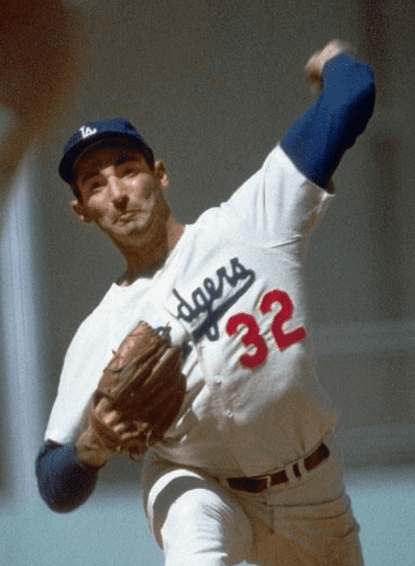
I grew up in the 1960s in Spokane, Wash., where the local minor league team was the Triple-A affiliate of the Dodgers. It was the gorgeous uniforms of the parent team that I loved most. The Dodgers wore those crisp, white home uniforms with their team name in dark blue and the vivid red numbers underneath. The grey road unis were equally beautiful. We didn’t have a color TV until the late ’60s, so I only knew what the uni colors were because my father was a charter subscriber to Sports Illustrated. I remember clearly the day when, at 10 years old, I took blue and red felt pens to one of my white J.C. Penney T-shirts, attempting to recreate the classic Dodgers uni. That was the start of my interest in following uniforms.
———
Jeffrey Sak
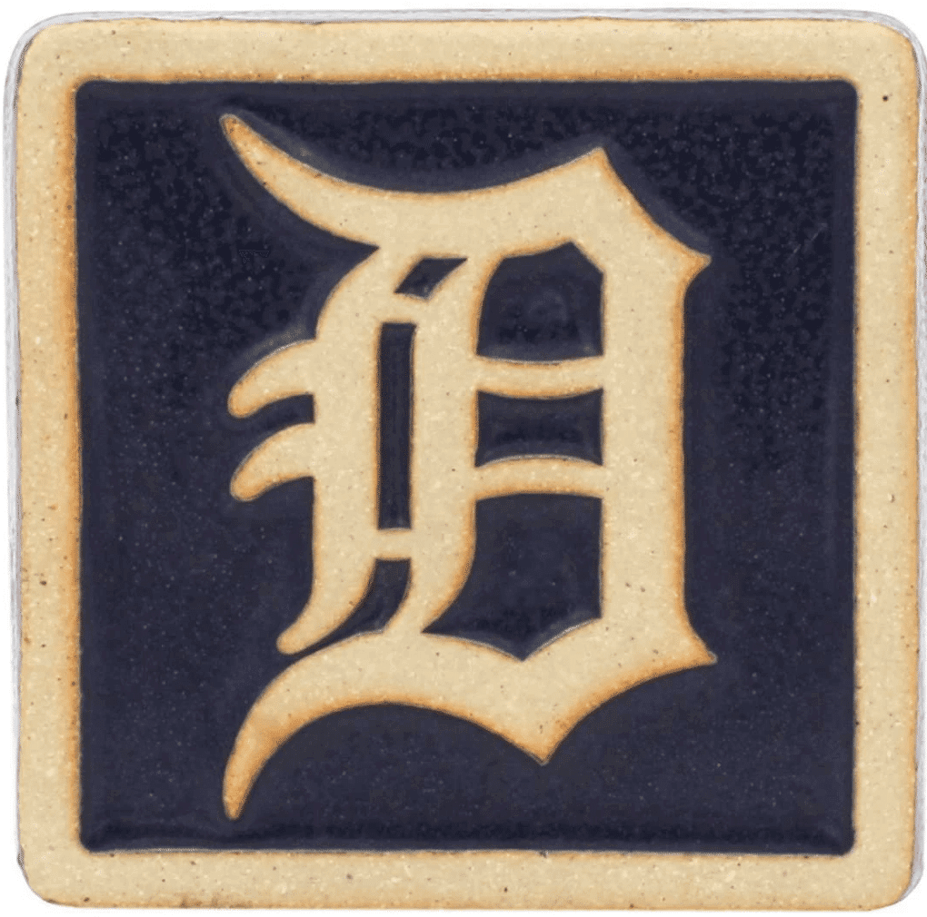
I first got it in the spring of 1982, when I was nine years old. I recall sitting in my third grade class doodling the Detroit Tigers’ old English “D” logo. I remember noticing the difference between the versions used on the Tigers’ jerseys and hats, and then trying to draw each version. Around that same time, the Detroit Lions changed the color of the numbers on their blue jerseys from silver to white. I was so upset by this that I wrote a letter to the editor of The Detroit News to express my displeasure — and they printed it! Unfortunately, I no longer have the clipping, but I do recall that the News titled my letter “Lions Look Sharper in Silver”.
———
Wayne Yeung
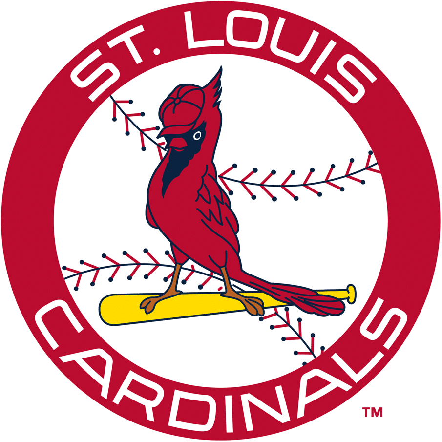
I first Got It™ when I was around five years old. I was with my mom at either J.C. Penney or Sears, and she let me pick out a pennant from a table covered with MLB and NFL designs. I chose a St. Louis Cardinals pennant featuring the team’s 1966-1997 logo. There was something about the bird on the bat wearing a baseball cap that really fascinated me, and the circular logo with the baseball stitching and clean “St. Louis Cardinals” script also caught my eye. I continue to get Cardinals merch featuring that logo, and I think it’s contributed to how I’ve favored circular logos throughout my life. I haven’t ever lived in St. Louis, but I’ve been a Cardinals fan since the day I picked that pennant. Considering they have the best uniforms in baseball, I’m really glad I did!
———
Witt McCall Featherson
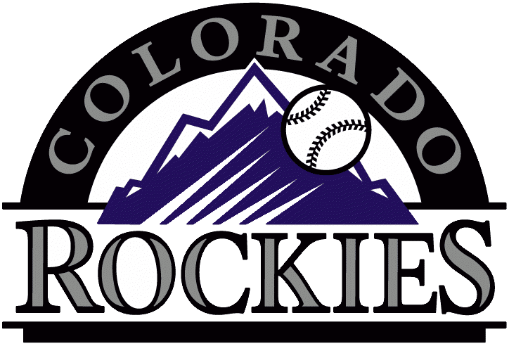
I remember as a kid (age 10-ish?) when all of a sudden it felt like there were a lot of new teams. Panthers and Jaguars in the NFL, Grizzlies and Raptors in the NBA, Rockies and Marlins in MLB. All of the new colors and logos made me realize, “Hey, these things aren’t given to us from on high! They’re a result of decisions being made!!” I think chronologically the baseball teams were first, and for whatever reason I was obsessed with the arched logo for the Rockies. I don’t really like purple, and I don’t really care for the Rockies as an adult, but at the time I obsessively tried to recreate that logo in my notebook using my protractor.
It was within a couple years of that that I heard the story behind the Mets’ colors for the first time (Brooklyn Dodgers blue, New York Giants orange). Unlike the Rockies, that bit stuck with me and the Mets are still my favorite baseball team 25-plus years later.
———
Brian Vineyard
I first “Got It” approximately 27 years ago. I was 12 and was reading the official yearbook for my favorite football team, the New York Jets, where I was mesmerized to find a section on their uniform history. This was when the Jets were in the middle of their New York Sack Exchange uni period, which had started shortly before I was born. NFL throwbacks weren’t yet a thing, so I had no idea the Jets had ever worn anything different. About a year later they became one of the first NFL teams to wear a throwback uniform when they turned back the clock for the 25th anniversary of their Super Bowl III win (although it was more of a fauxback, because they kept their then-current green helmet).
———
Rodney Suchland
I got into how sports looked at a younger age because I had older brothers that were into it. One painted his bike teal and purple in the early ’90s for the Charlotte Hornets. He would also paint the cleats on our Starting Lineup figurines to better match what the players were wearing on the field (orange cleats for Hanford Dixon) or what we thought looked better (black cleats for some Bengals players).
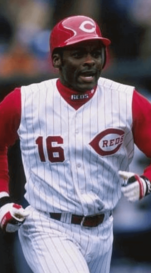
But I knew I Got It™ for myself in the mid-’90s, when I was about 14 years old. I wanted a Reggie Sanders No. 16 Reds jersey. He was my favorite player at the time (well, except for Barry Larkin, but everyone loved Larkin!) and I saw big things coming from him. Since he wasn’t a big star yet, no one made his jersey — so I decided I wanted to make my own. After an extensive search, I finally I found a white jersey with red pinstripes at a Value City store. I got a seam ripper and removed the sleeves. I mowed a few lawns and saved up some money, took the jersey to a local sporting goods store, and told them exactly what I wanted: 16 on the front right, the Reds’ logo on the front left, and SANDERS/16 on the back. They couldn’t do an exact match of the Reds’ logo because it’s trademarked, but they didn’t tell me that — either they didn’t think it was a big deal or didn’t think I would notice or care. But it mattered to me, even at 14 years old! I rarely wore that jersey because of it and was heartbroken that they “ruined” it. But the back was fine, so it has been wall decor pretty much ever since.
———
Paul here. I love these stories so much (especially the thought of a little kid with a torn-up cheek asking his dad, “But what about the uniforms?”).
Again, if you want to see the first batch of these stories, look here. I still have a bunch of submissions that I haven’t yet gotten to, so we’ll have another installment soon.
If you want to share your own story of how you first Got It™ — no more than one paragraph, please — go ahead and send it here (please note that this is not the usual Uni Watch email address). Thanks!
(My continued thanks to Brinke Guthrie for coming up with the idea for “When I First Got It™”.)
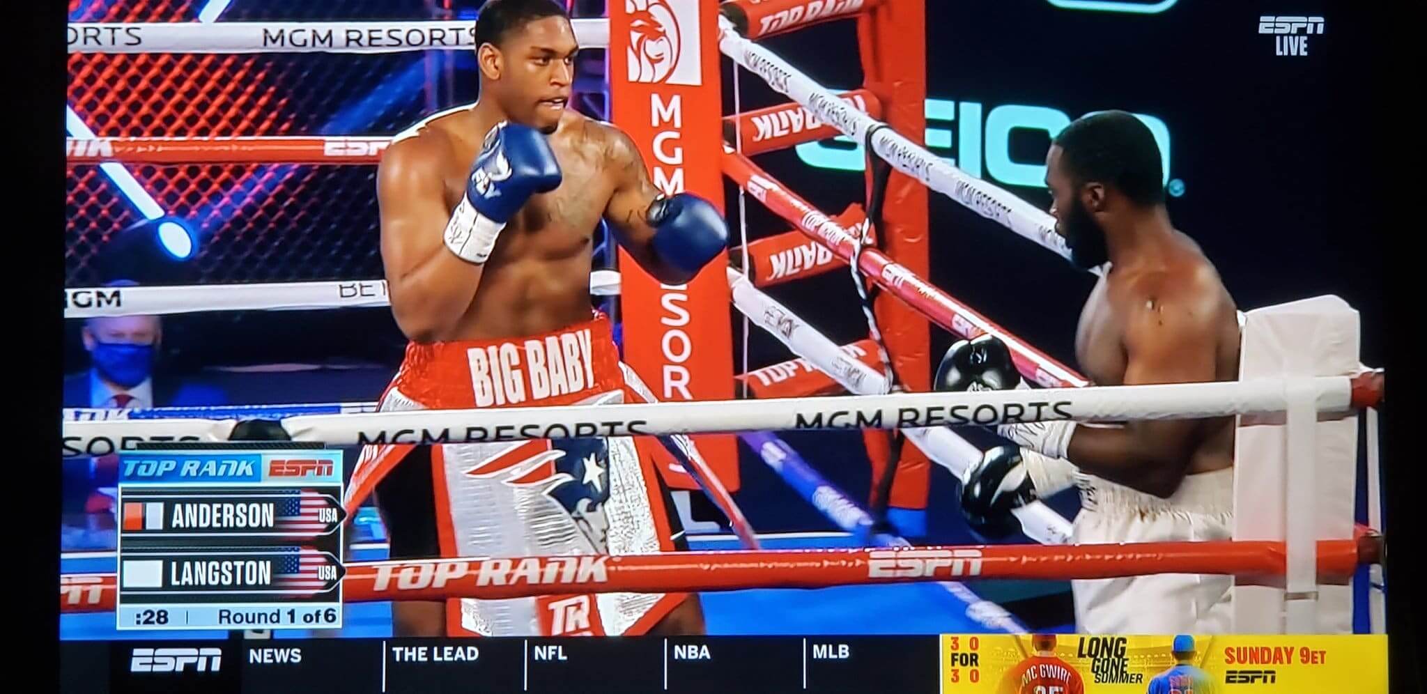
Screen shot by Timmy Donahue; click to enlarge
What, no Pat Patriot throwback?: Bizarre cross-sport display last night in Vegas, as heavyweight boxer Jared Anderson wore a gigantic Flying Elvis logo on his trunks loincloth.
Anderson had an additional nod to the Pats when he entered the ring, as he wore a No. 12 Pats jersey (although it did not have “Brady” on the back):
Also of note: Anderson had “Black Lives Matter” written on his glove tape, and his cornermen wore that same phrase on their shirts:
In another cross-sport gesture on that same boxing card, super featherweight Shakur Stevenson had a shout-out to Kobe Bryant’s daughter Gigi:
(My thanks to Jakob Fox for the Kobe/Gigi item.)

Membership update: Halle-freakin’-lujah, we’re almost done with all of the Purple Amnesty Day membership orders (there are still a few stragglers) and can now get back to card designs that are blissfully purple-free. That includes Tim Boreas’s card — based on, of course, the Royals’ gold-trimmed jersey — which is part of a new batch that’s been added to the membership card gallery.
Ordering a membership card is a good way to support Uni Watch (which, frankly, could use your support these days). And remember, as a gesture of comm-uni-ty solidarity, the price of a membership has been reduced from $25 to $20 until further notice.
As always, you can sign up for your own custom-designed card here, you can see all the cards we’ve designed so far here (now more than 2,800 of them!), and you can see how we produce the cards here.

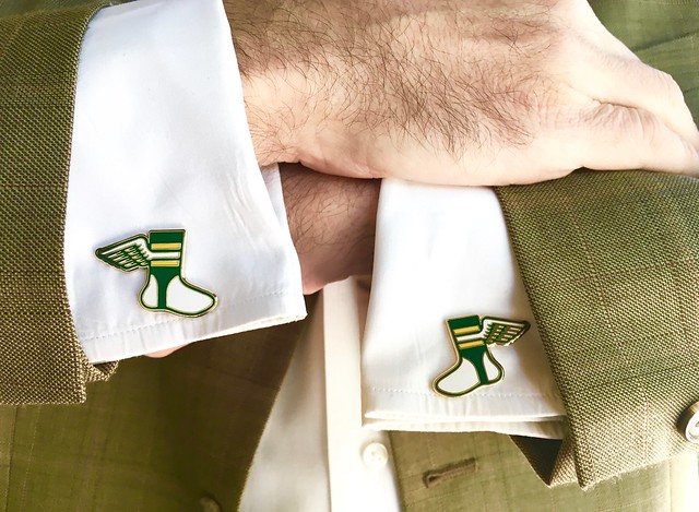
Pin Club update: As of this morning, there are fewer than 50 pins left for the Uni Watch Pin Club’s June design. So if you want one, move fast.
Remember that you can save a 15% on this pin, and on everything else in the Uni Watch Shop and the Naming Wrongs Shop, by using the checkout code COMMUNITY.
Also: If you order multiple pins (here are the May, March, February, and January designs, along with the basic winged stirrup) and find yourself getting hit with multiple shipping charges on the one order, go ahead and place the order and then email me with your order number — I can arrange for the extra shipping charges to be refunded.
While we’re at it:
• In case you missed it earlier, Uni Watch cufflinks, which usually sell for $26.99, are now just $16.99. Perfect for all those formal events on your busy shelter-in-place social calendar!
• All colors of Uni Watch seam rippers are currently available.
• Don’t forget about the awesome Uni Watch chain-stitched patches, hand-made for us by the great Amy Bengtson!
My thanks, as always, for your consideration.
The Ticker
By Lloyd Alaban

Baseball News: The Puerto Rico Independent Baseball League is using a modified Columbus Blue Jackets logo in this photo (from Vod Kanockers). … Longtime Uni Watch pals Tokens & Icons’ latest repurposing project: these bracelets made from the yarn inside baseballs.

Football News: The University of Tennessee has some great-looking Vols-themed masks. … Georgia Tech will switch from grass to artificial turf (from Andrew Cosentino).

Hockey News: Cross-listed from the baseball section: The Puerto Rico Independent Baseball League is using a modified Blue Jackets logo in this photo (from Vod Kanockers). … NHL writers debated over the best player to wear No. 2 (from Wade Heidt).

Basketball News: Twitter may have leaked Sixers C/PF Joel Embiid’s new personal logo.
.

Soccer News: Tottenham Hotspur supporters’ groups can send in the flags and banners they would normally bring to games to be displayed in the stadium while there are no fans (from our own Jamie Rathjen). … Also from Jamie: Scottish League One team Airdrieonians switched to Umbro from Under Armour. … And one more from Jamie: New all-white kit for Orlando Pride of the NWSL. … The next few items are from Josh Hinton: Ajax’s new second shirt has leaked. … Another photo of Real Madrid’s third kit has leaked. … Wait, one more from Jamie: New first shirt for English Championship team Rotherham United. … New home shirt for Bayern Munich (from Ed Zelaski).

Grab Bag: The International Cricket Council has announced it will be allowing ads on shirts for the next 12 months (from Evan McKay). … NASCAR driver Bubba Wallace will run a Black Lives Matter-themed paint scheme tonight at the Blue Emu 500 (from multiple readers). … Speaking of Wallace, he wants the Confederate flag removed from NASCAR tracks. … This discussion about the PGA returning contains a snippet about caddies and bibs (from Joseph Andersen). … Western Connecticut State University, whose teams are called the Colonials, will consider changing that name in response to student and alumni complaints (from Timmy Donahue). … An Atlanta-area brewery has created a beer named after Atlanta’s Major League Rugby team (from @bryanwdc). … Also from Timmy are these items: Students and alumni of Richland (Tex.) High School are asking administrators to retire its mascot and team name, the Rebels. … The U.S. Space Force might lose its trademark to the Netflix series of the same name. … The Chicago Police Department is investigating an incident involving an officer who wore a mask with a Three Percenter logo at a protest Saturday. … The Chief of Naval Operations, Admiral Mike Gilday, has told his staff to craft orders similar to those of the U.S. Marine Corps in banning the Confederate battle flag. No word yet on potential implementation. … There’s growing discussion in Alexandria, Va., about renaming T.C. Williams High School, which is currently named for a former school superintendent who was an ardent segregationist and fought against integrating the local schools (from William F. Yurasko). … New logos for UC Santa Cruz. … Interesting piece on the history of the Blue Lives Matter flag.

Click to enlarge

What Paul did last night: Spectacular day yesterday — warm, breezy, not humid. Wore one of the new Uni Watch masks on my daily bike ride — a test drive, you might say — and am happy to report that it made the grade. I hope to have these available for you in our Teespring shop sometime next week.
Meanwhile, as I mentioned yesterday, I’m using a different candy bar-themed tumbler each day this week for Pandemic Porch Cocktails™. Here’s the one from yesterday:

Afterward we called in a takeout order at our local Chinese place. Aside from that one bike trip I took back in April to pick up some barbecue in Manhattan, this was the first takeout we’ve done during the pandemic, so we went a bit overboard (and that photo doesn’t show the large order of fried rice or the spare ribs). It was mediocre at best, which was oddly reassuring — like, some things are the same as they always were, pandemic or no pandemic.
While eating, we streamed the new movie The Vast of Night, a weird amalgam of The Twilight Zone, Close Encounters, and Twin Peaks that a lot of people seem to like a lot, although we thought it was just so-so. Great 1950s sets, cars, and costumes, though, including a high school basketball game with very nice uniforms:
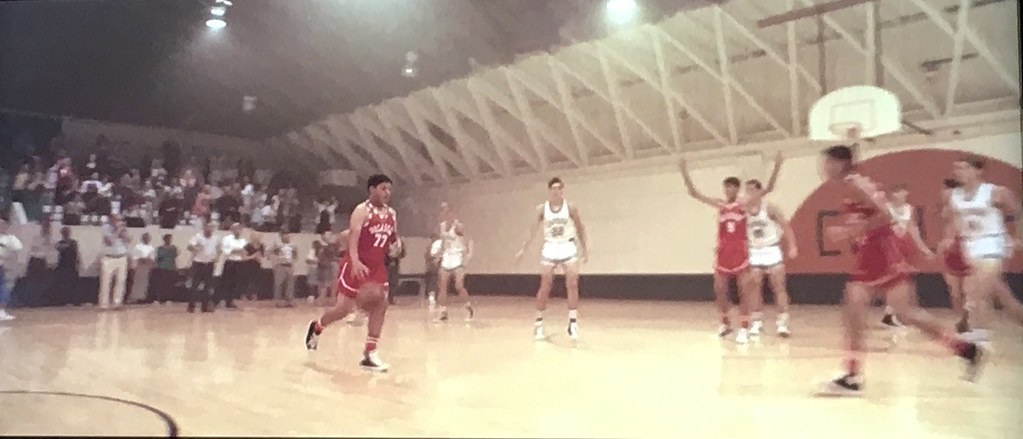
According to this article, that scene was shot at a high school gym in Whitney, Texas, and the crew had to remove the school’s three-point line, which cost $20,000. Vintage backboards, too.
Meanwhile: The branch is still there.
As always, you can see the full set of Pandemic Porch Cocktails™ photos here.
The winner of yesterday’s raffle is Alex Dewitt, who’s won himself a membership card. Congrats to him, and thanks to reader Ryan Houdayer for sponsoring this one. — Paul
I don’t know the cost of post-production work, but couldn’t the three-point line have been digitally erased for less than the $20,000 spent on sanding/re-finishing the floor?
Especially since the entire budget of the movie was only $700,000.
I agree with Paul. It was just ok. Started strong but got bogged down in the second half.
The link to your food at the end links to the pic of your beer
Now fixed. Here’s the proper link:
link
The link to the new Bayern Munich second jersey shows an Ajax jersey.
Where’s the photo of the food? I’m craving right about now lol.
Fixed. Here’s the proper link:
link
Big thumbs up to Bob Fittipaldo. There were at least 2 kids wearing A’s #35 jerseys in Pittsburgh in the 80’s. I wore my white polyester pullover to the arcade at Century III Mall on many, many days. My mother drove me to Cleveland in August 1983 to see Rickey play. He played both games of the Wednesday doubleheader, but sat out the Thursday get-away game, which gave me the opportunity to get his autograph on a rookie card.
Thank you for posting the write up about when I did first Get It. Would we be able to fix a small typo? Saskatchewan is missing the “c” in the first sentence.
Sorry, Wade. Fixed!
No problem! Good addition with the link to the newspaper article from 1985. Fun to read through that.
I would not mind the Riders bringing back silver and black trim to their current uniforms if it meant a return to the wraparound helmet logo. Really can’t do their wraparound helmet logo without the addition of those trim colours again.
Paul,
Anxiously awaiting updates on the Uni-Watch Masks!
My home made ones keep breaking straps & yours look great!
Only problem I foresee is maybe being mistaken for a Packers fan…
Ha!
Your bug is my feature: I’m not really a Packers fan but live in Wisconsin, so the color scheme adds utility for me! Looking forward to their availability.
Right on! I think Packer fans will love them!
Paul, I love it that the 93/94 Mets ‘M’ bothered you too!
I feel as though that validates my irritation with it.
You hit the nail on the head with the description of it looking like a not quite right homemade jersey.
Rodney’s story about the Reds jersey is great! I love that era Reds uniform, before the dropshadows came along. Cincy has one of my favorite uniform histories–with the vest’s and the names below the numbers in the 60s and the classic but still very 70s ice cream man look worn by the Big Red Machine. I loved last year when the Reds threw back to the 60s vests and a bunch of the players went sleeveless.
Shame that they’ve been so messy the last 20 years or so. They’re so close to having a great set.
“Ice cream man look” – ????
It’s funny you mention that, AJ. Barry Larking actually thought the uni’s from this era (with the white pin-striped hats) looked like ice cream men.
Nestor – Ice cream man – link
And I totally agree, their history has a TON of great looks. It’s a shame they have stuck with the current set for so long. The current ones aren’t bad, but they aren’t that great either. I think they could grab from their past and develop a great set that they may never have to mess with again.
If that is Budweiser Nitro Reserve Gold, how do you like it?
Yes, that’s what it is. My first time trying it. I think it’s fine, but I don’t think it’s worth the higher price. No plans to buy it again. (I continue to buy the copper/bourbon variety, however, which I like quite a bit.)
Good to know, if I see a single can for purchase, I’ll check it out. Also love the copper/black/reserve varieties, cheers!
Paul (and others): I tried the Bud Reserve Copper Lager myself based on your recommendation…and I agree it is very good. That said, it’s becoming hard to find here in my area. Upon some internet sleuthing, it appears it may indeed have stopped being made (at least for awhile) as of March 2020. So if you find some at retail, you may want to grab it while you can!
link
Yikes! I have just a few bottles left. Will save them for special occasions!!
One thing that’s surprised me reading this site is how many people swear allegiance to a team based purely on uniform. I know it’s wrong of me to think this way, but it seems to me that parental guidance was missing from these unfortunates’ lives.
I’ve liked and even loved other teams’ uniforms since I was a kid, but being a Cubs fan is my geographic and family birthright. Growing up, I thought this was universal.
Like I said, I know it’s a wrong way of thinking. But it gives me a weird kick to know that some are truly rooting for laundry.
A uniform is as good a reason as any. The team winning when you first watched the sport is another reason I can think of. Liking a certain player or players on a team is yet another.
Plus, not everyone lives in or is close to a major league city. I’m a 7-8 hour drive from the two ‘major league’ cities closest to mine (Winnipeg & Minneapolis) neither of which I had or have strong allegiances too (though I don’t dislike them either).
While for a while, when I was very young, the Leafs were my team (were and are my dad’s team) that was mainly because they were pretty well the only team on t.v. for me. Even then, after a while, I ended up abandoning them and choosing other teams.
Guilty as charged….St. Louis Blues fan since 1972…because of that logo & (original) uni….
@Rodney Suchland- Value City! I forgot about that place! Now did you take it to Koch’s I bet?
Value City was one of my favorites at that age. I could always find something cool to buy with the few dollars I had in my pocket at that age.
And no, not Koch’s. I’m up the road from Cincy a couple of hours. The Value City was in the Lima Mall (just a few miles away from Uniopolis!) and then the jersey went to “Sports N More” in St Marys. Neither place is open anymore. “Sports N More” probably closed because they messed up too many kids’ dreams.
Paul, thanks for the ticker inclusion on the MLR beer adventures, alas my Twitter handle is @bryanwdc – those pesky i’s!
No need to thank me — Lloyd compiled today’s Ticker, not me. Typo now fixed.
I first Got It when I went to the Buffalo Sabres new uniform unveiling at the Aud in 1996. I had no idea what they would look like. Then the banner went up with the goat head and the Sabres took the ice in black uniforms. I knew it wasn’t right. 1996 me couldn’t imagine it would only get worse.
Love the card! Hopefully it is the first of many for me.
Love the picture of Rod Gilbert (my favorite Ranger growing up). Nice touch!
My favorite too! Went looking for a photo of him to use in that spot and was lucky enough to find one where the North Stars were the opposing team — perfect!
IIRC, Bubba Wallace’s car for tonight’s (weather permitting) race would have otherwise gone un-sponsored as a result of his iRacing ‘rage-quit’ incident.
The #43 has a history with regard to the peace symbol being used…Richard Petty had a headrest using that shape in some of his cars during the Vietnam-War era.
Paul, just want to echo the sentiments that other readers have passed on the last few weeks and thank you for providing a daily reprieve from some very heavy things in the world right now.
Today especially reminded me of the comm-uni-ty you’ve fostered here, and how we all have our own quirky ways that we found our way to this shared interest. More importantly how 99.999999% of the time we are all able to just enjoy a shared common interest and our discussion of it without the heavy or increasingly divisive topics encroaching on it.
Thanks, Greg. I appreciate your contributions to the comments section, which are always thoughtful and constructive — thanks for helping to make Uni Watch a better place!
I may be wrong, but wasn’t T.C. Williams the name of the school in Remember The Titans?
Yup
Rename the school for Herman Boone.
Remember the Titans.
Over. Done with.
Boom.
The Puerto Rico Independent Baseball League’s using of a modified Blue Jackets logo reminds me of the one an Oregon politician used back in 2010: link
David Baughman’s entry about Vida Blue’s socks mirrors my childhood fascination with uniforms. As an Orioles fan, I thought Frank Robinson was the coolest looking player. I believe he was the first one to wear his socks like that.
I also had my mom fix my little league socks the same way. I used to refer to them as “high hikes” because she mentioned how Frank “hiked them up”.
I grew up in Greater Cleveland and when I was 10 years old I new I “Got It”. The Tribe came out with the blister red tops and the following year introduced the the red and blue onsies and the Browns joined the fashion ridiculousness with the orange pants and white facemasks. Being a traditionalist kid even at a young age I was appalled that the two historic franchises would resort to such fashion buffoonery. Being such a loser I can see why the Indians would be willing to try anything, but the Browns had just began to slide a bit 2 years prior. The Crusaders and Cavs had great gear at that time, so I’d say my attention shifted a bit. I remember becoming Dallas Cowboys fan at that point too, not only because I was a huge Roger Staubach fan, but also because of the classic look and hoping to see the blue jerseys being worn on a Sunday telecast, but that rarely happened…
link
link
link
link