Good morning from Uni Watch HQ, where everyone continues to be safe and sound. I hope that’s also the case at your home.
I recently invited readers to share their stories of how they first got hooked on uniforms — in other words, how they first realized that they Get It™. Many of you responded — too many to include in a single blog post. But here’s the first installment:
Frank Seitz
Has to be the Cowboys’ home uniforms and the mismatch of royal blue for the numbers, navy blue for the star and stripe, and metallic blue/green for the pants. I wasn’t even a Cowboys fan, I just wondered why they would have so much contrast in a “uniform.” This had to be in the early ’90s when Jimmy Johnson became the head coach.
———
Chris Connelly
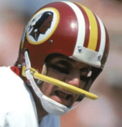
My earliest uniform memory is watching Super Bowl XVII between Washington and the Dolphins when I was eight, specifically the burgundy and gold of Washington. What really interested me, however, was Joe Theismann and his single-bar facemask. There was just something about that mask: the contrast between Joe and everyone else on the field, the way the single-bar masks had no “upper portion” near the bumper — everything about it intrigued me. My dad had an old football helmet, and I was obsessed with trying to find a single-bar mask for that helmet so I could look just like Joe. Alas, this was before the days of the internet and Amazon, and my parents weren’t exactly on board with an exhaustive search for a facemask, so I never did find it. To this day, I love seeing pics of that uniform.
———
Matt Battipaglia
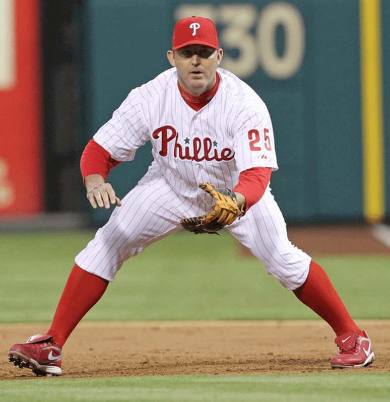
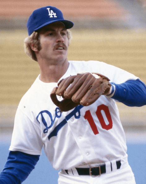
I was born and raised a Phillies fan. Jim Thome was my favorite player. Cuffed pants + red pinstripes = me Getting It™.
———
Mike Engle
I would have been about seven. I had a small stash of baseball cards (1996-era Upper Deck, probably from the local card shop, which was the brand my parents routinely got me for Chanukah) and I asked my dad, “Why do the Tigers and Royals have the really skinny belt loops, but nobody else does?” He looked at me like I was a real weirdo for noticing and said he didn’t know. Maybe I am weird (my wife definitely thinks I am), but at the same time, I was uni-watching before I knew what I was doing!
———
Elena Elms
I was probably around 12. I remember reading about a St Louis Cardinal — maybe Lou Brock or Bob Gibson? — describing how he got a smooth look when high-cuffing his uni pants. He turned them inside-out and, while holding them upside-down, slid his feet into the bottom hems until the edge got near his knees, then carefully took hold of the waistband and turned the upper part of his pants right-side-out as he drew them up his legs. I had a very small teddy bear and made a little Cardinals uni for it, embroidering the birds on bat onto it, and put the pants on it exactly that way. The bear didn’t have socks, but it had a nice smooth cuff.
———
Ryan Summers
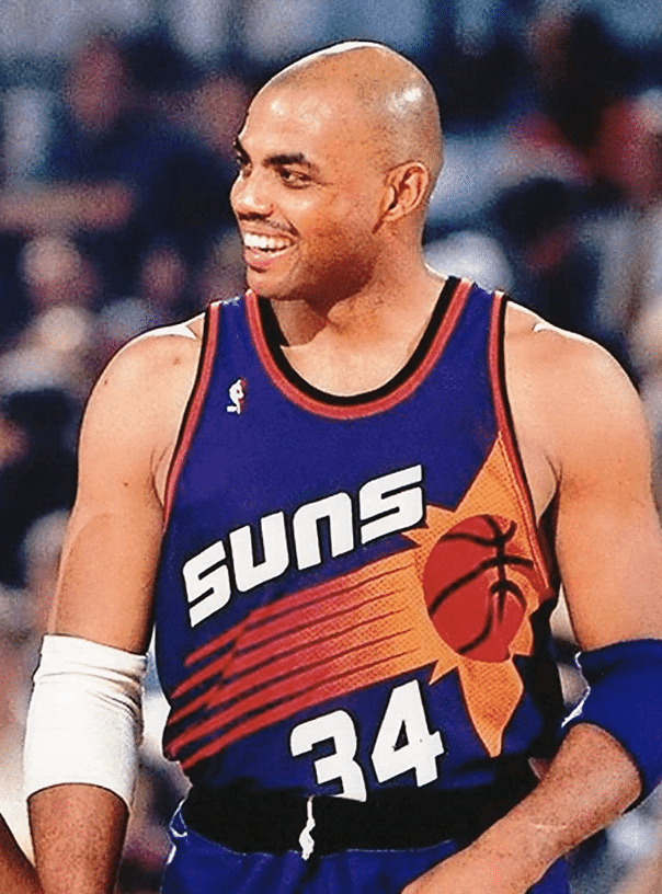
It was in the lead-up to the NBA season, and as an 11-year-old Suns fan, it had been quite a year. We had acquired Charles Barkley and Danny Ainge, along with the existing core of KJ and my personal favorite, Dan Majerle. I had also learned that the Suns would be getting new uniforms, and I scoured any source I could find to get more information about them. I remember getting a catalog, it may have been Eastbay, that showed a tiny image of their new “streaking sun” uniform, and I fell in love — not just with one of the most beautiful uniforms of all time, but with athletics aesthetics. I started researching all the uniform changes I could find, and started paying more attention to the uniforms. Now I can’t start my day without checking Uni Watch and holding out hope that those beautiful uniforms will one day return.
———
Anthony Scandiffio
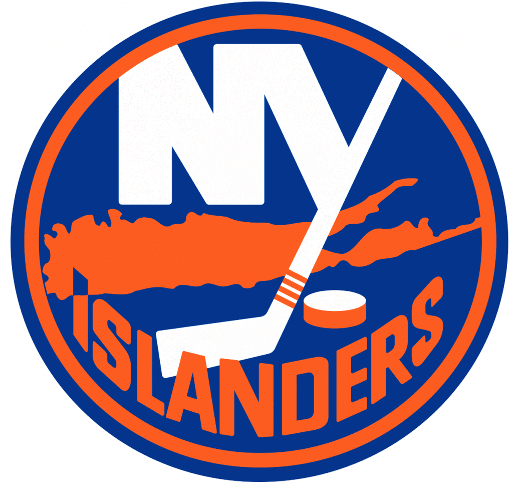
1978, I was seven years old and I received my first New York Islanders jersey as a Christmas gift from my mom. I was intrigued by how the “Y” looked like a hockey stick and the “I” pointed to the basic area of where they played. Once I saw that, I started to look more closely at other logos that were in the sticker books and baseball cards I collected at the time.
———
Randy Clement
I was seven years old and living in San Diego in 1967. I started watching a hockey game on TV — the New York Rangers were playing and I was immediately drawn to the way “Rangers” was diagonally placed on the jersey and the shadow font on the letters and numbers. I was hooked — and this was on a black-and-white TV! To this day, the Rangers are still my favorite sports team. This also kick-started my obsession with sports unis in general, and I am so thankful for Uni Watch and other uni geeks such as myself!
———
Jeff Israel
Hockey was the sport I first loved (because it was the fastest and had the shortest commercial breaks!), and it eventually became my gateway to the uni-verse. I remember buying the Panini sticker books from the Scholastic Book Fair in the early ’90s, and occasionally you’d get a sticker that was just a logo. When I saw the “H” in the Whalers’ logo, it blew my mind. That logo, and the Canucks skate logo, were my Rosetta Stone. That led to drawing logos, then uniforms and before I knew it, I Got It™.
———
John Horn
The first NFL game I ever watched was the 1967 NFL Championship game between Green Bay and Dallas — the Ice Bowl. It was a couple of weeks after my ninth birthday and I watched it with my dad and uncle. I knew next to nothing about the NFL at the time, but I cheered for the Cowboys in that game strictly because of their uniforms — specifically, their beautiful helmets.
———
Mike Kole
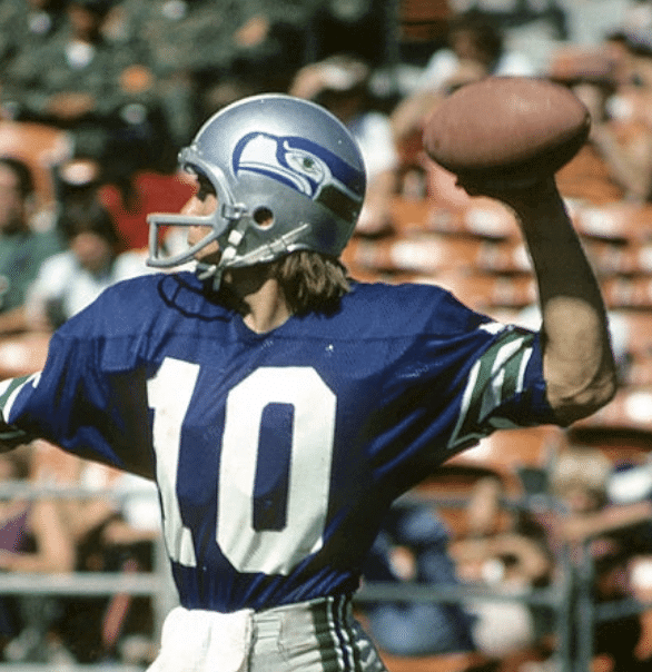
It was 1976 and the NFL expansion teams broke the league’s design norms. Until then, I thought the San Diego Chargers helmets were the coolest — no center stripe, lightning bolts, yellow facemasks. The Bucs brought out the funky ’70s colors, and the Seahawks’ helmet was stunningly cool. The silver was sharp, green and blue complemented each other so well, and that bird wrapping around the helmet was way outside the box — I loved it. Maybe it was something about Seattle, but the next year I discovered the Sonics’ jerseys, with the lettering that wrapped around the chest. I’m sure this all really resonated because I was in Cleveland, stuck with the most boring helmet — then and now!
———
Eric Bangeman
When I was a little kid, I loved traffic signs. The variety of geometric shapes, numbers, and colors fascinated me to the point where I started making my own traffic signs. Once I became aware of sports, watching WFL and NFL games on TV as a youngster in Hawaii, I immediately focused on the uniforms. I remember looking forward to Howard Cosell’s halftime highlights on Monday Night Football, as I’d get to see the uniforms of teams that I didn’t normally get to see on TV. But where the light really switched on for me was the 1976 Hula Bowl. Two players from the East, Cornelius Greene of Ohio State and someone else who I can’t remember, had their jerseys stolen before the game. One of them played in a jersey with no numbers and the other wore No. 00. Sitting in the stands at Aloha Stadium, I was struck by the combination of a couple jerseys with no name (and in one case, no number), a cacophony of helmet designs and colors, and, especially, the Hula Bowl jerseys. They had contrasting shoulder yokes, stars all over the place, and “HULA BOWL” in large block letters on the front. It was a feast for my eight-year-old eyes, starting me down the athletics aesthetics road.
———
Scott Fite
When I was eight years old, I was a casual baseball fan in the sense that I knew the teams and many players from baseball cards. But one afternoon, while watching the NBC Game of the Week (probably the first time I really watched a game on television), I saw the Los Angeles Dodgers’ home whites in action. They were crisp, clean, and looked like an American flag. It didn’t hurt that they had stars like Steve Garvey, Ron Cey, and Don Sutton. Blue was already my favorite color, so it seemed natural that this magnificent-looking club should be my favorite team as well.
———
Christopher Falvey
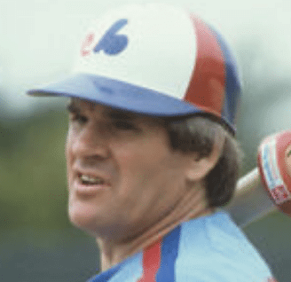
When I was about nine years old, I saw a picture of Pete Rose as an Expo. Knowing Pete as someone who always played for teams in red, this fascinated me. I’m not sure why, but I suppose it is the same fascination I have today with star players in the “wrong” uniform. That remains my favorite corner of the uni-verse, and I still seek out those anomalies.
———
Bry West-Whitman
As a middle school kid in the late 1980s, I used to spend my summers with my grandparents in Washington State. I loved to draw, and my grandma was always encouraging me. She was a huge Seahawks fan, and particularly a Steve Largent fan. Two things happened that summer that ignited my interest in sports logos. First, Steve Largent was on the Wheaties cereal box. I drew the Largent pose, showing him stretching out and reaching for a catch. I eventually mailed it to Seahawks HQ and was delighted when it was returned with Steve’s autograph. And the second thing was my grandma asked me to draw her a Seahawks helmet. She loved that helmet so much that I ended up drawing all 30 teams for her. My grandma passed away last year. I went to the hospital to visit her and stayed up all night in her hospital room to draw one last Seahawks helmet for her. Her eyes lit up when I showed it to her in the morning. She was the reason I became an artist and I will always have her voice in my head encouraging me when I draw. So that’s my lightbulb moment — I owe it all to my grandma.
———
Tim Bullis
I was around five or six. I was fascinated by football uniforms and liked to cut out players from our Sports Illustrated issues and sort of use them like action figures: “No. 24 moves the ball downfield, spins to avoid No. 66, and he scores!” while holding and moving the cutouts around in the air. I was fascinated by the coordination between the helmets, jerseys, pants, socks, shoes, and how the uniforms with pads looked on the players. I was immediately interested in things like Alabama’s football helmets having one white stripe down the middle, but the pants having two red stripes — stuff like that. Fast forward to when I’m around 11 or 12, we were living in Connecticut and I got really into watching football. Everyone was a Giants or Jets fan, and it bugged me to death that the Giants’ helmets appeared to be navy blue while the jerseys looked more royal blue. Why the heck don’t they match?! This was really the moment — from then on, I paid particular attention to the aesthetics of uniforms, how they coordinated, etc. Discovering Uni Watch has accelerated and enhanced that peculiar habit.
———
Dan Cichalski
In fifth grade (1986-87 school year), we were assigned a book report that had only one parameter: It had to be an autobiography. We could choose our own subjects, and at the end of the assignment we had to dress up like the person (not elaborately, as I’ll soon explain) and present a brief summary in front of the class. I chose Tom Seaver, probably because I wanted to do a baseball player. When it came time to dress up, we couldn’t find a Mets cap in the house (even though we were all fans), but for some reason we had a Yankees cap. So my dad took an orange marker and colored in the NY. After my presentation, one of my classmates asked if I was wearing a Yankees cap with the NY colored orange, and that’s when I truly understood the difference in the shades of blue and the style of the interlocking NYs. From that point on, I’ve been pretty good at drawing the Mets’ version from memory, serifs and all.
———
Axel Schmidt
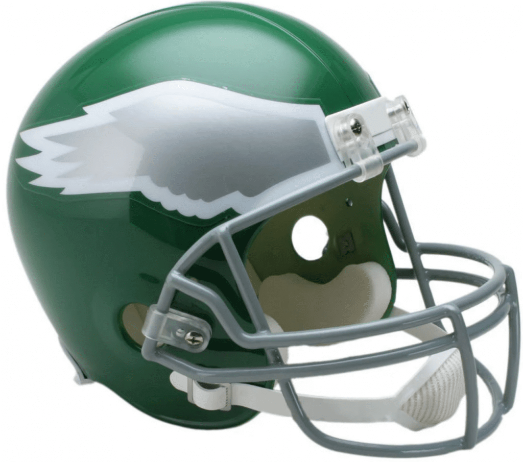
I remember being about five years old and looking over my dad’s shoulder as he read the sports section of the newspaper. I remember seeing the page previewing that weekend’s NFL games, with each matchup accompanied by the two teams’ helmets facing off. I was completely fascinated by the Eagles’ winged helmet. I thought that was such a cool idea, and it was the reason that I rooted for the Eagles for much of my youth. But I also studied every other helmet. That newspaper page showed me how a sports team could have a visual identity. From that moment on, a lot of my childhood artwork featured football helmets. I started collecting the gumball helmets from the grocery store. I started tracking every time a team changed their helmet design. And my interest in sports uniforms and uniform design grew from that.
———
Michael Baldwin
Growing up a baseball fan in the ’80s, I feel like you couldn’t help but get it. All those amazing logos, especially the Expos’ “M” with the pinwheel cap and the Brewers’ ball-in-glove logo. What a glorious time!
———
James Ryan
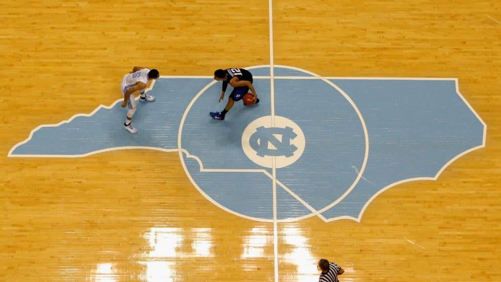
I was 11. I was at a UNC basketball game, and the first thing you notice when you see the Dean Smith Center is how bright that Carolina blue is. Then, looking on the court, the color pops on a very simple but beautifully designed court, especially the slender outline of the state in the center. So it didn’t even start with the uniform, but seeing the home whites, with “North Carolina” elegantly written on the front and argyle on the sides, completed the whole experience. I wonder how many other people Get It™ because their favorite team looked amazing.
———
Jay Wright
Around third or fourth grade, I read a book called The NFL’s Greatest Wide Receivers. Steve Largent was one of them, and I was mesmerized by the Seahawks’ uniforms. That’s how a small-town kid from Iowa became a lifelong Seahawks fan! Also, my dad was the athletic director at Boyden-Hull High School, and we got new basketball uniforms that year. They only had a stripe on one side of the uniforms, which was unique at the time, and that set me off on a course of loving all things uniforms. I can still recall every team’s uniforms from our conference when I was in fourth and fifth grade!
———
Jake Tilley
When I was about five, I saw the movie Rookie of the Year. I remember the manager going out to talk to Henry on the mound, and when he turned around I noticed that there was no MLB logo on the back of his cap. I remember thinking that was odd, because it was on everyone’s else’s caps. I spent the rest of the movie trying to spot whether each player had the MLB logo or not. I remember my dad telling me that most people my age wouldn’t catch that, or even care. But I cared a lot. I think it was then that I realized that the small details of uniform aesthetics mattered to me.
———
Dan Herr
When I was 12, my Little League team wore yellow uniforms. Everyone was issued a standard pair of stirrups, and I hated that look. I wanted solid-color socks, like Jim Thome had. So for the entire season, I would wrap the bottom part of the stirrup around my foot to ensure only the solid-color portion appeared. Still have very fond memories of that and how I was probably the only one in the league with a unique look.
———
Walter Helfer
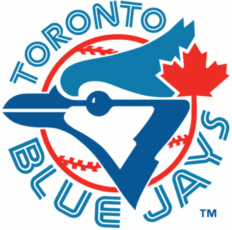
When I was in middle school in 1976, my English class was a hotbed of hockey fandom. Kids rooted for a wide array of NHL teams (Rangers, Islanders, Flyers, Bruins, Canadiens), and I was drawn in by a looseleaf binder my friend had that was covered with hockey action photos. He explained to me he pulled for the Flyers, hated the Bruins and Isles, and sketched the Flying-P emblem in the corner of my notebook. Before I embraced the idea of team colors or the differences between football and baseball, I glommed onto the graphic conciseness of hockey crests. Then when I got home, I saw a TV commercial for Sports Illustrated that spotlighted baseball’s upcoming expansion (the Blue Jays and the Mariners). The Blue Jays’ logo socked me between the eyes, like a two-by-four. I was hooked!
———
Rick Loomis
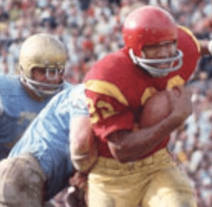
It was the day before my 10th birthday in southern California and I was watching the famous 1967 USC/UCLA “Game of the Century.” I noticed how great the game looked with both teams wearing their home uniforms, and how it worked so well because of the contrast, though I’m sure I didn’t use that word at the time. While I was attending USC in 1983, UCLA moved to the Rose Bowl and ended this tradition. Thankfully they brought it back in 2008.
———
Rob Yasinsac
I admired the Detroit Tigers’ home jersey and wanted one. The one I was given (a birthday gift, I believe) was a replica jersey that did not have the blue headspoon piping. I knew the jersey was missing something and it slightly bummed me out.
———
Ethan Lewis
In 1978 or so, when I was seven or eight, I saw an ad in a Phillies program for a “youth Phillies uniform” from Sixsmith’s Sporting Goods in Philadelphia. My uncle, who was the person who encouraged my love of sports, drove me into the city to get it, even though it was pretty expensive by our family’s standards. The initial rush of having an exact copy of the Phillies’ uniform was thrilling. But then I quickly realized that it was not exact — it had a round pullover neck instead of a zipper, the “P” was different, and the trim on the sides was wrong. I actually became so embarrassed that I kept it in the back of my closet until I outgrew the uniform. I’ve been a stickler ever since.
———
John Gogarty
I think my first uniform “Hmmmm” was watching the opening of Monday Night Football in the 1970s-’80s and seeing all the helmets together. It just seemed exciting to me as I waited for the Jets’ helmet to show up. The other thing was the Steelers’ oddity of having a logo on one side. I remember reading in a kids’ book about it being a cost-savings measure that stuck. I loved that it was the logo for U.S. Steel or whatever the governing body was.
———
Skott Schoonover
The first time I can remember being fixated on a uniform element was in 1987 as a six-year-old. I noticed that the halos on the Angels’ on-field caps were as thick as the letters, but the halos on the retail caps at the local Big 5 were just a single line. It bothered me to no end that the cap I could buy didn’t match what the players wore on the field. It started my obsession with understanding what made authentic merchandise the real deal, and how much better the quality was over replica merchandise. My dad still doesn’t see the difference.
———
Cris Routh
Growing up as a kid in the ’70s and early ’80s without cable TV, I thought uni changes weren’t very common. I was too young to remember the Chargers’ powder blues or the Oilers’ silver helmets. I knew the Padres changed unis every few years and that the Pirates had a bunch of different unis. I knew the Colts wore silver pants for a while and that the Bills switched to red helmets. But I never really gave those things much thought. For me, it really started in 1986. There was something different about my Dolphins’ unis that season that I couldn’t figure out. I finally realized that Miami had changed the stripe pattern on their pants. The following year, it really kicked in for me. I noticed all kinds of changes to Miami’s unis. TV numbers moved from the sleeves to the top of the shoulder pads. There was now a team logo on the sleeves. The jersey numbers had a white outline to them inside the orange outline. The font for the numbers “2” and “7” differed on some jerseys. I haven’t been the same since.
———
David Murphy
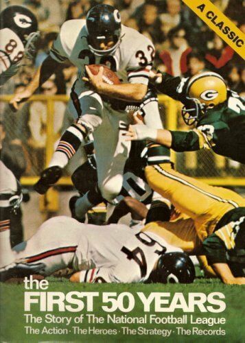
I first Got It as a young boy in the late 1960’s, growing up attending Braves and Falcons games. I was quickly fascinated by the uniforms, stripes, logos, facemasks, shoes, and socks. A player wearing his stirrups higher than others, like Frank Robinson. Brooks Robinson’s truncated batting helmet bill. Otis Taylor’s twin single-bar facemasks. Willie Lanier’s padded helmet. Football players with taped shoes, cut-off sleeves, and socks pulled up just so, like Fred Biletnikoff and Jim Kiick. Pete Maravich in the Hawks’ blue/green uniform and floppy socks. I would pore over two books: The First 50 Years (football) and This Great Game (baseball), mainly looking at the uniforms. Then in 1972 the Braves introduced their “feather” uniforms. At home (and in class at school) I would draw player after player. I’ve been uni-watching ever since.
———
David Tarr
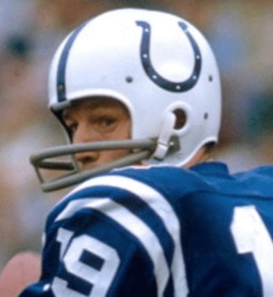
When I was a kid — probably about nine or 10 — my Dad and his cousin had season tickets to the Baltimore Colts (the height of the Johnny Unitas era). Twice a year they would give up one of their tickets so the other guy could take his son to a game. I remember that first Colts game I ever went to with my Dad. I took one look at that cool blue horseshoe on that white helmet with the blue stripe … and I was gone. That’s when I Got It™. And very soon after, I started paying attention to other teams’ helmets/unis, because I knew that their fans were just as passionate as I was. Ever since, I’ve been absolutely fascinated with sports teams’ names, logos, and uniforms. My gosh, I can hardly wait for the details of the new Seattle NHL team to emerge, and I have absolutely no rooting interest whatsoever in the Pacific Northwest!
———
Mark LaFountain
There was always a lot of football on TV when I was young — an occupational hazard of being a football coach’s kid. I don’t really remember caring which teams were playing, but I do remember being fascinated with the helmets. Different brands, models, facemasks. Bike-brand helmets had high snaps up on the sides of the helmets, while Riddell had low snaps. I remember Terry Bradshaw wearing a Rawlings model in a Super Bowl (with a black facemask!) and Roger Staubach wearing a Maxpro. As I got a little older, helmets moved from suspension models to different kinds of internal pads, and facemasks moved from grey to team colors. It was fascinating to see the different kinds of engineering that went into these helmets, which I usually learned by taking the helmets apart and then putting them back together. This fascination continued as I grew, and is actually quite helpful in my current position in football equipment sales.
———
Nate Meihak
I think part of the reason I became so enamored with sports was how players looked on the field, court, etc. I’m not sure what it was, but athletes looked different — they looked superhuman and larger than life. To me, I think wearing that sports uniform made them look “official” and I just loved the aesthetic. As I got older, I would draw uniforms in my notebooks, either for my favorite teams or for completely made-up ones. Eventually I stumbled across Uni Watch around six or seven years ago and felt validated to learn others felt the same way about sports uniforms and design. My friends get annoyed when a team releases a new look and I break down all the detailed reasons why I like or dislike the new look, but I guess they just Don’t Get It™!
———
Colby Greer
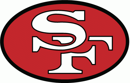
My first sports memory is watching Super Bowl XXIV (49ers and Broncos, 1990) with my big brother, who was a huge Broncos fan, and my favorite uncle. I was six at the time, so naturally I started rooting for the 49ers, just to get on my brother’s nerves. After that 55-10 butt whipping by the 49ers, I was instantly a fan, and I was obsessed with the interlocking “S-F” on the side of the 49ers’ gold helmets. I would draw this logo approximately 10,000 times before I reached adulthood and could probably draw it 99% accurately from memory today (I’m 35 now). I always struggled getting the oval around the “S-F” just right, but that didn’t really matter because the “S-F” was the star of the show and I still believe it’s one of the most best and most recognizable team logos.
———
John F.
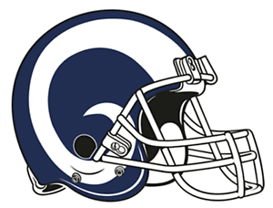
I grew up on a Brooklyn block filled with Jets and Giants fans, but three of us became L.A. Rams fans. It was 1964 and we were seven years old. Roman Gabriel was still a backup for Bill Munson and the Fearsome Foursome were not yet as fearsome as they would become … but those helmets! We became Rams fans because they had the coolest helmet in football (and their white uniforms also looked great on a black-and-white TV). I lost touch with one of my friends when he moved out west for college, but 56 years later, my other friend and I still root for the coolest helmet in football. Here’s hoping that the new logo is not a bad omen.
———
Chris Cooper
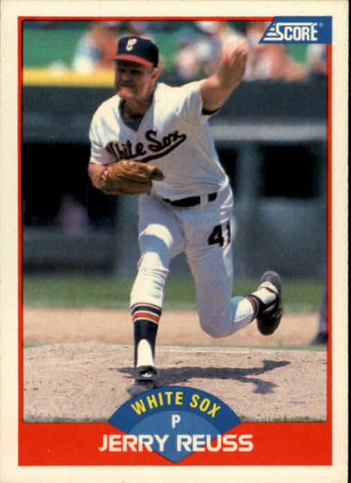
It was in January of 1989. My cousin gave me two baseball cards from the Score 1989 set: Greg Maddux of the Cubs and Jerry Reuss of the White Sox — the two Chicago teams. I was six years old at the time and did not know much about baseball, but I was informed by everyone in the family that I “could not be a fan of both teams.” That was the day my White Sox fandom started, and it was because I liked the cursive “C” on their hat better than the standard ‘C’ on the Cubs hat. I haven’t looked back since!
———
David Eng
CBS had the NHL Game of the Week in the early 70’s. As the 1970-71 season went along, I noticed the goalies wore only No. 1 or Nos. 29, 30, 31, or 35. Skaters’ numbers were no higher than 27 and only defensemen wore 2 through 5. I thought the NHL had banned the number 28. Even today, any non goalie wearing a number above 28 looks strange to me.
———
Paul here. Are these stories great or what? Interesting how often the Seahawks came up!
And there’s a lot more where that came from — I’ll run a second installment soon. Big thanks to everyone in the comm-uni-ty for sharing your origin stories!
If you want to share your own story of how you first Got It™ — no more than one paragraph, please — go ahead and send it here (please note that this is not the usual Uni Watch email address). Thanks!
(Special thanks to Brinke Guthrie for coming up with the idea for this entry.)
ITEM! Uni Watch featured in new podcast: Got a note the other day from Uni Watch reader Lendsey Thomson, as follows:
I wanted to let you know how much I appreciate you and Uni Watch, especially in this weird-ass time that we find ourselves. I recently started a podcast with my sister where we try to share positive stories to lift people’s spirits. In our very first episode, I share my story of Uni Watch and how much you mean to me and the rest of your readers. I hope you give it a listen. It’s off-the-cuff but (I hope) fun.
You mean a lot to me, man, and to the rest of the comm-uni-ty!
How nice is that? The podcast is called The Filling Station, and that first episode is available here. It begins with Lendsey’s sister Mallory talking about how much she loves the National Cowboy Museum in Oklahoma. The part with Lendsey talking about Uni Watch, begins at about the 17:20 mark and lasts 15 minutes.
Lendsey didn’t tell me he was doing this — he just did it. And it’s so nice! Aside from the kind words, I love that he thinks Uni Watch and its comm-uni-ty qualify in the category of “positive stories to lift people’s spirits.” Thanks, man!
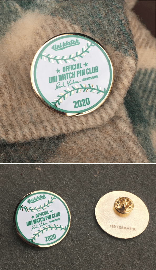
Pin Club reminder: In case you missed it on Wednesday, the Uni Watch Pin Club’s April design is now available. As you can see, it’s based on an official Rawlings/MLB baseball, complete with my signature as the “Commissioner.”
This is a numbered edition of 250 pins. Todd Radom and I each took five pins for ourselves, leaving 240 to sell. As of this morning, we had already sold 155 of them in the first two days, so only 85 are remaining. If you want one, I suggest that you move fast.
If you need to get caught up, here are the January, February, and March designs, all of which will remain available until they sell out (no reprints!). You can get a 15% on all of these pins, and on everything in the Uni Watch Shop and the Naming Wrongs Shop, by using the checkout code COMMUNITY.
And while we’re at it, several other discounts are in effect until further notice:
• The Uni Watch Classic Cap, usually priced at $39.99, is now $35.99.
• Uni Watch seam rippers, usually $6, are now $4.
• And custom-designed Uni Watch membership cards, usually $25, are now $20.
If you’d rather support Uni Watch via a donation, here’s now to do that.
My thanks, as always, for your consideration and support.
Click to enlarge
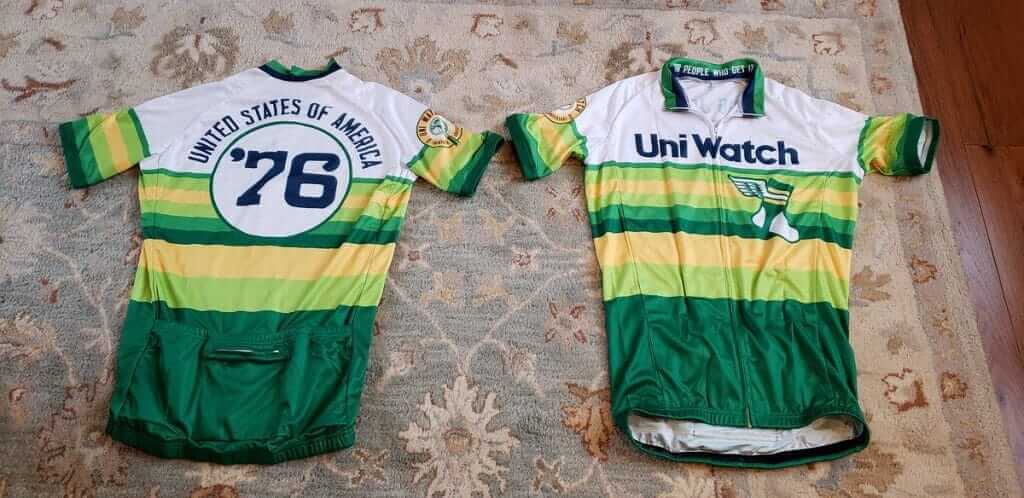
LAST CALL for the cycling jersey: Today is the last day to get your order in for the latest batch of Uni Watch cycling jerseys, move fast! As always, you can customize the back of the jersey with your choice of number and NOB. Full ordering info here.
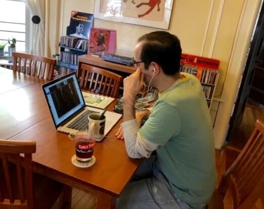
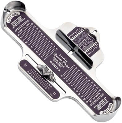
ITEM! Spreading the Brannock gospel: As I’ve mentioned a few times before, I’m a big fan of the podcast Side Door, which examines the stories behind some of the items in the Smithsonian’s collection.
The Side Door folks recently invited listeners to suggest topics for future episodes. I know that several decades’ worth of the Brannock Device Company’s records are at the Smithsonian, so I emailed to suggest that they do a Side Door episode about my Very Favorite Object.
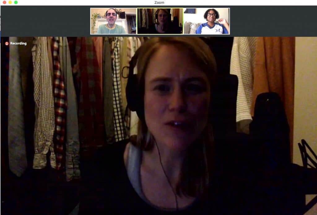
To my surprise, they wrote back, and yesterday I spent about 45 minutes being interviewed via Zoom by Side Door’s host, the awesome Lizzie Peabody — who was in a dimly lit closet at her fiancé’s apartment because that was the quietest spot she had access to! I made this screen shot (click to enlarge):
I really enjoyed chatting with Lizzie about all things Brannock (and holding my Brannock Device tattoo up to my laptop’s camera). Hopefully, this will be used in an upcoming Side Door episode. But even if that doesn’t pan out, it was still fun to meet someone whose work I enjoy so much. If you’re not already hep to Side Door, I heartily recommend it.
Today's #Timelapse of me painting #baberuth! Now I need suggestions for the best all time #Yankees centre fielder to join him…suggestions below please! @BabeRuthMuseum @PhilHecken @UniWatch pic.twitter.com/sw1lUjzb3u
— Andy Brown (@andybisanartist) April 2, 2020
Too good for the Ticker: British artist Andy Brown (who’s been featured multiple times in Phil’s weekend posts over the past couple of years) has been busy during the pandemic. His work is consistently great, as you can see on his Twitter feed and website, but this time-lapse video he posted yesterday, showing his depiction of the Babe, is particularly fun. Keep up the good work, Andy!

Membership update: Can you guess the uniform that Shea McMahon’s new membership card is based on? An orange jersey with white numbers outlined in powder blue — unusual, right?
Give yourself a pat on the back if you recognized that design from the recent NBA Rising Stars Game! I’m pretty sure that’s the first time we’ve had a request for a card based on a uni from that event.
Shea’s card is one of six new designs that have been added to the membership card gallery, as card designer Scott M.X. Turner and I continue to plow though the recent spike in orders (thank you!).
Ordering a membership card is a good way to support Uni Watch (which, frankly, could use your support these days). And remember, as a gesture of comm-uni-ty solidarity, the price of a membership has been reduced from $25 to $20 until further notice.
As always, you can sign up for your own custom-designed card here, you can see all the cards we’ve designed so far here (now more than 2,500 of them!), and you can see how we produce the cards here.


ITEM! Another membership raffle: A reader who prefers to remain anonymous recently ordered a membership card and also purchased one for me to raffle off, so that’s what we’re going to do today.
To enter, send an email to the raffle address by 8pm Eastern tonight. One entry per person. I’ll announce the winner on Monday. Thanks to our anonymous benefactor for sponsoring this one!
The Ticker
By Anthony Emerson

Baseball News: Cardinals 3B Matt Carpenter appears to be wearing last year’s jersey and cap in this video he posted to Twitter yesterday, on the date of what would’ve been the Cardinals’ home opener (from Paul Gardner). … There are lot of really great uni details at the 22:00 mark of this excellent SB Nation video on the Mariners (from Mark E. Kluczynski and Tim Dunn). … Parents of senior baseball players at Prince Avenue Christian School in Bogart, Ga., have hung their sons’ jerseys on the front doors of their houses as a way of honoring them, as they could never finish their final season (from @treyinathens). .. .Reprinted from yesterday’s comments: Here’s a look at the various memorial patches worn last season by MLB teams (from Brett Alan).

NFL News: The girlfriend of Browns WR Odell Beckham Jr. posted a video of herself dancing in a Browns helmet with a grey facemask. Is that a new thing? A throwback thing? A girlfriend thing? We’ll find out soon enough (thanks to all who shared). …@NFL_Journal unearthed a photo of Vikings DL Carl Eller wearing his jersey backwards — the NFL 50 patch should be on the left side of the jersey, as indicated by the purple arrow. Guess it was a lot easier to put them on backwards in the days of NNOB.
College Football News: The Athletic has a great article on Washington head coach Jim Lambright switching the Huskies’ helmets from gold to purple in the ’90s (from Jay Jay Dean). … With much attention being brought to the abuse of big cats in private ownership following the release of the Netflix documentary Tiger King, Baton Rouge’s daily newspaper, The Advocate, has published the story of how LSU rescued their current mascot, Mike VII (from Kary Klismet).

Soccer News: The story of how Czech side Slavia Prague brought back their famous red-and-white halved shirts — in defiance of an authoritarian communist regime’s orders — is well worth a read (from Ed Żelaski).

Grab Bag: NASA is bringing back its famous “worm” logo, which was used during the early Space Shuttle missions. How cool is that logo? So cool that my sister has a retro T-shirt with that logo and once refused to sell it to a classmate who offered her $100 for it! (From multiple readers.) … With no high school sports to cover, local sports pages are ranking high school logos (from Lauren, who didn’t give her last name). … A college student is making masks for the hearing-impaired community, with a transparent mouth panel that allows a viewer to read the wearer’s lips (from Timmy Donahue).

Click to enlarge
What Paul did last night: Back in the 1990s, people seemed to think I looked like Ben Stiller. I never saw it myself, but several people mentioned it to me, and my bank teller at the time routinely called me “Ben.” The kicker came on a summer night in 1997 — I’m pretty sure it was the night Princess Diana died — when I was at an indie-rock club in Columbus. This guy came up to me and said, “I don’t usually do this, but I’m a big fan of your work, and — well, would you be willing to give me an autograph?” At the time, I published a zine that was quite popular in indie-rock circles, plus my book had come out a few months earlier, so it didn’t seem so unthinkable that a fan might ask for my autograph. I said, “Sure!” and began fishing around in my bag for a pen, at which point the guy said, “I really appreciate this Mr. Stiller.” I should have just rolled with it and signed Ben Stiller’s name, but instead I gave him the bad news.
Anyway: So we’re sitting on the porch yesterday evening (beer for me, just seltzer for the Tugboat Captain because she had a grad school class coming up right after our porch session) when this jogger goes by on the sidewalk. He looks at me as he went, and then his face lights up and he says, while still looking at me, “Hey — Jerry Seinfeld! Holy shit! Yeah, awright!” And then he’s gone.
The Captain and I look at each other. “That’s a new one,” I say.
“You don’t look like Jerry Seinfeld. Not even a little bit.”
“Maybe he was talking about you.”
“No, he was definitely looking at you.”
And then it was time for her class.
Phil will have his usual content this weekend. Everyone stay safe — we’re all in this together, and together we will get through this. Peace. — Paul
Paul, do me a favor: please ask the owner of that black car parked in front of your house to try to center it between the two trees – it’s driving me crazy. Thank you.
I love today’s entry. I relate to so much of it!
That’s funny about looking like Seinfeld. People tell me I look like Jack Black. Once at a pool hall,a drunk girl insisted I was Jack Black. She mentioned several movies including Orange County. My favorite scene in that is when he is being questioned by Ben Stiller and Jack says his name is Joe John…..ston. So I said my name was Joe John. My wife had to come over and introduce herself as Mrs. Black. She insisted on a picture and I always wonder if I’m on her Facebook somewhere with her friends telling her that isn’t Jack Black.
I am the one at the end who didn’t give his name. Sorry about that.
And you still haven’t given your name!
Lol yes! Sorry again!
Such great stories! I too was amazed at all of the Seahawks references.
I remember 1976 so vividly with the red, white, and blue Cowboys helmet stripe and the plain silver Seahawks helmet. I was totally transfixed the first time I saw the Seahawks helmet with a logo in 1977.
Seems like yesterday!
I’m only in my mid 20s, but I do remember when I realized that I Get It. Madden 2003 came out for GameCube and before I played any games, I went through all the teams uniform combinations to see what teams had new uniforms. I didn’t have a phone, didn’t know how to use a computer. I was 7 years old going off memory to decipher who had news duds. I recall the Seahawks switching to their first green uniforms that year and I was officially hooked. I also had little pennant flags and mini helmets that I would place head to head based on the matchups I’d read from the paper on Sunday morning. Took me another 8-9 years to find this site. Haven’t missed a day since.
Feel free to email that to the link I provided, Trey. Thanks for your longtime readership!
Maybe Carl Eller was wearing his jersey backwards in support of Jim Marshall.
!!!
A brief glance–this looks like 1969 Week 5, in St. Louis: link
You don’t think it’s more likely the patch was sewn on the wrong shoulder? Gotta think a jersey would be noticeably uncomfortable with the back of the neck riding up into your throat.
I was today years old when I saw the H in the Whalers logo
This is why the Whalers’ logo was so special. It worked *without* needing to realize the negative space H was there. I loved that logo for a long time before the “H” revealed itself to my teenage eyes. Then I loved it all the more.
Logos that rely on negative space are trying to hard. The Hartford logo never demands anything. It’s nigh on perfect.
Also: I *hate* it when Carolina wears it. It’s like salt in the wound that the Whale are no more.
I’m guessing the membership card is the Minnesota Kicks. If not, it is still a good match. I’m planning on getting a card myself but have not been able to commit to a team/jersey. A Kicks jersey is definitely on my short list – maybe seeing this will finally spur me on to do it.
I missed this but two things.
First, I think it helped getting into uniforms by living in New York because you had twice the access to pictures and games and stuff, and the logos were all pretty easy to try to copy and recreate. I know for me, that Islanders logo and the uniform was so sharp, but the first time I got a uniform with my own name on it, I was hooked.
Second, I love reading your porch recaps Paul … I feel like its so simple and basic, but its fun to read. I’d stop by if I didn’t live in New Mexico lol.
Thanks, Frank. It would be great to finally meet you!
matt carpenter-looks like it’s a jersey from 2015 based on that postseason patch
I don’t remember a particular moment when I began noticing minutiae, including uniforms. I do remember discovering Uni Watch on Page 2 in the Ralph Wiley, Hunter S. Thompson days (hard to believe that was a thing). I was ~15 at the time. I can’t think of any other media I consumed at 15 years that I still consume today, which is certainly a testament to the staying power of this place. Thanks, Paul!
The orange is a bit off, but I thought Tennessee (Women) was a good guess for that membership card.
People mostly think that I look like John Ritter. Especially in the mid-00’s when I often dressed like Jack Tripper.
Seahawks at Chargers (1978)
At my Grandma’s
We didn’t have color tv yet
Thanks to everyone who submitted a recollection – I enjoyed reading them!
To Ethan Lewis:
It may please you to know that Sixsmith’s is still in business at that same location in NE Philly.
Had you and your uncle waited a few years, you could have gotten the genuine article from the “only official Phillies retail outlet”:
link
Great stories all around! I should probably send in my story, even if there is an embarrassing part.
Interesting story about the face masks for the deaf. Necessity is the mother of invention for sure! I passed it along to my wife as she is studying to be an ASL interpreter. She always wonders where I get these stories.