Click to enlarge
Good morning! Greetings from Uni Watch HQ, where all three inhabitants continue to be safe, healthy, and mostly sane (and where one inhabitant has a birthday coming up, but more about that later).
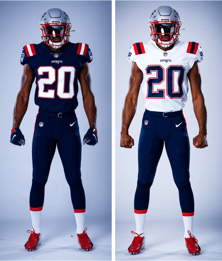
We knew that the Patriots were going to reveal their new uniforms today, but we didn’t know exactly when, because they hadn’t announced an unveiling time. It turns out that they did it at 8am Eastern, just as I was about to post today’s blog entry (here’s some additional info and photos). I want some time to look at all the details and gather my thoughts, so I’ll have full coverage on these designs tomorrow.
But today I want to go off-uni and tell you about an interesting experience I had yesterday. Last month I mentioned that the Tugboat Captain and I had planned to visit a friend in Texas on March 13-17 but ended up not going because of, well, you know. One thing we had planned to do there was eat a lot of barbecue. Ever since, I’ve had this serious unscratched ’cue itch smack-dab in the middle of my brain, tongue, and stomach. The itch was finally starting to fade until this past Friday night, when we found ourselves watching several episodes of the reality cooking show BBQ Pitmasters. It’s not a very good show (formulaic, repetitive, with too much manufactured drama), but the ’cue looked sooooo good. And that’s when I decided that I would bike into Manhattan on Sunday and get us some barbecue.
This was no small decision. I hadn’t left our immediate neighborhood in over a month, and I usually dislike biking in Manhattan because of the traffic. But I figured there wouldn’t be much traffic this time around, plus I was curious to see how other parts of the city looked, plus-plus it was nice to have some sort of purpose or narrative for the day that went beyond our apartment, plus-plus-plus I really wanted some barbecue. So off I went.
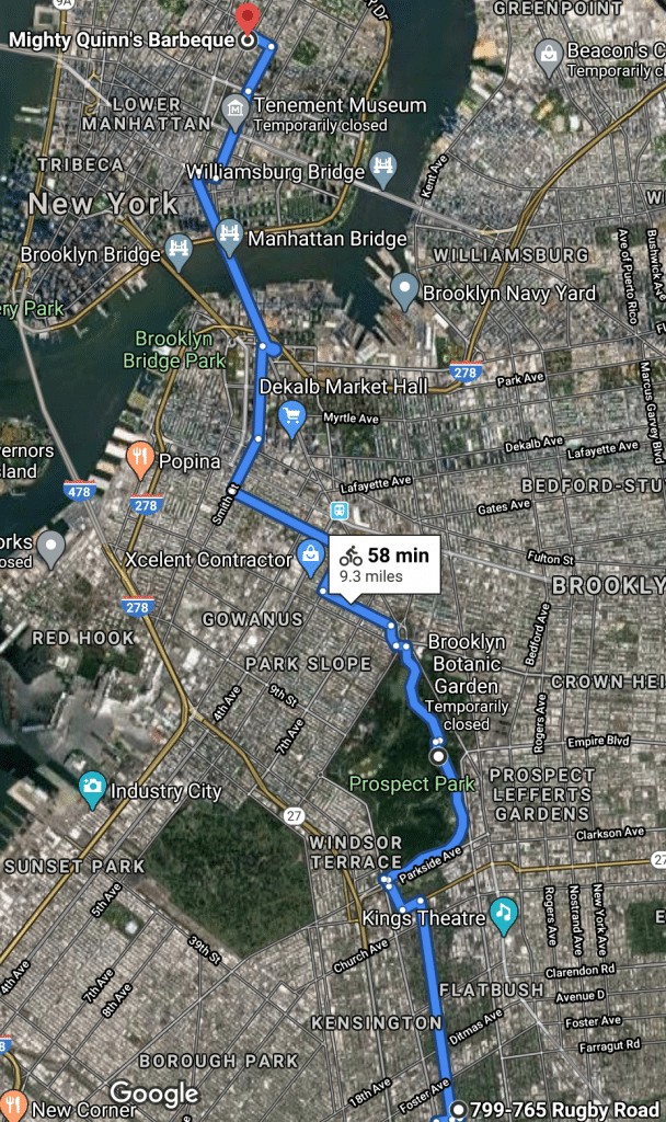
My goal was to go to the excellent ’cuery Mighty Quinn (Tom Shieber, if you’re reading this, that’s where I got the barbecue we ate while watching the 2013 MLB All-Star Game), which is located in the East Village — about an hour’s bike ride from Uni Watch HQ (the starting point on the route shown below is just a random spot in our neighborhood, not our actual address; for this and all subsequent images, click to enlarge):
I ordered the food on their website for a 3pm pickup (some ribs, burnt ends, pulled pork, wings, sausage, mac and cheese, broccoli salad). The cloth masks I wear while biking tend to get sweaty after an hour or so, which decreases their effectiveness, so I brought two — one for the ride in and the other one for the ride back.
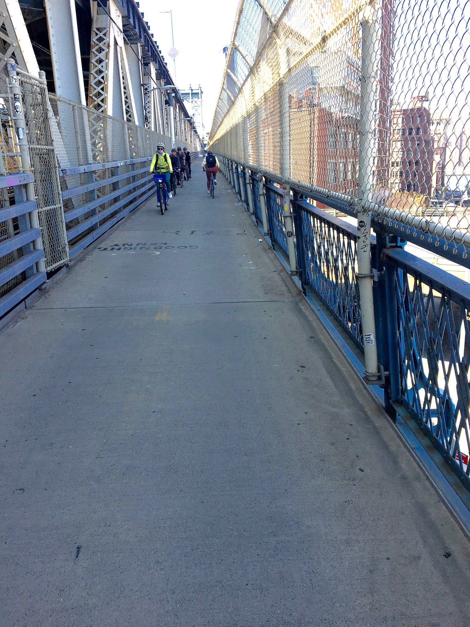
I left the house at 2pm. Up through Prospect Park, down through my old neighborhood, right past the old Uni Watch HQ, and on toward the Manhattan Bridge, which I hadn’t biked over in several years. I was wondering how crowded the narrow bike lines on the bridge would be. Medium-crowded, as it turned out:
I’d also been wondering how much boat traffic there would be on the East River. Usually there’s a lot: barges, pleasure boats, tour boats, etc. — it’s very much part of the New York landscape. Yesterday, though, it was almost completely empty. My camera focused on chain link fence instead of the water, but you can still get the idea:

The bridge deposited me in Chinatown, where I went slightly east and then began making my way north. Chinatown is usually abuzz with activity, but all the businesses on Allen St. — the road I was taking north — were shut down:

As I crossed into the East Village, Allen St. became 1st Ave. I’ve walked, driven, and biked on this street countless times in my life, and it’s always been jam-packed with cars. But yesterday I could’ve biked right down the center lane if I’d wanted to:

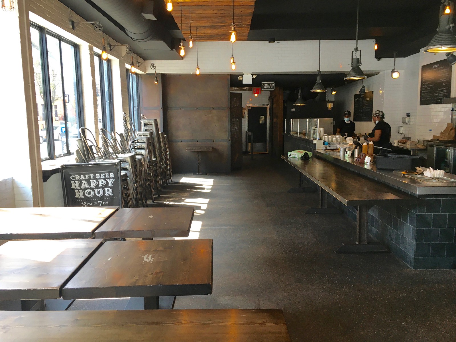
I got to Mighty Quinn right at 3pm. Like a lot of NYC eateries, they’ve remained open for pickups and deliveries, but the restaurant itself is empty:
Unfortunately, they were out of sausage, so I had them swap in some additional wings and ribs. They packed my order in paper shopping bags, but I’ve found that paper bags are tricky on the bike, because the folded corners are more apt to get caught in the spokes. So I brought along some plastic shopping bags (much better for biking because they conform to the shape of the contents and don’t leave any sharp corners), transferred the ’cue to those, and hung them from my handlebars:

The Tugboat Captain was nervous about my trip, so I texted her to let her know I’d picked up the food and was heading home. She wrote back, “Don’t forget to take selfies!” It was a good reminder, because I almost never take selfies, but it seemed appropriate in this case, so here we go:

Yes, I know, my mask isn’t covering my chin. I had just put it on, and I adjusted it after that photo to get it just right.
As I biked back toward the Manhattan Bridge, I witnessed a bizarre scene at the corner of Christie and Delancey Sts. Two guys in hazmat suits were interviewing and filming a wheelchair-bound amputee panhandler and his partner.

It was all a bit surreal. I asked the hazmat guy on the left (from a safe distance) what was going on, and he explained that they were in the middle of a years-long documentary film project about NYC’s homeless population. Wow.
The rest of the ride home was uneventful, and I’m happy to report that the barbecue handled the trip just fine (more on that later in today’s post). But I’m still processing the rush of emotions and thoughts that the trip prompted.
After a month of being cooped up at home, it was, frankly, exciting to be out and about. But it was also confusing. Although nearly all the businesses were shut down, a decent number of people were out walking and biking because it was a nice, sunny Sunday. So it wasn’t quite a ghost town — it was more like the business version of a neutron bomb had gone off, destroying the commerce but sparing the people.
Some people I passed were smiling and laughing. There’s nothing wrong with that, of course — on the contrary, good for them! — but it just seemed weird, like it didn’t quite compute.
And then there was that crazy street corner scene with the panhandler. When I told the Captain about it later, she said, “Should those filmmaker guys really have those suits and face shields? Shouldn’t medical personnel have those?” I countered that journalists who’ve been reporting from hospitals in recent weeks are presumably given PPE and that these filmmakers are essentially performing the same function, helping with the essential work of telling the story of the pandemic. We agreed that it’s a complicated issue.
So that was my day. Thanks for letting me tell you about it. We’ll get back to standard uni-related content tomorrow.
Uni Watch Haiku: I didn’t publish a haiku yesterday, and I thought lots of people — okay, a few people — would say, “Hey, where’s the haiku?” But exactly nobody said that.
But if you were thinking that would dissuade me from haiku-ing, think again! Here’s the latest:
Curls of yellow paint
Changed football’s look forever
Thank you, Fred Gehrke
And there’s more where that came from.

Click to enlarge
Meet the Uni Watch Team — Jamie Rathjen: Since September of 2017, the Tickers that you read on Mondays (including today’s!) have been compiled and written by Jamie Rathjen. Jamie is super-dependable and has a super-precise mind that notices every little detail — perfect for Uni Watch. He’s also extremely knowledgeable about soccer, a sport I know next to nothing about, so he’s helped boost our coverage in that area — not just in the Ticker but also with the occasional lede and sub-lede.
As you can tell from the shirt he’s wearing in the photo shown above, Jamie is a proud UVA grad. Here’s how he describes his work space:
I have two monitors at my regular job, so I replicated that setup at home on my desk using my laptop a spare TV, and an HDMI cable borrowed from elsewhere in the house. You can see my sim-racing wheel below the TV:

As for sports memorabilia, I have this year’s edition of the Capitals’ puppy calendar, which this month features Braden Holtby and the team puppy, Captain, as well as a miniature version of the Capitals’ Stanley Cup banner, which I got from attending the banner-raising:


———
Thanks, Jamie. I should add that I had the pleasure of meeting Jamie, along with his twin brother, Nate, last summer, when they came up for the Uni Watch 20th-anniversary party here in Brooklyn. Wonderful people — I hope I’ll get to hang with them again sooner than later. Stay safe, guys.


ITEM! A very special membership raffle: I recently received a note from a reader who wishes to remain anonymous, as follows:
Months ago, I purchased tickets to see my Cubs play the Cardinals in London. As everyone knows by this point, MLB cancelled the game. My wife and I are very fortunate, since we are being paid through all this unpleasantness (I’m a teacher and she works for the federal government), so I feel like I should do something more with the money that will be refunded to me for the game tickets.
We are going to give half of the money to a Covid 19-related charity, and with the other half I would like to donate 10 Uni Watch Membership Cards to be raffled. However, I was hoping we can bring a little joy to those who are being the true heroes right now by working in the public while most of us are at home. From health care workers and truck drivers to first responders and the guy working in a liquor store, all these people are risking a lot to try and keep our way of life as normal as possible.
How great is that?
So here’s how we’re going to handle this: This raffle will be open only to people who are currently working out in the field, so to speak. In addition to the people our anonymous benefactor mentioned, that includes grocery workers, food deliverers, pharmacists, postal workers, sanitation workers, transit workers, kitchen workers, and so on, all of whom are the real heroes of this crisis. Basically, if you’re working around lots of other people, this raffle is for you; if not, it’s not.
Obviously, there’s no way for me to enforce that restriction, but I have enough faith in the Uni Watch comm-uni-ty to believe that we can do this on the honor system. I mean, really, who would cheat on something like this, especially when we have so many other membership raffles that are open to everyone?
So: This will be a three-day raffle. To enter, send an email to the raffle address by 8pm Eastern on Wednesday, April 22. One entry per person. I’ll announce the 10 winners on Thursday. Big thanks to the anonymous reader who sponsored this raffle.
Inventory update: Here’s the status of various Uni Watch products:
• If you want a Uni Watch Classic Cap, I have sizes 7 and 7-7/8. All other fitted sizes are sold out, and so are the adjustables. I’ve ordered more of everything, but Ebbets Field Flannels’ factory is shut down until further notice, so I don’t know when those orders will be filled. If you’d like to be notified when I’m restocked, email me.
• Uni Watch seam rippers are completely sold out. I ordered new inventory more than a month ago, but it’s coming from China, so who knows when it’ll arrive. If you’d like to be notified when I’m restocked, email me.
• I’m down to seven two remaining Uni Watch gumball helmets. These will not be restocked — when they’re gone, they’re gone.
• Teespring continues to function normally, so everything in the Uni Watch Shop and the Naming Wrongs Shop remains available, including January, February, and March designs from the Uni Watch Pin Club (April is sold out and, like all the Pin Club editions, will not be restocked). You can still save 15% off by using the checkout code COMMUNITY.
• And of course there are no inventory issues with Uni Watch membership cards. You can also support Uni Watch by making a donation.
Thanks for everything, people — your support is greatly appreciated.
The Ticker
By Jamie Rathjen

Baseball News: The Korean Baseball Organization’s LG Twins added a 30th-anniversary patch (from Jeremy Brahm). … Oklahoma softball was supposed to wear batting helmet decals yesterday for the 25th anniversary of the Oklahoma City bombing. Although they aren’t playing, they still posted a photo of the decal (from Sam McKinley). … The tech website ZDNet collected photographs of MLB stadiums to be used as Zoom backgrounds, if you’re so inclined (from Kary Klismet). … More from Kary: an Ohio architect makes prints of digitally-recreated images of old baseball stadiums. … We’ve Ticked this before, but not for a few years: 1B George Scott, pictured here with the Red Sox, was one of several players to wear a helmet while fielding (from Michael Miller).

Football News: Reader John F. sent us a USA Today ranking of NFL uniforms, which they’ll have to update this week. As usual, you’ll probably disagree with it. … Larry Morris was watching a show about the 1984 NFL draft and noticed a Bengals helmet phone with an odd facemask, which he says is almost like a lacrosse facemask.

Hockey News: Reader David Firestone has more about a Ticker item we had last Thursday about the Rangers’ jersey numbers missing their block shadows in a 1991 preseason game. “During a period in the early 1990s, the Rangers would use cheap replica jerseys for the new players, as opposed to the standard ones,” he says. “These were made of cheap material, and the numbers and letters were heat pressed, as opposed to sewn.” David actually has some nameplates from Rob Kenny, a winger with the AHL’s Binghamton Rangers in the early ’90s who David says tried out but never made the NHL. … A Blues fan has a “fan cave” that looks like a rink, but it has various logos and ads on the “boards,” which seems odd, even if a podcast hosted by two former Blues players apparently does segments from the fan cave (from Wade Heidt).

Basketball News: Warriors co-owner Peter Guber is auctioning off his 2015 championship ring for coronavirus relief (from Kary Klismet). … NBA numerologist Etienne Catalan is back with a new No. 4 for Grizzlies PF Jontay Porter, who signed with the team right before the world stopped.

Soccer News: Spain’s Athletic Bilbao apparently came out with a commeorative logo for the postponed Copa del Rey final, which is to be a Basque derby between Athletic and Real Sociedad for the first time (from Ryan Maquiñana). … FC Barcelona’s YouTube channel accidentally posted a video with a picture of next season’s Manchester United first shirt, before replacing it with one using this season’s (thanks, Anthony). … German 2. Bundesliga team VfL Bochum released a black shirt that is supposed to be worn for their next home game, whenever that is, though soccer might resume in Germany sooner than other countries. … New first shirt for Indonesia, and the national association also introduced a 90th-anniversary logo. … This is apparently Chile’s next second shirt (from Josh Hinton). … England’s National Football Museum is the latest place to hold a greatest-shirt poll, with 20 choices. I’d vote for the Crystal Palace sash or the France sailor-hoops ones, since none of my favorites are represented (from Alex Evans). … U.S. Soccer is apparently the next place to hold a greatest-shirt poll, starting today. … The UEFA Youth Tournament, the modern equivalent of which is the Under-19 Championship, was held in Scotland in 1970, and from the pictures included with this article about the tournament it looks like participating teams wore UEFA’s logo on their shirts instead of their own crests.

Grab Bag: The U. of Iowa posted a picture of the first Hawkeye field hockey team from 1975, which is worth it for the black and gold striped sticks alone. … Great Britain and Scotland field hockey international Alan Forsyth is raffling off some old shirts and other equipment for coronavirus relief. … The website 1000 Logos is a database that focuses on logos for companies and governmental and non-governmental organizations, but also has some sports teams (from Kary Klismet).

Click to enlarge
What Paul did last night: Bud for me yesterday, and an IPA for the Tugboat Captain. I told her about my adventure in Manhattan (I had invited her to join me but she’s a nervous street biker and wanted no part of it), plus we talked a bit about our families and saw a bird that may have been a nuthatch, which I mention mainly because “nuthatch” is such a good word.
And then it was time to go inside and eat barbecue. Here’s what I brought home (clockwise from top left: mac and cheese; pulled pork; spareribs; more ribs; chicken wings; broccoli salad; and burnt ends):


It tasted as good as it looked. And since I intentionally bought way too much, we’ll have several days’ worth of leftovers. Not as good as our trip to Texas probably would have been, but not a bad consolation prize.
Ah yes, it’s Patriots’ Day. Makes sense.
Since I’m among the first comments here, I’ll use the Tarrant theory to predict that the reaction to the Patriots new uniforms will be mostly negative, but not terribly so since they aren’t a radical change from what they had been wearing. There will be disappointment that the team didn’t go back to the more “classic” Pat the Patriot look.
One question: these uniforms don’t have TV numbers. I thought the NFL required them, although I know that on occasion some color rush/throwbacks didn’t have them, but every primary jersey in the league does.
NFL uni guidelines do indeed require TV numbers. The Pats apparently got a waiver.
I immediately thought the same thing. No TV numbers? When was the last time an NFL team took the field (throwbacks excluded) with no TV numbers? All in all though I say this is a vast improvement over the Pats current look. Better number fonts and no panels or piping.
Paul,
If a team like, say…the Chargers, placed numbers on the helmet, would the NFL grant an exception to the jersey TV number requirement?
Well, it seems they’ve already granted an exception to the Pats, even without numbers on the helmets!
I don’ think I can roll my eyes any harder at the continued use of a self named theory which has had a million holes shot through it every time it is brought up.
You know I hadn’t put two and two together that this guy had come up with his own theory and then named it after himself. Yeesh.
Like I said before, it was meant to be tongue-in-cheek…there is probably a more official term in psychology for this type of thing that I’d be happy to use if I knew what it was.
So everybody chillax on that…
Rather than the Tarrant Theory, how about the “Chylak Fact”:
Everyone just wants to see the uniforms they grew up watching.
That doesn’t quite work because a lot of fans still think that looks that a team had before they were born are “classic”.
But generally the same idea.
I am a believer in the idea that the things that happened the year you turned 14 are what get cemented in your preference settings.
I have no name for this phenomenon, which is based solely on anecdotal evidence. But I believe it to be mostly true.
I love creamsicles, btw. Vintage 1979, the year I turned 14.
That’s true! I’ve always had a fondness for the Mets henley jerseys…they came out in 1978…the year I turned 14.
I think it’s a significant stretch to say that there are “a million holes” through this theory (lame as it is for this guy to continue using his self-named moniker for it). There are exceptions, but I don’t know how anyone could honestly say that in the uni watching world the general rule of “classic good, new bad” doesn’t accurately predict reactions most of the time
I don’t know how anyone could honestly say that in the uni watching world the general rule of “classic good, new bad” doesn’t accurately predict reactions most of the time
I would agree with that. Of course, “classic” designs are usually classic for a reason. If you had said “old good, new bad” I would strenuously disagree.
I don’t disagree with that. I think what people find frustrating is that people on this site generally do a pretty good job of assessing uniforms on the merits of the actual designs; if they like something “classic” or dislike something new, they can usually explain why with more nuance than “classic good, new bad.”. This guy keeps making a blanket assumption about why people like or dislike certain things, calling it a theory, all without offering any of his own assessment of the actual uniform designs.
Aloysius, you nailed it. Also Chance hits the point too, classic ≠ old. And not all that is old becomes classic.
Gets annoying when people who complain that nobody likes new uniforms claim that is because people just don’t want anything new, and refuse to address the merits of whether the new thing itself is actually good, or better than what it is replacing.
Steve says you should retire the term Tarrant theory. It’s almost as obnoxious as someone speaking in third person. If you smell what Steve is cooking.
MJ seconds this.
A “theory” is a a plausible or scientifically acceptable general principle or body of principles offered to explain phenomena.
You’re just a guy complaining on the internet.
Guys, enough. No need to get personal, I hope I never see the word “chillax” on my website again. Thanks.
Seconding this as well. No ch****x**g here. *shudders*
As I mentioned before, I am writing a longer piece on this idea that I will post on my own blog that Paul said he’d link to, that hopefully will explain where I’m coming from a little better and anybody who wants to discuss it is more than welcome on the comment section there.
And for Paul’s sake, I will officially retire the use of the term Tarrant Theory from Uniwatch.
I will offer a defense on a few points brought up however:
1. Yes, the idea is that the design really doesn’t matter, because the same design that the general public hates when it first comes out will become a “classic” look given enough time. In other words, it grows on people.
2. I will acknowledge that there will be exceptions in the sense that some looks are just so awful that it’s unlikely they never are seen as classics…you could call these “mistake” uniforms like we’ve seen in Cleveland and Tampa Bay where the teams “correct” them as soon as possible. But you never know, I used to think those Toronto Raptors jerseys with the dinosaur was the stupidest thing ever worn, and it seemed most people at the time agreed with me…and know even the jersey (which I still personally hate) is looked back upon fondly.
3. I am not saying that “classic = old”, only that if given enough time, a look that is considered “dated” and thus changed will become “classic” in the eyes of the general public.
4. I will admit that the theory is very subjective and generalized, I’m just going on my own personal observations as somebody who follows uniform changes and reads a lot of internet comments about them both here and on other sites. I’m not saying that everybody sees any particular uniform as “classic”.
5. A “theory” is defined as “a supposition or a system of ideas intended to explain something, especially one based on general principles independent of the thing to be explained”. So while I’m not saying this was a scientific theory, I think my use of the term was justified.
Also, it was supposed to be taken tongue-in-cheek, kind of like how Dwayne Johnson used to call himself “The Rock” in WWE…
I don’t hate the Pats new look. I wish they would’ve kept the silver pants for home, but as far as mono color uniforms go, these are not the worst. The wide pants stripe helps. The road uniform is a big upgrade. No more side panels on either Jersey is also a plus.
…and I guess no leaks on the new Chargers set ;)
The jersey is definitely an upgrade, with two huge BUTs:
– the lack of TV numerals; and
– the too-thick, too-truncated UCLA shoulder stripes.
Other than that it looks good, especially the numerals. HOWEVER, and it’s a big however, there doesn’t appear to be a white or gray/silver pants option, so the only home look will be navy-over-navy, which … ych.
I’m with you; silver pants on the home uni would have been a HUGE upgrade. I can also do without the double trim on the numbers. Red trim would have looked much better opposed to the doubled Red and Silver trim. But hell, at least they lost the panels ans piping.
I like the “double trim,” especially the “floating outline” effect on the white jersey.
Not sure if it’s intentional or not, but third paragraph you refer to her as “the tugboat”.
Also, you can tell a nuthatch as they have a peaked cap and they “walk” headfirst down the tree trunks.
Was not intentional and has now been fixed!
Lol…there is definitely a huge difference in nicknaming your girlfriend “The Tugboat Captain” and “The Tugboat”!
Not sure many women would be happy with the second one.
One more prediction: people will applaud the change from the prior custom number font to the more traditional block font.
That seems a fair prediction: People will tend to applaud a design change that increases the readability of a uniform element that exists to be read. Where we differ, I suppose, is on the question of whether legibility is a positive or negative attribute of elements that exist to be read.
Agreed. Those of us who value legibility will think this font change an upgrade.
For a change, you could critique the uniforms, rather than peoples reaction to them. All this seems to do is accuse people of not being able to critically think for themselves. I don’t see the point in constantly working to classify or predict, and in essence dismiss, the thoughts of others. I love when I read heated discussion in the comments but this is ridiculous.
+1
Save the critiquing of the critiques for Facebook.
Lee
THANK YOU!
I’m interested in everyone’s opinion on the uniforms. I’m not interested in anyone’s opinion on anyone’s opinion.
I hear you guys. Like I said, I won’t be bringing this up again. I didn’t mean to annoy people with it, or imply anything about anybody’s personal opinions or tastes.
At this point, I’ve stated my case and people will either agree with it or not.
Like most I think the Pat’s uniforms are a huge improvement. However if they aren’t going to have silver pants why not just go white with the helmet to allow for the Pat Patriot throwback? Maybe it’s a given the one shell rule is gone next year. Seems like alot of teams are talking about the future without it. I’m also glad to see at least that red stripe in the socks to attempt to break up the unitard look.
I don’t expect – or want – every team to wear standard a block number font. But I agree with Scott and Chance that legibility should always be the first consideration, followed closely by the related idea that uniform numbers should never create a distraction that takes a way from their intended purpose (quick and easy identification of players).
Numbers are by far the most functional and utilitarian of design elements on a uniform. When you spend more time figuring out the aesthetics of the numbers than simply being able to identify who’s wearing those numbers, they have failed for their intended purpose. That’s why West Virginia’s “pick axe” number font from a few years ago and Tampa Bay’s god-awful “alarm clock” numbers were failures.
But the Patriots’ proprietary font on their Brady-era uniforms? It was fine. Plenty legible, and not a distraction from its intended purpose. I actually wish it had been preserved on the new uniforms, but the block numerals certainly don’t offend the eye.
I didn’t mind the font itself, I just didn’t personally prefer the two or three outlines they had around them.
Same font with no or one outline would have been fine!
Lee
Hold on a second…do people really think that the previous Patriots’ numbers were hard to decipher?
I agree totally that there exist number fonts that have legibility problems but the Patriots prior font was really close to the standard block font, I can’t imagine many people found it hard to discern the numbers.
Seems to me that the Pats took a quirky detail that gave the jerseys some character and replaced it with something that looks more generic.
I completely agree with Dan here. I always like that Pats’ number font — uniquely theirs, but not absurd like so many custom fonts. I’ll miss it.
This “meh” uni set would look a whole lot better if Tom Brady was going to wear them.
Rather bland for the Patriots. Not very forward thinking, unless NFL teams know the 1 shell rule for sure is gone next year. Rather would have seen a white helmet with the new logo which would allow them to use Pat the Patriot and a throwback with the same shell.
Just doesn’t seem like there was much thought put in to these at all. Very basic Madden uniform editor. Any teenager could have done these on his PS4. NIKE either goes too far with the Falcons are entirely too basic like this. Very disappointing if you ask me.
Why do teams hate silver pants anymore? The Falcons and Patriots are both teams that should utilize silver pants. The Eagles should too. I know NIKE claims they can’t make silver with their new material but the Raiders pants look just fine to me.
Also, the Panthers seem to have mostly discarded their silver pants over the past season or two.
Which I hate! Black over silver was their best look.
Back in 1998, the Panthers wore silver pants with the white jersey. Looked really good. Wish they would do it more often. Hopefully New England will introduce a newer silver version as well. Really disappointed in the uni-tard look for the home unis.
It did look good. I have never really cared for the White over White. It was a one off in the last game of the season. I think it might’ve been some sort of protest over the imminent firing of Dom Capers?
Jeff is right…the Panthers wore those pants for literally one game and never again, even though the silver pants are the best look with the silver helmet and white jersey.
I do recall that when the team was first announced, Al Davis was concerned that the color scheme was too much like the Raiders’…maybe the white pants where a way to “throw a bone” to Al? It seems very odd especially now that they’ve introduced black pants as a mix-and-match item that nobody said, “hey, the silver pants would look good with the whites”
I had never heard BDanner’s claim about the firing of Dom Capers but that totally makes sense to explain using them just once.
Just for my own curiosity, I wanted to check.
Number of times Carolina wore silver pants in the regular season:
2019 – 3
2018 – 0
2017 – 6
2016 – 7
2015 – 9
Lee
Not very forward thinking
Not sure why we should think “forward thinking” is a virtue here.
Being a Pats fan, I like this look better than the prior. I think people were hoping for a Bledsoe era throwback (being in my teens in the 90’s, I do have a soft spot for that look). Not sure on the above comment that people will be disappointed about not going back to Pat Patriot, my sense locally is that there’s nostalgic feelings for Pat but not any great desire to bring him back.
I like the new Patriots uniforms. Nike didn’t ruin it, the number font is normal, and they got rid of the all the side panels and piping. It’s a much needed clean up (hello Bengals and Cardinals, you listening?). The shoulder stripes on their shoulders is consistent with their red jersey days.
1) Did they really go back to a standard number font? It looks the same to me.
2) They need silver pants to go with the navy blue. A full time mono navy blue look is not good.
3) I don’t like the lack of TV numbers on the shoulders, but I think if there’s just ONE team that doesn’t have it, it’s a nice little quirk to have. Like the Mets being the only MLB team to have orange foul poles. It’s a cute quirk that applies to one team, but wouldn’t be if multiple teams follow suit.
Really agree about going blue over blue as the primary look paired with the silver helmet. The pants need to be silver. The Pats fumbled the ball with this.
Maybe we will get silver pants later like how we may get a set of orange pants later for the Browns.
It does look to me like they changed the number font. The previous one had thinner horizontal strokes and thicker vertical. The NOB font is different too. As a lifelong Pats fan, my reaction is *shrug*. I’m not so reminiscent for the red jersey/Pat Patriot days. That’s the look I grew up watching, and the Pats stunk then.
They absolutely changed the number font. A huge, huge upgrade there.
I laughed at the Patriots press release mentioning there is no throwback because of the one shell rule and the silver helmet does not go well with the red uniform.
Well, it doesn’t exactly go with the new uniform either!
All navy at home is just terrible!!!
The Patriots now have the 31st worst uniform in the NFL just above Atlanta.
Ditto on the need for silver pants. Combining the silver with the new striping pattern would be a major upgrade. Don’t like the mono blue for the default home set. Serves to make the silver helmet color irrelevant.
You think they would have learned from the Bills that a full time mono look is a horrible idea.
How do you feel about North Carolina BBQ? It’s pork, vinegar/tangy… I can jot down a quick recipe if you are interested
Huge fan. My favorite place is Allen & Son in Pittsboro. Already have a good recipe, but thanks!
Good call on that one, Paul.
Who says you northern city slickers have no taste? ;)
Oh…I’ll second Allen & Sons. Some of then best I’ve had, and I’ve had it from one end of the state to the other.
I’ll have to stop by Allen & Son next time I’m around those parts!
There’s really two different NC sauces…western and eastern. Both are vinegary, but eastern is much heavier on the vinegar and western is a bit thicker and reddish. I’d take either over the mustard crap my home Carolina claims…that’s one thing we don’t do well here in SC is making sauce.
Agreed! Don’t care for the mustard sauce. I prefer the Eastern Style (not only the sauce, but they use the whole hog while Western uses only shoulders) but you can’t go wrong with either one.
The Pats uni is a huge improvement. I like ‘em! The prominent pants stripes save the mono home set and the roadie is just plain nice. No, they aren’t as nice as they would have been with a return to red but they still look pretty sharp.
Not a fan of the mono-blue, but then probably most here won’t be so preaching to the choir. At least the socks are semi-interesting.
I’ve also never really been a fan of the offset number border look (number, jersey-color inner border, outer border). Double border (Tampa Bay), fine. Border and outer border/drop shadow (Philly), eh, ok. This implementation (Dallas whites, Montreal Alouettes, Bills 2000s blues) not so much.
GC expresses my opinions on the Pats unis exactly. Overall, an improvement, but they’re still middle-of-the-pack C-plus, maybe B-minus, unis.
There actually is a “double border”; the inner outline is silver on both jerseys. I for one like the “floating outline” effect.
Forgot about the Panthers. They were great with silver pants too. This just seems like there was no thought at all put in to it. They took their color rash uniform, made the jersey white and called it a day.
All the BBQ talk and photos have left me depressingly hungry at 9:00 AM.
Overall downgrade for the Pats. Lack of TV numbers is bothersome. If that is part of NFL jerseys, it just looks completely off for them to not have the numbers. The UCLA style stripes is an upgrade from the solid silver stripe. But if they wanted the UCLA stripes then just dump the sleeve logos and put the numbers in that spot. Same logo on the helmet and sleeves is repetitive anyway. Navy pants with the navy jersey, big down grade. Going full mono with navy socks too is pathetic.
Initial thoughts, as a Pats fan:
No white helmet or pants is a gigantic missed opportunity. The silver helmets look out of place with silver nowhere else on the uniform, and the unitard look is bad.
The loss of the proprietary font stings.
That being said, the jerseys themselves are an upgrade — I like the road one a lot. No more side panels or piping was always going to be an upgrade, though.
So it’s fine, I guess. An improvement, even. But they could’ve knocked it out of the park and they didn’t. They played it safe.
If you have a car and live in the NYC metro area, Sempre Fame in Floral Park on Long Island has some of the best BBQ around. It is a local, family-owned business, and John who runs the places makes everything himself. They have stayed open for pick up and delivery during the pandemic. The homemade pork rinds are phenomenal. If you’re not a huge BBQ fan, my wife swears by the Burgerito.
I like Smokin’ Al’s in Massapequa Park. Or, even better, Hometown BBQ in Red Hook, Brooklyn.
Hometown has something I didn’t think was possible: barbecue that’s too rich for me. It’s sooooo unctuous, with so much melted intramuscular fat, that I start to feel a little gross after a few bites and can’t finish. Happened on three separate occasions, so it’s definitely not a random thing.
But I know lots of people who swear by it! Just not for me.
As a resident (but not native) of Charleston SC, I can totally relate to your BBQ jones. And great call on the burnt ends! They’re my fave. Similar to NYC, all of the restaurants in Charleston remain open for carry-out only, so all 6,000 BBQ joints down here are still available (thankfully). Stay safe and enjoy that ‘cue!!
Minority opinion, I know, but the Pats’ unis are not good. I even like the Falcons’ new set better than these. I am biased because the predominantly red and white “Pat Patriot” set is one of my favorites ever. Not an improvement on the latest set. Nothing really different or innovative. No real fauxback elements. And not a return to the better designs of the past either. Do not like.
The Patriots should have ditched Flying Elvis on the sleeves and kept the TV numbers. Not having TV numbers feels ‘college-y’ to me.
Haven’t TV numbers outlived their usefulness for the most part in this age of constant replays, isolation camera shots, and pre-game/in-game/post-game information ‘overload’?
I agree that there’s too many Flying Elvis’s in the Patriots uniform set; use the logo on the helmet, not the jersey.
I asked this before—Paul did a story on it years ago. Apparently they are still quite useful to game spotters.
There’s 5 Elvi (I think that’s the correct pluralization of Elvis) on that uniform. At least they didn’t stick one on each hip.
Here’s the story:
link
I like the Patriots new uniforms. I do find it odd that the only use of silver in the home set is on the helmet (and even on the white set the silver number outline is tiny!), but they look a lot better than they did.
Also, Best. Raffle. EVER! I mean, best anonymous benefactor or what?! I can’t participate because I’m only a college student and being on the front lines isn’t my thing (I’m more of an English teacher), but this is probably my favorite raffle yet!
There is a silver outline on the numbers, but it’s basically invisible from more than 5 feet away. I definitely agree that this is an upgrade.
From the “info” link re the Pats’ uniforms: “Several other NFL teams changed their uniforms ahead of the 2020 season, and while there was speculation that the Patriots change might revive the popular red uniforms of previous decades, a current NFL uniform rule makes it impossible to wear the red throwbacks while respecting the integrity of that uniform… A silver helmet with the “Flying Elvis” logo just doesn’t work with the red uniforms”
Really? (“while respecting the integrity of that uniform”, wtf?) Apparently, they’ve never seen Ohio State’s uniforms. A red jersey with silver pants/blue trim would work just fine. I don’t see this as much of an upgrade, other than losing the side panels on the jerseys. Mono-unitard looks crappy IMHO. Interesting they got a 5-year waiver on the TV numbers.
They’d basically be the USFL Chicago Blitz.
(Which I always thought was a decent look.)
Agree. I’ve long thought they should go silver helmet and pants, with what is basically their red throwbacks, maybe add in some silver outlines along with the blue number outlines, a small wordmark below the collar too. Also switching from navy back to royal blue. So many navy teams they all blend together.
Paul, you’re description of what it feels like to go out in NYC in the midst of this is so spot on. Love Mighty Quinn’s as well, and. Ow I have a hankering for some BBQ.
Personally, as a Patriots fan, they did exactly what I wanted (and I have commented on UW a bunch of times over the last couple of years) in promoting the CR to home and introducing a white of that template as the road. I do wish there were silver or white pants. I
I also Wish there was a 95-99 throwback though, but I understand that most want the PP look back (which don’t get me wrong, I would love that) so I get why they’re waiting until the one shell is likely gone in 2021 (which seems to be what the tea leaves indicate).
Tangentially, “The Mighty Quinn” is a terrific little movie, one of Denzel Washington’s first starring roles. It’s got some … problematic plot elements in terms of postcolonial white-gaze, but the performances make it worthwhile anyway. Worth seeking out.
Great to see another sim racer. What do you usually run, Jamie?
Usually touring cars or sportscars, since the game I have, RaceRoom, has a background in those. You’ll sometimes catch me submitting motorsports Ticker items.
Another sim racer here. I run iracing, what about you Drew?
Same! I resisted iracing for years after nr2003 died down but I haven’t regretted it since jumping in last September.
Drew What series do you run?
Nice call on the barbecue. I always enjoyed Mighty Quinn’s when I lived in the city, though Brisket Town/Delaney Barbecue in Williamsburgh was my favorite. I tried to get a free sandwhich from Mighty Quinn’s because of the whole same name thing when they were a stall at Smorgasburgh, but no dice.
Thanks for the report from NYC – fascinating. Not a NYC resident and I’ve only visited a handful of times but I’m always struck by how busy the streets of Manhattan are at all times of day/night, so I can appreciate how surreal your excursion must have been. Great snapshot of what life is like in this moment in history.
It looks as if the Patriots picked up some XFL unis on the cheap. I’m happy they didn’t get the Nike treatment, but I don’t see this as an improvement over their previous set. I didn’t realize how much I liked their blue over silver pants combo until I saw their new home set. I bet they bring some silver britches into the mix sooner than later.
Exactly.
Monochrome dark as a Thursday “thing” is bad enough.
I am a saints lifer and the one horrible thing about the Payton/Brees era is their full on allegiance to the Jackass Junior College Black leotard monochrome mess.
Making such an XFL reject the regular home uniform is simply childish and not really worthy of the maturity and class of an NFL franchise, particularly a winning, older NFL franchise.
The Jaguars, the Big West, the MEAC, whatever – can all go do what they want, but the Patriots doing this, really?
THIS ENTIRE MESS CAN BE SOLVED BY SILVER OR WHITE PANTS.
Leave the monochrome mess for St. Mickey’s JV.
and then the whole dark same color stockings, throwing away the really great, classy three stripe Road socks (that really should have been worn with both home and away unis – they were that good)
And exactly how many damn times does a mascot logo need to appear on an NFL uniform.
Five years to get rid of this mess can not come too soon.
IN sum, a big step backward
Spent my whole life in NY/NJ until moving to Dallas 2 years ago. Always been a BBQ nut, had vacationed down here many times and once did a BBQ road trip through NC/SC. The BBQ here is on a different level. Some of the better places up there (Quinn’s, Virgil’s & Local Smoke) are really good, but…nothing is like TX BBQ! Hope you reschedule your trip as soon as you are able!
This is the most barebones uniform unveiling I can remember. There’s one set of pants. One set of socks. No mix-and-matching. No throwbacks. No alternates.
Just two jerseys, pants, and socks. That’s all.
Seems very incomplete, right?
Lee
That’s all anyone needs.
Not overwhelmed by the Pats’ uniforms, but an improvement nonetheless. 2020 is the year the NFL finally said no thanks to bespoke fonts, a good trend if you ask me. I’m surprised when uni manufacturers push back on design elements I think critical, such as shoulder hoops and satiny britches. My attitude would be, “then find me someone who CAN make these uniforms.”
As a STL area native – the “ads” on the Blues fan rink are all local St. Louis companies. I doubt it’s a sponsorship or anything and probably just more of a “local pride” sort of thing.
I have wondered this for a while: the shoulder stripes (they’re known as ‘UCLA stripes,’ aren’t they, in the same way the two-thin, one-thick sleeve stripes are called ‘Northwestern stripes?’) haven’t wrapped all the way around the armpits in years.
When did that stop and why? Is it because sleeves have gotten so small that it’s a fabric challenge to get the (usually stretchy) material to have enough actual jersey material around it to make it work?
It looks amateur to me to have what amounts to weird epaulets instead of the actual bands going all the way under the armpits.
I first noticed this with the Colts several years back. I have a 1995 Jim Harbaugh that has the stripes almost touching under the armpits. But they don’t even make the attempt anymore.
Am I the only one who notices/cares about this?
You are definitely not the only one who cares — many of us do.
It changed because the tailoring patterns changed — seams (or lack thereof) in different places.
I believe the panthers are the only one that still wrap all round the armpits.
link
Actually, with the Panthers, it seems the stripes wrap around the shoulders only on number 1’s jersey!
Luckily for the Patriots, they had no where to go but up from the prior set. I wish that the shoulder and pants stripes matched and that they had TV numbers but overall I like them. I tend to lean towards the more simplistic traditional looking uniforms. Really they just took their Pat Patriot uniforms and blended them with their current color scheme and logo. I think they tried to satisfy those who wanted the throwbacks without having to do a total rebrand. Thanks for not fucking it up like others have done (falcons)
If Tom Brady got an advance view of those new Patriots uniforms, I”m pretty sure I know why he left for Tampa Bay. Ugh!
Doubling down on some bad mono-navy Color Rash uniforms as the primary home set? That’s just poorly considered and lazy to boot!
If Tom Brady got an advance view of those new Patriots uniforms, I”m pretty sure I know why he left for Tampa Bay. Ugh!
Funny, my thought was “they finally got good uniforms right when Tom leaves and can’t wear one.” Except for the mono, of course.
These uniforms would be okay with silver pants. The elimination of the navy side stripes bordered by the red piping is the quintessential example of addition by subtraction.
I realize the red-white-red UCLA stripes on the shoulder are supposed to evoke the similar striping on the old Pat Patriot jerseys. But they would have been a a more accurate reference to the past – and looked less jarring – with two white stripes surrounding a colored strip in the middle. Plus, the truncated stripes created by Nike’s jersey template makes them look more like randomly-placed rectangular bars rather than true, actual stripes.
The shoulder stripes would also look better with thin silver stripes integrated into the design – either as bordering stripes or perhaps in between the thicker red and white stripes. The lack of silver in those design elements calls out its inconsistent use throughout the rest of the uniform design. The other option would have been to jettison silver altogether (which I would not have been opposed to). But this half-assed approach makes it feel like they weren’t willing to commit one way or the other.
I have little more to add about the navy pants (with the home jersey, at least), as they simply exacerbate the problems I describe above. The Patriots could have gone a lot of different directions with this re-design and they chose something piecemeal, unimaginative, and with little cohesion.
But your mileage may vary, Chance, which is the beauty of this forum! :) By all means, I’d love to hear what you like about the new set!
First of all, I think you’re absolutely right about addition via subtraction. Removing the fussy piping is a huge upgrade.
I also love the new number font. I don’t think everyone has to wear block, but I really hate fonts that have drastically unequal weights in its numbers. So link is good, link are good, and link is good. link are bad and so are link.
Personally, I love the shoulder stripes. Doesn’t bother me that they come to a sharp end. It would if they were trying to re-create an old jersey exactly, but here it doesn’t. Even “randomly-placed rectangular bars rather than true, actual stripes” can be a legitimate design. Heck, it’s not as though sleeve stripes link for a long time now. And the color scheme is great. Braisher stripes – team color/white/team color, that defines the NFL for me. Always happy to see it.
The white jerseys have minor issues – I don’t think the red and blue shoulder stripes are nearly as effective as Braisher stripes, and the silver outline bugs me between blue and red – but the navy jersey is gorgeous.
Yeah, after reading this I’m going to need to bike to Eli’s BBQ in Cincinnati. Won’t be an hour each way, though. More like 10 minutes
It may be sacrilegious but I much prefer City Barbecue to Eli’s.
Big fan of the Harpoon IPA.. wish they distributed to Chicago. Also surprised and horrified that you didn’t eat the BBQ ASAP. I wouldn’t have been able to sit and exchange pleasantries. As soon as I hopped off that bike, i’m chowing down.
Ha! A very fair critique!!
and saw a bird that may have been a nuthatch, which I mention mainly because “nuthatch” is such a good word.
My favorite bird!
Third choice for a bird-named expansion baseball team, though, behind Buntings and Flycatchers.
Stranger, I like your ways!
Nice bike! Love the low-tech approach to attaching a bike-radio :)
A little surprised I didn’t see a saddle bag. Do you not carry a spare tube in case of a flat? Just curious.
I went out on a ride a few weeks ago without a spare (broke the stem on my rear tube pumping my tire and had to use my only spare just to get started), and managed to pop a flat along the way. Didn’t want to call anyone to pick me up (because social distancing), so I had to walk 4 miles home!
Do you not carry a spare tube in case of a flat?
I should, but I don’t.
Long-time Pats fan here. Initial reaction:
(1) Ugly
(2) The former uniforms had very distinctive number and NOB fonts, and they have gone to plain and ordinary.
(3) Since there is no more silver in the unis, they should have switched to a white helmet which would have allowed them to throw back to the red unis with Pat Patriot on the helmet.
(4) The lieutenant’s bars on the shoulders will be the first to go in years when they redesign.
(5) Will they announce a red alternate jersey at some point?
I have to agree with you here. I’m not a Patriot fan, yet I’ve always liked their color scheme. I didn’t think their prior set looked all that great but at least there was contrast and fluidity. It was intrinsically consistent. The side panels are gone and that’s the only upgrade. I’m usually not a fan of custom fonts but New England’s wasn’t obnoxious. I could live with it. This is just a very bland look. My biggest gripe with their color rush was that they just looked like the Texans (another drab set).
My biggest qualms with this new uniform is they ditched the sock stripes that were always paired with the blue pants. It’s too much. And now the silver helmet seems out of place. I actually preferred the USC type stripes before compared to the UCLA stripes they’ve adopted. Red/white/red UCLA stripes on a navy blue jersey just come off gaudy to me. Pair that with blue pants and stripeless socks I think it’s an overall downgrade.
I certainly wasn’t expecting Pat Patriot. I wasn’t a fan of the soccer jersey Bledsoe era. Makes a cool throwback I suppose. Just thought they’d clean it up a bit and add some white pants.
PATRIOTS – good: conventional font (the old one was dated, especially with the NOB being unique for the sake of being unique – and it was an adidas design), UCLA stripes, double-outline numbers.
PATRIOTS – bad: navy pants only (silver was the right choice and pairs with navy and white tops), UCLA stripes don’t reach the armpits, no TV numbers, kept the silver helmets (especially with no silver pants)
VERDICT: an upgrade and they fixed the worst parts of their now-old uniforms (side panels, weird font, adidas sock stripes), but they left some meat on the bone.
Expectation was that the Patriots changes would be minor. I mostly like the update. The funny thing is, the Patriots changes from 2019 to 2020 are arguably as significant as the Browns change from 2019 to 2020. (same helmet, changes in shirt and pants striping, socks)
Certainly the Patriots changes from 2019 to 2020 are much more significant than the Browns changes from 2014 to 2020.
So did the Patriots move up my ranking of NFL uniforms? Yes, they went from bottom 5 to the bottom of the middle of the pack. Did they improve upon what they had before? Yes, but that is because what they had before was trash and people only put up with it due to how successful they were. Does the pant striping not matching the UCLA stripes on the shoulders thoroughly bother me and make me not really like the new look? Yes, seems like a pretty big of oversight.
I don’t know if it’s just me, but the home uniforms feel less like Patriots uniforms and more like if the Houston Texans had a fauxback color rush uniform. They really need more silver to distinguish themselves and tie in the helmet.
Silver pants would turn them from a B- to a solid A.
That’s a pretty fair assessment. It felt like their prior set only needed a couple of tweaks to make them instant classics. Just get rid of the piping and the side panels and you’d have made those unis much, much better. These feel like, like you said, not quite the Patriots. To me the look is almost a collegiate or XFL squad, like another poster said, something out of the Madden uniform creator. Silver pants would have been a better choice than blue if they were only going to have one set.
I really enjoyed the travelogue today. It’s fascinating to see what a big city like NYC looks like in a pandemic. It reminded me of the scenes from “I Am Legend” when Will Smith is foraging for supplies. I should take a similar field trip to the Las Vegas Strip.
Not that the Pats unis were that great before, I don’t think these tweaks improve much. Sure, no more side panels is a good thing. but the rest of the changes feel very boring and almost like a total downgrade.
Mind you, I loathe this franchise, so there is some joy to be had in them looking bad. But as a Uni-Watcher, I am disappointed.
Without TV numbers, it looks like a knock off jersey from a grocery store. Horrible.
Do you know when the Ebbets Field Flannels factory will open up again?
No.
After an hour bike ride, do you reheat the ‘cue? If so, how? I always find that to go ‘cue seems to not retain heat.
I reheated mine; the Captain did not.
Silver pants would take the new Pats unis from meh to classic.
Absolutely. The blue pants are the only misstep in a fantastic upgrade.
Especially since they opted for blue-topped socks…the Pats are gonna look like they’re wearing ‘floods’.
So Nike can’t make silver pants? With all the tech now they cannot accommodate the existing color swatches? Isn’t that a step backward? Aren’t they supposed to be innovative?
Nike doesn’t do your retrograde “metallic fabrics” anymore. They’re too innovative for those.
Remember when they took over the Eagles didn’t have green jerseys to wear for the first half of the season because they couldn’t figure out the color. Clearly their special materials that allow players to be so much faster (eye roll) struggles to properly replicate certain colors?
And they really seem to have a problem creating the metallic silver or gold to match the helmets of the teams.
That’s sad commentary for such a retailer. That companies could provide proper shades of uniforms fifty years ago until the Swoosh.
Let’s be clear – they can provide proper shades, but choose not to.
Pushing their latest proprietary fabric is more important.
The biggest shock to me is just one set of pants was unveiled (for now I suppose) – when’s the last time that happened?
Lots of teams have just one pair of pants (well, at least for their primary uniforms): Steelers, 49ers, Packers, etc.
I know that — I meant when debuting new uniforms. It’s usually 3 now, I know the Browns just unveiled 2. Off the top of my head maybe the Arizona Cardinals?
I suppose the 49ers could fit that
Since 2001-
AZ(2005)-2, ATL(2020)-3, BUF(2011)-1(added blue next season), CIN(2004)-2, CLE(2020)-2, DET(2017)-2, HOU(2002)-2, JAX(2018)-3, MIA(2013)-2, MIN(2013)-2, NE(2020)-1, Jets(2019)-3, SF(2009)-1, SEA(2012)-3, TB(2020)-2, TEN(2018)-3
Patriots RB James White posted a picture of himself in the new unis with his dogs. Worth noting that the pant stripes are different from the release photos and also not the same as previous Color Rash pant stripes!
link
Paul. Ever thought of replacing your skinny bike seat with a larger one?
Happy with the one I have, thanks.
So long duct tape shoulder stripes – you lasted a whole lot longer than you should have had – thanks to B & B.
The new look – yep an improvement – but mostly meh.
This is just a lazy effort. Shouldn’t the stripes on the shoulder be the same as the pants? Is that so hard? And why double color borders on the numbers. Looks like a child did cut and paste.
As a professional herpetologist and a very serious amateur ornithologist, let me just advise you… look up the etymology of the word “nuthatch”. You will not be disappointed.
Oooh, so I see!
Something like these would’ve been gorgeous: link
upgrade over the old uniforms, but mono blue with silver helmets is still a bad look. The road uniforms are decent, but would have been better without the red outline on the numbers. I considered their uni’s to be 3rd worst in the league on Sunday (ahead of bengals and cards) and these would bump them up to around 17th I think. Overall impression is that they look like “cheaper” versions of what some other teams are doing with colors (texans) and overall desing (browns).
The home uni’s could have kept these navy jerseys, but gone with white pants and white helmet (with flying elvis logo). Silver helmet just doesn’t fit anymore.
Wahoowa Jaime R. I really appreciate all the updates especially those in ‘Hoo-ville.
Just a note to say my UniWatch hockey jersey arrived today. Looks awesome. Even better, the 2XL is large enough to fit over my goalie chest/arm pads. Now we just need this virus to go away so the rinks will open back up and I can wear it on the ice.
Great post, I enjoyed the barbecue post. Did your Big Green Egg make it to the new Uni Watch HQs. Your endorsement of the BGE put me over the top to purchase one in 2010 I think? Anyway I still have mine, have since built a table and upgraded to a Large. I enjoy it immensely, my self and friends from 3 states had a virtual rib off last week. Each smoking ribs, sending video recipes, tips, and tricks to a judge. I wore my new C-Chili shirt, it was great fun.
Unfortunately, the new Uni Watch HQ does not come with a backyard, so I gave my Egg to a friend. I miss it!
I shouldn’t read Uni-Watch before dinner. It’s like going to the grocery store on an empty stomach. I too have been craving BBQ for a while but will make do with bacon cheeseburgers tonight. There are usually a few parking lot BBQ pop-ups near me but methinks the Covid has shut them down.
Always enjoy the detour into non-uni subject matter Paul. Really appreciated your entry today and enjoyed hearing (and seeing) about things going on, or not going on in NYC.
Thanks, Keith — appreciated!
Paul – I’m no birder, but I actually know two things about nuthatches. First, nuthatch IS a great name. Second, nuthatches exhibit a distinctive behavior that makes it easy to distinguish them from chickadees and other LGBs (Little Grey Birds): lots of birds bop around on tree trunks looking for bugs, but nuthatches do it upside down. That is, they face the ground instead of facing up or sideways. Stay well!
Tim Cox
Orni-Watch, the Obsessive Study of Ornithological Oddities
Not sure if others suggested, but a white helmet would look good, enough with silver! Added bonus of optional Pat Patriot alternate set in 2020. (if there is a 2020)
Really was hoping the Patriots would change to a white helmet, oh well. The new uniforms are an improvement for sure just by losing the side piping and changing the number font. I am good with losing the silver pants but I really wish they would have done a white set and a red color rush. Oh well again. Maybe they will be coming as a surprise later in the year. Now for the Chargers!
PAT’S NEW UNIFORMS ARE HORRIBLE
Monochrome dark as a Thursday “thing” is bad enough.
I am a Saints lifer and the one horrible thing about the Payton/Brees era is their full on dogged allegiance to the Jackass Junior College Black leotard monochrome mess.
The monochrome, stripeless White-over-White practice uni monochromes are also pretty unimaginative and suck.
The Patriots making such an XFL reject uni their regular home uniform is simply childish and not really worthy of the maturity and class of an established NFL franchise, particularly a winning, older NFL franchise.
THIS ENTIRE MESS CAN BE SOLVED BY SILVER OR WHITE PANTS. Leave the monochrome mess for St. Mickey’s JV.
The Jaguars, the Big West, the MEAC, whatever – can all go do what they want, but the Patriots doing this, really? Did the XFL just have a Garage Sale? Maybe Arena Three?
Then there is the whole dark same color pants/stockings disaster, Patriots jettisoning their really great, classy three stripe Road socks (that really should have been worn with in some variation with both home and away unis – they were that good). Instead, we get the unitard look with a thin red stripe. Ugh.
And exactly how many damn times does a mascot logo need to appear on an NFL uniform? Really? They’d do better just leaving it empty if they won’t fit a TV number in there.