Click to enlarge
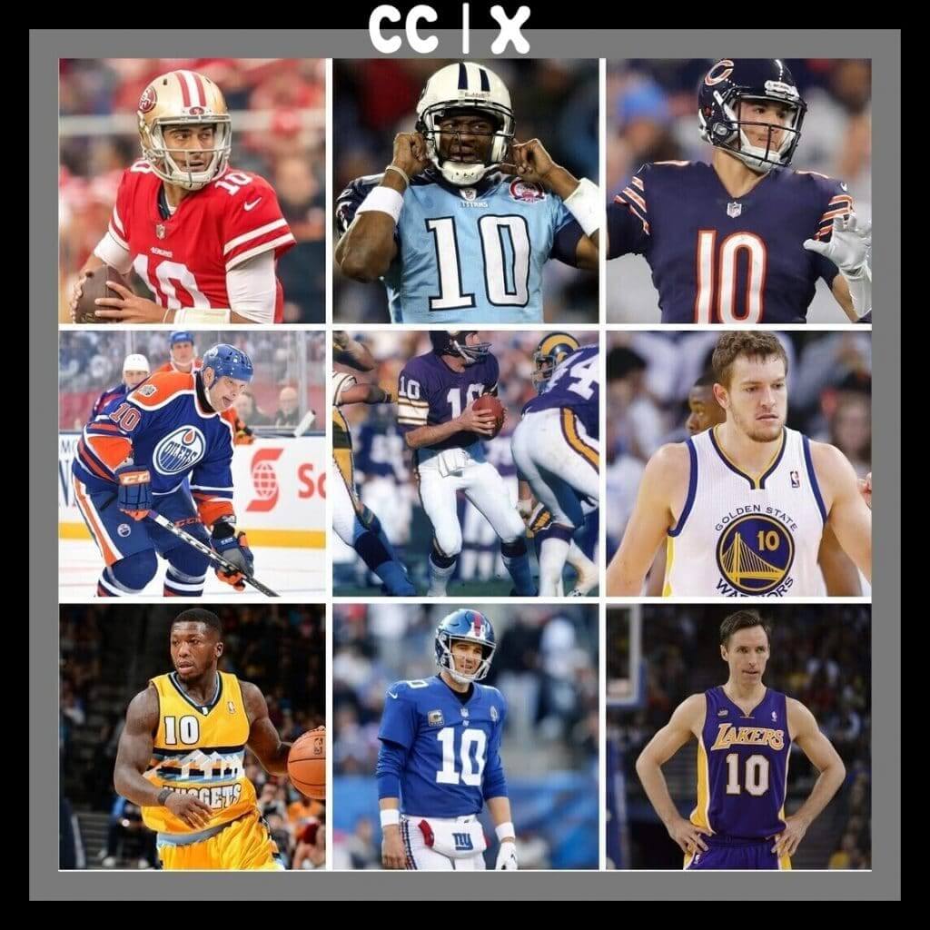
In 2009 and early 2010, a Uni Watch reader named Brinke Guthrie began sending me lots of eBay listing links to include in the Ticker. At some point he suggested doing a regular feature in which he’d feature the coolest retro collectibles he could find on eBay, and I agreed that that made more sense than just having these items scattered throughout the Ticker. And so “Collector’s Corner” was born.
Except it wasn’t originally called “Collector’s Corner.” The first installment was actually called “Punkin’s Corner” — a reference to Brinke’s cat, Punkin! But that moniker was quickly scrapped in favor of the now-familiar CC.
That first installment ran on May 4, 2010 — 10 years ago yesterday. So today is CC X, as Brinke has been calling it.
Brinke and I both wanted to do something special to mark the occasion, and he came up with a great idea: He decided to revisit the nine featured items that he listed in that very first column, try to find now-current eBay listings for them (he managed to do so for all of them), and offer some new commentary on them. Take it away, Brinke:
CC X: The Collector’s Corner 10th-Anniversary Edition
By Brinke Guthrie
Follow @brinkeguthrie
As I recall, the brief pitch to Paul went something like this: “So, what if I did a weekly thing that had uniforms, logos, and sports memorabilia you could find on eBay?” Paul’s response: “That might work, yeah.” So let it be written, so let it be done.
A decade later, it has apparently worked! So let’s revisit those items that ran in the first installment 10 years ago and see what’s available.
Little NFL Mini-Records: Back then, I guess I didn’t remember what you played these with. Well, a mini-record player, naturally!
Issue of Pro! for the 1971 NFC Championship game: Ten years ago, I typed in “1972,” and well, that’s wrong. The game was Jan. 2, 1972, for the 1971 season. As I mentioned a decade back, I sat in the new Texas Stadium end zone, freezing, and held up this cover for NFL Films. Cowboys 14, Niners 3. Little did I know I’d later end up being a fan of the visiting team.
Tudor NFL Electric Football Games: This was my featured present for Christmas 1971, and the teams were the Colts and the Cowboys from Super Bowl V. Nice timing, since I was living in Dallas. (The listing I just linked to shows the previous year’s teams, the Chiefs and the Vikes from Supe IV.) Yes, I’m sure they’re still jamming up in the corner of an end zone somewhere.
Fridge Magnets: MLB or NFL, take your pick. As I recall, I didn’t have the standings boards you could get — I arranged them by division on our avocado-colored (of course) fridge.
NFL Logo Pennant: If you want to pledge allegiance to the league, instead of to a specific team, wave one of these.
AFC East Patch: Thought it would be hard to find another one of these. Ten years later, got one right here.
NFL Helmet Plaque: Placo was the maker for the classic shadowbox style, as seen here with this Philadelphia Eagles plaque.
NFL Films Music LPs: The soundtrack of the 1970s NFL. Somewhere, John Facenda nods his head gravely. Remember — the autumn wind is a Ray-duh.
Expos Logo Patches: I said “Betcha can’t eat just one.” I have no idea what I was going for here. An edible Expos logo? Anyway, you can still get one.
And there you have it — from 2010 to 2020. See ya in 10!
———
Paul here. Please join me in congratulating Brinke on his 10th anniversary with the site. In addition to doing CC, he also runs the Uni Watch Facebook page, proposes all sorts of fun ideas (many of which I turn down, mainly because I’m too busy, which I always feel bad about), and is generally the most loyal, helpful guy imaginable. Thanks, Brinke, and happy decade-versary!
Yes, these are all hand-drawn and colored with your basic fat sidewalk chalk… the color palette limitations are killing me inside 🤣
— Ross Yoshida (@RYDesignLA) May 4, 2020
Oh. My. God. Dodgers design director and longtime Uni Watch ally Ross Yoshida tweeted this amazing photo the other day, showing chalk renderings of all the National League cap logos.
As you can see, Ross said they were all “hand-drawn.” But if you look at a larger version of the photo, it’s hard to believe it was done freehand. I mean, look at that Rockies logo — all the curvatures are perfect! Were Ross and his kids using stencils, or maybe tracing over projections of the logos?
Nope. “Everything was done freehand,” Ross told me yesterday. “No stencils, no templates — just old-school drawing! I do look at a logo on my phone for reference, and just draw it out as I’m doing that — that’s something I learned in art school, way back in the day. My kids took care of most of the coloring.”
I asked Ross if he had any additional photos showing the progression of the project — no dice, unfortunately. “I think we will do some in-progress shots when we start working on the American League (which is the more difficult of the two leagues, for sure!).” Something to look forward to!

Click to enlarge
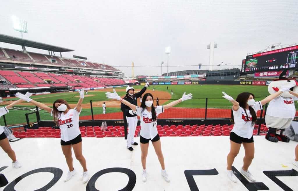
Play ball: The Korean baseball season began last night, so baseball-starved fans were tuning in. One thing several people noticed was that KT Wiz outfield Mel Rojas had “Love 팬” as his NOB. According to several Twitter-ers, the “팬” means “fan,” so the NOB is apparently an expression of love and appreciation for the fans. Sort of an anti-“He Hate Me.” It’s not clear, at least to me, why the NOB mixed English and Korean — anyone..?
The game also featured a socially distant first pitch:
KT Wiz held a socially distant first pitch before their game today pic.twitter.com/DR0R9wulRi
— Dan Kurtz (@MyKBO) May 5, 2020
Although there were no fans in attendance, there were still cheerleaders — wearing masks:
Meanwhile, NC Dinos catcher Yang Eui-Ji had an oddly placed captain’s “C” — or at least that’s what it seems to be:
I don't know if this is out necessity from all the ad patches on the uniform or if it's an aesthetic choice, but interesting placement of the captain "C" patch on the jersey of NC Dinos' catcher Yang Eui-Ji.@UniWatch pic.twitter.com/EFzzj7cUUe
— C Nep (@CNep1) May 5, 2020
Anyone know more about that?
(My thanks to Eric Garment, Dan Kurtz, and @CespedesBBQ for their contributions to this section.)

ITEM! Purp Walk preview: “Collector’s Corner” isn’t the only thing celebrating its 10th anniversary this month. Our annual Purple Amnesty Day celebration — the one day of the year that I accept orders for purple-inclusive Uni Watch membership cards, traditionally celebrated on May 17, the anniversary of the blog’s very first post — is also marking its 10th year.
The idea came from reader Tim Cox. On the blog’s fourth birthday — May 17, 2010 — Tim posted the following comment:
Congrats on 4 entertaining years, Paul & company. I’m a daily reader but not a member because I can’t do a Rockies membership card without purple. The 4th anniversary seems like the perfect occasion to grant amnesty to all the Rockies, Vikings, LSU, Northwestern, etc. fans out there.
I then responded:
[Y]our idea for a one-day purple amnesty program is a good one. If anyone wants to sign up for a purple-inclusive membership card, today — and only today — I will honor all such requests!
And just like that — very informally — Purple Amnesty Day was born. Five years later, in 2015, membership card designer Scott M.X. Turner came up with the ingenious slang term “Purp Walk.” That was also the year that designer Bryan Molloy suggested that we offer a Purple Amnesty Day T-shirt as a 24-hour merch item. (We’ve since continued to offer 24-hour items in 2016, 2017, 2018, and 2019.)
As for this year: May 17 falls on a Sunday this year, so this is what we’re going to do:
• Phil will have his normal Sunday content on May 17.
• We will celebrate Purp Walk on May 18, which this year will be Purple Amnesty Day (Observed). I’ll have a special blog entry that day about purple uniforms.
• I will accept purple membership card orders on both days — May 17 and 18. (Sorry, you cannot order in advance. You must place your order on one of those two days.)
• This year’s purple merch item (I’ve been working on it with Bryan — it’s really good!) will, as usual, be available for only 24 hours, but that will be on May 18 — the Monday, not the Sunday.
So if you want a purple card and/or this year’s 24-hour purple merch item, mark your calendar now so you don’t forget!
Click to enlarge
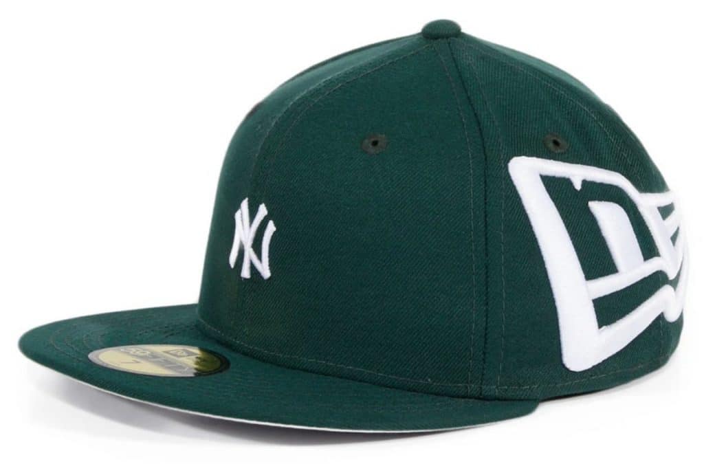
We’re gonna need a bigger seam ripper: Reader Lawrence Kuhnast brought this cap design to my attention yesterday. And yes, it’s a real cap that you can actually buy! Kinda sums up the increasing trends in branding, no?
Well, at least they don’t have the big New Era logo on the front and the little Yanks logo on the side — yet.
Click to enlarge
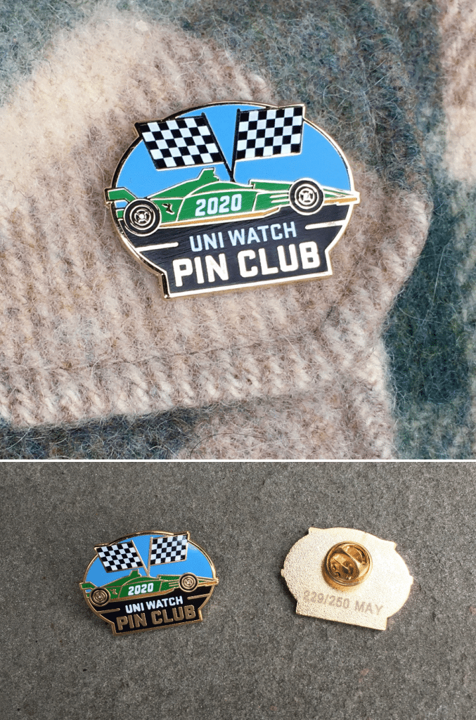
Pin Club update: This is the part where I say you should buy the Uni Watch Pin Club’s May design because it’s selling fast and soon there won’t be any left and then you’ll feel sad for having missed out and you sure don’t want to feel that way, right?
And then we get to the part where I say you can still get the January, February, and March pins, but April is sold out so you can no longer collect ’em all in one fell swoop (or even lots of little swoops), but those early pins are still pretty cool so you should check them out anyway.
And then I remind you that you can save 15% on all of these pins (and on everything else in the Uni Watch Shop and the Naming Wrongs Shop) by using the checkout code COMMUNITY, and then you go ahead and buy a pin, or a T-shirt, or whatever, and then you feel a bit better because you’ve helped support Uni Watch and I feel a bit better because I’ve produced a fun product that you liked enough to purchase, so it’s a win-win.
See how that works?
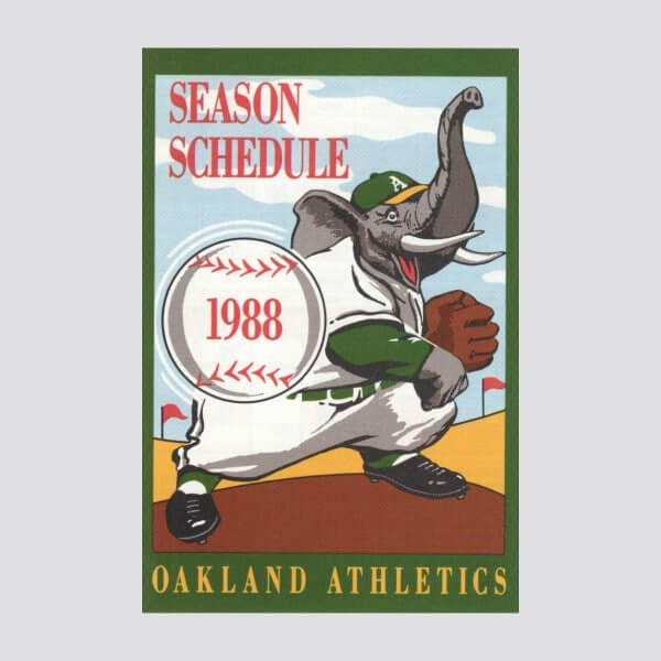

Raffle reminder: In case you missed it on Monday, we’re running another raffle for our longtime advertiser Vintage Brand, which means a lucky Uni Watch reader will get to choose anything from the VB site (including the A’s poster shown above, which might be the world’s only depiction of an elephant wearing stirrups).
Please note that this raffle is only open to people who have shipping addresses in the USA. It will be a three-day raffle. To enter, send an email to the raffle address by 8pm Eastern tomorrow, May 6. One entry per person. I’ll announce the winner on Thursday. Good luck!
The Ticker
By Alex Hider

Baseball News: The Braves debuted a video over the weekend about how the 1990s Braves influenced hip-hop style. … Tom Morel sent along the logo he designed for the Little League in Poughkeepsie, N.Y., featuring the Mid-Hudson Bridge. … With yesterday being “Star Wars Day,” SB Nation examined the phenomenon of minor league teams wearing Star Wars uniforms (from Kary Klismet). … Also from Kary: Baseball America has ranked the top 25 uniforms in college baseball. … Chris Mycoskie notes that a minor league hockey team in Texas is using the same flag patch on their uniforms that the Rangers use as a secondary logo (the same patch Paul blogged about a few years ago). Lots of college teams use that patch as well: Houston, TCU, Incarnate Word (also from Ignacio Salazar). … When Pirates OF Dave Parker faced A’s P Mike Norris in the 1981 MLB All-Star Game, it was a rare yellow vs. yellow matchup.

NFL News: Bears chairman George McCaskey has an enormous jersey collection, and he shared some of the highlights with The Athletic (from Tom Juettner). … Check out the stationery then-Browns coach Bill Bellichick used when he responded to a fan’s note of support in 1994. Very subtle (from Ted Bloss). … The Texans made their Madden debut in Madden 2002. Of course, that game was released in 2001 — a year before the real Texans took the field. Because the team had unveiled logos but not uniforms (or players!), the game makers took some liberties — white helmets and stripe-less jerseys (from Joey Rogers). … Patrick Schmiedt noticed that the chain gang at Arrowhead was using a “Drive Start” sign in 1972. I don’t think I’ve ever seen that before — did any other teams use a sign like that at the time? … Pro Football Journal found a lot of Lions uni oddities in this old shot.
College Football News: According to this story in The Athletic, Virginia Tech determines number assignments (paywalled) partly based on its offseason conditioning program (from Andrew Cosentino). … North Carolina is renaming the field at its football stadium after receiving a sizeable donation from an alumnus (from James Gilbert).

Hockey News: Reader Mike Clary has a tweak for the Caps logo. He thinks the hockey stick should take the place of the “l,” not the “t.” … Cross-listed from the baseball section: Chris Mycoskie notes that the Allen Americans of the ECHL are using the same flag patch on their uniforms that MLB’s Texas Rangers use as a secondary logo. … New logo and colors for Czech hockey team Energie Karlovy Vary (from Ed Zelaski). … The Reebok logo was covered up on an Islanders jersey in an old episode of New Girl (from @UntillTheNight). … Check out the Wilkes-Barre/Scranton Penguins cake a local bakery made for a hockey fan (from Adam Vitcavage). … Remember how early Topps basketball cards usually showed the the players wearing their jerseys backwards because Topps didn’t have the rights to show NBA team logos? The same was apparently true of this early-1970s print ad featuring Kings C Ralph Backstrom. Anyone ever seen that before for an NHL player? (From Tris Wykes.)

NBA News: The Last Dance, the ESPN documentary series about the ’90s Bulls, covered the ’92 Olympics on Sunday. Of course, Michael Jordan famously draped a flag over his shoulder to hide a Reebok logo on his team jacket. However, Brian Vineyard notes that some Dream Team members, including Clyde Drexler, had a Reebok logo on their pants, while others didn’t.

College Hoops News: Colorado posted photos on Instagram of PG McKinley Wright IV wearing former Buffaloes star Chauncey Billups’s high school jersey (from Kary Klismet). … Doug Shivers found a rare color shot of the Oklahoma State women’s sleeved tequila sunrise jerseys of the 1980s. Awesome.

Soccer News: Scottish team Rangers said last week that they’d have a new kit manufacturer in 2020-21. There are rumors circulating that they’re signing with Castore, a brand that’s mostly known for making tennis gear (from our own Jamie Rathjen). … Louisville’s Falls City Brewing has released a new beer to commemorate the opening of USL Championship side Louisville City’s new stadium (from Kary Klismet). … Stephen Smith designed a series of Star Wars-inspired soccer shirts. … FC Cincinnati has announced it’s sold the naming rights to the “premium club section” at its soon-to-be-completed stadium (from Ed Zelaski).

Grab Bag: Fourteen professional sports leagues are partnering together for a PSA honoring health care workers amid the pandemic. The campaign shows players taping over their NOB and writing in the name of a nurse, doctor or other health care worker (from our own Jamie Rathjen). … The Score began counting down what they considered the Top 100 uniforms in sports yesterday (from Kary Klismet). … Also from Kary: New athletic logos for Monroe College, a junior college in New York City. … A designer gave Philly’s pro sports logos a coronavirus-themed remix (from Joshua Bradford).

Click to enlarge

What Paul did last night: Three-ish weeks ago we noticed a fairly large branch dangling from the upper reaches of the tree directly across the street from us. It must have broken loose during a storm and then gotten caught in some of the larger boughs. It was swaying back and forth rather precariously, and it was directly above a parked car that happened to be owned by our neighbor Jason, so we pointed it out to him. He looked up, said, “Holy shit!,” and then moved his car before the branch could come crashing down on it.
Another car promptly took the space (parking spots tend to last about eight minutes in our neighborhood), and then another, and another. Meanwhile, someone (not us, I’m embarrassed to say) called the city’s 311 line, and a municipal employee arrived a few days later to see the branch for himself. He took photos (or so I’m told — I didn’t witness his visit myself) and apparently left people with the impression that someone would soon arrive with a cherrypicker or whatever to remove the rogue branch.
That was about two weeks ago. Nobody from the city has come to remove the branch (which seems understandable, given the current state of the world), and the branch has obligingly refrained from crashing down on anything. It’s still there, swinging back and forth, looking sort of ominous but not actually doing any harm. It has now become a supporting character in our porch sessions. We’ll plop down on our seat cushions, take a sip or two of our libations, and then one of us will glance across the street and say, “Branch is still there.” The other: “Yep.”
Yesterday afternoon was very windy, and I was certain the branch would finally relinquish its grip on the tree (or the tree on it). But nope — it was still there, swaying back and forth, when we hit the porch in the early evening. I shot a bit of video so you can see (I happened to do this just as the branch was casting a nice, swaying shadow on our neighbor’s house):
At this point I feel like the branch has become something of an acquaintance. There’s conversational aspect to its swaying, and I like how it’s kept us guessing about its true intentions. It seems pretty secure up there, and it’s not hurting anyone (yet), so I’m selfishly hoping nobody shows up to remove it.
Feliz Cinco de Mayo to all who are celebrating today. A few readers, including Mark Richter and Mike Wilson, have already broken out their Observación de Uniformes T-shirts for the occasion. Stay safe, and I’ll see you back here tomorrow. — Paul
Beautiful to see the greening taking place during the porch photo timeline.
Seeing the purple sunrise shirt, was there ever any chance that your purple signature baseball card was also going to have a swatch from the purple jersey?
A while back someone asked if they though manufacturers would start making their marks harder to remove, perhaps this is their answer.
Seeing the purple sunrise shirt, was there ever any chance that your purple signature baseball card was also going to have a swatch from the purple jersey?
That was never discussed, no. Fun idea, though!
Happy anniversary, Brinke!
Thank you very much! It’s been a lot of fun, for sure.
There is somewhat of a progress photo here…
link
On a couple of the Dream Teamers where the Reebok logo isn’t showing on their right pant leg, does it look like they’ve pinned their jacket to their pants so that the bottom of the jacket won’t ride up and display the logo? (I’m looking specifically at David Robinson and Karl Malone here.)
Matt, that is an interesting thought I had not noticed before. Intriguing…
There are not a lot of HQ photos from that ceremony, but I found this photo which might show the presence of a safety pin on David Robinson:
link
However, this photo still makes me unsure:
link
Largely because for those who you can clearly see the Reebok logo, it seems to be more level with the Olympic rings logo.
That second photo you link to makes me think that Pippen had things pinned/rigged similarly. There’s that weird notch on the hemline of his jacket and it looks like the pant material on his right thigh is hitched up while that’s not the case on the left.
Certainly makes one wonder…
Based on this photo, maybe?:
link
This photo, not so much it seems?:
link
Here is one other HQ group photo, but the direction they are turned doesn’t show much:
link
Would be an interesting question if I were ever to meet one of them.
This inquiry all started for me when the announcer commented about Michael Jordan draping a flag over his shoulder to hide a Reebok logo on his team jacket. As I watched more of the ceremony I could not see the logo on any of the jackets which made me wonder what the flag was covering?
Upon further review I discovered they were all hiding it with the collar of their jacket, and this is what it looks like if not hidden:
link
Evidently athletes like Michael Jordan and Charles Barkley who were affiliated with Nike used the American flag as an extra precaution instead of early speculation they might deface the Reebok mark.
Magic Johnson also had a flag, but clearly he was not worried about covering anything:
link
or
link
I wonder if Reebok later regretted the location they placed their patch considering how easily it was covered? For example, you also cannot see it on the jackets of this other popular American team from 1992:
link
Yet you can see it on the majority of their pants…
Awesome research, Brian! If I ever get drinks with MJ or Charles or Scottie, this’ll be the first thing I bring up! :-)
Enjoyed the chat here, sir. All the best to you!
Your dangling-branch story reminds me of something that happened here in MPLS recently, but the subject being a pizza box! This quote is especially timely, “Because if this pizza box stuck in an Uptown Minneapolis salon’s sign can hang in there like it did, then so can you.” link
That Yankees hat is going to give me nightmares.
Did you ever think of having a classified section on your blog where fans can buy/sell/trade sports collectibles, baseball cards, jerseys etc and you take a piece for site funding?
We tried that a long time ago. Didn’t get much activity.
Congratulations on ten years Brinke!
I eagerly await Collectors Corner each week as I am always on the lookout for items featuring the plain silver Seahawks helmet they wore during their first season.
I see what you did there.
Well, you know, I do take requests.
The worst part about that Yankees cap is that nearly every size is sold out. Yikes!
The worst part about that Yankees cap is that it exists.
Uni Watch. -daily required reading
Collectors Corner- Look forward to that every week. Brinke, thanks for your work in finding some real chestnuts. Gotten my share after seeing them posted.
Congratulations in your Ten years at Uni Watch. To many more, whether I have space for it or not !!!!
Looking forward to….CC|XX! (sounds like the numbering for the Chicago albums.)
Ross Yoshida won the day. Those are amazing for freehand.
Continues to amaze with his talent, in all forms.
It’s the Branch of Damocles!
(And just for fun, here’s Vin Scully telling the story of the Sword of Damocles between pitches: link)
How are your trees so green already? I am in Mass – not that far away, and the trees are really just starting to get their buds where I am.
The story of the branch is great. Perhaps a branch tracker could be in the cards…
In the VA Tech piece about jersey number selection being influenced by offseason conditioning, the conditioning program is called the “Hard Hat” competition. Because…..blue collar.
Congrats on 10 years Brinke-man!
TY Phil, and how many is it for you? I believe a ZOOM call is in order, what do you say?
So at first I wasn’t into the porch photo thing, but it’s slowly grown on me and now I look forward to seeing it each day. But as someone who likes seeing things in their surrounding context, and having never spent any time in Brooklyn myself, would you be willing to go down your front steps and shoot a few pictures of your street to share with us?
That New Era hat is an abomination…first of all the manufacturer’s logo bigger (and looks like a toddler barfed the thing onto the hat) than the team logo which is too damn tiny! Second of all, how can you do this to one of the iconic teams with one of the most iconic and recognizable uniforms in baseball??
The Yankees train left the station years ago. In fact you might say that the Yankees train was the first to leave the merchandise station, as far as modern-day merchandising goes:
link.
I didn’t used to mind – the Yankees would sell all manner of stuff, but kept the actual uniforms sacred. But now that they’ve backed off that…
I never realized that the NL West all have interlocking letters (except for Arizona, obviously). The Rockies logo got me thinking, and I’m sure it has been addressed before, but are there any other professional sport teams that have an interlocking logo where one of the letters references the team name and not the location? I can’t think of any off the top of my head! Thanks again Paul for providing Uni-Watch every day even during these weird ass times, it is a very welcome break!
There are a couple, the LA Chargers logo:
link
But seriously, the Houston Rockets have two interlocking HR logos. Their primary:
link
And also a secondary mark:
link
The ’90s Milwaukee Brewers for sure.
Montreal Canadiens count as interlocking?
Whole bunch of Brewers logos; maybe not all interlocking, but certainly adjoining: link, link, and the link as well.
Most of the Brewers’ logos have incorporated the team name initial.
Can think of one at home here in the Lower Mainland. Similar to the Rockies logo. The early aughts short-season Single-A baseball Vancouver Canadians. Back when they wore blue and red.
link
link
California Angels had the “CA” on the hat from 1965-70, and again from 1993-97. One could make the case the “C” was just a hastily-switched “L”, and one could make a similar case the “CA” was the postal abbreviation for California, but I’ll follow Occam’s Razor in this instance.
California Angels before Disney bought them. Then you have the Twin Cities logo.
I can’t reply to all of these comments, but dammit I knew you guys would know! Thank you!
The adjustment to the Capitals logo is to the only “L”, not the second one and, yes, it does look better. I don’t know if it would work so well with the sweater being worn by a player, though.
Happy anniversary, Brinke!
Right. Fixed.
I like that adjusted Capitals logo a lot more than the real one!
The old Capitals’ wordmark had reverse-italicized letters, making for natural-looking hockey sticks. The new insignia makes the inclusion of a stick look like a shotgun marriage.
Caps logo adjustment.. I like it but would perfer if the puck was on the other side so it looks like it is being shot at the “net” made by pita.
Ken, I did make the logo with the puck on the left side of the hockey stick too, but didn’t submit it to Paul because I thought it might be overkill sending two versions of the logo with such a subtle change. But the more I look at the second version, coupled with the comment John H. made (above), I may like the version with the puck on the left side better – it’s more centered.
Also, I like your reference to the pita net. Cheers.
Since you’re in Brooklyn and there’s a branch getting attention, how about giving it a name? I believe Rickey would be appropriate!
I say you call it “Cliff”.
Since we’re talking about purple, this seems like as good a time as any to go down this road…
I’ve never had strong feelings (positive or negative) for any single color, but I’ve always felt a strong revulsion to the combination of green and yellow. (Any similarity to the color scheme of any particular well-loved blog is purely coincidental.) Both of those colors can look awesome in other contexts, but they look hideous together – to my eyes, anyway.
When I was a kid, I passionately hated the Minnesota North Stars, for no reason other than because they were green and yellow. I hated the Oakland Athletics for the same reason.
So what about other uni-watchers? Does anyone else have combinations of colors that you find particularly loathsome?
Blue & Orange.
0=)
(Obviously being playful.)
Red and green; red and yellow; red and purple.
This is mostly just on uniforms, though. I don’t mind red and green Christmas stuff, for instance.
Love the photo of the “Drive Start” sign from the old KC days. Nowadays, it’s just an X that marks the start of the drive. I always thought that member of the chain gang is unfortunate because he’s by himself for the whole game!
i’d wear that big NE logo hat over this one any day
link
Apparently they couldn’t give them away. It looks like a prayer shawl.
You’re setting a low bar, Tony!
Congratulations on 10 years of Collector’s Corner, Brinke! I always look forward to the latest installments, and am always impressed with your ability to sleuth out some fascinating collectibles! Thanks for all the time and effort you put into it!
Thank U, I appreciate that!
Typo, under Purp Walk: “ also marking its tenth decade” ??? That’s a really long time!
It is actually Marking the completion of its first decade, completion of tenth year, tenth anniversary, and beginning of second decade, eleventh year.
Congrats on the 10th Anniversary of CC.
Yikes! Fixed — thanks, Jerry!
Colorado posted photos on Instagram of PG McKinley Wright IV wearing former Buffaloes star Chauncey Billups’s high school jersey
The full Insstagram post has additional photos, inclduing a cool one showing the funky “o” in the “Patriots” font on the front:
link
(Billups went to George Washingtinon High School in Denver, which explains the nickname.)
That sidewalk chalk photo made me feel warm inside.
As a kid, I used to attempt to reproduce entire NBA courts (mostly the Bulls) in my drive way using sidewalk chalk. They never looked half this good and coloring in the key was death, but the thrill of playing on a freshly decorated court reverberates even today. It made me feel like a superstar in my own backyard.
I went to many games at old Mile High Stadium as a kid and I know the Broncos definitely used a drive start sign in the early 70’s.
Congrats on ten years of Collector’s Corner, Brinke!
I always liked the white helmets the Texans initially rolled out, but these days I really appreciate the decision to abandon them for the steel blue ..had they stuck with the white, I’m certain that the recent internet clamor for them to dress as the Houston Oilers would surely gain support. In this regard, long live the one-shell rule! ;)
Thank you!
Anyone else think it is damned disrespectful of the four letter network to do a best of/worst of NBA uniforms title piece today. I saw it pop up and immediately got pissed on Paul’s behalf.
Thanks for having my back, Marc! But honestly, it’s fine for them to do that. I may have established the uniform beat for them, but it’s not like I have exclusive rights to it. They’re allowed to cover uniforms too (hell, every other sports media outlet is doing it these days — uniforms have become the standard pandemic filler content).
Think of it this way: If your local TV station sacks your favorite meteorologist, they’re still allowed to do the weather report with someone else, right?
I know, it’s irrational.
But still…douchebags.
In the college baseball rankings I definitely had some disagreements. I think Stanford’s gray pullovers are far better than USC in black. I like the ASU red top with gold script “Devils” better than the white, and Cal State Fullerton’s white pinstripe look is better than Irvine’s. To me the little bit of orange in CSF’s look just separates them from than the countless teams doing navy and white pinstripes.
I wonder if New Era had been reading the stories about seam rippers and tearing out the logo and created this hat as a big F you to Paul as if to say,”try ripping the seams out of this hat”.
Why the mixed English and Korean lettering? Because it’s Korea. It’s what they do and there is no explanation.