
For all photos, click to enlarge
[Editor’s Note: As Phil noted in yesterday’s post, longtime Uni Watch friend/pal/hero Comrade Robert Marshall turned 50 years old on Sunday. To help mark that momentous occasion, today we have a guest entry from the good Comrade that I think you’ll like, about one of his characteristically awesome sports-themed art projects. Enjoy. — PL]
By Comrade Robert Marshall
For the last 13 years, I have accompanied my wife to her uncle’s house here in Chicago for her extended-family Christmas Eve. I usually bring her uncle the fruits of my canning labor for the previous 12 months, including delectables like my grandmother’s pepper relish and whatnot. Unfortunately, this past year I absent-mindedly left his goodies on the counter when we left the house, so I told him I would drop them off soon after the holiday. To atone for the shame of my mistake, I made him a little something additional — a little trophy, figuring he and his sons can use for whatever fantasy football-type activity they may engage in.
As you can see, it depicts two storied Bears players — Bronco Nagursky and William “The Refrigerator” Perry — manhandling a trio of division rivals. The 2″ sculpture/trophy, rendered at 1:72 scale, consists of dismembered electric football players that have been reassembled with various resins atop a polished square stone, painted, and placed within a small acrylic box. [The box is shown only in the photo at the top of this page. — PL]

I wanted it to be not only interesting to look at, but also to have the dynamic weight of a larger sculpture that people of 1:87 scale might walk by on the way into Soldier Field. As for the players, I tried to pick them based on interesting personal stories, but it’s a little Polish-heavy because my wife’s family is Polish.

In addition to whatever backstories might make this compelling, I think Uni Watch readers may appreciate some of the uniform detail too. For instance, Joe Kapp’s helmet and jersey purples don’t match, and “Wolf” Grabowski has the appropriate Packers sleeve stripes. Ditto for the Lions stripes on “What’s going On” backup singer Lem Barney.

But as many will enjoy pointing out, there are two intended mistakes for the Bears players. First, Bronco Nagurski’s uniform is accurate except for the brain-bucket, as they didn’t yet wear the wishbone-C on their lids during Bronco’s leatherhead-era days:
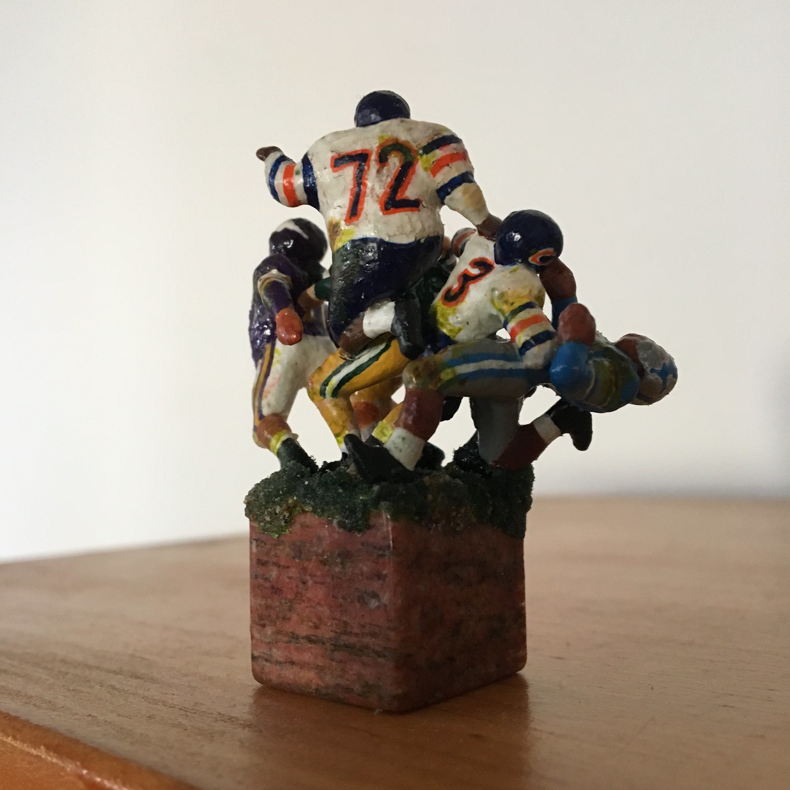
And second, the Fridge does not have right-proper pantaloons, which is fine because I would switch, and ditch the striped stitch for a sold midway-indigo anyway. Ah yes, the fun of making something with the obsession of a Uni Watcher.

So that was the project, and I probably never would have shared it. But as i was making decisions and painting, I thought about how the Bears’ white jerseys predated the Monsters of the Midway blues by 10-ish years. As I continued working and thinking, I also thought about the traditional Chicago home hockey whites. And then it dawned on me: They have similar stripe patterns, and have since the stone ages. They are both iconic, long-lasting, and associated with the Windy City — I hereby declare them to be Chicago stripes!
Now, I’m not saying this is as good a term as as “head-spoon,” which remains my greatest gift to high culture [for those who aren’t in the know, Robert coined that term to refer to the piping on a baseball jersey’s collar and placket — PL], but as a point of discussion and reference, can “Chicago stripes” stand up to scrutiny as a striping pattern? The idea is just to clarify — if we say, “Chicago stripes,” we’ll be referring to three stripes of equal width, with white or other jersey base color in between, and with the center stripe of a different color than the top/bottom stripes.
What do you think?
———
Paul here. First and foremost, let’s wish Robert a happy birthday and thank him for sharing this great project with us. You can see more photos of it here.
As for “Chicago stripes,” I like it! What say ye?
It took me a week to figure out where I saw those 2nd color #Chargers uniforms before. #BlackLightning might need to consult an attorney. @UniWatch pic.twitter.com/m3P5Utos3H
— Joe 🎧 (@JoBooMan) April 26, 2020
Lightning strikes twice: When reviewing the Chargers’ new uni set last Wednesday, I said “[S]omeone probably got the bright idea of doing this [mono-navy Color Rash] uniform just so they can call it ‘midnight lightning’ or something similarly cringeworthy.” I had no idea that there’s a comic book character named Black Lightning, whose costume actually resembles that uniform!
I’ve been saying all along that the Color Rash uniforms are designed to look like superhero costumes. It’s even truer than usual in this case.

Working Class Wannabes™: With the NFL draft having just taken place and high school players committing to colleges, we’re seeing a huge resurgence of blue-collar fetishizing. Here’s a sampling just from the past few days:
• With Iowa DL A.J. Espenesa being drafted by the Bills, college football writer Scott Dochterman described it as “Blue-collar player to a blue-collar city.”
• Speaking of the Bills and Espenesa, an article about the team’s draft picks included this passage: “On Saturday, the Buffalo Bills finished adding to their Lunch Pail Gang, a collection of blue-collar players, led by Iowa defensive end A.J. Epenesa and Utah running back Zack Moss, who would do just fine at the Tonawanda GM plant.”
• Maryland strength/conditioning coach Ryan Davis described Terps draftee Antoine Brooks Jr. as a “tough blue collar ball player.”
• Georgia Southern head coach Chad Lunsford described draftee Tyler Bass as “BlueCollar-discipline-tough.” (Footnote: Bass is a placekicker.)
• Utah coach Kyle Wittingham says, “I believe we’re a hard-working, blue collar program — very disciplined, very structured.”
• An article about undrafted Ole Miss DL Benito Jones, who has since signed with the Dolphins, decsribed him as having a “blue-collar attitude.”
• Another Dolphins free agent signing, special teamer Matt Cole, who played college ball at McKendree, says, “I just want to go down there [to Miami], work hard with that blue-collar mentality we had at McKendree, and prove myself.”
• An article about new Michigan State recruit Tyson Watson describes him as a “blue collar type player from a hard-working family.” The article’s headline adds that he has a “‘blue-collar’ work ethic.”
• New Lions draft pick Logan Stenberg is described as a “scrappy blue-collar guard.”
• New Bears draft pick Arlington Hambright says he loves Chicago’s “hard-working, blue-collar mentality.”
• Fansided’s Notre Dame blogger, Matt Clark, described one Fighting Irish draftee as “a blue-collar player who does what is necessary to succeed” and followed up an hour later with a separate article that described another Irish draftee as “a beacon for the blue-collar player who achieves the pinnacle of success through hard work and determination.” (He then used “determination” again in the next sentence.)
(Some of these were contributed by @ColHapablap, dignorant, and Timmy Donahue.)
Uni Watch Haiku: Here’s the latest from the Uni Watch haiku lab:
Longest baseball name?
Duh — Saltalamacchia!
Shortest? Hu’s on first
And there’s more where that came from.

Click to enlarge
Meet the Uni Watch Team
By Scott M.X. Turner
I was a Uni Watch fan going back to the column’s Village Voice days. Paul’s first encounter with me was in late 2004, when I submitted what turned out to be one of the winning entries for his first-ever design contest on ESPN.com. Then, early in 2006, shortly before the blog launched, Paul was planning the first-ever Uni Watch party in Brooklyn, and I sent him an unsolicited series of graphics:

The final version ended up on a T-shirt that was available at the party, and then became the basis for the Uni Watch blog’s first visual identity.
While we mainly collaborate on the Uni Watch membership cards — a painstaking process that involves lots of back-and-forth between me and Paul — I’ve worked on other Uni Watch projects, including T-shirts, stickers, logos, banners, wordmarks, and one legendary commemorative dinner plate (and while I didn’t come up with the idea for Purple Amnesty Day, I did come up with its nickname — “Purp Walk”). Wait till you see what we have coming up, too!
I’ve been a uni nerd for as long as I can remember, going back to the 1960s. Doing designs in Illustrator and Photoshop isn’t that different from using tracing paper and colored pencils to capture uniforms out of Sports Illustrated and The Sporting News when I was a kid, except now it’s part of how I make a living (a latticework that also includes music, writing, and photography). In the 1990s through 2012, I worked for Ebbets Field Flannels and Stall & Dean (I took Paul to visit the S&D facility back in 2009), where I really got to sharpen my eye for the details of athletics aesthetics.
When Paul and I met, we both lived in Brooklyn. While he has stayed there, I’ve been on the move — first to Seattle, where I met lovely people, played in great bands, and honed my photography with three shows, and then, two years ago, to New Orleans, where my wife, dog, cats, and stupidly large number of ballcaps all reside in a shotgun-single in the Fairgrounds Triangle neighborhood. I’m happy every time I encounter a second line, a po-boy or a really good story — often at the same moment. It’s a place where the dead and the living walk hand in hand — a good vibe for thinking on sports uniform history, culture, and details.
———
Paul here. Believe me when I tell you that this missive barely scratches the surface of what a fascinating guy Scott is — a true inspiration. Also, most people have no idea how much work goes into the designing of the Uni Watch membership cards, but this photo from a recent batch that we produced should give you at least a hint:

Scott has promised to write a guest entry explaining his working process. I for one can’t wait — even after working with him for 13 years on the membership cards, I know there’s a lot that goes on at his end that I never see or hear about, so his forthcoming piece should be just as enlightening to me as it will be for all of you.
Click to enlarge
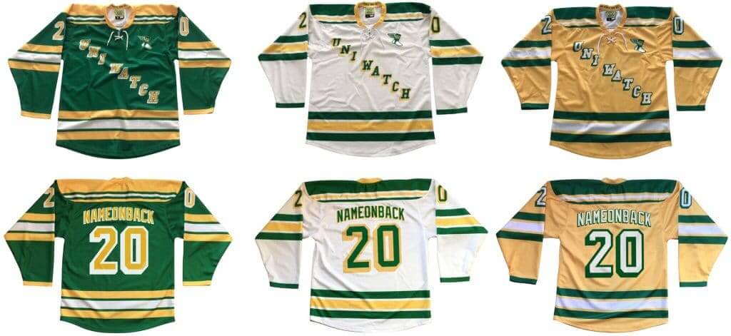
Hockey jersey reminder: In case you missed it last week, we’re now taking orders for another batch of Uni Watch hockey jerseys. Just like before, you’ll have your choice of three different colors (see above) and two different tailoring cuts (standard “fan cut” and roomier “game cut,” which will fit over pads for on-ice use).
To get in on these, you must order by this Friday, May 1. Full details here.
Many of you have asked which color was the most popular, so Nathan Haas of Adelph Wear made this excellent infographic that breaks down the 105 jerseys we sold in the first round of ordering earlier this year (click to enlarge):

As you can see, green was the most popular color, with fan cut and game cut being split almost evenly, and the overwhelming majority of people opting to have the winged stirrup on the chest.
While we’re at it:
• The Uni Watch Classic Cap is still available in sizes 7 and 7-7/8. And remember, the price has been reduced to a pandemic-friendly $35.99. (All other fitted sizes and adjustables are sold out. We have more on order, but our factory is currently shut down, so it will likely take a while. If you’d like to be notified when other fitted sizes and adjustables are back in stock, email me.)
• Uni Watch memberships, which usually cost $25, are reduced to $20 until further notice.
• You can get 15% off of everything in the Uni Watch Shop and the Naming Wrongs Shop by using the checkout code COMMUNITY.
• You can also support Uni Watch by making a donation.

Click to enlarge
Hypothetically speaking: I ask you: Who doesn’t enjoy a nice, tasty brat? Wouldn’t you like to have one right about now?
If you’d like to discuss those questions with me, feel free to drop me a line. I’ll bring extra napkins.


ITEM! Another membership raffle: Reader Jay Palmer recently purchased a membership for me to raffle off, so we’re going to do that today.
This will be a one-day raffle. To enter, send an email to the raffle address by 8pm Eastern tonight. One entry per person. I’ll announce the winner tomorrow.
Meanwhile, our latest raffle winner is Jon Director, who’s won himself $45 worth of merch from the Uni Watch Shop (and since we’re currently offering that 15% discount, he actually gets to choose up to $53 worth). He chose this shirt, this mug, and this mug. Congrats to him, and my repeated thanks to reader Ryan Harrington for sponsoring that one.
The Ticker
By Jamie Rathjen

Baseball News: MLB.com is attempting to answer the entirely subjective question of who has the best-looking swing in the history of each team (from Kary Klismet). … The Single-A Charleston RiverDogs were supposed to wear jerseys with an actual crossword on the front yesterday for a promotion that will apparently be rescheduled. … UVa’s equipment manager said that the baseball team will still be outfitted by Rawlings, even though it’s part of the school’s redesign and was included in some close-up pictures released on Friday.

Football News: Ravens sixth-round draft pick WR James Proche said he’ll be wearing No. 11 (from Andrew Cosentino). … Multiple readers were watching a rebroadcast of Super Bowl XXXI yesterday and noticed that Packers players were wearing both five- and three- striped sleeves. They changed to three the next season. … The U. of Colorado was the latest place to release Zoom backgrounds, and the sports-specific ones are football-related, so if you’ve ever wanted to have the football stadium or a giant swoosh behind your head go right ahead (from Kary Klismet). … Newly drafted Patriots K Justin Rohrwasser says he will cover his tattoo of a right-wing extremist group’s logo.

Hockey News: NHL teams apparently wore NOBs for nationally televised games before NOBs were required starting in 1977 (from Lance Harris).
.

Basketball News: You can see then-Pelicans PF Lou Amundson missing his NOB in this clip (from Ted Groyper). … A Clippers blog ranked the jerseys uniforms since the team’s current logo debuted in 2015 (from Kary Klismet).

Soccer News: Even though Euro 2020 was moved to next year, it’s keeping its name, but UEFA didn’t mention Women’s Euro 2021, which was also moved to 2022. … The English National League’s Woking started a fundraising campaign that includes donors’ names on next season’s shirts. Many teams of their size will inevitably face economic difficulty with no games being played. … The NWSL’s Chicago Red Stars are releasing this season’s new shirt on Thursday — they say “kit” but judging by past Red Stars releases it’s more likely they mean “shirt.” … The USL Championship’s Phoenix Rising made shirt concepts in the colors of the other Phoenix sports teams (from Tyson Tomao and Josh Pearlman). … A Paraguyan newspaper says the national team will be outfitted by Puma, switching from Adidas (from Josh Hinton). … Here’s a video podcast episode about soccer shirt fonts (from James Gilbert). … Also from James: Remember Paul’s recent interview with MLS font designer Rick Banks? Banks has a new book out, about soccer typography.

Grab Bag: Ohio State and Syracuse’s men’s lacrosse teams apparently have new gloves for next season. The latter teased a change and the former didn’t (from Michael Sullivan). … Reader Clint Richardson has been analyzing Auburn’s marching band uniforms. … Irish county Cork’s Gaelic football and hurling teams both managed to wear three different shirts in three consecutive games just before the world stopped; those are two sports where teams traditionally try to wear second or third shirts as rarely as humanly possible. … A state senator in Michigan apologized after he appeared to be wearing a Confederate battle flag face mask on the Senate floor.

Click to enlarge

What Paul did last night: Yesterday was a good day. Finally got caught up on a bunch of things and stopped feeling like I was treading water. Had enough time to actually read the Sunday paper on Sunday for the first time in many weeks. Went for my daily bike ride in the morning, just in time to beat the rain that ended up washing out the rest of the day. So I was in a very good mood by the time porch o’clock rolled around.
Since it was still raining, the front edge of the porch was wet, so we brought out the deck chairs. Bud for both of us. We talked about how old the trees on our block are (likely a century or so for the biggest ones, like the one at the left side of the photo), which in turn led us to talk about the giant redwoods we saw on our 2016 trip through northern California, which in turn led us to ask, “When will we be able to take a trip like that again?,” which in turn led to, “When will we be able to go to a restaurant again, or a bar, or a movie theater?”
Nobody knows the answers to those questions. We’re okay with that, or at least we were yesterday. We were discussing it more out of a sense of “Gee, isn’t this a bizarre world we’re suddenly living in?,” not a sense of despair. Like I said, I was in a good mood. On another day, with another mood, those same questions might leave me horribly depressed. But for one day — yesterday — they were fine.
As always, you can see the full set of Pandemic Porch Cocktails™ photos here.
I like Comrade Marshall’s designation of stripes of equal width with a different color in the center but I would add: with spacing equal to the stripes between each stripe.
Surprisingly, the Bears were the earliest team to deploy that pattern in the NFL in 1932. The Blackhawks didn’t use it until the late 40’s.
The Rangers and Bruins don’t use Chicago Stripes because the stripes don’t having spaces equal to the stripes.
It’s a good question as to why few teams were using the pattern. Perhaps because white jerseys weren’t that prevalent. You could see it in some baseball stirrups like the 1926 Senators but rarely almost never in football/hockey.
“blue collar type player from a hard-working family.” My wife and I had office jobs all our lives and worked hard. Blue-collar workers are not the only workers who work hard.
C’mon, white-collar people don’t work hard. They don’t live off the fat of the land, can’t pick themselves up by the bootstraps or put their pants on one leg at a time. They’re not the salt of the earth and they have no common sense.
Now excuse me while I go eat a lug wrench.
exactly. siting “blue collar” work ethic in sports is ridiculous from multiple (all?) angles.
head-spoon…?
head-spoon! genius!
Does Scott have some Pittsburgh connection? While he obviously have many, many ballcaps, three Pirates caps are prominently displayed.
Good catch.
It’s the link that jumped out to me.
In that link in the Ticker, that’s literally how, when, and why the Philadelphia Flyers had white name bars on the orange jerseys. White at home, NOB’s at home, therefore NOB’s on the whites…but then the Flyers got on TV and didn’t have orange name bars lying around, so they ripped off some white name bars to go on the oranges.
That is the way it should be now. White nameplates with black letters on both the orange and white jerseys for the Flyers.
Harumpf! As it is currently, the white bars on the orange jerseys are a true throwback to a quick solution that evolved into their thing. The black bars on the white jerseys are…trying too dang hard to be matching and cute in an ahistoric way.
Personally, I prefer the G2 uniforms with the black piping anyway. :P
But yeah, the black nameplates on the white Flyers jerseys are just being too cute for their own good, and something that shouldn’t have stuck around for a full year, much less a decade or more.
I’m going to have to disagree with the notion that the Rangers use “Chicago stripes”. Robert said that Chicago stripes have white (or I guess, dead space) in between the stripes, which definitely is not the case for the Rangers. I would even go as far as arguing that the Bruins’ (and many other examples) are not true Chicago stripes, since in the Blackhawks and Bears examples mentioned, the white space between the stripes is the same width as the stripes themselves. This is not the case for the Bruins or indeed most instances of similar stripes
Fair enough! Another commenter has made this same point. I’ll remove that bit from the text.
Wow. A red-letter day here at Uni Watch!
Comrade Marshall starts the entry with both an amazing bit of sculpture, and then opens a discussion about “Chicago stripes”. If the terminology is accepted, Chicago will become the First City of football striping cities, having Northwestern and Chicago striping! (also, is the Comrade’s long-running war on punctuation ended or did Paul engage in some Herculean copy-editing?)
Then we’re treated to Mr. Turner’s entry, which is another great window into a behind the scenes player at UWHQ! I always knew he was cool, but seeing those Black and White Docs made my heart warm. I wore the same thing every day I spent teaching in a classroom for 14 years.
What a way to start the week! (today is Monday, right?)
ha! that was paul.
…we’ll be referring to three stripes of equal width, with white in between, and with the center stripe of a different color than the top/bottom stripes.
Are link not also Chicago stripes? I say they are, so “white in between” need not apply.
Jimbo! Good to hear from you.
I guess we should say “white or other jersey base color in between.” I’ll adjust the text accordingly.
the same way northwestern stripes actually only refer three like coloured stripes, i think this is sticky wicket. but yes, it should apply, the spacing is equal to the stripes, and the stripes are two colours..
The raffle address link is misspelled. It’s missing the c
Ay yi yi. Fixed.
OK, so this is perhaps the silliest question/observation I’ve ever asked/made. Have you always spelled it “Ay yi yi”? I ask because my mom used to say that all the time (alternating with Oy vey), usually reacting to me or one of my two brothers, and whenever I used it in print spelled it “Aye yie yie”. I also see it “Aye yai yai”. Yes, I actually looked it up in a Google search and found there’s no real consensus re how it’s spelled, other than the belief that the “Ay” part is Spanish for “Oh”. I find my mind wandering to such dilemmas such as this in these strange times…
I always spell it “Ay yi yi,” but I wouldn’t argue for that being the “correct” way — it’s just the way I do it.
FWIW, I do like that all three words/syllables are two letters, which creates a satisfying kind of balance.
Scott.
Love that authentic White Sox road jersey (circa 1972-74) next to your monitor. Those were sweet! And thanks for creating my membership card (1969 White Sox road with white lettering/numbers – before they changed it a few weeks into the season). Carpe diem!
Scott is the best!
Jim! Great to hear from you. Hope you’re doing well and staying safe!!
Doing well, Paul. I’m finding solace and familiarity in my daily visits to Uni Watch. Thanks.
He really, truly is!
And, he’s a fine musician. This performance link was yesterday. Scott is at around 1:24, with those great stirrups visible behind him up on the wall.
“NHL teams apparently wore NOBs for nationally televised games before NOBs were required…”
Which nation?
The submitter said it was for games on NBC.
A++ haiku today, Paul.
Thanks! First time I built in a link. On the one hand, that feels a little like cheating; on the other, it’s using the medium to help advance the form!
There’s a subreddit for photos like Scott’s with bad HDR light levels:
link
Edmonton Oilers and Pittsburgh Penguins (on the stockings) wear Chicago stripes. But the San Francisco 49ers do not (well, didn’t, anyway) since all three stripes are the same color.
Both the Seattle Seahawks(original) and Houston Oilers (early ‘70-late ‘80s) white jerseys come close to Chicago striping, but I think the spacing wasn’t quite right.
houston and seattle do not work, they have buckeye(?) stripes, or “modified” northwestern.
yes! this is what i am suggesting. i forgot about edmonton, great example.
I’d absolutely love to read an analysis of UVA’s new logo set. I’m an alum and have mixed feelings – 95% hatred and 5% “OK, I guess”. To me, the two new logos are more like comic-book-like avatars and have no place on a uniform besides the collar or an arm patch. I suck at photoshop, but this has caused me to doodle other ideas I have like crazy.
I saw Pumba from The Lion King charging at me almost immediately after seeing the logo.
I’m the Uni Watch Hoo-in-residence, but I didn’t ask to write about the new logos (I hope I can do something when there’s new uniforms).
I like the new logos, the wordmark the most and the cavalier logo (not the shield one, the other one) least, relatively speaking, but I think the hat is a great, unique idea for a logo. The alternate logos look better when they’re in the one- or two-color versions that have been floating around.
When you say the alternate logos belong on “the collar or an arm patch,” that looks like exactly where they’re going, from the pictures that have been released. Colleges don’t always seem to emphasize alternate logos anyway, so if those are stuck on merch and social media like they have been so far I think we’ll be fine.
Note that they said any new uniforms “will be very similar to what each team wore during the 2019-20 season,” so it doesn’t sound like there’s going to be a sudden bunch alternates either.
That is an amazing piece of folk art.
And I’m totally on board with calling them “Chicago stripes”. Especially if you’re willing to consider link…. ;)
Agreed on all counts! So great to see Comrade Marshall’s work again, and I’m happy to call the style Chicago Stripes, even if it does include the word “Chicago.” And Braisher Stripes should be added to the glossary too.
yes! i agree with packer stripes 100%, or brasheer stripes? i would use it, but it might be too obscure for most people to pick up on.
and thanks. what can i say, i like to make stuff. and when it’s sports related, you’re freaks, i’m a freak, i see crossover:)
while i’m at it, i’m surprised dropping packer striping hasn’t put more bees in bonnets in green bay.
Wow-two of my favorite Uni Watch teammates on the same day!
Always love your work Comrade, and you’ll be happy to hear that I’m still adhering to the canons and observing Stirrup Friday during the MLB season (’54 Orioles last Friday).
And we miss you in Seattle, Scott. It was great to stop and chat while you were at EFF, and I still can’t thank you enough for the memorial patch (and awesome Uni Watch card design).
i. love. this. and no doubt on MX, always a fave of mine too. i knew his place would look like that, he had always reminded me of a very close friend, and it is so similar in organization and ephemera it’s uncanny.
Have you ever seen the NYC tree map? The city actually documents every tree on every street in the city, including their species, trunk diameter, and maintenance records. I thought they had an approximate age as well but I don’t see it now. Either way, it’s a fun little rabbit hole. link
Lots of cities do this, actually. Trees are a huge liability but also a huge asset! Tree law is a fascinating subject.
Great lede today!
At least he didn’t refer to this as “The Comrade Marshall Theory of striping”!
+1.
“Chicago Stripes” deserves to be added to the Glossary section.
I love models, dioramas, and model figurines, which makes today’s post one of my favourite Uni Watch pieces I can recall. And to render in 1:72 is even better, quite a challenge with great results. I’d love to see more if these if they exist.
Really cool piece, RPM-3! And good to see your work again. I’m gonna assume your wife is “Pineapple” Kate Perryman? If yes, then that makes the 1:72 scale and including William Perry even more loving and symbolic.
holy shite! the scale is random, but that is why it is the frig! perry-perryman, she was teased as a kid. and that is a great memory on pineapple’s name! by any chance are you from barrington, and have a sister named jenn who went to kansas city art institute?
Big ups to Scott for his Neville Brothers t-shirt. YYR! Those are my guys. Best of luck to all the good people of New Orleans. Who Dat!
I’m loving the Joe Strummer photo and the original “Pelham 1-2-3” movie poster. The man has taste!
Almost a blue collar moment in post draft press conference for the Seahawks. GM was asked about his shirt on the first day of the draft. I had heard it was a gas station attendant shirt with the hawks logo and the individuals name stitched. I was fully expecting him to say something about blue collar ethic but all he said was, “It was a gas station style shirt. We gave them to all of our guys as a gift.” Found it refreshing that his attitude was, “what’s the big deal. Its just a shirt.”
But why would you give gas station shirts to football players?
Even without him invoking the term, it sure seems like blue-collar cosplay.
I disagree. I loved the gas attendant style shirts and ordered a batch for my employees 4 years ago. There was no “work like a blue collar worker” strings attached, just a look we all thought was hip and cool.
And why exactly did you think it was “hip and cool”?
Not quite a fan of this “Chicago stripes” designation. Only two teams in Chicago use it, and those two only use it on their white jersey/uniform. I’d be more in favor of the term was used in a sporting goods catalog to define the pattern (as was Northwestern stripes).
You have to start somewhere. It’s not as though the term “Northwestern stripes” magically appeared in sporting goods catalogs on their own. We we can give our new term some currency, maybe it *will* appear in catalogs!
it also may be only two teams, but both cases it is either just as old or older then any other of their uniform elements. and in both cases we are talking either original NFL or predating possibly the original 6, so that’s pretty deep history.
Hey Paul, question about pandemic porch: Any rhyme or reason as to when you break out the chairs, and when it’s just the seat cushions from them?
The default is to sit on the front lip of the porch on our cushions. But if it’s raining — which means the front lip will be wet — we use the chairs.
As a Packers fan, i wish we would go back to the 5 stripe sleeve pattern rather than 3. I just prefer the thicker look.
Me, too, but link these days.
Does Scott have an instagram page? Or any other way to follow all his work? I’m already a huge fan with the little I know/see.
He sure does!
link
As an aside: Justin, I just trimmed, laminated, and mailed your membership card, so you should be seeing that shortly!
Awesome thanks for the link and update. Can’t wait for Scott’s next post. Stay well!
The best part of Marshall’s post is the idea of 1:87 football fans strolling past the sculpture. Great imagery! A world in miniature indeed.
Love Love LOVE the chicago stripes project! I could see those being big sellers for all cities (pro or college). Very artistic!
Nice work
Solid reading today.
Two pure artists featured.
RPM, genius using the electric football players. Great art.
Also, got my share of stirrups through you in the past.
Scott- cool. From Stall and Dean to EFF.
Love the whole scene going on in that room. Those window curtains are tremendous !!!
Scott is the man…his help to me on my blocks project was invaluable…I really appreciate the time he spent with me…this is a great community…
Great to hear from you, Loren. Hope you and your family are staying well!