Click to enlarge
Big thanks to everyone who submitted entries for our “Redesign the Patriots” contest (including Gene Sanny, whose entry, shown above, caught my eye because of his interesting side-view rendition of Pat Patriot). Today we have the results, as I’ve singled out the best and most interesting results. You can see them over on InsideHook.
Click to enlarge
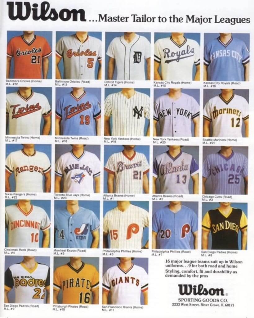
Thing of beauty: Gotta love this late-1970s ad from Wilson. Of particular note, check out the line at bottom where it says, “16 major league teams suit up in Wilson uniforms … 9 for both road and home.” In those days, that was more the exception than the rule, as teams routinely had different outfitters for their home and road unis.
(My thanks to Tom O’Grady for posting this on Twitter.)
Click to enlarge
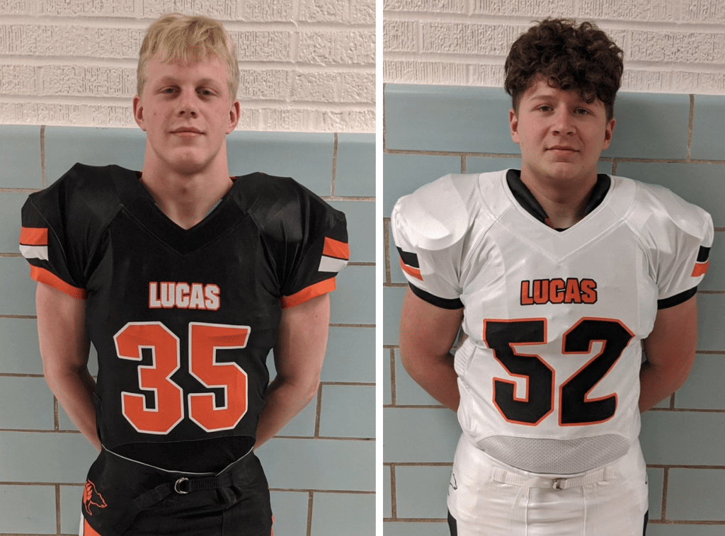
What’s in a name, continued: Earlier this month I mentioned how weird it was to see an obituary for someone with the same name as mine. Similarly, my surname has been misspelled as “Lucas” so often during my life that it’s also a bit weird to see the misspelling printed on the chest of a high school football uniform.
The school in question is Lucas High in the heretofore unknown-to-me town of Lucas, Ohio. They unveiled the new uniforms yesterday. Interestingly, they don’t seem to have maker’s marks — very Lucas/Lukas-appropriate!
Lucas, incidentally, is about two hours due east from another notably named Ohio town: Uniopolis. I may have to hit both of those towns on a road trip one day.
For the first time in Games history, #Tokyo2020 has created kinetic sport pictograms! #Tokyo2020 has created the first animated pictograms to highlight just how dynamic, innovative, and special this Games will be! ✨#UnitedByEmotion @Olympics @Paralympics pic.twitter.com/NFw8uhFaU2
— #Tokyo2020 (@Tokyo2020) February 26, 2020
Too good for the Ticker: Pictograms for the various Olympic sports are nothing new. But as you can see above, the 2020 Tokyo Games will have something new: animated pictograms.
I’m a sucker for this kind of simple but engaging animation. Click on the video link — it’s fun! Lots of additional info here.
Of course, it’s worth noting that the Tokyo Games could be cancelled due to the coronavirus, but let’s hope it doesn’t come to that.
(Big thanks to my pal Rob Walker for this one.)
Click to enlarge
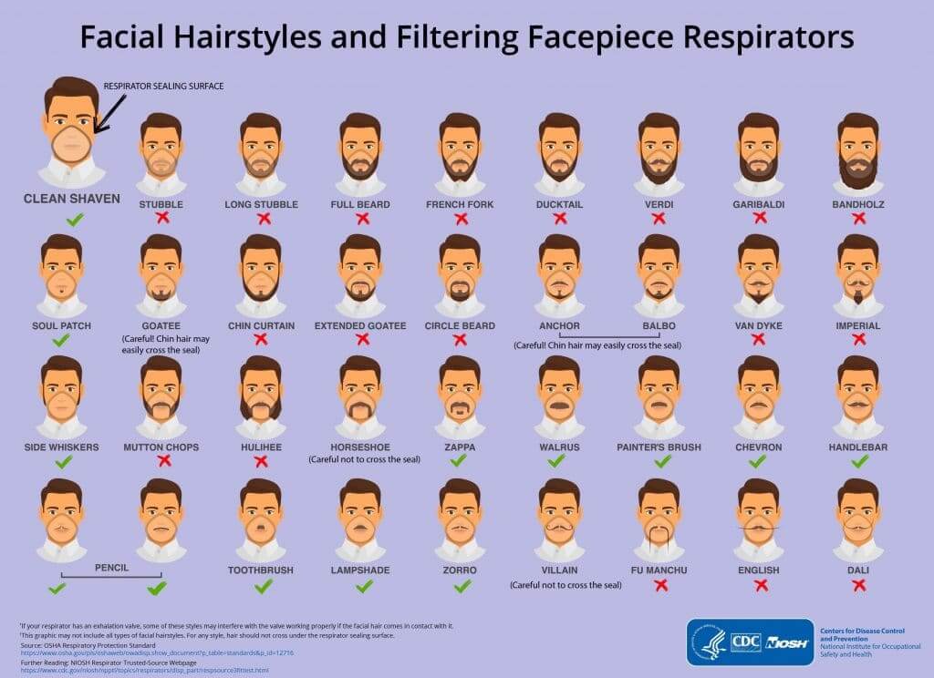
And hey, speaking of that virus thingie…: With the coronavirus threatening to become a global pandemic, the Centers for Disease Control issued this spectacular infographic showing how certain male facial hair styles compromise the efficacy of protective masks. Lots of names here I wasn’t familiar with, like Hulihee and Balbo. I also didn’t realize that a Hitler-style ’stache is called a Toothbrush, or that there’s another style called a Painter’s Brush. The more you know!
All joking aside, I’m a bit concerned about all of this because (a) I am a chronic asthmatic, which means any respiratory virus is a major danger for me (that’s a polite way of saying there’s a good chance the coronavirus would kill me), and (b) I take a medicine — for something else, not for asthma — that compromises my immune system, so I’m at a higher risk for infection (although, on the plus side, (c) I work from home, which helps limit my exposure). All of which is to say, I haven’t put on a mask yet, but I’m thinking about it. And if I go that route, this chart indicates that I’ll have to change my facial hair in order to preserve the mask’s effectiveness. I wonder how many other men will end up up changing their facial hair as a result of this outbreak.
Update: Reader/commenter Martina notes that this infographic was actually released in 2017. “The advice about respirators might end up being relevant to the coronavirus, but currently CDC is not recommending people use them.” Thanks for that, Martina!
Meanwhile: I’m sorry to report that the coronavirus’s disruption of global supply chains has affected us here at Uni Watch. Our March design for the Uni Watch Pin Club would normally be due to launch next Tuesday (the first Tuesday of the month), but that will will be pushed back to next Friday or maybe the following week, depending on how things shake out. Also, our Uni Watch hockey jerseys, which were originally slated to ship out to customers in mid-March, are being delayed by about a month. Obviously, we’re just a very small part of the global slowdown, but it’s interesting to see that even Uni Watch is not immune. Thanks to everyone for their patience.
(My thanks to the Tugboat Captain for this one.)
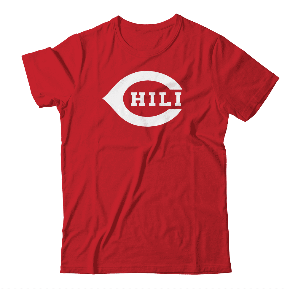
Hypothetically speaking: Did you know that today is National Chili Day? It’s true! Wouldn’t it be fun, just hypothetically, if this momentous occasion could be celebrated with the shirt design concept shown above? If you agree, shoot me a note. Thanks.
The Ticker
By Paul

’Skins Watch: Students at South San Francisco High School, whose teams are called the Warriors, are pushing for the school to stop using Native American imagery, although there’s no move to change the team name itself (from Timmy Donahue). … There’s reportedly an increased push for the U. of Illinois to change from the Fighting Illini to the Kingfishers (from Matt Snyder). … High school students in Menomonee Falls, Wis., have narrowed down the list of potential names that will replace “Indians” for the school’s teams (from @dbalke). … A recent installment in The Sturgis Journal’s ongoing series about local high school mascots in Michigan covers the White Pigeon Chiefs and the story of Wahbememe, a Potawatomi chief whose name translates to “White Pigeon” — the town’s name. “The article delves into the appropriateness of Native American nicknames and whether written approval from one of Wahbememe’s descendants provides sufficient justification for the use of the ‘Chiefs’ name,” says Kary Klismet.

Baseball News: Phillies P Zach Eflin has noticed some changes to the MLB ball this spring (from @brianspeaksnow). … The Single-A Lexington Legends, a Royals affiliate, will play as the Kentucky Beer Cheese on Aug. 13-15 (from Noah Neidlinger). … Former Red Sox star David Ortiz is selling off a bunch of cool memorabilia (from Sara Klein). … The Diamondbacks have explored the possibility of playing in Vancouver if their home ballpark has a structural emergency (from Wade Heidt). … The famously flippant St. Paul Saints will be giving away “Astro the Grouch” bobbleheads on July 31 (from Nick Hannula). … New powder-blue jerseys for the Pensacola Blue Wahoos (from Chris Nickinson). … The Cubs gave away Arizona State-themed Cubs caps for yesterday’s spring training game. … New cream uniforms for Cal State Northridge (from @MistaMaxG). … Reds OF Nick Castellanos was wearing the team’s regular season cap, rather than the spring/BP, during yesterday’s exhibition game against the Mariners (from Joanna Zweip). … Also from Joanna: Phillies OF Bryce Harper posed for a photo with Phils prospect Bryson Stott, who appeared to be wearing Harper’s personal logo on his belt. … Remember the black memorial armband that the Blue Jays recently added for Tony Fernández? They’ve now stopped wearing it. I thought they might replace it with a patch based on their new outfield wall memorial graphic, but not so far. … Vanderbilt C Ty Duvall’s batting helmet logo was askew yesterday. … It’s a little hard to see, but at least two Houston Cougars players appeared to be wearing black bands over their right hoodie sleeves the other night. Bob Andrews thinks they might be memorial bands for John Altobelli, who played college ball at Houston and recently died in the Kobe Bryant helicopter crash. … The Smithsonian’s permanent collection includes a Rangers uniform worn by country singer Charley Pride (from James Gilbert). … MLB will reportedly be cracking down on pitchers using foreign substances this season. … “The 1988 Fresno Suns were a co-op team consisting mostly of Japanese minor leaguers (with great names like Bullet Manabe) and castoffs (with even greater names like Rocco Buffolino) looking for a new gig,” says John English. “There are almost no color photos of them, aside from two card sets.” But that didn’t stop John from DIYing this great jersey. “My process involved printing stencils backwards, tracing those onto fusible bond-mounted flannel felt, then stitching everything together to reinforce, and adhering it to the jersey.” He also DIY’d that 1961 KC A’s jersey that’s visible in the final photo! … The Cubs have put their old, much-derided “Cuba” script in the outfield grass.

NFL News: Whoa, what the hell were they thinking when they put this messed-up Saints helmet graphic on the field in 1970? (Good find by @unavion.) … Here’s a weird one: The NBA’s Cleveland Cavaliers are offering a bobblehead of one of their players, Larry Nance Jr., in a Browns jersey. The rare cross-sport bobble! (From Jerry Wolper.) … Buccaneers coach Bruce Arians, discussing the team’s upcoming new uniforms, says, “I think it’s more closer to the Super Bowl uniforms.” If he’s right, that doesn’t bode well for those hoping for a return of the Creamsicles.
College Football News: The LA Bowl — that’s a new bowl game debuting next winter because, you know, there weren’t enough bowl games already — unveiled its inaugural logo.

Hockey News: Trinity Catholic High School will retire former co-captain Brian Bill’s No. 24 on March 2. “Bill, who became a Navy SEAL, died in action in Afghanistan in 2011,” explains Timmy Donahue). … Rare shot of Wayne Gretzky in a Phoenix Roadrunners uniform. He played one exhibition game for them in 1993 (from @SDubs35). … In this photo from a 1970s Leafs/Caps game, the Caps player in the center has white “Washington” lettering, while his teammates have blue (good spot by Johnny Woods). … Military-appreciation pregame sweaters last night for the Avs (from Collin Felix). … Speaking of the Avs, head coach Jared Bednar had quite the outfit last night (from Collin Felix). … The Golden Knights added a helmet decal last night for Alex Bush, a 12-year-old in the team’s youth hockey program who was recently killed by a distracted driver (from Taylor Crabtree). … The hockey team at Moorhead High in Minnesota has pretty much the best logo ever (from Jimmy Lonetti). … Unusual development in last night’s Kings/Pens game, as a puck got stuck in the net’s exterior plastic apron. … Prior to that same game, Kings mascot Bailey wore an L.A. Blades jersey in honor of pregame Black History Month guest Willie O’Ree.

NBA News: PF/C Donta Hall will wear No. 42 for the Pistons. … The D League’s Texas Legends went with mental health awareness gear last night (from Chris Mycoskie). … Cross-listed from the NFL section: The Cavs are offering a bobblehead of PF/C Larry Nance Jr. wearing a Cleveland Browns jersey (from Jerry Wolper).

College Hoops News: Here’s the court design for next month’s MAAC championships (from @DaveGH2P). … Villanova retired alum Kyle Lowry’s No. 1 last night (from Timmy Donahue). … Yesterday was Virginia Tech’s “Maroon Effect” game, so the Hokies wore maroon at home, with UVA wearing white on the road (from Andrew Cosentino).

Soccer News: New title advertiser for the Russian Premier League (from Ed Zelaski). … Also from Ed: New kit outfitter for Scottish side Kilmarnock FC. … “A match-worn Celtic shirt from the 1991-92 season was recently stolen from England’s National Football Museum in Manchester,” says our own Jamie Rathjen. … New secondary jersey for the Chicago Fire (from Terry Mark). … Speaking of the Fire, they’ve also unveiled a series of 12 patch designs that they’ll wear during the upcoming season (from Anthony Nuccio). … Chattanooga FC’s inaugural jersey will be subtly imprinted with the names of nearly 4,000 investors in the club (from @TannerDabbs). … Here’s a look at some basic facts and figures for every MLS training facility (from Wade Heidt). … Fun plug by Miles Crowther for an interesting-sounding project: “Away Days is a service this dude in Massachusetts runs, where he’ll send you a completely random, small-club soccer jersey for really cheap. There’s also membership component in which you receive a typed newsletter and random sticker for a U.S.-based club. It’s a cool way to learn about some lesser-known clubs from around the world.” … Bayern Munich will celebrate their 120th anniversary by wearing 1932 throwbacks. “That was the year when they first won the German championship,” says Tim Wünderlich. “Here’s a photo of the original kit.” … Finland’s women’s league has changed its name from “Women’s League” (Naisten Liiga) to the gender-neutral “National League” (Kansallinen Liiga). “The scarf at the top of this story shows the league’s new logo,” says our own Jamie Rathjen.

Grab Bag: NASCAR Cup driver William Byron’s car will have a Kobe Bryant-themed paint scheme this weekend. “it’s particularly appropriate because he’s the current occupier of No. 24,” says our own Jamie Rathjen. … And here’s a roundup of all the NASCAR/Bryant tributes (from our own Anthony Emerson). … Fun article on the current state of golf shoes (thanks, Brinke). … New logo for the historic Marylebone Cricket Club (from James Gilbert). … Whoa, this Twitter feed devoted to Japanese mascots is pure gold (from Alex Graber). … Here’s an explanation of the TSA’s logo (from @alfredisgreat). … You knew about retired uniform numbers, but did you know about retired sheriff’s deputy badge numbers? An Oklahoma sheriff’s department is doing just that for a deputy who recently died in the of duty (from Timmy Donahue). … Also from Timmy: New logo for the Truckee Meadows fire department in Nevada. … Dayton, Ohio, is down to three finalists in its quest for a new city flag design (from Todd Herzog). … Marine Corps Commandant Gen. David Berger has ordered all Confederate-related symbols to be removed from Marine Corps installations (from Timmy Donahue). … The Milwaukee brewery employee who shot five of his co-workers and then himself yesterday was still wearing his work uniform.
Our latest raffle winner is Chris Spisak, who’s won himself a free Uni Watch membership (and has chosen to base the card’s design on this awesome Cleveland Force jersey!). Congrats to him, and thanks to the anonymous donor who sponsored this one — he knows who he is. — Paul
I remember that Wilson baseball uniform ad! It was in the AL and NL Red and Green books, and I used to stare at it endlessly. Thanks for sharing it!
Odd the D-backs would consider Vancouver. There are like a dozen spots in the area already used for Spring Training. Seems like they could arrange something with one of them, and have it be a lot less disruptive for everyone.
We have 10, including the one the Diamondbacks themselves use. Which, obviously, could not accommodate half of a normal crowd.
Plus, summer.
The whole thing is a ruse, anyway. The team claims the ballpark is in disrepair (it really isn’t) because they want a new park. This is posturing.
Moving a game from the Phoenix area to BRITISH COLUMBIA would mean a lot of that crowd you’re worried about probably wouldn’t be attending anyway…
This article was written before the DBacks got control of Chase Field. They now can move after 2022, and I believe they will have a new smaller stadium over by their spring training park on the Indian Reservation. This is where most of the money and season ticket holders are located. Same thing the Braves did when they moved north to where their customers live.
This is what BC Place looked like set up for baseball in the 1980s when there were MLB exhibition games there. Prior to the stadium 2010 renovation.
link
They still could do the same configuration as there is still the ability to move lower bowl seats. Trouble would be getting the large hanging scoreboard out of the way. Not sure how viable that would be.
BC Place would be suitable as a contingency stadium but not for a long-term stay. It is busy enough hosting both CFL and MLS games, as well as other events, during baseball season.
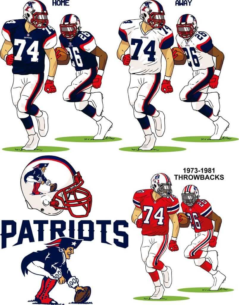
I love the template, but I LOVE even more the entire concept by Tim Fesmire. The mix and match of jerseys & pants was awesome (who knew red and blue went together so well?). Also, I like using the white shell with the more current logo because it pops more, and you can use old Pat the Patriot decals when you want to throw back.
“Pat Patriot is widely considered one of the best mascot characters in sports history”…citation needed? Doesn’t feel that way to me.
Given the amount of support I’ve seen expressed for Pat over the years, both in public forums and directly to me (often by non-Pats fans), I think it’s a fair statement.
The funny part of the Cubs giving away ASU-type caps is, of course, that ASU and the Cubs were supposed to be partners on the ballpark currently known as Sloan Park. It’s just over the Tempe/Mesa line, ASU was going to play its home games there and have more or less co-equal billing and branding.
Well, if you know how the Cubs operate, they altered the terms of the deal to the point where ASU said adios and now the Sun Devils play at Phoenix Municipal Stadium, which is a great park and great for them and right off the light rail line with easy access from campus.
Herr Hitler claimed that his toothbrush mustache was how he had to shave his mustache to fit under his gas mask when he served in the German army on the Western Front in WWI.
The other good thing that Herr Hitler did was murder Hitler.
I heard that joke first in 1988 in Bahrain in a chat with some fighter jocks from the UK.
An extra twist of the knife when it comes to that St. Paul trash can bobblehead: it’s the same weekend that the Astros make their only visit to Target Field in 2019.
link
I don’t think the Houston players are wearing any kind of black ribbon or fabric on their arms. If you look at the player on the left it is on both arms and the photo on the top of this page (link) seems to show that it is just how the sweatshirt was designed.
Correct. It is a Nike template that all Nike schools have, like this one link
TIL my beard is a “Bandholz”, not just simply “Full Beard”.
The beard infographic was released in 2017. The advice about respirators might end up being relevant to Coronavirus but currently CDC is not recommending people use them to try to prevent it link
Ah, did not realize. Thank you! Will add that to the text.
One of the reasons for being clean shaven every morning in the Military is to support the proper operation of your Gas Mask. If you have facial hair, you don’t get a proper seal.
Jumped out at me that the Expos road is #14 (Pete Rose) and the Phillies home is #20 (Mike Schmidt). This is clearly a 70s ad, but those two unis made me flash back to 1984.
It’s amazing with the Patriots, ditch the silver, add back the red, a touch a of little of a little old school feel and….they look just like the Bills.
Your picks the the redesigns are very surprising.
Some way better work left out IMO.
– DanBodurtha
– drewfansler
– KyleFloyd
– ColinEadie
– Ernie Chiara
– MattComeau
Those look like they put some serious time into it.
Serious work does not necessarily equate to *good* work. There mere fact that a design is polished, professional-looking, and the result of significant thought and effort does not automatically make it successful.
Also, as always, I chose what I felt were the best *and most interesting* submissions. In any case, different people will have differing tastes — I’m sure we can agree to disagree.
Lots more to unpack in that Leafs/Caps photo.
– The extra bar, “serif”, uh..hat(?)…on the Leaf’s A
– The early modern-style helmet on the Leaf in the upper left, very late-career Stan Mikita and mid-career Mike Foligno
– The leatherhead-esque helmet and lacrose-ish cage on the far right Cap
– The sideburns
I’d guess the goalie Ron Low, half-based solely on mask style. And, based on the four goalies who wore 30 for the Caps in the 70s, that Low playing in 1975 would be prime territory in the early years of the Caps for a mistake like that to occur. Purely conjecture but it’s an educated guess.
That has to be Lanny MacDonald at the upper left. He wore the weird bucket helmet early in his career.
link
The photo is almost certainly from 1974-75. That was the Caps’ first season, and Sittler became captain in 1975-76.
Here’s a discussion of the that particular jersey where they seem to authenticate the jersey as the one in the photo. They say the “top hat” was 1974-75 only. Along with a few more photos of that jersey in action.
link
Here’s Borje Salming with the same “Top Hat” A.
link
“Top Hat A’s a hell of a drug…”
That is a jarring letter to behold.
That’s Jack Lynch of the Caps wearing that old “bucket” style lacrosse helmet.
link
link
That’s the first time I’ve seen the red version.
Such a great picture.
That’s a good looking choice for a membership card! If anyone has or comes across that, or any, #15 Force jersey PLEASE reach out to me. Dad contributed all his MISL jerseys to a charity auction but they’re the best ones!
We’ve done one other Cleveland Force-themed membership card, although it was based on a different jersey design:
link
Kellen, that’s really cool that’s your dad! I grew up watching the Force and remember all the names! I’m super stoked to use their canary yellow home jerseys for my card. Pass the message on to him that his jersey will live on as a template for my Uni-Watch membership card!
I’ll tell him when I see him next weekend. I don’t think I’ve ever told him his ’83 Sounders jersey is the basis of my card. link
I regret not going with the Force design. I thought I was being all deep by getting the jersey from the year I was born but the Force was such a huge part of my childhood and a much more unique design. I think it may be time to renew my membership!
I can imagine the Force being a big part of your childhood! I loved making the trip to the Coliseum with my dad for Force games. There was something mysterious and unique about the Coliseum that I will always be drawn to. I actually have a set of seats from the arena! Plus, I still have an autographed rocket red ball signed by the team.
That Sounders jersey is pretty sharp with those pinstripes!!
You definitely need to tell him he’s inspiring membership cards!
Kingfish was the name of a prominent character on … “Amos ‘n Andy.”
Oops.
“Whoa, what the hell were they thinking when they put this messed-up Saints helmet graphic on the field in 1970?”
While it’s probably just a case of poor execution, maybe it was based on Sir Saint’s helmet?
link
Any serious Saints fan knows that shot – the kneeling player is Joe Scarpati, a defensive back who held for placekicks, the site of the picture is old Tulane Stadium, and that on that play Tom Dempsey kicked a 63-yard field goal to beat the Detroit Lions.
Of the Pats entries that didn’t get featured, I would adopt the ones by Bowen Hobbs, Colin Eade, or Kyle Floyd in a heartbeat. Outstanding! All the entries had terrific ideas, but those three felt like really solid ready-to-go ideas.
Of the entries that Paul featured, Tim Fesmire’s is the one I’d choose if I owned the Pats. It’s presented with a cute template, sure, but it’s also an excellent, coherent design. Though Tim Batzinger’s NE flag uniforms should totally be the Pats’ Color Rash uniform. Especially if/when the NFL allows alternate helmet shells.
Regarding the Wilson uniforms ad, i found it interesting that the Orioles alternate orange home jersey was a pullover, while the gray road jersey was a button-up. In the 1979 team photo, the white home jerseys are button-ups.
Hard to determine the exact year of the ad. Brooks Robinson wore #5 from 1957-77, then the number was retired. Checking Baseball-Reference, only obscure utility/bench players wore #21 for B’more in the ’70s until pitcher Steve Stone in 1979. Stone had a good year for a World Series club, then won the Cy Young award in 1980.
Looks like it’s from 1978 based on the Padres jersey worn for that season only. Ad shows their road jersey from 1977.
A lot of interesting designs in the Pats contest, but this is the one that spoke to me as a Pats fan:
link
Love the color rush design, love the throwback, and as much as I like Pat, I prefer keeping flying Elvis as the primary logo.
Good from all those involved though. Very creative as always.
link
Apparently I messed the link at first (stupid fat thumbs).
Interesting to see that Giants jersey in the Wilson ad. In 1977 the Giants changed from button up jerseys to pullovers. As far as I know, the Giants never wore the home jersey pictured.
During 1977, the road orange jersey used the font on the pictured jersey in the ad to spell “SAN FRANCISCO.” The home jerseys in 77 read “Giants” in script – the same as the team logo.
link
That Giants jersey looks like a prototype. I wonder if they changed their road jersey after 1977 from having “San Francisco” to “Giants” due to a possible A’s move to Denver. In early 1978, that looked like a real possibility to the point that the Giants worked on an agreement with the Oakland Coliseum to play around half of their home schedule there if the A’s moved. Not mentioned in this article but if I remember correctly the Giants would’ve been known as the “Bay Area Giants.” link
I’m a Pats fan and while there’s a lot of nice stuff with the ideas, none of them really screamed improvement to me, although Gene’s melding of old and new might be best. As someone who couldn’t think of a good concept to present, though, nothing but respect for all who submitted!
While I agree there’s too many college bowl games, the LA Bowl isn’t new. It’s the old Las Vegas Bowl that was being played at Sam Boyd Stadium in Vegas. I believe the Pac-12 signed on for a new bowl game to be played at Allegiant Stadium in Las Vegas.
Regarding the Wilson MLB ad… The road Phils jersey has a zipper and no line inside the P. The home one has buttons and the line. I don’t recall them being different styles like that at the same time. Road jersey is older.
I work in the safety field and I just mentioned last night to my wife that a TV show based on Firefighters was incorrect having some of them with facial hair. Even beard stubble of a day or more can keep the respirator from getting a proper seal. Also those surgical masks many wear do nothing to protect them from the corona virus or other viruses. You need a N95 respirator or better.
As usual, I’m really impressed with the imagination and execution of the participants in the re-design challenge – great work. The late ’60s / early ’70s Pats uniforms are possibly my favorite in all of sports so it’s been hard to ever imagine something straying far from that that could feel worthy in my eyes, but I saw a number of designs that I could picture the team adopting and me actually liking, which is a minor miracle.
I especially liked those who incorporated the chest straps and cross-straps of Revolutionary war uniforms, as did Dan Bodhurtha with his alternate jersey and Bowen Hobbs in his logo. Also kudos for those like Drew Fansler, Nick Lineback and Colin Eadie, who overhauled the current logo to make it look more like an actual Patriot than an Elvis robot. Also liked Alex Burton’s alternate “NE” logo with the “E” turning into the stripes of the flag.
Interesting that the Cavs put Larry Nance Jr. in a Myles Garrett jersey. Subtle support?
Also it’s not mentioned on the Cavs’ site. Interesting.
I’m curious whether any designers in your uniform re-do contests have ever gotten uni-related jobs based on their work? As usual, there are some outstanding concepts here—what a great showcase.
I’m a little biased, but my favorite Patriots design was from Casey Tebo. Clearly someone doesn’t understand what the “TM” means, because I designed the logo for Baptist Bible College.
I really hope that it was an honest mistake, since you could use the past and present NEW ENGLAND Patriots logos. That said, it would explain why I liked the logo so much more than the unis. I even thought the use of six stars to rep the 6 New England states was great.
Lucas High was good last year also! Lost in the Ohio Divison 7 (smallest schools) state championship game!
“The Flying Elvis era arrived with Brady and Belichick.”
“We think a new look would also be a good idea. The Pats’ current uniforms, which were introduced in 2000 (the same year Brady and Belichick joined the franchise)”
The Flying Elvis Era arrived with **Drew Bledsoe and Bill Parcels**.
While the current unis haven’t changed substantially since 2000 (though did technically change 11/12), Flying Elvis has been around since 1993. And those 94-99 unis with the phantom stripes were mint (let’s not talk about the 93 unis that looked like Kraft forgot to pay the designers for anything below the helmet).