By Phil Hecken
Follow @PhilHecken
Back in 2016, I began undertaking a series of entries looking at a team’s “signature” uniform. Loosely defined (and subject to interpretation) a “signature” uniform would be a uniform which one might definitively associate with a team, the one which stood out the most over the years. A signature uniform is not necessarily a team’s best uniform, or one which the team has worn the longest (although either of those could still apply), but rather the one uniform that, when you think of how a team looked at their most distinct, you have their signature uniform. Earlier this year, I resumed the series with the Montreal Expos, the Arizona Diamondbacks, the Oakland A’s, the Kansas City Royals, and the Washington Nationals.
If you missed the previous 2016 entries in the series, you can see them at the following links: Indians, Pirates, Astros, Mets, Rays and Padres.
Today we’ll look at the Atlanta Braves. The Braves moved to Atlanta from Milwaukee, where they’d spent the previous 13 seasons (having moved to Milwaukee from Boston prior to that). During their entire time in Milwaukee, the Braves were remarkably consistent in their uniforms: wearing just two different sets over that period. In fact, the 1953-62 uniform very closely resembles the one they wear today, with just a few changes. One of those changes would come in 1963, when the Braves dropped the tomahawk from their jerseys and went to a jersey with thinner headspoon piping, front jersey numbers, and without the tomahawk. They would return to wearing a similar alternate many years later in Atlanta.
So, when the Braves packed up their gear and headed south to Atlanta, they began life down south in almost the same uniforms as they’d worn when they were in Milwaukee — basically only swapping out caps from the block M to a script A. The team, and the league, were nearing the end of the wool flannel era, and the original Atlanta Braves uniforms were beautiful in their simplicity. They’d keep them just two seasons, however. Note the thin headspoon piping and beautiful chain-stitched “Braves” script on both home and roads. Also note the “screaming (or laughing) brave” logo on the left sleeve. Their colors were navy and red, with a bi-color cap and gorgeous stirrups. The wordmark and numbers would be red outlined in blue.

1966-67
After just two seasons wearing their “old” Milwaukee uniforms, the Braves sought out a new identity for their new city. In 1968, they would introduce a pinstriped home uniform and a very plain road gray uniform, both of which retained the familiar “Braves” script and the sleeve logo. They’d basically remove all red from these uniforms, moving to solid color blue caps and stirrups. The only red to remain was the red outline around “Braves” on their road uniform as well as the road numbers. The final wool flannel uniforms would be worn for four seasons.

1968-1971
1972 would dawn with the introduction of the polyester doubleknit uniform and with that came a new and fairly radical design. The jerseys were raglan-sleeved henleys (two button at the top of the collar), in with royal blue sleeves and stirrups for the home jerseys, and white sleeves with royal blue torsos for the roads. Both sets of pants were white, in belted style, and a new cap was also introduced: royal blue on the brim and crown, with a white front panel. The cap would sport a lower-case “a” and in 1972, with the Braves hosting the All Star Game in Atlanta, a logo patch on the side. While they would wear this style uniform for four years, there were actually two distinct uniforms introduced during this period, as the team switched uni manufacturers after two years and made some subtle, but notable, changes.

1972-73 Home

1972-73 Road
The Braves removed the “laughing brave” logo and replaced it with one of the most unique and cool designs in history: the “feather” logo on both sides of the raglan sleeves. The team kept the “Braves” wordmark from previous years and outlined it in white and red on the homes. Numbers had a unique font, appearing almost hand-drawn and were also royal outlined in white and red. On the road uniforms, the workmarks and numbers were white with red and white outlines. The royal blue jerseys had a thin red piping surrounding the feather and wrapping around the sleeves. Pants for both sets were white with thin piping down the sides.
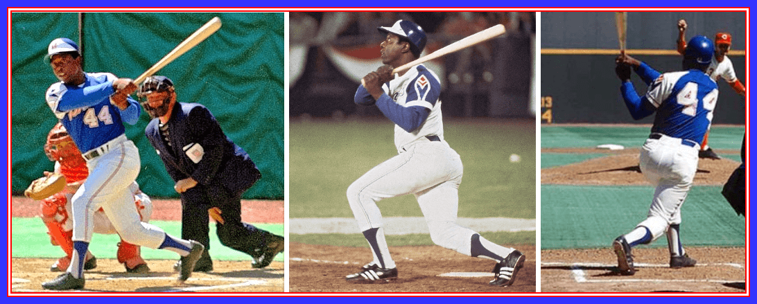
Sand-Knit made the 1972-73 uniforms and the team was dissatisfied with the fit and quality, so in 1974, they contracted with Wilson to basically replicate the uniforms from those two seasons. Gone were the henley collars (they became standard pullovers with a v-neck), and the numbers changed from the unique font to a standard block. To the untrained eye, they looked basically identical to their predecessors, but these changes are noticeable when pointed out. Of course, these are usually the uniforms everyone remembers of this 4-year stretch, because they were worn by Henry Aaron as he chased, caught, and passed Babe Ruth, becoming the home run king of baseball in 1974.

1974-75 Home

1974-75 Road
I would argue that even though these uniforms were worn for a four-year period (they’ve been in their current look for 32 years and counting — and those themselves are basically throwbacks!), THESE are the Braves signature uniforms. It’s not a clear-cut, 100% slam-dunk, as the current unis are quite distinct themselves (no one else has a uniform with a tomahawk!), but no one ever wore uniforms that looked like the 1972-1975 unis either. The royal blue and white (with just enough red) was so unique and distinct, it really stands out as the uniform you think of when you think “Braves.” It didn’t hurt that Aaron wore them when he broke Ruth’s record, leaving younger generations with both video and plenty of photos of this uni (plus the Braves have thrown back to this era — although note in the photo of John Smoltz, he’s wearing contemporary, not throwback pants). It’s beloved in Atlanta and elsewhere.
Sadly, the team ditched these beauties after only four seasons, continuing the rapid uni-turnover that had become prevalent in Atlanta. For the bicentennial of 1976, the team dumped the raglan sleeved jersey and went to a standard pullover, adding more red on the home uniform. They also added red pinstripes to the home uniform, keeping the royal blue script and numbers outlined in white and red. The caps would remain unchanged and the stirrups would stay blue. Pants remained belted.

1976-79 Home
Interestingly, the road uniform, which also changed for 1976-79, retained much more of the prior look than did the home. The royal blue was changed to gray, but the raglan sleeves remained (though they lost their red piping), along with the signature feather logo on the left sleeve only. For the first time since their move, “Atlanta” appeared on the jersey, in a similar script to “Braves.” Though the uniforms were gray, the wordmark and numbers were outlined in white and red and the sleeve ends were also white (in and of itself a pretty unique look).

1976-1979 Road
Both the home and roads began life with NNOB, but that wouldn’t last long. It was during this period that Braves owner Ted Turner decided to have some fun and added NickNOBS to many of the jerseys. Back in 2016, Paul penned a great piece for ESPN detailing the NickNOBs, and Uni Watch friend/God/guru Bill Henderson also noted it in his “Game Worn Guide to MLB Jerseys”:


As the 1970s turned to the 1980s, the Braves would again change uniforms. The home uniforms lost the red pinstripes, but retained the wordmark and number styles. Jerseys would remain v-neck pullovers, with a red/white/blue trim on both the collar and sleeve. They would finally ditch the belted pants style, opting for the “sansabelt” style popular for many years — the waistband would also be red/white/blue, and the pants would have thin red and blue piping down the legs. The team would make several one-year only changes before tweaking the uniforms going forward. On both home and road, the caps would remain the same as the previous seasons (two panel with lower case “a”). The last vestiges of the “feather logo” on the sleeve would disappear with the new road uniforms. They would also move from gray to powder blue (kind of late to that party by MLB standards, but many teams were wearing blue at this point — Paul’s recent column depicts this movement well). They’d resemble the homes moreso than the recent set, as they too were v-neck pullovers; however, these would be devoid of any red. The collar and sleeve piping would be royal/white/royal, and the “Atlanta” wordmark and numbers would be navy with a solid white outline. Pants became sansabelt with blue/white/blue waistband and piping down the legs.

1980
In 1981 the uniforms would be slightly changed. The on the homes, the cap would become solid blue and the lower case “a” was replaced with an upper case “A.” On the roads, the “atlanta” would become “Atlanta” but otherwise was exactly the same as the 1980 road. The cap went from white front panel to solid blue as well.

1981-1986 Home

1981-1986 Road
I happen to love this look. Powder blue isn’t usually associated with the Braves, but it worked well. But they’d only wear these uniforms for seven seasons, and as the team was pretty terrible at the time, those uniforms are not nearly as beloved as they might otherwise have been.
After wearing five different uniform styles (with tweaks to those) between 1966 and 1986, in 1987 the Braves would introduce a uniform that they continue to wear today. That uniform was almost a throwback itself, resembling one worn in both Boston and Milwaukee. The new uniforms were a return to the “traditional” look that began a few years earlier in baseball and which really took hold in 1987 (five teams, including the Braves would ditch contemporary looks for more classic ones that season). Their new uniforms would be button fronts with belted pants, with the familiar “Braves” script in red outlined in navy blue on the homes, and “Atlanta” on the roads. Neither uniform would have front uni numbers. The headspoon piping would thick red outlined in navy, and sleeve trim would follow the same pattern. A large red tomahawk underlining the wordmark would return (previously it had been rendered in dark navy or black). Numbers would also be red with navy outlines. Pants piping would feature the same style. The road uniforms would be gray with “Atlanta” in the same red/blue pattern as the homes. Caps would become two-tone, with a blue crown and red bill. The uniforms introduced in 1987 are basically identical (with some very minor tweaks) to the ones they currently sport. Since anyone who is a millennial or younger has probably only seen the team in these uniforms, one could make an argument they qualify as a “signature” uniform. But longevity doesn’t necessarily equate to signature, though the look is quintessential Braves.

1987-Present Home

1987-Present Road
Rather than mess with success (and the Braves would rapidly become successful in these uniforms, beginning in 1991), the team kept them. And kept them. They continue wearing them today. The would, however, succumb to another MLB trend (albeit late in the game there too), by adding alternate jerseys. The first came in 2005, when they added a red home alternate. It would be similar in style to the home/roads, but feature “Braves” in navy script outlined in white, with a navy blue (almost black) tomahawk. They’d keep this jersey through 2013.

2006-2013 Red Alternate
Shortly thereafter, the team decided it needed a road alternate, and in 2008 added a navy blue road jersey. This would keep the same Atlanta wordmark as the roads, and the dark navy tomahawk. However, this one contained, no headspoon or sleeve piping, and the “Atlanta” was rendered in the same navy blue as the jersey, with a thick white outline. Numbers would follow the same pattern. The team would add a solid navy cap to the rotation (to be worn almost exclusively with the navy jersey).

2008-Present Blue Alternate
While the Braves never changed their home uniform from the 1987 model, they did add a cream alternate to the mix in 2012 — this one would also be throwback-ish in nature, as it resembled the uniform they wore when they moved to Atlanta in 1966. The familiar Braves script in red with blue outline was there, but this had a thinner navy blue headspoon and front numbers (red outlined in blue). New cream pants with the same navy piping were also added. They’d wear these for weekend games. One change from the 1966-67 unis was the removal of the “screaming/laughing brave” from the left sleeve. A new logo with two crossed tomahawks and the number “1876” appeared (1876 refers to the Boston Red Caps — the predecessor of the Boston Braves, and from whom the team traces lineage).

2012-Present Cream Alternate
Not satisfied (apparently) with the red alternate introduced in 2005, and deciding they needed a tribute to the armed forces, the Braves introduced a new red alternate in 2014, with a more patriotic flavor, officially dubbed their “military appreciation” uniform. It is very similar to the red alternate it replaced, only this one contained white stars within the “Braves” wordmark. Originally worn with the regular cap, eventually the Braves wore all kinds of caps with it, including a new “military appreciation” model as well as first responder caps.

2014-Present Red Alternate
And there you have it — 53 seasons and counting of Braves uni history, and I would argue (though not as strongly as I’d like) that the team’s signature look was found in that brief period in the 1970s when they first began wearing polyester. It’s certainly a look no one before or since (with the exception of the Braves themselves during throwbacks) has worn, and it’s what I certainly think of when I think of a look that was theirs alone. But I wouldn’t argue too strongly with you if you wanted to say their current look, as classic and refined as it is, is their signature. Certainly no other team has a look like that (unless you count Cleveland’s Native imagery, but no tomahawk). I think that raglan jersey with the feather on sleeve design (and the mostly solid royal road top) was of its time, for sure, but it encapsulated the Braves of the early-mid 70s and beyond…so well.
Your thoughts?


Old Time Base Ball Photos
Readers will recall I featured Ronnie Bolton (who posts on Twitter as @OTBaseballPhoto and who you should definitely follow) earlier this year with some great football played on baseball field photos and writeups, some MLB Opening Day specials, and more recently with some old baseball stadia (here and here). As his twitter handle implies, Ronnie’s specialty is old baseball photos.
With my look back at the Atlanta Braves Signature uni(s) today, Ron’s got some old time photos of the Braves in their three homes: Boston, Milwaukee and Atlanta.
Enjoy. Here’s Ronnie:
Boston Braves

Boston, MA, October 6, 1948 – The Indians Dale Mitchell squares away to bunt against Braves ace Johnny Sain in the first game of the 1948 World Series. Sain would pitch a four-hit 1-0 shutout against Cleveland. The Indians started their own ace, Bob Feller, who took the loss despite giving up only two hits and giving up the only run in the game in the eighth inning, a Tommy Holmes RBI single scoring pinch-runner Phil Masi.
Despite taking the first game of the series, Boston would lose in six games as the Cleveland Indians would win only their second title with the other coming in 1920.
We would like to give Tom Shieber, Senior Curator at National Baseball Hall of Fame, big props for nailing down this photo as we only knew it was taken during the 1948 World Series. But due to his always diligent and excellent sleuth work, he was able to ID not only Johnny Sain but the home plate umpire (George Barr). He also suspects this photo was taken during the third inning of the game and we suspect he is right.
Boston was the first leg of a three-city journey for the Braves starting in 1871 as the Red Stockings and leaving for Milwaukee after the 1952 season.

till a fire destroyed the 6,800-seat ballpark in 1894

Boston Braves, his stay with them was brief and disastrous
Milwaukee Braves

Yankee Stadium, Bronx, NY, October 10, 1957 – Milwaukee Braves ace Lew Burdette has the New York Yankees on the ropes in the ninth inning of Game Seven and his team up 5-0, and the West Virginia native did shut New York down in that final inning to secure for Milwaukee their first World Series title (second one for the Braves franchise).
Burdette would be named the World Series MVP for posting a 3-0 record and a minuscule ERA of just 0.67. His most impressive feat in the series was shutting out the reigning champs in Game Five and Seven and on just two days rest. In those two games the crafty right-hander allowed 14 hits in 18 innings and walking just one Yankee.
They would repeat as NL Champs the the following year (1958) and face the Yanks again, but this time losing in seven games.
But this 1957 World Series victory was the pinnacle of the Braves relatively short stay in Milwaukee. They rolled into town in 1953, won a World Series in their fifth-year in Brew City and rolled out of town and headed south after the 1965 season.


first that year in the National League in attendance
Atlanta Braves

Atlanta Stadium April 12, 1966 – As both teams lined up for Opening Day introductions to start the 1966 season, the team on the right has to be wondering if the old proverb “third time’s a charm” would prove to be true. They are now in their third city in fifteen years.
On this historic night in Atlanta, the Braves tried their best to make an good first impression in their new city for the 50,671 fans who came out that night to battle the Pittsburgh Pirates for thirteen inning before succumbing in a 3-2 defeat.
The Braves first quarter century in Atlanta was a rocky road to say the least. In 25 seasons they finished in last place nine times while winning the NL West just twice (1969, 1982). But in 1991 their fortune changed and they won their division fourteen of the next fifteen years and a World Series title in 1995. It would be the Braves franchise’s only third title win, but conveniently they won a World Series in each city they called home: Boston 1914, Milwaukee 1957 and now Atlanta in 1995.


Thanks, Ronnie. He’ll be back periodically with more wonderful old photos and the backstories that go with them.

Last year, reader Ed Kendrick provided uniform tracking for us for four teams: the Arizona Diamondbacks, Washington Nationals, Boston Red Sox and Baltimore Orioles. This year, he’s added a fifth team, the San Francisco Giants.
You can check them all out via this link.
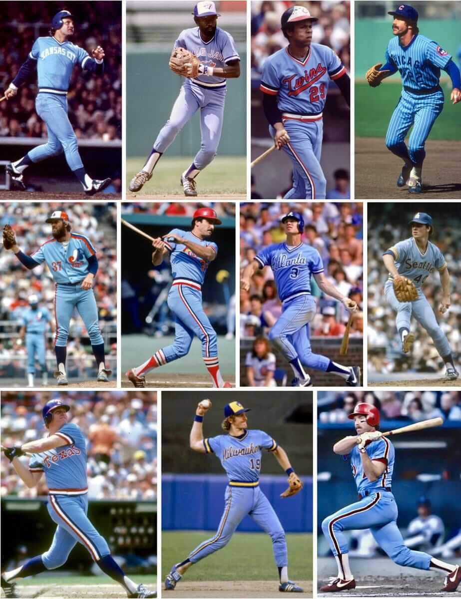
Click to enlarge
And now a few words from Paul: Hi there. In case you missed it on Friday, my latest ESPN column looks at the past, present, and possible future of powder blues (including 1980 and ’81, when a record 11 teams wore them, as shown above). Check it out here.
Also:
• Our friends at Ebbets Field Flannels are currently raffling off a very cool-looking Fort Worth Cats T-shirt. Full details here.
• The Syracuse Chiefs have revealed the full details of their Brannock Device Night promotion, which will take place on May 31 (with yours truly throwing out the first pitch). Full details here.
We now return you to your regularly scheduled Phil phantasmagoria.
Uni Watch News Ticker
By Phil

Baseball News: Tweeter Reid Cure asks, “I could be behind here, but I don’t know if I’ve ever seen a baseball team wear a sticker honoring someone in this helmet location.” True, they’re almost exclusively on the base of the back of the helmet. … “What’s the name on Steve Cishek’s glove?” asks Michael Kelley. “It’s certainly not Steve Cishek.” Turns out it’s Manuel Domingos, the name of his grandfather (thanks AJ). … Turns out facial protection is important: the Cubs’ Kris Bryant envisions even wider adoption of protective helmet flap. … Stirrups in softball aren’t common, but Nik Streng thinks white stirrups over white sanis kinda defeats the purpose of the stirrup. That’s CC of Spokane. — Matt Eliot provides another example, showing how colored stirrups over white sanis really are a sharp look. … WHOA: Check out these awesome late-1800s LSU unis (from Preston Kennedy). … In honor of yesterday’s Kentucky Derby, the Potomac Nationals had a pretty cool giveaway & jersey (from MiLB Promotions). … In a welcome move (although I thought many Little Leagues had moved to full cages), some Little Leagues are now adopting the C-Flat helmet extension (from Alexander Gannias). … The Charleston RiverDogs wore special Jamaican Bobsled-themed jerseys to celebrate the 25th anniversary of “Cool Runnings”, with an appearance from Doug E. Doug, aka Sanka from the movie (from Nate Kurant). … The Frisco RoughRiders had one of the best Cinco de Mayo jerseys yesterday (from MiLB Promos). … Here’s a fantastic photo of Bob Boone in an Alaska Goldpanners vest (from GOAT Jerseys). Note the zipper! … In honor of Cinco de Mayo(?), the Arizona Diamondbacks became Los Diamondbacks last night (from Ed Kendrick). … Add Phillie Carlos Santana to the list of players wearing the C-Flap helmet extension (from Blake Fox). … I usually detest softball colored jerseys with gray pants, but when paired with a gray cap< EMU makes them look good! (from Eastern Michigan U Baseball. … The historic Fox Theater served as the basis for the crown of the Oakland Athletics’ 50th anniversary logo (from Joey Post). … YES! Looks like the Arizona Diamondbacks bullpen cart is being used. Although it looks like it’s the Astros who took advantage (from Brad Darby and Rusty Flyn). … Must have been pretty cold in Oakland last night (from Josh Claywell). … You’ve always wanted to see Bob Uecker in a Milwaukee Braves zipperfront jersey, right? Of course you have (from Goat Jerseys). … Proof this cleat police shit is getting out of hand: the A’s Jed Lowrie was fined for wearing cleats in a non-standard color. No they weren’t white, but they were green (from Richard Paloma). … But apparently these cleats are OK (from Maximiliano) … Patrick Lenertz notes “Welington Castillo has his catchers mitt tethered to his wrist Nintendo Wii style.” … The Arkansas Travelers wore special Super Hero jerseys last evening (from Blake Parker).

NFL News: Eight Browns rookies have picked their jersey numbers. … Now that the Titans and Jaguars have released their new unis, something called the Spin Zone has released a list of the Best uniforms for all 32 teams. … The KC Chiefs have also given their rookies uni numbers. … Michael Princip notes the F7 sightings at NFL rookie camps. 49ers & Jets.

Hockey News: There is a bar in Seattle called “The Angry Beaver.” But that’s not even the best part. Said bar has a pretty amazing sweater collection (from Ryan Wetstein). No that’s really his name.
.

NBA News: For the first time all season, this deep into the playoffs, ESPN finally used a red score bar for the Jazz to match their City alternate jerseys (from multiple submitters, but Steve Carter was first). … Here’s a question no one some must be asking: “Why do the Philadelphia 76ers have a snake on their logo at center court?” Here’s your answer. … ESPN is running a hybrid, unofficial Pacers logo on their story about Cory Joseph (from George Miller). … Keenan Soto writes, “very odd add on Instagram. “Dallas Mavericks” in a Spurs logo and advertised as a “Rockets Playoff T.” Huh??”

Soccer News: There is now a new badge for newly promoted French side Nimes (from Ed Żelaski). … The Chinese Super League (CSL) is reported to sign a ten-year extension with its current sponsor Nike, according to Chinese newspaper Beijing Youth Daily (thanks, Paul).

Grab Bag: The NCAA’s website has selected its 21 favorite “offbeat retro college sports logos.” There are some real classics on that list (great submission from Kary Klismet). … The world’s oldest standing army is getting some new headgear. The Pope’s Swiss Guards plan to replace their metal helmets with plastic PVC ones made with a 3-D printer, giving the pope’s army cooler and more comfortable headgear when standing guard for hours at a time.
Love the series! Keep it coming! If we were debating Atlanta’s best uniform, the leaf-sleeved pullovers would definitely give the modern uni set a run for the money. But for signature, I just don’t think there’s a debate to be had. The 1987 set established a unique look in MLB such that a TV viewer could instantly recognize a Braves player from the shortest of highlights, home and road. Blue and red cap, headspoon, script on front? Brave. And the ‘87 incorporated elements of pretty much every uniform the Braves have worn since at least the 1940s. And aside from a few recent, uniformly negative, tweaks, they’ve maintained that look for 30+ years.
I’d be curious to see a Venn diagram charting the overlap between people who see the feather-sleeve pullovers when they think of the words, “Atlanta Braves,” and people who either were between the ages of 5-17 in 1974 or were residents of Georgia in the late 1970s.
I agree that 1987 to present would be the signature. Home white and road greys.
Likes and dislikes:
I really like the 2012-present cream alternate with the crossed tomahawks on the sleeve. Looks better in my eyes then the primary home white uniform.
I dislike the solid navy cap worn on the road. Braves should wear red billed cap at home and on the road like they used to.
All of Atlanta’s alt jerseys have been abominations against good taste and public decency. But I’d forgive all of them if the Braves would just stick to the single red-brim cap home and road. Even with teams like Minnesota and Washington stupidly adopting navy with red brim caps, that cap style still says “Braves” on first glance. If you’ve got a uni element that allows the most casual fan to identify your team from even the briefest video highlight clip, then you darn well wear that uni element every game, home and road, and count yourself lucky because only about five other teams even come close to that level of distinction in their uniforms.
The 87 set is definitely the “signature” look. It’s distinctive (script, headspoon, tomahawk), historic (with links to both Boston and Milwaukee), and long-lasting in its own right in Atlanta.
Supporting what’s been said here – if we’re going for “signature look”, it has to be what comes to mind first for most people when thinking of a team. Yankees in pinstripes. Cardinals with the birds on a bat. The Braves’ current look IS their signature look. Has been for 30 years straight and WAS their look through the Milwaukee years.
Now, if you want to argue “best” or “most distinctive”, that’s a different argument. I like the mid-‘70s departure from tradition on its own merits. But it is not their signature look. Nor, IMHO, is it their best look.
I love this series. So well done.
Did anyone ever explain why the mid-‘70s helmets had white brims but the caps had blue brims? Or why the helmet capital script A always looked so bulky and handmade compared to the cap A until last season? That discrepancy never gets the publicity of the differing Tigers’ D or Yankees’ NY, but it always confused me.
“The cap would sport a lower-case “a” and in 1972, with the Braves hosting the All Star Game in Atlanta, a logo patch on the side.”
I am fairly certain that they did not wear an All Star Game patch in 1972. That is a modern fauxback. Cap patches were not a thing until the 1990’s.
Lou is right. But later in the 70’s (76 or 77?) the road jerseys had a patch on one sleeve.
All of the above with respect to the 1987-to-the-almost-present Atlanta Braves look (obvious demerits already issued for the all-navy cap and needless alternates, plus another demerit for the abandonment of VAL), but you know what else is super unique to the Braves? Gorgeous pants piping, including around the belt tunnels.
So yeah, sorry Phil, you might have identified what was worn during Henry Aaron’s signature moment as a player, but I’m going to the 90’s for the Atlanta Braves’ signature look.
Yes, agreed completely on the VAL!
Agree on the pants piping and the VAL.
I was born in ‘68 and grew up in Atlanta (for the most part). I was there in late 70s and 80s. I’d say I most relate to the Hank Aaron record breaking uni mostly from pictures. The powder blue and vneck white 80s versions are horrible but a big part on my channel 17 Braves watching experience. Current uni is the successful one so I’m going with that as the signature look.
Great work. I was six when the Braves moved south, and have been going to games ever since. When the “feather” unis came out in 72 I loved them, and have ever since. I’ll agree with Phil – those feathers are ever bit as iconic as the tomahawk. Lots of fans still wear the feather to games all these years later. And as a lifetime Braves fan and uni watcher, each and every uni was special in its own way.
What is attached to the EMU belts, a faux fanny pack?
It appears to be a wristband similar to what quarterbacks wear, with a playcalling shorthand chart that gets inserted into a pocket with a clear cover. In the case of baseball, teams are using them to remind the players of their suggested defensive positioning, based on the batter and pitcher. Major league teams are beginning to use these a lot.
Love the Old Time Baseball Photos. Babe Ruth’s front foot was pretty far out of the batter’ box.
The Reds wore their “Los Rojos” uniforms last night.
The Braves current set is undoubtedly the signature look. I don’t even think it’s a debatable. It just strongly resonates as the representation of the team. It’s been a classic, iconic, identifiable look, it has been a long term look, and it’s has been around for a long period of dominance throughout the 90s and 2000s.
Other than “I just like the 70s uniforms” or “hey, Hank Aaron broke Babe’s record in these” I don’t know what justification there could be. Phil, if you surveyed 100 people, I think all 100 would disagree with you.
This is one of the easiest, slam dunk decisions of all the MLB teams. The signature look of the Atlanta Braves is the 1987-current uniform.
I love this series, but it seems very predictable. What the team wear in the 70s or early 80s = Signature Look
Brewers wore their Cerveceros jerseys for Cinco de Mayo yesterday
and I agree the 87 is the Braves signature
The Braves’ current look has longevity, unicity, and success in its favor. It’s their signature.
Yes the set Aaron wore in 74 will be long remembered. So are the dorks who chased him around the basepath. Doesn’t make either thing something people should want to remember.
After a brief angry beaver diversion – I woulda gone with the white Isles sweater instead of the blue – I give you the 1980 Braves pullovers with the small ‘a’ cap. If it’s not their sig look, by golly it’s their sweetest.
I miss the fat A on the batting helmets! Why did you guys have to take that from us Paul?!
Have to say this Atlanta Braves “Signature Look” is a big miss. The 1987-Present is what I think of when thinking of the Atlanta Braves. Sure Hank broke Babe’s HR record in those softball unis, and that too bad. When I think of Henry Aaron I think of him in the uniforms of his early career, which is very close to the current set. Always loved the navy blue hat with the red bill. Wish the Angels would go back to this.
I’m going to have to agree – the 1987 to present uniforms would be their signature look to me.
I’m going to be the contrarian here. While I have no bias against the Braves, I don’t think they’ve had an attractive uniform combination since moving to Atlanta. Not one.
One item not mentioned in the early 70s feather set was the change over in style of the Braves scripts. The 72-73 set had a totally new Braves script that had never been worn before. It also happened to pale in comparison to the more familiar design which they reverted back to just in time for Henry Aaron to break the Babe’s record.
A day late. great colorizations yesterday by Matt. But Phil and the Calvin and Hobbs strip about was the world in black and white really made me smile. That was a classic from the overall fantastic comic strip.
I had that one strip saved and posted it before for people who do not like colorizations and those who do.
Great work on the atl braves signature feature today.
Thanks for the hard work
Really enjoy the work you’ve put on on the series. I agree this is the Atlanta Braves look. Boston not Milwaukee can claim it. Right on.
“nor Milwaukee”
The signature look is the current one which harkens to the Milwaukee days. The BEST look is the early 70s feather (which I thought was a torch like the old Amaco logo) jersey. Despite our disagreement I applaud today’s post.
The only thing that would make the current Braves look better would be adding the brave head back to the shoulder.
The current uniform is the signature.
C flaps are actually being banned from Little League, as the guard-helmet combination is not compliant with NOCSAE standards required by Little League. Furthermore, most helmets are being altered (drilled) to attach the guard, thus making the helmet itself non-compliant with the NOCSAE standard.
Current look is not only the signature look, it is also BY FAR their best. They have stuck with this uniform set for a reason, the Scarlett and Navy is gorgeous. The red-billed hat is one of the league’s top branding pieces and needs to be worn with all uniforms, not just the home one. In fact, other teams shouldn’t even be allowed to have a navy hat with a red bill as it is so quintessentially Braves.
I hope they ditch the Navy alternates ASAP, they are so bland and ugly, it is absurd that they couldn’t even be bothered to choose a seperate color for the wordmark on the chest and the numbers for a bit of contrast. Would it have killed them to add some sort design aspect like piping or stripes? These dark, depressing unis scream “we are villains!”, and thats coming from a Braves fan.
Sorry but the Angels always had this navy hat with red bill until they went all red with Arte Moreno.
Well seeing as the Braves cap with the navy crown and red bill dates back to the 1930s through both stops in Milwaukee and Boston, I’m confident the Braves have the Angels beat.
I really like those dark blue ’70s Braves road uniforms; the double outline on the number makes it pop.
What’s with the terrible positioning of the number on the ’72 home jersey? Is that a game-used jersey or a bogus modern replica?
Also, is the number font they used in the early ’70s the same as the one the Astros used on one of the early iterations of their rainbow jerseys, when they put the number in a white circle?
Thanks – love the articles in this series. Are my eyes playing tricks on me or is the Braves away jersey just as white as their home jerseys? Or are they just a slight tint of gray?
The mid-70s Braves unis. Signature. April Fool’s Day was over a month ago, guy.