By Phil Hecken
Follow @PhilHecken
Back in 2016, I began undertaking a series of entries looking at a team’s “signature” uniform. Loosely defined (and subject to interpretation) a “signature” uniform would be a uniform which one might definitively associate with a team, the one which stood out the most over the years. A signature uniform is not necessarily a team’s best uniform, or one which the team has worn the longest (although either of those could still apply), but rather the one uniform that, when you think of how a team looked at their most distinct, you have their signature uniform. Last weekend I resumed the series with the Montreal Expos.
If you missed the previous entries in the series, you can see them at the following links: Indians, Pirates, Astros, Mets, Rays and Padres.
Today we’ll look at a team which is celebrating it’s 20th anniversary this season, the Arizona Diamondbacks, and who will actually be wearing their 1998 throwback uniforms this evening (which is why we’ll examine them today). Two important questions here: can a team that’s only been in existence for two decades have a signature uniform? And, as we’ll see, can a team that has worn almost as many different uniforms and combinations over the decades as the Oregon Ducks have a single uniform that you truly think of as their signature? Surprisingly, that answer is …
maybe. OK, likely, yes.
The D-backs uni history can be broken down into three segments — the “purple and teal (and black)” era, “Sedona red and black” era, and the “sublimated snakeskin” era. Let’s begin.
Right out of the box and before they’d even played a single major league game, the team introduced what would form the basis of their original uniforms in 1995(!), showcasing even then a number of options available:

As you can see, the “primary” uniform (white & gray) were both pinstriped with purple stripes, the home consisting of a slightly angled “Diamond Backs” (double stacked) with the road having “Arizona” (also slightly angled) rendered in purple and teal. Also shown there are purple and black alternate jerseys (which could be worn with both home and road pants), as well as a vested (really, a sleeveless jersey) white alternate featuring the “A” logo. Also pictured are three caps (though they would add more).
From 1998-2000, the team did indeed wear many of the combinations shown above; they’d add a few more as well, including additional caps.


By 2001, the team had assembled (mostly through free agent acquisitions and trades) some pretty good talent. They’d begin to add in additional uniforms to the palette and would drop the original black jersey (with the “A” on the left chest), the sleeved road pinstripe and the original white jersey with “Diamond Backs” fully spelled out. In their place, a sleeved white pinstriped jersey with the “A” logo, a new black alternate, and a sleeveless gray road jersey would be added. By 2002, they’d stop wearing the purple alternate, and they would add another new black alternate in 2005. All of this for a team less than 10 years old at the time.


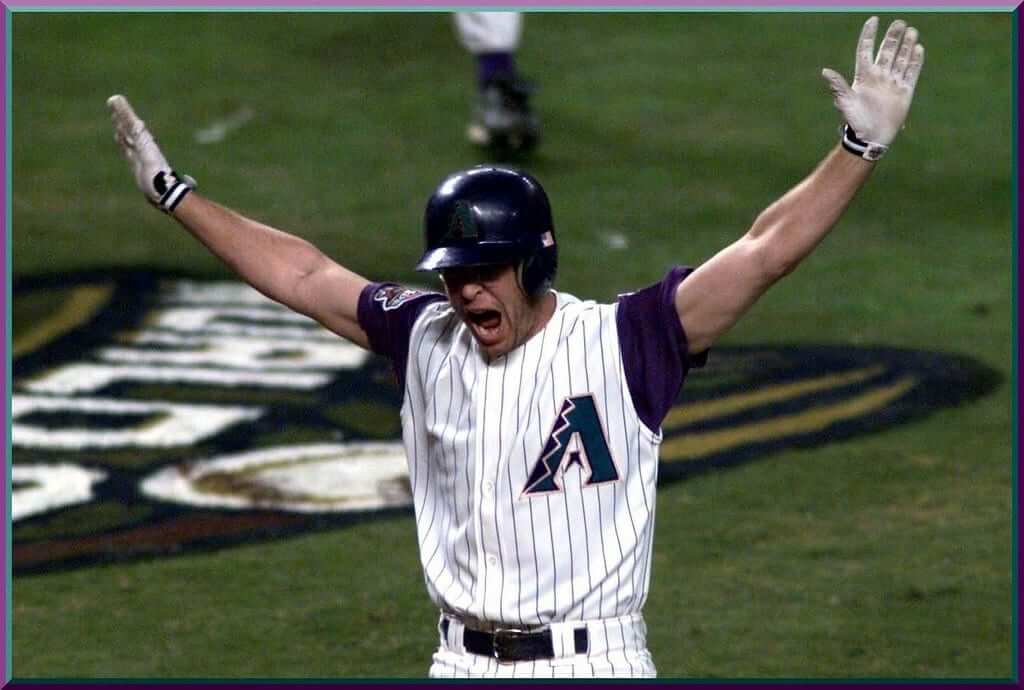
Of course and most notably during this time, the team won the 2001 World Series (in only their 4th year of existence), wearing what we would most likely consider to be their signature uniform. The sleeveless “vest” with purple undershirt:

Even with all the different combinations and iterations the team had worn up to that point (and since), the look that has come to best represent a “signature” uniform was the one they wore on that fateful night in November 2001, when they captured their first (and only) world series.
Following the conclusion of the 2006 season, it was time for the D-backs to change things up, and this time, in a radical way. The purple and teal, remnants of the mid-90s purple/teal craze in uniform design, would be jettisoned. A new look was on the way.
In 2007 a complete rebrand would take place, with the colors changing to “Sedona” red, black and “Sonoran” sand. While they would keep the team’s “A” logo and “coiled snake” D logo (though in new colors), the full word “Diamondbacks” would never again appear on a uniform. Diamondbacks was shortened to “D-Backs” on the home (in a new font) and red alternate jersey. A gray road uniform would use the word “Arizona” and the new black alternate jersey would keep the “A” logo. A new logo was introduced featuring ‘db’ in lowercase lettering as a sleeve patch (some folks observed the logo being somewhat phallic in design).


You can see a look at the two uniform sets (1998-2006 and 2007-2015) in a pretty good video, below:
And prior to the current uni, the Diamondbacks had worn a LOT of different caps.
The Diamondbacks would keep this look for nine years (from 2007-2015), when their identity changed once again. While the colors would basically remain the same (though a tealish color was added to some of the uniforms), the new uniforms took on a look never before seen on a major league diamond. The team introduced a “sublimated snakeskin” into the new uniforms (and there would be many of those) — including TWO different home white uniforms, TWO different dark gray road uniforms, and a black and red alternate jersey (along with numerous different caps). The black jersey retained the former “A” logo, while the new white, dark gray and red alternate all took on new wordmarks.

The primary home uniform would be white with red sublimated snakeskin on the shoulders and on side panels. D-BACKS in all capital letters would be the wordmark, and numbers and letters would be rendered in red/black/sand coloring.

In addition to the snakeskin on the jersey, the pants would feature a truncated pants stripe (common to all the new uniforms) and sublimated snakeskin that extended from the calf to the bottom of the pants leg. It was…different.

The secondary home uniform featured a slightly different snakeskin pattern (this time on the back of the uniform) and pants. This uniform would have a black/red/teal pattern, with teal/black striping.


The primary and secondary road uniforms would be similar — the red/black primary would have the same snakeskin pattern as the home primary; likewise the secondary dark gray uniform would have the same striping as the home secondary. Both said “ARIZONA” in capital letters across the front, and both were a much darker gray than any other road uniform in recent history (and maybe ever).


The red alternate would be similar in colors and striping to the home and road primaries, while the black alternate would use the old “A” logo and have sublimation patterns on the shoulders and side panels like the primary uniforms.


A look at the 2016 uniform unveiling can be seen below:
Realizing the pants with the “bloody cuff” and truncated stripe were probably a bit too radical, in 2017 the Diamondbacks toned them down just a bit — extending the pants stripe the full length of the trouser and eliminating the sublimated pattern altogether. While it’s still a very “forward” uniform design, the pants have gone back to a more traditional look.


I’m not particularly a fan of any of the D-backs unis or combos, but I think many (most?) of you would agree they basically got it “right” (trendy teal & purple of the time notwithstanding) from the get go, and each subsequent iteration has been a downgrade. But some fans…they love them all:
20 years of baseball means 20 years of uniforms! What do you think of my collection @Dbacks? #GenerationDbacks #MLB #Dbacks @AZSports @FOXSPORTSAZ pic.twitter.com/O47bGtc6ye
— Sean Lindsey (@seanplindsey) March 31, 2018
Each uniform set the Diamondbacks have worn in the their 20 year history has lasted 9 years (will the current one last nine as well?). Were it not for a Luis Gonzalez flare in November 2001, the Diamondbacks might very well not even have what one could call a “signature” look, but if one were hard pressed to come up with one — that would be it. And I’m sure most Diamondbacks fans who were alive back then would agree that the sleeveless jersey with purple sleeves during the ‘original’ purple/teal era would be the one. If we revisit the D-backs in another six years, and assuming they keep the current uniform set largely in tact — the current duds might very well be considered a “signature” (though which of the six different combos would be a tough call) uniform. For now, we’ll stick with the one that gives us the fondest memories.
Your thoughts?


Classic Ballpark Scoreboards
Our scoreboard creator Gary Chanko, after a long hiatus, has returned to grace us with “Series V” in the set of Classic Ballpark Scoreboards. This feature will occasionally appear on weekends.
Here’s Gary (click on image to enlarge):
Classic Ballpark Scoreboards – Series V
by Gary Chanko
In this edition of Classic Scoreboards it’s off to Jacksonville, Florida to visit a classic minor league ballpark with a unique scoreboard.
Wolfson Park

Baseball Home of: Jacksonville Braves (South Atlantic 1955–60),
Jacksonville Jets (South Atlantic 1961),
Jacksonville Suns (International 1962–68); (Southern 1970–2002)
Opened: March 16, 1955
Closed: September 2002
Demolished: 2002
For five decades Wolfson Park was home to Jacksonville’s minor league baseball teams. Originally known as Jacksonville Baseball Park, it was renamed in 1963 after the death of long time local baseball owner and then president of the Jacksonville Suns, Samuel W. Wolfson.
Wolfson Park was located adjacent to the Gator Bowl. When opened it was considered one of the best minor league ballparks.
In 1962 the Jacksonville Suns became a new addition to the triple A International League. With that came the creation of the ballpark’s iconic sun-shaped scoreboard. By 1980 the scoreboard now featured advertising on the lower portion and was showing signs of needing a replacement. The replacement arrived the 1980 season.
Wolfson Park was finally replaced with the new Baseball Grounds of Jacksonville in 2003. It now the home of the Jacksonville Jumbo Shrimp Southern League franchise.
Sun Shaped Scoreboard
The illustration depicts the scoreboard during a game with the visiting Atlanta Crackers. The exact game date is uncertain, but it was played during the 1962-64 seasons.
A Few Things to Know
• The infield was all grass with sliding pits around each base, similar to artificial turf fields. By the late 1970s the infield was converted to traditional dirt.
• The scoreboard was located outside the ballpark across a street boarding the outfield fence.
• Many of baseball’s greats (and one NBA great) have played in Wolfson Park:
Hank Aaron
Randy Johnson
Phil Niekro
Nolan Ryan
Tom Seaver
Hoyt Wilhelm
Michael Jordan (Birmingham Barons, 1994)
• Here’s a complete listing of Hall of Famers and other notables who played at Wolfson Park.
If anyone is interested in purchasing a digital copy of these posters, Gary is working on an online purchase option. In the interim you can contact him directly at Classicscoreboards@gmail.com.

Kreindler’s Korner
I had the distinct pleasure of featuring the wonderful artwork of artist Graig Kriendler on two occasions over the summer and fall of 2017.
For those who don’t wish to click the links, Graig paints baseball heroes (and regular guys) from the past, and is an immense talent.
Occasionally, I will be featuring his work on Uni Watch.
Here’s today’s offering (click to enlarge):

Title: “The Christian Gentleman”
Subject: Christy Mathewson, 1911
Medium: Oil on linen
Size: 26” x 36″
From the moment I saw this original photo by Charles Conlon, I KNEW it was something I was going to paint. It was always a goal to paint the man, after having read about his exploits on the diamond, as well as how he was adored by fans, the press and even his opponents. At the risk of sounding flaky, when I begun painting, it had awoken something in me and how I viewed my work.
A lot of my paintings are based on photography after all, and when I was first getting into the habit of doing them, it was little more than an exercise of getting the colors and values right. In other words, the end goal was making it seem ‘realistic.’ But it was here that I really started to think about my work in a new way. If I pushed myself harder, the paintings could be a window into the past. Not just seeing these players in color, but really feeling like you were there in front of them. It was important to not only get the portrait right, but the viewer had to feel the sweat on Christy’s forehead, or the overcast sky reflecting into his skin and hair. Also, the jersey really had to undulate in space, not just be an exercise in rendering; it should feel like fabric, there should be dirt stains, loose threads, or anything else I could think of that better told the story about the subject.
Even when I work today, I get caught up in stuff like that – it’s just become part of my process. And I really didn’t start thinking that way until Matty came along. Boy, I’m sure glad he did.
Thanks, Graig! You can (and should!) follow Graig on Twitter.
The Ticker
By Anthony Emerson

Baseball News: Here’s something I’d never knew before: at least one member of the Harlem Stars, Goose Tatum, of the Negro Leagues wore shorts. No in game shots unfortunately, so maybe they were just warmups, but this was decades before Veeck’s experiment with the White Sox. Faaascinating (many thanks to Bill Walker for sending this our way). … An as-yet-unidentified Tiger was wearing last season’s home jersey during yesterday’s game against the Pirates (from @JudsonK17). … Christian Yelich of the Brewers is now wearing a batting helmet flap (from @SoCalMindset). … Also posted in the NHL section: the Blues gave away these Blues/Cards crossover jerseys last Tuesday (from: @bmitchelf). … The Yankees need the express written consent of Major League Baseball to put their own players faces in beer foam (from Al N. Kreit). … The Lexington Legends, Single-A affiliate of the Royals, launched their new alternate yesterday (from Josh Claywell). … The Iowa Cubs launched their Iowa Oaks throwbacks yesterday (from Sean Jankowski). … Ump Mike Everitt covered up the Wilson logo on his chest protector with an American flag patch (from Jay Roddy). … Lots of uni-notable events in yesterday’s Nats/Reds game: the Reds have introduced 3D batting helmet decals, which they’ve never previously worn (from Joanna Zweip) and Tucker Barnhart’s was already coming off (from John Muir). … Bryce Harper broke out the old bacon strip stirrups yesterday (from Griffin Whitmer). … Homer Bailey got a hoodie when he reached base (from @WesAndHammy). … Even in the second year of New Era logos on on-field caps, some umps still lack the logo (from Niko Goutakolis). … A team in white and a team in grey. Nothing more baseball than that, right? Well, the team in white is the visiting Nebraska Cornhuskers, and the team in grey is the home Ohio State Buckeyes. Bizarre (from Cade Chiles). … Wichita State used an upside down 2 for a 5 (or an upside down 5 for a 2) on No. 25’s uni (from Michael Grubb). … Levi’s is expanding its MLB collection (from Tom Turner). Despite bringing back the brown “Friday” jerseys multiple times in a season, the Padres still can’t be bothered to wear brown catching gear or even brown sleeves (from Dan Pfeifer). … Check out Japanese marathon runner Yuta Shitara who ran 2:06:11 in the Tokyo Marathon with his time on his Yomiuri Giants jersey for his ceremonial first pitch (from Jeremy Brahm). … The Oakland A’s are wearing gold sleeves with the new green jerseys. Submitter Rich Paloma adds, “Back in Feb I had a talk with Equip Mgr Steve Vucinich the day after the jerseys were introduced and suggested going back to the gold sleeves for that uni.” While they may have gotten the sleeves right, they didn’t get kelly green hats (from Cap Carey). That’s almost as bad as the Padres navy with brown. Almost. … Jim Vilk would like to remind us there is free baseball all week.

Hockey News: Cross-posted from the MLB section: the Blues gave away these Blues/Cards crossover jerseys last Tuesday (from @bmitchelf).
.

NBA News: Here’s a great pic if the Celtics playing the Fort Wayne Zollner Pistons at North Side High School in Fort Wayne (from Greg Brubaker). … Last evening Russell Westbrook wore two different colored sneakers “like it’s some all-star game,” according to @HitTheGlass.

College/High School Hoops News: The NCAA throws a hissyfit whenever anyone drinks something out of anything other than an NCAA cup. Yesterday, Geno Auriemma went to his press conference yesterday with a Dasani water bottle, and waved it around as an NCAA official tried in vain to take it from him (thanks, Paul and Alex). … Lordy, get a load of this awesome satin University of San Francisco warmup Bill Russell is wearing here (thanks, Paul).

Soccer News: Tottenham Hotspur’s 2018-19 kits have leaked. … Does Major League Soccer’s exclusive kit deal with Adidas stymie creativity? (from @Jay_Pea_R). … All of the following are from Josh Hinton: Portsmouth FC are moving to Nike next season. … Barring an unforeseen hangup, Valencia are moving to Puma next season. … With regular tenants Rochester Rhinos on hiatus, Rochester’s Capelli Stadium is hosting four matches for Toronto FC II, despite TFCII having their own venue.

Grab Bag: Here’s a BBC Sport article on F1 cars that were beautiful on the track, but rarely had any success because of what was under the hood (thanks, Jamie).
Happy Passover to all who are observed last night and today, and Happy Easter to all who are celebrating tomorrow.
Happy Birthday to UW reader & contributor, and friend, Jason Bernard. Maybe CorCTiddly didn’t work out, but I hope today is great.
The As not getting “kelly green hats” is confusing to me because I assume hats=caps not helmet.
I can understand, not necessarily agree, if a team didn’t want to go to the expense of buying different color equipment for a one-off game, but not when it’s part of the regular rotation.
It will not be a one-off. The kelly green jerseys are to be worn at all Friday home games. Many more kelly green games to come. They should be wearing kelly green helmets for these games
Also when part of the regular rotation as you indicated James, they should have kelly green pullovers for in the dugout. I see some dark green tops in the background being worn in the dugout.
A’s got kelly green hats. And did NOT get kelly green helmets to match.
Similarly, Christian Yelich’s helmet always had a flap. Every new helmet has since 1981. He added the additional protection for his face this year.
The D’backs signature is their first iteration. Purple and teal are southwest colors, trendy or otherwise. A little copper for trim is very Arizona. But their true signature is “unspecified aesthetic disaster”. TWO cap logos, used contemporaneously. One of the cap logos representing the team name, not the home city/state. The eventual addition of a THIRD monogram (db). Every possible combination of vests, pinstripes and third jerseys. BFBS. Changing to Sedona red and basically matching the Astros of that era. Switching AGAIN to a radical futuristic design. Bloody cuffs. The weird “cape effect” on the shoulders of the jerseys. Comically dark gray road uniforms. Sublimated patterns on some of the caps but not all. And all in 20 YEARS!
Their signature is looking like crap.
Good stuff today.
Learned a lot from Classic Scoreboards. The ads are usually interesting but I have never understood why a public utility felt the need to advertise.
Great painting of Christy Mathewson.
Very good stuff, Gary, Graig and Phil!
This might be my favorite scoreboard of the whole series.
I can barely watch Arizona these days. That’s how much they hurt my eyes, so it’s nice to see them throwing back to their signature uni.
This is a rare triple crown: signature look, best (IMO) look and most successful look.
That being said, they need a complete rebranding. “Diamondbacks” is too clunky and “D-backs” is just…no.
I’d love to see them in copper caps and helmets, and since this name is no longer used, how about calling them the Wranglers?
link
What are you talking about..”since the name is no longer used”? Because they have “D-Backs” on their uniforms instead of “Diamondbacks”?
There is NO WAY they would EVER change their name.
Has any major sports team changed their name? I don’t mean from say Phoenix to Arizona or Boston to New England. And not when a team moves, like the Sonics becoming the Thunder. I do remember reading that when the Grizzlies were moving from Vancouver and were considering New Orleans, they had looked into swapping names with Utah. So Utah would have changed their name without moving.
By the way, “Scorpions” was selected by the fans in a poll, but Jerry Colangelo overrode it and selected Diamondbacks. I would have loved a Scorpion on the hats, but Diamondbacks relates to the region with the snake, and to baseball with the diamond.
The Washington Wizards would like a word with you.
So would the New York Titans New York Highlanders, Boston Braves, and Houston Colt 45’s
Haha…forgot about that. So if the Washington football team change their name, D.C. will have both the Bullets and Skins change their names for PC reasons. And I don’t mean “PC” as a slight.
The Boston Braves just moved to another city. Why did the Titans change to Jets? Forgot about the Yankees being the Highlanders, and the Astros being the Colt 45s. I believe the Astros changed their name a few years after starting, when they moved into the Astrodome.
The Braves changed to the Redskins 2 years before moving to DC
The Boston Braves were the Boston Bees from 1936-41.
I’m saying the name *Wranglers* isn’t being used.
The Steelers started out as the Pirates.
New Orleans Pelicans, Houston Colt .45’s, Titans of New York, Tampa Bay Devil Rays.
That’s all I could think of in 2 seconds.
Charlotte Bobcats
In MLB’s infancy, teams changed their names often (Bridegrooms = Dodgers, etc). However, as pro baseball franchises matured, there are at least two examples of teams changing their names to rebrand or shake things up. From 1936 to 1941 the Boston Braves became the Bees and the Philadelphia Phillies were known as the Bluejays in the mid 1940s. The original Tampa Bay Devil Rays are now known by just the Rays with a completely new logo. Who would have thought the Brewers and Astros would change league affiliations? And even more mind blowing is the rumor that MLB will eliminate the American & National league designations all together. So yes, anything can happen if there is enough money to make it so…
I like “Scorpions,” given that Arizona, depending on specific location, can be crawling with the critters. In fact, real estate firms offer “scorpion maps” showing how likely each neighborhood will feature the stinging arachnids. Arizona bark scorpions are especially nasty, and emergency rooms have anti-venin for them.
I’m a biology professor, and I’ve been stung about 30 times by various scorpions (including once by an Arizona Bark), so I can’t resist saying something here. Couldn’t use my arm for about 10 hours after my ABS sting. But I know a lot of other people in the biz who have been stung by them and said it was no worse than a bee sting. It all depends on how much venom they decide to give you. (And females who have recently given birth seem to be the worst.)
Since no one’s brought up any NHL teams yet, I’ll offer the following:
Toronto Arenas / St. Patricks / Maple Leafs
California (Oakland) Seals / Golden Seals
Anaheim Mighty Ducks (technically Mighty Ducks of Anaheim) / Ducks
I feel like there are more, but that’s all I can think of in a minute or so.
Don’t forget the Cincinnati Redlegs.
Looks like James McCann wearing last seasons home jersey.
The “db” logo is not phallic. It is clearly a snake head, and a pretty clever logo, if you ask me.
Clever or not, phallic or not, they don’t need 3 monograms. They had the “A” for Arizona. Inexplicably, they included the “D/snake” with their original look, even though nobody (except the A’s) uses the team’s nickname as their monogram or cap. An expansion team needs an initial identity, and they butchered it by choosing 2 cap logos! They already one too many, and then they add that. And I see where people get the phallic thing but it is a bit of a reach.
O’s hats (Ugh!) are currently used like the A’s.
True. Both the fact and the (Ugh!)
Don’t know if there was any change in the ads today, but the page is back to continually reloading on safari.
There was no change in the ad coding today, Lou. Same as yesterday. Are you referring to mobile or desktop.
The Blues/Cardinals crossover giveaway is a reminder for everyone to google the Stroop effect.
You’re right, that is Arizona’s signature look.
Not a fan of the red for the D-Backs. The reason given for the change is complete BS. Bottom line is the new ownership didn’t like purple, and purple was a Colangelo thing. Who gives a frack that the Rockies had purple, when red is used by a bunch of teams. And the Rockies have black hats. Every team except the A’s has either black, blue (navy or royal), or red hats. Purple hats was a nice change from the boring norm. But if they wanted to change but not completely piss on their tradition, they could have emphased teal/turquoise, and toned down or even eliminate purple.
Don’t really care for any of the D-backs unis except I like the new ones with red and turqoise for some weird reason.
Great job of showing what is the “UGLIEST ALL TIME EVERY STINKING UNIFORM SET THEY HAVE” Arizona Diamondbacks. there is not ONE combo that looks good nor appeals to my eye. But PHIL and team did such a great job I looked at every pic…..and they are still trash
PS typo in Hoops section:
Here’s a great pic if the Celtics playing the Fort Wayne Zollner Pistons
should be
Here’s a great pic OF the Celtics playing the Fort Wayne Zollner Pistons
keep up the great work and HAPPY EASTER AND THANKS UNIWATCH!
Nice Color-vs.-Color matchup between the Angels and the A’s last night…
Turned on my tv this morning to see Paul talking about BFBS on an episode of Top 10 on the NFL network.
I think that was filmed, like, eight years ago!
That #5 for Wichita State is correct. From what I could figure out from images, this is the number set in the Shockers’ font:
link
Hard to achieve, but, I think they’ve done it. Can’t come up with the signature Diamondbacks look.
Mets debuting a “Rusty” sleeve patch today. We’ll see if any of Staub’s other teams do the same.
Looks like a “no” on the Tigers.
I’m guessing the Expos are a “no” as well
I think fans of the team should determine what is a team’s “signature look” – not some outside observer with no emotional attachment to the club.
I am a 36 year-old Bucs fan and I don’t agree that the bumblebee uniforms are the teams’ signature look. I think it’s the Mazeroski era vests by a mile. I think most Pirates fans would agree with me.
The bumblebee era uniforms ARE probably the most distinct uniform they have ever worn and certainly the most garish. However, I don’t think that is the uniform that most Pirates fans think of when they think of their team.
Personally, I think everything about them is ugly and over-the-top, like bellbottoms, plaid couches, mutton chops, leisure suits, etc. It is all just far too era specific.
“picture if the Celtics playing” should be “of”.
Will Loyola-Chicago be the first team in the championship game ever to play all 6 games of the tournament in the same uniform? If they win today of course…
If you’re asking about road unis, I suppose it’s quite possible. No team lower than an 8 has made the championship game, and they ‘Nova ’85, Butler ’11, Kentucky ’14) would have almost certainly worn a home uniform against the #9 in the first round before a (likely) string of games against higher seeds.
However, I would think it’s pretty common that a 1 or 2 would have made a run to the title game in only wearing their home uni.
When the overall #1 seed wins it, then there’s a 99% chance that they wear all white throughout the tourney. Can’t speak for certain on other teams but I know that Kentucky in ‘12 did win it in all white. If Villanova beat Michigan, they would also have worn all white throughout.