By Phil Hecken
Follow @PhilHecken
Back in 2016, I began undertaking a series of entries looking at a team’s “signature” uniform. Loosely defined (and subject to interpretation) a “signature” uniform would be a uniform which one might definitively associate with a team, the one which stood out the most over the years. A signature uniform is not necessarily a team’s best uniform, or one which the team has worn the longest (although either of those could still apply), but rather the one uniform that, when you think of how a team looked at their most distinct, you have their signature uniform.
If you missed the previous entries in the series, you can see them at the following links: Indians, Pirates, Astros, Mets, Rays and Padres. I hope to complete the signature series this year, but … we’ll see.
Today we’re going to look at a team that no longer exists (although the franchise does): the Montreal Expos. The Expos were born in 1969, members of that year’s expansion draft, and played in Montreal through the 2004 season. That’s 36 years of baseball — and through all that time, hard as it is to believe, the Expos have really only had three distinctly different uniforms (with a few minor changes to each along the way). So it shouldn’t be hard to determine a signature uni, right?
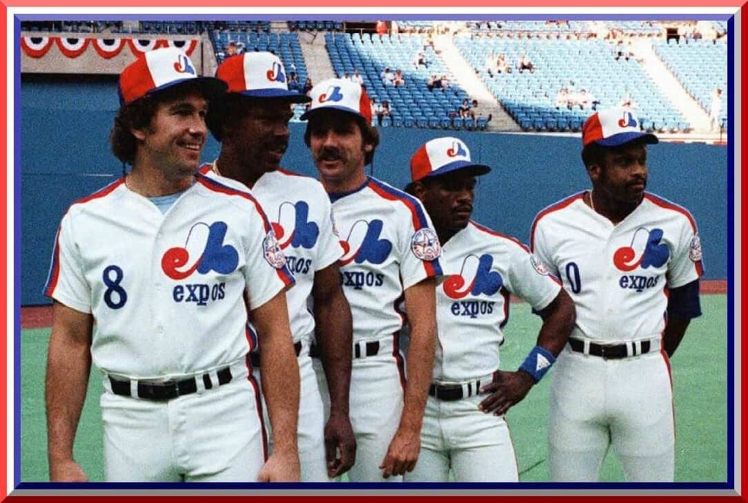
For their first 11 seasons, the Expos wore a beautiful uniform. The team itself was actually named after an event: “Expo 67,” which was the World’s Fair in Montreal. Like much of the “forward looking” type things that exist at Worlds’ Fairs, the Expos original uniforms were a modern, non-traditional set. Rather than using a team and city name (home/road) in script or block lettering across the chest, the Expos opted instead for a stylized logo on the left chest. Underneath that logo they’d place the team name (“expos” — in all lower-case letters); to balance the look, they placed a front uniform number on the right breast. The stylized “M” logo actually contains the letters “e” (the red curly-cue) and “b” (in blue), standing for “Montreal Expos Baseball.” We get our explanation from a 1985 New York Times article, which notes “The logo is composed of three colors – red, white and blue – and three letters: a large stylized “M” for Montreal, a lower case “e” for Expos in red on the lower left of the logo, and a “b” for baseball in blue on the right-hand side.”
For two-thirds of their “life,” the team would wear one of the most distinct caps in all of baseball. A red-white-and-blue tri-color paneled cap. The brim was blue, the crown was white, the side panels were red, and the back panel was blue.
From 1969 through 1972, both the home and road uniforms were a beautiful wool flannel.


With the league-wide change to polyester in the 1970s, the Expos changed too — but the eschewed the pullover jersey/sansabelt pant route, instead opting to keep the basic original uniform in tact, with full button fronts and belted pants. The only changes would be to the road unis, where the blue numbers were given a white outline. NOBs were added to both home and road unis in 1977. In addition, on the home uniform the blue numbers on the front of the uniform were changed to red. On the roads, the same change (blue numbers to red) also took place in 1977.


The first major change to the Expos uniforms would come with the 1980 season: the addition of red and blue “racing stripes” on the shoulders and down the sides of the jersey, and on the pants. The rest of the uniform remained basically unchanged, but the addition of the racing stripes added a new, unique and very distinct element, and was definitely a look the team would come to be associate with — in fact, we could say this was their “signature” uniform. Of course, they kept the beautiful tri-color cap with this set.
The white uniform would remain from 1980 through 1991, unchanged in any of these years. The road uniform would be the same from 1980 through 1988.


While the home white uniforms would remain the same through 1991, in 1989 and through 1991, the road blue uniforms added blue outlines to all the elements (number, NOB, “expos” wordmark).

The third, and final, uniform change would come in 1992. This one would be a radical departure from their original and signature looks.
The home uniforms were pinstriped, with a brand new cursive font saying “Expos” (with a long tail underline), and which was centered and angled upward on the jersey. The number would move from the right breast to the left side of the jersey, beneath the wordmark. Numbers and letters would be navy blue, outlined with a thin red piping. Hats and helmets went away from the signature tri-color to a sold blue, with the original “M” logo kept in tact.


The road uniforms would undergo similar major changes. The powder blue, worn since 1969, became gray. “Montreal” in script lettering was added (with a fleur-de-lis atop the “e” in Montreal), rendered in red, with a double outline of blue then white. Like the new homes, the wordmark was an angled script and the uni number was to the left side and below the “Montreal.” Thick blue, thin white, and thick red stripes were added to the sleeves of the uniforms, and also down the sides of the pants.


And then, they were gone — relocated to Washington, D.C. for the 2005 season and renamed the “Nationals” (we’ll look at the Nats signature uni another time). But for a franchise that existed for over 30 years, to have only three uniforms sets is pretty remarkable, and each one lasted for approximately the same amount to time. The originals (especially the flannel versions, with their rich texture) were, in my opinion, their best uniform, but their second generation, with the addition of the racing stripes, was definitely their “signature.” I also love this look, maybe almost as much as the originals.
Readers may be thinking, “Hey wait a minute, don’t you HATE the Mets racing stripes uniform?” I do — or at least I hate the home version of that. Just because racing stripes are on a uniform, that’s not the problem — the Mets own signature uniform isn’t bad because it had racing stripes: it’s bad because it had pinstripes AND racing stripes (total overkill) and was a pullover (paired with belted pants, no less) to boot. The Mets road racing stripe uni was far better because it lacked the additional vertical elements. The Expos racing stripe uni not only looked great (because it was on a crisp white or powder blue uni), it was a modern look on a traditional buttonfront/belted pants uniform. If the Expos ever become a thing in Montreal again, they could slide into this uni and all would be right in the world.
And there you have it. This one was an easy call. When you think of the Expos “signature” uni, it’s the racing stripes.

Readers? What say you?


Kreindler’s Korner
I had the distinct pleasure of featuring the wonderful artwork of artist Graig Kriendler on two occasions over the summer and fall of 2017.
For those who don’t wish to click the links, Graig paints baseball heroes (and regular guys) from the past, and is an immense talent.
Occasionally, I will be featuring his work on Uni Watch.
Here’s today’s offering (click to enlarge):

Title: “The Most Valuable Player”
Subject: Lou Gehrig, 1936
Medium: Oil on linen
Size: 16” x 20”Perhaps best remembered for how he left the game, Lou Gehrig is by far and away one of the best players to ever pick up a bat. Numbers aside, the implicit confidence – as sportswriter Stanley Frank put it – that he brought to the Yankees was what made him their most valuable asset. And, those pinstripes and interlocking NY never looked better on a player. In fact, the home New York Yankees jersey as we know it today became permanent starting in 1936. Though it would go through subtle transformations throughout the late 1930s, 1940s and into the 1950s (size of the abbreviation, width of pinstripes, flared serifs, etc), the general winning combo remained the same: A deep midnight navy NY and blue pinstripes. And for as long as Lou Gehrig was in the lineup and his jersey contained those elements, the Yankees won.
Thanks, Graig! You can (and should!) follow Graig on Twitter.
Click to enlarge
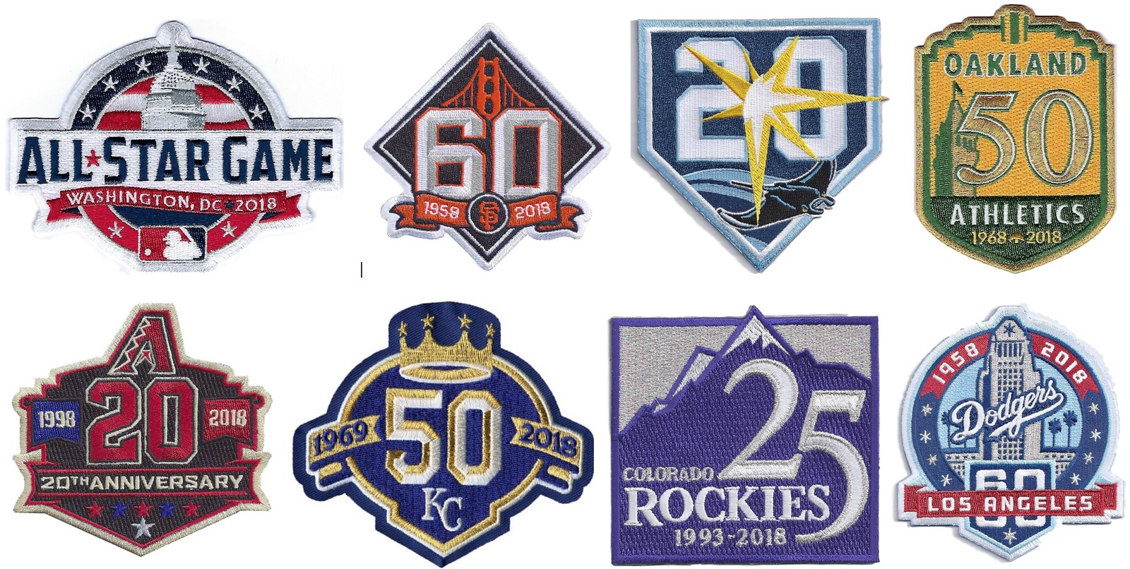
MLB Season Preview reminder: Paul here. In case you missed it on Friday, my 20th annual MLB Season Preview column, with all of the new designs for the coming season (including the patches shown above), is now available. Check it out here.
We now return you to your regularly scheduled Phil phantasmagoria.
The Ticker
By Anthony Emerson

Baseball News: Here’s something you don’t see every day: Joltin’ Joe in a Giants jersey! That’s from a 1962 old timers game at Candlestick (from Doug Brei). After Paul tweeted out this image, @BSmile replied with this pic of all three DiMaggio brothers at the same old timers game. Note that Joe kept the Yankees cap, while Dom and Vince both appear to be wearing Giants caps. All three spent time with the San Francisco Seals (that pic from @RzstProgramming). … A local ironworkers union has a great take on the ’80s White Sox logo (from Frank Barber). … Cardinals prospect Dennis Ortega has a Venezuelan flag-based bat knob decal (from @SuperMonicaco). … The Lehigh Valey IronPigs of the International League are wearing these caps and giving away these T-shirts on LGBT Pride Night on June 14 (thanks, Phil). … The Montgomery Biscuits of the Southern League are adding a powder blue alternate to commemorate the 15th year of their affiliation with the Rays (from Roger Kirk). … The Trenton Thunder of the Eastern League unveiled their pork roll alternate caps yesterday. … The Binghamton RumblePonies of the Eastern League will become the Binghamton Spiedies on May 26 (thanks, Phil). … The Durham Bulls are holding Stranger Things night on July 13. Here are the caps the Bulls will wear. … Middle Tennessee is adopting 3D helmet logos (from Lee Wilds). … Texas A&M’s grounds crew cut a script “Aggies” into the centerfield grass (from Nick McKenna). … Here’s a look at the Mets’ Dominic Smith’s custom kicks (from Megan Brown).

NFL/CFL News: Reader Joseph A. Bailey received his NFL fan survey, and it included questions about the aesthetic changes to the game ball, which included a change to how the team logos are presented on the ball to adopting a full-color shield. … After lots of speculation, the Eagles ended up not proposing an alternate helmet rule at the owners meetings (thanks, Phil). … Also listed in the NBA section: everyone attending Tom Benson’s funeral received and wore these lapel pins (from Lamar Bourgeois III). … CFL teams have two ad patches: one that each individual team negotiates, and one that the league requires all teams to have. The previous leaguewide patch was Canada Pacific Railway, as seen in these pictures from last year. CP’s contract with the CFL expired after last season, and they’re not renewing it. The company replacing CP has been kept very hush-hush until TSN released promotional photos showing CFLers with Kal Tire patches (from Wade Heidt).

Hockey News: Someone noticed that the Blue Jackets’ helmet decals are raised and textured. Does any other team do that? (from @CBJProspects). … Allen Americans goalie Jeremy Brodeur wore the ECHL Golden Goalie sweater while the rest of his team was in white last evening (from @MDWDFW).

NBA News: I think we may have covered this before, but just in case: Kyle Caffrey noticed that the number of stars on the side panels of the Sixers’ jerseys varies: four stars on the right side panel and three stars on the left side panel. Kyle thinks the disparity is supposed to represent 7 on one side and six on the other, including the three stars on each side of the shorts. Excellent work, thanks Kyle! … Here’s a decent guide to the players behind the Wizards’ retired numbers (from William F. Yurasko). … Speaking of, Phil Chenier describes his impending number retirement as “surreal” (also from William F. Yurasko). And here’s his number up in the rafters (from Mike Chamernik). … Cross-posted from the NFL section: everyone attending Tom Benson’s funeral received and wore these lapel pins (from Lamar Bourgeois III). … Steph Curry wore a Kentucky jersey at practice after losing a bet.

College/High School Hoops News: Yesterday gave us our first look at the Final Four floor. Anyone else getting a 90s Spurs logo vibe? (from Forrest M and @loneranger158). … Weird looking graphic last evening in the Orange/Blue Devils tilt: “I know what CBS is trying to do here, but is it me or does this “D” for Duke looks really odd?” asks Damon Hirschensohn.

Soccer News: What would’ve been the USA World Cup kits have been launched. Here’s some deeper information on the design (from Conrad Burry and Phil). … Stoke City’s 2018-19 home kit has been leaked. … Saudi Arabia’s 2018 World Cup kits have been officially launched (from Josh Hinton). … Last week, Yeovil Town asked its supporters to vote on three potential kit designs for next season, and the supporters have chosen the only halfway decent proposal (from Alex Evans). … FC Cincinnati’s of the USL have launched their new kits. … New kits for NPSL side Chattanooga FC (from Ed Żelaski). … Also from Ed: Cleveland Soccer Club of the NPSL have launched their first-ever crest.

Grab Bag: The debate surrounding whether tennis balls are green or yellow exploded recently when Roger Federer claimed they were yellow. Science says they’re both yellow and green. So everyone wins (thanks, Phil).
And Finally…
Big Uni Watch shout out to reader and contributor Kenny Ocker who is ruining his life taking the big plunge and getting married today! Way to go, Gobs. Good luck and happy trails, my friend.
It wasn’t until about ten years ago that I realized the Expos logo was supposed to be an “M”… I always saw it as “e l b” and stood for something like “Expos le Baseball”…
You’re not the only. First time I saw it on a baseball card when I was 6, I thought it was e l b. That stuck with me for 20 years. Could never see it as an M, even when seeing it mentioned in articles a few times that it was an M, until I took a trip to Montreal in my twenties, and saw the logo displayed in one solid color.
I agree, the racing stripe was the signature look, however the original set was still the best.
Totally nailed it. As pretty as the inaugural jerseys were and as much as I adore the Montreal script on the last road uniforms, les Expos SONT racing stripes and the tricolor hat.
Totally agree. Racing stripe uniforms worn during a time when the Expos were at their height of popularity back in the 1980s. Early 1980s was a time with good teams and when the Expos regularly drew over 2 million fans and their attendance was above the National League average. A real pretty uniform.
Will look forward to the exhibition games in Montreal coming up. Likely will be huge crowds again as usual. We will see a nostalgic return to sliding pits on the field!
-A small editing note re: a company name in my CFL ticker submission. The company advertising themselves on the league-wide patch the past few seasons is Canadian Pacific Railway. Usually just referred to as CP Rail anyway.
Odd you should mention “…[baseball] ever become a thing in Montreal again” – the Jays are playing a pair against the Cards at Olympic Stadium on Monday and Tuesday.
link
They’ve been doing this since 2014.
Nice work Phil. I may have missed it but wasn’t it not until 1977 that the Expos helmet went “pinwheel,” to match the cap? Also, thanks for the Kreindler’s Korner. I’ve admired his work for quite some time…just wish I could buy some prints!
Yes, the Expos had blue helmets in the early days – link
1. Expos 2nd design was far and away their best. I had family who lived in Montréal and I also had a sweet Expos Starter jacket. Still have a pinwheel cap.
2. The Sixers stars are arranged precisely as described – 7/6.
3. CBS needs to pull back on the Duke logo. Like looking into a portal to Hell…
The 2015 unveiling of the first iteration of this style of Sixers uniform says as much – link “STARS & STRIPES SIDING – All three uniforms are decorated with a column of patriotic stars down each side of the jersey bordered by variations of red, white and blue piping extending into the matching uniform shorts. There are seven stars on one side and six on the other, a nod to the “76ers” moniker and collective homage to the starry 1976-77 uniforms designed in part by Cunningham.”
The Sixers’ stars indeed are intentional. 7 on one side, 6 on the other. Total of 13. Like the 13 original colonies. The subtlety is not lost on this fan. Trust the Process!
I know I’ve said it before, but Wow! Graig has some major league talent. His paintings are first rate!
Is it me or do those front numbers on the Expos jersey look like they sit way too high? I never noticed that before. I do agree, racing stripes are signature but I think the first set is the best
Phantastic job on the EXPOS, PHIL!!!!
much appreciated and great work!
great catch by Damon Hirschensohn on that CBS Duke/Syracuse abortion. why would you not center it and show the entirety of the phrase “Blue Devils”? what the hell does “UE DEVILS BL” really accomplish?
get over yourselves, graphics team at CBS!
It’s a moving graphic, the bottom part scrolls from right to left. Although the Duke logo was scaled too close.
thanks TP
then let me adjust my comment
great catch by Damon Hirschensohn and Mr Tax Payer on that CBS Duke/Syracuse abortion. why would you not center and properly scale the “D”?
get over yourselves, graphics team at CBS!
Glad to see the return of the Signature Look series! And heck yeah, Phil nailed it with the Expos.
The original Expos unis are a huge letdown for me. When you look at the logo, the cap design, and the jersey insignia, it’s one of the boldest bits of design in baseball history. But all that is completely undercut by the plain-vanilla jersey style with its super-narrow piping. Even the blue road color can’t save that set. The racing stripes are exactly the kind of bold statement the jerseys needed. Those Expos unis were forward looking in a way that never became dated. Not just the team’s signature look, but easily a top ten uniform all time for big-league baseball.
Though props to the pinstripe-era “Montreal” script. That was a gorgeous standout on an otherwise dreary uniform set.
Is it me, or in the DiMaggio brother’s Giants photo where Joe has on the NY cap, does it look like he is wearing two caps. There are what looks to be two brims. Did he, or someone, put a Yankees cap over his Giants cap? The Yankees cap does look rather large on his head.
Domonic’s cap (Giants) has a similar look. I think it’s just the way hats were manufactured back then.
What I find irritating is how Joe’s belt buckle is almost on his hip. Always thought The Clipper took pride in his appearance.
Great article Phil! The 80’s Expos home uniform is in my opinion top 5 all time.
“Eagles not proposing alternate helmet rule”: Not a Philly guy, so help me understand the infatuation with the return to Kelly green. According to the Gridiron Uniform Database, the Eagles have worn dark green uniforms for 33 of the last 44 years, and the majority of the Super Bowl era (33/52). In other words, if someone is currently 44 years old, the Eagles have worn dark green jerseys for 33 years of their lifetime (1974-84; 1996-present) and Kelly green jerseys for just 11 (1985-95). Plus the team’s only Super Bowl appearances were in dark green. Not suggesting the dark green is better looking, just saying the darker green is more synonymous with the NFL franchise for most fans.
Back in, as I like to say, The Day, I thought the racing stripes unis were a joke, and the pinwheel caps looked like propeller beanies. Now that I’m older and a tiny bit wiser, I realize both were gorgeous. Forgive me, baseball gods.
Same here. A lot of things I hated back then I now love and things I loved I now hate. I also thought that the Astros tequila sunrise jersey was horrid but they have grown on me. I still think the Pirate bumblebee unis are awful.
New Orleans loses Tom Benson, and Miami just lost Wayne Huizenga. Godspeed to both gentlemen.
Expos racing stripe unis, for me, are one of the signature looks of all time in the major leagues, despite the short history of the team. You think Expos and you immediately think of the uniform. All around stylish look and if baseball ever returns to Montreal, I hope they use it.
And man, Tim Raines in racing stripes just feels right.
Texas A&M outfield art – might be worth a follow up.
– how do the do that? – GPS I’m guessing.
– suppose the Orioles wanted a big bird face in center field at
Camden Yards? would Rob Manfred freak out?
So glad that “What’s your Signature?” Is back! I missed that series and thought we weren’t getting any more
The Expos’ uniform change in 1992 marked the beginning of the end for that franchise, so that is certainly not their signature look. The all blue cap introduced that season is their best however.
Phil. Give my age, I prefer the Expos’ original design as many feel that 1969 was the single greatest year, collectively, for MLB uniforms. However, I won’t quibble with your selection as the signature look. Count me among those who would love to see MLB return to Montreal (and wouldn’t it be grand if they could update Jarry Park!)
Right there with you about wanting to see MLB return to Montreal, but will have to be a stadium at a different site.
Jarry Park has already been updated, as it is now a top class tennis stadium and training facility. Home of the Canadian national tennis training centre.
link
link
Too bad Mitchell and Ness won’t manufacture those inaugural jerseys. I’d be right behind you in the checkout line.
Sorry, the above reply was meant for Jet @ 3:00 pm (see below).
Wade, I know they refurbished Jarry Park several times. Chances are, a new stadium would go downtown anyway. Hope it comes to pass.
And of course Cleveland can’t spell the word “shield” correctly….
The Expos’ later design with the script wording looks generic and uninspired compared to what they had before. Easy to eliminate that one.
I personally prefer the inaugural look, but the racing stripe version is also pretty awesome and I would admit that it’s their signature look. But given the choice to buy a jersey, I’m going with the inaugural one…
-Jet
Please allow me a moment to vent. The US National Soccer Team jerseys are AWFUL!!! Just another sports team completely beholden to an apparel manufacturer. I did not think it was possible to create something worse than the 1994 denim kits. Embarrassing.
I personally like them, not sure how they’ll look on the pitch, so that may change. I do understand where ur coming from, these are either hit or miss. Do you think there are worse than last year’s Gold Cup Kits?
I liked the Gold Cup kits better, but they were not close to the top of my favorites. Just like this year’s kits, they looked gimmicky to me. Take away the sublimated stars on the Gold Cup kits and they look pretty good. Make the stripes go all the way across this year’s kits, it would look much better. This year’s design screams “we have stripes and a sash, RE-IMAGINED!”
Part of my problem is lack of a consistent identity other then red white blue colors. Pick a clean classic design and stick with it. If they want to be flashy, win something first. The other thing that bugs me (in my opinion) is that US Soccer has made themselves so beholden to Nike that they would not be able to determine the design.
Agree. Pick a basic look and stick with it. Also hate the new look, though I will reserve final judgement until we see them on the pitch for some random friendly.
I may be alone in thinking this way, but I look at the current Nationals road grays – with the “Washington” script and numbers rendered in red, with a double outline of blue then white – as a nod to the franchise’s Montreal past. Possibly my favorite current MLB uniform for that reason, although I’d like it more with a solid navy cap.
Phil,
Great columns about the signature look, if you want to challenge yourself (and probably get upset in the process) how about doing the signature look for the White Sox? That’ll prolly want to make you leave this site lol.
As the biggest Expos fan in Texas I felt I had to chime in on this topic – I’d have to agree that the second set definitely has to be the signature set of uniforms, but in my PERSONAL opinion I’d have to vote for the third and last set. So many good memories of seeing the Expos in that set of uniforms in the Astrodome and Minute Maid Park have a deep personal meaning for me. I rock the solid blue cap more often then the tri-color pinwheel, but only because it’s more practical. My UW membership card is done in the 2nd set powder blues because I simply adored that font they used with those. They may be the only team I know of that I’ve approved of every since logo and uniform in their history, and I’m anxiously awaiting their return someday.
Another HOFer, Ernie Lombardi, in the first photo with Joe DiMaggio.
Never heard of spiedies before,
but they look delicious
No signature Expos uni can exclude the tri-paneled cap or the powder blue road version. And since I was a trainer in the Expos’ minor league system in 1997 I have a proprietary interest in the subject.