
[Editor’s Note: Paul is on his annual August break from site. Deputy editor Phil Hecken is in charge from now through Aug. 25, although Paul is still on the clock over at ESPN and may be popping up here occasionally.]
By Phil Hecken
Follow @PhilHecken
Quite often, I’ll “meet” a Twitter user who happens to also be a big fan of Uni Watch. This makes sense as a lot of readers follow Paul, and I’m sure a significant number follow me as well. It’s less common to encounter the Twitter user who’s both a big fan of the blog and an immense talent. That’s the case with Graig Kreindler, an outstanding artist who paints old time baseball players from photographs. Before we take a look at a sampling of Graig’s work, I interviewed him about a few things, and I asked him to take some of his favorite works and describe them to us. Sit back and enjoy — I think you’re going to like him!
Uni Watch: OK, standard question first ”” how long have you been a Uni Watch follower and what first brought you to the blog?
Graig Kreindler: Well, first off, I gotta thank you guys for taking an interest in me and what I do! My brother first introduced me to Uni Watch years ago (I’d say 2003 or so). Since he’s a huge baseball fan and into all things sartorial, it seemed only natural that he would gravitate towards your stuff. And once I started to really get into painting this kind of stuff, I used to scour your archives for little tidbits to augment what I was putting on canvas.
(For what it’s worth, to this day, I’m still trying to figure out what the heck the reason was for the American Leaguers to wear different uniform numbers pinned to their backs in the ’34 All-Star Game.)
UW: How old are you and where do you live. Where were you born?
GK: I’m 37 years old and currently live in Brooklyn, NY, only a stones throw from Green-Wood Cemetery. However, I was born in Westwood, NJ and grew up in Rockland County, NY, a suburb just outside of Manhattan.
UW: I’m amazed at your paintings! What medium do you use?
GK: Thank you so much!! I primarily use oil paints, typically on stretched linen or linen that’s mounted to board.
UW: Where did you study?
GK: The bulk of my artistic studying took place at the School of Visual Arts in Manhattan, and with some of their professors outside of the school. I graduated with a BFA in Illustration in 2002. Going there was a pretty lucky situation for me, as it’s still one of the only art colleges that employs working professionals rather than professional teachers. In other words, when I got out of school, I was officially competing with my teachers for work.
UW: How long have you been painting? Did you begin at an early age, or perhaps I should ask, at what age did you first begin to paint?
GK: I started creating art when I was pretty young – even as early as 3 or 4, my parents tell me. I was always interested in drawing characters from the cartoons I used to watch as a kid, be it He-Man or GI Joe. My folks used to find me sitting in front of the television, with a taped episode on pause, just trying to recreate what I saw on the television screen. They also told me that it was the only thing that kept me quiet and still.
Around the same time, I got very much into drawing baseball players from my father’s baseball cards. Like most kids from his generation, his mother disposed of the majority of it, but he was still able to save a lot. What was left were a lot of cards from the late 1940s and early 1950s, especially Yankees, Dodgers and Giants. Because the majority of those early Bowman and Topps cards were actually illustrations rather than photographs, I was really attracted to trying my hands at recreating them.
UW: When did you find you had a talent for painting? Do you work in other mediums (pencil/sketching/watercolor, etc)?
GK: Honestly, I never really thought I had a talent for painting, even up until I got into SVA. I had always been a draftsman (mainly graphite) and never really felt comfortable holding or using a brush. The majority of what I submitted portfolio-wise were life drawings, but I suppose they were of enough quality to have them grant me admittance.
These days though, I’ve given up pretty much everything BUT the brush.
UW: I assume this is more than a hobby for you?
GK: Absolutely. It’s really what I think about more than anything. Even if I won the lottery tomorrow and never had to worry about money again, I’d be painting these guys (and gals). As corny as it sounds, I really feel like it’s something that I need to do. And I’d like to think that that sentiment somehow shows in the work, however intangible it may be.
UW: Is this your “full time” job or do you have another profession?
GK: I am lucky enough to call this my full-time gig, and have been doing so for the past ten years. I’m still absolutely terrified that at some point, somebody with a clipboard is going to come knocking on my door, saying, “all right, you’ve been screwing around long enough, time to go out and get a ‘real’ job.” I’m not sure if that feeling ever leaves freelancers.
UW: Where can we see your work? Have you had any shows (past or upcoming)? Do any of your works currently hang in any galleries?
GK: You can find most of my current inventory hanging at my agent’s gallery in Bronxville, NY – Objects & Images Fine Art. The majority of the paintings I complete are for clients and their collections, so as of right now, if you’re not seeing it on my easel or in Bronxville, it’s in a private home, institution or place of business.
Because of the amount of commission work I do, I have yet to really have a show solely of my paintings. I have been involved in a few fun ones over the years though, including one at the School or Visual Arts with a slew of other artists who are in the sports realm, including our buddy Todd Radom.
I’m also slated to be a part of a group show in the spring of 2020 at the Negro Leagues Baseball Museum. The exhibit is to commemorate the forming of the Negro National League’s centennial, and focuses not only on the players throughout the history of the Negro and Cuban Leagues, but also on important civil rights issues of the era. I’ll have over 150 small portraits displayed there, and the plan is to have the show travel across the country during the year.
UW: How long did it take you to *learn* to paint? Do you notice any differences between your early works and your current ones?
GK: Well, I’m definitely still learning. Every single painting has a new challenge to it, and I’m always trying to push myself. I feel like it’s really the only way for me to grow. For whatever it’s worth, I only started ‘seriously’ painting around 1999 (when I got to SVA), so I guess it really started almost 20 years go.
I can definitely notice the differences between my older and more current work. And it’s not necessarily that one’s ‘better’ than the other, it’s more of how I was seeing things, and what I was trying to accomplish in my paintings. I feel like in the beginning, I was doing my best to be as photo-realistic as possible – everything had to be tight, tight, tight. It’s only been in the past 5 years or so that I’ve tried to create scenes that go beyond those photos: things still remain tight in the focal points, but I tend to be a bit looser in other places, with more lost edges and impressionistic color. Lately, I’m also doing my best to experiment with creating more texture on my surfaces – something that I definitely shied away from when I was younger.
UW: How long does an “average” painting take? What picture took you the longest?
GK: The amount of time it takes to do a painting from start to finish varies with the size and complexity of the subject(s). If I’m painting a smaller single portrait of a ballplayer, those can be done in a matter of weeks. The larger, more panoramic stadium paintings take months and months. Sometimes, even more.
The longest I’ve spent on a single painting by far is the one of the 1927 Yankees. I’m actually embarrassed as to how long it took me, but the amount of visual information in it was beyond intimidating. Intimidating to the point of freezing me. Additionally, the amount of research that went into it was kind of obscene – whether that was looking for the eye color of a second-string catcher, or discovering that Bob Shawkey preferred to wear red shirts underneath his jersey. Thankfully, I had a VERY patient client who not only understood and appreciated my sickening meticulousness, but also had faith that the final result was going to be well worth the wait.
UW: Do you have a website? Social media presence?
GK: I do indeed! You can see my stuff on my website, graigkreindler.com. I also have a social media presence via Facebook, Twitter), Instagram, Pinterest and Tumblr. I’d say these days I’m most active on Facebook, Twitter and Instagram.
UW: I’d assume your paintings are for sale. Is there anywhere readers could contact you to inquire about a particular work?
GK: I can be reached pretty easily via Facebook or Twitter, or through my website which goes through my agent (usually for larger commissions and projects).
UW: Last question: If someone wanted a photograph (baseball or otherwise) painted, you could do that, right? Or are you already “all full” with work.
GK: Absolutely! However, he/she would just need to be patient. I have a pretty long backlog right now – at least a year and a half-worth – and I’m just trying to keep my head down and get through it by creating the best work I can.
UW: Thanks, Graig! OK, lets take a look at some of your work, with your descriptions! (All images below can be enlarged by clicking on them)

Addie Joss, 1910 – “Better Days Behind” – 16″ x 16″ – oil on linen (Original photo here)
This portrait of Addie Joss has always haunted me. For one, that gaze is just incredible. He might not have been the most attractive ballplayer you’ve ever seen, but if nothing else, his face certainly had character. But more importantly for me though, the moment I saw it, I thought of that beautiful light and what it was doing to his sweater and all of the wrinkles in his ruddy face. It was one of those images that I was able to see a finished painting of in my mind, which is a rare thing.

Babe Ruth, 1920 – “A Strained Start” – 46″ x 46″ – oil on linen (Original photo here)
I always come back to this photograph when I think of my favorite images of Babe Ruth. It was shot at the Polo Grounds before his first game of the regular season with the Yankees in 1920. In a way, the thought behind the scene represents what became the turning point of the AL New York franchise. I loved the challenges of working with that wool jersey, the way the different high-key tones and color temperatures played off of it. Since the canvas was so big, I was able to push the boundaries of an interesting surface (for me), as there’s plenty of impasto and scraping throughout. The way the shadow dances across Ruth’s face was especially pleasing (I thought), and I tried my best to make it as colorful and true to life as possible. It’s like I wanted the viewer to actually feel like he/she was standing in front of this legend, not just seeing some colorized depiction of him.

Bill Mazeroski, 1960 – “Fickle Fate at Forbes” – 60″ x 38″ – oil on linen (Original photo here)
This moment still haunts my father, like most Yankee fans of the era. I always thought that the image had quite a strong narrative to it, in that you can make out everything that’s happening in the game from the scoreboard, the clock and the flight of the ball. That shadow sweeping across the first base side of the field definitely didn’t hurt either. As I was working on it, I also really fell in love with all of the different textures the scene was able to provide, what with the fall-touched trees, brick outfield wall, the roof of what is now the Carnegie Museum of Natural History, and of course, the soft grass, pebbly dirt, spectators and uniformed ballplayers. Just a cornucopia of visual information.

Branch Rickey, 1914 – “Strange Complexities” – 12″ x 16″ – oil on linen (Original photo here)
Branch Rickey is a great subject in almost every single way. And here, what I thought was going to be an easy lay-up of a painting proved to be much more of a challenge. This being that I while I was painting the thing, my research had led me to the conclusion that his Browns jersey looked like I thought it should look: gray with brown lettering and trim. Marc Okkonen’s book said the same. I finished the painting, sent it to my client, and he loved it. I found out a month or so later that my research wasn’t exactly correct. There newspaper accounts from the era claiming that the trim of their jerseys was actually a deep navy, despite the club still being called the Browns. I discovered a handful of similar claims from other newspapers, and it was clear that I needed to make the change for own sanity. Luckily, the client was incredibly understanding and allowed me to do what was needed. I won’t lie though, it’s still a little odd to think that there was a period in the 1910s when the St. Louis Browns’ dominant jersey color was that deep navy. Weird.

Deacon White, 1886 – “Deacon” – 12″ x 16″ – oil on linen (Original photo here)
Deacon was another chance to do a portrait of somebody who looked incredibly cool facially-speaking, and was also in a cool jersey. With the blondish mustache, blue eyes, and balding skull, there couldn’t have been many people who would have looked cooler (or perhaps odd) in a baseball uniform. Finding the proper color reference for his jersey was especially a challenge, as his Detroit Wolverines wore three different ones that particular year. In the end, I especially loved the touch of blue in the tie that sets off from the red ‘DETROIT’ on his chest.

Yankees, 1927 – “Murderer’s Row” – 66″ x 44″ – oil on linen (Original photo here)
This painting had to be the most challenging one I’ve ever faced. At the start, in addition to getting all of the likenesses right, I wanted to be as historically accurate as I could be with their hair and eye colors. That in itself should be enough to drive anyone nuts, but mix that with 31 main figures and who-knows-how-many spectators, and there’s seemingly TOO much to be done. It doesn’t end there, either. 30 of those 31 players are wearing pinstriped uniforms – pinstripes that weave and undulate in space, as well as describe form. The architecture of the ballpark had to be right on, too! All the lines straight, all the rivets where they needed to be. This thing gave me nightmares. But the end result – especially in person – was something else.
WOW! Thanks Graig. Tremendous job on all of those. Thank you for sharing with us.
Graig has actually sent me many more images of his work, but for now, we’ll start with these. I will be back with more of his paintings later this month — I hope you’ve enjoyed this sampling so far!

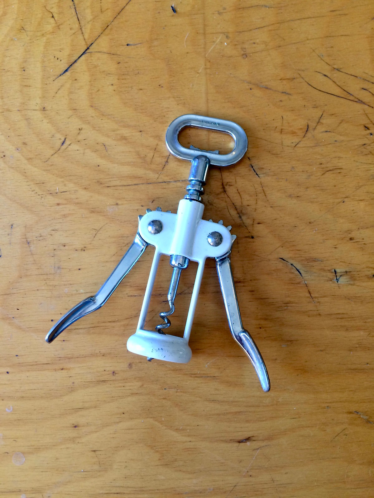
And now a word from Paul: Hi there. My friends Rob Walker and Josh Glenn have been running a project called Project:Object, in which they’ve asked a bunch of writers to tell small stories about objects of personal significance. The stories are broken down into four categories: political objects, talismanic objects, illicit objects, and lost objects.
They’re now in the “illicit” phase, and I’ve contributed an entry ”” a shameful story from many years ago, about the corkscrew shown above. You can read it here. (I’ll also have an entry in the “lost” phase, which is still to come. To keep up to date on that, sign up for the P:O newsletter.)
Meanwhile, as long as I have you here, a few reminders:
• I’m running a new ESPN contest to redesign the Titans. Details here.
• We’ve launched our latest limited-edition Uni Watch Artist’s Series T-shirt, designed by the great Rob Ullman. Here’s the base design (click to enlarge):
It’s available in a bunch of colors, through this Friday. Full details here, or just go straight to the ordering page. It’s also available in women’s sizes.
• We’ve also launched a bunch of new Naming Wrongs shirts, all of them pertaining to Seattle. Get the full scoop here, or just go straight to the Naming Wrongs shop. We’ll have new designs later this week.
Griffins Jersey Contest Reminder

In case you missed it, I’m again hosting a jersey design contest in conjunction with the Grand Rapids Griffins (an AHL affiliate of the Detroit Red Wings). All the details are contained in this post.
The deadline for getting your submission in to me is August 15 (at 6:00 pm Eastern Time), and we’ll have reader voting on the concept jerseys beginning on August 17th! Last year we had 85 entries and I’d expect we’ll equal or surpass that this year. Prizes include a custom jersey based on your design and tickets to the game that the Griffins will be playing in the jerseys you designed!
The Ticker
By Alex Hider

Baseball News: Buried in this piece by Rays beat writer Marc Topkin is this little nugget: “For the Aug. 25-27 Players Weekend in St. Louis, look for the Rays to sport a light-blue softball-style jersey with yellow sleeves, and with nicknames on the back.” … Color-on-color game yesterday between the Pirates (who wore “We Are Family” throwbacks) and the Padres (from Noah Kastroll). … Pirates IF Sean Rodriguez wore Andrew McCutchen’s cleats during yesterday’s game (from Adam McLean). … Mets P Steven Matz wore teammate Jacob DeGrom’s elbow pad during an at bat last night (from Tim Akins). … The Brewers dressed in purple on their flight to Minneapolis yesterday in honor of Prince (from Jerry Nitzh). … Royals C Cam Gallagher made his big league debut yesterday wearing a hockey-mask style helmet with a backwards cap underneath ”” and the cap goes over his ears! (From Brian Hansen). … It looks like the Hagerstown Suns of the South Atlantic League has some gray inconsistencies (from Papa Beez). … Color-on-color matchup yesterday between the Madison Mallards and the Lakeshore Chinooks (from Zachary Loesl). … Oscár Robles, a former Dodger and Padre who has built a legendary career in Mexican baseball, is retiring at the end of this season. His team, the Tijuana Toros, is honoring him with this logo (from Ian Hill). … Brian Clark spotted this ad for a hospital in Denver that features a young ballplayer with a loose stirrup. The thing is, he’s wearing his stirrups over two-in-ones!

NFL News: The Falcons donned camo unis during practice yesterday for Military Day (thanks Mike). … Tom Brady wore his practice jersey inside out during a recent interview, most likely to hide the Nike swoosh (he has a shoe deal with Under Armour) (from Brinke). … Spotted in a 1971 Eagles program: A number font inconsistency with No. 3 in the front row (from Jackie Treehorn). … How many people remember Michael Vick wearing Air Jordan basketball shoes on the old Georgia Dome astroturf? (From David Arnold). … Good feature story on the dark history behind the Super Bowl coin toss (from David Firestone). … One of the strangest team nicknames of all time: The Tokyo Gas Creators of the X League, a Japanese American football league (from Billy Braden). … Check out this shot of Jim Zorn from 1980 — it appears he had extra material sewn into the sleeve of his throwing arm (from Mike Selock).
College Football News: Cal’s memorial stadium is (in)famously built on a fault line. It’s not clear to me whether this is intentional or not, but you can apparently see the fault line on the stadium’s turf (from Ryan Gorcey). … New unis for Florida International (from Lemon City Live). … It looks like Mizzou is dropping the gray shoulder yoke on its white jerseys (from Jacob Bogage). … Notre Dame players will wear special jackets before home games this year that have the “Play Like A Champion” sign in the lining (from Paul). … USC has been wearing white pants with a red and gold stripe during practice this year. They’ve worn white pants in the past, often times without stripes (from Drew). … The Penn State Nittany Loins? Are they a team of butchers? (From Jeremy Reeder). … Infinite regression alert: Ohio State’s Liam McCullough was recently photographed wearing a a shirt with his photo on it, in which he’s wearing a shirt with his photo on it. Not quite infinite, but still good (from Mark Kunz). … New uniforms for the Southern Illinois Salukis (from Craig Choate). … Oklahoma State uses a barbed-wire motif on its football uniforms, intended to pay tribute to its mascot, the Cowboys. As noted in this article, barbed wire was anti-Cowboy (from Dale Alison).

Hockey News: Looking for a ’90s flashback? Check out this video from this 1991 Canada Cup game between the US and the USSR. “The sharks hats, the haircuts, the stadium advertising all is a blast from the past,” said reader John Chapman).

NBA News: It’s been rumored that the Golden State Warriors will have a throwback alternate this year. Now, there’s rumblings that those throwbacks will be ’80s-era white jerseys (from Conrad Burry).

Soccer News: Very satisfying moment during the Euro Women’s Final between Netherlands and Denmark yesterday, as the scorebug turned into a perfect palindrome (from Saurel Jean, Jr.). … Sporting Kansas City’s Dom Dwyer was recently traded to Orlando City for a record $1.6 million in allocation money, so one fan got creative with his now-outdated jersey (from Jeremy Brahm). … Great looking game between Everton and Sevilla yesterday. Both teams went ad-free, and Everton wore some nice-looking throwbacks (from Jonathon Sluss).

Grab Bag: Not only does Dale Earnhardt Jr. wear a QALO wedding band while driving, but he apparently has different colors to match his driving suits (from Bodz). … Speaking of Dale Jr., this guy likes him a lot ”” maybe too much (from James Gilbert). … There’s a store on Teespring that’s attempting to rebrand the Swastika as a symbol of love (from Jerusalem Stone). … Here’s a pretty impressive Wisconsin sports tee found at the Wisconsin State Fair (from Scott Gerke).

So…I’m Batting .200: Phil here.
In case anyone is interested, (and if you read Friday’s article), I wasn’t entirely successful at the Clothesline Art Sale on Saturday. I’d like to thank, er think, the bad weather was depressing turnout during the morning, when the majority of the pieces for sale actually get sold. I had hoped to sell two or three pieces, but only one — “Gas Pumps & Flag” sold. Below are the five works I had exhibited.


I saw in Friday’s comments a couple of you might be interested in some of these pieces. I had put them all for sale at $150 (of which I got to keep 50% on the one piece I sold), but I would be more than happy to listen to any offers from the UW readership if you’re interested in any pieces. To be more specific, each one is a 11″ x 14″ print, matted and framed. So each one is about 2′ x 3′ with the frame. I’ve never shipped anything that large, so that would need to be figured into the cost.
If you are interested, please send me an e-mail.
I guess the OSU PR people have never heard “Don’t Fence Me In”…
The Tokyo Gas Creators are named after the utility company that sponsors them; the company logo appears on their helmets.
link
People who put the emphasis on the wrong place make the same mistake they used to do with the Nippon Ham Fighters.
I guess their mascot is a can of beans?
Nice try. They’re still the Ham Fighters…
At any rate, I can think of at least 20 “stranger” nicknames in the baseball minors alone. Seriously, Brandiose needs to BURN.
Looks like No. 3 for the Eagles is missing the black outline on his numerals.
It’s also noticeably thicker and a slightly different style than the rest of the team, save #99.
33, too.
And 11.
I just realized/remembered #3 is kicker Mark Mosely (or ‘Skins fame. Pre-perm of course)!
Is #52 wearing a backwards 2 for a number?
I think that’s a 62 (two to the right is 52).
One thing about that Canada Cup clip, when Igor Kravchuk and Joel Otto have their exchange at center ice, you can see the NOB on Kravchuk’s jersey is spelled “KRAVTCHUK”. Ah, the inconsistencies of transliteration.
I liked the US National Team uniforms back in those years. Mainly because they were royal blue, instead of the navy that they have worn now for close to two decades.
That 1991 tournament was the last time that Canada wore one of my favourite uniforms for my country. The striking Canada Cup uniforms wearing blue as a trim colour (rather than black as trim which has been common for years). Good hockey memories tied to that uniform:
link
Back then, Canada had the unique situation of having two distinct uniforms and logos at the same time. There were the Canada Cup uniforms and there were the National Men’s Team uniforms for the team that barnstormed and participated in the Olympics:
link
Agreed on all points. And the awesome Tackla uniforms worn by Sweden, Finland, and the Czech Republic!
Er, who were still Czechoslovakia then.
There’s a store on Teespring that’s attempting to rebrand the Swastika as a symbol of love (from Jerusalem Stone).
Good luck with that. I don’t doubt the sincerity of such people, but they have picked a Sisyphean task. If you think you’re bigger than Hitler, take your best shot!
+1 for use of the term “Sisyphean.”
Brings this to mind… link
The Penn State Nittany Loins? Are they a team of butchers? (From Jeremy Reeder).
A particularly unfortunate mistake.
Reclaiming the swastika.
Not going to happen. Too much has happened with that as a symbol.
I mean, when a public figure in Washington, D.C. can be fired from his job for using the word “niggardly” in a memo, I think the reclamation of a certain racial slur isn’t going to happen.
“… a public figure in Washington, D.C. can be fired from his job for using the word ‘niggardly’ in a memo”
Still one of the dumbest things I’ve ever heard. Sheesh… ignorance trumping proper English.
Aw crap… are we both about to get fired now?
It will happen, and probably soon, and by “soon” I mean, some of us alive today will probably live to see it. History’s monsters are like that. During his career and the lifetime of the generations who experienced his wars, Napoleon Bonaparte was a byword for monstrous evil for most English-speaking people. Such that even during the American Civil War, Bonaparte was as grave an insult to be compared to as Hitler is for us today. But by the early 20th century, Napoleon had become more of an object of ridicule or kitsch, as he is today. The same thing will inevitably happen for Hitler and the Nazis as living memory of the Reich, the war, and the Holocaust disappears.
Morally, there is little difference between naming an American sports team after the ancient Spartans and naming it after the Nazis. Yet we think nothing of sending our children out to play games under the nickname of one of history’s most viciously evil civilizations. The same will one day be true of Nazis, and probably much sooner than twenty-five-hundred years.
Have you never seen Hogan’s Heroes? They were treating Nazis as objects of ridicule decades ago!
The thing I find particularly dispiriting about such “rehabilitation” efforts is the way unfeeling, inert symbols are treated as more important than humanity. If you like swastikas, draw them to your heart’s content; allow your eyes to follow the outlines of bathroom floor tiles. You will see thousands of them. Wear your beloved symbol on the sidewalks of Mumbai or Seoul. No one will bat an eye. Just don’t expect society to be complicit in your fool’s errand.
Been following Graig on Twitter for about 6 mos. now. An extraordinary artist and a nice guy to boot.
Awww, thanks a ton, Marc! I appreciate it.
The fault line on the turf at Cal is intentional. link
I’ll be honest Phil, if I was at the art show, that pumps & Flag was the one I would have bought, although they’re all awesome.
I won’t lie though, it’s still a little odd to think that there was a period in the 1910s when the St. Louis Browns’ dominant jersey color was that deep navy. Weird.
If I were around back then, I’d be sending telegraph after telegraph to Ye Olde Uniform Watch railing against this travesty the way I get on today’s Chicago AL team for not wearing white socks.
Cleveland Browns fans had better hope no one from Nike reads this. Otherwise they might approach Mr. Haslem with a BFBS offer he can’t refuse.
Anyway, GREAT artwork today…both from Graig and from Phil.
“Ye Olde Uniform Watch” Ha!
I still call it Weeghman Park!
Thanks so much, Jim!! 😀
Phil, question about Graig Kreindler – does MLB license him, or give him any grief for using their logos and intangibles in his paintings? I recall several years ago there was a painter that did this sort of work with golf subjects that caught some legal trouble.
I’m honestly not sure. Hopefully he’s reading today and can address this.
Hey Greg!
In response to your question, MLB doesnt give me any grief because I don’t sell reproductions of my stuff. Since I only do one-of-one originals, they’re considered artworks that fall under the protection of my First Amendment rights. If I were to make prints, I’d be using their IP (as well as player likenesses and what-not) for commercial purposes – that’s when I legally should be under license with them.
Graig – thanks for the rest of the story. I am in awe of your art.
Actually USC has been wearing white pants with Cardinal & Gold stripes for practice for a few years now. At least 3, if not longer. I believe these were brought in to be worn during games with the white road jerseys, and when the alumni and fans caught wind of this they raised hell. USC fanbase are overwhelmingly against any change for their football uniforms. The metallic helmets a few years ago didn’t go over well, and were discontinued.
Just saw a picture of Torin Harris wearing these white striped pants, and he was a senior in 2013.
The quality of light and color in Graig’s paintings is awesome. What a talent.
Enjoying Phil’s work also! Great scenes of Americana from the Eastern Seaboard…
Thank you so much, Jerusalem!
Jim Zorn threw with his left arm, and I believe the added material in question is on his right.
Color me confused.
Not sure what you’re seeing but the extra material is definitely on his left arm.
Sorry I’m late getting to the website today but, Graig, I have to submit a most favorable comment on your work. Each one is absolutely brilliant and I would be proud to display any of them in my home.
I have legendary baseball artist Dick Perez’s fantastic book “The Immortals” and your work belongs in the same league as Dick’s.
Thank you so much, John – that’s high praise!! Dick is an absolute legend in the field and was/is most certainly an inspiration for what I do. I’m honored by the comparison.
Outstanding work from Graig Kreindler, thanks for sharing it!
I wonder if the uncommon spelling of his first name owes anything to Yankees 3B Graig Nettles or it that just a nice coincidence?
Hey Joe,I absolutely was named after Nettles! My father, being a Yankee fan, was definitely into how well he performed with the glove in the ’78 World Series, and my mother LOVED the unique spelling. Put those together and you’ve got somebody who’s destined to be involved in baseball somehow…
…just not on the playing field.