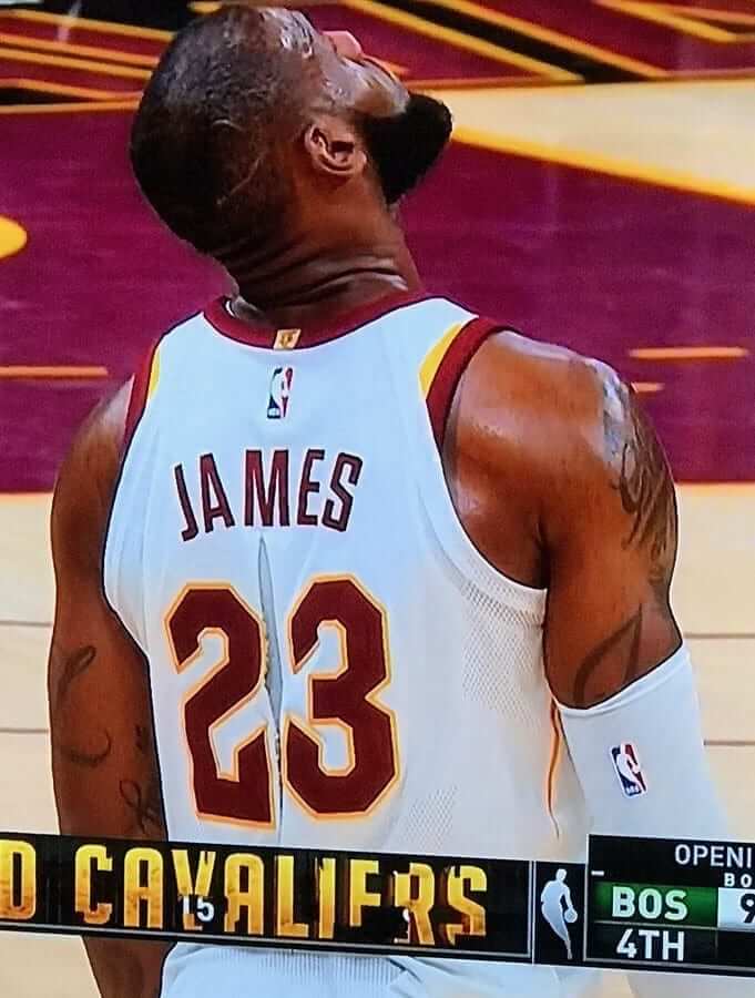
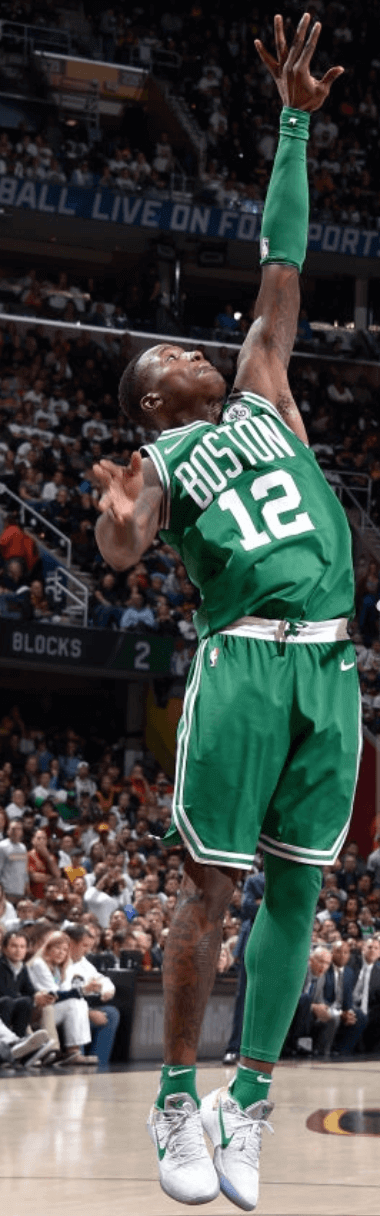
It didn’t take long for the new NBA season to have a uni-notable moment, as LeBron James suffered a ripped jersey during last night’s Cavs/Celtics season opener. As you can see above, the jersey tear ran right between his rear numerals. It apparently happened when Jaylen Brown of the Celtics grabbed a handful of polyester.
This is the second time in less than three weeks that an NBA player has sustained a seriously torn jersey. The first time was on Sept. 30, when Lakers guard Tyler Ennis was victimized during a preseason game. His tear also ran right between the rear numerals. Hmmmmm:
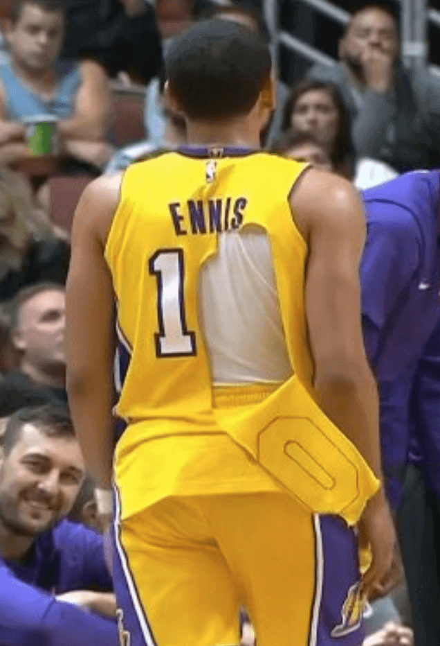
Memo to Nike: Better get this flaw fixed quickly.
Other notes from last night’s season opener:
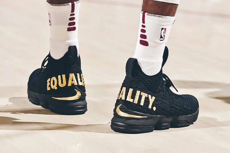
• Getting back to LeBron, he wore sneakers emblazoned with an “Equality” message:
• The Cavs linked arms during the national anthem:
The Cavs link arms during the national anthem before tonight's season opener vs. the Celtics pic.twitter.com/VY6wFzE4CP
— Sports Illustrated (@SInow) October 18, 2017
• Teams had worn white tights and mostly white socks during the preseason, but the Celtics went with green tights and green socks:
• That included Terry Rozier, whose signature one-leg tights look featured one green leg:
• Oh, and both teams wore completely unacceptable corporate advertising patches, but you already knew that.
Meanwhile, last night’s other NBA game featured the Warriors hosting the Rockets. Prior to the game, the Warriors received their rings and raised their latest championship banner:
What a time! pic.twitter.com/VGj0jLsMF3
— GoldenStateWarriors (@warriors) October 18, 2017
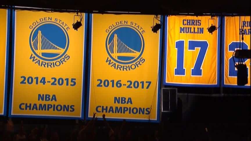
One big change from past seasons: The defending champs didn’t wear an O’Brien Trophy patch for the season opener. Gee, I wonder why. (Hint: Rhymes with “No room left after adding Nike logo and corporate ad patch. Douchebags.”)
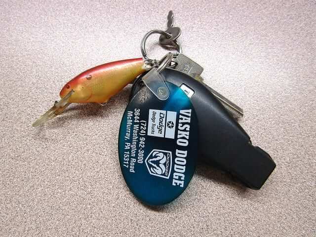
KRC update: The latest installment of Key Ring Chronicles is about an old orange fishing lure. I really like this one. Check it out here.
The Ticker
By Alex Hider

Baseball News: There’s growing hope that we’ll see the Expos logo back in the MLB soon. NBC Sports reported yesterday that there’s “growing consensus” that the league should add expansion teams in Montreal and Portland, as well as expand the playoffs and shorten the regular season (from Brinke). … Astros P Lance McCullers wear No. 43. But during Monday night’s Yanks/Astros ALCS game, a Fox Sports graphic featured of a photo of him from Jackie Robinson Day and mistakenly listed him as No. 42. … Interesting discussion: If Carlos Beltran were to be inducted into the Hall of Fame, which cap would he put on his plaque? (From Paul). … Dwyane White noted some Padres NOB arching inconsistencies during this shot of the 1984 World Series. … The fan who gave the thumbs-down sign that was adopted by the Yankees as a sign of team unity now has his own bobblehead.

NFL News: One ESPN writer thinks the Chargers should go powder blue full-time to help create buzz in Los Angeles. I think it’s safe to say that Uni Watch agrees (from Phil). … From Monday Night Football: Titans T Taylor Lewan lost a shoe during play. He ended up borrowing a shoe from fellow OL Brian Schwenke (from Paul Deaver). … It’s not uncommon for NFL teams to have players wear replica jerseys for community events, but the Saints have their players in old jerseys with the dreaded toilet seat collar (from Ray Garofalo III). … The late-’80s Rams had double-decker FNOBs for DL Richard Brown and WR Ron Brown (from Pro Football Journal).
College Football News: Players for Charleston Southern, an FCS program, chose to remove the decals from their helmets for their game last Saturday to protest the school’s administration. Their protest reportedly stems from the school’s cafeteria running out of food and leaving players hungry. The team says they plan on playing without decals for the rest of the season (from Joel Mathwig). … Virginia Tech will wear white helmets this weekend (from Andrew Cosentino). … Virginia tweeted a photo of S Quin Blanding wearing a Mighty Ducks jersey the other day (from our own Jamie Rathjen). … Youngstown State will wear Pinktober ribbon decals this week (from Robert Hayes).

Hockey News: The Penguins have taken to adding award stickers to a Pittsburgh Steelers helmet as a player-of-the-game ritual. The decals include the player’s number and the logo of the opposing team (from Mike Slavonic). … In a related item, the Flyers give their player of the game a Ric Flair robe (from @TheGoalNet45). … The Wilkes-Barre/Scranton Penguins wore new breezers and socks with old jerseys during a preseason game earlier this month (from Patrick Thomas).

Basketball News: P.J. Dozier, an undrafted rookie, will be the first player since Kevin Durant to wear No. 35 for the Thunder. … The Browns simultaneously wished the Cavs good luck and trolled Celtics G Kyrie Irving by blatantly Photoshopping Jabrill Peppers’ Cavs jersey in a photo. … Speaking of the Cavs, the season is barely underway and a pair of fans are already selling T-shirts urging LeBron James to re-sign with the team next offseason. … The NBA will auction off the jerseys worn during last night’s games to benefit hurricane victims (from Phil).

Grab Bag: ’Tis the season: Scott Nuzum spotted a pink-on-pink matchup at a high school volleyball game between Uniontown and Pleasanton in Kansas, and Burrill Strong spotted pink-on-pink game (with a little camo thrown in) between Dexter and Chelsea in Michigan. … Speaking of mono-colored high school volleyball games, Nik Streng spotted a red-on-red matchup between Weiser and Payette in Idaho. … Virginia Tech engineering students have created 3D-printed golf grips that are designed to perfectly conform to an individual’s hands (from Andrew Cosentino). …Paul Weisner ran the 40th Chicago Marathon earlier this month. Interestingly, they sent a patch to anyone else who registered for the race and also turned 40 during 2017. … American Airlines apparently doesn’t recognize curling as a sport (from Mark Smith). … A mother in Long Island wants a local high school to do away with revealing girls’ cross country uniforms (from Chris Flinn). … Youngstown State has added its athletic logo to crosswalks on campus (from Robert Hayes). … Here are the 2017-18 men’s and women’s volleyball uniforms for the Japanese V-League (from Jeremy Brahm). … New jerseys for the Wales Rugby Union National Team. Ditto for England (from Jimmy Griggs). … Here’s a detailed explanation of the crest design for the English rugby league team Salford (from James Welham).
Perhaps childishly amusing, but kind of funny how the positioning of the pictures of the championship rings makes it look the Warriors posted a pair of gilded toilets.
“The NBA will auction off the jerseys worn during last night’s games to benefit hurricane victims ”
Is the Lebron jersey (wait for it…) half off?
Wocka Wocka!
Lighter, faster, drier, weaker.
*Way to go, Swooshketeers.*
Proofreading my Ticker entry: Quin Blanding plays for Virginia, not Tech.
Baseball section: “Astros P L Lance McCullers.”
Fixed.
Thanks. The new “Virginia” has an extra I.
Ay yi yi. Fixed.
Regarding the WB/S Penguins item, I’m more curious as to why the Binghamton Devils were wearing the new New Jersey sweaters.
Hard to know for sure without a date on this picture (Ticker just says “earlier”), but it’s not unheard of for NHL teams to scrimmage AHL teams — especially if the “NHL” team in the scrimmage is by all accounts the AHL team but the NHL team hasn’t gotten around to making the next round of cuts yet. So that’s my hypothesis. A split squad New Jersey team playing WB/S.
By all accounts it was the Binghamton team, as I looked up their Twitter feed and saw their pictures from the game.
The dude with the Mighty Ducks jersey is from Virginia, not Va. Tech.
“A mother in Long Island wants a local high school to do away with revealing girls’ cross country uniforms”
Call me a prude, but I am on the side of the Mom I think. Seems a bit exploitative of under-aged girls to MAKE them wear those skimpy shorts. I guess the girls could buy their own baggier shorts if they chose to.
The larger issue is being treated as equals and not objectifying women because ‘that’s the way it’s always been’.
The section that stood out to me was the boys/young men being allowed to wear shorts despite the argument that the girls/young women wear ‘underwear’ because it makes them more aerodynamic.
The girls/young women and boys/young men should have the same options. That is equality.
In college volleyball, men wear regular shorts. Women wear super tight shorter than short shorts. I don’t get that. Beach volleyball? The disparity is even greater.
Never heard a male volleyballer complain about his shorts adversely affecting his game. I don’t see why women couldn’t wear them. Same for running.
I can’t believe the difference between the tight shorts and a pair of regular running shorts could possibly be more than .25 or even .10 second. Probably Nike or whomever the manufacturer is giving the school free shorts or even paying them to wear them.
No apparel company is paying or giving a high school free xc uniforms.
Just made me think of those terrible Australian women’s basketball national team onesie uniforms they used to wear…
IIRC players hated it
Oddly enough, the Pleasanton players in that volleyball match I shot last night seemed to have their choice of shorts. There were a few girls in the usual tight shorts, some in ones that were less tight and a couple who had loose shorts. I guess the head coach gives them a choice
I really think Americans are too afraid of anything that might be possibly sexual – and this shouldn’t be. I’m a man. My high school running shorts were only slightly more coverage than what these girls wear. I’m almost certain this is because of the likelihood of male genitalia protruding from the brief style shorts. Pro athletes wear these uniforms. It’s not a huge deal of we don’t make it one. That said if the athlete feels uncomfortable I don’t see why they shouldn’t have an option to wear a different standard style uniform short.
I really think Americans are too afraid of anything that might be possibly sexual
This issue here isn’t that it’s sexual. It’s that there’s a sexual *double standard,* with the girls wearing something tight and revealing while the boys wearing boxer shorts.
Pro athletes wear these uniforms.
Pro athletes are not children. High school students are.
I remember when I coached high school track we gave the boys and girls two types of shorts, tight form fitting shorts and looser running shorts and it was up to the individual to choose which one. Depending on the state in cross county you may have to match the exact uniform for everyone competing, but the rule is usually only enforced at championship meet. If they only give the girls the option of the racing short or brief then they should fix that. I do find it a little hypocritical that she said it’s okay for swimmers to wear a tighter uniform but not runners.
I do find it a little hypocritical that she said it’s okay for swimmers to wear a tighter uniform but not runners.
You’ve found an intellectual inconsistency in her argument. But that doesn’t mean that her primary argument, about the cross country team, is wrong.
The message, not the messenger.
The article was almost entirely focused on modesty not a gender double standard. I’m not denying that double standard exists. I did provide what I think at least partly explains this dichotomy though – if we are afraid of seeing a little cheek imagine the reaction to a visible scrotum. I even stated that these girls should have a choice to wear whatever they are most comfortable with.
My point about pro athletes is there is very likely a performance benefit otherwise they would be wearing something else. I still wear the shortest shorts I have to run in to stay in shape – they are least bothersome when running longer distance it’s not about aerodynamics. I think that we can refer to teenagers as such, certainly I don’t consider 16, 17 year olds children and 18 is legally an adult.
Force the Men’s team to run in speedo’s and everything will be equal.
Paul I watched the Cavs game and the patches don’t really bother me because you only see them in a close up shot
there’s “growing consensus” that the league should add expansion teams in Montreal and Portland, as well as expand the playoffs and shorten the regular season
You left out the biggest and most heinous part: doing away with the AL & NL! And with that is the unspoken and equally heinous possibility of no more pitchers batting.
I can dig a shorter season. I can even dig more wild card teams as long as they’re one & done games. But overall, no. Just no.
It pains me to say this but I’d rather one league with the DH instead of two leagues with differing rules.
In a perfect world, the AL would drop the DH and the teams would add 5 players to the 25 man roster and 2 to the 40 man to appease the union.
Sorry Portland, but what about Vancouver as a candidate for a team if there is a spot for 2 more cities, as outlined in the article below:
link
The short season Single-A club outdraws many Triple-A clubs in attendance:
link
There is a downtown waterfront spot for a stadium, as there was a proposal for that site to be a new soccer stadium before BC Place was renovated in 2011:
link
Vancouver is growing, cosmopolitan city and there is the money in the city that the idea has potential. Would be epic rivalry with Seattle Mariners.
You know I’m a Canada-loving American, but my hypothesis is that MLB in Vancouver would result in paying compensation for territory rights from Seattle AND Toronto. Hard to imagine anybody willing to pay off two teams in two countries before getting one’s own.
Fellow Canada-loving American and I would love to see Montreal and Vancouver be the chosen cities, especially Montreal.
But while I love the city of Montreal and its French culture, and I love the Expos’ old powder blue and their awesome number font, I think that “Expos” shouldn’t even be considered as a nickname for an expansion franchise. That 1967 World Exposition that brought about that name was never particularly inspired, and sounds downright silly fifty years later.
In the video game MLB The Show ’16, you can make your own team and choose from a list of cities and nicknames, so I picked Montreal and called them the Republicans. Nobody seemed to get the joke — the old AAA team there was the Royals, but in the French Revolution it was the republicans getting the better of the royalists — and I was a terrible player, but I had fun making spiffy maroon (the old hockey team’s color), black, and silver uniforms for my team.
I’d really love to see them get a new team. The only reason fan support plummeted was because Loria gutted the team.
Yeah, the whole realignment thing seems to be a fictitious part. I mean he says something like “the Mets won’t have any of their traditional rivals”. Why wouldn’t the Phillies and Nats also be part of this east division with New York(s) and Boston?
Not to mention every other article I’ve read about expansion has said if/when they get to 32 teams, they are going to go a 8 division structure.
Seems like there really isn’t enough fan interest in Portland. Ideally it would be Montreal and another sunbelt city (Charlotte?) so they could easily balance out geographically. Adding another team outside the eastern time zone is going to cause an imbalance somewhere.
Seems like there really isn’t enough fan interest in Portland.
And you base this rather sweeping assertion on..?
When I think “Hotbed of untapped baseball interest”, my brain doesn’t go directly to Portland.
And the reason your brain should be the go-to source for this assessment is..?
Maybe — just maybe — MLB has access to market data that’s more authoritative than “my brain” or “seems like.”
Comments I’ve read from people in that area when these sort of ideas get floated (including in that very article). Their inability to keep a minor league team in the city. That might simply be a stadium issue, but if they couldn’t locate and fund a small, less expensive minor league park, I’d image it would be hard to do so for a large, billion dollar major league park.
No saying they get a Chargers in LA type reception from the locals, it just seem there are other markets that would be far more attractive than Portland. Places like Charlotte, Nashville, and San Antonio come to mind first, with larger population centers. But they all have their pluses and minuses.
I definitely concede to your point about market studies. Then again, didn’t the NFL do a market study of LA that made them think they could put Rams and Chargers there and it would be successful? I’ve just read a bunch of these MLB expansion articles before. Portland always is listed in the running, but from what I have read, if you are looking at population size, population growth, corporate sponsor, and fan interest, Charlotte seems to come up as the city to join with Montreal. Charlotte’s negative always is that they just built a brand new minor league park that could not be expanded to major league specs (this also seems to be negative for Nashville).
Thanks for explaining. I didn’t mean to suggest that you were necessarily wrong; I just wanted to hear the basis for what you said.
Wouldn’t it be nice if sports reporters actually quoted people rather than reporting rumor and innuendo? Ringolsby’s original piece is poor journalism. But citing an anonymous GM or owner or manager is what passes for baseball journalism these days.
Portland has twice lost Triple-A franchises, most recently in 2010, in large part due to lackluster community support. There’s a Single-A team in Hillsboro, the Hops, in the Portland suburbs. They consistently run third in Northwest League attendance, well behind the Vancouver Canadians and the Spokane Indians, and barely ahead of the Eugene Emeralds and the Boise Hawks. There’s no stadium in place: Civic Stadium was renovated to be soccer only facility back in 2010, and the city could not agree on a site for a new ballpark.
link
Sourcing appears a bit scant in the basketball section.
Has it occurred to you that maybe Alex (who compiled today’s Ticker) found those items on his own?
No he didn’t because I submitted one of them.
Apparently the Florida Panthers’ equipment manager threw the roads and home jerseys together in the wash. The Adidas “toliet seat” collars on the road sweaters were noticeably pink last night in their game against the Flyers.
link
It was clearly noticeable on television coverage.
“The late-’80s Rams had double-decker FNOBs …”
The Rams white NOBs always looked out of place to me on an otherwise blue and yellow jersey and blue and yellow helmet. Thank goodness that franchise has cleared up its color issues.
Not sure if kidding…
#sarcasm
If Uni-Watch were around in the 1980s, we all would have been ripping the Rams for the white NOBs.
Not “all”. I happen to have liked the white NOBs for the Rams back in the 70/80s.
Lee
If expansion does go through, and it is Montreal and Portland, it best be the Expos and the Beavers.
And I just wanted to say thank you to Paul and all the Uni-Watch staff. Every morning, I’m able to come here and read something that provides a much needed mental diversion. And while it sometimes may seem a thankless job, know that it’s appreciated.
Thank you! And you’re welcome! In equal measure.
Is there sentiment in Montreal for an expansion team to be called the Expos? If there isn’t I be shocked if they went with that name/logo etc.
Has to be called the Expos. No debate there.
Not only will the MLB team in Montreal be the Expos (but I’m traditionally a guarded pessimist who doesn’t count a single chicken before it hatches), but we would probably peg the “Established” date back to 1969. The way we lost the Expos and the way the damn Nationals exclude our history to align with the city’s history, the next Expos will feel more like the end of a hiatus instead of a new expansion team.
If it ever comes around, the Uni Watch redesign contest will be so fun…
If I were a Nationals fan, I would be happy to leave out the Expos history, since it doesn’t have anything to do with baseball in Washington. And if I were a Expos fan, I would also be happy to leave the history alone, so it could be attached to the “new” Expos.
What’s to redesign? I know it’s fun to tinker around with, but the original logo, with the original flannels, were perfect. C’est magnifique!
“…it best be the Expos and the Beavers.”
It’s best to expose what?
.
.
.
tee hee
With reference to the 1984 picture of Terry Kennedy and Graig Nettles, Nettles was a midseason acquisition for the Padres, whereas Kennedy started the year with the team. As you know, vertical arching is a labor-intensive skill and tends to be cast aside for quick call-ups and unanticipated trades.
Essentially correct. But Nettles was not a mid-season aquisition; he was acquired in a trade from the Yankees at the end of 1984 spring training, and was in the Padres’ Opening Day lineup. Still, that was late enough for his nameplate to be made differently from those of his teammates.
When the Braves had vertically-arched names, they had the same practice of using radially-arched nameplates for players who were acquired any time after the beginning of spring training.
Nike Equality…except for the countries that their products are made in.
Nike Equality, unless you’re contractually obligated to another shoe company.
Nike Equality: stray from your core distribution strategy and prey upon your obsession.
I love marketing!
the 1984 Padres arching inconsistencies are not arching inconsistencies at all. It’s clear that one is vertical arch and one is radial. A common practice when a replacement jersey had to be made quickly. Most likely that was the case.
the 1984 Padres arching inconsistencies are not arching inconsistencies at all. It’s clear that one is vertical arch and one is radial.
Well, yes — that is the arching inconsistency. Two different kinds of arching.
Is it still an inconsistency when it is a consistent practice?
I feel like it’s becoming somewhat routine for the NBA to have equipment issues when they introduce a new product. They had the balls that no one liked in 2006, the player-hated sleeved uni’s near the end of the Adidas run, and now this. I can’t think of any other league that had so many documented issues of wide-spread equipment malfunctions/failures in just over a decade.
One would think it would be easy to make sure the uniforms can make it through a few basketball games without being turned into rags.
Kind of reminds me of how the Eagles pretty much had to go a full season without wearing their green jerseys because Nike couldn’t figure out how to make that shade of green when they took over the contract.
Seems to speak to the idea that for Nike it is less about providing uniforms the look good and function on the field, and more about selling merchandise to fans and recreational athletes.
Proofreading:
“3D-printed golf grips that are designed to perfectly confirm to an individual’s hands”
– conform
Fixed.
As much as I love the Chargers powder blue, I don’t like it for LA. From my perspective powder defined the San Diego Chargers and should stay in San Diego.
I think the way forward is for the Chargers to make proper home/away versions of their royal blue Color Rash uniforms. Make a different look for the new city.
But they wore powder blue — or at least a lighter blue, more like lapis — in 1960, when they were the LA Chargers:
link
So there’s some historical precedent.
I’m fine with that lighter blue – not as good as powder, but I’ll take it. I don’t like the navy. Also, I don’t know why, but the Chargers uniforms have started looking really cluttered to me. Maybe I’m just annoyed that their games are now on my TV and blocking me from watching better games. But they just seem unnecessarily busy. Maybe the multiple outline colors? Maybe lightening bolts are inherently busy? I dunno, I’m not an artist. Curious to see what happens – I’d really be in favor of a cleaner look.
I wouldn’t consider the 1960 Chargers to be powder blue actually. If anything I think its closer to the Color Rash than the powder.
link
Carlos Beltran which HOF hat? OK. He never played for the A’s, so I have no horse in this race. Suppose he has the numbers to get in the Hall. But, like so many recent inductees, (Pudge, Bagwell, Santo, Rice, Goose, Carter …) he’s not a Hall of Famer.
Thank you for being part of my morning ritual day in and day out. My day doesn’t officially begin until I check out the daily entry of Uni-Watch. Gotta say my favorite thing is the ticker every day and the Tuesday eBay list. Paul, you guys make my day -every day!
Thanks, Steve! And you’re welcome! Both in equal measure.
I don’t have any pics or know if this is a league-wide thing, but I have noticed that the new white Adidas jerseys for the Buffalo Sabres have an annoying feature of being near see-thru. And due to the players’ names being on a name plate, the name plate ends up being much whiter than the jersey, creating a blocky effect.
But hey, they’re 0.0027% lighter so the teams all have a performance edge now!
It can seen in this highlight clip.
link
So these Virginia Tech kids are getting praised for making illegal grips that are just a “custom” version of a training aid that’s been out forever in the golf world? Best part is the old one actually teaches the proper grip….
link
Ok I looked at it again. They are literally the same product. It’s a good concept….but it’s just ripping off another training aid, plus you have to be present and go through this whole process. Plus you aren’t gonna put one of these on more than one club because you’d have to buy hundred of regular grips and these grips just to get through a year. (Bout $10 a pop if you install yourself each time). So it’s “cool” but it’s nothing new and seems very time consuming.
I would certainly 100% support the Chargers going to powder blue as their regular home jersey, and the survey on the ESPN.com post suggests the fans overwhelmingly agree — the current tally I’m seeing has the two options of always powder blue or powder blue all but one game a year getting 90% of the vote while navy blue or navy blue all but one game a year getting 10%. I know personally, as someone who started rooting for the Chargers when I was about 6 years old, I’ve had more trouble pulling for the team since their move and would find this jersey change dramatically increasing my rooting interest.
A team in Portland named Beavers would be inviting school yard ribbing. I’d suggest Pioneers. It’s an alliteration,which is always a good thing for team names, and it would play upon the whole Lewis and Clark thing. Maybe have a beaver mascot.
link
Come on Penguins! That Panthers logo hasn’t been used in 2 years! The Preds logo may be out-of-date as well.
I didn’t really have an opinion on the Nike jerseys until last night but I hated the weird tailoring on the back around the arm holes, ruins all of the teams with hoops (which I think is most of them). Sort of like how the Colts don’t look as good anymore in the NFL (though that’s a more long term issue).
I’ve been surprised by the extent to which fans seem to hate the rear-armhole tailoring.
I mean, I agree that it looks like shit. I just didn’t expect so many people to care about that detail. I’ve gotten a *lot* of comments about it.
I think the main thing is that it would only look good with arm holes without designs and basketball jerseys don’t have much design space so you either have jerseys with a weird bad looking design in that spot or no design there and more plain looking jerseys (2000s pistons would look fine with that tailoring, and sure they are fine but boring) overall.