[Editor’s Note: Paul is on his annual August break from site (although he’s still writing his weekly Substack column). Deputy editor Phil Hecken is in charge from now through the end of the month.]
Good Monday morning, Uni Watch. I hope everyone had a pleasant summer weekend.
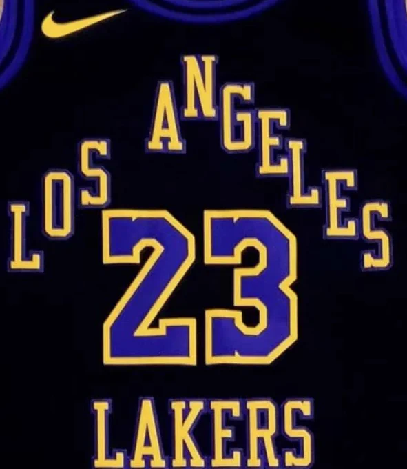
In case you missed it, there was a bit of a buzz over the weekend with the possible leak of a new City edition jersey for the Los Angeles Lakers (and also possibly for the Indianapolis Pacers, but we’ll get to that in a sec).
As many of you are aware, a gentleman who posts on twitter as @camisasdanba (which translates to “Shirts of the NBA”) has been notorious for several years for accurately leaking new NBA jerseys — in fact, Paul had an excellent interview with him back in late 2020. If you haven’t read that, I heartily recommend so doing. But the tl;dr version is he is almost always spot on accurate when he posts leaks, and this weekend he dropped a few tweets that purport to show the 2023 Los Angeles Lakers “City” edition jersey.
🚨 VAZOU (2X)
Aqui está a imagem completa da nova camisa City Edition do LOS ANGELES LAKERS.
Vocês gostaram?
🖼️ via @chadearnbatime pic.twitter.com/UKnuDJ8qiH
— Camisas da NBA (@camisasdanba) August 19, 2023
That was followed up by the following:
O uniforme resgata um logotipo antigo dos Lakers. Esse modelo em forma de triângulo foi adotado na década de 60, logo após a mudança de Minneapolis para Los Angeles.
🖼️ via @chadearnbatime pic.twitter.com/sHC06uxm02
— Camisas da NBA (@camisasdanba) August 19, 2023
My Spanish isn’t very good, so I put his tweet text into google translate, which came up with the following: “The uniform regatta with an old logo of the two Lakers. This triangle-shaped model was adopted in the 1960s, after moving from Minneapolis to Los Angeles.”
My Portugese isn’t very good, so I put the tweet into Google translate, which gave the following: “The uniform rescues an old Lakers logo. This triangle-shaped model was adopted in the 1960s, shortly after moving from Minneapolis to Los Angeles.”
Indeed, that logo was in use from 1960-1967, so it’s quite possible it will serve as the basis for the Lakers’ new City edition jersey.
The purported leak shows a black Lakers jersey, with the “Los Angeles” portion in a chevron shape above the uniform number, while “Lakers” is below. The neck and sleeves appear to show two purple stripes, with Los Angeles and Lakers rendered in gold, with purple outlines, while the number is shown in purple, with a gold outline. The back of the jersey shows a radially arched NOB in gold, with the same number treatment as on the front.
The jersey itself appears to be a replica — or at least not in the same template as current NBA jerseys, although similar leaks from Camisas da NBA have also shown replica versions. That should not necessarily detract from its possible authenticity.
Again, we have no confirmation this is indeed a legitimate leak, but Camisas da NBA has in the past been very thoughtful and very careful in what he tweets out. Based on his credentials, many outlets have picked up on these tweets as legitimate, which they may indeed be, but for now we’re simply going to put this out there as a purported leak. I’m sure we’ll find out soon enough whether this is legit.
🚨 VAZOU!
Aqui está a primeira imagem do novo uniforme City Edition do INDIANA PACERS!
O que você achou?
🖼️ via @FieldhouseFiles pic.twitter.com/KQZt8luxKP
— Camisas da NBA (@camisasdanba) August 19, 2023
You’ll note in that tweet he acknowledges he is posting that via @FieldhouseFiles, which posted this story (unfortunately that article is for “Paid Subscribers” only, so we can’t see the design, but it’s safe to say the graphic Camisas posted is the same as the one in that article).
While the Lakers “leak” is entirely believable, based on colors and the fact that the design is a harkback to one from the 1960s. The Pacers purported design is…um, different. If that graphic is correct, the jersey and pants will be gray, with “Indy” in a white, almost Comic Sans-esque font, with light blue blockshadow. Front number is a bright yellow. Side stripes on the jersey are solid yellow at the hem, transitioning up to a paint-splatter fade. That pattern is reversed on the shorts, which have a bright blue stripe on the hem.
This isn’t to say the Pacers “leak” isn’t legitimate, but I’d take that with more of a grain of salt than the Lakers’ leak. Still, the fact that Camisas has tweeted both — based on his track record — lends a bit more credence to them than other leaks from less reputable sources.
Will either or both of these turn out to, in fact, become the Lakers or Pacers new City uniforms? We’ll just have to wait and see.

GTGFTU: 11/21/1971; New York Giants (13) at Pittsburgh Steelers (17), Three Rivers Stadium.
Not quite.
Try again!
My Spanish isn’t very good, so I put his tweet text into google translate
The gentleman is Brazilian; his tweets are in Portuguese.
Whoops. Also put it into Portugese to English translate (post now updated). It’s quite similar.
Good call DJ
Dunderhead eh? My (very) Scottish father frequently says that, pronounced “dunderheid”, so I always assumed it was a uniquely Scottish insult.
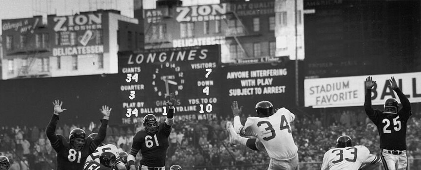
Looks like the 1956 NFL championship – Chicago Bears at the New York Football Giants in Yankee Stadium.
White jerseys and sneakers for the Giants. Not sure why on the former.
That’s my guess as well.
Always wondered about the white jerseys. That wasn’t a thing for the Giants until the 60s, right?
You got it right, William!
First season at Yankee Stadium (moved from Polo Grounds) – last championship for 30 years (SBXXI).
The Giants routinely alternated between blue and white jerseys at home until ’57, when the blues were designated as the home jerseys. They wore white@home exclusively during the ’67 and ’80 seasons, then a few times thereafter…typically when they matched up against the Cowboys in the ’80s.
I loved when the Giants did that against the Cowboys.
And I loved that uniform as it was. The Giants were one of a few teams that could go blue/white/white and actually look great.
Well, it’s safe to say the ‘72-‘23 Denver Broncos are not on your short list…and it’s unlikely that the Bears, Texans, and Seahawks make the cut too(?).
So aside from oldies but goodies(ex- the Colts 2x horseshoe helmets, the fearsome foursome Rams), that’s leaves the CFL Argos and Als, and of course the newly-branded Memphis Showboats-the last is one you like iirc). Are there others?
All of those are fine.
Bears and Texans also look good with blue pants but I don’t need them all the time.
Seattle… I’d prefer blue/wolf gray/wolf gray. Blue/white/white is acceptable.
Come to think of it, Denver may be the only navy blue helmeted team that bugs me the way they do. No…wait… when the San Diego Chargers had dark blue helmets they looked bad without gold or blue pants.
I think it comes down to this: if you have orange, red or yellow/gold in your color scheme, you really should wear those color pants on the road (the Browns, Bills and the NJ Generals are exceptions). Or something like that.
I’m clicking thru the GUD and am amazed that the Bears wore their navy blue jerseys for every regular season game from 1941 thru 1956!
Looks like the 1956 NFL championship – Chicago Bears at the New York Football Giants in Yankee Stadium.
White jerseys and sneakers for the Giants. Not sure why on the former.
You are an imposter, good sir. The real William F. Yurasko already posted this exact same comment. And the real William F. Yurasko would never post the same comment twice.
Also, I’m so old that the Mets on WPIX still seems unnatural.
WPIX = Yankees = Ballentine
WOR = Mets = Rheingold
That Pacers jersey is disappointing, that said I do like the fact that they are using an “Indy” wordmark. Would I be wrong in assuming this might be the first time they are doing so?
The yellow spray on the Pacers uni looks like a leak, all right.
B -D
Depends.
Can the City Edition uniforms please just stop? This is like a bad nightmare. Miss the days when NBA uniform changes meant something and were special. The BFBS stuff for the Lakers unfortunately exists and seems to never end as well.
And who has the money to grab all the merch that goes along with them…?
Most NBA fans are poor, literally (zero disposable income)….them shirts never get cheaper…
…and the Lakers and Celts aren’t giving any of them away…. 8 -{
“Most NBA fans are poor, literally (zero disposable income)”
Do you have any data to back that up or are you just making a blanket statement about “Most NBA fans”?
I like blankets.
I think you missed my point, Phil…
most NBA fans watch games on TV they don’t buy tickets or a lot of merchandise and my comments are based upon my own experience…of receiving NBA merch as gifts on Father’s Day Christmas Etc not buying it for myself…my own disposable income goes towards kids grandkids like most Americans not to buy the new overpriced city connect Jersey for myself… when I say “most NBA fans” I’m talking about myself, not sure how that got misconstrued but what better data to use other than one’s own experiences in life and how overpriced NBA merch is and how oversaturated it is…my point overall being how much it would cost to buy one version of every single Jersey that every team puts out that you’re a fan of?
that would be some data… B = D
Both of these jerseys are horrible if true but the target group will nag their parents ears off to get it for them anyway. As it is the NOW jersey and EVERYBODY has one. GOTTA get it or I will be IGNORED or RIDICULED on all channels. Well, wait a season and pick them up at outlets for less than half the price as there will be more produced than purchased. But that is not how things work with this target group. Get it, wear it once, find out it is really tacky, dump it at the thrift store. Start all over again until adulthood. Unless you are eternally worried about the effect of your outfit to others. Which is the basis of fashion.
Pretty much, yeah. The monster is amok and rampaging through the countryside.
GTGFTSB – Could also be a GTGFTU because of the rather unique uniform matchup, Giants at home in white jerseys against the Bears – 1956 NFL championship game, played on my -18th birthday, December 30, 1956. The Giants would score two more TDs, the first with a missed PAT, to win 47-7 and claim the title in the only championship game in an eight-season span (1950-1957) that did not involve the Cleveland Browns, Los Angeles Rams, or Detroit Lions in any way.
Yes, but…
These 2 teams played each other a few weeks before (17-17), both wearing the same uniform combinations.
You’d really need the scoreboard to “make a positive identification of one and only one game possible”, right?
The white sneakers are a giveaway that it’s the NFLCG…and the last time the 2 played with logo-less helmets…, but I suppose one could debate whether or not they are ‘equipment’ or ‘uniform'(?), since at least 1 Giant wore a pair of black ‘Chuck Taylor’-styled ones:
link
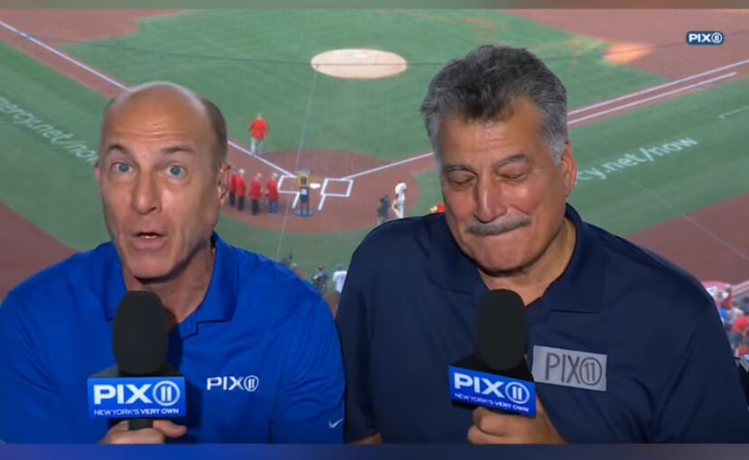
How refreshing to have a baseball game on regular broadcast TV. Any reason why this was OTA and not on cable? There have been times this season when an entire series has been on 3 different outlets, one for each game (cable, Peacock premium and Apple TV+). Very frustrating.
The Mets have for well over a decade played 20+ games a season on PIX link
They are exclusively on Friday, Saturday or Sunday (though not every F/S/S). Not quite sure of the arrangements between the two (they may also share cameras and equipment with SNY, aside from Gary, Keith & Ron Darling as the PBP/color team).
And yes, as William Yurakso noted above, they didn’t always use to be on PIX (that was the Yankees channel); the Mets were often on Channel 9 — WOR.
its true, Keith Hernandez is a “dunderhead”. he’s still one of my favorite players of all time, and he’s pretty entertaining in the booth as well.
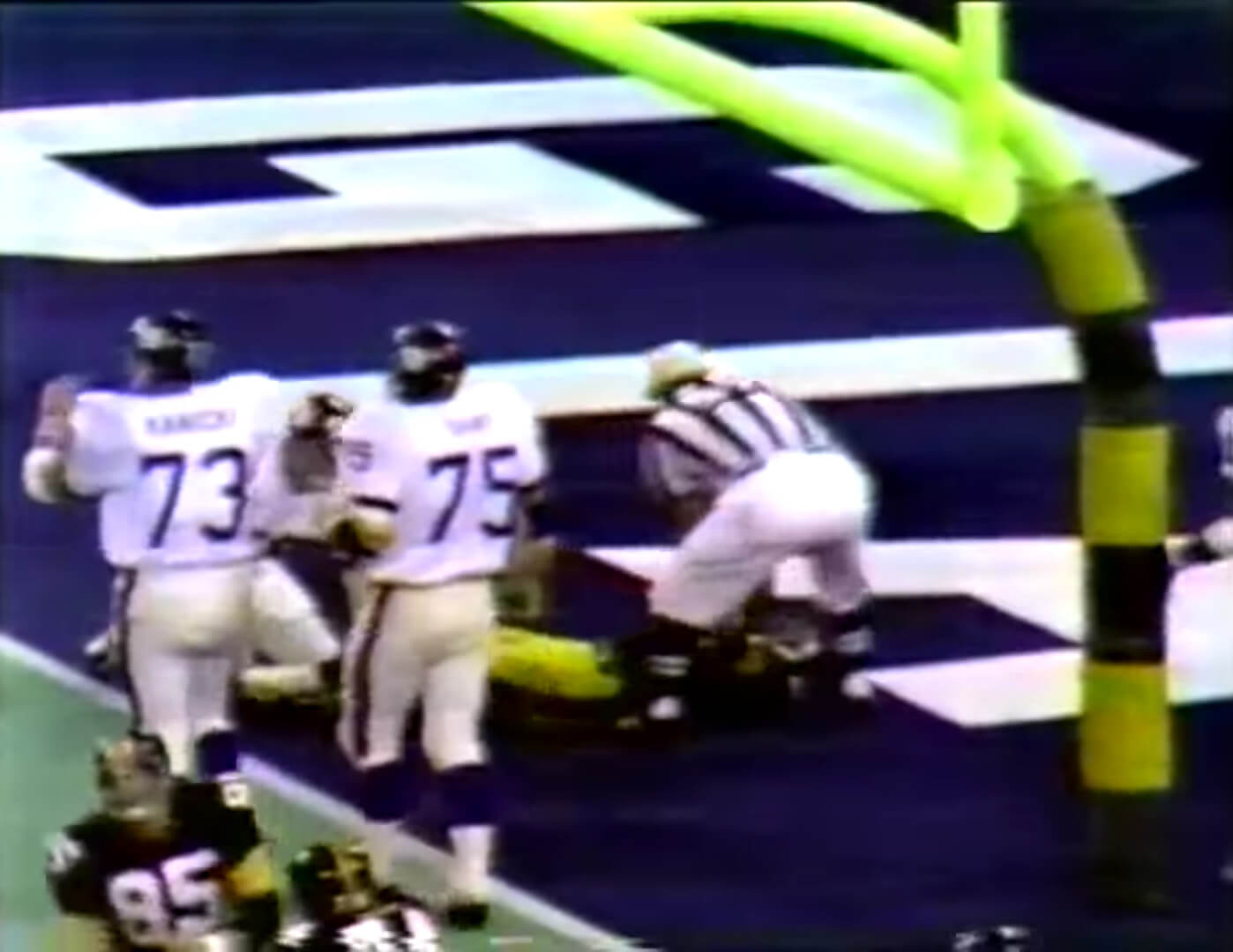
GTGFTU: August 28, 1970: Giants at Steelers (preseason)?
You got it!
The game was on ABC Sports, the first time Keith Jackson, Don Meredith and Howard Cosell called a game together. A few weeks later ABC would try this new thing called Monday Night Football.
I believe this is the only time the Steelers put the name of a non-conference opponent in one end zone. It’s one of a few times they put any opponent’s name there… for the 1972 and 1980 (’79 season) conference championship games, they had the Dolphins’ and Oilers’ names.
At first I thought this game was played @ the recently Astro-turfed Pitt Stadium, since the Giant blue endzone could easily(?) have been repainted for the Panthers, plus barber-pole upright pads were used there…guess the Steelers pulled out all the stops for the TRS pro football opener. The Pirates were on a west coast trip, so plenty of time to get the field back to green for their return.
Sadly, the Steelers didn’t use colored endzones for the 1st regular season game at their new home:
link
A Oiler Blue endzone would have looked awesome!
The Steelers were doing all kinds of things with their endzones the first three seasons at Three Rivers. Then they scaled back considerably until the late 80s. Looking back at those early 70s videos is a real treat.
Keith Hernandez is the man, I like his dunderheadness.
I get the feeling they’re running out of ideas for some of these alternate NBA uniforms…
“in fact, Paul had an excellent interview with him back in late 2020. If you haven’t read that, I heartly recommend so doing.”
Phil, I think you meant “heartily.” Or maybe “Hartley,” as in Bob Hartley, who was excellently played by Bob Newhart in his eponymous TV show from the 1970s.
Ugh. Yes, typo. Good catch. Now fixed.
Love that show.
The theme song is my ringtone for when my wife calls me.
If you love the old 70s show you have to go back and watch the last episode of the ’80s(Larry Daryl and darrell) Newhart Show…you will be rewarded
Best finale ever.
That Pacers jersey would be referencing a VERY specific design style that was popular in Indy starting with the 1990 Pace Car, and going throughout the mid 90s. Would totally believe that it’s genuine
The Indy uni looks like the cover of a bad early 80s new wave album.
I used to be excited about uniform news but the NBA/Nike has uniform whored it to a point that a brand doesn’t even matter anymore. When you turn on a game you should know instantly who’s playing. You can’t do that anymore. It’s just sad.
Wasn’t it already like that for some teams when Adidas took over?
It was definitely starting to get bad towards the later years of the adidas contract (some teams had 2 or 3 alternates), and never forget all those sleeved jerseys they foisted upon the league. Teams were wearing throwbacks (hardwood classics), alternates, Christmas, Chinese New Year, etc. So it was getting ridiculous.
But it’s worse under Nike: every team has at least four different unis, and (I’d have to check) but I believe one season the Warriors had either seven or eight different unis. Some are one-offs and some aren’t worn often, but there are WAAAAY too many uniforms now.