Click to enlarge
Lots of NBA news yesterday, kids. One thing at a time:
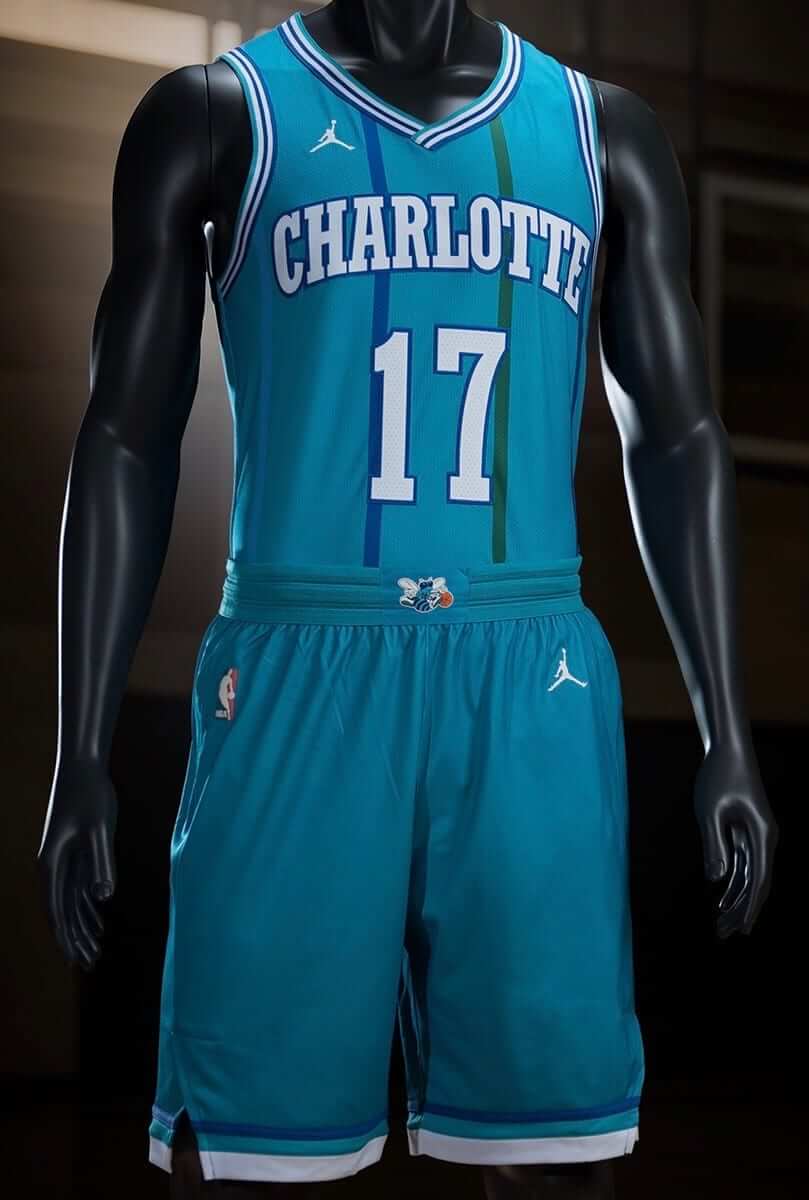
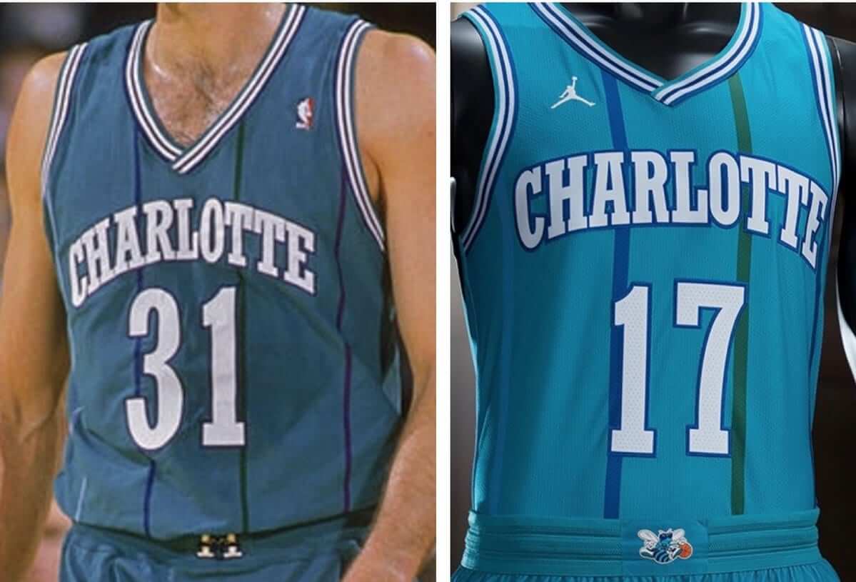
1. In a move that had been widely expected, the Hornets became the second team to announce a throwback for the upcoming season (the first was Milwaukee). As you can see above, the new rendition takes a few liberties with the Alexander Julian-designed original, most notably by making the stripes signifcantly thicker. Here’s a side-by-side comparison — original design on the left, throwback on the right (click to enlarge):
Personally, I’ve never liked this design. I don’t like the asymmetry of the stripe pattern, plus I hold this uniform responsible for igniting the purple and teal Dumpster fire of the 1990s. But it’s been made very clear to me over the years that Charlotte fans love this uniform, so good for them — now they’ll get to see it again. (Additional photos here.)
But they won’t get to see it very often, because, the Hornets plan to wear the throwback only three times: Nov.15 against the Cavaliers, Dec. 23 against the Bucks, and Jan. 13 against the Thunder. I guess that’s what happens when you have so many other jerseys to sell wear.
2. NBA uniform sleuth Conrad Burry posted a video game screen shot of what was purported to be a red alternate jersey for the 76ers:
JUST IN: Via 2K, confirmation of the Sixers red alternate uniform design. I like it better than my two ideas. Nice (h/t @JMoneyMikita) pic.twitter.com/0H22F56nlR
— Conrad Burry (@conradburry) September 13, 2017
That got the attention of the Philly-centric sports blog Crossing Broad, which promptly posted photos — real photos, not video game screen shots — of the same red jersey. It’s not clear where they got them or how long they’d been sitting on them. Here’s the front shot (you can see the rear view and the shorts in the Crossing Broad post):
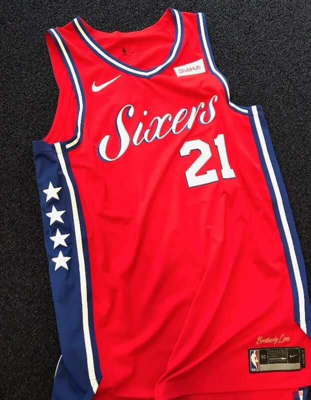
The team hasn’t confirmed anything. But given that the photos match the screen shot, I’m inclined to believe that this is legitimate. Some quick thoughts:
• This design has the same thin drop shadow and “Brotherly Love” hem embroidery that we saw with the Sixers’ blue and white uniforms, which were unveiled last month.
• The script looks a lot like the Christmas designs from the past two years.
• Speaking of the script: What the hell is that extra prong between the “i” and the “x”? Look:
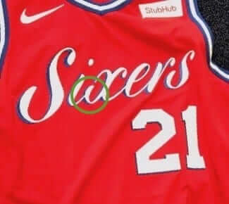
Okay, so we all know cursive writing is going the way of the dinosaurs, but that’s a bizarre way to connect those two letters. Let’s compare it to that Christmas design:
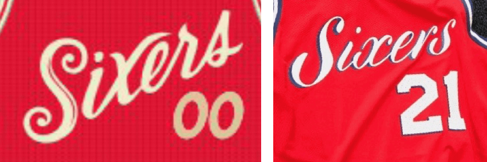
Now, which one of those looks better? Even worse, which one looks like “Sixers” and which one looks like “Suxers”? Come on, people — what were you thinking?
3. And then came the mother lode: That Sixers screen shot — the one that Conrad Burry posted — was originally tweeted at him by a gamer in Australia who apparently got his hands on NBA 2K18 ahead of everyone else. The gamer also posted shots of alternate designs for the Celtics and Raptors:
@conradburry boston statement jersey pic.twitter.com/m0rytYMo6T
— Josh (@JMoneyMikita) September 13, 2017
@conradburry raptors statement jersey pic.twitter.com/BxaR17SXxW
— Josh (@JMoneyMikita) September 13, 2017
So Burry asked the gamer if he could provide similar shots for all of the other teams, and the guy obliged. Burry then posted all 30 of them on SportsLogos.net — a great scoop on his part.
Ordinarily, I’d be at least a bit skeptical of video game shots. But the fact that the Sixers design appears to be legit suggests that the others probably are as well. We’ll know for sure soon enough, because the Suns are planning to unveil their alternate design tomorrow, and I’m hearing that there may be other unveilings tomorrow as well.
As you can see from those Celtics and Raptors jerseys, the screen shots indicate these alternates are a mix of new designs and old ones that teams have already been wearing. Some of the new ones are fine, and one is outstanding; some of the others aren’t so hot. You can see all of them in Burry’s post. I’m going to hold off on assessing them until we know for sure that they’re legit.
Also: As Burry notes in his piece, we were originally told that these alternates would be listed under the rubric of “the Athlete’s Mindset,” but the video game has them listed as “Statement Uniforms.” Those two terms are cringeworthy in roughly equal measure, so we’ll just keep referring to them as alternates.
ESPN reminder: My latest ESPN column has the results of our Titans-redesign contest. Check it out here.
Raffle reminder: I’m currently raffling off some cool Hartford Whalers memorabilia. Full details here.
Uni Watch roster update: As you may recall, I recently put up a “Help Wanted” sign so I could hire a new Ticker intern in the wake of Mike Chamernik’s departure from the site. I’m happy to report that we had so many excellent applicants that I ended up hiring three of them. Meet Jamie, Kris, and Anthony:

Jamie Rathjen
I’m from Centreville, Virginia, in the Washington, D.C. area, a recent graduate of the University of Virginia with a degree in English, and a longtime Uni Watch reader who had never submitted anything to the Ticker until last Thursday. That was a good time to start, I suppose.
My favorite sports are hockey, soccer (men’s and women’s), football (college and pro), and college basketball. I don’t actually play a sport (although I tried out for the UVa quidditch team), but I enjoy running and cycling. My other interests besides sports include reading, writing, music, video games, history, geography, and trivia.
Kris Gross
I am a 24-year-old board op/producer working for ESPN Radio in Dallas. I also work part-time with the Dallas Cowboys TV department.
I am a uniform enthusiast with a passion for purple jerseys (sorry, Paul) and a disdain for white pants. I graduated from TCU in 2014 with a degree in Sports Broadcasting, and I’m getting married to a girl way out of my league on Oct. 21.
[It’s a measure of my belief in Kris’s potential that I didn’t let the purple thing get in the way. — PL]

Anthony Emerson
I’m a 22-year-old English student at the University of Southern Maine in Portland. You may know me from the handful of soccer pieces I’ve written with Phil over the years. Soccer is indeed my favorite sport. I first got into Uni Watch via the ESPN column and then the blog, which I’ve been reading religiously since I was a teenager. I’m proud to be a part of the team.
Jamie, Kris, and Anthony all did extremely well in their Ticker auditions, and I’m confident that you’ll see no drop-off in quality when they’re on duty. With these new team members in place, and with deputy editor Phil Hecken and assistant editor Alex Hider still on board, we’ve reshuffled the Ticker assignments. Effective immediately, the Ticker will be authored by the following people on the following days:
Mondays: Jamie
Tuesdays and Wednesdays: Alex
Thursdays: Me
Fridays: Kris
Saturdays: Anthony
Sundays: Phil
I’m extremely happy to have these new additions to our roster. Please join me in welcoming them to the Uni Watch family.
Naming Wrongs update: Scott Turner and I have been wanting to create an all-purpose design that would apply to all corporate-named stadiums. We briefly dabbled with a design that said “I Hate Corporate Stadium Names,” but the use of “hate” seemed a bit extreme, plus we felt we could come up with something more creative. And now we have (click to enlarge):
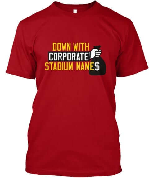
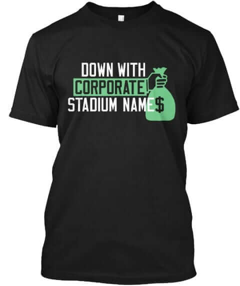
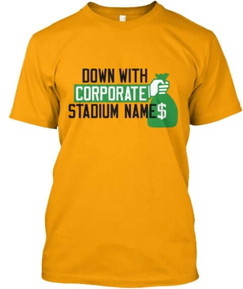
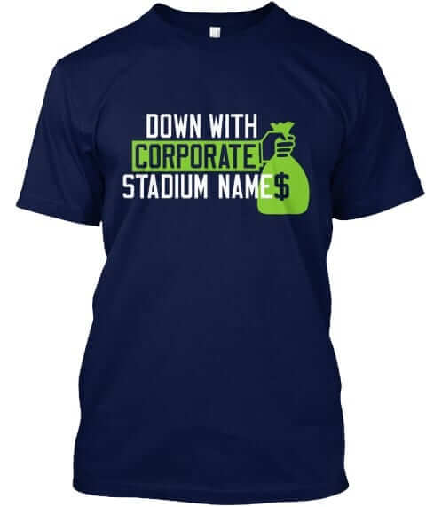
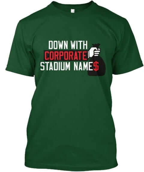
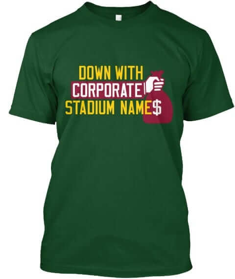
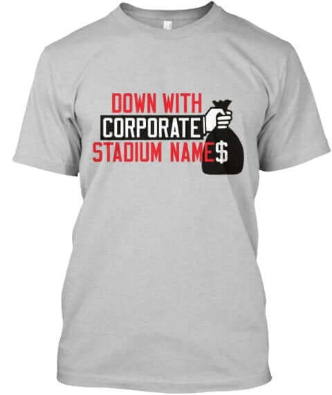
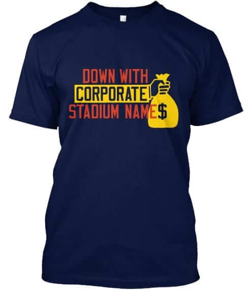
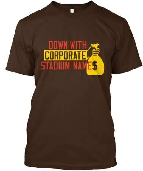
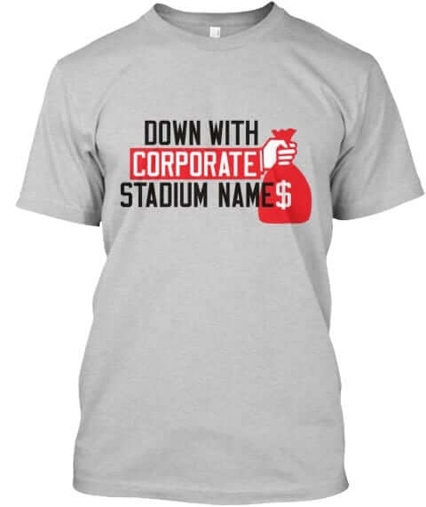
Not bad, right? We can do this in just about any color combo. If you have specific requests, just ask. We’ll also be adding versions with the word “Stadium” replaced by “Arena.”
All of these designs are now available in the Naming Wrongs shop. They’re also cross-listed in the Uni Watch shop, where card-carrying members can get 15% off. (If you’re a member and need the discount code, send me a note and I’ll hook you up.)
The Ticker
By Paul

’Skins Watch (now running on Thursdays): The city of Montreal, moving toward reconciliation with indigenous people, has added an Iroquois symbol to its flag and will rename Amherst Street, which had been named after the British general who advocated giving smallpox-laced blankets to Indigenous tribes (from @PureLipschitz).

Baseball News: I remember when this happened: Pirates OF Dave Parker had to wear a helmet in the field in Montreal because fans were throwing stuff at him. … The excellent Threads of Our Game website, which chronicles pre-1900 uniforms, has recently turned up some good info on designs from 1891. … A tweet from A’s exec Chris Giles indicates that the team will be moving back to kelly green. Maybe so, but I can tell you that it isn’t happening in 2018 (from Kyle Brown). … Speaking of kelly green, look at this! That’s the Single-A Eugene Emeralds. Yes, the stirrups are backwards, but still. Here’s another shot (from Wade Heidt). … Good spot by Jeff Walter, who noticed a sleeve logo inconsistency in a 1996 Reds game. … Durham Bulls P Mike Broadway was victimized by a NOB font inconsistency (from Casey Hart). … Check out the Phillies’ locker room nameplates: The lettering font matches the jerseys, but the number font doesn’t (good observation by Frank McGuigan). … Here’s our best look yet at the “Postseason” cap patch (from @frankie2pants).

Pro Football News: Here’s another article about the Colts’ seamstress, who’s been getting a lot of attention lately (from Mike Miller). … The CFL is eliminating pads from regular season practices. Current NFL policy limits teams to 14 padded practices during the regular season, although some teams don’t use them. … Back to school special: The mighty Fleer Sticker Project has a great post on old NFL and AFL textbook covers. … This is pretty funny: Taylor Nicolaisen has a blog devoted to spotting crooked Broncos logos.
College Football News: Here’s this week’s uni combos for Vanderbilt (here’s a closer look at the gold helmet), Virginia Tech, and Illinois. … The 1938 Tulane/UNC game might win the prize for weirdest program cover design (from James Gilbert). … Here’s a breakdown of the uniform outfitters for all 130 FBS teams (from @VictoryCB). … Here’s a good look at the Tulane equipment staff getting helmets ready for a game (from Ryan Doyle). … Here’s a good look at Purdue’s college football centennial helmet logo from 1969 (from Pro Football Journal). … As you know, I’m not a fan of commingling sports and corporate logos. But I have to admit that Ball State wearing the Ball jars logo would be pretty good. … Penn State freshman now have to earn the stripes on their practice helmets (from Jerry Wolper). … An alum has written an entertaining plea for the Columbia football team to wear Columbia blue uniforms. … Houston plans to scrap their regular NOBs for Saturday’s home opener and instead go with the rarely seen SNOB — that’s school name on back. … You knew this was coming: Florida is adding a new helmet decal for Hurricane Irma (from George Mangrum). … New mono-white road uniform for Northern Illinois (from @AVKingJames).

Hockey News: Some new uni number assignments for the Rangers (from Alan Kreit). … Speaking of the Rangers, look how their torso striping looks on the new Adidas road jersey — ay-yi-yi. That looks more like an Islanders fisherman jersey than a Rangers jersey. … New center ice design for the Capitals. “The buried lede of the whole situation is that they also changed the stripe pattern of the red line, from white stars to red stars within a red outline,” notes Zach Spencer. “I think the stripe looks way better and cleaner this way.” … The Canucks’ new practice jerseys use the team’s retro logo (from Ryan Wetstein). … New Ron Hextall-inspired mask for Flyers G Brian Elliott (from Patrick Thomas).

Soccer News: Nike’s soccer jerseys are making too many teams look the same (thanks, Alex). … UK soccer team logos reimagined through a Simpsons filter? Sure, why not (from Tanner Welch).

Grab Bag: A Canadian judge was suspended without pay and reprimanded for wearing one of Donald Trump’s “Make America Great Again” caps in his courtroom. … Gross: William Penn University puts the Nike logo on its business cards (from Jesse Gavin). … Here are this week’s IndyCar liveries (from Tim Dunn). … Interesting piece on hate group logos and iconography (from Jeremy Baker). … According to this book about marketing, chicken farmers in Nakuru, Kenya, painted their chickens purple. Why? “The color purple is not appetizing to birds of prey. As a matter of fact, eagles and hawks don’t know how to process purple things — they don’t recognize purple as food.” No comment (from Will Scheibler).
Thanks Paul, I can’t un-see the “Suxers” now on that jersey. Guess it is a good thing they are wearing it only three times :)
Actually, we don’t know how often the Sixers alt will be worn.
It’s the Hornets throwback that’ll be worn three times.
The Sixers’ cursive mistake is just sad.
Is that supposed to be a tire tread motif on the Cavs’ jersey?
And the “Down with Corporate Names” wording just reminds me of this: link
Looks like it was designed on a computer and not by hand.
Yeah, that prong between the i and the x is actually part of the x. As a standalone character, the x has a pretty big curl on each of its four legs. But when you put letters together in cursive, you need to know how the letters connect to each other. It takes a human hand and eye to modify the letters as needed to connect them, instead of just putting each of the letters in a row like a computer does. If they want the x to have the big fancy curls on each leg, then it is best not to try to connect all of the letters together. And vice versa, if they want the letters connected, then you do it like the Christmas jersey and lose the big curl.
About those guys in green, they are the Eugene Emeralds. Vancouver Canadians are the guys in red and black.
Thanks. Fixed.
I’d like to nominate Süxers as the proper spelling.
Love the crooked Broncos logo blog. I can relate as it is a pet peeve of mine whenever I see the Lions helmet logo (aka Bubbles) incorrectly positioned so that he appears to be crawling on all fours instead of leaping off his hind legs.
Paul the link to the Houston SNOB story is a link to a protected twitter account.
Thanks. I’ve swapped in a new link, here:
link
Welcome to the team, Jamie, Kris, and Anthony!
Yes, welcome aboard!
Congratulations to the new interns, and good luck, gentlemen.
-So happy to hear the A’s likely going back to kelly green! This is progress in the baseball world. Now we just need the Padres in brown full time, the White Sox wearing white socks, and the Blue Jays wearing their white front panel caps full time at home.
-The Canucks wearing stick-in-rink logo as a primary crest on practice jerseys is not a new event. They have been doing this for some time:
link
link
So happy to hear the A’s likely going back to kelly green! This is progress in the baseball world. Now we just need the Padres in brown full time, the White Sox wearing white socks, and the Blue Jays wearing their white front panel caps full time at home.
That would be a fabulous start. And then we could have the Marlins back in teal, the Astros in orange caps every day, the Rays going full-time ’79 or becoming the Expos, the Tribe in Wahoo-less caveman unis, the Angels dialing back the red and the Diamondbacks going with their full name on non-awful uniforms.
Don’t forget the Royals in royal blue.
FWIW – Ball State University is named after the Ball Brothers, the manufacturers of Ball Jars. So there’s at least a tie-in there.
Ah, didn’t know that! Thanks for the info.
Ball doesn’t even make Ball jars anymore: link
I think most people call them Mason jars*** despite the big word “Ball” molded onto them!
***just googled it–“mason jar” is now a generic term despite a previous patent/trademark:
” John Landis Mason was awarded patent #22186, issued on November 30, 1858 “
Chirp-Chirp!
I’ve always loved the “old” Hornets’ uniforms! My favorite is the purple one, but the teal ones look so nice. I’m not a Hornets fan, but I’ve always been a fan of the original franchise’s uniform design template.
Phillies Fonts. Gosh I wish they would dump the current font and change to what was on the “play like kids” costumes or what is on the locker nameplate.
Liked the website on crooked Broncos logos. Here in Massachusetts I see a lot of crooked Patriots logos. Elvis is supposed to be looking slightly down. A lot of people put on their stickers with Elvis looking straight ahead. Just looks wrong.
Lots of off-angled Dolphins logos here in FL.
Site was blocked for a few weeks at work and I posted a comment here yesterday (when I was home). Paul emailed me about the new server.
Just wanna pay Thanks Paul, appreciate you taking the time to email me.
De nada, Michael. Site working for you now?
Yup, thanks again!
Man they screwed the pooch with that Suxers font. Looks like the x was supposed not be connected to the i?
That last ticker entry immediately reminded me of this…
link
and this…
link
Rangers sweater had a few things, the hemline is just an awful holdover from the old era.
The collar on all Adidas sweaters appear to be a one color, with a hint of a second where it attaches to the yolk.
Rangers royal blue seemed to be a darker shade than last season, but that may have been the lighting.
A yolk is part of an egg. A yoke is part of a jersey. Spread the word.
The Adizero collars are… well, they remind me of the Nikelace collars for how badly they’ve jacked up the visuals of so many teams. The Edge collars weren’t nearly this bad.
I think you could argue the original Hornets is the most successful NBA brand of all time. I know it’s virtually impossible to remove the team’s success from the equation, but if you think about it, is there a more beloved brand (talking merch sales) for a team that really hasn’t accomplished anything? The Hornets never even advanced to a Conference Finals, but I imagine they had to be in the top 5 for merchandise sales throughout the 90s. (couldn’t find nba merchandise sales stats by year — anyone?).
Also, I think the thickness might be a parallel to the thickness of the pinstripes on the side of the new uniform’s shorts? Not sure why they’d do that but I like it, it shows off the colors a little more.
FFS, merch sales are not a measure of anything except popularity among people who buy merch. Please remember that there are many, many fans out there who do NOT buy merch (but who still buy tickets, watch on TV, discuss the team with their friends, and do all the other things that constitute a vibrant fan base), and that a uniform or “brand” must also appeal to those people in order to be “successful.”
Paul-
Fair points, although even among fans who don’t buy merchandise, the Hornets design and colors are/were still very recognizable to non-merch-buying fans. I think that it’s worth noting that the teal/purple combo was at the time very unique and still is identified primarily with the Hornets (as opposed to the tons of teams that wear navy or black) and that has to be considered a success.
The Hornets don’t have a huge fan base but that’s probably due to lack of winning and a small market home. Although they were still in the top 10 in attendance for 2017 despite having a non-playoff team with no marquee stars. So I’d argue their branding remains quite successful even if you’re not looking strictly at merch sales.
even among fans who don’t buy merchandise, the Hornets design and colors are/were still very recognizable to non-merch-buying fans.
I’m not denying that. But his original criterion for judging the “success” of the “brand” was merch sales. I’m simply pointing out that a uniform’s success cannot be gauged by merch sales alone, nor should we correlate sales figures of *anything* with quality.
Of course that makes sense, but I’m strictly interested in merchandise sales.
Can anyone think of some other good outliers – teams that are consistently in the bottom of the NBA standings but continually at the top of the merchandise sales ranks?
I would speculate that the Hornets in the 1990s would be a very good example of this, and as I said before, perhaps the best example. Can’t find the specific data but it appears to be generally accepted that their merchandise was very popular. Very little achievement on the court, but very high brand success *among people who buy merch*.
The Mighty Ducks appear to be a good example as well. In 1994, first in merchandise sales, dead last in the Western Conference. link
Merchandise sales may or may not be an interesting topic, but they are not what we cover here at Uni Watch. Uni Watch is about what the players wear (uniforms), not what fans buy/wear (merchandise).
I had a Mighty Ducks cap when I was a kid and I loved wearing it despite being a Lightning fan. I loved the color scheme it used back then. The Mighty Ducks’ visual program sure hooked me in ’94!
You hired a guy who loves purple uniforms and hates white pants?!?!?!?!
Blasphemy!
The 1938 Tulane/UNC game might win the prize for weirdest program cover design (from James Gilbert).
It looks like a still from an old Universal Pictures Puppetoon.
I actually like the Rangers having the stripes follow the shape of the bottom of the sweater. I always hated the the stripes being straight and the front and back fabric sort of dipping in the middle (particularly on the whites). Looked like diapers.
Also, I see “Slixers” when I look at the 76ers uni vs. “Suxers”; although, Suxers may be more appropriate.
Most program covers (even through the sixties) came from catalogs you picked the designs from. The same designs were usually available for a few years. The Tulane was from a line of the “doll” covers. Here is another one for link
Interesting. Thanks, Susan.
I am a Charlotte native and Hornets fan.
I was a teen in 1988 when the Alexander Julian designed original Hornets uniforms were introduced.
It’s funny how tastes changed. IIRC, almost everybody hated the Hornets uniforms when first unveiled. Now, almost everybody (except Paul I guess) loves them.
Seems a little unfair to “blame” the Hornets for starting the teal/purple trend of the 90’s; they were the first really to use this combo and succeeded in making it iconic. If others copied them, well, imitation is the greatest form of flattery, right?
Paul didn’t mention this, but one other difference between the throwbacks and the original is the belt logo.
I could be wrong about this, but I believe that the “H” logo you seen on the originals was also designed by Julian, separately from the “Hugo” logo that was considered the primary. The “H” logo was discontinued after a year or so, not sure why exactly.
Here’s a closer look for those not familiar. I am thinking that it might have been considered too similar to the Montreal Canadiens perhaps?
link
Daniel,
You’re right, I do think people had a little bit of shock when the original unis were released, but I think they quickly came around. At least they weren’t pink like they almost were (according to Alexander Julian!)
I imagine other teams looked at the merchandise sales and said “Dang, look how much the Hornets are selling! Let’s do something along those lines.” And the creative team got to work using purple and/or teal along with more fun, cartoonish logos.
Personally I’m fond of almost all of the purple/teal renditions of uniforms in the 90s included on the ESPN article so I certainly wouldn’t “blame” the hornets – I thank them for it! In fact, I met Alexander Julian in Chapel Hill and told him “on behalf of all 90s kids, I thank you for the purple/teal” – haha.
Interesting about that original hornets logo, I think you’re right about the Canadiens. Still a cool logo!
Can’t believe they flubbed the pinstripes on the hornets uniforms. Even non-hornets fans have wanted these back around town. We love them.
Really looks like they’re just copying the thickness of the current uniform stripes, but I think it throws off the balance of the whole thing. The two middle stripes are now way too prominent. I’m happy that its happening, just wish it had been done better.
I always wondered if the uniforms would look better if the pinstripes extended down into the shorts. Maybe they figured it would be difficult to line them up when a player was wearing them?
It always looked to me that they lost the matching shorts and had to run out to the store and find some quick replacements.
It is a little disappointing that the stripes are thicker but I think you’re right about copying the thickness of the current uniform’s stripes. I do like that you can really tell it’s Royal, Lt Blue, Green and Purple now – more noticeable.
That being said, people (myself included) have been clamoring for the return of this uniform since it left so it’s hard for me to complain. I love it! And will definitely buy one as soon as I can.
Cool Brian Elliott Flyers mask. Putting aside whether a middling NHL goalie should be entitled to a personal logo (LOL, who’s buying his swag?) his logo is awesome too. It’s his initials, what I’m presuming is his new jersey #37, and the #1 we normally associate with him from St. Louis and Calgary. Clearly, #1 is unavailable in Philly as a retired number for Bernie Parent.
Nice to see the logo of the NBA given very little prominence on the uniform. Maybe explains why The Logo, doesn’t want to be THE LOGO anymore
An alum has written an entertaining plea for the Columbia football team to wear Columbia blue uniforms.
CU’s uniforms are God-awful. I wish they would adopt something more akin to the Tar Heels… and retire that stupid Lion insignia.
If kelly green is coming back for the A’s, are they also returning wedding gown white, Fort Knox gold, and Vida Blue, too?
One more number change for the NY Rangers. Jesper Fast goes from 19 to 17. Rangers are retiring 19 for Jean Ratelle later this season.