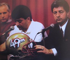
We all know the story about the helmet shown at right. The 49ers introduced it at a press conference prior to the 1991 season. But fan response was so overwhelmingly negative that the team backtracked the very next day, announcing that they’d stick with their old helmet design after all. And that was the end of that.
Or at least that’s what I thought — until reader Doug Kyed recently sent me this. He said he’d found it at his parents’ house while designing a Super Bowl cake.
For me, this constituted news on two different fronts: First, I’d never seen the Niners’ one-day helmet design used on any NFL-licensed product. And second, I had no idea what the hell a Duncan Hines “football cake kit” was. I asked Doug for more info, which he’s now provided.
Here’s the whole kit. As you can see, it included a jagged cut-out — now removed — labeled as “football laces.”
“From what I can gather,” says Doug, “it appears that the kit was just so you could make a cake look more like a football by attaching the laces that pop-out laces and then adding a helmet or two to the cake.”
Sure enough, I went to eBay, searched on “Duncan Hines NFL,” and came up with this. That kit is from 1989, so it doesn’t have the Niners prototype helmet. Weird that they included white stripes, since those don’t appear on an NFL ball. I like the cardboard grandstand/scoreboard, though. (In the unlikely event that anyone out there wants to buy this, here’s the full eBay listing.)
Duncan Hines also made an MLB cake kit, and Doug found one of those at his parents’ house as well. Much like the NFL version, it included a grandstand, but Doug’s family apparently used that part already. I wasn’t able to find this one on eBay, or anywhere else (although I bet Uni Watch pastry chef Elena Elms is trying to track one down as we speak).
You can see more photos of both cake kits here — but no finished cakes, alas. “I guess my next step would be to look through old family photos to see if I have any pictures of these cakes,” says Doug. “It’s entirely possible, as I think we’ve taken a picture of every cake ever made in my family. Still, the most interesting part of all of this is that the prototype 49ers helmet is included.”
Agreed. Until now, I’d never been aware of the Niners proto being used in any licensed-merch context. (Yes, some mini-helmets have been produced, but they didn’t appear until years later, plus I’m not sure whether they were licensed or bootlegs.) It’s interesting to see that the helmet design was far enough down the branding pipeline that it showed up in something like a Duncan Hines cake kit. Anyone know if it showed up in any other contexts?
Duncan Hines, incidentally, was a really important guy. Long before he became a cake mix, he basically invented the genre of roadfood reviews with his seminal 1935 book Adventures in Good Eating, which later spawned a full line of travel guides. They were big hits — sixty or seventy years ago, there was no greater stamp of approval a roadside eatery or motel could have than a “Recommended by Duncan Hines” sign in the window. The supermarket brand (which at one time included Duncan Hines bread, Duncan Hines ice cream, and lots of other things before the product line was whittled down to cake and brownie mixes) came later, in the mid-1950s, and was based on the popularity and credibility that Hines had established with the travel guides. So if you’re a fan of Chowhound, or Jane & Michael Stern, or any of the other contemporary roadfood reviewers, have an extra hot dog for Duncan Hines, the founding father of road-trip guidebooks.
Tyson update: My thanks to the many of you who submitted questions for me to ask Mike Tyson when I interviewed him last week. The interview went well, and a transcript of is up now on ESPN. Enjoy.
Stirrup Club reminder: Robert Marshall has a new batch of stirrups for sale. Details here.
And speaking of the Moose”¦: As most of you probably know, Robert Marshall also makes bobbleheads (and yes, they really bobble), and at the moment he’s making a special offer. Dig:
Do you like hand-sculpted, hand-painted bobbleheads? Do you like online paper-scissors-rock? Do you like the potential for free stuff? If you answered yes to these questions, this is your lucky day.
I have 15 precast bobbles in a variety of sports (baseball, football, basketball, hockey, soccer). They can be custom-painted however you like, and I’m offering them up at a clearance price. Instead of the usual $150-$200, these will be available for $125-$150 — or maybe even a bit less, depending on how many people want in. The greater the response, the deeper the discount.
In addition to discounting the work for everyone across the board, I would also like to have an online paper-scissors-rock tournament (or some similar raffle-type system) so that one person can win a free bobble. If there are enough people who like this idea, there can be multiple winners; not enough people, I’ll just give an additional price break to everyone who gets in touch.
Are you a past customer? I’ll knock off even more for you. Ditto for anyone who signs up for a Uni Watch membership in the next week.
Right now I’m just trying to see how many people are interested. If that’s you, get in touch. I’ll follow up with everyone once I see how many people want to be on board.
Uni Watch News Ticker: You know the problem with Penn State’s uniforms? Duh, they’re way too flashy. So now they’re gonna get simplified. Personally, I think it’s a good move — the contrasting trim seemed superfluous. ”¦ Next year’s Super Bowl logo has been unveiled, and it looks just a wee bit familiar. ”¦ And so it has come to this: a Prairie View A&M player with a sticker on his brim (disturbing find by William Banowsky). ”¦ Matt Mitchell found a photo of Mark Teixeira from when he signed with the Rangers. “I don’t know about that #10,” says Matt. “Teixeira wore 23 as a Ranger, and Michael Young was already wearing 10 when Tex got there.” ”¦ Taking the elastic out of your pant cuffs looks even worse during spring training drills. ”¦ Rob Ullman has produced a new batch of pin-up commissions. I especially like the mirror shot. ”¦ Goalie Craig Anderson, recently traded from the Avalanche to the Senators, is still wearing his Avs-themed mask, but with a Sens decal on the chin (good spot by Evan Williams). ”¦ Also from Evan: Blue Jays reliever David Purcey wears really big shoes. ”¦ The Twins’ new Japanese import, Tsuyoshi Nishioka, has been using a double-flapped helmet. He’s a switch-hitter, and a quick check of his Japanese photo history shows him sometimes going double-flapped and sometimes not, so it’s probably too soon to say what this means. Maybe he just hasn’t found a single-flapped helmet that fits properly yet. ”¦ A Washington Huskies player forgot his jersey the other day (with thanks to Jameson Costello). ”¦ Also from Jameson: The Giants may wear gold-trimmed jerseys for their ring ceremony. ”¦ Here are some additional photos and info on the robo-shirt that a few dozen players will be wearing at the NFL Combine. ”¦ The Rochester Rhinos — that’s a soccer team — have announced their new jersey sponsor: an anti-tobacco organization (with thanks to Kenn Tomasch). ”¦ A team called the Sir Bills? Wayne Koehler explains: “Johnstown, New York, was named after the son of Sir William Johnson, hence the team name.” ”¦ Here’s a late-breaking detail from the NBA All-Star Game: Little panels with the ASG logo were woven into the nets (great catch by Ryan Mandel). ”¦ One of Newcastle United’s players is wearing a mask while recovering from a broken cheekbone. ” I thought it was interesting that he had to come to the U.S. to get it made,” says Ross Hazlett). ”¦ Patrick O’Neil notes that the BC Lions (that’s a CFL team) have some markedly inconsistent home jersey cuts. ”¦ Interesting Aussie rules football story, as presented by Gibby Davis: “In a preseason game, the designated road team (Melbourne) was supposed to wear their clash guernseys and Essendon was to wear their primary guernseys. Melbourne had just developed a new clash guernsey created for the 2011 season, but once the guernseys showed up, a portion of them were pink instead of the intended red. Rather than wear the miscolored gear, they wore their primary guernsey instead. This created a bit of an issue due to the similar appearance of the two teams. As a result of this, the AFL, is asking the fans whether or not they felt it was a problem. It’s an interesting uni story on many levels.” ”¦ Andrew Primeau noticed something odd: The Giants are all wearing gray undervisors, at least in their Photo Day shots. Odd. ”¦ Weird situation in last night’s Celtics/Nuggets game: Boston had traded Semih Erden earlier in the day and signed Chris Johnson to a 10-day contract to give them a warm body. But Johnson didn’t get his own jersey — he was apparently wearing Erden’s No. 86 jersey, with a cover-up nameplate sewn over Erden’s NOB (screen shot courtesy of Bob Delano). … Here’s the latest think piece about uniform advertising (what was Phil doing on a Yankees blog?).
I think sports fashion has finally hit rock bottom with a player wearing a sticker on the bill of his cap in the field.
That is absolutely true. I see kids running around the mall with the stickers on their hats. I’m not an old man (yet) but still want to rip them off. They look like fools.
When I bought a new Rangers hat the other day, I somehow missed one of the labels when I put it on. I took it off a couple hours later when I got home and saw I’d been out in public with the brand label on the bill the whole time.
It took about 7 showers before I finally felt clean again.
Quote of the day candidate #1
I think this may be the one thing that everyone here actually agrees on.
Take the damn sticker off the hat you morons!
I take the big ugly stickers on the brim off everytime I get a new hat but my buddies always tell me I’m supposed to leave it on “so everyone knows its an authentic 51/50 hat.” That’s when I explain I can just take the hat off and show them the tag inside. They still don’t understand. I need new friends.
59/50* my bad
I’ve seen a couple of young men going around with labels on their lids around my apartment complex… they also happen to wear their pants rather low. So, yeah, they look ridiculous all the way around.
“I take the big ugly stickers on the brim off everytime I get a new hat but my buddies always tell me I’m supposed to leave it on “so everyone knows its an authentic 51/50 hat.” That’s when I explain I can just take the hat off and show them the tag inside. They still don’t understand. I need new friends.”
MWAH HA HA HA HA HA HA HA HA.
true.
Skinner is Quote of the Day candidate #2
I’ve never understood that line of “thinking.” For one thing, it’s no harder to fake a sticker, or swap a sticker from an authentic to a repro, than to fake a repro. Counterfeiters in all industries spend more effort faking the packaging than faking the product. But mainly, it’s like, dudes, grow a pair. If you’re not confident enough in others’ perception of the authenticity of the hat, then you don’t have sufficient self-confidence to wear the hat at all.
Plus, any reasonably knowledgeable cap-watcher can tell an authentic from a fake with a single glance at 20 feet at least 9 times out of 10. Anyone who can spot a fake is laughing at you for leaving the sticker on, and anyone who can’t spot the fake won’t be impressed either way.
Bottom line: I’d rather see a hundred Nike swooshes than a single bestickered brim.
From our friend Craig Robinson, FlipFlopFlyBall.com link
Is “51/50” a Freudian slip?
link
i bought a 59fifty cap at a mall last summer & as soon i purchased it i tore off the sticker at the counter (not thinking anything of it) the kid behind the counter’s look was if i had just murdered a puppy, ill never forget it.
And there’s Quote of the Day candidate #3
I don’t understand why the manager and coaches don’t put a stop to this foolishness.
It could only be worse if the brim was flat as well.
flat brim? you mean farmer brim? ya see in south Georgia its all the same.
A certain nationally syndicated morning radio talk show host I’ll call “Tom” has a great term for flat brimmed hats: “Probable cause.”
link
I just forwarded that link to all the guys in my office.
I was at Cubs fantasy camp last month and one of the things that made me happiest was during the first meeting of the week when Keith Moreland told everyone to take off their caps and see if there were any stickers on either side of the brim.
Anyone who had not removed them all was fined.
I get the idea of proving that it’s new and authentic, but if I’m paying $35 for a baseball cap, I’d rather it look good. Of course, I’d also rather buy polos from places that don’t embroider a logo onto the breast because I think that looks stupid too.
so ML baseball players feel the need to be able to shoplift easier now as well…
hell in a handbasket
Not to defend this at all, because it’s inexcusable, but the player in question is not a Major Leaguer. He’s a college player. I don’t know how many people would be spinning in their graves if this made it on to a big league field.
Honestly, and just as silly as the sticker business, is the weird habit of wearing caps backwards. It’s amazing to see how long this practice has continued, and it looks as strange as wearing a shirt backwards. Wearing a cap the wrong way started about the same time as excessively baggy pants.
On sunny days, it even defeats the purpose of the cap entirely.
here ya go gusto…
one time we agree
That picture makes me hurt inside.
O how i wish that were not a cubs fan…. coem on man, you’re making us all look bad.
The sticker on the brim/slightly crooked cap look actually has potential to look really good. Of course, to achieve that potential you need to tear the sticker off and straighten your fucking cap.
link
Sorry I was beaten to the punch.
Yeah, but leaving the stick and tag on make shoplifting easier.
I mean, c’mon, let’s keep our socio-econmic cultural thinking caps on (tags and stickers included, of course).
—Ricko
And another thing – what’s with these kids today wearing their blue jeans to restaurants, sporting events, school, et cetera? Dungarees should stay on the farm where they belong!
link
Indeed, Mr. Bernard — these kids today with their link…
What is the world coming to?
What the hell is Alfalfa wearing? Is he going to a rodeo, or a rave? His haircut wouldn’t look totally out of place in the mid-to-late 90s, so I’m going rave.
Love this pic, by the way.
Fully furred cowhide chaps: I think that no matter what event you wear those to, that event automatically becomes both rave and rodeo by the mere power of your presence. Raveo?
Rogers, you just blew my mind.
“And another thing — what’s with these kids today wearing their blue jeans to restaurants, sporting events, school, et cetera?”
I don’t think there’s an equivalency here, unless those kids today are keeping the link on their jeans while wearing them around town.
Of course we think the sticker and the brims and the baggy pants and the music, is beyond stupid. That’s a large part of what makes them like it.
Befuddling the Olds is half the fun of liking things when you’re young.
Y’all did it to your folks. I had a pair of pink hucks and wore parachute pants to the Dead Milkmen show.
The thing is that if it were truly just the kids doing it, I’d be OK with it. Kids are stupid. It’s a known fact. When I was a kid I was really stupid. And all my friends were really stupid as well.
But the problem I see is that a ridiculous amount of people my age and older are doing the flat brim and sticker thing.
I don’t give a shit how people wear their hats. The sticker and flat billed look doesn’t look any worse than a pair of white leather New Balance worn with some stone washed jeans. Jeans that are too tight around the ankle.
To each his own.
On the baseball field? Stupid.
My only problem with the whole hat thing is the trendiness. Safety in numbers, I guess.
Agreed Marty. While there is much stupidity in hat fashion these days, I DON’T REALLY CARE. If my kids want to put SpongeBob stickers on a hat, who cares. If a high school kid wears his with a 5950 sticker, I DON’T CARE. Would I do it? Hell no, looks stupid. Doesn’t mean I care if others want to look stupid. Actually I kind of like it, makes me look better. Wearing a flat bill looks no more stupid than a country boy overly rounded bill either. And I’m completely guilty of that one. I’m sure I looked stupid too. It’s a friggin hat. It’s not pants saggin. That has to be the dumbest trend in ever. Can’t walk, definitely can’t run, nothing right about that one. But hats? I really don’t care.
makes me look better
~~~
no it don’t
I bought a bunch of those stickers off a guy who works at Lids. I put about a dozen on each of the caps I own. When I wear one of these caps I consider it performance art.
Its pretty strange to see a company trying to sell their product by putting a Bengals helmet on the box.
Brian Wilson’s jersey in that media day photo doesn’t look right. Maybe it’s just a jersey not sitting right, but it looks to me like they started the GIA too far to the left.
link
Fittingly enough, the extra space on the other side makes me think of a certain team in our nation’s capital, and what a REALLY carelessly put together might look like for them.
“The Demons had decided against wearing their predominantly white strip because a production error in China meant the yoke on the jumpers turned out pink rather than red.”
… *sigh*…
Nice shout out to Duncan Hines the man.
I’m a big fan of the Sterns; I own copies of their Encyclopedia of Bad Taste and Encyclopedia of Pop Culture and they’re one of the few things I miss from the now-departed Gourmet. I was dismayed to read just now that they’ve divorced; given they still collaborate I’ll assume either it was amicable to they recognized the value of their franchise/brand/joint effort.
Sorry, should read “…it was amicable or they recognized…”. More coffee is on order.
What? The Sterns are divorced? But they still talk just like a happily long-married couple on The Splendid Table. Wow.
Penn State needs to go one step further and eliminate that totally useless dark blue stripe on the helmet. I’d also get rid of the TV numbers, too.
Oh, and one more thing, get that facemask back to gray.
Really want to lose the flash? Drop the swoosh. Or, since Nike is fond of white NOB on white jerseys, how about white swoosh on white jersey and blue on blue?
I bet if someone pitched that idea the right way, Nike would go for it. That might work!
removing the white cuff and colar was a huge step, they will look so much better. put the single stripe back on the pants, and in my horchata they will be about perfect.
I have always felt that way about the pant stripe.
Rule #1… helmet stripe matching the pants stripe.
Robertmarshall, you are starting to sound a lot like me.
You hate me, don’t you?
Just like that girl with the Niners socks.
Rule #1… helmet stripe matching the pants stripe.
Robertmarshall, you are starting to sound a lot like me
~~~
but you see…he’s not like that all the time — to each his own; what i mean is, he doesn’t ALWAYS want helmets to match pants, like most of us OCDers…that would be “boring” because everyone would do it
just like he loves (kind of) how penn state and oregon do their unis…each unique in their own way
unlike THE, who detests anything plain, no matter how classically perfect it is
and bama & PSU both have great helmets
Harold Ballard is calling from the afterlife and says he loves you.
Now if they didn’t have that stupid rule about having numbers on the front and back…
On Mr. Ullman’s work… Tony Amonte jersey reflecting Mark Howe – awhuh? I get what was done regarding the jersey designs and their similarities, but… interesting player choices, to be sure.
I’m generally assuming Amonte, because Patrick Sharp has only recently been an alternate, and thus has only worn the A on an Edge jersey; and I couldn’t tell you if Brian Noonan was ever an alternate in Chicago. And… I suppose it could be Pierre (Not-The-Ex-Avalanche-GM) Lacroix, or even Ulf Samuelsson, who each wore 5 with Pucky on the shoulder for one season…
And shouldn’t the 5 in the mirror be reversed?
It’s not actually a mirror. It’s a portal into an alternate dimension, so it doesn’t need to be reversed.
I’m wondering why he gave the Browns’ girl the wrong style socks.
Oh, so it’s the mirror Daniel Jackson found in season 1 of Stargate SG-1?
I was wondering about that too. Incidentally, the girl in the Earl Campbell jersey can bulldoze my defenses any day.
What is it about thigh highs that drive the male of the species — or at least *this* male of the species — right around the bend?
They accentuate the shape of the legs and provide lift and definition to musculature. Even though that’s not true in an illustration, our brains associate tight clothing on a shapely person with sexiness, so things like thigh highs automatically mean sexy.
That makes sense, but it isn’t just the tight/form fitting aspect.
Perfect example: my wife came home last night wearing a skirt and these high-heeled boots that were up to her knees. Even though I was pissed off at her for getting home late because I was trying to get out the door so I could make it to the Bulls/Heat game on time, I had to pause to take in the view.
I would love to have seen the Kosar era jersey that doesnt have the AL on the sleeve, BROWNS wordmark or NFL shield, as well as the actual striped socks. Other than than *wolf whistle*
Great article, Paul.
I’ve always been amazed that there wasn’t more “one day logo” 49er merchandise, considering how quickly teams have merchandise for sale right after the unveiling.
It’s not like the Premier League, where teams can unveil a new crest and wait months to put merchandise in the club shop, which gives them time to change their mind (which they link, but still).
Great article, indeed. Just another fascinating day of wonderment at UW!
-Jet
According to BRef, Young wore the number 2 in 2000 and 2001. Tex was a 2001 draft pick. By the time Tex got to the bigs in 2003, Young had switched to 10, so Tex would have ended up with something else.
Sign of the times …
link
The end is near….
link
At least we know what’s Paul’s personal anti-Christ would look like from the eyes up.
I suppose it’s a good thing that Rollie Fingers is retired. I can imagine a twist on that concept going far with him.
As far as the Giants going with gold-trimmed jerseys… I think what we all really want to see is link which of course was brought up last fall after their victory.
Even for one game, that’d be something to see.
Thing is, the Giants already have gold-trimmed jerseys. The “we’re the champeens” gold should go on the cap, and it should stay there until someone else wins a World Series.
I guess I just never notice the gold trim, what with the orange being dominant. Then again, I rarely look at a close-up of their jerseys.
Yeah, when I first noticed the Giants gold drop-shadows, at least a full year after they added them, my reaction in real time was roughly, “But they already wear orange and that’s gonna clash with the gold so what the fu — oh, wait a second, that really works. Huh.”
you can bareeeeeeeely notice it. as it should be. The Giants have the best uni’s in baseball IMO. Look at the shot of Posey PL linked to in the ticker, that’s just an old time ballplayer look. Coulda been taken any decade.
Now, I could absolutely go for a once a month throwback of the early 80’s orange Jack Clark look.
link
If they want to do a special self-congratulatory one-off, instead of adding more gold, they should add silver trim to the jerseys. Y’know, because the link is silver and gold.
While I didn’t mind the white/navy trim on the Penn State jerseys, I still think they will look great. My old high school wears uniforms identical to PSU, sans the trim. I’ve always been a partial fan of the Nittany Lions for that (admittedly) dumb reason. Since my favorite college team is Alabama, that’s a true win/win uni situation. The college I graduated from uses purple, so for Paul’s sake, we’ll pretend like I don’t have any affiliation with them.
Can’t wait for the return Bama/PSU game in State College this year. It’s dang near uni perfection, since I love football whites, and particularly Bama’s (with apologies to The Jeff).
I always thought it gave them just a bit of character on an otherwise totally plain jersey… but if the folks in Happy Valley are discontent with it, then I’ve got no problem with them changing it.
I guess if you want to be plain and boring, you should be as plain and boring as possible.
Ranking all the helmets in college football: link
I don’t know who I’d pick for #1 off the top of my head without a lot of thought… but there’s no way in hell it should go to a team with no logo.
there’s no way in hell it should go to a team with no logo
~~~
BFS
+1
What’s BFS mean? I think I’m falling behind in my internet acronyms.
Bull-Fucking-Shit
actually, in this case, it’s “big shock”
you forget phil plain=boring. simple is bad to jeff, he is a broken record. if every team was simple it would suck, just like if every team was oregon it would suck. can’t some teams celebrate simple, and other garishness? i would say it would be boing if all the teams looked alike, perfectly symmetrical stripes, and a sticker on the sie of the helmet as if it was some sort of template that everyone has to follow. if oregon tried to be penn state, fine, the boring assessment works, but penn state is being penn state. and in the case of the lid in this thread, it is sharp. it was actually considered somewhat garish when it was designed, and the gigies make it an uber unique look, it is much more then a logoless helmet. but whatever, it’s boring.
Agreed. And on the NY Jets forum that I’m a part of, we’re considering a ban anytime somebody links to Bleacher Report. They have the worst sports “reporting” of all time.
This guy lost me when he implied that the Stanford helmets should have a bird on them. It’s also obvious that he simply doesn’t like block letters on a helmet, and relegated any helmet with them to the back half, no matter what.
I should say block letters with nothing else. Does he really think the Minnesota logo would be improved by having a gopher peeking out above the M?
A bird?
Isn’t Stanford named after a color?
—Ricko
Exactly! Apparently this fool doesn’t understand that they’re the Stanford Cardinal for a reason, and that they’re not the Stanford Cardinals.
I’m not a professional but that is a really poorly written piece. It reads as if written by a middle school student. Leaving all the subjective aspects aside, the fact that the author listed “players to wear the helmet” that never did, but just played for the team, speaks of sloppy research.
Writers like this give bloggers a bad name.
Lazy construction with poor writing and a total lack of research.
When I saw that he ranked Temple as the worst helmet, I stopped right there. If the rest of the list is that inaccurate it’s not worth my time.
temple’s helmet is brutal jim. the uniform rocks, the helmet is meh. the guy who put it together does not have a clue, but temple is closer to 120 then it is 1 in the brain-pan protection department.
Nah, it’s solid, man. Top third of the list.
The Teixeira #10 jersey doesn’t seem like too big of a deal. When the Twins drafted Joe Mauer, they introduced him with a #16 jersey (his high school number at Cretin Durham Hall). Doug Mientkeiwicz was wearing 16 for the Twins at the time.
So that was likely the jersey number Tex wore with his prior team….
Nope, that was #23
link
Uni ads could generate millions: link
i know i read that somewhere today…
What were you doing on a Yankees blog?
twitter feed, son
I guess Gill’s not the only one who missed something in the ticker.
not sure if that was aimed at me, but i don’t troll the yankee blogs — it came to my attention via twitter and i sent it to paul for the ticker
Dude, read the last sentence of the ticker.
dude, i know what it says…and i know from whence it came; i KNOW the story is from a yankee blog — my point is that i don’t read yankee blogs…i was tipped off to a story of adverts on unis via twitter…really don’t care whether it was a yankee, cub or royals blog who carried it
link.
I just found another sound effect to bookmark, to go with the instant rimshot and sad trombone. Thank you.
Waiting for Phil to say, “OK, so I read Yankee blogs, but only for the articles.”
It was clearly worth emphasizing again. OK,caught me but I read all the other parts.
You know what I’d like to see in professional sports? LESS revenue. There shouldn’t be talk of a guy making $30MM for hitting a baseball 160 days a year.
I love sports. I watch whenever I get the chance. However, I don’t know the last time I paid full-price for tickets to a pro game, because I just can’t justify $300 or more for 3 hours of entertainment. Not when I have three school age kids to be responsible for.
I completely agree. No reason athlete’s shouldn’t make comfortable wages, but there’s really no reason (maybe for anybody) to be making $30 million a year.
So all that extra money should be kept by the owners. OK.
I think what they’re saying, Scott, is if more people had a hard time justifying $300 or more for 3 (more like 4 these days) hours of entertainment, neither the owners nor the players would have that much money. I love sports, too, but I’m not paying huge sums to watch them.
Exactly. Cheaper tickets, cheaper concessions, cheaper merch, less money to go around to everybody. But more people can afford to go to games on a regular basis, and athletes could still make a comfortable (if not outrageous) living.
link
U-g-l-y.
If you look at the Twitter post that’s the original source of those images, you’ll see that they’ve been floating around since late December….. Draw your own conclusions.
The designs don’t look too goofy to be real (after all, this is Maryland, Under Armour’s flagship and thus prototype), but the drawings are too goofy looking to be official.
Is it just me, or do those drawings look like a youth team? Or, at least, a four-foot collegian.
Paul- Great Article on Tyson! When I read interviews with him, I always get the impression that he is smarter/well thought than people give him credit for. After meeting him in person do you think thats the case?
oh man…those were some fantastic questions…how did you keep a straight face (even if it was over the phone)?
Actually, it was really interesting. He was more engaged at certain moments than at others, but he’d been doing phone interviews with assorted writers all day long, which has gotta be tiresome after a while, so I kinda felt bad for him….
Alex Kovalev will wear # 72 this evening in his return to the Pittsburgh Penguins. We’ll wait and see if he works out a deal with Craig Adams to get # 27.
link
my “Gets It” bobble from comrade moose… errr… marshall seriously, is without a doubt my favortie piece of memorabilia! the care and work that goes into each bobble is well worth the money. plus the cash goes to a friend, not some major company looking to sponsor yankees or marlins jerseys
and while on the subject of the moose… his flickr stream (all 588? pics), is EASILY one of the most entertaining things i’ve seen in i don’t know how long (aside from UW, natch)!
thanks lolco, you are too nice.
do you play Thockey(that’s table hockey for those who don’t know)?
no prob! LOVE you work… all of it. from the windows to the croquet cards!
yeah, i play any kind of hockey i get my hands on. was in iceland this past weekend playing… well… ice hockey. was playing bubble hockey recently at the local rink. and had a dek hockey meeting last night. so, in short… yes ;-)
*your
i tried making a replica of the invaders for a stiga game, but it was to stripey to paint on 2 inch figures, maybe i will have at it again, and see what i can do. you wear 40 if i recall, but what is your position?
aw that’s cool! i’m RW most of the time
Thockey’s nice, but I prefer Thoccer.
link
You should make one of those, Moose.
stiga makes a tsoccer game that is pretty stellar with 3d players that are much more fun to paint. you can do a lot more with link as your template.
As some folks have already discovered, my interview with Mike Tyson is up:
link
Just found a uni problem in the new Kevin Durant Gatorade commercial. When he comes running out of the tunnel in the middle of the commercial his sleeve stripes change from white to orange.
link
Not to interject politics into uni-watching, but by far the most interesting thing in recent news to me has been the situation in Libya. And by “situation,” I mean, “flag situation.” Back in 1977, Khad- Qah- screw it, Gandalf went all Tampa Bay Lightning and switched Libya’s flag from link to link. By far the simplest national flag in the world. As a result, the Libyan link has reasonably elegant link.
Now after a quarter century of having a plain green sheet for a flag, Libyans took to the streets to protest against Gandalf, and from the photo evidence I’ve seen, every single Libyan in the world – from Benghazi to Tripoli to Cairo to Ankara to London to Washington – had link in a closet ready to unpack and wave to signal their resistance to the regime. Thing is, that hasn’t been Libya’s flag since 1969.
Which seems extraordinary – that’s a long time to hold on to an old flag on the off chance that you’ll have the opportunity to rise up against your lunatic dictator. But it also kind of reminds me of how 30-plus years after the expansion Senators left Washington for Texas, when as far as I could tell most folks in DC didn’t even remember what you call that game where one guy stands on a pile of dirt and throws a ball to another guy with a wooden club, within about a day of the announcement that the Expos were coming to town every second head in DC had an expansion-Senators-era red curly-W hat on it. Straight outta 1971. There were a lot of Senators caps in the backs of closets in DC, just waiting for the day when it would mean something to wear them again.
As New Era says, it’s not a cap; it’s a flag. Or, maybe, vice-versa.
“Not to interject politics into uni-watching…”
Careful, Scott. You might chase some people away who don’t take kindly to being “lectured” when they come to Uni Watch.
“There were a lot of Senators caps in the backs of closets in DC, just waiting for the day when it would mean something to wear them again.”
I kept mine. It’s almost pink, the sticthing is bleached white, and it’s a size 7 1/4 while my head’s now a 7 3/8, but I still wear it. Not often (I let my new Nats hats take the wear and tear) but I still wear it…. though sometimes it makes me think of Bob Short and I want to burn it
Heh, my favorite part was calling the Lybian Lunatic Gandolf.
Also, what will happen to the Lybian Nat’l Football Team? Will they go Portland Timbers on us, or will they stay all green?
**Libyan. Sorry, English aint my majer.
link that puts even Nike to shame. Can it be long before we see this on ballpark seats?
could we use this technology for good? perhaps dugout benches could imprint stirrups onto pajamas.
Something here doesn’t add up. Here’s the quote from the ad agency:
“This meant that as well as having branded seats, a veritable army of free media was created, with thousands of imprints being created and lasting up to an hour.”
So they’re claiming that they’re getting two ads for the price of one.
But in order for the leg-imprinted ad to be right-reading, the original ad on the seat has to be backwards. So they don’t really have “branded seats” — they just have seats with some backwards gibberish on them:
link
Still a completely insidious campaign, but not quite as ingenious as they’re claiming.
Also, anyone sitting on a bus stop bench is going to get up and do what? Get on a bus. When they get on said bus, they’re quite probably going to be sitting down again meaning that nobody will be able to see the “ads.”
I this is a case where the actual ad and method isn’t that effective… but people talking ABOUT the campaign makes it effective.
I imagine lots of people in the city will mention “did you hear about those imprint ads at the bus stop by such and such company?!?”
True, but it would work with the swoosh or the Addidas stripes, which are recognizable even when mirrored.
Just to be on the safe side, everyone should immediately switch from shorts to kilts, which don’t ride up to expose the back of one’s thighs when sitting.
Paul,
Your Tyson interview was top notch. Wish they would have given you more than 15 minutes… really wanted it to get more in depth.
But thanks for basically keeping all cliched questions out of it.
Well done!
Thanks, man — much obliged.
I know you didn’t ask my question directly (I wanted to know how much he knew about the history of the sport)… but indeed that info came out in the interview. And, wow, I didn’t expect him to know that much about it.
Not at all calling him stupid. I’m a big fan of Tyson and have seen countless documentaries on him. He’s a very smart guy.
Side point- if anyone is interested, I highly recommend the documentary “Tyson” from 2008. Very moving story. There were parts where I even choked up a little. Very, very emotional.
Does anyone know when Penn State started wearing their current uniforms? It’s probably been a while, but I’m curious.
At risk of sounding ignorant, is “guernseys” pronunced the same way as “jerseys”, or am I missing something?
Nope, its pronounced with a hard “G”
link
have you ever heard of a link?
No…no I haven’t. Thanks for the Aussie English tip, though.
So, yeah, I submitted my membership fee yesterday, only to have my bank today send me an alert notice about “irregular activity” on my account! Seems going through Amazon Payments took them by surprise… fortunately, I got it cleared up with the bank.
Uni Watch is nothing but trouble! XD
Why was Penn State included on the Duncan Hines kit? NFC side, bottom row.
link
heh…good one
that looks like a blank, in case you want to create your own…or the panthers come into the conference
Yeah, I concur with Phil – only 28 teams at the time, and that blank makes a 29th helmet.
Alright, I don’t wear my pants baggy or sagging, the flat brim always felt corny and regular stickers did as well.
I keep the hologram stickers on the underside of the brim, mainly because I like them. They remind me of being a kid and openibg a fresh pack of Upper Deck cards, when they first came out with the hologram stickers.
No surprise that the baby blue fake satins won the Dodgers uniform contest. Why did the team even bother with a vote, I wonder.
Help Needed. I am looking to purchase an actual college football uniform (Arizona State U.) to be worn over full padding. Does anyone know the best approach – would the school sell me one, should I try Nike directly, etc? Any helpful hints or contacts would be greatly appreciated.
The Giants have worn grey underbrims for photo day before, including last year. We noticed this at the park last season and assumed that it was because the black underbrim creates a weird visual effect where you can’t see the curve of the bill, especially on the JumboTron or at home on TV. With so many teams weraing black hats nowadays, I wonder if this is done elsewhere and just isn’t noticed…
Yeah, it seems to be just for Media Day and MLB official portraits. The A’s and Phillies do the same thing. I guess those teams have a stash of the older hats just for pictures.
Chris, check the ASU website, they may sell them there; Ohio State usually has old ones for sale.
I’m not 100% on this (I’m referencing Wikipedia), but those BC Lions black jerseys are the alternates, aren’t they?
(link)
Those are the BC third jerseys, although they do wear them quite a bit. The absolute worst jerseys in the CFL belong to my hometown Calgary Stampeders. The Stamps used to have a clean classic look until the dickweeds at Reebok took over the contract and decided to redesign every jersey. Here’s a link to a photo gallery to see just how god awful their road jerseys are! Take a look at the 5th or 6th picture where you can see that there are 3 different stripe patterned jerseys…awful!!!
link
I know, they are awful jerseys all around, though I would pick the Stampeders over any team in the CFL, mostly because I like Black and Red, and no other team looks good enough.
What I noticed about the Reebox and the top shoulder yoke is that they tried to model those jeresy’s after Hockey sweaters…maybe to try and up jersey sales because Canada is the Land of the Hockey and Home of the Syrup, but looks like every bad thing that happened to the Bungles this year.
Sorry, its “but it looks like every bad thing that happened to the Bungles this year.
I’d like to say that you always offer valid information and I have been an fascinated reader of your site for
quite some time. I wanted to say thankyou really :) for all the good work you do!
Thank you, your achievement is really a lot an inspiration for me.
Paul,
How does the NFL convince their old (Reebok) and new (Nike)uniform and apparel licensee that it’s ok to let Under Armour being the uniform provider for the NFL Scouting Combines?
I don’t really like that equipment and I would really love if they would stay with the current one. Although I think the sponsors have the last word. Too bad that many good things are decided by money this days.