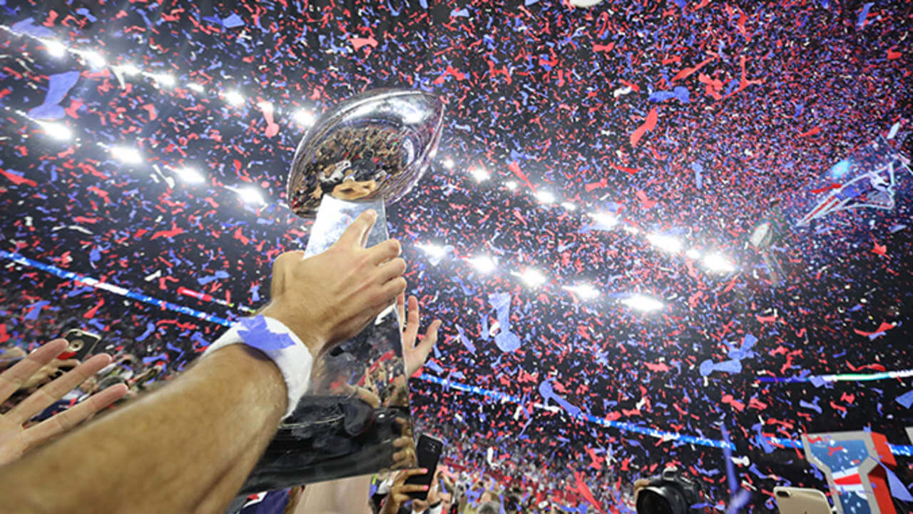
We have finally reached the day of Super Bowl LVIII (aka Supe 58), and today is the FINAL ranking of every SB uniform pairing ever played, going from worst to first. Of course, these rankings are largely subjective, and I’m sure you won’t agree with the order of my selections. After literally hours of finding and grading all 57 games played to date, I’ve come to the conclusion that ranking games ain’t easy — sure, there are some stinkers and some absolute all time glorious-looking games, but the middle-of-the-pack uni matchups can be a bit tricky.
For my rankings, the most important criterion is how both uniforms look together; we can have games where one of the two uniforms is fantastic, but the other is not. By and large, two good uniforms opposing one another will rank higher than just a single great uni. But there are times when both uniforms may look tremendous individually, but when paired together, the matchup as a whole isn’t as good as the individual parts. Where a game was played (as well as time of day) also factors into it: dimly lit dome games are likely to rank lower than games begun in sunshine, with all other factors being equal. Colors also play a part: if two teams have essentially the same colors, that may either work for or against the overall matchup, depending on where they appear (helmet, jersey, pants). Finally uniform styles — be they classic or modern — will affect the rankings. Two things that are not considered in the uni matchups will be the quality (or final score) of the game (close games and blowouts are factored equally), nor will a team’s success in a uniform be considered. For example, the Patriots’ “Flying Elvis” uniforms of the Brady years may have been successful in terms of Super Bowl appearances, but that factor alone does not for a good uniform make. Conversely, many Broncos fans may consider the orange jersey “cursed” but that will not affect their rankings in terms of being a good or bad uniform.
The Rankings were divided into four parts, in ascending order — last Saturday we looked at the 14 “worst” matchups, followed by the third-best 14 on Sunday. Yesterday, we saw the second-best 14 (which are all pretty-to-very good, just not quite Top 15), and today I finish up with the best 15 best uni matchups in SB history.
Remember, it’s all subjective, so feel free to disagree in the comments below.
San Francisco vs. Kansas City
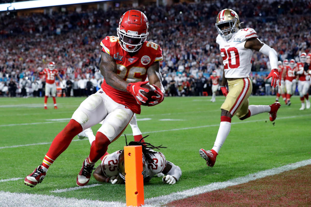
While this is definitely a preview of what we should see today, there will be a few differences from the first time KC and SF hooked up. Back then, the 49ers had only two red stripes on their shoulder caps, and we’ll see more than a few from the Santa Clara squad in high white socks or leggings today.
Indianapolis vs. Chicago
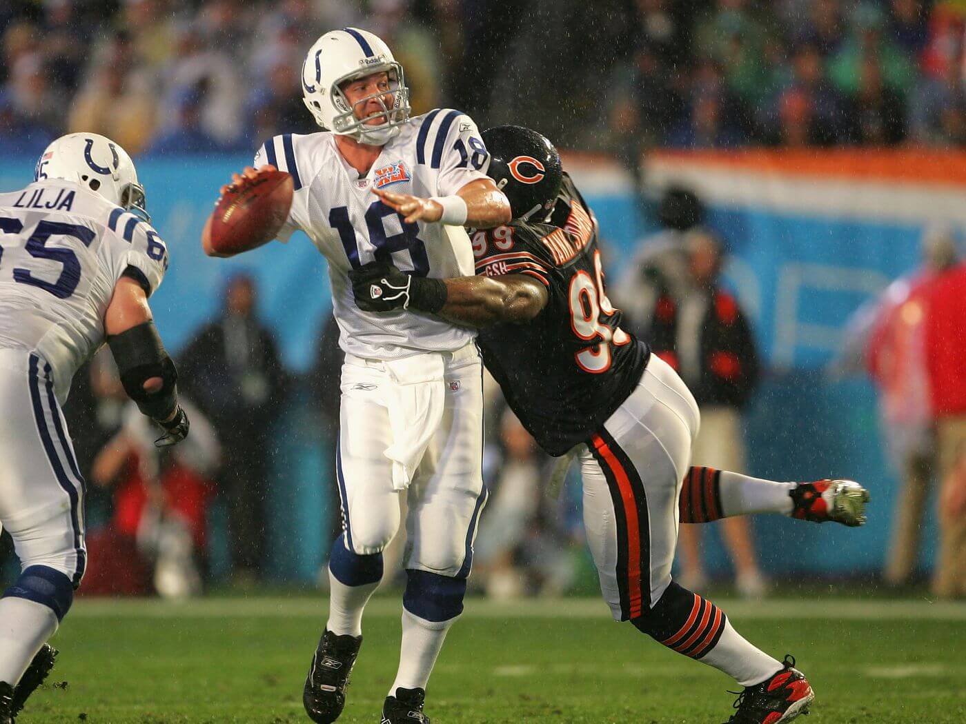
It doesn’t get much more classic than this: with just a few tweaks over the years, the Colts and Bears could have played a game that looked like this across multiple decades, and it was a beautiful uni contest. It was one of the few bad weather Supes in history, with almost an inch of rain falling, and 20 MPH winds in Miami.
Chicago vs. New England
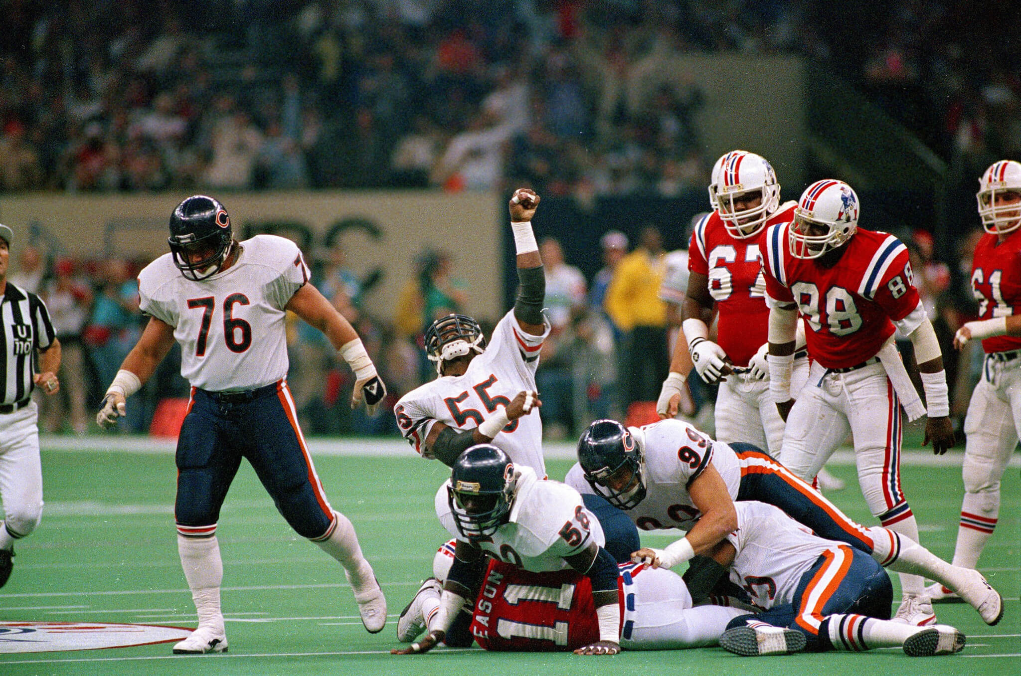
It should be a testament to how good the “Pat Patriot” uniforms were that they’re ranked so much higher over every other Super Bowl uniform the Pats have trotted out since — and while da Bears (like KC) are another team I prefer in white pants with white jerseys, the contrast between the red and midnight blue was phenomenal. I might have docked this game a spot or two for the horrible Superdome lighting and field, but how gorgeous were these Pats duds?
Washington vs. Los Angeles
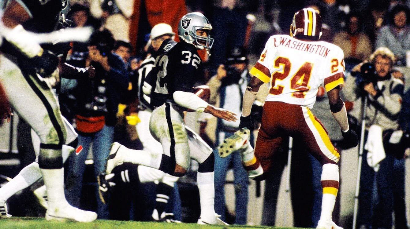
This game may have been a blowout for the black hole, but there’s just something so great about da Raidahs in silver and black, and Washington wasn’t too shabby either. When you think of DC in the Supe, the white jerseys and burgundy pants are the quintessential look.
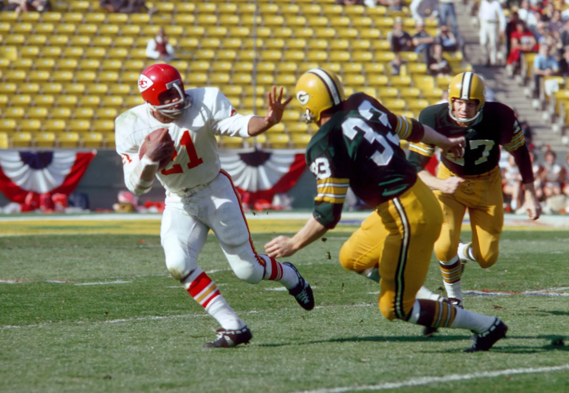
Minnesota vs. Kansas City
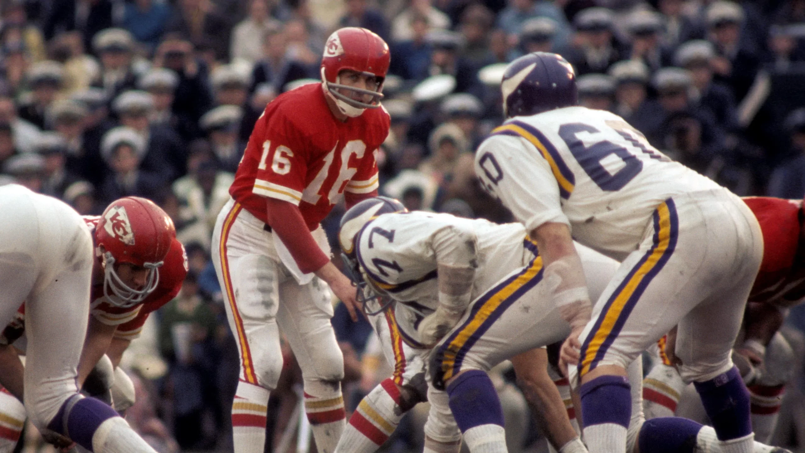
I know I’m going to catch flak from the future Weekend Editor for putting this game just outside the Top 10, but this one just doesn’t quite make it. Both teams looked fine (and the field even had some mud), but red/red/white vs. purple/white/white doesn’t have quite the “wow” factor it should.
Miami vs. Washington
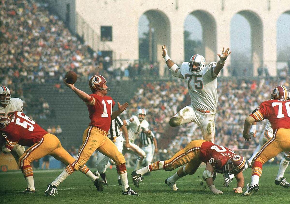
Many consider the burgundy over gold to be the greatest look for Washington, and it sure does look good. And you don’t get a much better setting than LA’s iconic Coliseum as a backdrop.
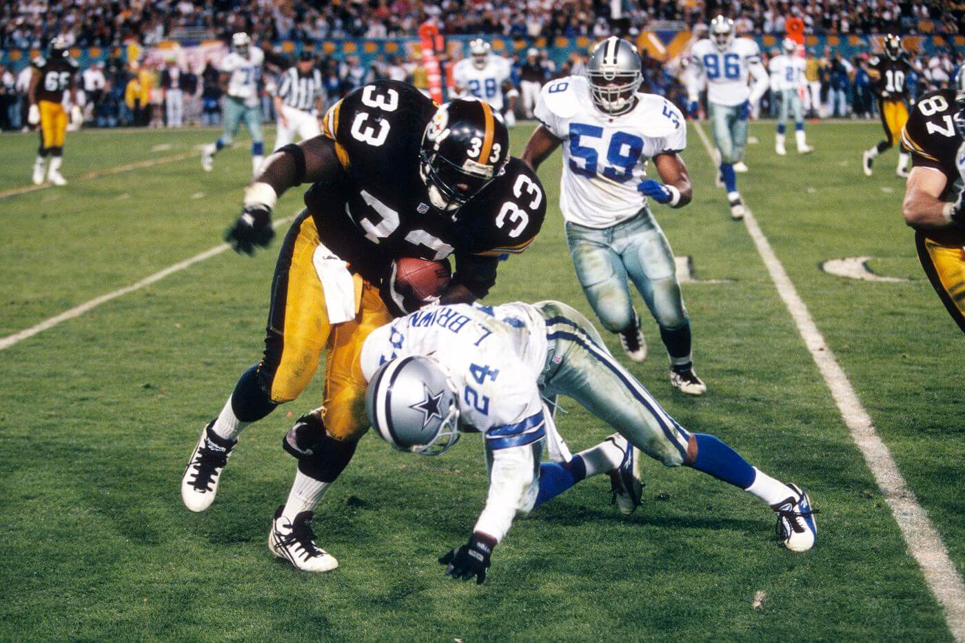
Dallas vs. Miami
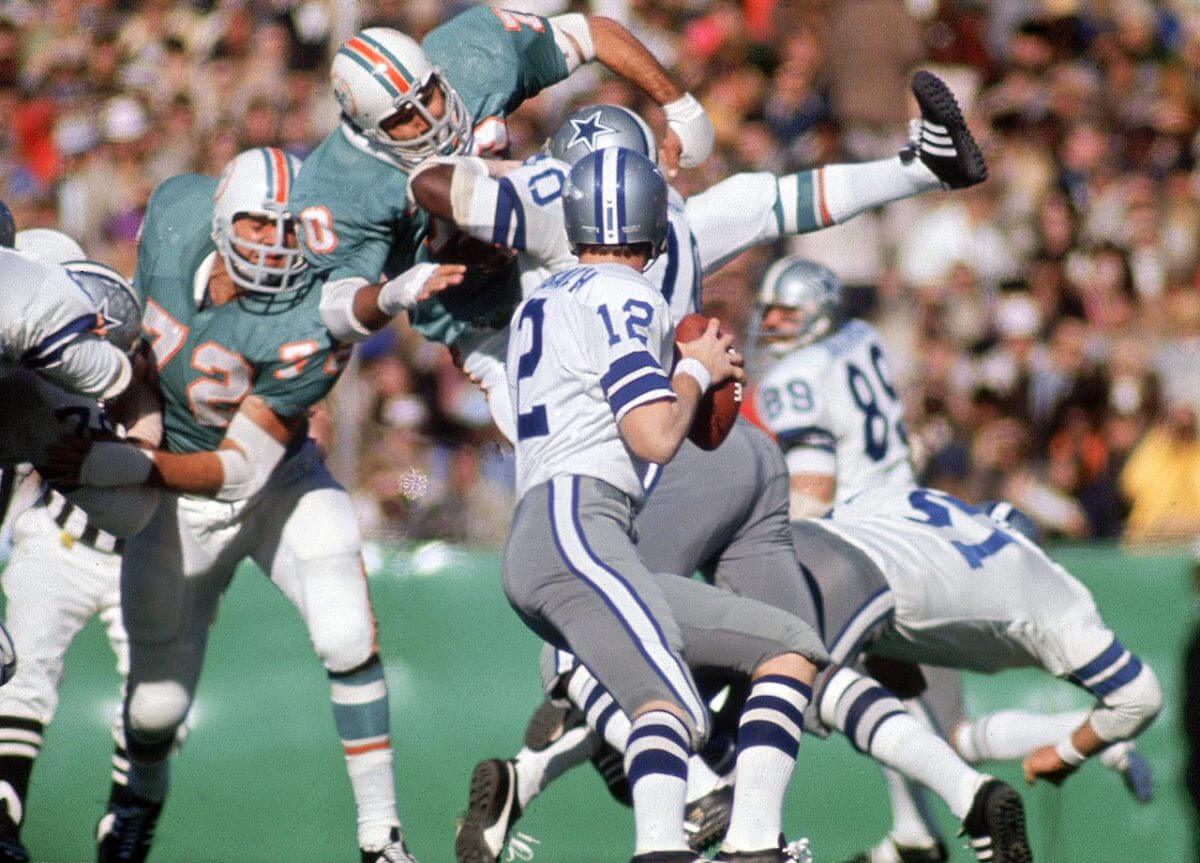
I’m absolutely smitten with the Cowboys uniforms of this era, when their silver-blue/gray pants perfectly matched their helmets, so this is a chef’s kiss matchup. My only complaint — and it’s a small one — was the plastic grass of Tulane’s stadium.
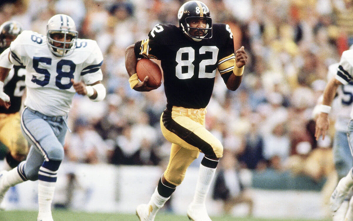
Dallas vs. Pittsburgh
Pittsburgh and Dallas met in Supes 10 and 13, with *almost* the same uniforms as SB 30, but not quite. Dallas had dumped their silver-blue/gray pants for a more greenish-blue look, and both teams’ pants had a more shiny sheen. It was still a fantastic-looking game, just not as great as X and XIII.
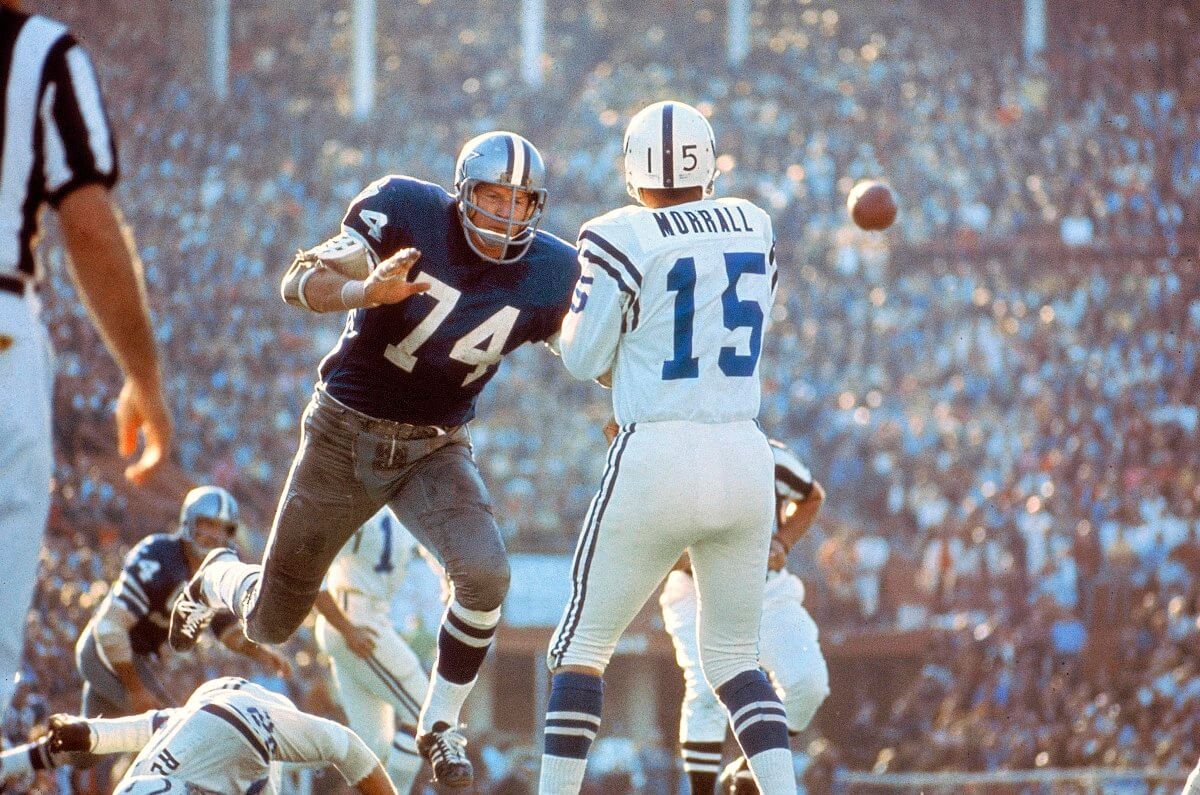
New York vs. Baltimore
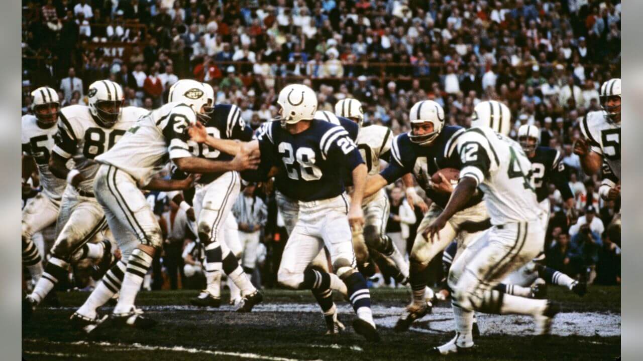
I want to rank this one higher — but I can’t. Even though the NFL/AFL merger was already underway, this game made the Super Bowl into the spectacular it is today, with the Namath guarantee showing the AFL could compete with the established league, and the perfect setting of the Orange Bowl. But this is a case where the individual unis are greater than both together, as the preponderance of white (both teams’ helmets and pants, as well as the Jets’ jerseys) just aren’t as great as the Top Six uni matchups.
Green Bay vs. Oakland
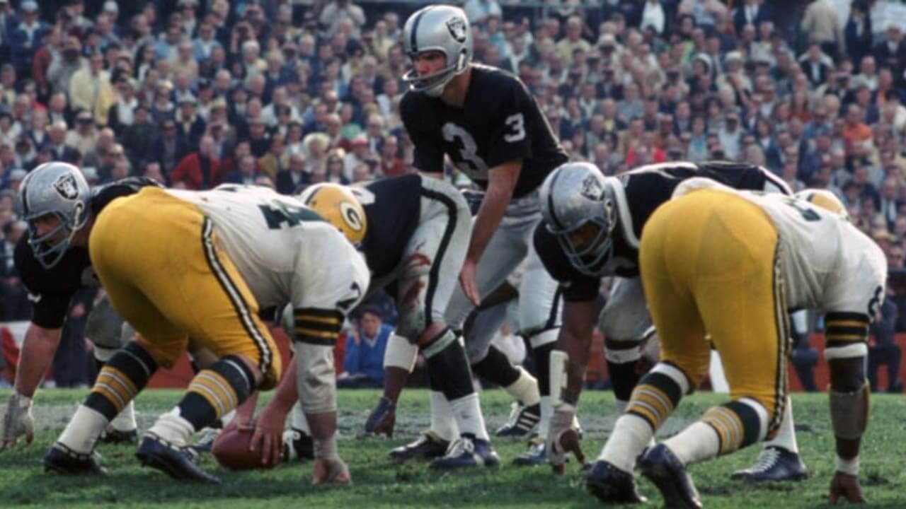
The end of the Lombardi Packers dynasty would culminate in a beautiful game in Miami’s Orange Bowl, but I definitely prefer the Pack in green jerseys. Such a good looking game.
Pittsburgh vs. Dallas
Just as Supe 30 wasn’t as good as SB 13 and 10, so too Supe 13 isn’t as good as 10, and that’s in part due to Pittsburgh’s black masks and Dallas’ now bluer pants. Don’t get me wrong — this is still a fantastic looking game, befitting of its Top 5 slot.
Dallas vs. Denver
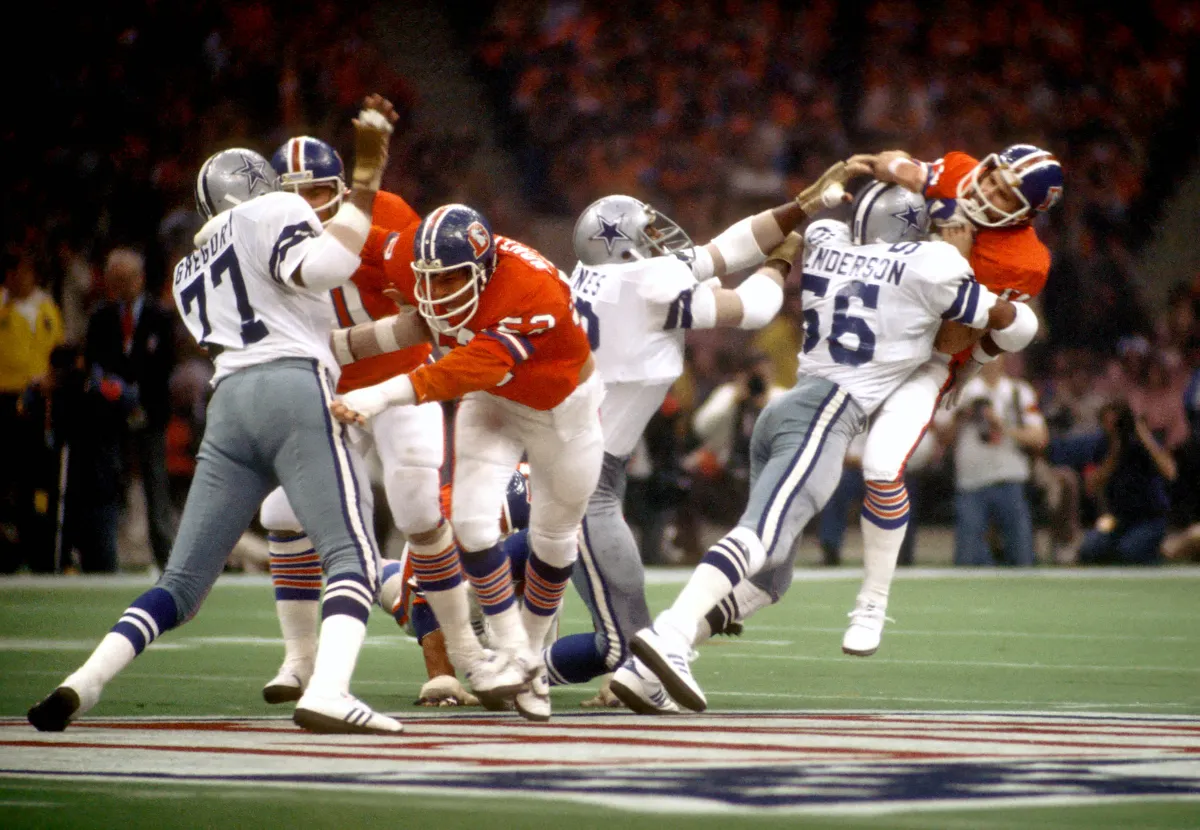
I’m not sure Dallas or Denver ever had better unis than these two sets. Unfortunately for the Broncos, their best look also began the orange jersey curse. The only drawback to this game was, once again, the fact that it was held in the dreary Superdome.
Kansas City vs. Green Bay
This was THE game by which all other Super Bowls have had to measure up, and boy did it make an entrance. It’s got my all-time favorite uniform in the Packers’ green and gold, and my preferred combo for KC. The late afternoon sunshine in the LA Coliseum only made it that much more delicious.
Baltimore vs. Dallas
Back in the early days of the Super Bowl, the designated home team did not have a choice of uniform: the home team had to wear their color jerseys — which wouldn’t normally be a problem since almost no teams wore white at home. Unfortunately for Dallas — but fortunately for those of us who LOVE their royal jerseys — the Cowboys (who hadn’t yet become “America’s Team”) were “forced” to wear their “bad luck blues.” The Cowboys may have come up a little short in this game, but it wasn’t because of the beautiful Miami afternoon.
#1: SB 10
Dallas vs. Pittsburgh
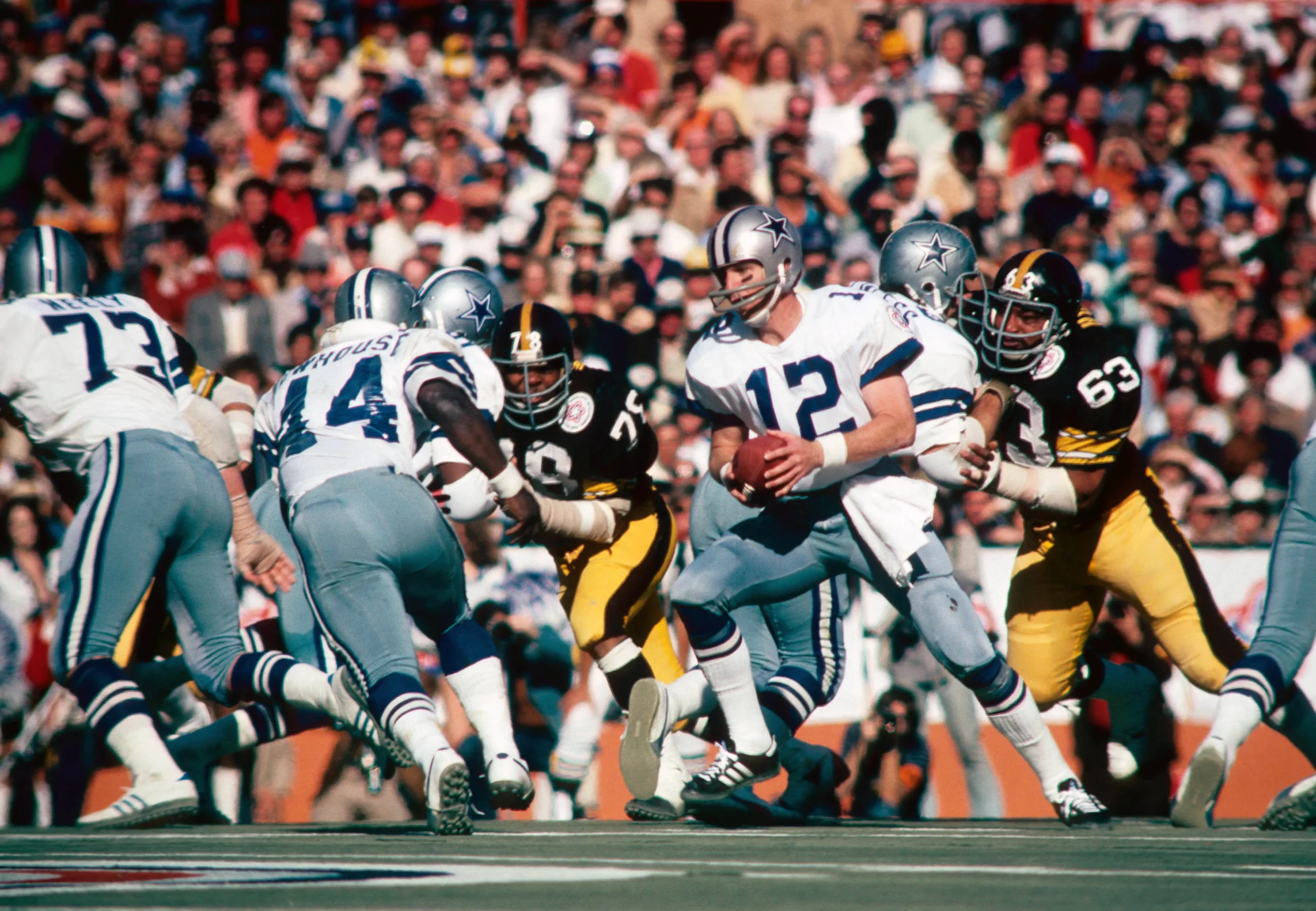
The first of three Dallas/Pittsburgh Super Bowls was by far and away the best looking of the three, and if you ask someone to encapsulate all 57 games with just one matchup, this would be the one. Featuring America’s team at the beginning of America’s bicentennial, both teams wore a bicentennial patch, and the Steelers would win their second of four Supes in six years (and in my preferred gray masks). THIS was the best Super Bowl matchup of all time.
As I mentioned at the outset, feel free to disagree in the comments below.
I think I would have ranked Oakland-Green Bay and L.A.-Washington higher, and one of them as #1 (probably the former), only because … well, Deh Raidehs. And I kind of agree about Super Bowl III; too much white, although I think it would have looked better with the Jets in green. (link) Surprised to see the the Dallas-Pittsburgh matchups so far apart.
“Surprised to see the the Dallas-Pittsburgh matchups so far apart.”
XIII and X probably could have been closer together, but all the top games are so close (to me anyway) that little things like Pittsburgh’s black face masks and Dallas’ bluer (or rather, less gray) pants made a difference. I’ve seen other rankings (done by non-uniform sites) that basically group all three games together as say (#9-7) as if the unis are identical, and they’re not. When I started the list, I had GB/KC (First SB) as my number one, but when I looked more closely, it fell slightly. If I did this list (or at least the top 15) again, I might have the top few in slightly different positions. But after having done this and spent literally hours on it … I don’t know if I’d ever attempt it again. It is not. easy. And I’m sure many will disagree (which is totally fine) with my rankings.
I would not place X ahead of XIII because I prefer the Steelers’ black facemasks over the non-team-color gray. I’ve never understood the sentimental favoritism toward gray facemasks when gray is not one of the team’s colors. Yes, the original facemasks were gray, but only by default, as it would seem that the capability of creating them in colors other than gray was not yet possible. Even with uniform configurations that are more retro, why not use either white, which would be acceptable because all teams have to wear white tops at some point, or a team color? If a team is wearing a throwback, to me this would be the only exception, as the gray facemask was indeed part of the uniform from that era.
I’ve always thought of gray facemasks as akin to brown baseball gloves. I’ve never had an issue with them for that reason, and for the additional reason that gray doesn’t really clash with anything, so they never really look bad.
I think most readers have their own uni quirks, as it were, and different preferences (it’s all good). I know Jimmer Vilk, for example, wishes every team had a white facemask; others think they should always match the color of the helmet, while still others prefer masks and helmets to be different colors. I have always liked gray masks, and while I don’t think *every* team should have one, I usually prefer them. Some folks like helmets and pants to ALWAYS match. It’s all personal preference, and while I may disagree with someone’s own opinion, it’s all good!
Grey is utilized in the logo on the side of Pittsburgh’s helmets, so it’s not like the grey face masks are a total anomaly.
I don’t really have a qualm with any of the the top 10, but Super Bowl XXV with Bills vs Giants was pretty special. Before patriotism became a jingoist trope, or a political front, having two teams with red/white/blue color scheme, which matched the Super Bowl logo, combined with the country just entering the Persian Gulf conflict…whew…that seems tough to top. Played on natural grass too. Visually it was a great Super Bowl. One of the best games played too
I would have ranked III lower and VII higher. I think I’d put 54 higher as well. But this was a very enjoyable series of articles. Thanks for all the work that went into putting it together.
I like that the earlier Cowboys pants matched their helmet, but what I don’t like is that the pants aren’t metallic like the helmet. Reminds me of the problem Nike has now of not being able to execute metallic pants. Don’t get me wrong, I still love the look of these Super Bowls, and I prefer the pants to the green-tinged and now blue-tinged pants, I just wish the Cowboys could get good silver pants that match the helmet and are metallic.
I really enjoyed this series of article PH. Good work.
The black facemask on the Steelers helmet is a huge upgrade. Gray facemasks only work for a few teams.
Preferring grey face masks seems to be a bias that many traditionalists have. I definitely lean towards traditional uniforms, but this is one area that I think colored masks are an improvement for many teams, but not all. Honestly for the Steelers I don’t care either way, black or grey.
Well done, Phil.
No. 1 takeaway: uniform socks, fuller sleeves and covered knees make all the difference. Oh, for those halcyon days… perhaps one day, they’ll return. -C.
Awesome! Great choices. Thanks for the trip down memory lane.
I might have personally gone for Super Bowl 11 over SB 4 to get the Vikes’ purple jerseys in (also giving us a Raiders white!), but not a lot to disagree with here.
Thanks Phil and well done! Awesome job putting this together!
One minor quibble: For whatever reason, I dislike the word “Supe” for Super Bowl. It bothers me. Everything is abbreviated/acronymed today, and for some reason, saying “Supe” over “Super Bowl” just bothers me.
Great job on this project, Phil! I love all the thought behind it and the way you thoroughly articulate the placement of each game. I particularly appreciate your explanations of how the interplay of the uniforms made a big difference in your rankings rather than just paying attention to whether you liked the uniforms or not.
As a football history buff, I can’t argue with a Steelers/Cowboys Supe in the top spot. My one quibble is that I might swap SB 10 and SB 13 on the list. I love the Bicentennial patches, but I’m no huge fan of the Steelers’ gray masks.
I know some traditionalists think all facemasks should be gray, but I’m not one of them. I’m not anti-gray mask. For some teams, I think it can enhance a classic look (the Colts come to mind). For others, the gray facemasks always looked out of place, and when the option to use color facemasks came along, they rightly jumped at the chance to enhance their looks. The Steelers fit in that latter category for me. While I appreciate their gray facemask era from a vintage/nostalgic standpoint, I’ve always thought they looked better with the black masks. I mean, come on! There’s no way that Jack Lambert would have looked more intimidating than he did here (link) with a gray facemask!
Thanks, Kary.
I mentioned it elsewhere in the comments, but this was a LOT harder than I thought it would be (even though I loved the hours of researching). And as I mentioned — maybe in yesterday’s comments? — if I had to rank these again tomorrow, my top 15 might have a slightly different arrangement. They’re all so so good. But just as you’d place the Stillers from SB XIII higher because of the black masks, that’s also precisely why I put them below X. But that’s what’s great about rankings like this — everyone has their personal preferences and what looks “best” to you may not to me and vice versa. But researching 57 games — even though I kinda knew how I was going to rank most of them — at least in groups of worst->not as bad->pretty good->Top 15, was hard. Maybe it’s because one single game decides a league champion, not a series, but I’ve always held the SB in the highest regard in terms of one game (I guess similar to the feel of a seventh game in the other major sports) is everything. In base/foot/basketball (and other sports) you can have a bad game or even a bad couple games and still win the Champsionship. In football, you’ve got to play your best game (usually) right out of the box.
this was a LOT harder than I thought it would be
Welcome to my world!
I have to say I’m surprised you had so many turf games (and a Superdome game!) in your top ten. I often thought about putting XII in my top five, but I already had XXXI and XX in there.
Not surprised you kept the Best Looking Game out of the top ten. In fact, I understand the too-much-white argument. I’m just glad it made it to your final list.
Not sure I could ever rank all the games by number. I’d probably just have four groups: Worst, Bad, Good, and Best.
The guys at NFL Films told me Super Bowl 10 was their favorite to shoot. Because of the early kickoff and open end of the Orange Bowl, they got bright natural sunlight the whole game, every shot looked great. The just had to watch out for shadows from the blimp.
Footage was shot for the movie “Black Sunday” at that Super Bowl; the film cameras were disguised as TV cameras.
Also loved the player introductions in Super Bowl 10, still remember how cool it looked when the Steel Curtain were introduced as a group.
So what you are saying is you really like Dallas uniforms and their mismatched color scheme. Got it.
And all of those unsymmetrical mono-white uniforms? Boring!
It’s all opinion, and my opinion is I disagree with 68.914% of your list.
Thanks for sharing.
Good Lord, Dallas needs to fix those stupid silver-blue-green pants things going on. Man would they look so much better if their uniforms were more uniform. I love their older Grey/blue/white combo.
For me personally, the white-over-white look (especially with a colored helmet) is the worst look for any team. Just do not like it at all…Chiefs, for example, look FAR better with red pants on the road. So any of the games featuring that combo would rank much lower for me. While games with a lot of contrast (Bengals/Rams, Broncos/Packers, etc.) would rank much higher.
Any of the Cowboys/Steelers contests though, I agree, are easily in the top 10. I like the unis the Cowboys have today, but when you contrast them with how much better their helmets/pants matched previously, it’s obvious they need to get back to that look ASAP.
Preach on Curt!
I am a long time Steeler fan and the gray facemask represents their first two Super Bowls to me, and the beginning of their run…the black facemasks remind me of being closer to the end. So I always prefer the gray. Frankly, I may be in the minority, but the facemask color is literally the last thing I would consider to rate a uniform.
One MAJOR thing I would rate, which nobody on a website that obsesses about detail mentioned, is the Cowboys original serif number font. That was the finishing touch that made their uniform great and screamed COWBOYS! Not using it for many years now makes zero sense to me and it is a shame. Odd nobody mentioned it at all, even Phil, though he did pick the right game as number 1 anyway.
Thanks for the feedback Steve! Just as you would consider face mask color as the last thing you’d consider to rate a uniform, for me, as long as the numbers are legible, that’s the last thing I consider. Different strokes for different folks! But I know how into number fonts (and the Sand-Knit font style in particular) you are, so I totally get your thought processes.
That being said, I still do consider font style when it’s dramatically different — for example, when the Stillers moved from their classic varsity block(?) to their current Futura condensed italic — I would rate those lower (and would be definite consideration) than their block font. But in terms of serif/sans serif on a block? Very low on my scale.
Funny how bland most of the games at the Superdome looked prior to Super Bowl XXXI, but Super Bowl XX just pops, even on the NFL Films highlight reel.
The link to the previous post goes to a random Twitter account.
Great series, Phil! The only real miss for me was the Cardinals/Steelers game, which I would have rated much higher. In your intros you mentioned how two good uniforms might rank lower if they didn’t look good together (Colts/Jets), but you didn’t give any credit to a bad uniform actually looking pretty good in context. It’s a YMMV for sure.
Those Patriots uniforms reached their peak when Tony Franklin split the uprights to give NE a 3-0 lead in SB XX. It’s been downhill pretty much since then.
Great choices! I was spoiled – my three electric football sets were Super Bowls V, VI, and VII. It just doesn’t get any better than that!
Great choices! I was spoiled – my three electric football sets were Super Bowls V, VI, and VII. It just doesn’t get any better than that!
Great list. Myself, I would have flipped X and XIII. To me XIII is the best. I’m 50/50 on gray/black masks, but XIII had one visual component that X lacked and I haven’t heard it mentioned. I love Super Bowls that begin in daylight and finish at night. That transition underscores the drama I think. Sure, it’s not a uni-element but there were other field criteria mentioned in the rankings. Thanks for doing this. So much fun!