There was big news at last night’s NHL All-Star Game, but it had nothing to do with Reebok’s much-vaunted new uniform system. The real story, flying beneath everyone’s radar, was the refs. Why were they wearing silver armbands instead of red? And why were the refs in Tuesday night’s YoungStars game doing likewise? Was this just a special all-star thing?
Nope — turns out this is how the refs will look next season. According to an NHL spokesperson who e-mailed me last night from Dallas, the idea is to give the armbands “a consistent look with the new NHL logo.” Never mind that the “new” NHL logo is now a season and a half old. Or that the old one was black and orange, not black and red, so the refs’ armbands never matched up with that logo to begin with. Or that hockey refs all over the world wear red-banded sleeves, regardless of whether they work for leagues with red logos. Or that the silver bands blend in with the refs’ zebra stripes, making it tougher to tell the refs from the linesmen. Or that the whole idea of basing this particular uniform element on the league’s logo colors is completely arbitrary. Or that not a single word was said about this major change to the game’s look until somebody (me) asked. I don’t like to pile on the NHL, but seriously, what the hell are they smoking over there?
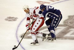
As for the player unis, what a big fuss over nothing. Yes, the actual graphic designs were total crap, but so what? All-star games always look like crap (see any similarities between this and this?), so that’s no surprise. The actual engineering of the new unis, which is the only thing we’ve seen so far, looks mostly fine.
But I emphasize “mostly.” A few things are cause for concern. To wit:
• I cannot stress enough how much I hate the look of those stretch-mesh panels that come up from the armpit to the collar. They were glaringly visible on the Eastern Conference jerseys, but less so on the West, which may mean Reebok still has some work to do in terms of getting the white fabrics to blend under TV lights.
• As if we all didn’t know already, jersey side panels and striped breezers tend to misalign when the players are actually moving. Why is it so hard for the NHL and Reebok people to grasp this simple fact?
• And as if we all didn’t know this too, that deep wishbone collar looks ridiculous, especially with the NHL logo pushed down so low. Fortunately, this collar style will not be a league-wide thing, but let’s hope no team uses it. V-neck, square neck, lace-up, whatever — anything’s better than this.
As for the slimmer fit and all that, I thought it looked fine. Wake me when the Canadiens announce their 2007-08 jersey.
All-Star Jersey Raffle — Last Call: Okay, forget all the negative things I just said about the NHL All-Star jerseys, because this one is being raffled off tonight. If you haven’t entered yet, PayPal me ($5 for one virtual raffle ticket, $10 for two, etc.) at paul_lukas at earthlink dot net by 10pm eastern in order to get your name in the hat. I’ll announce the winner tomorrow.
Post-Holiday Cheer: Got a visit yesterday from the UPS guy, who delivered a very light, flat package. Inside was this embroidered emblem and the following letter from reader Jeff Stephens of Middlebury, Indiana:
Happy Holidays! I know it’s a little late, but here’s a piece of “holiday cheer” I had made up for you. My mother has an embroidery business on the side, and she has an old chenille machine that she uses to make letters, chevrons, names, graduation years, and just about any kind of patch you might see on a letter jacket. I’ve had her make patches and such before, and her work is very good. So I asked her to make this “UW” patch, and she did it in no time flat.
I know the font is not exactly like the Uni Watch logo, but the colors match. You could purchase a jacket or display it in some other way. I just wanted to send something to thank you for all the hard work you put in on the blog and your ESPN column.
Man, is that a super-cool gift or what? Ãœber-thanks to Jeff and his mom! And I’ve said this before, but it bears repeating: Uni Watch readers are the best. Thanks to everyone for all the contributions — chenille and otherwise — that flow into Uni Watch HQ each day. You people all rock.
Uni Watch News Ticker: This AP photo shows a scene from the very first Cleveland Browns game, in 1946. “What’s really interesting is the numbers are orange with a white outline,” says Jeff Lindquist, who discovered the photo on this message board thread. “Most Browns fans know that the numbers have been solid white on the dark jerseys and seal brown on the white jerseys for most of the team’s history (although those awful orange unis from a few years ago had drop-shadowed numbers).” ”¦ “Mascots usually wear a uniform jersey consistent with what the team is wearing on the field/court/ice,” writes Doug Keklak. “But look at this photo, which ran in Sunday’s Pittsburgh Post-Gazette. Compare that jersey to Pitt’s two hockey squads, here and here. I’d be curious to hear from any other Pittsburgh-area folks if that jersey the Panther is wearing has ever been worn by the team.” ”¦ According to this article, the Florida Panthers will have “a much more contemporary look” next season (with thanks to Perry Gattegno). ”¦ And as many of you already know, Minnesota is making changes too. ”¦ “I just came across this article,” writes Jack Krabbe. “I’m really confused as to why Satchel Paige has his name on his jersey.” Anyone..? ”¦ Good hockey equipment timeline (reprinted from this booklet) toward the end of this blog post (with thanks to Vincent Vignola). ”¦ “I just got the 1987 National League Green Book on eBay for a project I’m working on,” writes Jesse Spector. “It had two pages of uniform specs for that season, so I scanned them and am passing them on.” ”¦ Eric Carsner has come up with another collegiate logo mascot wearing a sailor and/or freshman cap, as seen here. “I remembered this Michigan logo being on some of my older Rose Bowl shirts, but I don’t recall seeing them anywhere else.” ”¦ The NBA All-Star Game uniform packages (including shorts, warm-ups, etc.) will be officially unveiled tonight at 7pm. I’ll have coverage tomorrow. ”¦ NFL officiating executive Larry Upson has cleared up a point we’ve occasionally discussed here: According to what Upson told me yesterday, NFL teams wearing black shoes must wear black shoelaces, and white-shod teams must wear white laces. So this is technically a violation. ”¦ White-laced black shoes are also visible here, but the real story in that photo is Thomas Jones’s socks (good catch by Jacob Reed). ”¦ Our own Scott M.X. Turner sent along this photo of his 1975 Pony League team in Greensboro, North Carolina. That’s Scott at front left, No. 5, looking pretty classic. But check out the kid next to him — higher stirrups and white shoes with green laces! Major clash of styles there. … I did a really fun interview last night with the here or stream it here (either way, my segment, which lasts about 20 minutes, kicks in a little more than halfway through the two-hour show).
“As if we all didn’t know already, jersey side panels and striped breezers tend to misalign when the players are actually moving. Why is it so hard for the NHL and Reebok people to grasp this simple fact?”
Man, you worry about the craziest things sometimes. Humans move. Clothing moves. Watch the game.
NHL referee armbands are currently and as far as I know, always have been orange.
Same goes for most hockey I can think of. Even the picture you used as an example of red armbands, shows orange ones.
This isn’t to say that some leagues do use red ones because I know you can purchase red bands, but I’ve never seen them in use.
USA Hockey, as well as every high school eague I’ve run into, as well as college use orange bands.
In the link in the Comments section, in the bottom left, it mentions a secondary red road jersey top for the Cincinnati Reds that year. I don’t remember the Reds wearing it. I’ve looked for pics but haven’t had any luck.
Anyone know about or remember these?
FYI: Scott Turner’s 1975 photo doesn’t work. Flickr sez it’s unavailable.
I feel so juvenile for bringing this up, but the Pitt Panther mascot looks like he’s mounting the girl in front of him.
And I would pay good money for a Bob Dunn Ford jersey. A-maz-ing!
Change for the sake of change by the NHL referees…bad decision. How is one going to tell the referees apart from the linesmen? Different colored helmets?
Let’s see what happens when a team gets caught out of position trying to change personnel on a delayed penalty when it’s just a call for offsides.
I didn’t like the All-Star uniforms. Jerseys need stripes along the hemline, otherwise it’s the unitard effect.
[quote comment=”46420″]NHL referee armbands are currently and as far as I know, always have been orange.
Same goes for most hockey I can think of. Even the picture you used as an example of red armbands, shows orange ones.
This isn’t to say that some leagues do use red ones because I know you can purchase red bands, but I’ve never seen them in use.
USA Hockey, as well as every high school eague I’ve run into, as well as college use orange bands.[/quote]
I too always thought of them as orange.
I wonder if I have to buy new armbands for my referee jersey now…I don’t think the parents in Poughkeepsie NY care one way or another – they’d hate me no matter WHAT color I was wearing on my arms, because I still have stripes on the rest of me!
wow, I’ll admit I was all up in arms about the uni changes but after seeing them in action, they’re not that bad. I actually don’t mind them. I couldn’t see the side paneling during the game except for the close-ups, plus I don’t have an HD tv.
I kinda dig the ‘rail cam’ they had, and the conversations with Marty Turco while he was playing were great, although I think he might have let in his three goals because of it.
Just a small point I always thought that the ref arm-bands were link, not red. Am I color blind?
[quote comment=”46422″]FYI: Scott Turner’s 1975 photo doesn’t work. Flickr sez it’s unavailable.[/quote]
There’s a hanging BR tag on the end of it. If you pull the image code, you can see it link and view the greatness of Bob Dunn Ford.
Pitt’s ice hockey team is a club team and not a varsity sport, which means the team probably controls what the uniforms look like more than the Athletic Dept does. For example, nothing in Pitt athletics is allowed to use that link, everything must be the link – my wife works in their athletic dept and she has shirts at home she can’t wear because they have that or the script-Pitt on them. So Roc (the mascot) can probably wear whatever he wants. But sorry to say I don’t know much about their other uniforms….
In the link, these ear-bleeding words were spoken about ‘contemporary’ hockey jerseys. “Yormark said horizontal stripes are out and vertical stripes are in”. Ouch, it hurts my ears so much….
The Paige jersey is probably from his All-Star team, although I can’t confirm they played in the 50s (assuming the photo is correctly dated, it does look like a St.L on the cap).
Paige had his won all-star team in the 30s and 40s, and he often played against the Dizzy Dean All Stars. Can’t find photos of either team’s jerseys…
[quote comment=”46421″]In the link in the Comments section, in the bottom left, it mentions a secondary red road jersey top for the Cincinnati Reds that year. I don’t remember the Reds wearing it. I’ve looked for pics but haven’t had any luck.
Anyone know about or remember these?[/quote]
I answered my own question. The link confirms this. Still looking for pics though.
I refereed for years and hockey referee bands are a deep orange.
Also, while it looks bad to have the side-panels not aligned, I think it is the goal of Reebok and others to create a sense of movement.
Keep up the good work Paul!
I posted this last night but it seems relevent to todays topic as well.
The new sweaters look fine to me. I’m not crazy about the design but the fabric, stitching, and “snugness†are not factors to me. That being said, I reserve all rights to bash the crap out of these if some teams decide to use it as an excuse to do something silly and over the top with their designs. Remeber, K.I.S.S.
Ref’s are still wearing the silver arm-bands. If it aint broke, don’t fix it. Does RBK really have a problem with orange? Yes, it’s not the “coolest†color in the world but this is a matter of function over form. The orange is there too be noticed, not to be hip.
Just adding another voice to the opinion/fact that the NHL refs’ armbands are indeed orange.
[quote comment=”46422″]FYI: Scott Turner’s 1975 photo doesn’t work. Flickr sez it’s unavailable.[/quote]
Fixed.
NHL Jerseys….actually not that bad like Paul said, but I didn’t like some things.
On some of the players the top portion of the jersey just looked way to link and you could see the contours of the pads underneath…personally just don’t like that look, but it’s a by product of the new design. I can live with it, but I wonder why a material has to be tight in order to be flexible and wick moisture?
HATE the link of the front an back of the jersey. If a team wants to incorporate horizontal stripes at the bottom of the jersey things could get messy.
The sleeve seemed to get very tight just below the elbow pads of some players, and sometimes looked link. Seemed to be more visible on the whites, but just another personal preference thing here.
And what was that link on the back of everyone’s jersey? 51inch HiDef and still couldn’t make it out!!!
I understand from an earlier comment that it is a club sport, so the goalies probably pay for their own equipment, but the red, white and blue worn by one of the goalies in the first photo really looks bad with all the blue and gold.
Get a load of link abomination, but at 125 bucks, that’s practically a steal. Way to go, NFL.
Also I’d like to say that the slimmer silhouettes look really good, something about the snugness looks more modern.
[quote comment=”46440″]Just adding another voice to the opinion/fact that the NHL refs’ armbands are indeed orange.[/quote]
OK, OK, I get it — but I still say the orange used by the refs (more of a tomato, I’d say) isn’t the same color as the orange in the old NHL logo.
[quote comment=”46427″]I kinda dig the ‘rail cam’ they had, and the conversations with Marty Turco while he was playing were great, although I think he might have let in his three goals because of it.[/quote]
Rail cam was kind of sweet, however I wish it was on the far rail so when they went to the wide angle we didn’t have to see it zooming back and forth.
I just don’t see what the big deal is between orange bands and silver bands.
(I know, I know – this is the website for such changes.)
The refs and the linesmen are still marked as different. It might not be as much of a difference, but I’m not sure it’ll change my enjoyment of hockey.
(Which doesn’t mean the NHL doesn’t need to take about 20 hours of PR classes.)
Just guessing Joe but I reckon that mark is the NHLPA insignia, but I can’t be sure. BTW, I kinda liked the new NHL uniforms I thought they worked rather well and hopefully the snugger fit will help to cut down on the clutching and grabbing that seems to be sneaking its way back into the game.
PS, another vote that the old referee arm bands were in fact orange.
1. I liked the All-Star uniforms last night, especially the Eastern Conference duds and their crisp, white gloves.
2. As Paul brought up Canadiens ’07-’08 jerseys, I’d like to see link stay alive somehow, someway.
3. Mad props for the Uni Watch varisty letter. It gives me reason to show off my link.
Yes, orange.
I don’t mind the side striping on link, even when it doesn’t link. (Yes, as a Celtics fan it pains me to post two pictures of the Lakers). But, it definitley doesn’t belong in hockey.
I also don’t really mind the low cut collar on the new NHL uniforms (or at least the All-Star ones). I just think they stood out too much being gray and the rest of the uniform white or blue.
And what was that link on the back of everyone’s jersey? 51inch HiDef and still couldn’t make it out!!!
Looks like link
[quote comment=”46444″]NHL Jerseys….actually not that bad like Paul said, but I didn’t like some things.
On some of the players the top portion of the jersey just looked way to link and you could see the contours of the pads underneath…personally just don’t like that look, but it’s a by product of the new design. I can live with it, but I wonder why a material has to be tight in order to be flexible and wick moisture?
HATE the link of the front an back of the jersey. If a team wants to incorporate horizontal stripes at the bottom of the jersey things could get messy.
The sleeve seemed to get very tight just below the elbow pads of some players, and sometimes looked link. Seemed to be more visible on the whites, but just another personal preference thing here.
And what was that link on the back of everyone’s jersey? 51inch HiDef and still couldn’t make it out!!![/quote]
Well, thanks for the confirmation that big hdtv’s are not all that they are cracked up to be. My 32 inch, LOW def let me see that it was an NHLPA logo.
[quote comment=”46448″]Get a load of link abomination, but at 125 bucks, that’s practically a steal. Way to go, NFL.
[/quote]
HA! I love the “conversation”
[quote comment=”46451″][quote comment=”46427″]I kinda dig the ‘rail cam’ they had, and the conversations with Marty Turco while he was playing were great, although I think he might have let in his three goals because of it.[/quote]
Rail cam was kind of sweet, however I wish it was on the far rail so when they went to the wide angle we didn’t have to see it zooming back and forth.[/quote]
The camera and the rail itself were annoying, but it was a great shot on the breakaways. Much better looking than the rail cam that the NBA used for a few games years ago.
I noticed linkthe other day. Are NBA jerseys really that long underneath the shorts?
Just checked in at the NHL Officials Association discussion board to see what they thought of the silver armbands. Not much chatter about it yet, but someone mentioned that there was a new, higher-pitched whistle being used in last night’s game. The idea, apparently, was that the pitch of this particular whistle would automatically stop the clock (instead of a human clock operator hearing the whistle and flicking a switch).
Something a little more interesting that arguing over the hues of orange. Brian Rolston was apparently wearing some sort of NHL All-Star pants link over his normal Minnesota Wild pants/breezers.
I thought that the design of last night’s AllStar Sweaters was HORRIBLE. However, I really dig the shape of the new design.
I think it has a much more vintage shape to it like link
By the past low standards of NHL All-Star unis, I’d say last night’s were pretty OK. At least they were fairly clean looking. I think the NBA all-star unis are about 1,000,000x uglier, from what I’ve seen.
Those jersey numbers in the old Browns photo you linked to look drop-shadowed AND outlined to me, but they look drop-shadowed UP and right instead of the commonly seen down and right.
[quote comment=”46460″]
And what was that link on the back of everyone’s jersey? 51inch HiDef and still couldn’t make it out!!!
Looks like link[/quote]
link a better look at a jersey with the NHLPA logo.
[quote comment=”46469″]Something a little more interesting that arguing over the hues of orange. Brian Rolston was apparently wearing some sort of NHL All-Star pants link over his normal Minnesota Wild pants/breezers.[/quote]
It’s just a pant shell. You often see this so that players don’t have to break in new equipment.
[quote comment=”46467″]Just checked in at the NHL Officials Association discussion board to see what they thought of the silver armbands. Not much chatter about it yet, but someone mentioned that there was a new, higher-pitched whistle being used in last night’s game. The idea, apparently, was that the pitch of this particular whistle would automatically stop the clock (instead of a human clock operator hearing the whistle and flicking a switch).[/quote]
If those whistles work that would be a great thing not just for hockey but sports in general. I’m not sure how they would work in loud venues like autzen though.
I admit that I am not a die-hard NHL fan. I can’t help it… I lived my whole life in the South. That disclaimer aside, I really like the new jerseys. I do have a couple of complaints, however.
1. The shirt tail should be boxy, bot curved. It liiked like they were skating around in dress shirts out there with that goofy tail hanging out. Tails are made in that curved fashion so they will look good when they are tucked in. If they are not going to be tucked, they should be finished off in a nice box.
2. Sock stripes. While I like how they look from the side and front, they look absurd from the back. The stripes don’t meet in the back, but just dive into the skate. What the crap!?!? If they met at a point, I’d be all for it, but as it is now it makes the sock look like two separate pieces, with the striped portion layered over a sani.
Just my .02
[quote comment=”46420″]NHL referee armbands are currently and as far as I know, always have been orange.
Same goes for most hockey I can think of. Even the picture you used as an example of red armbands, shows orange ones.
This isn’t to say that some leagues do use red ones because I know you can purchase red bands, but I’ve never seen them in use.
USA Hockey, as well as every high school eague I’ve run into, as well as college use orange bands.[/quote]
Here in Ontario, I know that referees in the Ontario Minor Hockey Association (the body that looks after kid’s hockey in Southern Ontario outside of Toronto and South-Western Ontario) wear red arm bands. I don’t know why the different colour of choice though.
We can add Daniel Briere to the list of players with their fly link.
[quote comment=”46478″]By the past low standards of NHL All-Star unis, I’d say last night’s were pretty OK. At least they were fairly clean looking. I think the NBA all-star unis are about 1,000,000x uglier, from what I’ve seen.[/quote]
You know, I’ve always thought the complete opposite. I always thought the NBA had some of the nicest All-Star jerseys.
Examples of my favorites:
link
link
link (I know these are much maligned, but if you fixed the numbers on the front and made them horizontal instead of skewed a little bit these may be my favorites ever.)
link
link
It’s hard to find NBA All-Star uniform pictures online but you get the idea. Granted, they have some ugly ones… The one’s Karl Malone and John Stockton won the MVP in while they played in Salt Lake City…………..
[quote comment=”46463″]Well, thanks for the confirmation that big hdtv’s are not all that they are cracked up to be. My 32 inch, LOW def let me see that it was an NHLPA logo.[/quote]
Don’t hate on the TV!!! It was my lack of NHLPA knowledge…just wasn’t familiar with that logo. Now that I have seen the logo it’s obvious!
I remember the Reds wearing what looked like their link (they were mesh as well if I remember corectly) for some games in the early/mid 80s (with the wishbone C like the home jerseys), but I don’t remember a red jersey with “Cincinnati” like the road design. This was around the time when the Cubs were wearing their solid blue jersey on the road.
[quote comment=”46491″][quote comment=”46478″]By the past low standards of NHL All-Star unis, I’d say last night’s were pretty OK. At least they were fairly clean looking. I think the NBA all-star unis are about 1,000,000x uglier, from what I’ve seen.[/quote]
You know, I’ve always thought the complete opposite. I always thought the NBA had some of the nicest All-Star jerseys.
Examples of my favorites:
link
link
link (I know these are much maligned, but if you fixed the numbers on the front and made them horizontal instead of skewed a little bit these may be my favorites ever.)
link
link
It’s hard to find NBA All-Star uniform pictures online but you get the idea. Granted, they have some ugly ones… The one’s Karl Malone and John Stockton won the MVP in while they played in Salt Lake City…………..[/quote]
I should’ve specified THIS year’s NBA All-Star jerseys, although that one year they were in Phoenix and had a severe southwestern theme might be THE ugliest uni, ever.
Check out the logo creep on the helmet at the link. I’m shocked another company didn’t think of this first. Under Armour breaks a new barrier with logo creep.
[quote]I should’ve specified THIS year’s NBA All-Star jerseys, although that one year they were in Phoenix and had a severe southwestern theme might be THE ugliest uni, ever.[/quote]
Have they released this year’s NBA all-star uniforms yet? Paul said tonight at 7. If you’re talking about link… I have to respectfully disagree.
[quote comment=”46497″][quote]I should’ve specified THIS year’s NBA All-Star jerseys, although that one year they were in Phoenix and had a severe southwestern theme might be THE ugliest uni, ever.[/quote]
Have they released this year’s NBA all-star uniforms yet? Paul said tonight at 7. If you’re talking about link… I have to respectfully disagree.[/quote]
Is link the one you are talking about?
i think the collar and shield on the new hockey sweaters look kind of like necklaces or medals. maybe not so much in the shots where the players are standing still but definitely on the action shots.
[quote comment=”46467″]Just checked in at the NHL Officials Association discussion board to see what they thought of the silver armbands. Not much chatter about it yet, but someone mentioned that there was a new, higher-pitched whistle being used in last night’s game. The idea, apparently, was that the pitch of this particular whistle would automatically stop the clock (instead of a human clock operator hearing the whistle and flicking a switch).[/quote]
The NHL also was testing out a new idea with removing the goal judges. The had no goal judges (the guy who sits behind the net and turns the red light on when someone scores) in the Young Stars game, and are exploring the idea of removing them altogether.
Also, Brian Rolston has to be your new favorite hockey player, Paul, after this quote: “You know with those original six teams, I hope we can have the same look with the new fabrics. But I think they’re awesome jerseys.”
Paul, doing some digging on the AAFC and the Browns, I came across this painting of Otto Graham wearing a white jersey w/ orange numerals.
link
I love the ’96 NBA All-Star Unis…
As for the new NHL threads, I love em. The white stripe is a little funky, but I’m sure it will be modified.
SI.com has a good gallary from the all-start game, and as usually they have good clear photos…
Can’t wait to see what the Rangers’ new jersey looks like!
Oh, and the NHL linesman emailed me back.
The NHL basically didn’t give the officials any leeway on the new ref’s duds. It was a case of “you wear it, or we’ll find someone who will”. It’s funny, but the NHL officials are the most under-appreciated group of individuals in the NHL. It seems that any chance the league gets, they throw the officials under the wheels of the bus. Take the Chicago Blackhawks-Minnesota Wild shootout from a few weeks ago. link. Now, the on-ice officials called it a goal, but were overruled by the NHL’s video review team in Toronto, and then the NHL said the on-ice officials made a mistake.
By the way, the linesman that I know worked that Chicago game, and he said the ref got ripped by the NHL brass after he was interviewed on TV, saying that he made the right call. Apparently, the NHL is the one place where you don’t cross the boss.
On Prime Time Sports,which is a simulcast of a
popular Canadian radio show,last night,host Bob
McCown wore the blue Western Conference All Star
jersey that was given to him by either the NHL or
by Reebok. When he was interviewing CNBC sports
business reporter Darren Revell,he said that the
jersey was valued at about $295 US. He even showed
a FedEx invoice to the nearest camera.
[quote comment=”46436″][quote comment=”46421″]In the link in the Comments section, in the bottom left, it mentions a secondary red road jersey top for the Cincinnati Reds that year. I don’t remember the Reds wearing it. I’ve looked for pics but haven’t had any luck.
Anyone know about or remember these?[/quote]
I answered my own question. The link confirms this. Still looking for pics though.[/quote]
It was always listed in the Okkonen book – the bible for baseball uniform geeks – but I never remember seeing it in a game.
Thank you. Growing up in Wisconsin, I always called hockey pants “breezers.” When I got out of school and moved to Detroit — a hockey hotbed with Canada just over the river — whenever I called them breezers, I got a strange look and no one had ever heard them called that. I even married a Canadian with a hockey-mad father and 7 hockey-playing sons. No one had ever heard them called that. So, for years, I just chalked breezers up as some odd term my father had for them.
Thanks for redeeming my father and giving my always-lacking self-confidence a boost.
(By the way, changing the referee arm bands was like changing the NHL logo colors and direction of the diagonal stripe: The Powers-that-be being more concerned about meaningless window-dressing gestures than the nose-diving NHL TV exposure. Yep, Gary, those red arm bands are all that’s standing between the NHL and major-sports league status.) Weasel-faced idiot.
[quote comment=”46444″]NHL Jerseys….actually not that bad like Paul said, but I didn’t like some things.
On some of the players the top portion of the jersey just looked way to link and you could see the contours of the pads underneath…personally just don’t like that look, but it’s a by product of the new design. I can live with it, but I wonder why a material has to be tight in order to be flexible and wick moisture?
HATE the link of the front an back of the jersey. If a team wants to incorporate horizontal stripes at the bottom of the jersey things could get messy.
The sleeve seemed to get very tight just below the elbow pads of some players, and sometimes looked link. Seemed to be more visible on the whites, but just another personal preference thing here.
And what was that link on the back of everyone’s jersey? 51inch HiDef and still couldn’t make it out!!![/quote]
3 things:
1) That is Zdeno Chara. He could wear a baseball tarp and it would still be tight n him. The guy is like 20 feet tall for christ sakes.
2) That looks like a silhoute of an NHL Player. Kind of like the NBA and MLB logos.
3 The refs armbands were orange. C’mon Paul. You knew at this? haha. Just playing man.
[quote comment=”46498″][quote comment=”46497″][quote]I should’ve specified THIS year’s NBA All-Star jerseys, although that one year they were in Phoenix and had a severe southwestern theme might be THE ugliest uni, ever.[/quote]
Have they released this year’s NBA all-star uniforms yet? Paul said tonight at 7. If you’re talking about link… I have to respectfully disagree.[/quote]
Is link the one you are talking about?[/quote]
No those are the 1996 unis from San Antoinio. Check out the link from link that he is talking about. I honestly don’t think they are all that bad. The color scheme goes along with the link from the time.
[quote comment=”46451″][quote comment=”46427″]I kinda dig the ‘rail cam’ they had, and the conversations with Marty Turco while he was playing were great, although I think he might have let in his three goals because of it.[/quote]
Rail cam was kind of sweet, however I wish it was on the far rail so when they went to the wide angle we didn’t have to see it zooming back and forth.[/quote]
I thought so too.
Then i realized that switching between the two would “flip” the direction the players were skating.
Hardly the type of confusion you want to create when trying to allure more fans.
Did any casual hockey fans watch last night that dont normally watch hockey? I am always curious to get those fans’ reactions.
[quote comment=”46527″][quote comment=”46498″][quote comment=”46497″][quote]I should’ve specified THIS year’s NBA All-Star jerseys, although that one year they were in Phoenix and had a severe southwestern theme might be THE ugliest uni, ever.[/quote]
Have they released this year’s NBA all-star uniforms yet? Paul said tonight at 7. If you’re talking about link… I have to respectfully disagree.[/quote]
Is link the one you are talking about?[/quote]
No those are the 1996 unis from San Antoinio. Check out the link from link that he is talking about. I honestly don’t think they are all that bad. The color scheme goes along with the link from the time.[/quote]
You honestly like those uniforms? I can see liking them in a “so bad they’re good” way, or looking back on them with a sense of nostalgiac humor (as I do with link Toronto Raptors uniforms), but to me, there’s no way you can make a case that they’re straight up aesthetically pleasing.
[quote comment=”46456″]Just guessing Joe but I reckon that mark is the NHLPA insignia, but I can’t be sure. BTW, I kinda liked the new NHL uniforms I thought they worked rather well and hopefully the snugger fit will help to cut down on the clutching and grabbing that seems to be sneaking its way back into the game.
PS, another vote that the old referee arm bands were in fact orange.[/quote]
Last night wasn’t the night to compare clutching and grabbing though, PBG Gunny – it was an All-star game where there is NEVER clutching or grabbing.
The officials arm bands are orange, similar to a hunter’s/safety orange. Hockey Canada referee’s are supposed to wear the red bands. I see NCAA officials and other levels weekly during games that my teams play in. They are definently orange
[quote comment=”46480″][quote comment=”46469″]Something a little more interesting that arguing over the hues of orange. Brian Rolston was apparently wearing some sort of NHL All-Star pants link over his normal Minnesota Wild pants/breezers.[/quote]
It’s just a pant shell. You often see this so that players don’t have to break in new equipment.[/quote]
But my point is that the NHL made a big deal about all the players wearing next year’s stuff. Sleeker, faster, better, yada yada yada….
But Rolston wore his normal gear…..does this mean that some/many players will wear old gear?
[quote comment=”46527″][quote comment=”46498″][quote comment=”46497″][quote]I should’ve specified THIS year’s NBA All-Star jerseys, although that one year they were in Phoenix and had a severe southwestern theme might be THE ugliest uni, ever.[/quote]
Have they released this year’s NBA all-star uniforms yet? Paul said tonight at 7. If you’re talking about link… I have to respectfully disagree.[/quote]
Is link the one you are talking about?[/quote]
No those are the 1996 unis from San Antoinio. Check out the link from link that he is talking about. I honestly don’t think they are all that bad. The color scheme goes along with the link from the time.[/quote]
when it comes to nba all star unis, ive always wanted them to be a direct reflection of the host teams uni’s (this year would have been an exception).
take the color, template and typography of the team name and number of the host cities home and away uni’s and replace it with east and west.
this was tried like in 72 in LA… the numerals should have the drop shadow, and “west” should be more in the “lakers” typography though…
photo…
link
[quote]You honestly like those uniforms? I can see liking them in a “so bad they’re good” way, or looking back on them with a sense of nostalgiac humor (as I do with link Toronto Raptors uniforms), but to me, there’s no way you can make a case that they’re straight up aesthetically pleasing.[/quote]
Whoa Whoa, I never said I LIKED them. I said I honestly didn’t think they were that bad. Maybe i t’s just a nostalgic, NBA on NBC, John Tesh theme song kind of thing for me. I have a soft spot in my heart for any uniforms that were worn on Saturdays and Sunday during the early/mid 90s, it was awful basketball. Pat Riley single handedly ruined basketball in the early 90s with his slow it down and beat them up Knicks teams, but that era pushes my nostalgia button. Except those link uniforms they inexplicably came out with, man those were awful.
I know those all-star uniforms weren’t the most aesthetically pleasing all-star uniforms ever but they were far from the link.
[quote comment=”46509″][quote comment=”46436″][quote comment=”46421″]In the link in the Comments section, in the bottom left, it mentions a secondary red road jersey top for the Cincinnati Reds that year. I don’t remember the Reds wearing it. I’ve looked for pics but haven’t had any luck.
Anyone know about or remember these?[/quote]
I answered my own question. The link confirms this. Still looking for pics though.[/quote]
It was always listed in the Okkonen book – the bible for baseball uniform geeks – but I never remember seeing it in a game.[/quote]
Neither do I. But, according to the totally reliable [sic] link, the Reds wore them at least once for a game in San Francisco. The article states that they were originally intended only for use during batting practice.
[quote comment=”46551″]photo…
link
Did Jerry West play in this game? Would he have been the first person to have identical words and numbers on both the front and back of his jersey?
[quote comment=”46467″]Just checked in at the NHL Officials Association discussion board to see what they thought of the silver armbands. Not much chatter about it yet, but someone mentioned that there was a new, higher-pitched whistle being used in last night’s game. The idea, apparently, was that the pitch of this particular whistle would automatically stop the clock (instead of a human clock operator hearing the whistle and flicking a switch).[/quote]
Hockey would just be following basketball and football with this electronic whistle. Officials in both leagues wear special equipment (looks like a pager) that is linked remotely to the scoreboard. When the whistles are blown, the clocks are stopped.
I’ve seen ads for these whistles in Referee, and I think they’re made by Fox40, whom I linked to yesterday.
[quote comment=”46546″][quote comment=”46480″][quote comment=”46469″][/quote]
[/quote]
But my point is that the NHL made a big deal about all the players wearing next year’s stuff. Sleeker, faster, better, yada yada yada….
But Rolston wore his normal gear…..does this mean that some/many players will wear old gear?[/quote]
In an article in the Dallas Morning News it was said that players won’t be required to wear the Reebok Edge Pants, I’m sure guys will still wear whatever they like and those manufacturers will continue to link.
[quote comment=”46558″][quote comment=”46551″]photo…
link
Did Jerry West play in this game? Would he have been the first person to have identical words and numbers on both the front and back of his jersey?[/quote]
He did play in the game. He was voted the Most Valuable Player.
TRIVIA: Who is the only player to be voted NBA All-Star Game Most Valuable Player in consecutive seasons?
What happened to the socks being so well fitting that you don’t need to link your shin-pads?
Complete agreement with those that think there will be confusion between penalties vs. icing vs. offsides. Orange you can see at a glance… silver on a black and white striped jersey? Not so much. Gotta love the fact that the officials are just getting it rammed down their throat too.
As a faithful Center-Ice viewer, I was watching that Wild-Hawks game with the shootout controversy, and I cannot understand on what grounds they overturned the goal. It clearly crossed the line completely, and the official was right there to see it. Bleh.
Finally, what ever happened to the special mask that Ryan Miller was supposed to wear in support of the troops? When he came out to start the game, he had his regular Sabres mask on. Anyone know?
[quote comment=”46528″][quote comment=”46451″][quote comment=”46427″]I kinda dig the ‘rail cam’ they had, and the conversations with Marty Turco while he was playing were great, although I think he might have let in his three goals because of it.[/quote]
Rail cam was kind of sweet, however I wish it was on the far rail so when they went to the wide angle we didn’t have to see it zooming back and forth.[/quote]
I thought so too.
Then i realized that switching between the two would “flip” the direction the players were skating.
Hardly the type of confusion you want to create when trying to allure more fans.
Did any casual hockey fans watch last night that dont normally watch hockey? I am always curious to get those fans’ reactions.[/quote]
I watch a little bit of it…didn’t think the jerseys were bad at all, except for the typical gaudy All-star design
As said yesterday though…I am interested to see the individual team designs. Hopefully the Original 6 keep their same style
[quote comment=”46558″][quote comment=”46551″]photo…
link
Did Jerry West play in this game? Would he have been the first person to have identical words and numbers on both the front and back of his jersey?[/quote]
not only that, but he did in college as well…
link
link
link
[quote comment=”46502″]The NHL also was testing out a new idea with removing the goal judges. The had no goal judges (the guy who sits behind the net and turns the red light on when someone scores) in the Young Stars game, and are exploring the idea of removing them altogether.[/quote]
System needs some work then, because if I recall correctly, the missed a goal during the young stars game. After every other goal there was the horn and music and the red light and all that jazz, but after one of the goals (Zach Parise’s, I think) there was nothing. The players all stopped skating and there were the usual high fives and congrats, but the red light, music, horn etc. were all significantly delayed because (apparently) the powers that be didn’t notice the goal. Even the play by play guy on Versus said something along the lines of “it’s a goal, apparently”. I found it odd at the time, but it makes more sense now that I know there were no goal judges!
-Ricardo
[quote comment=”46575″][quote comment=”46558″][quote comment=”46551″]photo…
link
Did Jerry West play in this game? Would he have been the first person to have identical words and numbers on both the front and back of his jersey?[/quote]
not only that, but he did in college as well…
link
link
link
That’s great — I didn’t even think of that. Zeke from Cabin Creek!
Anyone else think link shoulda had an extra star or two along the side panel of his uni?
[quote comment=”46416″]“As if we all didn’t know already, jersey side panels and striped breezers tend to misalign when the players are actually moving. Why is it so hard for the NHL and Reebok people to grasp this simple fact?”
Man, you worry about the craziest things sometimes. Humans move. Clothing moves. Watch the game.[/quote]
KT definitely doesn’t Get IT
[quote comment=”46491″][quote comment=”46478″]By the past low standards of NHL All-Star unis, I’d say last night’s were pretty OK. At least they were fairly clean looking. I think the NBA all-star unis are about 1,000,000x uglier, from what I’ve seen.[/quote]
You know, I’ve always thought the complete opposite. I always thought the NBA had some of the nicest All-Star jerseys.
Examples of my favorites:
link
link
link (I know these are much maligned, but if you fixed the numbers on the front and made them horizontal instead of skewed a little bit these may be my favorites ever.)
link
link
It’s hard to find NBA All-Star uniform pictures online but you get the idea. Granted, they have some ugly ones… The one’s Karl Malone and John Stockton won the MVP in while they played in Salt Lake City…………..[/quote]
Oh man, just NO. I was at the 1996 All Star Game, and those monstrosities looked even worse in person – quite possibly the ugliest basketball uniform ever worn.
[quote comment=”46567″]TRIVIA: Who is the only player to be voted NBA All-Star Game Most Valuable Player in consecutive seasons?[/quote]
I’m going to take a guess at some old school guy who actually played hard in exhibition games… Bob Cousy?
(How many decades off am I?)
[quote comment=”46567″]TRIVIA: Who is the only player to be voted NBA All-Star Game Most Valuable Player in consecutive seasons?[/quote]
According to the NBA, link.
[quote comment=”46584″][quote comment=”46567″]TRIVIA: Who is the only player to be voted NBA All-Star Game Most Valuable Player in consecutive seasons?[/quote]
According to the NBA, link.[/quote]
because Pettit split it one year.
[quote comment=”46527″][quote comment=”46498″][quote comment=”46497″][quote]I should’ve specified THIS year’s NBA All-Star jerseys, although that one year they were in Phoenix and had a severe southwestern theme might be THE ugliest uni, ever.[/quote]
Have they released this year’s NBA all-star uniforms yet? Paul said tonight at 7. If you’re talking about link… I have to respectfully disagree.[/quote]
Is link the one you are talking about?[/quote]
No those are the 1996 unis from San Antoinio. Check out the link from link that he is talking about. I honestly don’t think they are all that bad. The color scheme goes along with the link from the time.[/quote]
Those is them. Ugh.
I could’ve SWORN I saw an ’07 All-Star jersey that was a shiny silver and blue-combo. Maybe it wasn’t that actual one.
[quote comment=”46558″][quote comment=”46551″]photo…
link
Did Jerry West play in this game? Would he have been the first person to have identical words and numbers on both the front and back of his jersey?[/quote]
The Washington Huskies had a guy a couple of years ago named Anthony Washington who had the same thing going on.
[quote comment=”46528″][quote comment=”46451″][quote comment=”46427″]I kinda dig the ‘rail cam’ they had, and the conversations with Marty Turco while he was playing were great, although I think he might have let in his three goals because of it.[/quote]
Rail cam was kind of sweet, however I wish it was on the far rail so when they went to the wide angle we didn’t have to see it zooming back and forth.[/quote]
I thought so too.
Then i realized that switching between the two would “flip” the direction the players were skating.
Hardly the type of confusion you want to create when trying to allure more fans.
Did any casual hockey fans watch last night that dont normally watch hockey? I am always curious to get those fans’ reactions.[/quote]
I wanted to watch the game, but since it wasn’t on a normal tv channel, only a special pay extra channel I didn’t get to watch it. Its pathetic that none of the networks would pay for the right to the game…they must have really thought no one would want to watch it. I feel so bad for hockey, I used to love it and watch it all the time. I haven’t even watched a game since they returned from the lockout, and now I finally want to watch one and I can’t
[quote comment=”46570″]Finally, what ever happened to the special mask that Ryan Miller was supposed to wear in support of the troops? When he came out to start the game, he had his regular Sabres mask on. Anyone know?[/quote]
He wore it during the link, and I believe he had it in his hands during the anthems before the game, but because the mask wasn’t specifically made for him (he’s got a fairly skinny head, and that model isn’t well suited to him), it wouldn’t have been safe for him to wear it in game conditions.
The story, according to someone on the goalie board I frequent with more inside contacts than I:
The NHL contacted Sportmask and wondered if they would do up something patriotic for the All Star game to auction off at a later date.
Sportmask agreed and had made up a Large Wide standard shell that you would get from any dealer. T-3 I believe.
Sportmask send the shell to Steve Nash, of Eye Candy Air to do the paint. Shell gets sent back. Shell goes to NHL head office.
Yesterday rolls around. Pics surface of Miller in a Sportmask. Sportmask crew are shocked and had no idea that this mask was even going to be worn or they would have made it fit a skinny guy like Miller better.
-Ricardo
NBA All star shorts for this year (sneak peek)
Adidas has taken logo creep to a new level once again (and you guys bang on Nike)
link
link
Just checked in at the NHL Officials Association discussion board to see what they thought of the silver armbands. Not much chatter about it yet, but someone mentioned that there was a new, higher-pitched whistle being used in last night’s game. The idea, apparently, was that the pitch of this particular whistle would automatically stop the clock (instead of a human clock operator hearing the whistle and flicking a switch).
I wondered when this kind of technology would start becoming popular. It seems like a no brainer (although to have it done with the frequency of the whistle wasn’t exactly how i pictured it).
I’ll give Paul a break on the orange/red strripes. They always have been orange, but lately a lot of leagues have been moving to a darker orange or red. ten years ago, they would have been bright orange. Which brings me to my next point, I don’t care what colour they are as long as you can tell the difference right away. With the silver, you can’t do that, its too hard to tell. From a fans persepective its no big deal, but as a player, you need to be able to tell whose who without taking you eyes off the play for more than a split-second.
[quote comment=”46592″]NBA All star shorts for this year (sneak peek)
Adidas has taken logo creep to a new level once again (and you guys bang on Nike)
link
link[/quote]
Now that I’ve seen the shorts, I remember seeing the jersey’s a few days ago in Paul’s post. Can’t seem to find it now. Oh well. Got to say, the jerseys were butt, but the shorts are kind of nice. I might buy me a pair if they aren’t too expensive. Agreed that the adidas logo creep is kind of annoying. especially since I hate the whole three stripes as poart of uniform design and not considering it a logo.
link isn’t the ball they are going to be playing with is it? I mean the thing costs $100 on the NBA store, if they are charging that much I’d assume it’s an authentic, but this thing better not ever be used in game action, that’s just wrong.
[quote comment=”46559″][quote comment=”46467″]Just checked in at the NHL Officials Association discussion board to see what they thought of the silver armbands. Not much chatter about it yet, but someone mentioned that there was a new, higher-pitched whistle being used in last night’s game. The idea, apparently, was that the pitch of this particular whistle would automatically stop the clock (instead of a human clock operator hearing the whistle and flicking a switch).[/quote]
Hockey would just be following basketball and football with this electronic whistle. Officials in both leagues wear special equipment (looks like a pager) that is linked remotely to the scoreboard. When the whistles are blown, the clocks are stopped.
[/quote]
I think football refs would have to control the pager-clock. When the whistle blows to signal the end of a running play, there is no reason for the clock to stop.
[quote comment=”46539″][quote comment=”46527″][quote comment=”46498″][quote comment=”46497″][quote]I should’ve specified THIS year’s NBA All-Star jerseys, although that one year they were in Phoenix and had a severe southwestern theme might be THE ugliest uni, ever.[/quote]
Is link the one you are talking about?[/quote]
No those are the 1996 unis from San Antoinio. Check out the link from link that he is talking about. I honestly don’t think they are all that bad. The color scheme goes along with the link from the time.[/quote][/quote]
Anyone else think the link look like somthing out of link?
• And as if we all didn’t know this too, that deep wishbone collar looks ridiculous, especially with the NHL logo pushed down so low. Fortunately, this collar style will not be a league-wide thing, but let’s hope no team uses it. V-neck, square neck, lace-up, whatever — anything’s better than this.
It’s already in use. It’s Buffalo’s collar.
All-Star
East: link
West: link
Sabres
Home: link
Road: link
[quote comment=”46554″][quote]You honestly like those uniforms? I can see liking them in a “so bad they’re good” way, or looking back on them with a sense of nostalgiac humor (as I do with link Toronto Raptors uniforms), but to me, there’s no way you can make a case that they’re straight up aesthetically pleasing.[/quote]
Whoa Whoa, I never said I LIKED them. I said I honestly didn’t think they were that bad. Maybe i t’s just a nostalgic, NBA on NBC, John Tesh theme song kind of thing for me. I have a soft spot in my heart for any uniforms that were worn on Saturdays and Sunday during the early/mid 90s, it was awful basketball. Pat Riley single handedly ruined basketball in the early 90s with his slow it down and beat them up Knicks teams, but that era pushes my nostalgia button. Except those link uniforms they inexplicably came out with, man those were awful.
I know those all-star uniforms weren’t the most aesthetically pleasing all-star uniforms ever but they were far from the link.[/quote]
I can definitely get behind some John Tesh/NBA on NBC nostalgia. Although even in the context of All-Star uniforms, I still think they’re pretty bad. Although they’ve certainly got plenty of competition in terms of gaudiness.
Yep, new jerseys and the sky has yet to fall. I thought they were okay, better than most All-Star jerseys, really.
They definitely need to square off the hemline, and the back of the socks looked terrible, with the parallel lines running into the back of the skate. I’d hope most teams will stick to the horizontal striped socks for next year.
The player implicated in link is Saints cornerback link.
So I went to a ECHL minor league Hockey game last night between the Trenton Titans and Johstown Chiefs. I wish I had brought my Camera.
The Goalie for the Titans wore Navy Blue pants while the rest of the Titans wear black pants to match the black home Jersey.
The Goalie for the Chiefs that started the game had pads colored the same as the LA Kings, and his Jersey had a nameplate with different fonts from the rest of the team. The nameplate was also just placed over what appeared to be an existing name. The backup goalie for the Chiefs was wearing a plain white jersey with a number on the back, nothing indicating any team. He also wore Tampa Bay Lightning pants. In the Third Period, they switched goalies, and the starter was wearing the white jersey adn the backup was now wearing a Jersey with the same number the original goalie wore but with his name properly sewn onto the shirt. So the starter had just placed a nameplate over his Jersey.
Now, obviously this sight has attuned my eye to noticing uniform quirks but I really spent five minutes mad at myslef for not packing the little digital camera.
[quote comment=”46600″]• And as if we all didn’t know this too, that deep wishbone collar looks ridiculous, especially with the NHL logo pushed down so low. Fortunately, this collar style will not be a league-wide thing, but let’s hope no team uses it. V-neck, square neck, lace-up, whatever — anything’s better than this.
It’s already in use. It’s Buffalo’s collar.
All-Star
East: link
West: link
Sabres
Home: link
Road: link
It’s not a recent thing either. Take a look at the 97-98 Ducks alts.
I bet they changed the color of the Refs arm band so that players would have a more difficult time to locate the Ref before taking a cheap shot on some one.
Trust me when you want to get someone back, you look for the orange arm band and then when he turns he back you give the other player a nice wack.
[quote comment=”46607″][quote comment=”46600″]• And as if we all didn’t know this too, that deep wishbone collar looks ridiculous, especially with the NHL logo pushed down so low. Fortunately, this collar style will not be a league-wide thing, but let’s hope no team uses it. V-neck, square neck, lace-up, whatever — anything’s better than this.
It’s already in use. It’s Buffalo’s collar.
All-Star
East: link
West: link
Sabres
Home: link
Road: link
It’s not a recent thing either. Take a look at the link[/quote]
I know, I know. But those teams didn’t have the NHL logo patch at the base of the collar. Someone else commented that it creates a necklace/medallion effect, and I agree.
[quote comment=”46483″]I admit that I am not a die-hard NHL fan. I can’t help it… I lived my whole life in the South. That disclaimer aside, I really like the new jerseys. I do have a couple of complaints, however.
1. The shirt tail should be boxy, bot curved. It liiked like they were skating around in dress shirts out there with that goofy tail hanging out. Tails are made in that curved fashion so they will look good when they are tucked in. If they are not going to be tucked, they should be finished off in a nice box.
2. Sock stripes. While I like how they look from the side and front, they look absurd from the back. The stripes don’t meet in the back, but just dive into the skate. What the crap!?!? If they met at a point, I’d be all for it, but as it is now it makes the sock look like two separate pieces, with the striped portion layered over a sani.
Just my .02[/quote]
Amen, brother!
[quote comment=”46610″]I bet they changed the color of the Refs arm band so that players would have a more difficult time to locate the Ref before taking a cheap shot on some one.
Trust me when you want to get someone back, you look for the orange arm band and then when he turns he back you give the other player a nice wack.[/quote]
I can’t imagine that was the motivation, but the concept is relevant. Not as crazy an idea as it seems…
Chris H. I have two questions:
First, are you sure about the use of the Panther head logo? The logo you reference in your post was on the football team’s sleeves and pants this year, including the final game of the season when the sported the gold jerseys for the first time. It’s also still on the shorts of the men’s basketball team.
The other question is that I’m curious of your wife’s attitude towards not being allowed to wear the Pitt script logo while the gift shop at the Peterson Events Center has no issue whatsoever with selling no less than 10-15 items with that logo present?! I own two very nice Adidas items and have bought many others for members of my family as gift items. That just seems somewhat hypocritical to me.
I do like the block PITT, but the script will always be Pitt’s true logo to me.
[quote comment=”46610″]I bet they changed the color of the Refs arm band so that players would have a more difficult time to locate the Ref before taking a cheap shot on some one.
Trust me when you want to get someone back, you look for the orange arm band and then when he turns he back you give the other player a nice wack.[/quote]
I disagree with this reasoning for two reasons:
1) The linesmen stay against the boards during the play, and rarely venture into the offensive zone.
2) The referees play the top and the bottom of the zone, meaning one is below the goalline, and the other is out behind the blueline. They switch positions depending on the setup. If Ref A is the ref below the goalline in the offensive zone, he is the blueline ref in the defensive zone, and vice versa for Ref B. It’s done this way to reduce skating, and to increase the amount of eyes viewing the play for infractions.
Since they are never along the boards when the play transitions from defense to offense, it would be easy to distinguish who the refs are if you look around the rink.
And since linesmen can call a “too many men on the ice” penalty, the benches won’t see a noticeable difference in penalties either.
I whipped up a short news item — not a Uni Watch column — about the silver armbands for ESPN.com. It pretty much re-states today’s blog post, plus a note about the high-pitched whistles, so it’s nothing new. But if you’re curious, it’s link.
[quote comment=”46612″][quote comment=”46607″][quote comment=”46600″]• And as if we all didn’t know this too, that deep wishbone collar looks ridiculous, especially with the NHL logo pushed down so low. Fortunately, this collar style will not be a league-wide thing, but let’s hope no team uses it. V-neck, square neck, lace-up, whatever — anything’s better than this.
It’s already in use. It’s Buffalo’s collar.
All-Star
East: link
West: link
Sabres
Home: link
Road: link
It’s not a recent thing either. Take a look at the link[/quote]
I know, I know. But those teams didn’t have the NHL logo patch at the base of the collar. Someone else commented that it creates a necklace/medallion effect, and I agree.[/quote]
We all know that styles change, but “Bling” (medallion effect) in hockey is not a good look.
The worst thing about these new NHL jerseys is that Authentics cost 400+ dollars, and Replicas are close to 200. The Replicas are screen-printed graphics on patches sewn to the jersey.
I find that more insulting than anything.
[quote comment=”46556″][quote comment=”46509″][quote comment=”46436″][quote comment=”46421″]In the link in the Comments section, in the bottom left, it mentions a secondary red road jersey top for the Cincinnati Reds that year. I don’t remember the Reds wearing it. I’ve looked for pics but haven’t had any luck.
Anyone know about or remember these?[/quote]
I answered my own question. The link confirms this. Still looking for pics though.[/quote]
It was always listed in the Okkonen book – the bible for baseball uniform geeks – but I never remember seeing it in a game.[/quote]
Neither do I. But, according to the totally reliable [sic] link, the Reds wore them at least once for a game in San Francisco. The article states that they were originally intended only for use during batting practice.[/quote]
Is this the linkyou guys are talking about?
I don’t know what others think, but this design trend where everything looks dynamic is being overdone. You see it with the new NHL socks, the “tapered stripes” on NFL pants, and even corporate logos…the list is endless.
I know this has been going on for a while, but it seems like everything is put through a graphic software meatgrinder. If I see another elipse I think I’m going to puke!
Any comments?
OK I know I’m going to take heat for this but in reading posts the past couple days it has built up:
I think the term “Original Six” is pompous, arrogant and stupid.
What tradition is being celebrated? I assume that O6 refers to the teams that existed pre 67 expansion since the Leafs and Canadians are the only franchises that exist from the first NHL season in 1917. (Bruins ’24, Rangers & Bhawks ’26, Wings ’32) Should we start saying a game between the cubs and cards is an original 8 match up? (referring of course to pre 62 NL expansion)
Are we celebrating the fact that half of the original six have been some of the most futile sports organizations when it comes to championships? (it’s been over 30 years since Bruins, Bhawks or Leafs lifted the cup) In Hockey it is about the cup since it historically has been easy to make the playoffs (4 of 6 teams made it during the O6 era/ in 81-82 16 of 21 made it for example)
Sorry, I read a post the other day that said the O6 are allowed to change the uniform policy when they play each other arbitrarily and saw the term in today’s posts. I understand and respect history, but the NHL has been the most autocratic and provincial (no matter how much they expand) of pro sports leagues the new jersey unveiling and refs armbands are further proof of this. There only This is something we should celebrate???
Also on the whole red/orange thing…I bought a replica Isles jersey at a flea market in the 80’s that had a red and blue logo…which i thought was a little odd until I bought an Isles game ticket and it had a red and blue logo.
Disregard “There only” before this is something we should celebrate???
[quote comment=”46620″]Chris H. I have two questions:
First, are you sure about the use of the Panther head logo? The logo you reference in your post was on the football team’s sleeves and pants this year, including the final game of the season when the sported the gold jerseys for the first time. It’s also still on the shorts of the men’s basketball team.
The other question is that I’m curious of your wife’s attitude towards not being allowed to wear the Pitt script logo while the gift shop at the Peterson Events Center has no issue whatsoever with selling no less than 10-15 items with that logo present?! I own two very nice Adidas items and have bought many others for members of my family as gift items. That just seems somewhat hypocritical to me.
I do like the block PITT, but the script will always be Pitt’s true logo to me.[/quote]
Yup, I should have been more clear. It’s not supposed to be used as a primary logo for sports teams, which is why you saw the Pitt helmets change a few years back.
As for your other question – hypocrisy? yes. she was PISSED when she started working there and found out she couldn’t wear some of those things at work or to work functions at sporting events. If you work for Pitt you have to follow the rules, and the rules are no “Pittsburgh” like they used to have, no panther head, and absolutely no script Pitt. As for the team store – you’re right, it’s full of old royal-and-mustard stuff. But you know and I know, it’s supply and demand. Have you been to a football or basketball game? The old Pitt script is EVERYWHERE, and kids want it.
I still can’t understand it, if they ever switch back I may have to stop being a Pitt fan. But then, I am also in the minority who think the Penguins changing to Vegas gold was the best thing to happen to them since the cup in ’92….
Eh. I don’t mind the Original Six term. These are the teams with the most traditions after all. The only thing that really sucks is that the Rangers won. Chanting “Nineteen-forty” during playoff games was a great tradition for many Patrick Division rivals.
[quote comment=”46641″]OK I know I’m going to take heat for this but in reading posts the past couple days it has built up:
I think the term “Original Six” is pompous, arrogant and stupid.
What tradition is being celebrated? I assume that O6 refers to the teams that existed pre 67 expansion since the Leafs and Canadians are the only franchises that exist from the first NHL season in 1917. (Bruins ’24, Rangers & Bhawks ’26, Wings ’32) Should we start saying a game between the cubs and cards is an original 8 match up? (referring of course to pre 62 NL expansion)[/quote]
The Original Six hockey clubs refer to the fact that the six teams that existed during the formation of the modern NHL in 1942 were the Boston Bruins, the Detroit Red Wings, the New York Rangers, the Chicago Blackhawks, the Montreal Canadiens, and the Toronto Maple Leafs. Officially, they were the only teams for 25 teams, and have been in existance for the longest time. Hence, their collective name is “Original Six”.
[quote comment=”46641″]Are we celebrating the fact that half of the original six have been some of the most futile sports organizations when it comes to championships? (it’s been over 30 years since Bruins, Bhawks or Leafs lifted the cup) In Hockey it is about the cup since it historically has been easy to make the playoffs (4 of 6 teams made it during the O6 era/ in 81-82 16 of 21 made it for example)[/quote]
Or it could be the fact the 16 of 30 teams play 82 games in one of the fastest, most violent, and most skillful games just to qualify for the playoffs. If you think it’s so easy, why doesn’t everyone play in the NHL? The NBA has 16 teams make the playoffs as well, and far less contact and speed. Do you think it’s easier to be an NHL player or an NBA player?
[quote comment=”46641″]Sorry, I read a post the other day that said the O6 are allowed to change the uniform policy when they play each other arbitrarily and saw the term in today’s posts. I understand and respect history, but the NHL has been the most autocratic and provincial (no matter how much they expand) of pro sports leagues the new jersey unveiling and refs armbands are further proof of this. This is something we should celebrate???[/quote]
For a league that is trying to change its image to attract new fans, what would you have them do? Sit on their hands and do nothing? Isn’t that how they got into their current position of 4th place out of four major sports?
As for the Original Six teams, I see no problem with them honouring traditions for the league’s oldest teams by allowing them to wear throwback “alternate” jerseys. In fact, I think any team with 25+ years of history should wear a throwback to honour their past, but that’s just me. I don’t work for the NHL.
[quote comment=”46657″]
The Original Six hockey clubs refer to the fact that the six teams that existed during the formation of the modern NHL in 1942 were the Boston Bruins, the Detroit Red Wings, the New York Rangers, the Chicago Blackhawks, the Montreal Canadiens, and the Toronto Maple Leafs. Officially, they were the only teams for 25 years, and have been in existance for the longest time. Hence, their collective name is “Original Six”.[/quote]
Ugh… big lunches make me sleepy, and that is very bad for editting.
I’m mildly surprised that nobody mentioned Andy Roddick’s change of uniform towards the end of his match with Roger Federer. (I suppose most people aren’t insane college students that are willing to stay up until 5 to watch a tennis match.) Anyway, Roddick, who wore a white Lacoste shirt with his matching white shorts and hat, pulled a black shirt out of his bag and threw it on part of the way through the third set. I know it’s not strange for tennis players to put on a new shirt part of the way through a match, but I’ve never seen anyone make such a drastic color change.
Side note: How is Serena Williams’ bright green dress legal? Shouldn’t there be some sort of rule against wearing clothes that the tennis ball could potentially blend into? I see it as similar to the “batter’s eye” in baseball stadiums — the dark, empty section of the stands in dead-center.
Teebz — thanks for sticking up for the people who give a crap about this game.
Also, the argument that the Original Six is meaningless because three or four of the teams have a history of futility is specious — of the “Original” MLB teams, only the Yankees have a lifelong tradition of dominance; there’s a clear parallel with the Canadiens, except the Yankees accomplished it by otuspending the other teams whereas the Canadiens did it by monopolizing scouting and development resources throughout Canada.
Oh yeah…in relating Serena’s dress to a “batter’s eye”, i should’ve pointed out that her dress would be an example of the opposite and a rule governing clothes should be similar to the “batter’s eye” rule.
[quote comment=”46629″][quote comment=”46556″][quote comment=”46509″][quote comment=”46436″][quote comment=”46421″]In the link in the Comments section, in the bottom left, it mentions a secondary red road jersey top for the Cincinnati Reds that year. I don’t remember the Reds wearing it. I’ve looked for pics but haven’t had any luck.
Anyone know about or remember these?[/quote]
I answered my own question. The link confirms this. Still looking for pics though.[/quote]
It was always listed in the Okkonen book – the bible for baseball uniform geeks – but I never remember seeing it in a game.[/quote]
Neither do I. But, according to the totally reliable [sic] link, the Reds wore them at least once for a game in San Francisco. The article states that they were originally intended only for use during batting practice.[/quote]
Is this the linkyou guys are talking about?[/quote]
That’s it. Throwbacks are manufactured, and it shows up in the Okkinen (sp?) book and elsewhere, but I have never seen a photo of that jersey being worn in a game.
[quote comment=”46661″]Oh yeah…in relating Serena’s dress to a “batter’s eye”, i should’ve pointed out that her dress would be an example of the opposite and a rule governing clothes should be similar to the “batter’s eye” rule.[/quote]
I doubt that such a rule exists because Wimbledon for years used white balls and still has their all white dress code. I don’t play tennis maybe it’s not an issue.
[quote comment=”46660″]Teebz — thanks for sticking up for the people who give a crap about this game.
Also, the argument that the Original Six is meaningless because three or four of the teams have a history of futility is specious — of the “Original” MLB teams, only the Yankees have a lifelong tradition of dominance; there’s a clear parallel with the Canadiens, except the Yankees accomplished it by otuspending the other teams whereas the Canadiens did it by monopolizing scouting and development resources throughout Canada.[/quote]
Hockey is my religion, Philly Bill. I will defend it until I die. :o)
While I do find some annoyances in the game, it is the fastest game played by man, the only sport where there are no less than 26 razor-sharp blades on the ice at one time, and the only sport where a piece of piece of frozen rubber can be propelled faster than highway driving speeds at a man wearing plastic under his jersey.
I love this game. Especially at the grassroot level.
[quote comment=”46660″]Teebz — thanks for sticking up for the people who give a crap about this game.
Also, the argument that the Original Six is meaningless because three or four of the teams have a history of futility is specious — of the “Original” MLB teams, only the Yankees have a lifelong tradition of dominance; there’s a clear parallel with the Canadiens, except the Yankees accomplished it by otuspending the other teams whereas the Canadiens did it by monopolizing scouting and development resources throughout Canada.[/quote]
Hockey is my religion, Philly Bill. I will defend it until I die. :o)
While I do find some annoyances in the game, it is the fastest game played by man, the only sport where there are no less than 26 razor-sharp blades on the ice at one time, and the only sport where a piece of frozen rubber can be propelled faster than highway driving speeds at a man wearing plastic under his jersey.
I love this game. Especially at the grassroot level.
I need to hire a typist. Anyone looking for a part-time gig?
As a ref in Canada for many years, I can say that the armbands normally worn by refs are indeed a brigh ornage that is consistant with the old logo. They are used as well in the Junior leagues here in Western Canada and they work.
As for minor hockey we use the red bands to stay consistant as we work under a different governing body.
[quote comment=”46666″][quote comment=”46660″]Teebz — thanks for sticking up for the people who give a crap about this game.
Also, the argument that the Original Six is meaningless because three or four of the teams have a history of futility is specious — of the “Original” MLB teams, only the Yankees have a lifelong tradition of dominance; there’s a clear parallel with the Canadiens, except the Yankees accomplished it by otuspending the other teams whereas the Canadiens did it by monopolizing scouting and development resources throughout Canada.[/quote]
Hockey is my religion, Philly Bill. I will defend it until I die. :o)
While I do find some annoyances in the game, it is the fastest game played by man, the only sport where there are no less than 26 razor-sharp blades on the ice at one time, and the only sport where a piece of piece of frozen rubber can be propelled faster than highway driving speeds at a man wearing plastic under his jersey.
I love this game. Especially at the grassroot level.[/quote]
Why is hockey 4th? Compared to the NBA it seems more exciting. What does the NHL need to do? I’m from West Texas so I don’t have it in my blood like a lot of people on here do. My first thought is make it a TV friendly product, isn’t TV revenue the big dog here?
Referee arm bands are orange for the specific reason that THEY SHOW UP ON TV! Hockey Canada mandates Red arm bands, and if you’ve ever seen Red Arm bands on TV, they don’t show up nearly as well as orange (though they show much better than silver).
This is just another case of it ain’t being broke and someone trying to fix it.
[quote comment=”46670″]
Why is hockey 4th? Compared to the NBA it seems more exciting. What does the NHL need to do? I’m from West Texas so I don’t have it in my blood like a lot of people on here do. My first thought is make it a TV friendly product, isn’t TV revenue the big dog here?[/quote]
They don’t have a US contract with a nation-wide television network. Therefore, they don’t get the exposure that the NFL, the NBA, and MLB get.
Hockey is the fourth pro sport and falling. It does not have the grassroot connection of other sports. Think about it, who besides kids from the upper midwest, and canada play pickup hockey? No one. Now who plays sandlot, pickup basketball, football, hell even soccer. TONS of kids. Hockey is falling, soccer is passing it.
This is not a dis on hockey. I love hockey, but one of the keys to any business is know your product, and know your customer. Hockey is more similar to baseball in the way its fans love tradition, but instead of acting like baseball does, they try to be cool and hip like the NBA. Hockey needs to embrace tradition, not try and be cutting edge. The NHL is turning away its small yet loyal fan base by trying to win over a new hip one it has no chance in winning.
[quote comment=”46670″]
Why is hockey 4th? Compared to the NBA it seems more exciting. What does the NHL need to do? I’m from West Texas so I don’t have it in my blood like a lot of people on here do. My first thought is make it a TV friendly product, isn’t TV revenue the big dog here?[/quote]
My opinion is that A) most kids aren’t familiar with it because it’s an expensive sport to play. B) Unless you have someone else willing to explain the rules and strategy, it’s kind of hard to pick up. C) Bettman is a moron. D) The owners only care about their own pockets and not the good of the game (Prime example: a schedule change was put off AGAIN).
I’ve always said to friends that hockey fixes all the stereotypical problems with soccer. It’s fast moving, more scoring, more scoring chances, more physical, and IT’S PLAYED ON ICE!
I know there’s a Celtic fan out there.
link
[quote comment=”46653″]Eh. I don’t mind the Original Six term. These are the teams with the most traditions after all. The only thing that really sucks is that the Rangers won. Chanting “Nineteen-forty” during playoff games was a great tradition for many Patrick Division rivals.[/quote]
The best part of that Stanley Cup win in ’94 was Adam Graves celebrating on the ice, looking right into the camera and screaming “1940” – and then the Garden started chanting “1940” like they were officially exorcising the demon.
Now I chant “1983” at Islander fans – along with the timeless “POTVIN SUCKS” – and I was there the first night the “WE WANT FISH STICKS” chant went up.
I have heard from a few people that the University of Miami(FLA) football team will be getting new uniforms for the 2007 season,i have looked around but have not seen anyway saying this.
Does anyone know anything about it?
[quote comment=”46674″]Referee arm bands are orange for the specific reason that THEY SHOW UP ON TV! Hockey Canada mandates Red arm bands, and if you’ve ever seen Red Arm bands on TV, they don’t show up nearly as well as orange (though they show much better than silver).
This is just another case of it ain’t being broke and someone trying to fix it.[/quote]
It seems to me this is a very fashion-conscious change. Silver goes with everything, especially B&W; orange doesn’t. Why the NHL thinks a man dressed in black & white stripes needs sartorial changes is beyond me – the referee is meant to stand out.
This just furthers the idea that, in a uni fashion sense, bright colors are out and subdued colors are in. Case in point: the previously mentioned “Vegas gold” Pittsburgh Penguins and the St. Louis Rams’ change from blue-and-yellow to blue-and-gold.
[quote comment=”46677″][quote comment=”46670″]
Why is hockey 4th? Compared to the NBA it seems more exciting. What does the NHL need to do? I’m from West Texas so I don’t have it in my blood like a lot of people on here do. My first thought is make it a TV friendly product, isn’t TV revenue the big dog here?[/quote]
They don’t have a US contract with a nation-wide television network. Therefore, they don’t get the exposure that the NFL, the NBA, and MLB get.[/quote]
What can be done about that? With all of the franchises here, surely there’s interest. What does hockey need to do to get a lucrative US TV contract?
I thought some of you would like to know that Tony Kornheiser is coming back to radio. He starts Tuesday Feb 20 on WTWP in DC. Thankfully, you can listen online. The show goes from 8:30 – 10:30 ET with a replay immediately following from 10:30 – 12:30.
[quote comment=”46694″]I thought some of you would like to know that Tony Kornheiser is coming back to radio. He starts Tuesday Feb 20 on WTWP in DC. Thankfully, you can listen online. The show goes from 8:30 – 10:30 ET with a replay immediately following from 10:30 – 12:30.[/quote]
link
There’s the announcement. Interesting. I wonder when he’ll stop for MNF, then.
[quote comment=”46670″][quote comment=”46666″][quote comment=”46660″]Teebz — thanks for sticking up for the people who give a crap about this game.
Also, the argument that the Original Six is meaningless because three or four of the teams have a history of futility is specious — of the “Original” MLB teams, only the Yankees have a lifelong tradition of dominance; there’s a clear parallel with the Canadiens, except the Yankees accomplished it by otuspending the other teams whereas the Canadiens did it by monopolizing scouting and development resources throughout Canada.[/quote]
Hockey is my religion, Philly Bill. I will defend it until I die. :o)
While I do find some annoyances in the game, it is the fastest game played by man, the only sport where there are no less than 26 razor-sharp blades on the ice at one time, and the only sport where a piece of piece of frozen rubber can be propelled faster than highway driving speeds at a man wearing plastic under his jersey.
I love this game. Especially at the grassroot level.[/quote]
Why is hockey 4th? Compared to the NBA it seems more exciting. What does the NHL need to do? I’m from West Texas so I don’t have it in my blood like a lot of people on here do. My first thought is make it a TV friendly product, isn’t TV revenue the big dog here?[/quote]
Therein lies the product problem – it is difficult to make it TV friendly when you don’t have a very good TV outlet – Versus is very difficult to find, and a lot of people (me included) have to pay an extra $8 a month to get it. When produced properly (ie: no FoxTrax puck or any of that nonsense) – it is TV friendly – especially on HD.
[quote comment=”46690″]What can be done about that? With all of the franchises here, surely there’s interest. What does hockey need to do to get a lucrative US TV contract?[/quote]
Advertise?
Seriously, when was the last time you saw hockey ads OUTSIDE of a hockey broadcast? (It’s on NBC, yet you don’t see hockey ads during football on NBC – and I know timing is an issue there.)
[quote comment=”46682″]Hockey is the fourth pro sport and falling. It does not have the grassroot connection of other sports. Think about it, who besides kids from the upper midwest, and canada play pickup hockey? No one. Now who plays sandlot, pickup basketball, football, hell even soccer. TONS of kids. Hockey is falling, soccer is passing it.
This is not a dis on hockey. I love hockey, but one of the keys to any business is know your product, and know your customer. Hockey is more similar to baseball in the way its fans love tradition, but instead of acting like baseball does, they try to be cool and hip like the NBA. Hockey needs to embrace tradition, not try and be cutting edge. The NHL is turning away its small yet loyal fan base by trying to win over a new hip one it has no chance in winning.[/quote]
I have to disagree with that in one aspect – in the winter around here (NY) you can see a lot of pickup pond hockey games – but unfortunately organized youth hockey took a big hit by me recently. But pickup games? My sister works in an Emergency Room – there are PLENTY of pickup hockey games around here in the winter.
D) The owners only care about their own pockets and not the good of the game (Prime example: a schedule change was put off AGAIN).
That is Bettman, not the Owners. At the last two meetings 22 and 20 owners respectively voted to change the schedule. Bettman then gave them two options to vote on, neither one solving the problems they bring up. Since the owners didn’t vote to adopt one of these two options, we’re stuck with the current shitty schedule.
[quote comment=”46682″]Hockey is the fourth pro sport and falling. It does not have the grassroot connection of other sports. Think about it, who besides kids from the upper midwest, and canada play pickup hockey? No one. Now who plays sandlot, pickup basketball, football, hell even soccer. TONS of kids. Hockey is falling, soccer is passing it.
This is not a dis on hockey. I love hockey, but one of the keys to any business is know your product, and know your customer. Hockey is more similar to baseball in the way its fans love tradition, but instead of acting like baseball does, they try to be cool and hip like the NBA. Hockey needs to embrace tradition, not try and be cutting edge. The NHL is turning away its small yet loyal fan base by trying to win over a new hip one it has no chance in winning.[/quote]
Upper Midwest and Canada…were you dropped on your head a child? How about the Northeast? Massachusetts, New York, New Hampshire, Rhode Island. Last time I checked they aren’t in the upper midwest!
Teebz, in 1981-82 16 of 21 NHL teams made the playoffs whereas 12 of 23 NBA teams did the same. Things have changed recently (where it’s 16 of 30 in both) historically everybody in the NHL made the playoffs. I included that point mainly to preclude anyone saying the bhawks and bruins were “successful” franchises because they made the playoffs 29 & 28 years consecutively. Almost every team made the playoffs during this string.
Philly Bill, I do give a crap about Hockey. I played roller hockey in Hawaii after playing street hockey growing up on Long Island (not many accessible ice surfaces for me in either of hose places) I used to say the Isles were my favorite team (I still hate the rangers above all other rivals) but it has been very difficult after the lockout…I guess I got used to life without the NHL. I fear that other fans of the game did as well.
I guess I’m just “jealous” of the respect given to a bunch of franchises that haven’t been particularly good in my lifetime. The O6 is held to be some magical sacrosanct group but in fact they are the original six because they fought expansion (and didn’t allow the Amerks and Maroons to rejoin the league). There were other cities and areas that could/should/would have been able to support franchises and maybe had the league expanded realistically earlier the fan reaction to the lockout would have been more visceral. The era being celebrated is a factor in what is wrong with the league now.
[quote comment=”46699″][quote comment=”46670″][quote comment=”46666″][quote comment=”46660″]Teebz — thanks for sticking up for the people who give a crap about this game.
Also, the argument that the Original Six is meaningless because three or four of the teams have a history of futility is specious — of the “Original” MLB teams, only the Yankees have a lifelong tradition of dominance; there’s a clear parallel with the Canadiens, except the Yankees accomplished it by otuspending the other teams whereas the Canadiens did it by monopolizing scouting and development resources throughout Canada.[/quote]
Hockey is my religion, Philly Bill. I will defend it until I die. :o)
While I do find some annoyances in the game, it is the fastest game played by man, the only sport where there are no less than 26 razor-sharp blades on the ice at one time, and the only sport where a piece of piece of frozen rubber can be propelled faster than highway driving speeds at a man wearing plastic under his jersey.
I love this game. Especially at the grassroot level.[/quote]
Why is hockey 4th? Compared to the NBA it seems more exciting. What does the NHL need to do? I’m from West Texas so I don’t have it in my blood like a lot of people on here do. My first thought is make it a TV friendly product, isn’t TV revenue the big dog here?[/quote]
Therein lies the product problem – it is difficult to make it TV friendly when you don’t have a very good TV outlet – Versus is very difficult to find, and a lot of people (me included) have to pay an extra $8 a month to get it. When produced properly (ie: no FoxTrax puck or any of that nonsense) – it is TV friendly – especially on HD.[/quote]
I agree that the glowing puck was the NHL “Ishtar” but what does produced properly mean? I guess I would know it when I see it. I have often watched and after a play been like, “what happened, I didn’t see anything.” Other times I can go a whole game without that feeling. With no production or hockey knowledge I don’t know the difference.
That’s it. Throwbacks are manufactured, and it shows up in the Okkonen book and elsewhere, but I have never seen a photo of that jersey being worn in a game.
That throwback looks a little weird — I could have sworn that the Reds’ jerseys in those days had hideously huge letters for the player surnames. Poor Davey Concepcion looked like a clown!
closing tag i hope
The only issue I have with the “Original Six” is that they are not “original.” The NHL started in 1917 with four teams, of which I believe two are still in existence (three if you want to count today’s Senators as the same as the old ones). And there were several other teams that passed in and out of existence in the league before it was left with the “original” Six.
[quote comment=”46689″][quote comment=”46674″]Referee arm bands are orange for the specific reason that THEY SHOW UP ON TV! Hockey Canada mandates Red arm bands, and if you’ve ever seen Red Arm bands on TV, they don’t show up nearly as well as orange (though they show much better than silver).
This is just another case of it ain’t being broke and someone trying to fix it.[/quote]
It seems to me this is a very fashion-conscious change. Silver goes with everything, especially B&W; orange doesn’t. Why the NHL thinks a man dressed in black & white stripes needs sartorial changes is beyond me – the referee is meant to stand out.
This just furthers the idea that, in a uni fashion sense, bright colors are out and subdued colors are in. Case in point: the previously mentioned “Vegas gold” Pittsburgh Penguins and the St. Louis Rams’ change from blue-and-yellow to blue-and-gold.[/quote]
So orange doesn’t go with link and link?? And link is better than link?? And link is better than link??
Why is hockey 4th? Compared to the NBA it seems more exciting. What does the NHL need to do? I’m from West Texas so I don’t have it in my blood like a lot of people on here do. My first thought is make it a TV friendly product, isn’t TV revenue the big dog here?
They don’t have a US contract with a nation-wide television network. Therefore, they don’t get the exposure that the NFL, the NBA, and MLB get.
What can be done about that? With all of the franchises here, surely there’s interest. What does hockey need to do to get a lucrative US TV contract?
First, they can start by lowering their standards. And by that, I mean they need to find a way to get back on ESPN or some other nation-wide network. The NHL can’t demand NFL money for a product getting less viewers than the Westminster Dog Show, so they need to take what they can get until their TV ratings improve.
Second, they need to force the US Network to hire intelligent hockey people for the broadcasts. When you think of Hockey Night in Canada, Bob Cole is the voice that is synonymous with that program. If they could get Mike Emrick or Mike Lange to do the broadcasts, they would be on-track for good things. As a color man, you want someone who will add insight to the game, and getting a guy like Ray Ferraro or Brendan Shanahan (when he retires) would be immensely helpful.
Third, you need a network to cultivate the growth of the game. The CBC in Canada is huge with this aspect, and TSN is making inroads there as well. You can’t just have NHL advertising on TV when the NHL is on. You need to drive it home through the media, and you need good network games to get that. NYR-Philly is always a huge draw on NBC, as is Detroit-Colorado, Philly-Pittsburgh, NYR-NJ, and Washington-Pittsburgh. Since you want to show more than Eastern Conference games, you can throw Minnesota-Chicago-Dallas games in there for the Central timezone, and plug Colorado against Anaheim, San Jose, and Vancouver for the Mountain and Pacific timezones. The key is to have exciting games on TV to help encourage the viewership watch the games. To add to the entertainment, refer back to my second point as well.
Lastly, you can’t give up on the NHL after one season of low ratings. It takes time for people to buy into new shows/telecasts. The network needs to sign on for a minimum of 10 years, and has to actively promote the game on its network. And don’t schedule games to compete with major TV events, like the Super Bowl. If the NHL was smart, they would go to a Thursday Night Hockey idea for a US telecast. If they can get a high-profile game for Thursday nights, they’ll do fine. TSN shows a Wednesday Night game, and their ratings are consistently decent for midweek games. The NHL needs to be the filler for the week and Saturday nights, and leave Sundays and Mondays for the NFL.
But that’s just my opinion on how to grow televised hockey in the US.
jersey side panels and striped breezers tend to misalign when the players are actually moving.
Paul, to what extent do you think this is a holdover from the original plan to have the jerseys tucked in? I mean, they’re much more likely to stay in alignment when tucked in than not. Perhaps they gave in the tucking requirement, but didn’t change the basic uniform design subsequent to that.
I thought the jerseys looked acceptable, but the matching stars on the pants looked pretty awful. Still, I’m pretty pissed about the whole thing. I own about 15 different authentic jerseys, and I can’t imagine myself ever buying one of the new ones, especially if they’re going to be charging upwards of $400 for one.
Trying to close tags.
[quote comment=”46714″]The only issue I have with the “Original Six” is that they are not “original.” The NHL started in 1917 with four teams, of which I believe two are still in existence (three if you want to count today’s Senators as the same as the old ones). And there were several other teams that passed in and out of existence in the league before it was left with the “original” Six.[/quote]
Montreal Canadiens – 1909
Toronto Maple Leafs – 1917
Boston Bruins – 1924
Chicago Blackhawks – 1926
Detroit Red Wings – 1926
New York Rangers – 1926
They are the original teams who haven’t moved or folded or took years off due to the inability to field a team. Therefore, they are the Original Six teams of the NHL since they are the only teams to have iced a team consistently since their inceptions.
I’m not sure if it’s been brought up, but my issues with the new NHL jerseys are the hemline. Its not straight like the old sweaters. They look like NFL jerseys, and I thought the only reason those jerseys had the rounded hemline has because they were going to be tucked in (longer in front and back to keep them tucked). This appears to me a precurser to tucking in jerseys OR at least the fact that RBK has designed the jerseys in the hopes that they would be tucked in.
I know the new team jerseys (now that theyve said they will not tuck in) may be flat on the bottom, but if they aren’t, they’ll look ugly (especially on a team that chooses to keep horizontal stripes on the bottom!)
About the refs silver bands…looked stupid…and I think it makes it harder to catch your eye on a delayed penalty…
[quote comment=”46665″][quote comment=”46661″]Oh yeah…in relating Serena’s dress to a “batter’s eye”, i should’ve pointed out that her dress would be an example of the opposite and a rule governing clothes should be similar to the “batter’s eye” rule.[/quote]
I doubt that such a rule exists because Wimbledon for years used white balls and still has their all white dress code. I don’t play tennis maybe it’s not an issue.[/quote]
It is not an issue because a player would not really be looking at the ball from the perspective where it would get washed out from Serena’s dress. No one hits the ball directly in front of their body unless it is a reflex shot or they mess up. Mostly you would be looking at the spin of the ball as it hits the racket, which would be far away from the hideous green dress. I’ve played a lot of tennis and have never been distracted at all by an opponents uniform.
Can someone fix the open italics tag?
[quote comment=”46738″]Can someone fix the open italics tag?[/quote]
I did it. How do I fix? test
try again
test test test test
Should be fixed now.
crap
Interesting article blog entry link from Blue Jays tv guy Jamie Campbell.
I’m gonna have to pledge my alliance to the silver armband haters. The whole idea of having orange or red is to make them stand out. Just ridiculous.
[quote comment=”46747″]Should be fixed now.[/quote]
thanks, i’m an idiot.
[quote comment=”46737″]It is not an issue because a player would not really be looking at the ball from the perspective where it would get washed out from Serena’s dress. No one hits the ball directly in front of their body unless it is a reflex shot or they mess up. Mostly you would be looking at the spin of the ball as it hits the racket, which would be far away from the hideous green dress. I’ve played a lot of tennis and have never been distracted at all by an opponents uniform.[/quote]
I’m with Jill here. The clothing doesn’t distract you on the court. The ball is played away from the body. No matter what shade of green I’ve seen from the other side, I haven’t lost sight of the ball, as I don’t look at the clothing of the opponent.
Like that UW varsity logo a lot.
Cleveland’s link now has a name, colors, and a logo.
What other instances are there of a team’s city being a body of water? I can only think of the Tampa Bay teams off the top of my head, since the city is really just called Tampa. But maybe that shouldn’t count, since Tampa Bay means the whole region. Lake Erie is just a lake, Greater Cleveland isn’t referred to as “Lake Erie.”
[quote comment=”46722″]Second, they need to force the US Network to hire intelligent hockey people for the broadcasts. When you think of Hockey Night in Canada, Bob Cole is the voice that is synonymous with that program. If they could get Mike Emrick or Mike Lange to do the broadcasts, they would be on-track for good things. As a color man, you want someone who will add insight to the game, and getting a guy like Ray Ferraro or Brendan Shanahan (when he retires) would be immensely helpful.[/quote]
My vote goes to Joe Beninati who does the Washington Capitals’ broadcasts for Comcast Sports Net in DC. The guy has done work with ESPN and he’s worked Olympic hockey for NBC. Joe B has a great broadcast voice and he knows what the heck he’s talking about. In the few years before the lockout, he was the only thing that made Caps Hockey bearable to watch.
Also, I like the All-Star uniforms overall, except for the wavy hemline. Cut that thing horizontially and we’ll talk. Refs with grey sleeve stripes…I guess it’s better than what NBA refs wear.
[quote comment=”46732″]
Montreal Canadiens – 1909
Toronto Maple Leafs – 1917
Boston Bruins – 1924
Chicago Blackhawks – 1926
Detroit Red Wings – 1926
New York Rangers – 1926
They are the original teams who haven’t moved or folded or took years off due to the inability to field a team. Therefore, they are the Original Six teams of the NHL since they are the only teams to have iced a team consistently since their inceptions.[/quote]
You’ve helped to make my point– that’s stretching the meaning of “original” mighty far. You even had to add the “due to the inability to field (ice?) a team” to account for 2004-2005.
Since we’re discussing stripes today, I have a question for my fellow UniWatchers:
Do the link have to change uniforms when they go to link? Seems like a revolving door to me and would save alot of money.
Also, does link resemble link at all?
All this talk of hockey reminded me of this:
link
[quote comment=”46763″][quote comment=”46732″]
Montreal Canadiens – 1909
Toronto Maple Leafs – 1917
Boston Bruins – 1924
Chicago Blackhawks – 1926
Detroit Red Wings – 1926
New York Rangers – 1926
They are the original teams who haven’t moved or folded or took years off due to the inability to field a team. Therefore, they are the Original Six teams of the NHL since they are the only teams to have iced a team consistently since their inceptions.[/quote]
You’ve helped to make my point– that’s stretching the meaning of “original” mighty far. You even had to add the “due to the inability to field (ice?) a team” to account for 2004-2005.[/quote]
The Ottawa Senators, Montreal Maroons, New York Americans, Quebec Bulldogs, Pittsburgh Pirates, St. Louis Eagles, Philadelphia Quakers, and Hamilton Tigers played in the NHL for a combined 57 seasons. Out of all of them, the Americans played the most between 1917 and 1942. They were part of the NHL for 18 years as the New York Americans, and one year as the Brooklyn Americans. The only constant in those early NHL years were the 6 teams that are still with us today, and referred to as the Original Six.
Doing the math, of the 25 years since Toronto and Montreal became charter members of the NHL, 8 teams moved, folded, or did not play. Since the Original Six teams are the only constants in the NHL, they get the moniker of “Original Six”.
And the lockout was not an inability to field a team. Don’t even try to rationalize that as being valid. The lockout was held as a way to prevent additional teams from folding, moving, or ceasing operations for a period of time. And it worked.
The Pittsburgh Pens AHL affiliate is wearing camouflage linkto honor all servicemen on February 3rd. Nice idea, ugly jerseys.
I played for the Pitt D-III team a few years ago. The script Pitt jerseys were actually pretty old. I would say that during the 2003-2004 season, which was the last season for the script on our jerseys if I remember correctly, the actual jerseys we had were probably 10 years old.
The D-II team had newer jerseys that are seen in this picture link. The team pictured is of the D-III team in the hand-me-down D-II jerseys of the previous years. This picture link is of the D-II team with their new jerseys.
The script Pitt jerseys were I believe Athletic Knit brand and were relatively heavy-weight. When I played, there were no name plates. The jersey that the Panther has on is one from those days. I mean actually one that was used by the team since there aren’t any sold that look like this.
The D-III socks my first year and the previous years were the same pattern as the old Buffalo Sabres socks. The next year they were just solid blue and white. Blue pant shells were given out as well.
To clarify, Pitt hockey is a club sport.
[quote comment=”46786″]I played for the Pitt D-III team a few years ago. The script Pitt jerseys were actually pretty old. I would say that during the 2003-2004 season, which was the last season for the script on our jerseys if I remember correctly, the actual jerseys we had were probably 10 years old.
The D-II team had newer jerseys that are seen in this picture link. The team pictured is of the D-III team in the hand-me-down D-II jerseys of the previous years. This picture link is of the D-II team with their new jerseys.
The script Pitt jerseys were I believe Athletic Knit brand and were relatively heavy-weight. When I played, there were no name plates. The jersey that the Panther has on is one from those days. I mean actually one that was used by the team since there aren’t any sold that look like this.
The D-III socks my first year and the previous years were the same pattern as the old Buffalo Sabres socks. The next year they were just solid blue and white. Blue pant shells were given out as well.
To clarify, Pitt hockey is a club sport.[/quote]
Edit: This is a picture of the D-II team link.
This is of the D-III team in the hand-me-downs link.
[quote comment=”46660″]Teebz — thanks for sticking up for the people who give a crap about this game.
Also, the argument that the Original Six is meaningless because three or four of the teams have a history of futility is specious — of the “Original” MLB teams, only the Yankees have a lifelong tradition of dominance; there’s a clear parallel with the Canadiens, except the Yankees accomplished it by otuspending the other teams whereas the Canadiens did it by monopolizing scouting and development resources throughout Canada.[/quote]
If I recall correctly, pre-amateur draft, the Canadiens also benefitted from a gentleman’s agreement with the other five teams that gave them first pick of players from the province of Quebec. That and GM Sam Pollock uncanny ability to fleece bottom-feeding teams of first round draft picks for aging veterans. Teebz, perhaps you can confirm or correct?
[quote comment=”46788″][quote comment=”46786″]I played for the Pitt D-III team a few years ago. The script Pitt jerseys were actually pretty old. I would say that during the 2003-2004 season, which was the last season for the script on our jerseys if I remember correctly, the actual jerseys we had were probably 10 years old.
The D-II team had newer jerseys that are seen in this picture link. The team pictured is of the D-III team in the hand-me-down D-II jerseys of the previous years. This picture link is of the D-II team with their new jerseys.
The script Pitt jerseys were I believe Athletic Knit brand and were relatively heavy-weight. When I played, there were no name plates. The jersey that the Panther has on is one from those days. I mean actually one that was used by the team since there aren’t any sold that look like this.
The D-III socks my first year and the previous years were the same pattern as the old Buffalo Sabres socks. The next year they were just solid blue and white. Blue pant shells were given out as well.
To clarify, Pitt hockey is a club sport.[/quote]
Edit: This is a picture of the D-II team link.
This is of the D-III team in the hand-me-downs link
Please clarify further.
D-II and D-III are usually taken to mean Division II and III of the NCAA.
A club team generally refers to a student run non university supported(financially) team.
Some schools have both types of programs (ie. Maryland has a Div I lax team and a club team as well)
So is Pitt Hockey NCAA or club?
[quote comment=”46558″][quote comment=”46551″]photo…
link
Did Jerry West play in this game? Would he have been the first person to have identical words and numbers on both the front and back of his jersey?[/quote]
Did John Denver ever play for the Nuggets?
The new AHL affiliate of the Colorado Avalanche was announced today, along with the new teams name, logo and colors;
link
“So is Pitt hockey NCAA or club?”
Pitt hockey is a club program. There’s some money given by the school to both of the teams (I believe it was about 10 grand combined). This is to help offset ice fees, jerseys, etc. Neither team, however, is a sanctioned varsity NCAA team.
When I say D-III team, it means that the team is D-III in the ACHA. I’m not entirely sure, but I’d bet that the ACHA is comparable to the NAIA. Neither is NCAA, but rather individual entities.
It turns out that this year is the first year of D-I hockey for Pitt in the ACHA. So, there is a D3 team and a D1 team that play in the ACHA for Pitt. The ACHA has a national tourney that leads to a national champion at the ACHA level. link
The D-III team is also part of the CHE, which is much more of a regional league. link
[quote comment=”46791″][quote comment=”46660″]Teebz — thanks for sticking up for the people who give a crap about this game.
Also, the argument that the Original Six is meaningless because three or four of the teams have a history of futility is specious — of the “Original” MLB teams, only the Yankees have a lifelong tradition of dominance; there’s a clear parallel with the Canadiens, except the Yankees accomplished it by otuspending the other teams whereas the Canadiens did it by monopolizing scouting and development resources throughout Canada.[/quote]
If I recall correctly, pre-amateur draft, the Canadiens also benefitted from a gentleman’s agreement with the other five teams that gave them first pick of players from the province of Quebec. That and GM Sam Pollock uncanny ability to fleece bottom-feeding teams of first round draft picks for aging veterans. Teebz, perhaps you can confirm or correct?[/quote]
That’s pretty much correct. The Habs had the pick of Quebec due to their locality. It was an unofficial agreement, but due to their “French Canadien appeal”, the other teams allowed Montreal to grab as many French-Canadian kids as they could stockpile. It also helped that the Canadiens had agreements with the Ottawa Junior Canadiens, the Montreal Junior Canadiens, and the Regina Pats in the 1950s and 1960s. They basically fed excellent junior players right into the Montreal Canadiens.
Looks like we have the first NHL player to revolt against Reebok’s new EDGE uniform, Roberto Luongo, who was definitely wearing his regular Vancouver Canucks pants in link.
[quote comment=”46809″]Looks like we have the first NHL player to revolt against Reebok’s new EDGE uniform, Roberto Luongo, who was definitely wearing his regular Vancouver Canucks pants in link.[/quote]
He may not have had the opportunity to wear the new pants at that time. Goalies are notoriously picky about their equipment. He will be wearing them next season.
[quote comment=”46801″]
When I say D-III team, it means that the team is D-III in the ACHA. I’m not entirely sure, but I’d bet that the ACHA is comparable to the NAIA. Neither is NCAA, but rather individual entities.
[/quote]
The American Collegiate Hockey Association (ACHA) is the organization governing club hockey programs at colleges & universities. Teams can compete at different divisions depending on things such as eligibility requirements. Division I teams can only use full-time undergraduate students. The lower divisions can use part-time or graduate students, I believe.
Whenever you’re in Tucson, AZ, make sure to stop by the “Madhouse on Main” for another exciting period of Icecat hockey!!!
Under Armour the next Nike?
link
[quote comment=”46684″]I know there’s a Celtic fan out there.
link
You called?
Don’t remind me about that thrashing we took at the hands of DC United :/ These games are nothing but traps.
If they tour and end up in New York, however, I’ll be very happy to see my bhoys :)
[quote comment=”46685″][quote comment=”46653″]Eh. I don’t mind the Original Six term. These are the teams with the most traditions after all. The only thing that really sucks is that the Rangers won. Chanting “Nineteen-forty” during playoff games was a great tradition for many Patrick Division rivals.[/quote]
The best part of that Stanley Cup win in ’94 was Adam Graves celebrating on the ice, looking right into the camera and screaming “1940” – and then the Garden started chanting “1940” like they were officially exorcising the demon.
Now I chant “1983” at Islander fans – along with the timeless “POTVIN SUCKS” – and I was there the first night the “WE WANT FISH STICKS” chant went up.[/quote]
Shove it.
In other news, Rick DiPietro’s mask is link (notice the POW emblem, the helicopters, mt. rushmore, the gun and helmet. There is similar imagery on the other side.
Also interesting is that he has worn the number 37 on the back of his mask ever since his good friend Mark Parrish was traded.
Hey Paul, I entered the raffle 10 mins. late. Hope I still make it in.
[quote comment=”46722″]Why is hockey 4th? Compared to the NBA it seems more exciting. What does the NHL need to do? I’m from West Texas so I don’t have it in my blood like a lot of people on here do. My first thought is make it a TV friendly product, isn’t TV revenue the big dog here?
They don’t have a US contract with a nation-wide television network. Therefore, they don’t get the exposure that the NFL, the NBA, and MLB get.
What can be done about that? With all of the franchises here, surely there’s interest. What does hockey need to do to get a lucrative US TV contract?
First, they can start by lowering their standards. And by that, I mean they need to find a way to get back on ESPN or some other nation-wide network. The NHL can’t demand NFL money for a product getting less viewers than the Westminster Dog Show, so they need to take what they can get until their TV ratings improve.
Second, they need to force the US Network to hire intelligent hockey people for the broadcasts. When you think of Hockey Night in Canada, Bob Cole is the voice that is synonymous with that program. If they could get Mike Emrick or Mike Lange to do the broadcasts, they would be on-track for good things. As a color man, you want someone who will add insight to the game, and getting a guy like Ray Ferraro or Brendan Shanahan (when he retires) would be immensely helpful.
Third, you need a network to cultivate the growth of the game. The CBC in Canada is huge with this aspect, and TSN is making inroads there as well. You can’t just have NHL advertising on TV when the NHL is on. You need to drive it home through the media, and you need good network games to get that. NYR-Philly is always a huge draw on NBC, as is Detroit-Colorado, Philly-Pittsburgh, NYR-NJ, and Washington-Pittsburgh. Since you want to show more than Eastern Conference games, you can throw Minnesota-Chicago-Dallas games in there for the Central timezone, and plug Colorado against Anaheim, San Jose, and Vancouver for the Mountain and Pacific timezones. The key is to have exciting games on TV to help encourage the viewership watch the games. To add to the entertainment, refer back to my second point as well.
Lastly, you can’t give up on the NHL after one season of low ratings. It takes time for people to buy into new shows/telecasts. The network needs to sign on for a minimum of 10 years, and has to actively promote the game on its network. And don’t schedule games to compete with major TV events, like the Super Bowl. If the NHL was smart, they would go to a Thursday Night Hockey idea for a US telecast. If they can get a high-profile game for Thursday nights, they’ll do fine. TSN shows a Wednesday Night game, and their ratings are consistently decent for midweek games. The NHL needs to be the filler for the week and Saturday nights, and leave Sundays and Mondays for the NFL.
But that’s just my opinion on how to grow televised hockey in the US.[/quote]The more Doc Emrick, the better. That man is hockey.
Sadly, I can get better coverage of the entire English Premier League than I can of the NHL, and I live 5 minutes away from the Nassau Coliseum. It’s rather disgraceful.
The Wheeling Nailers will be wearing jerseys that commemorate the Pittsburgh Pirates Saturday:
link
[quote comment=”46773″]The Ottawa Senators, Montreal Maroons, New York Americans, Quebec Bulldogs, Pittsburgh Pirates, St. Louis Eagles, Philadelphia Quakers, and Hamilton Tigers played in the NHL for a combined 57 seasons. Out of all of them, the Americans played the most between 1917 and 1942. They were part of the NHL for 18 years as the New York Americans, and one year as the Brooklyn Americans. The only constant in those early NHL years were the 6 teams that are still with us today, and referred to as the Original Six.
Doing the math, of the 25 years since Toronto and Montreal became charter members of the NHL, 8 teams moved, folded, or did not play. Since the Original Six teams are the only constants in the NHL, they get the moniker of “Original Six”.
And the lockout was not an inability to field a team. Don’t even try to rationalize that as being valid. The lockout was held as a way to prevent additional teams from folding, moving, or ceasing operations for a period of time. And it worked.[/quote]
Okay– I’m not trying to argue that the “Original Six” teams don’t hold a special place in NHL history, or that the teams that folded in the 20s and 30s are as significant in the grand scheme of things as the Canadiens, Leafs, Bruins, Rangers, Red Wings, and Blackhawks. Of course they aren’t!
My only issue was with calling them the “original” teams in the NHL, because it gives the false impression that the league started out with just those six teams (and before I learned more about NHL history, that was what I thought). It’s as if the NHL actually started in 1942 instead of 1917.
It seems like the wrong term to use– not that it’s easy to think of a more accurate one that would work well. Don’t worry; I can live with it.
I like the silver armbands of the hockey refs, but I agree that they aren’t very easy to discern. The league needs to return to the orange ones for clarity’s sake.
Looks like we have the first NHL player to revolt against Reebok’s new EDGE uniform, Roberto Luongo, who was definitely wearing his regular Vancouver Canucks pants in this picture.
According to today’s NY Post, the new pants are optional; only the sweater and socks will be required.
If you can stand all the mumbo-jumbo talk during the 4 minute link, there are a couple interesting shots.
When you see the two guys in yellow (Brazil shirt) and blue looking at the East jersey on the table, you can see some other uniforms in the background. Looks to me like the two in front are of some other designs for the all star jersey. Also visible are unis for the Blackhawks, Oilers, and Hurricanes, although I can’t tell if there is anything special about these jerseys.
Just after they introduce all the stats on “X% less water retention and X% lighter blah blah…” they show the back of an Eastern Conference uni with a row of stars below the nameplate. Also seen here – an all-star game patch just below the numbers which wasn’t present during the game.
Finally, in some screens you can see the player’s number on the front right leg of the breezers, also absent during the all-star game.
kind of off subject, but i thought i’d throw this out there since i was just watching nets highlights from tonight: does anyone else think when the nets move to brooklyn it might be a good idea for them to change their colors to simply royal blue and white to pay homage to the brooklyn dodgers? might be a classy look.
[quote comment=”46892″]
It seems like the wrong term to use– not that it’s easy to think of a more accurate one that would work well. Don’t worry; I can live with it.[/quote]
I understand what you’re saying. Honestly, there’s a lot of monikers in the NHL that don’t make a lot of sense. Such is the nature of the beast, thanks to humanity’s constant need to name everything.
calling them “the original six” beats calling them “the ones that made it”
[quote comment=”46578″]
Anyone else think link shoulda had an extra star or two along the side panel of his uni?[/quote]
i didn’t see the game, but one distracting element in the still photos, which you see in that pic on rafalski, is the way the snug jersey overemphasizes the hip pad or whatever it is (asspad?) in the back, making it look like someone pulled a thread and made the shirt pucker.
[quote comment=”46670″][/quote]
Why is hockey 4th? Compared to the NBA it seems more exciting. What does the NHL need to do? I’m from West Texas so I don’t have it in my blood like a lot of people on here do. My first thought is make it a TV friendly product, isn’t TV revenue the big dog here?[/quote]
Hockey has regional appeal, and doesn’t really work on a national level. The NHL will never get NFL-like money, but live sports has an advantage as its the few television events which lose appeal when not watched live. To really enjoy a game, you can’t TiVo it or watch it on iTunes.
The best thing that the NHL can do is make the game more accessible to fans. If I was Versus, I would move the national games to Thursday and Friday, and get Hockey Night in Canada on the NHL Network when it finally launches in the US.
I know everyone is saying the NHL needs to return to ESPN, but they’re not going to pay the money that Comcast did. What could be done is to give ESPN or ESPN2 one game a week, with Versus continuing its 2 nights a week, the All Star Game and playoffs. Then they get the best of both worlds: Comcast’s money and ESPN’s exposure.
[quote comment=”46482″][quote comment=”46467″]Just checked in at the NHL Officials Association discussion board to see what they thought of the silver armbands. Not much chatter about it yet, but someone mentioned that there was a new, higher-pitched whistle being used in last night’s game. The idea, apparently, was that the pitch of this particular whistle would automatically stop the clock (instead of a human clock operator hearing the whistle and flicking a switch).[/quote]
If those whistles work that would be a great thing not just for hockey but sports in general. I’m not sure how they would work in loud venues like autzen though.[/quote]
They have been using that in the NBA and NCAA basketball for a few years now. The volue in the arena really shouldn’t matter since the official wears a small microphone that picks up the sound and kills the clock.
In regard to the ACHA hockey discussion above, I can try to clue everyone in a little. I play ACHA hockey for Missouri State University. We are currently one of the top D-II programs in the country and are looking to make the jump to D-I in the near future. At the D-I and upper D-II level, ACHA teams tend to resemble an NAIA program. Many large state schools such as Penn State, Iowa State, and Illinois have D-I teams which are run just like any other varsity sport, except they don’t offer scholarships and aren’t under the control of the schools athletic department. They have their own dedicated staff which handles matters such as recruiting and scheduling. Some smaller NAIA schools such as Lindenwood (St. Louis) and Robert Morris College- Chicago have ACHA D-I teams that are under direct control of the athletic department and do offer scholarships. Most D-I teams consist of top high school players and junior A/B players who were not able to get a NCAA scholarship. Most of the better ACHA programs also have an on-campus rink. My team plays at a community owned rink that is two blocks off campus. We have our own locker rooms, skate sharpener, storage rooms, ect. Our logos are also present in the building, including on the ice surface. Many people assume that the ACHA is “just a club sport,†but the majority of the quality programs are, in essence, “non-scholarship varsity.â€Â
Here’s a quick look at our sweaters:
Looks like I’m a little rusty on my HTML:
link
Is that a 2007-08 Kings Edge jersey in the background? Last week’s Sports Illustrated has a less cropped version of this photo that you can see both armpit-to-collar panels (unfortunately colored in this case).
link
[quote comment=”48887″]Is that a 2007-08 Kings Edge jersey in the background? Last week’s Sports Illustrated has a less cropped version of this photo that you can see both armpit-to-collar panels (unfortunately colored in this case).
link[/quote]
Sorry, it dumped my image source. link
Rob S says:
Paul, Thanks for the great site. Concerning the new NHL Uniforms, I saw nothing ok about them at All! The lame coller, the curved hemline, the side mesh like panels(I hate these more than any other aspect). The tight fit or actual cut is horrible. They could of used this High Tech Material and kept the old cut. I know that you have pointed these problems out already, but my question is How can these jerseys then be ok?? Yah they could of been worse , but to me it doesn’t matter because they are unacceptable either way.I was almost hoping that they would be as bad as they were rumored to be, so I wouldn’t have to hear that they were not as bad as they could of been The bottom line is that these things are still hideous! I will no longer be purchasing Center Ice next season to subject myself to Gary’s NHL with futuristic players/robots skating around the rink. Watching the Sabres this season is bad enough. I also love that 19 year old Sidney Crosby is telling us all that it was time for change, and that this is a new era. What the hell does he know about NHL Tradition? He is a punk! After this season I have had it with the NHL!! Unfortunately I hear that the AHL is also going with these uniforms next year. Hopefully some of the minor leagues and College teams will not be making this move…Thanks!