Good Saturday morning, Uni Watch Nation (and a Happy 4/20 for all those who observe!). I hope everyone has had a good week. Too bad there really wasn’t any uni news this past five days.
I kid of course. This week (and next) will be some of the most uni-eventful weeks of the year, and with good reason: MLB has begun its annual merch dump fourth year of the City Connect program (with nine teams getting new CCs this season) and the NFL draft is next Thursday, so we’re also seeing the teams with new uniforms for 2024 unveiling prior to the draft. It’s also playoff time for the NBA and NHL.
I’m joined today by our own Jim Vilk, your future Weekend Editor, as we are going to do a riff on my annual NFL “Picking the Winners by Better Uniform,” only this time we’re going to do it for hockey. This one is Jim’s brainchild, but I thought it would be fun if we both played — and in Jimmer’s introduction, you’ll see the genesis for such.
So without further ado, I’ll let Jim give you his intro and then we’ll get to picking the Opening Round winners of the 2024 NHL Playoffs. Here’s Jimmer.
Instead, I proposed a straight-up winner for each series. To add a little spice, we’re going to pick the duration of each series. One team with a clear uniform superiority can win in a sweep, while two great looking (or bad looking) teams may end up going the full seven games in our minds. This way, even if we pick the same teams, we might have different durations, and therefore a clear-cut winner. Oh, and according to our good friend, fellow Sunday Morning Uni Watch contributor and big-time puck fan Wade Heidt, it appears our picks will not include alternate unis. “Carolina usually does (wear alts) but not this year,” he said. “The Hurricanes are wearing regular home unis. I don’t think anyone is wearing their alternate uniform in the playoffs. Have not heard anything.” If that changes, we’ll let you know. We’re going to follow the Game One playoff schedule for our picks, which coincidentally means we’ll be moving East to West. So let’s get underway, starting with today’s doubleheader.
PH: Thanks, Jim. We’re going to assume all teams will wear their standard home and away kits, so for each series, we’ll show the home and road uniforms, and base our picks off those. And since you know Mr. Vilk and I do not often share similar uniform likes, we may end up with different picks — or even if the picks are the same, like Jim said, we may arrive at our picks with vastly differing opinions of this years 16 playoff teams. Ready? Let’s go.
NEW YORK ISLANDERS at. CAROLINA HURRICANES
5:00 Eastern

JV: Phil’s team sure lucked out here, assuming no alts. If Carolina wore their red sweaters, I would have called this a sweep for the Canes. Both teams have great white sweaters, especially Carolina with the diagonal block letters. I have to give the Isles the series, though, because the logo really pops on their blue sweaters.
Islanders in 6 games.
PH: I’m obviously biased here, but I’ve also got eyes, and the Islanders home and road kits are far superior. After some fits and starts, the team is essentially wearing what they wore when they won four straight Lord Stanleys. The Drive for Five has been on hold for about 40 years, but the Isles will upset the Canes, uni-wise.
Islanders in 5 games.
8:00 Eastern
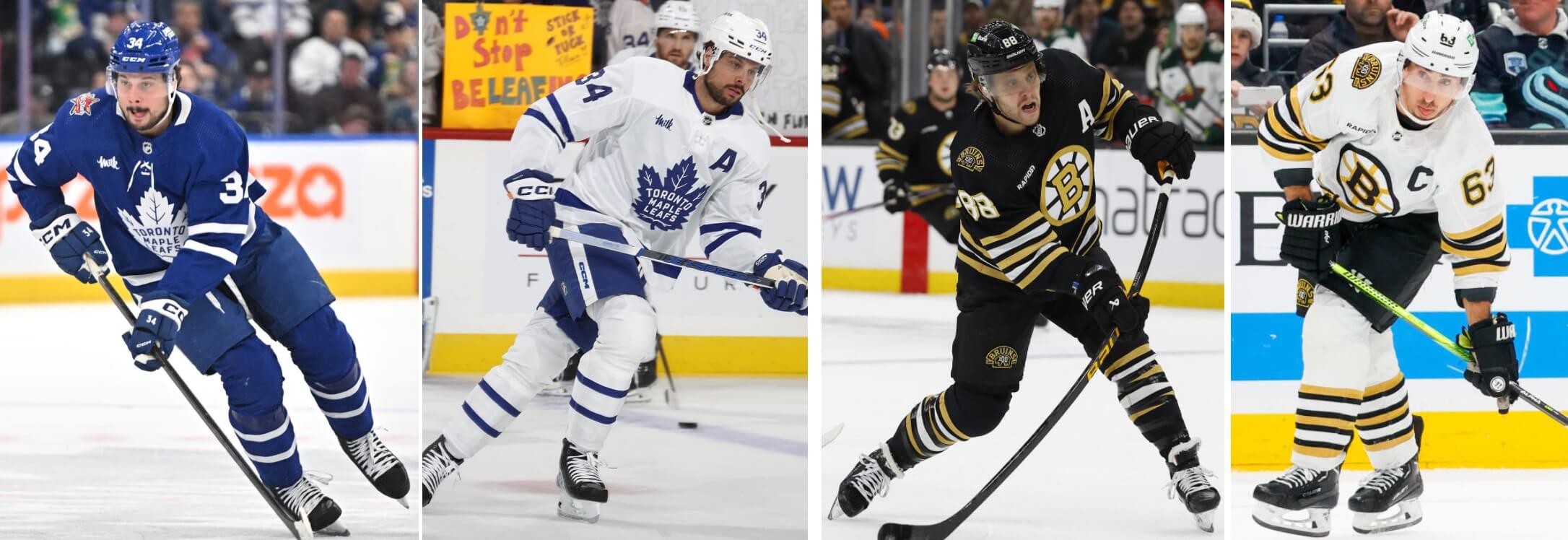
JV: Wow, they still let Canadian teams in the playoffs? And one of them is in an Original Six matchup! Absolutely classic looks from both sides, so Spoiler Alert: this one’s going seven. I really like the simple blue and white of Toronto and the subdued striping, but I love the abundance of gold, black and white striping on Boston a little more.
In the last minute of the second overtime it’s Bruins in 7 games.
PH: The Broons are celebrating their Centennial Season, so they’ve been wearing special uniforms (which I believe are one-year only) this season. I actually like these better than their regular set (which is also outstanding), and of course the Leafs are classically attired as well. This will probably be the best looking of all the Round One matchups, and this one is going the distance.
Bruins in 7 games, with a triple OT in Game 7 to decide it.
TAMPA BAY LIGHTNING at FLORIDA PANTHERS
12:30 Eastern

JV: The Toronto Bay Leafning…I mean, Tampa Bay looks good. Another blue and white wonder, which unfortunately will meet the same fate. Both white sweaters cancel each other out, so it comes down to that glorious red Panthers sweater. Bonus points for wearing a contrasting blue helmet with it.
Despite Tampa Bay pulling the goalie late, Panthers in 7 games.
PH: The Sunshine State Showdown gives us a couple of more modern, yet still pretty traditional, uniforms. While I love the classical simplicity of the Bolts, I wouldn’t want to see them play the Leafs — but since I’ve already picked Boston to win over Toronto, we won’t have to worry about that. If TB were wearing anything but these, I’d give the edge to the Panthers, but this tight uni battle will see one blue and white team advance.
Lightning in 6 games.
3:00 Eastern

JV: In the ’80s, this would be a Game Seven nail-biter. The Rangers would still win, though. You just can’t go wrong with that timeless look. I appreciate the Caps faux-ing back with these reds and whites inspired by their days in Landover. I don’t know if it’s the new font, or something else, but it doesn’t feel like an upgrade to me.
Rangers in 5 games.
PH: As much as it pains me to pick the Rags, I know the better uniform when I see it. And while the Capitals uniform today is definitely more classic than some of their less timeless attire, it still doesn’t compare to that of the Blueshirts. As Jimmer said, back in the ’70s or ’80s, this would have been a lot closer. Now? It’s a rout.
Rangers in 4 games
7:00 Eastern
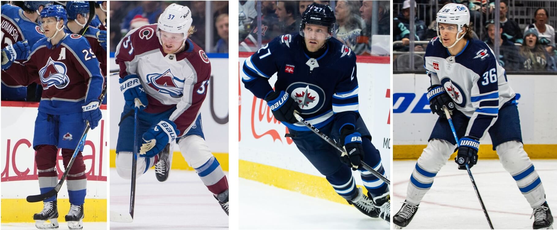
JV: Apparently I’ve become a forgiving person. A few years ago I would have said “Jets over the former Nordiques in a sweep…take that!” This series is extended a few games now. Winnipeg is sharp. Especially in the white sweaters, because I love the yokes. Colorado has yokes on both versions, and I love the contrasting blue helmets with the maroon sweaters. Not only have I forgiven them, I’ve given them the win!
Avalanche in 6 games.
PH: I’ve always thought it was tough to combine burgundy and blue, but somehow Colorado has managed to pull it off. I’m still not sure if I prefer their current homes to their previous set, with the black buckets, gloves and breezers, but I definitely like the blue elements with the white sweater. But the Jets have a really solid set, mixing mostly navy blue with a royal — usually a combination I dislike — but the royal here is mostly an accent, and overall it works. Neither uniform is perfect, but both are really good.
Jets in 7 games.
10:00 Eastern

JV: America needs more yellow-gold helmets. The Penguins won’t bring them back for me, so it’s up to the Predators. Sadly, that’s the best thing they have going for them. Not a big fan of the number font, and in the battle of logos, I’ll take the orca. Despite Vancouver going all blueberry on the dark uni, they win with ease.
Canucks in 5 games.
PH: Almost all of the previous matchups should be visually very good to excellent, but this one is going to be jarring, especially for the games in Nashville, where you’ll have white, gold, green and two different shades of blue. I love the gold sweater — but it should be their road jersey, with a blue sweater for home games. And I’m not overly fond of the Preds’ road look either. As for Vancouver, I’d rather they wear the stick-in-rink logo as their crest, rather than the orca. Neither uniform set is great, but the edge goes to the Canadian Club.
Canucks in 5 games.
VEGAS GOLDEN KNIGHTS at DALLAS STARS
9:30 Eastern

JV: Phil knows of my love for anthracite. Vegas calls it Steel Gray. Normally I’d be sad to see the Steel Gray sweater dropped to alt status, but Phil also knows I love a team named after a color to lean into said color. In other words, this team still looks great to me. Unlike Phil, my love of green and black ended when my beloved Washington Federals folded after the 1984 USFL season. Don’t get me wrong, it’s very nice, and it’ll make this series closer than I first thought.
Golden Knights in 6 games.
PH: First off, lets hope the Preds and Knights don’t match up. Two different shades of gold and different breezer and accent colors won’t mix particularly well. But since I don’t have Nashville advancing, hopefully that’s a moot point. I don’t particularly dislike Vegas’ uniforms, but Dallas’ kelly green is fantastic. I’m even OK with them pairing it with black (I’d prefer their road unis to have kelly pants, like NoDak), but it’s still a sharp kit.
Stars in 5.
10:00 Eastern
[Late update {Per Wade}: The Kings will wear their alternate road sweaters, but with white helmets, and black gloves, for this series. Their normal alternate look includes chrome buckets and white gloves.]
JV: Should the Kings still be in purple and gold? Absolutely. Should the Oilers ever change that uniform? Absolutely not. That being said, Edmonton’s logo is a little too 70s for me. You may disagree, and that’s why I’m saying keep it. Surprisingly, I like LA’s home plate logo better. The all-black uni is easy to read, and the white sweater with black pants is easy on the eyes, despite their being on polar opposite ends of the spectrum. Just glad they’re not wearing the chrome domes, so I don’t have to change my pick!
Kings in 7 games.
PH: You might think this one would be close…but it’s not. The Gretzky era has been over for decades, and it’s time to for L.A. to permanently retire the silver and black. The Kings need to be in forum blue and gold. Until such time, these unis will never advance. And yeah, I’m partial to royal and orange anyway, so this one is no contest. In the battle of the Great Ones, there can be only one winner.
Oilers in 5 games.


Picking the Kings over the Oilers is mad. Now, if the Kings bring back the Gretzky era sweaters, it’s a contest. But the current iterations, Oilers easy
It felt crazy making the pick. Guess I wanted to show that I’m not against the concept of an all-black uni, as long as it’s done right, and that just because something is classic it doesn’t automatically mean it’s better.
Best King’s uni was the original – all purple or all yellow with the crown.
One of the best all-time in any sport.
I love the purple and yellow Kings unis with one condition. The all yellow home unis looked like pajamas. The yellow sweater looked great with purple pants, though.
I’m also not against an all black uniform if it is done right, unfortunately for me this is far from done right. Even eliminating my bias for the original Kings uniforms, this home plate logo with the clunky letters with the quirky font along with the tiny crown below does nothing for me.
The “minimalism” of the Lightning and Stars has not grown on me. While it is a bit of a challenge to make a logo and uniform with the name Lightning, the Stars have no such excuse and can look to their history and elsewhere for better ideas. Away from the logo, the white jersey of the Stars look like what a second tier choice would have been decades ago for a beer league team that wanted a step up from a single colour practice jersey but wanted to save a few bucks on not having an NHL level striping pattern.
The Dallas Stars pre Reebok edge jerseys are imo some of the best in the league. Granted I love dark greens, but their striping pattern creating a giant star on the STARS jerseys. Bring it back
I actually agree with you, Jim. That Oilers logo is one of those things that you don’t notice until you actually _look_ at it and once you do, you can’t unsee the clumsy, pseudo-hippie 70s typography. It feels slightly _lewd_ somehow.
The Kings unis would be fine in black and white or Forum Blue and Gold if they just ditched the LA crest and went back to the crown.
The NFL is in a “modern classic era”??? Put down the crack pipe.
As far as those NHL matchups, lots of good looks. Beat dressed league by a mile.
UToTD:
We’re not there yet -there’s work to be done-like in DC, Atlanta, Tennessee, and now Houston-but the NFL is somewhat emerging from Dark Ages…thanks in part to the Cardinals roadie as shown above!
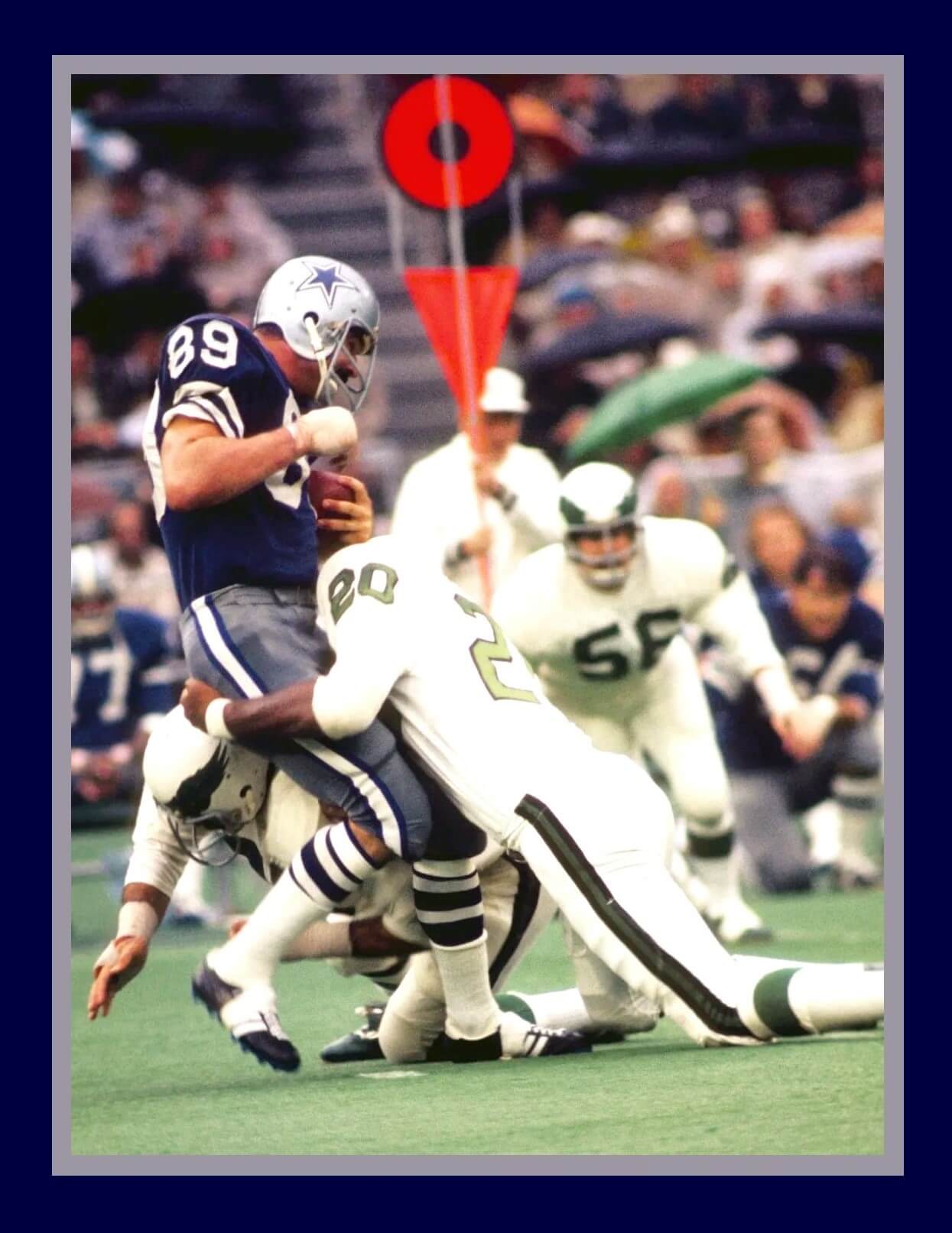
Cowboys at Eagles 1971. First Eagles game at The Vet. Mike Ditka returns to Philly.
1971! Both teams are also wearing new pants from what they wore in 1970.
You can expect Carolina to wear the red helmets on the road with the white uniforms. They love doing that and are the NHL team that got that trend going recently of the colour helmets worn with the white road unis. Would love to see the Hurricanes go back to their original uniform set as primary. The black home uniform was once the alternate and is more suited to be an alternate rather than a primary uniform for them. NHL jersey featuring different shoulder patches on each side should not be a primary jersey.
Interesting call by the Kings to wear their white alternates on the road. It looks good switching it up with white helmets and black gloves. I’ll take any old Kings logo on the front than their current primary logo.
Some things seem certain. The Capitals likely a lock to lose in the first round and that was a given considering the uniform match-up against the Rangers. The Capitals and Kings primary uniforms in dire need of a refresh and recovery from Reebok Edge hangover.
Red helmets on the road? I’m changing my pick! Isles in seven games instead of six.
Thank you, Carolina, for starting a new trend that actually works for me.
“A few years ago I would have said “Jets over the former Nordiques in a sweep…”
I would have said “the former Thrashers” – and your is the correct call in this one, though I do miss the Quebec branding.
Let’s Go Flyers…oh wait, never mind.
I don’t miss the Thrashers as much as the Nordiques.
The only thing I liked about Atlanta was what this article mistakenly calls the league’s “most forgettable jersey.”
link
I’ll never forget that beauty.
Let’s go Pens…oh wait, never mind…
You’re right. It’s not forgettable.
It’s… something
That may be the all-time worst NHL uniform. Near the top of the list if not number 1.
Their navy sweater was absolutely brutal. That might be my pick for worst ever.
Agreed, but I think if a team uses gold as one of its two colors, then it should be the designated light jersey. ALWAYS. A redesigned blue sweater for home and gold for road is ideal for that team.
Wade:
In a uni-verse that includes the Mooterus, BuffaSlug, and the mid-90’s-early 00 Flames, that Thrashers sweater isn’t so bad…that’s not to say it good though.
Chris, no doubt those are on the list. Poor Buffalo Sabres. Can’t seem to make the playoffs and they have more than one notorious uniform with an unfavourable name. Can’t forget the Turdburger.
link
Why in the name of Juha “Whitey” Widing, Bill “Cowboy” Flett and the Triple Crown Line won’t the Kings return to Forum Blue and Gold?
The silver and black was a 80s-90s thing tied to the Oakland-LA-Oakland-Las Vegas Raiders.
It’s all BFBS!
GTGFTU: 09/26/1971 Dallas Cowboys 42, Philadelphia Eagles 7; Veterans Stadium.
How ’bout them blue jerseys! No curse on those beauties, especially that day.
If they wore the jerseys more than once a year they would have won more games in them. Most seasons they would only wear them on the road against St. louis. The 70’s Cardinals with Jim Hart, Mel Gray and Terry Metcalf were a tough game to win on the road for any team in the 70’s.
GTGFTS
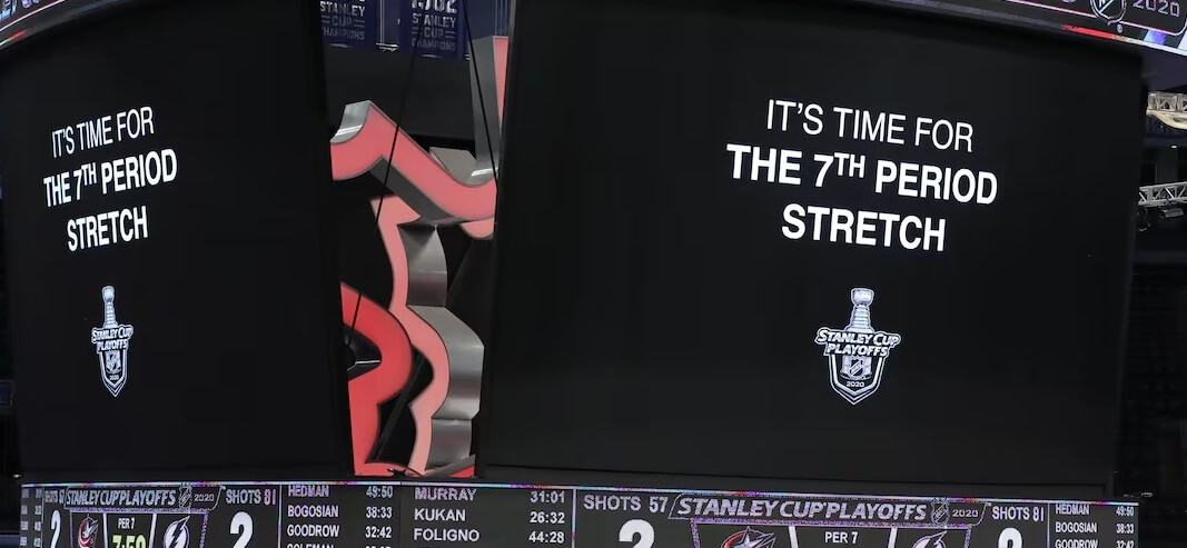
11 Aug 2020
Lightning 3, Blue Jackets 2
Game played in the Toronto bubble
Brayden Point scores the winner at 10:27 of the OT5
TB outshoots CBJ 88-63 in 4th longest NHL game ever
The Bruins would be an even bigger favorite over the Leafs if they were wearing the traditional yellow numbers and yellow socks with the black uniform.
I look forward to the Bruins returning to the proper yellow trim and shelving this one-year uniform.
The unfortunate thing. A season after a one-year uniform is the perfect time to make a uniform redesign. My understanding with Fanatics taking over, the Bruins will wear their old regular uniforms again next season and nothing new.
The Bruins need to stick with the logo they have been using this season. It is also the perfect time to fix the uniform. The timing is right to change to a current version of the uniforms they wore at Boston Garden leading up to the mid-90s.
link
GTGFTU
8/26/71
Cowboys v Eagles at the Vet. One of 3 times in 1971 the Cowboys were forced to wear Blue on the road.
Eagles lost 42-7. Key is Ditka as receiver. This was the only year during his tenure with the Cowboys they wore Blue in Philly.
Fixing a typo. 9/26/71.
I really want these Bruins unis to stick around for another season, especially considering their first ever season was 1924-25.
I dig the 100 anniversary alternate uniforms this year. Really would like the Bruins to keep using their original colours of brown and yellow in a regular alternate.
I’m curious if the Canucks end up wearing the black 90s alternates for the playoffs. They’ve had a better record IIRC, and there’s a fairly large amount of people who call for them to come back. That being said, probably will be wearing blue as they just put up new posters outside Rodgers arena with everyone in Orca jerseys.
Also while the Canucks are my main team, not living in the pacific time zone and being born in Toronto has led me to adopting the Leafs as my eastern conference team. Please, for the love of everything, swap it to a leafs win in OT of game 7. I don’t think that the city could handle losing to the bruins in OT 7 after the last decade
This is one of those fantastic uni matchups that should happen in a final or at least the semis. If TO were playing any other team but the Broons (or possibly the Rags), they’d cruise into the next round.
Also, I’m not 100% on the rules of playoff puck in regard to alternates being worn. I think they can (as Carolina has in the past, and LA are doing this year), but once they are declared, the team must wear them for the entire series (or post season). Perhaps Wade or someone who follows the NHL more closely can confirm (or correct).
Yup, the nhl only lets you wear two jerseys for the entire playoffs. Always found it interesting when a team routinely when with the alternate as one (sharks with the black and the wild with green in the early ‘10s)
Hey guys. As many may be aware, I live in Vancouver. The Canucks appear to be wearing blue and green at home in playoffs. You will always know which uniform they are wearing for a home game during the season based on what is depicted in their social media prior to a game. All playoff promotion has included photos with blue and green primary uniforms. Team has been using a slogan “paint the town blue”.
Basically, my understanding now is once you declare you are wearing the alternate or not, that is the uniform you are stuck with in the playoffs. No switching back and forth.
Of course, if the Canucks wore Black Skate at home during playoffs, they would look radically different at home compared to on the road with the colour scheme differences.
Matt, as you may remember being a Canucks fan, they started 2007 playoffs at home wearing Navy Orca uniforms before adopting their alternate third throwback Stick-in-Rink during first round and for the remainder of the playoffs through to second round. Not sure how that worked with them being able to do that then. They had the varying colour scheme differences at home and on the road but the situation was different then. At that time, we all knew the Canucks were returning to the blue and green as primary colour scheme for the 2007-08 season. It somewhat made sense as the transition was happening.
Despite what many fans are hoping (many younger fans who never saw them in Black Skate as primary before), the Canucks are not switching to the Black Skate as their primary uniform. Not right now. They likely will not as long as the Aquilini family owns the team. So primary uniforms will be the look in playoffs
Of course, Canuck fans always have the constant struggle within the fan base about what should be the look. This happens when you change the look vastly many times during team history and then bring back looks as an alternate. Count me in as team blue and green. Can’t give up the original colours once again for Black Skate look as primary. Been there, done that. Fans can enjoy both looks they way it is now. They just need to redesign the blue and green uniforms and get rid of the Orca. I have an ideal redesigned look in my mind for them.
Didn’t know that bit about the ’07 playoffs (was 6 and living in Iowa at the time, most games were way past my bedtime), so kinda curious what happened with that.
I’m 100% on the blue and green side of things, never been a huge fan of if (my dad called it the spaghetti logo and I didn’t realize it was supposed to be a skate for years). Bring back the old Johnny Canuck shoulder patch as the main logo, and use the old “V” striping from the original jerseys when they entered the league.
Have no idea which Cowboys-Eagles produced that photo, but I’m sure that we need a white Eagles helmet.
I think those Florida Panthers uniforms are the best set in hockey. They hit all of the main criteria for me: good color blocking, good crest, recognizable stripes (but not too crazy), doesn’t have a bunch of extra elements. Such a classy set.
Dallas, Vegas, and Nashville all look fugly to me. La Kings need some kind of refresh; but their colors and identity have some unfortunate drawbacks. I think they were on the right track with the 70s RR. I really wish Boston would come back to Jesus and wear yellow socks with their dark set again.
It’s so weird to me how I love Vancouver’s colors but I dislike all of their uniforms. It makes Carolina all the more tragic.
From an uniform point of view I am hoping for a Canucks-Bruins Finals. But I do miss the Wild and the Blackhawks in here: my 2 favorite NHL uniforms.
In the photo of the Hurricanes’ red sweaters, are we seeing 2 different versions of the sweater on ice at once? The player on the left has much wider white stripes on the sweater forearms than the two players on the right.