Late Saturday, the Boston Bruins unveiled three commemorative Centennial jerseys to be worn during the club’s 100th year in 2023-24, at a “fashion” show at Boston’s Logan Airport. There was actually a bit of a kerfuffle prior to the unveiling when images of the jerseys leaked early — it turns out by adidas!

They’re actually full uniforms, but the club was primarily interested in showing off the jerseys.
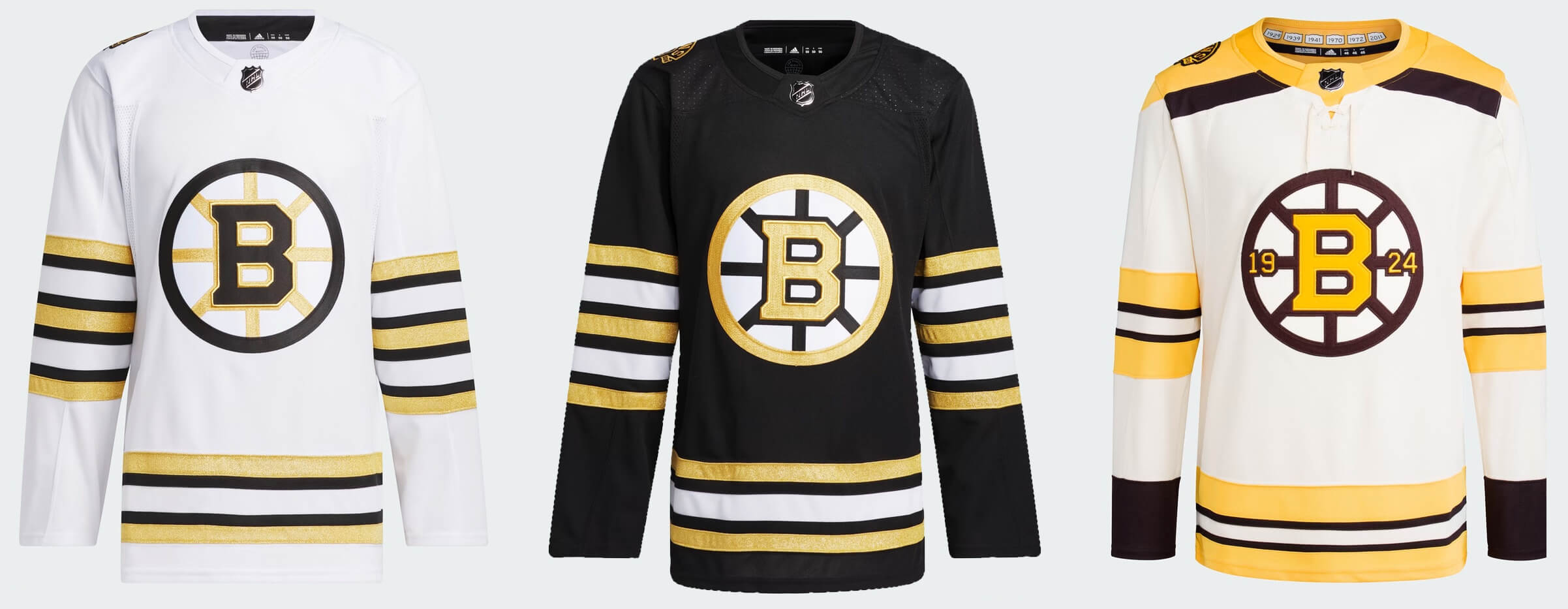
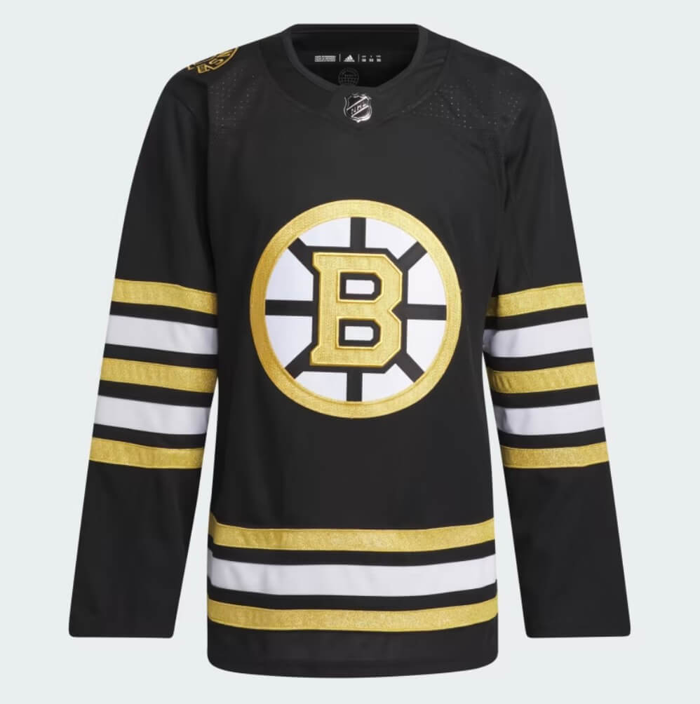
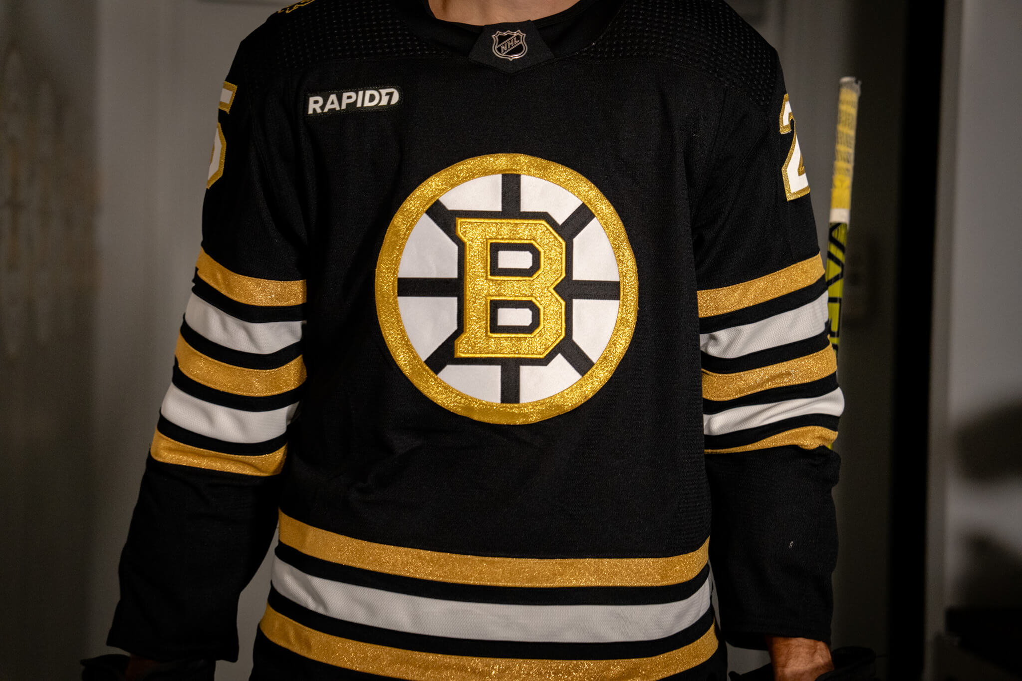
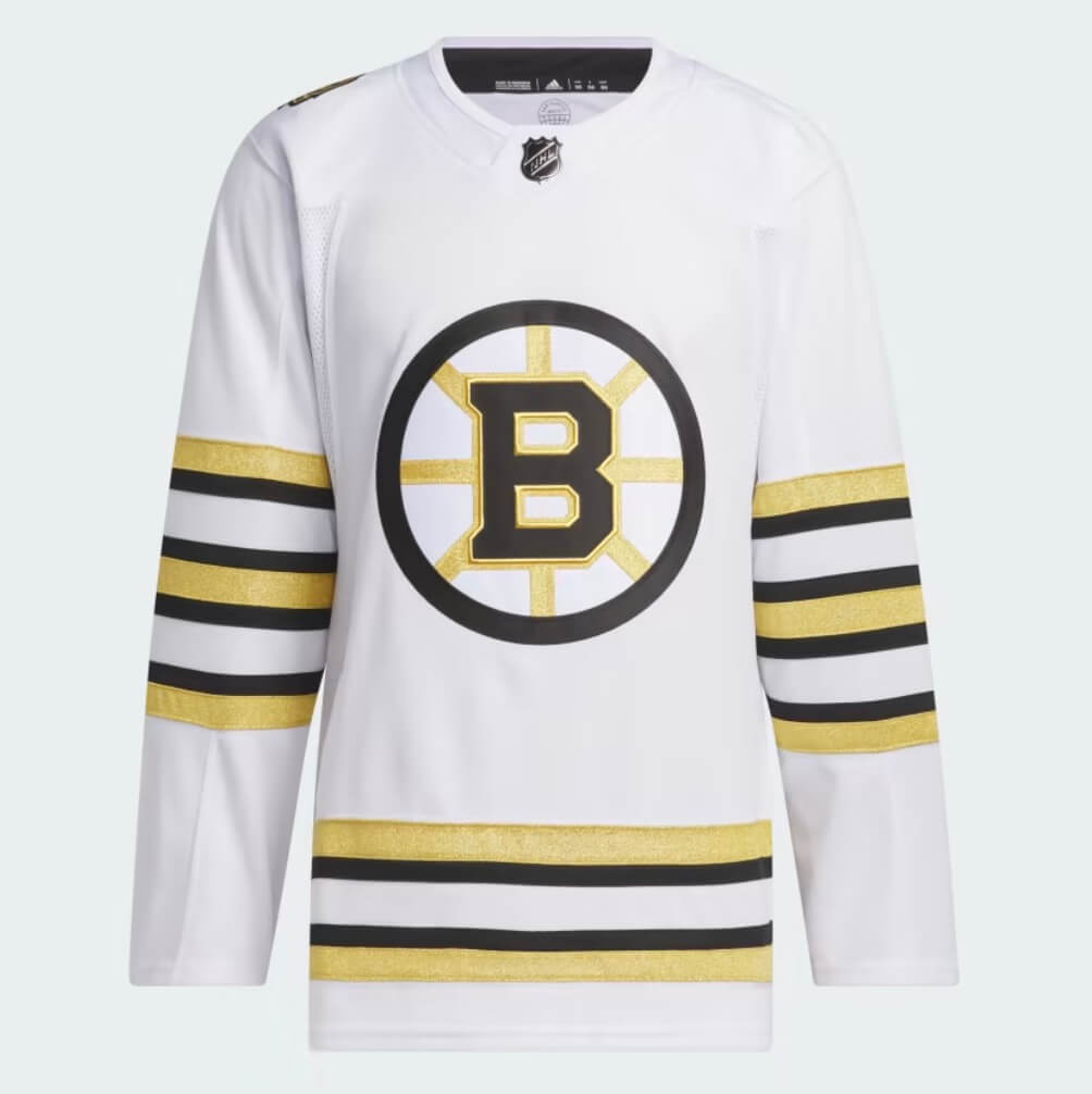
As expected, the team unveiled three new jerseys — a home (black), road (white) and alternate (also white). The “Vintage” (alternate) isexpected to be worn for select Original Six matchups during the coming season.
Let’s take a look at them now.
HOME:
ROAD:

ALTERNATE:
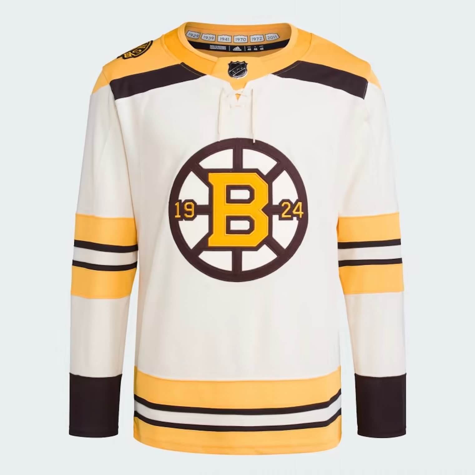

In describing the new home and road sweaters, the team states, “A spin-off of the recent black and white home and away jerseys worn by the Bruins, the Centennial primary uniforms feature new crests, coloring and striping. For the first time since the early 1990s, the club’s primary uniforms are adorned with complementary team crests – a gold-trimmed Spoked-B on the home uniform and a black-trimmed Spoked-B on the road uniform. The club adopted the home crest as its primary team identity for the 2023-24 season back in June.”
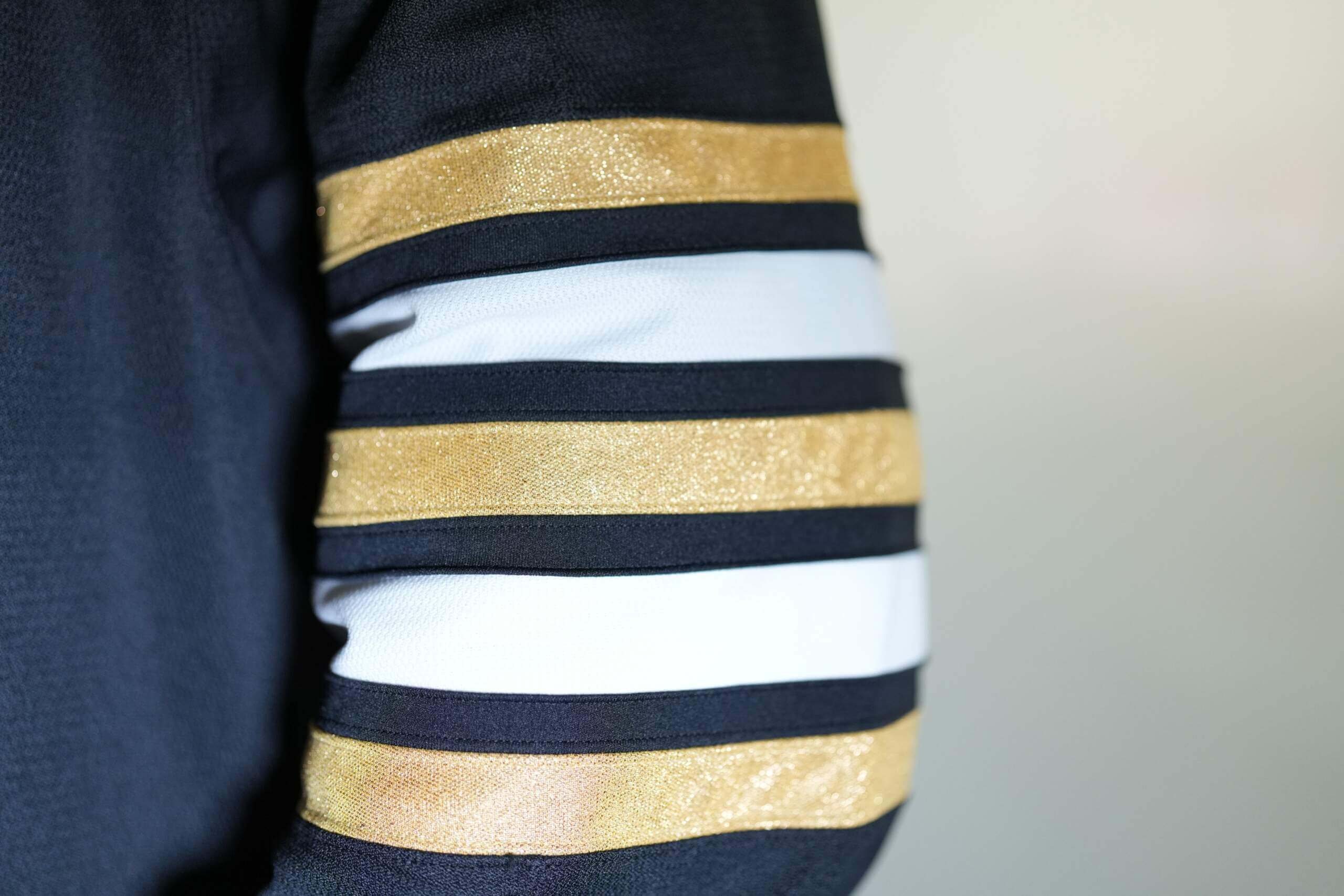
If you look closely at the jerseys, you’ll immediately notice the gold is different from the team’s usual color. Both sleeves of the home and road feature a unique stripe design. According to the team,
The “Centennial gold” coloring – a symbolic toast to 100 years of history – brings the primary uniforms’ style to a whole new level for the turn of the century. “Centennial gold” is also incorporated into the new striping on the sweater. The right and left sleeves each contain three gold stripes for a total of six as a nod to the organization’s six Stanley Cup® Championships (1929, 1939, 1941, 1970, 1972 and 2011).
The new alternate has a retro look and feel, but it too comes with storytelling:
The Bruins’ alternate sweater for the Centennial year carries a more vintage style but is the first sweater in club history that features “Bruins beige” as its base color. With highlights of brown and gold, the alternate harkens back to the Bruins’ foundational color scheme from 1924 when brown and yellow – the colors of owner Charles F. Adams’ First National grocery store chain – were chosen for the team uniforms.
Additionally, the alternate features a unique center crest inspired by the club’s 25th anniversary jerseys in 1948-49. The modern interpretation includes a “19” and a “24” gracing the horizontal spokes to celebrate the club’s founding year.
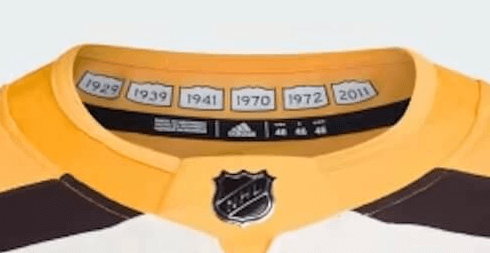
What won’t be visible on ice is the inside of the collar, “the Bruins’ six Stanley Cup® championship years are emblazoned on Massachusetts town signs.”
The alternate jersey will be worn with brown helmet, gloves and pants.
Here are a few more looks at the new jerseys:


I don’t know. I think there are too many stripes on the arms of the primary jerseys. And the lack of a yoke on the primaries makes them look … unfinished, IMHO. The Bruins have released a short video of their jerseys throughout the years: link There are some classic looks there.
The yellow/gold on the home and road looks like they’ve been washed with cheap detergent too many times
Also, the 6 stripes for 6 cups is a total bullshit. These have obviously been in the works for a couple of years, and they were the overwhelming favorite to win the cup last season. If they hadn’t choked in the first round would there be 7 stripes? Of course not. Dumb dumb dumb.
The home and road are awful for 2 reasons.
1. Too many sleeve stripes. It just seems like a needless mess up too.
2. Why did they go with literal “Vegas” gold, rather than the normal Bruins “gold” (which is really yellow)?
These are allegedly only for this season and I was skeptical but now I’m hoping they are.
Now for the 3rd. This one is actually beautiful, especially as a special Centennial. I did go ahead and order this one. Crazy how they can miss so badly 2/3 times but then the 3rd is so perfect.
Congratulations, it’s a hockey jersey. I can’t stand washed out metallic gold fabric the way hockey uses it (knights, penguins, now bruins). I woke up to see this and it’s putting me back to sleep.
Congratulations, it’s a hockey jersey. I can’t stand washed out metallic gold fabric the way hockey uses it (knights, penguins, now bruins). I woke up to see this and it’s putting me back to sleep.
Congratulations, it’s a hockey jersey. I can’t stand washed out metallic gold fabric the way hockey uses it (knights, penguins, now bruins). I woke up to see this and it’s putting me back to sleep.
By far the best of the three is the Orr-Esposito fauxback. I completely agree with the previous posters that the regular home and away jerseys have too many arm stripes. It’s a bad look. Also, the decision to replace Bruins gold (yellow) with that blah metallic gold was a mistake. One and a half thumbs down.
I appreciate the fact that Boston (and Toronto) manage to alter their uniforms frequently and still maintain the august look of the Original Six. A lesson that shows people love a new spin on an old classic.
There are things I like but ended up disappointed when the uniforms unveiled.
Like the main logos on home and away. This needs to remain when they return to regular uniforms. Like them heavily using brown for the 3rd uniform.
Major mistake is the gold. They are celebrating 100th anniversary of the team by wearing a trim colour that isn’t really theirs. It should be proper Bruins’ gold (yellow) and not this. Really disappointed aw well because with this gold it cements that Bruins won’t be going back to the yellow socks with the black jerseys like they should.
Ever since they switched away from yellow socks, that’s become all I care about when the Bruins unveil new uniforms. I really liked the Black/Black/Yellow (or even White/Black/Yellow) that they’ve worn in the past. It helped set them apart visually from the Penguins, and I think they really owned that version of the combo. Every time they have new uniforms without yellow socks, I’m almost automatically disappointed.
So with these fauxbacks, its really hard to tell. All the still images I’ve seen focus on the jerseys only, and the hype video seems edited to cut away specifically when the fauxback socks are about to be shown. In some parts, that player seems to be wearing plain black socks (the skate lacing part is interesting), or it’s heavily shadowed. I wonder if the socks for the alternate weren’t ready yet? I guess they could be saving that detail for a later surprise, but that seems unlikely.
Wow, I think these are gorgeous. I’m surprised (yet, somehow I’m not) at the amount of dislike in the comments.
I’m not crazy about the metallic gold but I don’t hate it. At least it’s actually metallic, and not the matte crap the Penguins used in the Edge era. The uni striping is fine. I’d love the third more if it wasn’t — “Bruins beige”, are you kidding me with that crap? Really, I was done with the “vintage white” crap well over a decade ago. Otherwise I’d love it.
Love ‘em.
I can’t be the only person to notice that the logo on the home jersey isn’t level, right? The sleeves at the bottom are perfectly aligned, and the hem stripes are level. So it’s got to be sloppy manufacturing. What a strange unforced error for adidas to release as a press photo.
Not popular around here but I like the home and away. Sure, it is Vegas/Pens gold instead of Bruins yellow but it is a special edition. I like those 6 stripes and the absence of anything on the top part of the sweater. I do not care much for the Vintage version as I do not like yokes. I do like the date 1924 in the logo and the cups on the sign but they should have been on the outside of the back collar.