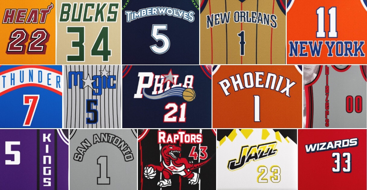
I’m once again joined by UW pal/designer Casey Vitelli, who has teamed up with ProLine to create what is being called the “NBA Rewind Series” (described below). If you missed Part I, click here. I’ll include the set up to this group below, so you don’t need to re-read Part I. Enjoy!
At ProLine we wanted to create a new template with a classic cut, and we’ve always been fascinated by the vintage NBA jersey designs like the ones from the Hardwood Classics line by Mitchell and Ness, so we opted for something with that look and feel. Whenever we finish 3D modeling and move on to the Photoshop templating we go through a testing process by mocking up various designs. During that process we had an idea to mock up vintage designs with modern branding elements. Normally our testing samples don’t see the light of day, but we thought they were so fun we decided to expand it into a public series with all 30 NBA teams. It was like watching basketball history merge with the present. Now, we’re eagerly waiting to see how other designers utilize our template to create their own interpretations of these classic designs and more, adding their personal touch to a piece of basketball heritage. Today’s featured designer is Casey Vitelli.
NBA Rewind Series (Part II)
by Casey Vitelli
Miami Heat
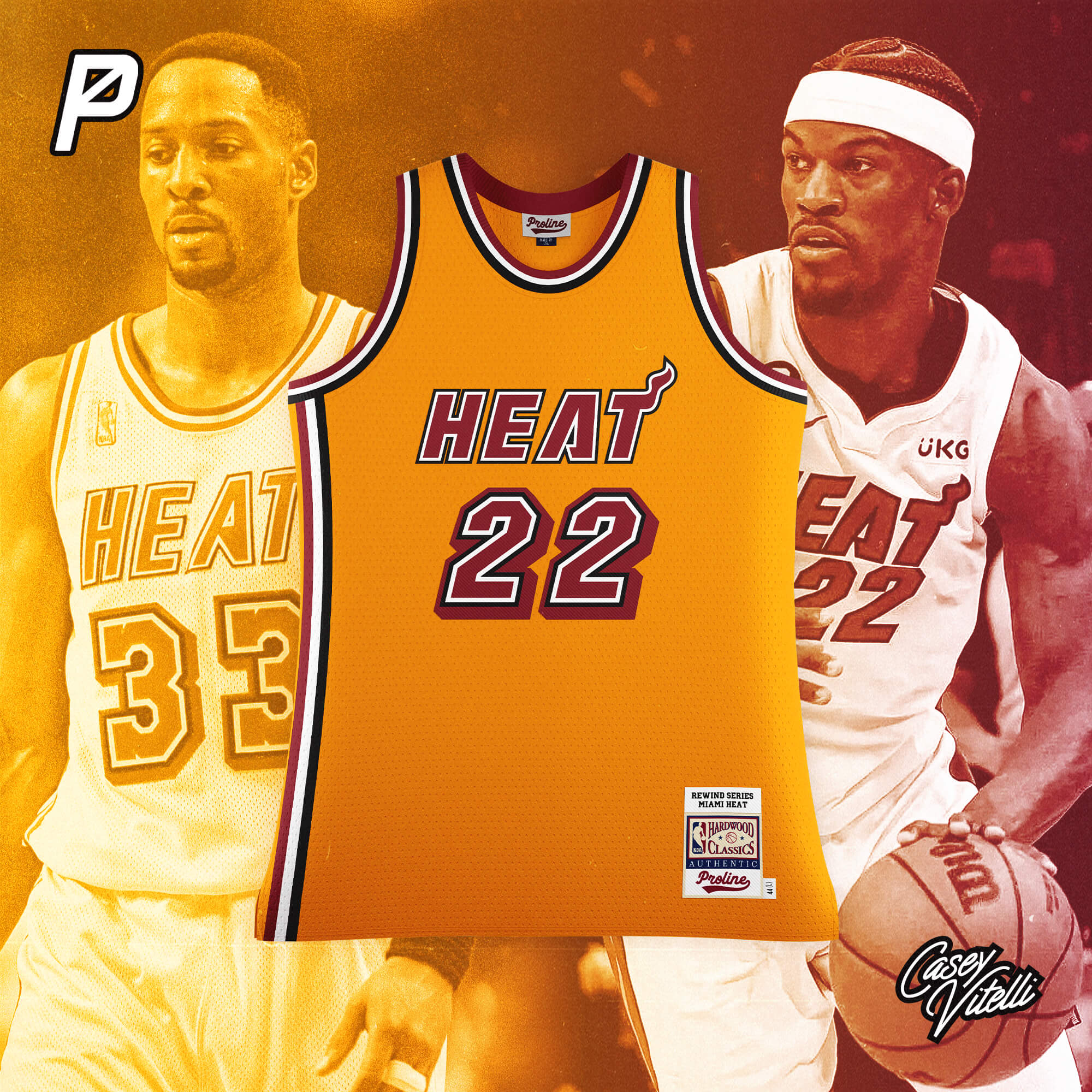
Based off the design used from 1988-1999
Milwaukee Bucks
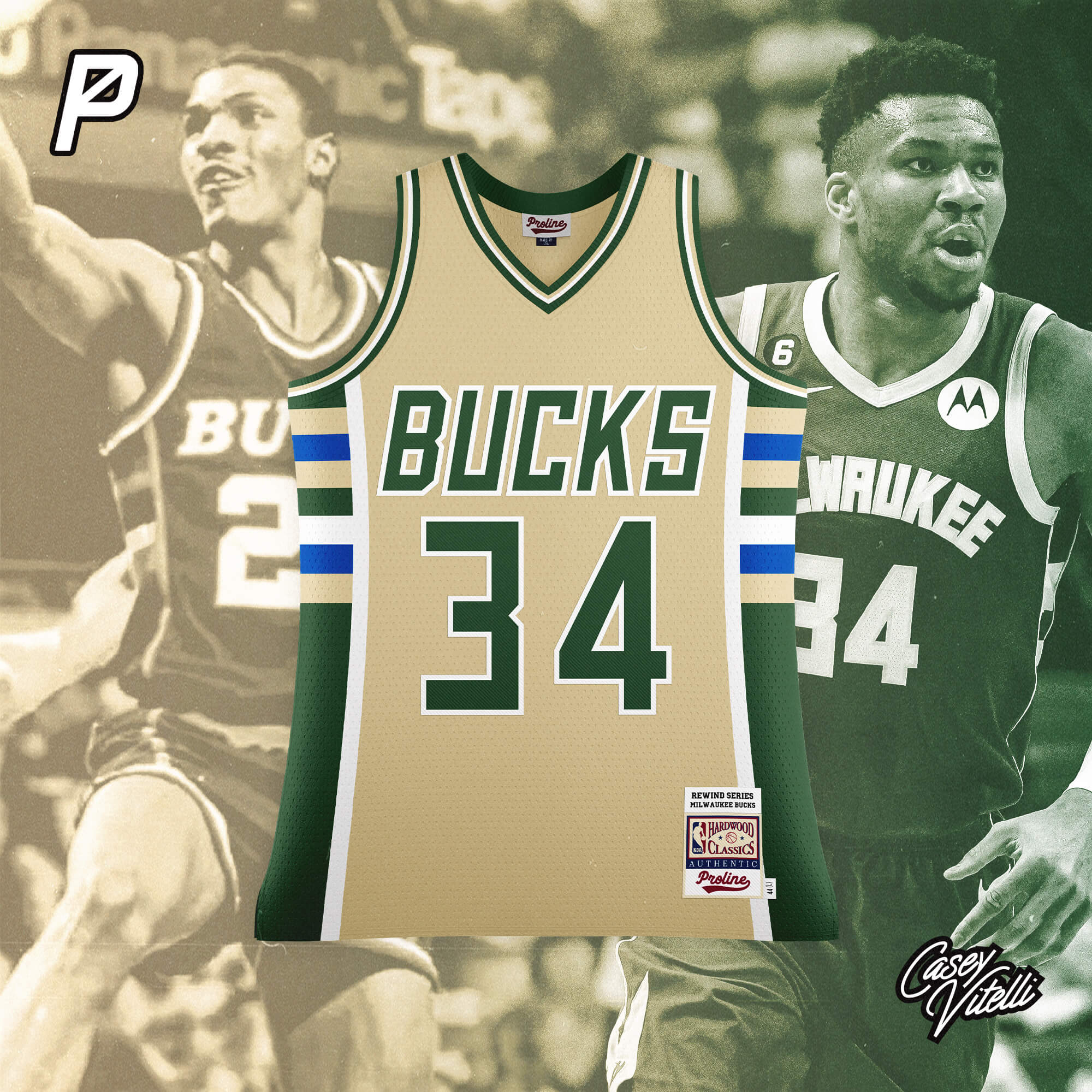
Based off the design used from 1985-1993
Minnesota Timberwolves
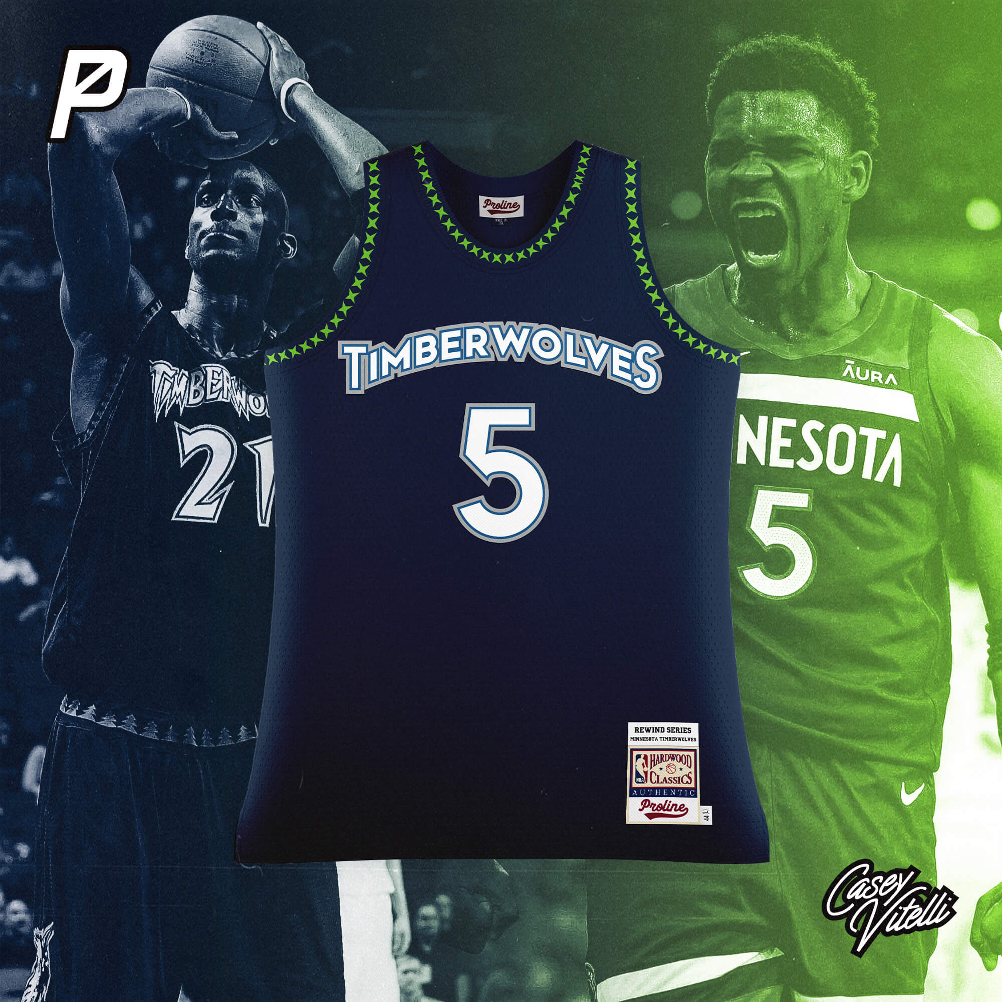
Based off the design used from 1996-2008
New Orleans Pelicans
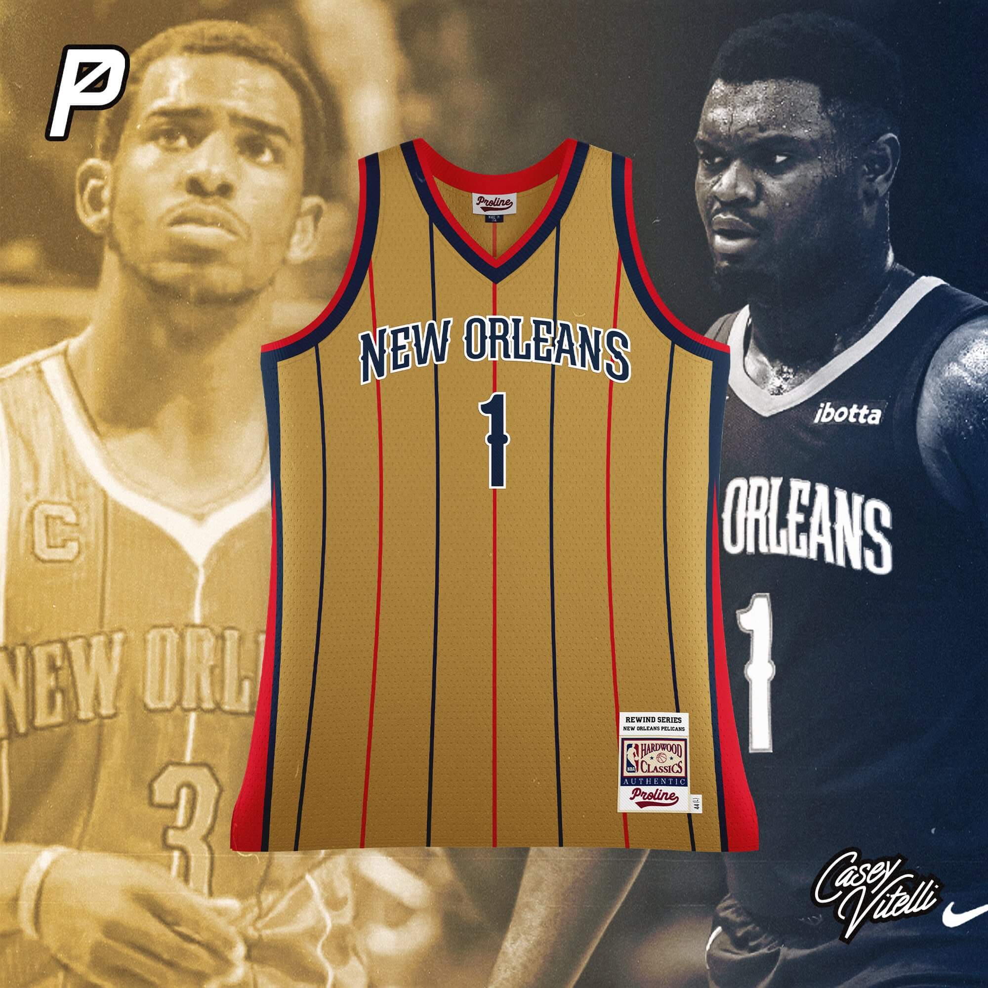
Based off the New Orleans Hornets design used from 2008-2013
New York Knicks
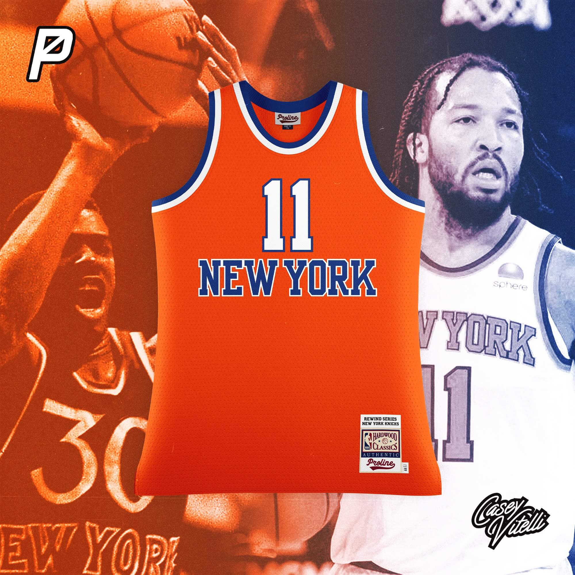
Based off the design used from 1979-1983
Oklahoma City Thunder
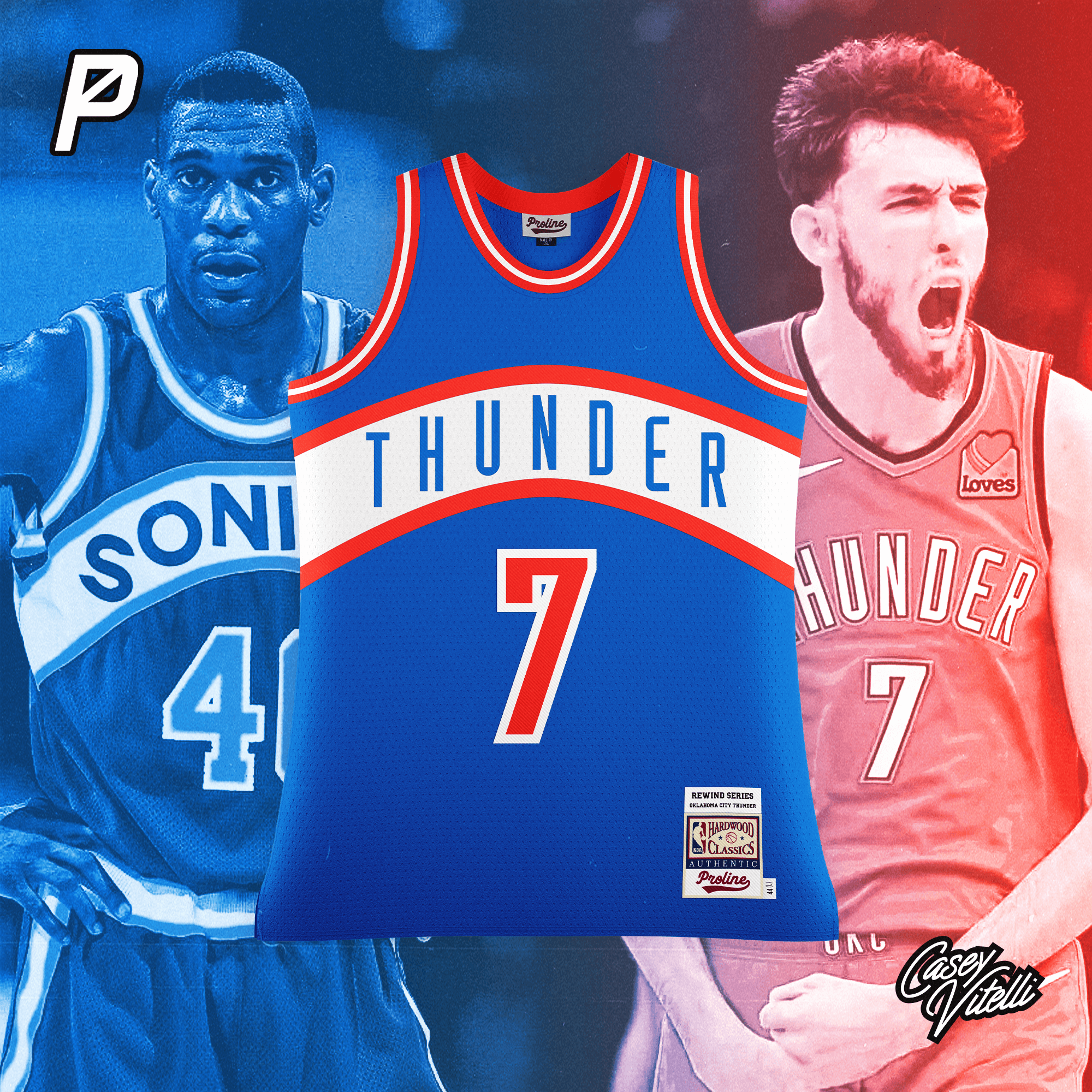
Based off the Seattle Supersonics design used from 1977-1995
Orlando Magic
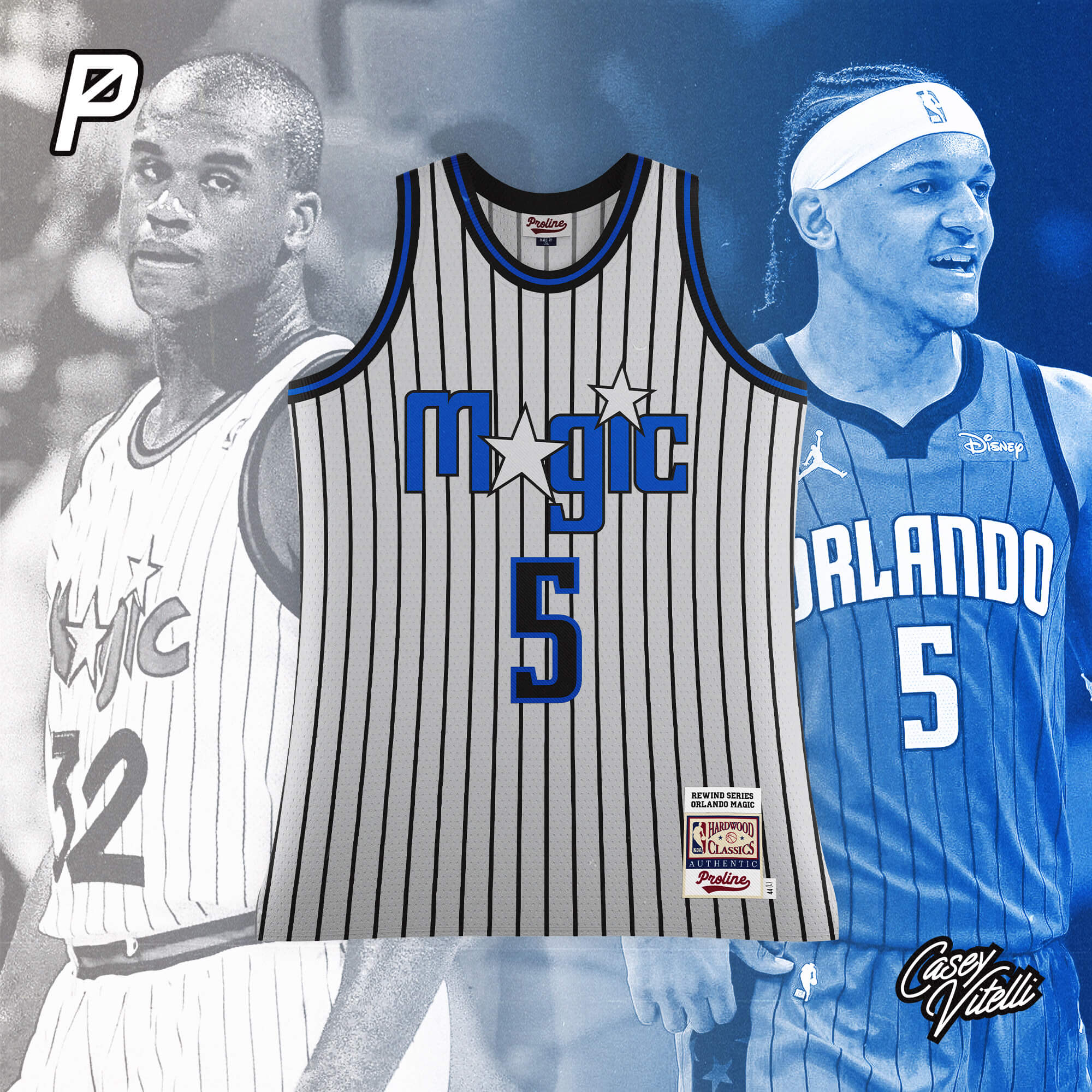
Based off the design used from 1989-1996
Philadelphia 76ers
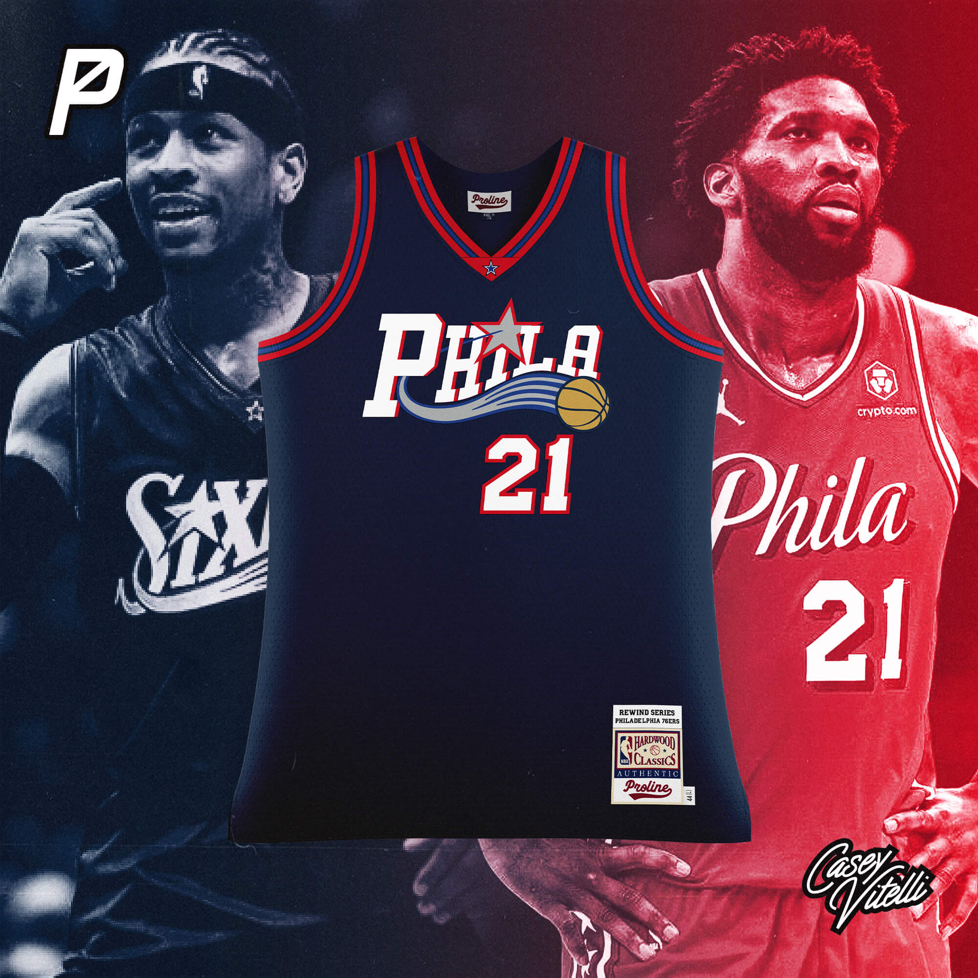
Based off the design used from 2000-2007
Phoenix Suns
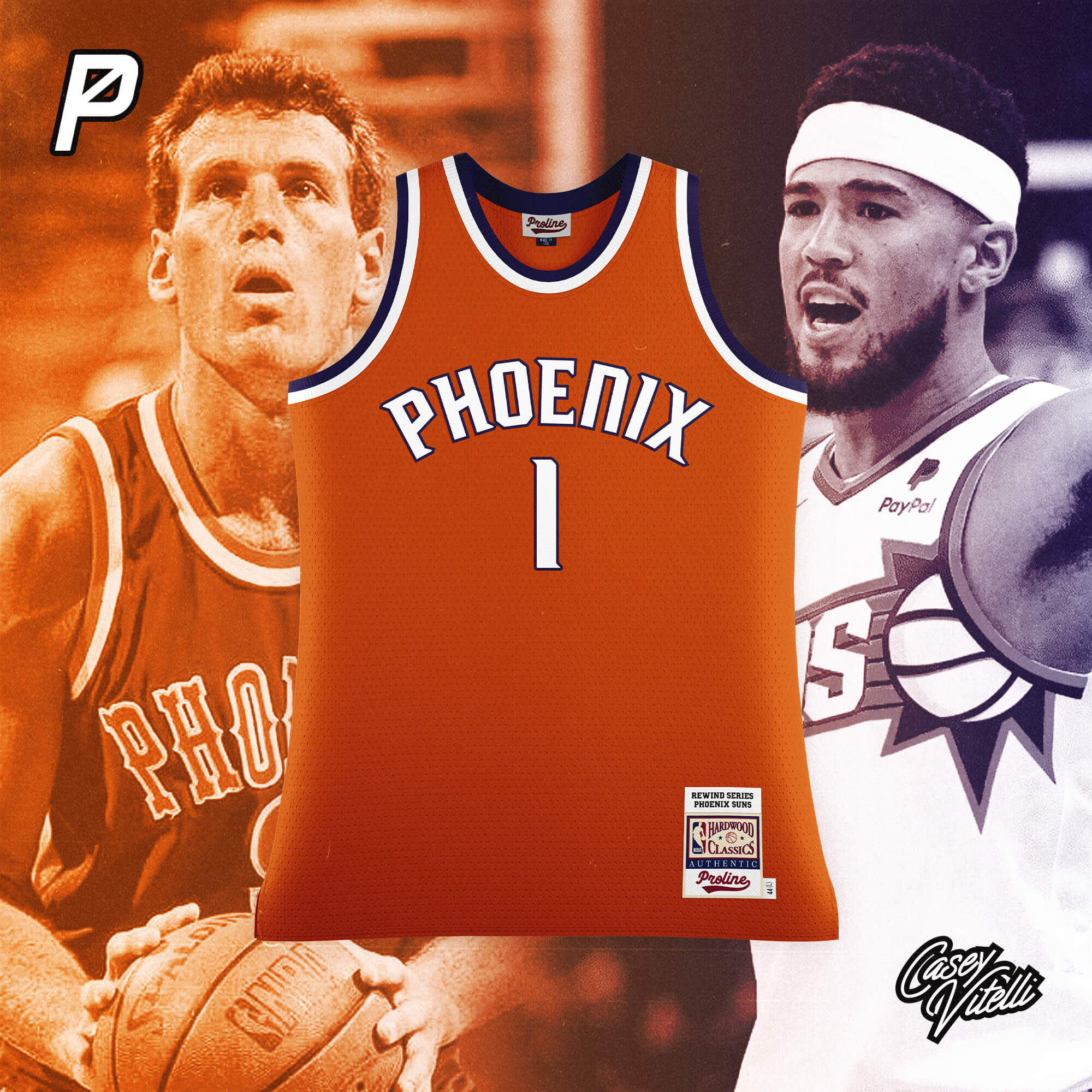
Based off the design used from 1973-1992
Portland Trail Blazers
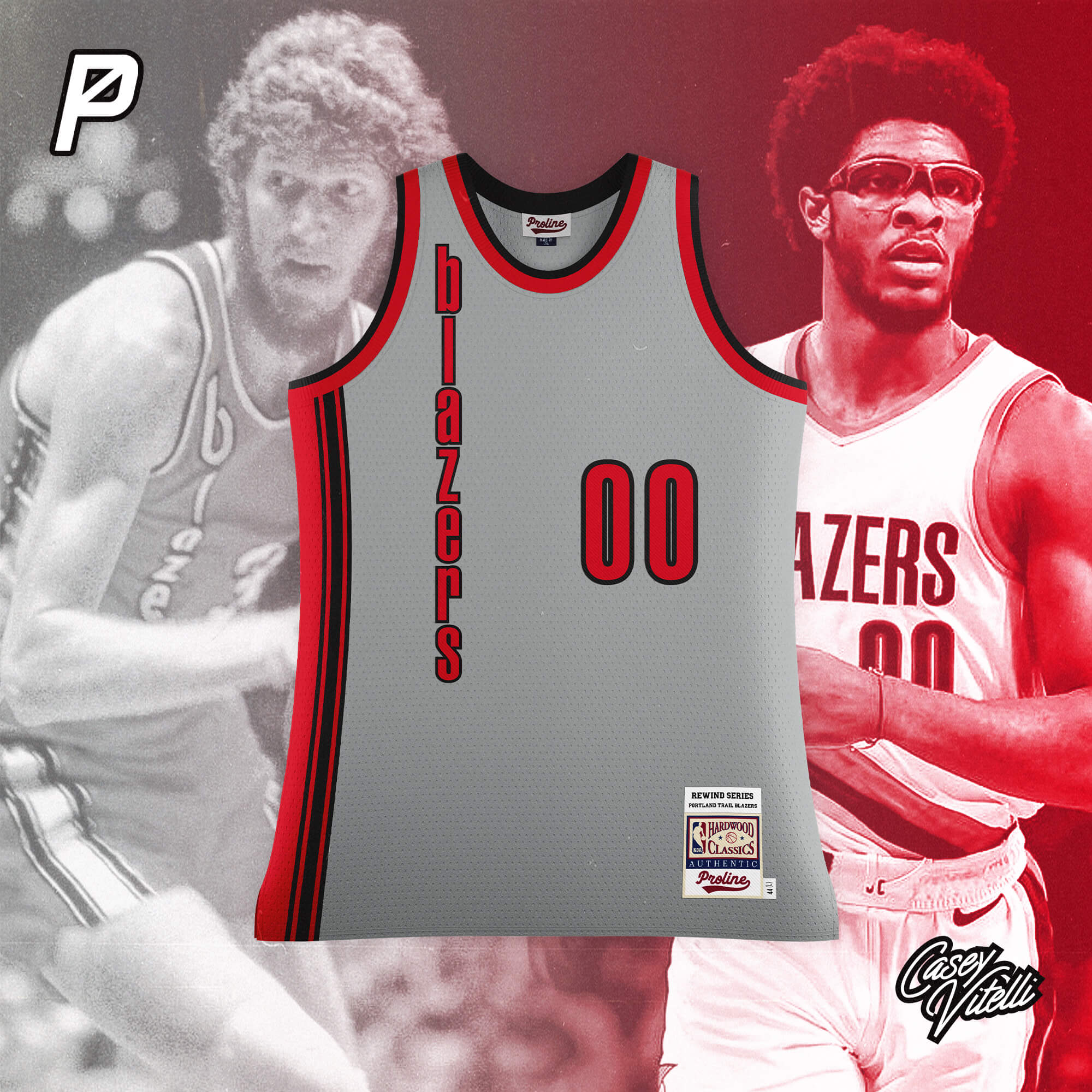
Based off the design used from 1975-1977
Sacramento Kings
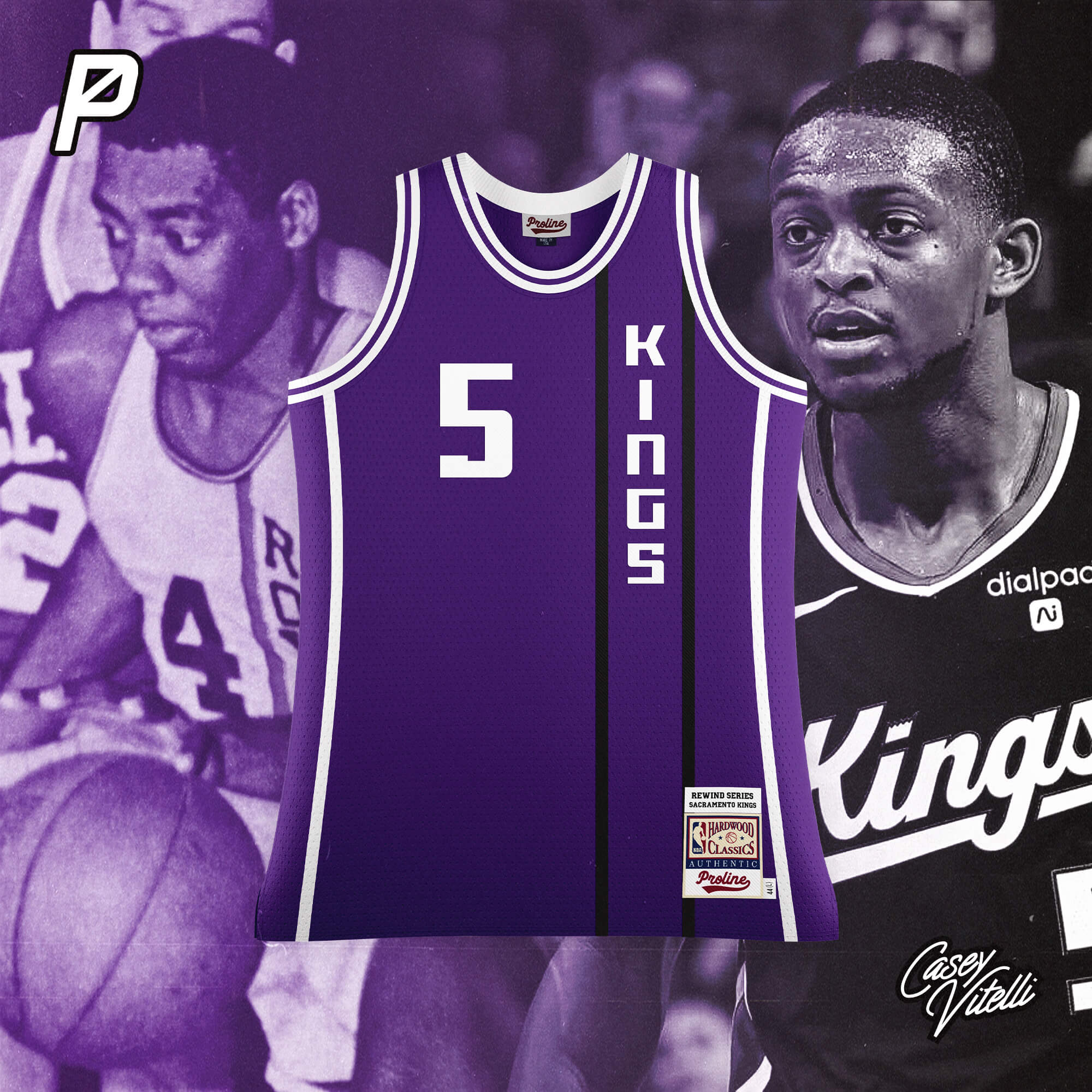
Based off the Cincinnati Royals design used from 1967-1971
San Antonio Spurs
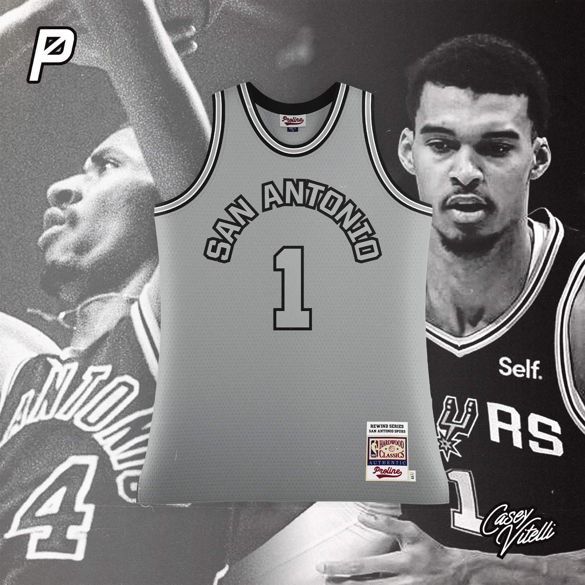
Based off the design used from 1974-1982
Toronto Raptors
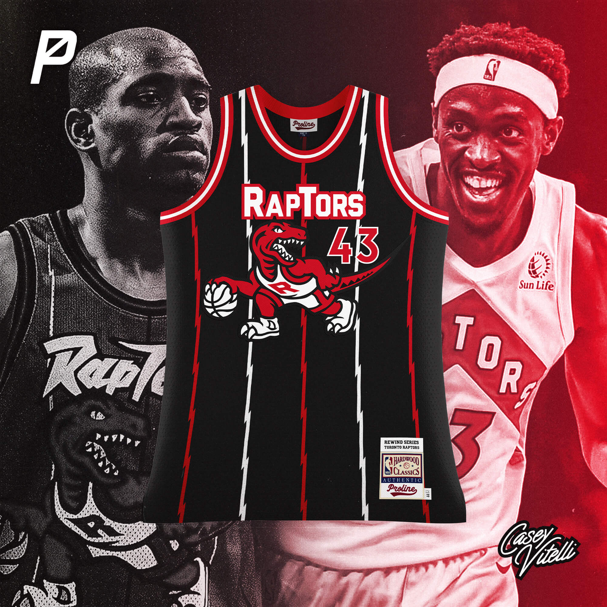
Based off the design used from 1995-1999
Utah Jazz
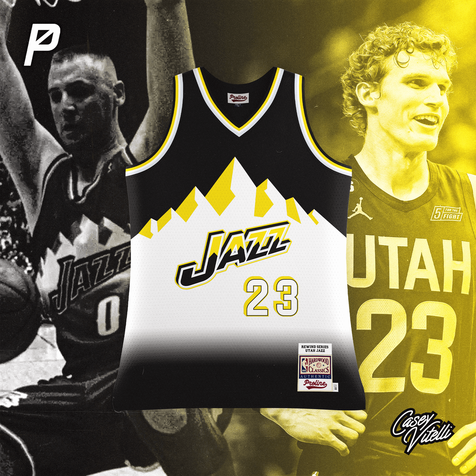
Based off the design used from 1996-2004
Washington Wizards
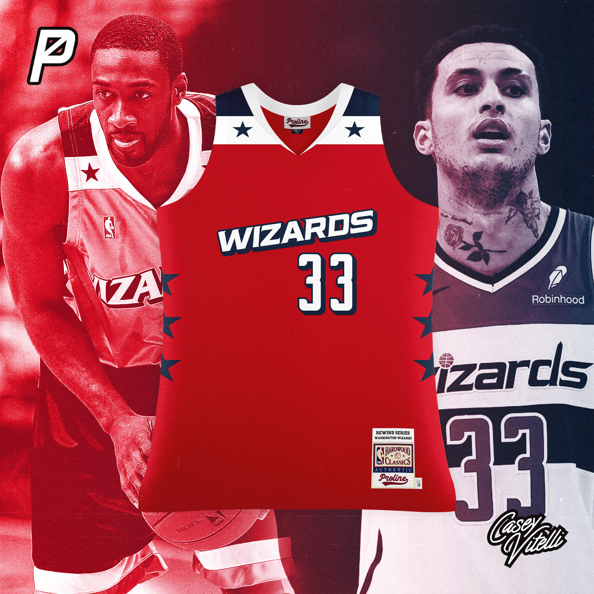
Based off the design used from 2006-2009
We wanted to create a more vintage NBA jersey template to allow users to mockup designs with a retro vibe akin to the cut that Mitchell and Ness currently use for the Hardwood Classics line. When it came time to test we thought it would be fun to bring historical styles to life using current team branding, so Casey got to work and made some really fun and interesting stuff. We look forward to seeing what other designers create with this unique template.
For Casey’s NBA Rewind Series:
Follow ProLine Mockups on Twitter and on Instagram.
Thanks, guys! Very cool takes on some classic NBA jerseys. Let us know your thoughts in the comments below!
Great designs. Love the heat and raptors especially. Struggle with the Thunder and Jazz. Jazz because their current set is so bad, it should be scrubbed from history. Thunder because the design and history should be Seattle’s.
Fun project! Thanks for sharing.
Heat = Lakers East since Pat Riley took over
Mostly praise, especially for the Pelicans, Heat and Thunder.
Thumbs down for:
1. Sixers – I never liked the BFBS years and I never liked the abbreviated “PHILA” on the jerseys; the only thing worse is the rumored MLB City Connect “PHILLY”.
2. Spurs – Too. Much. Gray.
3. Jazz – Not. Any. Purple.
Well, outside of the city jerseys, the Jazz don’t. Use. Any. Purple. These are based upon current branding.
Stop. Doing. That.
But they’re not. Almost all of these reference old uniforms. The Jazz not wearing purple are hot garbage (for aesthetics and for reflecting the most successful years of the franchise as well as their roots in New Orleans) and your “answer” isn’t within a mile of justifying it. And clapping back looks dumb when you didn’t make a cogent point.
They “reference” old uniforms with the current color scheme and wordmarks. The Cincinnati Royals didn’t not use black or purple. But the current franchise (Sacramento Kings) do. The Wizards did not use red in 2006, but they do now. These are renditions of popular uniforms using current colors (is that cogent enough for you?) and the Jazz do not currently use purple, outside of (as I mentioned) their City jerseys.
Reducing the Purple Mountains jersey to Utah’s current color scheme is just not worth it.
“Blasphemy!” thunders every extant Sonics fan.
Great concepts overall! The Knicks concept though, has no elements of one of the most perfect jerseys in basketball history:
link
Loved that the Sixers got the Iverson era treatment. While the U.S. has an undeniably great looking flag, the red, white, and blue/stars and stripes motif is the most overused theme in sports. For fans of a certain age, the Iverson Sixers jersey was ubiquitous, and the wide shoulder/muscle shirt cut was for the template of choice on the club basketball/AAU circuit (not to mention what Team USA was rocking when Vince Carter ended Frederic Weis’ life.) I think it’d look incredible as a throwback.
Also, forgot to mention that the Blazers are illegible (increase font size on wordmark) and if you’re going to throw back to the Knicks from 1980, the goofy numbers are needed.
Better than the first set because of much less BFBS. I like the TWolves, Blazers, and Kings best. Suns and Spurs are super boring, and the Jazz is just plain bad IMO.
Overall I would say this is a fun idea that is largely undone by the fact that a lot of current unis are bad, and an over reliance on black (particularly for the Celtics).