Tired of seeing annoying ads (like this one!) on Uni Watch? There’s a simple solution: Join Uni Watch Plus. You’ll get an ad-free site experience, plus exclusive access to our UW+ discussion forums, push notifications whenever a new blog post has been published, a special UW+ badge accompanying all your comments on the blog, and a 20% discount on our Teespring merchandise.
Good Sunday morning, Uni Watchers. I hope your Saturday was a good one!
This afternoon and evening we have what many — myself included — feel is the best weekend in the NFL: the AFC and NFC Championship Games. All the excitement of the Supe without all the (mostly superfluous) pomp and circumstance which surrounds the big game. KC visits Baltimore in the early game, followed by Detroit at Santa Clara to top it all off. I’ll have my picks based on better uni later this morning.
But first, I’m once again joined by UW pal/designer Casey Vitelli, who has teamed up with ProLine to create what is being called the “NBA Rewind Series” (described below), and we’ll have Part One of that series today. It is a pretty fun and well-designed set of NBA jerseys, and as the name implies, will be creating jerseys based on some of the classics worn by NBA teams in the past. Enjoy!
• • • • •
At ProLine we wanted to create a new template with a classic cut, and we’ve always been fascinated by the vintage NBA jersey designs like the ones from the Hardwood Classics line by Mitchell and Ness, so we opted for something with that look and feel. Whenever we finish 3D modeling and move on to the Photoshop templating we go through a testing process by mocking up various designs. During that process we had an idea to mock up vintage designs with modern branding elements. Normally our testing samples don’t see the light of day, but we thought they were so fun we decided to expand it into a public series with all 30 NBA teams. It was like watching basketball history merge with the present. Now, we’re eagerly waiting to see how other designers utilize our template to create their own interpretations of these classic designs and more, adding their personal touch to a piece of basketball heritage. Today’s featured designer is Casey Vitelli.
__________
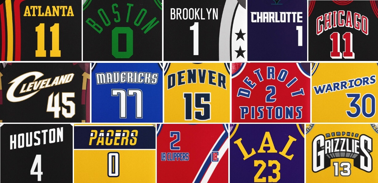
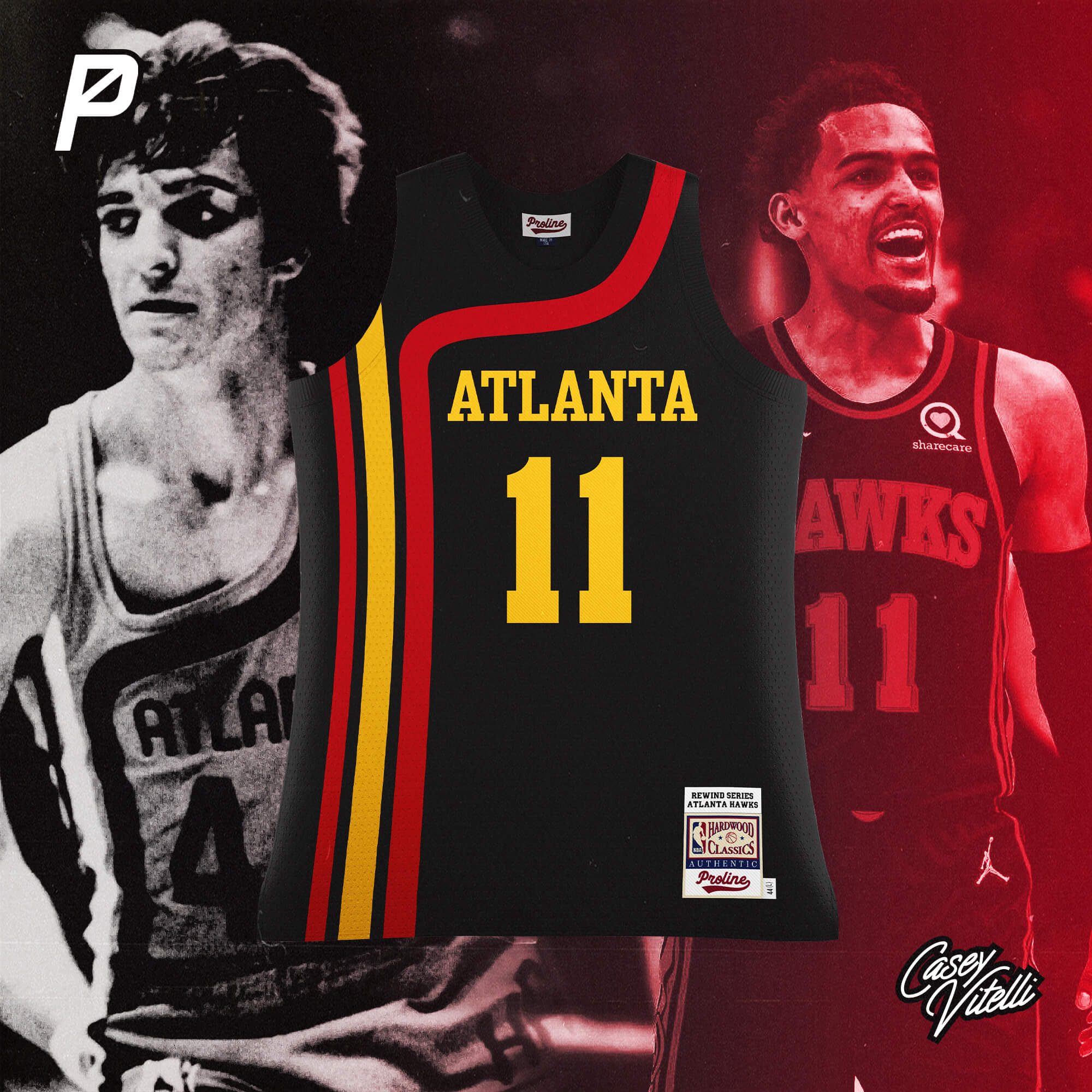
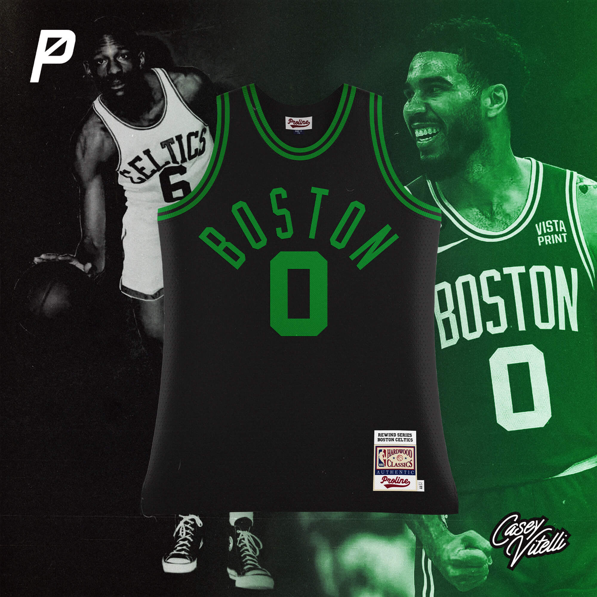
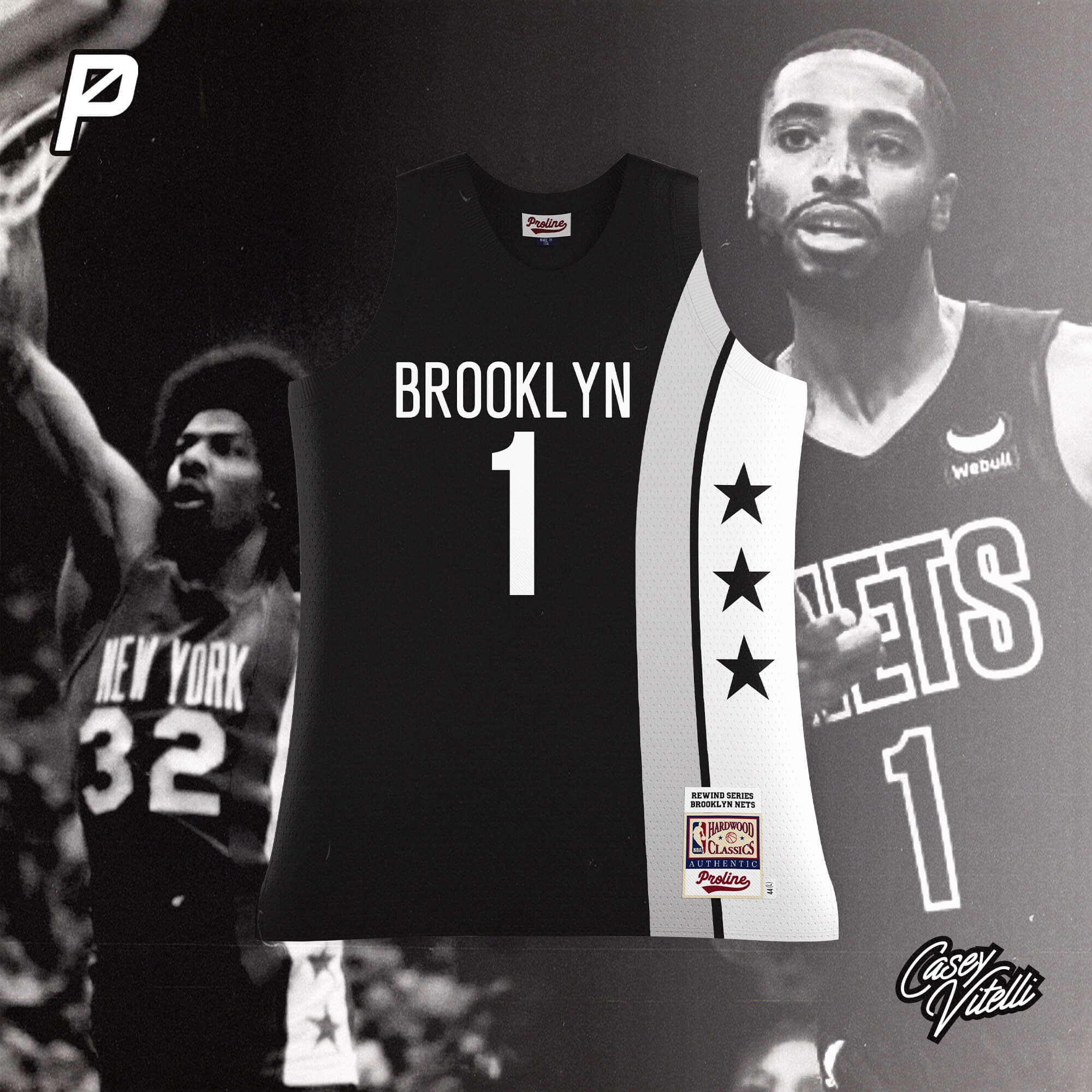
NBA Rewind Series (Part I) by Casey Vitelli
Atlanta Hawks
Based off the design used from 1970-1972
__________
Boston Celtics
Based off the design used from 1951-1968
__________
Brooklyn Nets
Based off the New York Nets design used from 1972-1981
__________
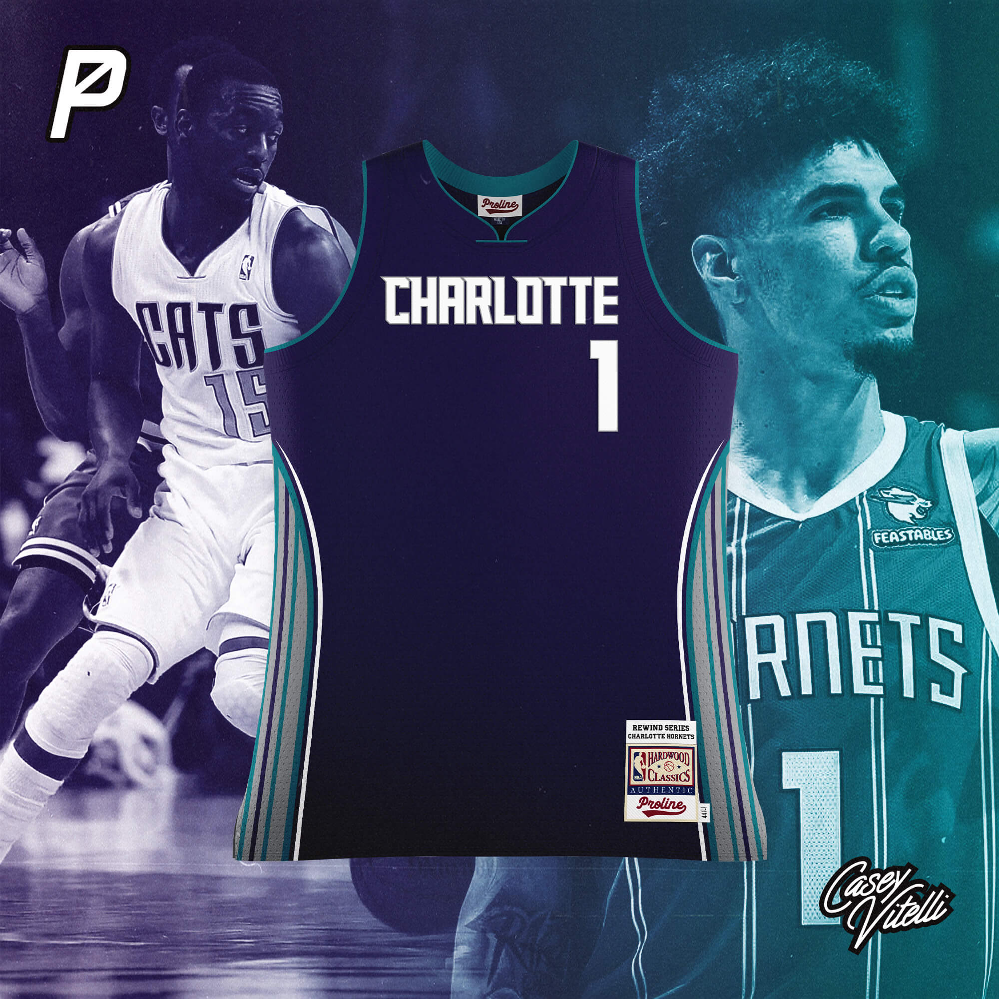
Charlotte Hornets
Based off the Charlotte Bobcats design used from 2012-2014
__________
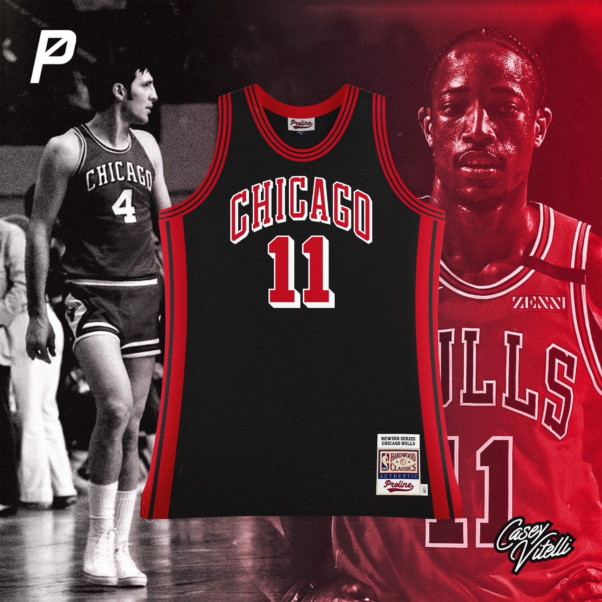
Chicago Bulls
Based off the design used from 1969-1973
__________
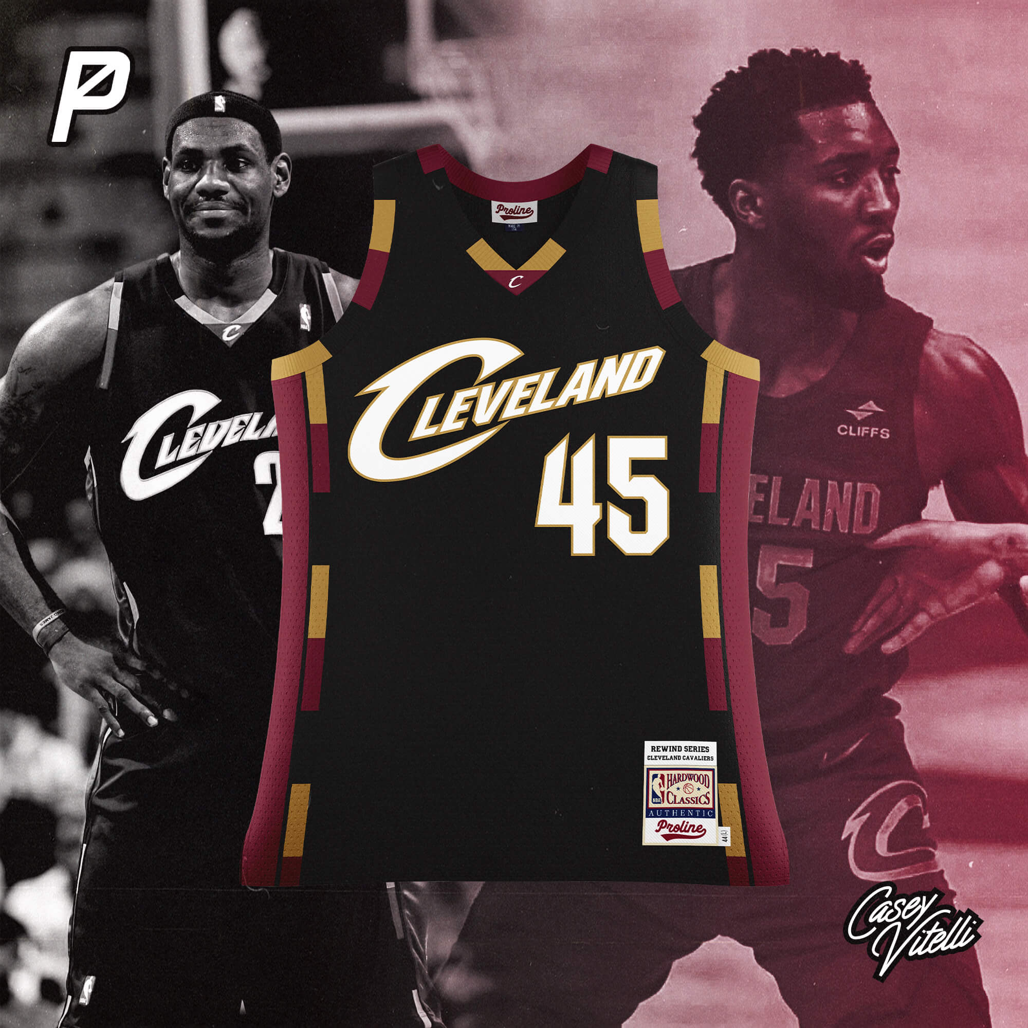
Cleveland Cavaliers
Based off the design used from 2005-2010
__________
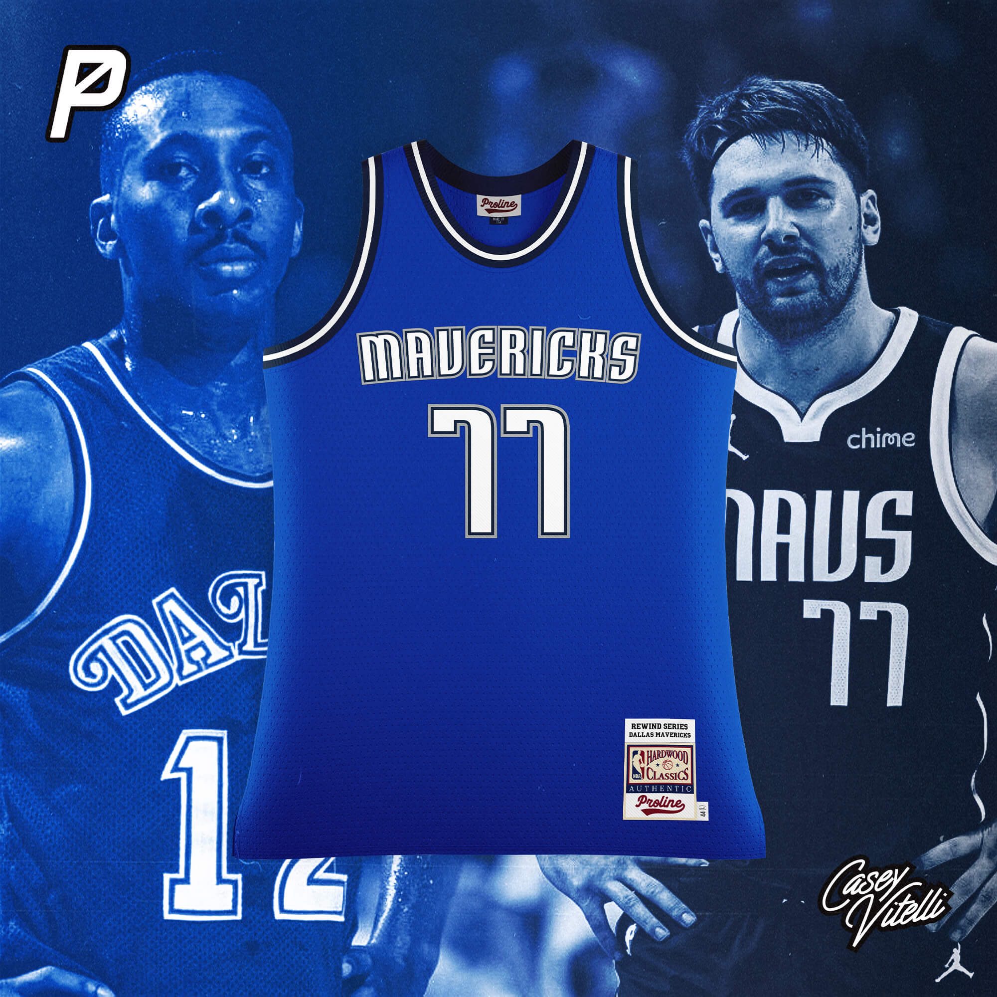
Dallas Mavericks
Based off the design used from 1980-1991
__________
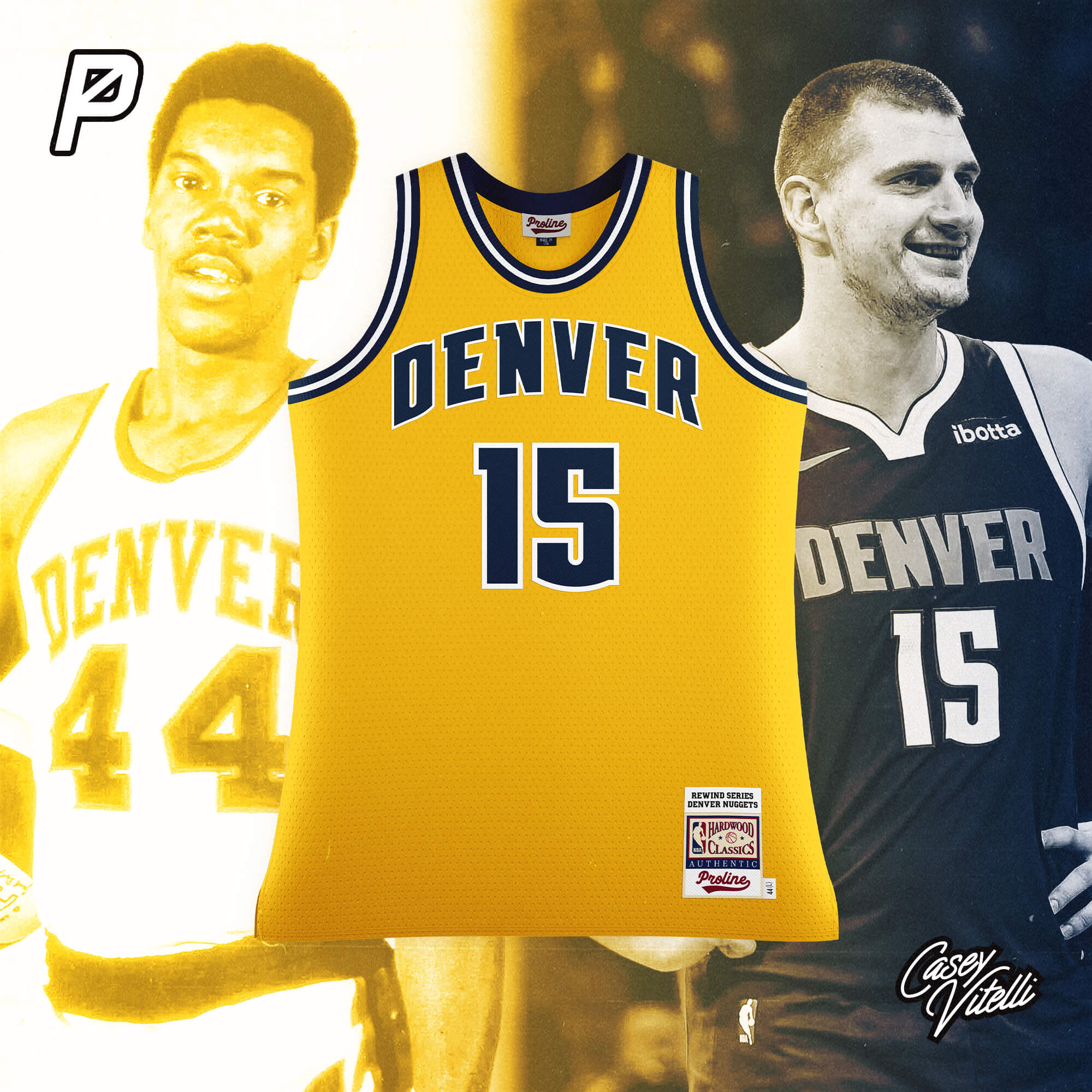
Denver Nuggets
Based off the Denver Rockets design used from 1967-1971
__________
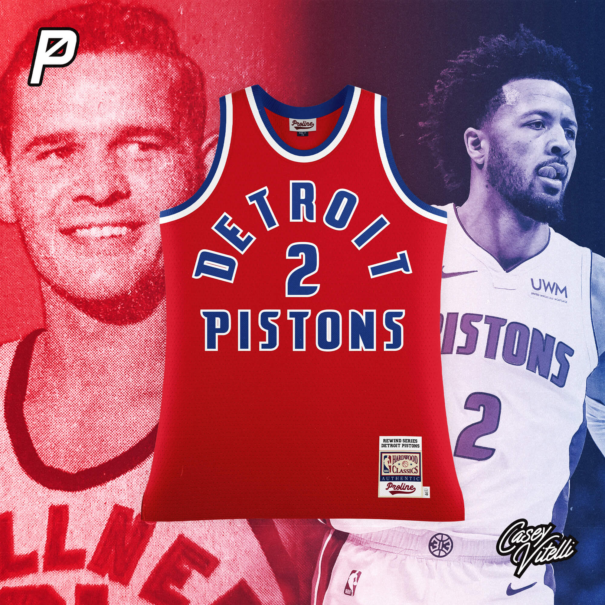
Detroit Pistons
Based off the Fort Wayne Pistons design used from 1948-1949
__________
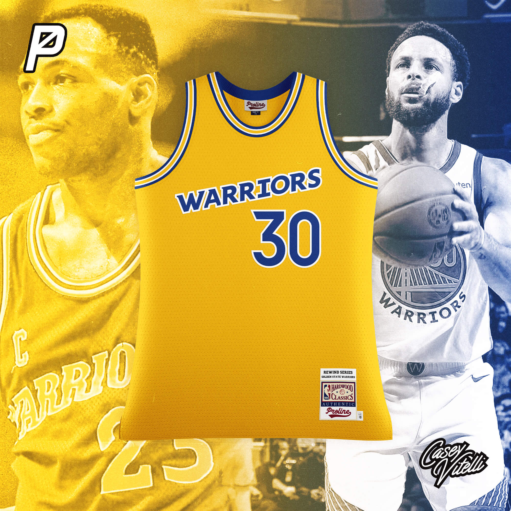
Golden State Warriors
Based off the design used from 1988-1997
__________
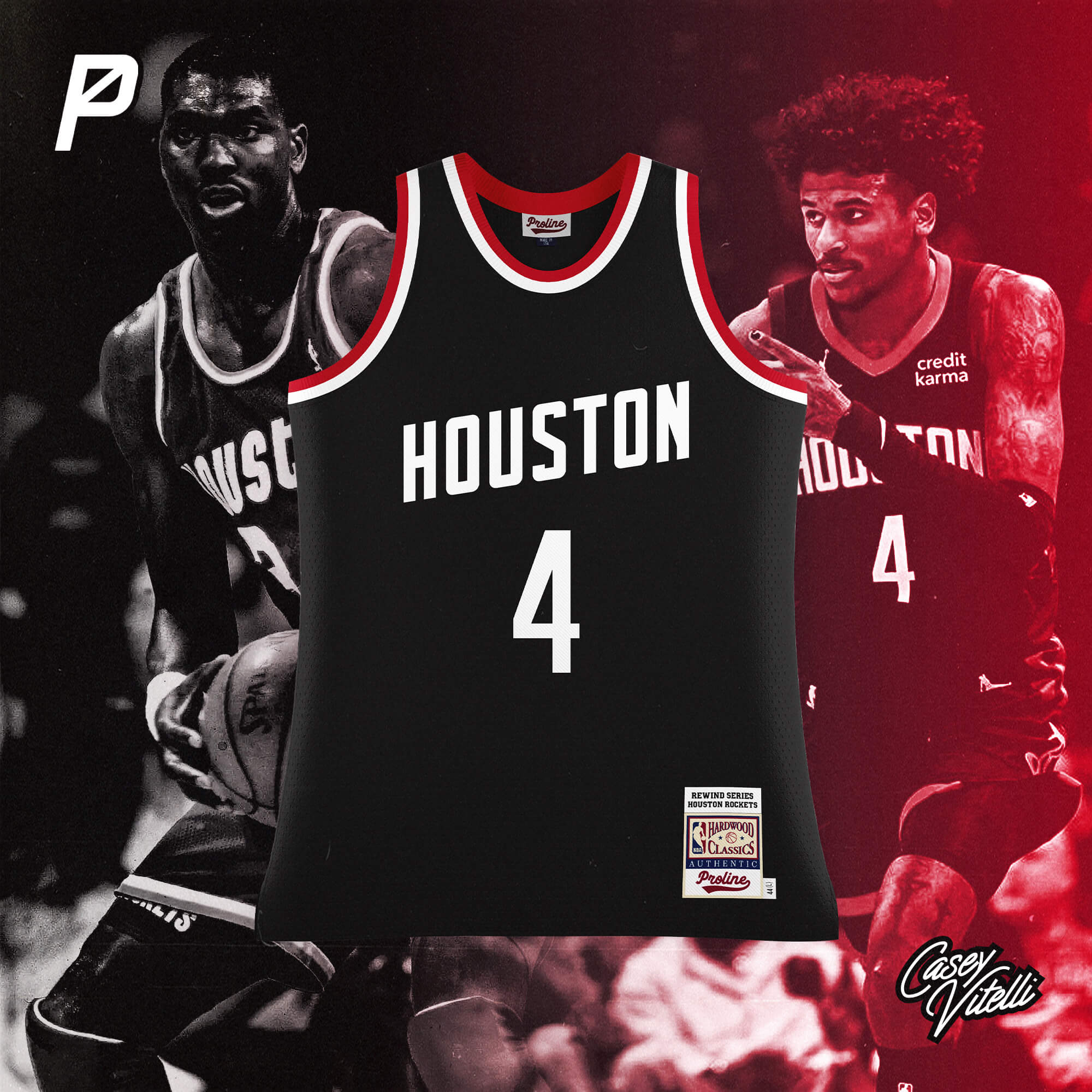
Houston Rockets
Based off the design used from 1975-1995
__________
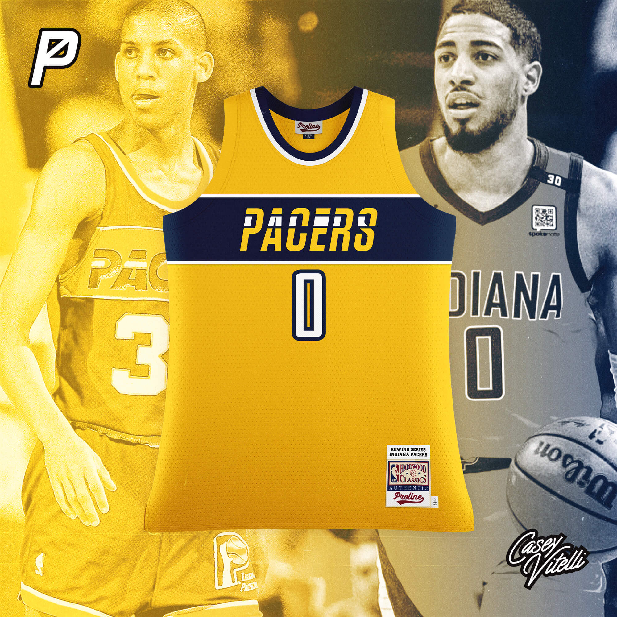
Indiana Pacers
Based off the design used from 1985-1990
__________
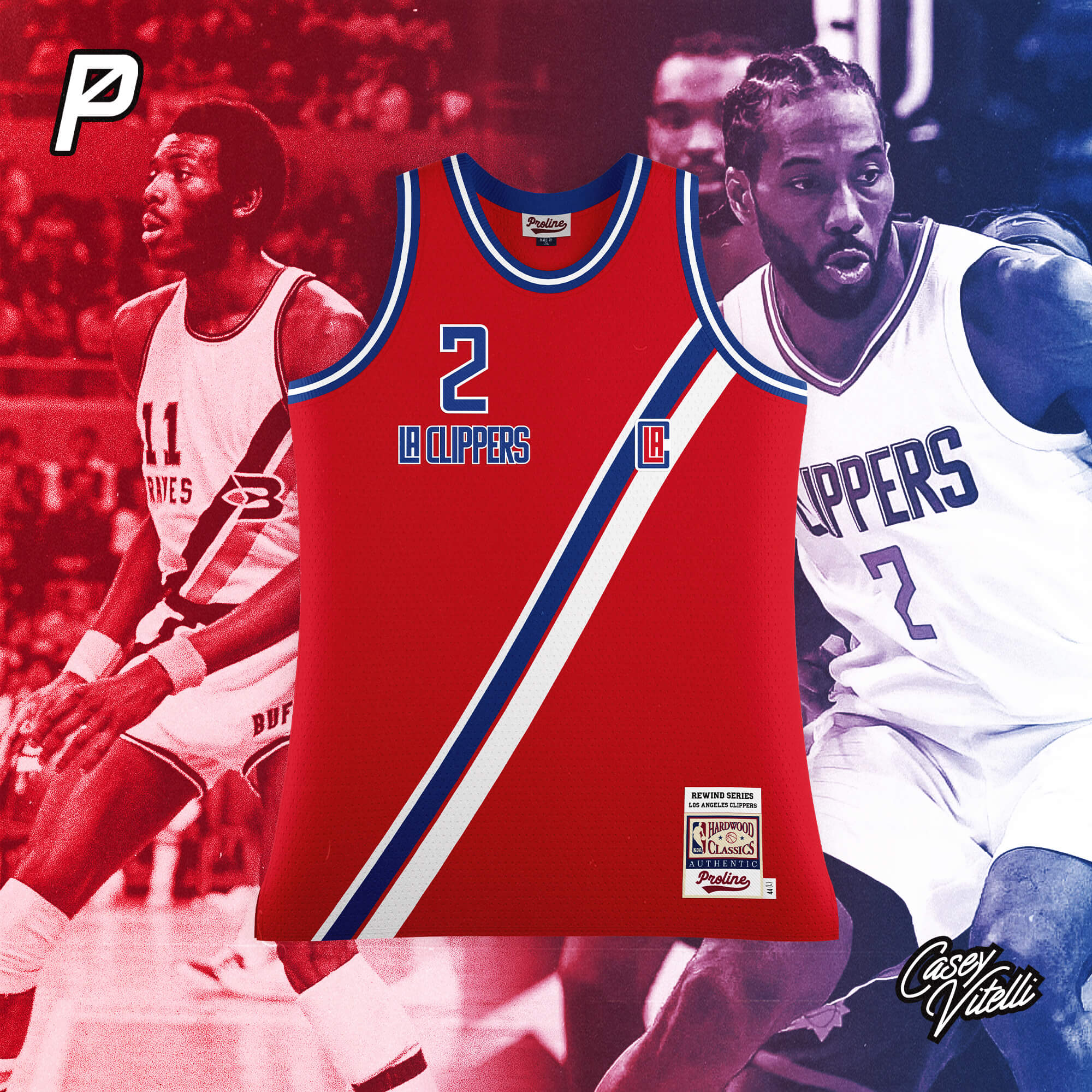
Los Angeles Clippers
Based off the Buffalo Braves design used from 1971-1973
__________
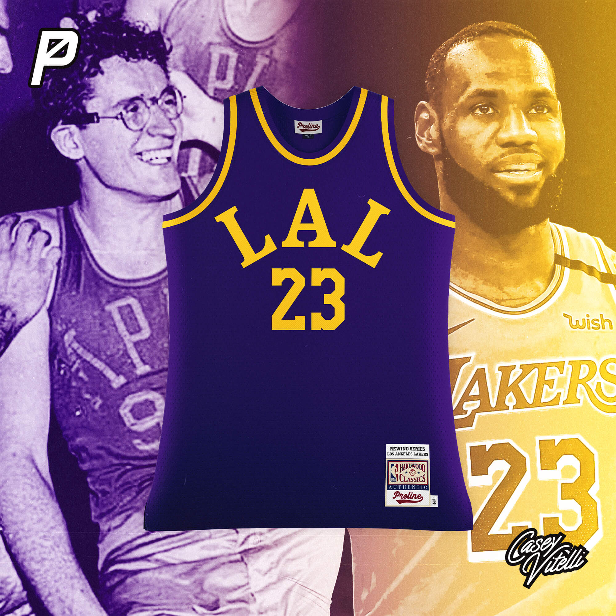
Los Angeles Lakers
Based off the Minneapolis Lakers design used from 1948-1958
__________
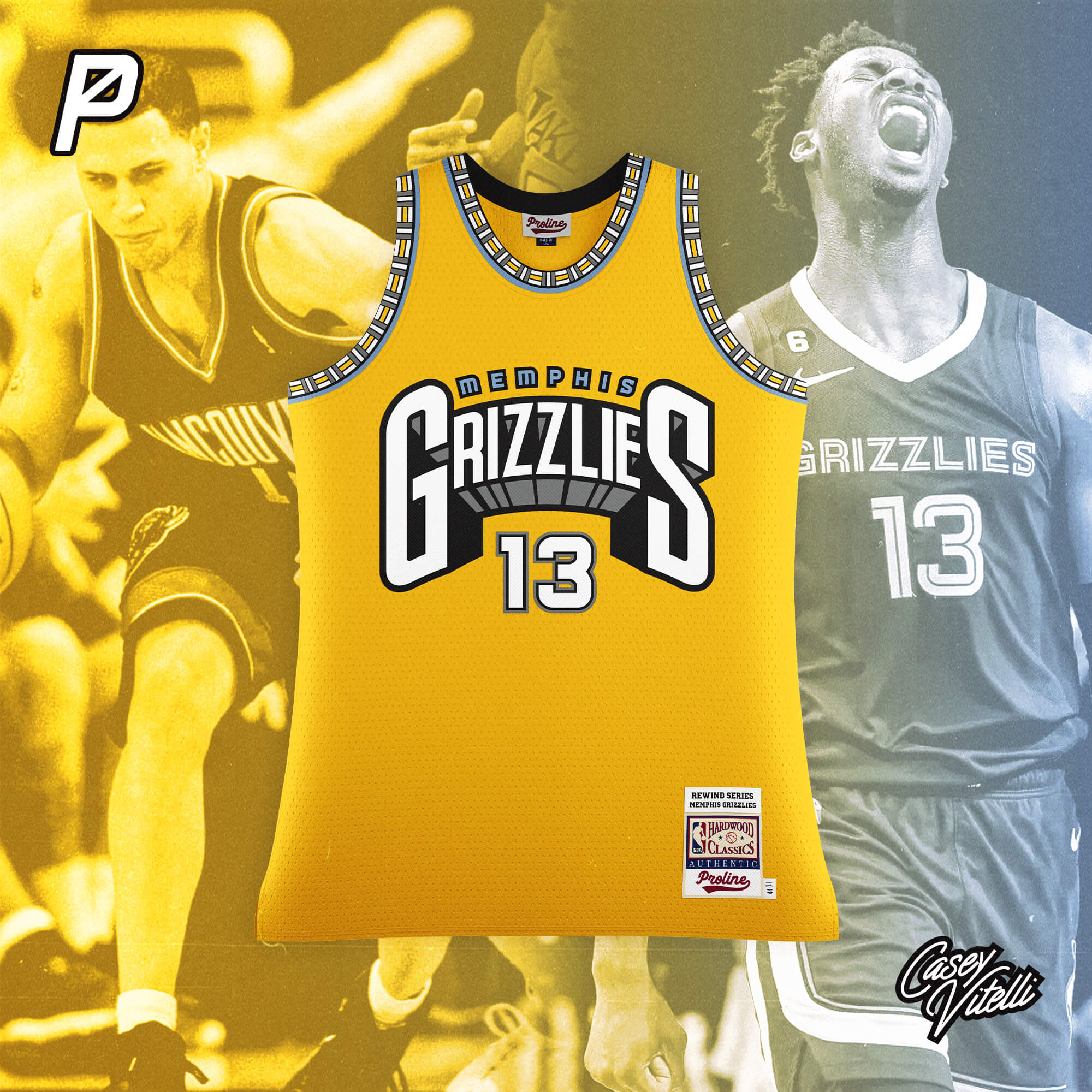
Memphis Grizzlies
Based off the Vancouver Grizzlies design used from 1995-2000
__________
We wanted to create a more vintage NBA jersey template to allow users to mockup designs with a retro vibe akin to the cut that Mitchell and Ness currently use for the Hardwood Classics line. When it came time to test we thought it would be fun to bring historical styles to life using current team branding, so Casey got to work and made some really fun and interesting stuff. We look forward to seeing what other designers create with this unique template.
Thanks, guys! Very cool takes on some classic NBA jerseys. I’ll have Part II in the very near future.
Guess the Game from the Scoreboard
Guess The Game…
…From The Scoreboard
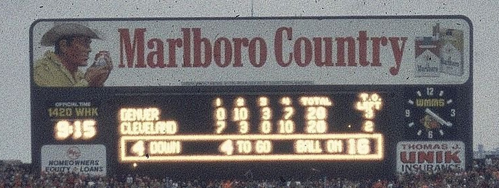
Today’s scoreboard comes from Chris Hickey.
The premise of the game (GTGFTS) is simple: I’ll post a scoreboard and you guys simply identify the game depicted. In the past, I don’t know if I’ve ever completely stumped you (some are easier than others).
Here’s the Scoreboard. In the comments below, try to identify the game (date & location, as well as final score). If anything noteworthy occurred during the game, please add that in (and if you were AT the game, well bonus points for you!):
Please continue sending these in! You’re welcome to send me any scoreboard photos (with answers please), and I’ll keep running them.
Guess the Game from the Uniform
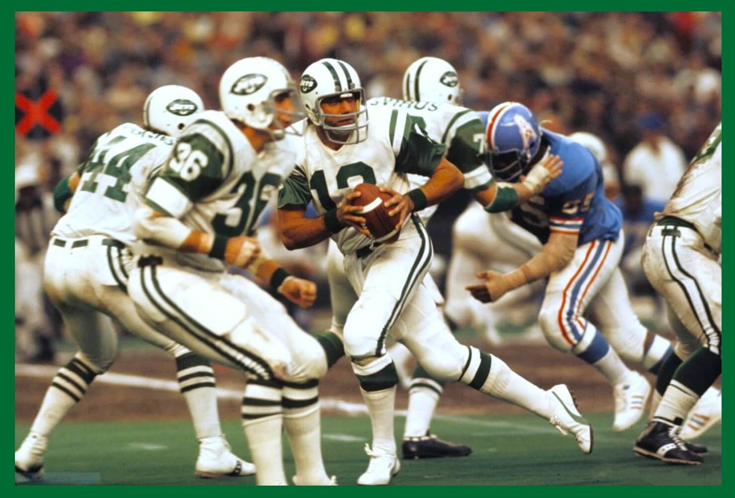
Based on the suggestion of long-time reader/contributor Jimmy Corcoran, we’ve introduced a new “game” on Uni Watch, which is similar to the popular “Guess the Game from the Scoreboard” (GTGFTS), only this one asked readers to identify the game based on the uniforms worn by teams.
Like GTGFTS, readers will be asked to guess the date, location and final score of the game from the clues provided in the photo. Sometimes the game should be somewhat easy to ascertain, while in other instances, it might be quite difficult. There will usually be a visual clue (something odd or unique to one or both of the uniforms) that will make a positive identification of one and only one game possible. Other times, there may be something significant about the game in question, like the last time a particular uniform was ever worn (one of Jimmy’s original suggestions). It’s up to YOU to figure out the game and date.
Today’s GTGFTU comes from Jimmy Corcoran himself!
(Jimmy notes that Jimmer Vilk is not allowed to play.)
Good luck and please post your guess/answer in the comments below.
Craig Brown's 'Threads Of Our Game'
Threads of our Game…
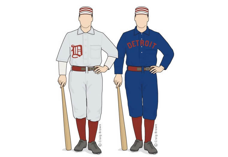
Got an e-mail yesterday from the great Craig Brown, who runs the fantastic Threads Of Our Game website. If you’re not familiar with it, the primary focus is on pre-1900 baseball uniforms and related ephemera.
He wrote:
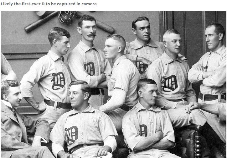
This may be the best team photo EVER — 1896 Detroit
Hello baseball historians,
Team photos are baseball treasures, especially from the 19th century. The faces of the players, some hopeful, some haggard, tell many stories. The heavy flannel uniforms, the old-school equipment, the soft natural lighting — these all make for enchanting images.
Even so, it was up to the photographer to compose the scene, set the background and instruct his subjects. It’s clear that photographer Clarence M. Hayes of Detroit was a master at all of this.
Remarkably, Hayes may also have been the first to ever photograph the Detroit “D.”
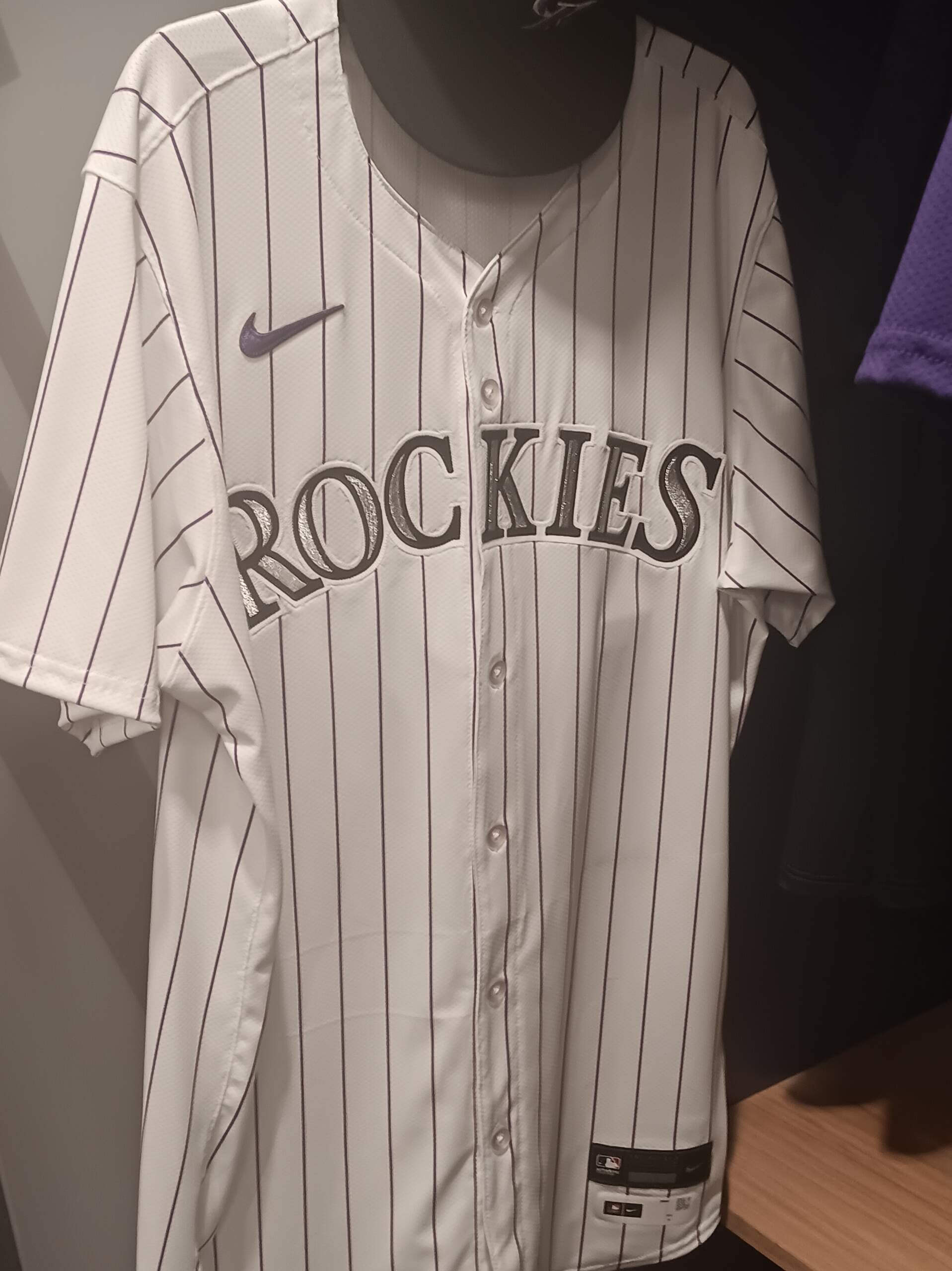
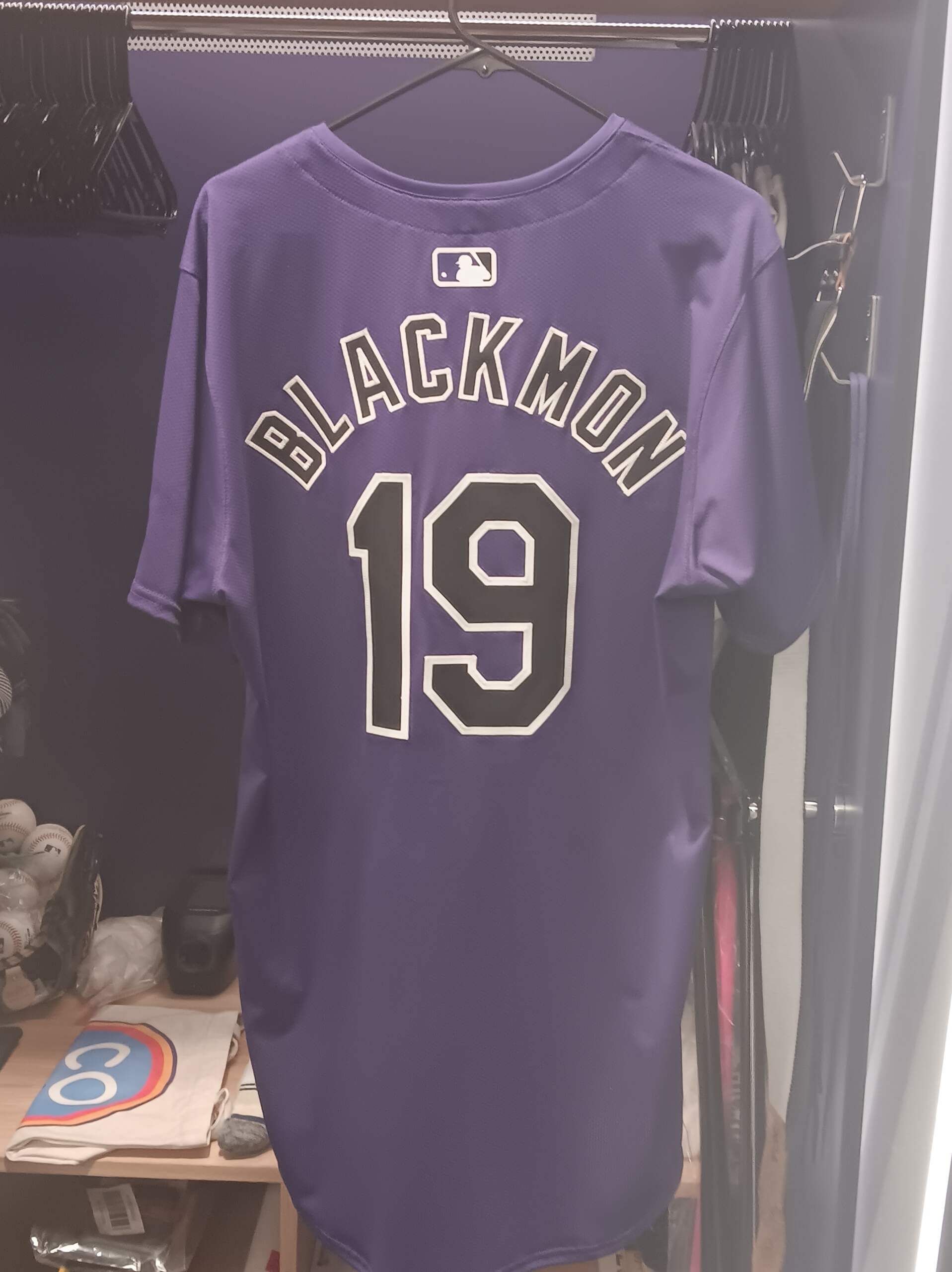
“Here’s some pictures of the Rockies jerseys in the new template.”
From those photos, it appears the team is keeping their same basic look from the pre-Nike days.
As you can see from the photo of the purple alternate, the Rockies (like all teams) will have the same radially arched NOB, and it’s located beneath the MLB logo. I think this new look is something that will definitely take some getting used-to.
Thanks Parker!
And finally...
…that’ll do it for the early morning lede. Big thanks to Pro Line Mockups and Casey Vitelli sharing the first part of the NBA Rewind Series! I’ll have Part 2 soon. Hat tip also to Craig & Parker for their contributions to this post.
I’ll have at least three additional articles this morning (plus the Ticker), so be sure to keep checking back. And of course, if there’s any breaking uni news early today, I’ll have that as well.
Everyone have a good Sunday — and enjoy the Conference Championships today — and a great week. I’ll see you all back here next Saturday.
Overtime of the 1986 AFC Championship
Broncos 23 Browns 20*
*=pending use of a Hot Tub Time Machine
LOL!
And correct, Marc…Denver v. Cleveland, 1/11/87…scoreboard minutes after “The Drive” and just before Rich Karlis bare-footed the Broncos into the Super Bowl.
NBA CONCEPTS: More bad than good here, a lot of these feel almost like they’ve been worn, and they seem to draw from a lot of current concepts. My biggest gripe is there is a lot of BFBS (Celtics, Hawks, Rockets, Cavs).
2 specific gripes:
I am not seeing a lot of the Derek Harper Mavs in the concept, as it lacks green and their old bespoke font; it looks like their current set, slightly adjusted.
The white space in the “E” of “PACERS” is too big.
GTGFTS: Cleveland Municipal Stadium, 11 January 1987. 1986 AFC Championship, as John Elway is leading the Broncos on The Drive to win the game 23-20.
Not trying to nitpick, but The Drive has already happened. This is the scoreboard right before Karlis kicks the winning field goal in OT. You can actually see it here in the background as the kick goes up:
You got it Marc, Namath’s knees must have been feeling pretty good here, the braces aren’t that heavy. The Jets are now wearing mesh jerseys from Champion, the season before they were Sand Knit durene.
It isn’t a nitpick if you are correct. And you are. My bad.
GTGFTU
1 October 1972
Oilers 26, Jets 20
Only time a Namath led white clad Jets team played a blue shelled Oilers team with red accents
Now that someone has played and won, I can add this…
This is the very first time the Oilers won a regular season game in Their Best Look Ever. And it was their only win in 1972,
Considering that the Oilers only wore this helmet for three seasons, Jimmer could guess these games in his sleep-too easy for him. It sucks when a team loses games in a great uniform and the new coach feels he has to change them. The Eagles did the same thing with the 1971-73 uniforms (I didn’t count 70 because the pants were different). The Chargers did the same thing with their one-year style 1973 uniforms. If they retained Ron Waller and won, I could have had my dream come true and been a Chargers ball boy.
“It sucks when a team loses games in a great uniform and…has to change them.”
No matter how great they look, they’re unlucky, so they gotta go ; )
Had the Oilers stayed the course and then swapped in the red masks they’d quite possibly be the best dressed team in the history of football.
If that Oilers hat had proper thin red/white/thicker blue/thin white/red striping, I might be inclined to agree with you. But it doesn’t.
Their best uniform was with the white helmet and gray mask that followed.
I’ll add that while the white-over-white Namath’s are a terrific (hate to dub them “iconic”, but they are), if ERJ goes full-time Klecko with the glossy green helmet-that may be their best look ever…save the ‘78 preseason mix/match.
Excellent NBA concepts. Feel classic, yet fresh. Colorful and fun, yet appropriate for the court. Wish the NBA cared more about design and less about merch, or whatever it is they care about that results in bizarre alternate uniforms every year.
Great job on the NBA Rewind. My favorites are the Cavs, Bulls and Pistons. Altlanta seems like a missed opportunity to feature the cool 1970s wordmark font, or the block shadow. The Rockets jersey seems to be the worst of all worlds in terms of colors, wordmark and font. The Lakers jersey doesn’t resonate with me…the font seems to come from the current Lakers wordmark, but apart from that logo it is not iconic to me.
I love the Clippers concept! So much!
So black.
Right?! It’s like “How much more black could they be?”
Artie Fufkin.
The Bulls’ jersey is the only one that says anything to me. The Charlotte uniform is a whiff; I don’t think there was much support for the Bobcats. The Cleveland uniform isn’t different enough from the jerseys that were actually worn..
Make that the primary uniform for the Brooklyn Nets.
The Clippers design is interesting but the winner is that Detroit team photo. Looks more like a frat league post match picture, only the beers are missing. I love it. Very relaxed and informal setting. and great uniforms.
Hate all of these except for the Clippers. I should have stopped once I saw the Celtics in black.


GTGFTS
Overtime of the 1986 AFC Championship
Broncos 23 Browns 20*
*=pending use of a Hot Tub Time Machine
LOL!
And correct, Marc…Denver v. Cleveland, 1/11/87…scoreboard minutes after “The Drive” and just before Rich Karlis bare-footed the Broncos into the Super Bowl.
NBA CONCEPTS: More bad than good here, a lot of these feel almost like they’ve been worn, and they seem to draw from a lot of current concepts. My biggest gripe is there is a lot of BFBS (Celtics, Hawks, Rockets, Cavs).
2 specific gripes:
I am not seeing a lot of the Derek Harper Mavs in the concept, as it lacks green and their old bespoke font; it looks like their current set, slightly adjusted.
The white space in the “E” of “PACERS” is too big.
GTGFTS: Cleveland Municipal Stadium, 11 January 1987. 1986 AFC Championship, as John Elway is leading the Broncos on The Drive to win the game 23-20.
Not trying to nitpick, but The Drive has already happened. This is the scoreboard right before Karlis kicks the winning field goal in OT. You can actually see it here in the background as the kick goes up:
link
You got it Marc, Namath’s knees must have been feeling pretty good here, the braces aren’t that heavy. The Jets are now wearing mesh jerseys from Champion, the season before they were Sand Knit durene.
It isn’t a nitpick if you are correct. And you are. My bad.
GTGFTU
1 October 1972
Oilers 26, Jets 20
Only time a Namath led white clad Jets team played a blue shelled Oilers team with red accents
Now that someone has played and won, I can add this…
This is the very first time the Oilers won a regular season game in Their Best Look Ever. And it was their only win in 1972,
Considering that the Oilers only wore this helmet for three seasons, Jimmer could guess these games in his sleep-too easy for him. It sucks when a team loses games in a great uniform and the new coach feels he has to change them. The Eagles did the same thing with the 1971-73 uniforms (I didn’t count 70 because the pants were different). The Chargers did the same thing with their one-year style 1973 uniforms. If they retained Ron Waller and won, I could have had my dream come true and been a Chargers ball boy.
“It sucks when a team loses games in a great uniform and…has to change them.”
No matter how great they look, they’re unlucky, so they gotta go ; )
Had the Oilers stayed the course and then swapped in the red masks they’d quite possibly be the best dressed team in the history of football.
If that Oilers hat had proper thin red/white/thicker blue/thin white/red striping, I might be inclined to agree with you. But it doesn’t.
Their best uniform was with the white helmet and gray mask that followed.
link
I’ll add that while the white-over-white Namath’s are a terrific (hate to dub them “iconic”, but they are), if ERJ goes full-time Klecko with the glossy green helmet-that may be their best look ever…save the ‘78 preseason mix/match.
Excellent NBA concepts. Feel classic, yet fresh. Colorful and fun, yet appropriate for the court. Wish the NBA cared more about design and less about merch, or whatever it is they care about that results in bizarre alternate uniforms every year.
Great job on the NBA Rewind. My favorites are the Cavs, Bulls and Pistons. Altlanta seems like a missed opportunity to feature the cool 1970s wordmark font, or the block shadow. The Rockets jersey seems to be the worst of all worlds in terms of colors, wordmark and font. The Lakers jersey doesn’t resonate with me…the font seems to come from the current Lakers wordmark, but apart from that logo it is not iconic to me.
I love the Clippers concept! So much!
So black.
Right?! It’s like “How much more black could they be?”
Artie Fufkin.
The Bulls’ jersey is the only one that says anything to me. The Charlotte uniform is a whiff; I don’t think there was much support for the Bobcats. The Cleveland uniform isn’t different enough from the jerseys that were actually worn..
Make that the primary uniform for the Brooklyn Nets.
The Clippers design is interesting but the winner is that Detroit team photo. Looks more like a frat league post match picture, only the beers are missing. I love it. Very relaxed and informal setting. and great uniforms.
Hate all of these except for the Clippers. I should have stopped once I saw the Celtics in black.