Back again with another of Chris Diamond’s “Uniform on 11” Project.
Click here for the AFC & NFC East, and click here for the AFC & NFC North
For each Volume of this series I’ll be including Chris’ introduction so you don’t need to check prior posts.
Click on images to enlarge.
Uniform on 11 – Just How Much More Uniform Could it Be? (Vol. 1)
by Chris Diamond
This site is Uni Watch and we are all UWers obsessed with sports uniforms. Currently the NFL’s uniform standards feel like they are in a fairly lamentable state with the “sock shit show” and untucked shirts for individual players and mono-mania, icy-whites, BFBS for teams (to name but the worst) ruining things for a lot of people. Often we hear “why can’t the NFL be stricter over uniform standards?”. I think people are mostly thinking about making existing uniforms more… well, uniform! But what if the NFL had a much stricter set of rules that it enforced on all teams? And here I don’t just mean enforcing uniform deportment, but mandating style in the same way that some soccer leagues enforce a common number and name font or rules on contrast between team uniform elements. Setting Uniform to 11!
Back in the 50s style was much more uniform between teams, with either plain jerseys or a few different stripe styles and college block numbers almost ubiquitous. So I came up with a “What If?” scenario based on a set of uniform rules being devised at that time and enforced ever since. What might that look like for the NFL teams now? These are the rules I have come up with for this project:
- All jerseys, pants and socks must be the same for all players on a team (apart from number digits)
- Teams must have a colour home and a white road jersey
- Jersey and pants must be different colours
- Pants and socks must be different colours
- Helmet must have central stripe in 1-2-1 pattern
- Helmet must have a team logo or wordmark on both sides
- Face mask must be in team colours
- Jersey sleeves must have stripes in Northwestern pattern in a single contrasting colour to the sleeve
- Jersey stripes may be outlined in a different colour
- Uniform must be unique within the league
- Numbers must be college block, 10” front, 12” back and 4” TV numbers on shoulders
- Number must be edged in contrasting colour unless team uniform is two colour only in which case edging can be the same colour
- Pants must have side stripe in 1-2-1 pattern
- Socks must have stripes in Northwestern pattern in a single contrasting colour to the sock
- Sock stripes may be outlined in a different colour
- Jerseys must be tucked into pants
I have created graphics for each team based on these rules using a simplified version of my usual template for the sake of clarity. For some teams I have done more than one version as the rules means the current colourway doesn’t work that well, or the team has several different looks I want to try. Before we crack on, some of you may remember that the WFL had a uniform ethos known as The Corporate Look that was along these lines. But the Birmingham Americans decided to get their uniforms made locally and messed the whole thing up, but still the idea was sound :)
So just how much uniformity is enough? Is this too much? I must admit it tickles my colours+sets OCD (in a good way) to see the NFL uniforms like this. Rather like the satisfaction you get from a good set of pool balls or the London Underground Map! But I can imagine it’s going to drive some UWers crazy, especially fans of teams with long-standing looks that this violates like the Cowboys or Bears.
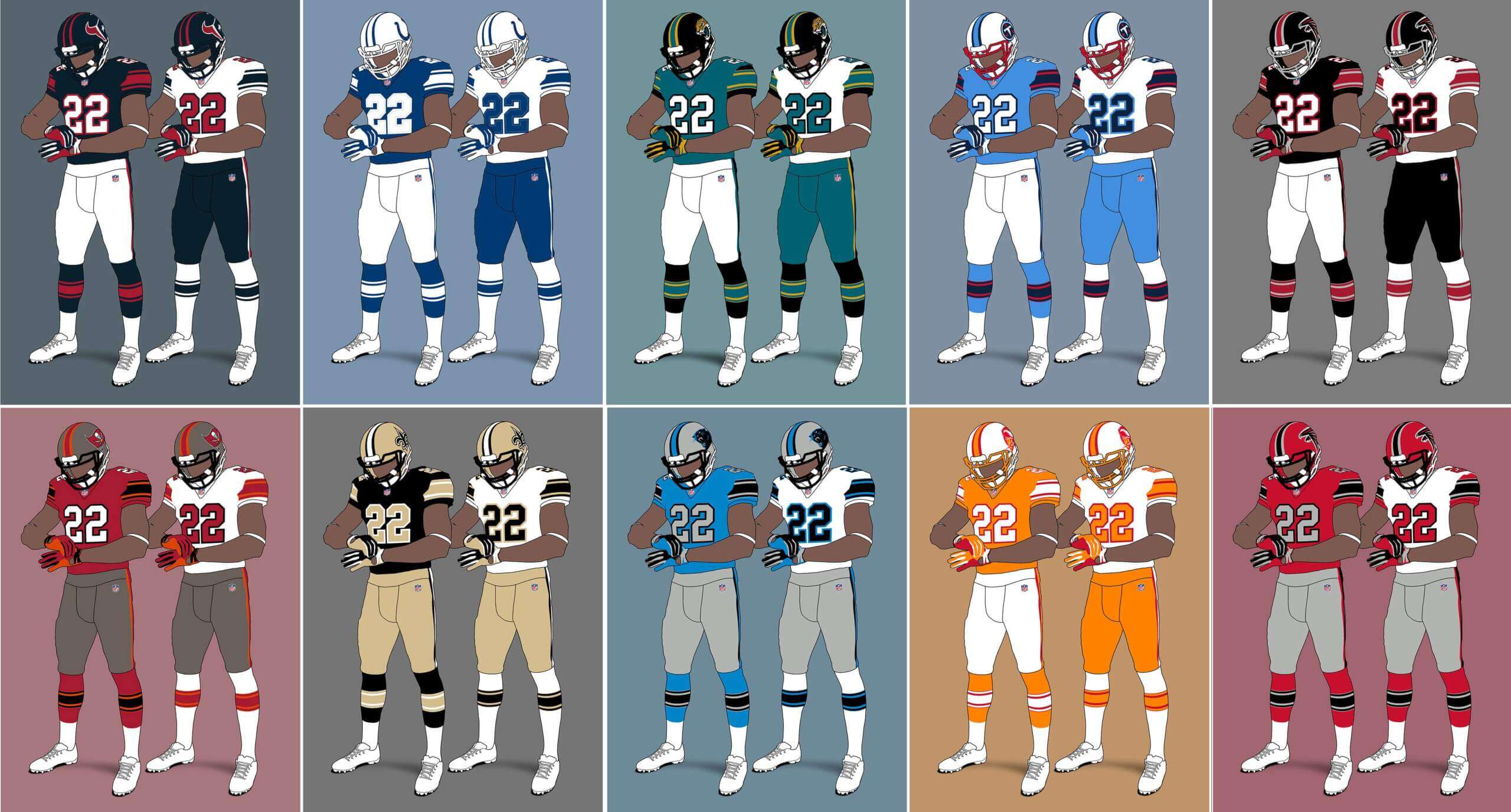
AFC South
Houston Texans
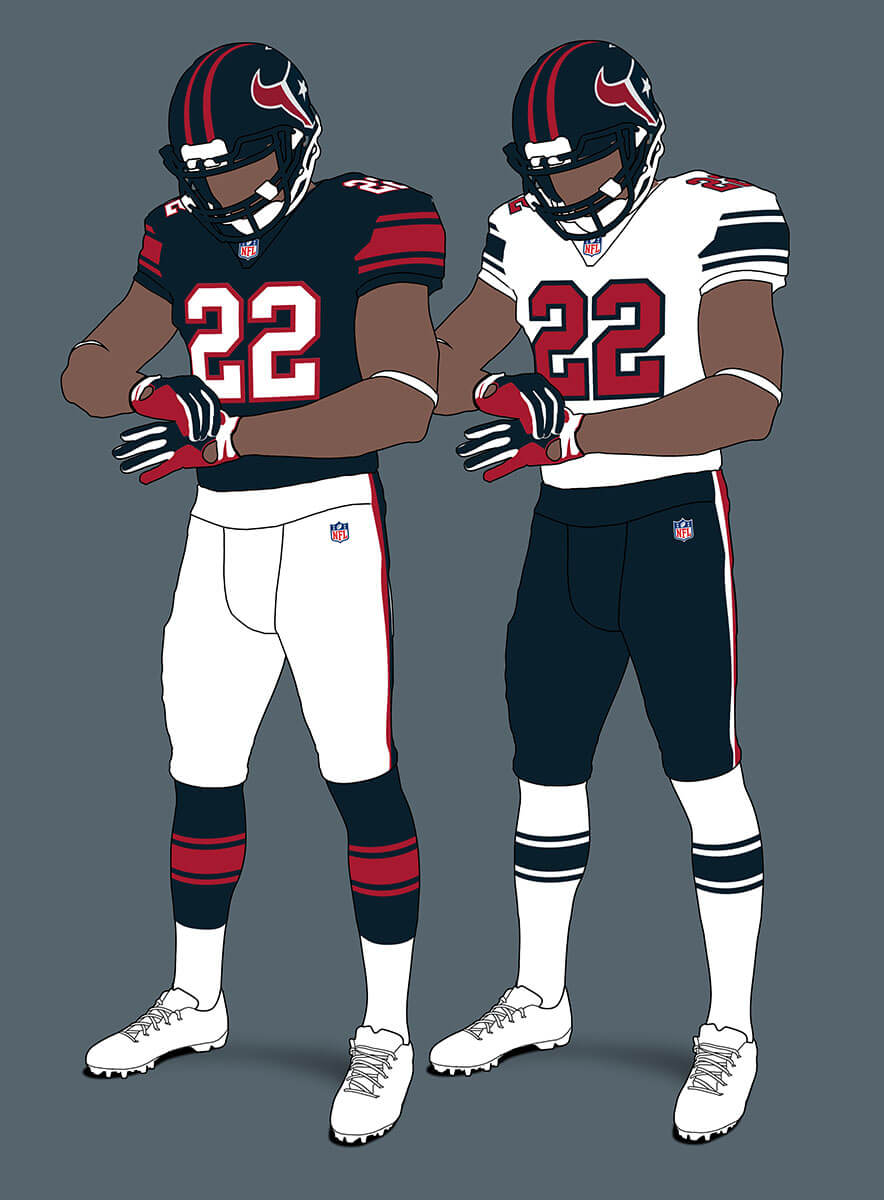
The Texans unis translate easily to the new template and they have the same elegant simplicity.
Indianapolis Colts V1
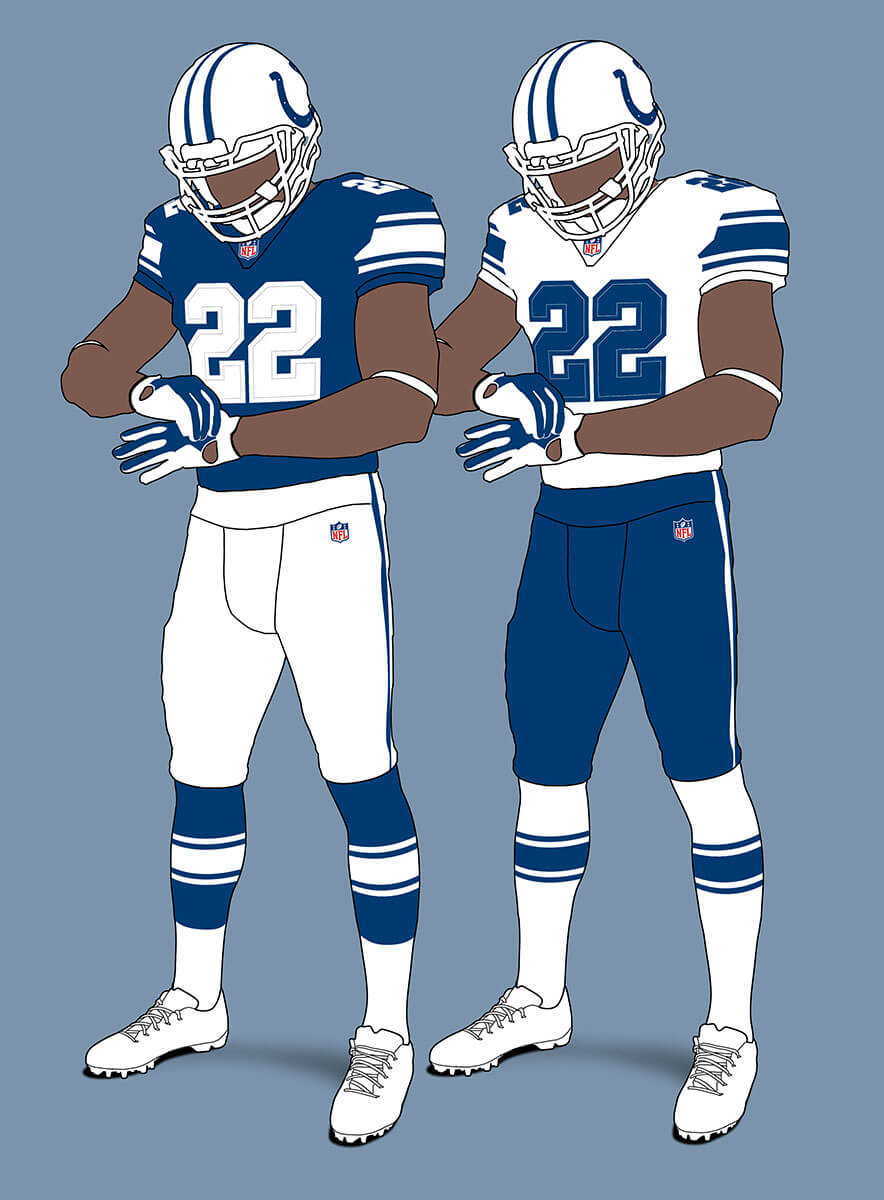
If we go with the Colts’ current blue+white scheme this is the result. It’s in the same ballpark as their current Alt-Unis unis so feels credible to me.
Indianapolis Colts V2
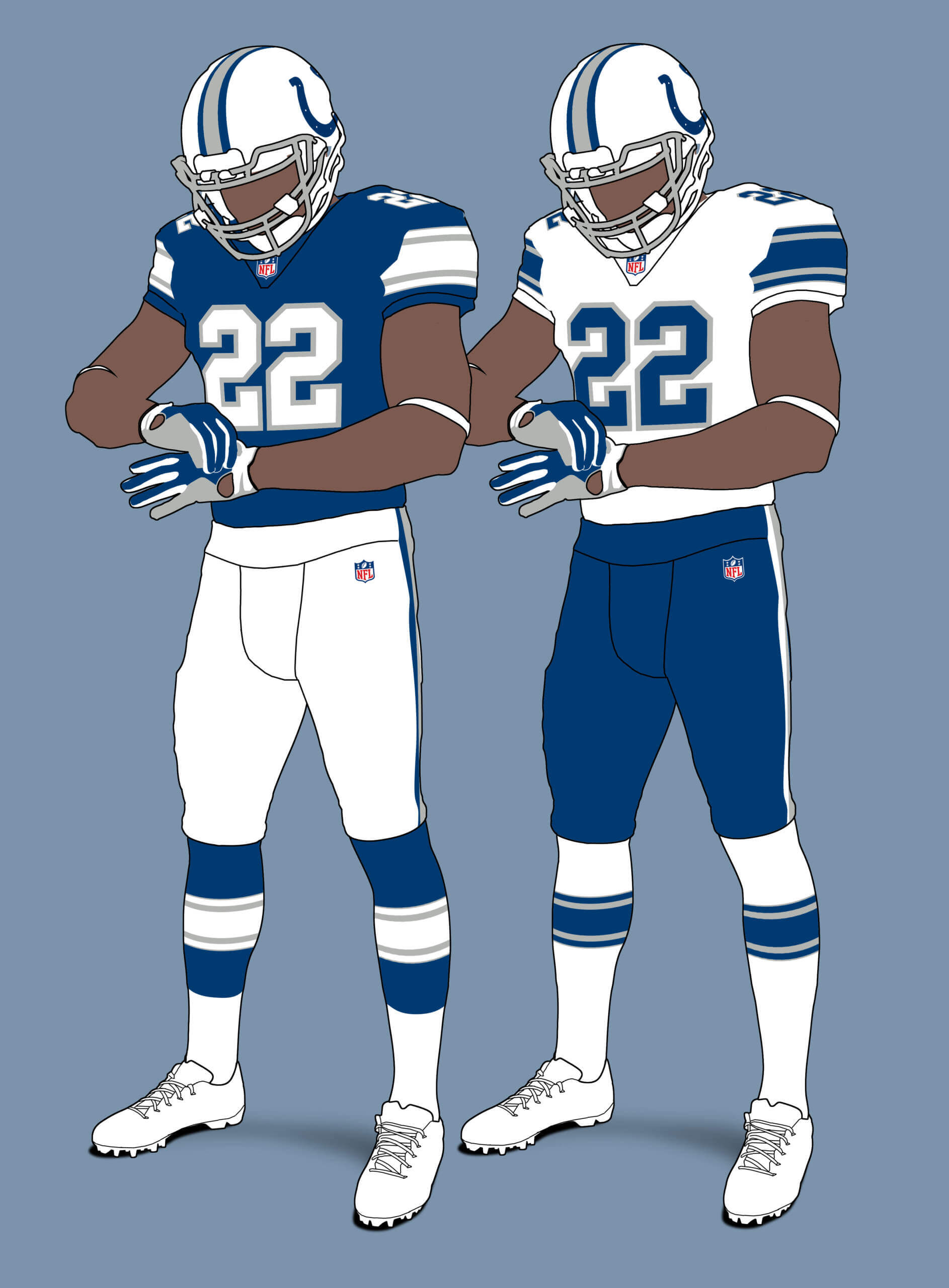
If instead we bring in silver as a third colour we can have this smart set reminiscent of their 1982-86 unis. It does give me vibes of the USFL’s Orlando Renegades though, which isn’t a bad thing!
Jacksonville Jaguars V1
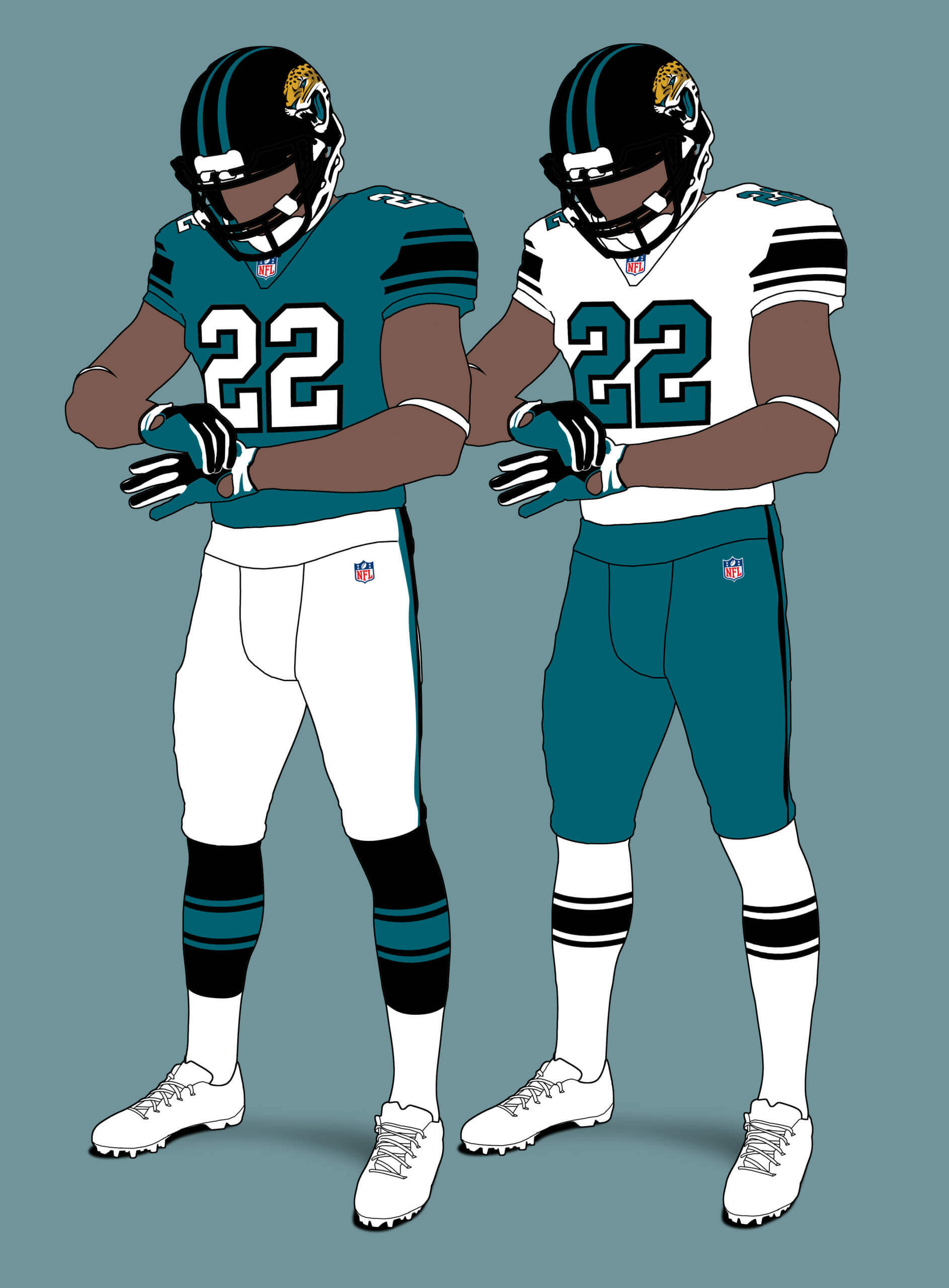
The Jags’ current unis are very plain indeed and look almost as brutal in this template, even with the added stripeyness.
Jacksonville Jaguars V2
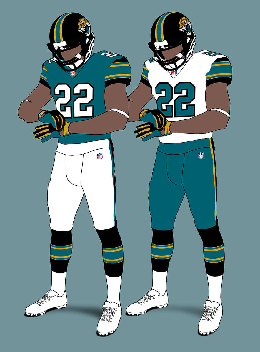
However if we bring gold back into the set they transform into a real looker! Jags take note :)
Tennessee Titans V1
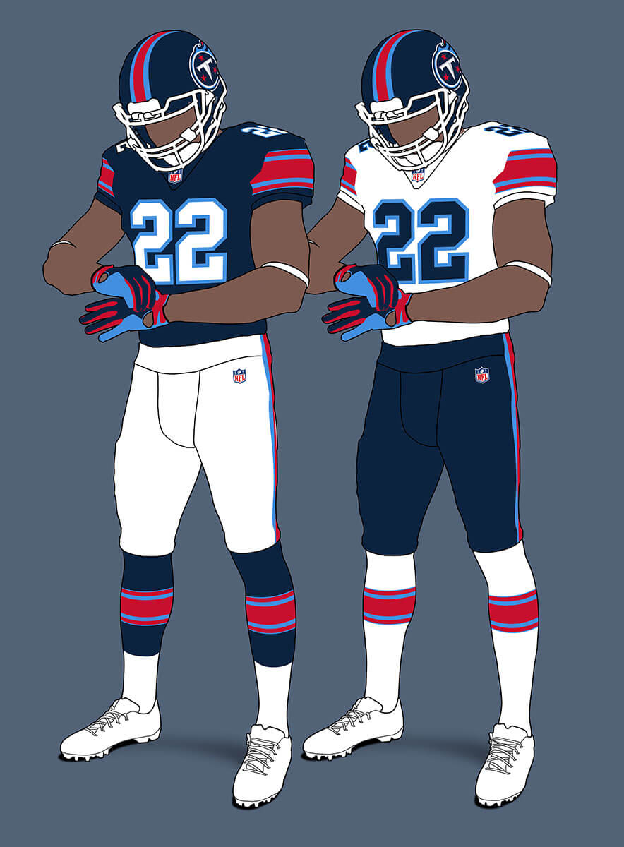
The Titans current sword unis don’t translate well to the template so I’ve had to tweak things a bit. I think the stronger use of red looks really good.
Tennessee Titans V2
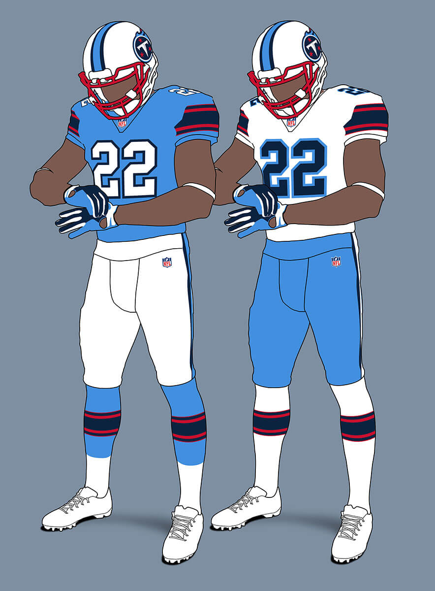
What if the Titans had stayed closer to the Oilers look – might it come out like this?
NFC South
Atlanta Falcons V1
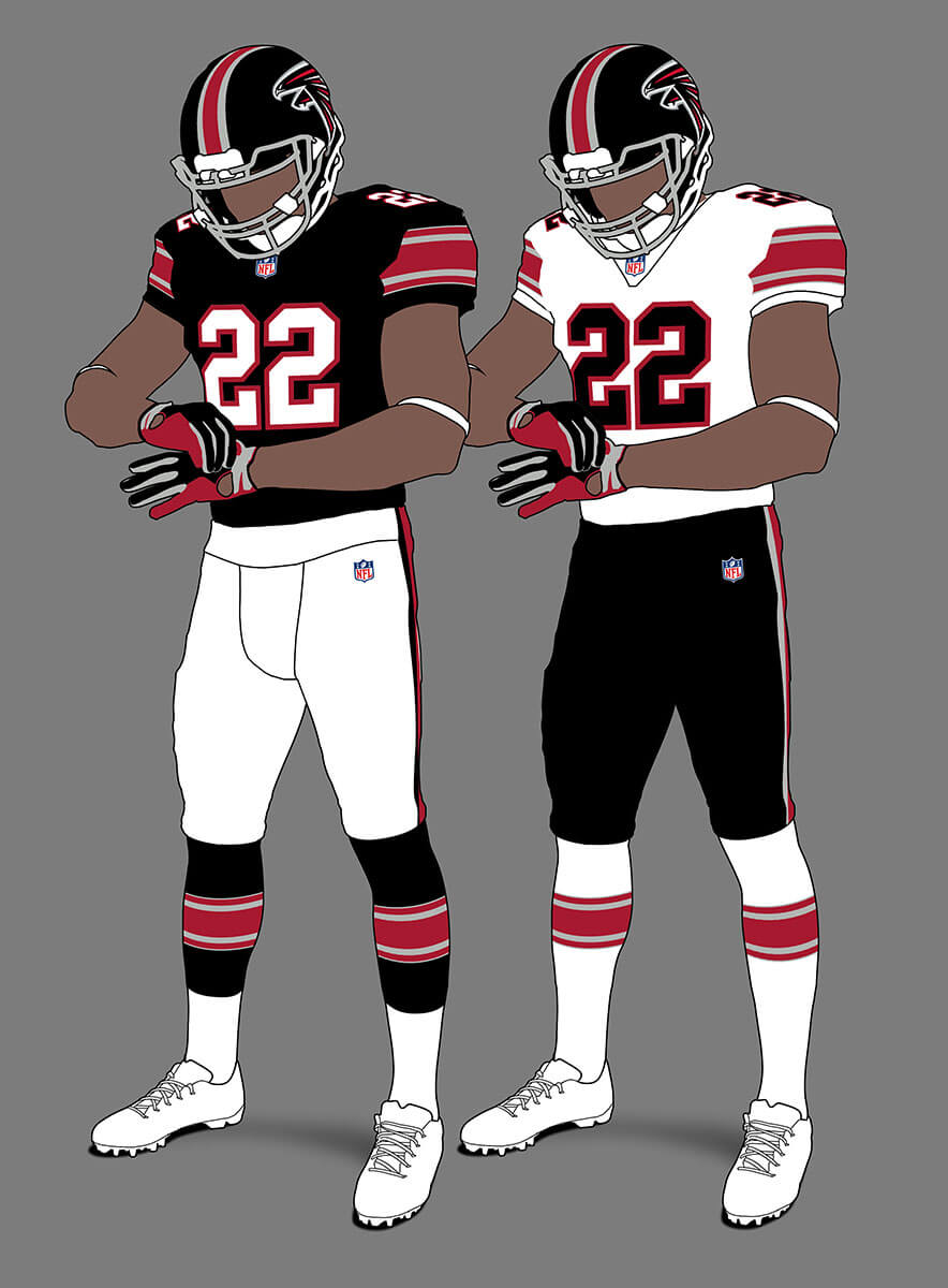
Getting rid of the funky number font improves the Falcons unis just by itself. The stripes make it even better in my view.
Atlanta Falcons V2
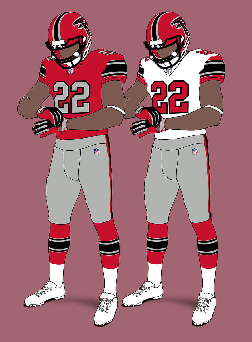
The black unis look good, but what if they stuck with the pre-Glanville red unis? A true thing of beauty is the result.
Carolina Panthers V1
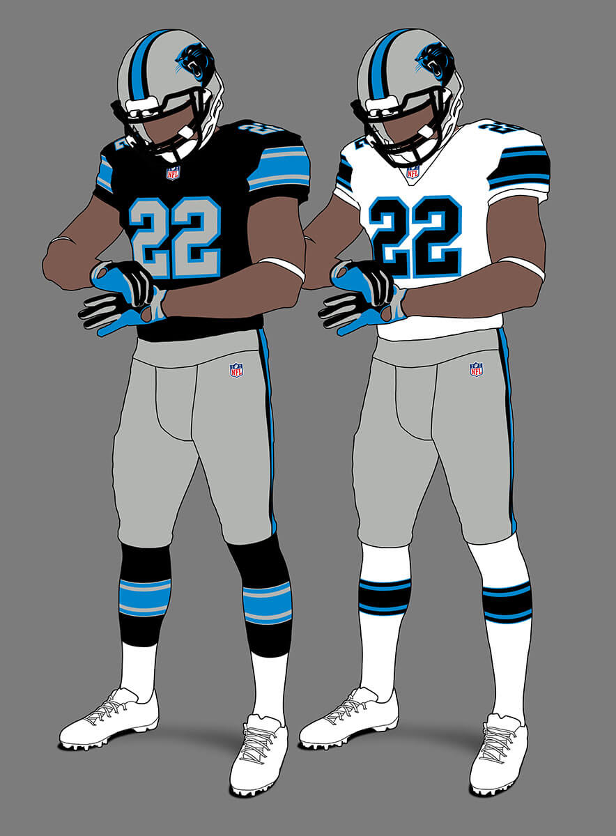
It’s hard to imagine the Panthers without their UCLA-esque stripes. But I really like this Northwestern stripe version and it shows how good the colours are as a set.
Carolina Panthers V2
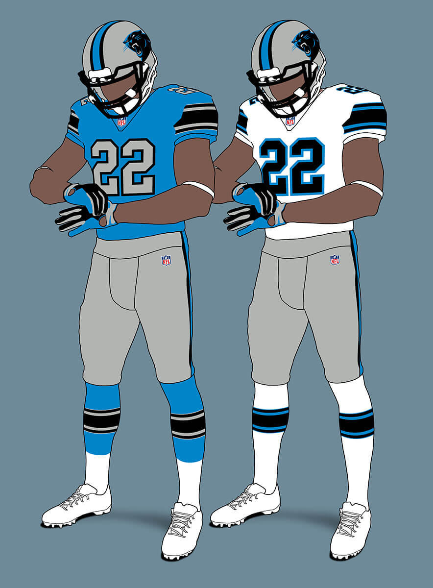
So Panthers are black but as has been discussed on UW recently, the Panthers’ Process Blue is unique so given the importance placed on that factor in this system, maybe they would go with that instead.
New Orleans Saints
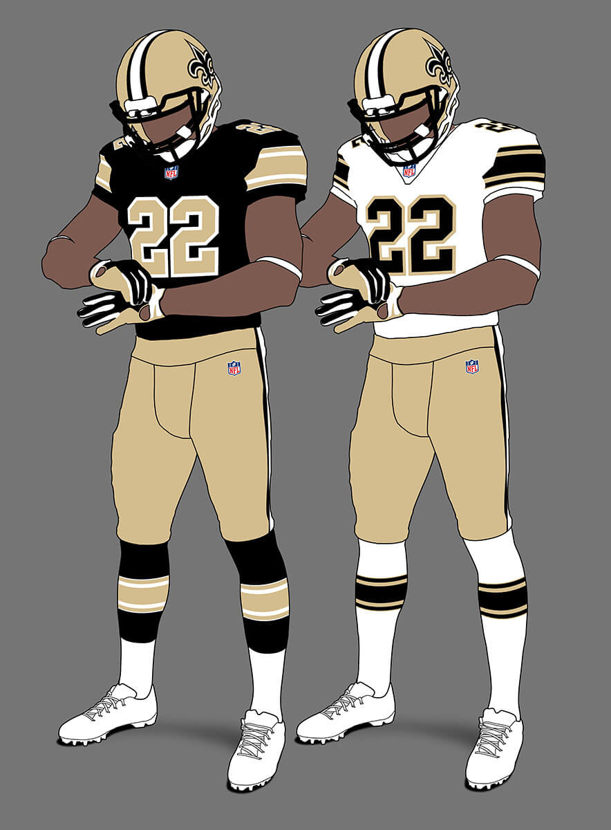
The Saints current unis are good as long as they wear the gold pants. I feel these combine the pop of the stripes from their throwbacks with them.
Tampa Bay Buccaneers V1
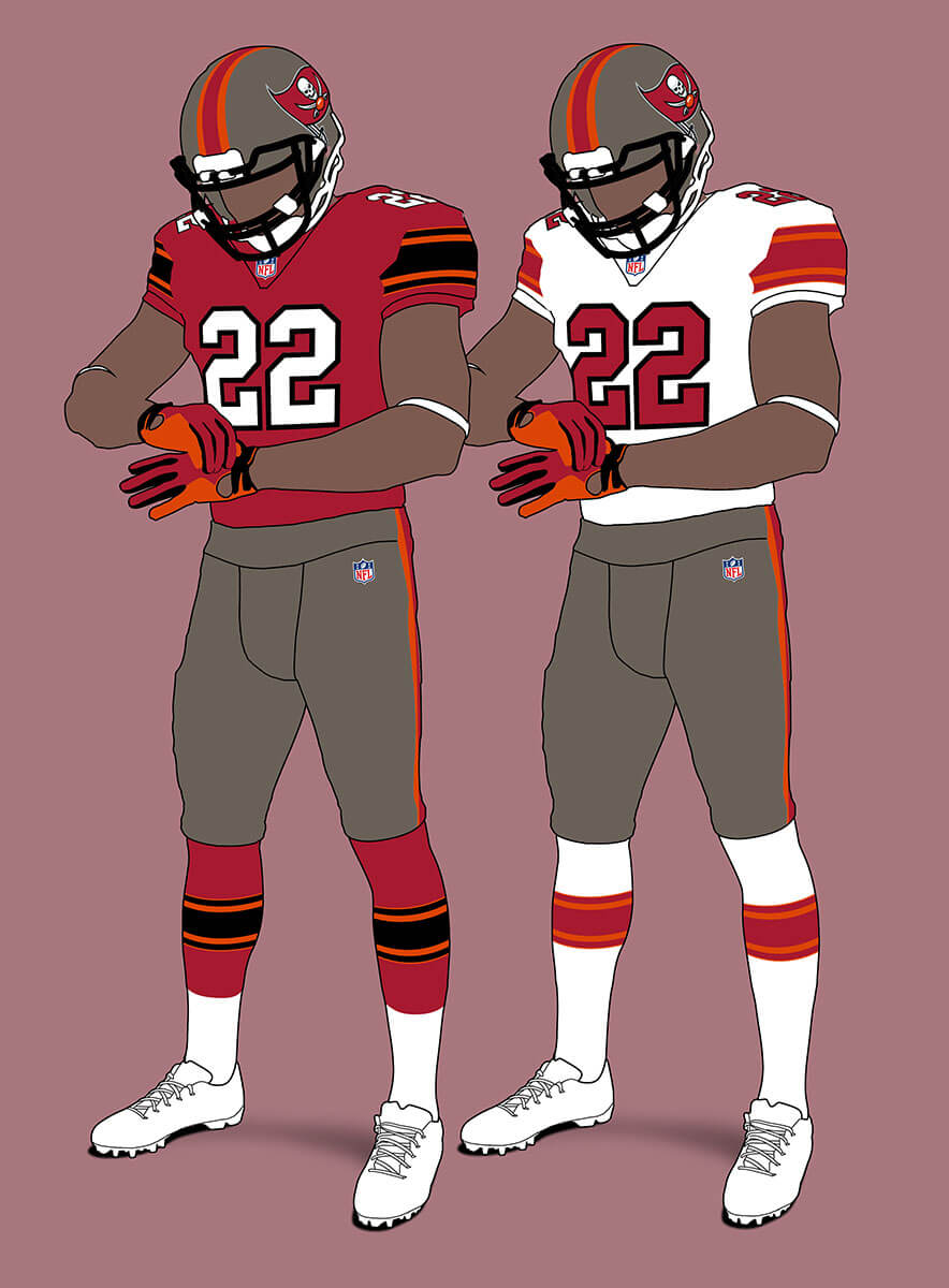
The Bucs current scheme doesn’t translate well into this template because of the way all four main colours are used. But I still think it looks pretty good.
Tampa Bay Buccaneers V2
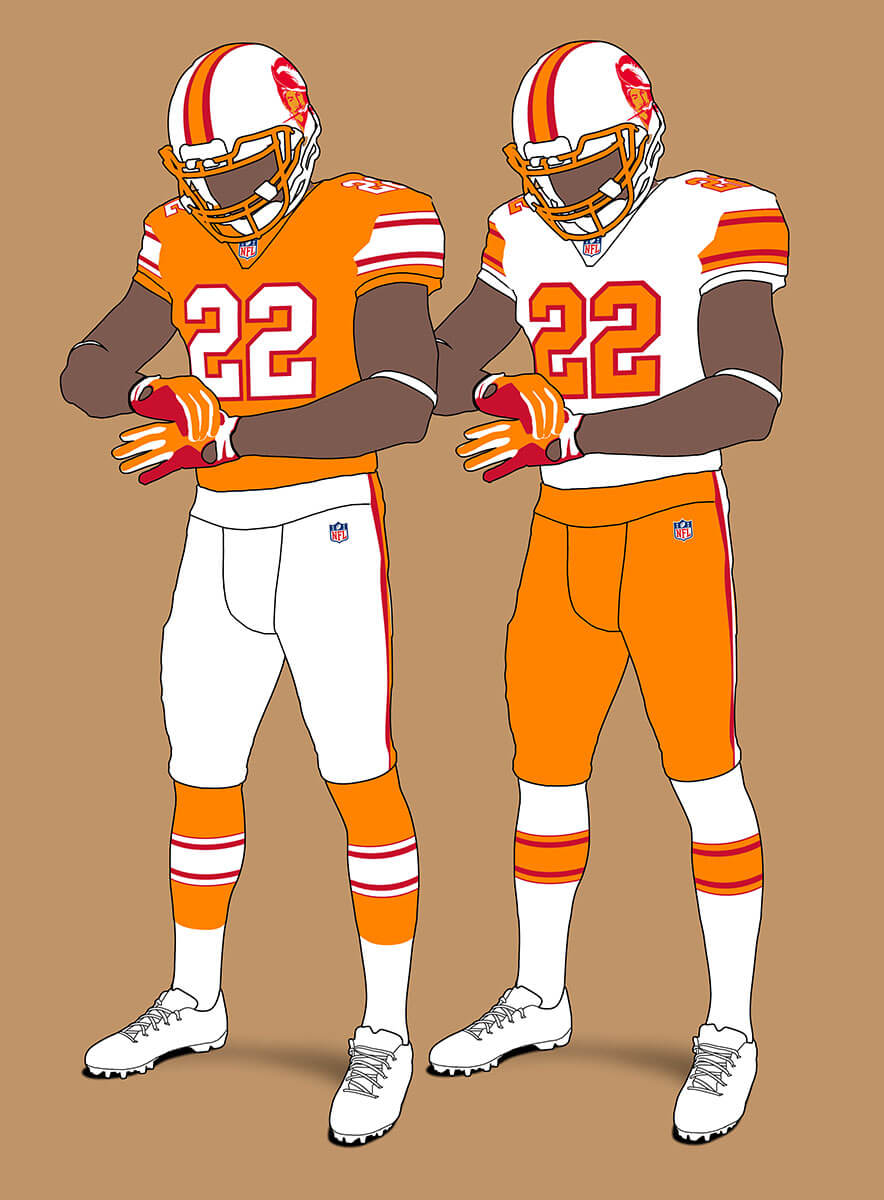
But the creamsicle version looks better in this template too.
Thanks, Chris! We’ll be back with additional divisional concepts next weekend.
Readers? What say you…
If there’s a hard-and-fast football rule, it’s that Columbia blue only works in simple color schemes. That’s why the Oilers look so great. Everything else looks great– you can start taking my money now for that gold-trimmed Jags’ getup– with the exception of the red and pewter Tampa Bay uniform, which suffers from having too many colors.
Yes when the Jags include gold in their unis they are so much better! The Titans have too many colours full stop = and I didn’t even try and include the silver-grey their actual unis have!
Titans V1 gives off a 80s vibe. I dig it.
Really like the look of the BYU Cougars… err the Indianapolis Colts. And that’s not a bad thing either!
Give me 1, 3 (except for all white), 4, and 16. No on the rest.
If this doesn’t conclusively prove how much better the Jags look with a little gold, then nothing will.
Meanwhile, the Titans’ red comes across as magenta when I look at it.
Why so much love for gray jersey numbers? It can look OK on some teams but on some of them, it looks more like dishwater/off-white than gray, and the numbers don’t pop as much.
I get what you mean about white numbers popping more, but I kinda like silver numbers for teams with silver pants!
Like the limited use of white pants. I much prefer silver/gray, gold, pewter rather than white. Many look better than the current sets. Fun project!
This instantly makes the NFC South (the ugliest division in the NFL?) so much better looking.
Would probably make the Texans helmet stripe white-red-white to match the blue pant pattern. Fun project!
I kept it all red to match the sleeve and sock stripes, but I think w-r-w would have looked good too.
A lot of these teams should adopt this look,Chris these are getting better and better
Thanks Christian! I think the last installment may be the best which will hopefully be coming next weekend :)
Thanks for keeping these coming, Chris!
Always felt the Titans needed a splash of red – and I can’t believe that I prefer V1 over the the V2 option.
Silver added to Falcons … never liked that.
Silver added to Colts … never liked that.
But here – yes to both!
Nice Falcons concepts, but I have to insist on the original red helmets + black jerseys.
I love this idea! Great concept and execution. I like a lot of these.
Makes me think of the 2009 UFL and how every uniform was in the same template, although this concept utilizes a much simpler, cleaner design with much better execution. Good work.