Last weekend, I ran a set of concepts designed by Uni Watch reader/contributor Walter Helfer in which he concepted NBA “Tournament Uniforms” for the Eastern Conference to replace those “City” editions introduced by the NBA this past fall. Yesterday, we looked at the proposed uniforms for the Western Conference.
Walter returns today with Part III, which looks at “vintage” teams. I’ll add in the introduction Walter provided to the previous posts below.
Enjoy!
NBA Tournament Uniforms Redux: Part III
by Walter Helfer
Frequent visitors to Uni-Watch know I’m not one to suffer in silence when professional leagues who ought to know better foist misguided and ugly uniforms on consumers of its product. I took on the City Connect project of Major League Baseball some time back, and now I turn my attention to the NBA’s in-season tournament. I tried to draw on what I find to be team’s trademarks, as well as their appearance when they enjoyed their greatest success. A hefty chunk of B-ball teams have never grabbed the brass ring, which gave me a degree of freedom not found in football and baseball. And, for your pleasure, I included the shorts and the backs; I’m nothing if not thorough. I can’t wait to read your input, and when necessary, correct my mistakes.
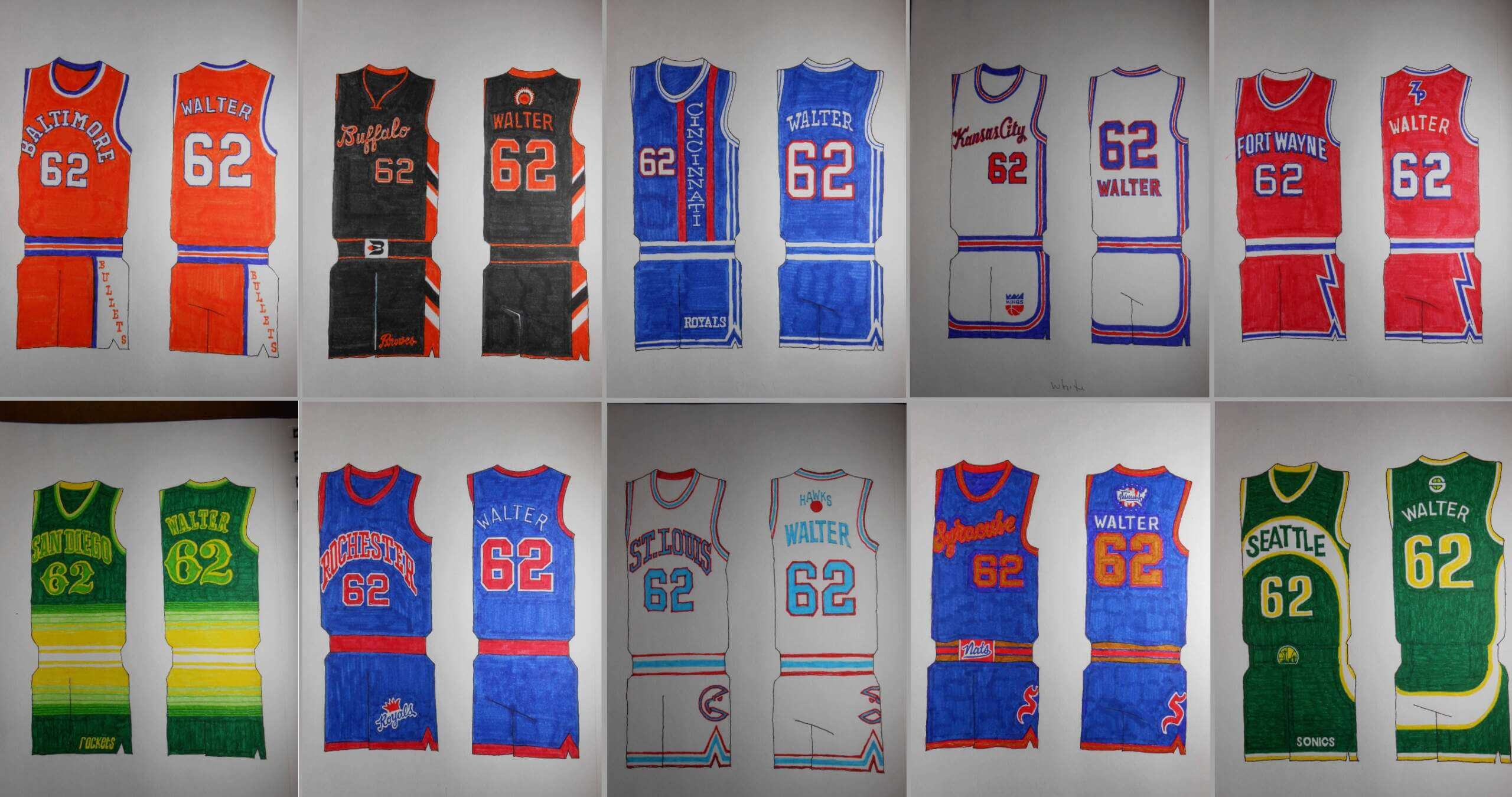
The Vintage Years
BALTIMORE BULLETS
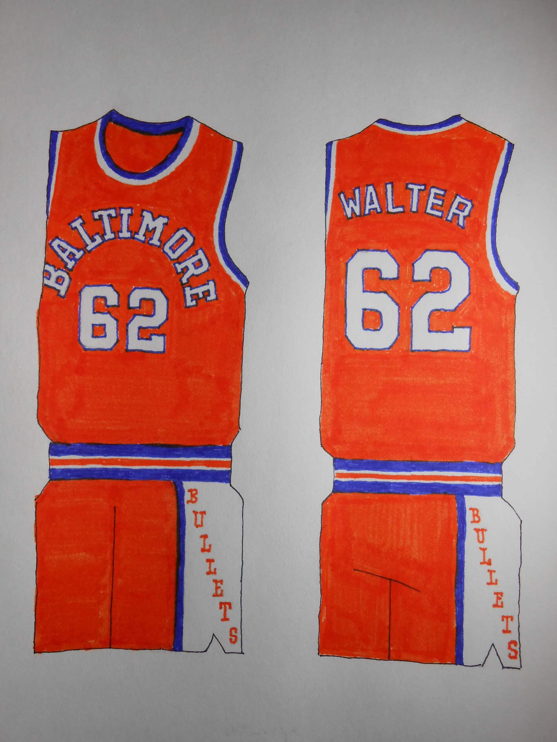
Okay, so my favorite Baltimore uniform was used for the Wizards. I still relish long locator adjectives (yes, that’s what I call them; you can thank Golden State).
BUFFALO BRAVES
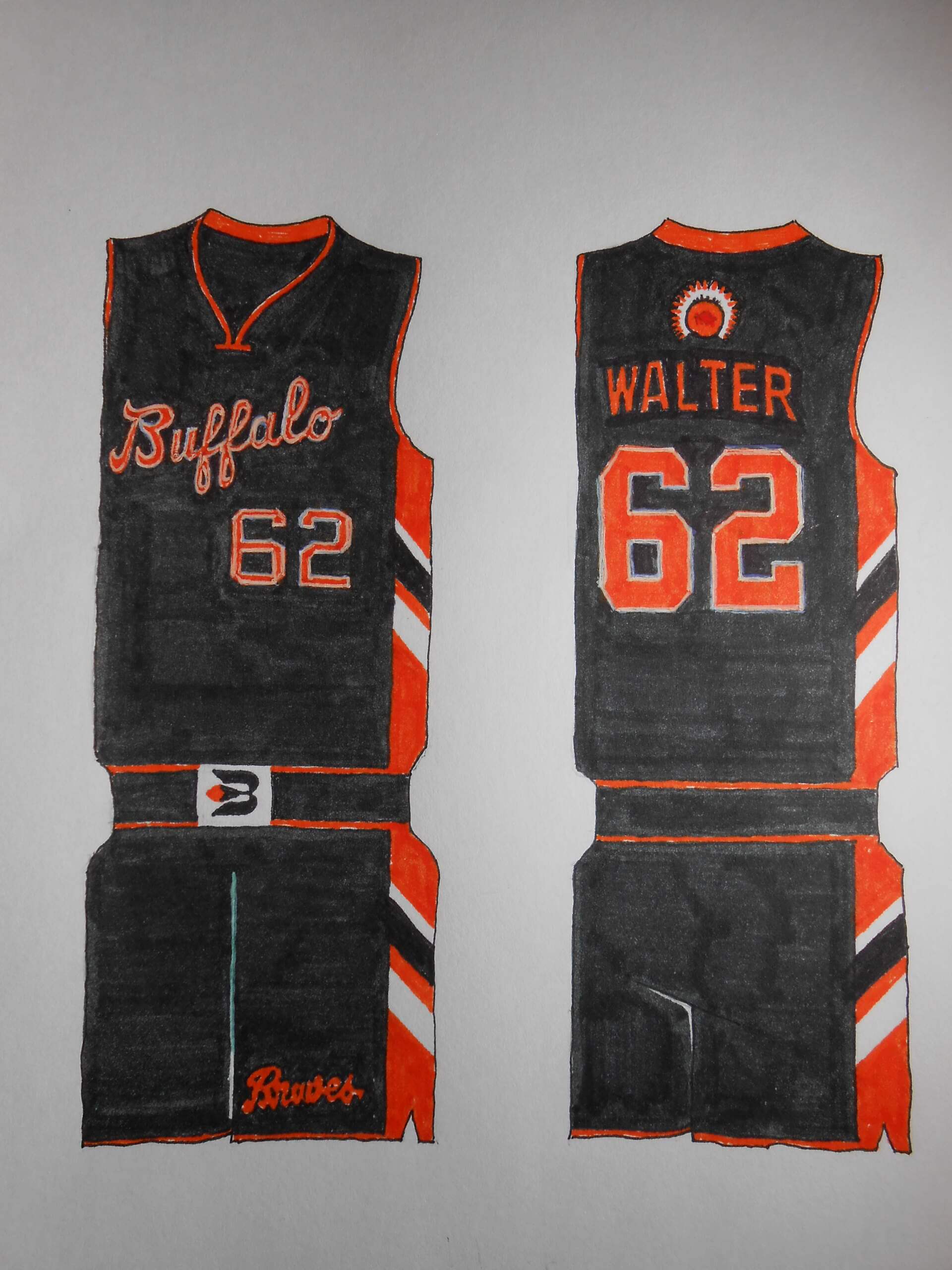
A memorable team, thanks to Ernie DeGregorio and Bob McAdoo: One that tinkered ceaselessly with their uniforms during their brief tenure. But the circumstances of their ending up in Southern California are byzantine… and they’re still tinkering.
CINCINNATI ROYALS
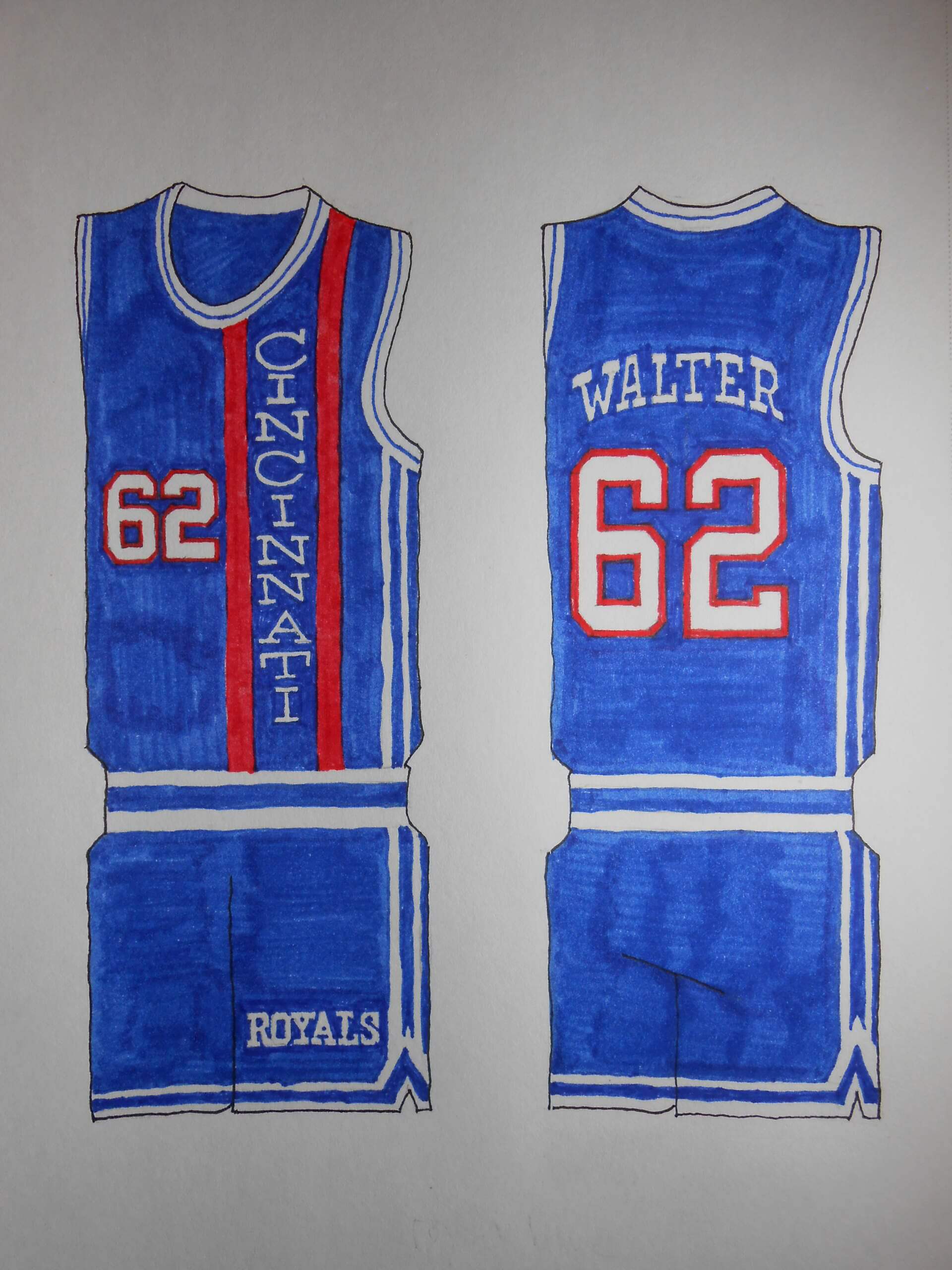
Neither hockey nor basketball of the professional variety lasted in the Queen City. That’s a shame. But it was fun putting CINCINNATI on those classic jerseys.
FT. WAYNE PISTONS
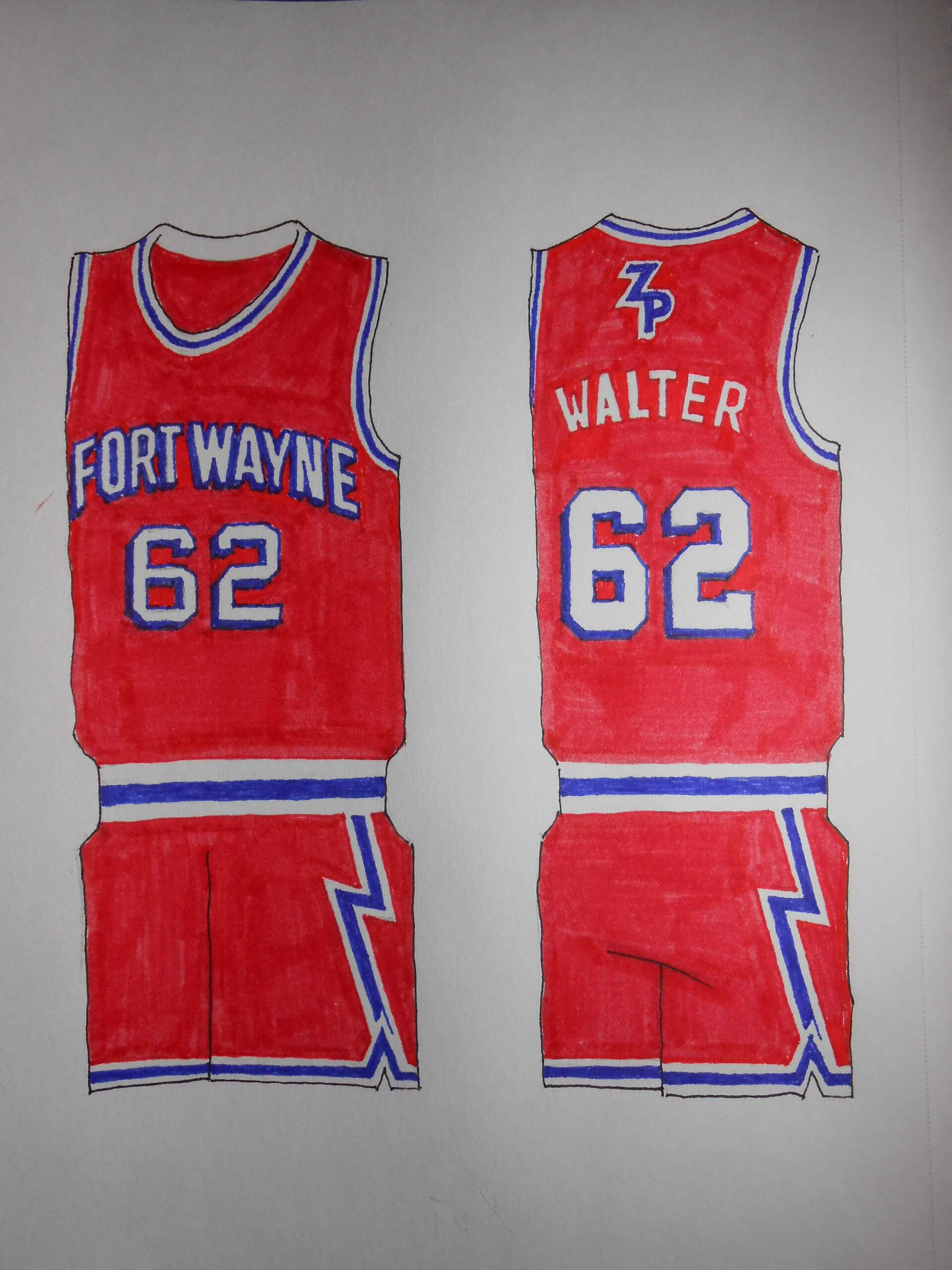
That’s ZOLLNER Pistons to you, buddy. A reminder of pro-basketball’s beer-league origins. Coming up with the Z-shaped thunderbolts on the shorts was the product of a brainstorm.
KANSAS CITY KINGS
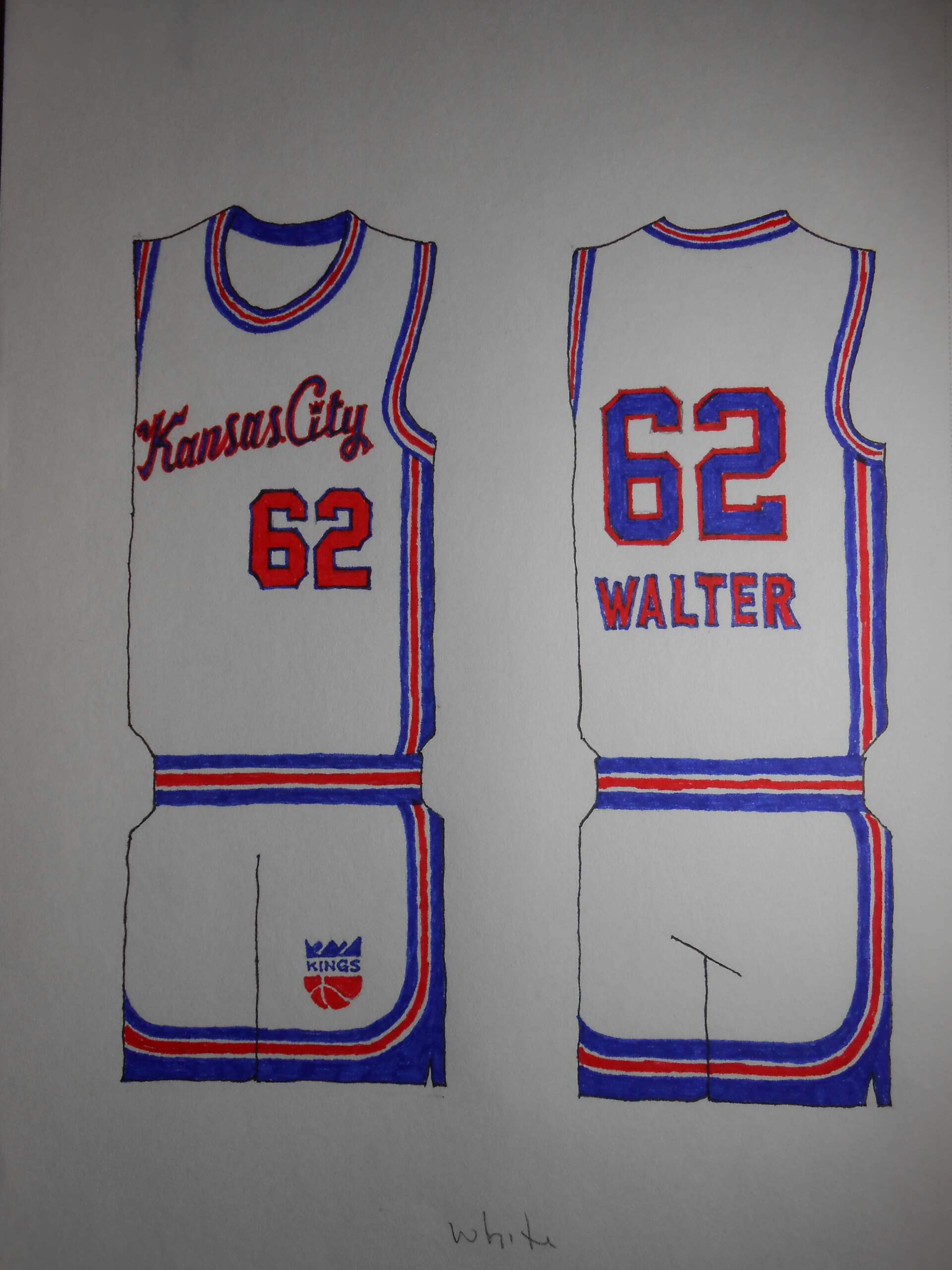
The NBA’s most-traveled team stops in the City of Fountains. Remember, after coming to rest in Sacramento, they attempted to bolt to Anaheim. This is a team on roller skates.
OMAHA ROYALS
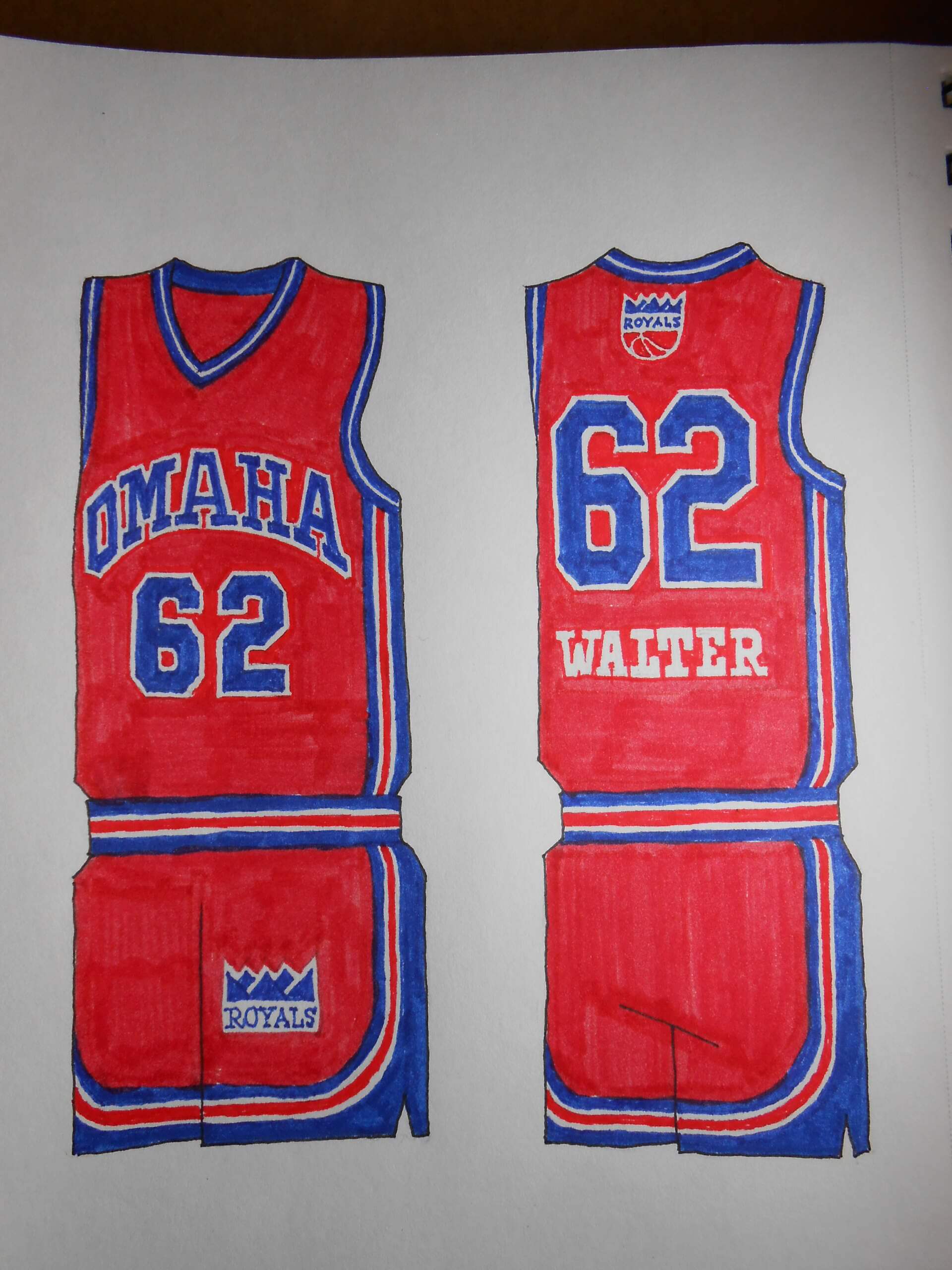
This one was a bit of a stretch, but it’s also one of my favorites. Nebraska’s only major league team, and they had to share it with Missouri! Had they opted to go all-in on Omaha, they could have kept the old name.
ROCHESTER ROYALS
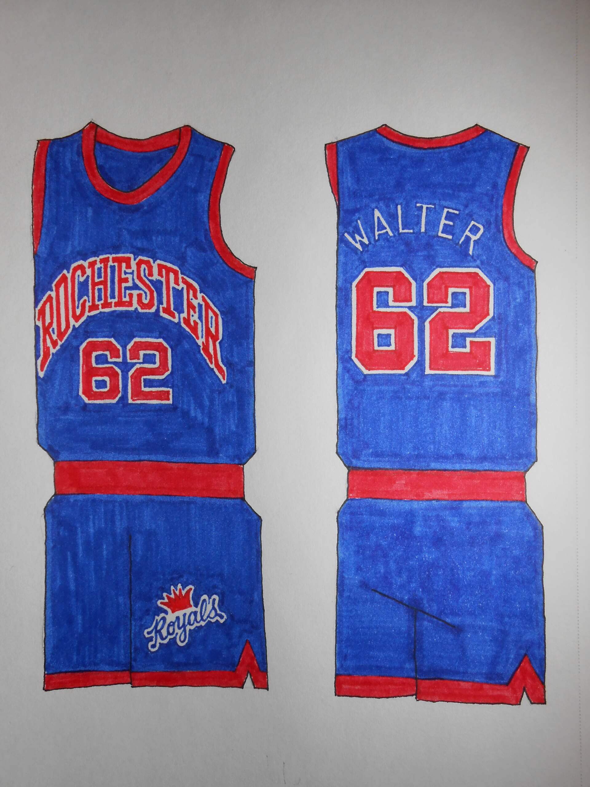
The NBA has passed through a lot of New York burgs, hasn’t it? Teams from 70-80 years ago had tiny lettering, especially when city names were long; I took it upon myself to make it less tentative.
ST. LOUIS HAWKS
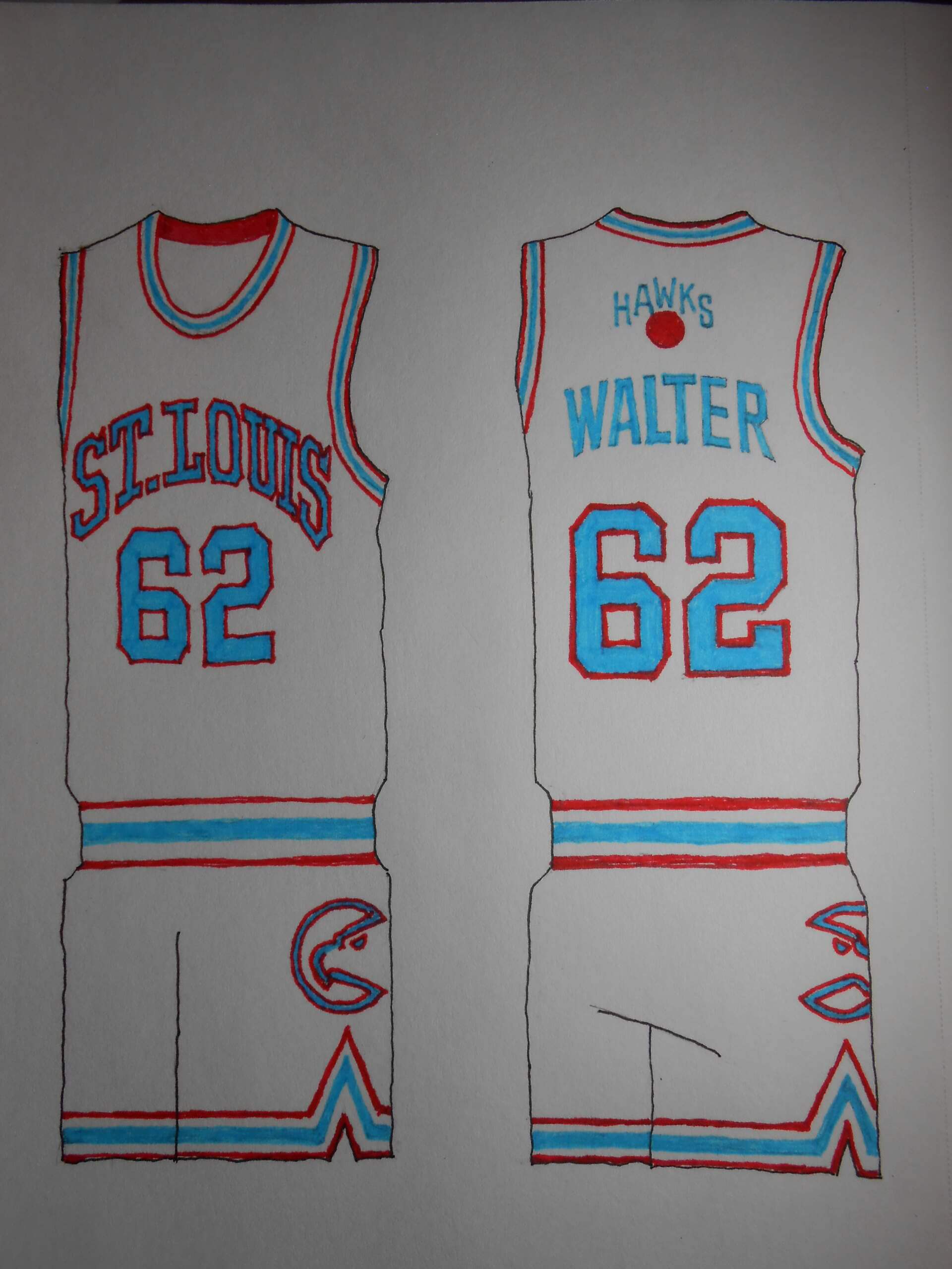
I guess Missouri doesn’t like basketball of the professional variety. But the uniforms are cool and that’s what counts! I don’t think anyone will tire of Columbia Blue and red.
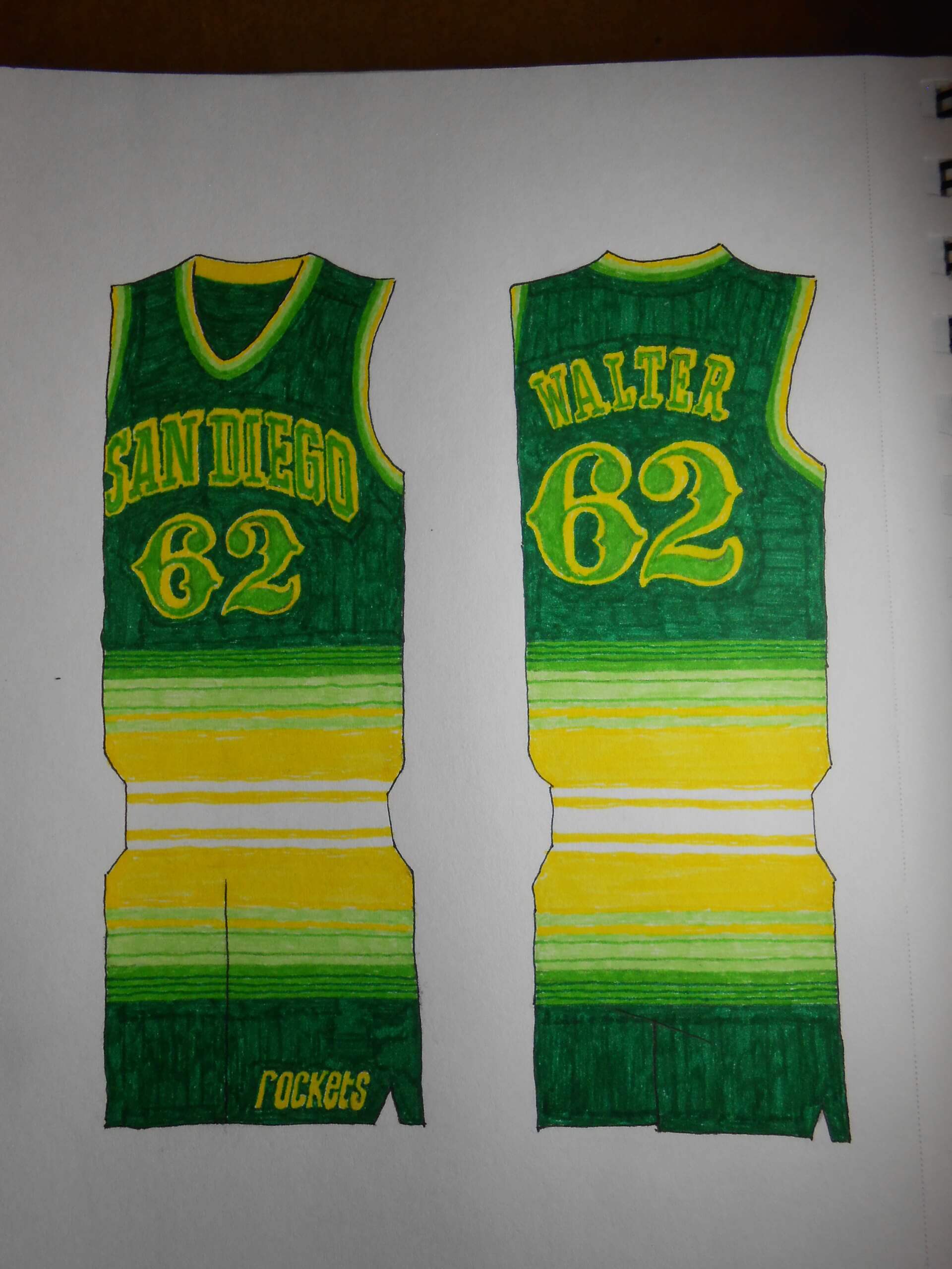
SAN DIEGO ROCKETS
I chose the Rockets over the Clippers because of the colors, and the novelty factor. The Clips were more of a let’s-try-this-again effort. All I can say is, I’m glad the Celtics didn’t end up there.
SEATTLE SUPERSONICS
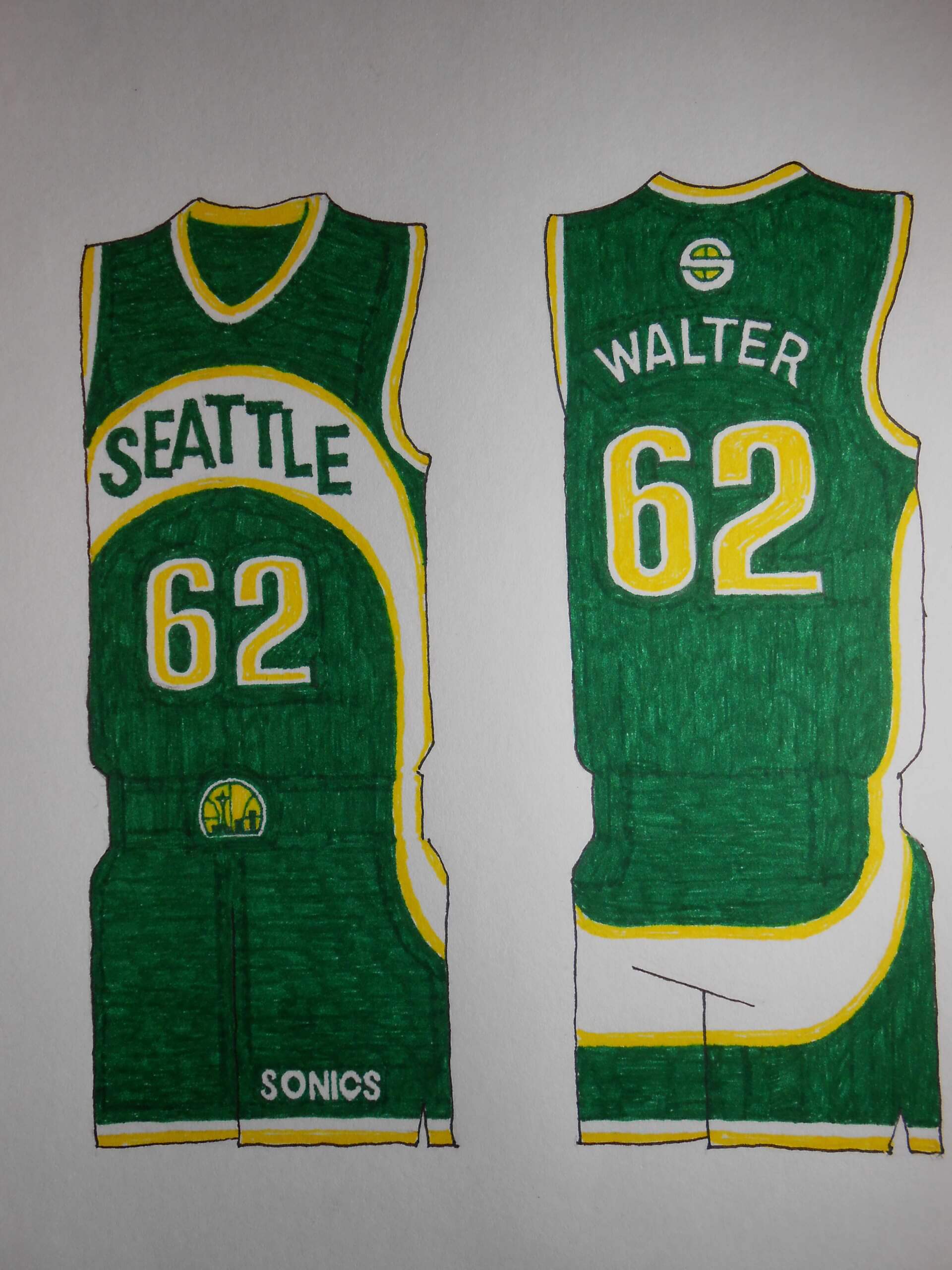
There’s a lot of 1979 in those uniforms, and I was naive enough to think a title would keep the team in place. It didn’t work for Rochester, either. It’s a matter of time before the NBA returns to the Emerald City, hope I’m still alive. Climate Pledge Arena needs another tenant!
SYRACUSE NATIONALS
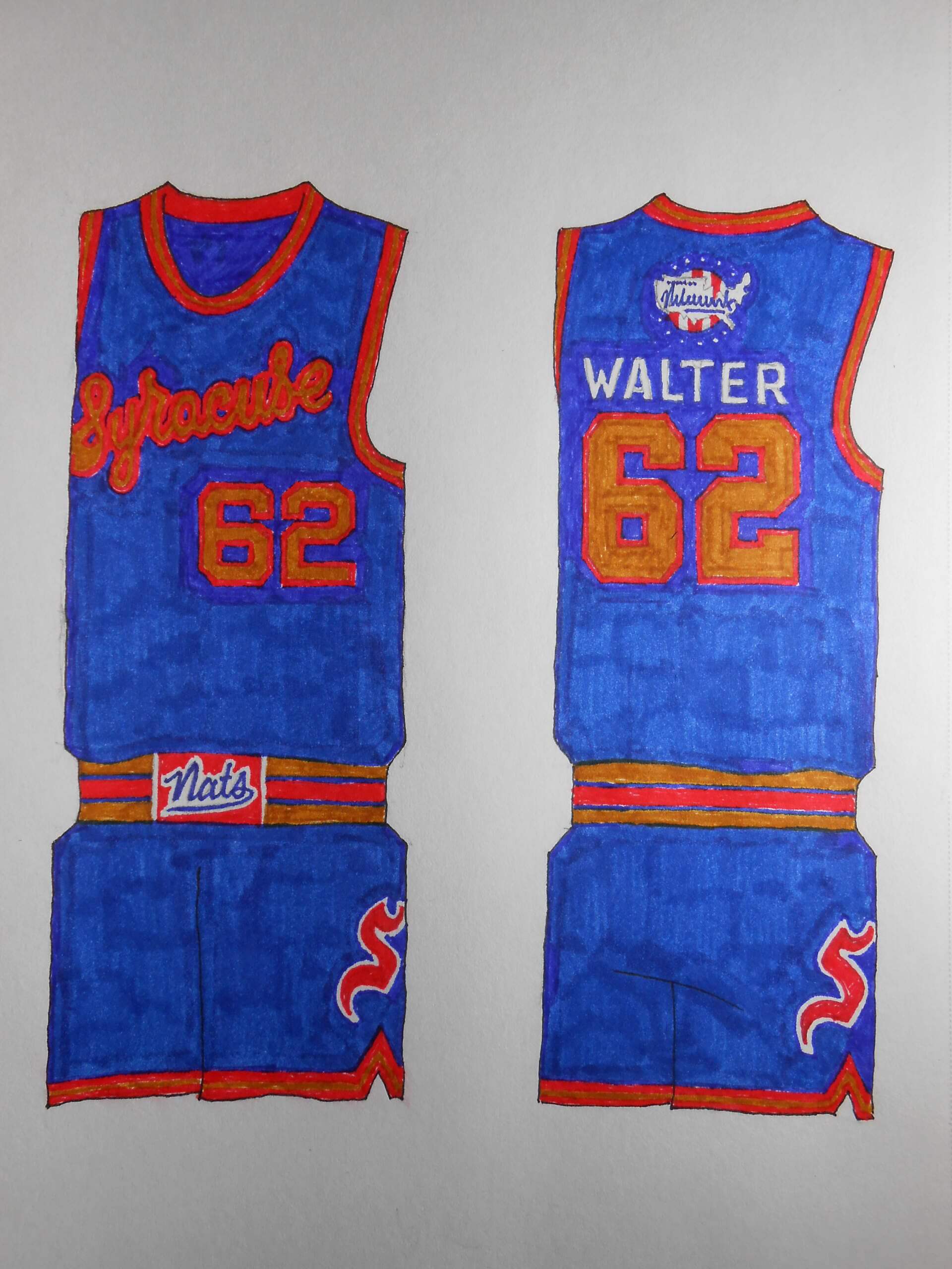
The team that would become the Seventy-Sixers had an interesting palette, but the uniforms needed some tarting up.
VANCOUVER GRIZZLIES
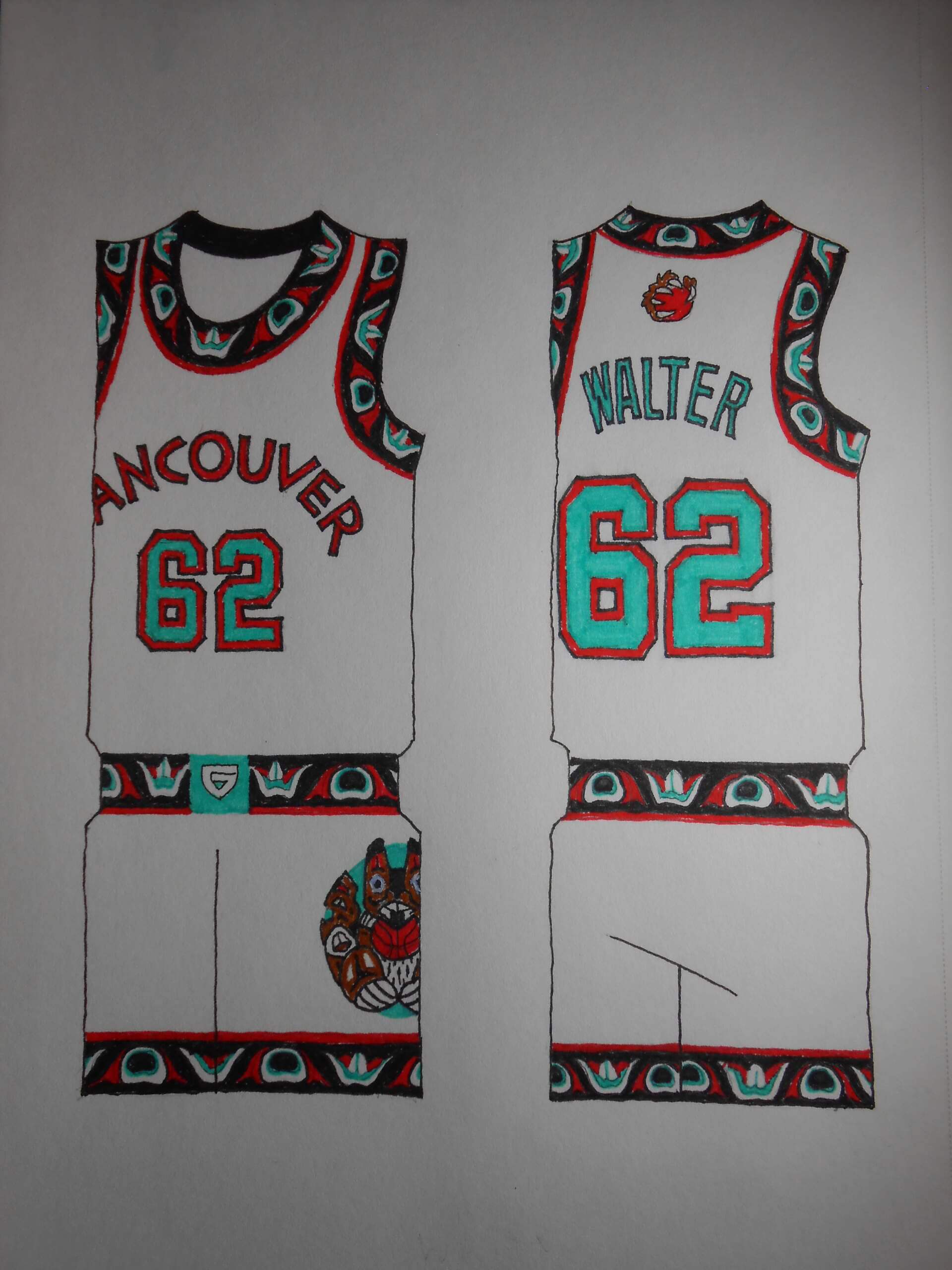
Their stay in the Pacific Northwest was brief, but DAMN! Those uniforms come alive with that tribal-inspired trim.
Thanks Walter! Another fantastic set of designs! I loved them all, but especially this vintage set — the NBA would do well to return to some of these designs pronto.
Some great uniform designs again Walter! Notable that if you walk around downtown Vancouver and see all the Vancouver Grizzlies merch available, a non-sports fan might think the team still exists.
We all know it is just a matter of time for Seattle and Supersonics return. If NBA expands to 32 teams Seattle would be one of them.
Thanks, Wade. I admit I didn’t care for the Griz right after they were whelped; the titles were too fussy, and the grizzly bear with the basketball didn’t appear to have any bones. I doubled down on all tribal imagery (a fraught position on these pages) and the new uniform really cohered.
Walter:
I can’t thank you enough for doing the SuperSonics and (it hurts to say this, but damn those uniforms were awesome) Vancouver.
I was born in Bremerton, WA and therefore a life long Seattle sports supporter.
Everything I keep hearing and reading, is that after the next tv deal expansion will be announced, with Seattle coming back.
I hope it happens!! I don’t like the feeling of having a relocating team coming in, especially after 2008.
Thanks again Walter!!
When a franchise moves there’s a winner and a loser. I would have hoped an owner swap like the Boston/Buffalo one from 1979 could have kept the Sonics in the Emerald City.
Fun stuff, Walter! I love the vintage concepts! There’s some serious research involved in tracking down images of those old teams! And knowing how many of those images are in black and white, figuring out color schemes must have been a challenge.
The Nats wore blue, red, and brown? Wild! Those uniforms are interesting but could use something to give some contrast. The wordmark and numbers are a bit hard to make out as they are, but there’s a ton of potential there.
Request for future editions: a take on the old Denver Rockets (before they changed their name to the Nuggets). Maybe as part of an ABA treatment? (Fingers crossed!)
“The Nats wore blue, red, and brown?”
The Nats wore blue, red and gold (although you could be forgiven for thinking it’s brown)
link
I was hoping for more of a buff color but I reached for the wrong Magic Marker. The caps don’t always match the ink!
Quality stuff, as always. Love the lightning bolts on the Zollner Pistons.
Those Rockets unis are gorgeous.
I don’t know if it’s intentional, but the Syracuse unis look almost identical to the road uniforms Buffalo wore in 1970-71.
Buffalo’s approach to its expansion-year uniforms was innovative. All the trim, numbering, and lettering was buff and red, the only difference being the background color, the fabric of the uniforms. There’s no white in the road suits; no blue in the home uniforms.
To borrow from Jim Vilk’s advice, Syracuse wordmark could use a little bit contrast (like a white outline similar to the S on the shorts) but otherwise a terrific bunch that beats all the City unis by a mile (km?) and even some regular unis, too!
I admit the ultimate look of the Nats’ colors didn’t come out the way I’d hoped. A few teams need tweaking.
Everything Paul said.
I really like this bunch, especially those Kings/Royals unis!
That San Diego Rockets one reminds me of the Uni-Watch Tequila Sunrise T-Shirt!
So cool, exactly the first thing that occurred to me…works so well as a basketball uni, could have been a Sonics alternate uni, too LOL
I know this is probably the dumbest question asked on Uni Watch, but I have to ask you Walter, what type of markers did you use when drawing these uniforms? I like the way the colors pop.
A holy trinity of Sakura Pigma Micron markers, Staedtler markers, and Crayola markers. I make color charts in one of my sketchbooks to make sure I have a handy swatch library. I couldn’t have done this with the lousy Magic Markers of the ’70s and ’80s. Quality is a quantum leap better nowadays.
Great drawings, Walter, reminds me of when I did more drawing….
When I was following comics and comic book artists, there was one who used some things called “Brush-pens” to ink over his pencils….
If you already know about them, cool, but if not, I’ve used them before, they are great and clean…
I haven’t ever used them to color but for my purposes, they were a great improvement over inking with regular markers….
Wonderful work, Walter!
“I don’t think anyone will tire of Columbia Blue and red.” Certainly not I!
Humor me: I think a key factor in being the type of fans we are is an undying fascination with shades of blue. A color with unusual power.
Mike I can credit to my late father. Columbia was the main color – scarlet was 2ndary – of the HS football team he was long-tenured team doctor for (also my and most of my brothers’ alma mater – I literally grew up surrounded by that hue). He served in the Navy – and Roger Staubach was one of his favorites; he’d often buy me Cowboys gear in their various shades via Sears, which I liked to wear, even through the Danny White years, but weren’t always well-received at the playground in my Philly neighborhood.
Is there a difference between Columbia blue, Carolina blue and powder blue? And, if so, what is the difference? Thanks.
Columbia blue is the most vibrant of the three, powder blue is the least. Carolina falls somewhere in between.
@Charlie: Thank you for that explanation
Great stuff.