
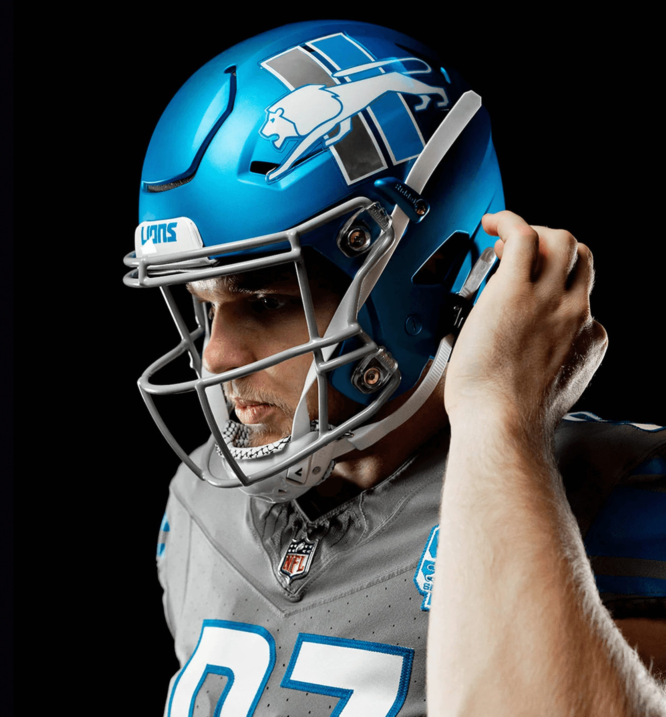
As promised, the Detroit Lions have unveiled their alternate helmet. As you can see above, it features a blue shell, the team’s retro “stalking lion” logo with “Mustang stripes” (so named because of the Ford Mustang logo), no center striping, and a grey facemask.
The logo is reversed on the other side of the helmet, so the lion is always forward-facing:

Here’s the team’s breakdown of the various elements:

As noted in that breakdown, this helmet will be worn only with the team’s truly awful grey alternate uniform, because NFL rules specify that alternate helmets can be worn only with alternate uni designs. Here are some views of how the new lid will look with the grey uni:


And here’s a comparison of the grey uniform with the primary helmet and the new alternate helmet:

———
My take: I didn’t think it was possible, but I believe they’ve now made the grey uniform worse. The new helmet isn’t bad on its own (although I think it would be much stronger with a chrome mask), but it doesn’t work well with the grey combo. Granted, nothing could make the grey set look good, but at least the silver lid didn’t stick out like a sore blueberry. What a mess.
Good-looking helmet. Naturally, they totally f*cked it up anyway…
Oh man, I saw the helmet and thought that might look pretty good with a white jersey and blue pants. Then I saw the grey combo. So much for positivity. That look is soooooooooo bad.
I’m with you. My first thought was that blue pants would vastly improve this.
I know the combo I’ll be using in Madden tho
Aren’t the lions getting a new uni set next year anyways? What is the point of this blue alternate? Just to make their current uni set more of an absolute mess than it already is?
Might be just a one-year thing, since it’s pegged to the 90th-anniversary logo.
There’s precedent for a one-year alternate: The Eagles debuted a black alternate last season with stated goal of wearing it for just one year and then swapping it out this year for the Kelly alternate.
I would also venture to guess that they want go gauge interest in a blue helmet to include in the next uniform set
I like the helmet. I have always liked this version of the Lion.
Disappointing they will only pair it with grey alternate uniforms. While the blue lid is a better fit with the grey than the silver, I do not like these uniforms in general. I would like to see how this helmet pairs with their regular home and away options because I think it could’ve worked nicely in some other combinations.
I don’t know anybody who likes these gray sweatsuit uniforms. Hopefully the next uni set will do something better, but I’m not holding my breath.
The helmet does look pretty nice, though, so long as you’re not looking at it with the sweatsuit. It would probably look good with their primaries (which they can’t wear it with), and with or without the logos, I think it would look good with the throwbacks.
I guess positivity week is over?
;)
I was wondering if there was going to be a recap on the takeaways from a week of positivity.
Leave it to the Lions to bring all good things to a screeching halt.
Lee
I’m positive I never want to see this helmet again.
It’s just OK. I love Honolulu blue but the silver helmets are beautiful. And SILVER… not gray. Gray isn’t a team color.
I agree with the consensus, no helmet is good enough to save that awful gray set. It’s monochrome AND dingy.
Can’t wait until the Lions mess up the redesign but until then, I can hope they just go back to either the Sanders Era or a tasteful update of it. Hope is all I have with this uniform.
Is it just me or does the logo look too high up on the helmet?
YES! I was looking through the comments to see if anyone else noticed that. Definitely looks too high. I think it would fill the helmet better if it was a little lower, and a little back
Too high, too far forward, and a little too big. But I hate this logo anyway, so even with more ideal placement, it would be lost on me.
@Rand My thoughts exactly. Would look so good with white tops and blue pants. I love the logo and the Ford Mustang stripes.
From the images above at least the regular helmet in some way links in with the shoulder stripes, the new one is a complete mismatch, It links in with their 90 Anniversary patch but no other element of the uniform.
Woof.
Here’s to hoping they decide to pair the gray jersey with blue pants instead of mono-gray. I think that’d be the only way to salvage the combo of the blue helmet/gray jersey.
Lions fan here. I love love love the helmet and the use of the “Mustang” logo on the uniform. I hate hate hate the paring with the grey jersey. I get that rules are rules and the alternate helmets can only go with alternate uniforms, but it all feels very forced. Is “Different for Different’s sake – DFDS” a new acronym we can use here, because that what this feels like. Just because they can doesn’t mean they should. A true throwback to the 60s-early 90’s uniform would pair well with this helmet.
I say this know as a kneejerk reaction. My opinion will probably shift once I see it on the field
100% agree.
My prediction is that once the Lions helmet hits the field, along with some of the other alternate helmets like the Panthers, the NFL will ease up and let them mix and match.
This isn’t like (say) Bucco Bruce or Pat Patriot where pairing the alternate helmet with the regular uniform set would be weird.
I actually think the helmet is pretty cool. Would look good with the white jerseys/blue pants. Those gray uniforms have got to go.
NFL Rules only allow them to wear this helmet with the grays this year, but I hope this goes to the white unis after the new uni reveal next year.
Solid Helmet overall, just is gonna look odd on a gray jersey
I think the helmet itself is great. Pair that with the proper shirt & pants and you have a very nice uniform. I’ve always thought Detroit has one of the best color schemes and alt logos in the NFL, but they have woefully underused them.
Is it just the lighting or did the shade of blue on the grey alternate jersey change to be closer to the helmet?
Its not how I would have executed it, but I’ll give the Lions credit for doing something other than just slapping their current logo on a different color helmet.
Any goodwill however is negated by matching it with their horrid gray uniforms.
Lee
I kinda wish they had just used the current lion logo.
The size of this logo isn’t a good fit with the modern vent hole placements on the helmet and unlike, say…the Dolphins throwback decal, doesn’t feel ‘classic’ – it’s just old.
Love that Mustang logo, and the helmet. Shame it gets ruined by that sweat-xedo looking uniform.
i’ll disagree with paul here and say the blue helmet on the grey unis is an upgrade from the silver helmets. the silver on the grey just looks too mismatched as shades of grey. the blue helmet break it up a bit.
those grey unis are terrible, but i actually think this helps a little bit.
Love everything about this helmet.
Very much shades-of-Memphis with that look. link
The blue helmet idea is a cool alternative, but for me this just misses the mark. The lion kinda gets lost in the Mustang stripes and just doesn’t stand out enough. I want the lion to be larger, but the real estate really isn’t available.
Agree with most posters that this would pair much much better with an all white set and I would go blue socks to avoid the leotard effect
Their own graphic says it’s “Designed to celebrate the Lions 90th season.” Not “…the Lions’ 90th season.”
Holy cow, NFL teams that generate billions of dollars and have hundreds of employees. Someone have a grasp of English.
The helmet is fantastic. They really did a bang up job with that aspect! It would look great with almost any other combo they have in their closet. Unfortunately, pairing this with the all-grey alternates is going to be so much wasted potential.
Here’s to hoping their upcoming redesign gives this helmet a more deserving pair of jeyseys and pants to call home.
A quick glance and it looks like a Kentucky helmet.
That logo is NOT made for a helmet. There is zero flow with it and it’s a prime example of today’s helmets with all of their vents having an impact on decal placement. Looks terrible with the grey uniforms and agree with many. Blue/white/blue would have been the best option.
Perfect example of a team creating a 2nd helmet just because they can.
And don’t forget. Honor the past while looking towards the future. Copy and paste for any uniform announcement.
I’m hoping that this logo will only be here for the 90th anniversary celebration this season. Then next season it will change. Teams must use a new alternate helmet for 5 seasons. But leeway has been given in regards to changing the logo and facemask.
Teams must use a new alternate helmet for 5 seasons.
Nope. The Eagles wore their black alternate helmet last season as a one-and-done design. Switching to the Kelly alternate this season.
Ahh yes! Philly IS doing that!
To all the people saying it doesn’t match: The Lions are getting new uniforms next year. I’m sure they designed this to match their new alternate uniform they will have next year. So while it looks bad now it will (hopefully) look great next year.
Also, if they were trying to improve the all grays, I think a matte gray helmet would help a lot
I love the optimism!
If we would at least pair this with the blue pants, or even striped ones, it wouldn’t be so bad.
Yeah, agreed…standing alone, it looks nice. Paired with that awful gray set, it drags it way down.
If they could pair this helmet with the white jersey and the blue pants…that might actually be pretty sharp.
But as you mentioned, they apparently can’t do that. Maybe they could wear the gray jersey with the blue pants to at least create more contrast, but that would be only a marginal improvement…
The Blue Helmet is cool.
By rule, the NFL will only allow them to wear an alternate helmet with alternate uniforms.
This tells me this is the last year for the Lions grey alternate uniforms.
This helmet will pair better with a blue alternate next year.
And, true to form and as predicted, they screwed this up.
The standard helmet looks far less intrusive with the already intrusive, god awful grey uniforms.
What is this “Detroit Grey” crap? Certainly this implies that Detroit is a grey ugly city. Well, it can be, and in some instances it is. Most definitely the 60-year old cloud that hovers over Ford Field is “Detroit Grey”.
Missed opportunity to have racing stripes.
I wanted to like this, but I don’t. Sorry! Another screwing of the pooch by the Fords.
I really like the helmet color, and even though I’ve always liked the Lions silver helmets, I think these would be great as their main helmet when they redo their uniforms. I’ve always loved the classic Mustang with this similar metallic blue. Like others have said, this would look great with blue pants and white jerseys. It would be great if Nike could get this blue right, with the same metallic sheen to the pants. I’m afraid they would probably go mono blue for home uniforms, but maybe adopt the white for home so they’ll wear these more. Better yet, wear the silver lids with blue jerseys and silver pants when wearing a blue jersey. Or is that forbidden by the NFL?
I mean by “forbidden”, is that the league might not allow 2 helmet colors, one for colored jerseys, and one for white jerseys. I think the second helmet color is only allowed for alternate uniforms. If so, then I think I’d still like this blue for their main uniforms, and then go with a classic look with silver helmets for their alternate uniform.
I know it’s a lion, but every time I see it I think of the Greyhound Bus Company
I think the blue helmet makes the gray alternate look better. Maybe pair it with blue pants?
Disappointed the stripe pattern changes with the change in direction of the logo, would have been a cool feature if the gray/white stripe was always to the right.
I noticed the stripe order also.
It is more pronounced because the side of the helmet they reversed stripes (to grey/blue)
is the same side of the uniform that has the blue/grey striping on both anniversary patch & the WCF memorial.
Looks like a rejected CFL franchise mockup
Nope.
A Honolulu Blue shell. The 1960s Lion logo on either side, sans vertical stripes. Take those stripes and add them to the top, running front to back.
A lot Boise State GFGS vibes.
Can they not wear these with the throwback blues? Not that I’d recommend that
Blame it on the NFL for the Grey Uni-Blue Helmet combo. They only allow alternate helmets with alternate unis. Since the Lions only have the Grey alternate unis, and their throwback unis, it doesn’t leave much room for options. My hope is that next year, maybe they pair this with a better alternate uni option.
at least the silver lid didn’t stick out like a sore blueberry
I like the fact that this fantastic helmet sticks out like a sore blueberry. Better than the Lions going full mono.
Like most people, I wasn’t a fan of the gray unis. They didn’t look right with the regular helmet. Unlike everyone else, I am a fan of them in this instance. Guess I’ll be the only one looking forward to seeing them.
I don’t understand the logic of the alt helmet being able to be worn with alt uniforms. If they want to cap the helmet being worn just say it can only be used three times a year to give the teams different overall options. No Fun League
You lost me at “grey alternate uniform.”
A nice flag on a dirty ship carrying stinking mud as we say in the Netherlands. The helmet is nice enough (would have preferred a chrome mask) but paired with one of the worst uniforms in all of sports ever (and for sure in my personal top 5 of horrible NFL uniforms) it accentuates the ugliness even more, as Paul said. Lions, Lions, Lions…(followed by sad left to right and reverse movement of my head).
I fw it the long way
I really like the logo, it’s nice to put it on a helmet. It’s like Bucco Bruce o Patriot Pat.
Is anyone else surprised that a Detroit team is paying homage to Ford, just one of the big three U.S. automakers who are (or were?) based in Detroit? Yes, the Lions are owned by the Ford family and play at Ford Field, but to me Detroit is known for Ford, GM and Chrysler.
I don’t think it should be a surprise to anyone for the reasons you mention and the fact that the logo is over 60 years old, so it isn’t like it’s newly made to pay homage to the Ford Mustang.
I used to think the Lions had the sweetest uniforms in the league, and to see how they are willfully making it worse and worse makes me sad.
That new uniform template is is very ugly. It looks like the collar is wrinkled. That is going to drive me nuts.
Love the automotive theme to this thing. No reason they can’t pair it with other combos in the future.
Great, classic logo on an ok helmet with a terrible uniform set. I am disappointed.
i feel like blue numbers, nike logo etc could possibly save it but its a tough look
The fact that they consider gray a “signature” color is a big part of their problem. I really like the new helmet with a white jersey and blue pants would be a good look.
Sadly, as a lifetime Lions fan, it doesn’t surprise me that they could take a terrible uniform and actually make it worse. They never should have gone away from the Billy Sims/Barry Sanders era uniforms. I shudder to think what they have in store for their new uniforms for the 2024 season. Ugh
Love the helmet, hate the grey unitard. Keep the logo. The current Lion is over-stenciled. This team hasn’t looked good since Eric Hipe and Barry Sanders.
Judging by all the comments, I’d have to say the lions did it right. Created a lot of conversation and a lot of people here do like them.
I for one do love the helmet. But wish they paired it with their “icy white” stripeless pants. And blue or white jersey.
The Lions have confirmed that they are getting new uniforms in ’24. I would hope that they would tweak the alternate uniform to match the helmet. Ditch the mono grey, because literally everyone hates it, and move on. And I agree, not using a chrome facemask was a brain fart for sure.
Does it bug anyone else that the mustang stripes on the helmet don’t match the ones on the sleeve?
Yes! I wouldn’t mind seeing an update with this to see how it looks.
I’m surprised I can still be shocked teams/companies can put out such awful looking uniform components with all the resources available to preview them.
Yes, the blue helmet stands out against the gray uniform. Which is exactly why it’s so good. Massive, massive improvement to the overall look of an otherwise dreary uniform. It’s still bad! But much less bad now that the helmet provides a bit of complementary contrast. The regular silver helmet both clashes with the gray and reminds the viewer of the far superior regular uniforms. This at least is a full-on alternate look.
Why does the league just leave the uniforms alone? Why do certain helmets have to go with certain jerseys. Just shut up and run the business of the league as poorly as you have the past decade.
Naturally the Lions would have to pair it with the ugliest uniform in the NFL. To be honest, dull gray is the perfect color for the Lions over the years; dull, lifeless, boring, depressing gray is how they’ve been for years. That helmet would really pop with the white jerseys, but it’s not even the same shade of blue to go with the home jerseys.
Disagree with the last line – silver and gray didn’t make sense together, they’re similar shades. Gray doesn’t really make sense for a team that already has silver and white in the color scheme. But if you must, a contrast color helmet is better, I think.
I am sooooo over the satin finish helmets.
I have to respectfully disagree with Paul. I think the blue helmet improves the all gray uniform look. Takes it from an F- to a solid F.