
Our friends at Grey Flannel Auctions have a new catalog of excellent items, including the two amazing 76ers warm-up tops shown above. The blue one was worn by Dr. J during the 1976-77 season, and the white one was worn by Shaler Halimon in 1968-69. Sensational stuff!
This latest catalog features a lot of NBA stuff, along with a smattering of items from other sports. Here are some that caught my eye:
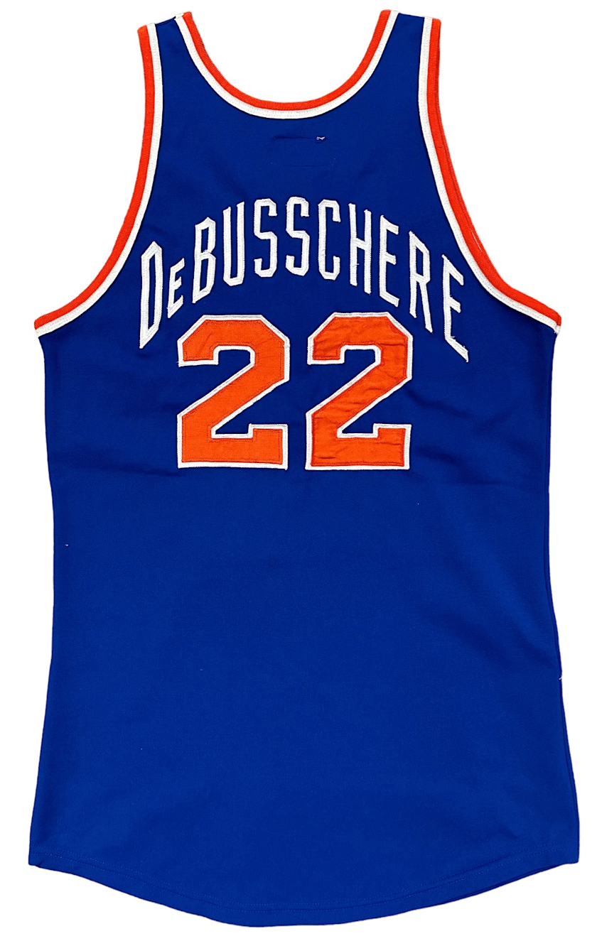
- As far as I’m concerned, the early-’70s Knicks had the best vertically arched NOBs lettering of any team in any sport. The small cap on Dave DeBusschere’s NOB is the cherry on top.
- Speaking of small caps, the kerning on the raised “c” in Kevin McHale’s NOB looks a little off here — a bit too close to the “M” and too far from the “H.”
- Probably no basketball player has ever been as famous for his socks as Pete Maravich, so it’s pretty awesome that there’s actually an auction for a pair of his game-used droopy socks. (If you’re into more traditional items, you can also bid on two of his game-used Jazz uniforms here and here.)
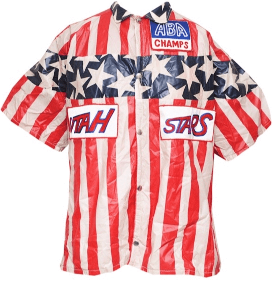
- Holy moly, look at this crazy 1970s Utah Stars warm-up top! Now that’s garish.
- This is interesting: There’s a 1986-87 Kareem Lakers warm-up jacket with no hyphen on the NOB, and an early-’80s jersey that does have the hyphen.
- Here’s something you won’t often see: a Phoenix Suns scooter!
- Gotta like these ticket stubs from the 1976 NBA Finals.
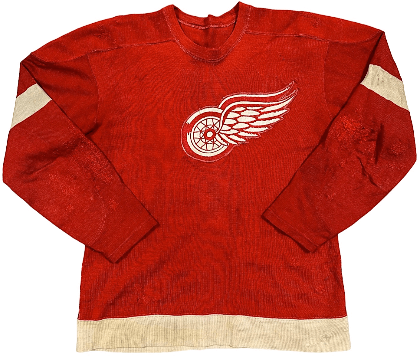
- Shifting from the hardcourt to the ice, this 1949-50 Red Wings jersey, worn by Sid Abel, is the bomb.
- I love the endearingly amateurish-looking crest on this 1991 Oshawa Generals jersey, worn by Eric Lindros. Great striping, too.
- Speaking of striping, check out the sleeve stripes on this 1945 Army college football jersey. Simple but very effective.
- If you think a crop-top football jersey looks weird on the field, it looks even weirder by itself, as seen in this Charles White 1977 USC jersey and this Gino Torretta 1990 Miami jersey.
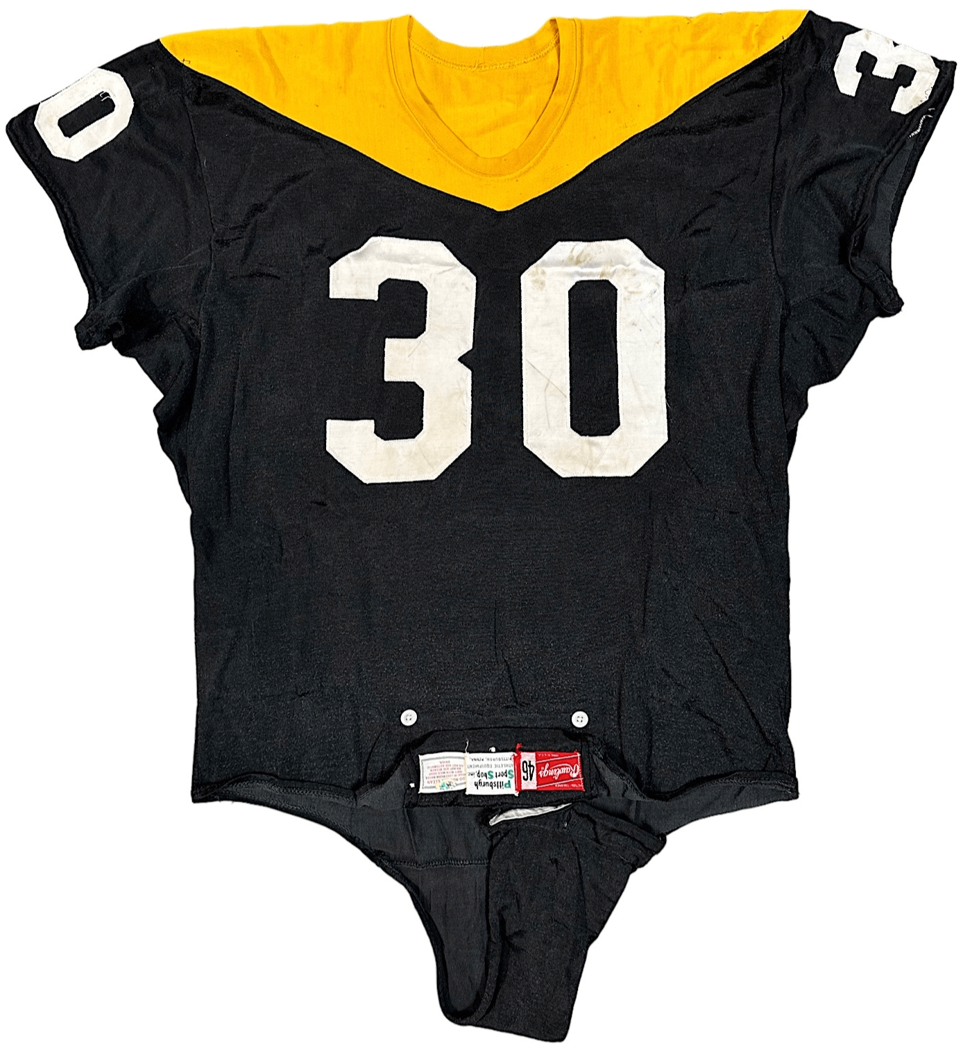
- Oh baby, sign me up for this 1960s Steelers “Batman” jersey!
- Although I hate the Bronx Bombers, I have to admit that I really like this pair of 1956 Yankees cufflinks.
- Check out the absurdly short sleeves on this 1956 Dodgers jersey, worn by Gil Hodges. It’s practically a vest! Sure enough, Gil wore his sleeves very short in those days, but this jersey really takes it to an extreme.
———
Want to see more? You can click through the entire auction catalog here.


Morning Paul, It’s LeVar, not LaVar.
Thanks! Fixed.
Hi Paul – that airplane on the can is a hoot – no airplanes were ever produced with three prop engines configured like that.
FWIW, it looks like the picture was inspired by the Boeing 314 (which had 4 engines):
link
I think the 4th prop is being blocked by the body of the plane. Could have been solved if they placed the props a bit further out on the wing.
Excellent stuff. As a Red Wings fan, I’m especially fascinated by the Abel jersey. It seems strange, though, that the captain’s patch was removed, since Abel remained captain through the 1951-52 season, after which he was traded to Chicago. But since NHL teams of the era were rather frugal, I’m wondering if Glen Skov (who switched from 14 to 12 after Abel’s departure) ended up wearing this jersey during the 1952-53 season. I’m also curious about this “Tool Shop” manufacturer’s tag.
And the old County Stadium scoreboard in the background of the LeFlore photo; Wisconsinite that I am, I find it fascinating that the venue was used for (at least) two baseball movie filming locations.
Speaking of scoreboards, my copy of “Classic Scoreboards” arrived last week, and it has been worth the read!
Oh, yes. Brewers fan and child of the ’70s here; I’d know that outfield backdrop anywhere.
I wonder what the cats would think if they saw water coming out of that spout. Not full blast, obviously – that would be a real dick move and they’d definitely be pissed off – but maybe just opening the valve a hair, allowing a very small trickle.
To me, it looks like that’s exactly what’s happening in the photo.
Actually, if you look closely, you can see that there *is* a small trickle!
Even by the standards of the ABA — which set out to be more colorful than the older, relatively conservative NBA — that Utah Stars warmup shirt is gaudy with a capital G.
Agree on the Knicks lettering. Those were all done by hand at Gerry Cosby I believe. On a short name like REED, they would use bigger letters…on a name like DeBusschere, they had to go narrow.
link
Love the daily kitty posts.
I dug that Ron LeFlore movie as a kid. I was always a fan of his after seeing it.