Greeting and a good Saturday morning everyone. I hope you’ve all had a good week.
With the NFL regular season in the books, today I wanted to take a look back at the “best” and “worst” uniform matchups for each week of the season. When I began this, I thought most weeks would have a “slam-dunk” best or worst, but it turns out it’s not so simple. Some weeks, we had a plethora of good looking games — other weeks, there were a good half-dozen contenders for worst uni combos. For each week, I’ve included a link to the GUD for all uni combos that week (indicated by “Week XX”) in the writeups, so you can see for yourself how all the teams were attired. I tried my best not to repeat any teams/combos, but in a few instances there will be repeats. Some “good” unis will always look good (it takes two to tango), while some teams with really bad looks won’t need much to make the matchup a real stinker. The fact that the Bills in mono-blue below the neck didn’t even make the list should tell you something. For the most part, I shied away from your “typical” great matchups that happen almost every season (though there are a couple of those), and tried to pick games that were the most visually appealing in a given week.
I’m sure you’ll disagree with a few of my picks — actually I would hope you do. Indeed there were some weeks where I waffled between a couple games (either bad or good). And if you happen to like a certain “look,” I’m sure you’ll disagree because I don’t. If nothing else, the 2022 season proved there are still some outstanding looking games…and we’re well on the way to a lot of less-than-stellar matchups both this year, and certainly in the years ahead.
Enjoy!
WEEK 1:
BEST: Raiders/Chargers
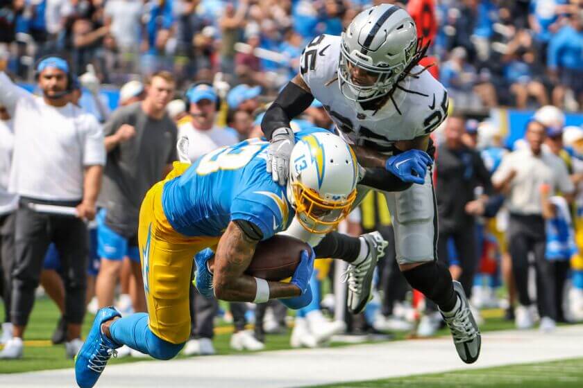
The original 1960 AFL rivals have almost always had wonderful looking games, and their Week 1 matchup was one of the best. The Chargers have (arguably) one of the Top 5 unis in football now, and da Raidahs never change (and that’s a good thing).
WORST: Broncos/Seahawks
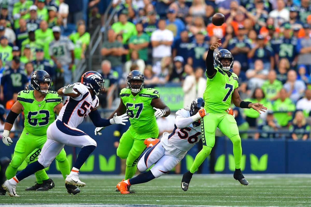
And it wasn’t even close. Despite wearing these unis (and winning three Supes) for a quarter century, I think we can all agree the Broncos are due for new uniforms.
WEEK 2:
BEST: Commanders/Lions
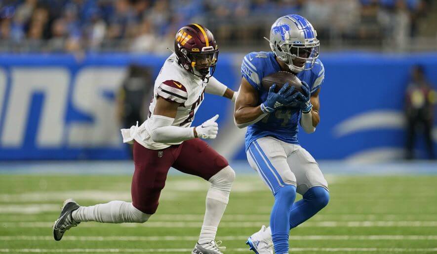
There were a number of good uni matchups in Week 2, (including the Packers/Bears), but the burgundy/white vs. Honolulu blue/silver was a pleasant surprise, especially considering some of the wretched combos both teams would wear thoughout the season.
WORST: Rams/Falcons
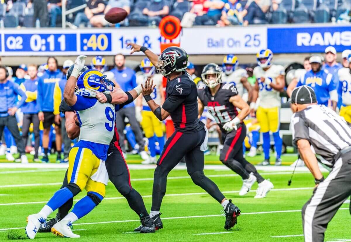
Week 2 also provided few truly awful matchups, but the Rams in their dishwater tops vs. a fully-mono-black Falcons club just did not look good. It could have been worse — both teams have even worse combos — but together they were the worst on the field for Week 2.
WEEK 3:
BEST: Steelers/Browns
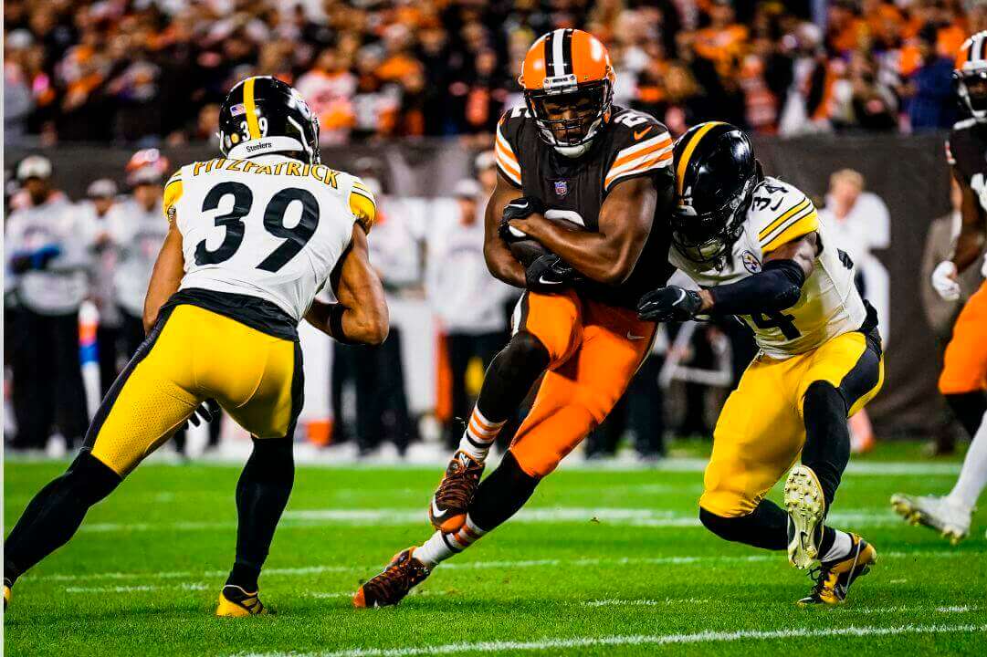
If you watched any TNF this season, you’ll know there were a plethora of truly awful matchups, so I was pleasantly surprised by this gorgeous tilt between the Browns and Steelers. Honorable mention to the Giants/Cowboys, but there was just too much white in the Big Blue’s palette to be the best.
WORST: Raiders/Titans
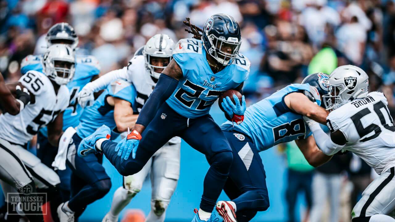
It takes two to tango — usually — to create a bad matchup, but Week 3 was also surprisingly good. I hate to penalize the Raiders, but the Titans navy/powder/navy-tights look is awful enough on its own to qualify this week.
WEEK 4:
BEST: Bears/Giants
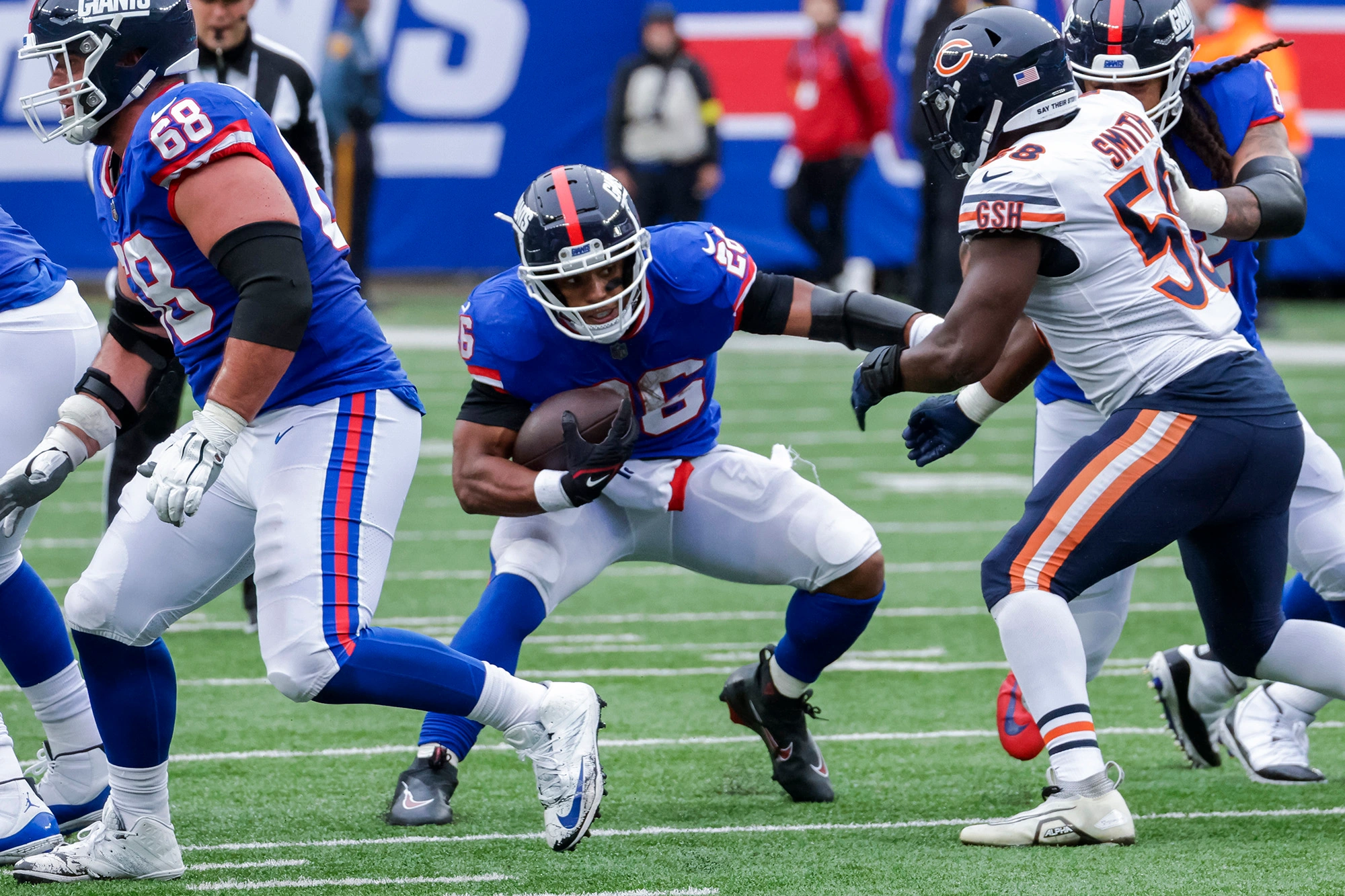
There were surprisingly few good matchups in Week 4, but the G-men in their 80s/90s throwbacks against da Bears really brought back memories of a great 80s rivalry. Great move by the Giants to bring back the two-time Supe winning look!
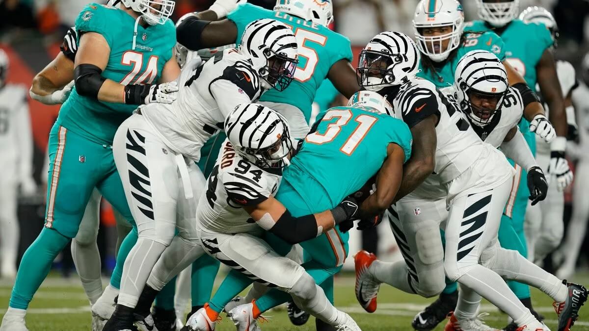
WORST: Dolphins/Bengals

If you clicked on the “Week 4” link above, you’ll note the multiple games with “mono-vs-mono” (at least below the neck) matchups there were, including not one but two mono-purple games. Woof. I almost hate to penalize the Bengals for their white tiger look (which I love), but that versus the all-aqua Dolphins? Not good. Feel free to disagree here, there were so many bad matchups this weekend.
WEEK 5:
BEST: Lions/Patriots
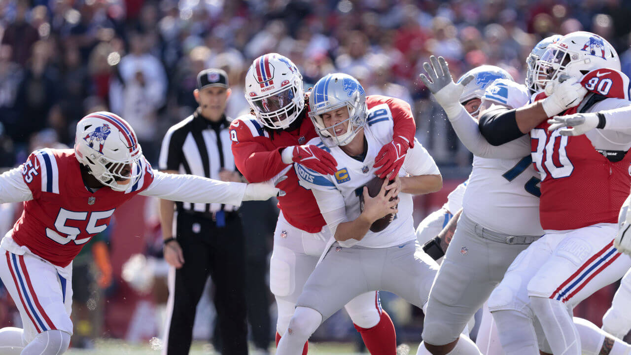
We have to thank the Lions for not ruining Pat Patriot’s return in Week 5. The Lions will be on at least one “Worst” list, but not today. Ever since the one-shell rule was lifted, this was one of the most anticipated throwbacks, and the Patriots didn’t disappoint!
WORST: Chargers/Browns
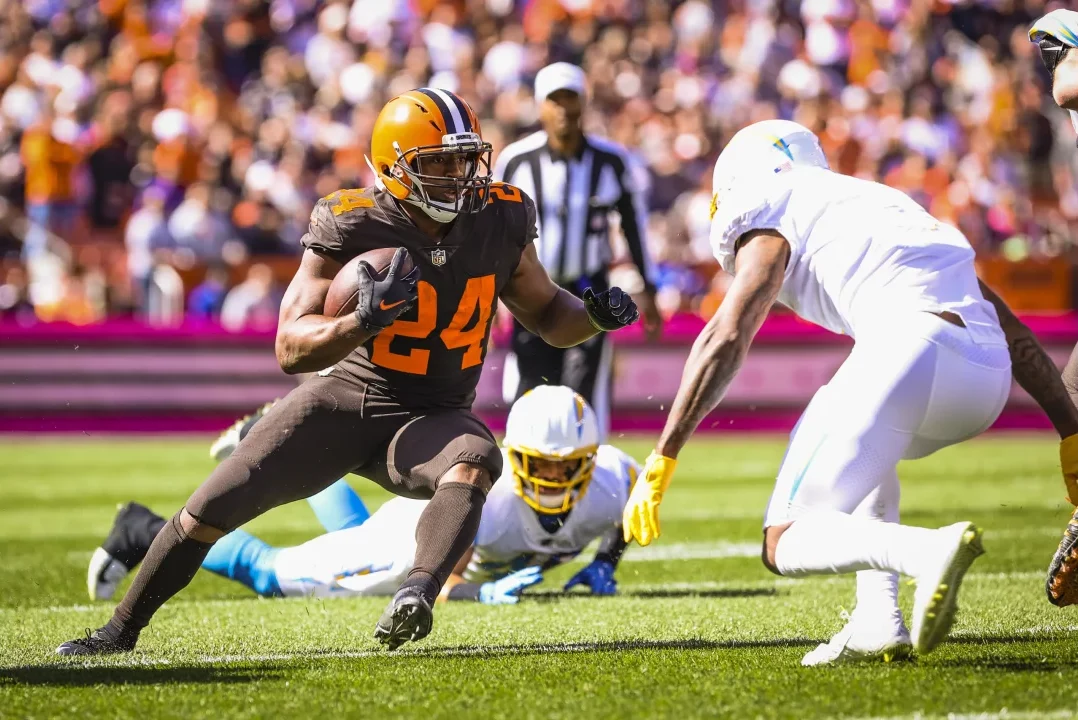
You won’t find the Chargers on too many “worst” lists, but in mono-white, in the glaring sun, against the mono-brown-below-the-neck Browns, this was NOT a good matchup. Contrast wasn’t the problem, but pretty much everything else was.
WEEK 6:
BEST: 49ers/Falcons
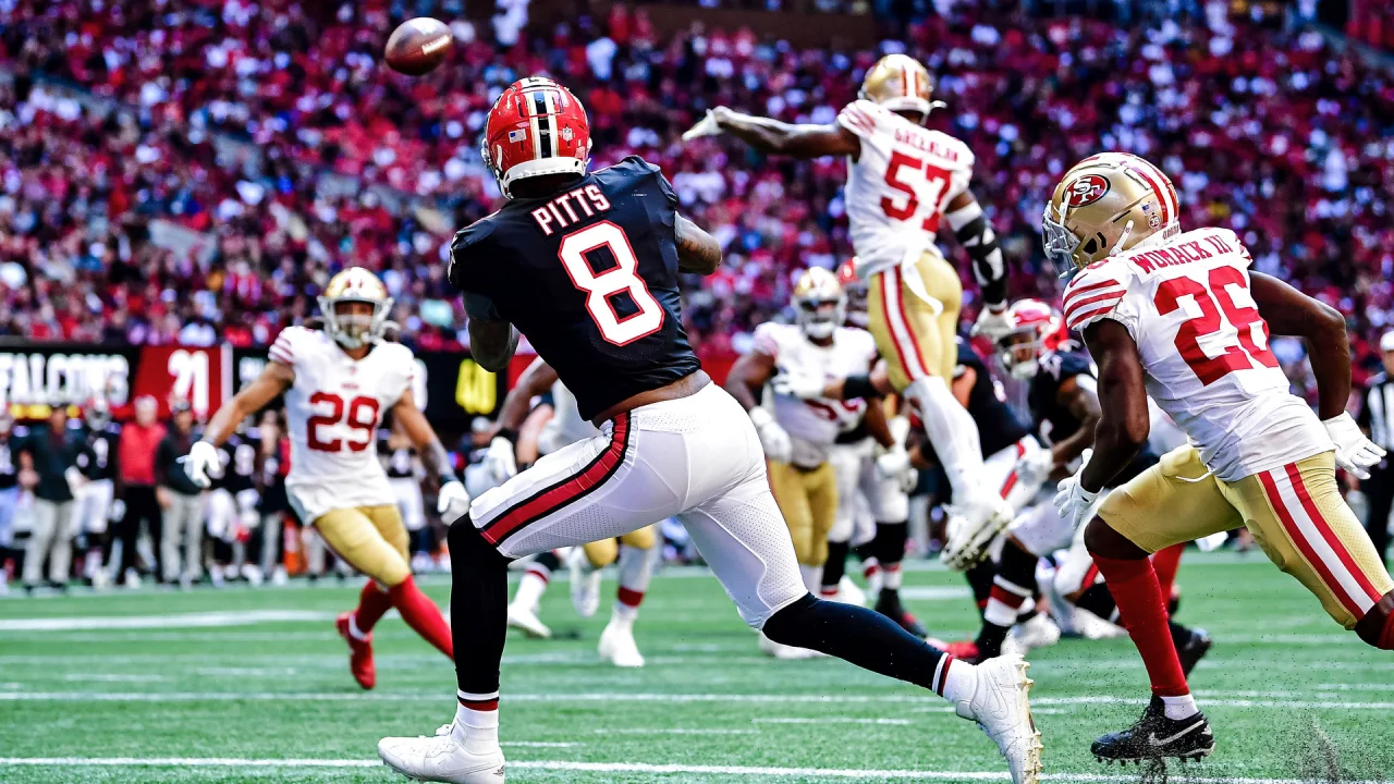
Just like you won’t find the Chargers on too many worst lists, you won’t find the Falcons on many “Best” lists either, but their Week 6 tilt in their fauxbacks versus the Niners was damn near uni-perfection for both teams. We’ve said it before a thousand times: JUST. MAKE. THESE. PERMANENT. FALCONS.
WORST: Jets/Packers
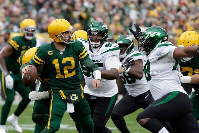
I like the Packers mono-green throwbacks (although I wish they’d wear constrasting socks), but when that look is paired with the Jets green/white/black-tights look, it’s NOT a good combo. Two different shades of green (hunter and kelly-ish), tights-look for both, and the Jets so-dated BFBS-fetish made this one very hard to watch.
WEEK 7:
BEST: Bears/Patriots
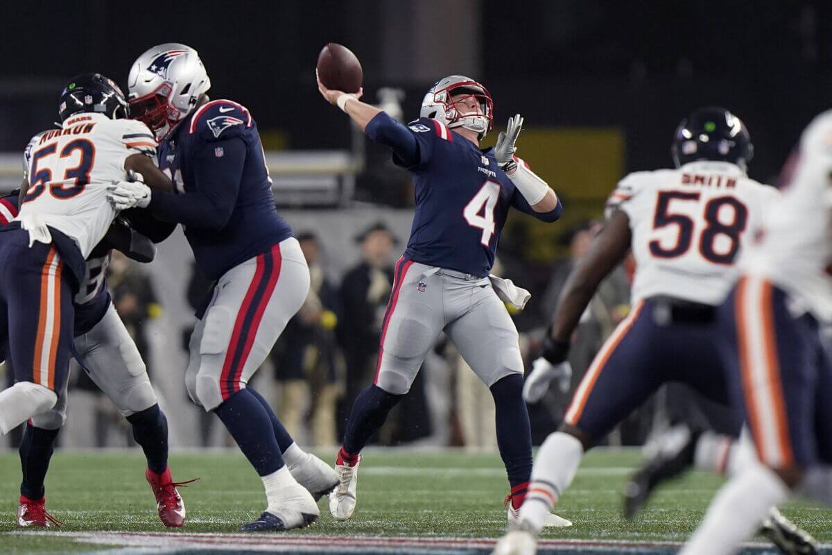
OK, so it wasn’t quite Supe 20 good, but the Pats finally broke out the mythical silver/gray pants in Week 7 which they should wear every week, and the game looked fabulous! Unfortunately, the pants were a one-hit wonder, since NE lost wearing them. Let’s hope they come to their senses next season and wear these — if not every week, then at least at home.
WORST: Saints/Cardinals
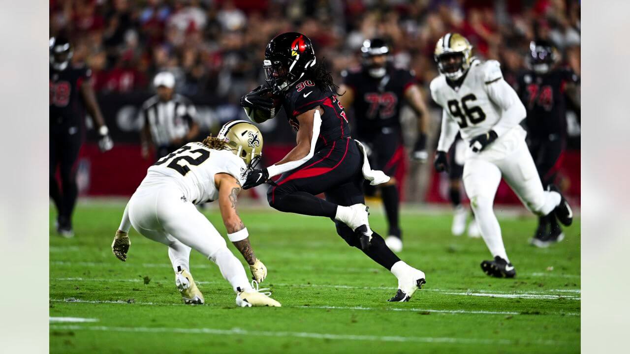
The only good thing I can say about this game is the Cardinals looked better with their alternate black helmet and CR unis than they did with their white hats. This one was a truly awful looking game.
WEEK 8:
BEST: Cowboys/Bears
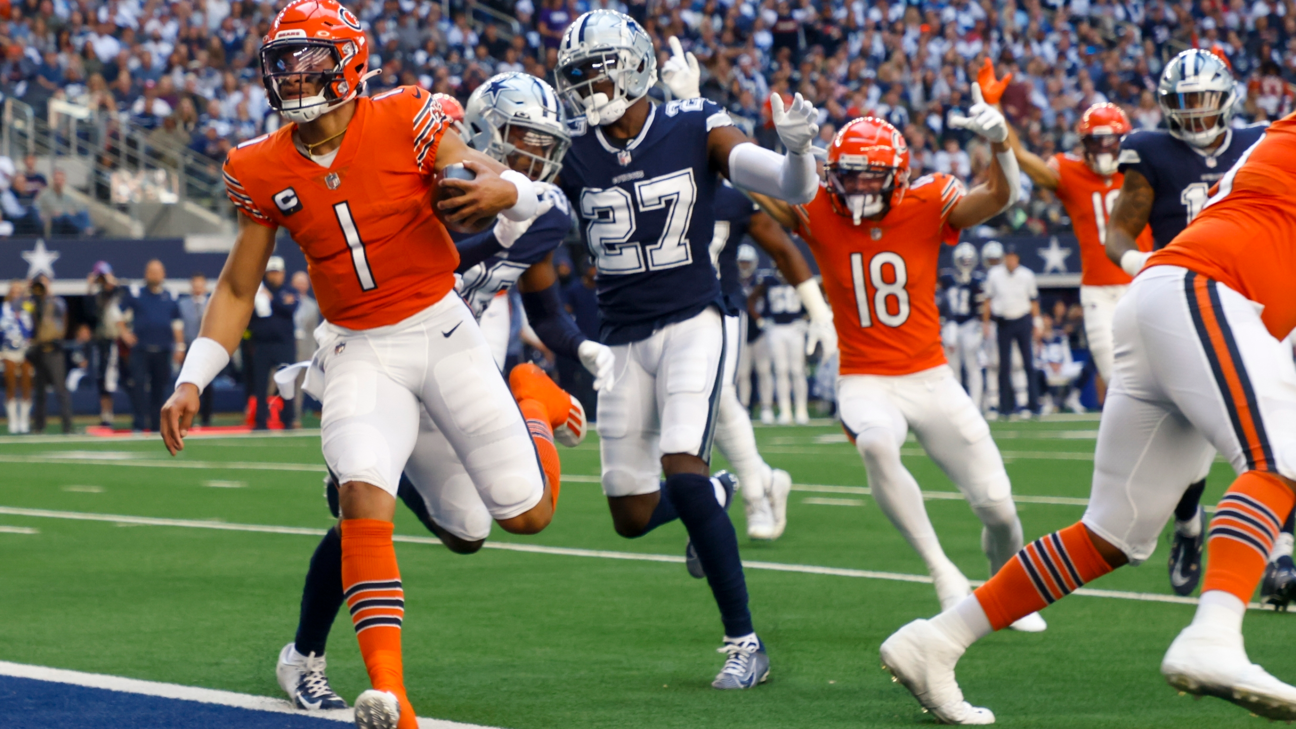
For Hallowe’en weekend in Week 8, we got a rare color-vs-color matchup. Yeah, I’m not a huge fan of the Bears alternate orange hats, and I didn’t like that both teams wore white pants, but man…that navy against orange really worked well.
WORST: Dolphins/Lions
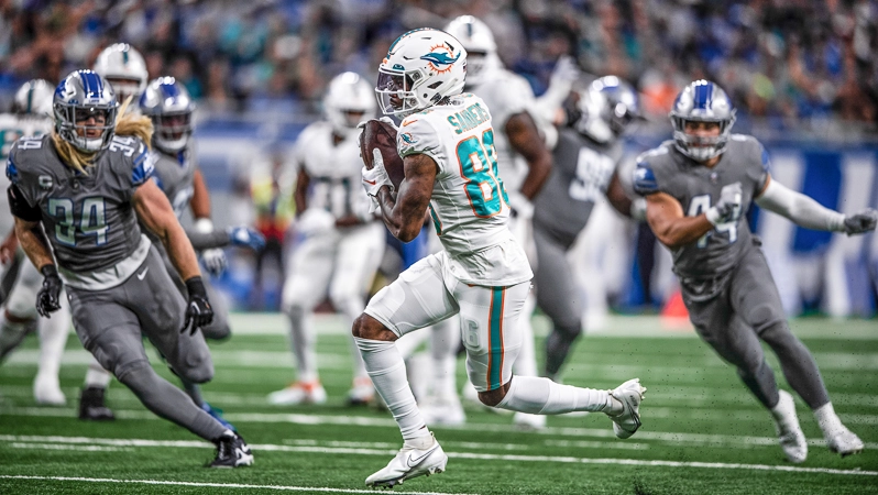
If the Lions mono-gray/silver isn’t the worst uni in pro football, it’s sure close to the bottom. Pair that against an entirely mono-white Dolphins and this was easily the worst matchup of the week.
WEEK 9:
BEST: Kansas City/Titans
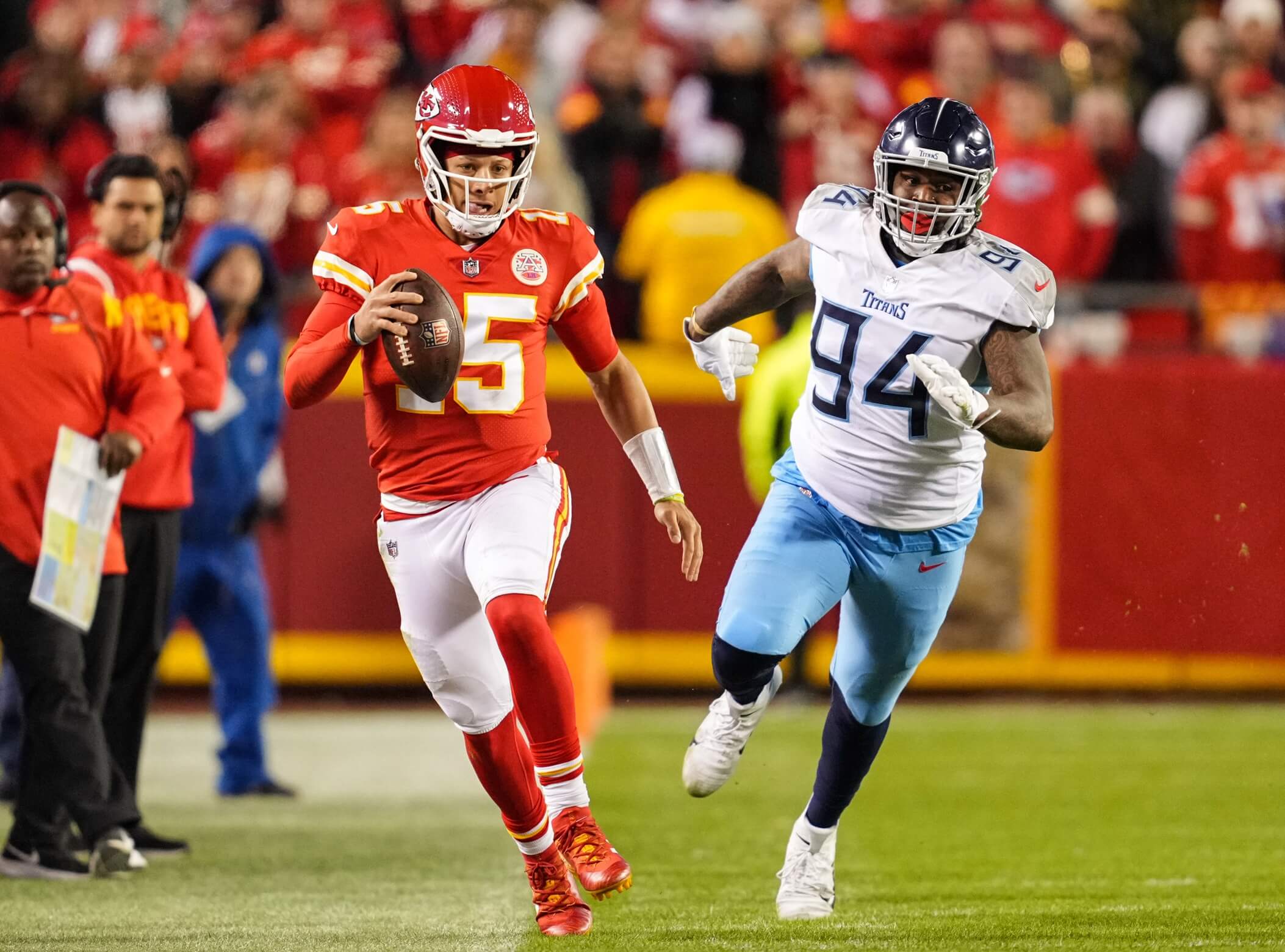
Wait…what? Yes, you know my feelings about KC’s unis, and by-and-large the Titans have one of the worst uniform sets (and combos) in the NFL. But their Week 9 pairing was probably the best these two teams will ever wear against each other. Just aesthetically pleasing.
WORST: Commanders/Vikings
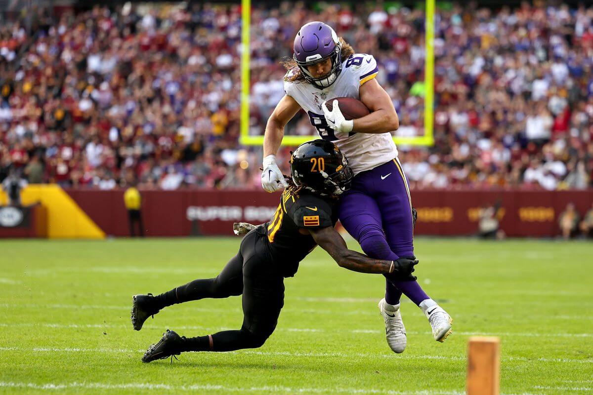
Yeah. No.
WEEK 10:
BEST: Cowboys/Packers
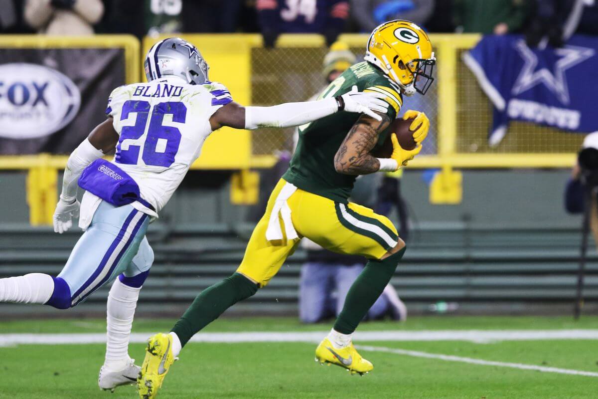
There were a bunch of decent looking matchups in Week 10, but none topped the old school classic look of ‘pokes vs. Cheeseheads. It honestly doesn’t get much better than this pairing.
WORST: Titans/Broncos
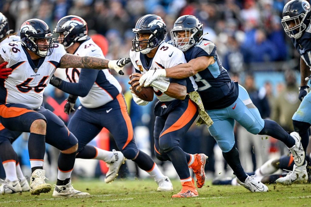
Sigh. Not only are these two uni templates awful by themselves, when seen together, there’s also waaaaay too much navy. Combine that with the fact that (for the the second time this past season) the Broncos mixed and matched their navy side-panel jerseys with their orange panel (stripe?) pants, and you get a terrible mix.
WEEK 11:
BEST: Saints/Rams
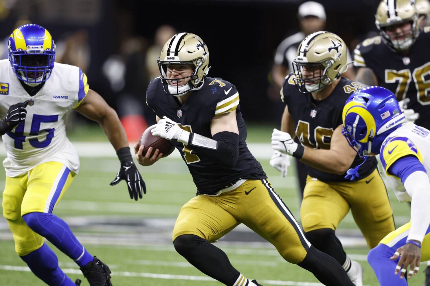
We can thank the Rams in Week 11 here for wearing their best look. Yes, the golds on the Saints unis don’t match the helmet, but can anyone look at this throwback and truthfully say, “this doesn’t look good”? No. Going forward, the Saints need to alter the gold helmet to be more of an old gold look (to match the unis) and make it permanent.
WORST: Falcons/Bears
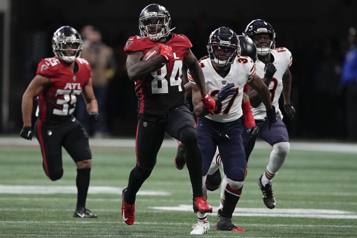
I can’t really fault da Bears here — although I wish they’d wear midnight/white/white occasionally — but the gradient of the Falcons combined with the large amount of midnight blue in the dank lighting in the ATL adds up to a muddled mess. No bueno.
WEEK 12:
BEST: Cardinals/Chargers
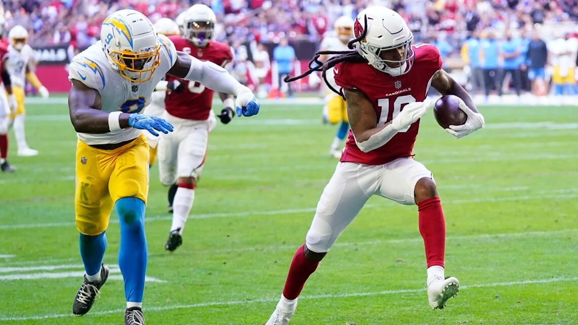
WHAT? For Week 12, a matchup between the Cards — who are the team in most need of a redesign in the NFL — and the Chargers are the best? OK, one could make an argument for a couple others, but this game in the late afternoon sun, with the Cards in their “best” (a relative term, sure) look and the Chargers (in their best road look) actually looked surprisingly good. Nothing this week really stood out (Steelers/Colts was nice), so looking at game photos, I found this one quite visually appealing.
WORST: Patriots/Vikings
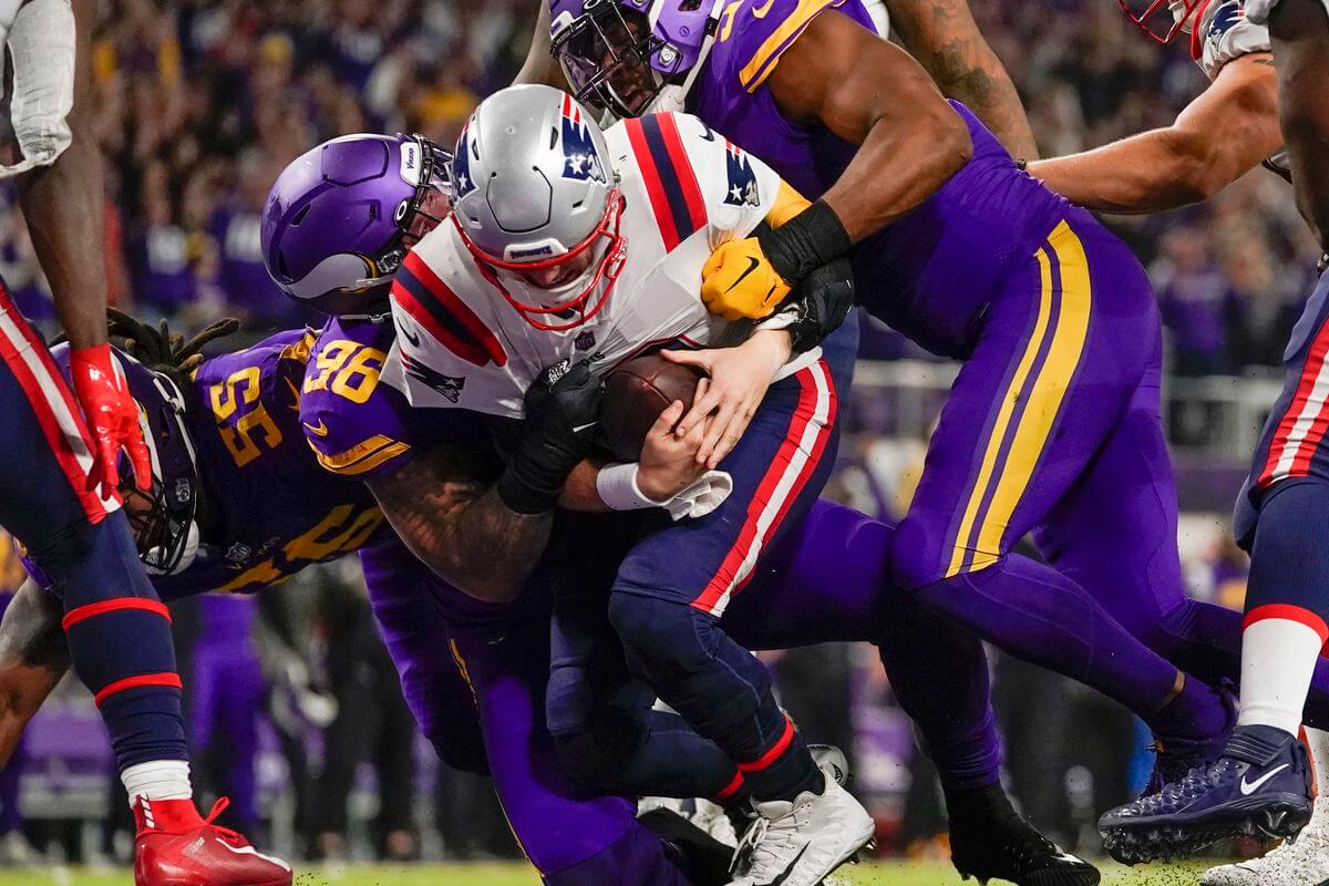
This game was brutal on its own, but the fact that neither the Patriots nor the Lions (playing Buffalo) wore throwbacks on Turkey Day was unforgiveable. Yes, the Vikings were home team, but they could have worn white jerseys against Pat Patriot. Instead, they chose to make Thanksgiving desert a fruit cake instead of a pumpkin pie. Feh.
WEEK 13:
BEST: Colts/Cowboys
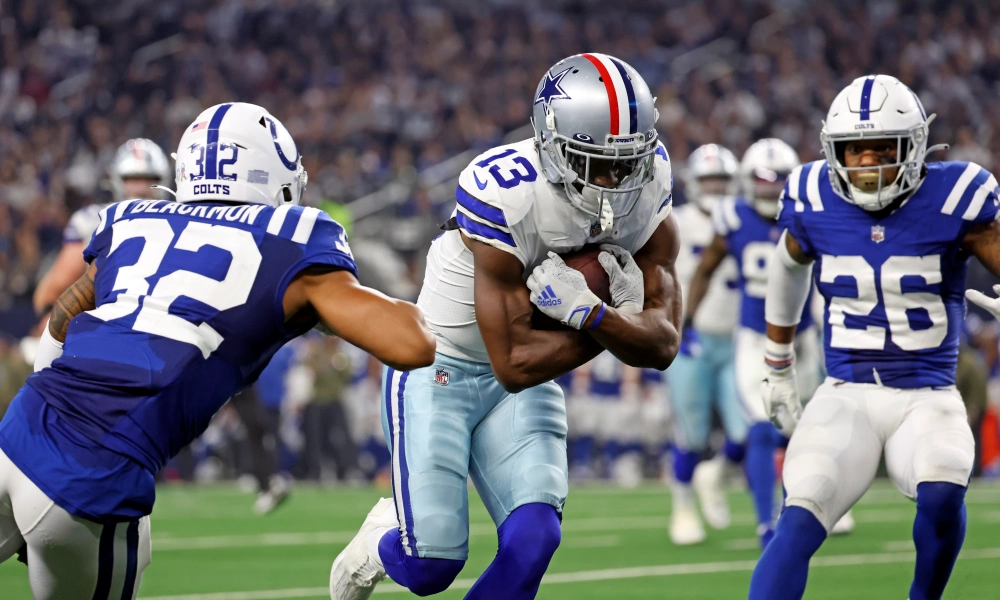
The Colts could probably make any “best” list at least half the time, but their Week 13 tilt against the Cowboys was superb. Bonus points to the ‘boys for wearing their 1976-throwback helmet striping!
WORST: KC/Bengals
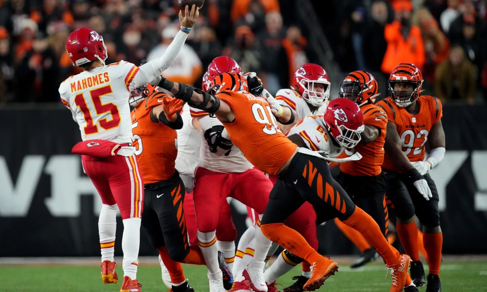
Individually, both of these unis aren’t bad (though I prefer KC in white over white), but together? WOOF! Orange and red do NOT a good mix make. They’re too close on the spectrum to work well together; instead, the visual is more that of an old analog TV set where you had to manually adjust the color contrast…and failing.
WEEK 14:
BEST: Rams/Raiders
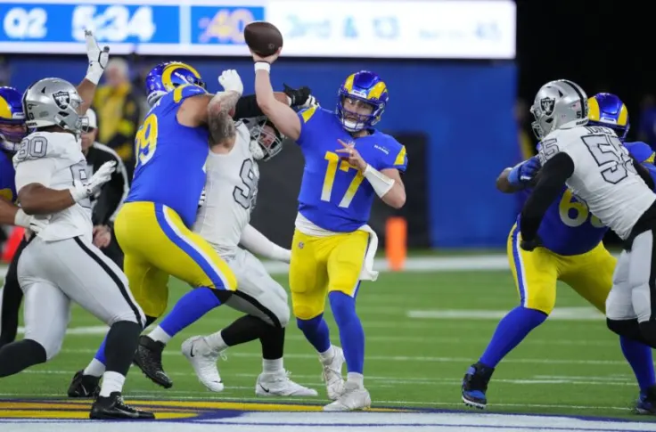
Like previous weeks, Week 14 didn’t feature a runaway best by any means, but da Raidahs in their throwbacks (and most players wore black socks) against the Rams in their second best look, and the combo of the two was really nice looking. You could make a case for other games here, but this was my top choice.
WORST: Titans/Jaguars
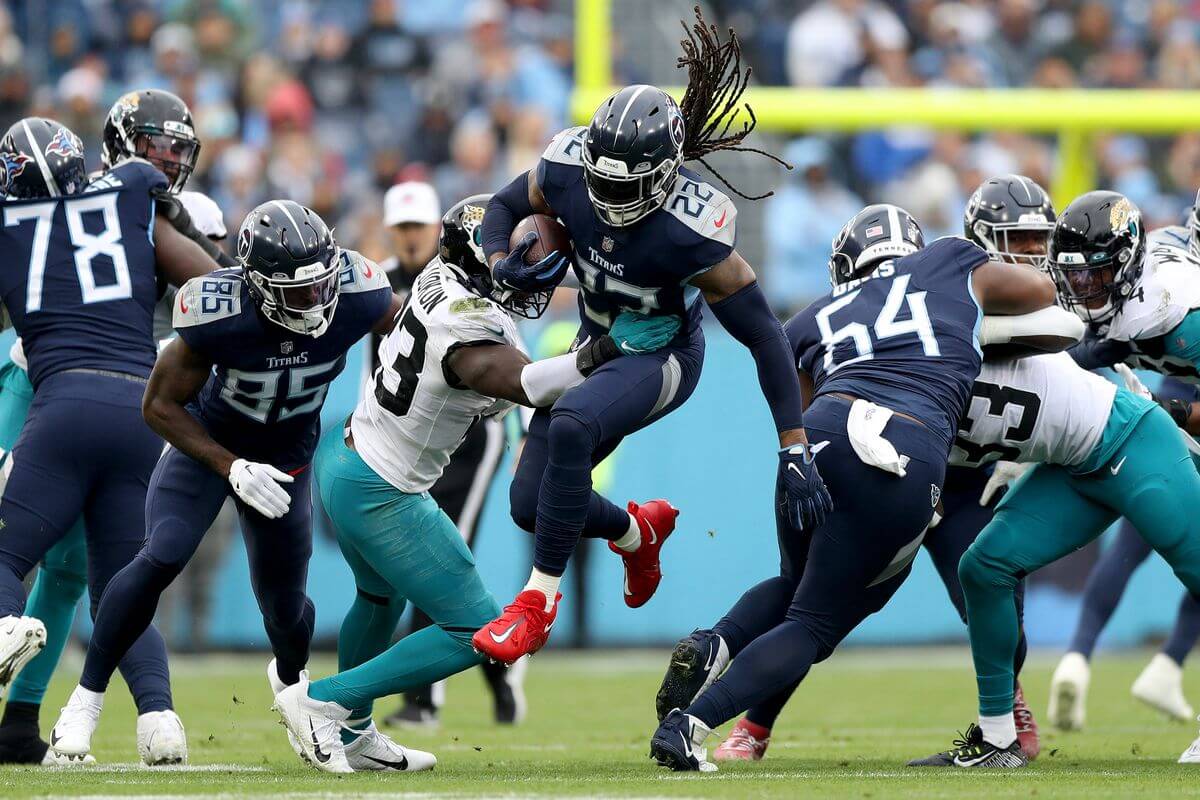
There is something about both teams wearing same color pants/socks, particularly if both are dark, that looks more high school or college than pros. Throw in the Titans in mono navy versus the Jags in teal leggings, and you don’t get a very good NFL product, uni-wise.
WEEK 15:
BEST: Bears/Eagles
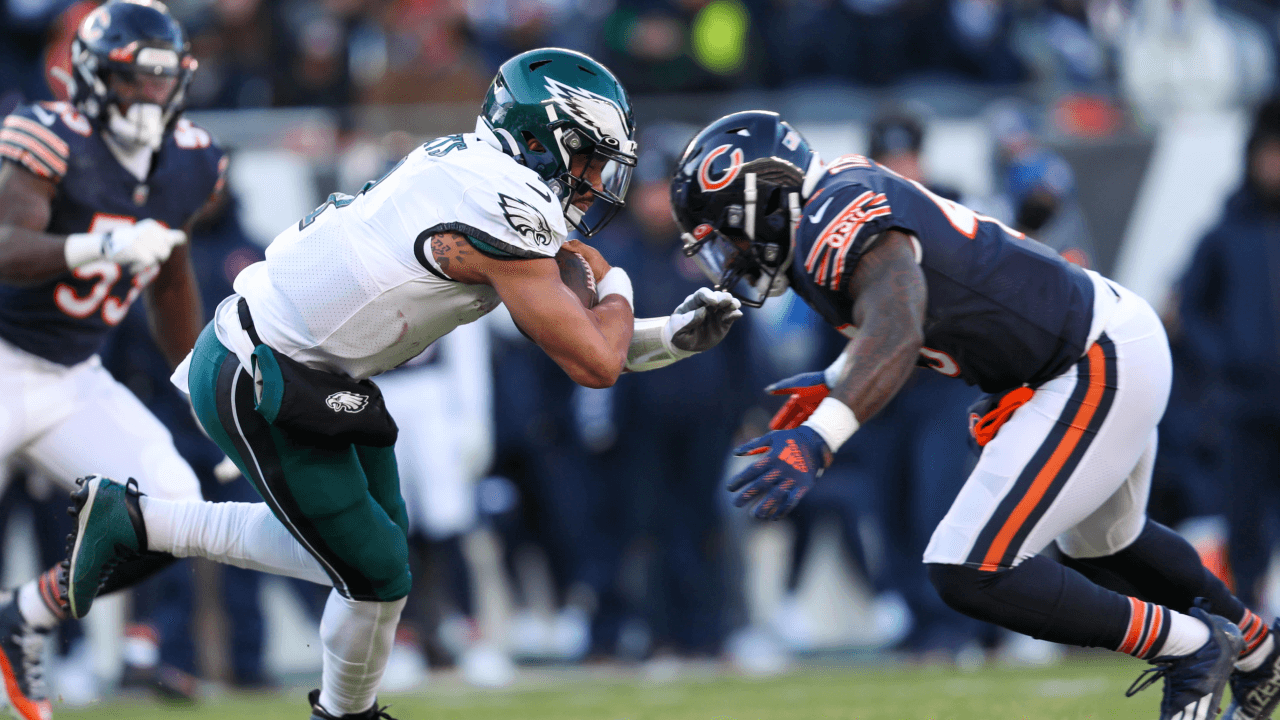
If you look at the Week 15 matchups, you’ll find a half-dozen choices for “worst,” but best? Honestly, I didn’t love any of the combos, but Philly/ChiTown stood tall. Tallest midget, maybe, but tallest nonetheless.
WORST: Bengals/Buccaneers
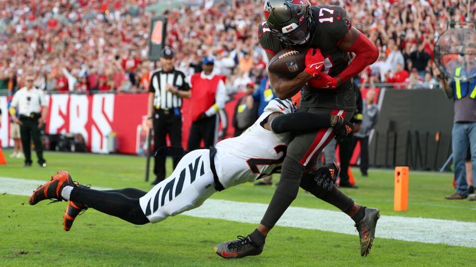
Lots of “bad” matchups to choose from here, but anytime the Bucs go mono-pewter, they take the clubhouse lead. It’s just so drab, so devoid of anything approaching a “cheery” color (but not in an intimidating kind of way). I don’t fault the Bengals here (indeed, anything they wore besides orange/white/white would probably have looked even worse). Let’s face it: what the Bucs wear below the neck isn’t what I’d call pewter (their helmet is close); it’s really brown with the life stripped out of it.
WEEK 16:
BEST: Steelers/Raiders
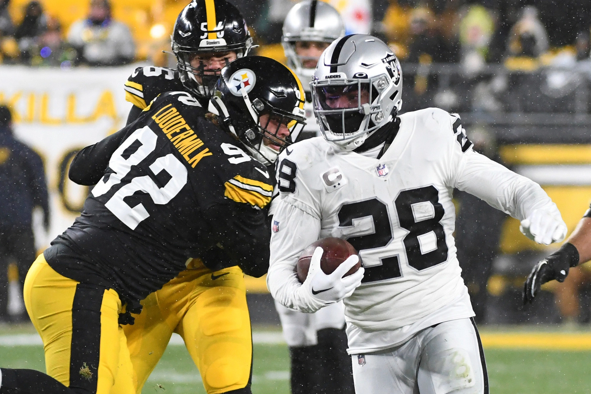
Oh baby. For Week 16, the Steelers and Raiders partied like it was 1972 — and indeed, the Steelers were honoring the “Immaculate Reception” with their throwbacks. Beautiful!
WORST: Jets/Jaguars
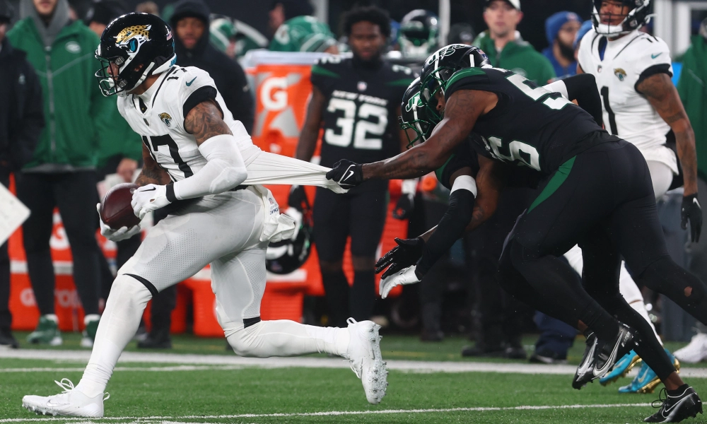
You probably think I’m picking on the Jags, but their decision to go black/white/white/white, with those white stripeless pants, against an entirely BFBS Jets, might have provided the greatest possible contrast, but that’s about all it did. Just…no.
WEEK 17:
BEST: Lions/Bears
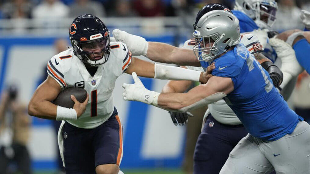
The Lions, for whatever reason, decided to wait until New Year’s Day to wear their Thanksgiving Day throwbacks. Better late than never, I guess. And da Bears were just…da Bears. The funny thing about Week 17 was there really weren’t that many bad looking games, and a bunch of good looking games. This was the best of the best.
WORST: Cowboys/Titans
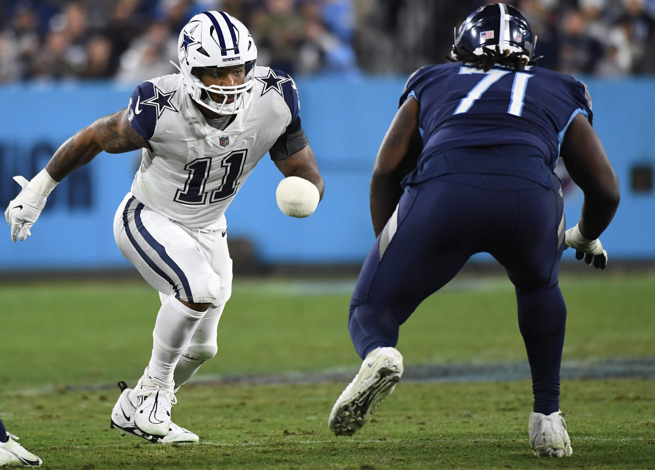
I hate to use the Titans mono-navy twice, but like I said above, there weren’t that many bad looking games, but Dallas — creating a special uniform with the cringeworthy nickname of “Arctic Cowboys” — was the worst of the not-so-bad. Love it or hate it, the ‘boys have a classic home uniform; they don’t need to be messing around with icy whites.
WEEK 18:
BEST: KC/Raiders
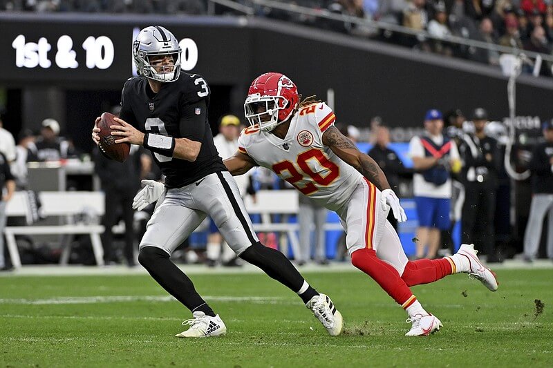
We’ll get to the “worst” matchup for Week 18 in a sec, but half a dozen games could go there. But the best? Simply the best KC/Raiders possible matchup ever! I know some of you love KC in red pants, but red/white/white is BY FAR the better look. This looked as good in the AFL days as it did earlier this month. Hot damn!
WORST: Titans/Jaguars
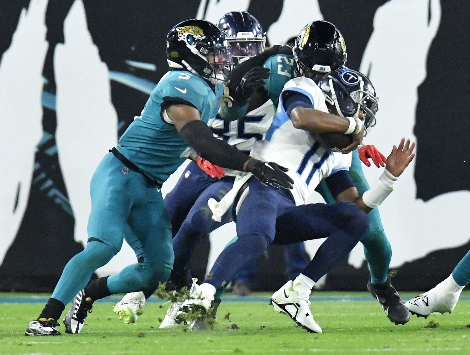
What is it about these two teams that makes them want to wear their worst looks against each other? The only thing worse than the Jags in teal tights is a teal body suit. FFS. But like I said, there were a number of candidates for worst matchup this week — feel free to pick another.
And there you have it. My picks for best/worst for the regular season. Feel free to tell me I’m wrong in the comments below.
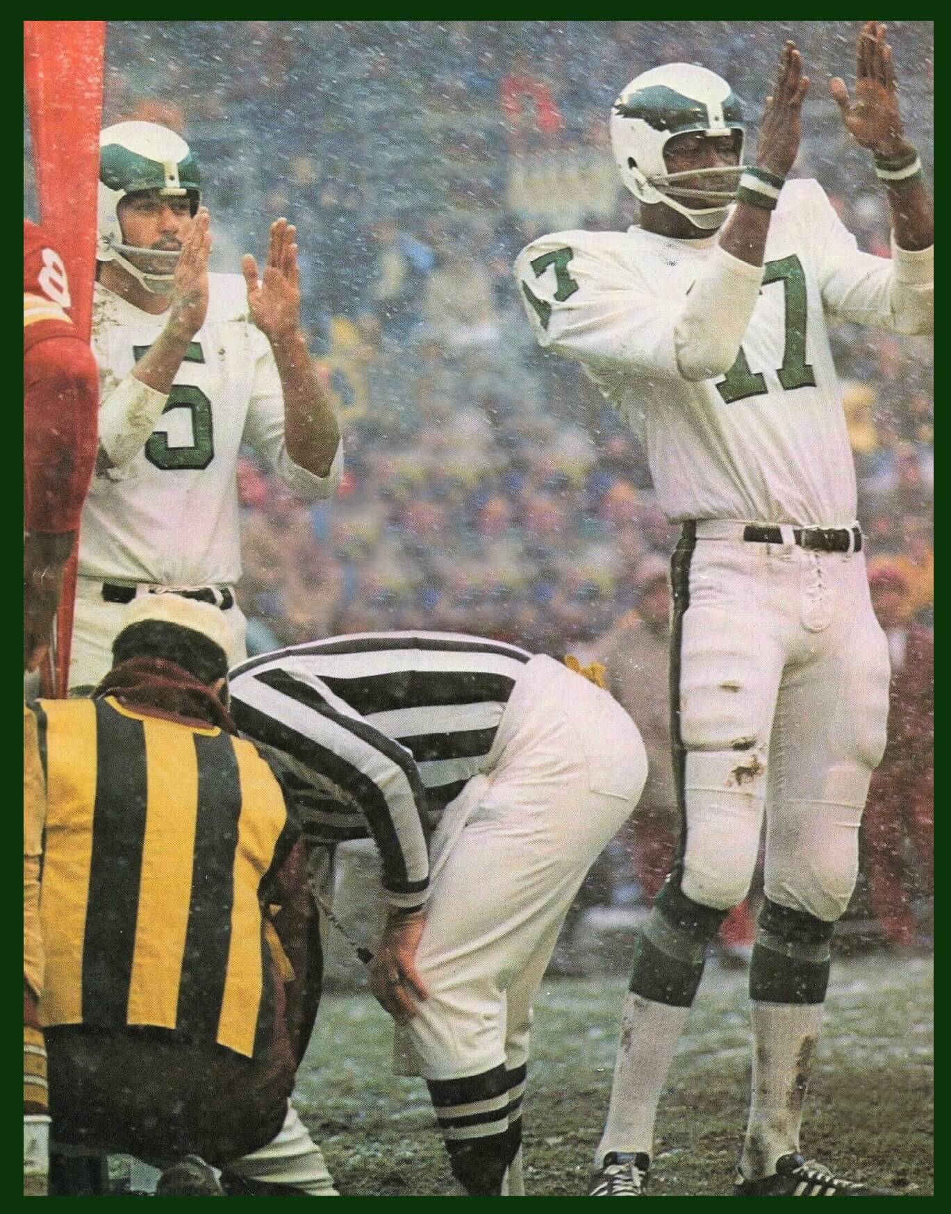
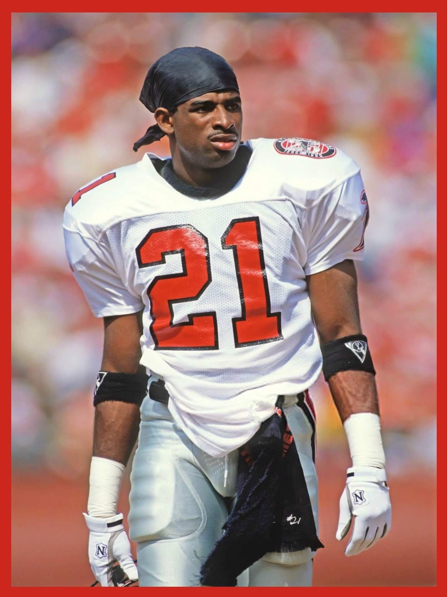
I will say Week 3 of 1990, Falcons at 49ers. The photo is definitely from the 1990 season due to Falcons 25th anniversary patch on the left shoulder.
Oh, and 9/23/90. 49ers won 19-13.
You didn’t have to even see the other team to guess it, you guys are too good. Anything different about the jersey?
Hi Jimmy; late to the party on this one but it was the last time the Falcons used red numbers with black outlines on their white jerseys until they did a slight uniform update in 1997.
They only wore the white jerseys with the red numbers 3 times in 1990 – a preseason game and then weeks 2 (indoors versus the Lions) and this week 3 game versus the 49ers. When they wore white jerseys the next time in week 7 they switched to the black numbers with red outlines.
Does anyone know why they started with the red numbers and then switched to the black numbers during the season?
You got it John! The Falcons only wore the red numbers twice that season, then switched to the black numbers for the rest of that season. Both sets of white jerseys were made for that 1990 season, you can see there is no shoulder numbers because that’s where the patch went, so it wasn’t like the red numbered jerseys were recycled from another season. Anyone know why the Falcons switched to black numbers that season?
Has anyone else come around on the Rams Unis? One caveat: they should always, always, always wear yellow pants. So long as they do, I actually kinda like their current look.
Wouldn’t say I’ve come around on them due to the gradient numbers, chest patch and what they could have been, but agree that if they always wear yellow pants, it’s not a bad uniform set. If the Rams were an expansion team and this was the set they designed for them I would have it rated much higher. However, we know how great they could have looked had they just gone with their throwbacks full time so that makes the uniform a lot worse IMO.
Agreed.
No, because one of the criteria for evaluating a uniform should be if it is an improvement on what previously existed. And this doesn’t. It takes their best look and adds a gradient font, an unnecessary bespoke font, unnecessary disruptions to the helmet logo, an unnecessary dishwater off-white jersey and eliminated the old royal/yellow sock stripes. If it ain’t broke, don’t fix it.
You and Patrick are 100% correct. The best option would have been the Jim Everett era uniforms. The Gradient numbers are a drag. The dishwater jersey is pretty bad. The redesigned horn is a downgrade. And again, their only option should be yellow pants. But assuming yellow pants, I think it’s a good look.
All of this.
May I amend your last sentence?
If it ain’t broke, just hire Nike.
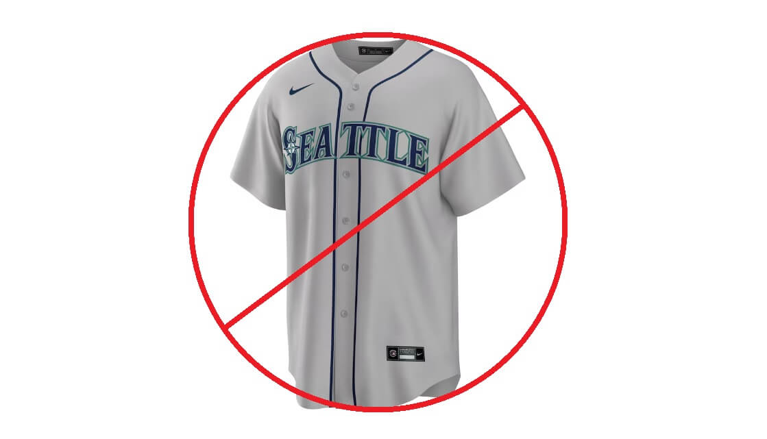
Regarding the Mariners, does eliminating the grey jersey mean eliminating the grey pants that go with or is it safe to assume they are just going solid color over grey pants on the road?
Pretty sure they will have gray pants for road games. They just won’t have the gray jersey to pair them with.
The Mariner’s grey pants are still going to be worn according to team. Recap of best/worst: Cleveland mono brown….candy corn on a dog dropping
Does this mean the MLB won’t be having specialty jerseys for holidays or Hallmark holidays?
(He asks hoping against hope that this will be true)
Everyone else seems to see “brown” in the Bucs’ pewter but I never have; to me it’s always been a dark silver/grey. Maybe it’s a link thing….
As for the Mariners, if MLB is going to limit every team to four jerseys then it should also require that one of them be grey. I have no problem with limiting the number of jerseys but every team should have a road grey; I’m even willing to concede the Mets’ stupid revived BFBS home alts in exchange for seeing their gorgeous greys in all 81 road games.
“I’m even willing to concede the Mets’ stupid revived BFBS home alts in exchange for seeing their gorgeous greys in all 81 road games.”
Great point, Jay. While it wasn’t mentioned as part of this new “4+1” rule, I seem to recall the Mets “had” to drop their blue road jersey (link) when they promoted the black jersey to full-time alt status. So their four jerseys are white pins, gray, black and blue. This was an apparent casualty of the 4+1 rule, even if not explicitly mentioned at the time.
I’m sure there are more than a few teams who will be affected by the “strict” enforcement of this rule.
More about pewter: link
Are the Cardinals the NFL team most in need of a redo on their look? Tennessee, Washington? Miami, Detroit and the Falcons absolutely botched their latest go-rounds. The Jets and Bengals have potentially nice looks but do they’re damnedest to pick the worst combinations of what they could wear. The late ’90s Broncos called to ask the team to move on. I never liked the evolution of the Seahawks look ever since they left silver, royal and kelly green a couple iterations back. By my estimation, the Cards barely make the Top 10.
Detroit seems to be slowly coming back to what they never should have gone away from in the first place (Barry Sanders-era look). And yes, the Falcons are much more of a mess than the Cardinals. But I think the Eagles’ look is far more cringe-inducingly ’90s and in need of a redesign (Hello, Randall Cunningham era?) than the Broncos’.
The midnight green was the new owner’s wife putting her stamp on the team. (They have since divorced.) and while kelly green > midnight green (which is now practically teal… thanks Nike), the Birds have worn it now since 1996 and won a Super Bowl in it. A majority of fans here want a return to kelly green but it is not the slam dunk choice that other teams are facing, thus the Eagles didn’t make the top 10 IMO.
I remember back when MLB teams finally gravitated back to grey roads as a whole and felt their were finally getting it right, now we’re sliding back the other way. Disappointing.
How does this rule affect a team like Philadelphia? Technically they have 5 looks (home pinstripe, road grey, cream, powder blue throwback, and red top), but I believe the red top is just their batting practice jersey, so does that count towards the total?
I’m pretty sure that a BP jersey still counts as a jersey, so it would seem one of the five (white, cream, gray, powder, red) is on the chopping block.
I really hope the Phillies do the smart thing and lose the BP jersey. Ideally, I would love to see the Phillies go with would be:
Home: Maroon pinstripes, cursive P
Away: Powder Blues
Sunday Special: Cream fauxback
Alt: Current pinstripe home uniform/Wiz Kids throwback
The red jersey is not their BP jersey. They have a very strict schedule for what they wear – 1948 fauxbacks for Sundays, powder blues on Thursdays, and I forget when the red tops (getaway road games?).
I can already tell I am I going to be angry when Nike unveils the Phils’ CC – not just because it is going to be awful but because it will come at the expense of a better look. They would probably get rid of the red tops because the powder blues are beloved and the cream fauxbacks pair with the blue caps.
The creams aren’t Sunday exclusive, they are for day home games (and occasionally nights when they have a doubleheader without a break between games).
I hated the return to gray in the ’90s, not least because (1) in the interval between the previous gray era, pants had gotten longer and socks became invisible, meaning that uniforms had even less color, and (2) polyester gray is a lot more boring-looking than the “character” that flannel gray does, being a mix of multiple colors of thread. The post-’90s gray was just dull. I don’t think it’s a coincidence that teams jumped to color as soon as polyester came in. The world in general was getting more colorful, sure, but gray polyester is a special kind of dull. I say go back to color on the road!
That Titans vs Broncos game was the *second* time that Denver wore white over blue. Their London game vs the Jags was first. So it was the second and last time (this season).
Ah. Yes, my bad. Will edit the text.
I am all for teams having less jerseys, but home whites and road greys should be mandatory. I hate that Nike seems to be controlling this. As Phil said, why is a contractor telling the business they work for what they can and cannot do? I am sure this all relates back to fan jersey sales and what they want to stock, etc… More tail wagging the dog.
I am also for less. Home (white), road (gray) alternate (team color), to be worn rarely. All the other nonsense can go in the garbage.
My hot take is every teams’ worst look is a colored jersey over grey pants.
Not a hot take, just reasonable.
That’s a good take…but 2 of my all-time favorite road looks are the 80’s Cubs(good) and Rangers(better):
link
link
I am all for teams wearing color tops over white trousers. Preferably pullovers over sansabelts, but not a requirement.
A’s and Giants were better still!
link
link
Absolutely loved the orange sanis on the Giants
I go the other way. I wish every team would wear white at home and and the team color on the road. Other than tradition, I don’t see any Redon to keep using grey jerseys. They make every game look drab and the same.
GTGFTU is mislabeled.
Oy. Sorry. Now fixed.
Does anyone know the last time that there was an actual throwback Game?…not just one team wearing an old design?
In my opinion it just ruins the entire reason for
throwbacks…i.e. horrible Jets uni vs. Classic Packer uni…
Any hope of this getting modified next season or is it too late?
There *may* have been a game or two where both teams have worn throwbacks — though not specifically designated as such — in the 2010s, but I believe the last time the league specifically designated throwback games was the 2009 AFL 60th anniversary season.
link
Week 1 worst Cardinals (white/red/red) and Chiefs (red/white/white). Not even the same shade of red. If you’re Arizona, that’s the game you wear all black.
Week 12 was so irrationality annoyed with the Saints for wearing gold pants on the road against the one other team that has gold pants! Really?! They rarely wear them and that’s the game the pack them along? White or black was the better choice there. I struggle to understand the thinking on how teams pick their combo some weeks.
Even if it’s one of their better combos, the Titans’ week 9 look really did nothing for me. I’d take Packers-Lions over that game as the best of week 9 (as much as I don’t care for some of the details of the Lions’ current unis, they wore their best home combo that’s not their throwback that week).
Gotta wonder what the 4+1 rule means for MLB’s stupid holiday pandering unis.
Regarding that Cavs/Browns concept, the only drawback is that you can’t really do on the court what Brownie’s doing; carrying the basketball (traveling), and I’m pretty sure the stiff-arm is a no-no.
*Week 1 Chiefs (red/white/red)
So then what happens when the Mariners visit a team who is wears navy blue at home? Will the home team be forced to wear their white so the M’s can keep wearing their blue tops or will they add the northwest green top as an option if said home team wants to wear their navy blue?
Team said Northwest Green will be worn when home team wears blue. If the home team is powder blue, they may stick to navy jerseys.
Fun Saturday post, thanks for the week by week rundown! While I like the Chargers’ unis shown in week 1, I don’t think they’re as great as most people. I’d like them more with white socks. And I think someone else pointed out on UW that there are three different color combos of the lightning bolt on that one uniform (blue/yellow on the helmet, white/yellow on the jersey, blue/white on the pants), which now I can’t help but notice when I see it.
The Cardinals unis are horrible but the black helmet with the red cardinal is an absolute showstopper. That needs to be their helmet and they should design a uniform that complements that. That helmet is the first thing I’ve ever seen associated with that franchise that actually looks good.
link
Like the Bengals before and Titans today,the problem with the Cards is from the neck down.
The Titans played their part in the worsts 5x…seems about right.
Sorry but the Commies should not be rated the best of anything uni-wise…so wk 2 really belongs to GB/CHI (despite the fact that the Bears would look sooo much better going white over white on the road). Heck I’d lobby for Cowboys/Bengals (the mono black bring their best look IMO) or Colts/Jags:
link
Of all the posters who’ve expressed opinions on the UW, I think your NFL “uni best looks” most closely align with mine! We have a few disagreements, but we’re both firmly in the camp that prefers both the Bears AND KC in white over white vs. white over colored pants.
Include me in that. Always preferred Chiefs and Bears wearing white jerseys and pants when the other team wears a colored jersey.
Hilarious that the Worst Week 1 matchup mentioned NOTHING about the Seahawks in their mono Neon Green uniform, that’s how much people hate the Broncos’ current look–which to me is just “meh” but not actually offensive, like the Jets in Black or the Lions in Chrome or the Jags in general. And the Titans were the Worst Week 3 in what is actually their least worst look, that’s how atrocious their whole set is. Can we please bring back the 70’s with the Pats and Hawks and Falcons and Jets and Cmdrs and Phins and Oilers (either city) and the Steelers’ number font and just be done with it?
“I also recall the Marlins going an entire season without wearing a gray jersey when they actually had it as an option”
While that was disappointing, ditching rather than freeing the orange caps was unforgivable!
The 2019 redesign was far worse than the original Miami set.
I’ve said it before and I’ll say it here: missed opportunity to have the Bears wear their 1936 throwbacks against Detroit’s throwbacks.
The bashing of the Bills mono blue set is getting old. There are many worse uniforms out there.
I wouldn’t want to see The Seahawks in neon green every week, but once or twice a season is just fine.
Regardless of how many worse unis are out there, the Bills’ monos are especially gross when considering that their blue jerseys, white pants pairing is one of the league’s best looks.
Not to be all “woke” here, but the term “midget” is considered a slur these days (think the n word). “Dwarf” is an accepted substitute, since it’s a medical description. Might want to revise for history.
Not sure if it was picked up here yet, but this week’s conference championships will be the first time since the 2008 season (2009 championship games) that none of the teams has a shade of blue as part of their colors.
And on technicality, it would be the first time EVER no team wears blue on their uniforms, because every other instance where it wasn’t in the teams colors, it included the Steelers, who of course have a blue hypocycloid in their helmet logo.
I know there is a lot of blue teams, but I was pretty shocked this is the case.
My takeaway, Phil likes the Raiders (uniforms).
I do. They’re not my favorite (I’d say Green Bay’s home unis are), but they seemed to luck out this season in playing a number of “good looking” games. And, with a few minor tweaks, their uniforms are essentially unchanged since the early 1960s. They’ve stood the test of time and look as good today as they did for almost the last 60 years!
Love those silver-on-white jersey numbers.
Fun post! Amazing how the combo of two teams can render bad uniforms in a better light and vice versa.
Phil, what do you think of ranking the worst NFL uniforms this year. There definitely is a thread in the comments naming folks’ respective worsts.
“what do you think of ranking the worst NFL uniforms this year”
I usually deferred on uni ranking to Paul, but it’s a thought. I don’t think I’d rank teams (as Paul is wont to do), though ranking some of the worst of the worst might be fun. I’ll consider it!
Hope the Braves done lose their Hank Aaron throwbacks.
Figure they will go Home Whites, Road Grays, Road Navy, Home Reds
Seems silly to limit a teams jersey but have 20 different hats
I love your page bro, however i think you need to let me in as a second opinion. I see that you like the classic looks, i like a lot of the modern looks. I am opposite of you on most of these best and worst matchups. IE: the Jets all black vs the Jags all white has got to be one of the best matchups of the years. Those too combos are fire!
For Those Who Don’t Get it? ; )
Agree totally with the uniform picks, am in total horror over a supplier dictating the number of uniforms for a league (while flooding another league with horrible uniforms) and only have one objection against Brownie on a Cavs uniform: in this pose he is about to commit a travelling violation. Dribble, Brownie!
I don’t want the nfl to go full college, but I like the idea of alternate helmets. As long as they keep the logos the same, I think they could be used to make the game easier to watch. Whenever the cowboys play the lions, for instance, it looks like an inter squad scrimmage. Just use them to avoid teams with the same helmet color from matching up, and I think it’s a good thing.