For the win!!! On to the next! pic.twitter.com/rd2oJ24fpi
— Robbie Gould (@RobbieGould09) January 23, 2022
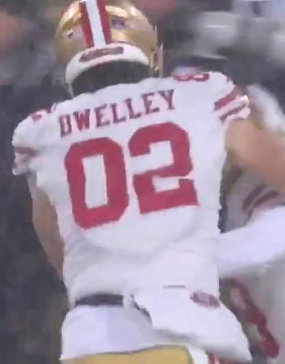
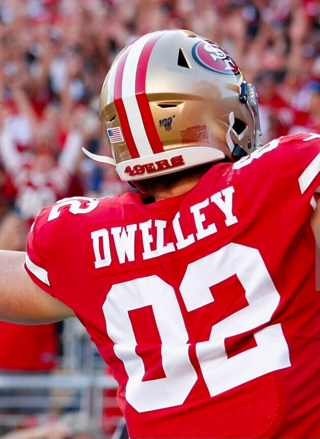
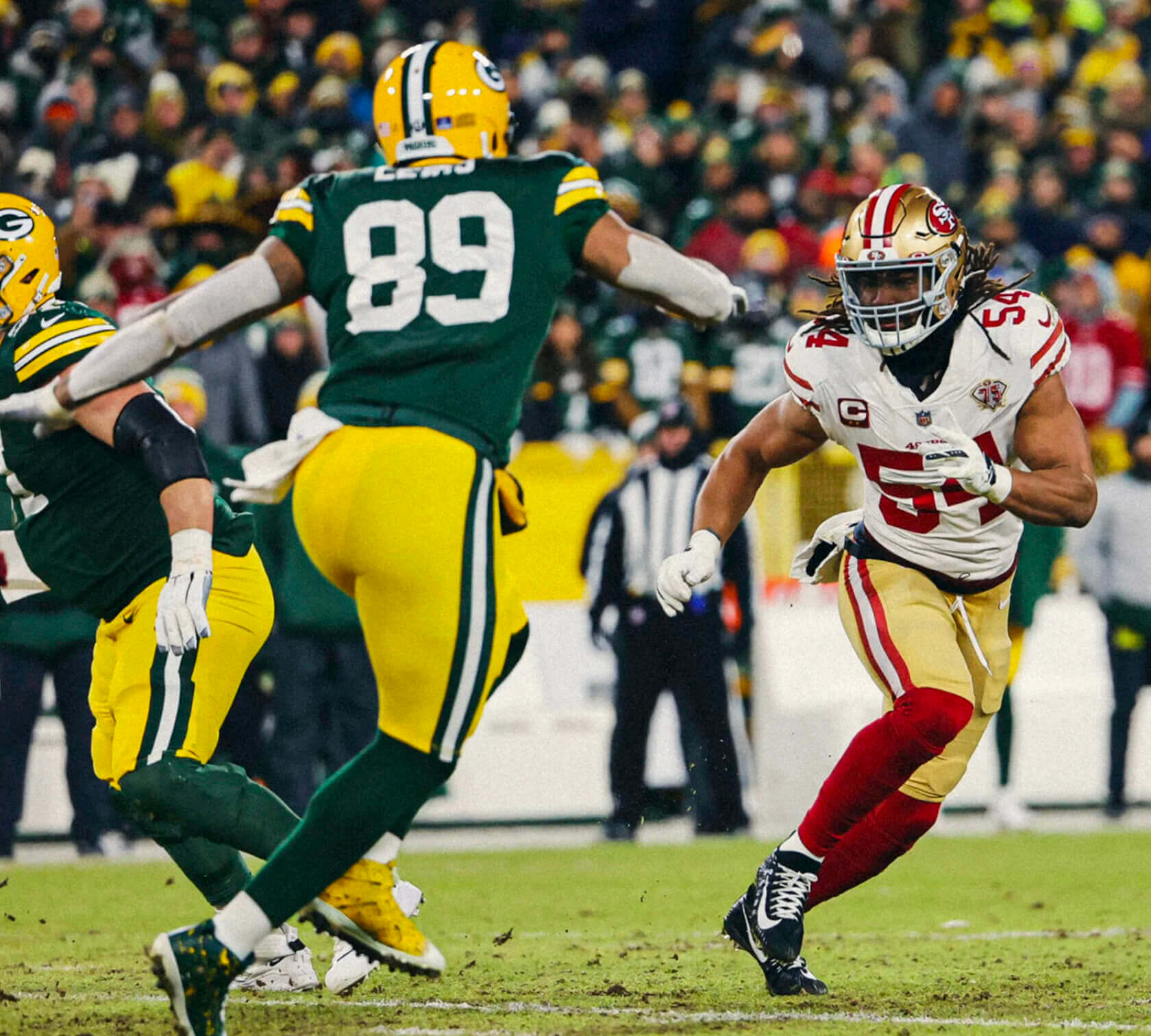
If you watch this video of the final play of Saturday’s 49ers/Packers playoff game, in which Niners kicker Robbie Gould kicked a game-winning field goal to send the team to the NFC Championship Game, you’ll see something very strange: 49ers tight end Ross Dwelley, who’s celebrating the win along with his teammates, appears to have No. 02, instead of his usual No. 82, on the back of his jersey. Here’s a screen shot from the video:
This wasn’t the first time that Dwelley’s unusual-seeming number appeared onscreen during the game, but it’s the one that most people noticed. I received approximately eleventeen bizillion inquiries about it on Saturday night and Sunday, some of them postulating various grassy knoll theories. Let’s handle this one in FAQ mode:
Is 02 even a legal number in the NFL?
No.
But the 49ers assigned him that number anyway? Won’t they be fined?
They did not assign him that number. His roster number is 82. If you look again at that screen shot, you can clearly the 8 on his right-shoulder TV number.
Oh, so the horizontal line at the center of the 8 must have fallen off or gotten torn or something.
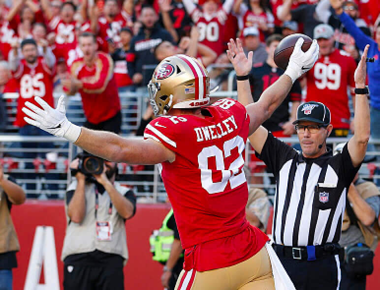
Nope. The 8 has two little crimps on the sides as you can see from this photo from an earlier game (for this and most of the rest of the photos in this section, you can click to enlarge):
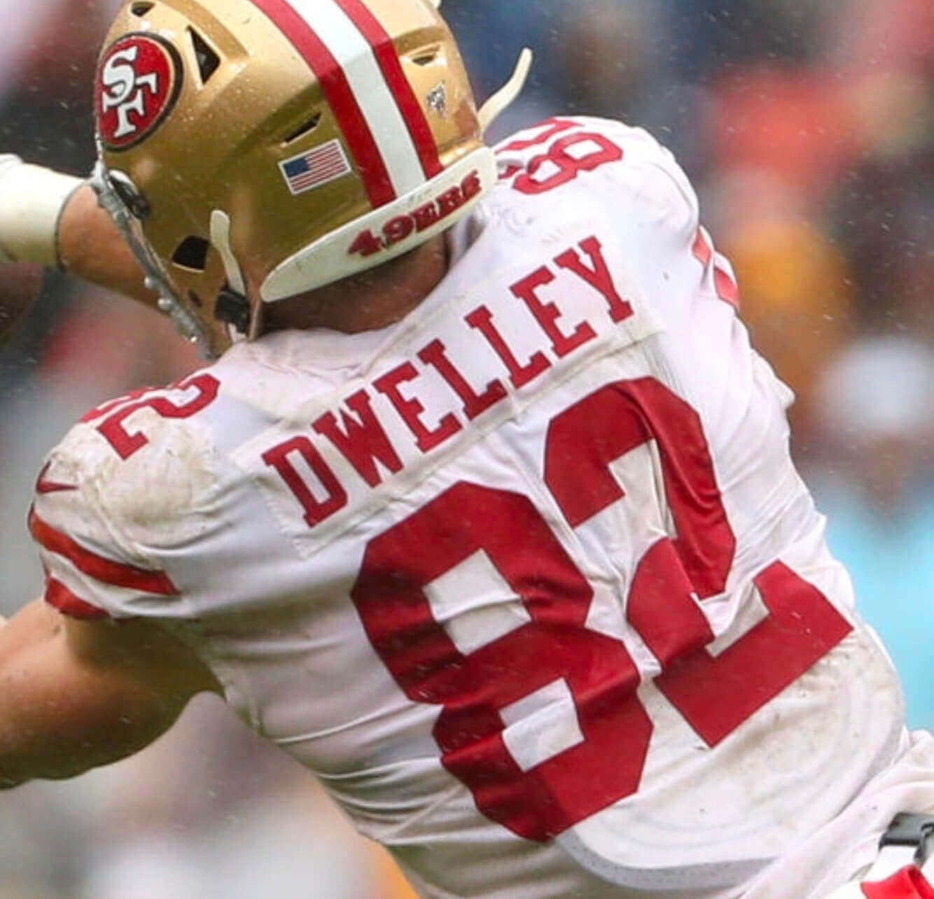
So even if the horizontal stroke somehow fell off, the crimps would still be there. But they’re not. So that’s not what happened.
That leaves only one explanation: His jersey was misprinted with a zero instead of an 8. Someone at Nike is gonna lose their job over this!
No, that’s not what happened either.
So what’s your explanation, smart guy?
The fabric of his jersey was folded in, which swallowed part of the 8 (and also part of the 2).
I keep staring at that screen shot, but I don’t see any fold. It just looks like a zero.
True enough — for that particular screen shot. But let’s look at a few others, taken from the same video:
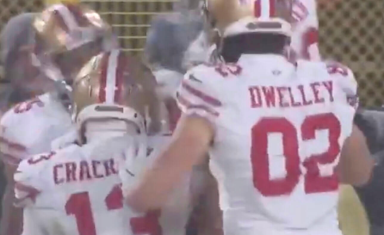
In those shots, it’s evident that something funky is going on with Dwelley’s jersey — you can definitely see a fold there.
Yeah, but how could the fold make the entire center of the 8 disappear and make it look like a zero? It would have to be the most perfect fold ever!
I agree that it seems pretty miraculous. But this has actually happened to Dwelley before. On Nov. 17, 2019, he had a very similar jersey fold, with similar visual effect, during a game against the Cardinals. You can see the fold much more clearly in these photos:
Okay, that was definitely a jersey fold. But the one on Saturday night was different — it stayed that way all game long and didn’t change when he ran or moved. It must have been a misprint!
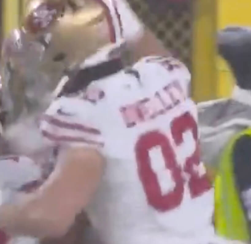
Let’s compare one of those 2019 photos with another screen shot from Saturday night:
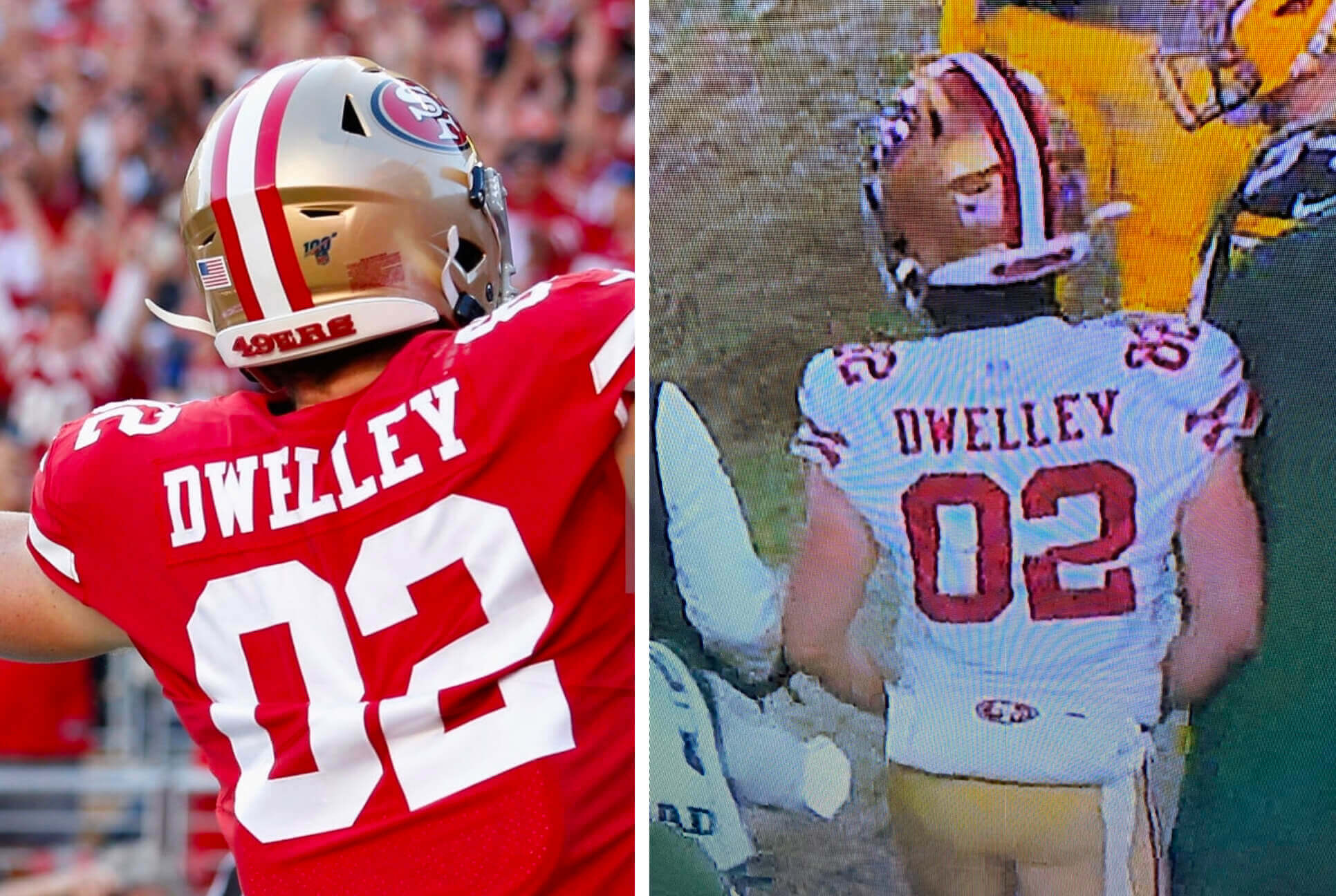
When you look at them side by side, the similarities in the folds become pretty obvious. Even the 2s got distorted in nearly identical ways. You can also see that in both cases, the fold runs along Dwelley’s back plate. The jersey may even be adhered to his pads with double-sided tape (as is pretty standard these days).
Conclusion: Ross Dwelley had a highly unusual but not unprecedented jersey fold on Saturday night. He is apparently the king of this particular uni phenomenon!
You’re no fun! Why do you have to ruin everything?
Believe me, I wish he’d been wearing No. 02 — it would be an amazing story! Unfortunately, though, that’s not what happened.
In other news from Saturday’s and Sunday’s NFL playoff games:
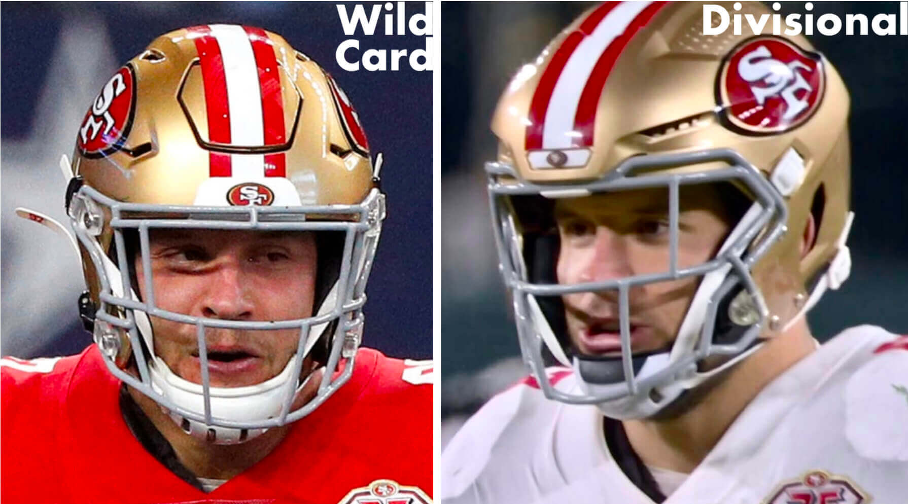
• 49ers defensive lineman Nick Bosa, who sustained a concussion during the Wild Card game against the Cowboys, returned to action this week with a new helmet — the Vicis Zero2 Trench. Here’s a comparison:
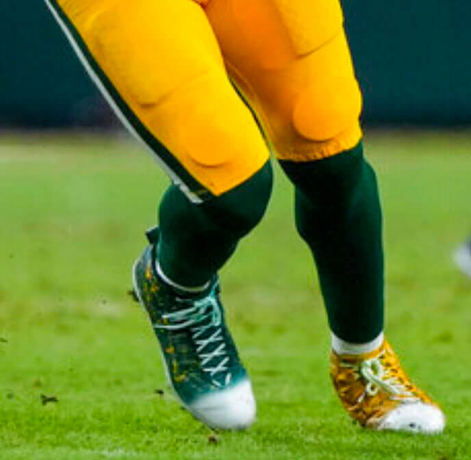
• Packers tight end Marcedes Lewis wore one green shoe and one yellow shoe:
• Bengals quarterback Joe Burrow wore a purple “LSU Football” wristband:
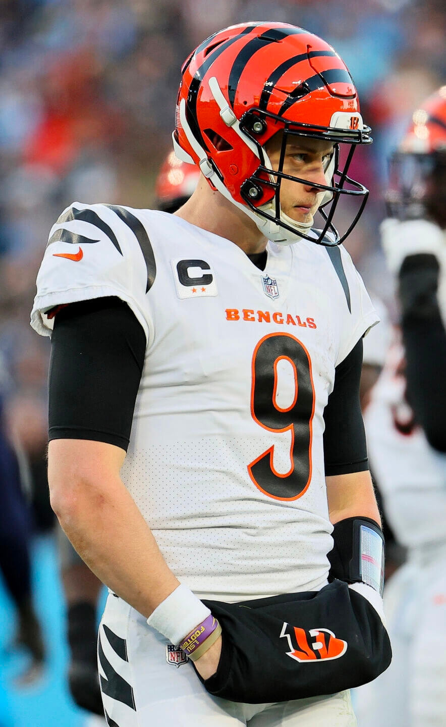
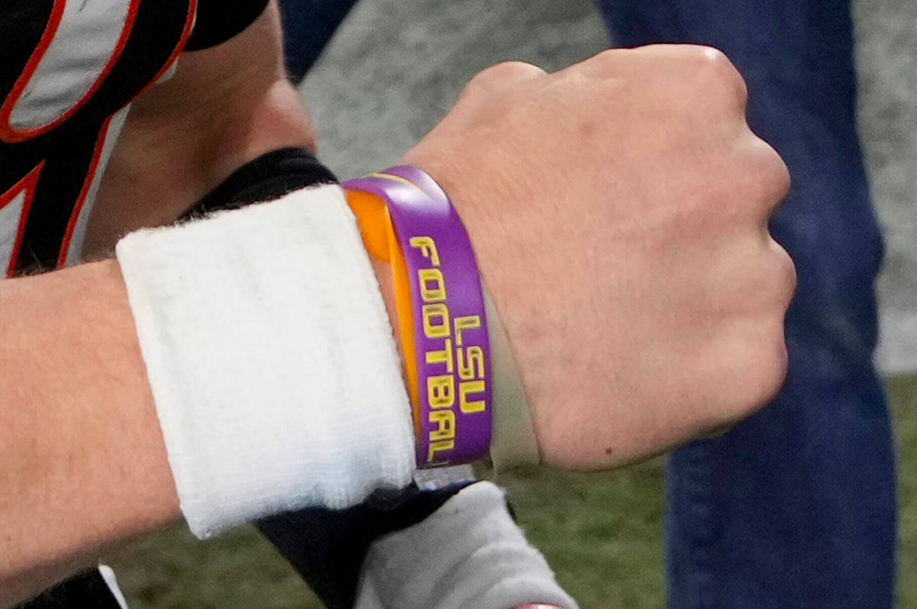
It turns out that this is not a new thing for him, but I hadn’t been aware of it until now.
• The Bucs once again wore white at home.
———
Now that we’re down to four teams, let’s look at the potential Super Bowl uni matchups:
• Bengals vs. 49ers: The AFC is the home team this year, so the Bengals would presumably wear black, creating an approximate visual reprise of Super Bowl XVI. If Cincy opted to wear white for some reason, we’d see a modern update of Super Bowl XXIII. Either way, it would be fun 1980s nostalgia but not such a great visual pairing because the Bengals still look pretty bad.
• Bengals vs. Rams: Ugh — Cincy vs. dishwater. Probably best to find something else to do on Super Bowl Sunday, because this would be a visual train wreck, and one of the worst-looking Supes ever.
• KC vs. 49ers: We just saw this matchup two Supes ago. Sadly, it’s probably the best remaining option from a visual standpoint.
• KC vs. Rams: An ugly team vs. a Native American-themed team — not ideal.
Personally, I was hoping for Bills vs. Niners, or even Bills vs. Packers, either of which would’ve qualified as eye candy. Dang.
(My thanks to all contributors, including Brandon Smith, John Turney, and the Tugboat Captain.)
Click to enlarge
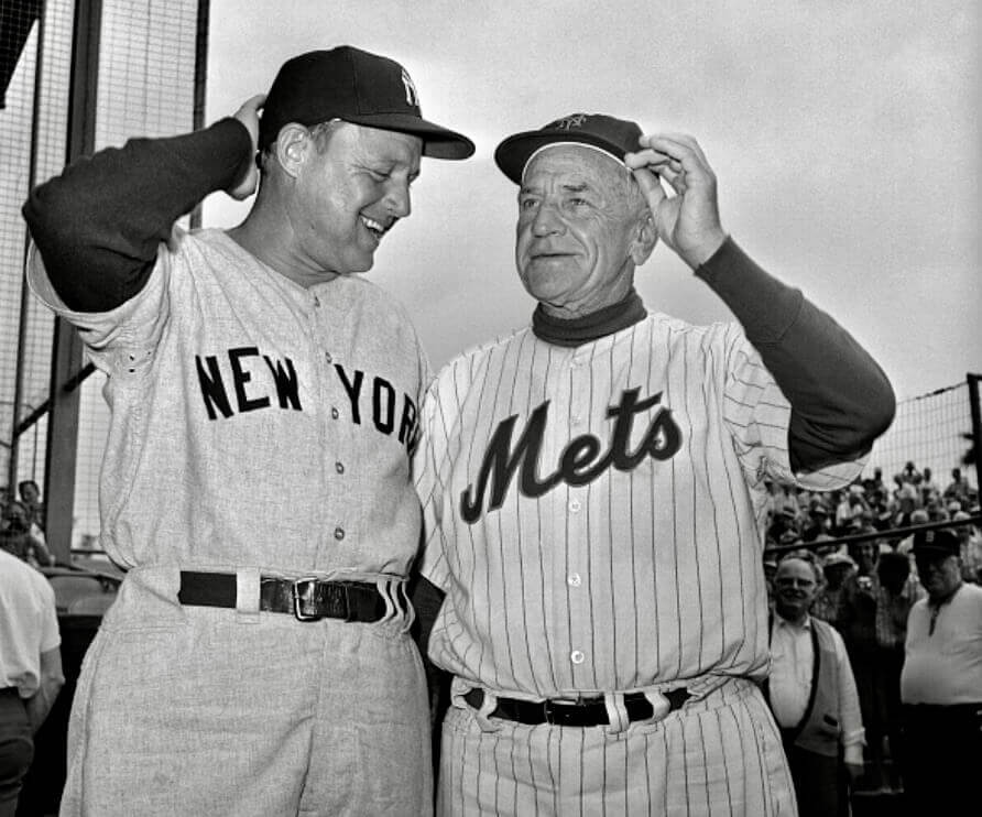
Pocketed proceedings: This 1962 spring training photo of Yanks manager Ralph Houk and Mets skipper Casey Stengel is uni-notable for two reasons. For starters, it’s our first look at Houk wearing the front pants pocket, so we can add him to our roster of pocketed MLBers. And second, I believe this is our first photo showing two opposing skippers who are both wearing the pocket — a special meeting of the managerial minds!
(My thanks to Matthew Houk — no relation to Ralph — for this one.)
Click to enlarge
Pin reminder: In case you missed it last week, all of our remaining Uni Watch pin inventory is now available at a discounted price, with bigger discounts for multi-pin bundles. Full details here.
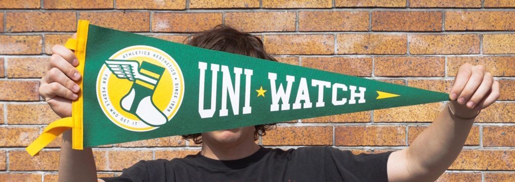

ITEM! Pennant raffle: We produced these awesome pennants in conjunction with the great folks at Oxford Pennant in 2019. There are exactly five of these beauties left, and we’re going to raffle them off this week. Once they’re gone, they’re gone for good!
This will be a two-day raffle. USA mailing addresses only. To enter, send an email with your mailing address to the raffle in-box by 8pm Eastern tomorrow, Jan. 24. One entry per person. I’ll announce the five winners on Wednesday. Big, big props to Oxford Pennant for collaborating with Uni Watch on this product and for shipping out the five pennant prizes!
Click to enlarge
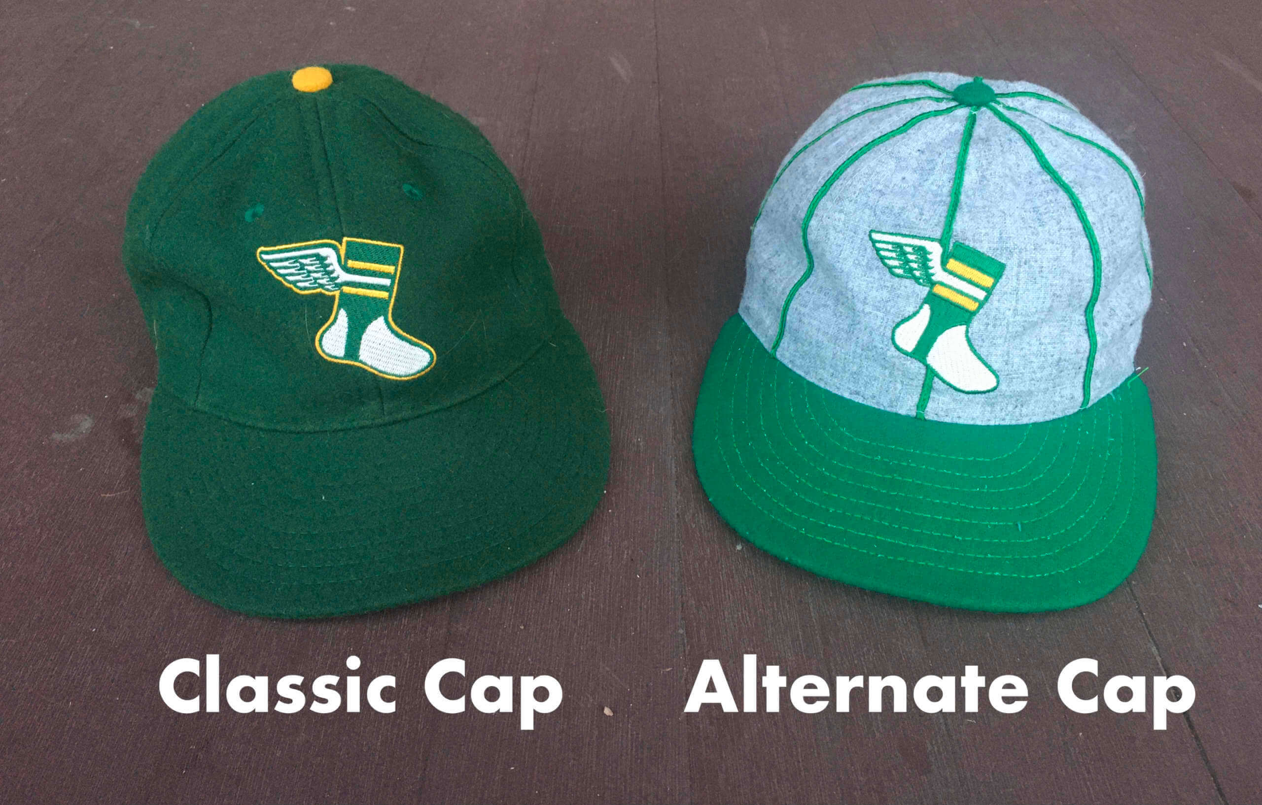
ITEM! Your input needed: Our Uni Watch Classic Cap and Alternate Cap are both now sold out, and I’m considering whether to put them back into production. Ebbets Field Flannels no longer has access to the darker green fabric that was used to make the Classic Cap, so here are my options:
• I could just order more of the Alternate Cap.
• I could do the Classic Cap in the lighter green fabric. Here’s a Photoshop that gives you an idea of how that would look (click to enlarge):
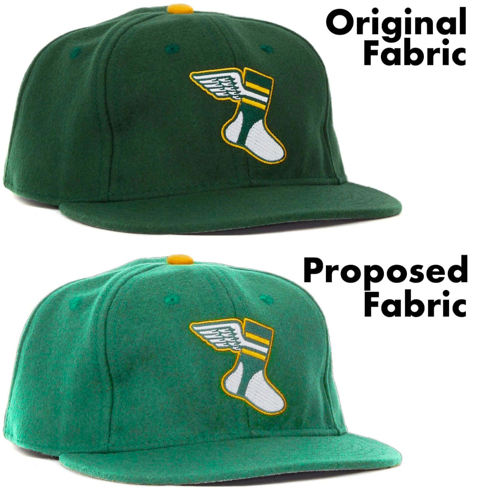
• Or I could do both.
The route I take here will largely depend on you folks, because the caps require large advance orders that will put me close to a thousand bucks in the hole, so I’ll only go ahead with them if I’m sure there’s enough demand. If you’re interested in either cap, please email me and let me know (a) which cap(s) you’re interested in, and (b) your preferred fitted size, or adjustable/strapback.
This is not a formal pre-order commitment — that will come later. For now, I’m just trying to gauge the rough level of demand. Thanks!
(Special thanks to Scott M.X. Turner for the Photoshoppery.)
Click to enlarge
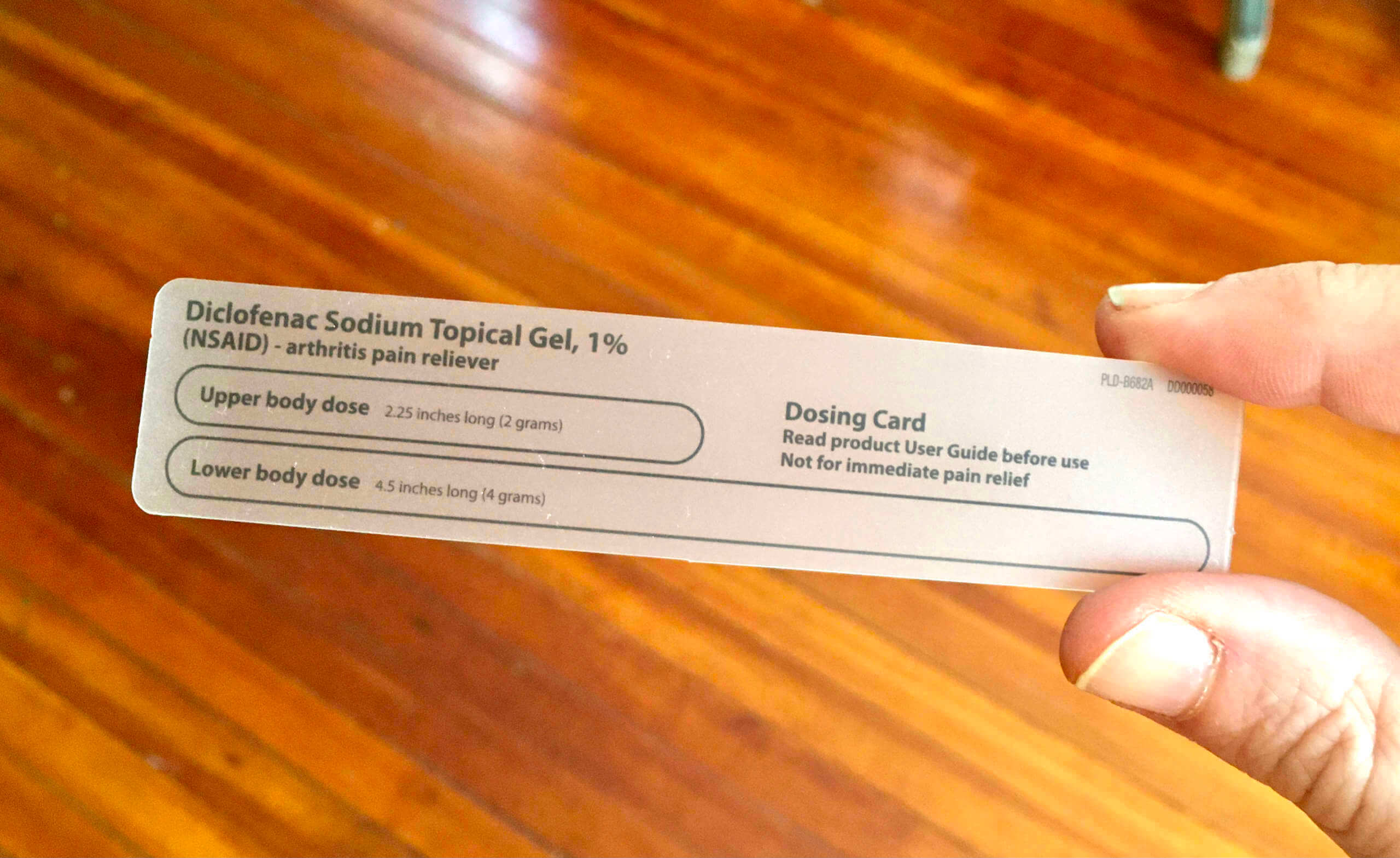
Very satisfying: The Tugboat Captain recently sprained her wrist, so her doctor recommended a pain-relieving cream that’s usually used for arthritis. The cream came with this “dosing card” — basically a little gauge to measure the proper amount of the cream to squeeze out of the tube.
When she saw that, she said, “Oh, Paul’s gonna love this!” She was right. It seems to fit into the world of uniforms, catalogs, and so on, wouldn’t you agree?
Click to enlarge
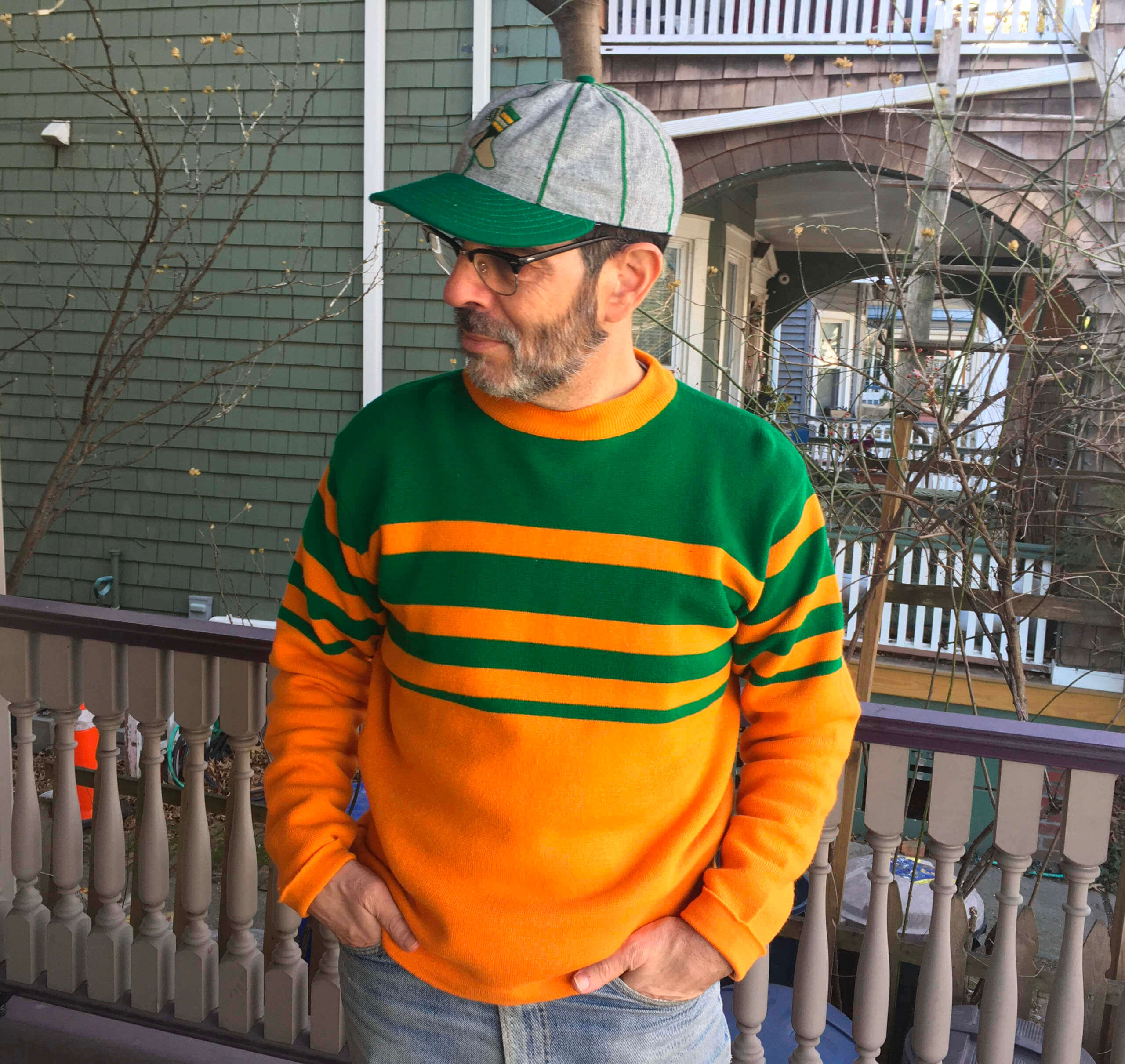
Latest vintage score: I found this vintage sweater on eBay. It’s not exactly a uniform, but the design definitely feels uni-inspired, at least to me. After I tweeted a photo of it, Jordan Owen pointed out that it’s similar to an old America’s Cup jersey, so there you go.
The Ticker
By Jamie Rathjen

Baseball and Softball News: The Guardians posted several cap-related teasers on social media yesterday implying something will be happening today (from multiple readers). … West Texas A&M softball revealed championship rings for their 2021 Division II championship (from Kary Klismet).

Football News: A Canadian sports website ranked the nine CFL stadiums (from Wade Heidt).

Hockey News: Sabres players arrived to Saturday’s game wearing jerseys of local youth teams (from Stephen Langdon). … The Devils wore pride warm-up jerseys on Saturday (from Wade Heidt). … The PHF’s Buffalo Beauts also wore pride jerseys on Saturday, and the Connecticut Whale were supposed to do likewise before their game was postponed. … Huntington Crescent Club on Long Island, a golf club that was a favorite of former Islanders captain Clark Gillies, is flying an Islanders flag and a No. 9 flag in Gilles’s memory (from John Muir).

Basketball News: Some really interesting NBA history lessons and uni photos in this WaPo column about the league’s 75th anniversary (from Tom Turner). … The jerseys for the new Athletes Unlimited basketball league were revealed on Friday. Unlike other AU sports, the four colors are also all different designs (also from Antonio Losada). … Saturday’s Iowa/Penn State men’s game was color vs. color. A live hawk mascot also appeared, thanks to Iowa’s Raptor Ambassador Program (from Kary Klismet). … “Ran across this jersey in an antique store in Jacksonville, Fla., today,” says Raymond Neal. “The seller thinks it’s from the ’20s but I’m not so sure. That looks more like a ’50s tag to my uneducated eye.” … Utah men’s retired Wat Misaka’s No. 20 on Saturday night. Misaka, who was Japanese-American, was the first non-White player in the NBA (from Trent Lowe). … Texas’s arena has some major orange-inconsistency issues (from @sultan_of_snark).

Soccer News: Germany’s Bundesliga and 2. Bundesliga annually commemorate the Jan. 27 anniversary of the liberation of Auschwitz in 1945, collectively given the slogan “Nie wieder” (“never again”), though not all of it is uni-related. Greuther Fürth wore a message saying “Vielfalt gewinnt” (“diversity wins”) and Freiburg wore warm-up shirts for the occasion. … Inter Milan wore Chinese-script NOBs in their Serie A game on Saturday, one of several clubs that usually does so around Lunar New Year (also from Kary Klismet). … Another from Kary: Mexico’s Monterrey have a new shirt for the upcoming Club World Cup. … The new USL W League team run by USL League One’s South Georgia Tormenta said they’ll keep the Tormenta name after considering a different one. They’ll be distinguished by adding which league each plays in. … New Bob Marley-themed away shirt for Irish side Bohemians (from Ed Zelaski).

Grab Bag: Besides the AFL Women’s pride designs that we’ve covered, teams still wore rainbow-trimmed socks, which is what many of them did before introducing their own designs. Melbourne, but nobody else, also wore rainbow numbers. … “Cool find by the excellent College Sports Logos Twitter page, which uncovered basketball- and football-specific versions of Wichita State’s WuShock mascot from the mid-1960s,” says Kary Klismet.
This 8 to 0 visualization issue, I don’t remember this being a thing in the pre-Nike days. Am I just showing my anti-Nike bias or is something else at foot here? Maybe the super tight jerseys of today?
It’s not as though it started happening right away in 2012 (when Nike took over the league’s uniforms), nor is it running rampant thru the league. It’s happened twice, several years apart, to the same player. I’d say it’s a Dwelley thing, not a Nike thing.
I’ve noticed this with countless players on the Colts for the last few seasons. Like, practically every player.
Photos?
It frequently happens to Wisconsin football, as well, since they adopted the current numeral font an Under Armour-manufactured jerseys.
link
link
Even in the RBK era, there were times with the Eagles that you couldn’t tell the difference between 0, 8, 6, and 9 because the middle sections of the 8, 6, and 9 seemed to be at the exact spot that the pads would cause them to fold. The announcers would repeatedly get players wrong if they weren’t obviously recognizable by means other than their numbers.
I typically agree with you in regards to the dishwater look the Rams sport, but, if they make it to the big game and they wear what they wore yesterday, it won’t be so hard on the eyes. Being a Rams fan I was bummed when they released these current unis instead of making the “throwbacks” their primary unis.
But they won’t be wearing what they wore yesterday. The AFC is the home team and will likely wear color, so the Rams will have to wear dishwater.
Eh, I don’t know about that Paul. Haven’t most of the teams who have gotten the choice chosen to wear white in the Super Bowl lately due to the overwhelming majority of SB winners wearing white the past decade or two? I think if the Chiefs make it they would wear white since they won in white and lost in red last year. And even if the AFC team choses their color jersey I could see the Rams going with their new white jersey with the yellow pants since they have worn the yellow pants for the playoffs.
Feel free to tally up the all-time Super Bowl numbers, Mance. Let me know what you find out.
The Chiefs won the Super Bowl in red. And then last year they lost in red, due to the Bucs choosing white at home. So they are 1-1 in recent SB’s in red and haven’t played one in white.
– The Chiefs won & lost in red the past 2 seasons
– 3 of the last 6 home teams have chosen to wear white
White team is 8-2 over the last 10 Superbowls, including a 6-0 run from SB 46-51. Only 2 of those 8 teams were home team in white; the Broncos in SB50 wearing white because they were winless in orange in the SB, and the Bucs last year, presumably wearing white since they often wear white at home due to the weather.
All time white at home SB teams are 4-2
Dallas L vs Pittsburgh in SB 13
Dallas W vs Buffalo in SB 27
Pittsburgh W vs Seattle in SB 40
Denver W vs Carolina in SB 50
New England L vs Philadelphia in SB 52
Tampa Bay W vs Kansas City in SB 55
Dallas wearing white is obvious. Pittsburgh chose to continue to wear white as they won 3 road playoff games to get there.
So you are talking about 1.5% of teams choosing to wear white in the SB. And two of those are the Cowboys who wear white at home anyway.
I thought I had replied but can’t see my comment so I apologize if this is duplicative.
I was wrong about the Chiefs winning in white, for some reason I thought they had worn white in their win. But to Greg’s point, 80% of the SB winners in the past decade have worn white and I thought I had read an article (I could swear it was a UW article too) that said more teams were starting to pick white when given the option due to that trend. That just means we could see a better aesthetic uniform matchup in my opinion since you can’t go wrong with the Chiefs in white over red and the Bengals whites are their best look. This would also potentially reduce the odds of seeing the Rams’ dishwater trash.
My math was way off there, rough 10% of teams have chosen to wear white as the home team. And 2 of the instances were the Cowboys who normally wear white at home. However the remaining 4 instances all happened in the last 15 years, so it is becoming more common lately.
Overall white teams are 35-20 by my count.
Greg ~ don’t forget Washington in SB17
Have to? They won’t be given the option to wear their white alts?
Not in the playoffs. Primaries only.
Regarding possible Super Bowl uni match-ups: Is it just me, or could the Rams make their uniforms roughly 100% better with simple addition by subtraction? Eliminate the dishwater (the white alternates are waaayyyyy better), eliminate the blue pants (if you really want to wear them very occasionally, fine). And done. Yeah, the gradation numbers on the home blues should really go too, and the new horn on the helmet isn’t as nice as the old one, but for me, the simple elimination of a few options upgrades the set from bad to solid. I might even say (gasp!) I like them.
All true, but I think even if you take the steps you discussed to get rid of a lot of the really bad elements (though you forgot the name tags on the jerseys), they will still look bad precisely because you had a classic look that is so much better, that you are not wearing.
And I wasn’t even one clamoring for them to go back to their classic design, I’d have preferred they just took their navy/gold set and swapped it to the blue and yellow they have now. I think even when you take out some of the more awful elements of their current design, the Rams will still look bad in comparison to the far superior sets they had before.
You’re spot on. The Rams current set isn’t great, but it’s the awesome old sets, the Dickerson era set in particular, that makes the current uniforms look worse than they really are. I’d actually put a lot of teams in this category: Lions, Vikings, Patriots, Bucs. Maybe the Seahawks. Hey now, not so fast Cardinals! You guys still just flat out look like crap. 2005 called — it wants it design elements back (and even then it was an awful look).
Is it possible that Dwelley is purposely folding his jersey that way? Seems to be happening too often to him and not anyone else
It’s possible, but let’s be careful with our supporting arguments — “too often,” as you call it, is actually just twice. And we’d also have to account for dozens in games in which he *didn’t* do it.
Somehow, the Niners equipment guy needs to be reached for comment!
(I blame Jim Burt, the father of the tight jersey plague that has infected the game.)
-C.
I’ve asked. The response so far has been, “They’re too busy right now to deal with this type of request,” but I’m trying other angles as well. We’ll see.
Thanks, Paul! Appreciate your legwork. -C.
Excellent photo find by Matthew Houk…thanks for sharing!
Regarding hats, what about a hat the same shape as the alternate cap, but with a green body, and yellow bill and/or stripes (and maybe even squatchee)? I know you might not be looking to do yet ANOTHER cap design, but I think that something that uses both of the Uni Watch colors roughly equally might be very visually pleasing. Speaking of which, that new sweater you scored definitely falls into that category!
About Super Bowl unis.
-Possible the Bengals may go white as they may end up winning 2 consecutive games on the road in the white unis. Stick with it as a superstition thing.
-Really would want the Rams to wear their white alternate “modern throwback” jersey with yellow pants if the need to go light in the Super Bowl. Rams managed to get permission to wear the alternate royal blue in the Super Bowl a few seasons ago. Dishwater uniforms cannot be etched in Super Bowl history.
I think it’s a possibility Cincy could go white. Chiefs would definitely go red. Why does everyone feel its such a certainty the home team will go color in the Super Bowl? 3 of the last 6 they’ve chosen to wear white
Why does everyone feel its such a certainty the home team will go color in the Super Bowl?
Because in most NFL games (including most Super Bowls), the home team wears color.
Dwelley’s shoulder pads have a lower back pad attached which hangs below the main pads on short straps. It looks like his jersey has gotten caught in between the main pads and the lower pad which folded the numbers.
Yes, I mentioned his back plate right there in the text.
Now that the Bengals may potentially go to the Super Bowl, how are we feeling about their redesign? Paul has been pretty down on them, but they’ve grown on me a lot over the course of the season. Number font is inoffensive and a little different, shoulder stripes look great, helmet is as great as ever, and the orange outline on the numbers is dandy. Only criticism is the weird black outline on the tigers stripes on the pants; I wish they’d gone with a black panel or something. For those who don’t like them, what could they improve on? This seems like it is about as good as the Bengals are going to look imo.
I’d like the (seemingly) imminent move to a White Tiger alternate helmet to go with the current Color Rush white. But that’s just me (even though I think there is no such thing as a white Bengal tiger).
I’m not a fan of their helmet, so off the bat they look bad to me, but given that they seem unwilling to ditch it, likewise I think they should have orange as the primary jersey, but again, seems like that isn’t happening. That said, there are still lots of problems:
1. Lack of TV numbers (this goes for all teams in this new trend) make the jerseys look cheap or fake. For years the “unofficial” retail jerseys would be missing things like TV numbers, so it just looks cheap and bad.
2. Neither set of white pants really match up with the black jerseys in a practical way. Having the tiger stripes on the pants without a corresponding alternate color panel (like they had in the past) means you have orange stripes on a black jersey and either orange on white, or black on white with the pants. Ditto when they go white jersey over black pants. And we’ll ignore mono-black because that is just ugly to begin with.
3. The white over white look doesn’t have the problem with the stripes, but does cause problems due to the lack of orange in the jersey/pants compared to the orange helmet. It just doesn’t look like it belongs together. Maybe if they wore orange socks with the white/white combo it might provide some balance, but the lack of orange in the white/white look is too jarring with the orange helmet. This may be fixed next year with a white helmet. And while that would look nice, I’m not in favor of alternate helmets (unless you are talking like a one-off throwback). So the only way to really save the white set is to have different home and away helmets, which I think is problematic given how key a teams helmet is to their visual identity in the NFL.
I like the jerseys, but the pants have always bugged me and couldn’t pinpoint why…until today.
The stripes on the pants run side to side, while the uniforms of the SB era ran top to bottom.
Now, if you search for tiger images, you’ll see their stripes run top to bottom in the tiger’s body, but side to side in the tiger’s legs.
For some reason, my brain is conflicted about those pants stripes orientation, though they might be technically correct. I think that, since most of a tiger’s stripes run top to bottom, Cincy should wear them like that.
The pants should be white with orange and black stripes down the side and black with orange and black stripes down the side. Neither of their white pants options makes sense. And they should have gone with a modified block number instead of evolving their numbers to just have no drop shadow. But they are close to being a solid-to-good jersey with two glaring miscues.
They could scrap the entire tiger stripe motif and start over. LSU and the Detroit Tigers seem to have done fine without it.
Looks to me like Dwelley is wearing some kind of lower back pad, which the upper part of the jersey, for whatever (comfort or fit) reason gets tucked into.
Looks to me like you didn’t read the part of the entry where I mentioned that.
;)
From looking at your very nice new vintage sweater, it’s so very appropriate that someone so closely associated with sports has a fence made up of little baseball bats.
Found a front view of Dwelley after the Gould FG. He’s definitely wearing 82.
link
And another couple of game action views from 2019 of Dwelley… showing a fold and “02”
link
link
Um, those 2019 photos are already in today’s entry.
Honestly, are people so eager to comment that they don’t even bother to finish reading the article?
I read the article. I read Uni Watch as I listen to a morning podcast, go through my morning email, etc., while prepping to go to my office for work.
I read the whole article, just didn’t compare the 2019 downloads to what was in the article when I was searching. My apologies.
Here’s the “scrunch” showing on the Colts between Wentz’s rib pads and shoulder pads
link
Oooh, good one on Wentz, Tim! Also, I really like the term “scrunch” — much better than “fold.” That is now Uni Watch’s official term for this phenomenon (with full credit to you, of course).
The New Era website has authentic Guardians caps posted. Same basic design as last year with the new Guardians G.
link
So much better than the previous C. The white outline makes a massive difference.
So if the Rams were to beat the Niners; they’d be the visiting team in their own stadium for the Supe.
Yeah, that’s a fun wrinkle!
Given how many tickets I expect LA fans to sell to people from Northern California, it may seem like the NFC Championship game is a road game, as well.
Really? I know that happened in the final regular season game, but the Rams had already clinched a playoff spot by that point, so the game wasn’t so meaningful to them. Would it really happen for the NFC Championship Game?
Not saying you’re wrong — just didn’t realize that it could play out like that.
Rams already put one measure into place to fix the issue: link
Granted, that leaves the secondary market still, but I tend to agree that there won’t be a repeat. Niners will still have a strong contingent, but should be less than Week 18.
Tennessee tried to limit tickets to Bengal fans last week as well. Didn’t help them win the game.
link
Proofreading:
…WaPo column about the league’s 75th anniersary…
Got it.
Interesting trivia about this year’s NFL playoffs — every game where a team’s logo is just a symbol, with no letters, the symbol team has lost. Additionally, teams like the Steelers and Raiders, where the letters are fairly incidental to the logo, have lost every time to the more letter-focused logos. There’ve been a couple symbol-vs.-symbol games (such as Eagles-Bucs) and a few pitting teams with prominent letters against each other (49ers-Packers), but those games aside, basically the letter-focused logos have a perfect record against the symbols / symbol-focused teams.
I should clarify, this refers team logos, not helmet logos, so it’s the Bengals “B” rather than the tiger stripes on the helmet, and the Rams “LA” logo rather than the horns on helmet. My observation is based on the NFL graphic posted here…
link
Inter Milan are also owned by a Chinese company. Could be a factor in doing that kit for the new year.
Re: Burrow’s LSU Wrist band (and I know this has been covered here before), but Leonard Fournette still wears his LSU Shoulder Pads.
link
A comment and two questions on the divisional round uni issues:
The Dwelley situation is like one Paul and I discussed a few weeks ago in the UW comments with Mac Jones’ pants. His striping appeared misaligned on one side for the entire game, but Paul found evidence of a fold there as well. No obvious explanation save for the fact that he had some sort of brace on that leg’s knee, but likely some sort of non-uni equipment issue regardless.
Is it legal for non-kickers to wear non-matching shoes? (Related: I know that kickers wear a kicking shoe and a plant shoe, but why do they (or did they at one time) so rarely match?)
Is Bosa’s helmet change an exception to the one-shell rule? (Regardless, I’m glad he was able to get something (presumably) better.)
>Is Bosa’s helmet change an exception to the one-shell rule?
I came here to ask the same question. How is this allowed?
Is it legal for non-kickers to wear non-matching shoes?
I don’t think so. But shoes and socks have become a free-for-all. Not much enforcement anymore. (And even if they do enforce it, the fines are inconsequential for millionaire athletes, so it doesn’t really matter.)
I know that kickers wear a kicking shoe and a plant shoe, but why do they (or did they at one time) so rarely match?
This has long puzzled me as well. Everyone has a shoe deal, so why not provide matching-colored shoes, even if the two shoes themselves are constructed differently?
Is Bosa’s helmet change an exception to the one-shell rule?
Players have always been able to trade up for a higher-safety model. This is one of many questions addressed in my FAQ page on the rule: link
That’s a sweet sweater Paul.
Ugh, I was hoping it was an 02 jersey, lol.
I’m rooting for your 49ers vs my Bengals.
Not sure the whole FAQ-mode was necessary… just say it’s a fold/backpad and show the old photos. Filled some space, I guess.
If you saw how many Twitter/email back-and-forths I had with people who refused to accept that it was simply a fold, you’d understand why I decided to do this post. Sorry it didn’t work for you (but I can assure you I was not just “filling space”).
It would be funny is this year’s Super Bowl matchup was the Bengals vs. 49ers for the third time.
Voltaren Gel (brand name for the Diclofenac Gel) isn’t the only topical medication that uses a card to measure the dose. Nitroglycerin Ointment (Nitro-Bid) does as well:
link (page 9 of the PDF shows the dose card
I could be mistaken but I think there’s an NFL rule saying that a team can wear an alternate uniform once per postseason. What if the Rams make the Super Bowl and then don the modern throwbacks? Wouldn’t be near as bad I think.
Excuse me for getting ahead of things but if San Francisco wins the Super Bowl would they be the first team to do so by winning 3 games in the same stadium as a road team?
In the space of five weeks, too!
Regarding the Chiefs, I an a huge fan, my Dad was born and raised in KC, he met my Mom there, thus I was born there. I have been a Chiefs and Royals fan my whole life, probably more Royals since baseball has always been my first love. Ok… I am in favor of a name change, I cringe now when I see the chop on tv, and I am guilty of having partaken in it while at games (0 since 2016), I wish they would stop. In this day and age of PC I was taken a back when I found out the REAL reason for their name. I always heard it was because the mayor’s nickname was Chief, little did I know about the mayor’s white washing of Native American heritage and his inappropriate names of these groups of kids involved. While I am for a change…I want to see the arrowhead gone (but as I am found out, Native Americans weren’t the only groups of people to use arrowheads) and replaced by the interlocking KC logo on the helmet, albeit bigger, but not gaudy. The uniforms have basically been the same since their move to KC, I am proud of that, I would say it is a timeless look, although I am not a huge fan of the gold, but oh well. I would support a change, it will be a lot to get used to, but it would be worth it. I love the city, I love the teams that call KC home. I wish the team would follow through using the chop less, but I guess they have some sort of permission? I can’t remember. I want this team to do right by the Native Americans, with so many worse names out there its still has it’s roots in racism and appropriation. Regardless, the unis are gorgeous, even more so when they wear all white. Now if only they would go back to grey face masks and black shoes!
Paul –
The Cleats used by Gould to kick the winning kick in Saturdays game were SOCCER cleats and were provided by my local soccer shop who has been a staple in the community for years.
Article:
link
Interesting!