Good Saturday morning, Uni Watchers — I hope everyone has had a good week and you’re all staying warm! We’ve got two NFL Divisional Round games today (and I’ll have my predections by “Better Uniform” later this morning), one of which won’t feature a particularly great uni matchup, followed by a classic one later this evening.
Last weekend, I ran the first of several concept series by Chris Diamond which attempts to add even more uniformity to NFL uniforms (and yes, I’ll have more on that later today as well). That article generated a number of comments, including one by WFL expert Jimmy Corcoran, (who’s also the son of WFL/NFL QB “King” Corcoran), who spent a good part of his youth on the sidelines and who has in the past regaled us with stories from his salad days.
Jimmy’s comment — which you’ll see in the first link below — served as the genesis for the article you’re about to read today.
Enjoy and please click on all photos to enlarge!
Did the Patriots use the WFL Sand Knit template?
by Jimmy Corcoran
This article started out as a comment I made when Chris Diamond made all of his football uniforms with the WFL corporate look, I mentioned the 1973 Patriots first used the template that Sand Knit used on their 1974 WFL jerseys, Phil said this would make a good article, I agreed but had to gather photos and though I know everything you could know about WFL jerseys, I had to do research on the Sand Knit jerseys that the Patriots started wearing in 1973. I was very surprised to find out that the Patriots actually started wearing the template that the WFL wore in 1974.
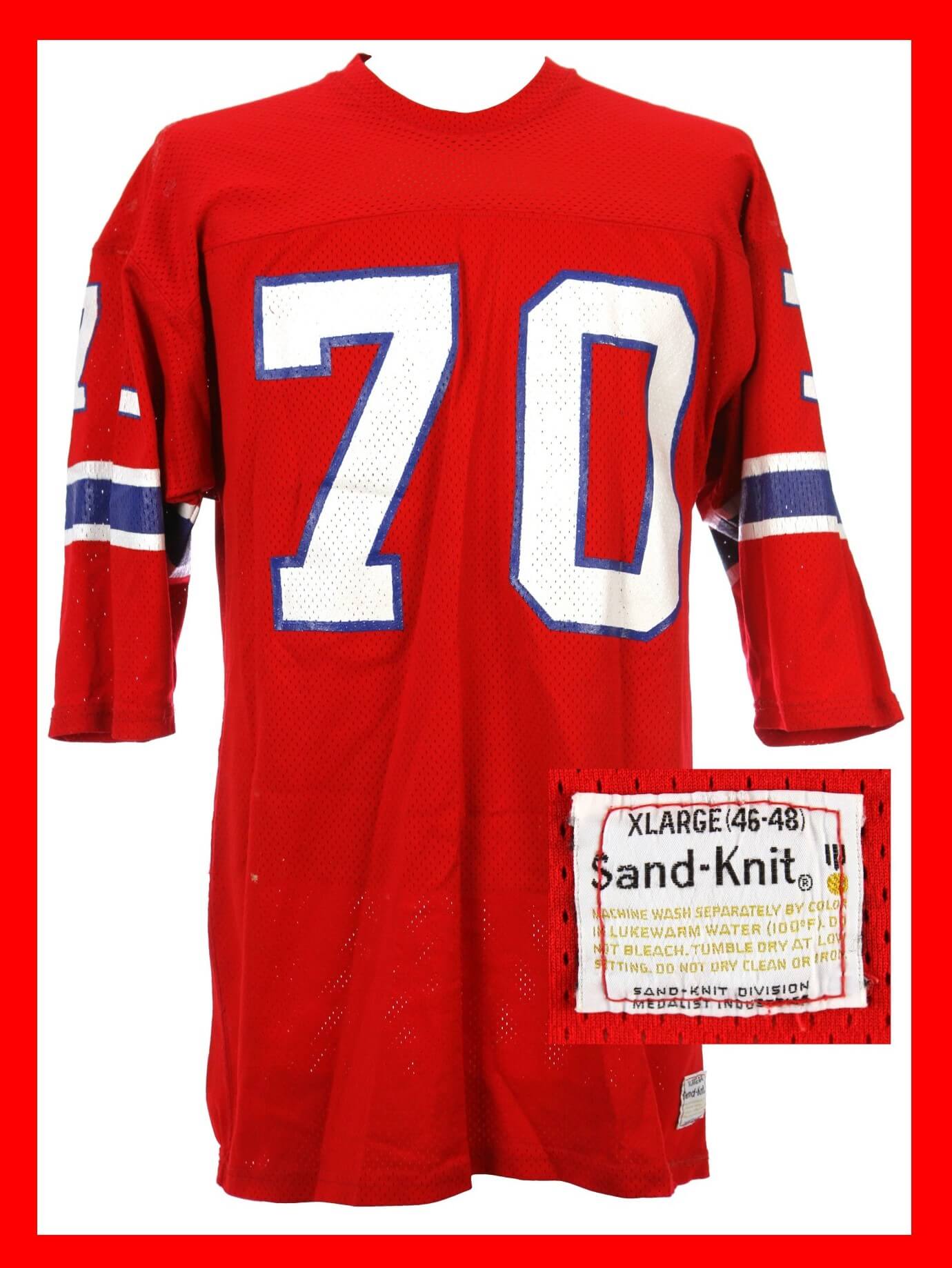
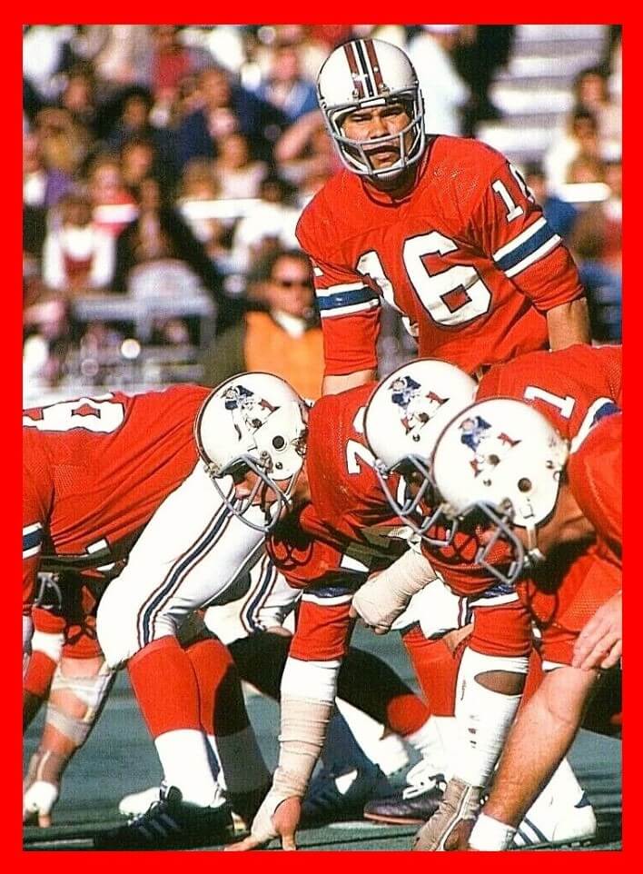
A year before the WFL started in 1974, the 1973 Patriots wore what I thought were the exact same jerseys from the same template Sand Knit used of their WFL jerseys. Here is a photo of Jim Plunkett in the new style jerseys and a #70 Patriots jersey that is described as a 1973-74 style.
I compared this to my father’s Sand Knit Bell jersey that I have and to the other ten WFL teams that wore this style jersey, three of the WFL teams wore this style but they were not made by Sand Knit and I will get into that later. I noticed three differences in the Patriots jersey from the Sand Knit WFL jerseys, first the Patriots had a crew neck and all of the WFL jerseys had a v neck, the Patriots jersey has more material under the stripes than the WFL ones have and the proportion of the stripes are different, the blue stripe is thinner than the WFL ones and the white stripes were thicker, this is what fooled me because I remembered them exactly like The WFL ones, but were they? More on that later.
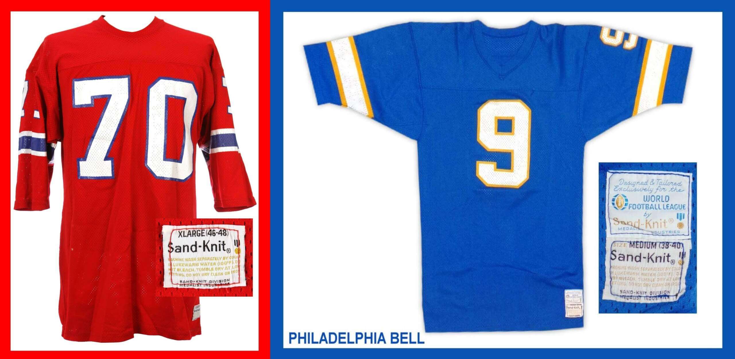
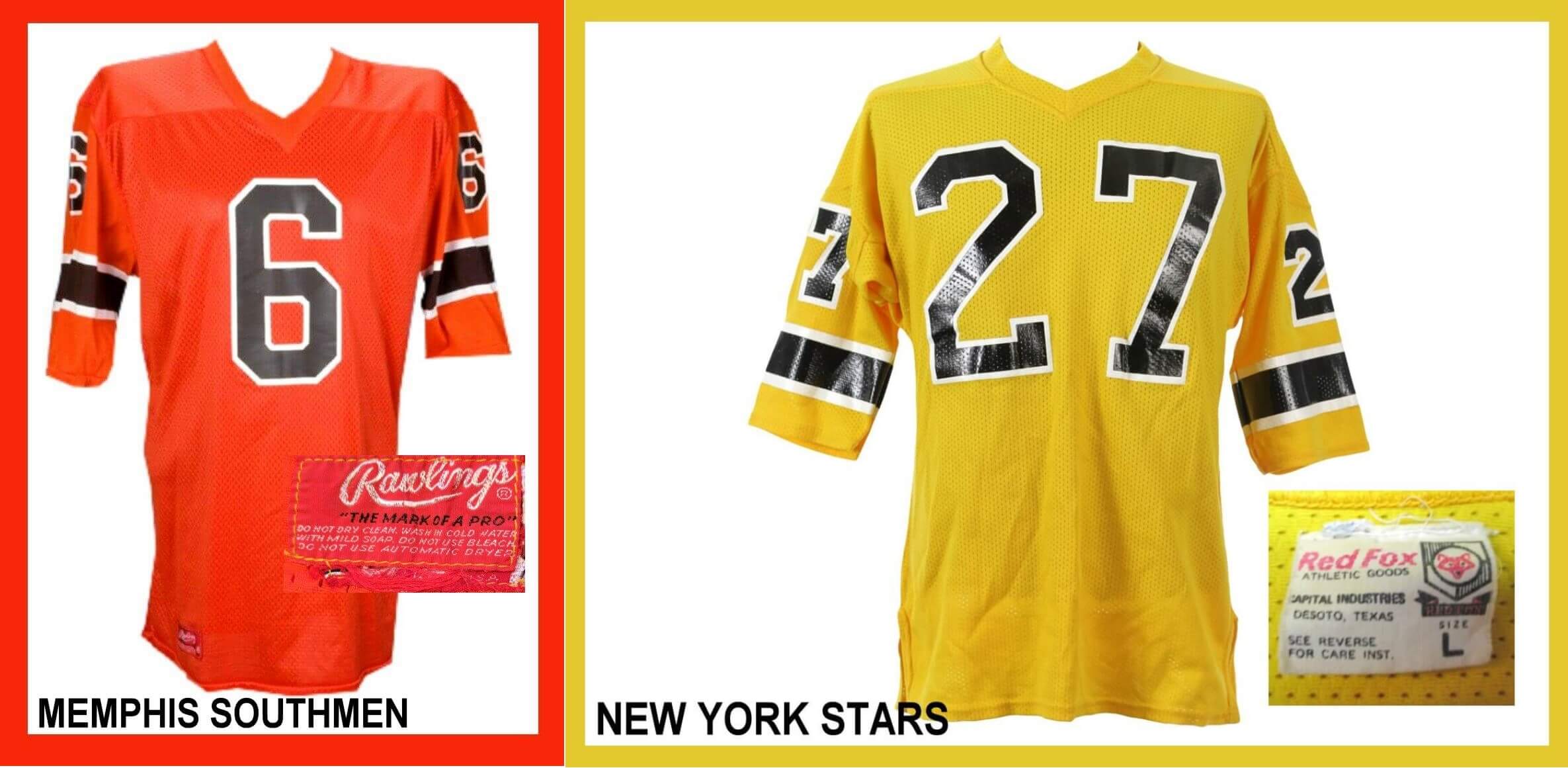
Ten of the WFL teams wore the same style jerseys, the ones by Sand Knit were interchangeable, the names on the back were printed different though because they were done through local sporting goods stores, some had sewn on, and some were screened on, and the fonts were different. Now three teams had this style of jersey but they were not made by Sand Knit, the Southmen, Stars and Sharks had different manufacturers, and I have to be honest, as a kid I saw all ten of these teams play in person but I was only able to figure out that the Southmen and Stars were different.
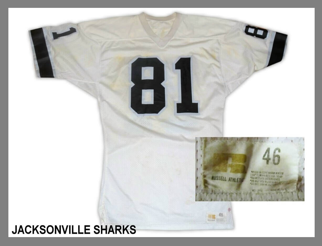
The Sharks fooled me, I thought they were Sand Knit but they weren’t. The Sharks were made by Russell Athletic, now it is easy to tell, the trim on the numbers is thicker than Sand Knit and the V neck on Russell game jerseys goes past the top seam, on the Sand Knit jerseys the V neck will stop before the seam, but as a kid I missed it. My father told me he loved the Sharks uniforms, but he hated playing against Ike Lassiter.
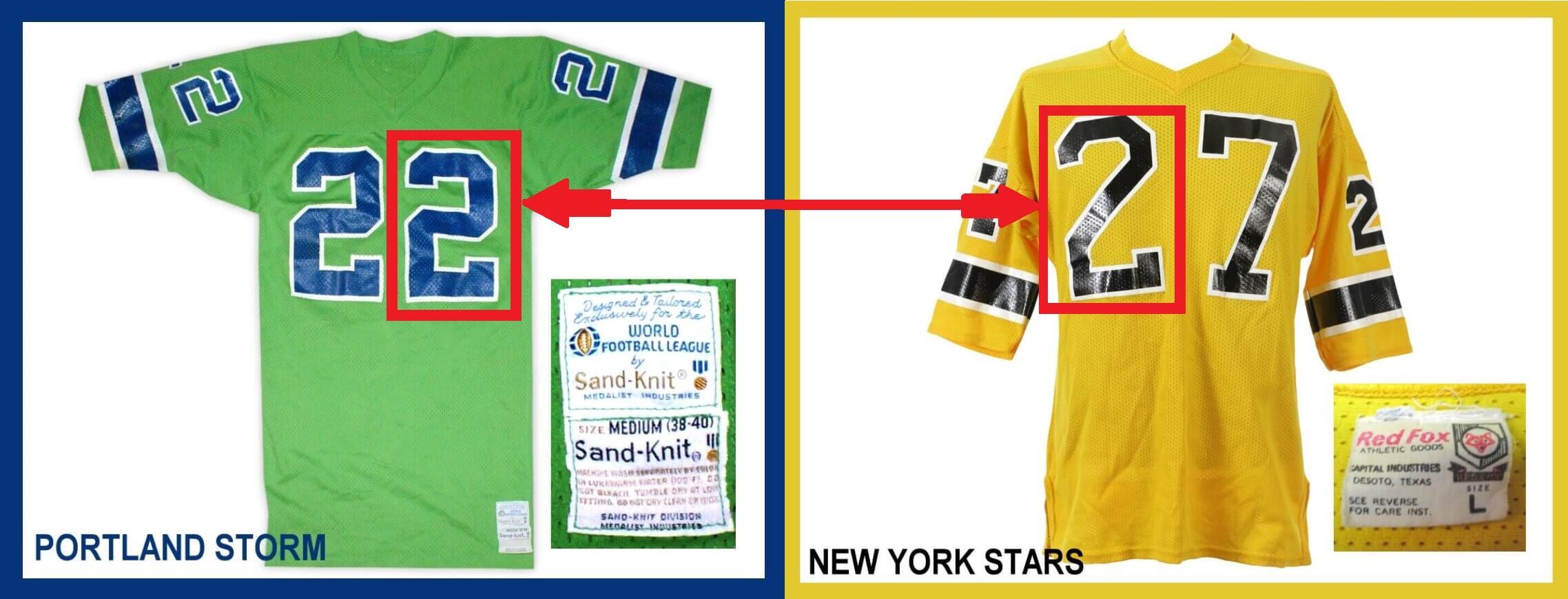
When the Memphis Southmen came to Philadelphia, I could see the jerseys were not Sand Knit, the numbers looked shiny, and the fonts were different, also when some of the jerseys got untucked there was no white Sand Knit tag on them. Now when the New York Stars came to town anyone could see these jerseys were different. The Bell lost this game so the locker room was quiet, Ron Waller would say he didn’t want people joking around after a loss, the jerseys pants and socks were put in piles, and I had the unenviable job of helping equipment manager Bob Colonna separate the white tube socks from the blue stirrup socks, not a fun job.
I asked Bob why the Stars had different numbers than the Bell, he said “I don’t know what you are talking about kid.” At the time I didn’t know what the word font meant, and I was unable to get Bob to understand my question. I said, “Didn’t those numbers look different to you?” and he said “no, kid.”
The blue game jerseys were clean and all lined up on a rack, I went over and looked for one that had a 2 on it, I either picked up Jimmy Joe’s 32 or A Train Thompson’s 22 but I showed Bob what I was talking about.
I said this 2 is thick and square shaped and their 2 is skinny and slants like the Jets. Then Bob understood what I was talking about, he said, “Yeah, they have different jerseys, because theirs are Red Fox, they didn’t order them from Sand Knit,” and that’s why they looked different. I was happy Bob finally gave me an answer, if I asked Ron Waller, he would have just made something up like he always did to me. I spent my teenage years thinking the Chargers had fiberglass helmets because that’s what Ron told me.
Now back to the Patriots and their WFL style Sand Knit jerseys, at some point the stripes on the Patriots jerseys changed to the same dimensions as the Sand knit WFL jerseys. It looks like in some photos in 1975 the lineman are still wearing the thinner blue stripe and other players are wearing the thicker blue with thinner white stripes.
Below are photos of Patriot greats Mike Haynes, Sam Cunningham and Darryl Stingley.
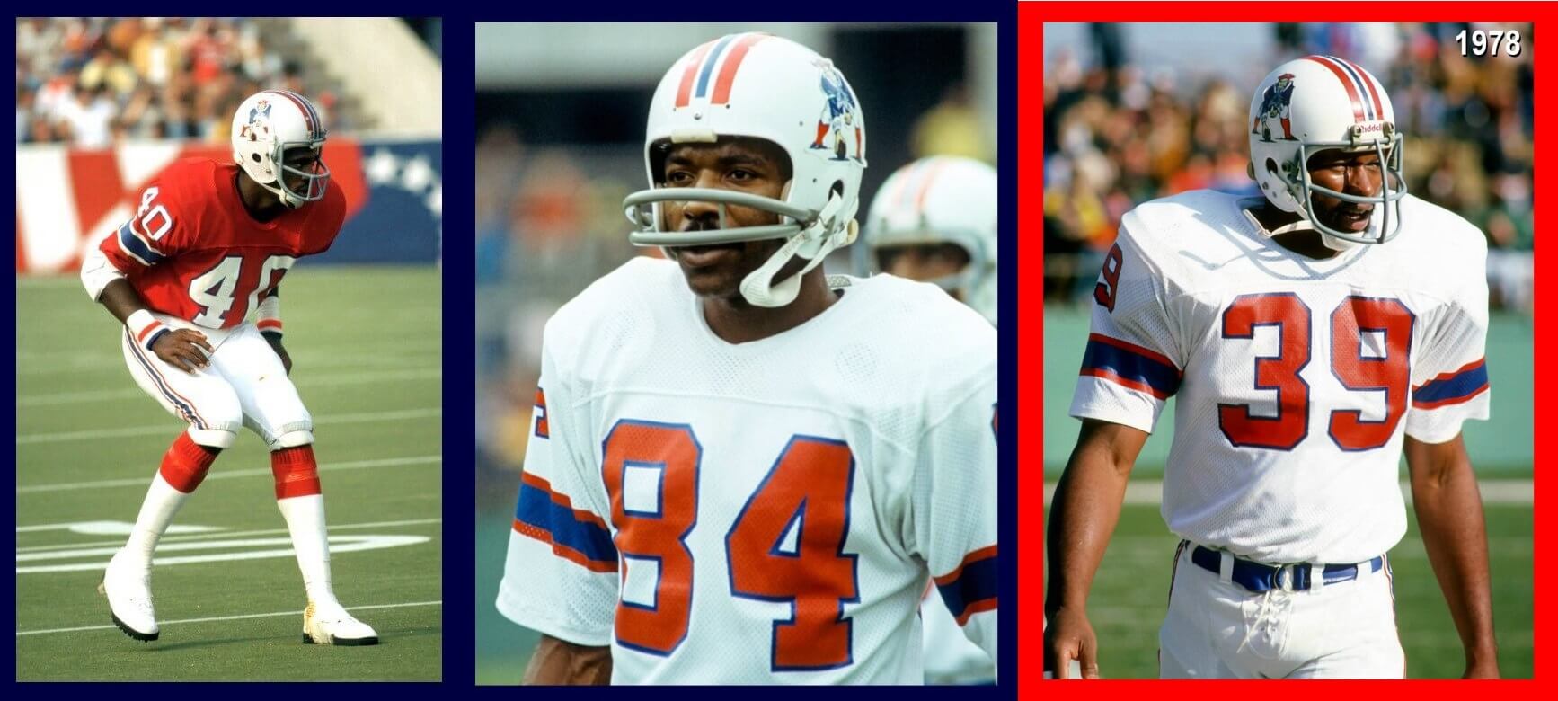
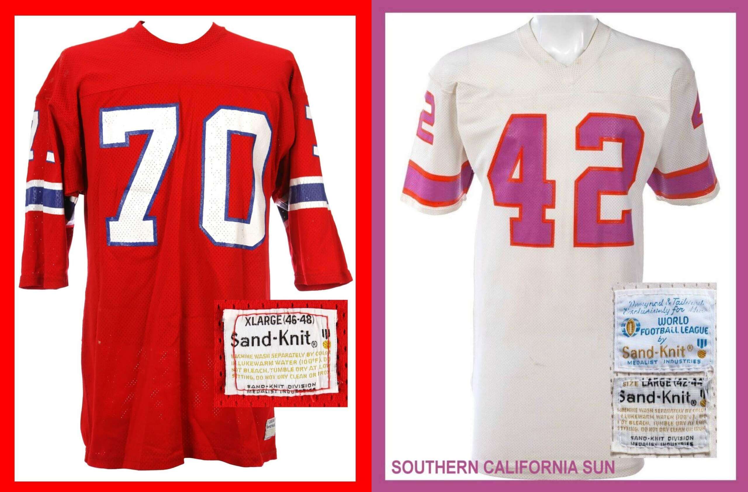
The WFL folded in 1975 and Mike Haynes didn’t get to New England until 1976 but if you look at the stripes of his jersey, they now look like the stripes that the WFL wore and the blue is thicker and the white thinner than the 1973-74 versions on Plunkett’s jersey and the #70. The photo of Sam Cunningham is from 1978, it looks like he is wearing a WFL jersey, this could have easily been worn by the Florida Blazers, in fact the sleeve stripes are the same just the numbers are reversed. The Patriots wore this style of jersey up to the 1983 season but there was also another team who went with a WFL style Sand Knit jersey and that was the Tampa Bay Buccaneers in 1976. The white Tampa Bay jerseys were only a one-year style, they changed the numbers to a dark orange in 1977 but their 1976 jersey’s looked like they would have been a white alternate jersey for the Southern California Sun.
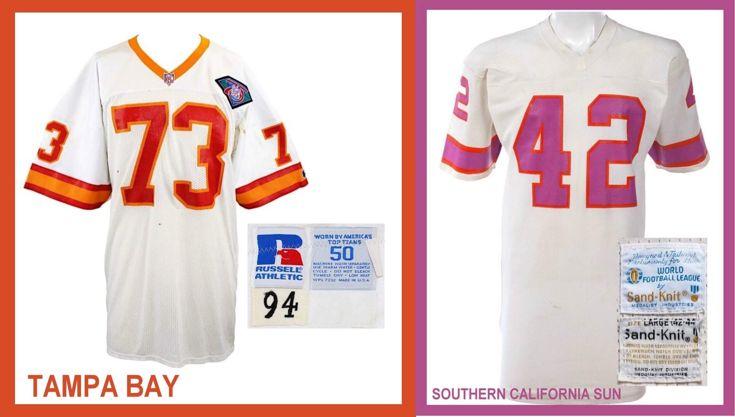
The sleeve stripes were the same style as the WFL jerseys. Though Sand Knit made most of the WFL jerseys, the Sharks used Russell Athletic so Tampa Bay would have had access to that style of template too. As you can see Tampa Bay’s WFL style stripes stayed pretty consistent throughout its run despite having different manufacturers’, first made by Russell Athletic, then by Wilson and finally back to Russell athletic.
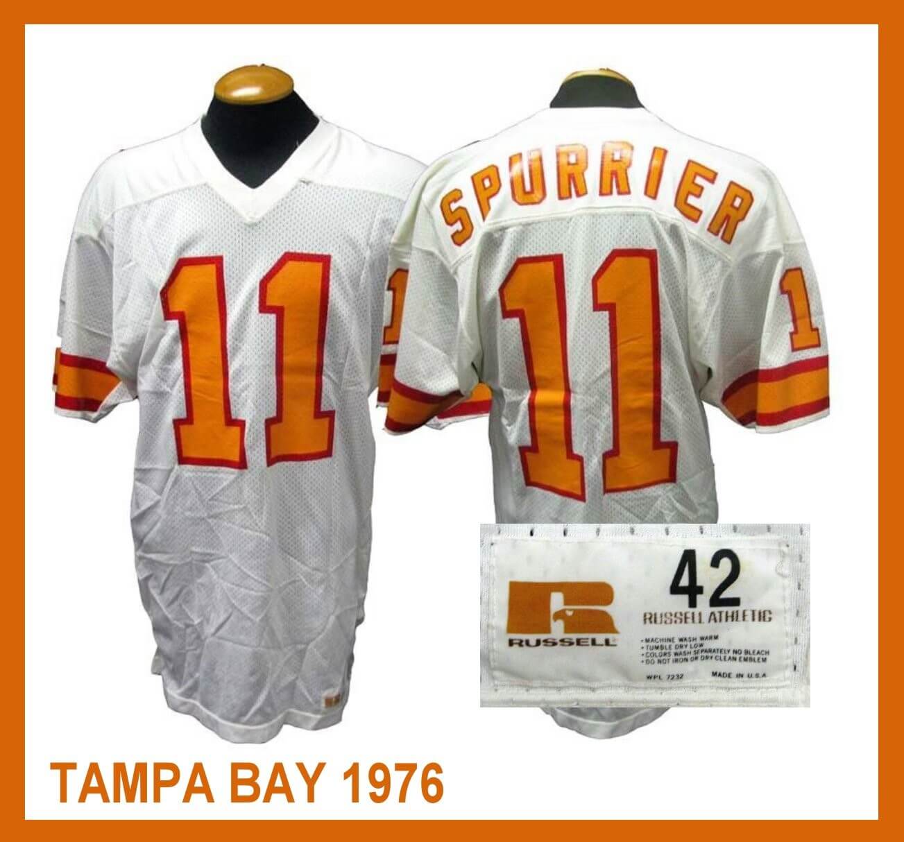
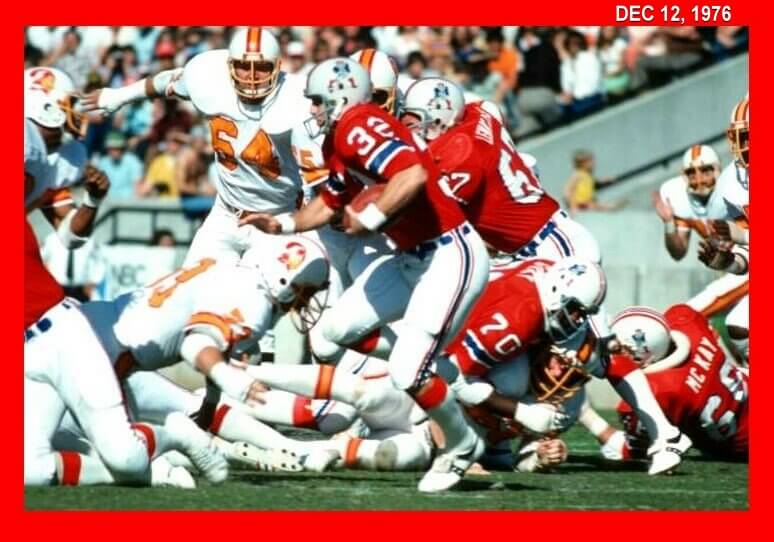
Tampa Bay wore this style of jersey though the 1996 season, that was quite a run for a jersey style that started in 1973 with the Patriots, the WFL that didn’t even last two years all the way up to the mid 90’s. On Dec 12, 1976, New England and Tampa Bay played wearing these WFL style jerseys and it was only fitting that this was the last game the Buccaneers wore their one-year style white jerseys.
And here’s a full gallery of all the WFL jerseys for the 1974 Season:
Great stuff Jimmy! I knew we could count on you to explore this wonderful NFL/WFL jersey tempate rabbit hole!


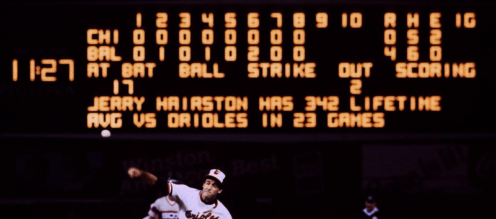
Guess the Game from the Scoreboard is game 2 of the 1983 American League Championship Series. The game was played at Baltimore’s Memorial Stadium on October 6, 1983. The Orioles won 4-0 and went on to win the next two games in Chicago to advance to the World Series.
Sure is, Stephen!
’83 ALCS (Game 2, 10/6), Pale Hose @ O’s. Boddicker fans 14, Baltimore goes on to win series in 4.
Readers my recall Paul’s Uni Watch dream lede a while back:
link
This may have been the game!
Game 2, 1983 ALCS. Boddicker gets Orioles back into the series.
Scoreboard: Game 2 ALCS in 1983. Orioles beat White Sox 4-0
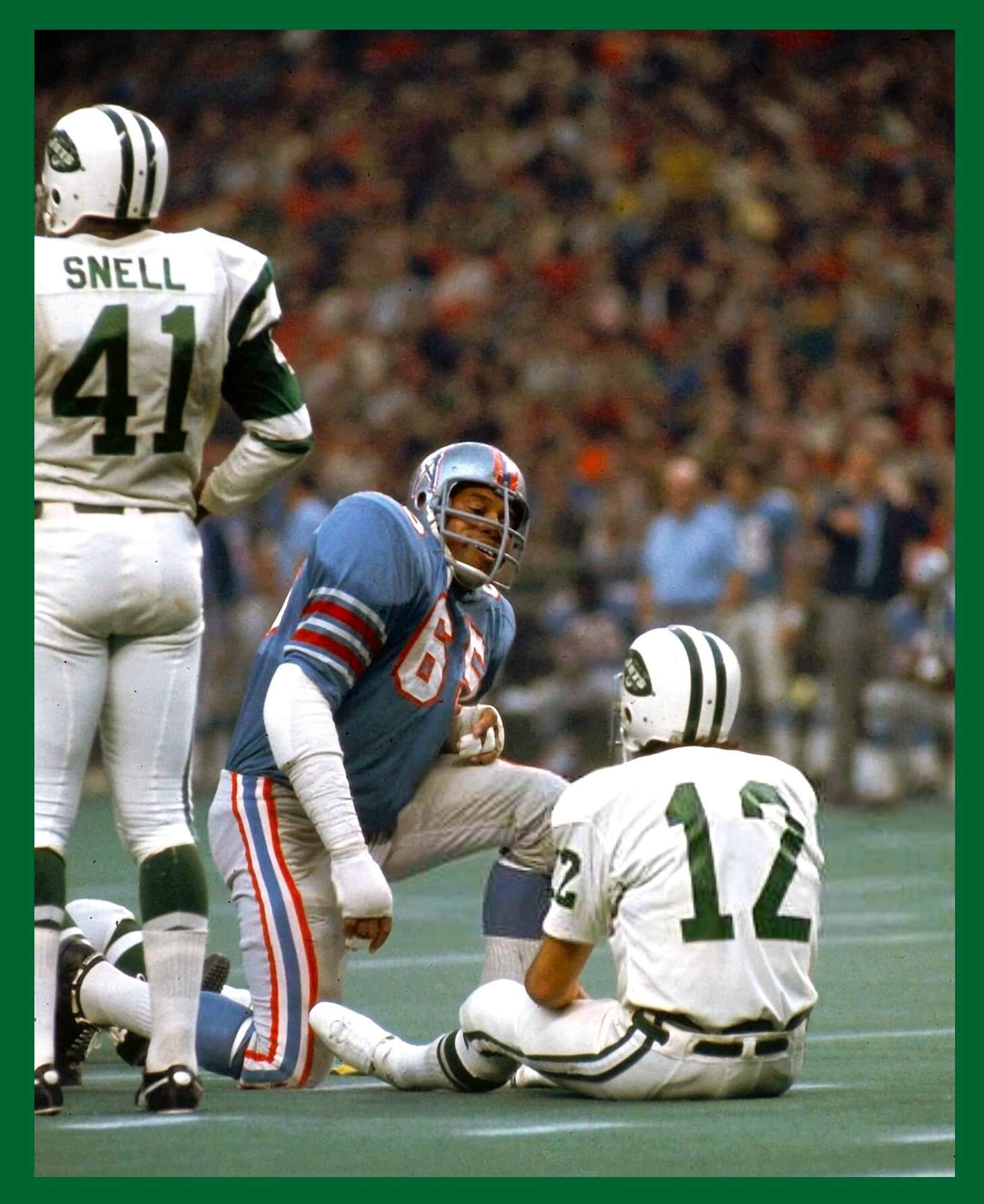
GTGFTU
6 December 1969
Houston Astrodome
Jets 34 Oilers 26
Namath’s jersey was stolen, so he had to play in a practice jersey (hence the NNOB and lack of shoulder stripes).
Those silvery Oilers…woof!
Their second best look, after the 72-74 unis!
You got it Marc! I’m surprised Namath didn’t lose more game jersey at the cleaners. My father was on the Jets taxi squad briefly and knew Namath, he told me he would get jocks stolen, anything he wore would be a souvenir to people. When the Bell played the Sun in 1975 Vince Papale’s game jersey disappeared before the game, and Tim Rossovich had a couple of his Bell jerseys, not make it back from the cleaners.
I’m likely in the minority, but I preferred the sleeve stripes over the shoulder stripes during the Pat Patriot uniform era. Such stripes obviously wouldn’t work today, given that with the way the unis are worn now, sleeves are practically non-existent.
As for the GTGFTU, I’m guessing 1969 regular season, game #13. Two games earlier, the Jets’ locker room was broken into at Cincinnati, and the road unis were stolen. For that game, the Jets had to wear the Bengals’ road whites. After that, some of the Jets players finished the season in plain white jerseys, with the numbers spray-painted on. Sport Magazine had Joe Namath on the cover of an issue not long after that, and the picture was of Namath in that plain, no-stripe jersey. Hmmm, makes one wonder, if this happened present-day, how long it would take for replacement jerseys to be made available by the manufacturer.
Jeffrey Herrick, I didn’t know the whole locker room was broken into, I thought just Namath’s jersey disappeared? My father’s white Bell practice jersey didn’t make it back from the laundry, there was no spare, so he wore a huge white t shirt with a number 9 written in magic marker. He brought it home to show me, it looked awful.
Great work, Jimmy! I love that your field of expertise covers what I consider the onset of pro football’s golden age. I remember going to Gerry Cosby’s in Manhattan and having the salesmen wish their customers would help them unload a bunch of WFL jerseys. The wild colors made my head spin. Mind you, this was in the late 1980s and early’90s.
They could have been the authentic replicas. that Sand Knit made for the WFL, they looked just like the game jerseys but had a crew neck, no sleeve numbers and a WFL patch on the sleeve, You could also buy these jerseys in the back of Sports Collector’s Digest in the mid 70’s.
Great stuff, Jimmy! I love how you Got It(TM) even as a kid who hadn’t learned the word “font” yet.
Thanks BvK, and I was dealing with guys who did not share my interest in uniforms! My father knew nothing about them, only that he had to have number 9. Ron Waller would just make stuff up to get me to stop asking him questions. And Bob Colonna knew a lot, but this was his job for many years and sometimes he didn’t want to be bothered.
Excellent work, Jimmy!
For a league that only lasted a couple of seasons 50 years on, the WFL sure has a lasting uniform legacy…and is still uni-relevant today.
Thanks ChrisH, I was thinking the same thing the other night when I took a picture of my father’s Bell jersey for the article. I was thinking this is still a great looking jersey.
This is such a fascinating article Jimmy! I did consider using this template in my article (instead of Northwestern stripes) and I think they would have looked good too. But I wanted something that originated in the ’50s and this design is pure ’70s.
You know Chris, that would have been a cool concept, do todays NFL teams with WFL stripes, some would look better than the ones worn today. I did not submit photos of the Americans or Fire jerseys because they had a different sleeve pattern than the other WFL jerseys.
Any idea where I could find a new York giants jersey from 1976-79.
the Patriots had a crew neck and all of the WFL jerseys had a v neck
One of the very few instances where the WFL was superior to the NFL.
Thanks, Jimmy, for the great look back at the Sand Knit jerseys!
I love the style of 2 the New York Stars used. I prefer that over the “upside down 5” look.
You know Jimmer, the V neck may have been a last minute switch by Sand Knit, the WFL authentic replicas were made before the actual game jerseys. They were in colors that never ended up being WFL jerseys like the Toronto Northman who became Memphis. Sometimes you can see these replicas for sale on ebay. They were made in the same factory that Sand Knit made the gamers and colors and material were identical. The order for these jerseys may have gone in, in 1973, the same year as the new Patriot Sand Knit jerseys, because the WFL replicas also had a crew neck.
Great job Jimmy! What an amazing resource you are. The Sand Knit font you talked about is a very important font in the history of sports, not just the NFL and WFL. Anybody interested can read a lede I wrote about it a few summers ago:
link
Gee, thanks SteveD I will read it right now. I am almost 60 years old but can always learn something new about those Sand Knit fonts.
You left a comment on it back then!
You are right, I started reading this and thought, this sounds familiar? That wouldn’t be like me to miss a piece like this on Uni Watch but sometimes an article will slip by me. I thought this was one of them, but it wasn’t, but I just read it again anyway, great article.
Thanks!
What really makes that Bucs vs Patriots game the most WFL-ish of all NFL games is that both teams wore white helmets. For some reason, 1/3 of all WFL teams wore yellow helmets and 1/3 wore white. The rest being one black, one red, one blue, one silver.
link
I don’t know why ’70s fashion was so heavily biased towards white and athletic gold and against metallics. Compare to the ’80s USFL, where metallics and red were everywhere.
Meanwhile, there is a fascinating photo of WFL founder Gary Davidson in front of some uniform designs on a wall.
link
There are other versions cropped in different ways, but this one is the most detailed. We can see that the WFL considered a proprietary font startlingly similar to the current Commanders’ font. Otherwise the uniforms are very close to those actually used by the Bell, Blazers, Hawaiians, Texans, Sharks, Fire, Wheels, Sun and Storm. Two obscured pictures along the top must be the Stars and Americans (who completely ditched the WFL template later). This leaves only Memphis unaccounted for, but at this point the team may still have been in Toronto. Maybe it’s the yellow pants we see just above Davidson’s perfect ’70s coiffe. A different cropping shows that’s actually with a red helmet and jersey with black numbers.
I always liked the Buccaneers first year white jerseys better. The orange trimmed with red numbers looks much better imho.
I liked them too, but I think it was the same problem at the 1970 Oakland Raiders, they had those great looking silver numbers trimmed in black on their white jerseys. They were too hard to see on TV.
And the NY Stars became the Charlotte Hornets, and presumably used the same uniforms and helmets with a different logo on them. The Hornets played their last game in Philadelphia.