[Editor’s Note: Paul is on his annual August break from the site. Deputy editor Phil Hecken is in charge from now through the end of the month, although Paul may be popping up here occasionally.]
By Phil Hecken
Follow @PhilHecken
Greetings and a good Tuesday to you all. Hope everyone had a good Monday.
We’re getting very close to the NFL season, but something near and dear to some of us will be happening next season that will really spice up (in a good way, hopefully) uniform options. That is the end of the “one shell rule” that prohibits teams from wearing different colored shells with their current uniforms (home, road, alt, CR, throwback, etc.), which has had the effect of preventing a number of teams from wearing classic uniforms, simply because the shell color they currently use wouldn’t work with a throwback. In fact, even before the rule change was official for 2022, I offered up suggestions for both the NFC and AFC.
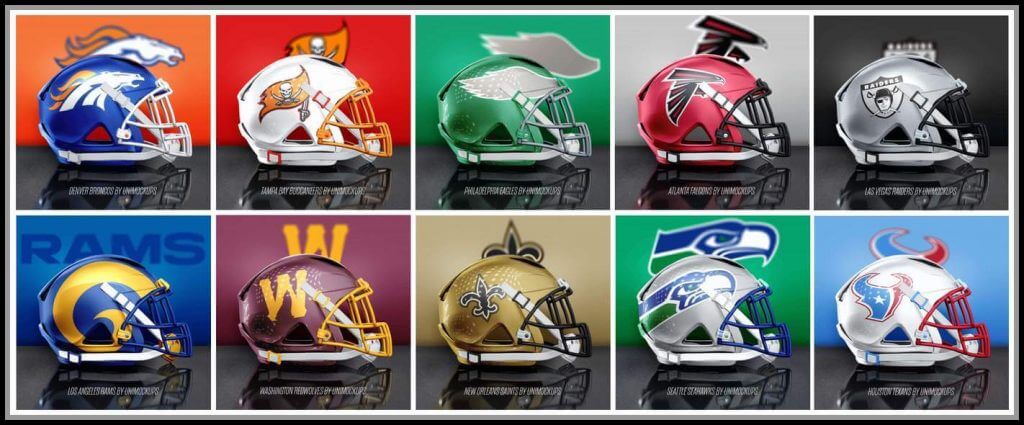
In a similar vein, designer Mike Joseph, who is very active on twitter (one of his handles is @unimockups), has created a new helmet template and designed ten helmets he would love to see once that one shell rule is no more. So without further ado, here’s Mike with…
Ten Helmets That Need To Happen
by Mike Joseph
With the NFL season about to kick-off I wanted to launch a new template to take UniMockups up a notch, and I’ve always really liked the look of the Xenith Shadow XR helmet that some players wear, so I decided it would be our first 3D model. To test it out I picked my Top 10 Helmets That Need to Happen Now and mocked them up. Here they are in no particular order. Note: some of these would obviously require entire uniform changes to match the helmets.
Rams:
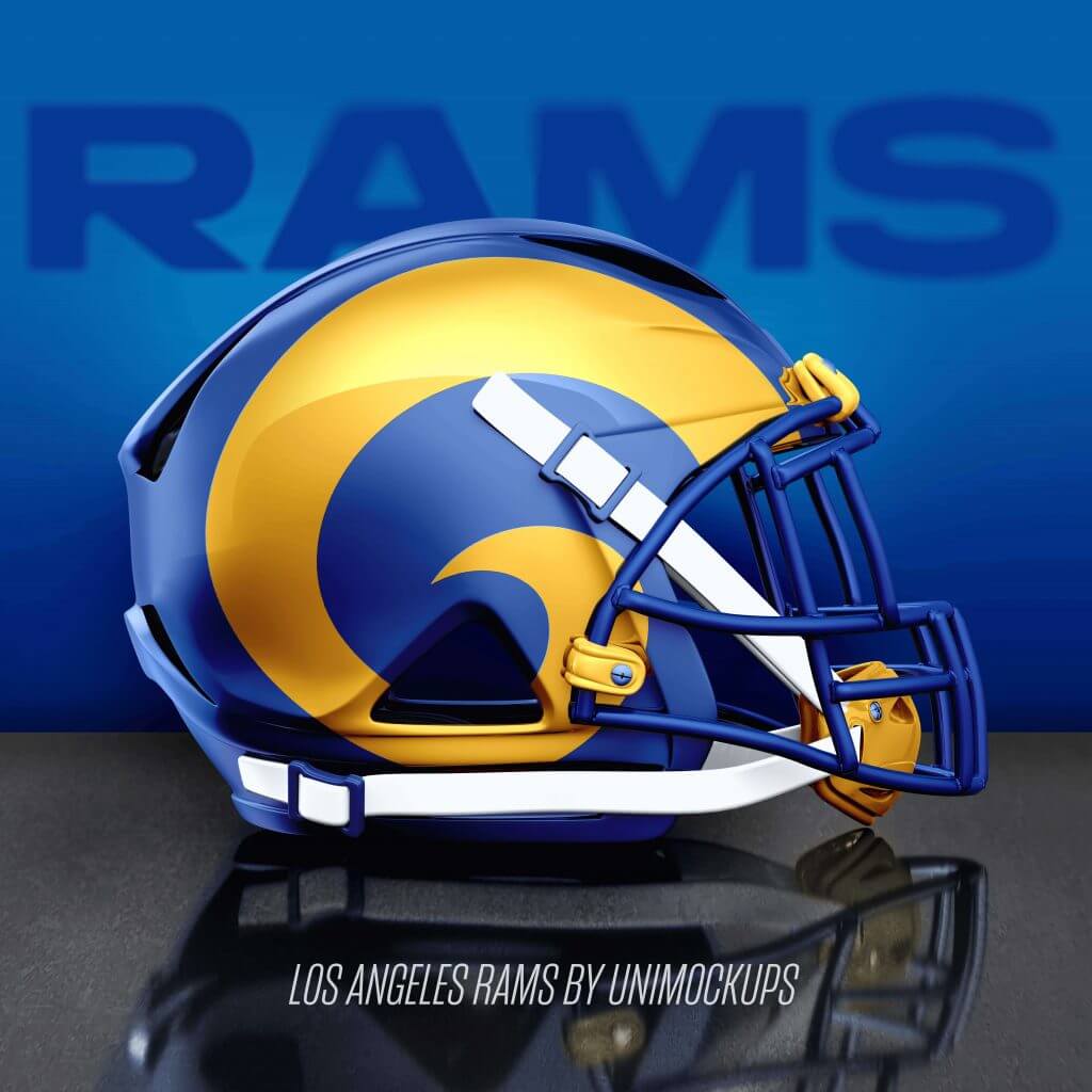
The Rams fix the mistake that is the current uniform experiment gone wrong and return to one of the best looks in sports uniform history. Sometimes the easy thing is the best thing. Nike should follow its own slogan and just do it.
Saints:
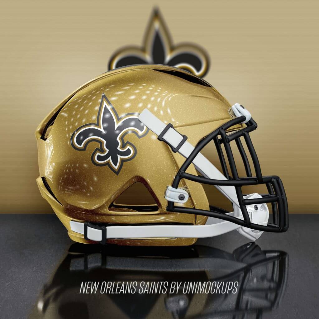
The Saints go back to the old gold. It’s a simple fix and it must happen. The current light gold (similar to the background color used in this picture) is just too light and looks awful.
Eagles:
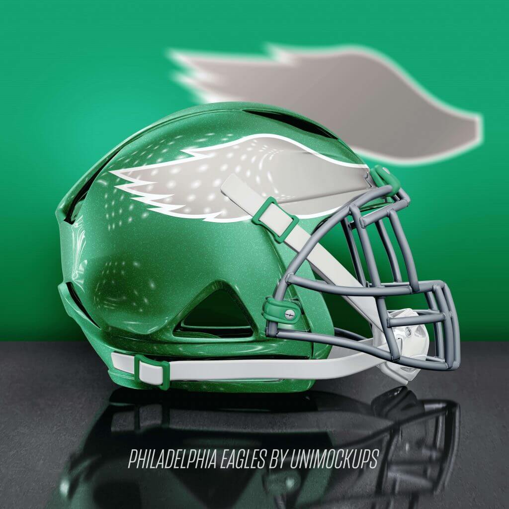
The Eagles bring back the Kelly green, gray mask and use a more vintage look for the wing. The midnight green look has run its course.
Texans:
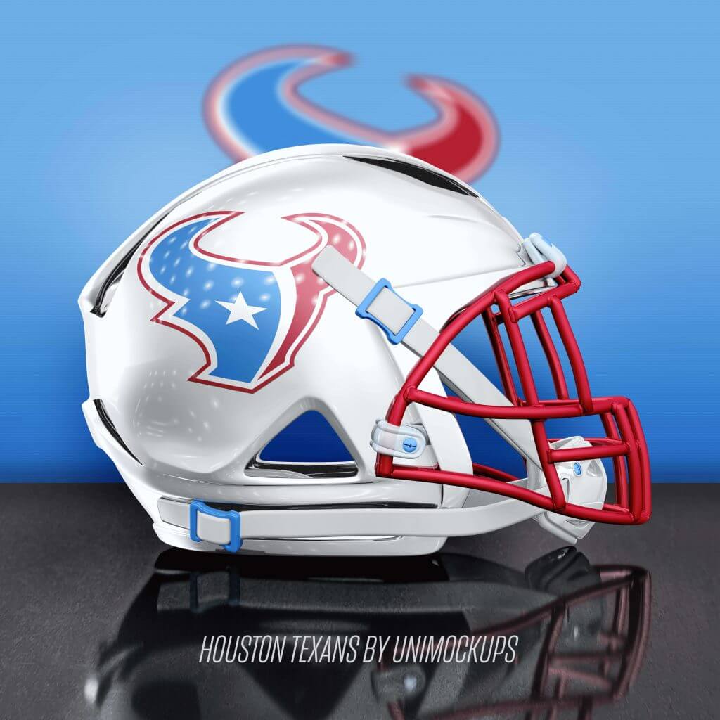
The Texans bring back the Oilers color scheme. Yes, I know the current colors match the Texas flag, but there are too many teams that use those colors in sports and not enough that use this look in football.
Raiders:
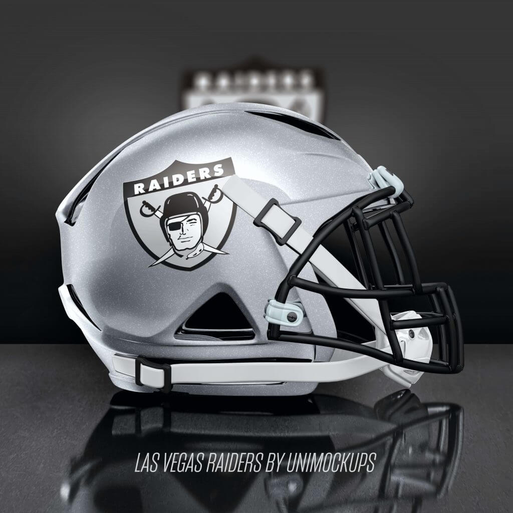
The Raiders put the AFL logo back on the helmet and swap the silver mask for black. It just looks better.
Broncos:
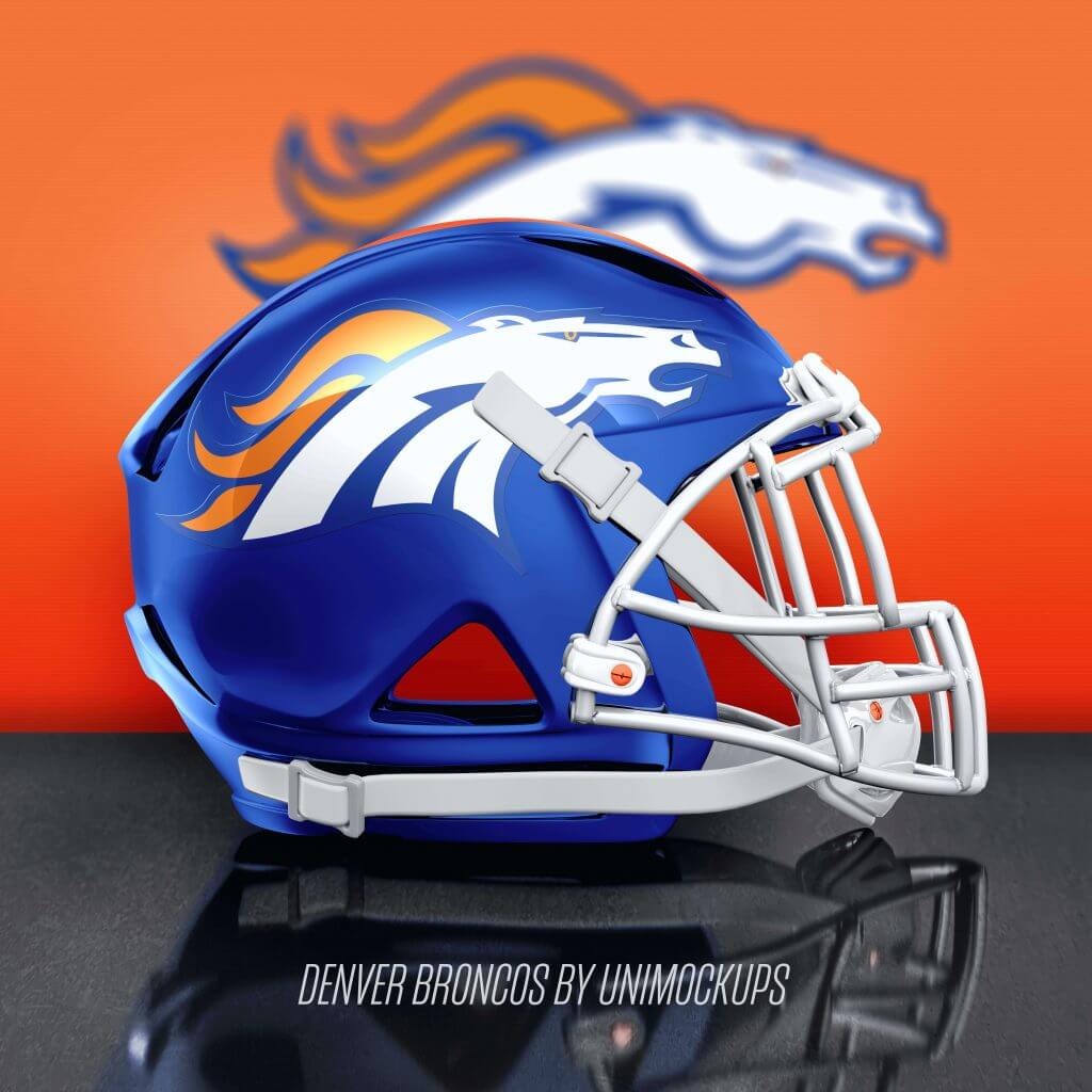
The Broncos go back to the academy blue and ditch the dark navy but keep their Super Bowl-winning horsehead logo to keep fans from all eras happy.
Falcons:
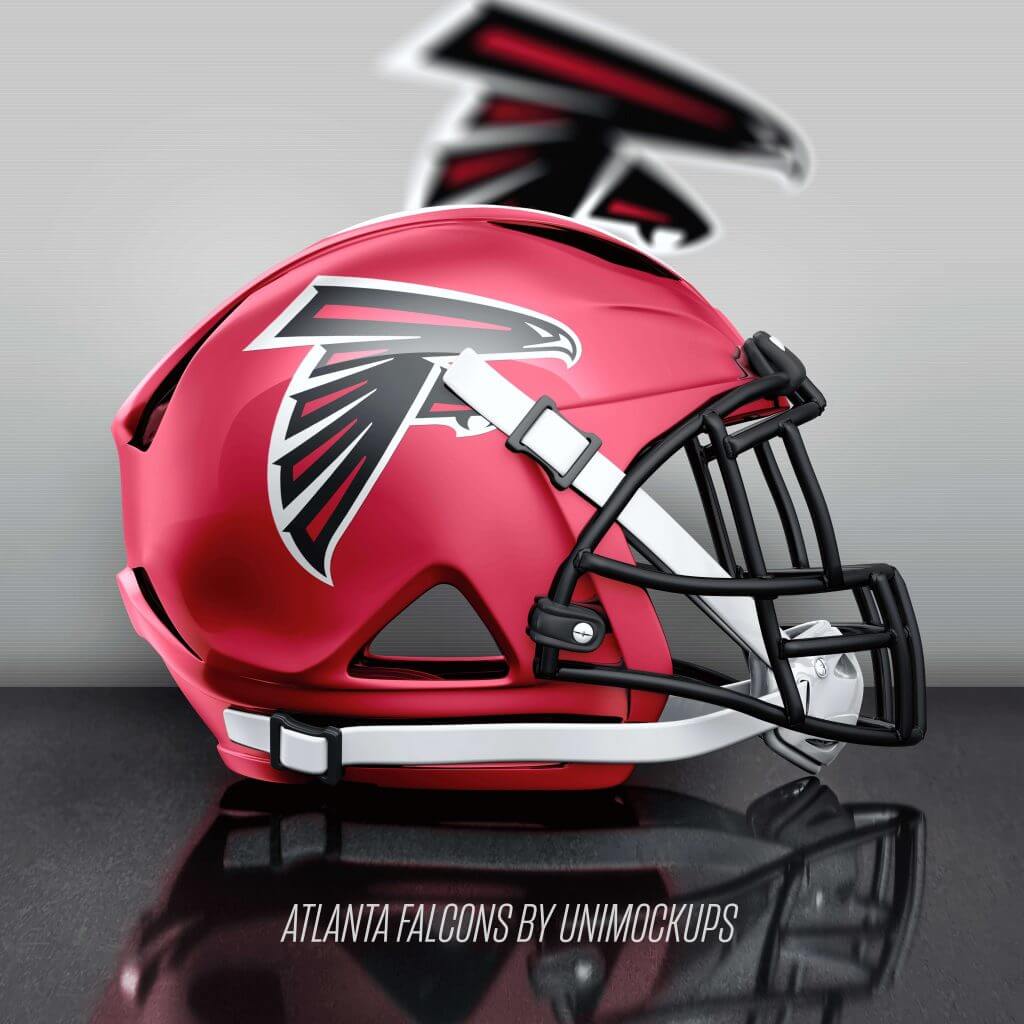
The Falcons bring back the red shell and black mask and bring the logo back down to a reasonable size.
Buccaneers:
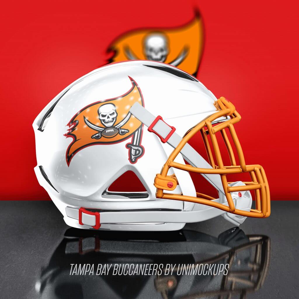
The Buccaneers return to the white shell and Creamsicle orange with hints of red. Fans seems to have a love/hate relationship with this idea, but I hear about more than just about any other.
Seahawks:
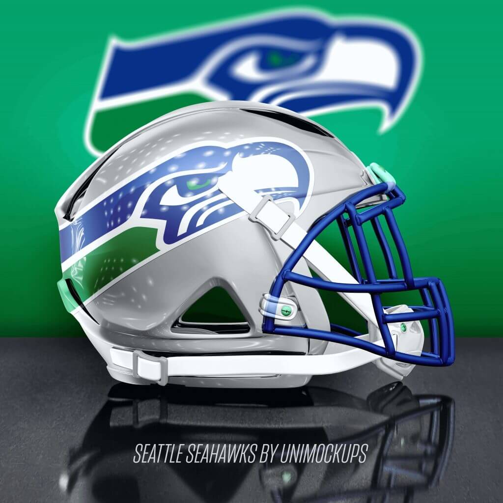
The Seahawks return to their original colors. Their current look is severely dated. Yes, they won a Super Bowl in it, but it’s not timeless. This is.
Washington Football Team:
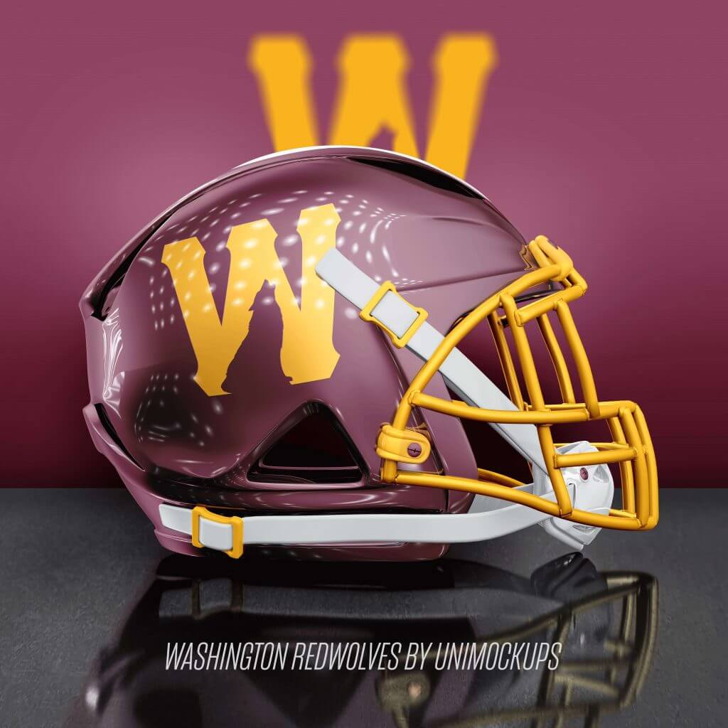
The Washington Football Team chooses Redwolves as its name and goes with this look. Simple and clean, but strong and in line with the current look that has the numbers on the helmet (which would be a miss with such a cool name like Redwolves).
Thanks, Mike! Some neat concepts there (and love the template) — while I’m not a fan of Washington going with “Redwolves,” if they do, I absolutely love the logo created, featuring the negative space wolf within the “W”. Good stuff!
Readers? What do you think?
Collector’s Corner
By Brinke Guthrie
Follow @brinkeguthrie
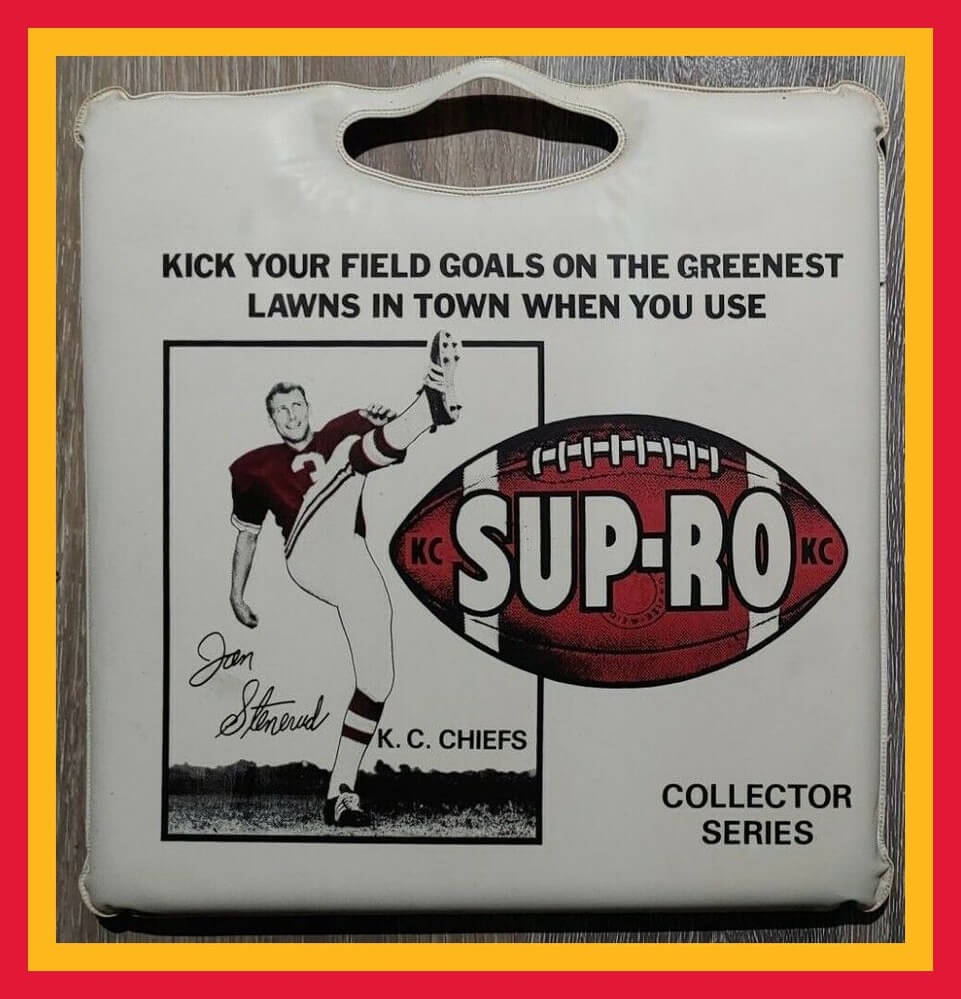
Chiefs NFL Hall of Fame kicker Jan Stenerud (I liked his name, and also thought he was cool due to the soccer style kicking) lent his image to this promo seat cushion for the Kansas City market: “Kick Your Field Goals On The Greenest Lawns In Town When You Use SUP-RO.” (Must have been some kind of lawn care product.)
Now for the rest of this week’s picks:
• Another promo cushion: interesting how the logo on the helmet of this 1970s Seattle Seahawks seat cushion is riding just a bit low.
• Going back to the early 1960s for this item, a “Challenge The Yankees Baseball Game” by Hasbro; “Hitting…Stealing…Bunting. You Manage The Yankees And The All Stars.” It’s all up to you. Lineups, starting pitchers, strategy, what alt uniform they’re going to wear- wait, strike that last one. We didn’t do that back then.
• Never seen this item before. Here’s a 1970s metal container full of 28 NFL Team Pencils made by Castell. Notice the QB on the front is wearing a generic red/white/blue uni and has an “NFL” logo on his white helmet; he’s about to get squashed by some guy wearing a Browns uni.
• Here’s a framed 1960s Detroit Lions print from The Master, Dave Boss.
• Defensive lineman Lyle Alzado of the Brownies was front and center on this 1981 promotional glass from Wendys and Dr. Pepper.
• Speaking of the Brownies, here’s an early 1950s fan for the St. Louis Browns baseball club. They moved to Baltimore after the 1953 season to become the Orioles. Wikipedia says this little guy was named “Louie.”
• “Hutch” was the maker of this 1970s San Francisco 49ers/Joe Montana kids jersey/pants set, featuring the period appropriate 49ers “saloon” logo.
• Interesting how this helmet logo borrows the NFL logo just a little bit. (I am going to guess “Naperville” refers to the Chicago suburb and “YFL” stands for “Youth Football League.”
• Used to love the mid-1970s NFL Fleer Big Signs; this seller has the entire set of 26 up for auction.
• I sure liked the Baltimore Colts uniform when they added the gray/silver trim inside the stripes, like you see on this 1983 Media Guide.
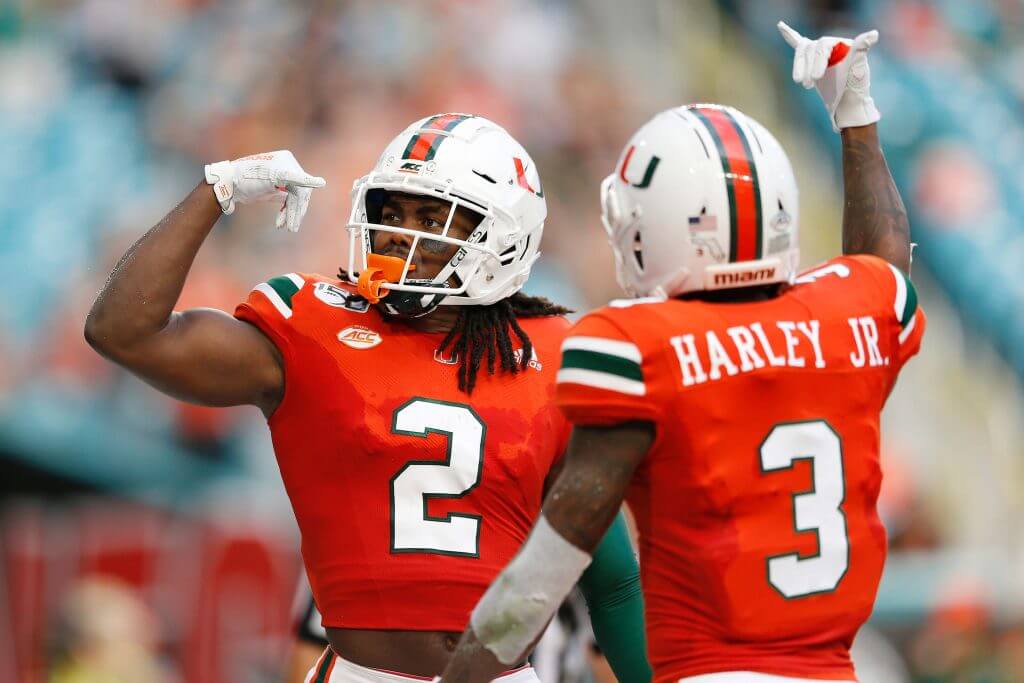
Miami Hurricanes Update Unis
Yesterday, the Miami Hurricanes football team announced they were tweaking their uniforms via the standard hype video:
A few tweaks and now, the uniform is pic.twitter.com/324ahFxkKr
— Canes Football (@CanesFootball) August 23, 2021
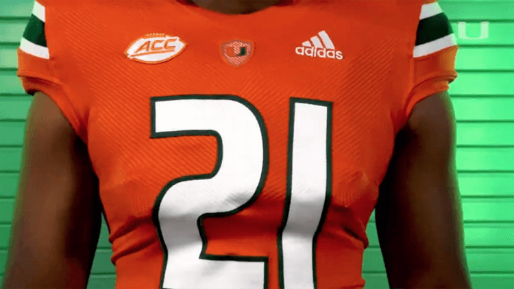
The biggest, or most noticeable anyway, change is to the number font, which is changing back to the “Dade Bold” font the team wore from 2000-2016.
The team had previously worn a block font:
Normally, I LOVE block fonts and would welcome their continued use, but the dade bold was best part of some otherwise pretty awful Hurricanes uniforms for a decade and a half. With the classic template and dade bold numbers, I have to say these new unis look pretty good.
Other minor changes include putting the “U” Logo on the collar inside of a shield and replacing the ACC logo on the front helmet bumper with a Miami wordmark.
The orange, green and white jerseys will all have the updated font, and the team will begin wearing the new jerseys September 4th against Alabama.

Guess The Game…
from the scoreboard
Today’s scoreboard comes from Helene Beesley.
The premise of the game (GTGFTS) is simple: I’ll post a scoreboard and you guys simply identify the game depicted. In the past, I don’t know if I’ve ever completely stumped you (some are easier than others).
Here’s the Scoreboard. In the comments below, try to identify the game (date & location, as well as final score). If anything noteworthy occurred during the game, please add that in (and if you were AT the game, well bonus points for you!):
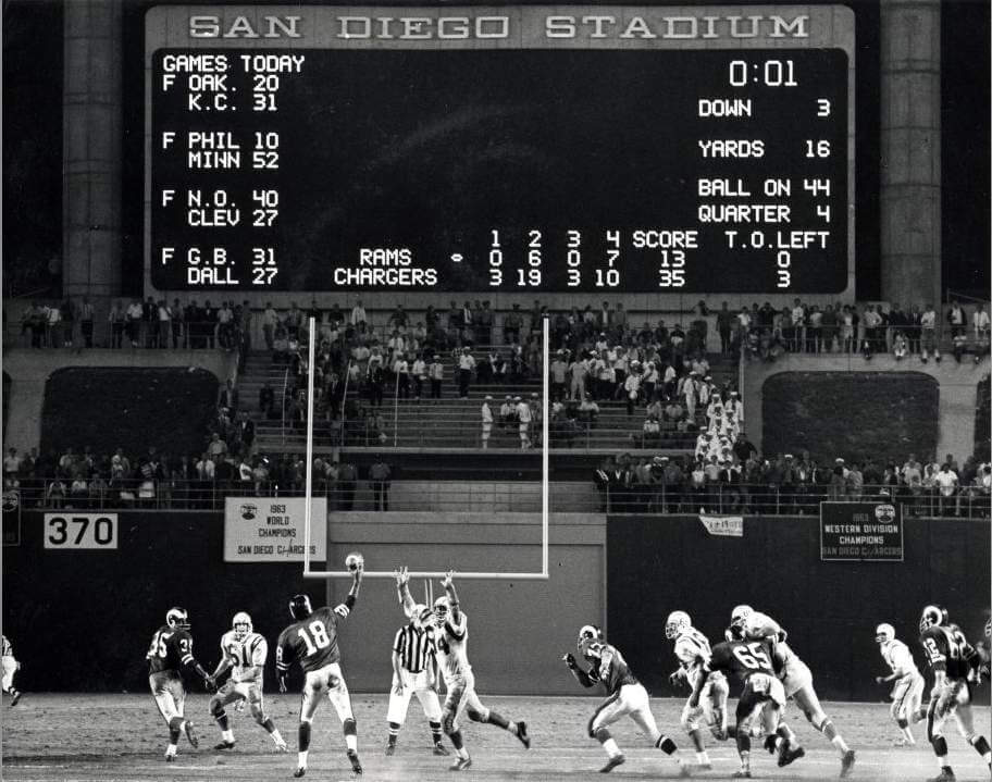
Please continue sending these in! You’re welcome to send me any scoreboard photos (with answers please), and I’ll keep running them.
The Ticker
By Alex Hider

Pro Football News: It’s hard to tell that Cowboys running backs Tony Dorsett and Herschel Walker are even on the same team in this 1980s poster. Different number fonts, different pants color, different jersey materials — has to be composite a photo, right? (From Rich Fuller). … A glitch in Madden 22 gave Eagles coach Nick Sirianni a crazy sweater (from @PhillyPartTwo). … Spotted at a Burlington department store in New Jersey — a jersey for Jets’ new QB Zach Wilson that combines the team’s old and new designs (from Khaled). … The Regina Thunder of the Canadian Junior Football League debuted their new maroon uniforms over the weekend (from Wade Heidt).
College/High School Football News: Paul tweeted out a few college uniform changes from around the country yesterday: Bowling Green has new pants, Western Michigan has new white uniforms, and ECU has new purple uniforms. … Amid unsubstantiated rumors that Georgia could wear mono-red at some point this season — a hot topic for a fan base averse to alternate uniforms — a blogger argued that “uniforms don’t matter” and don’t affect the outcome on the field (from Phil). … Also from Phil: Minnesota will go BFBS for their season opener against Ohio State on Sept. 2. … FAU will reportedly wear red throwback jerseys this season (from Ayden Pierce Maher and Jake Elman). … New uniform combinations for FAMU (from @asth52). … Florida State is changing its nose bumpers from the ACC logo to a “Noles” wordmark (from @TaReefKnockOut). … Florida is charging an additional $15 to fans that want a physical copy of their tickets (from @GriffinTSmith). … Reader Ben Zoss is an assistant football coach at Morton High School in Illinois. During a recent scrimmage, the team’s head coach had every position group wear a different uniform combination. “It worked out well and the kids enjoyed it,” Ben said.

Hockey News: The Kraken are using their secondary anchor logo as the red line striping design at their practice facility — could it be a preview to their home ice red line design? (From Wade Heidt). … An Islander blog argues that the team should keep its navy alternate for their upcoming 50th season (from Phil). … Blue Jackets G Elvis Merzlikins recently welcomed a new son and got him a tiny set of goalie pads so he could match his dad (from @artofscorebug). … Speaking of the Jackets, the Red Wings mistakenly used the Blackhawks logo in place of Columbus’ logo on its website (from @tigerbotpayne). … RIT has temporarily moved most of its Wallace Library collection into one of their two on-campus ice rinks (minus the ice of course!). They are calling the venture “Wallace on Ice”, and as seen in this article, they have even created custom hockey sweaters for some of the library staff (from Joe Werner).

Basketball News: We’ve got more leaks to indicate that the Heat will be wearing ransom note-style uniforms next season (from Phil).
.

Soccer News: The Washington Post (soft paywall) has a story about the struggles facing the Afghan women’s national soccer team following the Taliban takeover of the country. Founder and former team captain Khalida Popa, now living in Denmark, is urging former players still in Afghanistan to destroy evidence that they played soccer (from Jamie Rathjen). … Also from Jamie: Rangers have not been wearing the new Scottish Premiership patch because the new patch has an ad for a car-buying website. A competing business advertises in the club’s stadium, and the team won’t wear the new Premiership patch because they think it’s a conflict. … New Zealand’s national team, which traditionally wears all-white uniforms, often goes by the term “All Whites.” The team is now considering dropping that name (from Jeremy Brahm). … Inter Milan fans who purchased F Romelu Lukaku’s jersey last year have found a creative fix after Lukaku was transferred to Chelsea (from @texastrevor). … This article from The Athletic (paywall) discusses manager “fashion” in the Premier League (from John Flory).

Grab Bag: The U.S. and Argentina squared off in men’s field hockey at the Junior Pan American Championships. Argentina’s NOBs were printed above a large black stripe — Jamie Rathjen thinks the jerseys were hand-me-downs from the senior team, and they simply crossed out the old names and put the new ones on top. … Here’s what the ball design will look like for wheelchair volleyball during the Paralympics (from Jeremy Brahm). … Pinehurst Golf Club in North Carolina has unveiled the logo for the 2024 U.S. Open, which they will be hosting (from James Gilbert).
.
Uni Tweet of the Day
When the one shell rule is lifted, we need to be careful what we wish for…
Mixing throwback helmets with modern uniforms.. which one looks better? #MondayMashupSeries pic.twitter.com/7jwxOeZ8u2
— The Graphic God (@TheGraphicGod_) August 24, 2021
And finally… thanks to Mike for sharing his helmet concepts with us. That’s all for today. See ya guys and gals back here tomorrow.
Peace,
PH
Typo alert: The hockey ticker item I submitted about the RIT library contains the passage “…dinner of the library staff.” The word “dinner” should have been “some”. This was my fault, as autocorrect on my phone put that word in my original email, and I didn’t catch it. Sorry!!!!!
Fixed
I thought that the Washington football team said that they weren’t going to pick a name that is even native American adjacent, which is why they ruled out Warriors. So I don’t think they’ll go with something like Redwolves either.
Red Wolves are actual animals that once had a strong population in the DC area up until the early 1900s, when habitat destruction nearly drive them to extinction. It’s a strong name that can be used without any Native American connotations.
Red Wolves has gained quite a bit of local traction and support.
link
link
So using it for the mock up makes sense. Depending on how they handled the full name, it could be easily chosen and still avoid any Native American imagery.
Dan Snyder will screw it up no matter what is chosen though, that’s kind of his thing.
I’m still holding out hope for “Warthogs” based on the link. Doubt it, though.
Warthogs doesn’t seem to have made the team’s final list, alas. As to Redwolves, I think it’s a terrible name for the Washington team for 3 reasons: 1) I just personally can’t stand the whole two words jammed together as a team name. Riverdogs or Redwolves belong in the minor leagues, at best. 2) This team with its history should avoid having “red” in the team name, unless it goes with the very clearly Black-history inspired Red Tails. 3) Red wolves are real actual animals, and the real-world red wolves do not live in the Washington, DC area. Of the major wild canids, only coyotes are native and common in the area, and then only in the last 15 or so years.
The Red Wolf is native to the DC area but was wiped out over time. I believe the only place they currently occur in the wild is Alligator River National Wildlife Refuge in North Carolina, and they aren’t doing well there. They very well may be extinct in the wild (again) within a few years.
How about “Firebirds”, which is a nickname for the very local Baltimore Oriole? A phoenix on the red helmet would look pretty awesome.
surprised Pat Patriot didn’t make the list for today’s post. Exceptional design, IMO.
Pat the Patriot is my #1 “Why did they ever abandon that logo?” logo in all of sports. That would be an interesting topic, btw.
Wouldn’t WFT and the Raiders be able to do this now? It’s not a different shell, just different decals and a facemask swap.
Also the Rams
And also the Raiders.
All three would simply be decal/mask changes, not shell changes.
Sorry, I missed the Raiders mention in Jon’s post. Not fully awake yet!
Correct, WTF, Raider, Saints, and Rams all could do this without having to have 2 helmets.
Everything so far on helmets has been geared towards throwbacks for the most part. I wonder if any teams will take a 2 helment approach like college teams and use multiple colors to make multiple uniform combinations.
Teams I would love to see would be Bengals in white, Carolina in black, Arizona in red, Cowboys in blue, Jaguars in teal, Detroit in anything but silver, and Vegas in black.
I was thinking the same thing. Seems like the Pats white helmet with old school logo should be added here. Also, isn’t the Saints helmet here the same color as the current helmet?
I understand why the Saints’ helmet may look the same, but it is actually a little darker.. When the Saints entered the league their gold helmets and unis were darker than the current gold color.. As well the Saints’ old school logo was larger on the helmet..
OK thanks. Doesn’t seem like much of a difference. Seems like the Saints old black helmets and associated uniform would be a better second shell.
The Saints did wear black helmets during the ’69 preseason but they were were never sanctioned by the NFL. And by the start of the ’69 regular season the Saints used their gold helmets.. The Saints have never worn a black helmet during the regular season. I do thing a black Saints helmet though would be nice to see as an alternative helmet..
think*
Love the Bucs and Texans revamps. The others aren’t wowing me much.
btw, I HATE metallic-looking helmets.
I mostly hate white helmets and metallic helmets, but that Bucs design makes me want to see it with metallic flecks in the white. But even not metallic, this helmet and color scheme are exactly what the Bucs should wear.
GTGFTS August 24, 1968. They called them “exhibition games” back then and why the hell is Roman Gabriel still on the field?
Up the road in Los Angeles, Two From The Vault was being performed that evening.
Hard to believe there was a time when the NFL played SIX exhibition games every season. Nothing like having half of your lineup out of commission before the first play of the regular season.
The Texans’ color scheme isn’t an exact match of the state flag. The blue on the Texans’ unis is a much darker shade than what is found on the flag.
No, Mike…the Titans need to bring back their Oilers’ color scheme. The white helemts would suffice…powder blue would be better.
I would not mind seeing a yellow Redsk…err, Football team helmet sometime soon.
Otherwise, nice work.
Re: Regina Thunder Ticker item. It is just the jersey that is new. The pants have been around earlier. New jersey lacking the navy blue and silver trim familiar to the Thunder. Here is a look at the old jersey for comparison (with the maroon pants):
link
“I sure liked the Baltimore Colts uniform when they added the gray/silver trim inside the stripes, like you see on this 1983 Media Guide.”
Had they swapped out the white facemasks for gray, I’d would have liked them too.
Because kidnapping is a cool way to sell jerseys?
The feature today is kind of confusing, it is saying what should happen if the one shell rule is lifted, which implies throwback or alternate helmets, but many of the designs use the existing helmet color, or in their explanation call of for the team to dump the existing uniform and helmet in favor of this design.
Actually only 3 of the helmet redesigns use the same helmet base color that the teams currently use.. That being the LAR, Raiders, and WFT.. I understand the comment because some of the changes are subtle.. As with the Saints and Broncos, but it states that the helmet base color would be different (old school helmet base colors) .. Which would then require and additional helmet if the teams were to also keep their current helmet.
The Tennessee Titans own the rights to the Houston Oilers’ color scheme, so that helmet redesign is not available to the Texans…
Not sure how that can be since the Texans and Titans have both been using navy and red since the Texan started play back in 2002. The Titans own the rights to the Oilers history and brand name but I don’t recall a deal prohibiting the use of colors like the Ravens had when they relocated from Cleveland.
Yes, the Titans do own the rights to everything associated with the Oilers’ history.. Which also includes the Oilers’ color scheme. Only the Titans could use the Oilers’ throwback unis. The Texans of course dont have any throwbacks to use. And they would be prohibited from using the Oilers’ color scheme with their current logo..
I looked it up, I was incorrect Sir.. The Texans just cant use the Oilers’ throwbacks.. The color scheme is not exclusive to the Titans..
Reminds me a little about how Al Davis attempted to either sue or block (through the NFL) the Carolina Panthers using a silver and black color scheme that was sort of similar to the Raiders. Davis failed obviously.
I’m surprised the NFL brain trust doesn’t have more authority to pry the Oilers’ iconography out of the Adams’ hands. Make the Adams’ name a fair price and let the Texans pay it. Keeping the Oilers in circulation would create more revenue for everybody.
I got really excited when I scrolled down and saw a Seahawks concept! Returning to the original colors would be incredible and I agree the helmet version with the logo makes the most sense.
Can’t wait for this!
Yes, the Titans do own the rights to everything associated with the Oilers’ history.. Which also includes the Oilers’ color scheme. Only the Titans could use the Oilers’ throwback unis. The Texans of course dont have any throwbacks to use. And they would be prohibited from using the Oilers’ color scheme with their current logo..
Sorry wrong reply..
I agree! Bring back the old Seahawks unis/colors
Make the Falcons helmet with the original logo (and switch the shell from metallic maroon to plain ol’ red) and you’re on to something.
Okay I never knew the Saints had changed helmet colors.
Yes, their gold helmet and unis use to be much darker back to when they they first entered the league. And the logo was larger.
Saints should go to the black helmets.
link
Yes, Im aware of that bit of Saints history.. A black helmet would be nice as an alternative helmet, but I would change the design of it some compared to that ’69 version..
And the next thing out of New Zealand will be that the Rugby team should drop “All Blacks” as well? From a country that has locked up its entire population because of 1 Positive Covid TEST? SMH.
Don’t know the game in the scoreboard picture, but the QB is Roman Gabriel, who I got to meet about 40 years ago. Quite an interesting guy.
From this perspective, all colors that can be associated with a fleshtone create problems. Thus, we are limited to blues, greens, and purples, and I’ve children’s faces turn purple when throwing a tantrum.
The “1970s” NFL team pencil set includes one for the Indianapolis Colts.
The whole point of ebay is to punish you for knowing things.
This.
As far as helmets go, Steelers/yellow, Pats w Pat Patriot, Dolphins w the correct org Dolphin logo, I’ve always liked the idea of a Bucs mashup, just bring back the Houston Oilers already,, Falcons red and I don’t dislike the Rams new helmet the colors really pop but from the neck down is a complete failure. Washington FT is fine as a name, would love the helmet stripe to make a return and keep the side blank ala Browns, the post-it note numbers look forced and w tv numbers on the jersey it’s pointless.
Love the helmet concepts, particularly the Seahawks and Falcons. Well done.
Scoreboard: August 24, 1968
Chargers 35, Rams 10
link
The scoreboard is from Harvey Haddix’s 10 inning perfect game that he ended up losing. It’s May 26. 1959, in Milwaukee. Hank Aaron is at the plate.
The Texans idea is brilliant. I’d love to see the 90s jets helmet.
I have a feeling we’ll get unique city connect designs similar to NBA and MLB.