By Phil Hecken
Follow @PhilHecken
Good Sunday morning to all Uni Watchers, and for all those celebrating, a Very Happy Easter as well. I hope all are safe and well.
With the recent news that the NFL may be lifting its “one shell rule” (you can read a great explainer that Paul created on this), it’s once again time to start getting our hopes up that this will finally be the year when different colored helmets are permitted for all teams. Obviously, the best result of a rule change would be to permit teams to wear throwbacks which they can’t currently wear, or won’t, because their current helmet shell is a different color from the era to which they wish to throw back. But if the rule is lifted, would teams be limited to wearing only “throwback” helmets, but be required to keep their current helmets when wearing their normal unis?
In a time before many of us were born, a few teams wore different colored helmets with different uniforms (I believe the most recent example is the 1969 Philadelphia Eagles, who wore white helmets with green jerseys and green helmets with white jerseys). But since the 1970 merger, teams have been restricted to one helmet per uniform set. The exception has been for throwbacks.
Aside from throwbacks, teams have also all worn some form of Color Rush (CR) uniform, and have often looked ridiculous because the helmet doesn’t match the solid uni color (I say this as a general rule — there are exceptions, where a head-to-toe mono look would actually be even worse). But what if teams were allowed to wear a same-color helmet which matches their CR (like, how good would the Bengals look with a white shell for their CR uni)?
For argument’s sake, let’s just say the one shell rule has been lifted, but teams can only wear the new color shell with a throwback OR a CR uni. What sort of looks would we want to see? And just because a team could wear a different color shell, it doesn’t mean they should. With that as our premise, here’s how I’d like to see the NFC, with the kicker that not all teams should do this (which I’ll note). I’m just throwing out possibilities. OK? OK. Here we go:
NFC East
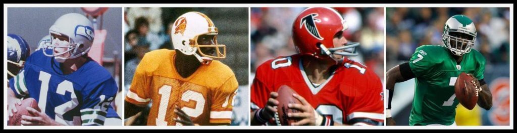
Dallas Cowboys
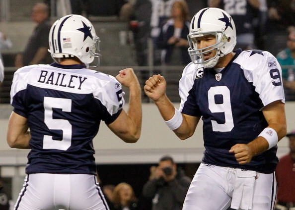
This one’s a no brainer — and they’ve already done it. Bring back the 1960-63 white helmet and unis. Either the blue jersey with white shoulders or the white jersey with blue shoulders (as seen on Dandy Don). In 2026, I’d love to see them wear the red/white/blue striped helmet for the 50th anniversary of their Bicentennial look.
Should They? Yes
New York Giants
Except for their nascent years, the G-men have always worn a blue helmet, but back in the leatherhead days, that wasn’t always the case. They could bring back their 1933 look, and give the helmet the winged treatment for a modern upgrade. Pair it with some tan pants and boom.
Should They? I think it’d be fun to see at least once.
Philadelphia Eagles
Another no brainer. The Eagles had a beautiful kelly green throwback in 2010 (to 1960), and that kelly green needs to make a comeback. Yes, they’ve had other nice kelly green unis (including ones with silver pants), but the 1960 throwback is … perfect.
Should They? Damn straight
Washington Football Team

Nope. Sorry. I’m all for historical accuracy, but I can’t support the team throwing back to any team or year in their repertoire, even if the uni or helmet didn’t contain Native American iconography. Let’s see what direction the team moves in going forward, and we can discuss future uni/helmet options then.
Should They? N/A
NFC North
Chicago Bears
Here’s one I wouldn’t change — I LOVE the 1933 Bronko Nagurski throwbacks they’ve adapted to a modern template. We’ve seen what happens when they went a bit too far back. Yes, the team wouldn’t even need a multi-shell rule for this to happen. But with the exception of a few orange or white painted leather helmets from their history, the team has always used a blue shell anyway.
Should They? They already do!
Detroit Lions
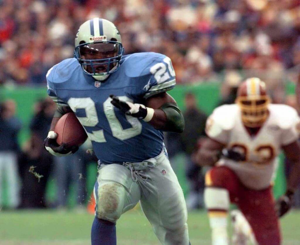
Let’s face it — who wouldn’t love to see the Lions throw back to their black/red days (see 1948-50) for one game? No one? Well, maybe not. And the Lions have been wearing silver helmets for more than 60 years, so while some might want to see a Honolulu blue hat, that’s not a good option. Instead of their current throwbacks, which are plain but gorgeous, their best look would be basically be anything worn during the Barry Sanders years. This team once achieved uni perfection. For one game a year, I’d love to see them return to it.
Should They? YES!
Green Bay Packers
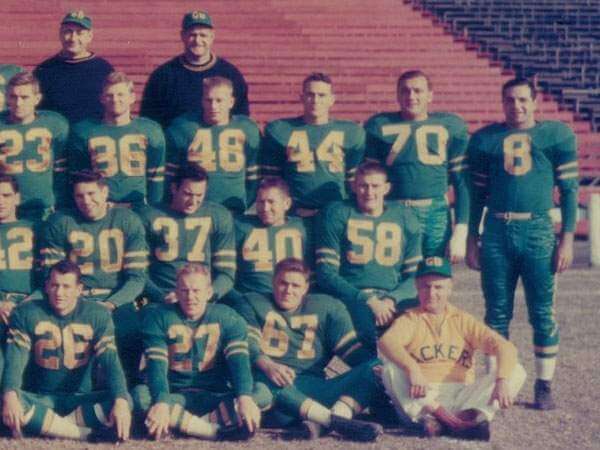
A decade or so ago, the Packers wore an early 1920s throwback (with brown helmet to simulate leather), and more recently have thrownback to the 1940s, so they’re pretty good at wearing their history. But why not show off their 1953 mono green unis? Or how about the gold over green alternate from that same season? Yes, the GUD shows them in tan helmets — but why not just pop on a green helmet for the hell of it? No? OK. I happen to think the current Packers uniform is the best in the NFL, so maybe we just leave this one alone.
Should They? Tough call. I think I’d need to see it “on the field” to give a true verdict.
Minnesota Vikings
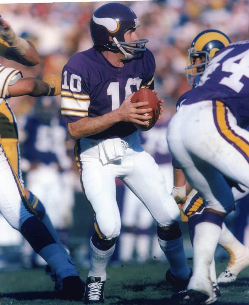
The Vikings are somewhat of a tough case, since they’ve always worn a purple helmet. And unless you happen to think a gold helmet is a good idea, then they may as well return to one of the better uniforms they wore (1970s era). Unless you wanted to pair that gold helmet with their current CR unis — which I wouldn’t recommend.
Should They? No gold helmet. Yes to the Tarkenton-era throwbacks.
NFC South
Altanta Falcons
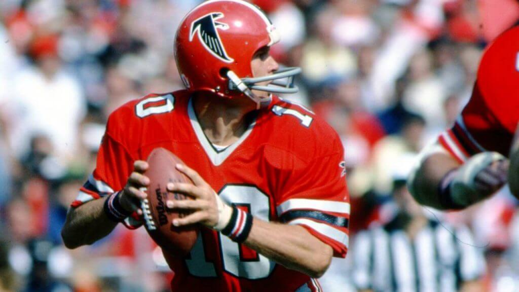
This one is a given. The Falcons never looked better than when they wore red helmets and jerseys — you can argue whether those looked better with white pants or gray pants — but if the one shell rule is lifted, the red hats & shirts need to return.
Should They? HELL YES!
Carolina Panthers
Throughout their history, the Panthers have always had a silver helmet, so the lifting of the one shell rule wouldn’t affect their “throwback” options. But what if the team changed colors to white or blue? In theory it might work — but I’m not so sure a blue helmet/blue jersey would work in practice. And the white helmet paired with anything but the white jersey probably doesn’t work either. Let’s just leave this one alone.
Should They? Nope
New Orleans Saints
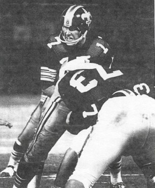
During the 1969 preseason, the New Orleans Saints wore black helmets. Unfortunately (or fortunately, depending upon your perspective), they never saw the field for regular season play. I for one would love to see this look at least once on the field. Sure, it’s a bit of a Steelers vibe, but that’s OK. I have a feeling if they were to bring back the black hat, they’d use it with their current all-black uniform — which would actually make that look a lot better.
Should They? Yes. I think I could deal with their mono-black unis if they had a black hat.
Tampa Bay Buccaneers
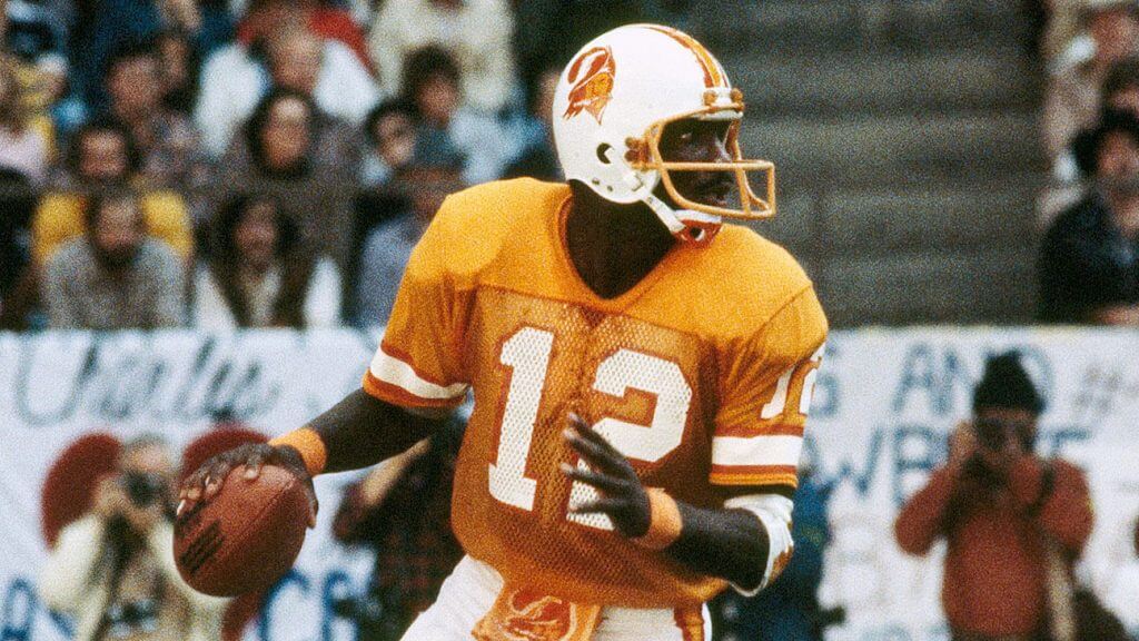
Duh.
Should They? This uniform is why we all want the one-shell rule lifted!
NFC West
Arizona Cardinals
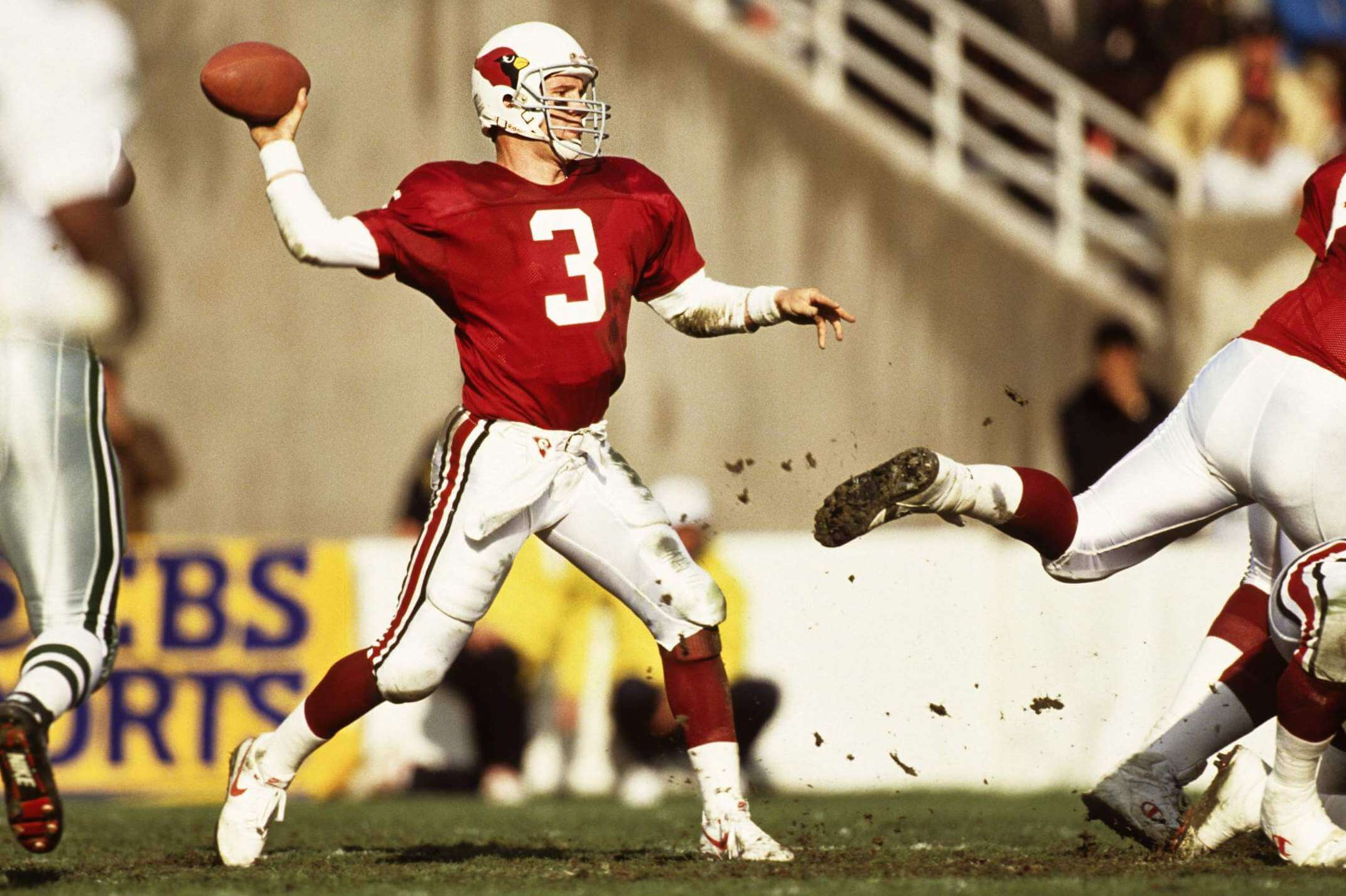
Let’s face it — the current Cardinals unis are an absolute disaster, and not likely to be remedied by the use of a different color shell, be it red or (heaven forbid) black. The Cardinals haven’t worn a red helmet since their days in Chicago, so while there is historical precedent, it’s probably not something that needs to be rebirthed. Better to just blow up the current set, and maybe consider simply returning to the uniforms they wore when they moved to Phoenix in 1988.
Should They? Absolutely NO to the red or black helmet. Yes to the 1988-era throwbacks.
Los Angeles Rams
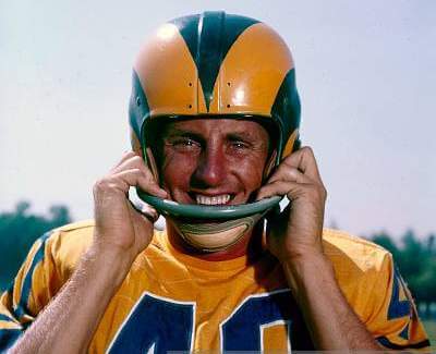
As fun as it might be to put the Rams in a red based helmet, like they wore for one season only in 1949 (even if only for one game), the far better option would be to give them a 1951-56 retro treatment when they wore gold jerseys and white pants. It’s a really good look, and one of the few from the 1994 75th Anniversary throwbacks that worked. They’d need to use a darker blue shell than their current metallic royal shell, so that would work out just fine.
Should They? I’ve been waiting for the Rams to wear gold jerseys (just not with the CR pants and socks) for decades.
San Francisco 49ers
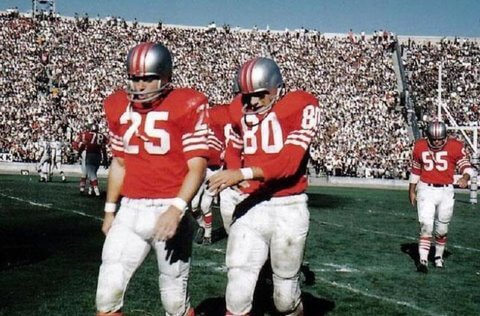
As most of you are probably aware, for a brief period in their history — 1959-1963 (and also during the leatherhead days about a decades prior) — the 49ers wore silver helmets and pants. This might be a fun look to see brought back. There was also a period (between 1950 and 1956) when the team sported red helmets, which I’m not a keen on seeing. For one game, I think we’d all love to see a silver hatted 49ers team (provided their opponent is not also wearing silver lids).
Should They? At least for one game, yes.
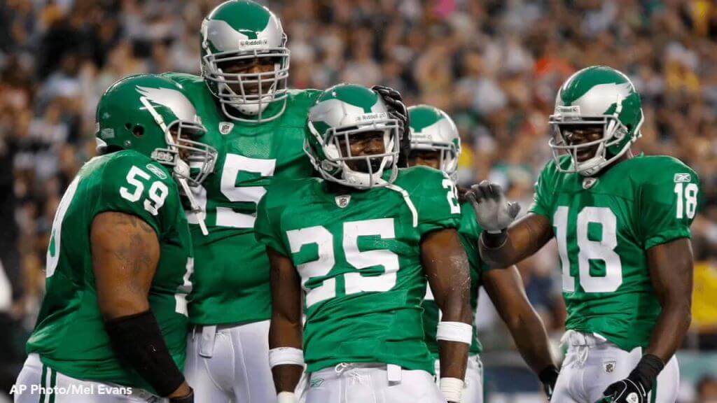
Seattle Seahawks
One last no brainer for today. The original Seahawks uniforms were a work of art, and with the one-shell rule lifted, fans can see just how great this team once looked. Ideally they would bring this back as a full-time alternate (and dump the CR neon green), but the team looked best between 1976 and 1982, and these unis need to be seen again, in all their glory.
Should They? This is one uniform the team never should have ditched. Bring it back!
And there you have it — just a few suggestions for (mostly) throwbacks if the one shell rule is lifted. It’s time.
What say you?

And indeed… it was a One Day Uni Wonder
Looks like the All Star Patch is gone
cc: @UniWatch https://t.co/7prugUQOUW— Phil Hecken (@PhilHecken) April 3, 2021
As you can see, yesterday Atlanta took the field wearing their gray road jerseys and blue caps, and the All Star Game patch, which they had worn for their season opener on Thursday (on the right sleeve and right side of their caps), was removed (or actually it looks like it was covered over). Here’s a closer look:
Looks like they didn’t remove it, just covered it. pic.twitter.com/qJofH61v6O
— Logan Stair (@LogStair) April 3, 2021
The team still has the cap tributes to Henry Aaron and Phil Niekro — no word yet on whether they will move those (or add those) to the now vacant right sleeve, which I would think they will do once they permanently remove the ASG patch.
In case you missed why this is big uni news, please give yesterday’s Uni Watch a quick read.

Guess The Game…
from the scoreboard
Today’s scoreboard comes from Akeem Drexler.
The premise of the game (GTGFTS) is simple: I’ll post a scoreboard and you guys simply identify the game depicted. In the past, I don’t know if I’ve ever completely stumped you (some are easier than others).
Here’s the Scoreboard. In the comments below, try to identify the game (date & location, as well as final score). If anything noteworthy occurred during the game, please add that in (and if you were AT the game, well bonus points for you!):
Please continue sending these in! You’re welcome to send me any scoreboard photos (with answers please), and I’ll keep running them.

Uni Concepts & Tweaks
Time for more Uni Tweaks from the UW readership.
I hope you guys like this feature and will want to continue to submit your concepts and tweaks to me. If you do, Shoot me an E-mail (Phil (dot) Hecken (at) gmail (dot) com).
Today’s concepts come from Justin Bruce, who has some Iowa State Cyclones football concepts.
He writes…
Phil, my submission is attached for “concepts & tweaks”. Love the website. Thanks for all y’all do for uni-watching!
My concept for Iowa State has a mixture of old-school & modern elements.
• The chest & pant legs have Jack Trice ghost stripes.
• The black collar is an homage (so-to-speak) of a cardinal’s collar.
• The jerseys, pants & socks are meant to be worn in only these combos, but the white helmet can be worn with any combo & helmet logos are interchangeable, except for the all-white which can only use whirly-Cy & is only meant for meaningful contests & preferably night games.
• The running-Cy logo was designed by Drak on the Cyclone Fanatics forums. The logo is a modern version of logos used in the 60s, 70s & 80s.
I hope you all enjoy!
Justin B. – Des Moines
And here are his designs:
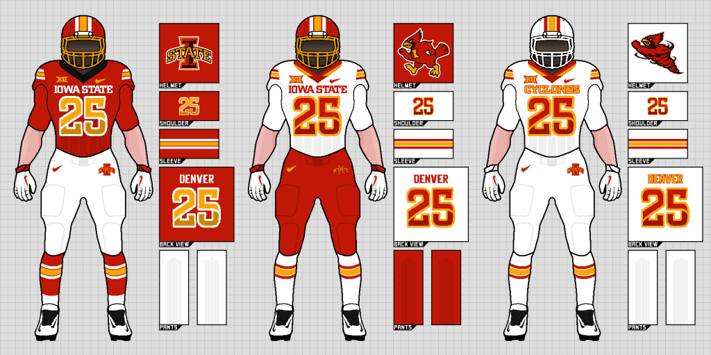
Thanks Justin!
OK readers (and concepters). If you have some tweaks or concepts, shoot ’em my way with a brief description of your creation and I’ll run ’em here.
And now a few words from Paul
Hi there. Happy Easter weekend! Two things to let you know about:
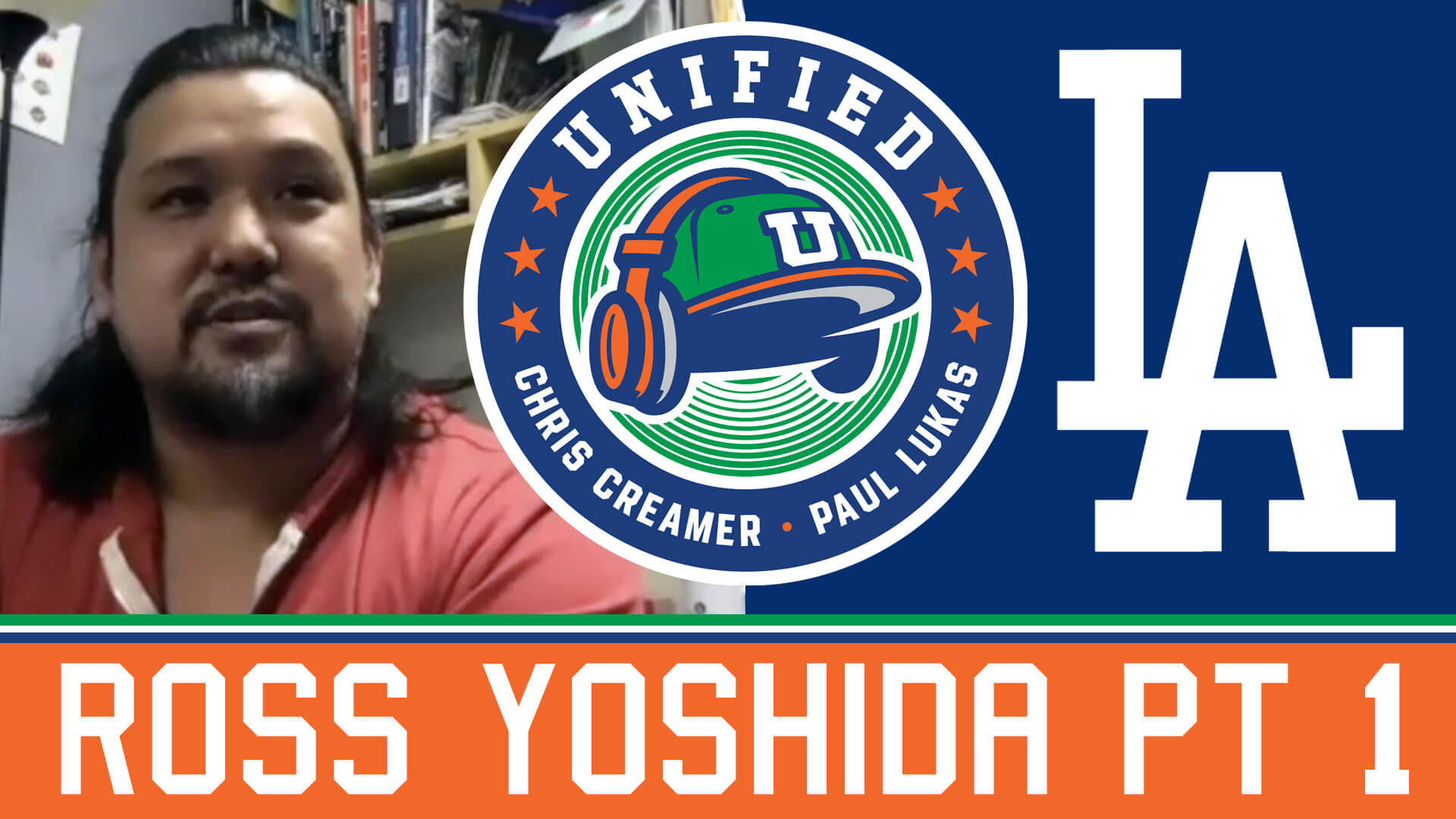
1. In case you missed it on Thursday, the new episode of Unified features an interview with Dodgers design director Ross Yoshida for this week’s episode of Unified — our first guest! You might think he doesn’t have a lot to do, since the Dodgers’ visual identity is so traditional and static, but he’s designed lots of the team’s sleeve patches, fixed their iconic script after it somehow got altered, and a lot more. This is the first installment of a two-part interview with him, which we think you’ll really enjoy.
As always, you can listen to us on Apple, Google, Stitcher, TuneIn, and Spotify, or just use the player below:
The show notes from this episode, which include photos of many of the things we discussed, are here. Those photos (and some additional ones) also appear in the video version of the episode, which you can see here:
Please consider supporting this episode’s advertisers, Oxford Pennant (get 20% off any order with checkout code UNIFIED), Ebbets Field Flannels (10% off, except on NFL items, with checkout code UNIFIED), and Tokens & Icons (free shipping by checking the “For Office Use Only” box and then entering the checkout code UNIFIED).
2. In case you missed it on Thursday, our April pin has a golf/Masters theme:
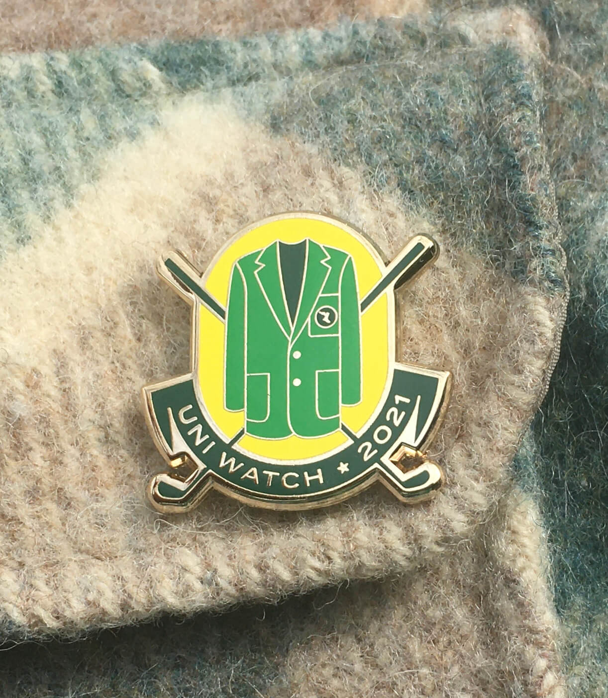
It’s a numbered edition of 200, with each pin individually numbered on the back, and as of this morning about 75 are remaining. It’s available here, and we’re donating all the profits from this one to Fair Fight. You can learn more about why we’ve chosen to do that here.
That’s it! Now back to Phil.
Uni Watch News Ticker
By Phil

Baseball News: Uni Watch readers likely know most of the information (and there seem to be a few discrepancies contained therein), but here’s an article on uniform histories of several MLB clubs. … Oy Vey. We know Stance makes some pretty great socks, but these fake stirrup socks ain’t one of them (from Addicted to Helmets). … Speaking of A’s fake stirrups, check out this COVID tracking device on Sergio Romo (from Steve Silva). … Check out the Astros “fan” caps with the MLB Opening Day logo (from Ignacio Salazar). … Stars and stripes uniforms for Kansas baseball against Texas yesterday in Lawrence (from Timmy Donahue). … I have no idea why anyone would want to own a cap that looks like this, let alone one with a Cards/Nats mistake (from Mike McCorkle). … No photo unfortunately, but in Friday night’s White Sox/Angles game, Sox DH #73 Yermin Mercedes got a hit off of Angels RP #73 Chris Rodriguez. Submitter Doug Robb asks, “Wonder if it’s a first #73-#73 regular season matchup but as a uni enthusiast, it’s obviously the first thing I clued in on.” … Our own Alex Hider notes, “Reds 2B Jonathan India cuffs his pants a bit high…not quite as high or baggy as Carlos Santana, thankfully.” … Looks like MLB teams will have an on-field option to wear mesh-backed caps this year (from F.K. Yaaj). … The Cardinals Bob Gibson memorial patch will be a unique color for each uniform this year it appears (from Ryan). Here’s a larger view. … Check out the OSU logo in the outfield of their softball game vs. UO yesterday (from Jeremy Brahm). … “Is Ha-Seong Kim the first dude with New Balance batting gloves?!” asks Robbie Darch. “The rest of the New Balance guys go with Franklin mitts.” … Check out U of Florida pitcher Elizabeth Hightower with a sunflower in her hair (via Paul).

NFL/NCAA Football News: Check out this awesome 1970s game used New England Patriots MacGregor clear shell football helmet (from Helmet Archaeology). … There may be another “benefit” to allowing teams to issue more single-digit numbers. You can probably guess what it is (from Tom Turner). … New Dominion Blue uniforms for Old Dominion University (from Tracking the Monarchs). … There was a color vs. color matchup from Cedar City, Utah, yesterday (from Benji King). … Some of you know this for sure: There was a time in the 1960s when wearing a black helmet was an honor for Badger Football players. The concept was featured during the John Coatta coaching era from 1967 to ’69. One member of the defense was chosen on a weekly basis to be singled out for his aggressive play (from Scott Hurley).

Hockey News: The Junior A BCHL started the shortened regular season on Friday night. Submitter Wade Heidt notes, “The league had played an extended preseason months ago but then the season was delayed due to COVID. The Alberni Valley Bulldogs opened their regular season debuting their new alternate black uniforms.” … Also from Wade, there were some notable color vs. color in a BCHL regular season opener Friday night. The Penticton Vees were wearing their black uniforms against the Trail Smoke Eaters in their orange uniforms. Also, “All BCHL players wearing full shields this season instead of visors as a COVID protocol, though not sure how that would really make a difference,” he adds. … Here’s one hockey blog’s ranking of the best Anaheim Ducks logos of all time (from Kary Klismet). … In honor of his 500th NHL game, the Florida panthers all wore Sergei Bobrovsky “500” jerseys (from Wade Heidt). … The ECHL Allen Americans wore three different sweaters last night. By virtue of Allen Police beating Allen Fire in their annual game earlier yesterday, Americans wore police-themed sweater in first period. Fire in second. Frontline healthcare workers in third (from Chris Mycoskie).


NBA/College Hoops News: Former Laker Isaiah Thomas will honor Kobe Bryant by wearing jersey No. 24 with Pelicans. … Here is the (not quite up-to-date) uniform tracker for the NCAA Tournament (it’s missing yesterday’s games) — from Brandon Wright-Rowan. … UCLA is the first Final Four team without a uniform manufacturer’s logo on their jersey since 2010, which also took place in Indianapolis (from Ryan Cotter). … In one of the all-time incredible finishes last night, Gonzaga’s Jalen Suggs just won the game with a deep 3 pointer as the clock in OT expired. “But he could have been a major college football player,” says Max Weintraub. Here is a photo of him as a high school QB in his senior year, when he was named Minnesota Football Player of the Year.

Soccer News: Nice pregame tribute yesterday from Arsenal for David Rocastle. According to submitter Jeremy Brahm, “Even the ad boards had a song about him in the 7th minute of play.”

Grab Bag: Yesterday the The Tar Heel Women’s lacrosse coaching staff wore blazers pregame in honor of the retiring Roy Williams (from James Gilbert). … In yesterday’s morning draw at the Curling Worlds, Canada wore their alternate black uniforms. Submitter Wade Heidt also notes Third Darren Moulding wore the red hat (he’d been wearing a black hat with white unis earlier in the bonspiel). … Every April is Autism Awareness Month and police officers for the Village of North Syracuse are marking the occasion with a very special addition to their uniforms (from Timmy Donahue). … The next four submissions are all from Kary Klismet: The Omaha public school district has announced that two new area high schools, Buena Vista and Westview, will have sports teams called “Bison” and “Wolverines,” respectively. … Here’s a cool story about the evolution of Rowdy, Colorado Mesa University’s costumed bull mascot. … This article, although a couple of years old, provides a fascinating in-depth look at the history of the baseball cap and how it became such a ubiquitous everyday fashion accessory. … And finally, similarly fascinating, if only slightly more recent, is this photographic exploration of early drag racing fire suits (thanks Kary!). … UNC’s Women’s Tennis Team got framed tank top jerseys for Senior Day (from James Gilbert).
And finally… that’s it for today. Everyone have a great week (and enjoy your Easter Sunday if you celebrate) and I’ll catch you back here next Saturday.
Peace,
PH
N.C. State beats Houston 54-52 in Albuquerque to win the 1983 NCAA Championship. Lorenzo Charles dunks it for the winning score.
Did anyone catch the Arsenal Liverpool match yesterday…during the second half the NBC commentators were joking about the color of the Liverpool kit, which apparently is supposed to match the Liver bird monument in Liverpool.
Re: GTGFTS… 4 April 1983.
Albuquerque, NM (The Pit).
NCSU 54, Houston 52. Jimmy V needs a hug.
Re: one-shell rule… the Bears, Lions and Vikings don’t red the one-shell
Rule to change, as the desired throwbacks would be the same shell color as the current model (or close enough that we don’t need to split hairs in the case of the Vikings, the difference between their purples isn’t as stark as the Eagles midnight versus kelly green).
Re: ISU concept… LOVE IT. good use of school colors, not a Southern Cal clone, no gray or black.
Re: Stance socks… it seems like they might be pulling back on the variety of sock options. I’ve watched both Phillies/Braves games, and I have only seen the Phils in solid red (for those who show calf) and the Braves who go high-cuffed have the awesome Northwestern stripes.
I believe your example of the 1969 Eagles having alternate helmets is incorrect ( if I understand your commentary). For one or two seasons, maybe longer, in that time frame the Eagles helmet was white with green wings.
I was only 3 years old in 1969, so I don’t have any actual memories of this, but link, they had both green and white shells that season.
The Eagles also wore different jerseys in 1969, they had plain sleeves with a number and NFL 50 patch on them and also the jerseys with the UCLA style stripes. I mentioned before equipment manager Bob Colonna once told me he redesigned the Eagles helmets to white with the green wings without the leagues permission, but I still find that hard to believe? The Saints got in trouble with the black helmets and couldn’t wear them. One of these days I have to tell the story when Tim Rossovich stuffed Bob in a trash can because of a dirty t shirt when they were with the Bell.
No, in 1969 the Eagles did wear 2 helmets, but it was white helmets with green wings at home and green helmets with white wings on the road. They also had both stripeless and striped jerseys (the same jerseys with shoulder and elbow stripes they had worn since 1965), so across pre-season and regular season they wore the white helmets with both stripeless jerseys and the green striped jersey; similarly the green helmet was worn with both stripeless jerseys and the white striped jersey. It was supposedly a trial to see which helmet would be used in 1970 – the first merged season.
The white shell was chosen and was worn from 1970 – 1973, as were the stripeless jerseys.
The link is missing for item about the Canadian curling team in the Grab Bag. Here is the link:
link
Thanks (and sorry). Should be fixed now.
Personally, I would love to see the Seahawks throwback to their original look – but aesthetically I think it would be best to have the logo on the helmet and not wear the plain silver one.
Phil, Phil, Phil…WHY did you not see this coming and add something in your writeup to explain that THE SEAHAWKS DID NOT WEAR PLAIN HELMETS IN 1976?
Stop feeding the troll and he will go on to other sites in search of food.
When I got to the Seahawks section, I stopped reading and went right to the comments.
I knew I’d find this posted.
So it goes.
If we are going to have 2 shells, we should look at the Dallas Cowboys. They have different shades of both blue and silver when they wear their white uniforms compared to their darks. The helmet never exactly matches.
We could have 1 helmet that is more blue silver with royal striping that matches the pants for the white uniform. The other helmet featuring the silver and blue that better matches with the blue jersey and silver pants with that set.
If some of the die-hard hockey fans are looking for more BCHL news, the Chilliwack Chiefs also debuted their new black third uniform in their season opener. We had seen the jerseys before in Dec on Uni Watch when released. Here is how the full uni looks on the ice with the black socks. No photos out there just highlights.
link
As a fan of the WFT, I would like to point out that the team wore its current throwbacks in 2020 but without any of the logos that were originally on the jerseys. If the one shell rule were lifted, the faux leather helmets designed for their throwback uniforms (work only once in 2012 before the one shell rule was instituted) could be worn with their logo-less throwbacks. I personally feel like the helmets are a cool idea that we only got to see on the field one time and since they don’t include any logos and the jerseys have already been worn without the logos, it’s a look the team should be able to wear before their new name is finally announced in 2022.
Totally agree on the textured leather looking helmet they have. Those looked amazing.
If the NFL is going to keep the CR uniforms, then I’d be in favor of a red helmet for the Cardinals. Also if teams were allowed to have a 2 helmets like the Eagles did in the past, a red helmet would look good with white jerseys and red pants.
I never fully understood the NFL’s claim that it was safer if a player wore only one helmet during the season, but presumably the league had some evidence that this was the case.
So wouldn’t it be a little awkward now for the NFL to lift that rule now for the sake of getting more throwback designs on the field? They’d basically either be admitting that their prior reasons for the rule were false or that they don’t really care.
I think it was a CYA move from the league in light of concussion lawsuits. Perhaps they’ve looked at data from the college game and seen it’s no less/more safe and are willing to make change?
Re today’s lede: I agree with every second single word you have written, Phil. Thank you for speaking truth so boldly.
Re Justin Bruce’s Iowa State uni concept: as an Iowa State alum, I approve. I definitely feel the ’80s vibes and the design mixed with the modern. The updated Walking Cy is an improvement over the one currently in use:
link
Finally, Happy Easter to everyone celebrating! The Seder celebration we do at my church in connection with the Passover and Easter season concludes with the traditional Hebrew Seder salutation, “Next year in Jerusalem.” Regardless of where it is, whether Jerusalem or elsewhere, may our Easter and Passover celebrations next year be free of the constraints of this pandemic.
As a Trojan alum, Iowa State looked too much like USC. Both schools in Iowa had copycat uniforms, with Iowa being a knockoff of the Steelers. Glad to see Iowa State lately have more uniform options.
Iowa State’s uniforms from 2009 through 2015 were never intended to be copycats of USC. Yes, there were some similarities, but the shoulder stripes, number font, and lettering across the front of the jersey were all different.
In particular, ISU’s shoulder stripes were UCLA stripes, which I can’t imagine any self-respecting Trojan fan confusing as a USC copycat. ;-) And Iowa State wore red or white pants on the road far more often than gold, which further differentiated the teams’ uniform sets.
(like, how good would the Bengals look with a white shell for their CR uni)?
I’d like to see that, but you show a picture of a silver Bengals helmet…
I’m all for historical accuracy, but I can’t support the team throwing back to any team or year in their repertoire, even if the uni or helmet didn’t contain Native American iconography.
Disagree. If there’s no imagery, have at it. Better yet, they could always throw back to the Washington Federals…and then keep that look.
Sure, it’s a bit of a Steelers vibe
No, that Saints look is more like the first two years of the USFL’s Denver Gold. And that would be fine as an occasional alt.
We know Stance makes some pretty great socks, but these fake stirrup socks ain’t one of them
MLB teams will have an on-field option to wear mesh-backed caps this year
If everyone wore fake stirrups and adjustable meshbacks (and if you got rid of the DH and got back to contact hitting and a proper strike zone), I might like baseball again.
Reminds me…for those who want to watch Manfred League Baseball, it’s Free Preview Week, at least on DirecTV.
If everyone wore fake stirrups and adjustable meshbacks (and if you got rid of the DH and got back to contact hitting and a proper strike zone), I might like baseball again.
Do clubhouses still have kangaroo courts? If the team’s sluggers grounded into the bizarre shifts (like having the whole defensive alignment stand between first and second) I would give those undisciplined hitters a big fat fine after every game.
As far as the Eagles are concerned, I think the best kelly green option is the 85-95 era. I’ve also always been a fan of the understated ’70-’73 with white helmets. But like so many other throwbacks, the team’s record in those wasn’t great, so I won’t hold my breath.
Your Steelers threw back to two different eras of futility (1934 and early 60s), so hold your breath…anything’s possible.
Re: Justin’s ISU football uniforms. Great work! I especially like the tones of gold and red on the jersey numbers. And the Jack Trice stripes are one of the more innovative trademarks to come up recently. Evocative of Georgetown’s Kente pattern or the Charlotte Hornets’ colorful pinstripes.
Happy Easter, Uni Watch!
Falcons: “… you can argue whether those looked better with white pants or gray pants,…”
Nope, it’s gotta be the white pants. And the white face masks are a must, too.
Redsk,…err, Football Team: I’d love to see the rear feather stripe helmets are an obvious choice for a comeback. Sadly that won’t happen, so I’d settle for their faux-leathers to return.
Gray pants, white facemasks.
Can’t wait to see the Emerald City’s Ocean Buzzards in their Jim Zorn/Sherman Smith finery. Make it happen, NFL! I like the hung-over bird logo of the expansion years better than the current rabid one.
Why did the 49ers, a team named for a GOLD rush, decide to make silver one of their colors. It’d be like the Cincinnati Reds deciding to wear blue uniforms.
Or the Cardinals football team wearing dark blue as their “change” jersey in the 40’s and 50’s. Additionally, the Giants and the Lions both had alternate plain red jerseys during the same period. In fact, during the late 40’s/early 50’s, the Cardinals, Lions and Giants red and blue jerseys all looked pretty much the same! Here’s a link to link when the Colts also seemed to get in on the bulk lain red jersey sale!
Assuming the records on Baseball Reference are correct, Mercedes vs. Rodriguez was the first 73 vs. 73 batter / pitcher matchup in MLB history.
The Redskins helmet from 59-64 would be an amazing option. Love the feather going down the center. Not sure why the guy who wrote this up skipped them as last I checked they are still a part of the NFC.
We don’t promote design concepts that use Native American iconography, such as a sacred feather.
It would be nice if the teams scheduled their throwbacks, so they are playing against teams wearing throwbacks from the same, or at least close to, era, preferably against long time rivals (Bears v Packers, 49ers v Rams, etc.).
The 49ers should wear their 1962-63 silver helmets that also had the red oval “SF” logo. Pair these with the 1955/1994 throwback sets (home red and road white) and I think they’d have a sleek, killer “white gold” look for 1-3 games a year (primetime games) and maybe for playoffs as well.
Sorry if this has been covered/addressed – but with vehicles they have vinyl wrap product – wouldn’t it be something that the NFL could have tolerated/experimented with where there was a thin vinyl applied to the initial shell in the ‘new’ desired color – then emblems applied to that.
Here, read this:
link
The NFL…always a couple years too late. The 100th anniversary would’ve been perfect opportunity to shelve the one helmet shell color rule (and allowed teams to wear more throwbacks)…it’s not like a 100th anniversary comes along every year, right???
Oh well, I suppose better late than never!
Yes, the Washington Football Team (WFT) should have a throwback if the one shell helmet rule were to be lifted. The WFT should use the 1942 throwback (one of the years that they won the NFL Championship). The entire uniform does not have any Native American logos, and the colors are burgundy and gold (yes, there is also a blue jersey but stick to the burgundy jersey). The organization was founded in 1932 and continues to use the burgundy and gold colors.
Wow, so many dead links in that NFL throwback article after a day. Too bad I can’t always read this same day.