The World Series begins tonight in Houston, with the Astros hosting the Nationals. That means it’s time for my annual Uni Watch World Series Preview, with fun facts and observations about the two teams’ uniforms. Ready? Here we go:
1. A very uniform look. The Nationals wore their navy alternate jersey for their three victories over the Dodgers in the NLDS (they wore grey and white for their two losses in that series) and for all four games while sweeping the Cardinals in the NLCS, so that jersey is on a seven-game postseason winning streak. Since that jersey can be worn both at home and on the road, it’s widely assumed that the Nats will wear it throughout every game of the World Series. If so, that would be unusual but not unprecedented — the last time it happened was in 2016, when Cleveland wore their navy alternates for all seven games of their Fall Classic series against the Cubs.
(There’s also been some chatter that the Astros could conceivably block the Nats from wearing navy for the games in Houston by wearing their own navy jerseys [WaPo link], which would supposedly force the Nats to wear something other than navy because MLB rules supposedly prohibit same-colored jersey matchups, even though such matchups happen here and there during the regular season, so who knows. We’ll all find out by tonight.)
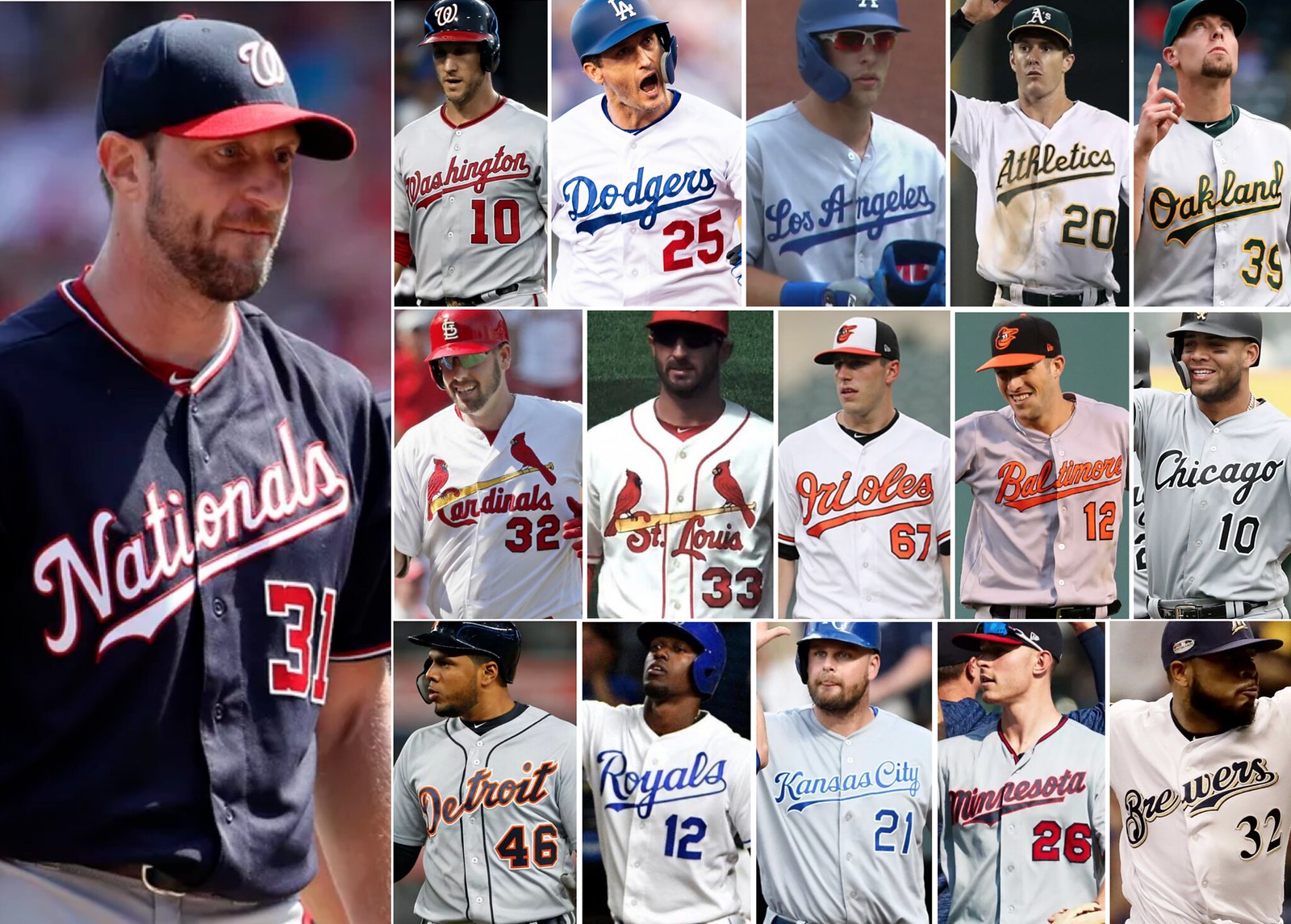
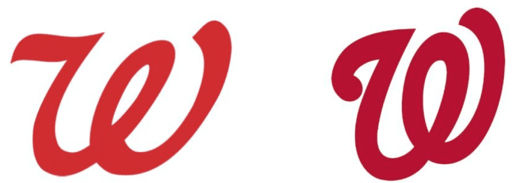
2. Uphill climb. Speaking of the Nats’ navy alternate: From the moment it was unveiled nearly two years ago, I’ve always felt that the script runs far too severely uphill. If we compare it to other MLB jerseys that include a script insignia and a front number — including the Nats’ own road jersey — it becomes apparent that there’s nothing else like it, and I don’t mean that as a compliment (I left out alternates that essentially duplicate script/number designs already shown here; click to enlarge):
3. Leaning tower of Houston. The Nats aren’t the only team in this Series with a jersey insignia issue. The Astros’ white and orange uniforms have badly off-center chest lettering, with the “R” in the center, three letters to one side of it, and only two letters to other side of it (click to enlarge):
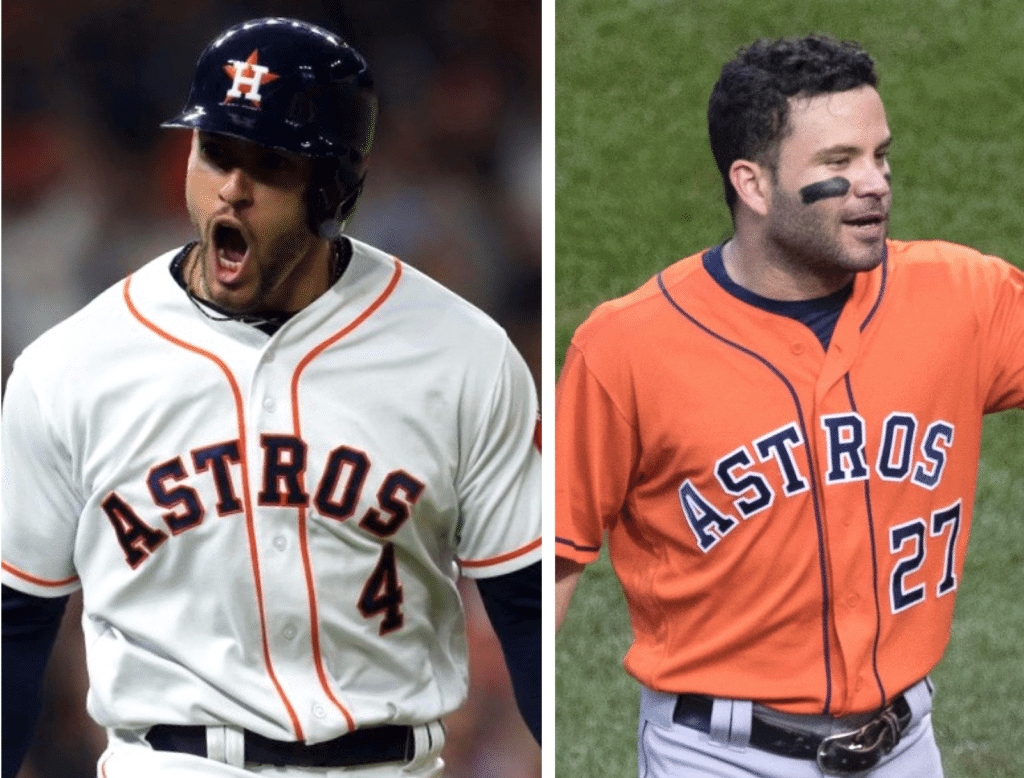
They’re not the only team with this issue, but they’re definitely a prime exemplar. Once you see it, you can’t unsee it!
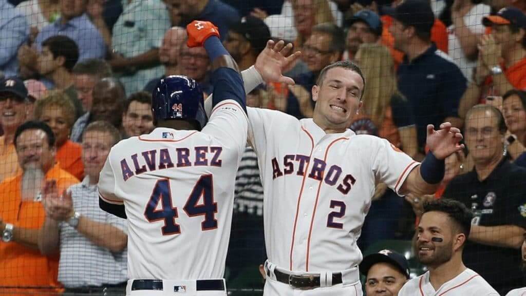
4. NOB job. One thing I’ve always hated about the Astros’ current set is that the NOB lettering on the back of the jersey is almost the same size as the chest lettering on the front of the jersey (click to enlarge):
5. Your prescription is ready. Lots of people have noted the similarities between the Nationals’ logo and the logo of the pharmacy chain Walgreens. How similar are they really? Let’s take a look:
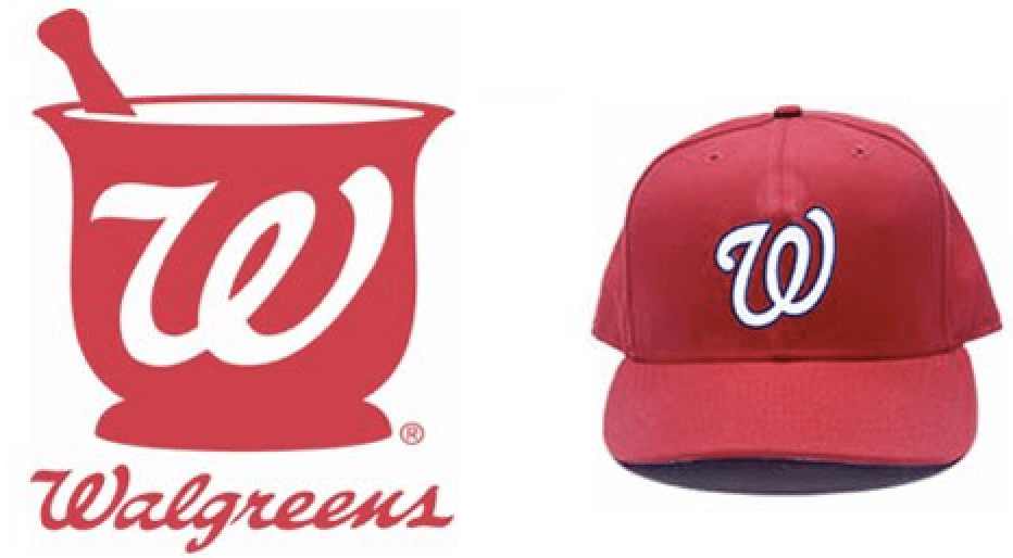
A DC radio station had some fun with this a few months ago, asking fans if they could tell the difference:
6. Turn back that clock! As many fans have noted, this could be a truly epic World Series, at least for a uniform perspective, if the teams broke out some 1980s throwbacks:
Here’s a vote for @MLB to have the @astros & @Nationals #Expos wear their #throwbackuniforms in the #WorldSeries @UniWatch #AZFamily pic.twitter.com/OLTooMkhbw
— Mark McClune (@MarkMcClune) October 20, 2019
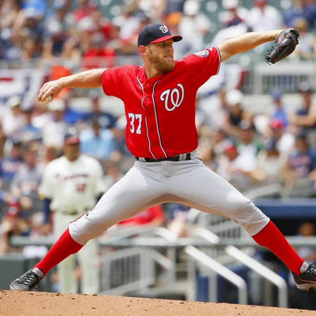
7. How it’s properly done. Lots of MLB players go high-cuffed, but most of them don’t do it quite right. They’ll either have their pants bunched at the knee and/or with the elastic showing (and then there’s Hunter Pence). These players could all learn a thing or two from Nationals pitcher Stephen Strasburg. Right from his very first game, he has been a one-man master class in the proper way to cuff and blouse a pair of baseball pants. His pant legs are always smooth from top to bottom, the cuffs always gorgeously bloused. It would be even better if he wore stirrups, but I guess we can’t have everything. I mean, look at this magnificence (click to enlarge):
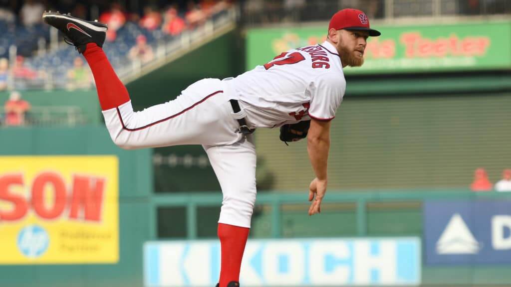
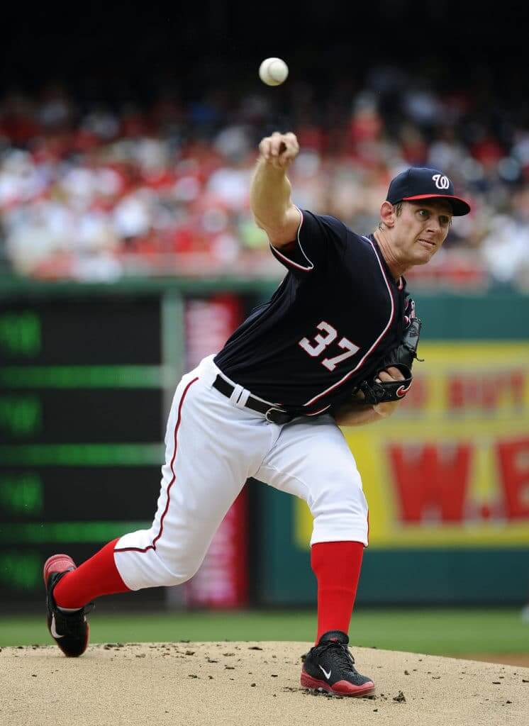
8. Color correction. Look again at that last photo of Strasburg. Does anyone else think the Nats would be better off wearing navy socks, instead of red, with their navy jerseys? I for one find the red hose with the navy tops to be jarring. The thought of having to look at it through every game of the Series makes my head hurt.
9. Ad-free zone. In a heartening development, this will be the seventh consecutive World Series in which at least one of the stadiums — Nationals Park, in this case — does not have a corporate-advertised name. The last time both ballparks’ identities had been turned into billboards was 2012, when the Giants faced the Tigers.
10. Nice while it lasted. In a less auspicious turn of events, this will be the last World Series — and the last MLB games, period — without a maker’s mark on the front of the jerseys. Sigh. Enjoy it while you still can.
Honorable Mentions: Longtime MLB ump Eric Cooper died over the weekend, so the umps in the World Series will wear a memorial patch for him. … You probably know this already, but just in case: Nationals pitcher Max Scherzer has one blue eye and one brown eye. … Speaking of Scherzer, I love the way he puts his hands over his head and then looks in for the sign when pitching out of the windup. Can’t quite explain why I love it, but for some reason I find it very satisfying.
NBA Season Preview reminder: In case you missed it on Monday, the annual Uni Watch NBA Season Preview, with all of the new uniforms, logos, and court designs for the upcoming season, is now available on InsideHook (my first piece for them, but hopefully not the last). Enjoy!
While we’re at it, here are a few more reminders:
• We’re taking orders for another round of Uni Watch cycling jerseys. Just like before, you can customize these with your choice of number and NOB. The ordering window for this batch will run through the end of next week, so move fast.
• The good folks at Art of Words are letting me raffle off one of their amazing lettering-based illustrations. The winner will get to choose any print from the Art of Words website. To enter, send an email to the raffle address by 8pm Eastern tomorrow, Oct. 23. One entry per person. I’ll announce the winner on Thursday (and we’ll have another raffle that day).
• If you’ve received your 2019 Uni Watch Press Pin, please feel free to enter it on our pin registry.
• In case you’ve somehow forgotten, we have all sorts of cool merchandise available here.
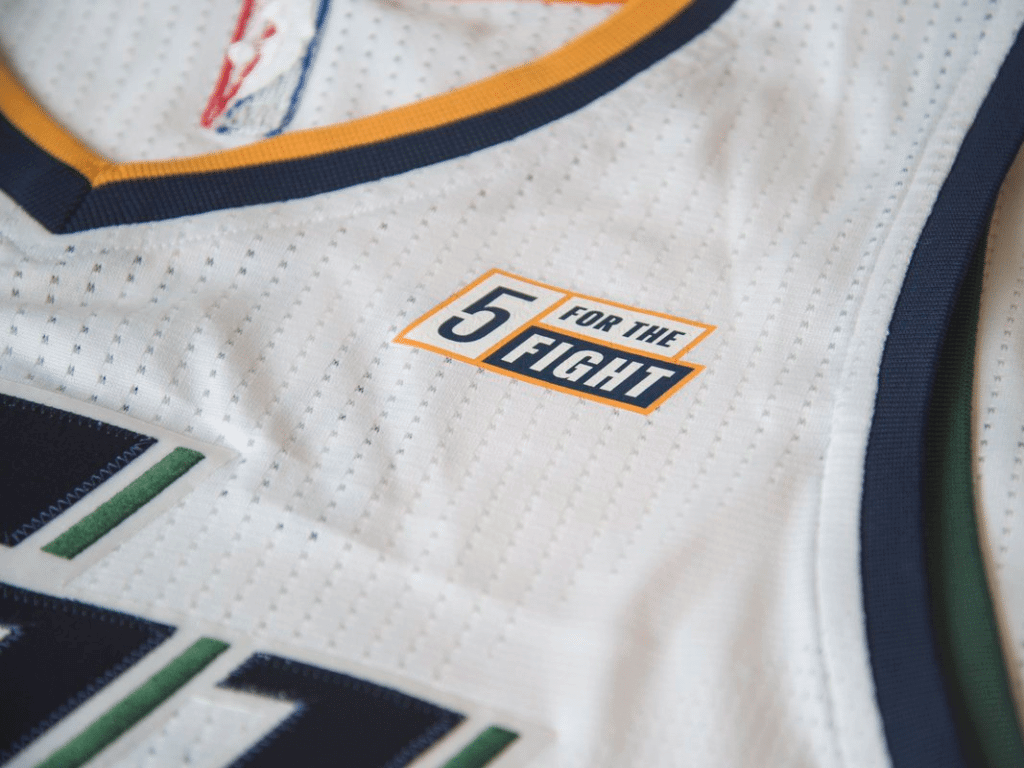
Best uni set in the league: When the Jazz announced two years ago that their jersey ad patch would be a “5 for the Fight” logo — an anti-cancer charity initiative from the software company Qualtrics — most observers, myself included, figured it would be a one-season thing and that the Qualtrics logo would replace the charity logo for the second and third years of the ad patch deal.
But that’s not what happened. “5 for the Fight” remained on the Jazz’s jerseys last season and is still there this season. Yesterday the team announced that Qualtrics has renewed its uniform patch deal for three additional seasons, and will keep “5 for the Fight” on the jersey for the duration of the deal.
Kudos to all involved, both at the Jazz and at Qualtrics — good for them. And shame on all the other NBA teams and uni advertisers, not a single one of which has used the NBA ad patch program for the benefit of anything but self-enrichment, self-aggrandizement, and commerce.
Click to enlarge
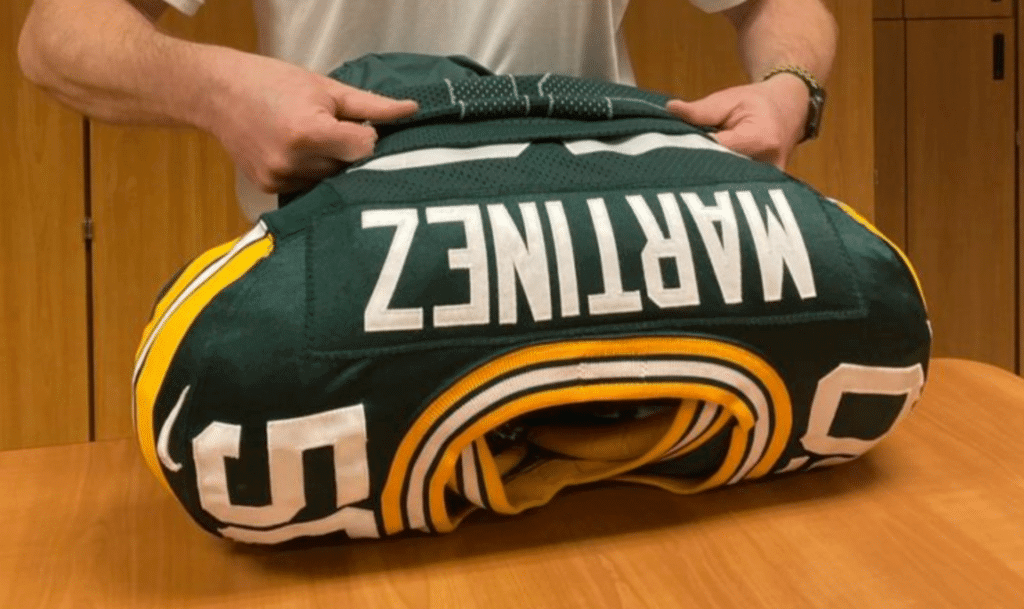
Packers double-jersey update: Yesterday I mentioned that when the Packers’ equipment staff put a jersey over a player’s pads, there seemed to be a second jersey underneath the game jersey. I’d never seen this before and didn’t know the story behind it.
The answer comes from former NFL equipment manager Scott Rotier, who emailed me yesterday with this explanation:
Most defensive and offensive lineman, linebackers, tight ends, and running backs use some sort of material — usually either double-sided tape or Velcro — to hold the jersey tight to the shoulder pads. It gives the defender less material to grab onto.
The Packers use a “sleeve” of sorts, which goes over the tape or Velcro that goes on the shoulder pads. This sleeve allows an equipment manager to put the jersey on over the pads more easily and then they can pull the sleeve out, leaving the jersey stuck to the tape/Velcro. The sleeve is made of a material that slides off the tape/Velcro easier, allowing the jersey to stick to the tape/Velcro when the sleeve is removed.
You’ll see teams that use Velcro (instead of double-sided tape) using a similar material to cover the Velcro during practices, so the practice jersey doesn’t stick to the Velcro.
As for why the sleeve has a collar, I’m not entirely sure, but my guess is that they put the collar on there so they can use it as a template when applying the actual jersey.
Faaaascinating. Thanks, Scott!
Click to enlarge
Collector’s Corner
By Brinke Guthrie
Follow @brinkeguthrie
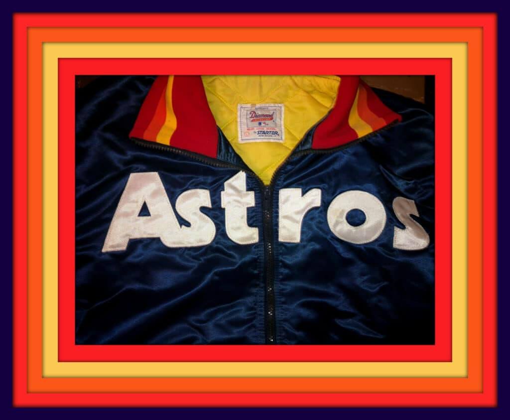
With the World Series starting tonight, here we go with this nice-looking Astros Tequila Sunrise Starter jacket. This is an original version from back in the day, not a reissue. It would be terrific to see those rainbow-striped unis in the Series, right?
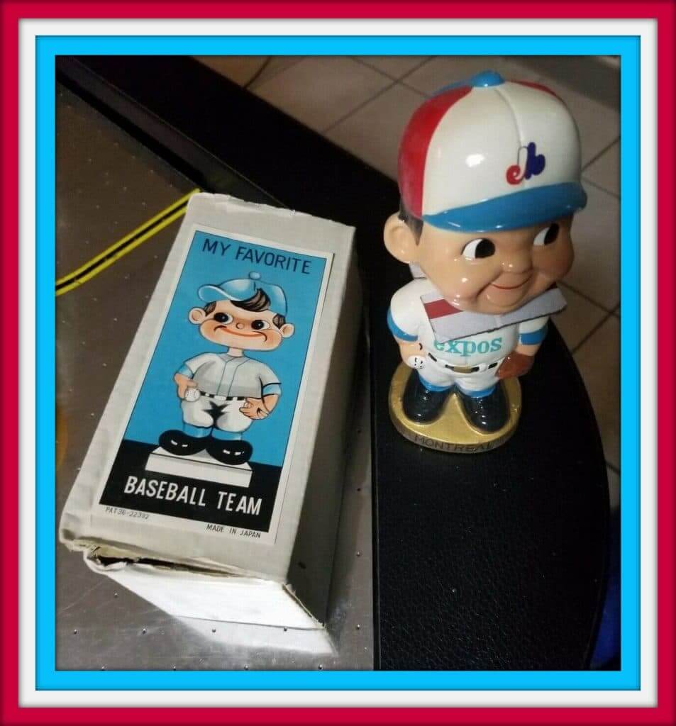
As for the other team in the series, the Nationals haven’t been around long enough to have any “classic vintage” Nationals stuff, so we’ll honor their franchise history by going with this 1960s Expos bobblehead in pristine condition! We’ll give that a showcase spot too:
Okay, now it’s “Batter up!” for the rest of this week’s picks:
• Here’s more for the Astros: There used to be a restaurant in the Astrodome called the Domeskeller (a take-off on the Rathskeller). It seems the waitresses there didn’t go with the standard baseball-themed attire.
• Reader David Shank says, “Here’s a rare ‘Turn Ahead the Clock’ Pittsburgh Pirates jersey from 1999. I’ll see throwback jerseys regularly available, but I hardly ever see these.”
• This 1970s Vikings “knit stocking cap” is just a little — oh, what’s the right word? — creepy. Maybe it’s just the
face they put it over.
• This 1970s Fisher Nuts Steelers glass shows the helmet logo on the wrong side.
• You have to wonder if Steelers linebacker Jack Lambert ever saw a nickel from this 1970s “Super Steelers T-shirt.”
• This 1970s Toronto Blue Jays dugout jacket was made by a Los Angeles manufacturer called Goodman & Sons, which I’m not familar with.
• “Two Great Names: Pittsburgh Penguins & Iron City Beer” is the slogan on this 1970s (empty!) beer can.
• This is an “Alex the Dog” glass (he was the the Baltimore Bullets’ mascot, kids; they’re now your Washington Wizards) from the 1960s, with the slogan “The Bullets Are Tall in Baltimore.”
• Been searching for a half-dozen 1970s Philadelphia Flyers hockey pucks? If so, today is your lucky day.
• Nice artwork on this collection of 1970s-1980s Boston Red Sox game programs.
• Take a break from your usual T-shirt: Your baseball clothing wardrobe will get a nice upgrade with this clean and classy Cooperstown V-neck sweater.
Got an item to include on Collector’s Corner? Send any submissions to uniwatchcollectorscorner@gmail.com.
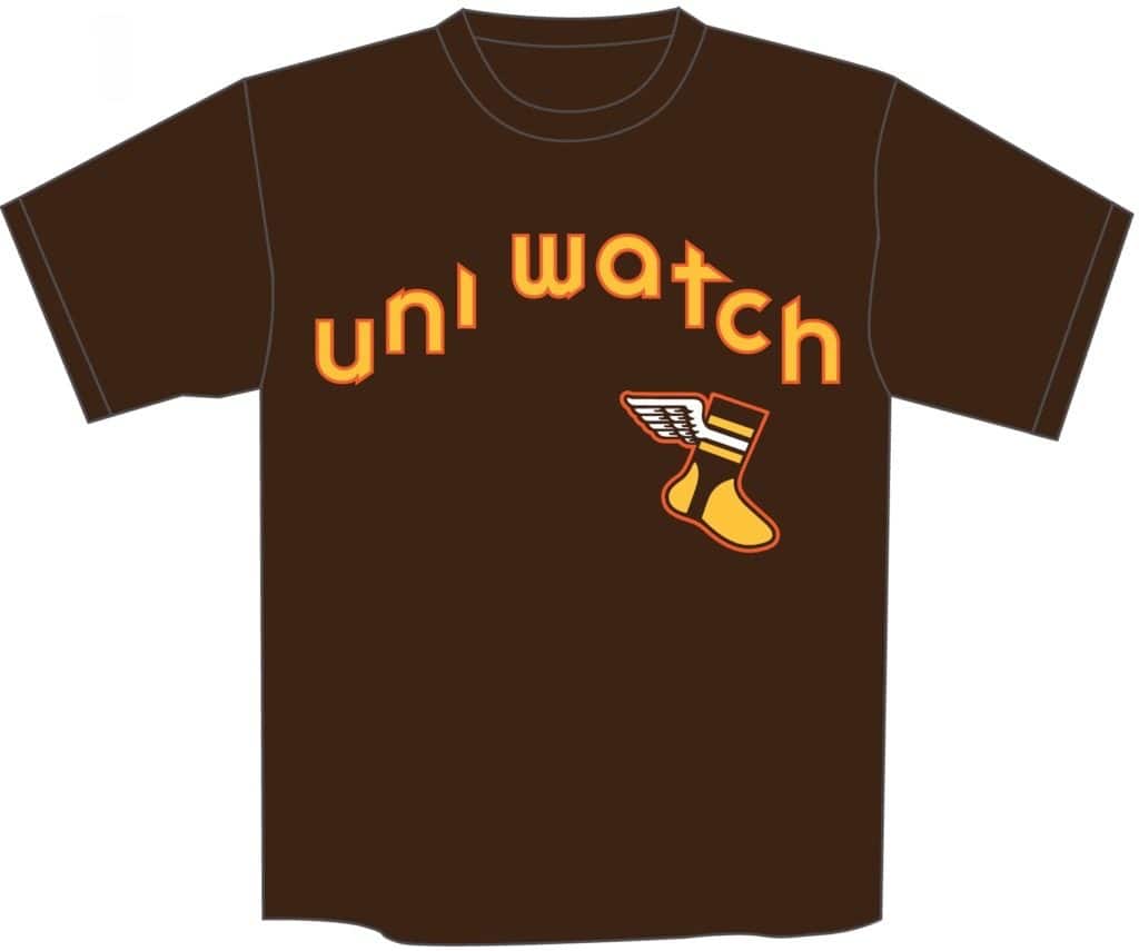
Brown T-shirt update: Yesterday I asked you folks to vote for one of three different logo designs to appear on a new Uni Watch Padres-style brown T-shirt. The vote turned out to be very close:
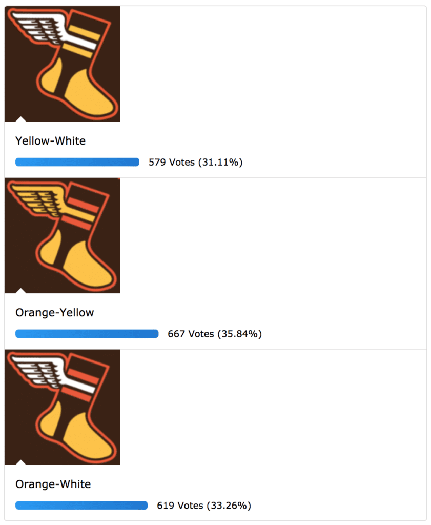
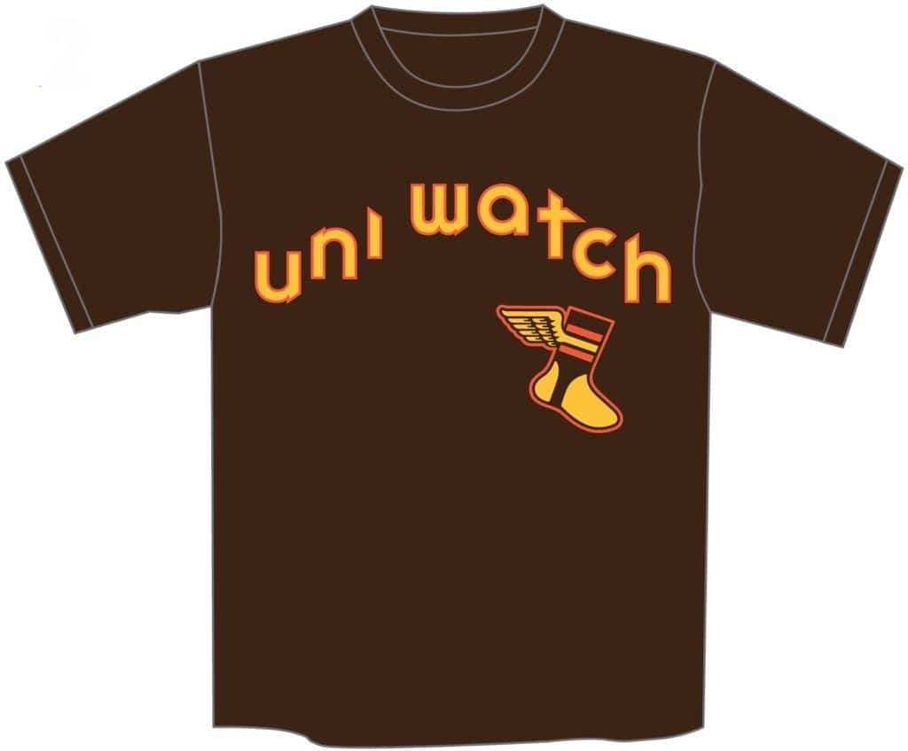
Those were the vote totals as of this morning. As you can see, the yellow-winged design won, but the two white-winged designs were close behind. Several people suggested to me that two white-winged designs may have split the white-wing vote, allowing the yellowed-winged design to win. Hmmmm. With that in mind, I’ve decided to toss out one of the white-winged designs (I decided to keep the one that I prefer), and we’re now going to have a runoff vote between these two designs (click to enlarge):
Vote here:
[totalpoll id=”117457″]
The winning shirt will be available for ordering tomorrow (or, if a clear winner emerges in the voting, later today).
Click to enlarge
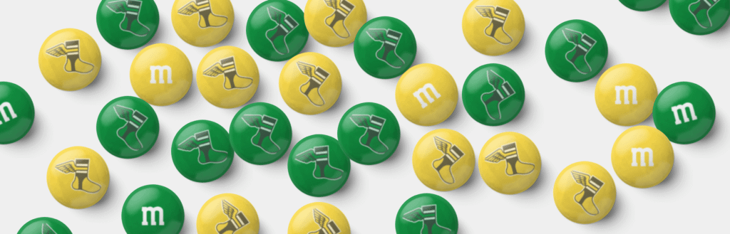
Candy-coated Uni Watch: I was playing around the other day on the “Design your own M&M’s site and created the mock-up you see above. I was thinking it might be fun to create a bunch of Uni Watch M&M’s in brown and yellow for my upcoming trip to San Diego (I figured we could have a big bowl of them at the Uni Watch party or something like that), but for some reason they won’t let you personalize/customize the brown ones. Dang.
That got me thinking it it would be fun to have winged stirrup-shaped chocolates. Or gummies! Hmmmm. If anyone out there works in the candy biz and could possibly make this a reality, feel free to be in touch.
The Ticker
By Paul

’Skins Watch: Collège Ahuntsic in Montreal will no longer call its teams the Indiens. They’re scrapping their logo mascot of a headdress-clad native, too (from Sara Klein).
.

Baseball News: In an odd move, SportsCenter chose to honor CC Sabathia’s retirement with a photo of him holding a batting helmet (from @wBlinty).
.

NFL News: The Jets went mono-green for last night’s game against the Pats — the first time they’ve worn that combo with their new uni set. … Meanwhile, Pats QB Tom Brady once again didn’t have the NFL 100 logo on his jersey collar, as has been the case all season long with his white jersey. A new wrinkle this time, though: His jersey sleeves were sliced open, similar to what another Boston icon, Pedro Martinez, used to do. … Browns WR Odell Beckham Jr. is not happy about being fined for wearing his pants too short.
College Football News: Here’s a graphic showing every Iowa State uni combo over the past 10 seasons (from Chad Lehman). … Blaise D’Sylva’s latest helmet collection is for Old Dominion. … Nebraska will be wearing black alternates this Saturday.

Hockey News: Hmmm, could the Devils have a new logo in the works? (From Moe Khan.) … Here’s a time-lapse video of Mosaic Stadium in Regina getting prepared for the 2019 NHL Heritage Classic (from Wade Heidt). … Whoa, check out the world’s largest collection of Penguins program covers.

NBA News: Here’s the schedule of when the Kings will be wearing their throwbacks this season (from @SacKings_Unis). … The Lakers have a new 60th-season-in-L.A. logo and are apparently planning some sort of announcement today (from Adam Stoneman).

College Hoops News: New uniforms for Auburn. … Syracuse will retire John Wallace’s No. 44 jersey on Feb. 29. “It’s their 15th retired number and the second No. 44 (Derrick Coleman’s 44 already hangs in the rafters),” says @PhillyPartTwo. “44 is already retired for Syracuse football for running backs Jim Brown, Ernie Davis, and Floyd Little.” … New throwbacks for Northern Iowa — the school whose abbreviation (although not on these throwbacks) is UNI! … New home whites for LIU (from @CaliGlowin).

Soccer News: NPSL club Napa Valley FC has a new shirt calling for an end to gun violence. “All proceeds from shirt sales will go to charity,” says Ed Zelaski. … Lazio striker Ciro Immobile got stuck while trying to celebratorily remove his jersey and fell down in the process (from Mark Coale). … From our own Jamie Rathjen: “Scottish Premiership teams Hamilton Academical (white/red, but solid white on the back) and Hibernian (very light grey) looked very similar from the back on Saturday.” … The Premier League’s anti-racism message is now printed on the league ball (from Josh Hinton). … New third kit for Leeds United (from Ed Zelaski). … Also from Ed: New away kit for Bolton Wanderers.

Grab Bag: New volleyball design for the CEV Champions League Volley (from Jeremy Brahm). … Here’s the new logo for the 2020 Democratic National Convention Host Committee. … Here’s the logo for the 2024 Paris Olympics (from Jeremy Brahm). … Interesting article about how climate change is affecting stadium planning, design, and construction (WaPo link). … New kimono-inspired livery for the Formula E team Nissan e.dams (from DarkAudit). … Under Armour founder Kevin Plank is stepping down as the company’s CEO.
A small correction:
“in 2016, when Cleveland wore their navy alternates for all seven games of their Fall Classic series against the Cubs.”
The Indians wore white uniforms for Game 1 (at home), then navy jerseys the rest of the way.
That’s a rare factual error for you, Mark!
link
Indeed, I stand corrected! I could have sworn they wore the white uniforms… I was so sure I didn’t even check!
(Sorry for taking up the first post with a mistaken correction!)
The 2016 World Series tracker agrees:
link
I was half-watching Patriots’ dismantling of the Jets last night, and while I am never a fan of the mono-look in football, I did find myself thinking that the more I see the Jets’ new uniforms, the more I like them.
The helmets look especially good, and the uniforms as a whole seem to be the perfect mix of a modern (but not too crazy) look that doesn’t completely sever ties to the past. If it were up to me, I’d either reduce in size or eliminate the “NEW YORK” from the jerseys and probably get rid of the black trim, but all in all I’d say these are the best new NFL uniforms in recent memory.
I’m no doubt going to be in the minority with that opinion, but was curious as to if others here are starting to like the new look at least a little more now that we’ve seen it a few times in action…
Agreed, helmets are the best part.
Minus the black trim it would look even better. Def an upgrade
i mostly agree. the color of the helmets is the best innovation in nfl in recent memory. four things that would make their uniforms top tier:
1 as you said, ditch the “new york” wordmark on jersey;
2 get the other uniform elements’ colors closer to the green used on the helmet;
3 ditch the black jerseys and pants; and
4 (unrealistic i know) use a graphic instead of a wordmark for helmet
Yes to all 4!
Also, I’d love to see a secondary logo on the sleeve. You can even narrow the white slash. Blank sleeves look boring IMO, especially on QB longer sleeves. The secondary logo right now is an “NY” in a football shaped outline (link below). It could work well with inverted colors for green/white tops. But this could also be an opportunity to come up with an actual jet airplane logo alternative…
link
I am on board with what you are saying. Liked the uniforms from 1998 to 2018, but the problem with those was the green being too dark.
Liked the previous Jets look up to 1997 and have been hoping for a return of a close to kelly green helmet in the NFL for so long.
The black trim is so minimal there is no reason it should be involved.
Going with the mono-green last night, really looks like they are paying homage to the Saskatchewan Roughriders now :), as Riders regularly wear the mono-green. Jets should look more closely at the Riders uniform, as they have gotten rid of the black entirely, except it is still just in the logo.
link
The uniforms are definitely growing on me too. However, I thought some players untucked white undershirts looked kind of sloppy with the mono green look. That being said, matching green undershirts wouldn’t look much better. Maybe just get shorter length undershirts?
the tutu look of short jersey with untucked undershirt is really bad and quite non-uniform. i remember a bronco game earlier this year where there were white, blue, and orange untucked undershirts under white bronco jerseys all on the field at the same time.
Maybe lack of enough coffee here, but I don’t understand the answer to the question about the Packers equipment guy using a second jersey underneath?
I didn’t quite understand it, either…
-Jet
It made sense to me, but I was also so fascinated by the pictures from yesterday that I probably read through that answer like four times. Long story longer: many layers like skin tight jerseys that can’t grabbed and stretched. The packers use a double sided tape, think carpet tape, that happens to adhere really well to that specific jersey material and the pads themselves. Since it’s hard getting the jersey pulled over the shoulder pads once the tape has been applied to the pads, I can imagine it sticks immediately and probably starts to peel it off. So they found a similar material to the jersey material that doesn’t stick to the tape, and made a mock jersey(sleeve) out of it. They apply tape to the pads, put the non-stick sleeve/jersey over it, slide the actually jersey over it, using the collar applied to that sleeve as a guide to get the real collar lined up properly, then once it looks straight, they pull the non-stick sleeve/extra jersey out from the top, allowing the game jersey to fall onto the tape, exactly where they want it.
Here’s what I read: the inner jersey is mostly a hunk of fabric that they use as a “sleeve” to cover the velcro / tape that’s on the shoulder pads so that they can position the game jersey properly without the velcro / tape interfering. Once they get it set up, they pull the hunk of fabric out.
If I had to guess why it has a collar, its because they’re using a piece of actual old jersey because its the right shape.
Immobile got a yellow card for his failed goal celebration. Diego Forlan still has the best shirt removal celebration. When playing for Manchester United he successfully removed his shirt but was unable to get it back on because of a complicated lining. The game resumed with Forlan still shirtless clutching his shirt in his hand.
Sounds like any chatter about the Astros wearing blue is just speculation in the mind of one writer. I have not seen anyone else have any credible information from anyone in the Astros organization on this. The Astros have never worn that blue top for a regular-season or postseason home game in the middle of the week. They wore it for one regular-season Saturday game this year on a weekend when one of the league-wide “special occasion” jerseys were worn the next day. And they’ve never worn that blue top in the postseason, period. They’ve occasionally worn the orange jersey on the road in the postseason and they did it for the first Friday home game against the Red Sox two years ago in the ALDS.
Looks like the writer convinced his editor to let him write a story that is nothing but unfounded speculation. Happens a lot in the media space these days.
“this will be the seventh consecutive World Series in which at least one of the stadiums— Nationals Park, in this case — does not have a corporate-advertised name.”
2016 – Progressive Field (insurance company) and Wrigley Field (chewing gum?). I know Wrigley was named years ago for a former team owner so that could be a stretch. Wrigley gum is still a thing but owned by Mars now. I can’t find a source that says Mars pays the Cubs anything for naming rights but they do receive a ton of publicity for the Wrigley name.
link
Wrigley Field is a vanity name, not a corporate name. Mr. Wrigley owned the team and named the stadium after himself. The gum company has never paid to have the name on the stadium, and the Cubs are free to sell the naming rights to another company, but they choose not to.
Regarding the uphill script, the Braves script on the white home jerseys seemed to be more uphill when they adopted them in 1987. I believe they appeared more flattened out by the early 2000’s when they changed outfitters from Wilson to Russell.
Terry Pendleton 1991 jersey (Wilson):
link
Glenn Hubbard 2004 jersey (Russell):
link
Paul, you mentioned in your NBA preview that the ‘ninja style’ headbands have been banned in the NBA possibly due to safety, any idea why it’s not banned in the WNBA?
Doesn’t sound like it’s really a safety issue, is it?
Didn’t realize they’re allowed in the WNBA. Interesting!
when Uni Watch originally report the NBA ban there were some user comments regarding WNBA players. This GQ article from before the ban notes that the Holiday brothers were inspired by WNBA players – link
WBNA players were definitely wearing these headbands all season. Since the NBA ban was announced during the WNBA season it is possible that it will take effect for the 2020 WNBA season
I voted for the winged stirrup with a white wing. My opinion is that no matter the color scheme the wing’s filled color should be white. Otherwise, I just think of a dirty chicken or turkey who hasn’t cleaned its feathers. I know, I am weird.
Likewise…
-Jet
I just don’t think the white fits in. It’s the only white on the shirt and pops just a little too much for my tastes.
I know this is an impossible battle, but I wish everyone would stop crossing the Expos’ history with the Nationals’. If the Nats had kept the name or at least acknowledged our history (I’m a Montrealer) before this year, it would be one thing… but from 2005-2019, they did everything they could to disassociate themselves from the Expos including having a player wear #10 (retired by the Expos for Andre Dawson). They adopted the histories of the former Nationals and Senators and basically erased Montreal from their existence until they realized they could sell a metric tonne of baby blue jerseys and tri-colour hats this summer. Let them “throw back” to Walter Johnson. The 1969-2004 Expos are ours.
I guess in that sense the Nationals are more like the OKC Thunder and Baltimore Ravens.
from 2005-2019, they did everything they could to disassociate themselves from the Expos
Not entirely true. In 2019 they wore Expos throwbacks. And for many years (maybe including now, I’m not sure and don’t have time to check) they listed the Expos’ retired numbers on their website.
Those Expos throwbacks were the first time the Nationals did anything Expos related. For a July day in 2019, the Nats whipped up Expos uniforms, had a pop up poutine concession stand, and had Anaheim Angel HoF inductee (but definitely former Expo) Vlad Guerrero throw the first pitch for a game between the Nationals playing dress up as a team they’ve disavowed since moving here and the Kansas City Royals. In context, 50th Anniversary throwback my ass. You can’t actively erase the Expos but throw a huge random honorific party later. And about the retired numbers, all I can say is that while Carter, Raines, Staub, and Dawson have names and Expos logos on the facade, those numbers were decidedly unretired tout de suite, with Washington #8 Marlon Anderson, #10 Royce Clayton, and #30 Mike Stanton.
Lemme tell you, ever since the Cleveland Browns, franchise histories just aren’t as objectively factual as they used to be. I’m a former Montreal resident who lives in DC. The Nationals taking Expos stuff stinks. The Nats even being here at the expense of the Expos stinks. I wear Expos stuff to Nationals Park as a fuck-this to the Nats, not because I’m an original gangster. If the Expos come back, the Nationals will be just another team to me, and I’d predict they’d borrow the Walter Johnson or Frank Howard histories as best as they can. Until then, BOO!
I don’t necessarily disagree with any of this. I was simply pointing out that the original commenter’s statement was inaccurate.
One problem in online debate these days — and in cultural debate in general — is that people have a tendency to “round up” (or down, as the case might be). If the position you’re advocating is a strong one, there’s no need to exaggerate. Just say “most of the time” instead of “all of the time,” or “rarely” instead of “never,” or “de-emphasize” instead of “disavow,” or whatever. It will lead to a more rational discussion and increase your credibility as you advocate for your point of view.
(Not directing that at you, Mike. Carry on!)
You “predict” they’d borrow the Walter Johnson or Frank Howard histories as best they can? They already do; where have you been? They have statues of both players outside the park for crying out loud (along with Josh Gibson). They resurrected the curly-W from the expansion Senators and took what had long been the official name of the original Senators (Nationals).
Honestly, the Nats are in a damned-if-you-do, damned-if-you-don’t situation with the uni-history crowd. When they ignore the Expos, they’re erasing history, and when they acknowledge the Expos, they’re stealing history or rubbing it in. If you have a problem with them reversing course for one afternoon this year, take it up with those Montrealers who had been screaming for them to do so for years.
I want a new Expos team too, preferably an expansion club so they don’t have to deal with internet-types carrying on about the erasure of (Devil) Rays history. But at least some acknowledgment that there’s no good way to handle the PR situation the Nats are in vis-a-vis the Expos would be nice for a change.
I’m with you – it’s gross
I find off-putting that the Nationals (too?)often celebrate, as their own, ‘all things Washington DC baseball’ but I was pleased that they finally on-field-acknowledged the franchise’s origins(and those throwbacks were gorgeous…worth the wait!).
I don’t understand this perspective. Who else is going to celebrate the history of Washington baseball if not the Washington baseball team and its fans? The alternative is virtually nobody in the baseball landscape celebrating Walter Johnson, which is unacceptable.
Franchise history matters for statistics, which is why it’s silly that the NFL pretends that the Ravens were an expansion team, but there’s also a spiritual history to teams. To understand the new Browns’ statistical history, you have to know about the Ravens and the move, but to understand the new Browns’ fans and culture, you have to know about the old Browns. We don’t have to pretend that the Nats didn’t move from Montreal, but we also don’t have to pretend that there’s no emotional through-line in the history of Washington baseball from Griffith Stadium to RFK Stadium to Nationals Park. These things can both be true.
I love that you said “metric tonne” because it is funnier and more interesting to my American ears than a “S*it ton” which people tend to say a lot. But, I was at a Nationals game on July 31 and there were no Expos hats/jerseys were to be found in the team stores. They ordered just enough to sell for that one throwback game and that was that. I was surprised they were not making a bigger deal of it.
I was at a Nationals game back in June and I wore my Expos cap (and my purple amnesty shirsey!). I thought for sure I’d hear some comments but not a peep, all the way from Ballston station to the ballpark. Now I’m conflicted as to which cap to wear tonight.
If that is a new NJ Devils logo – what the heck is it? A pitchfork? In any event it looks terrible. I am not a Devils fan but I at least respect the simplicity and consistency of their look.
Agreed, and very disappointing coming from a team that has adopted a traditionalist approach to their uniforms, i.e. apart from the trim color change from green to black, they’ve kept their look fairly consistent over the years and haven’t succumbed to the tawdry “let’s see how many third/alternate jerseys we can cook up to sell to our sucker fans” mentality. Just look at teams like the Kings, Sabres, Canucks, Penguins with their wholesale logo and color changes, compared to the Devils…
Agreed. I always respected the Devils for adopting a traditionalist approach to their unis; apart from the trim color change from green to black they’ve kept their look fairly consistent and haven’t fallen prey to the “let’s see how many third/alternate jerseys we can cook up to sell our sucker fans” mentality.
Compare that to the wholesale logo and color changes from the likes of the Kings, Sabres, Canucks, Penguins… pretty remarkable that the Devils have gone this long and kept the look. It would be a shame if they started messing with it now…
Jet
Now my replies are showing? I posted twice because there was nothing there after I hit “Post Comment”… sorry for the double post.
I’ve always felt the NHL missed a jersey selling bonanza by not forcing the Devils to have Miroslav Satan on their team. A Devils jersey with Satan on the back? Marketing genius.
In a somewhat related observation, also a shame former NHL defenseman Paul Ranger never suited up for the Rangers.
The Astros off-center lettering is *somewhat* mitigated by putting the uniform number in the lower right of the jersey. Takes away from that glaring space a bit.
-Jet
“Does anyone else think the Nats would be better off wearing navy socks, instead of red, with their navy jerseys? I for one find the red hose with the navy tops to be jarring.”
The Nats ditched the navy socks around 2009 when they began the gradual transition to the ‘Curly W’ as their primary logo. I don’t think they’ll bring it back. Also consider these recent WS participants.
The Red Sox won the World Series last year with navy tops and red socks. Indians also wore red socks with navy jerseys during the 2016 World Series at home.
Boston and Cleveland’s navy jerseys both have red lettering, which coordinates much better with the red socks.
The Nats’ navy jersey has white lettering. I would prefer navy socks.
Red numbers, though. I’d imagine the red socks would be less jarring when looking at Nats players from the back. It’s not nearly as jarring to me though as it was the first couple times they wore this jersey last season with their alternate red hats… link
(example of look at jersey+socks from behind with big red numbers)
link
I suppose multi-colored stripes à la classic Cardinals and a Red Sox would be too much to ask. A red sock with two pairs of white and blue stripes at the top? Yeah, too much to ask.
I tried 3 times to leave a comment about the Devils possible new logo and the post didn’t take, yet my other posts did take. The devil at work here, perhaps?
-Jet
my earlier comment took a long time to post. not sure just how long. i checked after 10 min, not there, i checked after an hour it was there
If comments get inadvertently caught in the spam filter, I usually spot them and free them right away.
This morning I was busy with other things and was away from the site for more than an hour, so some comments were stuck in moderation for longer than usual. Sorry.
sorry. i wasn’t complaining – just hoping to add info for Jet
Ah okay, I should have known that because I think I ran into this issue once before
cheers,
Jet
Perhaps that’s what happened to me a week or so ago when I made a comment about Larry Fitzgerald being patient zero with the bicycle shorts look on today’s football players. Thanks for the info. -C.
Printing techniques may have changed but based off my past experiences I think the white wing would mean adding another color which would raise the cost of each shirt.
Paul, how would you prefer the ASTROS lettering to go across the chest? The wide placket on a baseball jersey ensures that the break in the fabric is not directly on-center, and attempts to split letters across the gap look terrible.
I would prefer a much more dynamic lettering style — a script, a larger A at the front, something like that — that allowed for a balanced presentation.
Not Paul, but I would prefer it like this: link
I don’t know why they didn’t do this when they changed uniforms last time.
They blew it by not embracing the shooting star.
I’ve never liked their current fauxbacks, or the swollen cap logo.
That said, I like the blocky number font. Don’t try to figure me out.
Use a zipper, but not for the road jersey.
I didn’t mind the Jets in all green because the solid white socks helped to balance out all the green, perhaps one of the few net positives of the revised sock rule this year.
Re: Toronto Blue Jays dugout jacket made by Goodman & Sons. This was a Los Angeles based sporting goods store that made many different jerseys, etc. They were for many many years the concessionaire for the Dodgers. How many times did I hear Vince Scully talk about the new Danny Goodman this and that; whatever it was, they had it covered. All the souvenir stuff in the stadium was made by them. They also, for how many years I don’t know, made the Dodgers uniforms (I have a Rick Rhoden, year unknown, in excellent 70’s polyester.) Pretty sure G&S is now gone. They had a big store in downtown LA. Hope this helps.
Goodman and Sons also supplied uniforms to the other SoCal sports teams, and the Mets in 1986. :)
I’m okay with red socks/navy top. What I hate is red socks paired with red shoes. The Ronald McDonald look.
When thinking of how poorly the Jets have done this year, and how poor the Titans were last year, it got me thinking- Has any team with a redesigned uniform other than Seattle had a successful season in their first year in their new duds since Nike took over? The Browns, Dolphins, Titans, Jags (both times), and Jets have been consistently terrible, and I am pretty sure the Vikings and Lions had poor seasons their first year in the new uniforms too.
Paul,
I respectfully strongly disagree with your choice for the winged stirrup logo on the Padres T-shirt. Here’s why… it’s my opinion that the main reason a team should wear colored sanis is to incorporate a color from elsewhere in their uniform that would not otherwise be represented in their sock stylings. If you’re going to put all those colors on your socks, why not put ALL your colors on your socks? Picture the Chicago Bears wearing blue socks with three white stripes and no orange. It would look like something is missing. (And because I voted for the other one.)
Also, since Uni Watch professes to only concern itself with what the players wear on the field, wouldn’t it make sense for the number on the back of the shirt to be 20 (and not 19) because the brown uniforms won’t be worn on the field until the 2020 season?
I think all the logo options look good, so the shirt will look fine no matter which design wins. Personally, I like the version with the white wing (because I just think the white wing looks better) and the yellow stripes (because the Padres have actually worn brown stirrups with yellow stripes in their history). But like I said, all of the options are good. We chose 19 because the unveiling/party are in 2019 and also for Tony Gwynn. Can’t please everyone!
My favorite off-kilter baseball jersey lettering was the 80’s Red Sox roads that had link Never mind that “Boston” is only one word. They replaced it a few years later with the classic link Wicked!
The “Bos. Ton.” jerseys are underrated classics. However, they would have been improved by using the McAuliffe number font.
New TCU uniforms for the Texas game.
link
Just thought I’d add about blousing trousers. When I was in high school (oh many many years ago), the day after final cuts, we received our uniforms. Our coach then instructed us how to wear them. He made a specific point about the pants. He said to put on the sanitaries, put on your stirrups and pull them up over your knees. Then put on your pants, and pull the elastic all the way up to the bottom of the knee. Then take the pants down so that the pants legs were turned inside out on your lower leg. Turn the stirrups and sanitaries down, then pull your pants back up. Perfect blousing every time. His logic was that you now had three layers of clothing on your upper calf, which acted as a sliding pad.
That is the exact correct way to do it.