While I was in Scotland a few weeks ago, this article ran in the New York Times. It included the following quote from Derek Jeter, recalling his early days in the Yankees’ minor league system: “There were always a lot of rules. No facial hair. We had to have our pants bloused.”
That last bit was puzzling to a guy named Michael Malone, whose e-mail was waiting for me when I got home. “What the heck are ‘bloused’ pants?” he asked. “Is he talking about uniform pants or dress pants?”
Here’s what I wrote back:
Blousing refers to the proper method of wearing one’s baseball pants high-cuffed. It’s not enough to have the pants bunched up at the knee; the proper way is to have the elastic cuff tucked under and out of sight, which causes a slight bulge at the point where the fabric breaks underneath. This is blousing.
Look here. See how the pant leg fabric turns under? And here. See how the cuff point is wider than the stirrup just below it? That’s the blousing effect.
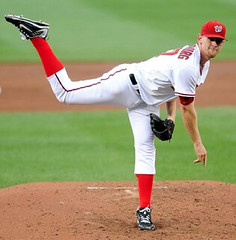
The next time someone asks me this question, I’ll just show them photos of Stephen Strasburg.
As impressive as Strasburg’s pitching was last night, his pants were even better. You want blousing? That, people, is picture-perfect blousing, at least in the double-knit era. So much better than letting the elastic show. Great tailoring, too, with no excess fabric or bagginess. Look how the pant leg looks like a cylinder, just slightly wider than the shin — thing of beauty.
And my god, what a pleasure to see a high-cuffer who doesn’t go too high. Strasburg’s cuff point, at mid-calf, is exactly — exactly — where it should be, and a welcome break from all the high-cuffers who cover their kneecap but nothing more (a look that should be reserved for football pants).
As it stands now, Strasburg has only one pants peer: Jim Thome, whose nicely bloused mid-calf pant legs have made him Captain Cuff for the better part of two decades now. But Thome is now long in the tooth (plus he’s only a DH these days, which means we never get to see him without one of his cuffs butting up against his shinguard), and I’ve been worried that there might not be anyone to inherit his cuff crown. Even my great hosiery hope, Corey Wimberly, has been noticeably weak when it came to cuffing acumen — all that bunching and wrinkling, tsk-tsk. But with Strasburg now on the scene, I can finally sleep at night, secure in the knowledge that the baton of pants protocol has been handed off to a new generation.
Of course, there’s one thing that would make Strasburg’s look even better, and you know what that would be. Credit equipment manager L.I. Phil with outfitting Straburg in those virtual stirrups. In fact, Phil was a busy boy last night, depicting Strasburg in low-cut stirrups (which Phil prefers) and in slightly higher-cut hose (which I favor). You can see the full fruits of his labors here.
And there’ll probably be a lot more where that came from, because it looks like Strasburg is the real deal, which means we’ll be seeing a lot more of him and his cuffs. Even better, given his rock star status, it may mean that others follow his lead. Let’s hope so.
ESPN Reminder: Two World Cup columns down (here and here), two more to go. The third one will be running later today. Link coming soon. Update: Today’s column is now up and running.
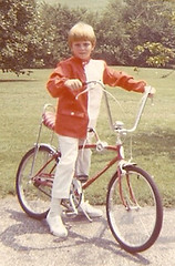
Collector’s Corner
By Brinke Guthrie
That’s my Indy Car phase. Louisville, late ’60s. Got the racing jacket from a model kit offer, I believe. It came with a “Hurst” patch, and I collected many additional patches when attending the yearly Indy time trials. Schwinn Spyderâ„¢ from Sears.
Now then, in eBay action:
• Here’s a different sort of collectible: an NFL business card.
• This one’s for Paul: a 1970s Madison Square Garden tote bag. [That’s pretty damn cool, but the players really should be wearing higher socks. — PL]
• These old Rawlings football kits were great. For the record, No. 22 on the Vikes in those days was Paul Krause.
• Your guide to Monday Night Football, 1973 edition.
*From the politically incorrect file: Okay, so African-American bobbles used to be rare, but do you really need to refer to it as “blackface”? A mere $800, too. Can’t imagine it not selling.
• Here’s a nice Esso NHL sticker collection.
• Can’t put my finger on it, but there’s something curious about this CuBs pennant.
• I remember these albums. But why does this Niners version have a Giants player on the front?
• You know how college football programs often used the same artwork? So did MLB pocket schedules, as you can see in these 1973 skeds for the Brewers and Cubs. Kinda looks like Santo to me.
• This ram horn looks anemic. Must have been a baby ram (which is actually called a lamb, but I don’t think you’ll see any teams calling themselves that, what with the whole slaughter metaphor and all).
• Here’s another one of those 3-D helmet plaques. Look how small the helmet is for his head!
And now back to Paul for today’s Ticker.
Uni Watch News Ticker: Here’s a sensational account of a visit to an old sporting goods shop in Nashville (big thanks to Todd Radom). ”¦ The Chicago Tribune ran something really mature in yesterday’s editions. ”¦ Anyone in the vicinity of Evanston, Illinois, will probably wanna check out this awesome-looking film program that will be screening at Northwestern tomorrow night (with thanks to Chris Falvey). ”¦ Super-duper-cool die-cut baseball book available here. ”¦ This might be Rob Ullman’s best illo yet. To see more of his recent work, scroll down through his blog. He’s also selling some of his sketches and decals on Etsy. ”¦ Tris Wykes was covering a Quebec Senior Indoor Lacrosse League game (and you thought I had a specialized beat) and noticed something interesting: “The game was at a hockey rink — they just ran around on the concrete floor with the boards and glass up. Partway through the game, I noticed this black gunky stuff in the goalie’s crease, so I asked a rink attendant about it. He said the floor is a bit too slick for running and cutting and stopping at full speed, so they spray a sugar-water concoction on it before games to provide a little stickiness. On top of this, the goalies often pour soda on either their crease or sneaker bottoms or both. One visiting goalie poured bleach over the bottom of his shoes so the rubber became soggy and sticky as it sort of melted. One goalie told me he doesn’t add anything to his shoes or crease, but he sweats so much that it combines with the sugar-water already on the floor and creates the black gunk.” ”¦ Longtime reader Bill Scheft had a book review published in last Sunday’s New York Times. It’s very smartly written, especially Bill’s description of baseball authors as “[the] writers entrusted to feed our baseball-history tapeworm.” … Karl Anderson notes that Joe Mauer has switched to that A.J. Pierzynski-style catching helmet. ”¦ Not sure if this was covered while I was away, but Luis Durango (who I believe is now back in the minors) was wearing a double-flapped throwback helmet a while back. Like most, but not all, double-flappers, he’s a switch-hitter (with thanks to Patrick Karraker). ”¦ Andrew McCutchen was apparently mic’d up for last night’s game, because the audio rig fell out of his back pocket (screen shot courtesy of Ryan Connelly). ”¦ Check out the tremendous sleeve patches on this old varsity sweater (with thanks to Robert Saietta). ”¦ “Stopped by my friend Barry Herem’s place a few days ago and took some pics of this batting helmet he recently designed,” writes Michael Princip. “It’s an example of Formline art, the graphic design system invented among the aboriginal peoples of West Coast Canada and Southeastern Alaska. It’s a highly disciplined two-dimensional style originally painted, carved in wood, and woven with wool. Formline art is now being applied in numerous ways to any surface, curved or flat.” You can see more of Harem’s artwork on his web site and at this gallery (which is right around the corner from Ebbets Field Flannels, don’tcha know). ”¦ If you haven’t already read the piece about Pete Rose’s apparently corked bat, I recommend it. I am not trying to kick-start the debate on Rose — just think it’s an unusually well-presented article. And after you’re done with it, there’s an intelligent follow-up analysis here.
How do you rate Juan Pierre’s blousing? I thought he looked pretty good when he was with the Dodgers – and he actually wore stirrups, not socks.
Also an apostrophe catastrophe in the 49ers Mini-Card Album.
Paul
Your expert Doug is perpetuating a fallacy in his critique of the Germans’ World Cup kit. This can be verified, because West Germany’s first international match after the war was not played against Ireland. It was against Switzerland on Nov 22, 1950 in Stuttgart. Their next match was also against the Swiss, on Apr 15, 1951 in Zurich. The Germans then had matches against Turkey and Austria that summer before playing Ireland in the autumn, in their fifth match after World War II. Thus, Germany’s decision to wear a green change kit for all those years was not a gesture of ‘thanks’ to the Irish. A little homework makes all the difference, and a lack of it can be a detriment to the credibility of an expert.
[quote comment=”393627″]Paul
Your expert Doug is perpetuating a fallacy in his critique of the Germans’ World Cup kit. This can be verified, because West Germany’s first international match after the war was not played against Ireland. It was against Switzerland on Nov 22, 1950 in Stuttgart. Their next match was also against the Swiss, on Apr 15, 1951 in Zurich. The Germans then had matches against Turkey and Austria that summer before playing Ireland in the autumn, in their fifth match after World War II. Thus, Germany’s decision to wear a green change kit for all those years was not a gesture of ‘thanks’ to the Irish. A little homework makes all the difference, and a lack of it can be a detriment to the credibility of an expert.[/quote]
Not really, I just wanted to point it out :-)
[quote comment=”393627″]Germany’s decision to wear a green change kit for all those years was not a gesture of ‘thanks’ to the Irish. [/quote]
so…why DO they wear it then? since you seem to know all the facts
Man oh man… Strasburg did just about everything right in his debut, didn’t he? The word on sports radio in Cleveland is with the Tribe’s lineup, he’s gonna toss a perfecto on Sunday. I hope for his sake, the kids doesn’t think all MLB lineups are as tough as the Indians and Pirates.
[quote comment=”393629″][quote comment=”393627″]Germany’s decision to wear a green change kit for all those years was not a gesture of ‘thanks’ to the Irish. [/quote]
so…why DO they wear it then? since you seem to know all the facts[/quote]
found this from The Guardian (not sure of its veracity)- Green was Rheinland’s colors while the black & white from the home kit were the traditional colors of Prussia.
link
I wonder how Strasburg will look in pinstripes in 2014!
I had one of those Cubs pennants on my wall growing up as a kid – the lettering always bothered me even then…
Long time “reader?” Gee, Bill Scheft has done a few more things than a NYT book review. Personally, I miss his phoners w/ Bob & Tom
(Cumulus dumped them locally ). Pretty pretty pretty good with the one liners, our Bill.
found this from The Guardian (not sure of its veracity)- Green was Rheinland’s colors while the black & white from the home kit were the traditional colors of Prussia
Green and white are the colors of the badge of the DFB (the German Football Federation), and are the colors of the soccer pitch (green grass, white lines).
[quote comment=”393629″][quote comment=”393627″]Germany’s decision to wear a green change kit for all those years was not a gesture of ‘thanks’ to the Irish. [/quote]
so…why DO they wear it then? since you seem to know all the facts[/quote]
This is pure speculation on my part, but it may have something to do with the link of the German Football Association.
Glad to see such a thorough post on blousing. This was standard practice for us in LL and high-school ball (in the 80s). You put on your sanis and stirrups, then your pants. Pull the pants legs up just below the knee (which is where most high-cuffers seem to stop), then pull the pants back down and flip the top of the socks over the bottom of the inside of the pant leg. Then pull the pants back up. The elastic of the socks keeps the cuffs in place. Nice, clean look! Way to go, Stephen!
[quote comment=”393632″]I wonder how Strasburg will look in pinstripes in 2014![/quote]
Kinda like link?
[quote comment=”393632″]I wonder how Strasburg will look in pinstripes in 2014![/quote]
Good to know you think the Mets still will be wearing pinstripes in 2014.
Or isn’t that what you meant?
Yeah, like Mauer “will look good in pinstripes.”
Actually, he does. Just aren’t Yankee pins.
;)
Speaking of that, anyone noticed how much Mauer’s and Bryce Harper’s swings look alike? Harper, at least at his level of play, generates more power, but the mechanics are strikingly similar.
—Ricko
Watching highlights from the strasburg game … am I crazy or do the black marlins jerseys have a reflective wordmark?
[quote comment=”393625″]How do you rate Juan Pierre’s blousing? I thought he looked pretty good when he was with the Dodgers – and he actually wore stirrups, not socks.[/quote]
link and I like the way he wears his uni, but link has link been Juan’s link.
[quote comment=”393641″]Watching highlights from the strasburg game … am I crazy or do the black marlins jerseys have a reflective wordmark?[/quote]
Yeah- it says PITTSBURGH
Crap. Messed up the link.
You talk about high-cuff versus low-cuff baseball pants all of the time and I gotta agree with you not just in a fashion sense. I remember playing organized ball when I was a kid and I always wore the pants higher because a)I thought that was how you did it and b)it ensured the pants did not go over my heels, causing me to trip over my feet as I played.
I’m surprised we don’t see more cases of players tripping over their pants with them wearing them as link.
Thanks for the allplaidout link. I started digging around on it this morning. They’ve got some good stuff. I’m going to have to pick up the Dennis Wilson album they were talking about a few posts back.
Anyone else with mobile access know how to refresh comments without having to scroll through the entire post again?
a few thoughts on the Strasburg high-cuff display… and some other mentions..
my first thought, and comment to my girlfriend, was the same as Paul mentioned: “I hope his style and superstar status start a trend with young players”..
I also ‘teach’ the blousing technique to my HS team.. most have never heard of it, but after my personal, live demonstration they never forget it!!
It was ironic to read that Jeter had to blouse his pants in the minors considering he has NEVER gone high-cuffed in the majors!!
More on the Nats… I couldn’t help but notice that Bryce Harper (the Nat’s next superstar?) not only goes high-cuffed, but also wears 8″-cut stirrups and sanitaries… very nice!
[quote comment=”393630″]Man oh man… Strasburg did just about everything right in his debut, didn’t he? The word on sports radio in Cleveland is with the Tribe’s lineup, he’s gonna toss a perfecto on Sunday. I hope for his sake, the kids doesn’t think all MLB lineups are as tough as the Indians and Pirates.[/quote]
Don’t forget the 30th ranked hitting White Sox for his 3rd start. Cripes the kid’s gonna break 20 K’s without breaking a sweat.
“Strasburg’s cuff point, at mid-calf, is exactly – exactly – where it should be, and a welcome break from all the high-cuffers who cover their kneecap”
Amen! Players today seem to look like they borrowed their big brother’s pants or are channeling Babe Ruth.
[quote comment=”393643″][quote comment=”393641″]Watching highlights from the strasburg game … am I crazy or do the black marlins jerseys have a reflective wordmark?[/quote]
Yeah- it says PITTSBURGH[/quote]
Great link to Nashville Sporting Goods. They sponsored a baseball team I played for in my youth, my high school is 2 blocks away, and I even applied for a job there way back when. Unfortunately they are a dinosaur in the sporting goods business. Sport specific websites and mega-stores have relegated these types of stores to simply survival.
[quote comment=”393650″]”Strasburg’s cuff point, at mid-calf, is exactly – exactly – where it should be, and a welcome break from all the high-cuffers who cover their kneecap”
Amen! Players today seem to look like they borrowed their big brother’s pants or are channeling Babe Ruth.[/quote]
my favorite look:
i’m a fan of high-cuff-mid-calf showing socks with stripes (rather than ‘rups), and “some” excess fabric or bagginess (same amount as my jersey)…
this is almost the look, just a touch less baggy/excess though:
link
Was at the Nats game last night, had a blast. Spoke with Phil Wood, who does the Nats post game radio show, re: a blog post of his on the MASN website about the Nats eliminating the block font on the home jerseys and going with script, like the roads. He replied he thinks it’s a go, but there is the question of the scoreboard, which still uses the block font, concerns about uniformity.
[quote comment=”393654″]Was at the Nats game last night, had a blast. Spoke with Phil Wood, who does the Nats post game radio show, re: a blog post of his on the MASN website about the Nats eliminating the block font on the home jerseys and going with script, like the roads. He replied he thinks it’s a go, but there is the question of the scoreboard, which still uses the block font, concerns about uniformity.[/quote]
Yeah, God forbid the link doesn’t precisely match what’s on the jersey.
Hopefully Strasburg will be the new standard of dress. Players don’t like the feel of the stirrup strap under their feet so the socks are fine with me, considering the long pants alternative. Notice also the well fitted jersey. Buttons create no problems when the jersey fits. Could S.S. be the uni savior?
[quote comment=”393655″][quote comment=”393654″]Was at the Nats game last night, had a blast. Spoke with Phil Wood, who does the Nats post game radio show, re: a blog post of his on the MASN website about the Nats eliminating the block font on the home jerseys and going with script, like the roads. He replied he thinks it’s a go, but there is the question of the scoreboard, which still uses the block font, concerns about uniformity.[/quote]
Yeah, God forbid the link doesn’t precisely match what’s on the jersey.[/quote]
Or this one:
link
[quote comment=”393654″]Was at the Nats game last night, had a blast. Spoke with Phil Wood, who does the Nats post game radio show, re: a blog post of his on the MASN website about the Nats eliminating the block font on the home jerseys and going with script, like the roads. He replied he thinks it’s a go, but there is the question of the scoreboard, which still uses the block font, concerns about uniformity.[/quote]
The Nats unis are such a clusterf- er, mess that the only way out is forward. The scoreboard logo looks great in the stadium and in the context of DC architecture, so it’s OK if it doesn’t match the unis. (Though that right there is why the original Nats unis were, contra Paul, so awesome.) I can’t find a picture, but all the Nats have to do is add an “s” to the end of the script the NL wore during hitting rehearsal at the 2002 All-Star Game. Or even better, ditch home script entirely for a curly W on the left chest, as an homage to the pre-1961 Nats who most often wore a W on their chest.
That last would require a complete revamp of the uniform piping, home and away, and any move away from the current home script should also be accompanied by a new, non-beveled number font. But again, the only way out of the current mess is forward. The more that changes, the better.
Why are Wimberly and another player both wearing #3 in link?
And Ricko, good job calling out another of those goofs who thinks that the Yankees are the only pinstriped team, and who uses “look good in pinstripes” to mean “play for the Yankees”. It’s not like other teams had pinstripes long before the Yankees (or Highlanders) ever considered it.
Oops; missed the link at the end of my post. It should read:
—
Why are Wimberly and another player both wearing #3 in link?
And Ricko, good job calling out another of those goofs who thinks that the Yankees are the only pinstriped team, and who uses “look good in pinstripes” to mean “play for the Yankees”. It’s not like other teams had pinstripes long before the Yankees (or Highlanders) ever considered it.
[quote comment=”393657″][quote comment=”393655″][quote comment=”393654″]Was at the Nats game last night, had a blast. Spoke with Phil Wood, who does the Nats post game radio show, re: a blog post of his on the MASN website about the Nats eliminating the block font on the home jerseys and going with script, like the roads. He replied he thinks it’s a go, but there is the question of the scoreboard, which still uses the block font, concerns about uniformity.[/quote]
Yeah, God forbid the link doesn’t precisely match what’s on the jersey.[/quote]
Or this one:
link
Hell, the Nats don’t even have to go very far to find link.
[quote comment=”393629″][quote comment=”393627″]Germany’s decision to wear a green change kit for all those years was not a gesture of ‘thanks’ to the Irish. [/quote]
so…why DO they wear it then? since you seem to know all the facts[/quote]
Don’t really think there was a need to be snarky in response to a lighthearted post bringing to light an error on Paul’s ESPN column.
They wore green because 1. it is the chief color of the DFB (the Deutscher Fußball-Bund, or German Football Association) and the green and white combination allegedly reflects the colors of the football pitch.
Believe it or not, somewhere on the internet, there is a list of the dates and scores of every international match the German National Team has ever played, and it wasn’t hard to find. I know the facts because I looked them up, Doug didn’t. Personally, I would check my own facts before I submitting work that I knew was going to appear on a national media outlet. Even so, Page 2 or not, the editor should have done the fact-checking before publication, no?
Here’s a link for that 2002 NL All-Star Game BP uni with the almost-right-for-the-Nats script:
link
This was what I had hoped the Nats script would look like when the relocation was announced in 2004.
The traditionalists out there should appreciated this comic strip:
link
[quote comment=”393662″]Don’t really think there was a need to be snarky in response to a lighthearted post bringing to light an error on Paul’s ESPN column.
[/quote]
i didn’t take it as light hearted
it was critical (even if factually correct) of the efforts of those paul has graciously helping him…you pointed out his error, on this board, in what i took to be a snarky manner; you offered no counterpoint, merely stating he was wrong; you can easily reach paul (or myself) to offer your correction, or you could have even pointed it out, politely, on here or page 2
instead you made a “lighthearted” post clearly critical of an error i am quite certain doug is not the first to make
i apologize if i didn’t get the ‘joking’ manner in which you posted your critique
I meant that I wondered how Strasburg would look in PINSTRIPES not just pinstripes….the ones in the Bronx!
Not the sometimes if its cloudy on Tuesday and we dont want to stain our snow whites so we wear beige and pinstripes of the uniformally challenged boys in Flushing!
And most certainly not the funeral colored black purple and grey sometimes vest pinstripes out west!
As for Mauer, although he would of course look great in YANKEE pinstripes. I actually hope he stays with the Twins. Nice new stadium, nice new/old uniforms and have done a good of staying relevant even when most were screaming contraction! I hope Mauer gives them a hometown discount and stays there for a long time.
Besides Twins can’t beat the Yankees even with Mauer!
Also you called me a goof because I assume pinstripes mean Yankees…..
But, although I meant Yankees, I never mentioned Yankees, Bronx, New York etc,….
YOU immediately understood that by “pinstripes” I meant “Yankees”…….
link who looked great in pinstripes…
For about two seasons.
Whatever the source for the German green soccer shirt, I always loved it way WAY more than the regular white and the other change colors they’ve worn since.
[quote comment=”393632″]I wonder how Strasburg will look in pinstripes in 2014![/quote]
Too bad he is under club control through 2016.
I wonder if the high sock look will last for Strasburg.
I can’t tell you how many times a minor leaguer has been called up and played a handful of games with the minor league look and then switched to the pajama look. Maybe it is because the custom fit look conveys a big leaguer look and the high socks is what the guys wear down in AAA?
I hope it maintains, but wouldn’t be surprised if he switched it up
[quote comment=”393666″]As for Mauer, although he would of course look great in YANKEE pinstripes. I actually hope he stays with the Twins. Nice new stadium, nice new/old uniforms and have done a good of staying relevant even when most were screaming contraction! [/quote]
Just as an aside, the only one screaming for contraction was the Twins’ owner himself.
[quote comment=”393667″]Also you called me a goof because I assume pinstripes mean Yankees…..
But, although I meant Yankees, I never mentioned Yankees, Bronx, New York etc,….
YOU immediately understood that by “pinstripes” I meant “Yankees”…….[/quote]
Doesn’t mean I think of the Yankees when I think pinstripes.
Just means I can recognize people who do.
Hell, the talking heads are the same way.
All part of the “God obviously like us better because he chose us to get to see the sun before everyone else every day” mentality.
I’d fallen asleep for a bit the other night and thought I’d awakened in some bizarro universe where the sun rose in the west. The Padres were on ESPN. The Padres??? And they weren’t playing a team from New York or Boston, either
It was just too weird. ;)
—Ricko
[quote comment=\”393672\”]
Just as an aside, the only one screaming for contraction was the Twins’ owner himself.[/quote]
Couldn’t blame him. The Twins were garbage from 1993 up until the 2001 season. They were averaging under 13,000 a game in 2000. That is worse than what the Marlins are doing these days.
He was headed for a nice payday
[quote comment=”393674″][quote comment=\”393672\”]
Just as an aside, the only one screaming for contraction was the Twins’ owner himself.[/quote]
Couldn’t blame him. The Twins were garbage from 1993 up until the 2001 season. They were averaging under 13,000 a game in 2000. That is worse than what the Marlins are doing these days.
He was headed for a nice payday[/quote]
His policies, of course, were the REASON they were garbage.
And the loved the team and Minnesota so much that he said, basically, “Hey, if somebody gives me $75 million I’ll just shut the whole damn thing down.”
—Ricko
[quote comment=”393675″][quote comment=”393674″][quote comment=\”393672\”]
Just as an aside, the only one screaming for contraction was the Twins’ owner himself.[/quote]
Couldn’t blame him. The Twins were garbage from 1993 up until the 2001 season. They were averaging under 13,000 a game in 2000. That is worse than what the Marlins are doing these days.
He was headed for a nice payday[/quote]
His policies, of course, were the REASON they were garbage.
And the loved the team and Minnesota so much that he said, basically, “Hey, if somebody gives me $75 million I’ll just shut the whole damn thing down.”
—Ricko[/quote]
Of course.
I still wish that they would have contracted the Expos and Twins (no offense to Twins fans). seven team divisions would have been awesome and evened out the schedule a little more.
[quote comment=”393667″]Also you called me a goof because I assume pinstripes mean Yankees…..
But, although I meant Yankees, I never mentioned Yankees, Bronx, New York etc,….
YOU immediately understood that by “pinstripes” I meant “Yankees”…….[/quote]
TFYF
I don’t know much about Twins ownership, but management has done a nice job of putting an excellent team on the field year after year ( although they got fleeced by the Mets in the Johan deal ).
I think it would be good for baseball if he stayed in Minnesota…
Also altough I am a Yankee fan, I was being somewhat sarcastic about Strasburg in the Bronx!!
[quote comment=”393677″][quote comment=”393667″]Also you called me a goof because I assume pinstripes mean Yankees…..
But, although I meant Yankees, I never mentioned Yankees, Bronx, New York etc,….
YOU immediately understood that by “pinstripes” I meant “Yankees”…….[/quote]
TFYF[/quote]
“DING-DING! Quote of the day! Now let’s show him what we have for him, Johnny!”
[quote comment=”393665″][quote comment=”393662″]Don’t really think there was a need to be snarky in response to a lighthearted post bringing to light an error on Paul’s ESPN column.
[/quote]
i didn’t take it as light hearted
it was critical (even if factually correct) of the efforts of those paul has graciously helping him…you pointed out his error, on this board, in what i took to be a snarky manner; you offered no counterpoint, merely stating he was wrong; you can easily reach paul (or myself) to offer your correction, or you could have even pointed it out, politely, on here or page 2
instead you made a “lighthearted” post clearly critical of an error i am quite certain doug is not the first to make
i apologize if i didn’t get the ‘joking’ manner in which you posted your critique[/quote]
See post directly after the original post, in which I tried to clarify the attitude of the post:
“Not really, I just wanted to point it out :-)”
Yeah, I screwed up, but I tried to not screw up :-)
Random thoughts:
1. Is there any reason why MLB can’t make players wear socks of some sort? High low, stirrups, solids, whatever, just something. If they can do it in the minors, they can do it in the majors.
2. This one’s for Ricko: Looks like the Twins have come full circle with their caps and helmets and totally ditched the “M” versions. The have the blue “TC” from the ’70s and ’80s), wore the red/blue “TC” cap as an alternate last year (also from the ’70s and ’80s) and let Mauer wear that awesome tri-color helmet (from the late ’70s). The only thing missing is that red/blue batting helmet — or have they worn that?
3. Watching the Reds last night. Can’t find pics, but what are they doing with the Chicago Bears’ logo on the field? ;)
lone voice against the mob. once again. blousing looks like you’re trying way too hard…put on the pants. pull ’em up. elastic exposed? wtf. let’s play ball.
Interesting pic.
link
[quote comment=”393665″][quote comment=”393662″]Don’t really think there was a need to be snarky in response to a lighthearted post bringing to light an error on Paul’s ESPN column.
[/quote]
i didn’t take it as light hearted
it was critical (even if factually correct) of the efforts of those paul has graciously helping him…you pointed out his error, on this board, in what i took to be a snarky manner; you offered no counterpoint, merely stating he was wrong; you can easily reach paul (or myself) to offer your correction, or you could have even pointed it out, politely, on here or page 2
instead you made a “lighthearted” post clearly critical of an error i am quite certain doug is not the first to make
i apologize if i didn’t get the ‘joking’ manner in which you posted your critique[/quote]
c’mon phil… you didn’t ge the joke after the big finish:
“A little homework makes all the difference, and a lack of it can be a detriment to the credibility of an expert”
which is in no way snarky…
lol
Ten teams wear pinstripes now, by my count. I’m including the Pirates’ alternate jerseys.
[quote comment=”393685″]Ten teams wear pinstripes now, by my count. I’m including the Pirates’ alternate jerseys.[/quote]
1. chisox
2. twinkies
3. cubbies
4. rox
5. fish
6. metropolitans
7. phils
8. stros
9. bucs alts
but only the YANKEES wear pinstripes
yup…fully 1/3rd of MLB wears pinstripes, but the yanks own it…gotcha
Today’s ESPN column is up:
link
The soda-syrup thing for indoor-lacrosse goalies has been used for years for indoor motor racing on concrete.
I first saw it at Madison Square Garden in the early 1970s for a Yamaha Gold Cup motorcycle race. They pulled out the boards and put in a center island. It was wild; plenty of traction so that guys like legend Kenny Roberts flew around the little oval.
Most recently it was done at Providence’s Dunkin Donuts Center for a mini-sprint event there last winter.
[quote comment=”393681″]Random thoughts:
1. Is there any reason why MLB can’t make players wear socks of some sort? High low, stirrups, solids, whatever, just something. If they can do it in the minors, they can do it in the majors.
2. This one’s for Ricko: Looks like the Twins have come full circle with their caps and helmets and totally ditched the “M” versions. The have the blue “TC” from the ’70s and ’80s), wore the red/blue “TC” cap as an alternate last year (also from the ’70s and ’80s) and let Mauer wear that awesome tri-color helmet (from the late ’70s). The only thing missing is that red/blue batting helmet — or have they worn that?
3. Watching the Reds last night. Can’t find pics, but what are they doing with the Chicago Bears’ logo on the field? ;)[/quote]
Once the Twins went to the red-crown caps both home and road (last years of the powder blues), the batting helmets were red with a navy visor.
—Ricko
just found this. 2006 MLB All Star Game Street Banner BURTON MORRIS Art!
link
[quote comment=”393679″][quote comment=”393677″][quote comment=”393667″]Also you called me a goof because I assume pinstripes mean Yankees…..
But, although I meant Yankees, I never mentioned Yankees, Bronx, New York etc,….
YOU immediately understood that by “pinstripes” I meant “Yankees”…….[/quote]
TFYF[/quote]
“DING-DING! Quote of the day! Now let’s show him what we have for him, Johnny!”[/quote]
And I replied…
“Doesn’t mean I think of the Yankees when I think pinstripes.
Just means I can recognize people who do.”
–Ricko
[quote comment=”393678″]I don’t know much about Twins ownership, but management has done a nice job of putting an excellent team on the field year after year ( although they got fleeced by the Mets in the Johan deal ).
I think it would be good for baseball if he stayed in Minnesota…
Also altough I am a Yankee fan, I was being somewhat sarcastic about Strasburg in the Bronx!![/quote]
Figured. That’s why I threw the Mets into the mix. Because these days “sarcastic” is pretty much a given when you talk about the Mets. ;)
—Ricko
[quote comment=”393689″][quote comment=”393681″]Random thoughts:
1. Is there any reason why MLB can’t make players wear socks of some sort? High low, stirrups, solids, whatever, just something. If they can do it in the minors, they can do it in the majors.
2. This one’s for Ricko: Looks like the Twins have come full circle with their caps and helmets and totally ditched the “M” versions. The have the blue “TC” from the ’70s and ’80s), wore the red/blue “TC” cap as an alternate last year (also from the ’70s and ’80s) and let Mauer wear that awesome tri-color helmet (from the late ’70s). The only thing missing is that red/blue batting helmet — or have they worn that?
3. Watching the Reds last night. Can’t find pics, but what are they doing with the Chicago Bears’ logo on the field? ;)[/quote]
Once the Twins went to the red-crown caps both home and road (last years of the powder blues), the batting helmets were red with a navy visor.
—Ricko[/quote]
Like this…
link
[quote comment=”393659″]Why are Wimberly and another player both wearing #3 in link?
And Ricko, good job calling out another of those goofs who thinks that the Yankees are the only pinstriped team, and who uses “look good in pinstripes” to mean “play for the Yankees”. It’s not like other teams had pinstripes long before the Yankees (or Highlanders) ever considered it.[/quote]
Aw, and I don’t get any credit for beating Ricko to the punch? (see post #14) :-)
[quote comment=”393686″][quote comment=”393685″]Ten teams wear pinstripes now, by my count. I’m including the Pirates’ alternate jerseys.[/quote]
1. chisox
2. twinkies
3. cubbies
4. rox
5. fish
6. metropolitans
7. phils
8. stros
9. bucs alts
but only the YANKEES wear pinstripes
yup…fully 1/3rd of MLB wears pinstripes, but the yanks own it…gotcha[/quote]
True, people rarely refer to, say, the Cubs’ pinstripes. The Mets didn’t even really stick with them.
Am I the only one who thinks that the whole “blousing” thing looks really dorky on modern uniforms? I appreciate the whole stirrup movement – they looked great back in the early days of baseball. But, there is something about uniforms today (the cleats maybe?) that kind of ruin it for me.
[quote comment=”393689″][quote comment=”393681″]Random thoughts:
1. Is there any reason why MLB can’t make players wear socks of some sort? High low, stirrups, solids, whatever, just something. If they can do it in the minors, they can do it in the majors.
2. This one’s for Ricko: Looks like the Twins have come full circle with their caps and helmets and totally ditched the “M” versions. The have the blue “TC” from the ’70s and ’80s), wore the red/blue “TC” cap as an alternate last year (also from the ’70s and ’80s) and let Mauer wear that awesome tri-color helmet (from the late ’70s). The only thing missing is that red/blue batting helmet — or have they worn that?
3. Watching the Reds last night. Can’t find pics, but what are they doing with the Chicago Bears’ logo on the field? ;)[/quote]
Once the Twins went to the red-crown caps both home and road (last years of the powder blues), the batting helmets were red with a navy visor.
—Ricko[/quote]
In other words, they matched. At one point they wore red/blue hats and matching helmets at home, blue hats and matching helmets on the road, and the tri-color helmet for both. Then was there a point where they wore only the red batting helmet even though they had the home and road caps?
CNN asks “link“
Hey Ricko, maybe the Mets can do what the Phillies did and get some “road” games at Citifield!
Unless the problem on the road is uni-related…..
Remember those player designed Yankee jerseys from last week? link
It appears Andy Pettite has gone all in with our link
link wears a double-flap helmet but is a lefty, not a switch-hitter.
Also, the Sawx just unveiled a link honoring teammates, Williams, Doer, Pesky and Dimaggio.
Stirrups and blousing on display in all their bronze glory.
[quote comment=”393701″]link wears a double-flap helmet but is a lefty, not a switch-hitter.[/quote]
Some players go double-flapped if they’ve been skulled by a throw on the bases somewhere along the way.
The shit or teh suck?
Check out the guy link over Patrick Sharp’s right shoulder. He appears to be wearing a red sportcoat with the wordmark from a White Sox road jersey.
[quote comment=”393703″][quote comment=”393701″]link wears a double-flap helmet but is a lefty, not a switch-hitter.[/quote]
Some players go double-flapped if they’ve been skulled by a throw on the bases somewhere along the way.[/quote]
Reminds me of a softball game I once played in. My buddy’s brother-in-law (big-time douche) played on the other team. TWICE in the game, he got beaned coming home to score. The fact it happened twice is amazing, but even moreso the fact that it was the same guy (2nd baseman) throwing the ball. What are the odds of hitting a moving target the size of… well… your head from about 80 feet away… twice?!?!
[quote comment=”393696″]Am I the only one who thinks that the whole “blousing” thing looks really dorky on modern uniforms? I appreciate the whole stirrup movement – they looked great back in the early days of baseball. But, there is something about uniforms today (the cleats maybe?) that kind of ruin it for me.[/quote]
I’m definitely with you on that, with regard to the shoes. If the cleats are high tops, or have too much white on them (that would be guys like Ichiro and Soriano) then high pants with lots of colored sock doesn’t look real swift. Makes ’em look like 11-year-olds from the ’50s playing in their Chucks, or Keds, or P.F. Flyers (“Run faster, jump higher”).
Bob Cousy’s tennies look silly on a baseball diamond, especially with high, dark socks.
—Ricko
[quote comment=”393705″] What are the odds of hitting a moving target the size of… well… your head from about 80 feet away… twice?!?![/quote]
apparently you haven’t seen this
[quote comment=”393707″][quote comment=”393705″] What are the odds of hitting a moving target the size of… well… your head from about 80 feet away… twice?!?![/quote]
apparently you haven’t seen link[/quote]
I should have added “thrown by a stoner who’d had a couple beers prior to the game.” ‘Cause they were. :-)
[quote comment=”393705″][quote comment=”393703″][quote comment=”393701″]link wears a double-flap helmet but is a lefty, not a switch-hitter.[/quote]
Some players go double-flapped if they’ve been skulled by a throw on the bases somewhere along the way.[/quote]
Reminds me of a softball game I once played in. My buddy’s brother-in-law (big-time douche) played on the other team. TWICE in the game, he got beaned coming home to score. The fact it happened twice is amazing, but even moreso the fact that it was the same guy (2nd baseman) throwing the ball. What are the odds of hitting a moving target the size of… well… your head from about 80 feet away… twice?!?![/quote]
In the early ’50s, at a game in Philadelphia, the Phillies’ Richie Ashburn fouled off a pitch and hit a woman in the stands. In the same at-bat, as she was being carried out a stretcher, Ashburn fouled off another pitch and hit her again.
True. You could look it up.
—Ricko
[quote comment=”393704″]The shit or teh suck?
Check out the guy link over Patrick Sharp’s right shoulder. He appears to be wearing a red sportcoat with the wordmark from a White Sox road jersey.[/quote]
that guy is peter billingsley… also known as, ralphie from the christmas story. he’s in the piven (to his right), and vaughn (to his left) entourage! better pic of him here:
link
Looks like the Rams will be wearing white throwbacks at home in honor of Isaac Bruce.
link
[quote comment=”393709″][quote comment=”393705″][quote comment=”393703″][quote comment=”393701″]link wears a double-flap helmet but is a lefty, not a switch-hitter.[/quote]
Some players go double-flapped if they’ve been skulled by a throw on the bases somewhere along the way.[/quote]
Reminds me of a softball game I once played in. My buddy’s brother-in-law (big-time douche) played on the other team. TWICE in the game, he got beaned coming home to score. The fact it happened twice is amazing, but even moreso the fact that it was the same guy (2nd baseman) throwing the ball. What are the odds of hitting a moving target the size of… well… your head from about 80 feet away… twice?!?![/quote]
In the early ’50s, at a game in Philadelphia, the Phillies’ Richie Ashburn fouled off a pitch and hit a woman in the stands. In the same at-bat, as she was being carried out a stretcher, Ashburn fouled off another pitch and hit her again.
True. You could look it up.
—Ricko[/quote]
LOL… I forgot all about that!
[quote comment=”393710″][quote comment=”393704″]The shit or teh suck?
Check out the guy link over Patrick Sharp’s right shoulder. He appears to be wearing a red sportcoat with the wordmark from a White Sox road jersey.[/quote]
that guy is peter billingsley… also known as, ralphie from the christmas story. he’s in the piven (to his right), and vaughn (to his left) entourage! better pic of him here:
link
Damn that hemline looks stoopit on a Blackhawks’ jersey. Talk about screwing up a classic uni.
(I mention that not merely to defer comments on how classy Ralphie looks).
—Ricko
[quote comment=”393710″][quote comment=”393704″]The shit or teh suck?
Check out the guy link over Patrick Sharp’s right shoulder. He appears to be wearing a red sportcoat with the wordmark from a White Sox road jersey.[/quote]
that guy is peter billingsley… also known as, ralphie from the christmas story. he’s in the piven (to his right), and vaughn (to his left) entourage! better pic of him here:
link
I hate that ‘bag Piven and his phony hair.
[quote comment=”393713″][quote comment=”393710″][quote comment=”393704″]The shit or teh suck?
Check out the guy link over Patrick Sharp’s right shoulder. He appears to be wearing a red sportcoat with the wordmark from a White Sox road jersey.[/quote]
that guy is peter billingsley… also known as, ralphie from the christmas story. he’s in the piven (to his right), and vaughn (to his left) entourage! better pic of him here:
link
Damn that hemline looks stoopit on a Blackhawks’ jersey. Talk about screwing up a classic uni.
(I mention that not merely to defer comments on how classy Ralphie looks).
—Ricko[/quote]
What if the teams with stripes at the hem did like the Florida Panthers 3rd link and made the stripes conform to the scoop hem? FTR, I prefer the straight hem, I don’t see the fascination of the scoop hem like Nike and Reebok do.
Correct me if I’m wrong here, but it seems like the Blackhawks don’t get nearly as much guff when it comes to depictions of Native Americans as teams like the Indians and Redskins. Not a lot of difference between link and link, don’t ya think?
[quote comment=”393710″][quote comment=”393704″]The shit or teh suck?
Check out the guy link over Patrick Sharp’s right shoulder. He appears to be wearing a red sportcoat with the wordmark from a White Sox road jersey.[/quote]
that guy is peter billingsley… also known as, ralphie from the christmas story. he’s in the piven (to his right), and vaughn (to his left) entourage! better pic of him here:
link
You were aware of this and you didn’t post it here or submit it for the ticker?
You’re losing your touch, Connelly.
Did anyone mention that the UCLA women’s softball team wore “black JW wrist bands” in honor of John Wooden?
link
[quote comment=”393716″]Correct me if I’m wrong here, but it seems like the Blackhawks don’t get nearly as much guff when it comes to depictions of Native Americans as teams like the Indians and Redskins. Not a lot of difference between link and link, don’t ya think?[/quote]
True, the images are similar.
However, the Redskins don’t usually get a lot of heat for their logo, but for their name. Even a lot of people who dislike the name (like me) feel that Washington has a fairly respectable logo.
[quote comment=”393716″]Correct me if I’m wrong here, but it seems like the Blackhawks don’t get nearly as much guff when it comes to depictions of Native Americans as teams like the Indians and Redskins. Not a lot of difference between link and link, don’t ya think?[/quote]
That’s true. But I’d say there’s at least three good reasons for that.
1) The NHL flies under the radar in comparison to the NFL and MLB.
B) As a nickname, “Blackhawks” is just a tad bit more reverential than “Redskins”.
III) In terms of offensiveness, does link even hold a candle to link?
[quote comment=”393719″]
True, the images are similar.
However, the Redskins don’t usually get a lot of heat for their logo, but for their name. Even a lot of people who dislike the name (like me) feel that Washington has a fairly respectable logo.[/quote]
[quote comment=”393720″]
That’s true. But I’d say there’s at least three good reasons for that.
1) The NHL flies under the radar in comparison to the NFL and MLB.
B) As a nickname, “Blackhawks” is just a tad bit more reverential than “Redskins”.
III) In terms of offensiveness, does link even hold a candle to link?[/quote]
Good points! Then there’s link.
[quote comment=”393716″]Correct me if I’m wrong here, but it seems like the Blackhawks don’t get nearly as much guff when it comes to depictions of Native Americans as teams like the Indians and Redskins. Not a lot of difference between link and link, don’t ya think?[/quote]
blackhawks is, at least in theory, a reverential name (scroll down to the “Teebz Hates Cox” section; redskins (despite the apparent stories that it was a nickname of “ole redskin” aka lone star deitz; scroll down to “Redskins Not Racist”) refers more to a race than a specific person — and according to some native americans, is quite offensive
indians, probably not as offensive a ‘name’ as redskins, but chief wahoo? c’mon…that cartoonish thing is really bad…just imagine if the indians used some other cartoonish mascot?
plus, the indians & redskins play major sports, while the the blackhawks play…hockey
[quote comment=”393717″][quote comment=”393710″][quote comment=”393704″]The shit or teh suck?
Check out the guy link over Patrick Sharp’s right shoulder. He appears to be wearing a red sportcoat with the wordmark from a White Sox road jersey.[/quote]
that guy is peter billingsley… also known as, ralphie from the christmas story. he’s in the piven (to his right), and vaughn (to his left) entourage! better pic of him here:
link
You were aware of this and you didn’t post it here or submit it for the ticker?
You’re losing your touch, Connelly.[/quote]
haha! yeah! came off a rough weekend (aka: gettin’ old)…
for credit, frist saw it here:
link
[quote comment=”393709″][quote comment=”393705″][quote comment=”393703″][quote comment=”393701″]link wears a double-flap helmet but is a lefty, not a switch-hitter.[/quote]
Some players go double-flapped if they’ve been skulled by a throw on the bases somewhere along the way.[/quote]
Reminds me of a softball game I once played in. My buddy’s brother-in-law (big-time douche) played on the other team. TWICE in the game, he got beaned coming home to score. The fact it happened twice is amazing, but even moreso the fact that it was the same guy (2nd baseman) throwing the ball. What are the odds of hitting a moving target the size of… well… your head from about 80 feet away… twice?!?![/quote]
In the early ’50s, at a game in Philadelphia, the Phillies’ Richie Ashburn fouled off a pitch and hit a woman in the stands. In the same at-bat, as she was being carried out a stretcher, Ashburn fouled off another pitch and hit her again.
True. You could look it up.
—Ricko[/quote]
Read somewhere Ashburn and that woman remained in contact long after that incident, right until his death. Life’s funny sometimes.
[quote comment=”393724″][quote comment=”393709″][quote comment=”393705″][quote comment=”393703″][quote comment=”393701″]link wears a double-flap helmet but is a lefty, not a switch-hitter.[/quote]
Some players go double-flapped if they’ve been skulled by a throw on the bases somewhere along the way.[/quote]
Reminds me of a softball game I once played in. My buddy’s brother-in-law (big-time douche) played on the other team. TWICE in the game, he got beaned coming home to score. The fact it happened twice is amazing, but even moreso the fact that it was the same guy (2nd baseman) throwing the ball. What are the odds of hitting a moving target the size of… well… your head from about 80 feet away… twice?!?![/quote]
In the early ’50s, at a game in Philadelphia, the Phillies’ Richie Ashburn fouled off a pitch and hit a woman in the stands. In the same at-bat, as she was being carried out a stretcher, Ashburn fouled off another pitch and hit her again.
True. You could look it up.
—Ricko[/quote]
Read somewhere Ashburn and that woman remained in contact long after that incident, right until his death. Life’s funny sometimes.[/quote]
She was the wife of the managing editor (or some such) of the Philadelphia newspaper, I believe. Don’t know if it was the Inquirer; not sure how many dailies Philly had back then.
—Ricko
[quote comment=”393716″]Correct me if I’m wrong here, but it seems like the Blackhawks don’t get nearly as much guff when it comes to depictions of Native Americans as teams like the Indians and Redskins. Not a lot of difference between link and link, don’t ya think?[/quote]
“Blackhawks” is not an offensive term. “Redskins” is.
Would calling a team the “Aztecs” be offensive? No. But I’m sure you can think of some offensive terms for Mexicans that would be completely offensive.
The NHL is running a video series called “Inside The Equipment Room.”
Its pretty cool:
link
[quote comment=”393722″][quote comment=”393716″]Correct me if I’m wrong here, but it seems like the Blackhawks don’t get nearly as much guff when it comes to depictions of Native Americans as teams like the Indians and Redskins. Not a lot of difference between link and link, don’t ya think?[/quote]
blackhawks is, at least in theory, a reverential name (scroll down to the link section; redskins (despite the apparent stories that it was a nickname of “ole redskin” aka lone star deitz; scroll down to link) refers more to a race than a specific person — and according to some native americans, link
indians, probably not as offensive a ‘name’ as redskins, but chief wahoo? c’mon…that cartoonish thing is really bad…just imagine if the indians used link?
plus, the indians & redskins play major sports, while the the blackhawks play…hockey[/quote]
And hey, don’t forget link. At least the Braves were wise enough to retire that dude.
I’d heard from a Native American friend that “Indian” is what many of them call themselves, so I’m not sure how offensive the term is to their community, but Wahoo is a definite no-no. Like you guys said, the Redskins name and not so much the logo is what’s really,/i> offensive there. The Blackhawks name seems fine, but couldn’t the logo be deemed somewhat offensive what with the “war paint” and all? I dunno… it seems fairly innocuous, but I’m a suburban white guy, so I’ll defer judgment on what’s offensive to those who are represented by such depictions.
[quote comment=”393726″][quote comment=”393716″]Correct me if I’m wrong here, but it seems like the Blackhawks don’t get nearly as much guff when it comes to depictions of Native Americans as teams like the Indians and Redskins. Not a lot of difference between link and link, don’t ya think?[/quote]
“Blackhawks” is not an offensive term. “Redskins” is.
Would calling a team the “Aztecs” be offensive? No. But I’m sure you can think of some offensive terms for Mexicans that would be completely offensive.[/quote]
I hear ya. What I’m trying to say is that it seems the Blackhawks kinda get off the hook a bit in comparison to teams like the Redskins and Indians. It’s funny though, because even though their name seems innocuous enough, the Blackhawks’ logo features a warrior (albeit a rather placid one) with a feathered headdress and “war paint” on his face.
[quote comment=”393722″]
indians, probably not as offensive a ‘name’ as redskins, but chief wahoo? c’mon…that cartoonish thing is really bad…just imagine if the indians used link?[/quote]
Yeah… it could end up being link! :-)
[quote comment=”393687″]Today’s ESPN column is up:
link
Great feature, Paul, and an excellent format, even though those guys drive me nuts some times. Home kits for Slovenia (Charlie Brown mountain peaks) and Cameroon (bright green shirt, bright red shorts, bright yellow socks) are the faves in these precincts…
To further my last reply with the Fighting Irish logo, it’s odd how a cartoonish mascot depicting a member of an ethnic group once treated as inferior and sub-human can be assimilated to the point where the logo now seems comical and even a symbol of Irish-American pride. I think that’s what supporters of the Chief Wahoo logo and his ilk want him to be, but it just ain’t there yet.
[quote comment=”393731″][quote comment=”393687″]Today’s ESPN column is up:
link
Great feature, Paul, and an excellent format, even though those guys drive me nuts some times. Home kits for Slovenia (Charlie Brown mountain peaks) and Cameroon (bright green shirt, bright red shorts, bright yellow socks) are the faves in these precincts…[/quote]
I’m interested to read tomorrow what the panel thinks of Spain’s kits. They’ve changed from a dark navy blue to a bright royal blue. I really like the new shade.
old- link
new- link
[quote comment=”393733″][quote comment=”393731″][quote comment=”393687″]Today’s ESPN column is up:
link
Great feature, Paul, and an excellent format, even though those guys drive me nuts some times. Home kits for Slovenia (Charlie Brown mountain peaks) and Cameroon (bright green shirt, bright red shorts, bright yellow socks) are the faves in these precincts…[/quote]
I’m interested to read tomorrow what the panel thinks of Spain’s kits. They’ve changed from a dark navy blue to a bright royal blue. I really like the new shade.
old- link
new- link
Visually, I’d call that a step back, IMO. On television and in the stadium, however, that uniform may help them stand out much better.
[quote comment=”393710″][quote comment=”393704″]The shit or teh suck?
Check out the guy link over Patrick Sharp’s right shoulder. He appears to be wearing a red sportcoat with the wordmark from a White Sox road jersey.[/quote]
that guy is peter billingsley… also known as, ralphie from the christmas story. he’s in the piven (to his right), and vaughn (to his left) entourage! better pic of him here:
link
There have been a number of celebrities at the Blackhawks games.
link have sat together thanks to them filming the movie “Cheaters” in the city.
John Cusack, an Evanston, Illinois native, has also link.
[quote comment=”393729″][quote comment=”393726″][quote comment=”393716″]Correct me if I’m wrong here, but it seems like the Blackhawks don’t get nearly as much guff when it comes to depictions of Native Americans as teams like the Indians and Redskins. Not a lot of difference between link and link, don’t ya think?[/quote]
“Blackhawks” is not an offensive term. “Redskins” is.
Would calling a team the “Aztecs” be offensive? No. But I’m sure you can think of some offensive terms for Mexicans that would be completely offensive.[/quote]
I hear ya. What I’m trying to say is that it seems the Blackhawks kinda get off the hook a bit in comparison to teams like the Redskins and Indians. It’s funny though, because even though their name seems innocuous enough, the Blackhawks’ logo features a warrior (albeit a rather placid one) with a feathered headdress and “war paint” on his face.[/quote]
Yeah, but the logo isn’t offensive. And “Blackhawks” is merely the name of a tribe.
However, I will grant this: I could see it as offensive if Native Americans were bothered by the fact that we’re sort of “stealing” their image.
As in: we booted them off their land, killed a lot of them, and now we’re just using their image willy nilly?
I don’t have a say in the matter- I’d leave that to Native Americans to speak up on. I’m curious on what they do think.
Best. DIY. Ever.
link
All UFL team’s logos have now been released. Sacramento’s was unveiled today:
link
Not sure why this one isn’t on their logo sheet:
link
Instant Quote of the Year: “What did I tell you…the Power of the Pinstripes! Take THAT, Charlie Samuels!!” — Howie Rose, as Ike Davis is being mobbed by his pinstriped Mets mates following his walk-off blast vs. SD, WFAN-AM, 6.08.10
[quote comment=”393738″]All UFL team’s logos have now been released. Sacramento’s was unveiled today:
link
Not sure why this one isn’t on their logo sheet:
link
Not bad, clever use of the S and M.
[quote comment=”393737″]Best. DIY. Ever.
link
No question.
Jets coach Rex Ryan threw out the first pitch last night at
CitiShea. Atrocious link, but sweet Nolan throwback. I bet that link measures up to CC’s.Can anybody find a wire photo of Ryan with one of the current Mets, to compare the cream unis with the throwback?
[quote comment=”393740″]Instant Quote of the Year: “What did I tell you…the Power of the Pinstripes! Take THAT, Charlie Samuels!!” — Howie Rose, as Ike Davis is being mobbed by his pinstriped Mets mates following his walk-off blast vs. SD, WFAN-AM, 6.08.10[/quote]
What??? He used pinstripes in reference to the METS??? Yankee fans must snorting in their shorts. How DARE he. The nerve.
—Ricko
[quote comment=”393743″]Jets coach Rex Ryan threw out the first pitch last night at
CitiShea. Atrocious link, but sweet Nolan throwback. I bet that link measures up to CC’s.[/quote]saw that (or a similar pic) in Newsday today, and was gonna say something similar, but totally forgot
nice grab
/i think that’s two shirts stitched together
[quote comment=”393745″][quote comment=”393743″]Jets coach Rex Ryan threw out the first pitch last night at
CitiShea. Atrocious link, but sweet Nolan throwback. I bet that link measures up to CC’s.[/quote]saw that (or a similar pic) in Newsday today, and was gonna say something similar, but totally forgot
nice grab
/i think that’s two shirts stitched together[/quote]
That thing better have AC in the armpits. CoolFlo isn’t going to do enough for that man.
Heading to Camden Yards to catch the Metsies Friday night. Anybody have a good recommendation for a good crab shack near the park?
turn it up
Some people look okay in those knit-in stirrups…
link
—Ricko
That settles it. Kane is Able.
Hey ben, look up Faidley’s, which is about a half mile from the stadium. Ask for jumbo lump and a boh.
[quote comment=”393682″]lone voice against the mob. once again. blousing looks like you’re trying way too hard…put on the pants. pull ’em up. elastic exposed? wtf. let’s play ball.[/quote]
I don’t care for it either. It looks like their cut off, no tapering to the sock. Unnecessarily neat.
Dear Mssrs. Huening, Marshall, Walaitis, and everybody else in the Windy City:
Congrats. And thanks for beating Philly.
-The Expatriate in Montréal
[quote comment=”393755″]Dear Mssrs. Huening, Marshall, Walaitis, and everybody else in the Windy City:
Congrats. And thanks for beating Philly.
-The Expatriate in Montréal[/quote]
…and the bad news is that baseball season has officially begun.
Screw that. The link is underway!
And that’s all I’ve got to say about that — except for link.
These look like they might be youth size.
Got a kids’ team you’d like to outfit in stirrups?
link
—Ricko
How ’bout a dozen black stirrups?
link