Good Sunday morning everyone. I hope everyone had a good Saturday. Don’t forget Father’s Day is next Sunday — scroll to next section for info on how to submit for the “Fathers in Uniform” special article!
Monochrome (meaning pants and jerseys of the same color) uniforms have been a staple of MLB since its inception. In modern baseball’s early years (1900-1910s), teams wore more than just white over white or gray over gray — sometimes teams sported dark monochrome road uniforms. While not an examination of mono unis, this article about black possibly being considered a neutral color shows several examples of early teams wearing dark colored, mono unis. In the early 1940s, the Cubs introduced the first mono powder uniform, a look that several teams adopted for their road uniforms in the late 1960s, 1970s and 1980s. Also during that time, we had several teams experiment with mono-dark colored unis, such as the White Sox, Padres, Athletics, Pirates, Cleveland, and Orioles, just to name a few. The introduction of City Connect (CC) merch dumps unis has also led to several teams wearing monochrome uniforms.
I could go on for 10,000 more words on monochrome’s place in baseball, but I’m trying to keep this intro as short as possible.
While only a few teams feature monochrome uniforms today that aren’t all white, all gray/sand, or all cream, almost all teams have an alternate (“softball”) colored jersey, which is always paired with light pants. Today’s post is not to argue the merits of the dark-top-over-light pants (and I’ll admit, while I don’t like “softball” jerseys, some of the combos with color over white look good). Today’s post seeks to determine whether any team who has an alternate/softball top would look good if that top were paired with same-color pants, making for a traditional “monochrome” uniform.
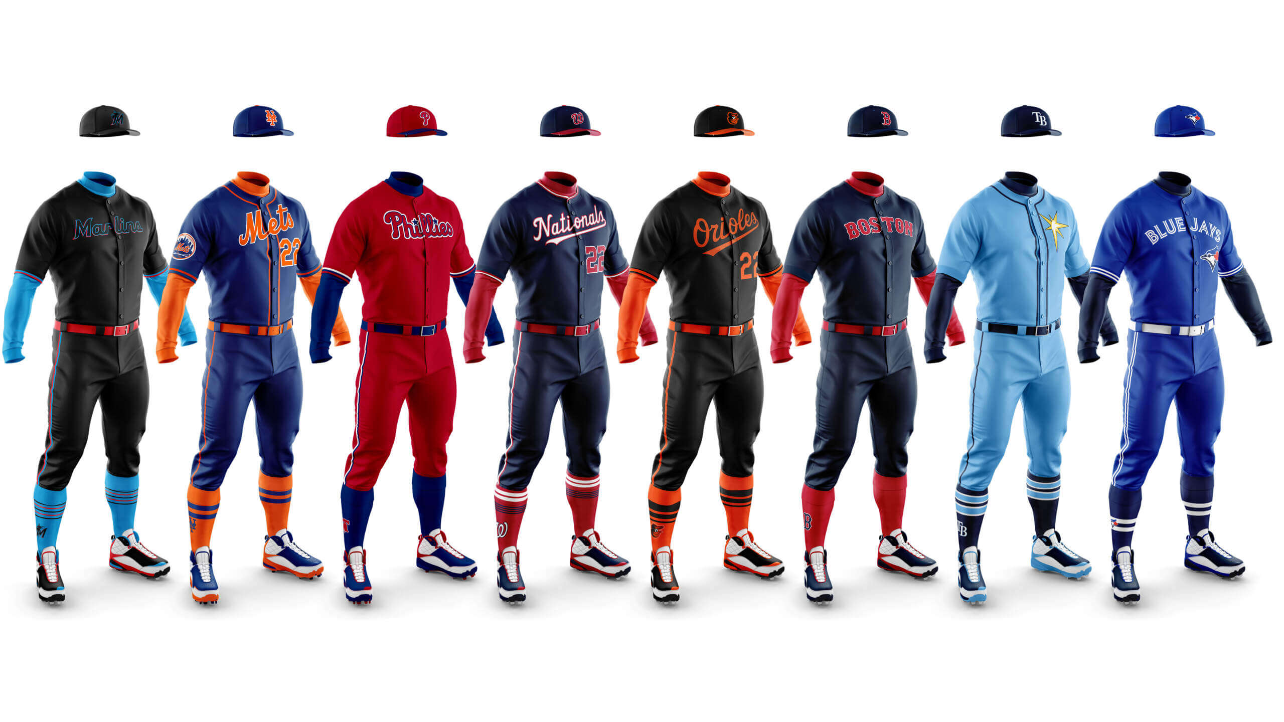
I’m joined today by graphics guru Chris Diamond, who created every mock-up mono-uni you’re about to see. The idea in this post (which I’m referring to as “Phase One”), is to look at every team’s existing alternate jersey/cap/socks, and to create pants that match the style and color of the alt/softball jersey. If you looked at some of the 1970s mono looks (above), you’ll note that in almost all cases, the uniforms “worked” because one color wasn’t completely dominant: most teams had color contrasting caps, sleeves and stirrups (socks). However, today’s softball-toppers — due to the dint of pairing colored tops with light pants — will oftentimes have caps, sleeves and socks that are the same color as the jersey. Creating same-color pants is most likely NOT going to look ideal. However, wearing contrasting belts, sleeves and socks can sometimes greatly enhance a monochrome uniform.
The goal for Phase One is NOT to necessarily advocate for any team to take their existing colored top and pair it with same-color pants. In this exercise, we’re going to simply take a look at how a dark-monochrome uniform — using all existing alternate accoutrements — would look. Every team that has an alternate softball top (even those who have two alternate tops) will be given the “mono treatment.” Only teams (Yanks, Cards, Dodgers, etc.) who don’t have an alternate top at present will be excluded. Phase One will look at the NL and AL East divisions today, and we’ll take on the Central and West in subsequent weeks. Phases Two and Three will be more conceptual, allowing us to adjust all elements of the uniform to see if a monochrome dark uniform could work.
We’re tacitly acknowledging Nike/MLB’s “4 + 1” rule with this, merely adding same-color pants to teams who currently go softball top over light pants. Again, the point isn’t to force any team into adding new same-color pants to their dark tops; it’s simply to see how those softball top-wearing teams would look going mono.
Before we delve into the uniforms, Chris has a few words about this project. We’ll then go over the East Divisions with our comments. I think most of you will agree that very few of the uniforms pictured below would “work” (and that’s OK — we’re just showing how they’d look); the point is to see if any teams can take their existing softball tops (and existing caps/sleeves/socks) to create mono-dark unis. Chris has created two different graphics for each club: one is the “full on mono” look, the second uses contrasting sleeves and socks (and belts). Even tweaking these few elements makes a big difference visually.
Chris Diamond: Coming from the UK where mono uniforms are ubiquitous in soccer, I don’t have quite the same distaste for them as a lot of UWers. I sort of understand as I definitely don’t like them in football having followed that since my teens. But I got into baseball much later in life so I think am more tolerant of things that drive others mad like long cut pants, no blousing, socks instead of stirrups, makers marks and of course mono unis! But rest assured, I am just the graphic artist here — this article is Phil’s idea and it’s his exploration of the possibilities of mono unis that we are investigating!
AMERICAN LEAGUE EAST
Baltimore Black
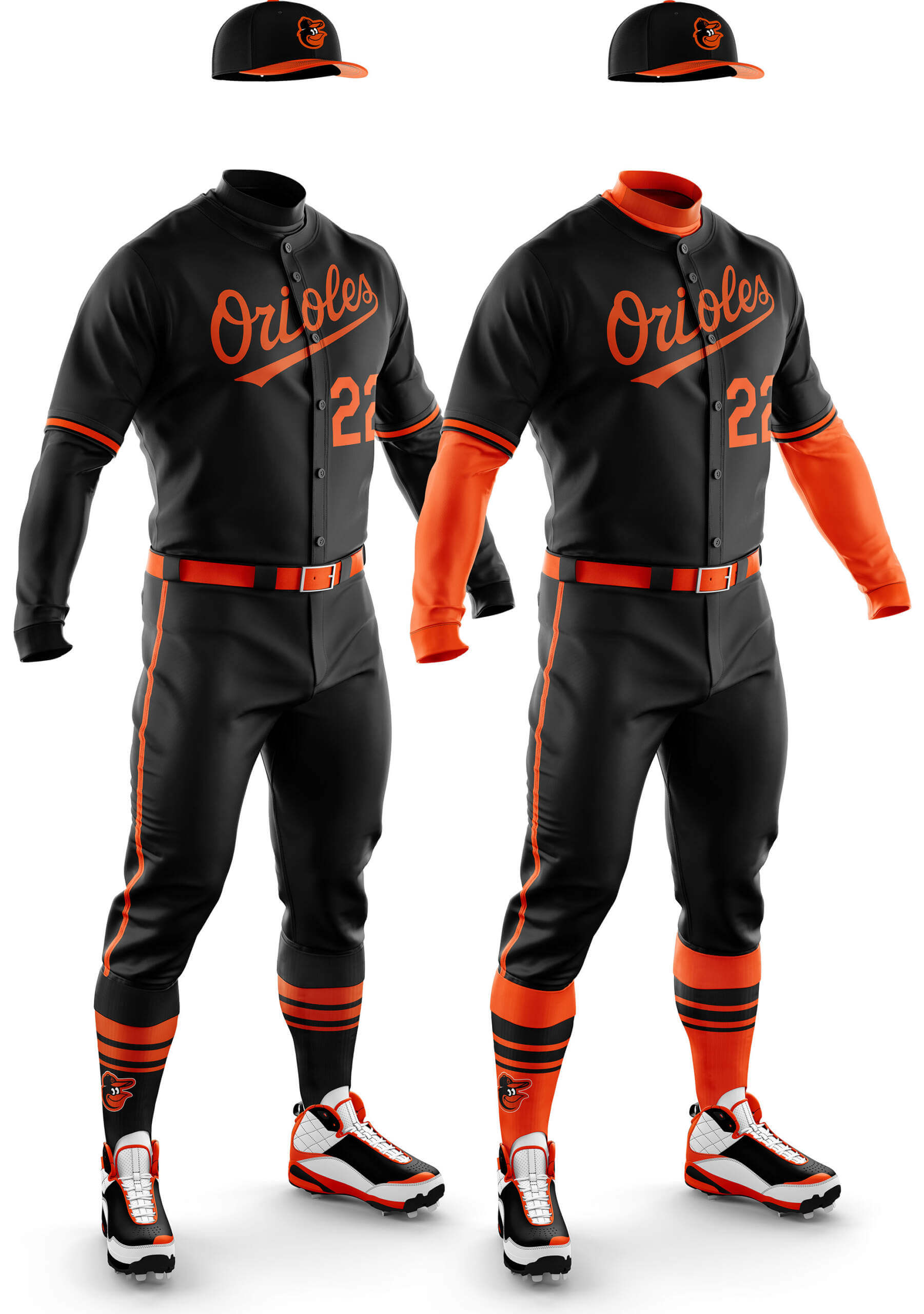
CD: I like both versions of this. The pure black/orange look looks really smart to me and the stripes break it up enough to stop it looking boring.
PH: “Wait,” you’re saying. “Didn’t Baltimore just get an all-black City Connect uni?” Unfortunately, yes, so that pretty much moots this mono-black concept. However, this one — with the orange accoutrements — could actually work as is (one of the very few for “Phase One” that does). Obviously you’d need players to go high-cuffed, but this one is doable.
Baltimore Orange
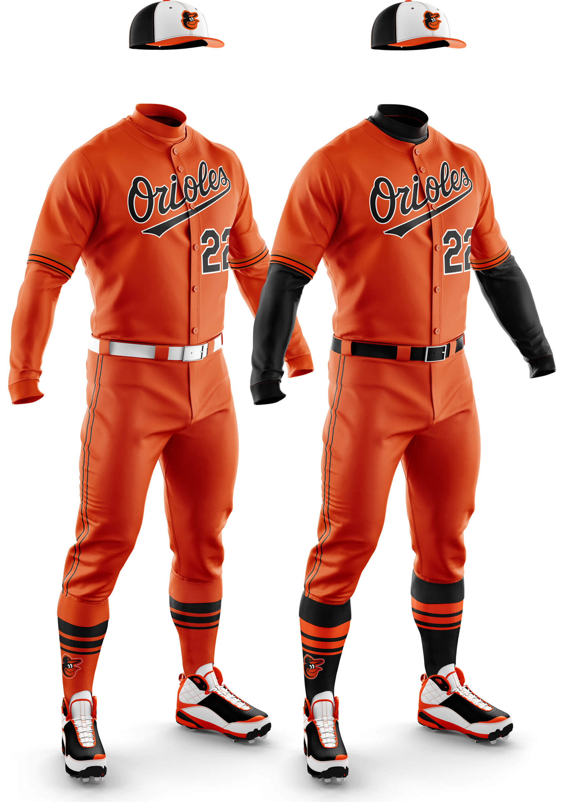
CD: Unlike the black I dislike both of these. All orange feels just too much and even adding black undershirt and socks doesn’t seem to help!
PH: Yep. The O’s already tried mono-orange (designed by Brooks Robinson, no less!). They even brought that look back as a fauxback. It’s another of the Phase One monos that could work as is. Honestly, I’d love to see the O’s try either of these on a limited (perhaps a Friday night thing) basis. Either of these are still better than the CC.
Boston Navy
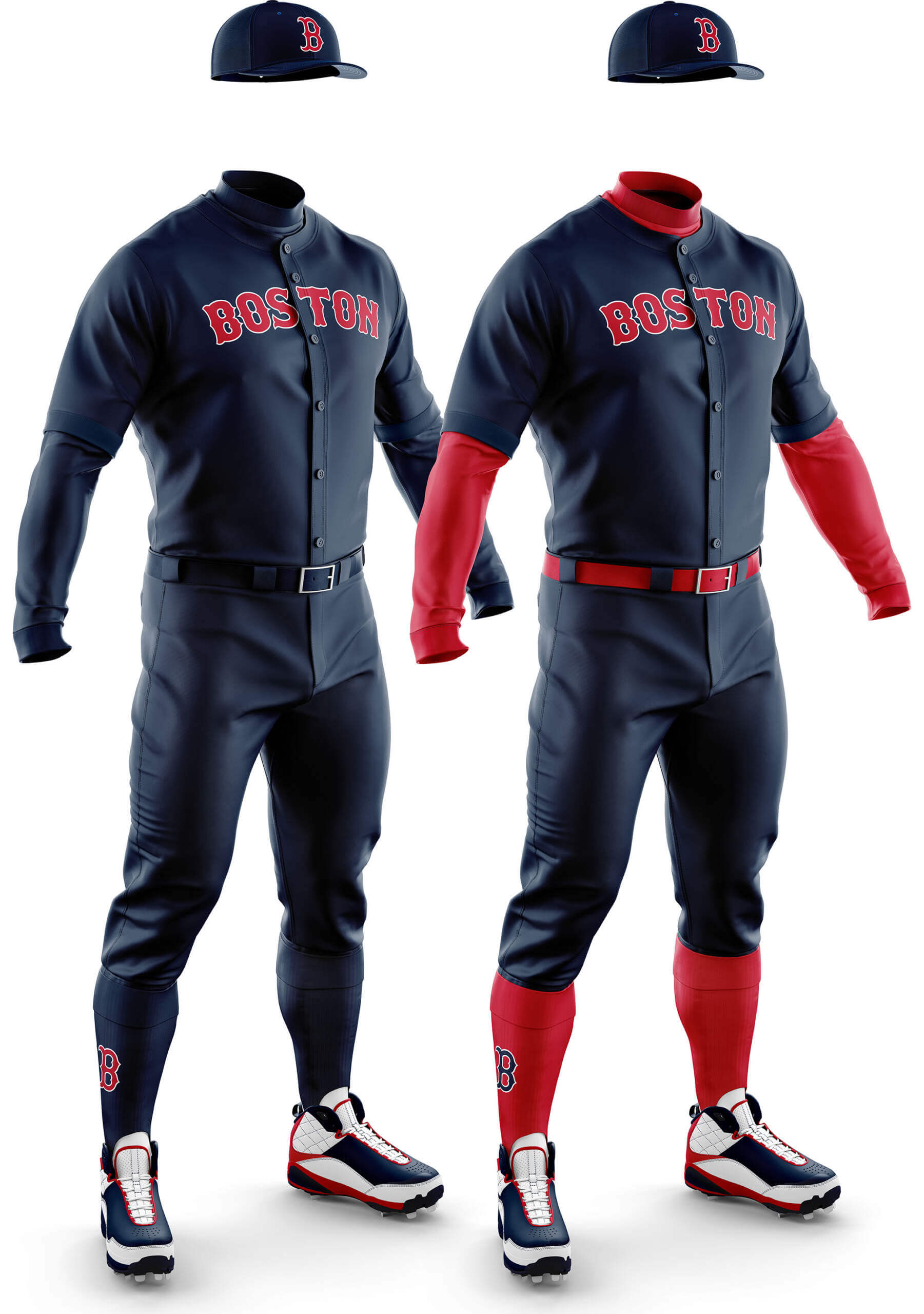
CD: The plainness of the jersey means the pure mono looks too much like a boiler suit to me. But the red undershirt and socks add enough pop to make that just about wearable.
PH: As you’ll quickly see, teams who wear red or navy softball tops are many, and it’s going to be hard to argue for any of these looks in Phase One. The mono-navy, even with the red sleeves and socks (RED SOX!), it’s hard to make a case for this one.
Boston Red
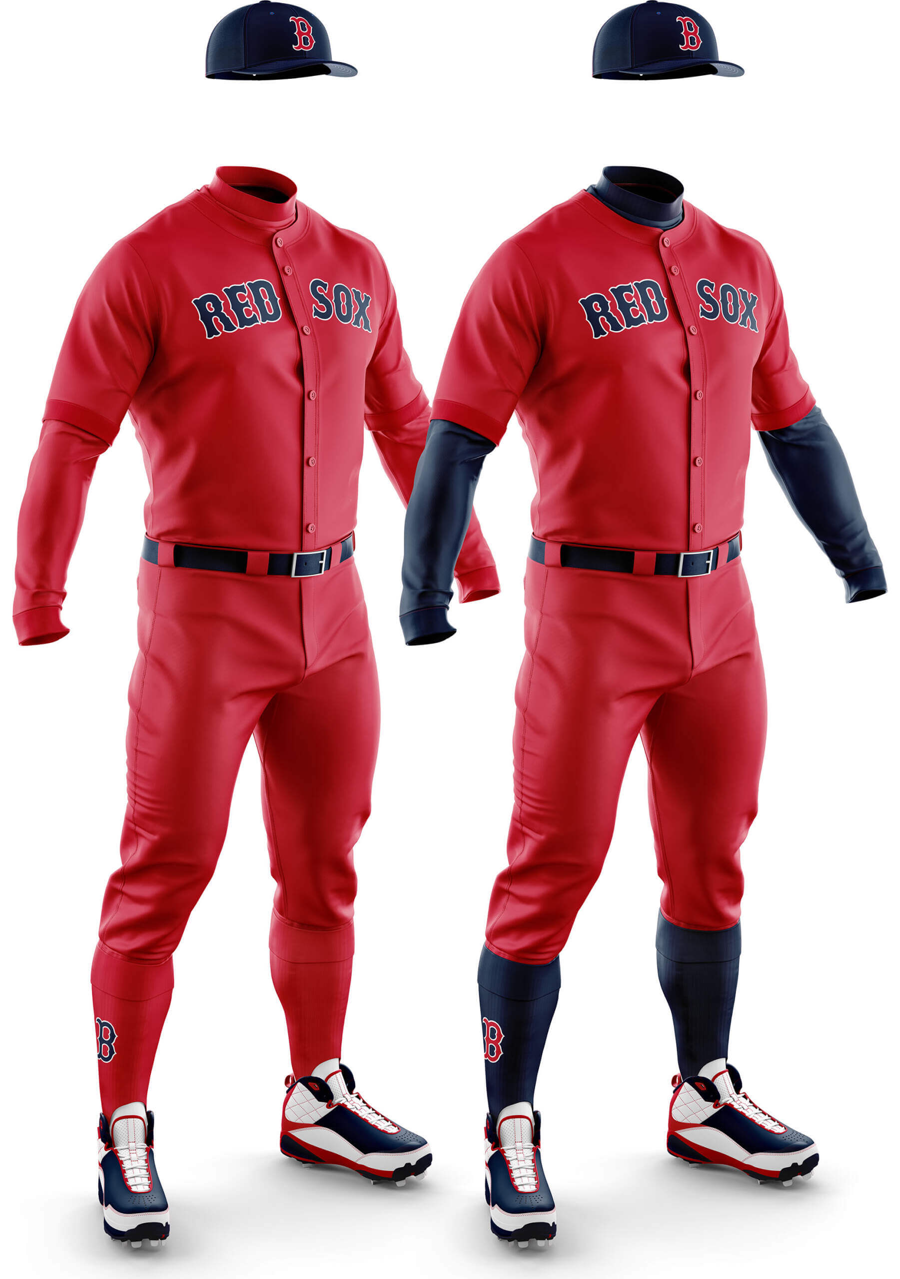
CD: The same applies to the red mono, but it looks more like someone fighting an oil fire! Navy undershirt and socks definitely improves things, but it still feels a bit too much to me.
PH: Nope. The all red is way too red, and even with navy sleeves and socks (plus they’re, ya know, the RED SOX), it doesn’t work here.
Tampa Bay Navy
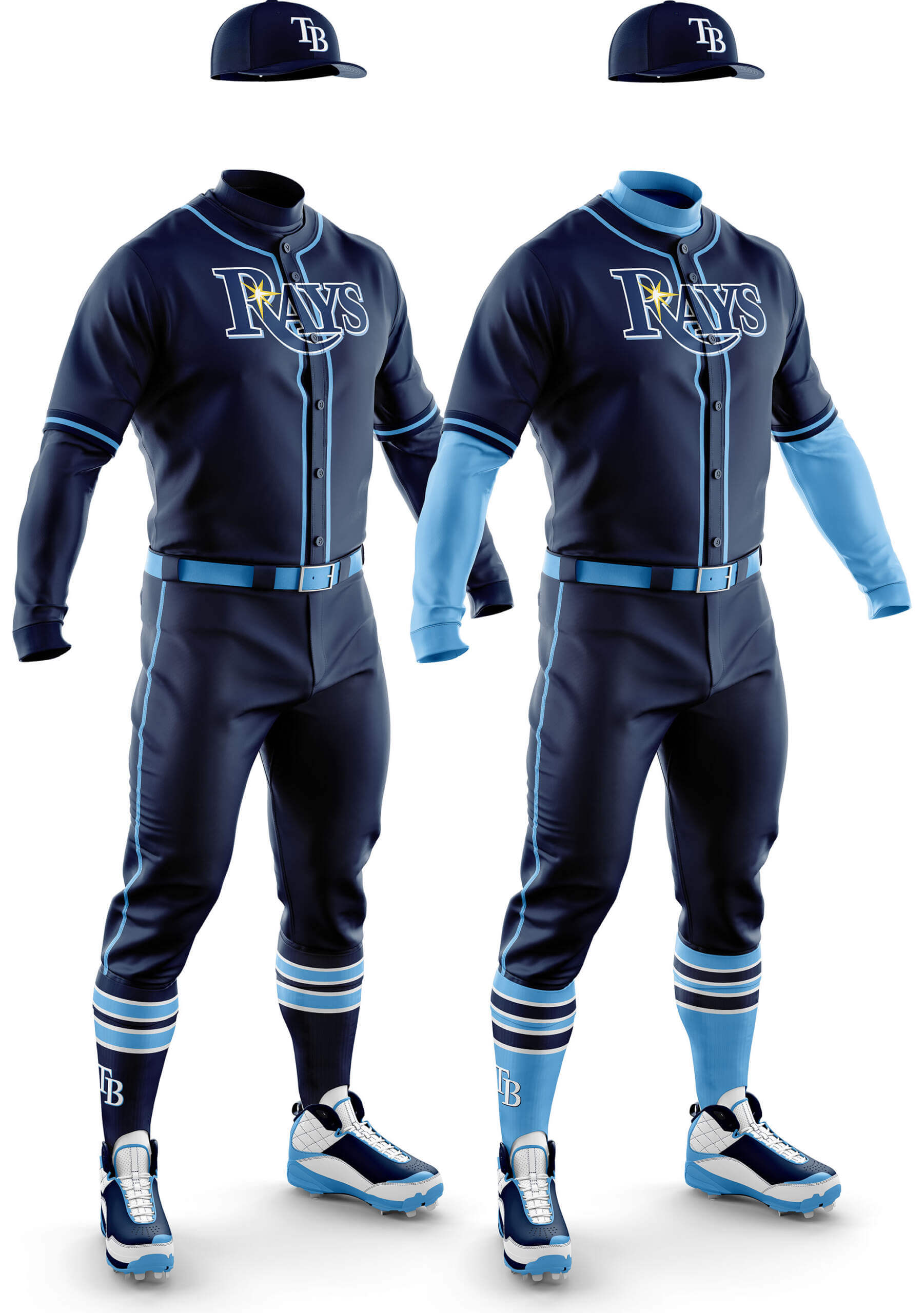
CD: It’s amazing what a bit of high contrast striping can do to make a mono look OK. I like both of these but think I actually prefer the all-Navy version.
PH: The Colombia (powder) blue does contrast well here, but it’s almost too close to the Cubs CC. I don’t hate the Cubs CC unis, but with the many navy softball tops out there, this one is best left as a concept. However…
Tampa Bay Columbia Blue
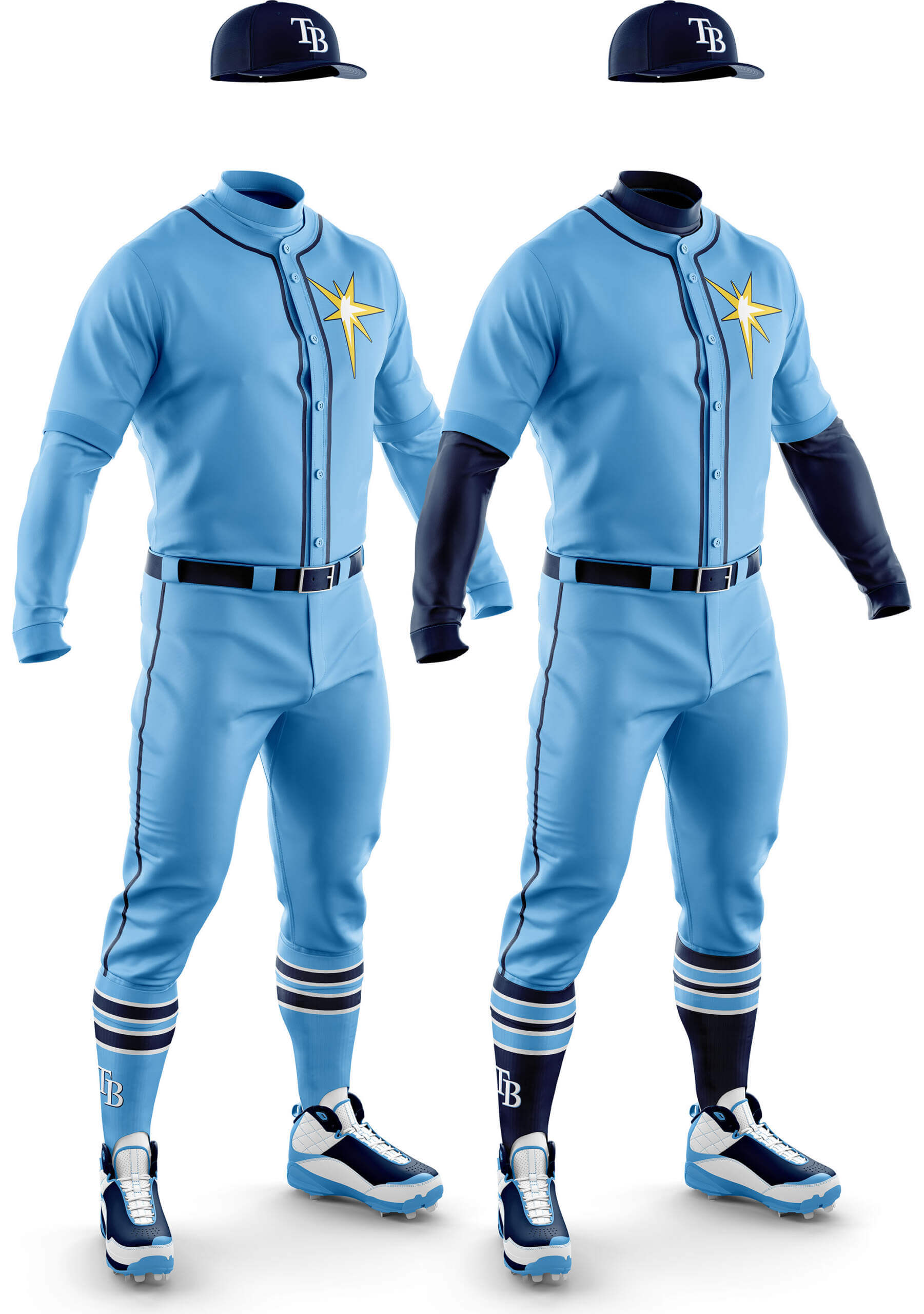
CD: For some reason (and I can hear the cries of heresy already) I don’t like “powder blues” in general. Either here where it is a team colour, or proper powder blues. So no sir, I don’t like it!
PH: Having grown up in the “powder blue” era, I have always been partial to the look to a point. To me, the best powder blue uniforms combined navy and powder, and this one fits the bill nicely. I’m not a huge proponent of the “sunburst” logo (I’d prefer the jersey say “RAYS”), but for Phase One we won’t be changing anything. The navy cap, sleeves and socks add just the right amount of contrast. This is one that I would love to see them wear as their road uni.
Toronto Royal
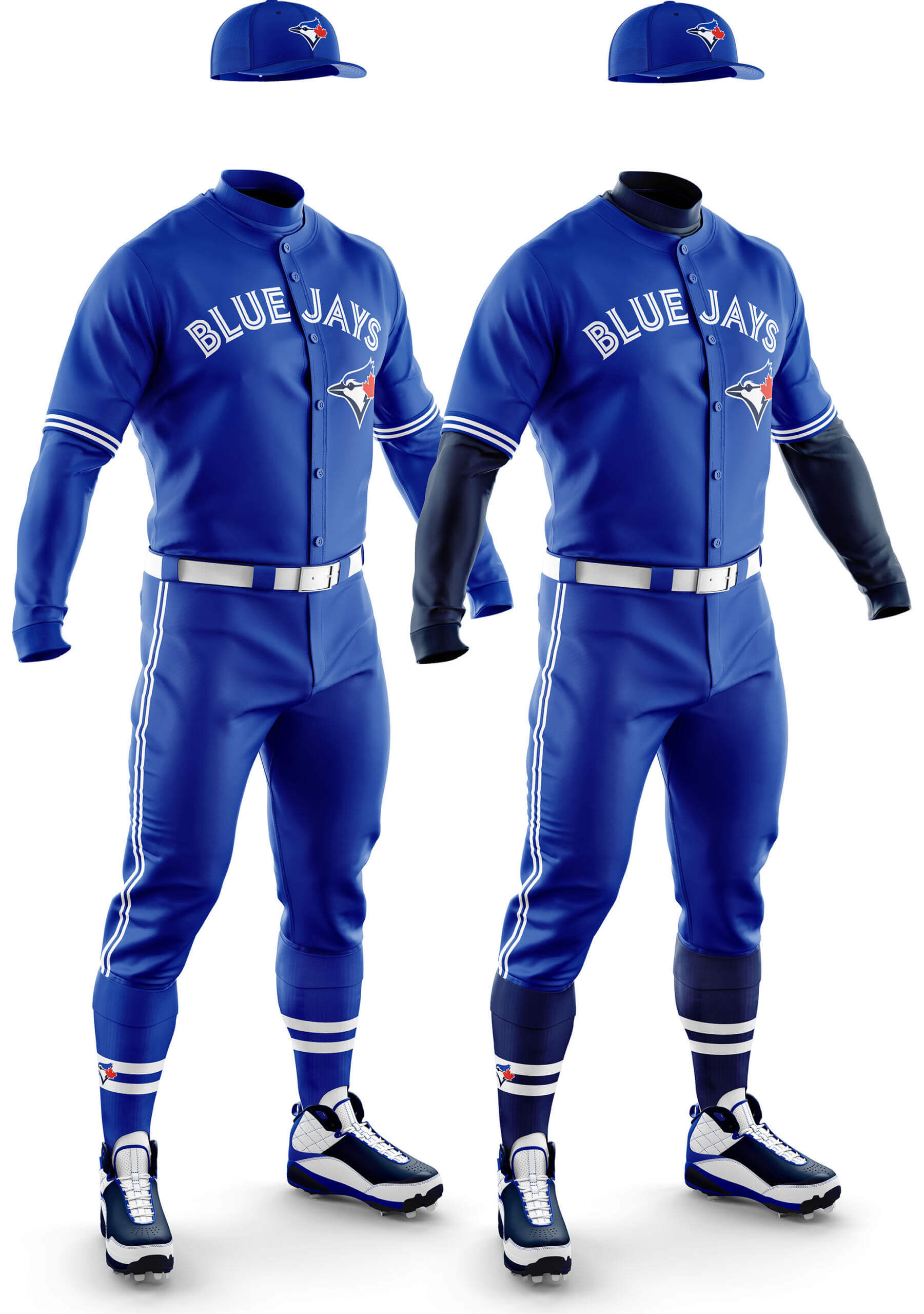
CD: Because the Jays use the Royal in a fairly monochromatic way generally, I think the pure royal/white look is best here. The addition of the navy undershirt and socks adds too much navy for me. The same would be true for red undershirt/socks.
PH: The Jays already have the perfect non-white/gray mono uniform, so there’s no need for a second one. There might be room in the game for one (non-CC) all royal uniform in MLB. This ain’t it.
NATIONAL LEAGUE EAST
Atlanta Navy
[Due to use of Native American iconography, it’s UW policy not to show these concepts inline. However, since we’re using every team’s current colored jerseys, you can check those graphics out by clicking on the links provided.]
CD: Here I feel the choice of pure white striping (unlike the home which has navy/red/navy) makes the pure mono look too plain. The addition of the red undershirt/socks makes it interesting enough to work.
PH: If anything, the team needs to ditch the navy blue jersey, not add navy pants to it. Nope.
Atlanta Red
CD: I’m starting to realise I don’t like mono-red uniforms! Although these are the best of the bunch so far for me.
PH: If anything, the team needs to ditch the red jersey, not add red pants to it. Nope.
Miami Black
CD: I think if any team were to do a pure mono black uni this works the best for me. The contrast between the black and neon bright blue and orange looks good. But adding blue undershirt/socks (or orange) doesn’t work because that favours one colour over the other and both are equal in the Marlins scheme.
PH: The Marlins have such a tortured relationship with their uniforms, and the black jersey in all it’s ghost-lettering glory needs to disappear immediately. Still…Miami has such a tortured relationship with their uniforms, maybe an all-black, with light blue sleeves and socks (and I do love the red belt!) is fitting. Nah. What the hell am I saying.
New York Black
CD: I don’t think anything can save this for me. The all black is an abomination and adding blue undershirt and socks doesn’t help because of the low contrast. Best buried in an unmarked grave at midnight somewhere.
PH: In the spirit of Spinal Tap, I have a two-word summation. Bet you thought I was gonna use this one. Pete Alonso and some other children of the 2000s may like the black jersey, but it is the very definition of BFBS. No need to make it worse by adding more black.
New York Royal
CD: Where the black doesn’t work, I feel both these looks are great. Nothing but blue and orange as far as the eye can see!
PH: The Mets actually wore mono-royal almost a decade ago, when they honored the Royal Giants of the Negro Leagues. I’d really rather the Mets not wear the royal softball tops, but if they were to pair them with royal pants, and wear orange sleeves and socks, it’s not the worst look in the world. One could make an argument that the Mets can actually pull-off mono-royal (certainly better than the BJs and Dodgers, and a couple other teams you’ll see at a later date). This one has possibilities.
Philadelphia Red
CD: Yes…really don’t like red mono. The deeper shade of red is right into blood-clot territory. We’ll have to wait and see if a maroon version could work.
PH: With a white, gray, cream AND powder blue set of mono-unis, the Phils certainly don’t need another. And after their experiment with the Saturday Night Special (and it’s evil fauxback), I think it’s best the Phils just jettison the red tops altogether.
Washington Navy
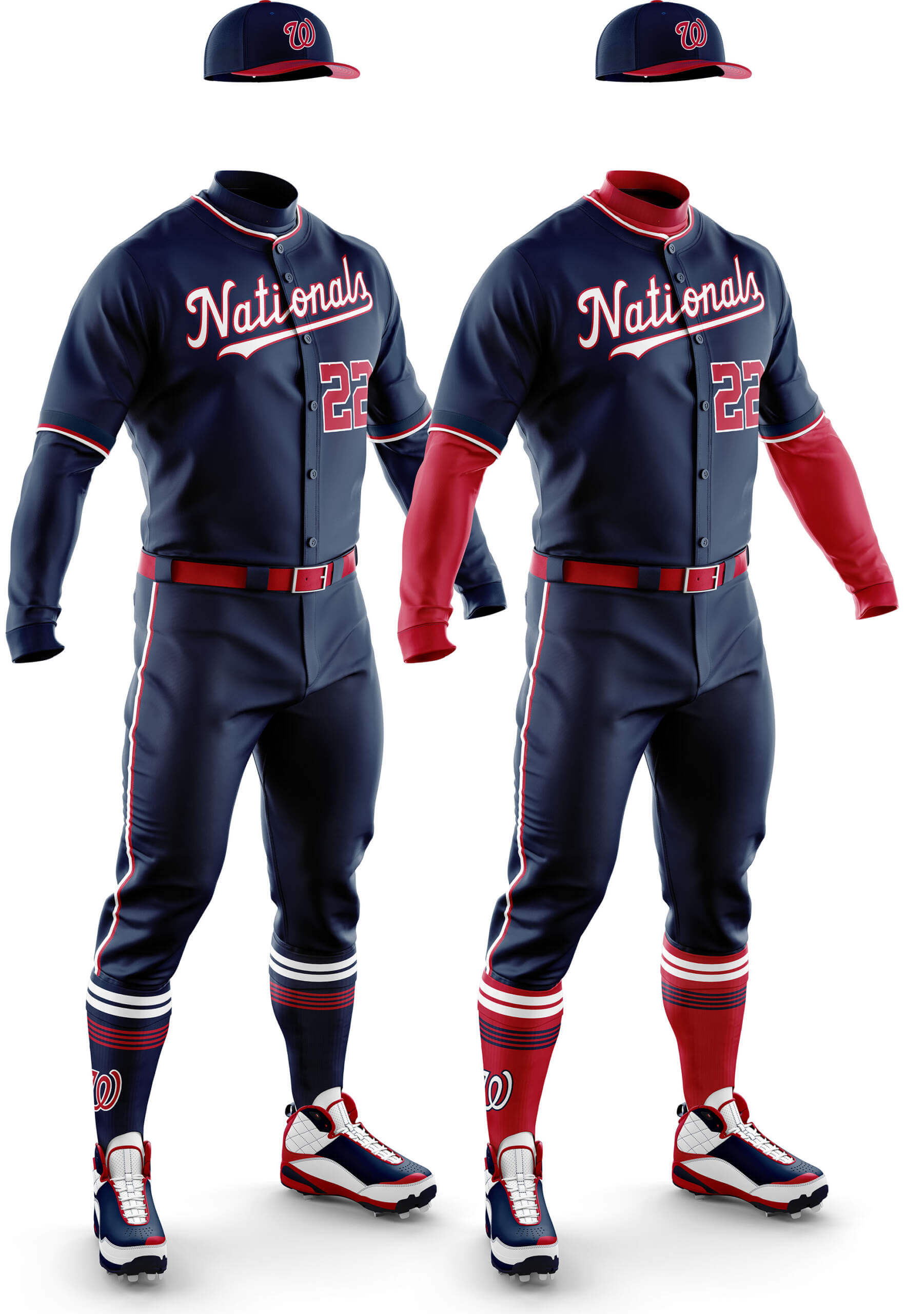
CD: For some reason I don’t like the all-Navy version. I think it’s because the red numbers are stuck out on their own, but with the red undershirt/socks they have something to hang on to.
PH: We’re only just finishing up the East Divisions, and already, with this experiment, we’ve concepted four all-navy (and three all-red) unis. You can see how this is not going to end well. And with a couple teams already sporting mono-navy CC unis (Astros, Cubs), there’s no call for any more.
Phew! If you made it this far, thanks for your enthusiasm/patience. And huge thanks to Chris for creating all these graphics!!!
Let us know in the comments below if you think some (any?) of the proposed mono-dark uniforms might work on the diamond. Even if you’re opposed to alternate (softball) tops, would you be less opposed if teams stopped pairing them with different colored pants? Do you think creating mono-dark unis (to replace dark jersey/light pants) — at least for a few teams — is a direction in which baseball unis should be heading. And if you like the alternate tops with light pants, but not as mono, that’s fine. We’re simply looking to see if mono-dark unis might be a way for teams to keep their softball/alt tops, but wear them as uniforms, rather than the current mix/match.

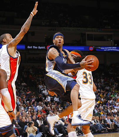
GTGFTU: 11/05/08: Denver Nuggets 101 at Golden State Warriors 111; Oracle Arena.
Phil, Why do you label the O’s orange unis they wore in 2010 as “fauxbacks”? They look as close to the original as you can get with modern tailoring. Uni Watch even labeled them throwbacks in 2010 in John Ekdahl’s write up of the game.
They wore solid black socks instead of stirrups. But they were pretty close to the originals
At least Felix Pie was wearing stirrups – and maybe the base coaches.
link
at the 25:07 mark if the link isn’t bookmarked properly.
Bring on the softball pants!
The monochrome exercise proves red, white and blue are overused in MLB. Give me the Marlins in teal. The Rockies purple (sorry Paul) and the A’s in glorious green (preferably kelly green) and gold (and in Oakland too). They are instantly recognizable and stand apart from their red, white and blue brethren.
I think the GTGFTU is the November 4, 2009 game between the visiting Memphis Grizzlies and the Golden State Warriors. The Warriors won 113 – 105. Allen Iverson of the Grizzlies, in his limited time with Memphis, is driving and Mike Moore of the Warriors (#33) is turning his head. This doesn’t match up with Iverson’s time with the Denver Nuggets as the Nuggets had already changed to powder blue as their only blue jersey. Also, the gray side panels match the Grizzlies jerseys.
This is the game I figured out too. You can also see the Grizzlies logo on the neck line. Reason this game could be seen as somewhat important (besides being part of AI’s 3 games in a Grizzlies uniform), Steph Curry got his first NBA win this game.
Good eyes-and good background research, Geoff!
Great guess…and the correct “Answer”!
Certainly a low point in AI’s career and the Grizzlies and Warriors uniforms too.
If you’re ever in a discussion about great athletes forced to wear terrible uniforms, Iverson must be pert of that conversation, no?
Yikes. Designs are well-executed but yikes.
Orioles black and Nats navy aren’t bad, Rays light blue with navy socks and Red Sox navy with red sox are good, I could live with the Mets and Jays (BJs? C’mon, Phil, that’s not a thing…) in royal (but never royal/navy, it is not enough contrast and it looks bad) but beyond that, these are brutal. Would love to see the Marlins in teal with more hot pink accents.
These monochrome looks are generally… awful. Even the concepts that almost work (like the Orioles and Rays) would benefit from real stirrups and the addition of other contrasting uniform elements. I’m eager to see what future phases of this project can do to improve the near-misses and salvage the disasters.
“These monochrome looks are generally… awful”
I don’t want to say “that’s kinda the point” but yeah. Phase One ONLY adds same-color pants. As you allude to, future phases will attempt to address issues from Phase One. Even then, especially with the prevalance of navy and red softball tops, there’s only going to be a handful of teams that could pull off the mono-dark look. And we’re not necessarily even advocating that…but simply seeing what the alt/softball top would look like when paired with dark pants.
I think most of us would agree that while the softball top over home white pants does indeed work for several teams, the alt top over gray road pants looks like crap. IF teams insist on wearing these alt tops, we’re trying to see how they’d look as uniforms, not mix/match of elements that don’t work together.
Yep! Totally get the concept, and I appreciate the incremental approach. It’s sort of an exercise in doing what my math teacher always told us to do on exams… “Show your work!” It’s just jarring, visually speaking, to see how low the baseline is.
And I couldn’t agree more about softball tops with grey pants. There are few looks in baseball that are worse. As a kid, I always liked the Cubs’ road unis from the ’80s that featured royal blue pullover tops and white pants: link
It worked because few if any other teams were wearing softball tops at the time, so there was no question the Cubs were the road team when you turned on the TV and saw them wearing those, even with the white pants. But whenever they tried pairing a blue alternate jersey with grey pants? link Ugh! Just, ugh!
Really don’t get the “color over gray” hate. Gray is neutral and doesn’t clash with any color. That’s why gray has been in the color palate of every team for a century or so.
I’m fine with full road greys. But when teams swap out the grey jerseys for colored ones over the grey road pants, it looks dingy, in my opinion. Plus, the colored jerseys looked muted on top of grey pants, which dulls the aesthetic effect. The colored jerseys “pop” much more over white pants.
@ Randy: gray was chosen because it his dirt better than navy for teams that were away from home and didn’t have their usual laundry facilities, and it was visually distinct from home whites. That said, gray pairs well with any team’s colors. I also don’t get the dislike for colored tops over gray, although one part of it is that few teams use gray trim in their uniform elements; they more commonly use white. The Mets are one of the few teams that actually put gray elements into a colored top, and it doesn’t look bad – but it doesn’t look as “sharp” visually as it would if the lettering were white.
I can’t abide orange jerseys over gray pants. And red is barely better. The darker the better.
There was that weird time in the ’70s when teams wore only softball tops over white pants, but in the National League those always were on the road, while in the American League those often were at home, like Cleveland. Then the Pirates steamrolled the distinction.
link
That’s the one big problem with these sorts of multi-layer Photoshop templates. They are great for adding stuff to and colour changes but it’s a pig of a job to make any change to the basic look without access to the original 3D models. Phil did ask for more classic stirrups but we were limited to what you can see, sorry!
Thanks, Chris! Your work on this is great! As a graphic artist, you’ve put some lovely lipstick on those pigs! :^) And I’m looking forward to seeing what comes next in the creative process now that you’ve established this baseline.
To me none of the uniforms work if it’s all one main color from head to toe including sleeves and socks I like all the uniforms that break it up in those parts where the undershirt sleeves and sock’s complement the uniform
I know this isn’t the point of the exercise, but I feel like a lot of these would actually work if you swapped the pants–for example, the red Red Sox jersey would look good paired with the navy pants from the other set. Same with the light blue Rays jersey.
Stay tuned.
I didn’t like the all-red teams or the Marlins for either iteration of the mono-uni. For most others, the Uni with the contrasting accoutrements looked sharp. I think the Orioles and the Mets Royal look particularly good in either iteration.
The Orioles blacks are the clear winners but that may only be in comparison to their blah CC unis.
The Marlins dark look could be good with some adjustments. There’s something there with that look of there’s, but the execution isn’t great. Definitely there needs to be a better way to do the logo and numbers so they aren’t as ghosted. Thicker outlines? Do them in blue with a thick red drop shadow? Hard to say
Orioles’ black looks great but the orange is not that bad. It reminds me of their all-orange 1970s foray.
And the Yankees are above this??? No all-navy blue with white pinstripes? Not saying it would look good, but let’s have a peak!
It’s not that the Yankees are “above” this — at least for Phase One, we’re ONLY doing teams who have a colored softball top in their rotation at present. So a few teams will be excluded (Yankees, Tigers, Cardinals, Dodgers…). The Dodgers blue CC jersey doesn’t count as a colored top. It’s *possible* the Yanks might have a midnight-blue mono uni, but it’s not going to be part of Phase One for sure.
I hate the Yankees for many reasons, but I’ll never fault them for only having two unis. In fact, until Nike took over, they actually paid to keep the Majestic logo off their uniforms and never participated in the TATC nonsense. They even fought (to no avail) the stupid Players Weekend garbage from the past few years.
Cardinals have four jerseys (white, gray, cream, powder) but they also wear each of those with corresponding colored pants, so they don’t have a “softball” top.
It’s interesting to see how the mono-look in baseball is prevalent in both college and high school. I wonder sometime in the future that the younger generation of baseball players will start pushing for the mono trend in the pros
Only one version should be made for Boston navy and for Boston red. And you know which version that is.
Nice work on all of these!
The one with blue socks, right?
That comment should be stuck in moderation, Wisenheimer.
And hopefully Phase Two will fix the Marlins’ unreadableness.
That’s what I’m looking forward to! I believe Fla….I mean Miami has something there with the color scheme, but the execution is off.
I’m surprised that I feel this way, but I like these mono color looks. The problem is that I like these much more when worn with contrasting socks/stirrups, or at least with contrasting stripes when the socks match the pants, whereas the vast majority of MLB players wear pajama pants.
Right!!! The contrasting belt/stirrups/socks is a must to make some of the mono unis really pop
I like most of these- remember, I am the Uni Watch contrarian- but I feel most of them would be improved by switching to Sansabelt britches. That said, they look pretty good with buttons and belts.
I quite like the Sansabelt idea for one of the later phases. What do you think Phil?
No team has worn sansabelt in 30+ years (unless it was an attempted throwback). I think we’ll stick with belted pants.
In other words “BFBS” is factually wrong and profoundly ignorant of uni history. Entirely the creation of an old Northeastern white hipster who is bad at his job and wants those kids off his lawn.
Aren’t they supposed to be baseball uniforms? All of them look like softball uniforms for a beer league.
The DO look like uniforms. That’s why the jerseys and pants match (hence Uni•Form); beer leagues typically have ONLY tops that match (usually almost always dark tops) and players wear whatever pants they have on hand. That’s why they’re called “Beer League”. It’s played more for fun and drinking beer afterwards; they’re not supposed to look like a “professional” team. It’s how the term “softball” top originates — not for high level softball (such as that played in the Women’s college game, and whose teams usually look professional and awesome), but for beer drinkers getting together to have some fun on a Sunday afternoon (or weekday evening after work).
Thanks for your soliloquy. How about they’re ugly.
I think the Marlins concept illustrates that the club’s original and continuing sin is the color black. Even though it’s been part of their uni palette for all three decades of their existence, it’s the perennial element that keeps them looking just … off. They don’t necessarily need to formally adopt the “Sugar Kings” CC uniforms, but adopting that palette, minus black, would be their first real sartorial path forward.
So I didn’t see the Nats all red possibly, but I figure you won’t like it anyway.
I really like every one of the navy-over-navy and black-over-black designs, and especially wish the Red Sox and Nats would go navy-over-navy. For me, these are so much more BASEBALL uniforms — tied in with the traditions of the late 19th century and early 20th century — than are the softball tops.
The only ones with potential here to me are the Mets with royal blue and orange and the O’s with black and orange. All the other options are not working for me. But I basically hate monochrome color for baseball (all white at home, gray or powder blue on the road, please) and football (except for all white). For soccer, rugby and hockey it often works, for basketball it is mandatory to me. It has to do with the length of the pants I just think. Under the knee or right on top of it? No monochrome, please.
I know this is an MLB exercise, but I think it’s apropos given the hot mess of the uniform combo in the ORU v. Oregon game yesterday. Dark softball top over white pants vs. dark softball top over white pants? As much as I wanted to watch this game, I had a hard time not being annoyed, especially given Oregon’s great colors.
link.
I think the all-black Mets design would work much better if the team was using their original, more vibrant shade of blue. Would contrast better with the black.
I think the monochrome uniforms that look best are the ones where the cap contrasts. IMO that’s why the orange one works for the orioles, but the black one looks extra bad. This is also the reason I think the blue jays powder blue looks great, and the rangers one looks bad – they pair it with a powder blue cap. To me, football and baseball should have the same rule – hat/helmet, pants, jersey, 2 out of 3 match, but never all three and pants and socks contrast.
I disagree with those that hate the “softball” tops with grey pants and wish every mlb team would get rid of road grays. White v grey makes every game look the same, and every other sport does a white v color aesthetic. I think every grey uni looks terrible and drab.