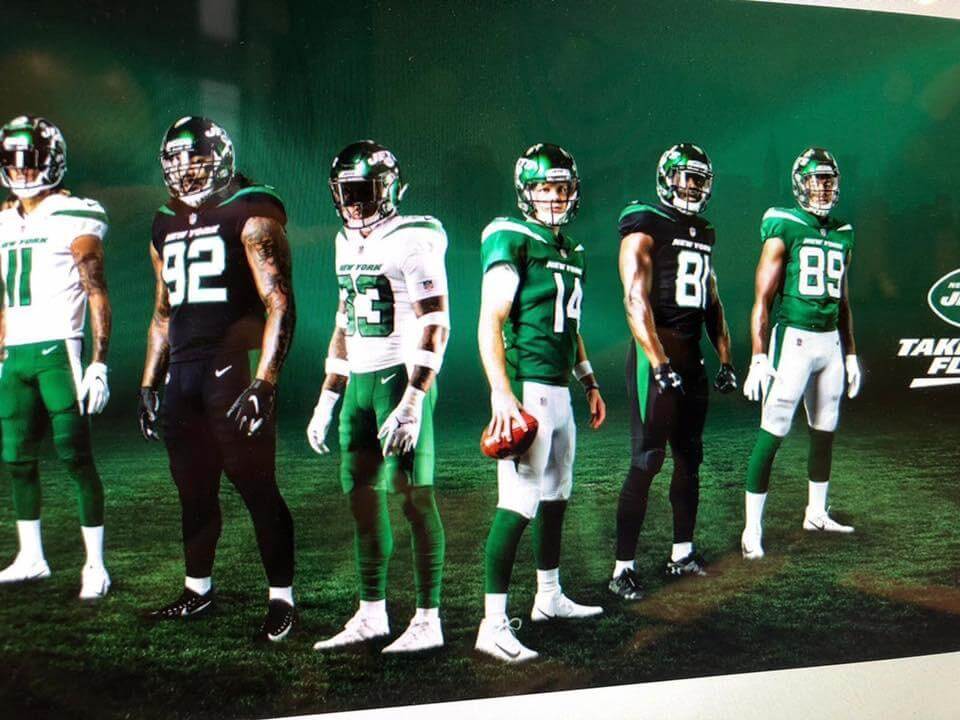
Click to enlarge
A new Jets leak, shown above, began circulating yesterday morning and the internet pretty much went bananas. I usually try to avoid discussing unverified leaks of questionable legitimacy, but this is pretty much a Jets day in the uni-verse because the official unveiling is this evening, so let’s go ahead and discuss the alleged leak.
It’s not clear, at least to me, who first posted the image, so we don’t know the source. As soon as the image came across my radar, I checked with two sources I trust, both of whom basically said (I’m paraphrasing here), “It looks like what I’ve been told, but I can’t say with any certainty that it’s 100% legit.” Both sources also pointed out some details that could argue against the image’s legitimacy.
My position on this leak is the same as for any unsourced, unverified leak: It could be real, or maybe not. Until I know more, I’m maintaining a healthy skepticism.
Let’s shift into virtual-Q&A mode (most of the questions and statements in bold are similar to, and in some cases direct quotes of, things I saw people posting on Twitter):
It sure looks legit to me!
Lots of people said this yesterday, including some media outlets and journalists that really should know better. I’m not sure what anyone means by “looks legit.” That leak from January “looked legit” too, didn’t it? But it was fake.
It must be real! Why would anyone post something like this if it was fake?
Some people like to plant hoaxes and get people talking.
It’s way too elaborate to be just a Photoshop job. It must be real!
I’m not a Photoshopper, but several people who are Photoshoppers tell me that this image is very much in the realm of the Photoshop-possible. That doesn’t mean it’s fake; I’m just saying that there’s nothing about it that rules out fakery.
We’ve heard from legitimate sources that the Jets would have a more Kelly-ish shade a green, and black alternate, and more. It all matches up! It must be real!
No, that doesn’t indicate anything one way or the other. If you were creating a faked image to leak, you’d use that same legitimate info to reverse-engineer your fake.
Someone on the Jets said on Instagram that it’s real! But wait, someone else on the Jets said it’s not real. Now I’m confused!
I think it’s safe to say that we shouldn’t trust what team members have to say about something like this, because it could all be a misdirection to elevate (or preserve) suspense ahead of tonight’s unveiling.
One of the players is wearing Under Armour cleats and gloves. Nike would never allow that — it must be a fake!
No, that has no bearing on anything. Under Armour is an approved on-field brand. If you look at past NFL unveilings, you’ll find that players sometimes wear non-Nike gear. Look at this Jags unveiling shot from just last year, for example.
Why would Nike let players do that?
Sigh. It’s not a Nike unveiling. It’s a Jets unveiling. (And that other photo was a Jags unveiling.) You people really attribute far too much power to Nike.
So you’re saying the Jets photo is real?
No, I’m saying that a player wearing Under Armour accessories doesn’t indicate anything one way or the other.
I have a friend at Nike who says it’s real.
Great. Please send me his name and contact info.
I have a source who says it’s fake.
Great. Please send me his name and contact info. Then we can put him in touch with the Nike guy. I’m sure they’ll have a lot to talk about.
You mentioned something about details that call the image’s legitimacy into question. Like what?
1. Do these jerseys have TV numbers? It’s hard to be sure — the numbers could be there on the shoulders, but the camera angle makes it impossible to tell. Not having TV numbers seems like it would be a big tell. Then again, the Patriots’ Color Rash uniforms don’t have TV numbers either, so there’s some recent precedent.
2. If you look at the jersey collars, they appear to have the standard NFL logo, not the NFL 100 mark that we know teams will be wearing this season. Of course, they could have done the photo shoot before the NFL 100-inclusive jerseys were made, so this doesn’t necessarily prove anything, but it strikes me as an eyebrow-raiser. (Similarly, the pants have the standard NFL logo, although we don’t yet have confirmation that teams will be wearing the NFL 100 mark on their pants.)
3. Speaking of the collars, they appear more like the old Elite 51 collars, not the newer template with the little triangle, although it’s hard to be sure about that.
4. The lengths of the various pants stripes seems very inconsistent. This is actually the thing I find the most troubling about the image.
5. The two guys in the foreground — safety Jamal Adams and quarterback Sam Darnold — appear to be the same height, or maybe Adams is even in a bit taller. In real life, Darnold is listed as being two inches taller than Adams.
6. The Jets’ two big offseason acquisitions — linebacker C.J. Mosley and running back Le’Veon Bell — are not shown in the image. You’d think they’d want to showcase them, right? Of course, the photo could have been taken before those guys came on board.
7. We heard just a few weeks ago that the new uni numbers “kinda look like Oregon’s.” No sign of that here.
Okay, you’ve convinced me — it’s fake!
I’m not trying to convince you of that. All I’m saying is that I don’t know whether it’s real or fake.
You just want to be negative. You hope it’s fake!
Actually, I hope it’s real, because I’ve already started writing something about it, just in case, and it would be nice to have that head start on tonight’s article. But I honestly don’t know if it’s real, and I do know from past experience that it could be fake.
Let’s say, for the sake of argument, that it’s real. What do you think of it?
I’d rather wait until I know what the real design is.
You must be a lot of fun at parties.
I realize reality checks aren’t as much fun as wild speculation or jumping to conclusions, but my job is to deal with reality, not fantasy. (Also, I’ll be covering tonight’s unveiling for Sports Illustrated, so they have first dibs on my opinion about the new uni set, whatever it turns out to be.)
———
Honestly, I hate leaks. Everyone goes bonkers and gets seriously stupid. Thank god the unveiling is tonight so the whole issue will be put to rest.
Speaking of which: The uni reveal is scheduled for 7:30pm Eastern. I’ll be arriving at least an hour before then to take photos of the scene (watch my Twitter feed for juicy bits), do some reporting, enjoy the open bar with Chris Creamer and Todd Radom, etc. Once the actual unveiling happens, I will likely stop tweeting and stop looking at my email, because I’ll have to start interviewing Jets and NFL people who’ll be there and then write my SI story. (I’ve been told that there will be not be a media room where writers can work, so I’ll have to either sit on the floor in a corner or find a nearby pub, grrrrr.)
Not sure exactly when my SI piece will go up (I’ve never covered breaking news for SI, so I don’t know how quickly they process things), but I’d guess probably somewhere around 9:30 or 10. I’ll tweet the link to the SI story, of course, and I’ll try to have some sort of recap here tomorrow. See you then.
Click to enlarge
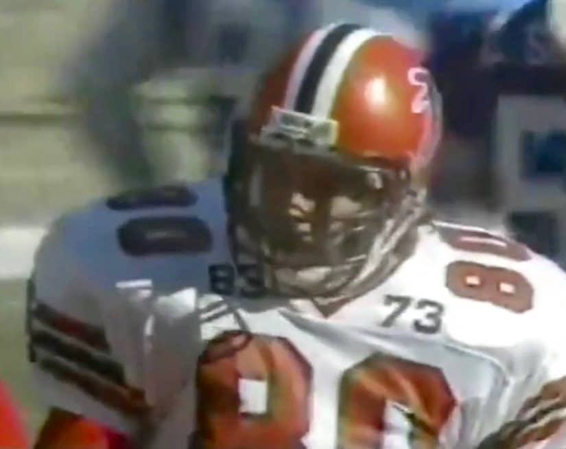
Bookended memorials: Here’s one of the weirder NFL uni memorials that you might not know about. Late in the 1989 season, the Falcons began wearing a black “73” for offensive tackle Ralph Norwood. A few weeks later, for the final game of the season, they added an “83” for tight end Brad Beckman, creating an unusual bookend effect.
(My thanks to @JackyPucks for this one.)
Click to enlarge
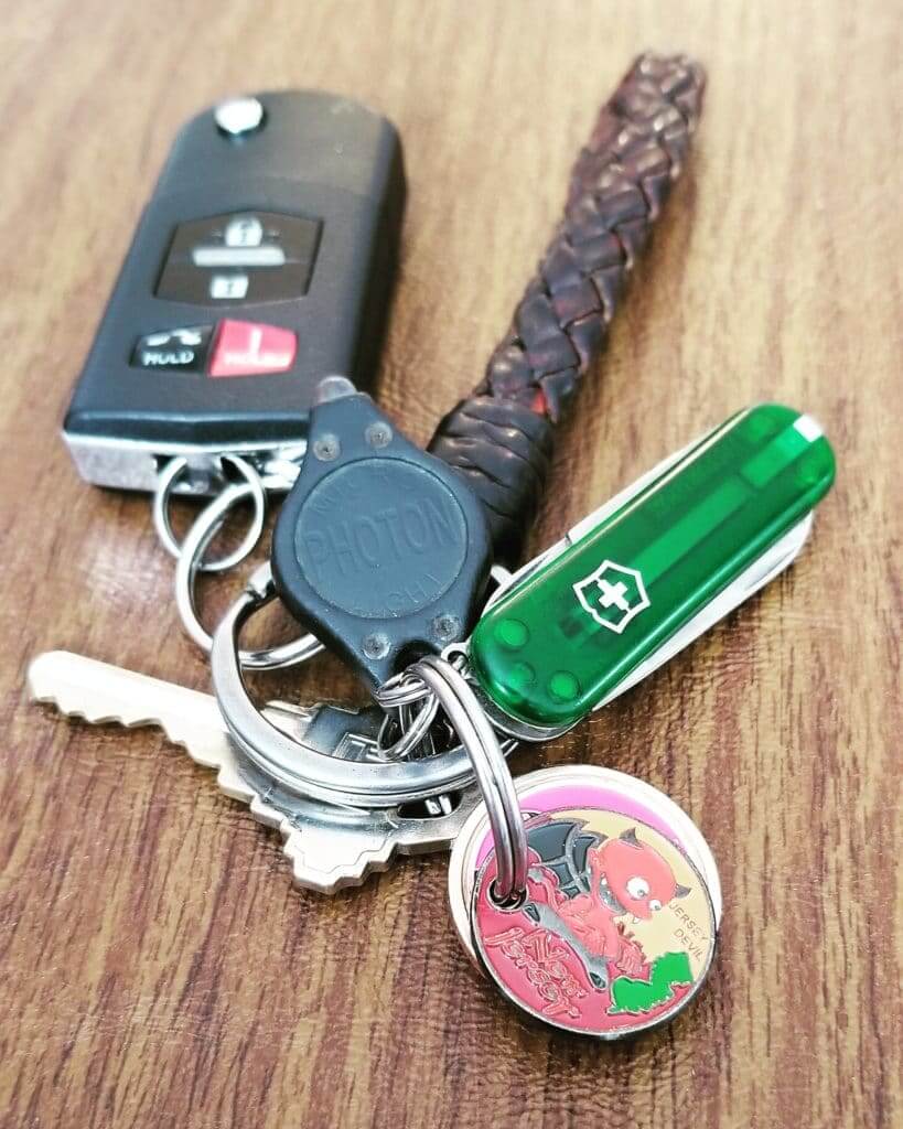
KRC update: The latest installment of Key Ring Chronicles is about a little New Jersey Devil coin. Check it out here.
The Ticker
By Paul

’Skins Watch: Sneaky move by Indians P Trevor Bauer, who has created a T-shirt that salutes Cleveland fans. The shirt’s design features a word cloud shaped like Chief Wahoo (from our own Yianni Varonis).

Baseball News: One of the video boards outside of Nationals Park was rebooting yesterday morning. “That’s pretty much the Nats’ season so far,” says William Yurasko. … Here’s some 1929 footage of Tigers great Ty Cobb participating in a baseball exhibition in London and wearing a New York Giants cap (from David Sikula). … The radio show Marketplace did a segment on the Baseball Card Vandals, the guys who deface trading cards with sophomoric graffiti. The Vandals also have a new book, which I recently received a review copy of, so I’ll be writing about that soon (from Andrew Cosentino). … Brewers P Freddy Peralta came up to bat with a blank batting helmet during yesterday’s game against the Reds. … The Omaha Storm Chasers’ April Fool’s Day prank, about renaming the team as the Omaha Potholes, was such a hit that they’re selling Potholes merch and actually goig ahead with a Potholes Night at the ballpark (from Chris Mattox). … Of all the organizations that would copy MLB’s classic red-white-blue silhouetted-batter logo, about the last place I’d expect to do so would be the Cultural Services French Embassy in the United States (good spot by Clint Wrede). … Oooh, check out this awesome baseball jersey worn by the crew of the U.S.S. Lexington in 1936. More info here (big thanks to Kevin Rice). … Royals players had inconsistent belt colors yesterday. … Speaking of belts, Mets C Wilson Ramos has been wearing a belt that’s orange in the front and blue in the back (from Mike Nessen). … Twins utility man Willians Astudillo’s helmet keeps falling off when he swings. … Interesting moment at the start of yesterday’s Red Sox/A’s game as No. 50 led off against No. 50. … The D-backs have so many uniform combos that the players can’t keep them straight (from our own Alex Hider). … The Jan. 7, 1955, edition of The Baltimore Sun had a good article about the Orioles’ new uniforms (from Will Shoken). … Gee, ya think the Sultanes de Monterrey have enough jersey ads? (From Chris Richards.) … As we all know, the Pirates’ home pants are white with black/gold piping. But SS Erik González’s pants yesterday were piping-free. … Let’s hear it for A’s P Marco Estrada, whose cap last night didn’t have the New Era maker’s mark (from Samuel Lam). … Here’s a look back at Columbus Clippers uniforms through the years (from @MiLBPromos).

Football News: A talk show host on the Texans’ radio station says he’s heard that the team could have new uniforms in 2020 (from Tyler Johnson). … Mount Marty College starting a football program. Here is a prototype helmet (from Jay Wright). … Ohio State coach Ryan Day is apparently considering restoring grey to the Buckeyes’ uniforms (from Mark Kunz).

NBA News: Yesterday’s Ticker mentioned that Warriors G Steph Curry wore an Andris Biedrins jersey to the arena the other night. Turns out Biedrins loved that. … Newly acquired Kings G B.J. Johnson will wear No. 9, and new Knicks G Billy Garrett will wear No. 3. … A Minnesota man has found a trove of old Minneapolis Lakers photos from the early 1950s (from Keith Grinde).

Soccer News: “I was listening to a past episode of the podcast 99% Invisible and they interviewed a person who studies colors,” says Derek Linn. “At approximately the 6:30 mark she talks about red vs. blue in English football and says that studies show teams wearing red tend to win more than they would be expected to. This also applied to combat sports in the 2004 Olympics. It’s a really great listen.” … Tottenham Hotspur’s new stadium features commemorative corner flags. “That’s something I’ve never seen before,” says our own Jamie Rathjen. … Speaking of Tottenham, they’ve released a new kit with a special print for their first match at the new digs (from Josh Hinton). … While honeymooning in Indonesia, Grant Hewitt saw this kit for Bali United. “The white/black plaid on the leg is inspired by the local saput poleng fabric, symbolizing the yin and yang in their heavily Hindu culture,” he explains. “And their jersey fabric has a sublimated face of Barong, who is the king of spirits and leads of the hosts of good.” … The seven charter teams for the Canadian Premier League will unveil their kits today, with lots of “lifestyle influencers” in attendance, oh boy! (From Wade Heidt.) … The recent game between the women’s teams of FC United of Manchester and the Sir Tom Finney Training Centre of Preston featured a pink ball (from Graham Clayton).

Grab Bag: An Idaho high school has been raising funds by selling pillows made from old band uniforms. … New logo for the Great American Duck Race in Deming, N.M. … New logo and name change for the Queens Public Library. … Tennis pro Roger Federer is reclaiming his personal logo from Nike. … NASCAR Xfinity Series driver Tyler Reddic will buck convention and superstition this weekend by driving a pink car. … The curling sheets at the University of Alberta have the house printed in Uni Watch colors! (Nice one from Buford Grimes.) … After I tweeted that curling photo yesterday, Steve Kaltenbaugh informed me that the Bucks County Curling Club near Philadelphia has a similar color scheme. … Check out the “NCAAction” logo on this old seat cover that Jimmy Roe found. Never seen that before. … Here are some mascot pictograms for the 2020 Paralympics (from Jeremy Brahm). … Patagonia, whose logo-clad vests have become standard workplace perks on Wall Street and in Silicon Valley, plans to become more selective about the companies it supplies, preferring to work with environmentally friendly firms (from Logan Irons). … Here are the IndyCar liveries for this weekend’s race in Alabama. “Interesting that Colton Herta, at 18 years old, wins the last race at COTA in Texas to become the youngest IndyCar winner ever but still doesn’t have a primary sponsor for the car,” says Tim Dunn. … New name and logo for the Penn State lacrosse student section (from María Canales).
The winner of our latest one-day raffle is Shawn Dobbins, who’s won a free Uni Watch membership. Congrats to him, and big thanks to Tim Walsh for donating this raffle prize. We’ll raffle off another donated membership tomorrow, and yet another one next week.
While i like your analysis above re: the reasons to be skeptical of the Jets leak, i wouldn’t put much stock in the stated heights of players. A few years ago i was at an event with then-Broncos Malik Jackson and David Bruton. Jackson was listed as much taller than Bruton and he wasn’t. super muscular, helluva a player, but not nearly as tall as the published number.
That’s why I specifically said that Darnold is “listed” as being taller. I didn’t say he *is* taller, because I don’t know that for a fact.
In the Ticker, under Etc: pitcograms should be pictograms
Thanks. Got it.
While not leaning towards either “real” or “fake, in regards to the old template collars it looks (to me) like at least Darnold and Herndon look like they have the triangle at the collar base.
Also, the “prototype helmet” hyperlink is bad. ”
link
Fixed. Here’s the proper link so you don’t have to scroll back up:
link
I read this twice because I missed “hyperlink” the first time. The prototype helmet IS bad!
I wouldn’t expect anything less though — I coached against Mount Marty for two years. Not much positive to say about the place.
I feel like Nick Cage in 8mm
THE PHOTO IS REAL!!!
Another interesting aspect of the Jets photo is what Jamal Adams is wearing. His gloves have the Jumpman, but all of the Jordan-endorsing players were still wearing gloves with Nike logos as recently as the Pro Bowl. I’ve not heard whether the Jordan logo will be an approved on-field logo for the coming season (I know in the past it wasn’t, but the cleats from last season have visible logos, whereas in the past they didn’t), but it’s still curious. Also, he’s wearing Jordan 11 cleats. Nike started to push the Jordan 1 cleats in the Playoffs. Of course none of this is conclusive evidence one way or the other, but it’s interesting.
I love the Alberta green and yellow curling houses! But the photo shows that they’re using red and yellow stone handles. A pet peeve of mine is house rings that match stone colors. Most clubs seem determined to ensure that one handle color matches and blends in with one ring color.
That’s not just the French Embassy, that’s the official mark of the French Government and has been in use by them since 1999:
link
Damn as a French guy I had never noticed how similar it was to the MLB logo haha. Mind blown.
I didn’t notice the difference in the length of the stripes on the leg. The two black pants are way different.
Great recap about what leaks like these mean Paul. I find myself having a similar train of thought when people discuss the 1st amendment.
Train of thought meaning the same questions and statements come up and there’s still a lot of confusion of what is what.
The Jets photo is clearly Photoshopped (the feet alone give that away) but that doesn’t necessarily mean the uniforms are a hoax. Could just be an assembly of individual pics from the photo shoot planted into one image.
That’s 100% true… That’s the way do these a lot of the time… Individual pics photoshopped together, o they can control the individual lighting. So yes, it’s photoshopped no matter what, but is it real still remains to be seen.
I could tell right away the January leak was fake.. never even gave it a second thought.. appeared to be a uniform/player template available all over the web… The one yesterday though… That looked real. If it’s not, as someone who works in Photoshop every day, it’s pretty freaking impressive.
Yeah.
Real/fake (when it comes to uniforms, mind you) is one of those things I think you develop a feel for. Generally speaking, the fakes kind of have a way about them — they’re often lacking something in quality or completeness. They’re a little too generic. You often times do see the same templates used over and over again. Etc.
I, too, saw the leak and thought, “You know, that looks like the real deal to me.” When they have multiple, actual players photographed, they have different accessories, all the little things you expect to see branded are branded and the things that aren’t don’t, etc., you kind of can tell. It’s not exactly something I can fully put my finger on, but it’s just kind of a spidey sense, particularly for those of us who really pay attention to details and, well, Get It.™
I know that runs a little counter to what Paul was saying in this whole thing, and it’s hard to quantify. But, at least in my mind, it felt real, it seemed real, and in the end, it turned out to be real.
Interesting that the 1955 Orioles article says that the plan was to use the complete bird-on-ball logo as a sleeve patch, when in reality they only used the bird’s head as the patch.
Also there was no mention in the article about the old-English B logo that was used on the Orioles batting helmets in 1955.
I like how the illustration in the Sun was drawn by the same artist who drew the young bird.
Here is something we missed for the hockey ticker:
Phil and Tony Esposito on the ice last night before the Chicago Blackhawks game. Note the jersey details with logo in the sleeve stripes and Tony wearing some of the old school goalie gear.
link
That tomahawk logo over the sleeve stripes was discarded in 1959, years before either Esposito played for the Blackhawks
Anyone else get a Richard Todd vibe from the shot of Darnold?
I was thinking more Sam Jones from Flash Gordon, but the number’s right for Todd.
Neil O’Donnell.
I’m aware of the ol’ green car jinx in NASCAR, etc…, but I’ve never heard of any pink car superstition.
Anyone know more?
Is it a superstition, or just more of the fact that pink is considered to not be a “manly” color?
I do remember that in 2006, Katherine Legge drove a pink car in the CART race at Road America. The car suffered a rear wing failure (as in, it came completely off the car) in one of the turns, which led to a horrific crash that completely destroyed the car. Surprisingly, she walked away unharmed.
2 of 3 Roush-Fenway Fords were pink for the fall 2012 Talladega race, and both had good luck.
Matt Kenseth won and teammate Greg Biffle scored a top 10:
link
Bad luck for Carl Edwards that day in his green and gold ride (finished 36th).
The only thing that gets more attention than uniform leaks is Tool albums news / them updating their logo…
Those Jets uniforms are fugly.
The “New York” wordmark on #81’s jersey appears to be skewed too far to the right beyond the 8.
“We heard just a few weeks ago that the new uni numbers “kinda look like Oregon’s.” ”
Sigh. Why can’t anyone just use a regular number font? Why can’t they be just football jerseys? Why does every damn jersey need to make a damn statement? And why are those kids on my lawn?
I really enjoyed your systematic evaluation of this Jets leak. I wish more people still did journalism this way, particularly when dealing with issues far more impactful than an NFL team’s new threads.
I can’t believe the league would do the large “NEW YORK” on the front of the jersey after the same idea failed so miserably in Cleveland…
consult the Pictorial Dictionary of Sports under hapless and you’re likely to see the Browns, Jets, and Lions
They always seem to be putting stuff above the numbers and throwing off the balance. We don’t need the NFL shield above the front numbers either. They looked much nicer link
Given Bauer’s sense of humor, there is speculation that his t-shirt design is not actually Chief Wahoo but a hand flipping the bird. Some consider them both to be obscene gestures.
Interesting blurb on CBC news about the leaked Jets uniforms looking a lot like the Saskatchewan Roughriders.
link
Really more similar to the 2012 to 2015 Roughriders uniforms with the black trim. Current ones are just green and white with some black just in the logo.
link
And yes, us Rider fans had to deal with a similar all-black third in the mid-aughts.
link
Great. Please send me his name and contact info. Then we can put him in touch with the Nike guy. I’m sure they’ll have a lot to talk about.
Ok, that made me laugh.
On the Red vs Blue in combat sports – I took Taekwondo for many years and our sparring gear was double sided, one side red, one side blue… When sparring at our school you always wanted to be blue and not red. (which goes against what the expert in the 99% Invisible podcast said.)
The “theory” (I admit it may be a bunch of BS) was similar to the notion that a bull that sees red charges. Seeing red in a combat sport (in this case, Taekwondo) was supposed to subconsciously insight a more aggressive fury and thus be an advantage.
Of course if the dude is just better than you, the color doesn’t matter all that much.
I would say the complete opposite regarding the Culture Services of the French Embassy considering that’s their exact flag, just with an added silhouette in the negative space.
If the leaks are real, I can’t wait to hear the nonsense behind the meaning of the stripes when they can be explained in one sentence, “we used the USC template with jets colors”
As far as the leak goes, I almost hope it is real. Most of the time, when teams change a perfectly fine uniform, it’s a huge downgrade. Proper block number font goes a long way. Other than the black, it’s almost like an updated Sack Exchange look.
That U.S.S. Lexington baseball jersey in the ticker would be such a great thing for the minor-league Lexington Legends to resurrect for one of those Military Appreciation events, rather than the usual ugly camo jerseys.
Ten years ago I wrote this ESPN story:
link
Key passage:
To my knowledge, no MLB or MiLB has ever done this. Easier to do the lazy camo default, sell it, and be done with it.
The Corpus Christie Hooks sort of went halfway between camo pander and the vintage military uni route with their “Blue Ghosts” uniforms last year: link
Not a vintage reproduction of an old uniform, but not camo either, and the visual style of old tattoo art was at least kinda-sorta in the direction of the way a recreation of an old military unit sports uniform would pay tribute. Not nearly as good as an actual military unit throwback would be, but heaps better than more camo pandering.
While I don’t care for either of the “leaked” Jets jerseys, I like the January jerseys waaay better than those from yesterday.
The green and white uniforms are ok, i know change is a part of life. But. “BLACK”.That has no place on GANG GREENS team.
I suspect these Jets uniforms are the real deal since they suck so bad, which has been the norm for practically any new uniforms recently. The only thing I like with these Jets uniforms is the color of the green. Concerning the BFBS, I’m surprised that this is still a thing. What amazes me with many of these new uniforms in recent years is that practically any average fan could come up with a better look.
They’re going Bonkers in Yonkers!!!
Those Jets jerseys just look like Eagles jerseys.
No they don’t.. there’s literally nothing the same
Top 5th inning in the Mets broadcast talked about the Mets uniforms. You might enjoy listening, Paul!
Ah, I was out for my daily bike ride, listening to the game on the radio!
Will catch up with the that TV chatter later. Thanks for the tip!
Supposedly teams will have the NFL 100 logo at the collar, except for the Bears, who have their own 100 year logo. The below link from April Fool’s shows the Bears wearing their 100 yr logo as a patch, with the normal collar. Not that this signifies how unis will look come fall, but it is of interest nonetheless.
link
Two thoughts on the ticker item regarding defacing trading cards:
1. April Fools’ Day was Monday.
2. I probably did something like this when I was 12. Then I grew up.
Steve
Sadly, we can expect knockoff Chief Wahoo items for a very long time. It’s been more than a decade Illinois retired Chief Illiniwek, and I guess about a quarter of the people attending a game still wear Chief apparel.
Fucking awful Jets uniforms.
Only (words that Paul will ban me) Jets fans will buy these.
What a terrible event.
Dear Jets fans…you are the stupidest fans.
I strongly disliked the look of the leak picture, but after staring at them for awhile in that obnoxious event, they might rate a 4 on a 10-point scale. The all-white one is fine. The logo change is exceedingly lame. There are so many ways to go with the team name Jets. I don’t understand why you would keep the same logo minus its small hint of character. Interesting choice to stick with the same distinctive font. I like it, but keeping it minimizes the effect of the other changes. I hope they don’t lean on the black too often. The overall effect is Conference USA, but they didn’t break things too badly. The brighter green beats the drabber green as a primary team color, even though I would take the classic unis from the last 20 years over the new ones any day.
Is it possible the new Jets unis were designed by the same crew who did the current Browns unis? The only thing missing is a honky “Jets” written on the pants. :-)
Looking at the new Jets unis, you’d think it was 1993
Jets uniform are pretty much a “meh”. Not horrible, some minor stupid things, (mainly the pants stripe, to a lesser extent “New York” script) and just overall kind of blah. Can a NFL launch be more boring?
There was no need to change the design of a classic uni, just make them Kelly green again. “Gotham green, spotlight white and stealth black”…..sickening!!!
75% of me says yes hopefully Jets will go with something similar (minus the black) to the leak and get rid of those current borrrrring uniforms. The rest says is that the Eagles or Jets? Come on Jets, dig deeper!!
They’re real and they’re just awful in my opinion. I Really just think they look like a high school teams uniforms
Those new Jets uniforms are so bad! In the words of Charles Barkley….. “Turrible, just turrible”. And to think that we have to look at them for at least the next five years. Surely they could have been a little more creative than that. I definitely do not like the shoulder stripe. Reminds me of when the Chargers lowered theirs. That still bothers me to watch the Chargers jerseys. Looks like the lightning bolt is sliding off the sleeve.
Also, why does Nike insist on wrapping stripes around the front of the jerseys? They did the same with the Seahawks and Browns.
they can’t put stripes on the sleeves when there are no freaking sleeves