For all photos, click to enlarge
A weird phenomenon has been unfolding here in NYC, and it recently created a moment of revelation followed by everlasting tragedy in my new neighborhood. I want to go off-uni to talk about it today.
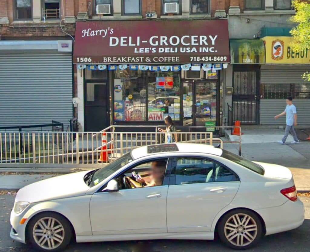
So: Around the corner from Uni Watch HQ is a bodega run by a very nice Asian couple, Mr. and Mrs. Lee. As you can see in the photo above (which is a Google Maps street-view shot taken in August), the Lees appear to have appended their name to the awning put up by the previous owner, whose name was apparently Harry.
Here in New York, storefront businesses need a license from the Department of Buildings before they can erect an awning or sign. But many businesses have apparently failed to go through the proper licensing procedures, and lately there’s been a flood of complaints about them. This has led to a bunch of businesses receiving citations and hefty fines, which in turn has led lots of other businesses to preemptively take down their unlicensed signs before they can be cited.
In some cases, this has led to older signs suddenly being exposed after many years of being covered up by newer awnings. That’s what happened to my bodega last Friday. I was walking by and was surprised to see that the Harry’s/Lee’s awning had been removed, exposing an amazing sign for — get this — Nathan’s Food-o-Rama:
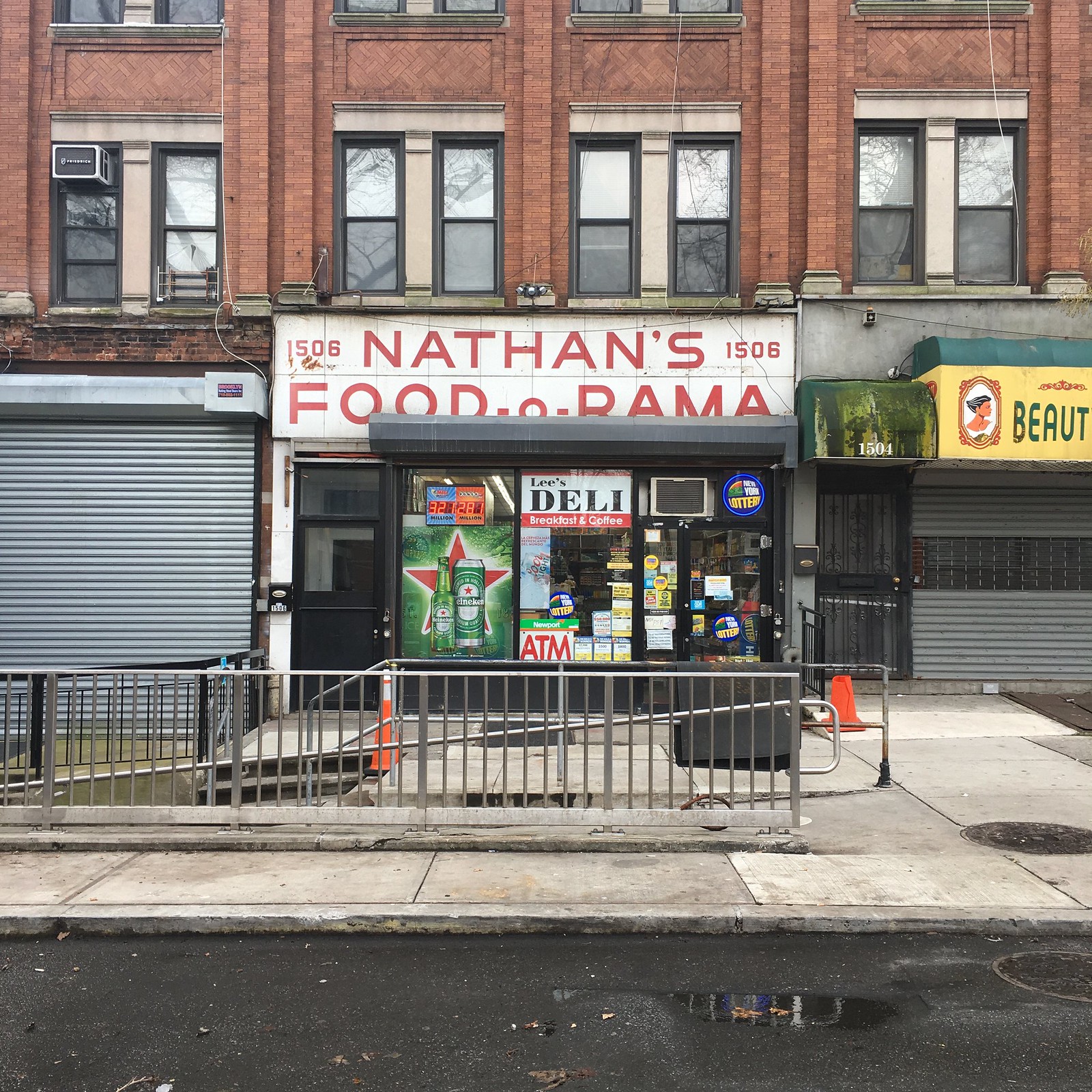
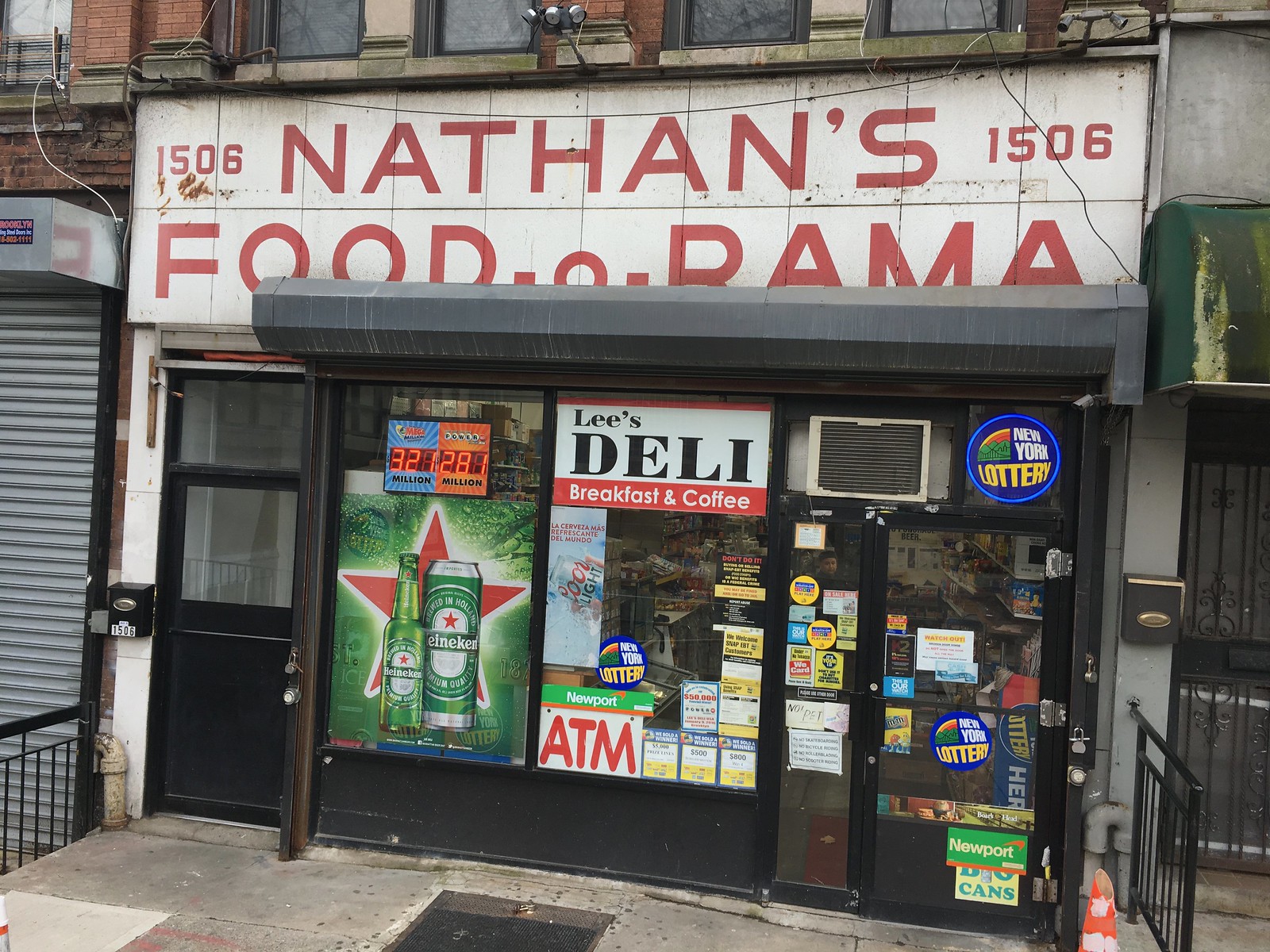
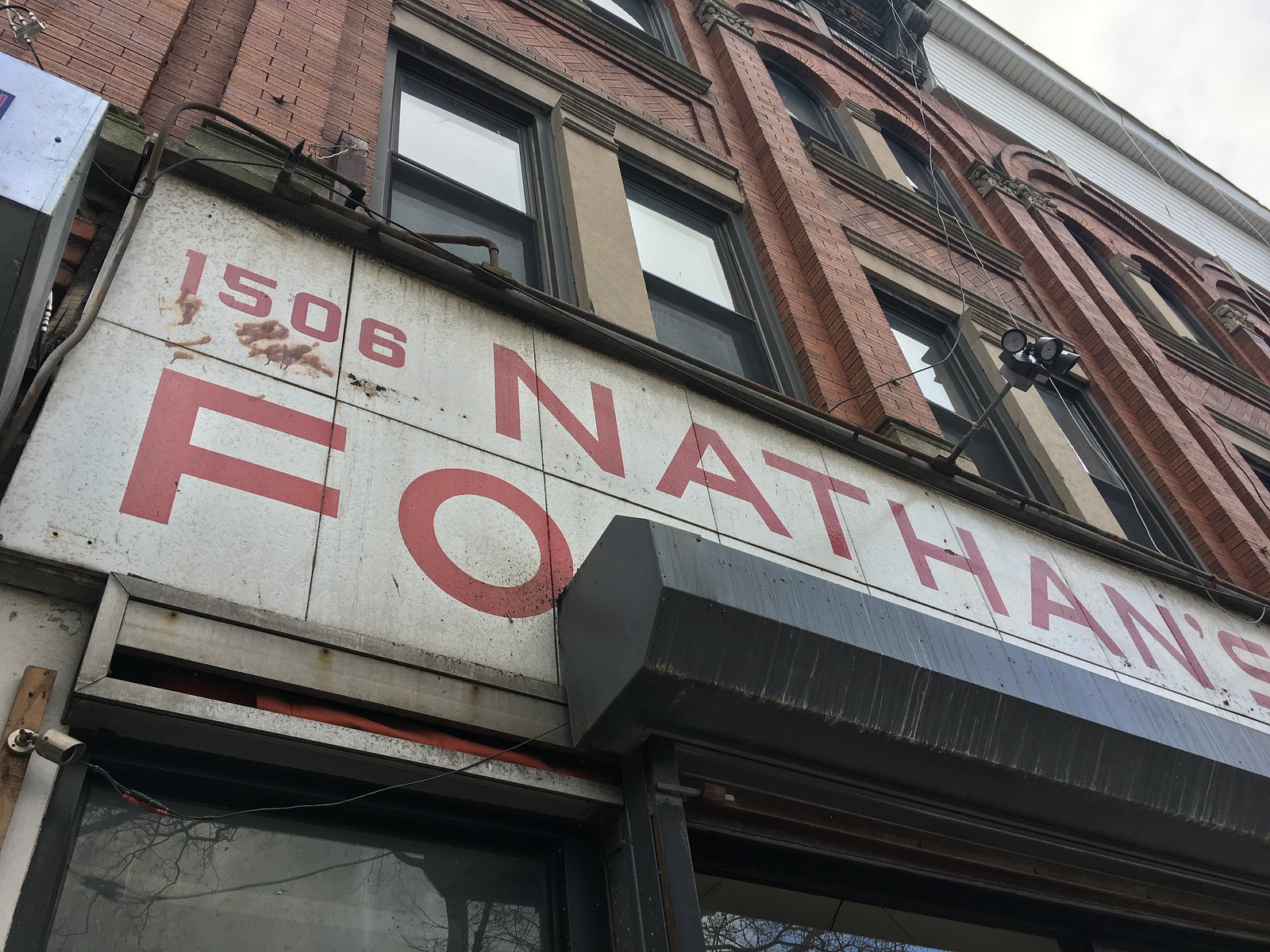
I was super-excited about this. For starters, anything-o-rama is always cool, plus I love the typography. I went home and did a bit of internet research, which revealed that the Food-o-Rama sign dated back at least to July of 1963 but did not yet exist in 1940, so it was erected somewhere in between those two years. It had still been in use as recently as January of 2007 (with the lower portion fully visible and not obscured by the roller gate housing that either Harry or the Lees later installed).
The Tugboat Captain was busy for most of Friday and hadn’t seen the newly exposed Food-o-Rama sign. The next morning we went over to Harry’s/Lee’s so she could take a look. We also tried to talk a bit with Mrs. Lee about the sign situation. Her English is pretty spotty, but she confirmed that they had taken down the awning “just in case” and said it would be several months before they could get a licensing appointment with the Department of Buildings for a new awning. So we figured we’d be able to enjoy the Food-o-Rama sign for a few months before it got covered up again.
But a few hours later we were walking to the subway and were confronted by tragedy:
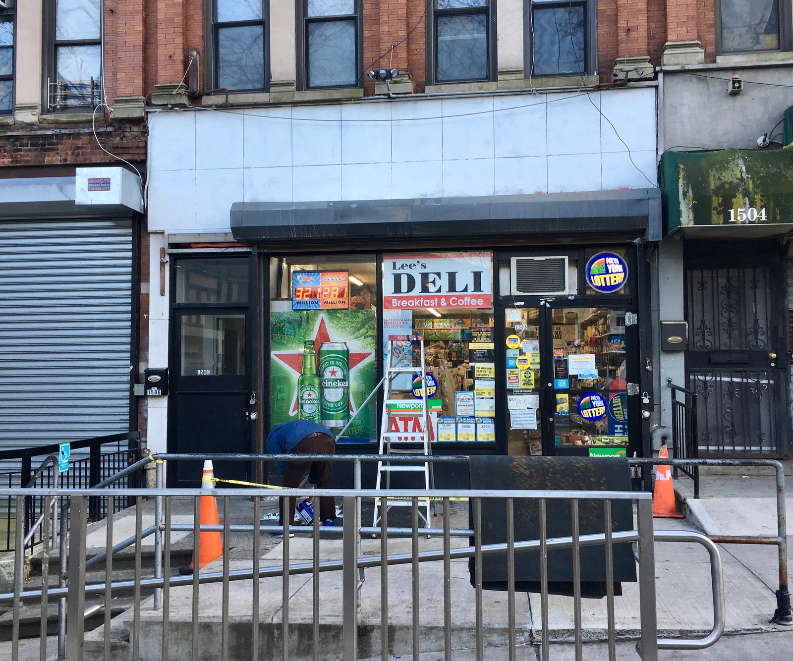
That’s Mr. Lee crouching next to the ladder. He had just finished painting over the Food-o-Rama sign. I’m not sure if he did this because he didn’t like the old sign or if this was another “just in case” move to prevent the old sign from possibly receiving a citation (and his English is even worse than Mrs. Lee’s, so I didn’t ask him). Either way, I’m sick over it.
So the Food-o-Rama’s second life lasted only about 24 hours, and then it was destroyed forever. Sigh. R.I.P.
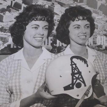
Money shot: The great Helmet Hut site has come up with a new find (or at least it’s new to me): a prototype Oilers helmet with the team’s familiar oil derrick logo spurting a gusher. This version was apparently used for promotional purposes prior to the AFL’s first season but never made it onto the field.
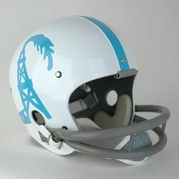
Helmet Hut has gone ahead and created a reproduction of the old design (additional photos and info here):
Collector’s Corner
By Brinke Guthrie
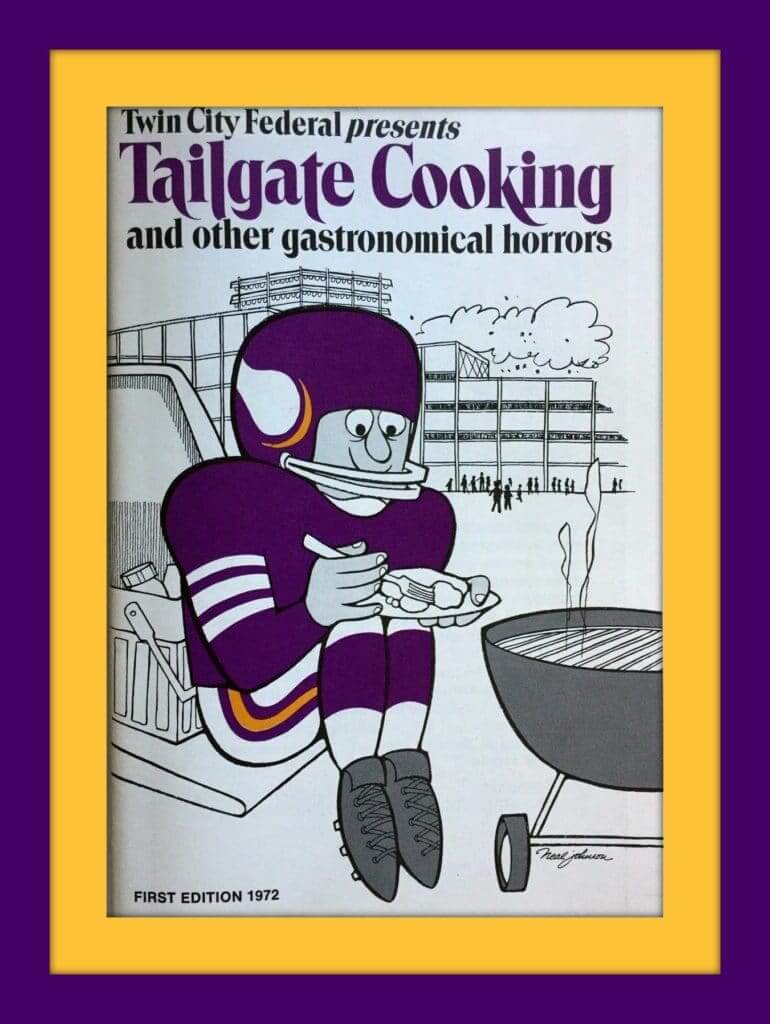
And we’re back with a special Thursday post-Christmas/pre-New Year’s edition of Collector’s Corner. Hope you got some great uni-loot on Tuesday, but if not, here are a few things you can spend Grandma’s gift cash on. Starting off, how about this tailgater’s cookbook for Vikes fans, Tailgate Cooking And Other Gastronomical Horrors. This is from 1972, and includes “Offensive (and Defensive) Tailgate Recipes You Should Try,” like “Boom Boom’s Super Tacos.” Nothing like a Super Taco when you’re freezing to death out on the Met parking lot, right? (Yes, kids — the Vikes used to play outdoors.)
Now for the rest of this week’s picks:
• Once upon a time, the NFL’s Chicago Cardinals moved to St. Louis. Then they moved to Phoenix and used the same pennant design. Eventually they’d settle on the regional Arizona Cardinals name that we all know today, as shown on this Puma Jake Plummer jersey. Always loved those Arizona state flags.
• One more for the St. Louis Football Cardinals: this 1970s zip-front sweater, courtesy of the Sears Put-On Shop. (In 100% Virgin Acrylic!)
• Wow, is this a great-looking 1970s Detroit Tigers satin dugout jacket, or what. The seller says “it could be team-issued,” and it was made by Wilson Sporting Goods.
• In the 1970s, the Pro Bowl had its own custom stationery.
• Ever seen one of those old “picture keychains?” You peered through the hole at one end of this little plastic thing, and a picture showed up on the other end. Since you usually held it up to the light, you’d get a bright photo of one of your sports heroes (or whatever), in this case, Bill Walton of the Celtics.
• Here’s a nice-looking, conservatively designed Golden State Warriors team-issued warmup jacket. The seller says late 1980s for this one. Made by Sand-Knit of Berlin, Wis.
• Terrific-looking mid-1970s helmet logos for the AFC teams on this collector’s glass.
• This 1970s 49ers helmet medallion is still sealed in its package.
• We’ve got a 1970s Minnesota North Stars hockey puck bank here. Still in its original packaging, too.
• I’ve never come across a Cowboys helmet buggy until now! In great shape, too. None of the usual stripe or side-decal peeling you tend to see after nearly half a century.
And before we wrap, a quick programming note: CC will once again run on Thursday next week, and then after that we’ll get back to our usual Tuesday schedule. Have a great New Year!
Seen an item on eBay that would be good for Collector’s Corner? Send any submissions here.
Click to enlarge
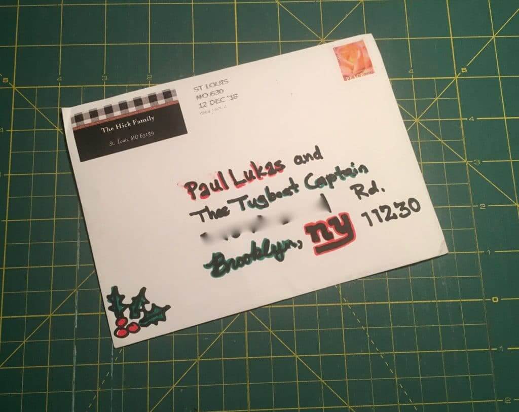
Mail call: Got a swell holiday card yesterday from longtime reader/pal Marty Hick. It was nice of him to include the Tugboat Captain on the envelope (where I’ve blurred out our address, sorry), but what I really love is his use of the Giants’ logo — nice. Thanks, Marty!

All that glitters: I’ve been a fan of the great writer Caity Weaver since her days at the late, lamented Gawker (where, among other things, she wrote about how she spent 14 hours ordering the “endless appetizers” at a TGIFriday’s). She later moved on to GQ and then to The New York Times, where she’s just written a completely fascinating piece about glitter — how it’s made, how our eyes perceive it, and, at the most fundamental level, what it is (and isn’t). It’s a great topic to write about — I wish I’d thought of it myself. But even if I had thought of it, there’s no way I could have written about it as entertainingly as Caity Weaver, who was born to do stuff like this. Check out her excellent article here.
Cincy reminder: Tomorrow morning I’ll be hopping on a plane and heading to Cincinnati, where I’ll be spending the last weekend of the year. We’ll be convening a Uni Watch gathering at the Mt Adams Bar & Grill on Sunday, Dec. 30, at 3:45pm. We’ll be there at least until 6pm, and maybe a bit longer.
Uni Watch Ticker assistant Alex Hider, who produces the Tickers that appear on Tuesdays, will be on hand (I’m looking forward to meeting him in person for the first time), as well several other longtime Cincy-based readers like David Sonny, Patrick O’Neill, and Frank Bitzer. Come on down and join us, won’t you?

’Skins Watch: There’s more controversy brewing about team-branded totem poles (WaPo link), which are now starting to attract a fair amount of negative attention from a variety of fronts (from Tom Turner).

Baseball News: If you look here and here, you’ll see color footage of a 1962 Cards/Mets game at the Polo Grounds. Cards already head NOBs that year. Mets wouldn’t add them until 1979 (thanks, Phil). … A Baltimore Sun reporter got a Reggie Jackson bobblehead for Christmas, with an Orioles uniform hand-painted over the original Yankees uni (from Brad Fair). … Will Sheibler was looking through the Oregon Historical Society’s website and found some good stuff, including a gas company softball team and a Mission baseball team with gorgeous bell-themed sweaters. … The Wasco Reserves, who will begin play next year in the independent Pecos League, plan to wear powder blue jerseys reminiscent of the early-1970s Phillies — complete with the zipper! (From Kevin McLaughlin.) … An MLB coloring book mistakenly shows Cleveland P Cory Kluber alongside a Cubs logo (from @theREALBGott). … Spectacular batch of rare patches from the old AAGPBL (from @BeautyOfAGame).

NFL News: DB D.J. Swearinger was named as a Pro Bowl alternate last week, when he was still on Washington’s roster. But then they cut him for criticizing the team’s defensive play-calling, and he was subsequently scooped up on waivers by the Cardinals. The NFL says that if he ends up playing in the Pro Bowl, he’ll wear a Cards helmet for the occasion. That could actually be his first game in a Cards lid, because he might not be active this Sunday. If so, it would be similar to the 1998 situation when Cincinnati Reds P Jeff Shaw was named to the National League roster for the MLB All-Star Game but was traded to the Dodgers just prior to the game, so he made his Dodgers uni debut at the ASG (thanks, Brinke). … The NBA’s Chicago Bulls gave Bears LB Khalil Mack his own Bulls uniform (from Mike Chamernik). … With the Steelers needing help from the Browns to make the postseason, Pittsburgh WR Antonio Brown has added an “S” to his replica jersey NOBs.
College Football News: Here’s what Baylor will be wearing for the Texas Bowl (from Ignacio Salazar). … 156 SEC players will be wearing graduation patches in their bowl games (thanks, Phil). … Cops escorting Alabama to their bowl game get team-issued ’Bama-style motorcycle helmets (from Crimson Kirk).

Hockey News: Icethetics, which is usually reliable, says 14 NHL teams will be getting new jerseys next season. … Jon Springer, who usually specializes in writing about baseball in general and the Mets’ uniform numbers in particular, has done an interview with Nick Hirschon, the guy who wrote the new book about the Islanders’ fisherman uniforms. … Last night’s Rochester Americans vs. Cleveland Monsters game featured Ninja Turtle-themed jerseys. … Here’s something you don’t often see: The goalie for the Czech Republic at the World Juniors wears No. 2. … The Binghamton Devils have signed G Alex Sakellaropoulos to a pro tryout, which means we now get to see his 15-letter NOB (from @j_canales87 and @shawngilligan). … Here’s an article on the equipment manager for the Grand Prairie Storm. … Everyone loves this old NHL jersey poster that’s been hanging at @teedoteop’s uncle’s house for decades.

NBA News: Cross-listed from the NFL section: The Bulls gave Chicago Bears LB Khalil Mack his own Bulls uniform (from Mike Chamernik). … Warriors G Steph Curry thinks the team should have worn “We Believe” throwbacks for their last season in Oakland (from Edward Lugo-Lopez). … In 1984, the Sixers somehow misplaced Julius Erving’s jersey prior to a game against the Knicks in New York, so they purchased an NNOB jersey at Gerry Cosby’s, which Erving wore in the game (from William Henry).

College and High School Hoops News: Santa gave Louisville some new uniforms, which they’ll be wearing on Saturday against Kentucky (from Kenny Klein and Josh Hinton). … Disappointing to see that Tupelo High School in Mississippi has corporate advertising on its warm-up tops (from Michael Martin who also notes that the uniform shown in the photo is BFBS, because the school’s actual colors are blue and gold. … Here are one observer’s ACC uniform power rankings (thanks, Phil).

Soccer News: Italian club Cagliari Calcio added a Santa hat to their crest yesterday (from @VictoryCB). … Here’s a ranking of the 10 worst kits in Premier League history. Josh Hinton notes that they got the year wrong for the Norwich design on the list, which is actually from 2015-16, not 2016-17. … Arsenal wore bright red socks yesterday. It’s apparently the first time they’ve ever worn red hose with navy shirts (from Ted Arnold and our own Jamie Rathjen).

Grab Bag: This is pretty awesome: a chess set made of salt and pepper shakers (big thanks to Jim Vilk). … Classy: A Boston TV station showed the Yule Log with a product-placement ad from a car company. “Tasteless,” says Sandy Dardick. … Good article by my friend Neil deMause about how cities don’t want to host the Olympics anymore.
I have a medical procedure this morning. Should be back in the afternoon. Play nice while I’m away, okay? Thanks. — Paul
second link in nfl section is wonky
Fixed.
The D.J. Swearinger story is a bit inaccurate, he wore a Cardinals helmet for 2 seasons in the past (2015-2016).
In the DJ Swearinger blurb in NFL Ticker, the MLB pitcher is not actually named.
Fixed.
Speaking of goaltenders at the World Juniors. Though he is wearing the more traditional #1, Canada’s G Mike DiPietro has a cool set of equipment for the tournament. Pads, glove and catcher for this year’s tournament adorned with the maple leaf.
link
Nice job by the guy who addressed the holiday card. I’m surprised the envelope arrived with the barcode for the zip+4 missing. or did you blur that too?
Nope, didn’t blur that. As you can see, they also didn’t cancel the stamp, so there were apparently some issues.
Weird. Looks like it was machine canceled so no idea what happened.
Also took 2 weeks to travel between 2 major metropolitan areas …
Looks like the “Brooklyn” in the address was a nod to the Dodgers logo.
Ah darn. “Lee’s food-o-rama” has a nice ring to it, and Mr. Lee would have only had to paint half the sign.
Very good article, I love when old hidden business signs get revealed, a shame it got painted over so quick, but good thing you took pics of it when you could.
same thing happened here recently. they redid a corner on the town square, exposing (briefly) a very old store sign.
then they covered it for a new (blech) Chipotle.
Paved paradise, put up a parking lot.
The Cardinals pennant has the same theme, but the yellow stripe was changed to black.
Wincraft makes/made a ton of pennants. I wonder if any other teams got any color switcheroos between those two years.
Not just this Czech goalie, but current Carolina Hurricanes goalie Petr Mrazec also took #2 in the world juniors. It’s interesting to me which numbers are traditional to backup goalies in which countries. By my quick informal survey, Sweden is #25, Finland is #19, Russia is #20, and in Canada and US, anything 30-something.
link
One can never be sure with black-and-white photos, but that Oilers derrick sure looks like it’s darker than light blue. The helmet has a stripe that’s definitely lighter than the derrick, and one of the women has painted nails that are also lighter than the derrick. If her nails are a shade of red – much more likely then than today – then the logo cannot be light blue. Seems like a good chance that the promo helmet showed a black spewing derrick and a light blue center stripe. Could also be navy blue, or, if the lighting and white balance were right, red. But assuming the center strip is light blue, then the logo certainly isn’t.
I couldn’t figure out what was bothering me about that helmet reproduction but that is exactly it. That light (columbia) blue just does not look right for the oil derrick.
The helmet did make an appearance on bobbleheads, though:
link
*Albeit with the colors reversed.
It’s a great logo, maybe better than the one the Oilers went with, but shouldn’t the gusher flow toward the back of the helmet, not the front? The bobblehead shows the derrick on the opposite side of the helmet from the photo but the logo reversed so the gusher also points toward the front of the helmet.
I’ve recently become fascinated by NYC’s use of the word ‘bodega’ so I finally did some searching around and found this enlightening article – link
Thanks for sharing. It is a great article. Growing up in close to the suburbs in Chicago in the 70’s, there were a few “corner stores” in my neighborhood. I was always fascinated by the architecture of the building with an apartment usually above the store. The family that owned the store usually lived there. As supermarkets grew and these stores closed, it was interesting to see how the buildings were repurposed.
thanks for sharing that food-o-rama story and pic. this link has tons of great storefronts in Brooklyn (including the food-o-rama)
link
Paul, Hope your procedure goes off without a hitch and your back to 100% (or as close one gets these days)!
Cool find on the Oilers helmet, I have never seen that before. It is a shame the team history wasn’t left in Houston like what happened when the Browns moved.
Proofreading: Cards already head NOBs that year.
Hey Paul,
Shame about the sign. Just curious…with the sign painted over, is there still any remaining visible evidence of NATHAN’S FOOD-o-RAMA, either because the paint did not fully cover the writing or the writing was slightly raised and can still be seen up close? I often seem to undertake these type of do-it-yourself projects and wonder how it would come out (of course I would not have undertaken this one).
If Mr. Lee follows trends I’ve seen across the country with a number of Asian markets, the next version of the sign will be in his native language.
If you’ve ever eaten at Raising Cane’s, they have a mural of their logo painted inside each location as a shout-out for their original location having a Wolf’s Bread mural that was exposed during construction. The whole company ended up designing their logo around the mural.
link
Great photos from the Oregon Historical Society. Jerseys, jackets, and sweaters from both photos are fantastic. Wish we could make out the colors…
I like how the mascot logo on the softball team is made of of the letters G-A-S
Thanks for posting the Food-o-Rama sign I love stuff like this.
Great looking NHL poster! Yellow on a uniform always looks good which makes me wonder why it’s been banned and is now called gold.
That is a great poster, but the stars are missing on the Capitals jersey.
Typo in Baseball News:
“Cards already head NOBs that year”
I can’t really blame Mr. Lee for painting over the “Nathan’s” sign since his business not named as such. He probably just thought potential customers might find it confusing.
Does anyone that speak the language live nearby? I’m really curious about why he painted it over.
My first thought about painting over the sign was that that people would find it confusing when looking for the Lee’s establishment. On the other hand, their regular customers already know where they are, and most, if not all new customers are probably just walk-ins. So yeah, it’s too bad he painted it.
I’m also cautiously optimistic that the Canucks new jerseys are going to include the “Johnny Canuck” logo.
Said it before and will say it again. Canucks just need to switch to this concept I found online. I would be a happy fan with this. Shout out to Colin May and Justin Cox on their creation:
link
Though minor tweak. Stick in rink on shoulder of green 3rd jersey.
I’m Still Calling It Food-O-Rama
ooooooooo THAT is T-shirt design.
Since “anything-o-rama is always cool”, perhaps your next project should be a (subject)-o-rama
Here’s a local to me pics with Eaton’s Groceteria that later changed to Eaton’s Foodateria (with the more impressive lettering)
link
Here’s one that got found with renovations in 2016
the “Lecky & Ollie” on glass (far right) in this Then & Now local to me picture.
This sign didn’t last either – currently a Vaping Shop:
link
link
Seriously? “Money Shot” is your caption for the photo of two hired pretty girls with that helmet? Gross dude. It’s 2018.
Couldn’t agree more with this comment. Perhaps most readers just skipped by this, but it’s really not appropriate.
Really gross.
No – many feel it’s wrong it’s just pointless having a different view then PL bc he’s always right
Yep it’s 2018 where everyone has lost a sense of humor and are looking to be offended.
Yeah, dudes, what’s funnier than ejaculating in the face of two women?!? Harhar! Amirght fellas?!
**chugs beer**
You’d have to be a real stick in the mud not to laugh at how funny and clever that is!! Good point Jimmy!
**slaps waitress on butt**
Harhar! Some people are just sensitive!
**belches**
That 70s Cardinals sweater has another piece of soon-to-be nostalgia….a Sears tag.
Dominik Hasek wore #2 when he played for Czechoslovakia in the 1980s. link